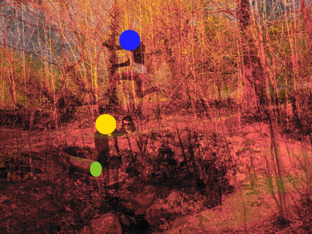
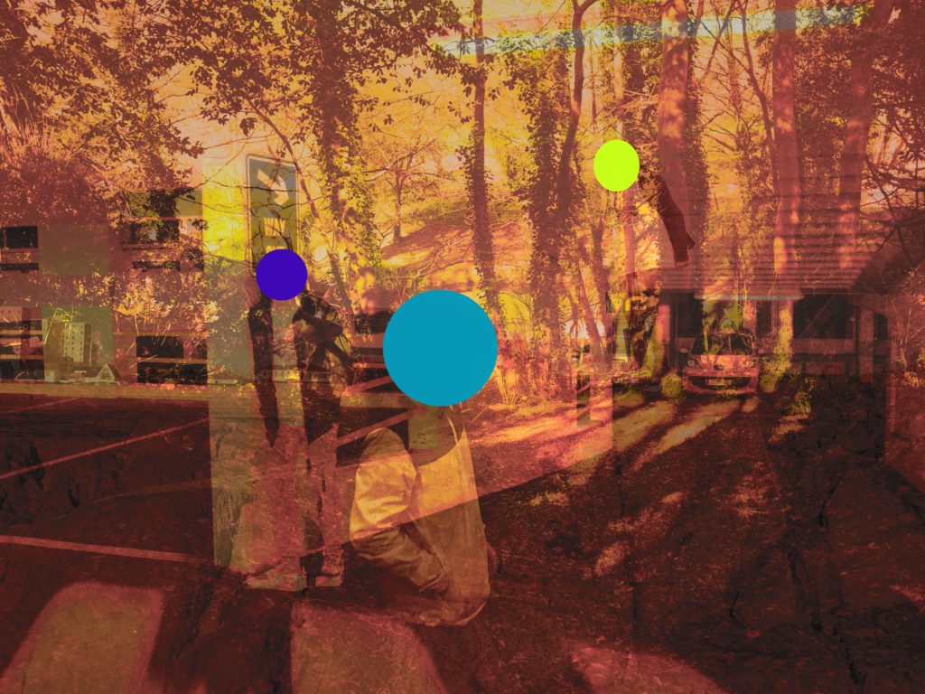
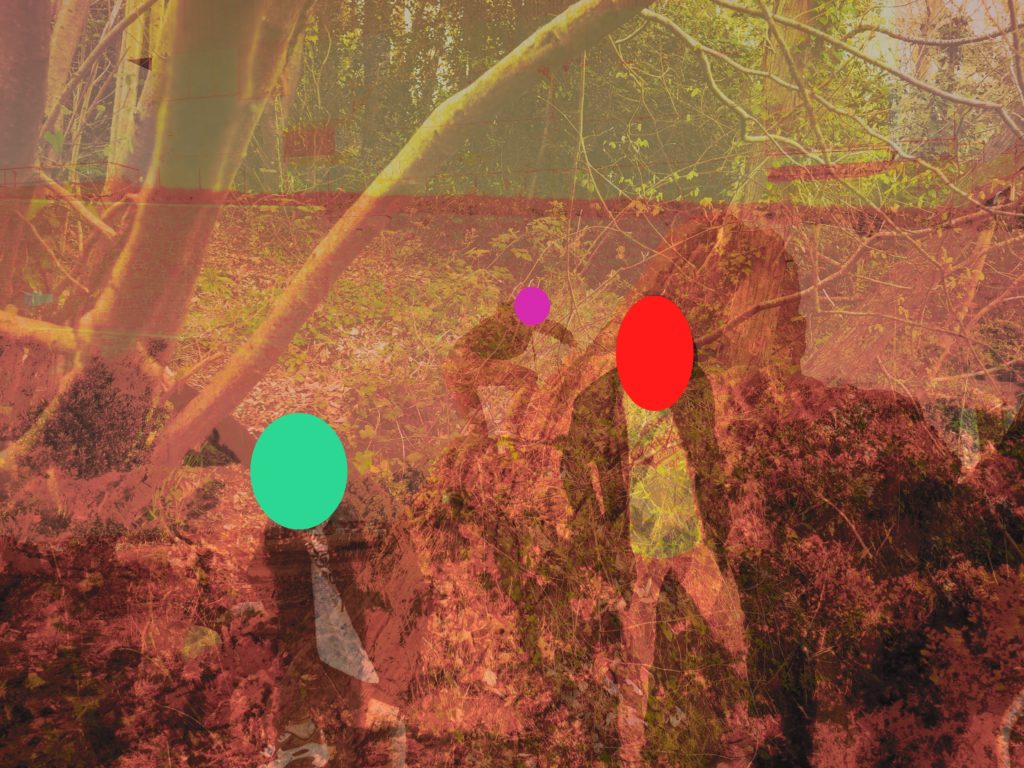
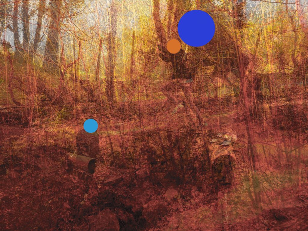
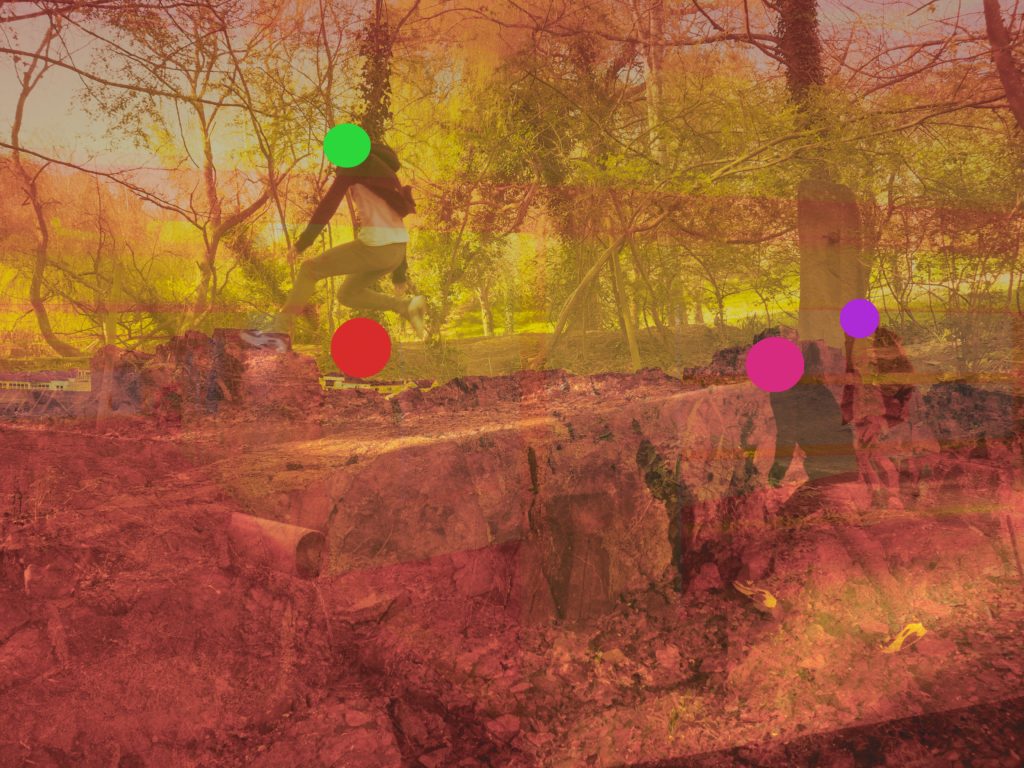
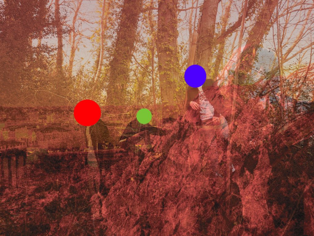
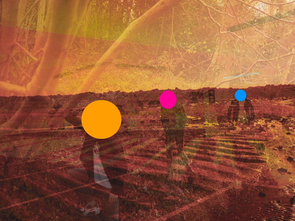
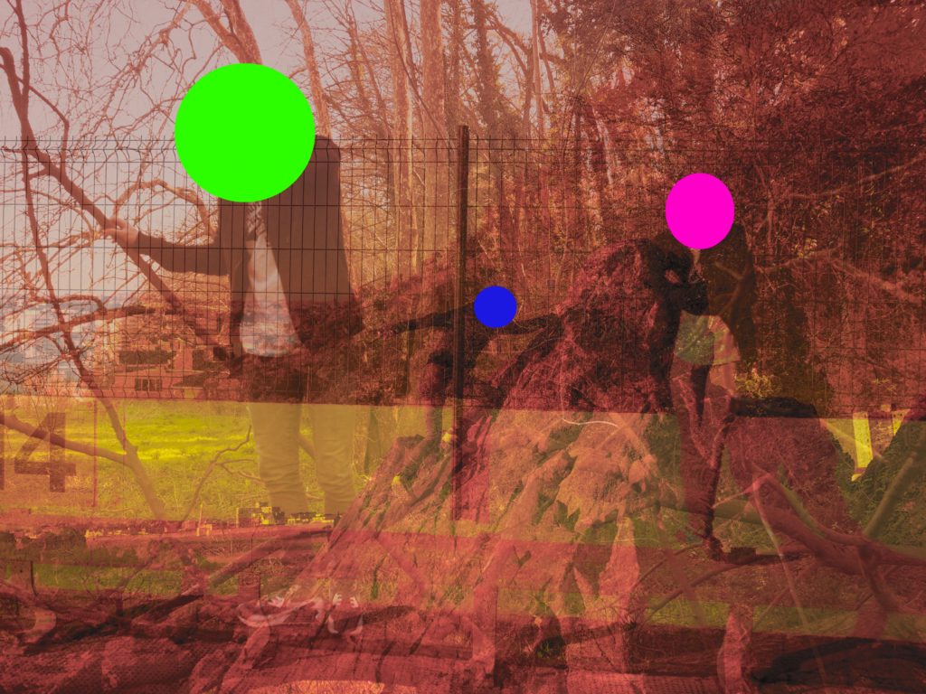
For this Set of edits, I have used the edits from the previous set to work on.
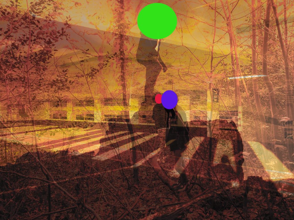
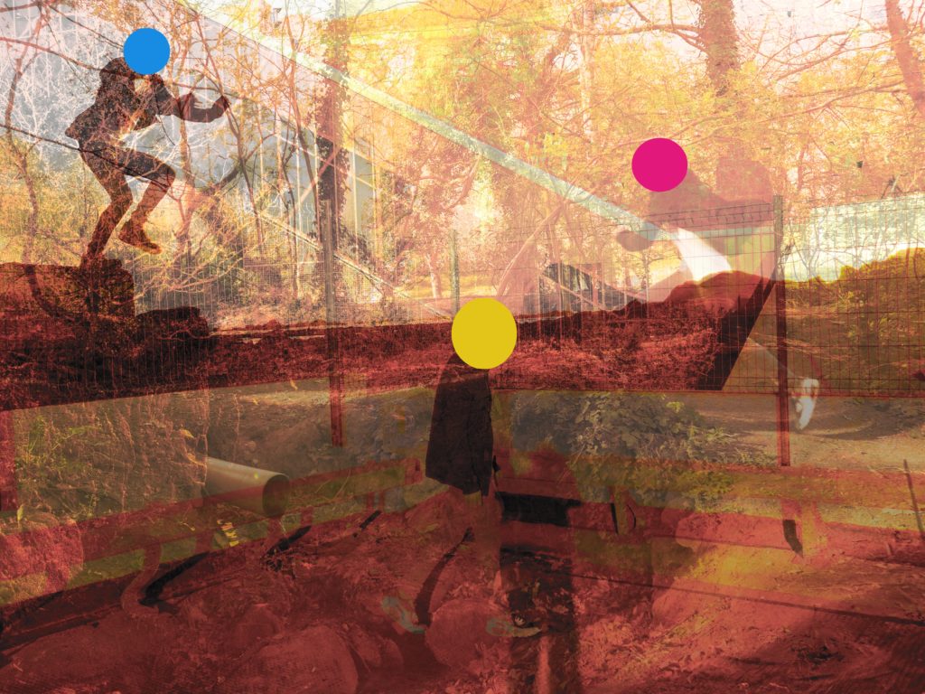
I have used influence from John Baldessari and the way he used shapes to cover peoples face and make the images he made more obscure to the eye.
I have tried to replicate this method through the application, sketchbook, of which I made circular overlays on top of the faces that are in my photos.
have experimented in a variety of different ways, creating different shapes and types of lines. I have experimented on all of my photographs because I want to have a variety of options and a large range to choose from, this will make sure there is nothing I’m missing when making my final selection.
I have chosen a select amount of photographs from photoshoot 1, flowers, to experiment on using different processes and methods in Photoshop.
Original Photographs:
Edit 1:
To create this effect I inverted the colours, creating a eye-catching glowing effect.
Best outcome: I have chosen this as the best outcome becuase I like the way inverted colours switch the colours, the purple and white petals turn a vibrant green and the dark green grass turns shades of purple, the glow, this bright colours creates a eye-catching contrast.
Edit 2:
To create this effect, in photoshop I posterized the photographs, popping the colours.
Best outcome: , making I have chosen this photograph as the bets outcome because I like the way ‘Posterize’ creates a cartoon like effect, this also makes the photograph look like a painting, making the colours block together as if they have been painted and this makes the photograph standout and appear brighter.
Original Photographs:
Edit 1:
To create this effect, in Photoshop I used ‘Gradient map’, this creates a spray paint like effect and I chose to group together contrasting colours; purples, oranges and blue to make the images stand out.
Best outcome: The gradient map effect creates a glowing effect, making the flower the focal point of the photograph stand out and the back drop contrast with it.
Edit 2:
I recreated the ‘posterize’ effect in Photoshop to create these images, experimenting with the white backdrop.
Best outcome: this is the most successful image because the bright orange is heightened by the posterize effect and contrasts well with the white backdrop.
Experimenting with similar photographs, ideas and effects is very helpful in finding the best possible outcome for the photographs, for example I used the ‘Posterize’ effect on both sets of flower photographs, white back drop and grass backdrop, experimenting with both allowed me to see that one us more successful then the other, for example the grass backdrop produces better outcomes because it creates contrast and is more colouful, creating a more interesting photograph.
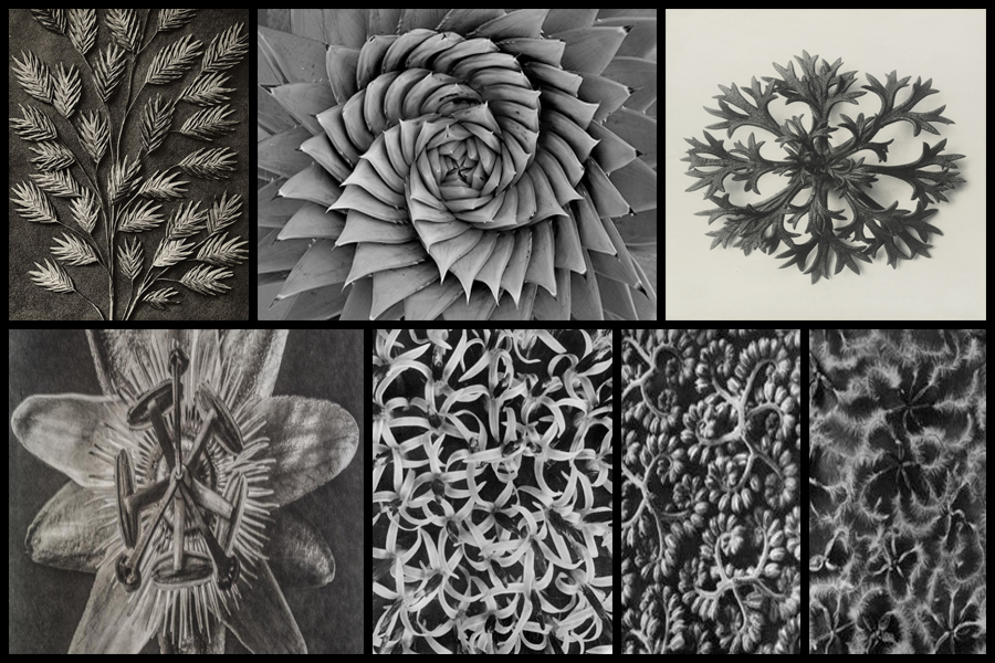
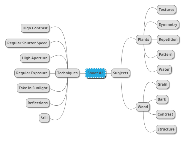
For this shoot I wanted to focus my attention around the textures and patterns found within the abstraction and isolation of photographing a single plant. Having previously looked at the works of Karl Blossfeldt I became inspired through the simplicity of his style but effectiveness regarding the plants hidden beauty from their structure and aestheticism. What I wanted to capture in this shoot was how patterns and textures can be found wherever you go in Jersey whilst looking at the wildlife, and that one such instance, in this case plants, can’t be viewed by the everyday eye but instead needs to be viewed from a closer and unusual perspective in order to properly see how the plants truly looks. I wanted to achieve an aesthetic looks like Blossfeldt’s, using a monochrome filter that exaggerates the shades of the plant, contrasting it from the surrounding environment. Some of his work can be seen below:
Once I had looked at some of his work I decided to go onto make a mind-map for my shoot. By doing this I hope to make my shoot a lot more easy for me to complete, this is because by using a mind-map it would allow me to more effectively identify what I should photograph when in the are, stopping me from taking images that would maybe distance myself from my aims. Here are some examples of my ideas regarding the new shoot:
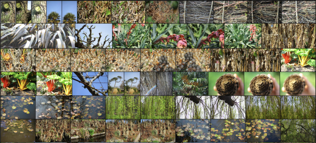
Once I had completed my mind-map I decided to go ahead with the shoot, my main focus for the area are around the coastal areas of Jersey which have the biggest variety of plants to photograph. Using my mind-map as my primary source of inspiration I decided to take 100-200 images regarding textures and patterns. Here are my results:
Once I had completed the shoot I decided to go onto select ten images I thought best reflected the overall intention of the shoot. By doing this it would allow for me to whittle the results down to only five which could then be used to analysed in more detail and find the photo that best overall represented the entire shoot and my thought process. Here are the selection of ten images that I thought both visually and contextuall reflected the shoot:
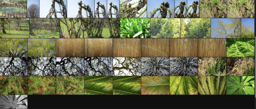
After I had chosen the ten images I thought were most effective I then moved onto selecting the pieces that I thought summed up the shoot well. To do this I will be analysing the five that I found to be both visually and contextually appealing to me and the viewers, this would include looking at the visual, technical and conceptual aspects of the piece in order to select the image that best sums up the overall shoot. Here are my decisions:
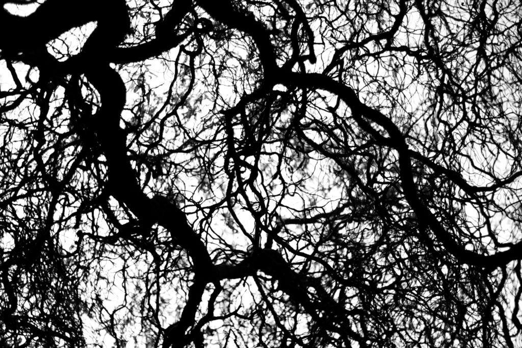
I chose this image because I loved the textured pattern created by the branches of the tree growing out, for me this resembled a spider web where a general formation can be seen from what the branches have created, however there is a randomness overall as each branch has no sense of direction. I found that the thickness of certain branches brought together the overall piece, this is because of how they provide a sense of aestheticism within due to smaller black lines dart out of the sides of think thicker pieces. For me this is particularly effective from how the backdrop is white and so creates silhouettes of the outreaching branches, really abstracting the tree and highlighting the patterns created from it. Overall I found this image related well to the topic of patterns and textures due to it presenting the top of the trees through a perspective not usually regarded. providing the viewer with an insight into the patterns branches make across the landscape.
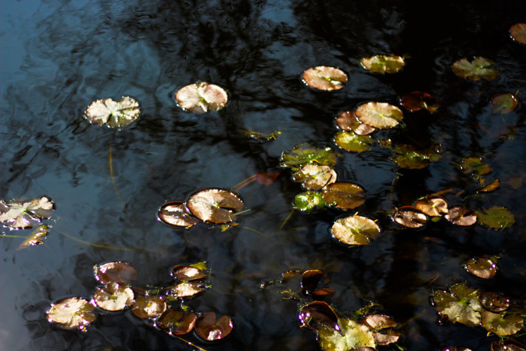
What I really liked about this photograph was the use of motion blur to capture the lillies and the reflection of the water. By capturing the brightly coloured lillies against a mainly dark surface of water I found that it created an unusual texture as by incorporating both on a sunny day it removed the impression of water, instead replacing it with a mirror of what overlooks the pond. The motion blur for me also added a sense of movement within the piece due to how it distorts the water surface replacing it with a pattern of blues and blacks blended together making it look almost like a convas. Overall I found that this piece went well with the topic of textures and patterns due to how the blur smoothened the waters surface whilst using the lillies as patches of vibrant circles to highlight what is reality.
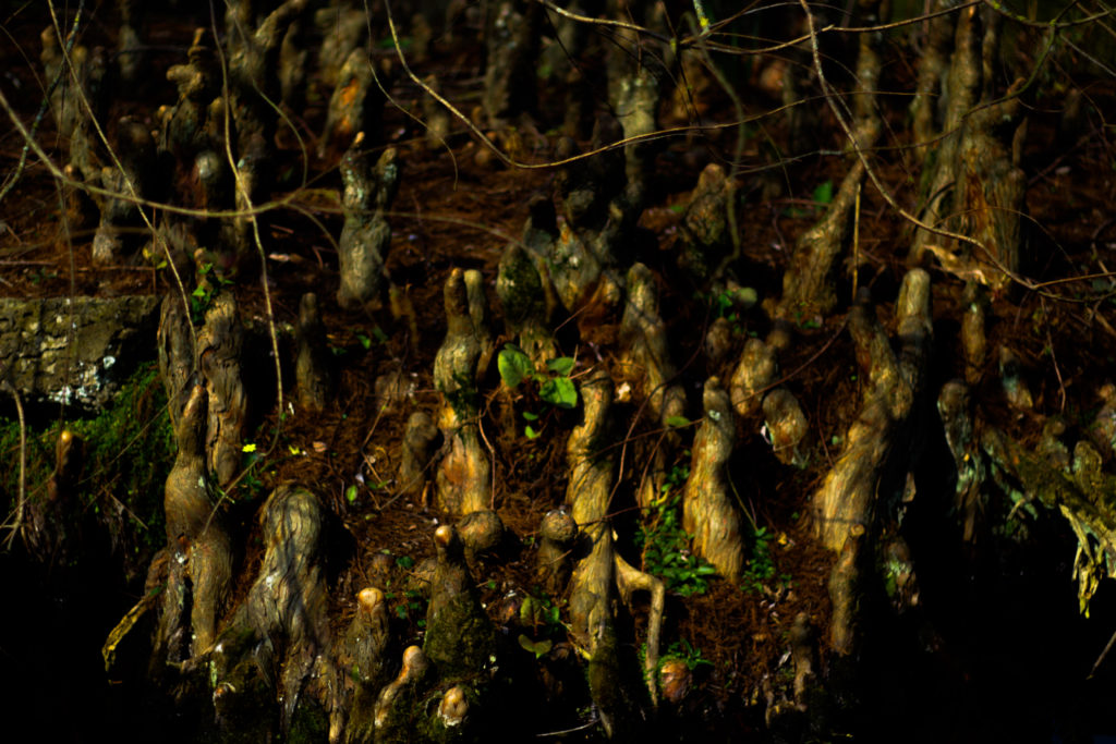
For me I selected this image because of how the forms created by the wood come up from the ground as if they were an alien species, these little wooden formations jot up from the group and spread out as they lead further back in land. This pattern they create for me really provided a great contrast due to the variety of different colours which can be seen defining the shapes through things such as grass, moss and water. I found that the black border which surrounded the piece really added to the overall effect due to ow it almost boxes in how the image is represented, making the viewer question what is beyond the patterned field of wooden spires. Overall I found this piece represented the topic well due to the odd spire like structures dotting out of the ground in random patterns, for me this was a good representation of natures patterns and how they can range from normal to unnatural.
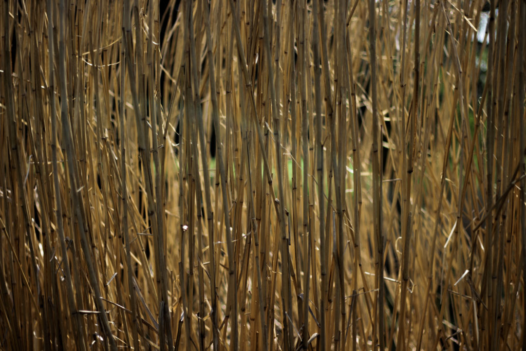
The reason I selected this image was because of the use of repitition present throughout the photo. I found this image to be effective due to how it portrays a common pattern often seen in nature through many of the same plants seen side by side often next to walkways, and so capturing it using a composition that boxes this symmetrical and repetative pattern in really abstracts it from its surrounding environment as it gives the viewer a more upfront and personal confrontation to a common pattern seen in your everyday life. Overall I found that the piece is effective in presenting viewers with an everyday view into the patterns and textures you can find almost anywhere you are.
Like one of the images above what I liked about it was the use of motion blur to create a textured pattern between both the water and lillies. I really liked the random pattern created by the lillies onto of the water which reflects the lillies below the surface, by doing this the water creates the imapression of two layers of lillies on top of each other. I didn’t however find this photo to be overall that effective due to how the lillies for me take up too much of the surface leaving little for the waters surface to be portrayed properly. Overall however I found it did relate to the topic of textures and patterns due to how the double layer of lillies represented the repetition found in nature.
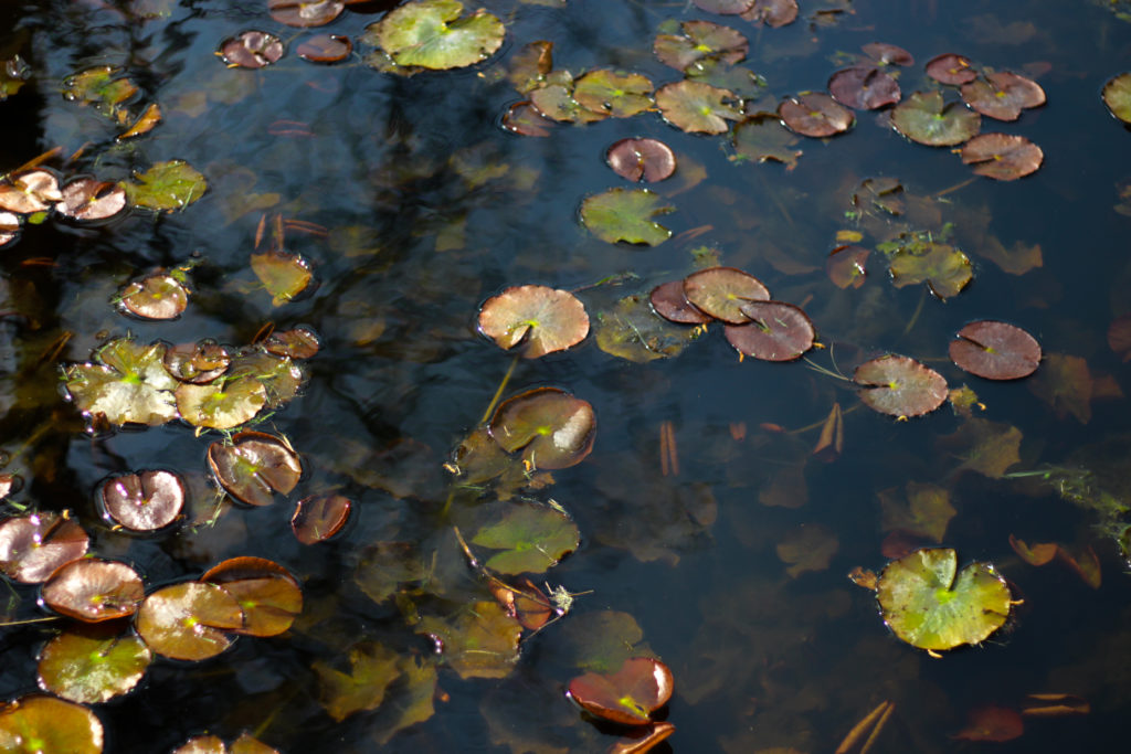
After my shoot and analysing five of the images it allowed me to come to a conclusion regarding the best outcome from the entire shoot. Here is my final decision for the photograph that best sums up my aims from the shoot:
Final Image:
When looking over this image I found that it put across a great sense of aestheticism with the blacks of the waters surface and the blues complimenting the vibrant lillies which are dotted around the photograph. I really liked the underlying lillies below the surface as I thought they added some depth to the overall image with the reflection of the trees overcasting the lillies added to the contrast of the image. In regard to the topic title of textures and patterns I found that the photo related well to the title due to how the pattern of the lillies dotted around the surface with the surface of the water becoming blurred from motion which as a result added texture to the surrounding area.