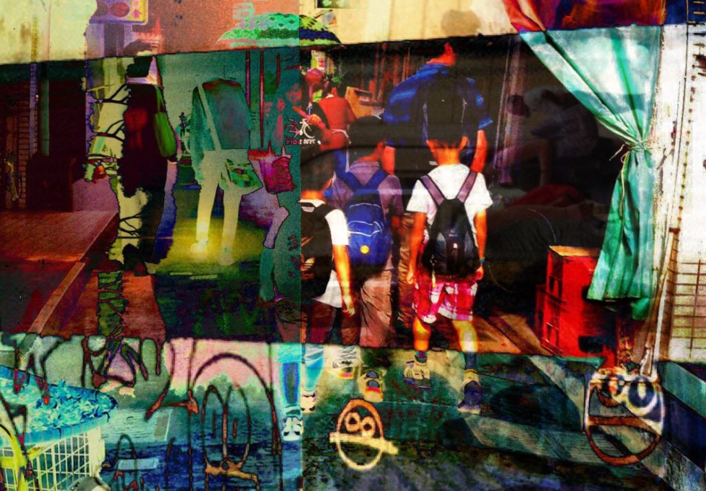
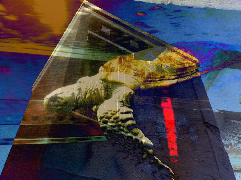
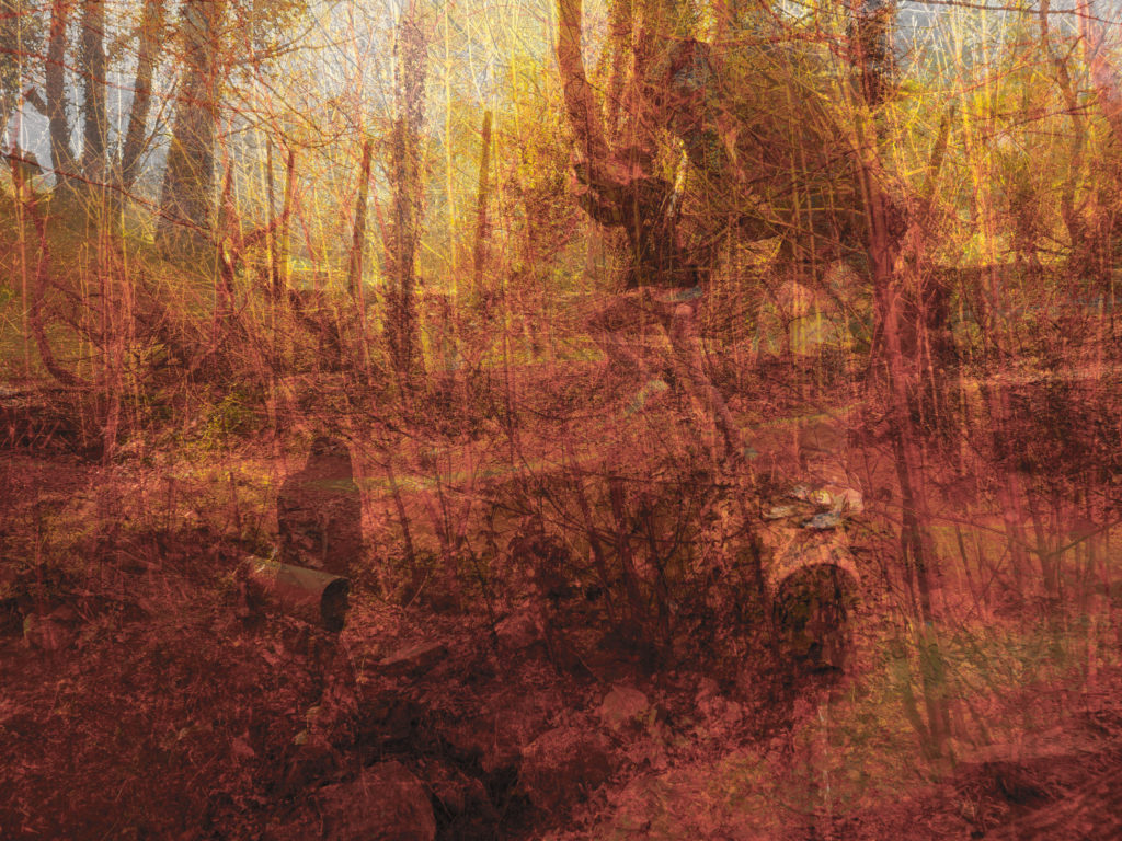
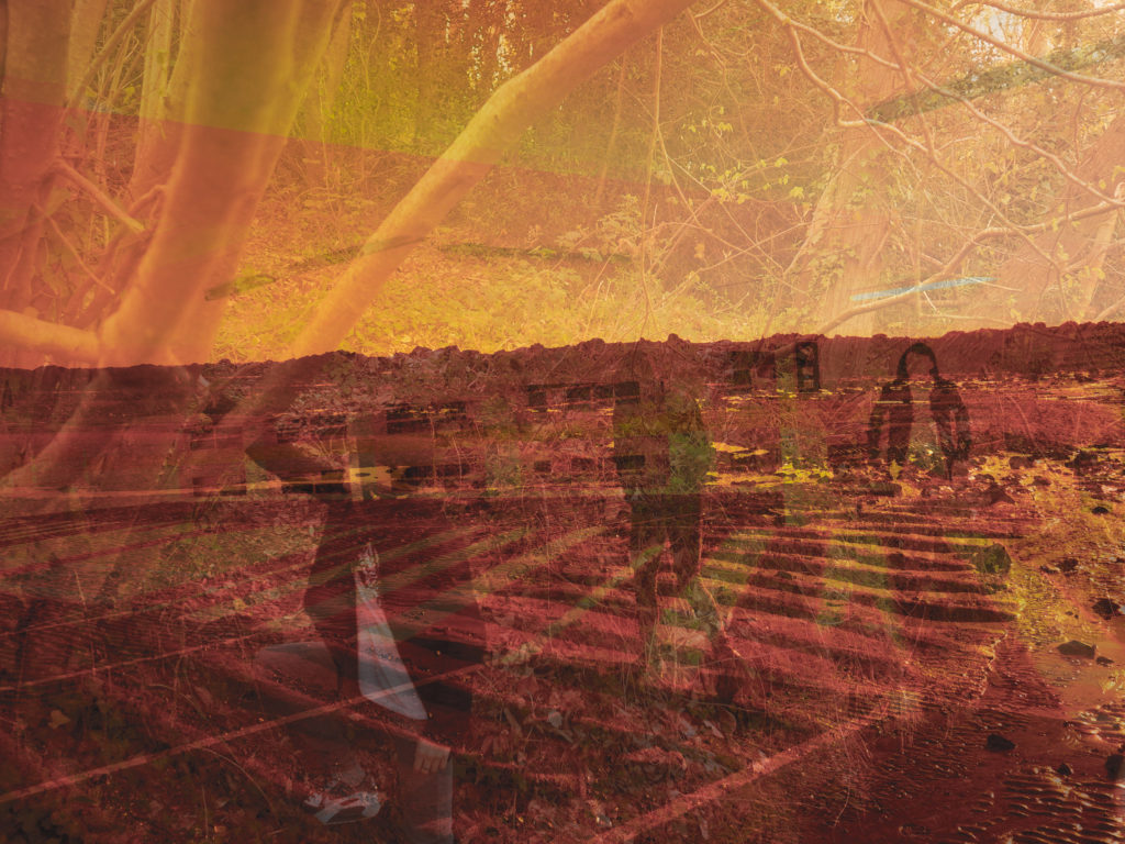
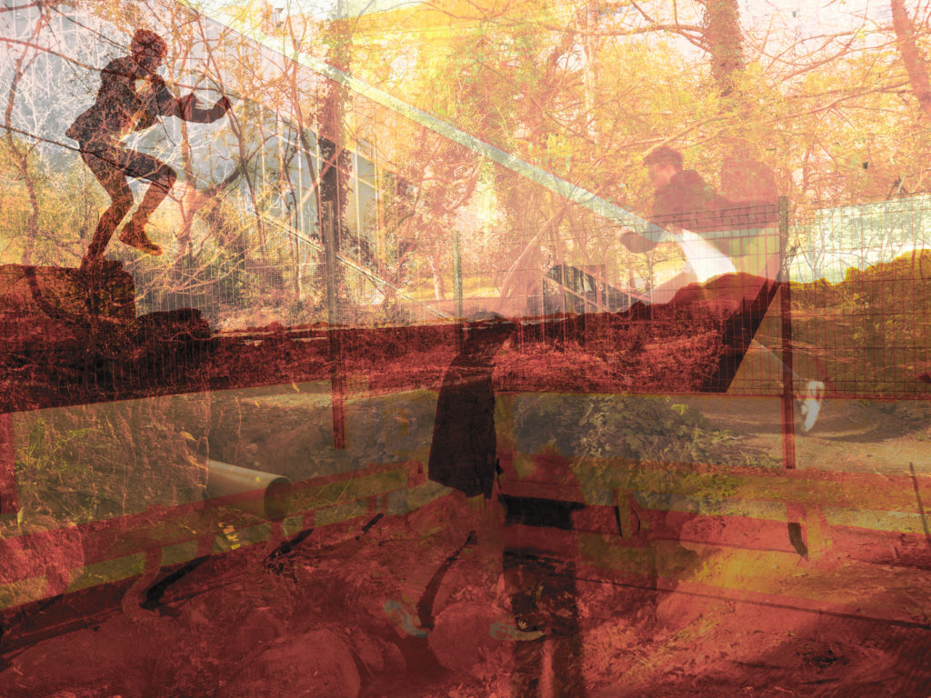
For each of the edits that I have done in this set I filtered between 3 images, the beach shot on a shadow colour balance setting, the woods shot on a midtones colour balance setting and the car park shot on a highlights colour balance setting.
I then adjusted the opacity of the two images in front of the beach photo accordingly so that all the people in the shots were equal in visibility. After that I then adjusted the brightness and the contrast to increase the highlights and shadows within the images.
Then as a final touch I went to the vibrance tool and decreased vibrance fully and increased the saturation by 50% to create an almost burnt out look on some of the edges.
First my first few photo-shoots I have a few ideas.
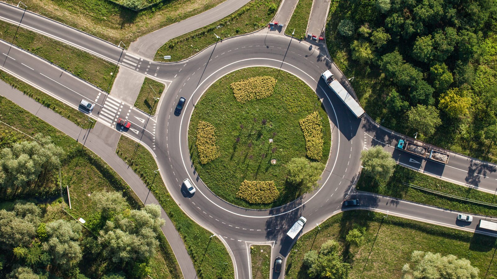
Drone Top Down
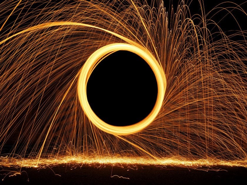
Steel Wool
Circles in town
Circles inside
Drone Top Down
For this shoot, I plan to shoot one if not more locations in Jersey where there are prominent circular features. These places include Noirmont Point MP1, Noirmont Point Lighthouse and a roundabout, likely at the Waterfront St Helier.
A similar stlye to what I would like to try – Image by BAM Perspectives
Steel Wool
For this shoot, I would like to produce something similar to what is below. It involves sparking a strip of steel wool and swinging it around in a circle.
Unknown
Circles in Town
Walking around urban areas, photographing things that are circular. I am not sure what to expect but I would imagine I will find a lot of examples.
Jono Vernon-Powell
Roundabout
Again with the drone, I would like to fly over a roundabout (perhaps at the Waterfront St Helier) and shoot top-down onto the roundabout.
Unknown
Circular Tiny Planet
For this I will take images and then use a circular photograph program to create this images.
He was born in London, started taking photographs as a teenager, and has been involved with photography ever since. In 1979 he set up Science Photo Library, a picture agency specializing in science and medicine. In 2003 he started a new career as a landscape photographer, with a focus on exploring natural change in the world around us. Sea Change, a series taken over 10 years, compares identical views at high and low tide around the coast of Britain. Sea Change won the LensCulture portfolio grand prize in 2011 and has been exhibited in Britain, Italy, Denmark, and the United States.
From 2003 to 2012 Michael Marten traveled to different parts of the British coast to photograph identical views at high and low tide, six or eighteen hours apart. His beautiful and surprising photographs reveal how the twice daily rhythm of ebb and flood can dramatically transform the landscape. This links to my previous studies of the depiction of light and how this can transform a familiar landscape. I have also focused on the sea within this and therefore looking at the sea in another way and the way in which it changes a landscape really appeals to me and connects perfectly for my project.
“I am interested in showing how landscape changes over time through natural processes and cycles. The camera that observes low and high tide side by side enables us to observe simultaneously two moments in time, two states of nature”.
Recent landscape photography often focuses on human shaping of the environment – urbanization, globalization, pollution. Even when critical and committed, this approach can emphasize and glamorize humankind’s power over nature. “I’m interested in rediscovering nature’s own powers: the elemental forces and processes that underlie and shape the planet. The tides are one of these great natural cycles. I hope these photographs will stimulate people’s awareness of natural change, of landscape as dynamic process rather than static image. Attending to earth’s rhythms can help us to reconnect with the fundamentals of our planet, which we ignore at our peril.” — Michael Marten
“… a sense of threat as well as one of miracle attends Marten’s images. The people who fill his beaches at low tide seem often still to be there at high tide, invisibly in their fixed positions, fatally swallowed by metres of sea.” – Robert Macfarlane
With one of the fastest moving tides in Jersey I think taking inspiration from Marten’s sea change project will be a very interesting subject matter. It will be especially appealing for local residents to see the dramatic change that they often overlook everyday when driving past. The difference between low and high tide creates a completely different mood similar to lighting which i have previously looked at. With this focus on how a place feels, the mood and atmosphere, as appose to the detail of a certain subject matter I am going down a different route to the stereotypical type of photography.
I have chosen to photograph flowers as a way to represent ‘variation and similarity’ because there is the opportunity to photograph a wide range of the same type of something but at the same time have them be very different, therefore being a variation of similar objects, flowers. I photographed the same group of flowers on a white backdrop and in a grass backdrop, this also creates variation and also allows me to experiment with what creates a more successful photograph.
Most successful photographs:
I have chosen this photograph as one of my most successful because I like the movement within the petals and the fact they are curled up and all in different directions, created by the fact the flower is dying. I also like the contract of the bright yellow flower and the dark green grass and the fact the flower is almost being tangled within the grass, this photograph was taken in outdoors in natural lighting, this allows the colours to be more vibrant and also shows off smaller details caught in the light like the water droplets on the grass and the pollen and creases on the petals and blades of grass. Over all I think this is one of the more interesting photographs due to the movement and busyness of the image.
This photograph was taken outdoors in natural lighting, high lighting the colours of the flower, I have chosen this photograph as one of the more successful photographs because I like the way the colours progress through out the petal, how the colour develops from light to dark, white to purple, this is made more apparent by the movement within the petals, giving the impression that the flower is moving with the wind, when really it is wrinkling up, I picked the flowers the previous day and arranged them back into the ground and photographed them over the next couple of days, I did this to create a more interesting effect. The natural lighting high lights interesting features of the flower and surrounding, for example the steam and its details, the detail in the near by blades of grass and leaves, this creates a more successful image because it gives you more to look at.
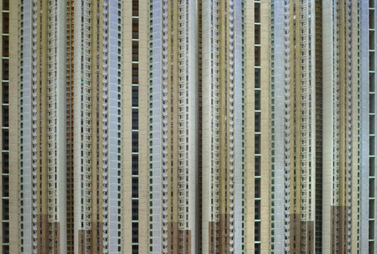
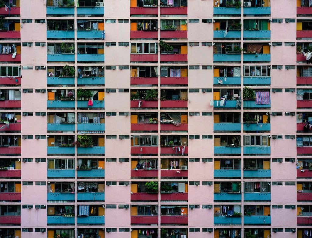
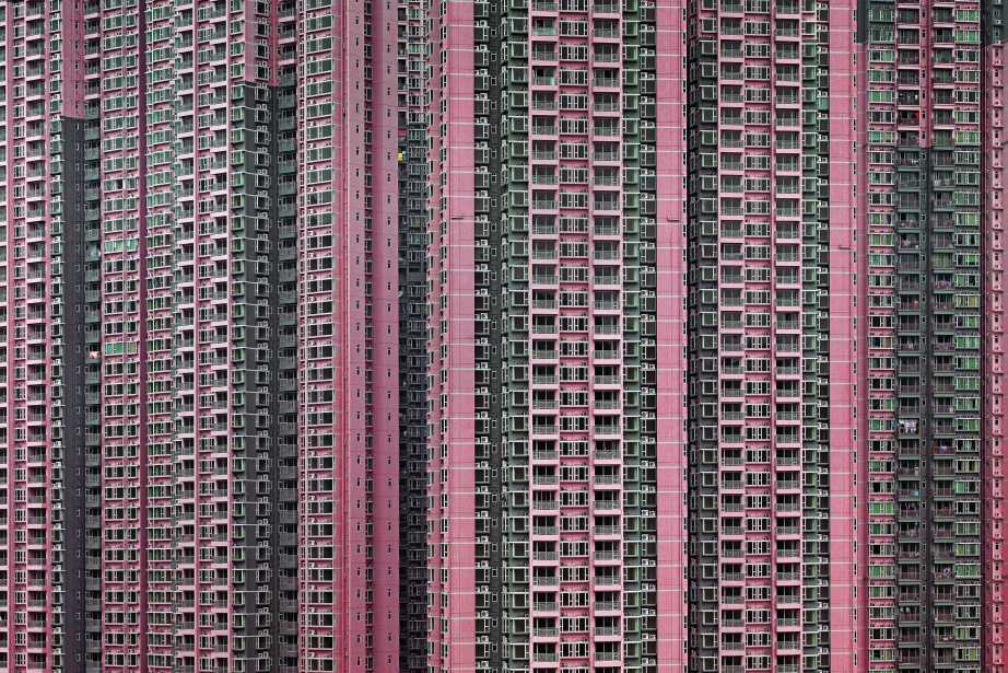
The focus of German photographer Micheal wolfs work is life in mega cities. He explores and documents the archaeology and culture in cities such as Hong Kong, Tokyo, Chicago, and Paris and address issues such as population concentration, mass consumption, privacy, and voyeurism.
In Michal Wolf’s ‘Architecture of Density’ he has used natural light from the city of Hong Kong to catch the repetitive and colourful high-riser apartment block. A shutter speed of 1/60 would have been use as it is the usually one for people and slow moving object an ISO of about 100. this has lead to a visually appealing image. Natural lighting has been able to capture the natural tonal ranges of the building which I think depicts the city of Hong Kong well. A deep depth of field would have been used this is because all parts of the photograph are in focus.
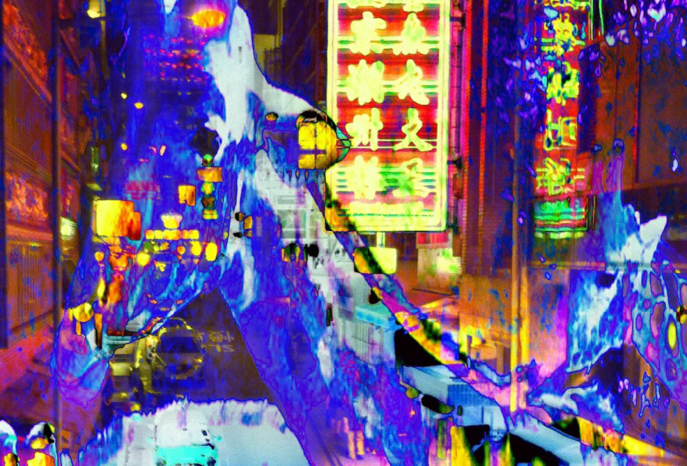
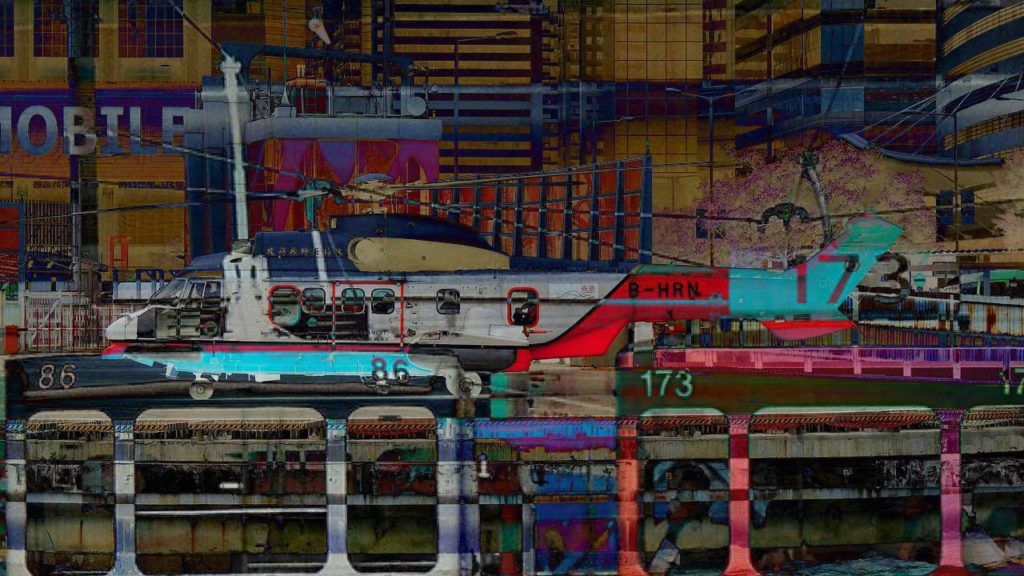
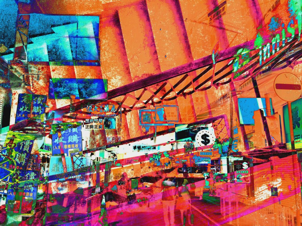
So far I am following my project specification very closely are taking inspiration from the artists, photographers and movements which I have researched. I have stuck to my aesthetic plan of a chaotic look, and this is something which I believe is particularly working very well. Although I am taking inspiration from my research as I said, I don’t feel like this is to the point where the pieces I am producing so far aren’t original, since I personally feel like the aesthetic of the work is something which I have come up with myself. Aside of the 15 responses to the work of Dexter Navy which I made…
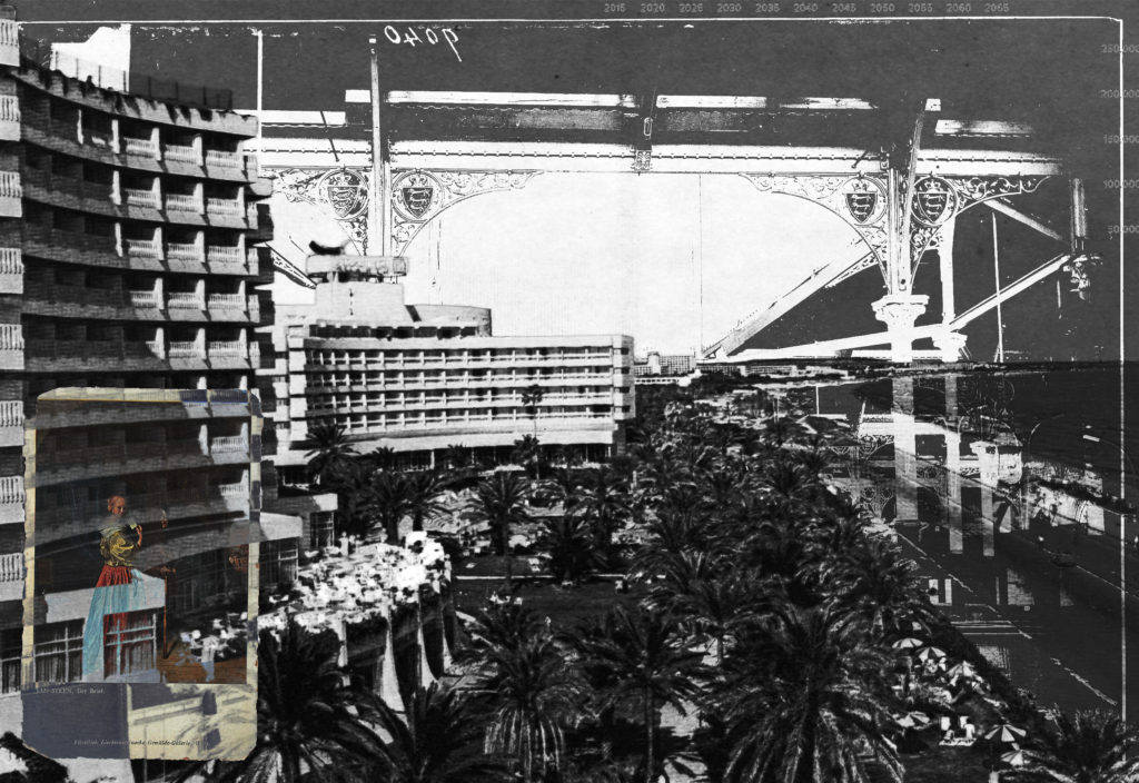
…I have also begun to use my initial two shoots to begin creating some photo-montages, here is what else I have made so far…
I am so far satisfied with how my techniques of photo-montage are working, using cutting out and double exposures to combine images with subtle links. From these further 4 montages above my favorite is the fourth, this is because of the carefully considered colour palette and the open spaced elements of the piece. Whereas with the other three although I think they are successful maybe they are overly chaotic and don’t actually look controlled. Therefore I plan to make a post on my editing process of the fourth photo-montage so that I am able to follow the process and hopefully continue to produce successful pieces.
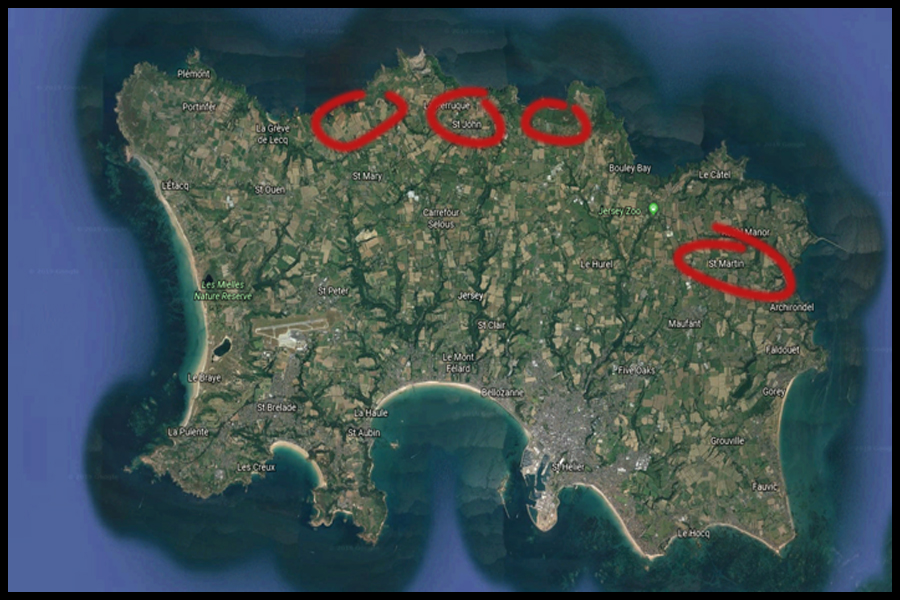
Before going ahead with the next shoot I decided that I would plan what I would want to focus on within the shoot. To do this I had previously looked at the photographer Karl Blossfeldt, a photographer who took a more abstract approach to photography looking at contrast within the structures of plants as his main method of depicting the presentation of them in a more abstract way, doing so through pattern and texture. By using him as my main source of inspiration towards the shoot I would like to produce a response which can also link into my topic of textures and patterns. An idea for the shoot is to photograph colorful or monochrome image in an abstract way regarding areas of Jersey which present me with a huge variation of plants that can reflect that area of the island. To do this I have produced a map which highlights the areas of Jersey which would allow me to take imagery in the style of my chosen photographer through what is present there. Here are some of the locations that I could potentially go to when in the process of the shoot:
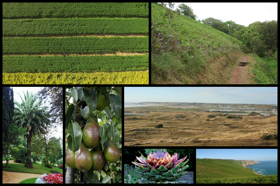
When looking over the map I decided that the reservoir located on the East of the island would provide me with the wider range of plants due to there being a broader variety of types that can be located along the shore and further into the trees. When taking the images I would have to become more up close to the subject due to wanting to capture the symmetry present in their every day designs. The North of the island however provides me with more sea based plants such as sea-weed and other plants, something completely different to the plants that could be found elsewhere. Here are the locations within the mood-board that I wish to capture in my shoot:
The aspect that I wanted to explore the most is based around the structure of the plants themselves, looking at their hidden beauty not seen to the everyday eye due to their aestheticism being hidden to those who walk past. I want here to combine both aestheticism and texture and patterns together through these natural formations as I think they provide a great contrast to my previous shoot which looked at the large forms of textures and patterns in everyday lives surrounding the coast.
Another idea could be the use of a high aperture, by doing this like in my previous shoots it would allow me to further remove the subject photographed from the actual backdrop possibly making a more unusual and weird result. From here I really wanted to draw people away from the way plants are usually seen, using a sense of aestheticism and how their shadows cast on the land could provide other forms of abstraction that I could compare to using pattern and texture.
Finally for my last idea I could use editing software such as Adobe Photoshop to edit the saturation of the plants into a different colour, by doing this it would allow me to produce more abstract images due to the contrasting colours being seemingly otherworldly and impossible to find. This could also work with their shadows which I could edit in the software to increase the contrast and produce a set of images where the shadows are emphasized.
In 1881 Blossfeldt began his studies as an apprentice at the Art Ironworks and Foundry in Mägdesprung, Germany, where he studied sculpture and iron casting. He then moved to Berlin to study at the School of the Museum of Decorative Arts (Kunstgewerbemuseum). In 1890 Blossfeldt received a scholarship to study in Rome under Moritz Meurer, a decorative artist and professor of ornament and design. Along with several other assistants, Blossfeldt created and photographed casts of botanical specimens in and around Rome. He continued to work with Meurer through 1896 and traveled beyond Italy to North Africa and Greece to collect specimens. Beginning in 1898 Blossfeldt taught design at the School of the Museum of Decorative Arts (Kunstgewerbeschule), and in 1930 he became professor emeritus. There he established a plant photography archive that he used to teach his students about design and patterns found in nature.
Blossfeldt had no formal training as a photographer and used homemade cameras that he outfitted with lenses capable of magnifying his subjects up to 30 times their natural size. The use of magnification resulted in images of extreme detail and clarity. With the precision of a botanist, Blossfeldt photographed the natural world for scientific and pedagogical purposes and inadvertently became a modern artist. His work was considered the forerunner to Neue Sachlichkeit photography, which favoured sharply focused documentarian images. In 1926, when Blossfeldt was already in his 60s, his work was exhibited to the public for the first time at Berlin’s avant-garde Galerie Nierendorf.The works exhibited there were published in the book Urformen der Kunst (1928; Art Forms in Nature [2003]). The first of his three photo books (the other two were Wundergarten der Natur, 1932; and Wunder in der Natur, 1942, the last published posthumously), it was enormously successful and remains one of the most-significant photo books of the 20th century.
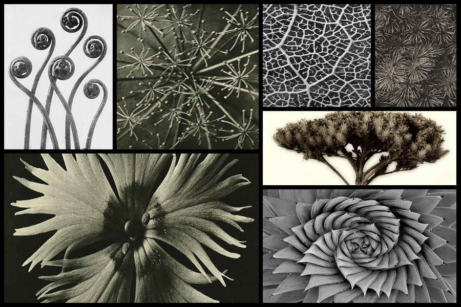
I was particularly inspired by how the textures and patterns created by these natural forms really highlighted minute details that could not usually be seen by the everyday eye. Some examples of his work can be seen below:
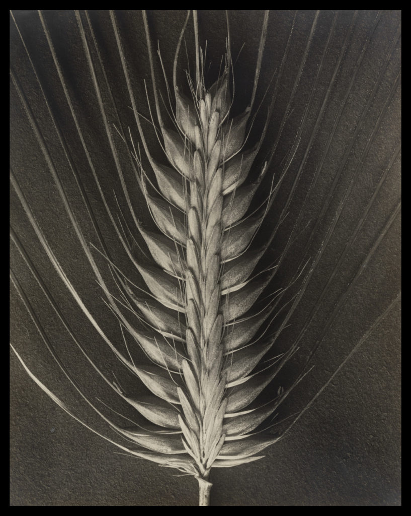
After looking at Blossfeldt’s work I decided to go onto analyse one of his images, here I would be looking at technical, visual and conceptual aspects of the photo. By doing this it would allow me to have a better understanding of how he goes about composing his imagery, and the composition he uses to do so. The image I have chosen to analyse is called Hordeum distichum and is part of his fine art series looking at textures and patterns within the structures of plants:
Visual: Visually the piece is extremely aesthetic, using contrast and a symmetrical appearance to highlight the various shadows and depth of the plant. By capturing the plant up close on a macro scale it essentially brings together the whole photo as it fills in a space that otherwise would be blank with symmetrical lines, using a high contrast to highlight the identity of the plant which seemingly unfolds from itself using predominantly darker shades to fill up any space which would contain negative space. The image itself has been taken on a closer level so that the viewer can become more personal with the plant, as seeing it up close presents the viewer with a perspective that might not have been traditionally provided for them. Because of this the photograph seems to make the plant into something completely different to its original appearance, as by singling one bud head out it casts a light onto it that maybe is not accessible when viewing them en mass.
Technical: The photo itself has been taken in black and white, using a black sheet of paper as a backdrop which highlights the structure of the plant, adding a sinister and symmetrical feel to the entire piece. Blossfeldt has made sure to capture only the head of the bud so that it may be presented in a overall symmetrical manner which leaves the end result more aesthetic for the viewers, as using an increased contrast making the different shades pop due to it greatly exaggerating the change in shade so that things like black are emphasized. When taking the image the shutter speed would have been relatively normal due to Blossfeldt not needing to capture any moving object due to the photo being taken in studio conditions, which as a result gives off a beautiful result which perfectly presents the head of the plant in a way not previously done before. Texture and pattern making up the majority of the piece as the photograph breaks up the plant so that it becomes more abstract, creating shapes that could not be previously seen due to a greater scope needed to see it.
Conceptual: Conceptually Blossfeldt can be seen taking this image in reference to fine arts, using a simple but effective camera angle and subject to produce a piece that is extremely aesthetic to the eye, emphasizing the shades so that they perfectly contrast each other and define the overall result of the photograph. The piece plays part in a series of photographs of bud which at the time were taken so that his students could use them to produce biology based work that could be used in class, however his passion for this kind of photograph led him to create more of the typographic styled method.
the principles and activity of commerce, especially those connected with profit rather than quality or doing good [Cambridge Dictionary]
Consumerism-
the state of an advanced industrial society in which a lot of goods are bought and sold [Cambridge Dictionary]
– the situation in which too much attention is given to buying and owning things[Cambridge Dictionary]
For my theme I wanted it to be about Commercialism and Consumerism. I wanted to focus on products and brands, looking at how people consume these products and how we are influenced by certain brands more then others. I also wanted to potentially create a pop art sense in my photography after looking at Andy Warhol. With my photography i wanted to produce work that makes the viewer think about when they are shopping questioning whether or not they need these things but also looking at Consumerism in a less negative light seeing how the shapes and images in the products can create an almost art form with its typology and illustrations.
Above is a link, which allowed me inspiration for the following ways I could access a performance of self portraiture. As spoken about previously, I intend to experiment with the emotional vulnerability of the beauty within others and ideas of what my being could or should mean to myself and others. Due to much of my project being surrounding the beauty , opulence and sense of visceral within what people see to be valuable and what we are surrounded with on the daily and take for granted, also discussing the topics such as haiku, and the effortless of betray found within nothingness. I belive I could experiment within many techniques of self portraiture, however, This is mostly done for experimental purposes and I will not as a project to be led into my self.
Below I have found some examples of self portraiture from many artists which I believe could fit the the within.
I belive this shoot is a-lot more classical within the presentation of black and white, and too the conceptual positioning of the body, in order to evoke a sense of artistry, further linking within fine art. This shoots elements of self portraiture, as a whole has a clear connection between fashion photography, and a much more tablo presentation of ones self. This is my personal favourite shoot of self portraiture within here, although I believe It would change the aim of my whole project narrative. This also explores the ability to perhaps focus on sections of my body, and perhaps be taken in a more abstract close up manner, to become abstract lines, discussing the fact that nothing is more valuable or unique than our own dna and our lives.
I chose this image as inspiration as there is clear connection between the narrative construct of the haiku within this photo. The composition and use of the blur to the left side draws the viewer into the image and creates a more abstract interest within the image itself. I believe if I were to do a self portraiture elements to connect within my project, this perhaps might connect more with the beauty. I belive I could create a shoot here which is a possible reflective of emotional state within myself, and too an experimentation within possibility how others too me. After thinking about the relation between variation and similarity and the use of self portraiture, I could develop the outcomes of how visible different emotions. Additionally, the use of the lighting and more interesting composition, has clear denotes to that of opulence and creating a visceral section of intrigue. The shapes forming on the face, creates tonal lines, creating interests within the eye and create a personal connection of artistry.
I also chose this artists work, due to the more conceptual thought, focusing on sections of different elements of yourself, that you might belive are either the most beautiful, or perhaps you belive, these elements of yourself, focus on the most self conscious appearances of yourself. I also belive the use of blur, is an interesting concept as it almost communicates through the ability of the lens, how people can see an view themselves under different circumstances and scrutiny. I believe this shoot too could be a combination of the other angle of self portraiture above, as I could develop this more conceptual composition. Forming a demand of attention of specific features, creates an invitation for scrutiny, but this vulnerability is what I want to access within my own work. I belive their is a way which I could develop a combination of all of these three many angles of self[ portraiture within my work, and then within the development of the narrative of my book, I could use the one which flows with the narrative concept the best. As I want this new project to have a personal relation to myself and my own attitudes towards beauty and how I view myself, both using an involvement of emotional venerability and the fine art sense of haiku. But perhaps I could also attach in what others belive is the most and least beautiful about people, and segregate myself into these sections. I have come to the conclusion after much of this development, that it is just simply what we see is the truth, but it is possible to see the beauty within the pain of the world, and find something within the chaos of the world around us, finding beauty within the reality of life, knowing it is happening, and being able to accept this. Like loving yourself, is an acceptance of who you are.


.jpg)