For my last shoot I wanted to use urban man made structures as my base to contrast my other shoots in the edits I will make. I used the same subject again and asked him to do the same sort of actions.
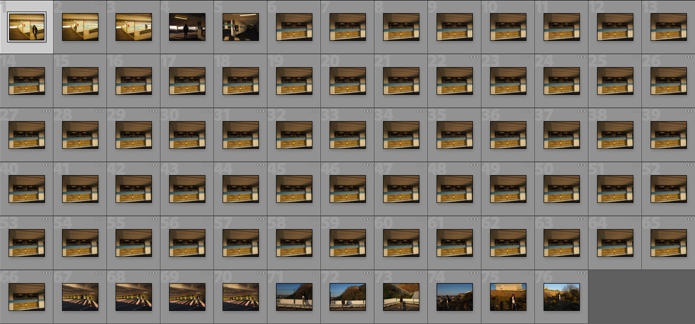
For my last shoot I wanted to use urban man made structures as my base to contrast my other shoots in the edits I will make. I used the same subject again and asked him to do the same sort of actions.

Sources
In my first photo shoot I plan on taking photographs of flowers. I have chosen to take photographs of flowers as my take on variation and similarity because I feel like it is something that is accessible and is something that I can create successful outcomes from, for example I hope to find a variety of colours and types of flowers. I also plan on using a variety of backdrops; grass and a white backdrop, this allows me to create the factor of variation while taking photographs of the same object, creating the similarity. To create a more interesting effect I want to pick the flowers and photograph them the following day, I hope this adds more texture and detail to the flowers when photographing them.
Types of flowers I hope to find and photograph:
Places to photograph:
Equipment:

2. 2-3 ideas about what you are planning to do; how, who, when, where and why?
1.What I plan to focus on within ‘variation and similarity‘ is nature. For example I want to record the variation and similarities of a number of different places and areas around Jersey; fields, beaches, woods.
Places and areas:
2. Secondly I want to also focus on specific objects within nature; leaves, clouds, rocks, trees, flowers, etc, I plan to photograph these objects numerous times in a number of different areas and attempt to find a variation of the same type of object.
Objects:
3. I also want to incorporate people into my photographs, for example using hands to to hold objects and act as a backdrop for objects such as leaves, flowers, rocks, also photographing a person stood in the same position, but in different areas, allowing the model to give insight into each area, for example size and scale of areas and the comparison to each other.
I want to focus on variation and similarity within nature, because I feel like Jersey is largely made up and has a lot of nature; beaches, fields, woods, for me to photograph, giving me the opportunity to include a large range of photographs and therefore a lot more chance to show more variation and similarity.
To allow the best possible outcomes I plan on shooting outside in natural light, in the areas and places that objects are found and the areas themselves, but also I plan on shooting inside using lights and a backdrop, to create a more professional finish to my photographs. Shooting both ways will give me the opportunity to experiment and in turn make more informed decisions about my final outcomes.
When presenting my photographs I want to incorporate typologies and the style that Bernd and Hilla Becher used to present their photographs, I feel this is an effective way to show the similarities of objects and areas that would otherwise by them selves appear unalike.

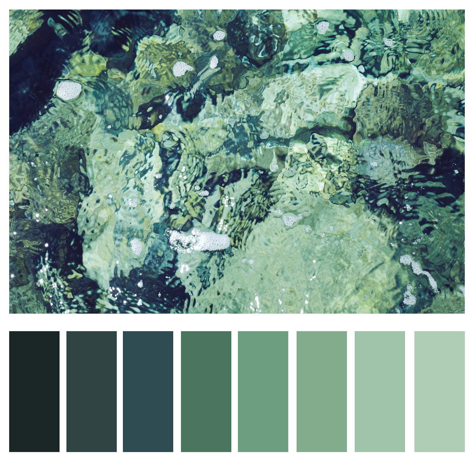
Colour is the aspect of things that is caused by differing qualities of light being reflected or emitted by them.
To see colour, you have to have light. When light shines on an object some colours bounce off the object and others are absorbed by it. Our eyes only see the colours that are bounced off or reflected.Light waves carry energy, determined by frequency, carried by small packets known as photons. This energy provides the basis for human vision, solar power and digital photography.
In color photography, electronic sensors or light-sensitive chemicals record color information at the time of exposure. This is usually done by analyzing the spectrum of colors into three channels of information, one dominated by red, another by green and the third by blue, in imitation of the way the normal human eye senses color.

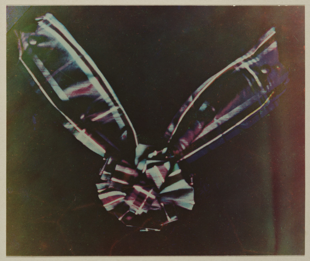
Before colour could be reproduced the nature of light and how we perceive colour had to be clearly understood. The scientific investigation of colour had begun in the seventeenth century. In 1666, Sir Isaac Newton split sunlight with a prism to show that it was actually a combination of the seven colours of the spectrum. Nearly 200 years later, in 1861, a young Scottish physicist, James Clerk Maxwell, conducted an experiment to show that, in fact, all colours can be made by an appropriate mixture of red, green and blue light.
Maxwell took three separate lantern slides of a tartan ribbon through red, green and blue filters. These slides were then projected through the same filters using three separate magic lanterns. When the three images were carefully superimposed on the screen, they combined to make a coloured image which was a recognisable reproduction of the original. While Maxwell’s experiments demonstrated clearly the basic principles of colour photography, in practice, his demonstration should not have worked at all. Although the physicist didn’t know it, the photographic emulsions that he used were insensitive to red light. Fortunately for Maxwell, the red cloth in the ribbon reflected ultraviolet light. This was invisible to the eye but did register on the emulsion.
One person may interpret light differently than another person. There are instances two individuals seeing the same object interpret different colours. Scientists are uncovering some interesting data on how we interpret light waves. Even though two people are seeing the same wave length they may still interpret the object to be a different colour than the other. New research suggests this can be due to things like mood and experiences.
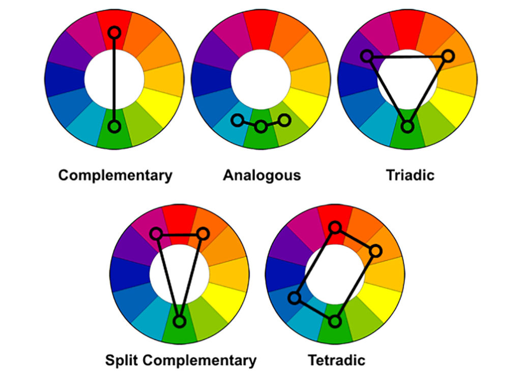
The distinction between “warm” and “cool” colors has been important since at least the late 18th century. The difference seems related to the observed contrast in landscape light, between the “warm” colors associated with daylight or sunset, and the “cool” colors associated with a gray or overcast day which make you feel calm, relaxed and refreshed . Warm colors are often said to be hues from red through yellow, browns and tans included. They are associated with heightened emotions and passion as well as joy and playfulness. Cool colors are often said to be the hues from blue green through blue violet, most grays included. There is historical disagreement about the colors that anchor the polarity, but 19th-century sources put the peak contrast between red orange and greenish blue.
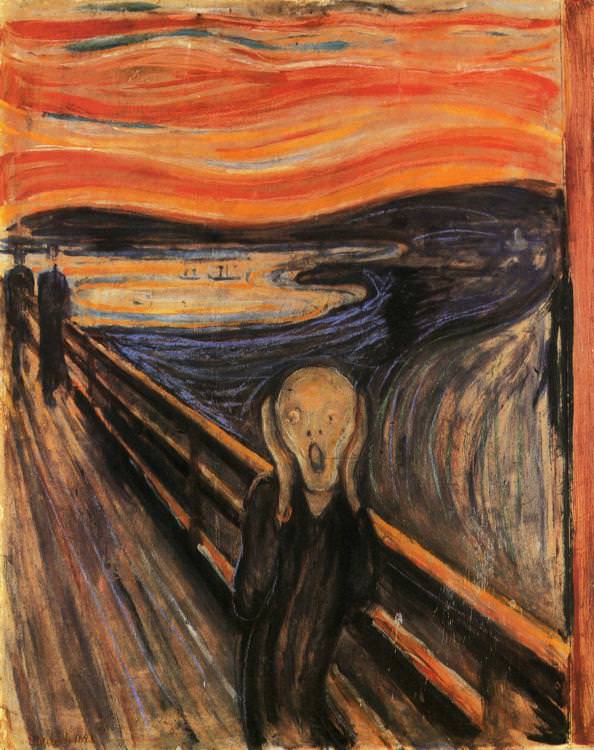
According to Munch, “I painted this picture – painted the clouds like real blood. The colors were screaming.[”, warm and cool color intensified fear and the feeling of hopelessness respectively, the combination of opposite color tone made the contradiction more significant and thus affecting the emotion of the audience more.
Color theory has described perceptual and psychological effects to this contrast. Warm colors are said to advance or appear more active in a painting, while cool colors tend to recede; used in interior design or fashion, warm colors are said to arouse or stimulate the viewer, while cool colors calm and relax.
Color psychology is the study of hues as a determinant of human behaviour. Color can indeed influence a person; however, it is important to remember that these effects differ between people. Factors such as gender, age, and culture can influence how an individual perceives color.
Just as black is total absorption, so white is total reflection. In effect, it reflects the full force of the spectrum into our eyes.
Positive: Clarity, Purity, Cleanliness, Innocence, Simplicity, Sense of Space
Negative: Sterility, coldness, barriers, unfriendliness, elitism
BLUE:
Blue is the colour of the mind and is essentially soothing; it affects us mentally, rather than the physical reaction we have to red. Strong blues will stimulate clear thought and lighter, soft blues will calm the mind and aid concentration.
Positive: Intelligence, communication, trust, efficiency, serenity, duty, logic, coolness, reflection, calm.
Negative: Coldness, aloofness, lack of emotion, unfriendliness.
YELLOW:
The yellow wavelength is relatively long and essentially stimulating. In this case the stimulus is emotional, therefore yellow is the strongest colour, psychologically. The right yellow will lift our spirits and our self-esteem; it is the colour of confidence and optimism.
Positive: Optimism, confidence, self-esteem, extraversion, emotional strength, friendliness, creativity.
Negative: Irrationality, fear, emotional fragility,
RED:
Positive: Physical courage, strength, warmth, energy, basic survival, ‘fight or flight’, stimulation, masculinity, excitement.
Negative: Defiance, aggression, visual impact, strain.
Being the longest wavelength, red is a powerful colour. Although not technically the most visible, it has the property of appearing to be nearer than it is and therefore it grabs our attention first.
BLACK:
Positive: Sophistication, glamour, security, emotional safety, efficiency, substance.
Negative: Oppression, coldness, menace, heaviness.
Black is all colours, totally absorbed. The psychological implications of that are considerable. It creates protective barriers, as it absorbs all the energy coming towards you

Wassily Wassilyevich Kandinsky was a Russian painter and art theorist. Kandinsky is generally credited as the pioneer of abstract art. Born in Moscow, Kandinsky spent his childhood in Odessa, where he graduated at Grekov Odessa Art school. He enrolled at the University of Moscow, studying law and economics.
Kandinsky exploited the evocative interrelation between color and form to create an aesthetic experience that engaged the sight, sound, and emotions of the public. He believed that total abstraction offered the possibility for profound, transcendental expression and that copying from nature only interfered with this process. Highly inspired to create art that communicated a universal sense of spirituality, he innovated a pictorial language that only loosely related to the outside world, but expressed volumes about the artist’s inner experience. His visual vocabulary developed through three phases, shifting from his early, representational canvases and their divine symbolism to his rapturous and operatic compositions, to his late, geometric and biomorphic flat planes of color.
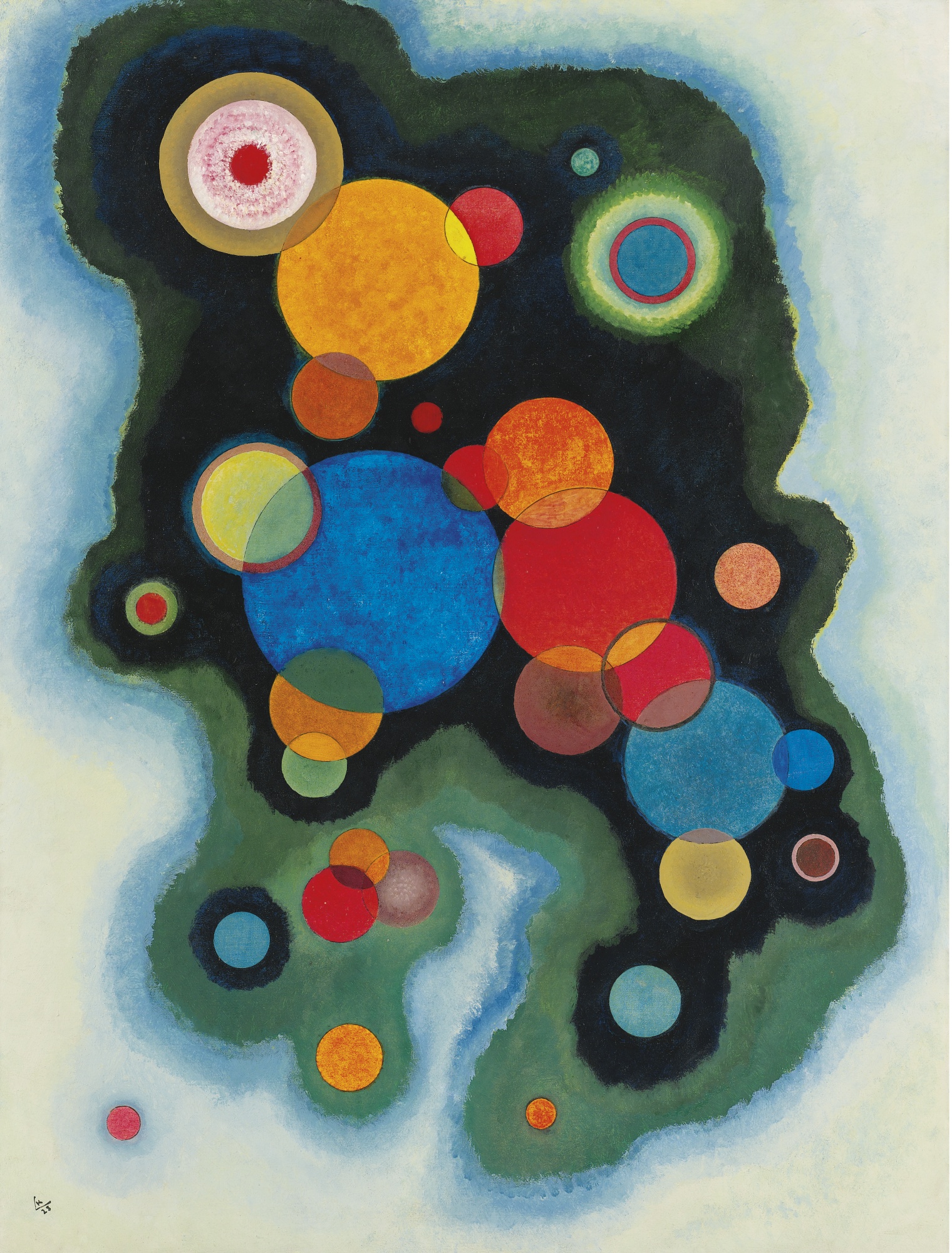

Kandinsky’s most famous pieces are his abstract work, in these examples you can see his frequent use of circles in his paintings. This was another artist of whom sparked or continued that interest in circles in imagery and I would be keen to explore this further and produce responses to these artists.
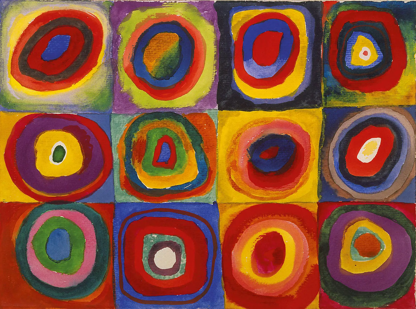
Squares with Concentric Circles (above) is a small watercolor made with gouache (a type of watercolor paint) and crayon. Kandinsky created a grid composition (the “squares”). Within each square unit, he painted “concentric circles”, meaning that the circles share a central point. He believed the circle had symbolic significance relating to the mysteries of space and he used it as an abstract form to which he would create his art. Kandinsky explores many side-by-side combinations of color relationships: complementary (colors opposite each other on the color wheel, such as orange and blue), analogous (adjacent colors on the color wheel, such as red and orange), and triad (colors spaced equally on the color wheel, such as red, blue, and yellow). He varies the intensity and value of some colors, sometimes even within the same circle. The close placement of such high-value colors makes them appear to pulsate.
The painting is a study, or sketch-like investigation into a subject. Kandinsky’s quick, freehand renderings produce lopsided and irregular geometric shapes, giving the conceptual work a living, organic feel. The watercolors bleed into one another, and the artist sometimes breaks from his formula. He saw the formula as secondary to the study’s purpose, which is the experience of viewing color relationships. Kandinsky never intended for this study to be viewed as a finished work of art, but rather as a color aid to refer to while he worked on other paintings.
The running theme throughout my project is photo-montage, The main use of photo-montage is to see the many ways in which you can manipulate an image. Photo-montage has its roots in the Dadaism movement. Dada was an artistic and literary movement that began in Zürich, Switzerland. It arose as a reaction to World War I in around 1916 and the nationalism that many thought had led to the war. Its output was wildly diverse, ranging from performance art to poetry, photography, sculpture, painting, and collage. Dada’s aesthetic, marked by its mockery of materialistic and nationalistic attitudes, proved a powerful influence on artists in many cities, including Berlin, Hanover, Paris, New York, and Cologne, all of which generated their own groups. The movement dissipated with the establishment of Surrealism, but the ideas it gave rise to have become the cornerstones of various categories of modern and contemporary art.
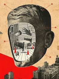
Dada was the first conceptual art movement where the focus of the artists was not on crafting aesthetically pleasing objects but on making works that often upended bourgeois sensibilities and that generated difficult questions about society, the role of the artist, and the purpose of art. So intent were members of Dada on opposing all norms of bourgeois culture that the group was barely in favor of itself: “Dada is anti-Dada,” they often cried.
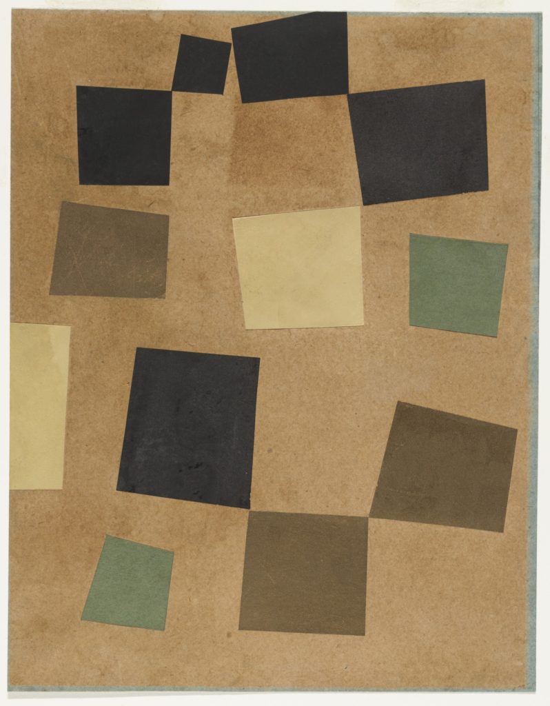
One of the key figures in the Dada movement was artist was Hans Arp. He made a series of collages based on chance, where he would stand above a sheet of paper, dropping squares of contrasting colored paper on the larger sheet’s surface, and then gluing the squares wherever they fell onto the page. The technique arose when Arp became frustrated by attempts to compose more formal geometric arrangements. Arp’s chance collages have come to represent Dada’s aim to be “anti-art” and their interest in accident as a way to challenge traditional art production techniques.
The lack of artistic control represented in this work would also become a defining element of Surrealism as that group tried to find paths into the unconscious whereby intellectual control on creativity was undermined
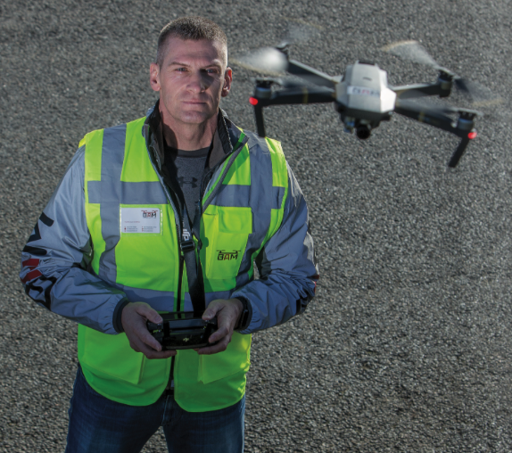
BAM Perspectives is a business created and run solely by Marc Le Cornu, who happens to be my father. ‘BAM’ (his nickname) began the business after becoming a trained commercial drone pilot for the States of Jersey Fire and Rescue Service a few years ago, he then created the emergency services drone team to allow all emergency services to acquire use of the Fire Service’s drone and train multiple operators with ‘BAM’ in command of the team. His passion for drones and drone photography was clearly visible from this point, he loved it and decided to buy a drone himself; a DJI Mavic. This drone was compact, light and had a good camera for its relatively small size. It was with this drone he began taking photos and videos which sparked online with many people sharing and liking his work.

With this, he decided to create his own business to run part time whilst in the Station Commander/Group Commander position at the Fire Service. He came up with BAM Perspectives, he used social media to advertise almost completely free and he also created a website to sell images (which he could legally do with a commercial licence). He is the only local drone pilot to hold a dense urban area license, allowing him to fly over town (large built up areas) which other pilots simply cannot do (legally).


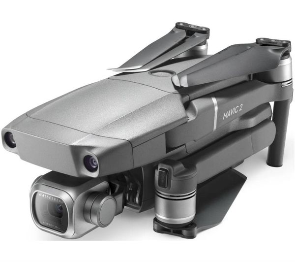
His work mainly consists of landscape imagery, both from drone and DSLR. He has 3 drones currently, DJI Mavic 2 Pro, DJI Phantom 4 Pro Obsidian and DJI Inspire 2. Not only does he do landscape imagery, he does land survey imagery, property surveys and progress images for building sites and even the predicted window views for the Horizon Apartments site. He also takes a fine art approach with abstract imagery, his use of circles both in natural and urban landscapes is something that sparked some ideas for me to follow for a project idea.
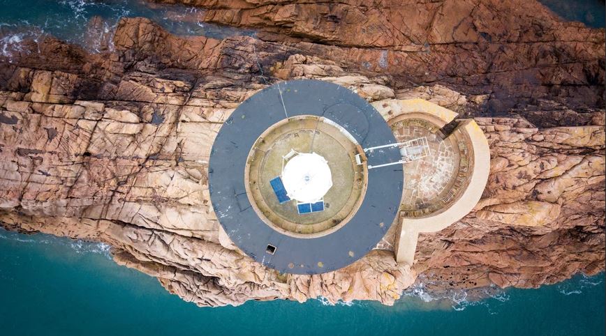
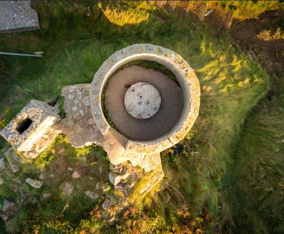

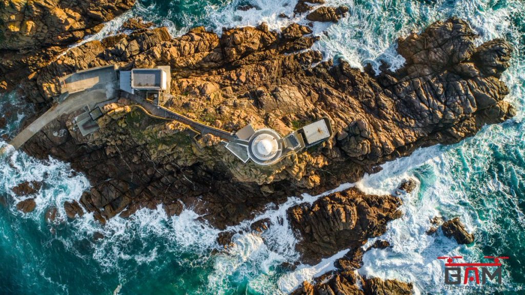
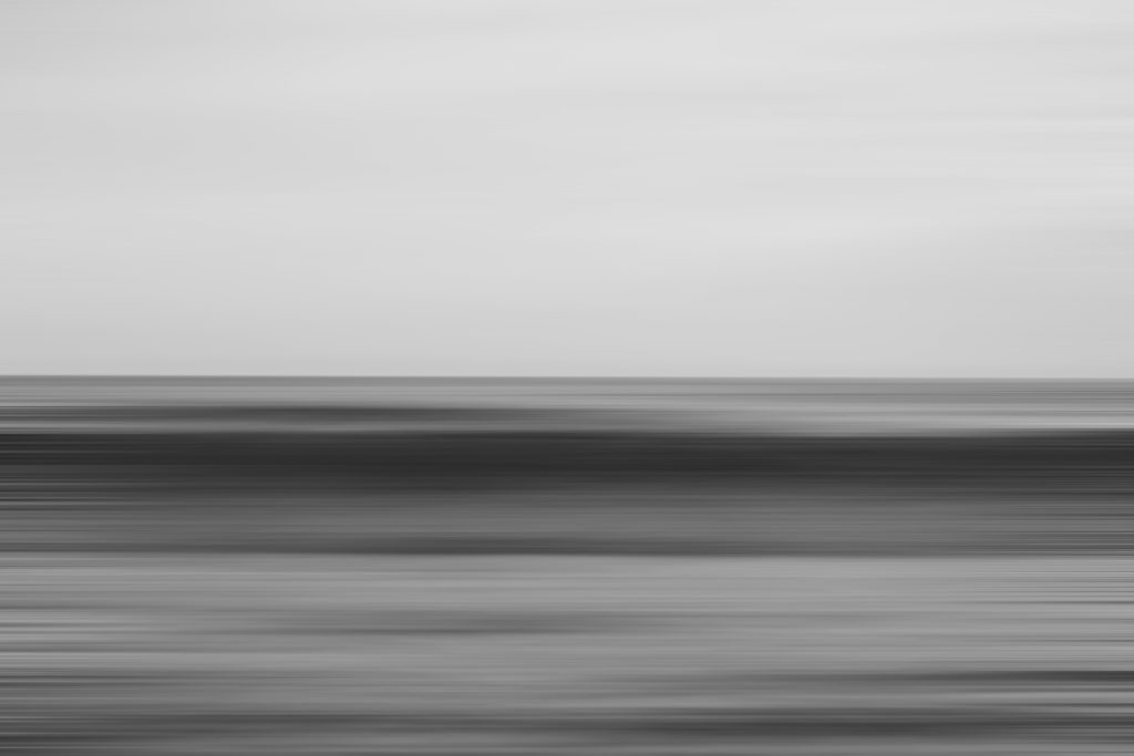
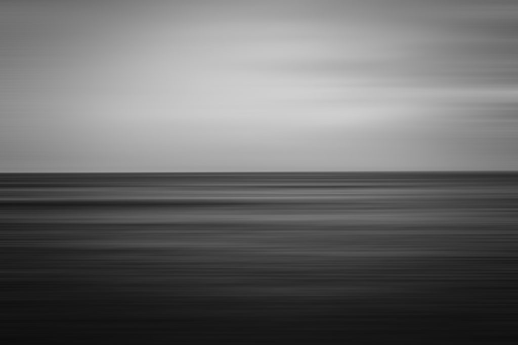
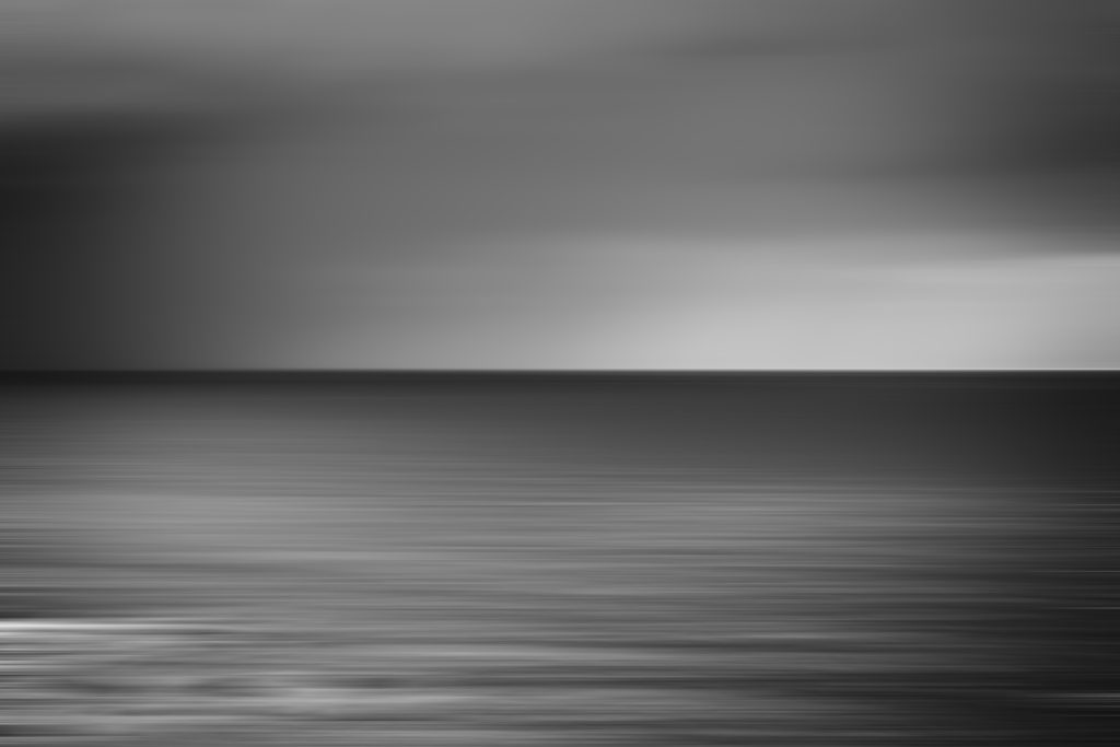
Image Analysis: Corebiere (image above)
jj
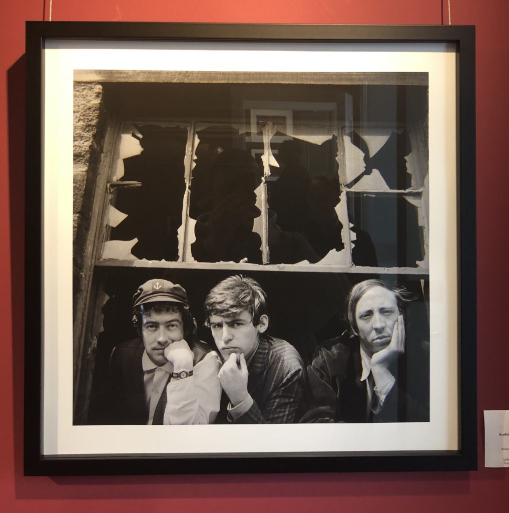


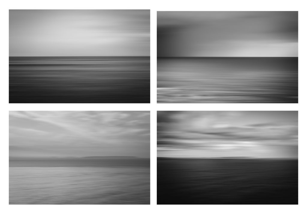
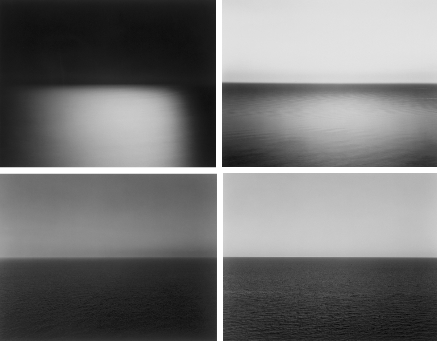
Comparison Of work
