I wanted to experiment with something similar to the Bechers, where I would photograph similar objects to create a repeated effect. I thought that photographing different windows and doors around the area I live would create an interesting effect as they all the same objects as they all do the same thing, yet they are all completely different in terms of colour, size, shape, texture and tones. My experimentation with typologies is shown in the 2 shoots below.
Shoot 1: Doors
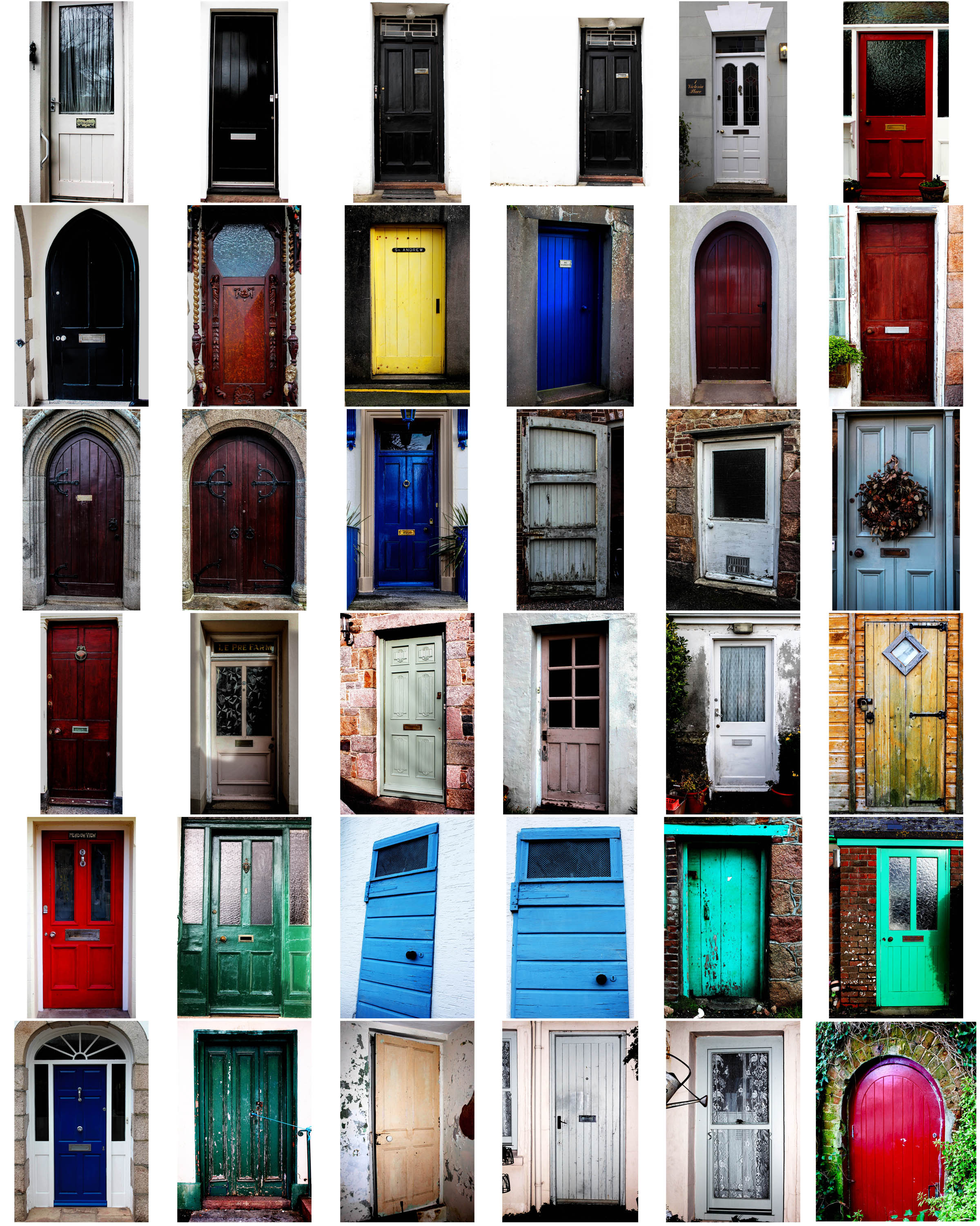
For this shoot, I made sure I captured each door I wanted to photograph from a face on perspective, so that they all had a similar viewpoint. I did this as I was inspired by the Becher’s to create multiple photos of the same object from the same camera angle. I edited all my images in lightroom, where I adjusted the brightness and contrast, as well as the exposure to make the photo colours more vivid and bright. I kept my images in colour because I felt that this was more appropriate for the shoot I was doing; I wanted to show the variance of different colours and textures in all the doors I photographed – a black and white effect would’t have made this same effect. Although the Becher’s did this, I wanted to differ from their typologies because their work was carried out in the 1900s, whereas my interpretation is more modern, with more modern and bright doors.
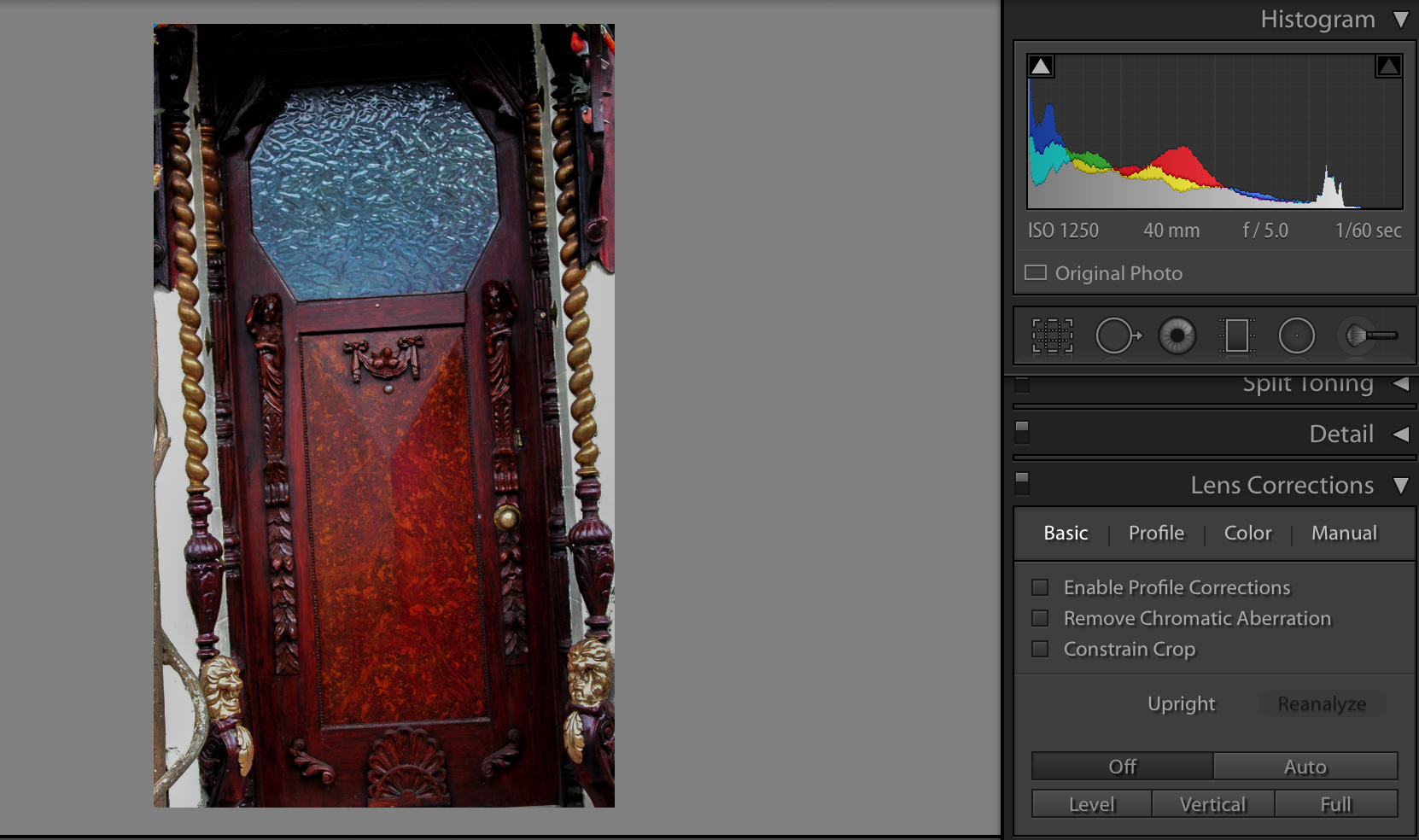
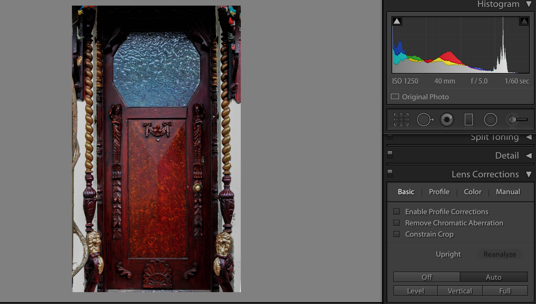
Additionally, I adjusted the lens correction for most of my images so that they all had a face on perspective. For instance, the screen-shots below is a valid example of how I used the lens correction to straighten up my images:
Shoot 2: Windows

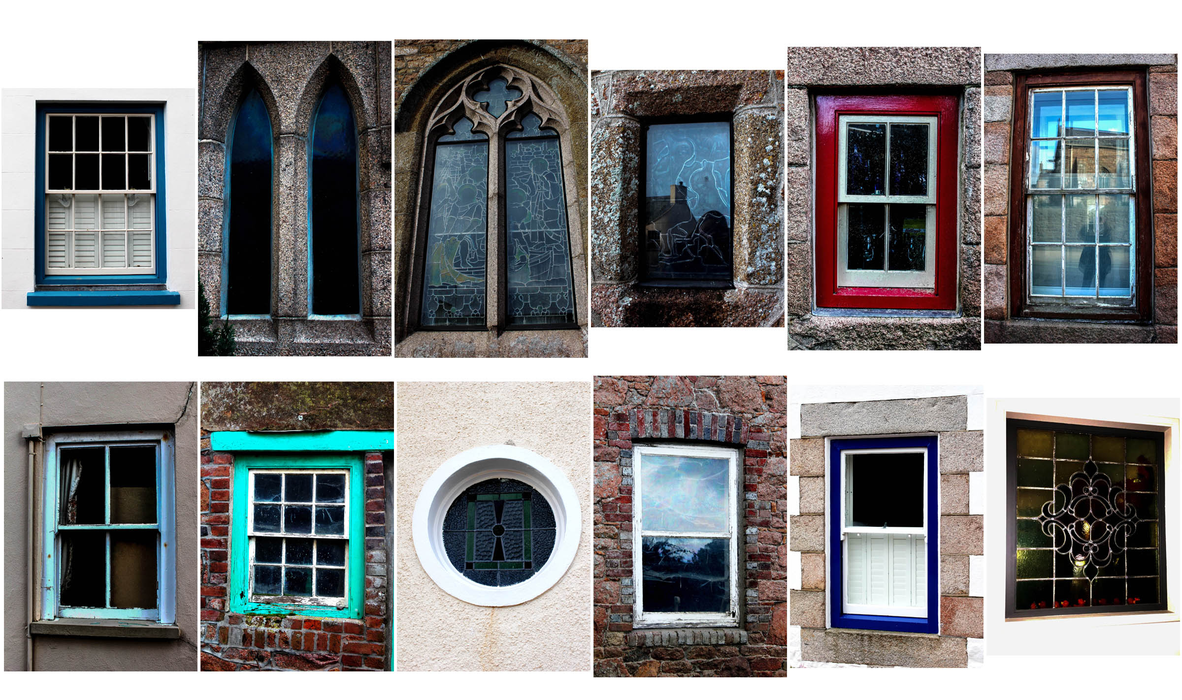
For this shoot, I took the same approach as with my first shoot of doors, but used windows as my main focused object instead. Again, I took all my images from a straight on perspective and edited them all in lightroom.
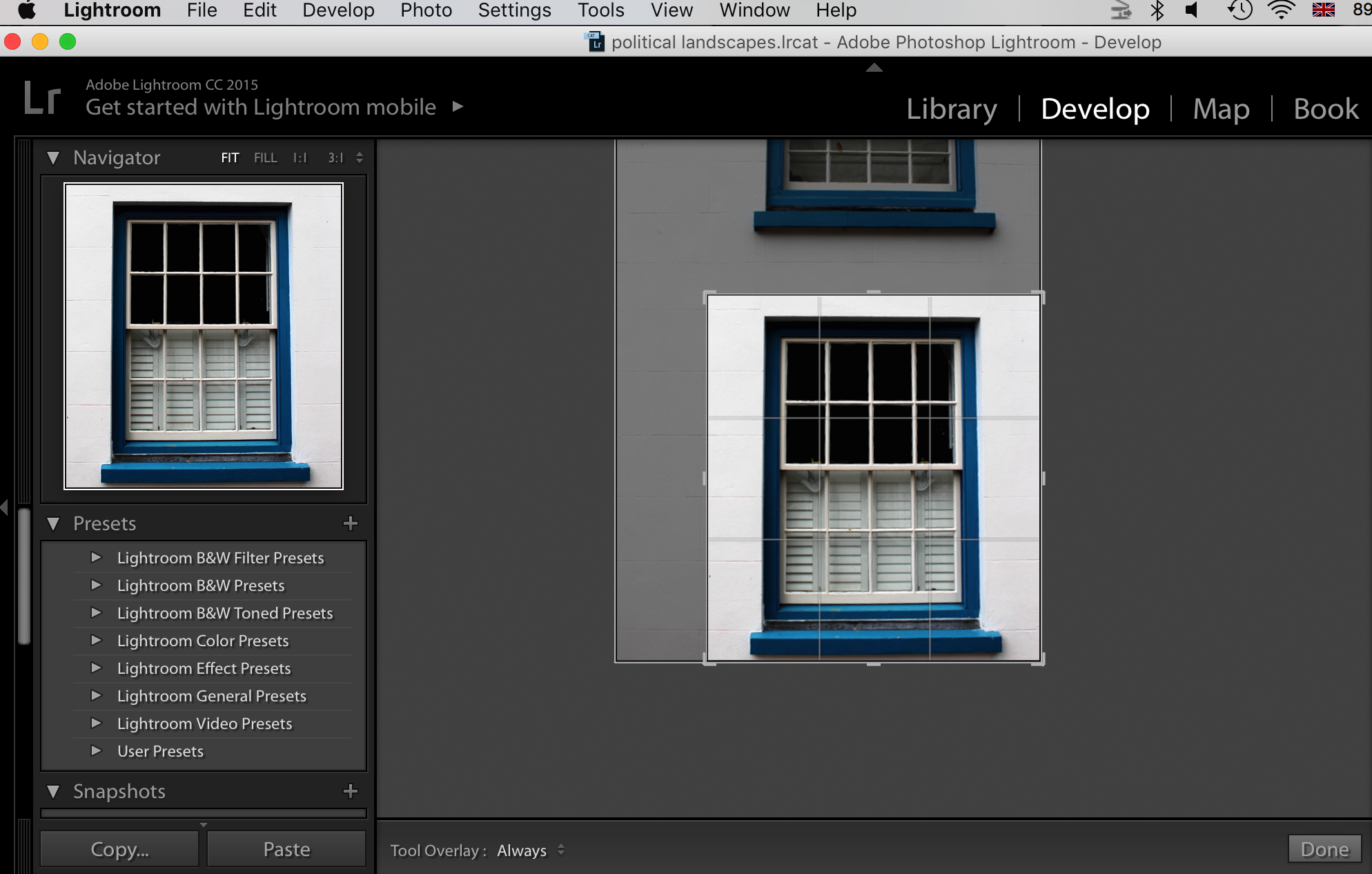
I cropped every image that appeared less straight on than others, so that they all were cropped to show an even photo. For example, I cropped this image here as I realised I wanted to create a consistency between my series of images of doors and windows, and so only showing one window an image would work best to create a repetition effect.
