Russian Avant Garde (Context & Analysis Study)

WHAT IS RUSSIAN AVANT-GARDE?

Russian avant-garde was a very influential movement in the world of avant-garde art, that was at its height in Russia, from around 1890 to 1930 however it is said that its beginning could be as early as 1850 and its end could be as late as 1960. However personally I believe this may be due to the influences continuing from the movement which I will talk about, and the beginning is debatable as there were many things that inspired the movement in the first place. The Russian avant-garde movement includes many separate but closely related art movements that were prominent at the time of the movement as a whole. These closely related movements included movements such as: Suprematism, Constructivism, Russian Futurism, Cubo-Futurism, Zaum and Neo-primitivism. The movement reached its most publicly popular height in the period of the Russian Revolution between 1917 and 1932, at which point the ideas and concepts of the avant-garde clashed with the newly emerged state-sponsored direction of Socialist realism. Socialist realism was the complete opposite of what Russian avant-garde was about, it was a style of realistic and state approved art which, it emerged at the end of the Russian Revolution where it was first used in 1932. I believe what most solidifies the fact that it was pretty much completely influenced by the soviet state was that the term was settled upon in meetings that included politicians of the highest level, including Stalin himself.

In order to gain a better understanding of the Russian avant-garde movement, these two videos made by the museum of modern art (MoMA) help a lot.


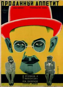
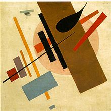
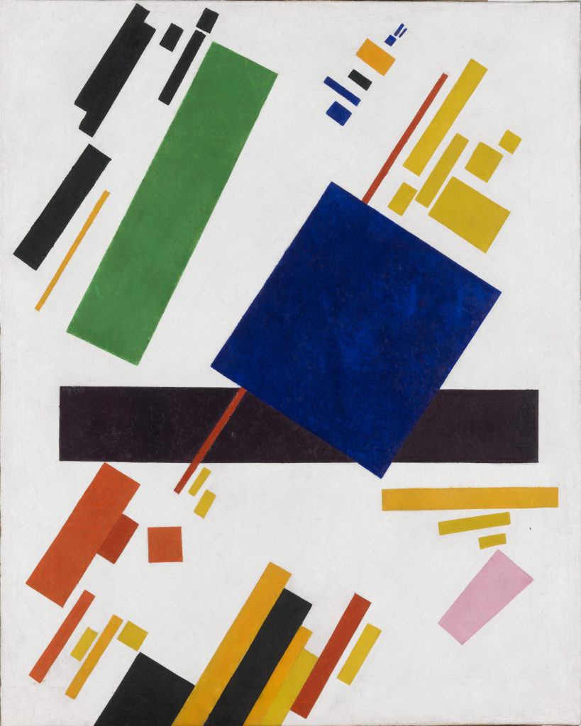
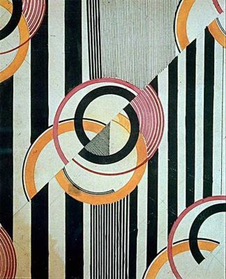
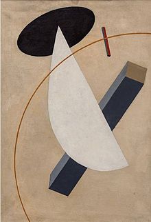
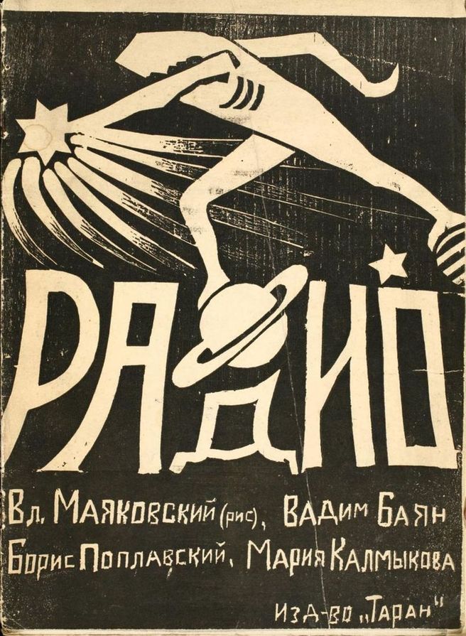
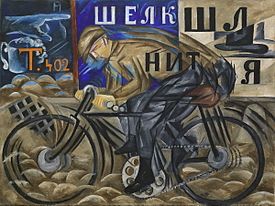
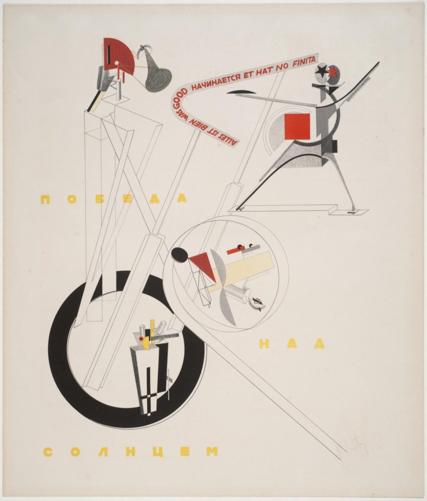
3 examples of work from the Russian avant-garde movement which I am particularly fond of…
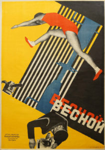
SUB-MOVEMENTS OF RUSSIAN AVANT-GARDE…

As I mentioned, within Russian avant-garde there were many closely related styles/sub-movements of art. In order to give myself a better understanding of the whole movement I then began to look into each sub-movement and what was included in each, here is some insight on a few of these sub-movements…

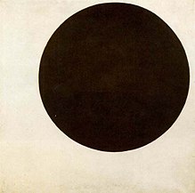
SUPREMATISM: this was an art movement which focused on basic geometric forms found in everyday life, such as circles, squares, lines, and rectangles, which were painted in a limited range of colours. The main artist involved in this movement was Kazimir Malevich who was believed to have founded the movement in 1913, which he then officially announced at one of his exhibitions in 1915. The actual term of supematism itself is a reference to the form of art that was based upon “the supremacy of pure artistic feeling.” This was instead of a realistic depiction of subjects. Said about constructivism by Malevich was that ”Under Suprematism I understand the primacy of pure feeling in creative art. To the Suprematist, the visual phenomena of the objective world are, in themselves, meaningless; the significant thing is feeling, as such, quite apart from the environment in which it is called forth.” Below are some examples of the art which came from the movement, all 3 from Malevich.

CONSTRUCTIVISM: This was a movement of ”architectural” art which the same as suprematism began in 1913. It began at this time, founded by artist Vladimir Tatlin. The constuctivism movement was actually very influential on the art world as a whole, causing major effects upon sculpture, graphic design, industrial design, architecture, theatre, film, dance and fashion. Below are some examples of the artworks which came from the constructivism movements. As you can see however, there were a lot of visual overlaps and similarities between constuctivism and suprematism.

RUSSIAN FUTURISM: This was another movement within the overall Russian avant-garde movement. It was a style and philosophy of work which was adopted by Russian artists who were influenced by the principles of Fillippo Marinetti’s ‘Manifesto of futurism.’ This manifesto expresses an overall concept called futurism that referred to a rejection of the past and a celebration of speed, machinery, violence, youth and industry. The Russian futurism movement is said to have begun in 1912 (a year earlier than the other two sub-movements which I have looked into) However instead of being influenced by an individual artist, this time the movement was influenced by a group of artists called Hylaea who were based in Moscow. It is only fair that I list the artists who equally made up this group, it included: David Burlyuk, Vasily Kamensky, Velimir Khlebnikov, Aleksey Kruchenykh, Vladimir Mayakovsky, Mikhail Larionov, Natalia Goncharova, Kazimir Malevich and Olga Rozanova. When looking at works of art from this movement it quickly became evident to me that a frequently used piece of symbolism within the art was the depiction of wheels and physical speed. The presumptions which I make from this is that the wheels and speed represent moving into the future. Below again are some examples of artwork from the movement which I have just spoken about.

INFLUENCES ON MODERN CULTURE AND FASHION FROM RUSSIAN AVANT-GARDE…

As I began to explain before, the Russian avant-garde art movement has continued to influence many forms of creativity since its hay day. In terms of how it is still influencing creativity today, there are two creators that stand out to me as being particularly influenced by the movement, and they are fashion designer/photographer Gosha Rubchinskiy and graphic artist/obey clothing brand owner Shepard Fairey. These two artists show clear visual influence within their work from Russian avant-garde. This is particularly through the use of colour, shape, form and elements of text.

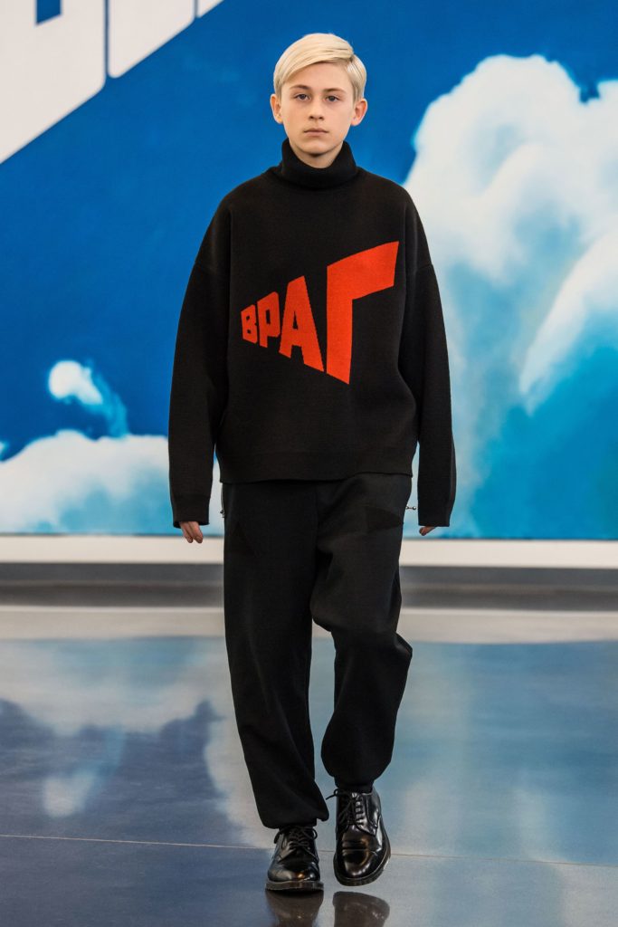
Gosha Rubchinskiy (Гоша Рубчинский), a Russian himself, shows a significant amount of influence from Russian avant-garde when it comes to the design of the garments which he designs for his self-named ”Gosha Rubchinskiy” brand. A brand which is very well known in the street high-fashion industry, who have collaborated with worldwide fashion brands such as Adidas, Levi’s, Burberry and Dr. Martens. The main way in which I believe the designs which Gosha produces reflect the movement is in terms of its political statements/rebellion and the use of bold graphic text. Below you can see examples of his work which I believe give a better understanding of my suggestions.

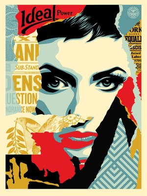
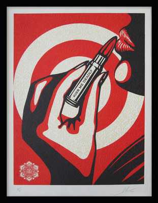
Shepard Fairey who as I said also takes inspiration from the Russian avant-garde. He emerged as a street artist from the skate scene and is best known for his ‘OBEY’ branding and the notorious Andre The Giant logo which he began his brand with as a sticker campaign. Similarly to Rubchinskiy, Fairey also reflects the movement is in terms of its political statements/rebellion and the use of bold graphic text. He is influenced by the Russian graphic rebel propaganda used at the time of the movement and also by the constructivism sub-movement which I explained earlier. His work seems to intend on using the similar effective aesthetic values of the Russian movement in order to get across messages about the political and social issues which we face within our modern society today. Below are some examples of Fairey’s graphic art which I have spoken about.

Visual analysis of a work by Shepard Fairey…
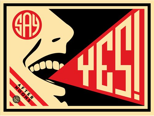
Here we have a piece of work titled Say Yes by Shepard Fairey, a screen printed graphic which was published in 2008 by Fairey. My first thought on this image were that there was a clear political message being put across by Fairey with the ‘say yes’ slogan which I initially believed to have been a link with the OBEY branding surrounding Fairey’s career, and that maybe ‘say yes’ was a message about conforming to society and political changes which is what the OBEY brand entails. Come to find out however that this piece is not intending on conveying any sort of political message, and however is actually a poster created for one of Fairey’s friends Steven Scott who is a part of the ‘afternoons’ band, the artwork is for a song called ‘say yes’ and from there the poster was printed 150 times as part of the project. This is better described by Fairey himself saying ”My friend Steven Scott who works at my favorite LA breakfast spot, The Mustard Seed Cafe, gave me a copy of his band’s demo CD. The band is called AFTERNOONS and their music is very symphonic, uplifting, indie rock in the vein of the Polyphonic Spree or newer Flaming Lips. The standout track is called “Say Yes” and I was so inspired by it that I decided to make a poster for the band to put up on the street, and a few to sell to recoup printing costs. The edition is only 150.” I then begun to become aware of the feeling that I had seen something very similar to this piece and quickly realised that in fact when researching the constructivism sub-movement of Russian avant-garde, I came across a poster by Aleksandr Rodchenko from 1924 which depicts a woman screaming a slogan however in Russian with blatant visual reflections to Fairey’s ‘say yes’ poster. Here is the Rodchenko poster which I believe to have somewhat inspired Fairey.
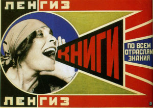
As well as many other clear aesthetic similarities, the joyful expression of the mouth in both Fairey and Rodchenko’s artwork clearly shows a great similarity. And although I am actually unable to find any hard evidence as to whether Fairey was directly inspired by Rodchenko’s piece, I am quite confident to say that I would be nearly certain that Fairey’s piece is a refence to this and that if not it would be a considerable coincidence which I have come across. Overall I believe that Fairey’s ‘say yes’ piece is a very successful work. The composition of the piece is great as it is full yet remains graphic and not over-complicated, also Fairey’s choice to only use 3 colours (most likely due to the screen-printing technique) is easy on the eye and reflects the style of Russian propaganda in which they tended to also limit the amount of colours used.

KARL BLOSSFELDT

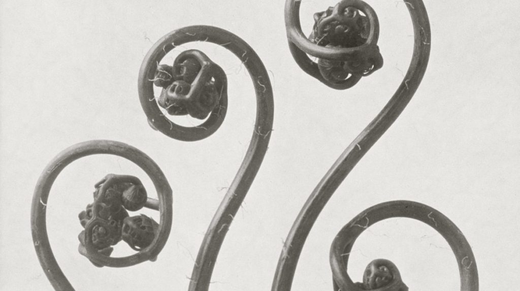
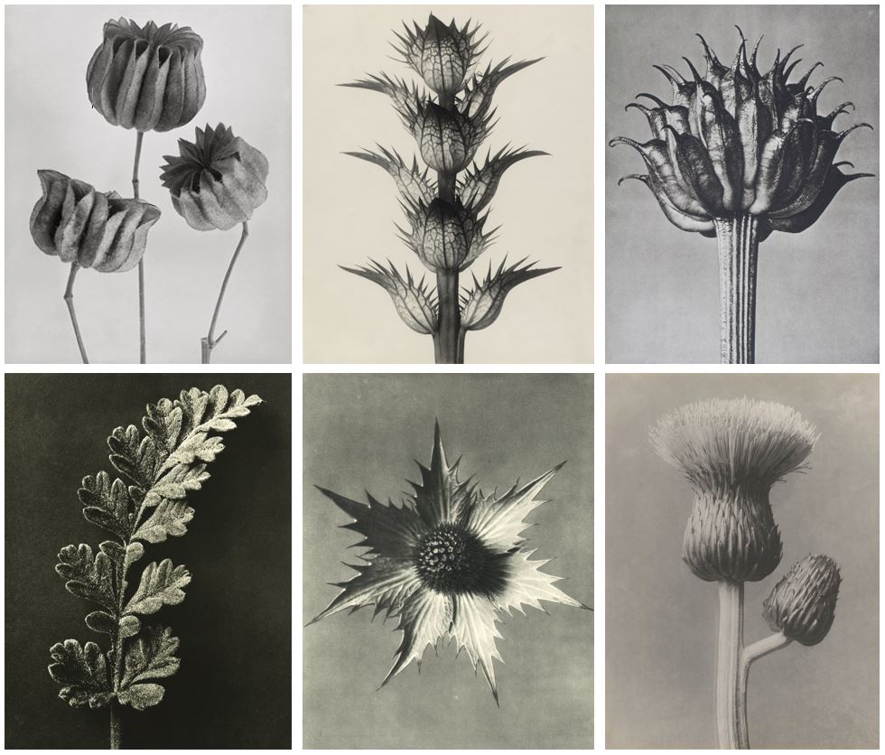
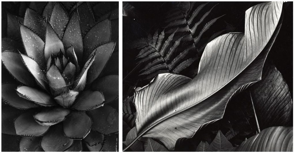
Strikingly modern and inherently beautiful, Karl Blossfeldt’s photographs of plants, flowers and seed heads are as appealing today, as they were when they were first introduced to the public in his two landmark books Urformen der Kunst, (Archetypal Forms of Art), 1929 and Wundergarten der Natur, (The Wondergarden of Nature), 1932. From 1898-1932, Blossfeldt taught sculpture based on natural plant forms at the Royal School of the Museum of Decorative Arts in Berlin. In his lifetime Blossfeldt’s work gained praise and support from critics such as Walter Benjamin, artists of the Neue Sachlichkeit (New Realism) and the Paris Surrealists. The use of botanical specimens as photographic subject matter became popular in the early and mid-nineteenth century at the inception of the photographic medium.

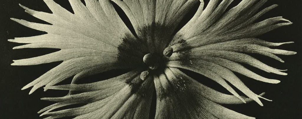
What made Blossfeldt’s work unique was his extreme technical mastery of photography. He specialised in macrophotography to enlarge his plant specimens and even designed a camera for this purpose. As a result, everyday garden flowers are presented in such a way that their rhythmic forms are emphasised to the extreme and the plants take on new and exotic characteristics. Blossfeldt wanted his work to act as a teaching aid and inspiration for architects, sculptors and artists. It was his firm belief that only through the close study of the intrinsic beauty present in natural forms, that contemporary art would find its true direction.

Image analysis:

This particular photograph from Blossfeldt’s wide collection of monochrome botanical studies really looks into and highlights the idea of nature being a weird and wonderful thing. At first glance, this photograph doesn’t look like a natural form and instead looks a man made and altered object. The architectural-like structure and strange curves and bends presents the interesting side of simple things like plants that are overlooked as being boring or monotonous. The very zoomed in angle once again emphasizes the detail of the form, with very little negative space in the image so the background doesn’t take away from the main focus.


“IF I GIVE SOMEONE A HORSETAIL HE WILL HAVE NO DIFFICULTY MAKING A PHOTOGRAPHIC ENLARGEMENT OF IT. ANYONE CAN DO THAT. BUT TO OBSERVE IT, TO NOTICE AND DISCOVER OLD FORMS, IS SOMETHING ONLY FEW ARE CAPABLE OF.”


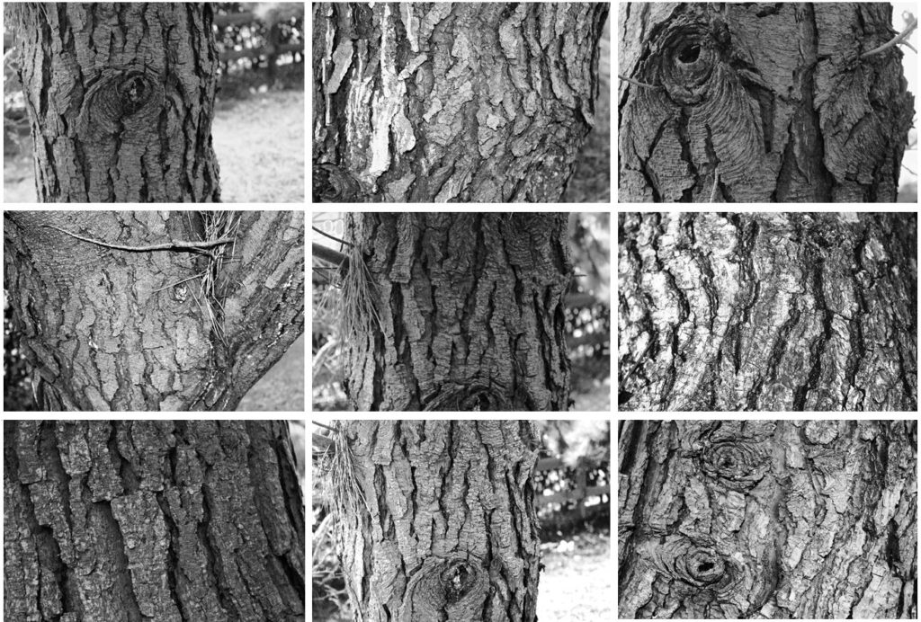
SHOOT 1 – TREES

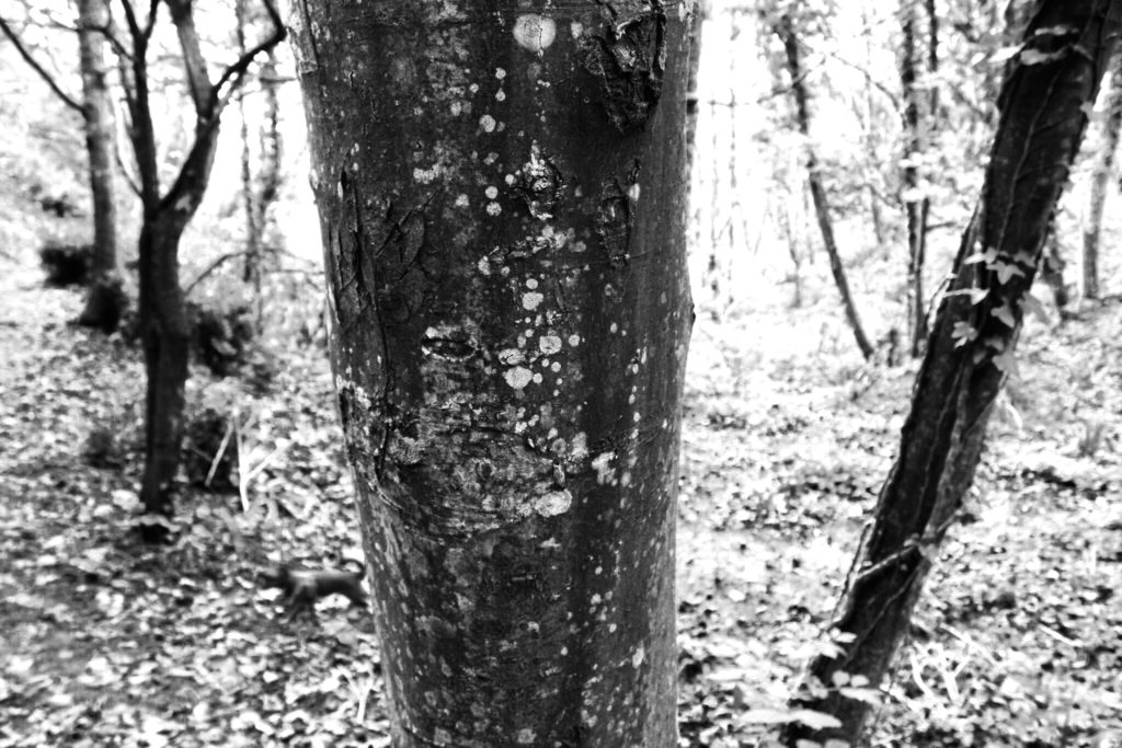
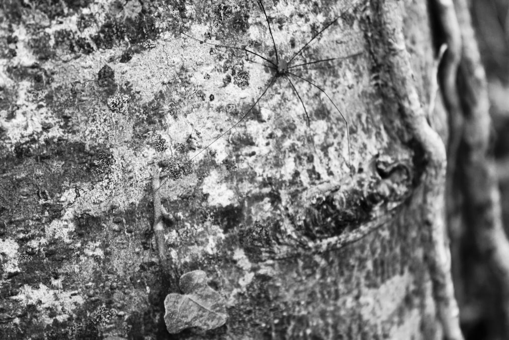
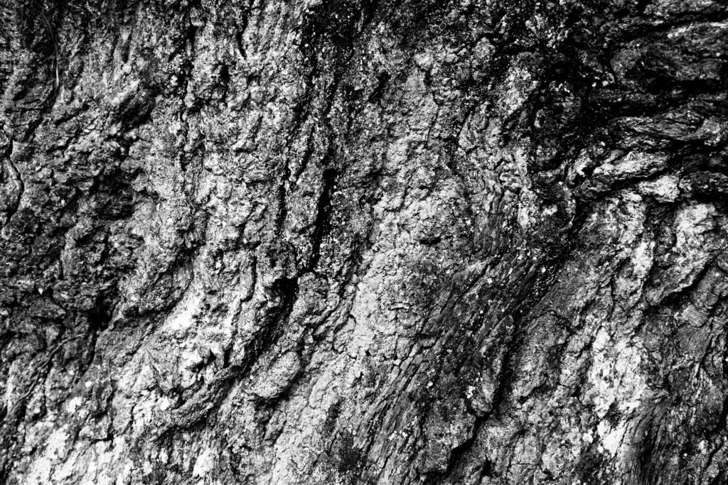
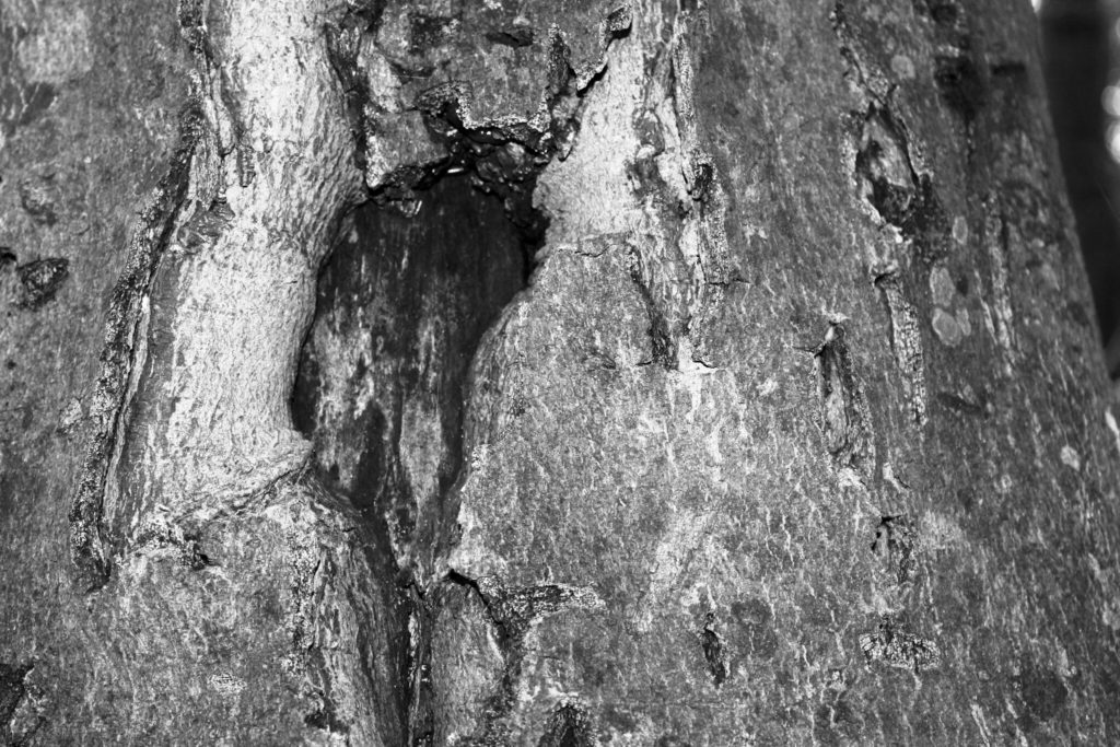
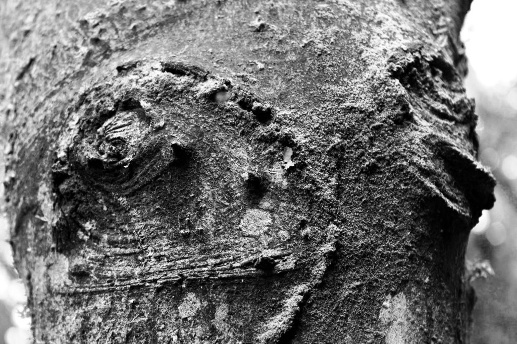
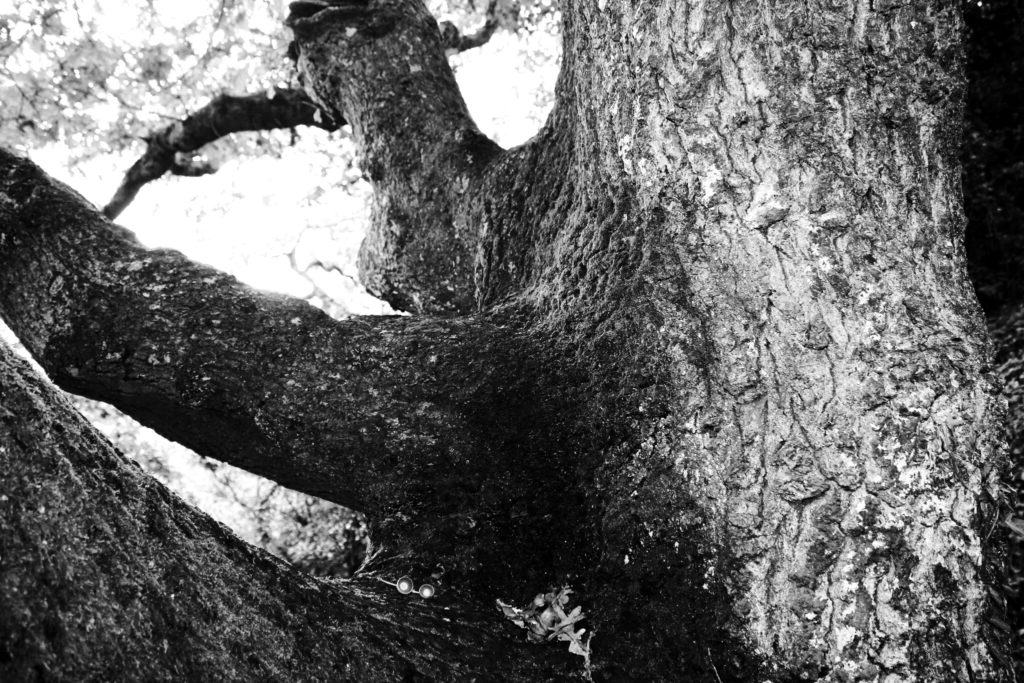
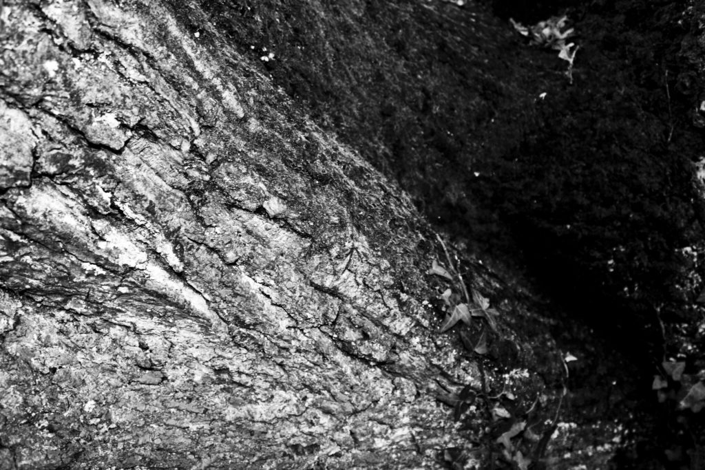
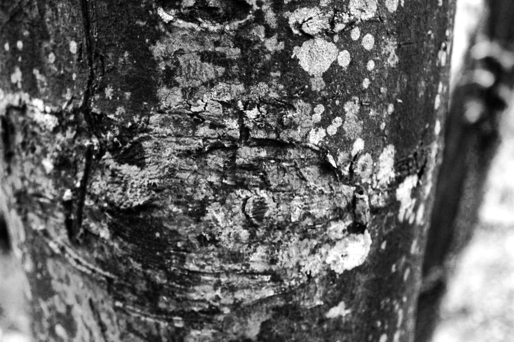
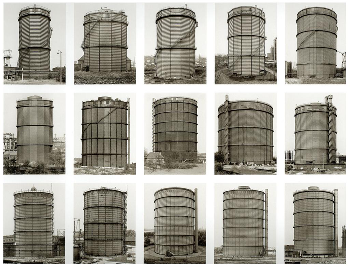
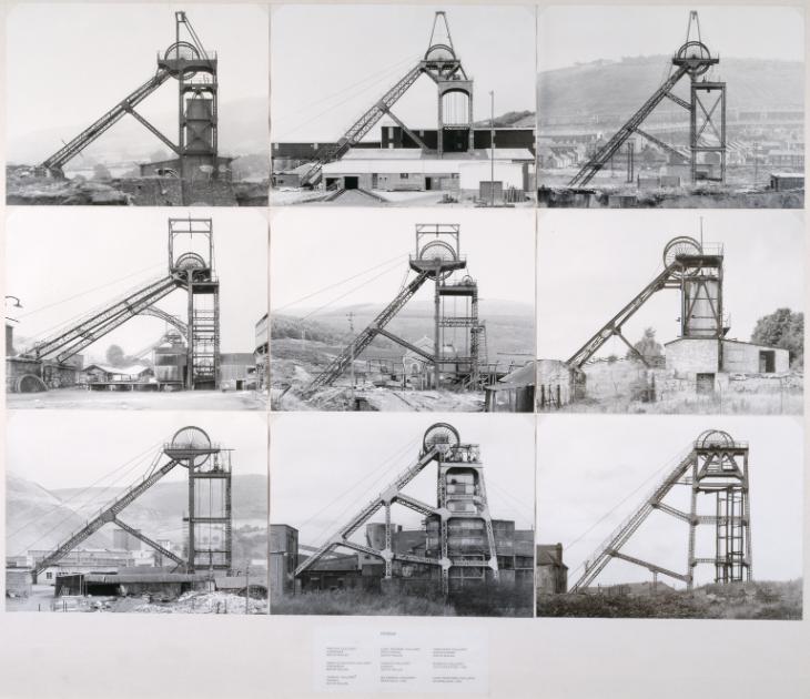
My first photoshoot for my Variation and Similarity project was based around trees. As trees come under the form of typologies, studied by Bernd and Hilla Becher, I have experimented with presenting my work in the style of these photographers. The basic yet effective grid format gives my photographs a clear presentation and shows a variety of my images side by side in one photo montage. Along with looking at the overall structure of trees, I have zoomed in on the closer features like bark patterns and colours, to explore my project route of variation within nature.


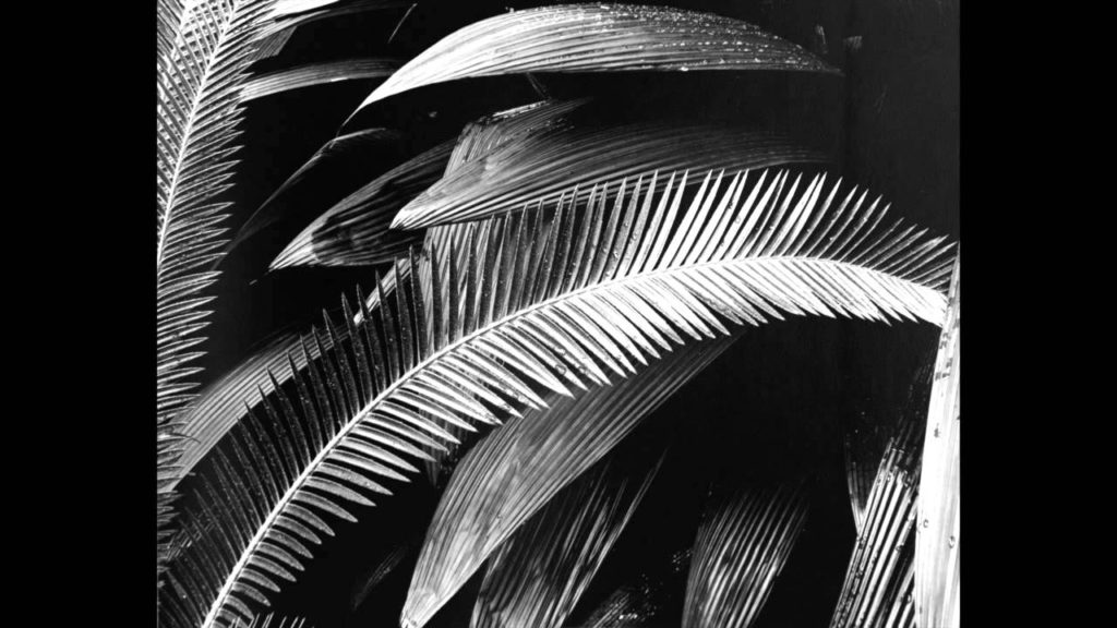
BRETT WESTON

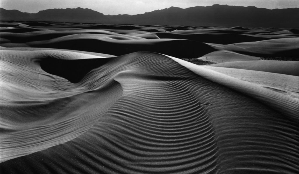
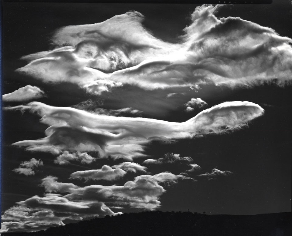
Theodore Brett Weston (December 16, 1911, Los Angeles – January 22, 1993, Hawaii) was an American photographer described as the “child genius of American photography.” Weston’s earliest images from the 1920s reflect his intuitive sophisticated sense of abstraction. He began photographing the dunes at Oceano, California, in the early 1930s which later eventually became his favorite location. Brett preferred the high gloss papers and ensuing sharp clarity of the gelatin silver photographic materials of the f64 Group rather than the platinum matte photographic papers common in the 1920s. Brett Weston was credited by photography historian Beaumont Newhall as the first photographer to make negative space the subject of a photograph.


“THE CAMERA FOR AN ARTIST IS JUST ANOTHER TOOL. IT IS NO MORE MECHANICAL THAN A VIOLIN IF YOU ANALYZE IT. BEYOND THE RUDIMENTS, IT IS UP TO THE ARTIST TO CREATE ART, NOT THE CAMERA.”


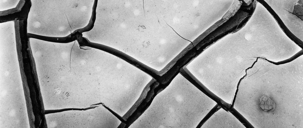
Throughout the decades of the 1950s, 1960s, 1970s, and 1980s, Brett Weston’s style changed sharply and was characterized by high contrast, abstract imagery. The subjects he chose were, for the most part, not unlike what interested him early in his career: plant leaves, knotted roots, and tangled kelp. He concentrated mostly on close-ups and abstracted details, but his prints reflected a preference for high contrast that reduced his subjects to pure form. In the late 1970s and into the 1980s Weston spent much of his time in Hawaii where he owned two homes. He would travel back and forth between them, shooting along the way: “l have found in this environment, everything I could want to interpret about the world photographically.” Brett Weston died in Kona, Hawaii, January 22, 1993. He was ranked one of the top ten photographers collected by American museums by the final decade of his life. His photographs are included in the collections of countless museums, including the Los Angeles County Museum of Art, the Oklahoma City Museum of Art, the Virginia Museum of Fine Arts, and the Museum of Photographic Arts.

CONTEXTUAL STUDY 1: PICTORIALISM

“AS MUSIC IS ONLY SOUND UNDER GOVERNANCE OF CERTAIN LAWS, SO IS PICTORIAL EFFECT ONLY THE COMBINATION OF CERTAIN FORMS AND LIGHTS AND SHADOWS IN LIKE MANNER HARMONIOUSLY BROUGHT TOGETHER.” – Henry Peach Robinson

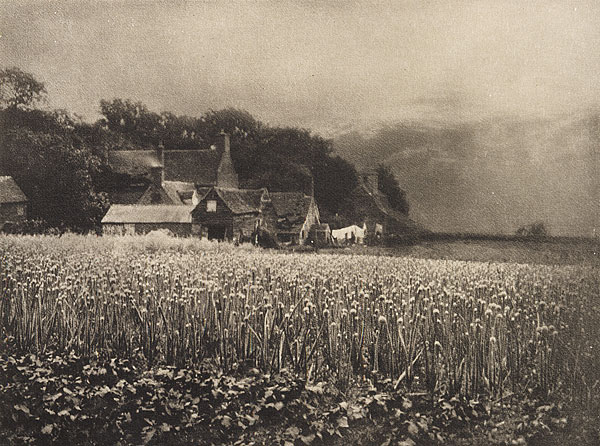
Pictorialists took the medium of photography and reinvented it as an art form, placing beauty, tonality, and composition above creating an accurate visual record. Through their creations, the movement aimed to elevate photography to the same level as painting and have it recognized as such by galleries and other artistic institutions. A Pictorialist photograph is usually taken to mean an image that has been manipulated in some way to increase its artistic impact. Common themes within the style are the use of soft focus, color tinting, and visible manipulation such as composite images or the addition of brushstrokes. Photography was invented in the late 1830s and was initially considered to be a way in which to produce purely scientific and representational images. This began to change from the 1850s when advocates such as the English painter William John Newton suggested that photography could also be artistic. The Pictorialist movement was at its most active between 1885 and 1915 and during its heyday it had an international reach with centers in England, France, and the USA. Pictorialists used a range of darkroom techniques to produce images that allowed them to express their creativity, utilizing it to tell stories, replicate mythological or biblical scenes, and to produce dream-like landscapes.

Pictorialism was closely linked to prevailing artistic movements, as the photographers took inspiration from popular art, adopting its styles and ideas to demonstrate similarity between it and photography. Movements that were particularly influential were Tonalism, Impressionism and, in some instances, Victorian genre painting. Pictorialists were the first to present the case for photography to be classed as art and in doing so they initiated a discussion about the artistic value of photography as well as a debate about the social role of photographic manipulation. Both of these matters are still contested today and they have been made ever more relevant in the last decades through the increasing use of Photoshop in advertising and on social media. The movement led to great innovation in the field of photography with a number of the photographers associated with it responsible for developing new techniques to further their artistic vision. This laid the foundations for later advances in color photography and other technical processes.

BERND AND HILLA BECHER

typology/tʌɪˈpɒlədʒi/nounnoun: typology; plural noun: typologies

  1. a classification according to general type, especially in archaeology, psychology, or the social sciences.
    • study or analysis using a classification according to a general type.

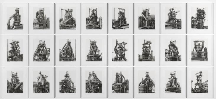
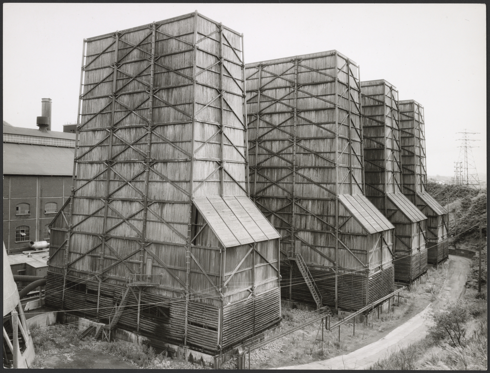
Bernhard “Bernd” Becher and Hilla Becher were German conceptual artists and photographers working as a collaborative duo. They are best known for their extensive series of photographic images, or typologies, of industrial buildings and structures, often organised in grids. For over 40 years, Bernd and Hilla Becher photographed the architecture of industrialisation: water towers, coal bunkers, blast furnaces, gas tanks and factories. They did so in an obsessively formalist way that defined a style, and made them one of the most dominant influences in contemporary European photography and art. Their work had a documentary style as their images were always taken in black and white, however, their photographs never included people. Both subjects addressed the effect of industry on economy and the environment. “I became aware that these buildings [blast furnaces] were a kind of nomadic architecture which had a comparatively short life—maybe 100 years, often less, then they disappear,” the artists said of their work. “It seemed important to keep them in some way and photography seemed the most appropriate way to do that.” They began collaborating together in 1959 after meeting at the Kunstakademie Düsseldorf in 1957. Bernd originally studied painting and then typography, whereas Hilla had trained as a commercial photographer. After two years collaborating together, they married. As the founders of what has come to be known as the ‘Becher school’ or the ‘Düsseldorf School’ they influenced generations of documentary photographers and artists and have been awarded the Erasmus Prize and the Hasselblad Award.

“WE DON’T AGREE WITH THE DEPICTION OF BUILDINGS IN THE ‘20S AND 1930S. THINGS WERE SEEN EITHER FROM ABOVE OR BELOW WHICH TENDED TO MONUMENTALIZE THE OBJECT. THIS WAS EXPLOITED IN TERMS OF A SOCIALISTIC VIEW—A FRESH VIEW OF THE WORLD, A NEW MAN, A NEW BEGINNING.” – Bernd Becher

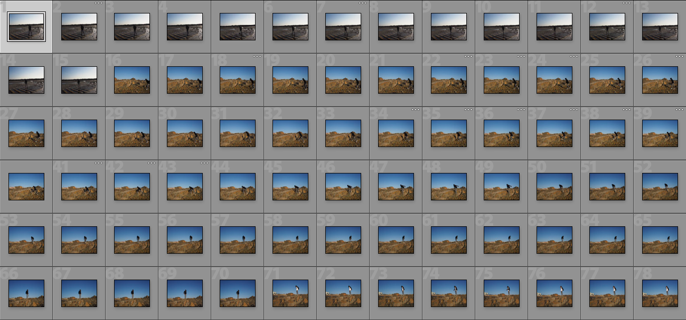
CHAOS EDITS AND SHOOT

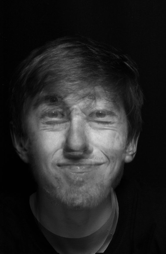
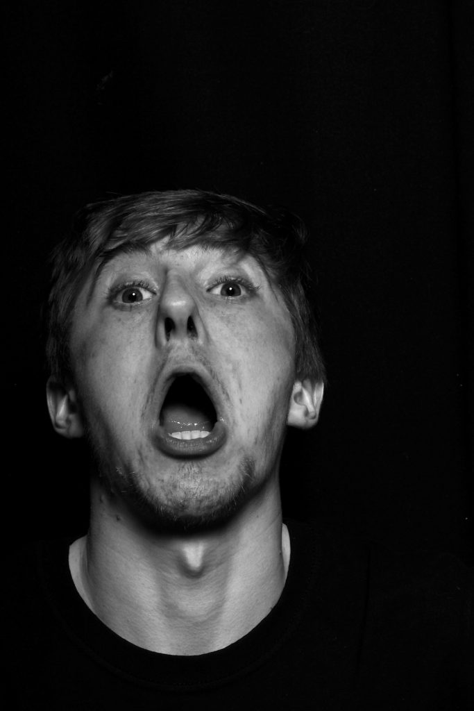
ANYLSIS: This shoot of Chaos, was once again one of my three main original starting points. I wanted to still experiment within the theme of chaos for a short period, as I belive it is fascinating the reactions and effect of the hypodermic needle is to audiences, and how one persons actions can effect the actions of so many more. The influence of what we see within the media and how this not only influences our own acts, but the influence of our mind set is significant. With the continuous promotion of only negative news, their comes a time where this negativity creates an illusion that this is the whole premis of what their is within the world, and a false reality of the vast majority of the world is a bad place filled with bad people. Hovwer I want to break free form this idea and create a sense of emotional vulnerability within these images. I have spoken previously about exploring a sense of exposing the true emotions and feeling of myself and others, considering what we fine beautiful and what we view most important with others and ourselves. I belive many people hide their emotional state and have a tendency to only show a false sense of their feelings, especially towards the news. The news and chaos within the media is to my mind a from of the elephant in the room, we know it is their and we justify its news given yet I do feel it negatively effects us as a collective. This is a set of images where I wanted to cover each image with many others all expressing a different over- exaggeration of emotions, in order to create an aspect of importance and relevance to our justify our feelings. The effect of the editing of the amount of opulence you se in each image and how you are able to see all the layers and feel a movement to the image, almost personifies the world chaos into an image itself. I belive this Is why I find this shoot so interesting, not just the outcomes, but the original importance of the shoot itself. I could create a juxtaposition from these images and how what we should see and feel in the world with an accurate representation of emotions for people. A contrast of hate to love, and negativity to positivity. Life should not be so concentrated by a monopoly of negative issues, but a celebration of the beauty and experience others are having in the world around us.

Artist Research: August Sander

August Sander, born 17 November 1876 – 20 April 1964, was a German portrait and documentary photographer. Sander’s first book Face of our time was published in 1929. Sander has been described as “the most important German portrait photographer of the early twentieth century.”

Image result for august sander typology

Sander was born in Herdorf, the son of a carpenter working in the mining industry. While working at a local mine, Sander first learned about photography by assisting a photographer who was working for a mining company. With financial support from his uncle, he bought photographic equipment and set up his own darkroom.

He spent his military service (1897–99) as a photographer’s assistant and the next years wandering across Germany. In 1901, he started working for a photo studio in Linz, Austria, eventually becoming a partner (1902), and then its sole proprietor (1904). He left Linz at the end of 1909 and set up a new studio in Cologne.

In 1911, Sander began with the first series of portraits for his work People of the 20th Century.

His work includes landscape, nature, architecture, and street photography, but he is best known for his portraits, as exemplified by his series People of the 20th Century. In this series, he aims to show a cross-section of society during the Wiemar Republic. The series is divided into seven sections: The Farmer, The Skilled Tradesman, Woman, Classes and Professions, The Artists, The City, and The Last People (homeless persons, veterans, etc.). By 1945, Sander’s archive included over 40,000 images.

Image Analysis

I haven chosen this photograph of Sanders to analyse because this photograph is a similar style to the type I want to photograph in my third photoshoot, a model in a open natural landscape. I like this photograph because the backdrop of the fields creates an interesting effect in the way that the fields create a very nateral backdrop, its very simple and allows as much attention on its self as the model, creating a perfect balance. The model is an interesting factor in the photograph, oppose to being stood still, lifeless, he is stood in an intriguing pose, creating a more engaging photograph. The texture of the mud creates a noticeable contrast within its self and the model and fields, dividing the photograph into sections, allowing there to be more to look at within the photograph. In conclusion this photograph is simple but engaging and similar to what I hope to photograph myself for my project.