Gustave Le Gray – Historical Context

Jean-Baptiste Gustave Le Gray was a French photographer who lived 1820 – 1884. He has been called “the most important French photographer of the nineteenth century” because of his technical innovations, his instruction of other noted photographers, and “the extraordinary imagination he brought to picture making. His most well known images are seascapes, the first to ever have an exposure that was able to depict the detail in both the sky and sea at the same time.
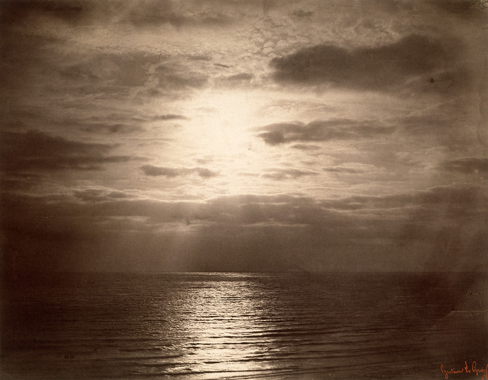
Image result for gustave le gray

Technical innovations

His technical innovations included:

  • Improvements on paper negatives, specifically waxing them before exposure “making the paper more receptive to fine detail”.
  • A collodion process published in 1850 but which was “theoretical at best”. The invention of the wet collodion method to produce a negative on a glass plate is now credited to Frederick Scott who published his process in 1851.
  • Combination printing, creating seascapes by using one negative for the water and one negative for the sky

Combination printing, creating seascapes by using one negative for the water and one negative for the sky at a time where it was impossible to have at the same time the sky and the sea on a picture due to the too extreme luminosity range. Combination printing was an early experiment of HDR photography where you expose for bright and dark areas of a landscape scene.

In October 1999, Sotheby’s sold a Le Gray albumen print “Beech Tree, Fontainebleau” for £419,500, which was a world record for the most expensive single photograph ever sold at auction, to an anonymous buyer. At the same auction, an albumen print of “The Great Wave, Sète” by Le Gray was sold for a new world record price of £507,500 or $840,370 to “the same anonymous buyer” who was later revealed.
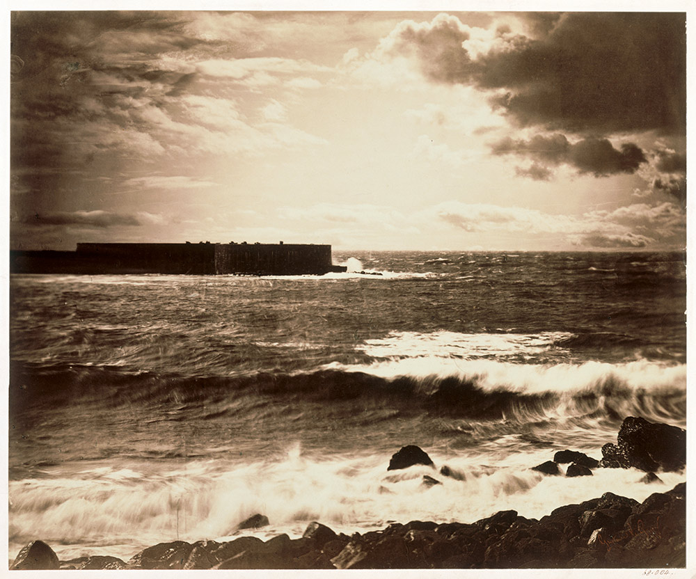
The seascapes were, and are still, Le Gray’s greatest public, commercial and aesthetic success. He took them in France – a first set taken in Normandy in the summer of 1856 and a second set from the Mediterranean coast in spring 1857. At the horizon, the clouds are cut off where they meet the sea. This indicates the join between two separate negatives. The combination of two negatives allowed Le Gray to achieve tonal balance between sea and sky on the final print. It gives a more truthful sense of how the eye sees the landscape, rather than how the camera perceives nature. When first shown, the luminous, shimmering effects, Le Gray’s otherwise dark seascapes were often mistaken for moonlight. It is easy to see why this misconception arose in these monochrome images where darkness encroaches towards the edges of the scene.

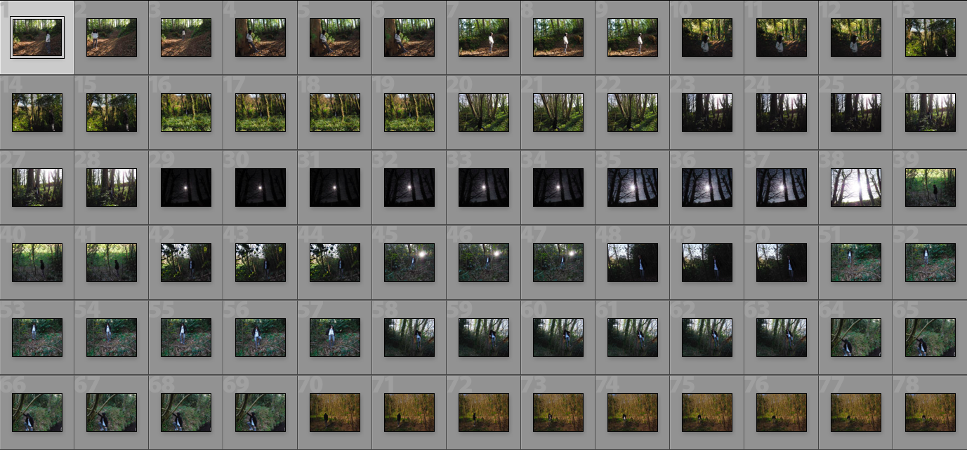
Experimenting With Images – Colour

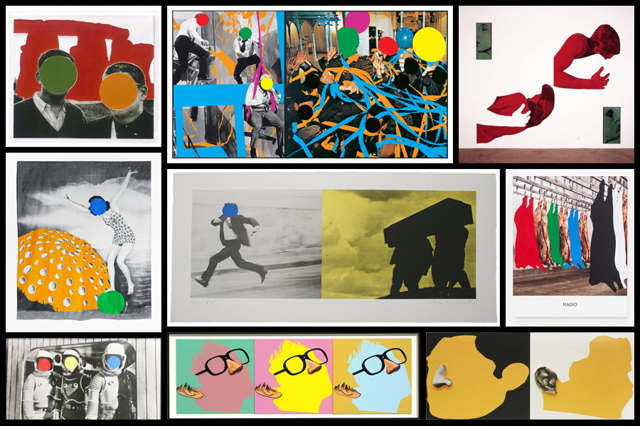
After looking over the works of John Baldessari I became inspired to create my own response regarding the colours used within his graphics used. I really liked his used of block colouring to create abstract effects within pre-taken images of people and landscapes, blocking out faces and aspects of the environment as a means of censorship. As a result of this it produces collages of different materials which contrast one another allowing for a aesthetically pleasing result. To create the intended results I would have to use software such as Adobe Photoshop to cut and paste in colour in the areas wanted, the photos I will be using are images I have previously taken in shoots regarding the topic of variation and similarity. Here are some examples of Baldessari’s work which I will be drawing inspiration from:

Once I had chosen some of the works which I would be using as a reference to create off I decided to go ahead and proceed to cut areas out which I thought would look more effective with varying ranges of colour. Using Adobe Photoshop I used the snipping tool to cut out and replace the different areas of each image with block colouring, looking back at Baldessari’s work as a reference to my structure of creating related works. Here is the process of me creating each image:

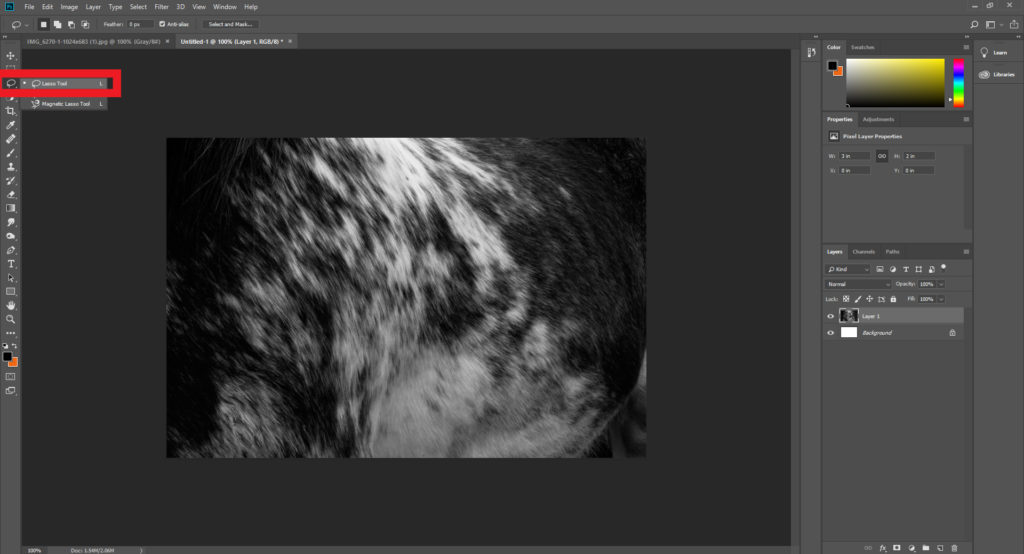
Step 1: Select the lasso tool located on the top left hand side of the tool bar and make sure the freehand option is chosen.

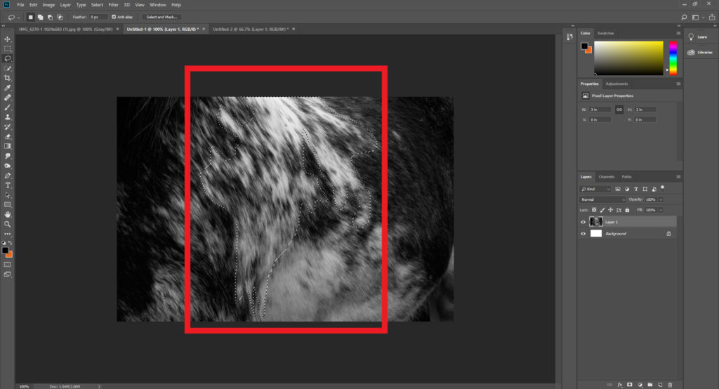
Step 2: Once you have selected the lasso tool draw out the desired shape of the area you intend to make a block colour out of, when doing it make sure to connect the end and the start point so that it does not ruin the layout.

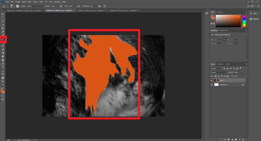
Step 3: After highlighting the wanted area make sure to go on to chose the paintbrush tool next, located just under the lasso tool. Using the colour boxes select a colour that contrasts the piece well and paint it within the lassoed area, making sure to deselect the highlighted are once completed.

When I finished experiment with various designs I then chose four images that I best reflected the intended outcome of the process and inspiration towards John Baldessari’s work. These are the images I selected as the best outcomes of the experimentation:

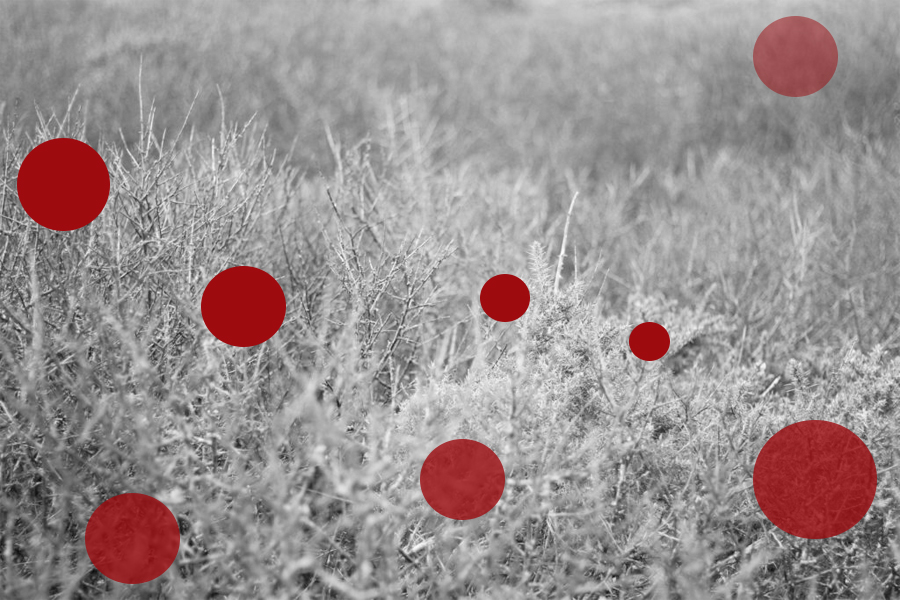
For this image I used red circles each with a varying opacity, by doing this it would create the impression of different depths of fields, with the more out of focused being the more faded shapes. When creating it I wanted to make sure there was still a natural feel to the piece, so limited the amount of shapes depending on the focus of the area so that they would not overpower and fill the entire piece.
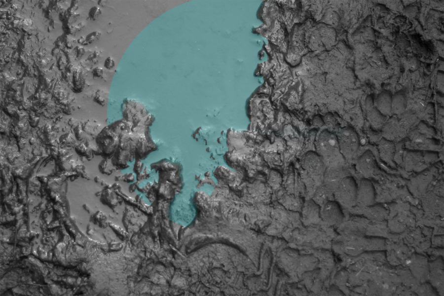
Here I wanted to capture a reflection of a shape within a muddy puddle. To do this I had to crop out the parts of the shape which touched the mud, this seemed a bit to complicated for a Baldessari’s work, however I liked the final outcome of how the lighter blue completely contrasted that of the surrounding black mud of the image.
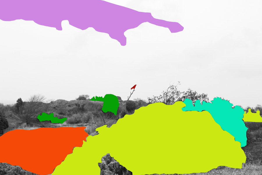
When editing this piece I tried to block colour only the bushes and trees that were the most outstanding to the environment, allowing me to roughly cut out the area and replace it all with colour that contrasted but complimented each other so that it would not become eye sore. When placing the block colours I made sure not to have them grouped together so much as by clustering them together it would reduce the effect of the simplicity I wanted to put across, instead abstracting the photo too much.

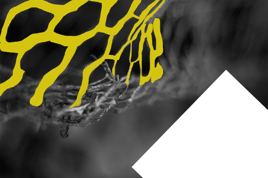
Finally I selected this image because I like the roughly cut out mesh wire which it replaced with a contrasted yellow which compliments the black which makes up the majority of the photo. By also adding the white rectangle I found that it brakes the piece up and instead stops the yellow from becoming too minimal and the black becoming too overpowering.

Artist research: Luigi Ghirri

Luigi Ghirri, born 5 January 1943, was an Italian artist and photographer who gained a far-reaching reputation as a pioneer and master of contemporary photography, with particular reference to its relationship between fiction and reality.

He started his career in the 1970s. Influenced by conceptual art, he created his first two series, Atlante (1973) and Kodachrome (1978), where his cropped images of the landscape were presented with a deadpan, often ironic wit and a continuous anthropological engagement with his surroundings. The compositions and hues of his photographs suggested subtle emotional tones and a meticulously rich way of viewing the world, as well as the role of images within it.

Ghirri’s work quickly attracted international attention. In 1975 Time-Life included him in its list of the “Discoveries” of its annual Photography Year publication, and he showed at the Photography as Art, Art as Photography exhibition in Kassel. In 1982 he was invited to the photokina in Cologne, where he was acclaimed as one of the twenty most significant photographers of the 20th century for his series Topographie-Iconographie.

Image Analysis:

I haven chosen this photograph of Luigi Ghirri’s because it has all the aspects of what I want to include within my own photographs, for example, a wide natural background and the inclusion of models. I like this photograph of Ghirri’s because of the use of colour and contrast, the swimming costumes the models are wearing are different shades of blues that match the blues in the water but also contrast at the same time, also the contrast between the white sand and blue water progressing to an even darker blue is interesting, linked with the almost orange models wearing vibrant blue costumes, the photograph is very simple and candid but the colouring makes it far more interesting and engaging. In conclusion this photograph is simple but engaging and is a very similar style to what I hope to photograph myself for my project.

Work to do by Mon 18 March

Produce an appropriate number of blog posts with good use of images, hyperlinks and written analysis or evaluation of the following:

1. Photo-Assignment: PLAY
- Historical/ contextual references to Marcel Duchamp, origins of conceptualism, John Baldessari, Tom Pope and others mentioned as artists references and creative starting points

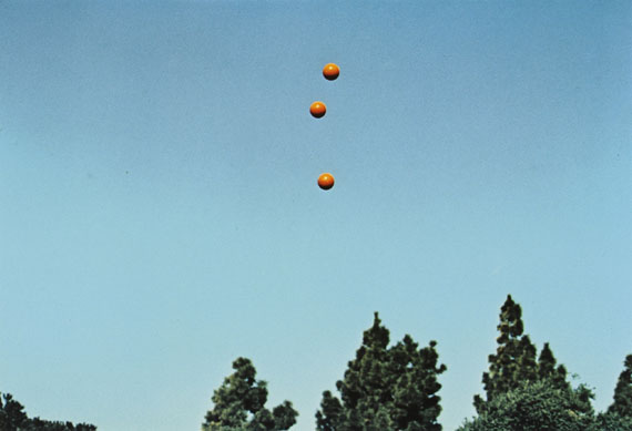
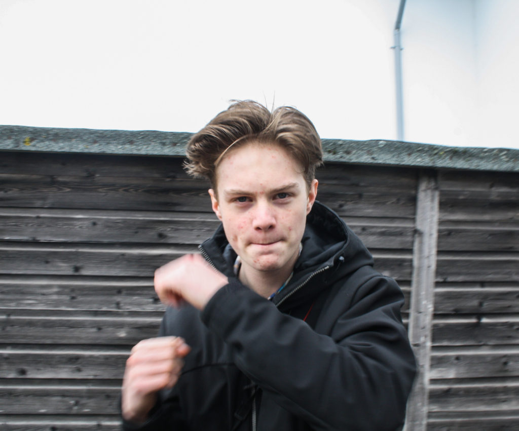
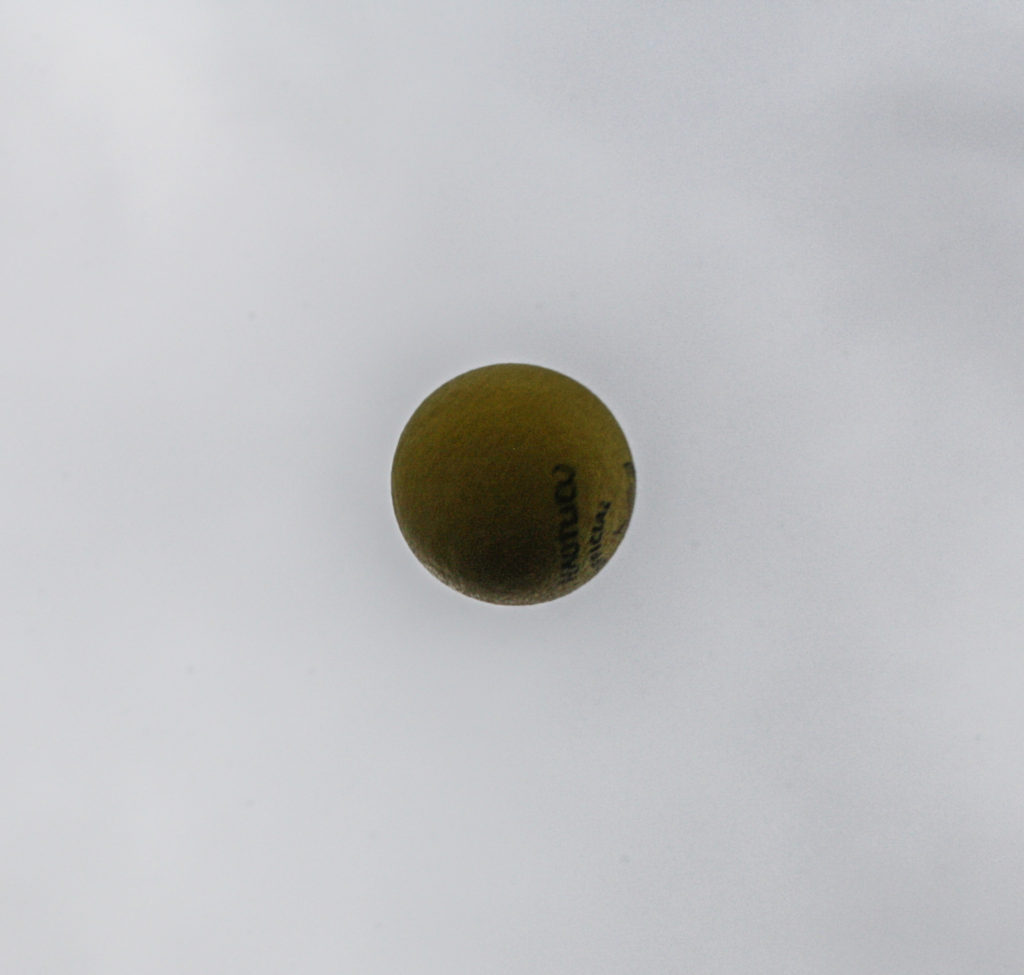
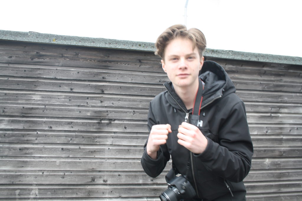
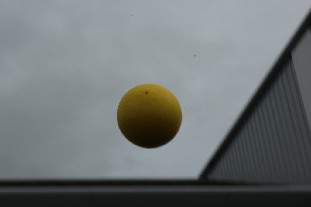
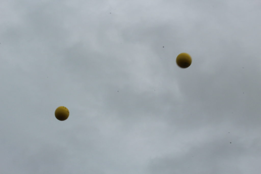
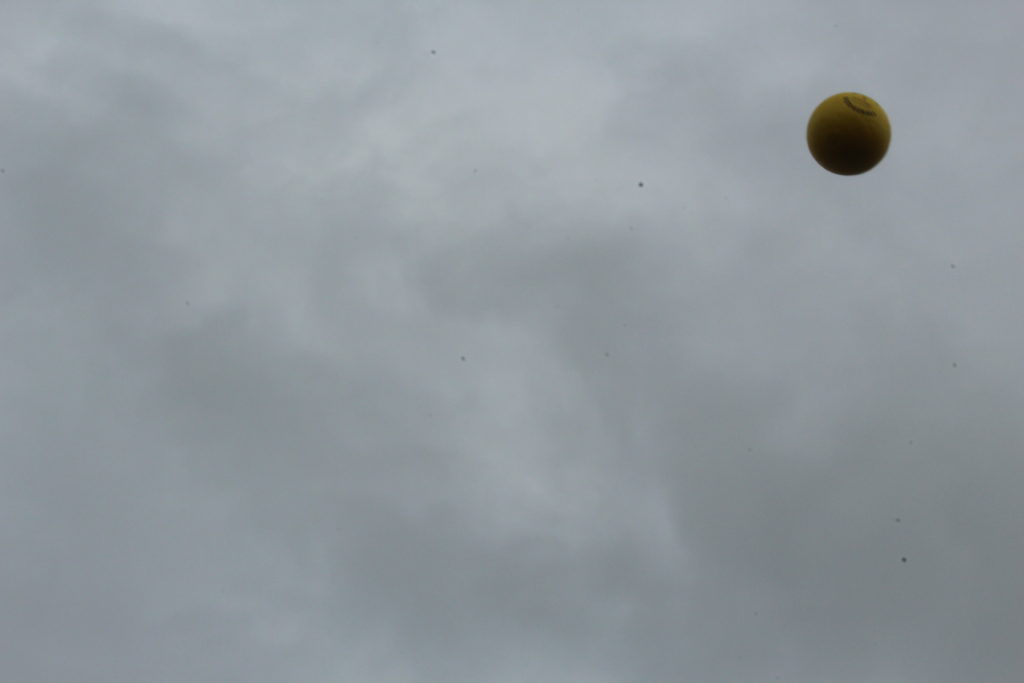
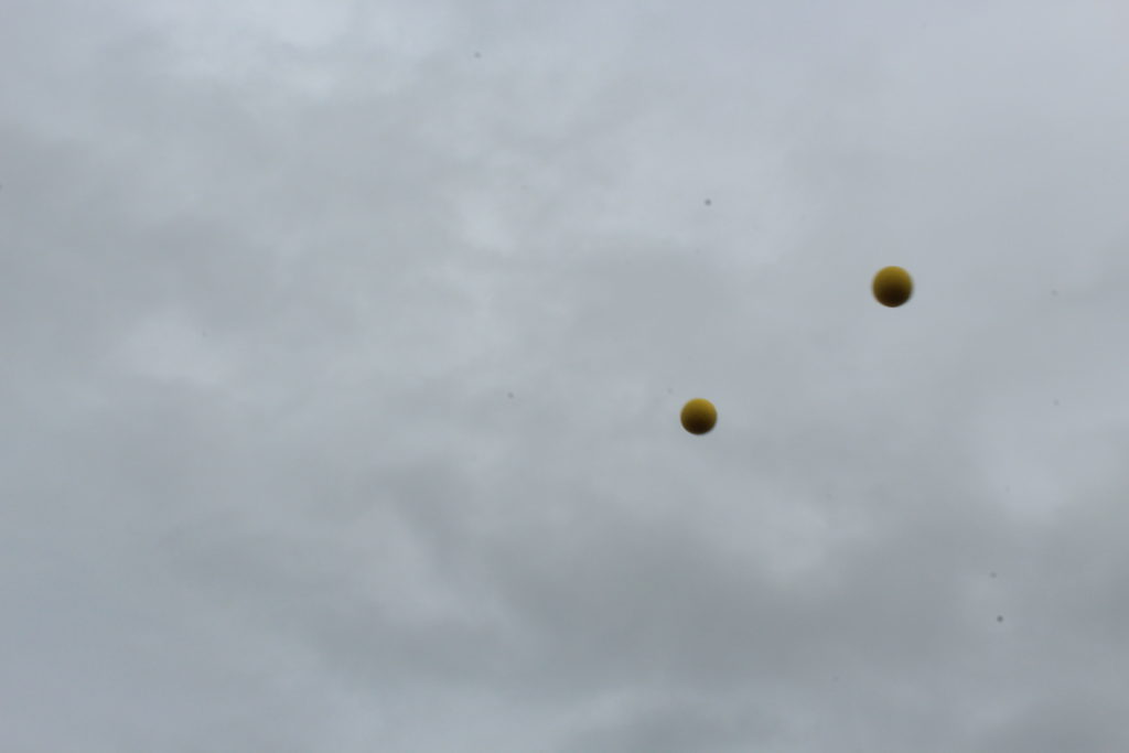
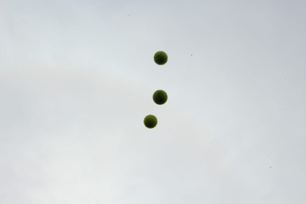
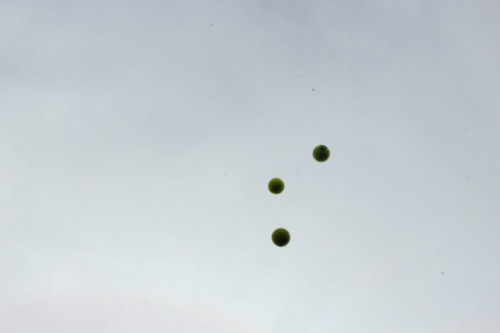
- Responses/ experimentation: Upload images from last Wednesday photo-games with a ball and coin toss and produce a number of photographic experiments eg. grids, diptychs/triptychs, stop animation (GIF), montages etc.

2. SPECIFICATION: Write a specification with 2-3 ideas about what you are planning to do; how, who, when, where and why? Use images to illustrate your ideas

3. RESEARCH AND ANALYSE: ARTISTS REFERENCES Research and analyse the work of at least 2-3 (or more) photographers/ artists. Produce at least 2-3 blog posts for each artist reference that illustrate your thinking and understanding using pictures and annotation and make a photographic response to your research into the work of others

- Produce a mood board with a selection of images.
Provide analysis of their work and explain why you have chosen them and how it relates to your idea and the exam themes of VARIATION and/or SIMILARITY.
- Select at least 2 key images and analyse in depth, TECHNICAL (lighting, camera), VISUAL (composition, visual elements) (interpretation, subject-matter, what is the photographer trying to communicate), CONTEXTUAL (art historical, political, social, personal), CONCEPTUAL (ideas, meaning, theory of art/ photography/ visual culture, link to other’s work/ideas/concept)
- Incorporate quotes and comments from artist themselves or others (art critics, art historians, curators, writers, journalists etc) using a variety of sources such as Youtube, online articles, reviews, text, books etc.
- Make sure you reference sources and embed links to the above sources in your blog post

4. PLAN AND SHOOT:
Plan at least 2-3 shoots as a response to artists references where you explore your ideas in-depth.
- Edit shoots and show experimentation with different adjustments/ techniques/ processes in Lightroom/ Photoshop

5. REVIEW AND REFLECT: Evaluate each shoot afterwards with thoughts on how to refine and modify your ideas i.e.  experiment with images in Lightroom/Photoshop, re-visit idea, produce a new shoot, what are you going to do differently next time? How are you going to develop your ideas? Plan a second or third shoot. Explore different photographic techniques and processes. Research and analyse new artists references/ inspirations etc.


ARTIST REFERENCES – GROUP WORK

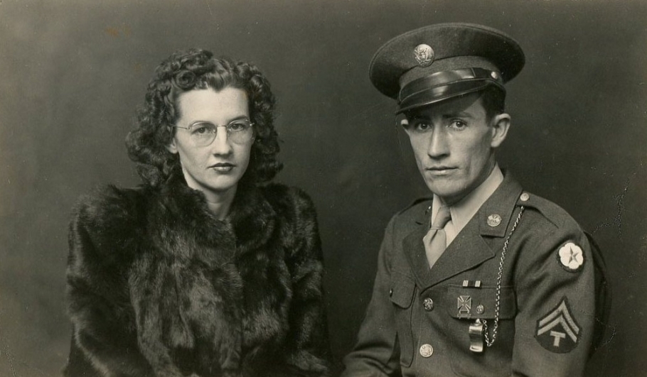
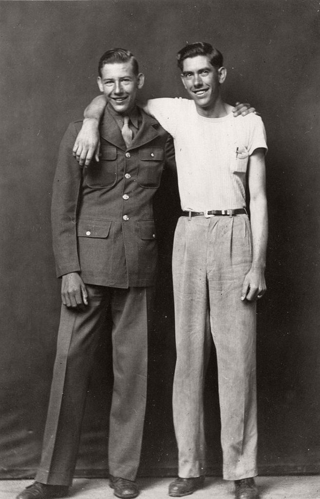
Mike Disfarmer

(1884–1959) Portrait photographer from Arkansas in America, he captures harsh realism is rural parts of the country for 40 year. He lived a reclusive lifestyle only making human contact when taking hid photos. After leaving his family farm and changing his name to Disfarm as a form of rebellion he taught him self how to take and develop photos even building his own studio. He would charge 25-50 cent for a penny portrait which people from the community would buy as tokens to give to family and friends. He photographs, individuals sometimes groups generally with a natural expression not posing or overly smiling. The overall collection creates a sense of identity for the time, rural location and people who occupied it.

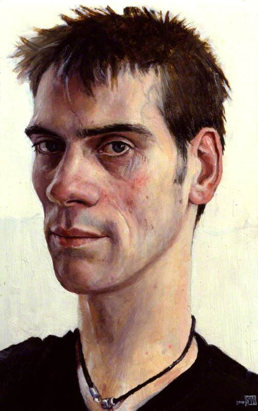
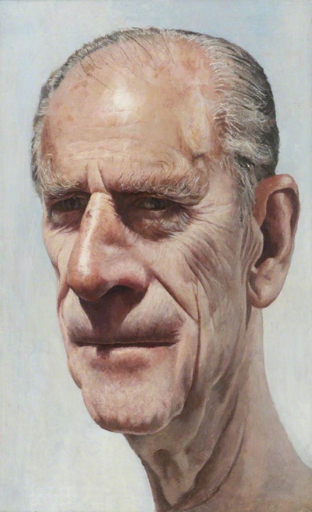
Stuart Pearson Wright

Wright plans a move away from portraiture, yet his projected subjects remain bound up with the enigma of his own identity and origins.

“People say I make my subjects look sad or old. I suppose I do instinctively either bring out of them, or project on to them, something rather melancholy.”

Wright explores identity of other people out of his own isolation. His obsession with portraiture formed out of never meeting his father, he was born as the result of artificial insemination.

Seydou Keita

https://www.all-about-photo.com/photographers/photographer/125/seydou-keita

https://www.guggenheim.org/artwork/artist/seydou-keita

‘Serving elite and middle-class patrons, his images often highlight the idealized or imagined socio-economic status of his sitters through the inclusion of props: cosmopolitan clothing and accessories, radios, telephones, bicycles, and sometimes his own car. To formalize the outdoor setting, Keïta regularly employed richly patterned backdrops that add movement and visual energy to his images and used a low vantage point and angular composition to highlight his clients’ confident facial expressions and relaxed postures. ‘

Experimenting with GIFs

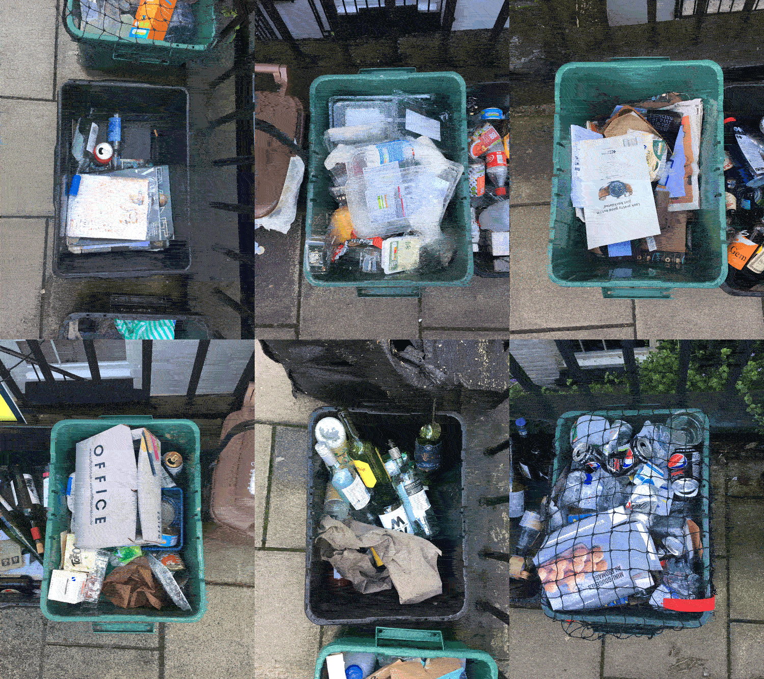
Whilst in Bristol I saw an opportunity to continue to experimentation with GIF’s, along most streets, outside each house were a collection of recycling boxes. The pavements seemed to be covered in these boxes, presumably because it was collection day however it did ruin the overall look of the area. There were a mix of green and black boxes containing various packagings to be recycled, for example Glass, plastic bottles and cardboard. I decided to take pictures of these boxes from a birds eye angle framing the rectangle shape in the centre. I was interested in the variety of thing in the bins and how they differed from house to house and how they reflected the lifestyle of the people living in each house. I cropped all these photos to the same size and orientation so that they all followed the same shape conventions. I then proceeded to bring them into photoshop and turn them into a GIF, each frame lasting 0.1 of a second. The final GIF flicks through the photos showing the variation and similarity between each recycling bin.

This image has an empty alt attribute; its file name is Gbins.gif

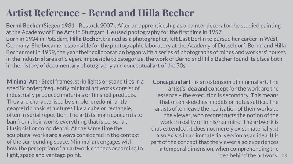
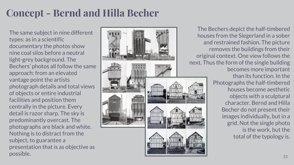
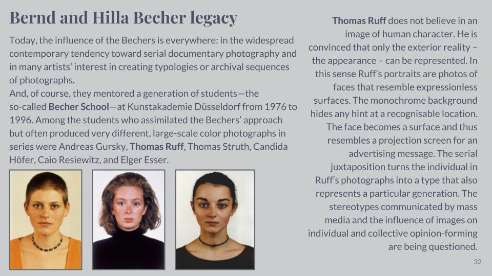
Artist Research – Bernd and Hilla Becher

Sources: