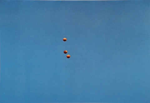
Experiment 1:
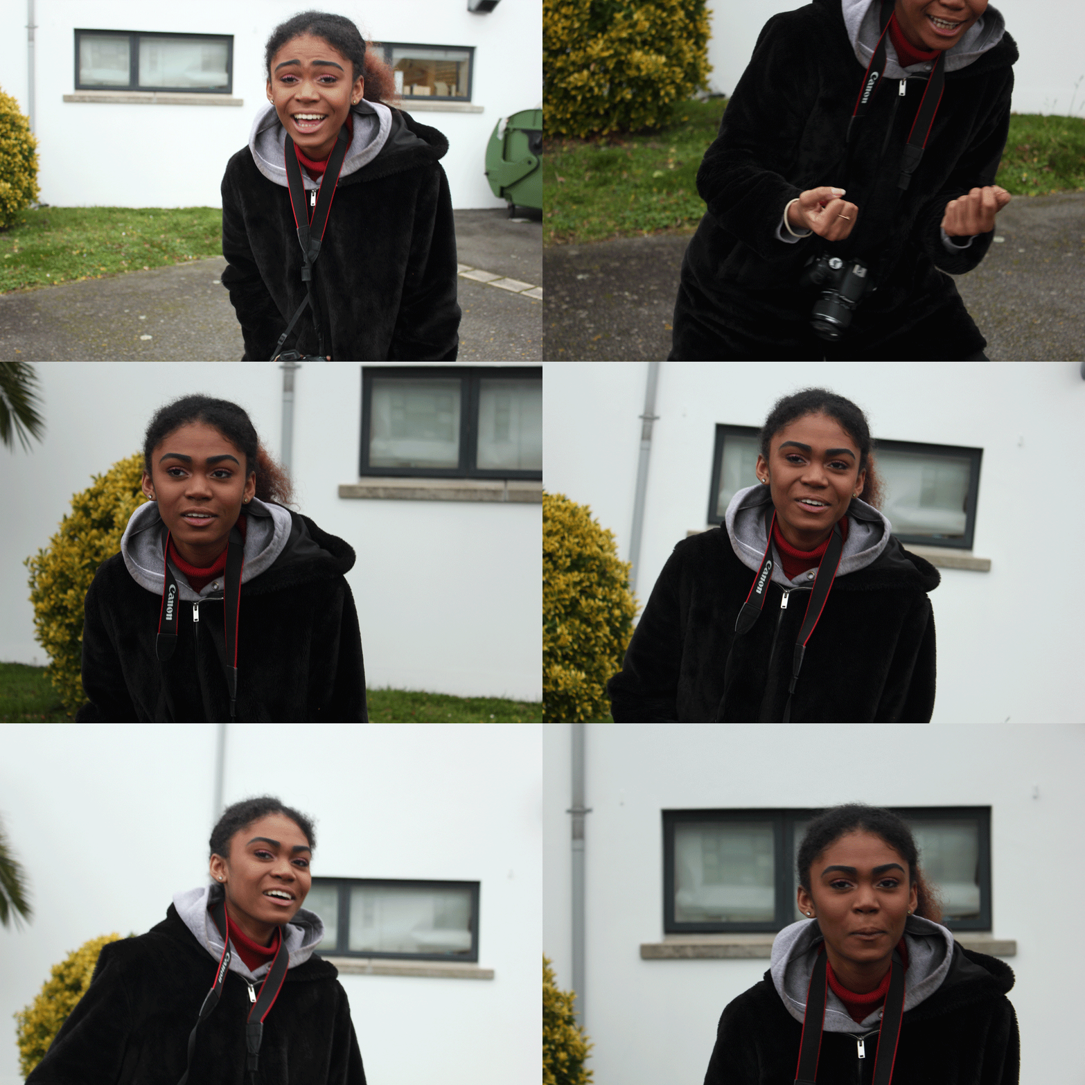
I was inspired by John Baldessari to capture images of a model moving and dodging the camera, due to his photographic art being humorous, so I experimented with something that I could create into a style similar to his. I wanted my model to appear as if she is boxing, hence why she is clenching her hands into a ball to appear as if she has boxing gloves on. On my camera, I used the setting Tv, put the white balance to cloudy (approx 6000K on my camera), and set the ISO to 1/200 for this first shoot. This made my images quite sharp and clear, due to a fast shutter speed.
Experiment 2:
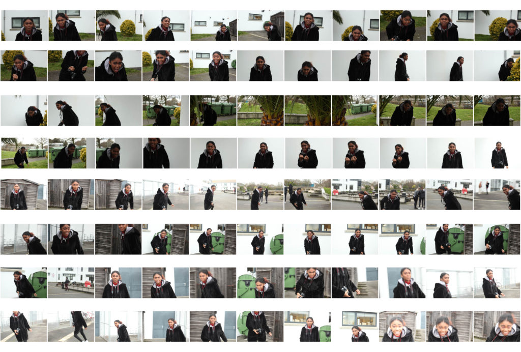
For this experiment, I changed my camera settings; I kept the white balance and camera setting ‘Tv’ the same, however I lowered the ISO to 1/160. I told my model to do the same technique and movements as the last shoot, where she had to try and run around and dodge to camera. I decided to make a grid layout as I felt that this repetition of similar images is easy and interesting to look at from this sort of format.
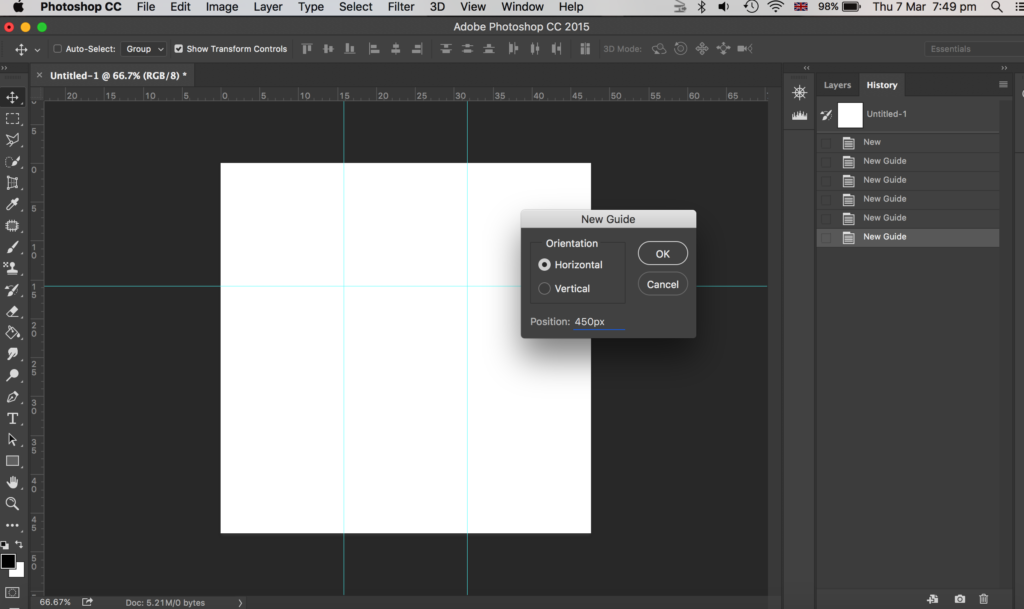
To make this grid layout, I used photoshop. My first step was to create a square canvas. Next, I went to view, new guides and clicked horizontal 450px. I did this again but changed the px to 900px. Then I repeated this for vertical guides, where I chose 450px and then did it again with the vertical option selected and put 900px.
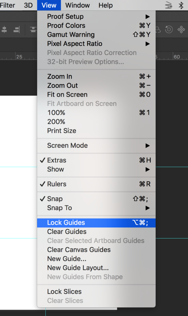
Then I went to view and chose lock guides.
Then I opened up all my images on photoshop that I wanted to use – I chose 9 images of my model dodging the camera. I went onto each photo in photoshop and went to select, all and edit, copy.
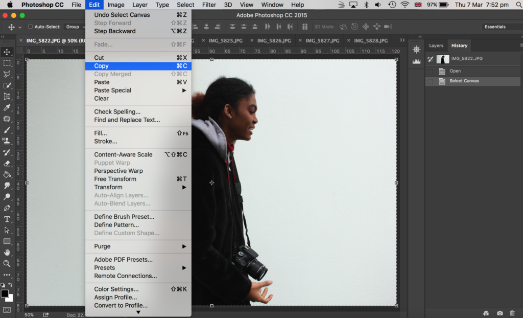
Then I went onto the canvas I made with guides and went to edit, paste. To make my image smaller to fit on the canvas I went to edit, free transform where I could then adjust my image size. I placed it within one of the squares the guides had made. I then got the rectangular marquee tool and made a selection of what part of the image I wanted to get rid of; I wanted the image to be square, with a white border in between the image and the guidelines. Then I went to layer, layer via copy.
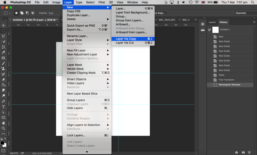
After that, I went onto the layers panel to the right side of the image shown above, and deleted the original layer of that image (before I cropped it) so that I was left with a cropped version of that photo which I made as a square shape.
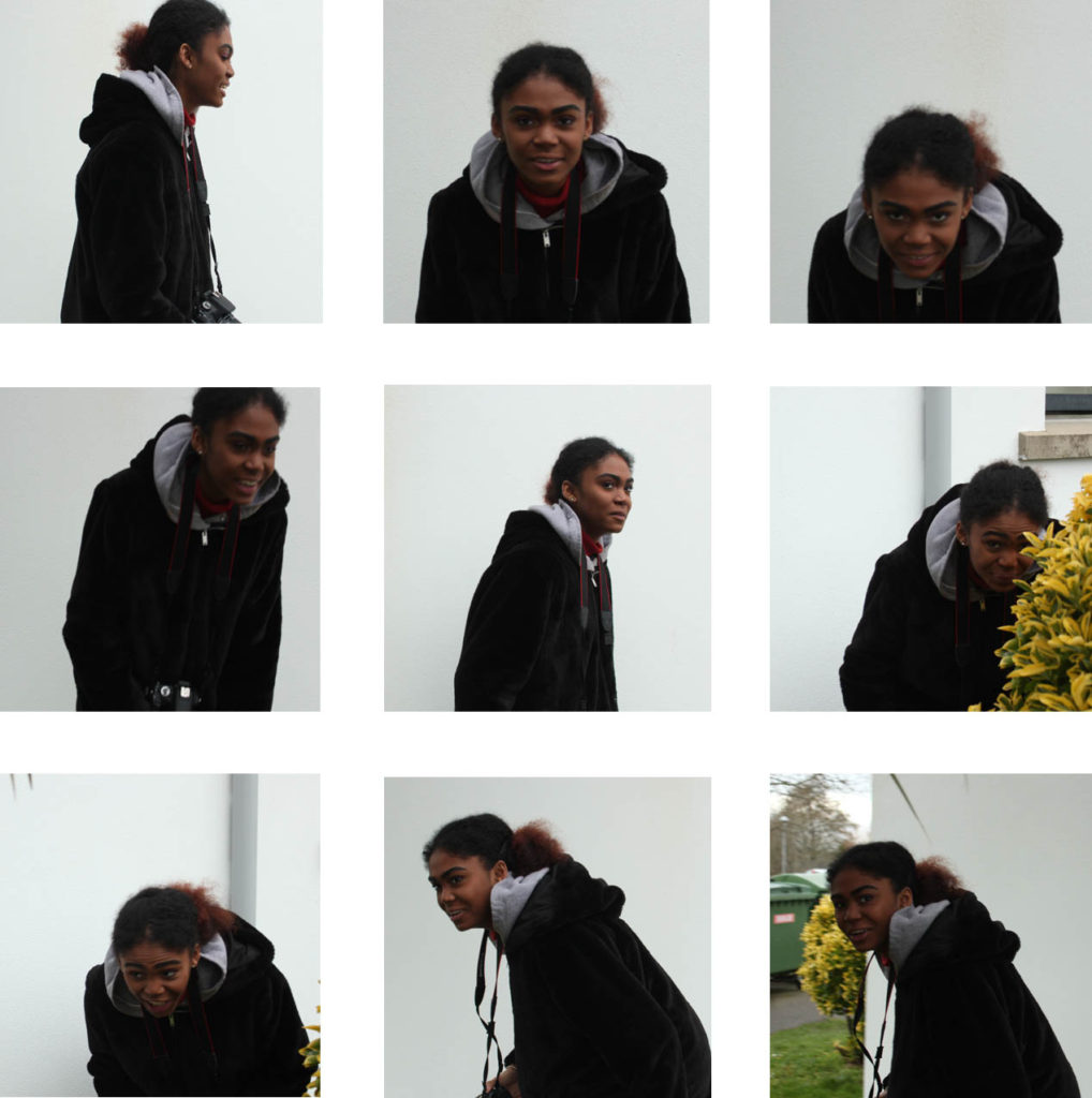
Here is my final outcome as shown above.
Experiment 3:
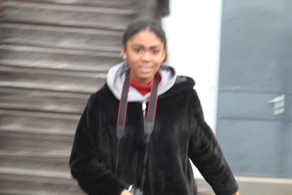
I did the same game of play, where the model had to run round and dodge the camera and make actions as if she was boxing, yet I wanted to experiment with the ISO again. So, for this experiment, I lowered the ISO to 1/100. This made the images blurrier due to a slower shutter speed.
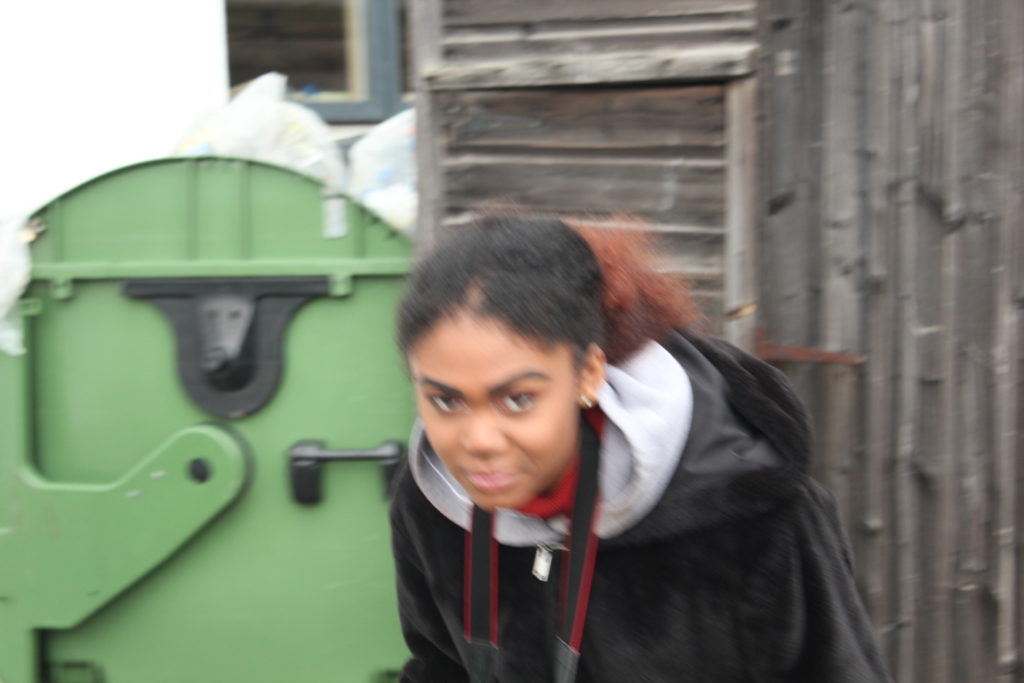
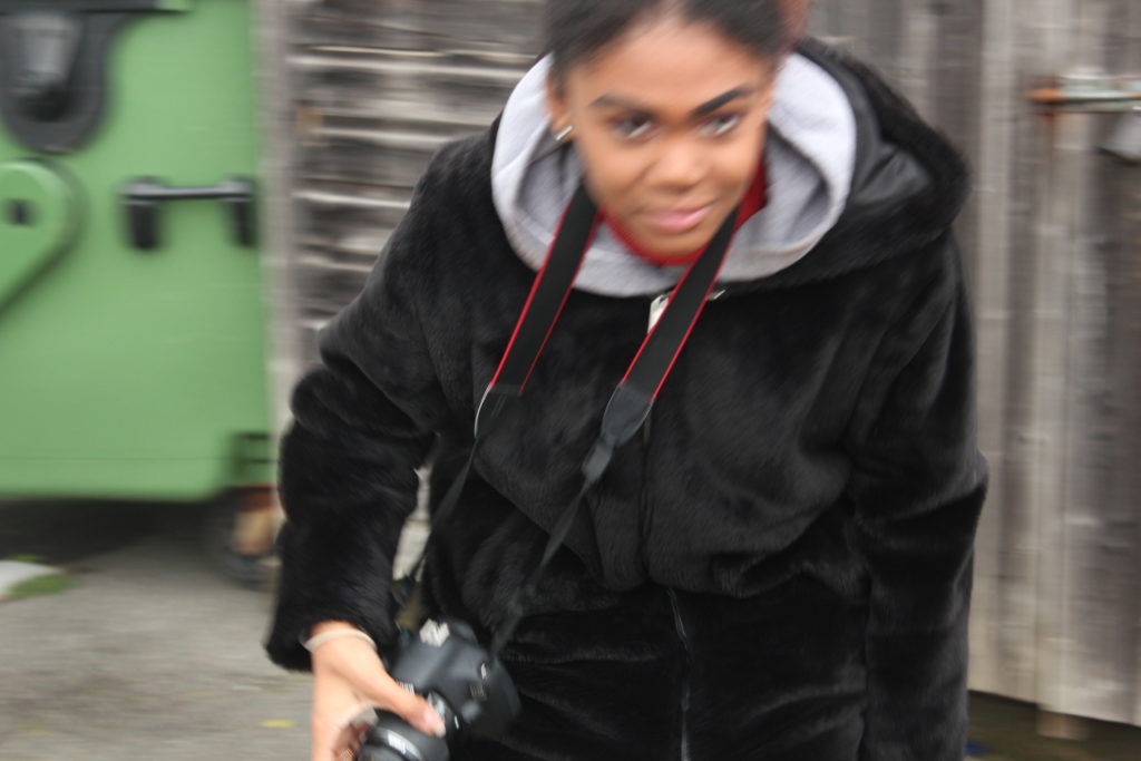
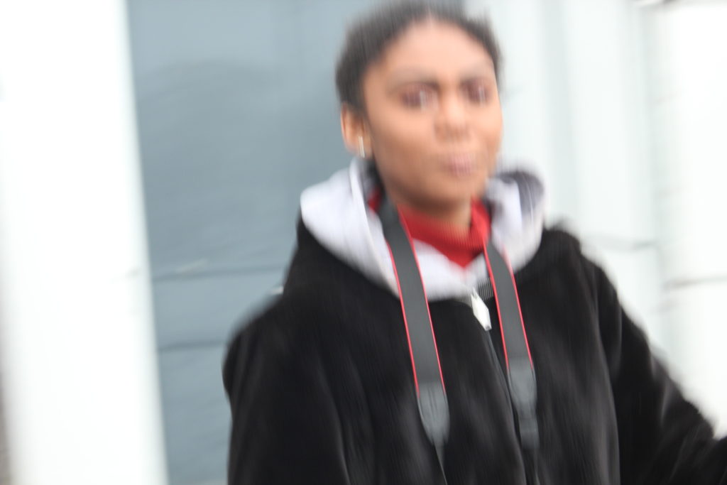
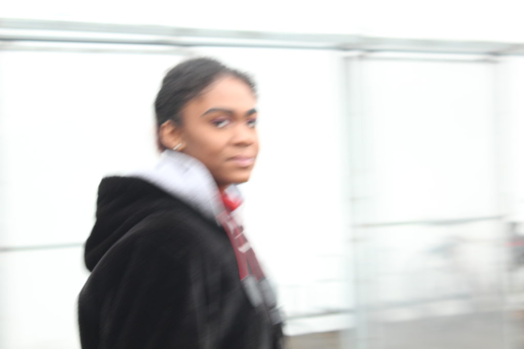
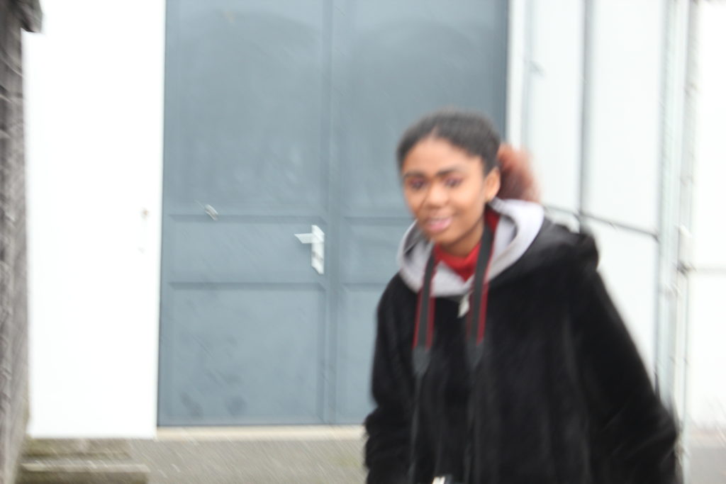
Overall contact sheet of my first ‘play’ shoot:
Experiment 4:
For this experiment, I got my model to throw up one yellow ball in the air. This was an idea inspired by Baldessari, again, as he throw oranges up into a clear sky in California. However, because the sky was cloudy and grey (unlike Baldessari’s blue sky,) I chose a yellow ball to throw into the air as I felt this would be a clearer colour to see in the dark, gloomy sky. I experimented with the ISO; the first image is with an ISO of 1/200, which made my image appear lighter. The other 2 images are where I experimented with a lower ISO so they appeared darker.
Expriment 5:
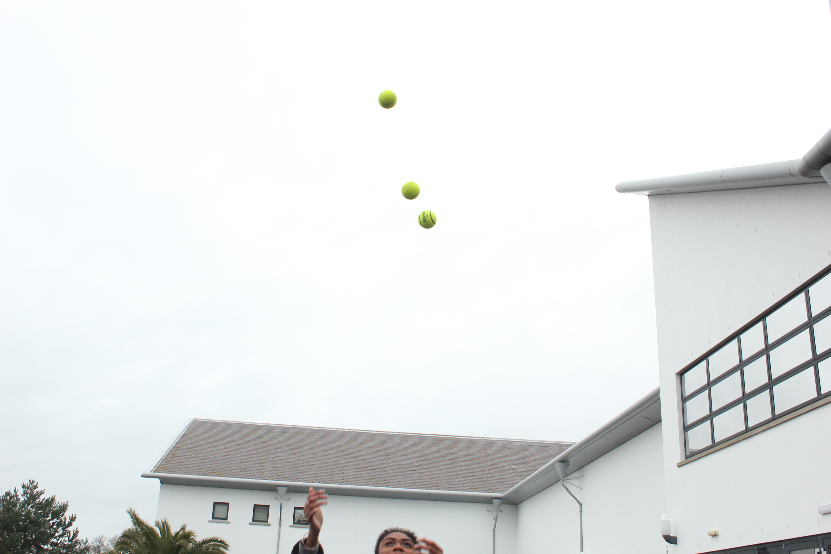
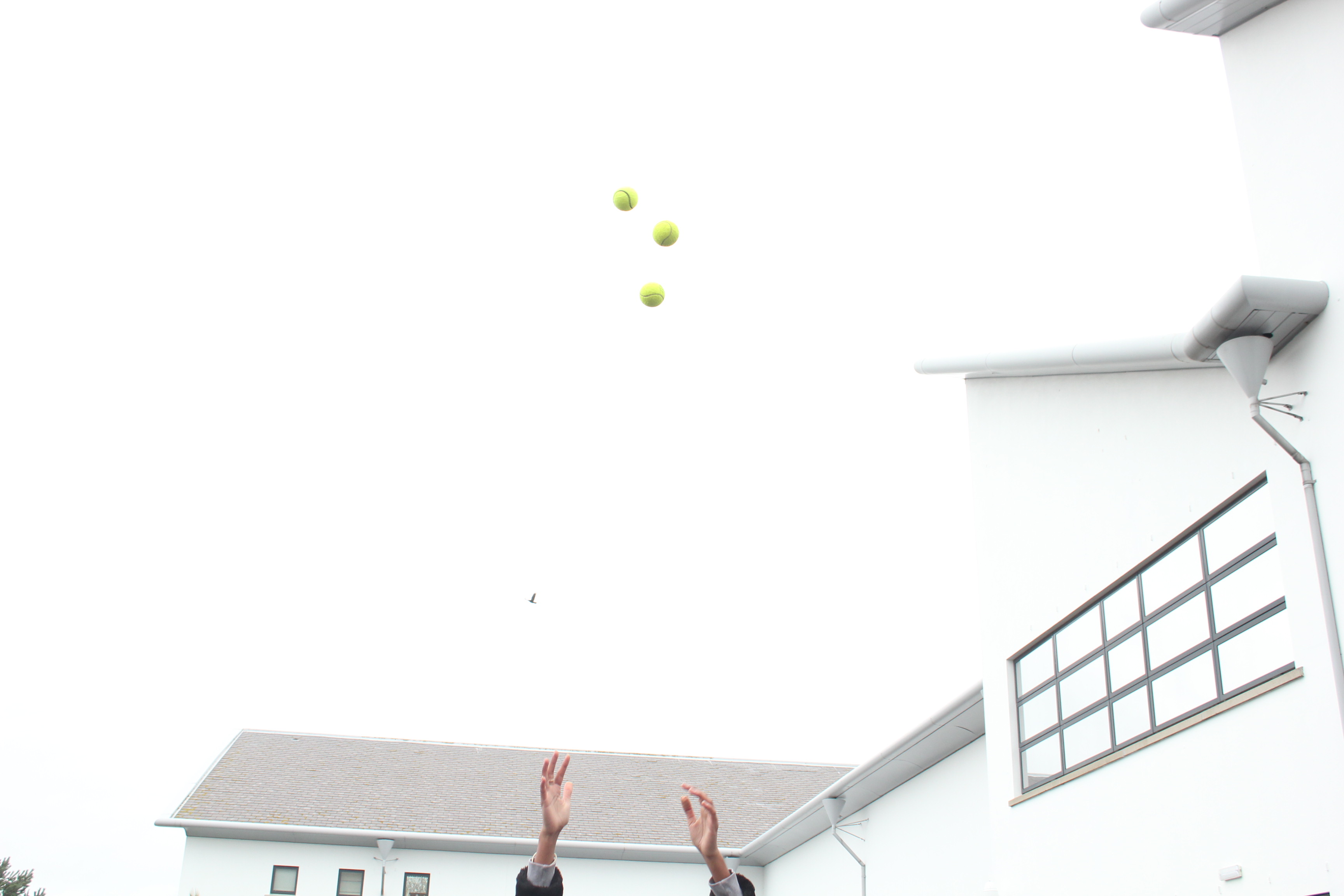
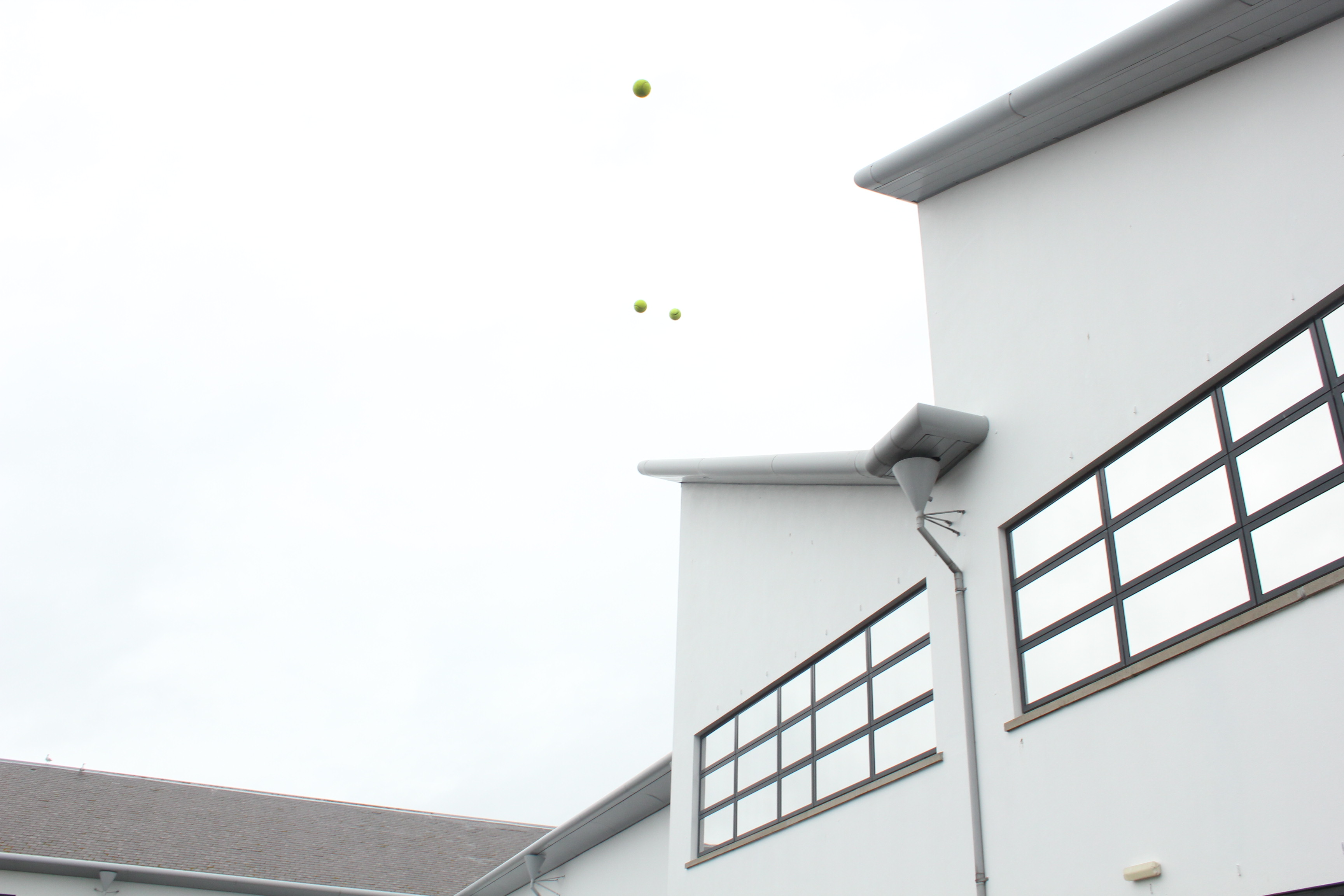
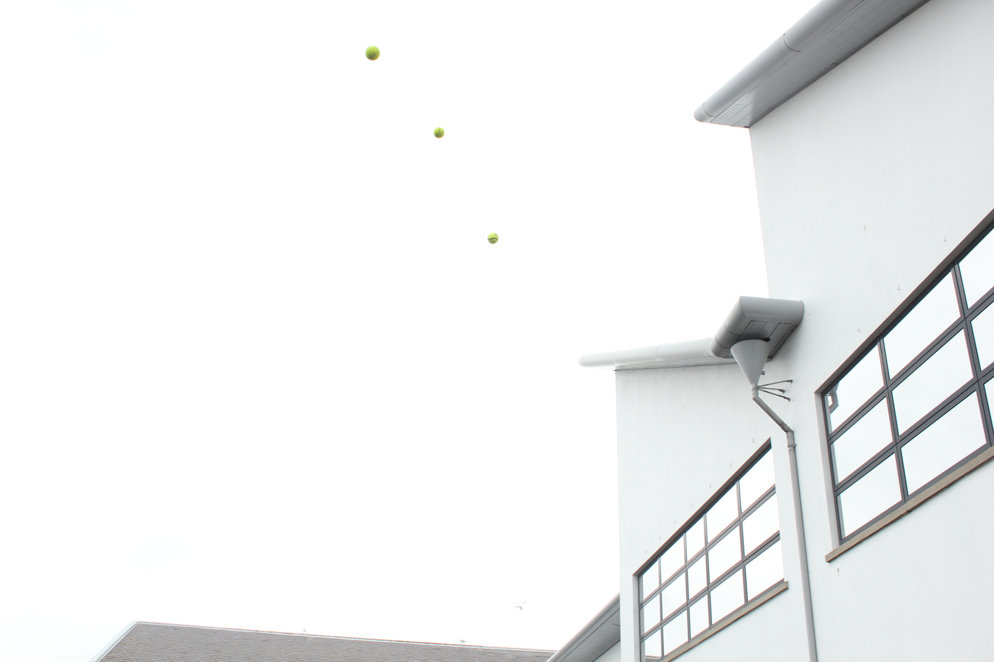
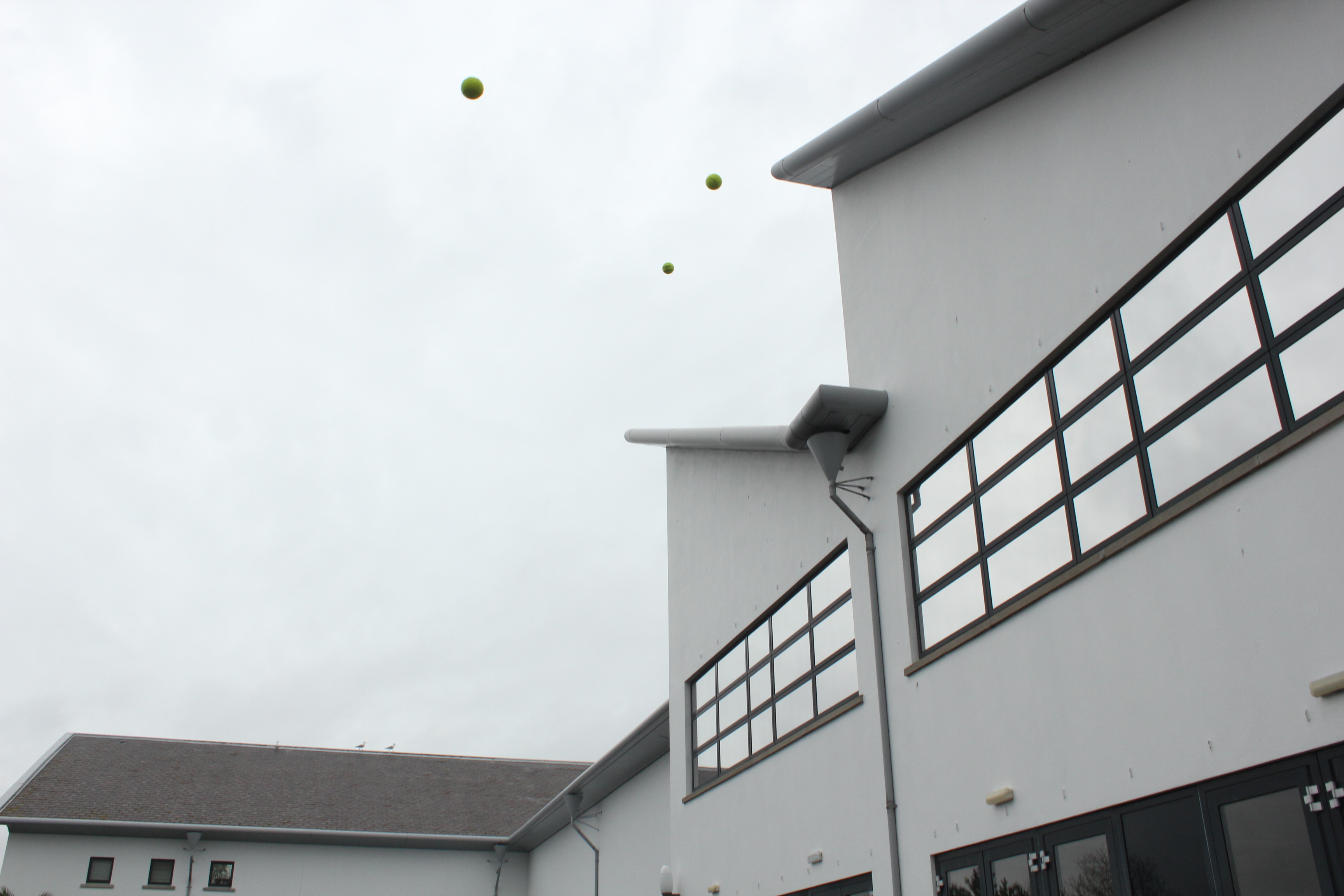
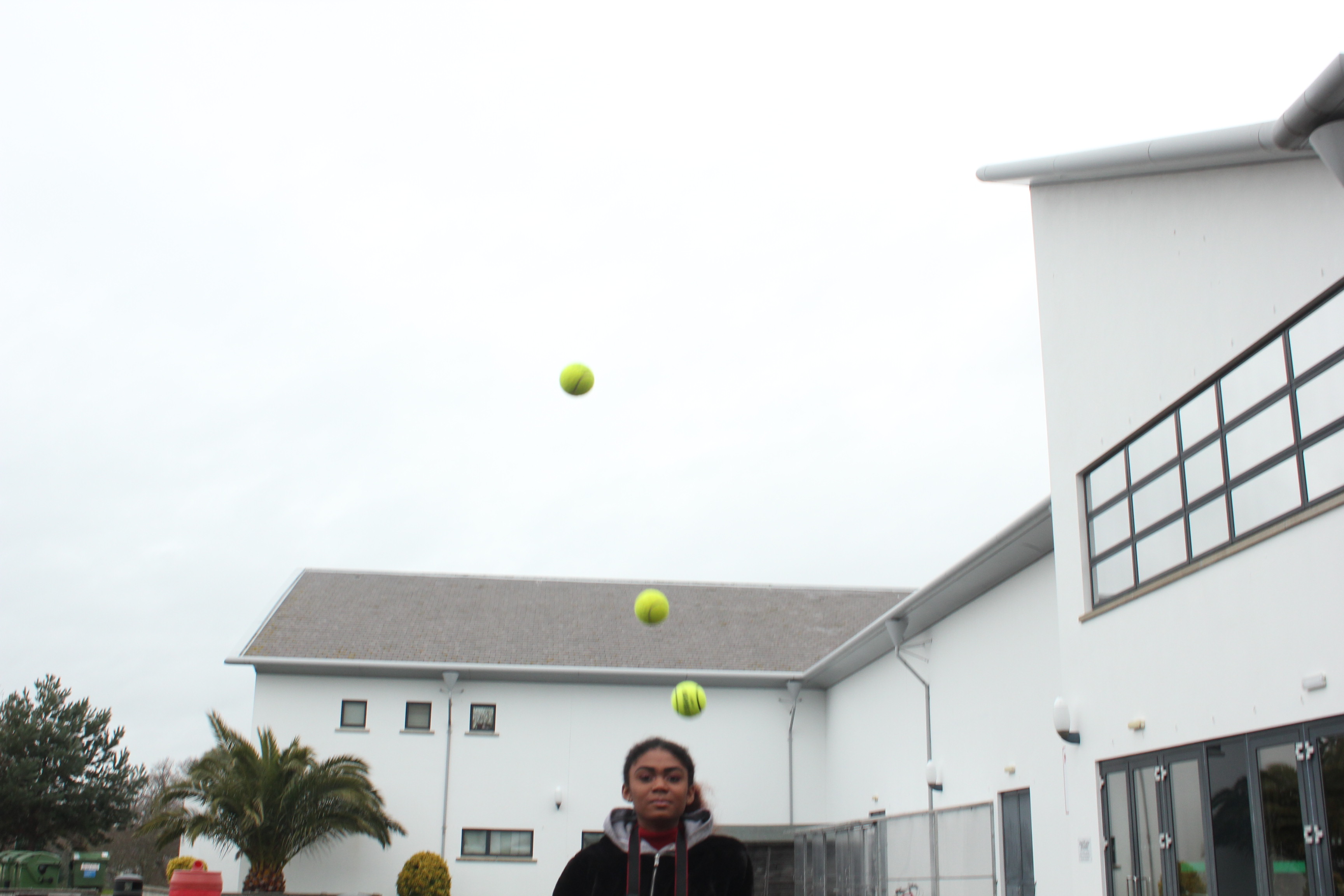
With this experiment, I then used 3 yellow balls and got my model to throw them up into the air, again, like Baldessari’s work of throwing oranges into the sky. To achieve a similar image to his, I got my model to throw all 3 balls at the same time, so that it created a line of the 3 balls.
