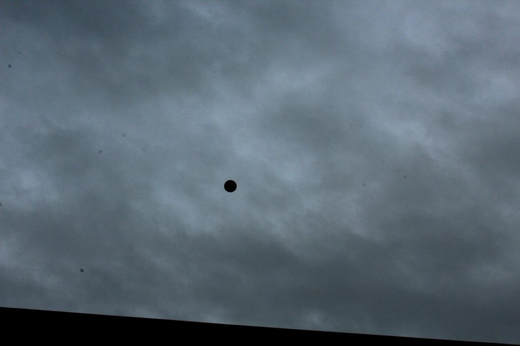
For my response to Hiroshi Sugimoto, I photographed the horizon and edited the images by cropping them into squares, adjusting the contrast and applied a black and white filter. I feel that my last image in this response is the best result.
Daily Archives: March 6, 2019
Filters
JOHN BALDESSARI, REPONSE
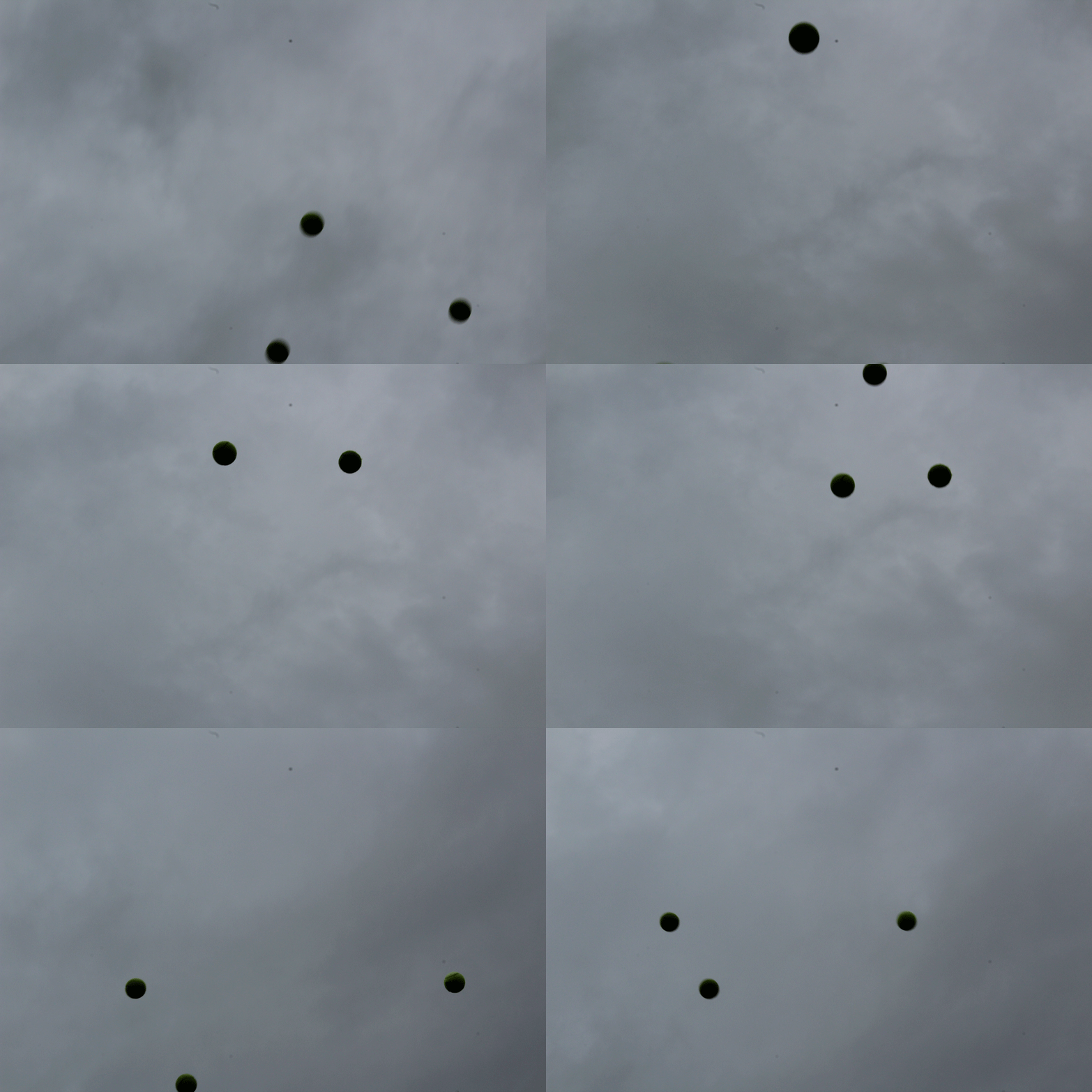
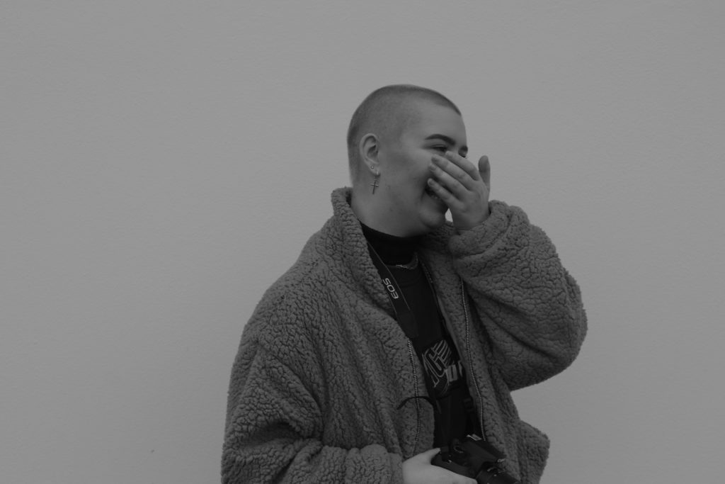
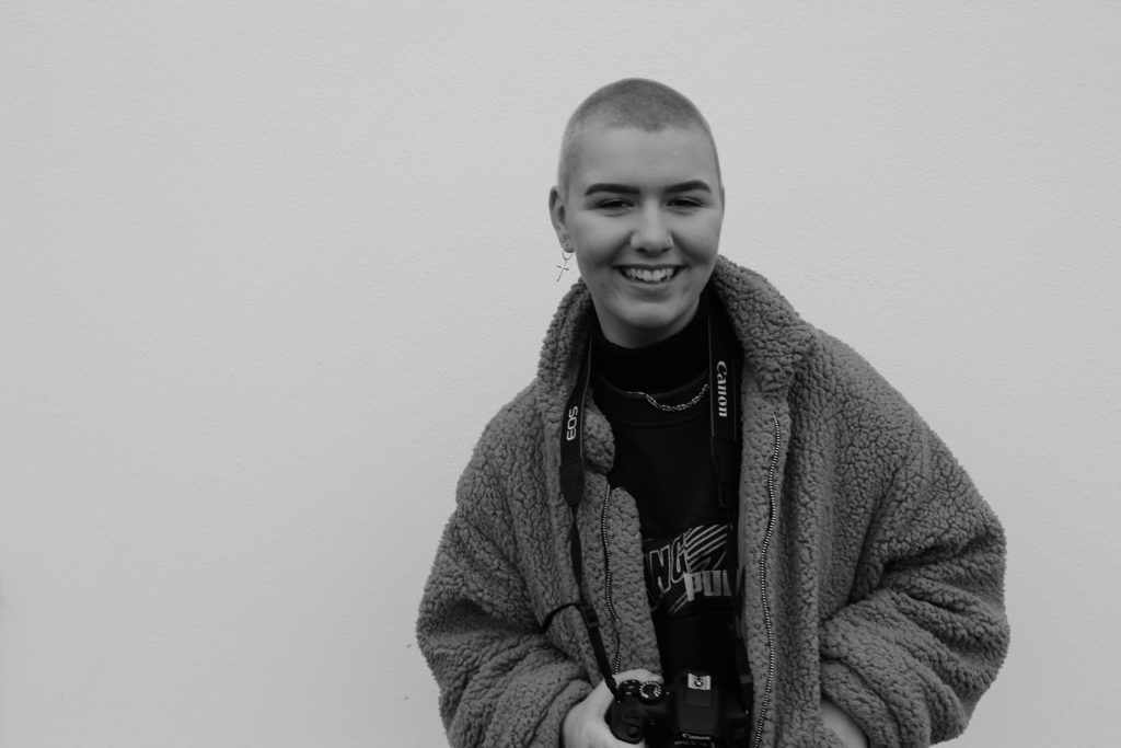
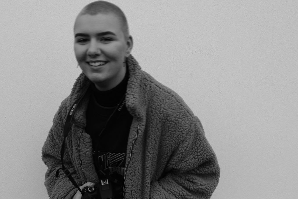
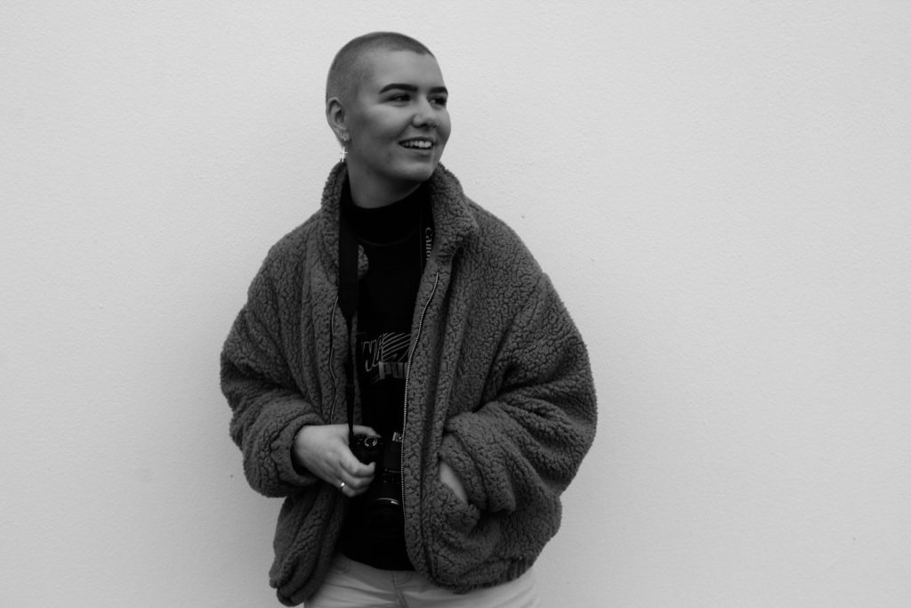
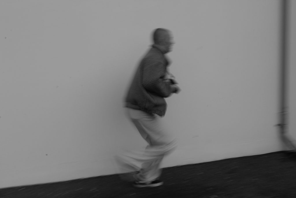
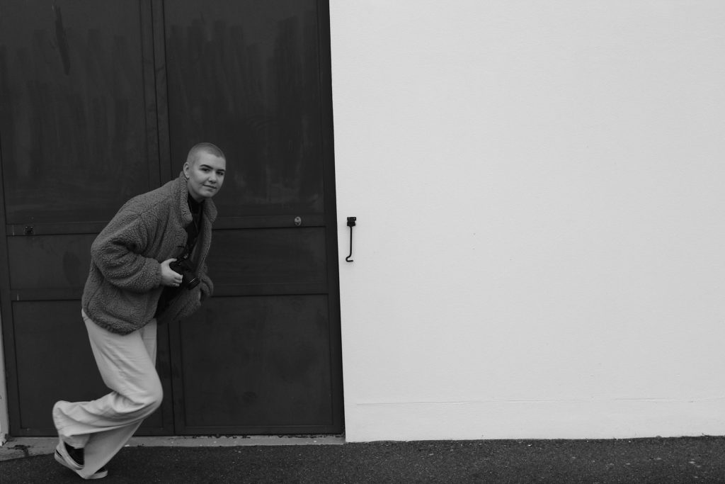
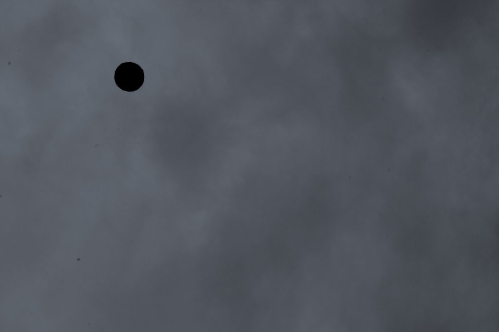
This shoot was inspired by both Baldessaris video of what is art, and then subsequently a response to throwing and lining up balls in the air. Although I believed I have mimicked the same or similar composition, and a real raw reflection of motion and a sense of reality within the images themselves. I have edited the images above to be in black and white, much like the video itself, I believe this also brings more of a directed narrative to the central character of the girl herself, and her emotional expressions of her own artistic voice. I believe I could further these images of the girl, with small aspects of coloured dots, possibly on her, to enforce more of his more pop culture concerned themes. I wanted too to capture images showing movement of her running, as this shows a more realistic approach of herself. My favourite image is the one on the bottom right, when she is running yet has direct eye contact at her camera, This demonstrates a breaking of the third dimension and relationship to which she is addressing and almost questioning the viewer on her actions.
Analysis: For this shoot it is evident that I was inspired by the artists own work of capturing ‘ a line of three tennis balls’, however, evidently I decided to focus on one larger ball, and have not successfully achieved a line of all three. Although, I belive using just one ball too creates an interesting more centered composition to the piece itself. I could however, edit the image and create an illusion of three balls, despite The fact that I could, I do not think this is the approach Baldessari would use. I believe if I was to repeat the shoot with a larger multitude of time and shots, much like the artists himself, the odds would be much greater.
My Response – Micheal Wolf


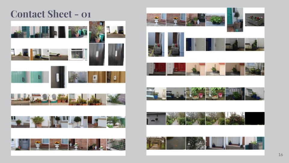

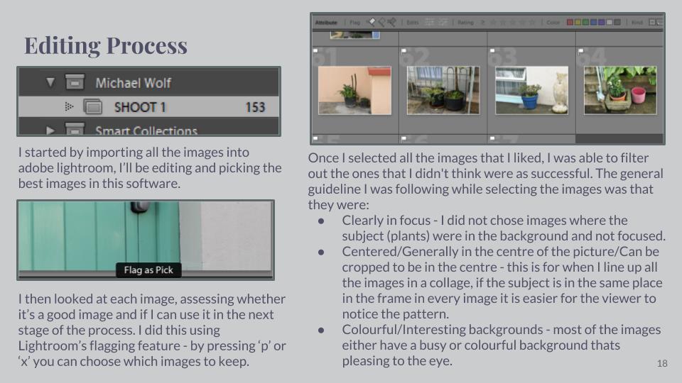


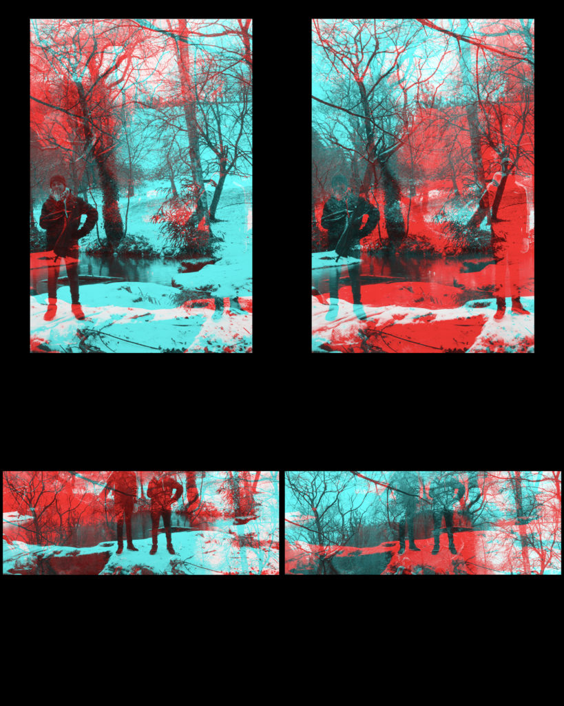
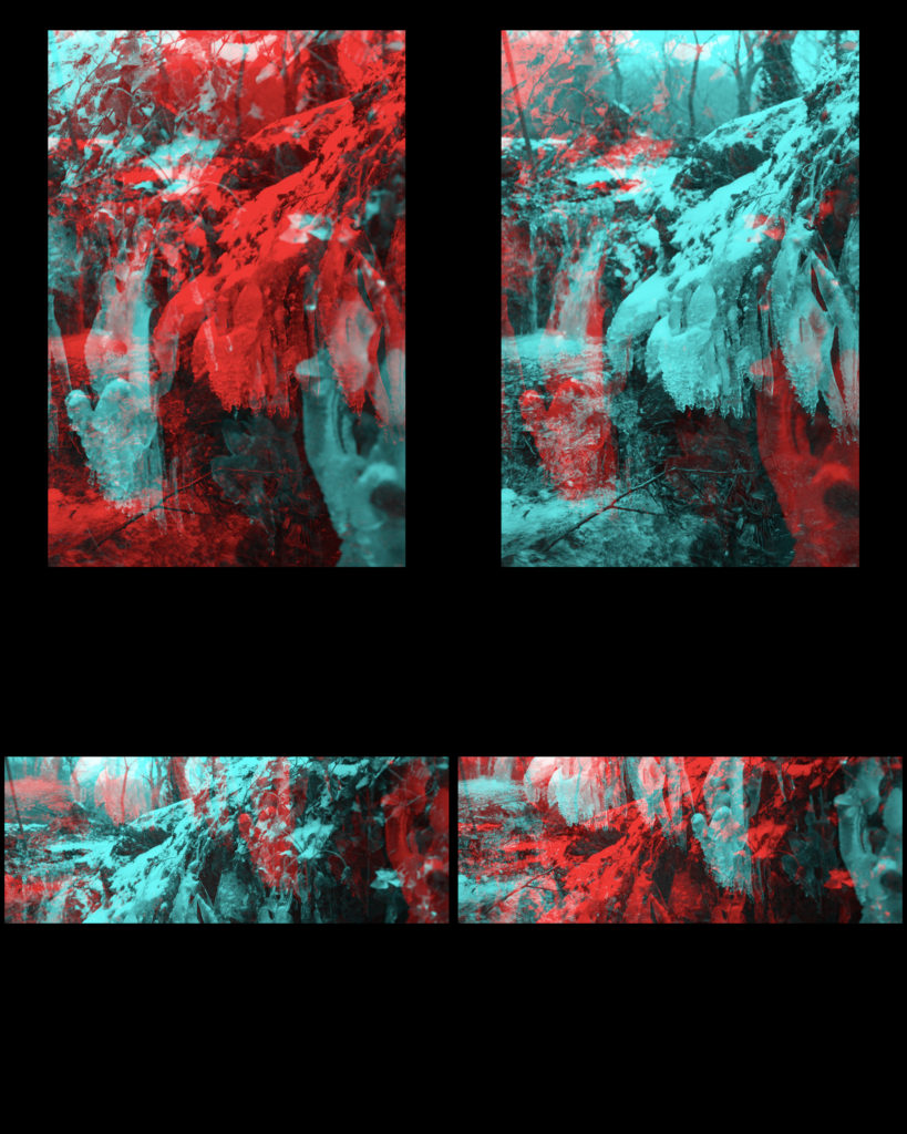
A2 Photography Exam – Civil War Stereography response
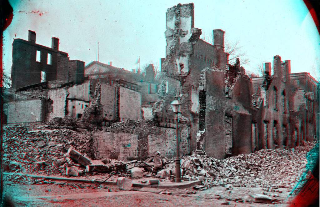
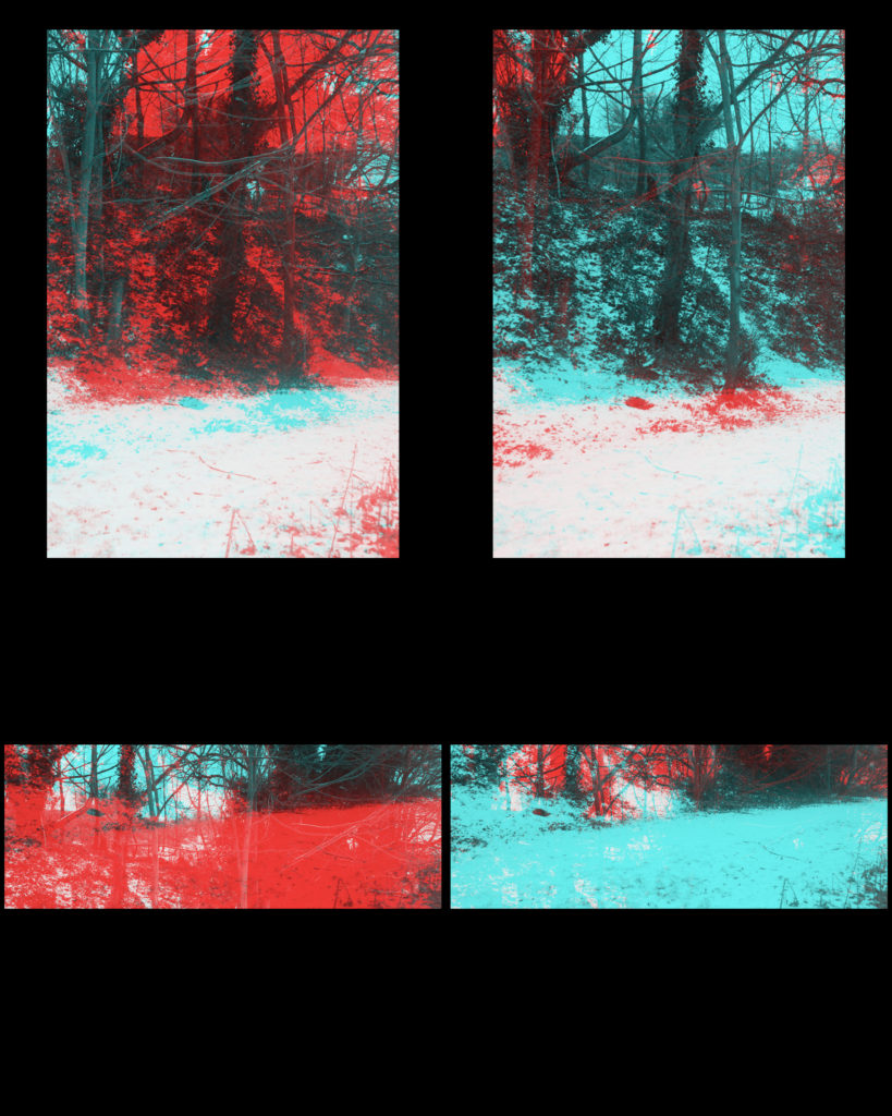
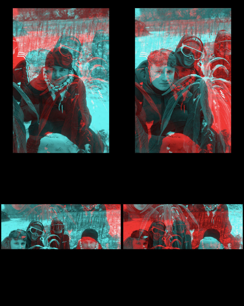
For my response to the Civil war Stereographs I will be using this photo as reference and I will be using these images for the edits.
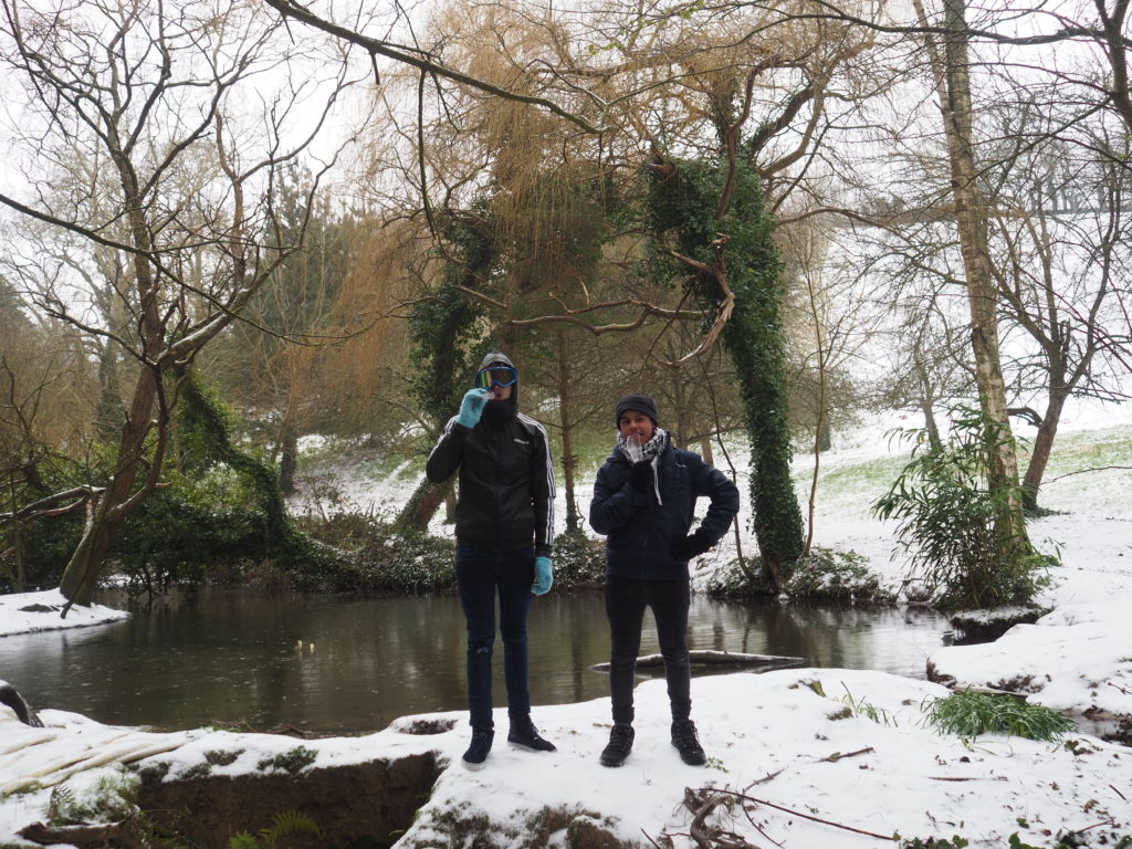
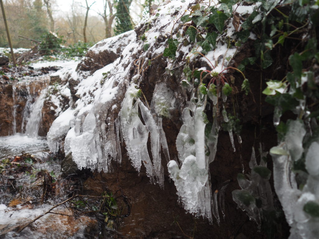
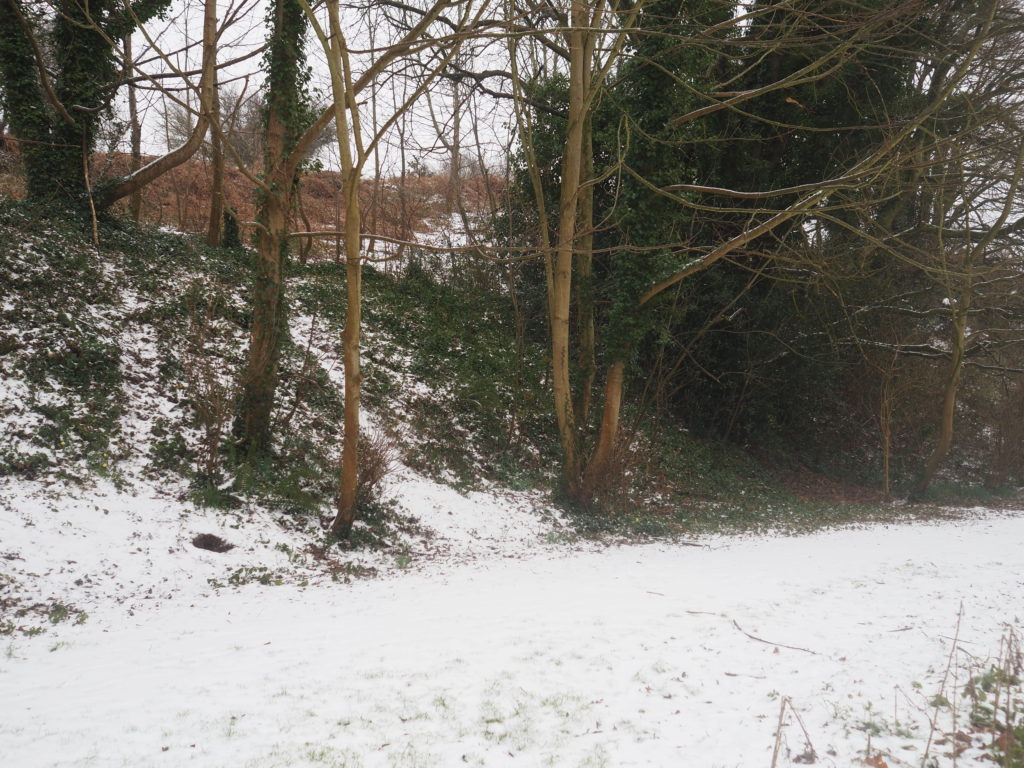

To create these stereographs I used an application called XstereO Player, it allows you to use red and blue, or green and magenta. I used photos that I took on a snow day a while back. The image shapes you can get are a standard portrait, or a wider landscape.
My Response to Huang Qingjun
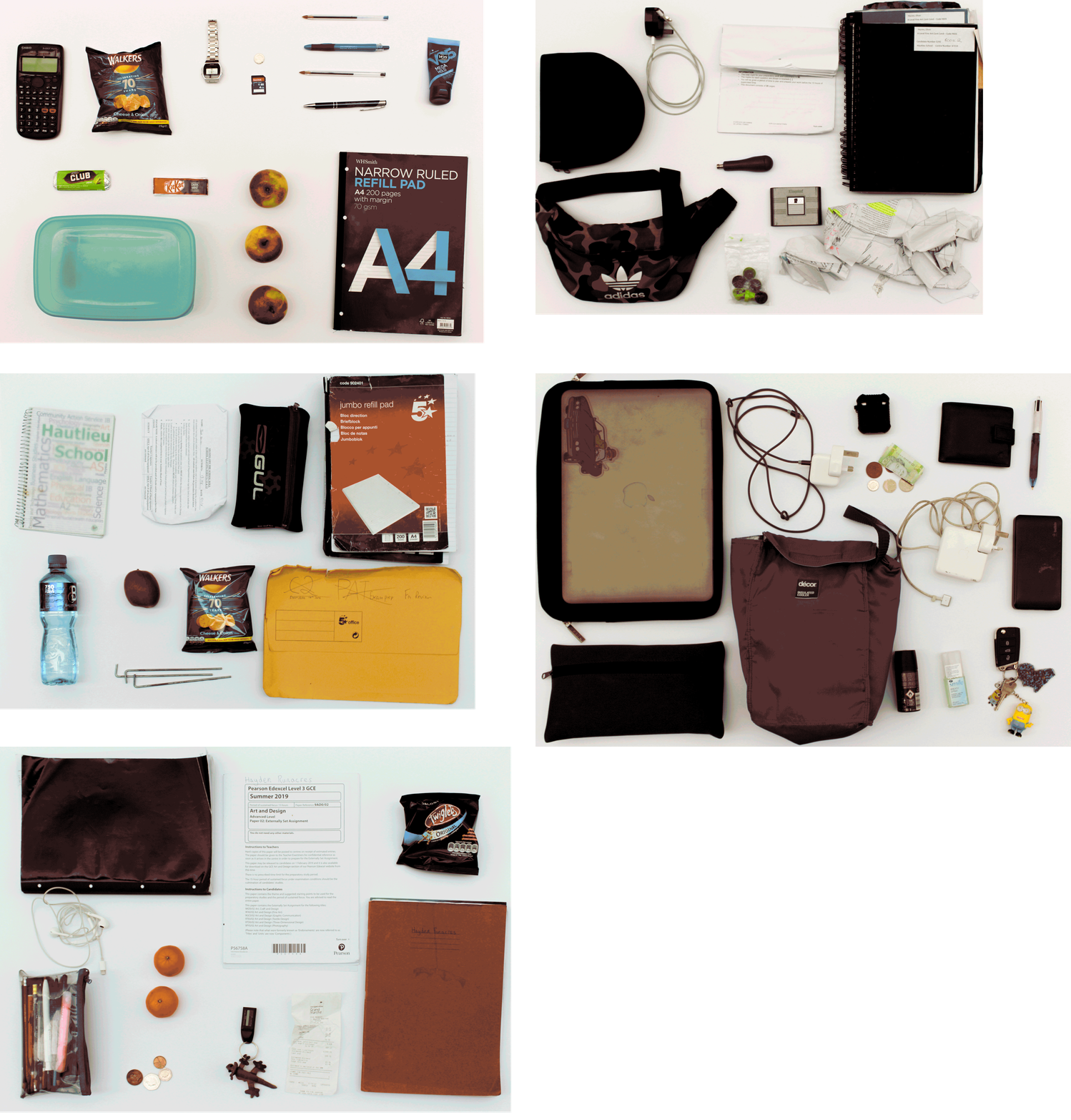
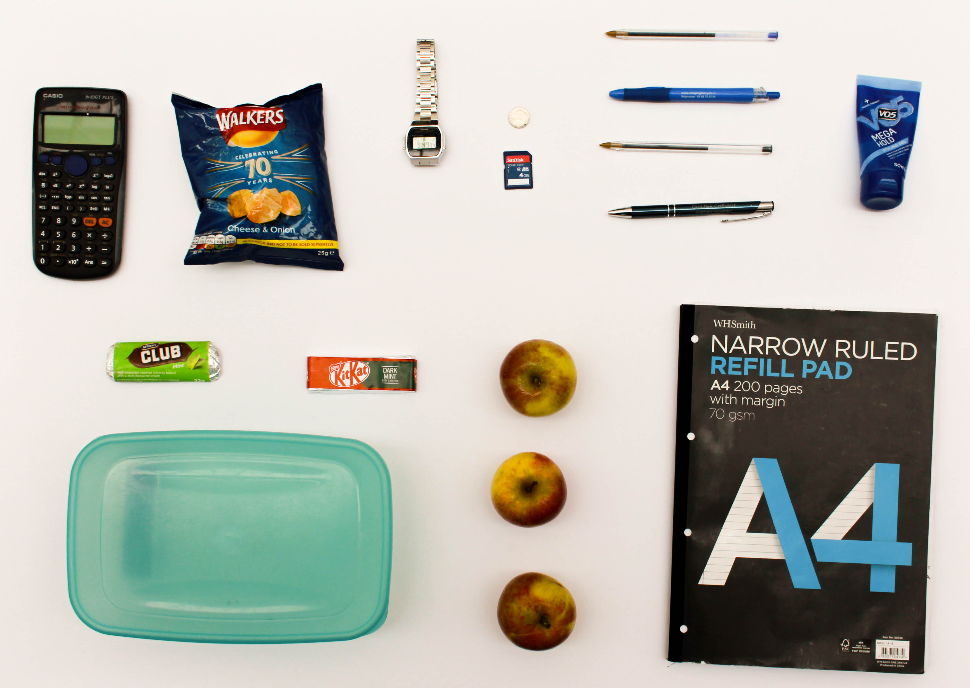
The idea behind this shoot is to explore the different items that people regularly carry around in their school backpack in order to look at the similarities and differences between the contents as well as giving a slight insight into who the person is and what their interests are. Some of the bags that I took photographs of contained only the minimal indicating that the person may be very organised or may not like to carry much on them whereas other bags had lots of random items in them which may suggest they like to ensure they have what they could possibly need throughout the week on them at all times and may not mind having clutter in their bag. This shoot relates to ‘Variance and Similarities’ as it can show how one standard thing that everyone does/has can vary so widely but then at the same time they will all have similar items within the bags, such as pencil cases or lined paper. The shoot takes inspiration from Huang Qingjun’s ‘Jiading’ meaning ‘Family Stuff’ and shows an insight into the unlimited variety of combinations of different belongings that people may carry around with them.
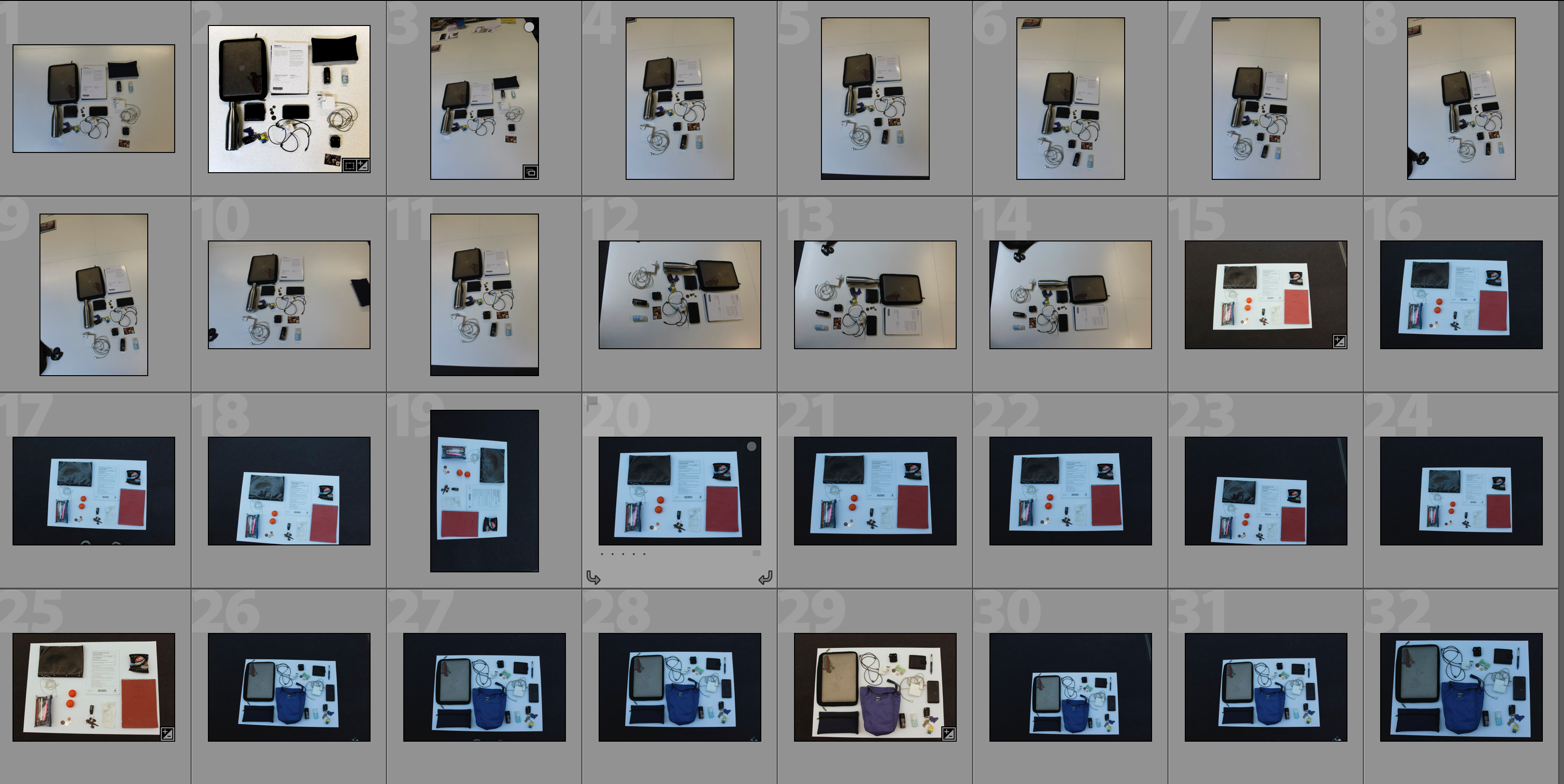


In order to capture the photographs I would empty out the bags onto a blank sheet of white paper and arrange the items into a displayable arrangement with slight separation between each item in order to allow each item to be observed individually. A would then photograph all contents from the same height facing the camera directly towards the floor. I edited the photographs to create the outcome achieved by first editing the distortion of the picture and the perspective so that the photograph would be face-on to the camera and then I would crop it so that only the white background can be seen. I then changed small features such as white balance, exposure and contrast to create a more visually aesthetic composition. The idea behind the editing was that each photograph would have the same setup to allow the features to be compared side-by-side.

Experimentation with GIF’s
Below I have experimented with presenting my outcome in the form of a GIF. The first GIF shows each frame for 0.2 seconds whereas the second GIF shows each frame for 0.5 seconds. I have included both speed of GIF’s as I feel that they present the photographs in different ways – the faster GIF creates a more abstract approach where the viewer has to concentrate closely to pick apart the individual photographs whereas the faster GIF’s allow the viewer to focus more on each individual photograph and to compare the photograph’s features more. The use of a GIF allows for quick comparison of the photographs in an interesting way and suggests how different each picture is even though they have a different layout because the first thing the viewer notices is shapes and colours and then they have to look closer to understand what the photograph is showing them.

Analysis
In this photograph I have used the natural lighting from the roof windows in order to ensure that a consistent light is spread across all of the items within the photograph. The skylight also allows for the light to shine directly down onto the items from the bag and so reduce the shadows within the photograph to emphasise the difference between each item and the shapes within them. Due to using a sharp white sheet as the background for this photograph there is a clear contrast between the items, such as the apples, and the background. This has also allowed for the tones within the photograph to be more clearly defined. I used a deep depth of field to capture this photograph as I wanted to ensure that all of the items featured in the photograph were clear and sharp because each item featured gives an insight into the personality and life of the person to which the items belong. I used a shutter speed of 1/60 when taking this photograph as well as an ISO of 100. The low ISO ensured that the noise within the photograph was kept to a minimal and that the photograph was as of high quality as possible – the 1/60 shutter speed paired with this to ensure that there was enough light entering the lens from the surrounding environment and that the photograph was correctly exposed. There is a slightly warm colour cast to the photograph which reflects the fact that this shows items which everyone is familiar with, and so creating a warm feeling.
This photograph contains a wide variety of colours due to the fact that there are varying items that use different colour schemes to appeal to their target market, such as chocolate bars using colourful packaging and note pads using more subtle grey tones. Using the white background to place the objects on has allowed the shapes of the items to be clearly defined as well as the textures within them – the shininess of the crisp packet and its creases can be seen for example. There is also a slight 3D effect due to this reason and slight shadowing – this helps to emphasise the individual features of each object. The objects have not been set out in any specific way or pattern; they were set out in a way that displays each of the objects individually therefore the layout is quite random and forces the writer to focus on each subject rather than as a collective.
The idea for this shoot comes from Huang Qingjun’s ‘Family Stuff’ project in which he would photograph the rural residents of China outside of their houses along with all of their personal possessions. My work on this shoot links to this work by Qingjun as these contents of an individuals bags give an insight into who the owner of the bag is, in the same way as the possessions of the Chinese residents gave an insight into the way in which those people lived. When the photographs in this shoot are paired together it creates comparison between the different contents of bags to show both variance and similarity between people and the objects that they tend to carry around with them in a school bag. The variety of items that are carried in each bag show whether the person likes to carry either the minimum with them or carry clutter, as well as often showing an insight into their diet. Small details such as these start to paint a bigger picture of who these people are.
ESA// Hiroshi Sugimoto
Hiroshi Sugimoto is a Japanese photographer and architect. He was born in 1948 in Tokyo, Japan. In 1970, Sugimoto studied politics and sociology at Rikkyō University in Tokyo. He retrained as an artist in 1974 and recived his BFA in Fine Arts at the Art Center College of Design, Pasadena, California. He later settled in New York City and soon started working as a dealer of Japanese antiquities in Soho.
He has spoken of his work as an expression of ‘time exposed’ or photographs that serve as a time capsule for a series of events in time.
In 1980 he began working on an ongoing series of photographs of the sea and its horizon, Seascapes, in locations all over the world, using an old-fashioned large-format camera to make exposures of varing duration (up to three hours).
The black-and-white pictures are all exactly the same size, bifurcated exactly in half by the horizon line. Many of his images lack any physical detail which would make the objects of his photographs easily distingushable , instead, he strongly focuses on lighting and textures in his work.

photograph
This photo has been taken using natural lighting while being carefully positioned in order so that the horizon in the middle of the photograph. This taken rule of thirds seems to have been considered in terms of the shading differences in the background and foreground. There is a large tonal range of grey, where there is a gradual shade change, from the darkest point along the bottom of the image and the lightest being at the top. There is a very short depth of field considering that the photo is mostly blurred from the fog. However the foreground of the image is the only part to be in focus and where textures can be seen from the small ripples in the sea, although it is very still. The dark, grey/blue tones bring a cold temperature to the photograph along with the low light sensitivity where we can just about see the horizon in the middle of the image. Although the image is blurred and obscure there are no rounded or curved shapes. Everything is very straight but there are no outlines.
Sugimoto’s image brings a sense of romanticism in their evocation of landscape, related to Ansel Adam’s approaches to photography. This image shows how he sees nature. Sugimoto has said: ‘When I look at nature I see the artificiality behind it. Even though the seascape is the least changed part of nature, population and the resulting pollution have made nature into something artificial’.
Possible responses could be:
- Seascapes
- At dusk/sunset
- At dawn/sun rise
- On an overcast day to have a similar hue over the entire photograph
Origins of Conceptualism

DEFINITION = Conceptual art is art where the idea (or concept) behind the work is more important than the finished art product/object.
It emerged as an art movement in the 1960s and the term usually refers to art made from the mid-1960s to the mid-1970s. When an artist uses a conceptual form of art, it means that all of the planning and decisions are made beforehand and this has greater importance that the artists final outcomes. Conceptual art can be anything – the overall visual aspects of conceptual art may be confusing, misleading or it could be boring or interesting. The reason that it became an art movement is because of its intriguing features – many people look at conceptual art and wonder why an artist has displayed something in this form. There are many artists that had made conceptual art, but it was only defined as a distinct movement in an article written by Sol LeWitt in 1967. The link attached shows many of the artists that have formed conceptual art, and many of their exhibitions. Some of these are Bruce Nauman, Martin Creed, John Baldessari and Bernd Becher and Hilla Becher. They all take approaches to this that have influenced many other artists and artworks. For example, Bernd and Hilla Becher focus their work on typologies.
Variation and Similarity
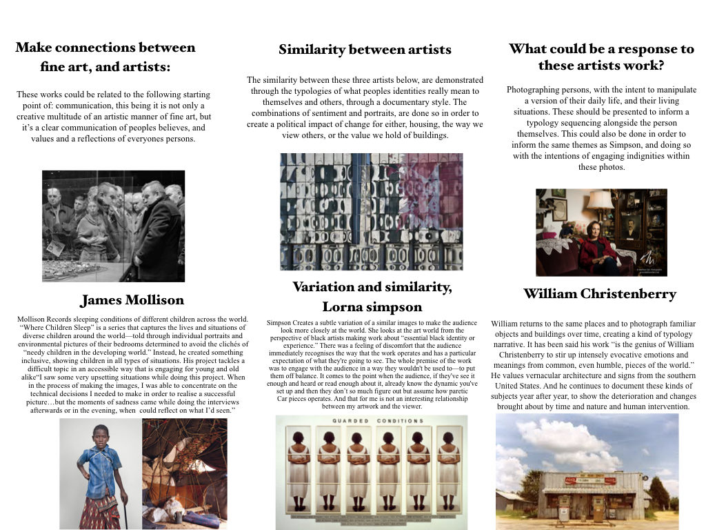
Variation and Similarity is the given title for our exam. I In this post I will be showing my understanding of this title as well as looking at ways in which I can explore it.
Variation
Definition
A change or slight difference in condition, amount, or level, typically within certain limits.
A different or distinct form or version of something.
Synonyms regarding variation
Difference, Contrast, Variant, Form
My understanding of the word variation is that features or characteristics can vary massively between subjects and so give these subjects different characteristics.
Similarity
Definition
The state or fact of being similar.
A similar feature or aspect.
Synonyms regarding similarity
Likeness, Sameness, Parallel
My understanding of the word similarity is that two things that have similarities have many things which are somewhat parallel to each other and so have things in common that are comparable.
Lorna Simpson
John Baldessari
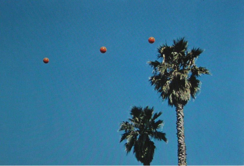
This photo series documents John Baldessari’s repeated attempts at throwing balls in the air, hoping they form a straight line. Baldessari invented and pursued this seemingly meaningless challenge. These photographs demonstrate Baldessari’s interest in exploring the structure and limits of games and language.
My response
