Impressionism – Historical Context

Impressionism is a 19th-century art movement characterized by relatively small, thin, yet visible brush strokes, open composition, emphasis on accurate depiction of light in its changing qualities (often accentuating the effects of the passage of time), ordinary subject matter, inclusion of movement as a crucial element of human perception and experience, and unusual visual angles. Impressionism originated with a group of Paris-based artists whose independent exhibitions brought them to prominence during the 1870s and 1880s. The impressionist artists were not trying to paint a realistic picture, but an impression of what the person, object or landscape looked like to them. This how the name of the movement came about – impressionists. They wanted to capture the movement and life of what they saw and show it to us as if it is happening before our eyes.

Image result for impressionism

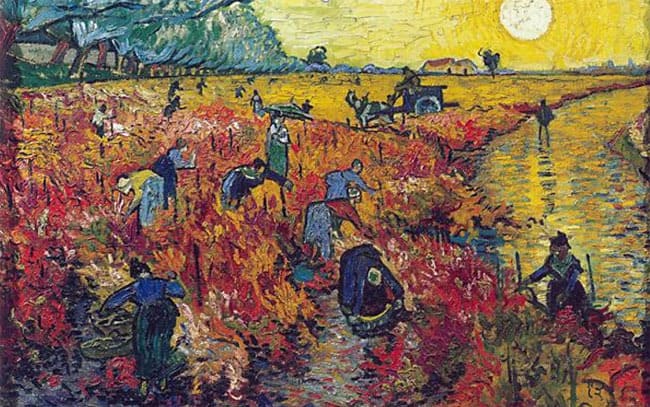
The sudden change in the look of these paintings was brought about by a change in methodology: applying paint in small touches of pure colour rather than broader strokes, and painting outdoors scenes to catch a particular fleeting impression of colour and light. The result was to emphasise the artist’s perception of the subject matter as much as the subject itself.

Impressionist art is a style in which the artist captures the image of an object as someone would see it if they just caught a glimpse of it. Usually when you imagine a scene you view this the same all the time, however it should differ as time goes on because the lighting is always changing. Impressionists paint their pictures with a lot of color and most of their pictures are outdoor scenes. Their pictures are very bright and vibrant with the absence of detail but with bold colors. Some of the greatest impressionist artists were Edouard Manet, Camille Pissaro, Edgar Degas, Alfred Sisley, Claude Monet, Berthe Morisot and Pierre Auguste Renoir.
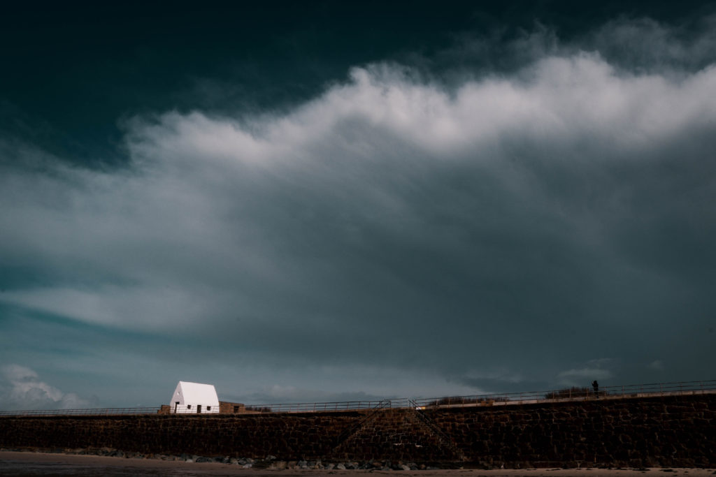
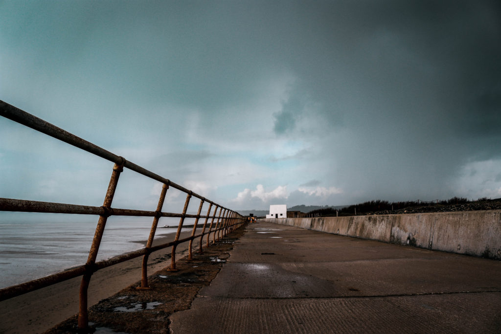
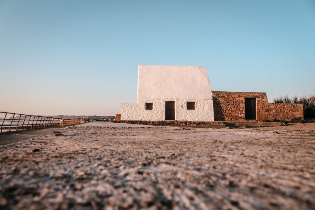
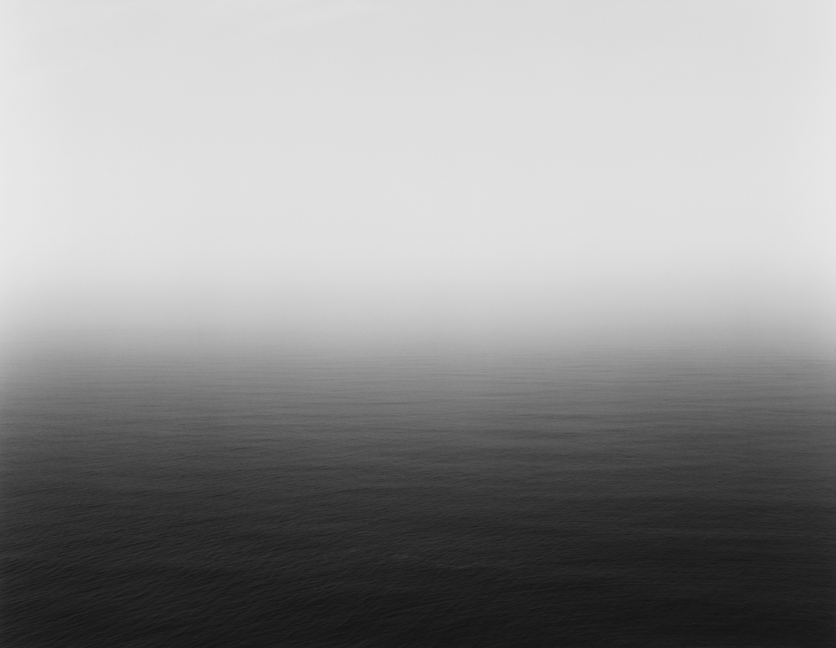
Monet was interested in subtle changes in the atmosphere which I have taken a particular interest in shown through my previous shoots.

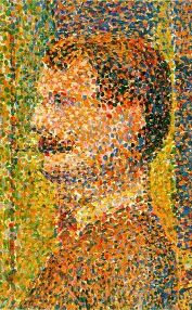
Impressionist covers much of the art of this time, there were smaller movements within it, such as Pointillism, Art Nouveau and Fauvism. Pointilism was developed from Impressionism and involved the use of many small dots of colour to give a painting a greater sense of vibrancy when seen from a distance.

Image result for Pointillism

Before impressionism, landscapes in art were often imaginary and painted perfectly from a studio. The impressionists changed all that. They painted outdoors and on the spot. As they were outside, they looked at how light and colour changed the scenes and painted what lay in front of them. The technique of impressionism allowed the artists to quickly paint what was in front of them resulting in what some people argued to be ‘messy’. Lots of people didn’t like impressionism as they thought it was a bit messy and that the paintings looked unfinished. They thought art should be neater and that subjects in art should be more important than just everyday scenes. I argue against this point and believe that it is an interesting technique that allows an appreciation for the depiction of light which is often overlooked when looking at an art piece.

HAYSTACKS BY MONET RESPONSE 2 – Cloudy Weather

Carrying on from my previous shoot, this shoot is dedicated to creating an intense and moody atmosphere. I kept a close eye on the weather and picked my time to undergo with this shoot carefully. As explained in my previous post, I am focusing on the white house location with a variety of weather conditions to portray how the weather can transform a familiar landscape. The end result will have my images in a typology which will allow an easy comparison between the different weather and lighting.

Contact Sheet

Edited Images

I was really happy with the way in which this shoot has turned out. The sky formed perfectly for the moody feel I was going for. I shot the majority of these photos with a very fast shutter speed to present us with a darker and more intense image. It worked well that my focal point was white as it really stood out against the dark background. These images will work extremely well along side the photos at sunset from my previous shoot helping me to demonstrate how lighting changes a landscape.

John Coplans

This image has an empty alt attribute; its file name is 2002.31.jpg

John Coplans (1920 – 2003) was a British artist, art writer, curator, photographer and museum director. Coplans is a veteran of World War II and emigrated to the US in 1960. He has exibitions in Europe and North America – including the Art Institute of Chicago, the San Francisco Museum of Modern Art and the Museum of Modern Art, NY. He is known for his series of black and white self-portraits which are a study of the naked and aging body. He photographed every part of his body but never his face as his photographs would not focus on a specific person or identity. Coplans’ photographs questioned the taboo of age through the forward style in which he addressed his body. Coplans stopped making paintings in the early 1960s and in 1979 took up photography; he says he decided to become a photographer because “I wanted to go back to being an artist. I had had enough of art history, critics, museology… I chose photography because I could not go back to painting… photography… is a medium to build an identity out of a composite personality, to find an artistic identity”.

“I have the feeling that I’m alive, I have a body. I’m seventy years old, and generally the bodies of seventy-year old men look somewhat like my body. It’s a neglected subject matter… So, I’m using my body and saying, even though it’s a seventy year old body, I can make it interesting. This keeps me alive and gives me vitality. It’s a kind of process of energizing myself to my belief that the classical tradition of art that we’ve inherited from the Greeks is a load of bullshit”

Coplans shows through this explanation that he believes just because he is older his body is not inferior to what a conventional body in its prime is – he believes that an aging body should be celebrated and documented for everyone to see. Coplans began to think about the body as being able to express a language through shapes and lines. The photographs produced by Coplans were always cropped tightly and dramatically enlarged. To capture the photographs Coplans would use a video camera and monitor to view parts of his body. Once he has selected an area, an assistant would take a photograph using positive/negative Polaroid film which would create an instant image as well as a negative used for later printing in large scale. The fragmentation of the male body and the manipulation to create ambiguous shapes recalls artistic classical sculptures such as the Belvedere Torso as well as sculptures by artists such as Franz Xaver Messerschmidt who would explore extreme expressions to create something away from the ordinary in the way that Coplans does.

Coplans/Tim Booth and ‘Variance and Similarities’

The work of Coplans is similar to the work of Tim Booth in ‘A Show of Hands’ in which he photographed portraits of subjects through their hands to show an insight into the subjects lives and professions through markings and objects related to the subjects’ lives, such as a chess piece for Lord Carrington’s portrait. Booth’s work explores the body in detail in the same way that Coplan does and brings emphasis to the small details and flaws within the human body and celebrates the details that make everyone individual. Both photographers also use a black and white filter in order to highlight the blemishes and veins rather than the viewer focusing on colours. These projects fit into the theme of ‘Variance and Similarities’ because they look at how each individual has unique marks, likes and shapes within their body that makes their body individual and unique to them – these may be features that the owner of the body believes is private to them or may be individual but obvious lines such as a person’s fingerprint. I believe that this is what Coplans is trying to show through his focus on his body; he wants to show that everyone has flaws and quirks in their body and they should embrace these individualities rather than feeling ashamed because of them. I plan on responding to both Booth and Coplans by conducting my own photoshoot focusing on the hands of the subjects – I will do this in a style more similar to Coplans than that of Booth’s as I believe that a more macro and close-up/abstract approach to the shoot could be the better option but I will be experimenting with both.

Analysis

In this photograph of Coplans hands and knees it appears that he has used a strong studio lighting to create dark shadows behind the wrists and in the space between the knees below the fingers, resulting in dramatic and contrasting atmosphere within the composition. This dramatic use of light to create shadowing creates a wide tonal range within the photograph ranging from the deep black tones underneath his kneecaps to the light grey of the background. A deep depth of field will have been used when setting up the photograph which can be seen as the whole of the photograph is in focus and both the hands and knees are clearly in focus allowing the viewer to pay attention to details as small as the hairs on his thighs. A quick shutter speed with an ISO as low as 100 will have been used in this photograph as to capture the highest quality photograph possible with correct exposure Coplans will have ensured that he kept the ISO as low as possible whilst having the shutter speed slow enough to allow plenty of light to enter the lens from the studio to create a composition that is correctly exposed. There is a slightly cold colour cast to the photograph which reflects the fact that Coplans doesn’t want to create compositions that are friendly and familiar – his work is about pushing boundaries and comfort zones.

For the same reason as using a cold colour cast to the photograph, Coplans has used a black and white colour palette as he wants to create a cold-feeling to his work. This black and white colour scheme also allows the viewer to focus on the small details within the hands and body, such as the veins and hairs, rather than focusing on the colours within the composition. Although this is a self-portrait, Coplans doesn’t show his face as he instead focuses on isolated body parts such as hands and feet, showing them enlarged and close-up, so that they seem at once familiar and unfamiliar – this leads to an interesting composition that sets his work apart from other artists that have explored the body, such as Tim Booth. The photograph was taken at the level of the knees, viewing them directly from the front. The skin at the joint of his knuckles appears stretched and the wrinkles can be clearly seen throughout the photograph, creating a textured, deep and dramatic composition. The image is tightly cropped, ending at the artist’s wrists at the upper edge and the bottom of his knees at the lower edge. A narrow margin of white background on either side of the legs frames the body. Due to the narrow margin of white background and the framing of the hands and knees there is a slight 3D effect to the photograph which, when paired with the textures and shadows within the photograph, brings the details out to the viewer.

Coplans believes that an aging body should be celebrated and documented for everyone to see. Through photographs such as the one shown, Coplans began to think about the body as being able to express a language through shapes and lines whilst creating an unfamiliar composition using familiar body parts in an abstract way. Coplans would set up the photograph and composition using a monitor and then use an assistant to take the photograph once it was to his liking. By using this style of photography Coplans wants to show that even a body of a seventy year-old man can be extremely interesting as the marks and folds show the events and life that the person has been through. Ultimately, Coplans is showing how individual and abstract the human body can be and that everyone has flaws/marks that they are either proud of or try to hide; but Coplans believes that the way forward is to put these individualistic features on show for the world to see.

Haystacks by Monet Response – Golden Hour Light

Inspired by Haystacks and the notion of effects of changing light I have decided to peruse a shoot series looking at this. For these shoots I have focused on a specific location this being the white house at St Ouens bay. The reason I chose this location was due to the fact it is a popular location for local photographers on the island and therefore will be a very different approach to how the majority of people chose to photograph it. Also i like how the shape of the building linked with the shape of haystacks with a cone shaped top. I have decided to achieve the best result i will photograph it at different times of the day also whilst varying on the days I shoot to get a variety of weather conditions. Through this series of photo shoots I will be showing the changing light and how it colored the surroundings of the same place. Also inspired by Sugimoto there will be a representation of time and movement within this. I will use the typology method at the end of all the shoots to show the impact the light has on perspective.

Contact Sheet

My Edited Images

Overall, I think this photo shoot has been successful in demonstrating the golden hour light upon the white house. I think I have clearly portrayed the lighting within this hour and through the editing process in Lightroom I have made this much more enjoyable for the audience. Originally the photos were much too harsh and the harsh yellows did not blend well causing a distraction for the viewer. Therefore in Lightroom I adjusted the yellows to become slightly more orange whilst changing the blues to aqua to create a nice contrast. These two colors compliment each other creating an overall successful aesthetic. To further develop this shoot I think it could be interesting to mess around on photoshop trying to create brush strokes in the style of ‘impressionism’ and like Monets haystacks series. Or perhaps i could try and create a faded look similar to Sugimotos seascapes project. I have intentions on re-visiting this location when it is cloudy and dark creating more dramatic and moody images that will transform the landscape into something that will far differ from the one I have depicted in this shoot.

Analysis of my favorite Image from the shoot

I captured this image using natural lighting which allowed me to bring out the natural shadows and shapes within the sand and sky. Using natural lighting was one of the key factors that i had in mind when going on this shoot as my overall intention is to show how a landscape is transformed in different lighting/weather conditions. There is a subtle tonal range with the most part of the picture dominated by the brightness of the sky there are also some variety of highlights and shadows within the sand creating a very interesting texture. Clearly, these images were captured on a very sunny and bright day therefore a low ISO of 100 was used with a relatively fast shutter speed of 1/200. Having a low ISO allowed me to keep a high resolution image preventing little to no grain in the image.

I really liked this image due to the overall composition and textures that are present. Linking to Sugimotos seascapes project I have incorporated a method that he used where he bifurcated exactly in half by the horizon line however I have used the sea wall as my point to divide from. The interesting textures within the sand help to draw the viewer to the main subject thus being the white house. I also like how there is a direct contrast between the many textures within the bottom half of the picture compared to the top half were it is all one constant texture. This incorporation of variety at the bottom and similarity at the top is a direct link to the exam project title.

The concept behind this image is the notion of movement and time implied through the light which although appears in this photograph as something that is always there, is not and is always changing. Also the textures within the sand help to show this sense of time as it appears to be moving just like how the sun is always moving that creates a variety of light. The photographs from this shoot show just one perspective of a landscape and indicate the one perspective we usually have of a landscape. However through multiple shoots at the same location I intend to show how the image should differ throughout time.

A2 Photography Exam – Dafna Talmor response

Dafna Talmor created a project called Contructed Landscapes in which she used multiple photographs from many shoots to create her own constructed landscape, she did this by creating her own edges, filtering through photos on top of each other and using different colour filters on top.

This is the photo I shall be using as reference to make a response from

To create a response to her work, I have used a selection of images from my trip to Ireland, in which hills, trees, and lakes are featured.

To work with these photos, I put them into black and white and increased the contrast to full, and used the brightness tool accordingly to make them all look a similar tone.

I then got to work on cutting up parts of the images on photoshop using the magic wand tool and moving the cut out parts onto an empty black landscape template to create my own bold edges to the image.

After placing all of the cut out parts on the black template, I used the colour balance tool to put in the red and yellow tones within shadows, mid-tones and highlights.

After that I then used two of the black and white images, and colour balanced them in the same way and overlay them on top of the image I had made using a hard light overlay and made a second with pin light overlay.

Initial Ideas and Research

Idea 1: I was planning on going on a trip to London and during the time in London i am planning on photographing buildings. Exploring the extreme variation between modern and post modern architecture within the city and how it developed and evolved into the city it is today. In addition, i would like to look into future building plans and compare them to recently finished structures and much older structures. When taking the pictures i will take into consideration, the golden ratio (Fibonacci sequence), geometry, symmetry, opposites, dramatic juxtapositions.

Idea 2: For my second idea I looked at size, shape and colour within the streets and natural landscapes. Colour is everywhere in our lives so i wanted to explore the aesthetic. Colours have been assigned to many different signs and and objects over the years; such as, traffic lights, red means stop and green means go. or the blue flashing lights on emergency vehicles, or uniforms. I want to explore the colours we see everyday, artificial and natural, to compare and contrast between them. I will research the origins of colour photography and how it has progressed with modern technologies.

Idea 3: For my third idea i was planning on focusing on similar shapes and sizes of objects and show the variations between them. For this idea i would explore Standardisation. This is when components of parts and or just about everything. It is when things are made so that they can be assembled easily, used with comfort. They take into consideration human orthographic which is the average human dimensions. This shows how everything we have build is designed around the human body so i thought this would be an interesting concept.

To conclude, the idea i would like to use for my variation and similarity project is idea 2. I feel like this will be the most exciting and interesting idea to go ahead with, this is because alot of photographers use black and white. Why take away the natural colours? I want to go in an opposite direction from black and white into vibrant and saturated images that pop with colour.

VARIATIONS AND SIMILARITIES

GOOGLE DEFINITION
GOOGLE DEFINITION

My idea for this project sprung whilst analysing the exam spectrum. Variations and similarities is a very broad subject and can be explored in different ways. From this, I researched the deeper meanings behind these words and how they are used in order to get a deeper understanding.

Variations refers to a change or difference in conditions usually within certain limits. It is more simply: a different or distinct version of something. After a lot of research I discovered that there are different types of meanings for the word, variation. The biology term of variation refers to the occurrence of an organism in more than one distinct colour or form. This is called genetic variations and are the differences in DNA or genes between each individual being. I found this very interesting to explore as everybody is similar as we all have genes, are made up of the same organs and our own DNA but no individual has the same exact genes as we all vary from one another. Variations in terms of people, can be identified as the differences among the individual of the same species.

When researching similarities, I found that this word also used humans and biology as an example. It describes this word as being an aspect, trait or features that could meant the “the similarities between people of different nationalities”. Overall it simply means, the state or fact that makes things comparable.

I found it very interesting to see how both words separately can link to the same this, humans, and therefore I have decided to base this project on life while also using it to show that we are all similar no matter our religion, race, ethnicity, authority, etc.

Here is a mood board of what I plan to achieve in my portraits using studio lighting only.

John Baldessari

The American conceptual artist John Baldessari (born June 17, 1931) is known for his work featuring found photography and appropriated images. He has influenced several generations of younger artists, and since the 1960s, has consistently renegotiated his own working practice – from his earlier text paintings to reworkings of old film stills.  His work is primarily regarded as an extended humorous meditation on the nature of art itself; he is notorious for cremating his own paintings, commissioning others to make his artwork, and admonishing himself to make no more boring art.

In 1970 he began working in printmaking, film, video, installation, sculpture and photography and abandoned painting altogether, makng a diverse range of media . He has created thousands of works that demonstrate the narrative potential of images and the associative power of language within the boundaries of the work of art. 


John Baldessari
Hitch-hiker (Splattered Blue) 1995

“You know, when you’re sitting in a dentist office or doctor’s office, and you look in a magazine and, and you go, ‘What was that?’ I would like people to have that feeling, you know, that, ‘Wait, what did I just see?’ ” Baldessari says with a laugh. Like with the colored dots pasted onto photographs — they’re actually price stickers. Over the years he’d been collecting black-and-white news images — pictures of people at various civic occasions.

“I just got so tired of looking at these faces,” Baldessari says — faces of mayors shaking hands with firefighters, faces of local officials at ribbon-cutting ceremonies.

He invariably works with pre-existing images, often arranging them in such a way as to suggest a narrative, yet the various means he employs to distort them – from cropping the images, to collaging them with unrelated images, to blocking out faces and objects with colored dots – all force us to ask how and what the image is communicating


John Baldessari, Fissures and Ribbons,2004

Using two found photographs, one color, one black-and-white, and eradicating the faces in both photos with his trademark dots and color silhouette techniques, Baldessari presents two protagonists, one implicitly heroic, the other not so much. Wearing a military uniform, arms crossed, sitting upright, the hero figure is carried on the shoulders of a crowd of celebratory men, draped in streamers and balloons. The scale of the image, together with the grandeur of his pose, invoke history painting, as well as movies about World War II.  The second section is marked with orange painted lines, echoing the orange and blue painted streamers that festoon the hero’s celebration, yet here the painted lines represent lines of fracture—fissures—which show how this world is coming apart, as if under the strain of its own contradictions.

“If you can’t see their face, you’re going to look at how they’re dressed, maybe their stance, their surroundings,” he explains.

Defining of his practice was an embrace of humour, and a tendency towards producing art that, while it may appeal to more cultivated sensibility, is also accessible. For example, in his video I Am Making Art 1971 we see him repeatedly reciting the title as he raises one arm after the other consecutively.

John Baldessari
Prima Face (Third State): From Aloof to Vapid 2005


A crucial development in Baldessari’s work was the introduction of text to his paintings. It marked, for him, the realization that images and texts behave in similar ways – both using codes to convey their messages.


PRIMA FACIE (THIRD STATE): FROM AGHAST TO UPSET, 2005

Much of Baldessari’s work from the 1980s participates in a dialogue with a number of his contemporaries who were exploring questions of sexual identity and representation through photography and text. Baldessari’s interest in making the gaze explicit, in a number of works from this period, such as Man and Woman with Bridge (1984) and Spaces Between (Close to Remote) (1986), belongs to this historical moment. During this period, Baldessari also produced a series of works that explicitly deal with issues of masculinity and representation. Arguably, he shifts away from the category of Conceptual art to take up some of the political and aesthetic concerns of a younger generation


John Baldessari: Talking Art (talking about his career)

https://www.tate.org.uk/context-comment/video/john-baldessari-talking-art

David Prentice | Linked to Hiroshi Sugimoto

David Prentice was an English artist and former art teacher. In 1964 he was one of the four founder members of Birmingham’s Ikon Gallery. His work is hard-edged, abstract, close to the Op art of a period when young artists and architects were full of ideas for new beginnings.

For many years, his subject was the Malvern Hills, which he knew intimately from countless walks with sketchpad in hand. The forms of the hills were a constant, the weather constantly changing. He painted with the concern for structure and surface that had characterized his earlier work. The watercolors, often done on the spot, were more specific but the paintings done in the studio were as carefully constructed as ever. 
In time his subjects expanded to include dramatic cityscapes of London, especially of the river, and the landscape of Skye, or rather its approaches.

Image result for david prentice artist
Images from David Prentices gallery
Image result for Hiroshi Sugimoto
Hiroshi Sugimoto Image from Seascapes Project

I believe there are direct correlations between the work of David Prentice and Hiroshi Sugimoto. The key similarity is the attention to lighting and textures as appose to detail and displaying a landscape how we would usually see it. Instead, Prentice uses large brush strokes giving a faded/blury look to the landscape with emphasis on accurate depiction of light. Sugimoto focuses on using slow shutter speeds to bring about this faded look like Prentice does. Despite Sugimoto’s images being in black and white I believe there is a main focus on how lighting/weather can transform the similar landscape that he focuses on. Another key similarity in their works is the elimination of any man made features creating a difficulty in identification of a place.

Colour Meaning and Symbolism

Colour has the power to portray feelings, being used in all forms of media, from literature to film. It has the ability to influence emotion and is a common technique in Marketing to reflect how a business wants their customers to feel about a product – 90% of snap judgments made about products can be based on color alone.

Colour meanings can reflect personal mentality’s, demonstrating one’s past experience or culture. For instance, while the colour white is often used in many Western countries to represent purity and innocence, it is seen as a symbol of mourning in many Eastern European countries. However, Colour also has international meaning.

RED: Danger, Passion, Excitement & Energy 

Red is a very strong and noticeable colour that is often used on signs for signaling caution or warning. It is a warm colour that evokes a strong sense of passion, lust, sex, energy, blood and war. On the negative side, it represents revenge and anger.

The colour red can increase enthusiasm and confidence as well as
raising blood pressure and heart rate.

YELLOW: Optimistic, Cheerful, Playful & Happy

Yellow is the brightest color that the human eye can see. It represents youth, fun, joy, sunshine and other happy feelings. It is a cheerful and energetic colour hence its use in children’s toys and clothes. Darker shades of yellow are used in life vests, police cordoning tape and hazardous areas as a cautionary colour, as well as representing jealousy, decay and disease.

The colour yellow  sharpens memory and concentration, making it easier to take decisions, yet can also be anxiety-provoking as it moves rapidly forward in life.

GREEN: Natural, Vitality, Prestige & Wealth

Green is the colour of nature and health. It represents growth, fertility and safety. Darker shades are associated with ambition, greed and jealousy.

The colour green provides both mental and physical relaxation
as well as a sense of renewal, freedom, self-control and harmony.

BLUE: Communicative, Trustworthy, Calming & Depressed

Blue is a colour that symbolizes loyalty, strength, wisdom and trust. Being the colour of the sky and the sea, it is a colour known to have a calming effect on the psyche hence its use in hospitals and airlines. However, being associated with the emotional feeling of being ‘blue’, it is also used to express sadness or depression.

PURPLE: Royalty, Majesty, Spiritual & Mysterious

Darker purple shades are traditionally associated with royalty, representing luxury and opulence whilst lighter shades are quite feminine, sentimental and even nostalgic.

The colour purple encourages creativity and imagination being used to represent the future and dreams. It inspires our psychic abilities and spiritual awareness as well as ensuring that we stay grounded and down to earth.

ORANGE: Fresh, Youthful, Creative & Adventurous

Orange is an optimistic and uplifting colour that promotes risk-taking, physical confidence, competition and independence. It is often associated as a colour of youth.

However, darker shades of orange can mean deceit and lack of confidence.

PINK: Feminine, Sentimental, Romantic & Exciting

Soft pinks are stereotypically associated with feminine qualities as  they represent sweetness, playfulness and cuteness. However, other shades can be considered sentimental and romantic, being used as the universal colour of love of oneself and of others. At the other end of the scale, hot pink indicates youthfulness, energy, fun and excitement.

BROWN: Organic, Wholesome, Simple & Honest

Brown is associated with healthy, natural and organic things, and everything related to the outdoors. The colour calls for high priority, a strong need for security, belonging to a family and having lots of good friends. Of colour meanings, brown stands for material security and acquirement of material possessions.

From a negative perspective, the colour brown may also give the impression of stinginess or dirtiness.

WHITE: Purity, Simplicity, Innocence & Minimalism

White is a simplistic colour, often used by charity and non-profit organizations, as it symbolizes positivity and innocence. Hollywood often depicts their actors in white as being good, using such imagery as white horses or cowboys with white hats.

In colour psychology, white is the colour of new beginnings – wiping the slate clean.

The white colour is also used in many medical practices such as dental clinics, doctor’s waiting rooms and operating rooms, as an indication of cleanliness and efficiency.

Although there are very few negative aspects of the colour white, ‘too much’ white can seem cold, isolated and empty. White can give a sense of sterility, distance and lack of interest.

BLACK: Sophisticated, Formal, Luxurious & Sorrowful

Black is most commonly viewed as a colour that portrays something evil, depressing, scary and deadly. The black colour meaning is often negatively charged, as in “blackmail”, “blacklist” and “black hole” etc.

Black is the absorption of all colours and the absence of all light. This makes it popular in hiding ourselves from the world around us. Some use it to hide their weight, while others use it to hide emotions, fear and insecurity.

Black is also a very powerful colour that symbolizes class, elegance and wealth. Stylish clothing is often designed in black, everything from suits, to sexy black dresses, to formal black tie outfits. From formality to mourning to power, black is bold, classic and not to be fooled with.

Websites used:

https://www.color-meanings.com/

https://www.canva.com/learn/color-meanings-symbolism/