Rinko Kawauchi

http://rinkokawauchi.com/en/

Image result for Rinko Kawauchi

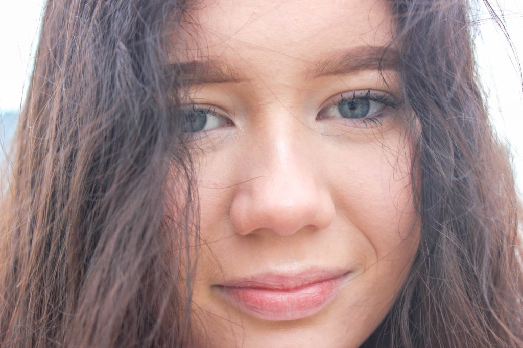
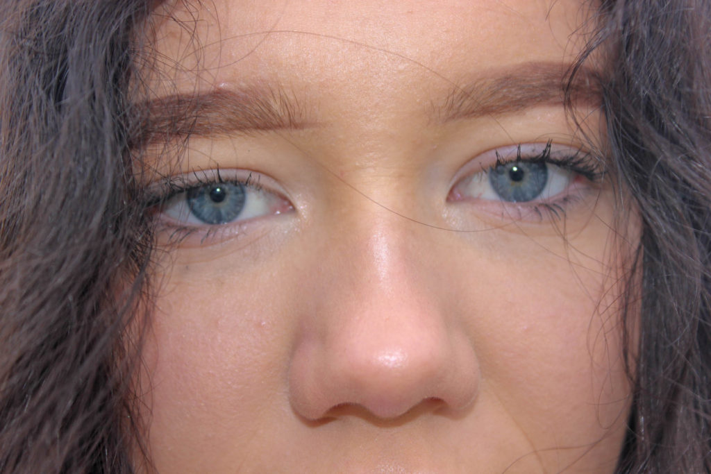
“Just when it seems that everything has been photographed, in every possible way, along comes a photographer whose work is so original that the medium is renewed. Such a photographer is Rinko Kawauchi, who makes simple, lyrical pictures, so fresh and unusual that they are difficult to describe or classify. Her images document everyday things, yet could not be described as documentary. They are generally light in tone, yet somehow dark in mood. They are almost hallucinatory, yet seem to capture something fundamental about the psychological mood of modern life.”
Garry Badger on Rinko Kawauchi’s book “Utatane” (Siesta)

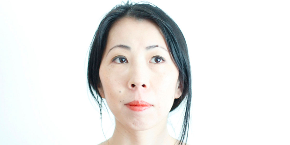
Rinko Kawauchi was born in Japan in 1972. Kawauchi became interested in photography while studying graphic design and photography at Seian University of Art and Design where she graduated in 1993. She first worked in commercial photography and advertising for several years before embarking on a career as a fine art photographer. In Japan Rinko Kawauchi has become one of the most celebrated photographers of her generation. After appearing in several museum exhibitions and festivals in Europe (among others “Rencontres de la Photographie”, Arles; Fondation Cartier, Paris; Huis Marseille, Amsterdam: Photographers’ Gallery, London) the Metopolitan Museum of Photography in Tokyo is preparing a major exhibition about the artist for May 2012.

In 2001 three of her photo books were published: Hanako (a Japanese girl’s name), Utatane (a Japanese word that defines a state between wakefulness and sleep ), and Hanabi (“fireworks”). In the following years she won prizes for two of the books in Japan.In 2004 Kawauchi published Aila; in 2010, Murmuration, and in 2011 Illuminance; in 2009. In the ‘Utatane’ series. Rinko demonstrates a concentrated intentness on what she calls “the little voices that have been whispering to her since childhood”. These are the source upon which she draws, the intimate origin of a world described here according to a highly personal aesthetic: Utatane re-creates a fragmentary and fleeting world in which every detail relates to notions of birth, life, death and the passage of time.

Rinko Kawauchi’s work focuses on ordinary things and everyday situations. Her photographs attain their specific quality through her use of cropping and choice of perspective as well as the subtle use of natural light in combination with often virtually transparent colours. Rinko Kawauchi works in series, which, in the form of open narratives, combine poetry and emotion with representations of mortality and occasional melancholy.

Kawauchi’s art is rooted in Shinto, the ethnic religion of the people of Japan. According to Shinto, all things on earth have a spirit, hence no subject is too small or mundane for Kawauchi’s work; she also photographs “small events glimpsed in passing’, conveying a sense of the transient. Kawauchi sees her images as parts of series that allow the viewer to juxtapose images in the imagination, thereby making the photograph a work of art and allowing a whole to emerge at the end; she likes working in photo books because they allow the viewer to engage intimately with her images.Her photographs are mostly in 6×6 format.However, upon being invited to the Brighton Photo Biennial in 2010, Kawauchi first photographed digitally and began taking photos that were not square. Kawauchi also composes haiku poems.

Image result for rinko kawauchi

artist experimentation

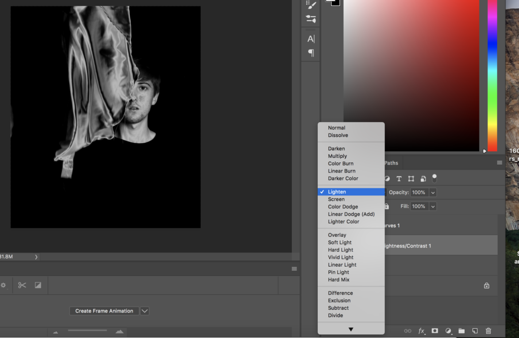
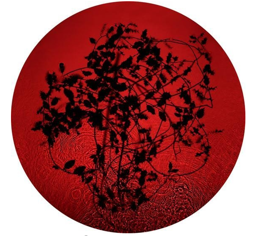
This experimentation, is to show how I could develop my images, into the same silver and black edits similar to ASTRES NOIRS BY KATRIN KOENNING AND SARKER PROTICK. in terms of variation and similarity, I believe the effect of using a repetitive edit system shows the similarity, yet the variation is between the slow movement of life, and the revolving from darkness, brith, life, decay and death. This evolution within my book creates a narrative construct that is able to express.

photoshop development: Turn Black and white , Flatten, Ctrl j, Circle ,Invert, Top two layer , Inward and later one, Control right merge ,Shift ,Play with other setting, Blending moulds, Darken, Final adjustments

Susan Derges

Susan Derges (born 1955) is a British photographic artist living and working in Devon. She specialises in camera-less photographic processes, most often working with natural landscapes.

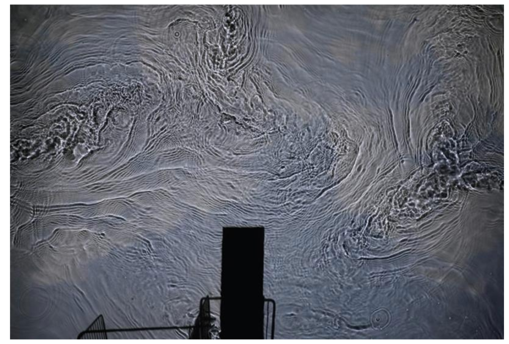
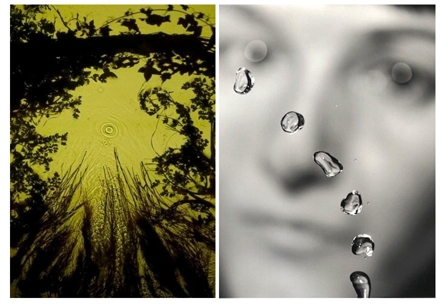
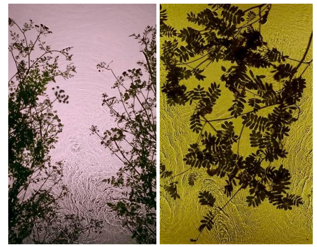
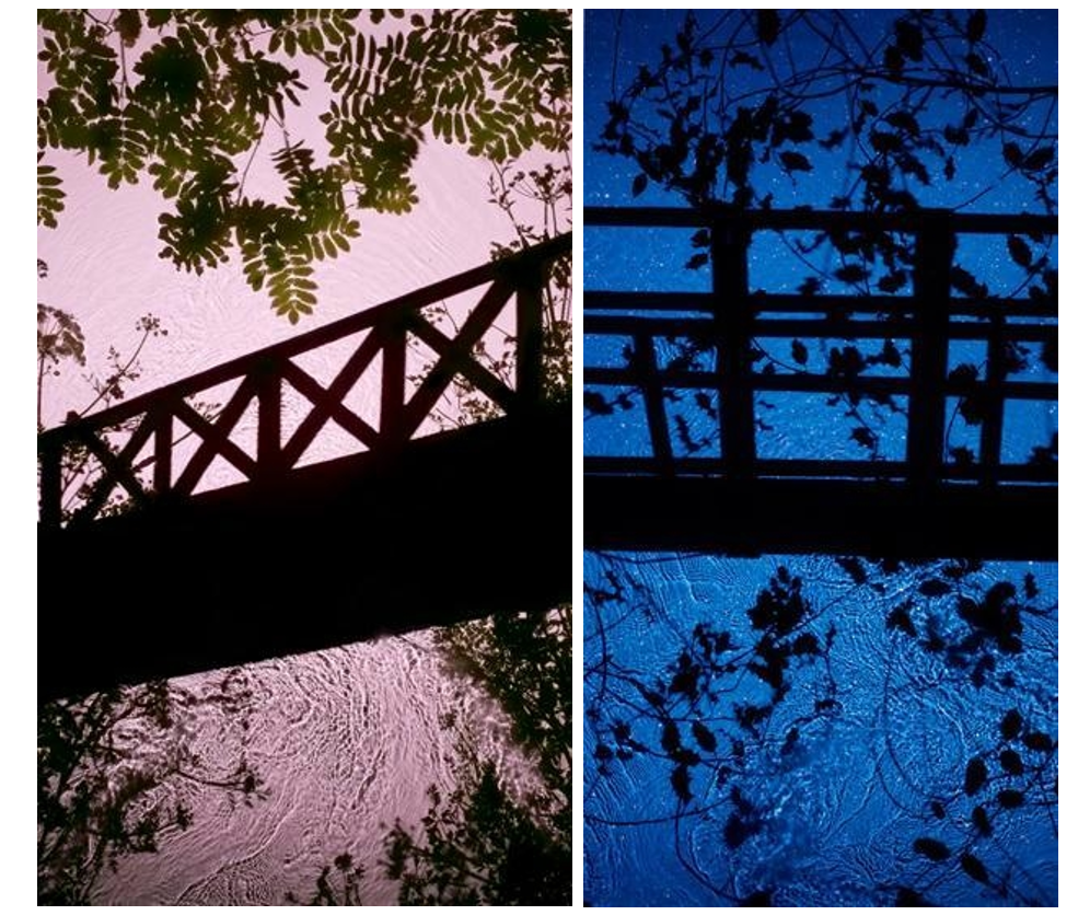
Derges’s 1991 series The Observer and the Observed explored the relationship between object and viewer, and art and science. Propelling a jet of water through the air, Derges used a strobe light to capture the suspended lens-like droplets set against a blurred image of her own face. During the 1990s, Derges became well-known for her camera-less photographs and her pioneering technique of capturing the continuous movement of water by immersing photographic paper directly into rivers or shorelines. Often creating work at night, she works with the light of the moon and a hand-held torch to expose images directly onto light sensitive paper.

Her work revolves around the creation of visual metaphors exploring the relationship between the observer and the observed; the self and nature or the imagined and the ‘real’.  Ambient light affects the colour of the images which ranges from blue at full moon to green at new moon. Stormy weather conditions whip up sand in the water, which appears as dark vortices and spirals within the image of the wave. 

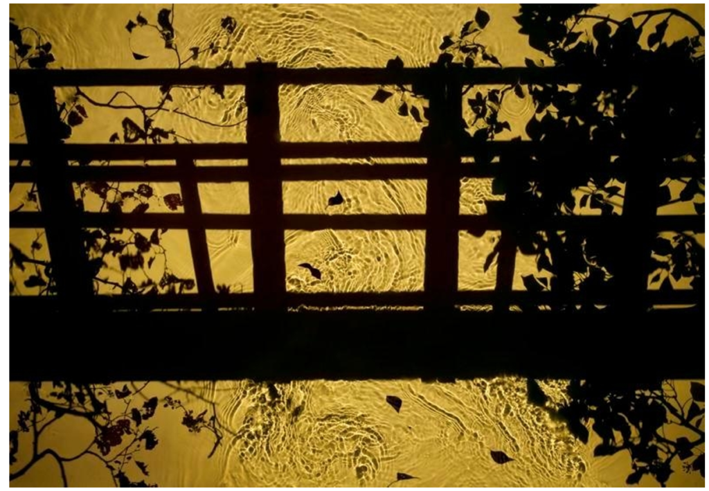
Her 1997 River Taw series exemplified this direct interaction with the landscape. Using the river near her Devon home as a lens, Derges captured fragments of ivy, ice, and debris reflected in or passing through the water. 

It was the river Taw that gave Derges the idea that transformed her work. “I was fed up with being the wrong side of the camera. The lens was in the way. I was stuck behind it and the subject was in front. I wanted to get closer to the subject. I had longed liked the idea of the river as a metaphor for memory. The river being a conscious thing containing memories – all the things it carries with it such as rocks, pebbles, shale. It is nature’s circulatory system. I was interested in the science of complexity – mathematical descriptions, information and stimuli, which are supplanted when a more ordered group of descriptions, information and stimuli come in. I was also working with beehives at the time as a model – seeing a connection between how human beings operate and how nature operates – studying the bees was a way of looking at human structures.”

It was working with a waterfall that Derges realised how fully involved she was with her subject matter. When unrolling a print of a waterfall, she was mystified to discover that there were two columns of information recorded. She realised that the second column was actually her fingertips, which had been holding the print in place. She found herself in the arena of her work, actually part of it. “In making the waterfall prints I could not help being part of them.

Derges’s images of botanical organisms and flowing water are metaphorically rich, alluding to the connections between ourselves and the natural world. Her 1997 River Taw series exemplified this direct interaction with the landscape. Using the river near her Devon home as a lens, Derges captured fragments of ivy, ice, and debris reflected in or passing through the water.

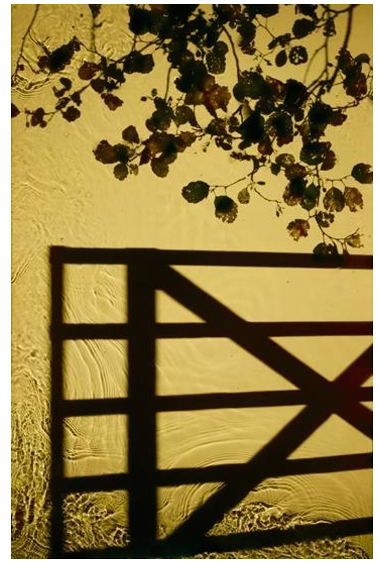
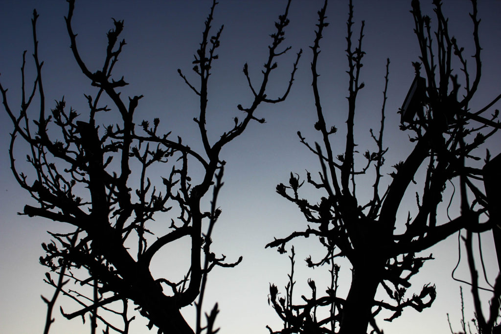
The structures and bridges in some of her images she stated were made with constructed silhouettes. It’s a reference back to growing up. It’s an imaginary place with the branches brought in. It’s a digital print made with a digital camera.”

Derges expressed an early interest in abstraction because “it offered the promise of being able to speak of the invisible rather than to record the visible”. She turned to camera-less photography after experiencing frustration at the way “the camera always separates the subject from the viewer”. Much of her subsequent work has dealt with this relationship – of separation and connectedness with the natural world. In Derges’ photography, nature imprints patterns and rhythms of motion, growth and form directly on the light-sensitive surface of the photographic emulsion, such as falling water drops etc.

 Recently she has begun working in the studio combining analog and digital techniques to create new forms and perspectives hitherto impossible to capture. Her practice reflects the work of the earliest pioneers of photography but is also contemporary in its experimentation and awareness of both conceptual and environmental issues.

Adroplet of mercury lying in the bottom of an upturned speaker cone, which reflects the lens of the recording video camera, is subjected to a sweep of sine waves. The sound disrupts the spherical form of the mercury droplet into ordered shapes of increasingly complex geometrical structures until it passes beyond the range of response of the mercury and the camera ‘eye’ re-emerges on the surface of the droplet.

Artist Reference – Franco Fontana

Who is he?

Franco Fontana was born in 1933 in Modena. He took up photography in 1961 and joined an amateur club. He held his earliest solo shows in 1968 in Modena, his native city, which marked a turning point in his career. He had published over severnty books with Italian, French, German, Swiss, Spanish, American and Japanese publishers. His photographs have appeared worldwide in over 400 exhibitions, solo and collective. His images are in collection in over fifty public and private, Itlaisn and international galleries. Many companies have asked him to collaborate on advertising campaigns, he had published photographs in The New York Times and various other major magazines, with Fontana being invited to hold photography workshops in various school, universities and institutes such as the Guggenheim Museum in New York. Every year he holds academic courses at the Politecnico di Torino, and the LUISS University, Rome. He is the director of the Toscana Fotoferstival and has collaborated with the Centre Georges Pompidou, the Japanese Ministry of Culture and the French Ministry of Culture.

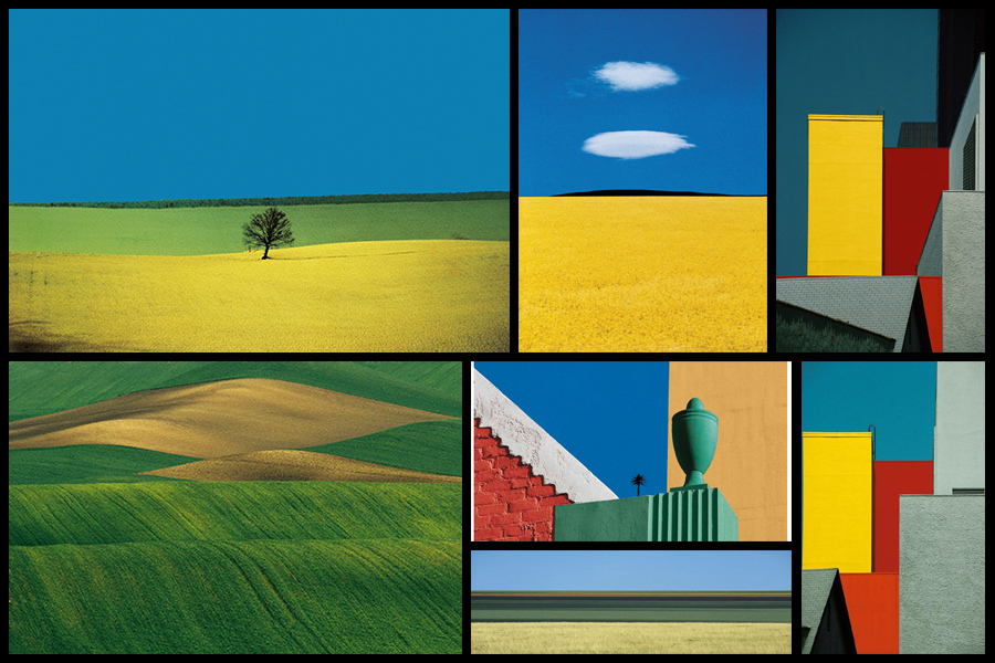
Fontans photography mainly depicts extremely aesthic portrayals of natural landscapes, using vibrant colours and a high saturation to link beauty to what would typically be seen in things such as flower, fields and the sky. What has inspired me is his use of aesthetics through a more unusually high saturation, depicting which would usually be everday scenes in a more visually appealing approach. Here I intend to go about photographing nature in a more aesthetic manner, using the textures and patterns found in each subject as a means of photographing a hidden viewpoint not usually seen to the everyday eye. Some examples of his work can be seen below:

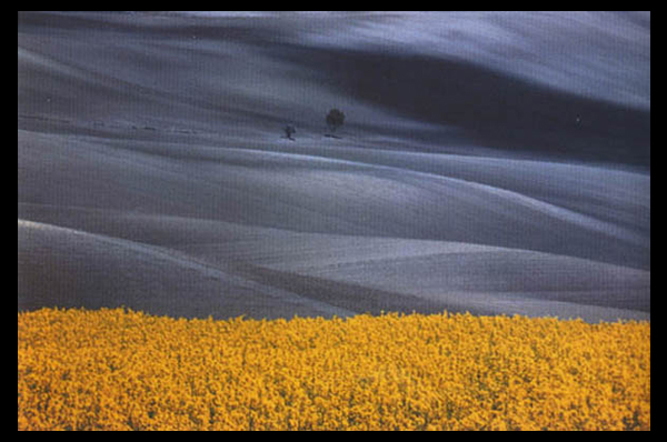
After looking over some of his works I decided that I would go onto analyse one of his images, by doing this it would allow me to have a broader knowledge regarding the techniques used to photograph the pictures and the more conceptual side of them. To do this I would have to look at three categories, technicality, visual and conceptual, the image that I have selected to study is called Paesaggio Basilicata, and was photographed 1990, depicting the use of minimalist styled composition of a agricultural landscape:

Technical:

Technically the image is composed using a very minimalist technique, capturing and using only the yellow crops and the contrasted black and white backdrop to provide the image with an overall very aesthetic product. The photo has been taken in two filters, one being coloured and the other monochrome, by doing this it really highlights the shadows that make up the layers of the hill seen in the background and as a result create an abstract like effect which in a way depicts them as waves. To stop the monochrome becoming too overpowering Fontana has included two small trees located in the center of the photo, including this allows for a more symmetrical and aesthetic looks as the continual gradients of the hill are broken up and separated. The yellow contrasts this due to it being a contrast to black and so allows the shades on the hillside to pop even more.

Visual:

Looking at the image its evident that a high saturation has been used to create the vivid colour of the grass which is depicted unnaturally yellow. This is also contrasted by the monochrome hills which by doing so allows for all of the hills to have a layered portrayal used by the darker areas which have highlighted and smoothed out the grass to create a more gradient effect as a result. Composition wise the placement of the trees in the center has definitely been thought about, this is because of how it breaks up the otherwise consistent pattern found throughout the photo, with the yellow flowers taking on about 1/3 of the image up so that it cant become too overpowering due to its colours.

Conceptual:

The style used for this photo is based on his on vibrant language, Photographic Trans-avantgarde, abstracting the landscape and its colours. By using things such as a higher saturation he aims to create ideals for people regarding the aestheticism of an area which is often over-exaggerated in order to push a certain mind-set onto the viewer.

Exhibitions

Behind the Lens

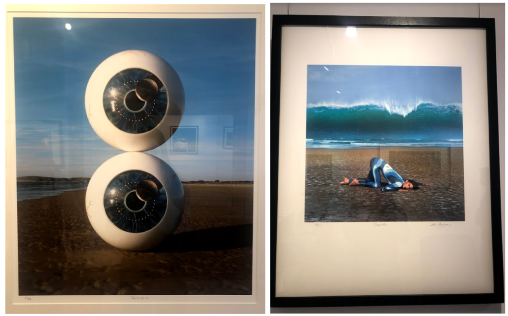
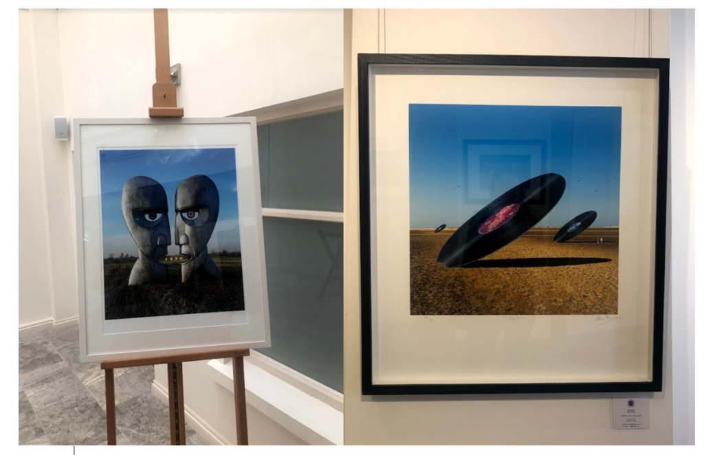
I visited the CCA gallery which had an exhibition called ‘Behind the Lens’ by
Mike McCartney, Carinthia West and Rupert Trueman looking at Britain in 1960s-70s, pop/counter culture, sexual revolution, rock documentary.

This image stood out to me in this exhibition as the mirrors had been physically put into the landscape rather than being digitally manipulated in. I liked this as it shows nature in a different way to other images I’ve seen. I like how the landscape looks artificial, but still shows the natural waterfall and grass in the background and foreground of the image. I also like the simplicity of the image, and how the tree is the main aspect of the image, with the shadow along the floor.

Pop Icons

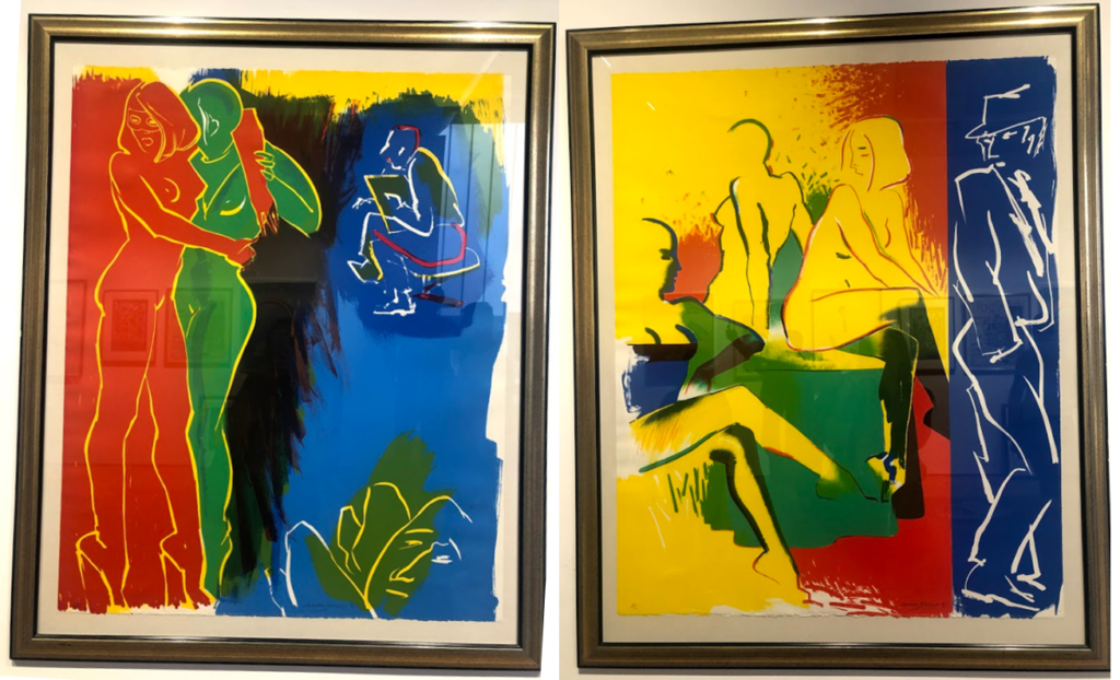
The second Private gallery I visited looked was called ‘Pop Icons’ and looked at Pop-art, reflecting on mass consumerism, advertising, celebrity culture, iconography. Artworks by Andy Warhol, Roy Lichtenstein, David Hockney, Peter Blake and other artists were displayed.

1950’s in Britain and late 1950’s in America, Pop Art reached its peak in the 1960’s and went on to become the most recognisable art form of the 20th century. It began as a revolt against the dominant approaches to art and culture and traditional views on what art should be. I particularly liked these two pieces above by the same artist because of their use of primary colours and the sections in which they’re divided into. I think i have slightly explored this in my project where i focused on block colours when editing the original images. Adjusting the colours in these images make them link to the work in pop art, although they are not a bold colours, this is something I could explore in my project further. I also like the use if cured lines and shapes representing the figures i the images as I think they relate to shapes and lines that you fins in natures and plants, linking to my projects.

Gallery Director Chris Clifford said, “Pop Art often takes imagery that is currently in use in advertising. Product labeling and logos figure prominently in the imagery chosen by pop artists, seen in the labels of Campbell’s Soup Cans, by Andy Warhol who is one of the artists featured in this exhibition. I also liked this image I displayed above as the repetition of the curved lines and colours, links to the theme of variation and similarity. I also liked how the patterns in the 2D images looked 3D like they wee coming off the image. In his image I thought that the blue colours linked to colours in nature and water, and the bright orange also links to my experimentation where I have included colour which arena normally found in nature within my images to make them stand out.

Being Human –

Feminism, representation of women artists in the art world, alternative voices etc.

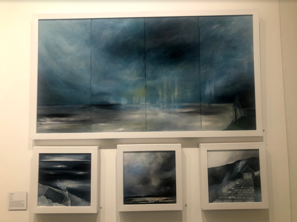
I think the this exhibition related well to this project as a lot of the work focused on nature, emphasising the representation of woman artists. This relates to my work as one aspect i am exploring is femininity in nature, looking at soft shapes that follow a stereotypical view of woman. I particularly liked these pieces above as I think that they represent ideologies of sublime, with the storm and dark clouds above the landscape, creating movement. The tones in the image are cool and emphasis the shadows, looking at the vastness in the scene. This relates to the work I am doing now as I have explored the ideologies behind sublime and beautiful, this type of image being something I could explore more in my project where I look at the other dangerous side to nature, rather than the fragility that i have focused on so far. So far i have explored warm, soft tones and colours in my images, this contrasts to these pieces where predominately cold dark colours are used, and is another aspect that i could look at in my work, contrasting cool and warm tones.

exhibit write ups

CCA GALLERY

Overview of the cca gallery: The exhibition at the CCA gallery was a variety of more documentary focused aspect of photography, with some elements so highly edited when discussing new 20th century art and photography.

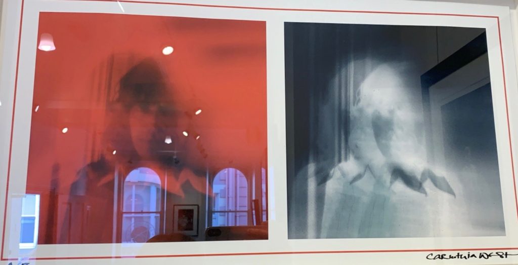
Going to CCA gallery I found two pieces which I belive could benefit my work and really influence the angle of my project. So far my work has been about the creation of beauty, However I have considered adding both beauty and chaos to form a disrupted narrative contrast, and I belive these two pieces perfectly fit into this possible expenditure of my theme. There is such a raw exposure of emotional expression, the sense of solitude and isolation coupled with the movement of the faces coming from within the centre of the composition, creating a new disposition of character. I also belive the use of red and black and white, creates not only a contrast between the pieces themselves, but both colours have strong connotations to strength of emotion. Red is a substantial denotation for that of suffering, pain and elements of blood. However, the black and white creates an element of exposure, as in you are looking into someone. This x-ray type of site shows an area well with-the aspect of your own chaotic image. My own work surrounding chaos could be produced more similarly to this work, but showing more of a movement instead of layered images, I will experiment with these effects, and possibly done with photos of different plants and mediums.

the artist: why they did this:

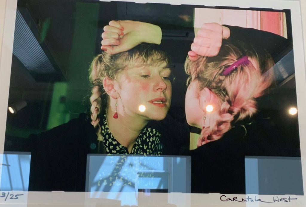
I chose this image also, as to my mind, there are clear connections to my shoot idea of self portraiture, there is a clear connection of emotional vulnerability, and almost a mocking or finding of personality. The character is presented as a form of mimicry, and done in such a way to show a vulnerability and a sense of false acts and emotions. I find it very interesting using objects such as a mirror to show a whole three dimensional view and performance of a person. I have spoken previously about the media within photography, and to my mind, this is a free flowing performance and an act of character, used in order to presented a certain display of masculinity or femininity, the use of the fist is only really visible to the viewer on the non reflected side, this sight of a tight fist accompanied with gritting teeth, perhaps is a warning or a clear dispute of women feeling anger and aggression as her posture and pose is very different from the femininity of the plait and jacket. I could link this to my project again finding what people find to be sad or happy and perhaps how unpredictable this could be due to someones appearance.
PUBLIC AND PRIVATE

The public and private was a very different exhibition than that of the CCA gallery. The exhibition was much more concentrated on the idea of pop art and pop culture. Much of the work was highly colourful, edited and abstract, made at the time of hugely monumental periods of popular culture. With many artists work such as, Andy warhol. Warhol was the artist who created the mediated expression, everyone one day will have 15 minutes of fame. I believe this is relevant to this exhibition as many of the works, were not created to from or create something seen but was to from and create a more controversial forming of elements. The exhibition itself was named ‘ pop icons of the 20th century, Britain and American pop art’ this work was emerging in the 1950’s in Britain and late 1950’s within America, the peak of pop art was in the 1960’s and went on to become the most recognisable art form of the 20th century. it was the revolt against the dominate approaches to art and culture and the traditional views on what art should be.

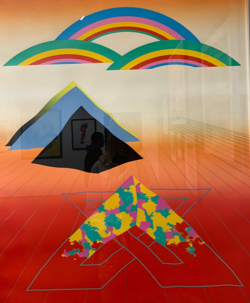
This piece I decided early on, was my least favourite piece I saw out of all three of the exhibitions. It is not to my taste, due to the wholly abstract lack of composition, showing three key areas, arranged with no intentional form scattered around the piece. Too, I belive the deep tonal red contrasting the the lighter abstract triangle, not only creates an uneasy element, but too contributes to the contrasting of red at the top of the piece. The lines are not straight, yet not so un-even to be considered an intentional element. I do not see the intention as to why this piece was formed, And this is my initial problem with the piece, It is definitely not conventional of art, yet does not, to my mind symbolise the revolution and refusal to show conformability of fine art previously seen. Additionally the contrasting of all the triangular shapes, to that of the rainbow and rectangular shapes , does not work well as an overall successful composition.

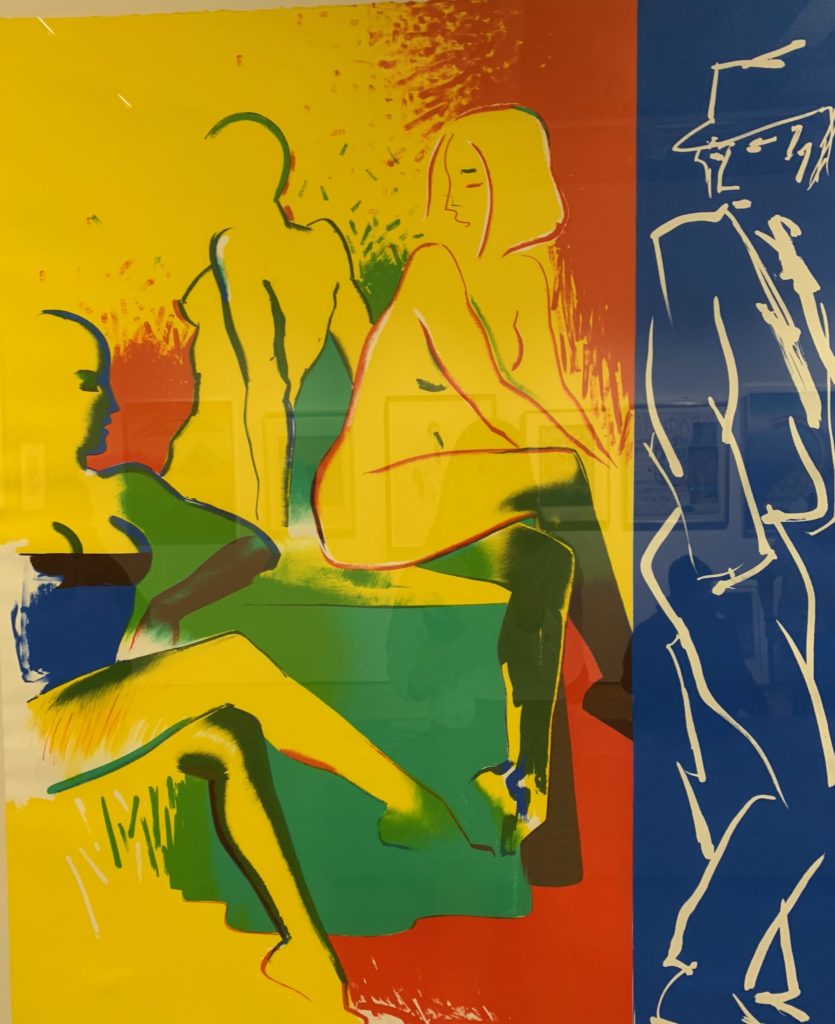
Lastly, I chose this piece as I found the use of the three primary colours, to be really successful. The piece itself, has such a strong centred composition with the primary attention being drawn into the female sitting down, the amount of levels within the piece allows your eye slowly to be drawn out and see everyone surrounding them. This piece was one of two from the artist Allen jones called table talk. I belive due to pop art being a more informal connection people are able to have and form a condition with art, this piece shows a demonstration of a real life scenario which too seems to mimic the everyday actions we all have. Not only within this piece is their a a clear element of seduction, but also a clear illusion of mystery within the piece, and perhaps a new form of seeing the male gaze. Their is also a clear juxtaposition of the women not wearing clothes and the male figure watching being dressed as a detective type of man. Because of this I believe it is changes form an unipersonal imagery, to emphasis a personal feeling and symbolism characterised into abstract expressionism of our own lives. Due to this piece being clearly a fine art piece and so not a photography image like my two previous inspirations, My intention of influence would be the way he so effortlessly captures an emotional connection shown through the sense of reality of the piece itself. The colours too are very bright and abstract which too is a pivotal element of seeing beauty within the world.

Shoot 2 – Home

Home shoot

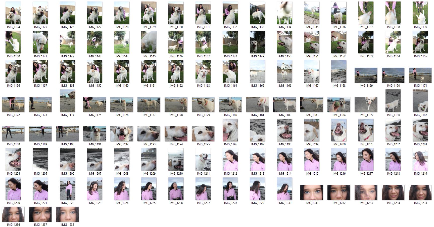
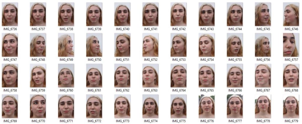
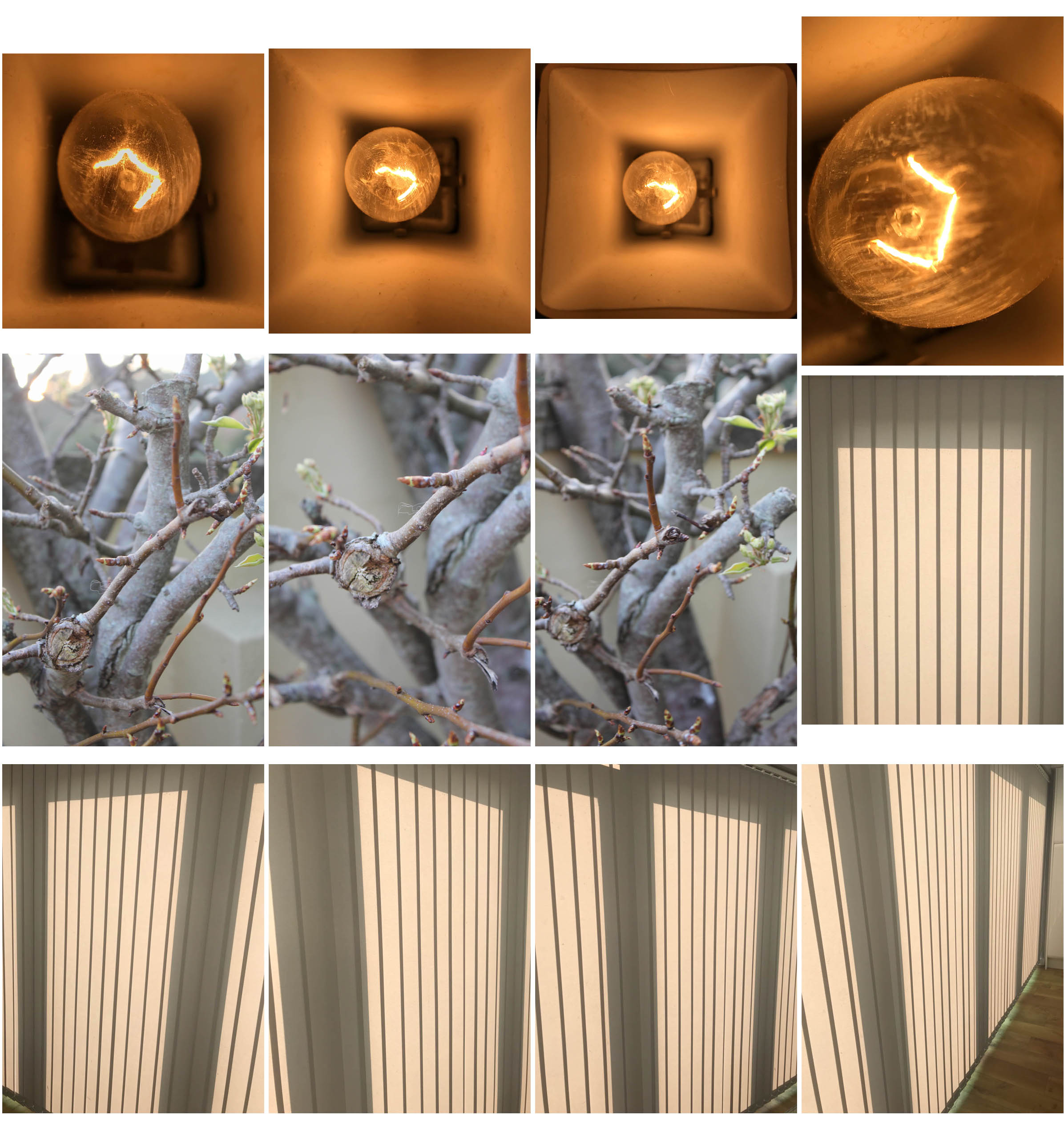
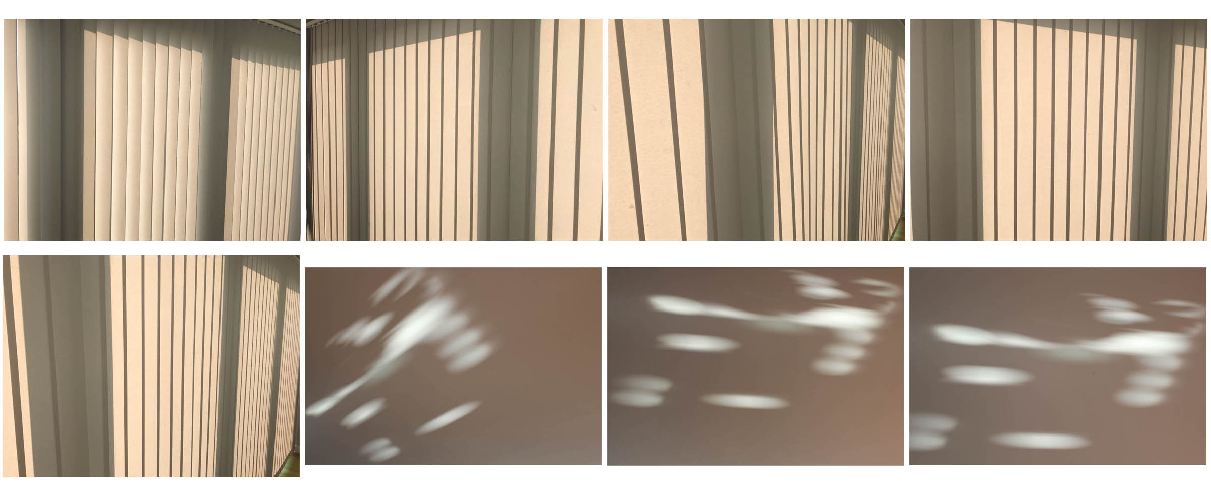
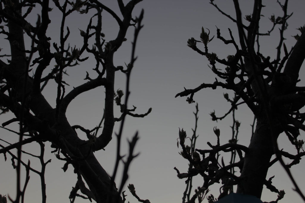
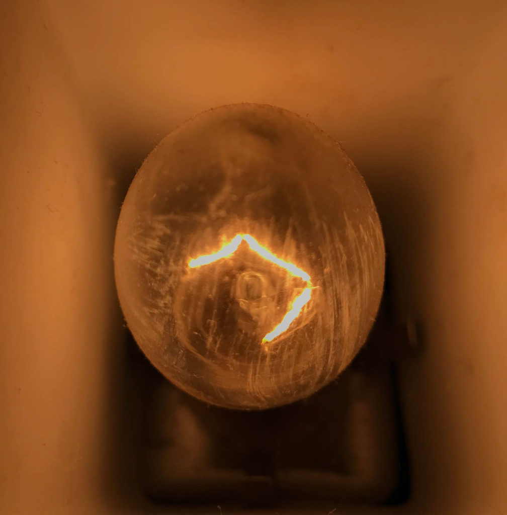
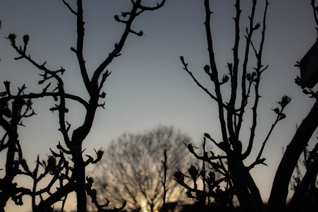
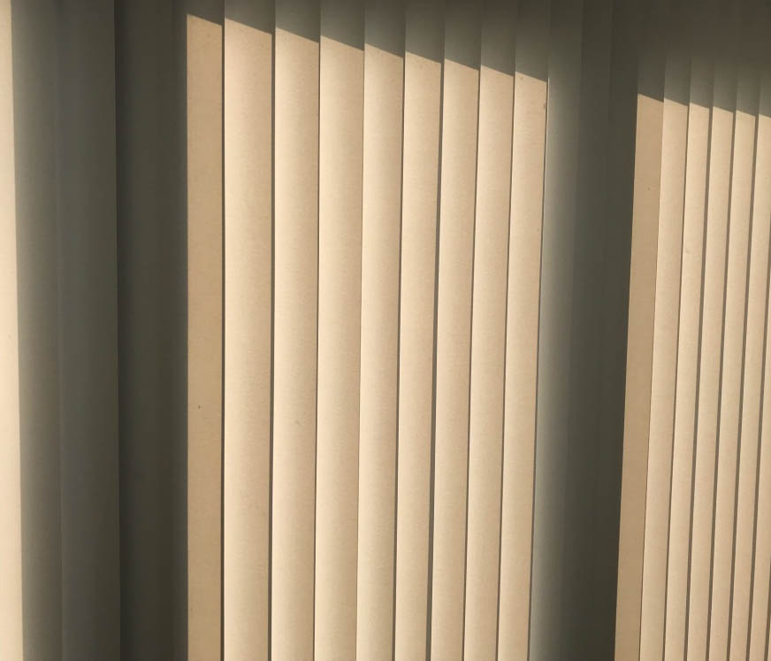
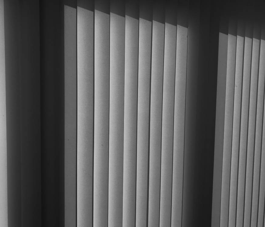
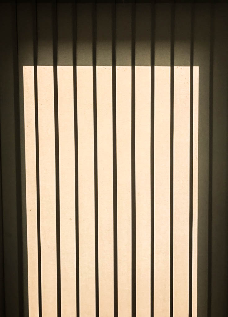
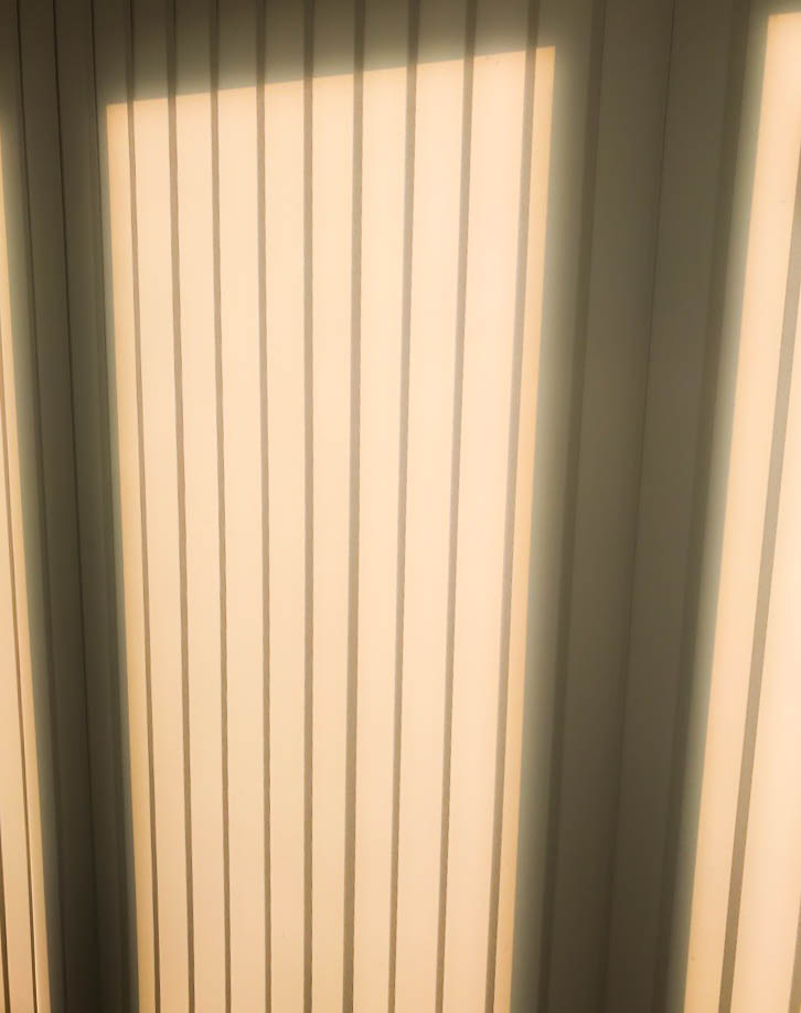
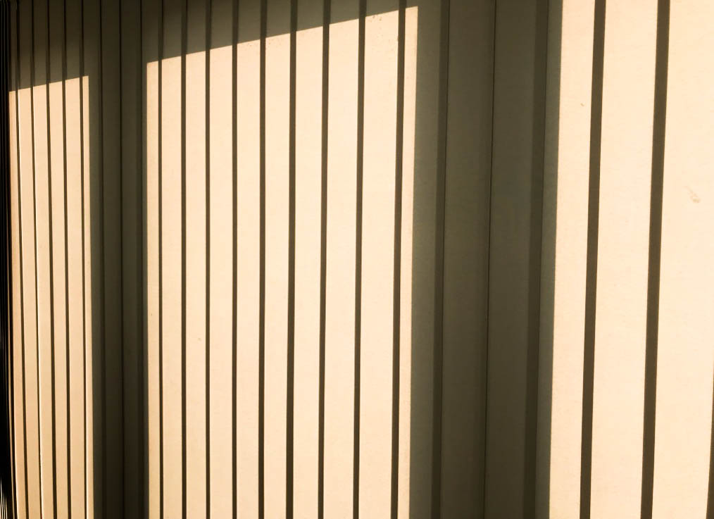
For this shoot, I wanted to just focus on light and/or shadow affecting objects or areas in and around my house. I used my Canon camera for this shoot. Below are the contact sheets displaying my responses:

Contact sheet 1
Contact sheet 2
Contact sheet 3

Experimentation

To edit my images, I used lightroom. I adjusted the brightness, contrast, shadows, whites, blacks and sometimes the clarity. I also experimented with 2 black and white images but thought that the colour images looked best for these types of images, as light and shadow contrasts the best when in their natural colour.

Compare and Contrast

Mine

This image has an empty alt attribute; its file name is IMG_9585.jpg
My final image I edited using photoshop, I didn’t use double exposure in the final creation of the image as I felt that the reflection on the water was distorted enough. However I did change the colour balance and incred the levels of blue and red to give the image a blue/purple tint to it. This makes the overall image feel very cold, which is in contrast to Laura’s image. I do think that the image does feel very dreamy/fantasy like due to the colours and the fact that only some parts of the image are in focus

Laura El Tanawy

To create this image I think that Laura has used double exposure/layers. The image has a sense of dram/fantasy, due to the collection of the things in the image, the trees flowers, birds. The images give off the connotations, of tropical weather because the type of tree that is in the image in normally found in hotter climates, and the use of the reds and yellows in the image. Where as in tmy image has more of a colder feel to it. However of the things that is similar between the tow images is the use of pastel colours rather having the colors of the image be very bright and fully saturated.