This shoot draws inspiration from Lewis Bush’s ‘Metropole’ as well as Michael Wolf’s ‘Architecture of Density’ and aims to show some of the repetition and symmetry in blocks of flats and offices whilst at the same time showing the difference in designs between buildings. Going into this shoot I had the vision of photoshopping the photographs that result to create compositions that are full of patterns and are illusion-like. Lewis Bush’s ‘Metropole’ came to me as an inspiration because it explores the fact that there are an increasing amount of large buildings for offices or flats taking away from green land and so the landscape in which we live is turning into a repetitive view of similar flats and offices leaving citizens with a feeling of monotony as everything is being redeveloped to serve the same purpose. Bush’s work on ‘Metropole’ shows a lot of emphasis on the repetition between buildings and I have tried to replicate this in this shoot. Wolf’s work has inspired me as he essentially does what I am attempting to do in this shoot but on a much larger scale by photographing the density of high-riser apartments in Hong Kong.
One way in which I could develop on this shoot in the future is by looking at typology, which would involve me researching Bernd and Hilla Bechers, of high rise buildings in Jersey. I could approach this by finding the 14 high rise apartment blocks in Jersey and photographing these in a similar style to this shoot and then creating a typology page of these different buildings.
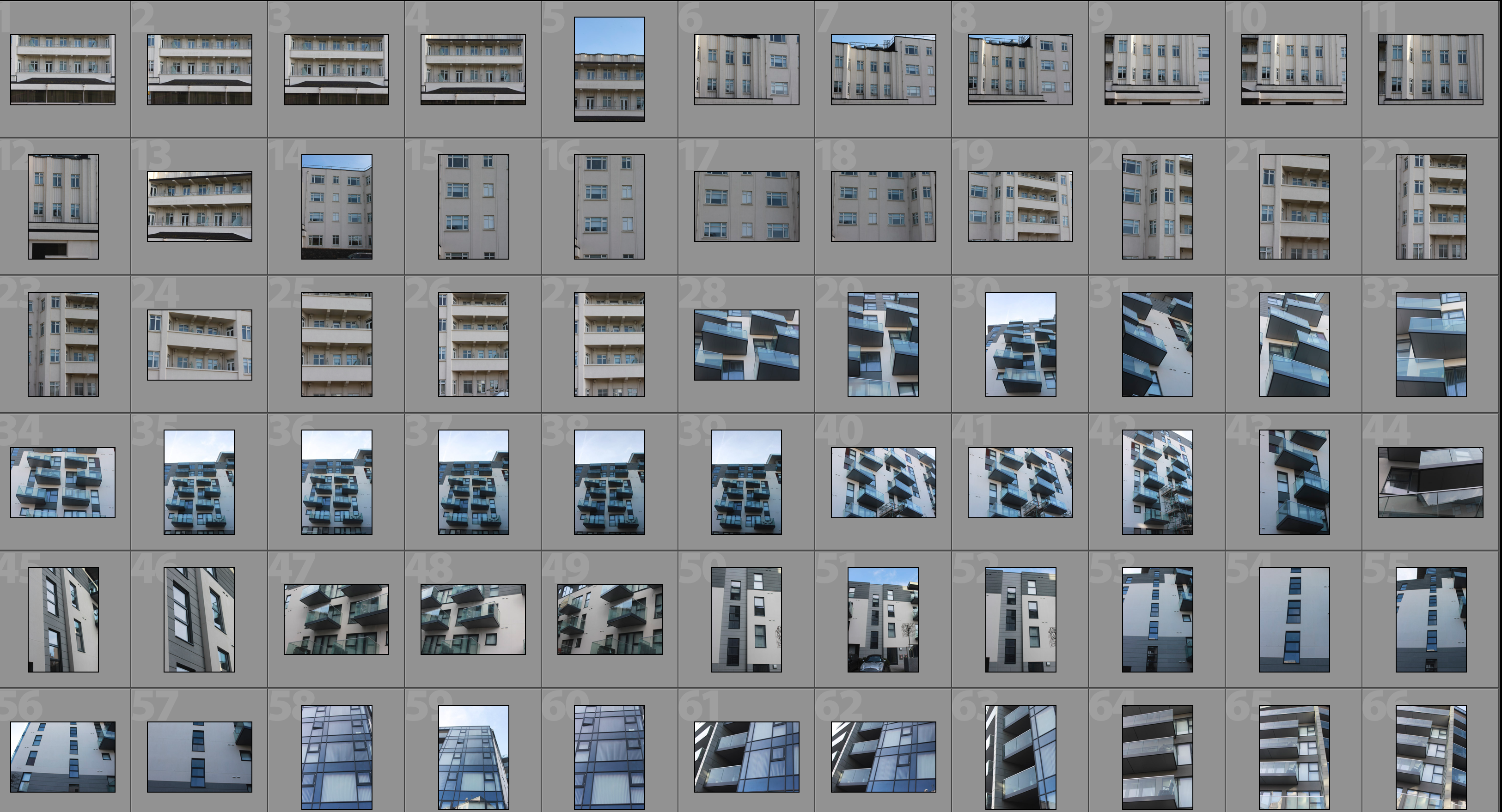
Contact Sheet


Edited Photographs
After going through all of the photographs that I produced on this shoot I selected some of the best that I could edit. I edited these photographs by putting a black and white filter on in order to allow the viewer to focus on the shapes within the photographs rather than the colour. I then used a perspective crop on the majority of the photographs in order to make the photograph completely straight on in order to further emphasise the symmetry and patterns within the photographs. As well as the black and white filter I increased the contrast, used high highlights and whites, used low shadows and blacks and adjusted the exposure accordingly to create a composition that is mostly over exposed but the features such as the windows are emphasised to help the shapes within the buildings to come forward.


Edits
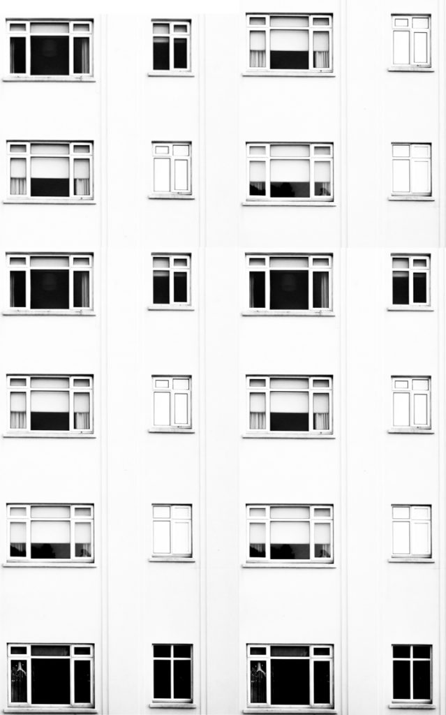
After editing the individual photographs I brought the photographs into a blank photoshop document and duplicated it. After the duplication I then messed around with the layout of the multiple photographs to create illusions that show lots of repetition and some symmetry. The result is montages that emphasise in blocky shapes and use a black and white filter to bring contrast into the photographs.
#1

#2

#3

#4

#5

#6

Analysis

I captured this photograph in a natural lighting in order to bring out the natural shadows and shapes within the building that I was photographing. There is a wide tonal range due to both the nature of the building and my editing to the photograph. The bright whiteness in the walls of the photograph contrasts greatly with the dark black shadows on the balconies. I took this photograph on a bright day where there was plenty of sunlight so only needed to use a low ISO of 100 along with a shutter speed of 1/60 to capture this photograph. The low ISO paired with the quick shutter speed allowed for the photograph to be as high in quality as possible as well as not being overexposed (even though I edited the photograph to increase the exposure. I edited this photograph by using a black and white filter to bring out the shapes in the windows as well as the shadows and then I increased the contrast, highlights and whites whilst reducing blacks and shadows to create a composition that had high contrast between the black and whites. A depth of field of f/16 was used to capture the photograph which can be seen as the whole of the photograph is in focus. The photograph has a slightly cold colour cast to it due the bright whiteness throughout it.
I opted for a black and white filter over a colour photograph as it helped to bring out the details within the buildings, especially the contrasts as well as a wide tonal range to create a more dramatic composition. Due to the deep shadows and edges within the photograph as well as the editing of the photograph the composition has a 3D effect as it appears to have different layers which bring the photograph to life. There is also a lot of patterns and repetition within the photograph, which I aimed to create when setting out on this shoot. I have placed the balconies on the two horizontal lines of the rule of thirds as I feel that they are the most interesting parts of the photograph so placing them along these lines creates a more interesting composition as well as helping with symmetry.
The aim of this shoot was to create a set of photographs that showed the repetition of shapes within blocks of flats and offices and how this repetition can be aesthetically pleasing. The overall results shows how even though there is a lot of repetition within individual buildings, each building has its own unique characteristics and shapes and therefore have variance. The inspiration for this shoot came from photographs of tall tower blocks in cities such as Hong Kong where each floor and flat are almost identical, which is perfectly demonstrated in Michael Wolf’s work as well as inspiration from Lewis Bush’s ‘Metropole’ in which he looks at the development of buildings through a double exposure technique to create a similar outcome to what I have done.
The concept behind this is that there are an increasing amount of these large and repetitive buildings that make way for office buildings or flats due to the ever rising population and urban migration. The photographs resulting from my shoot show just how repetitive these buildings that are taking space from nature really are and reflect the idea that some residents may believe that the landscape of cities including Jersey is becoming repetitive and monotonous as lots of land is being taken to serve the same purpose of housing or offices.


