SECOND ARTIST: Yoav Horesh: Aftermath: CHAOS

Yoav Horesh, Sbarro Pizzeria, Jerusalem, August 2003, gelatin silver print, 18½ x 14¾”. Courtesy of the artist.

Horesh was a student in Boston during 9/11 and was struck by how different the American response, with its grounded planes and makeshift memorials, was from his own experiences in Israel. While the American impulse was to “never forget,” Israel’s urge was to erase. (Though curator Kristina Durocher sees a parallel between “America’s response to mass shootings as a new societal norm” and the “cultural fatalism” in Horesh’s photos.)The ghostly reflections in a Sbarro window gesture at what can’t be seen. There are no monuments here, as Horesh explains, because there would be a plaque on every corner. If Lee Friedlander’s The American Monument is a testament to monuments hiding in plain sight, Horesh’s Aftermath, also a book, is a mournful dirge for trauma swept under the rug in the name of “normalcy.”By evoking the uncomfortable gap between violence and the collective “cleanup,” Horesh leaves us space to contemplate. Who was the bomber? Who were the victims? What butterfly effect has been set in motion?

The work I am influenced by and analysing is from his project ‘Aftermath’ It nods to the traditions of street photography, photojournalism and the archival impulse, as well as photo books like Joel Sternfeld’s On This Site and The American Monument. Yet unlike Friedlander, Horesh can only capture the hum of ghosts. To paraphrase Robert Frank, Horesh’s compassionate eye listens before it looks. Yoav Horesh B/W and colour photographs have been dealing with conflict, human tragedy, memory and recovery in Europe, Asia and America since 2001. His deep interest in the history of “sites” led him to explore close and far locations in search for cultural clues and personal histories. His evolving practice has grown from “street photography” to large format landscapes, interiors and portraits that open up the discussion between present and history. His projects also took place in the American South-west, Germany, Laos, Israel, the Gaza Strip and Cambodia, where history still shapes and influences current events and life.
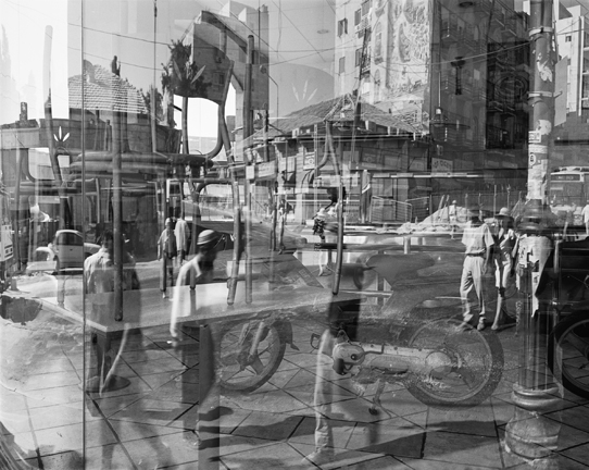
ANYLSIS: I chose to study Horesh, as a consequence from this image. I believe not only does this image show an encounter of our daily lives, but it is a perfect example of chaos. The many images being overlaid. creates a composition that is not messy, but almost works structurally as a whole. The element within each image fit s together and creates a new composition. Each image slipping into a different aspect creating interests of architecture, and new movements of present and past people. This is clearly a very organised and thought out image, and one he did not easily put together. This also symbolises a passing of time, it shows the impact of live, perhaps the evolution of the area, due to the consequences of events which occurred there.

The concept from this image was from a book called aftermath. it is a presentation to make a political point about the conditions and daily lives that are similar to many in poverty and living in this area. His work is a transgression of more complex pieces such as the one above, and also images of slow shutter speed watching the visibility of cars moving, people, and details and shadows and aspects usually unseen in an area. He not only successfully captures the attitudes of people so well, but he too demonstrates knowledge of how to show these emotions very personal to an individual through a piece from a location. he himself has said ‘For two and a half years I photographed over 100 different sites of the suicide bombings in Israel while I lived in New York. I would go to photograph at least twice a year while doing my research for official and non-official information I needed in the United States. The bombings were happening on a daily basis; I would turn on the computer or read the newspapers and obviously I was very worried about my family and friends. The thought that they could be taking a bus or walking down the streets and disappear from life within a blink of a second horrified me. Perhaps it was also the feeling of guilt that pushed me to start this project, to be in far New York while this was happening in Israel so frequently. Maybe this is my mechanism of dealing with trauma; Repeating the action, the visitation, photographing, like going back to “a crime scene” and trying to understand what has happened there psychologically and visually.’

why did I choose this artist: He not only successfully captures a narrative of chaos caused by suicide bombings, and a clear emotional responses to each and everyone of his photos, but also his ranges from teaching 4×5, colour, black and white, darkroom printing techniques to digital photography. His subject matter has always remained the same: life, family, our history and primary emotional responses to the world. Ut’s about how we interpret the world using photography and how we analyse and understand photographs in various contexts. I don’t think these things changed since the first camera was manufactured, only the tools changed. It used to be large format box camera and now you have your phone camera. His photography is not just about creating impressive imagery, but I think that with this project, he was  also trying to raise awareness about how life is made a series of random events that affects all of us tremendously. These places he photographed were mundane. They were dictated because of their traumatic history. There was nothing unique about these sites until history scarred them. They turned into significant sites of trauma that he reduced into pictures of the landscape, the city, trees, cafes or street corners.

 

Variation / Similarity : generating ideas

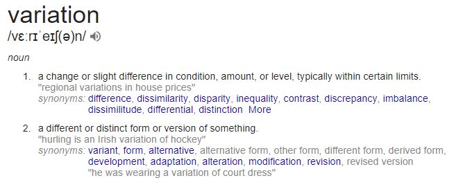
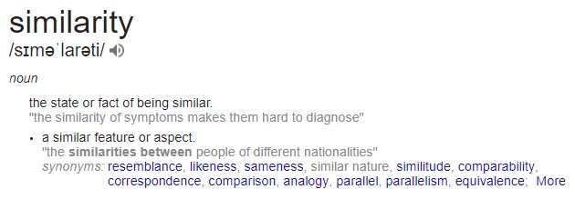
1. Define and interpret the words

  • Variation
  • Similarity

2. Look carefully at the inspiration points below …

August Sander – The Face of Our Time

One of the first photographic typological studies was by the German photographer August Sander, whose epic project ‘People of the 20th Century‘ (40,000 negatives were destroyed during WWII and in a fire) produced volume of portraits entitled ‘The Face of Our Time’ in 1929. Sander categorised his portraits according to their profession and social class.

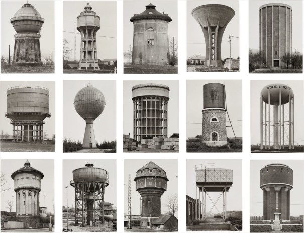
Sander’s methodical, disciplined approach to photographing the world has had an enormous influence on later photographers linked to The Dusseldorf School, notably Bernd and Hilla Becher. This approach can also be seen in the work of their students Thomas Struth and Thomas Ruff. Other photographers who have explored this idea include Stephen ShoreGillian WearingNicholas NixonMartina Mullaney and Ari Versluis.

Image result for bernd and hilla becher
Bernd and Hilla Becher
Read this article about by Hans-Michael Koetzle about Sander’s epic project.
Image result for august sander grid
August Sander
The Typologist – a Tumblr blog
Typologies Flickr Group
Typologies article
Steve Tyler’s series Typologies of Mass Consumption
A great blog post about Typologies

Boris Mikhailov – German Portraits

Nearly a century after August Sander’s portraits of German society, the Ukrainian photographer Boris Mikhailov created a series of pictures of the amateur actors in a German theatre company in the town of Braunschweig. Shot in profile against a black background, the photographer makes reference not only to Sander’s typol0gical study but also to Theodor Piderit’s Principles of Mimic and Physiognomy, published in Braunschweig in 1858 and also to Hitler’s interest in eugenics; Hitler became a German citizen in Braunschweig in 1932. The profile portrait also encourages the viewer to make formal comparisons between the sitters. Mikhailov’s portraits and those of August Sander were exhibited together in 2012.
Image result for boris mikhailov german portraits
Boris Mikhailov

Michael Wolf – Paris Tree Shadows (and other urban phenomena)

Michael Wolf’s early career as a photo journalist is perhaps evident in his various studies of urban life. He documents repetitive features of the urban landscape, clearly influenced by the deadpan approach of the Dusseldorf School and the New Topographics photographers. However, Wolf’s approach appears more concerned with the symbolic role played by mundane items such as his ‘bastard chairs‘ which suggest the density of the urban environment of Hong Kong and the human ingenuity of its inhabitants. Wolf often uses a strict typological approach, as in his series ‘100 x 100‘, repeating the same vantage point. However, Wolf is always interested in the individuality of his human subjects and the tremendous visual variety of the interiors in which they live. He often displays his images in groups or in series to draw attention to repetitive phenomena. There is humour and poetry in these groupings. A good example of this is the beautiful and subtle “Paris Tree Shadows’ series.
Image result for michael wolf paris tree shadows
Michael Wolf

Michael Wolf is known for his large-format architectural photos of Chicago and primarily of Hong Kong, where he has been living for more than 15 years.

His latest pictures have also been created in a big city: Tokyo. But this time Tokyo’s architecture is not the topic. Michael Wolf’s Tokyo Compression focuses on the craziness of Tokyo’s underground system. For his shots he has chosen a location which relentlessly provides his camera with new pictures minute by minute.

Every day thousands and thousands of people enter this subsurface hell for two or more hours, constrained between glass, steel and other people who roll to their place of work and back home beneath the city. In Michael Wolf’s pictures we look into countless human faces, all trying to sustain this evident madness in their own way.

VARIATION VS SIMILARITY

V A R I A T I O N

/vɛːrɪˈeɪʃ(ə)n/
  1. a change or slight difference in condition, amount, or level, typically within certain limits.
    synonyms: differencedissimilaritydisparityinequalitycontrastdiscrepancyimbalancedifferentialdistinction
    • ASTRONOMY
      a deviation of a celestial body from its mean orbit or motion.
    • MATHEMATICS
      a change in the value of a function due to small changes in the values of its argument or arguments.
      the angular difference between true north and magnetic north at a particular place.
    • BIOLOGY
      the occurrence of an organism in more than one distinct colour or form.
  2. a different or distinct form or version of something.
    synonyms: variant,  alternative, alternative form, other form, adaptationalterationmodificationrevision

S I M I L A R I T Y

/sɪməˈlarəti/

  1. the state or fact of being similar.
    “the similarity of symptoms makes them hard to diagnose”
    • a similar feature or aspect.
      “the similarities between people of different nationalities”
      synonyms: resemblancelikeness, similitude, comparabilitycorrespondencecomparisonparallelequivalence.

Brainstorm

Variation

noun
1.  A change or slight difference in condition, amount, or level, typically within certain limits.
Synonyms: difference, dissimilarity, disparity, inequality,  contrast, discrepancy, imbalance, differential, distinction
2.  A different or distinct form or version of something.
Synonyms: variant, form, alternative, other form, different form, derived from, development, adaptation, alteration, modification, revision, revised version


Similarity

noun
  1. the state or fact of being similar.
    -a similar feature or aspect.

Synonyms: resemblance, likeness, sameness, similar, correspondence,  comparison, analogy, parallel, equivalence, interchangeability, closeness, nearness, affinity, agreement,  indistinguishability, uniformity, community, kinship 

Key Words:

  • Contrast
  • Distinction
  • Alternative
  • Modification
  • Revised version
  • Resemblance
  • Comparison
  • Repetition
  • Parallel
  • Closeness
  • Agreement
  • Community

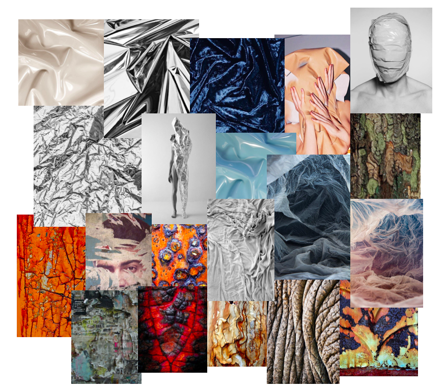
Texture

Texture photography stands out from different types of this medium as the focus of photographers is put on the textural aspect of it. The quality of each photo is measured by its impact, and this type of photography can be defined as imagery which impact depends on the texture of the represented subject.

Texture can stand for surface irregularities or small forms on a surface that are sometimes rendered visible through the optical enlargement of details. While the aim of each photo is to attract the attention of the viewers, this could be achieved through the emphasis of different elements such as color, leading lines, dramatic scenery, or in this case texture.

Three sub-types of texture photography can be defined through the use of terms detail, information, and drama. In the first, interesting details on the surface of an object are of primary concern for the photographer, drama relies on the dramatic effects, as the term itself suggests, and for information it is important to select what info is communicated through the photo and to make a compositional decision that would best bring it out.

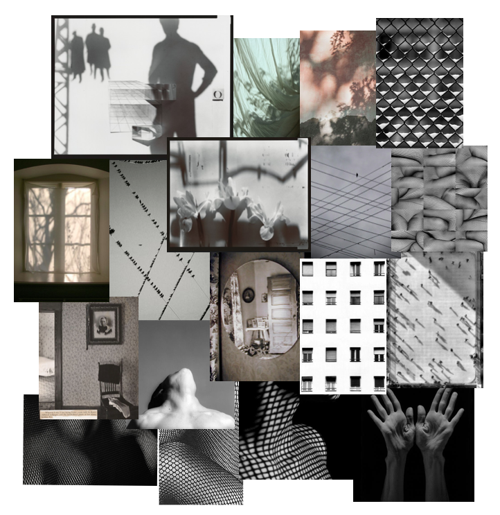
Patterns and Shadows

Filling the frame with a repetitive pattern can give the impression of size and large numbers. The key to this is to attempt to zoom in close enough to the pattern that it fills the frame. Patterns can be found virtually anywhere, although some of the easiest ones to identify occur in nature. Architectural design offers a great source of patterns, especially in mirrored high-rise buildings. Compositional considerations such as the Rule of Thirds, leading lines, balance, and framing usually don’t apply when shooting patterns.

The other common use of repetition in photography is to capture the interruption of the flow of a pattern. Broken repetition might include adding a contrasting object (color, shape, texture) or removing one of the repeating objects.

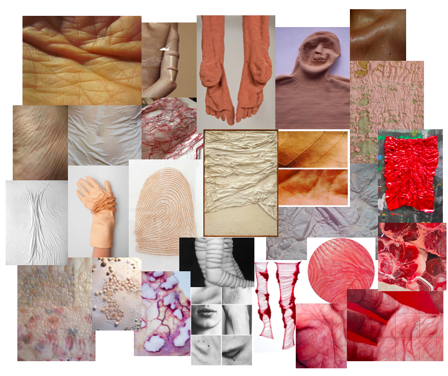
Body and Patterns

The human body is central to how we understand facets of identity such as gender, sexuality, race, and ethnicity. People alter their bodies, hair, and clothing to align with or rebel against social conventions and to express messages to others around them. Many artists explore gender through representations of the body and by using their own bodies in their creative process. Portraying body and pattern could challenge the notion that the female in art is an”object,” rather than its, subject, viewer, or creator.

The 1960s and 1970s were a time of social upheavals in the United States and Europe, significant among them the fight for equality for women with regards to sexuality, reproductive rights, the family, and the workplace. Around this time, the body took on another important role as a medium with which artists created their work. In performance art, a term coined in the early 1960s as the genre was starting to take hold, the actions an artist performs are central to the work of art. For many artists, using their bodies in performances became a way to both claim control over their own bodies and to question issues of gender.

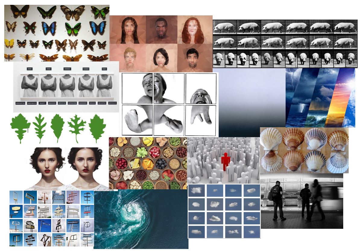
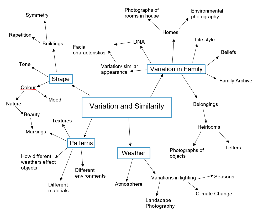
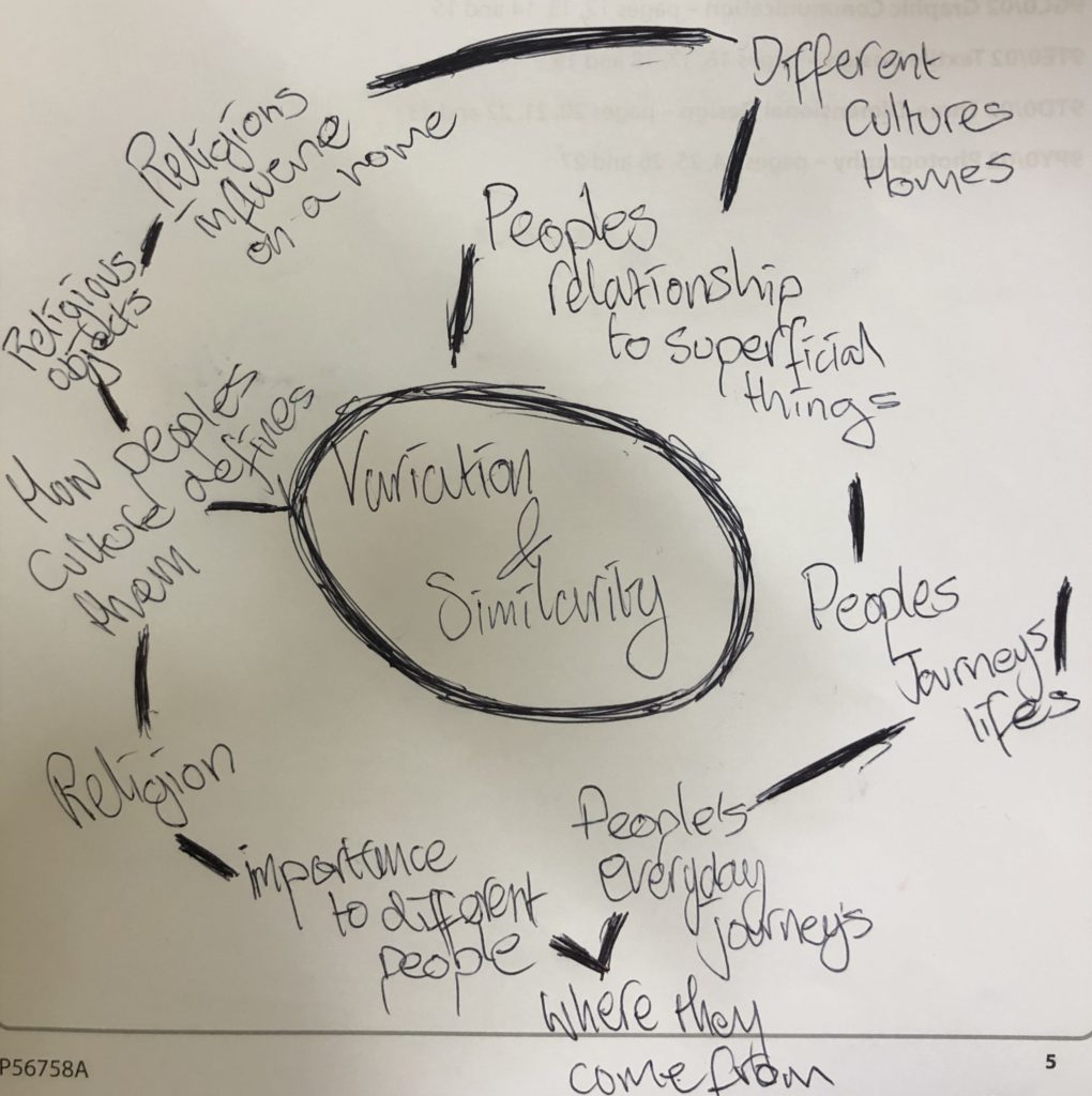
Variation & Similarity mind-map and mood-board

Initial Ideas (Starting Points) –

Words that relate to the theme:

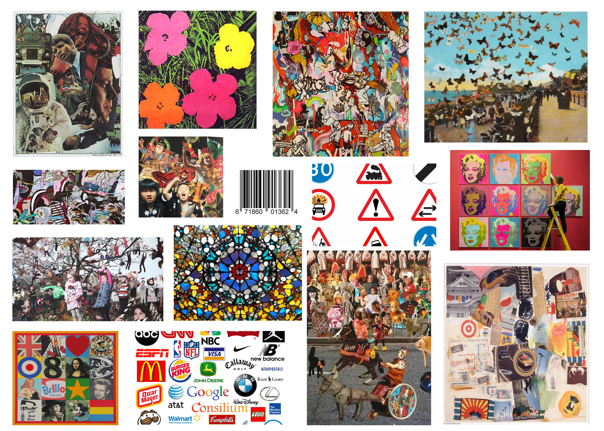
Chaotic, Pop Art, Logos, Symbols, Products, Scale, Graphic,  Figures, Colourful (Butterflies, Flowers etc.), Bright, Objects, Abstraction, Layering, Barcodes, Pop culture, Fashion, Text, Sourced imagery, Busy, Manipulation, Collage, Photo-Montage

Artists/Photographers – 

Robert Rauschenberg, Peter Blake, Damien Hirst, Richard Hamilton, Dexter Navy,  Jean-Michel Basquiat, Alice Wielinga, Dan Baldwin, Logo Graphic Designers

Mood Board

Definitions Of Project Title

Variation and Similarity

The title that we have been given for this exam is “variation and similarity”, within this blog post I intend to explore ways in which I can respond to this title and what the meaning of this title is.

Variation

Definition; A different or distinct form or version of something.

Similarity

Definition; A similar feature or aspect.

I decided to begin by brainstorming some initial ideas that came to mind when thinking about variation and similarity, I wanted to create a project with images that were personal to me and my environment and the people around me so I started to think of things that I have in common with people around me and how many aspects of our lives have similarities with slight variations from person to person, I started out with something that is considered one of the variations among people being culture and religion and even though it is a subject considered to have many differences there is often also many similarities, from there I started thinking about how I could compare the similarities and differences of everyday life between different cultures and religions, this is when I then started thinking of the everyday and how most people are stuck in a pattern of everyday doing the same things but different, I then tried to think of things in my own life that I do the same often but still has variations within it, this is when I started thinking about journeys and how travelling to and from school and from home to work, etc, is a big factor of my life and of the lives of others around me. I decided that I wanted to find a way to record the ‘world’ around me, that being Jersey, through travel, I found that something that was a big part of Jersey’s culture and of many people around me including myself was the buses. Buses are a huge factor in many peoples lives in Jersey, wether its travelling everyday to work or school, or it being a huge part of the tourism industry, I decided that by using the bus service a a way of travel i would have a way of capturing Jersey in a way other than sunsets and cows, and make it more about the people and the everyday life of the island.

My Response to HIROSHI SUGIMOTO’S

“‘Seascapes’ is art for the plateau, a group of images that measure time not by growth but in repetition.”

Inspired by Sugimoto’s seascape project, a meditation on time examined through repetition and constancy, I decided to do a photo shoot focusing on the movement of the sea. Throughout this shoot I wanted to capture a sense of the sublime that the ocean entails. With its array of colors and amazing formations it is undoubtedly beautiful however with its immense power and force it can be very dangerous too. The main aim for this shoot was to display a sense of repetition through the representation of the ocean as a rhythmic entity of waves. I also wanted to develop my own style inspired by Sugimoto therefore as well as using his long exposure method i also contrasted this with very fast shutter speed images to capture the waves in motion and gain a bunch of detail that can’t be seen by the naked eye. Changing up the shutter speeds allowed me to capture a whole range of different images which gave variety to this shoot whilst keeping to the similar theme of the ocean.

Contact Sheet

Edited Images

Using a combination of Photoshop and Lightroom I decided to edit some of the best images from this shoot. I used Photoshop to remove some elements of the photograph that were distracting for example the safety barriers that are positioned the hole way along the sea wall. Using Lightroom allowed me to do simple adjustments such as changing particular colors, highlights and shadows. Throughout the editing process I cropped the images to achieve the most aesthetic result and within some images used a black and white filter to replicate the style of Sugimoto.

Geometric landscapes

Image result for geometric landscapes

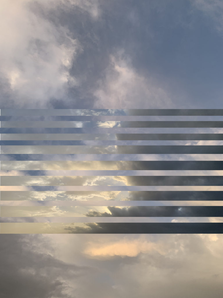
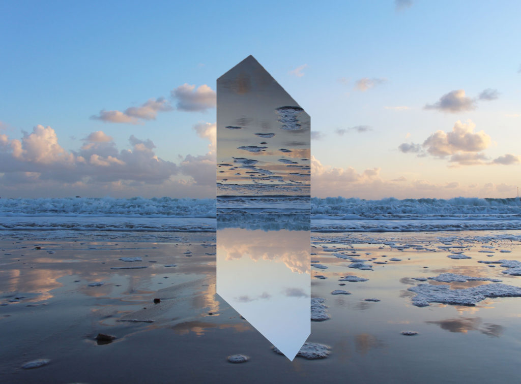
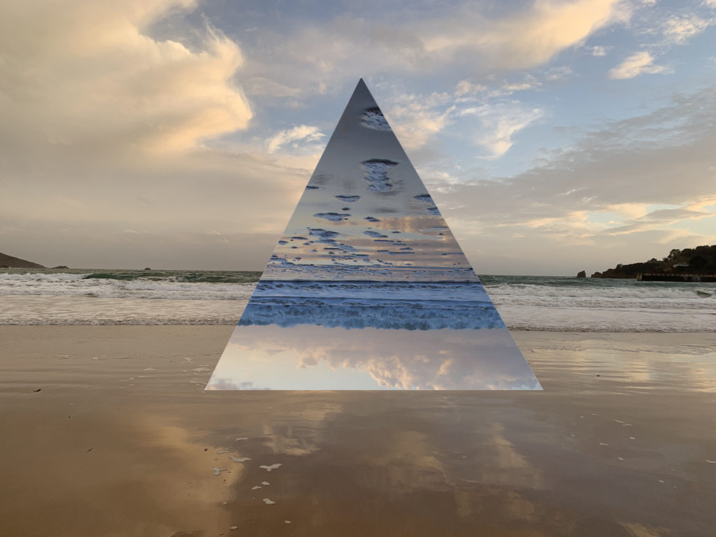
Geometric Landscapes is a series of landscapes overlaid with geometric shapes. The design is very attention grabbing from a viewers perspective. To make the design effective and look sleek, the editing process needs be be very precises with measurements and relies heavily on symmetry.

I began to experiment with some images that I had previous taken from other shoots and began to experiments with different designs to see which the most effective.

I think that this image would be better if the images where contrasting to each other because they are both images of the sky on cloudy days so the colour palletes are very similar. Another thing is that the lines of the images get gradually bigger so when I begin to editing in Photoshop again I will take more care and makes sure that the measurements are the same.
I found these images that I had taken from another shoot which have been taken in the exact same location, with the second layer image I flipped it upside down so that the line of the waves breaking are in line with each other, so the images become connected to each other. I find this to be athletically pleasing to the eye. The only thing that I think could improve the image would be if the colours of the images where different because the images where both taken during the sunset they both have a large amount of yellow and blues in them, so I will go and re take theses images, when I weather is stormy so the two images will be contrasting to each other

Initial Ideas

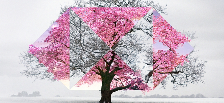
When I was coming back to Jersey through Gatwick airports I saw adverts for HSBC, which gave me inspiration of what I could do in my project.Image result for hsbc advert airports

In the images, there are two images that have been laid on top of each other to create a binary opposition, so in this image it is a Cherry blossom tree in the winter when the tree is bare and then in the spring/summer when the tree is out in full bloom. I thought that this was a very effective photography technique. Which I think is very fitting with the theme of the exam project ‘Variation and Similarity’ Image result for hsbc advert airports

The campaign by advertising company Saatchi & Saatchi  aims to bring to life HSBC’s role in “connecting the world”, and boost awareness of its “Together we thrive” brand promise, which launched earlier this year.

Each ad offers a view of a global scene relating to the bank’s business priorities – from trade and education to diversity and sustainability – as seen through the lens of HSBC’s “hexagon” logo. Topics include rooftop farming practices in New York, community cycling in the UK and food markets in Hong Kong.

A series of 79 different creative executions will roll out across 17 airports in nine countries – including Heathrow and Gatwick – covering 1,500 jet bridges and 94km of passenger walkways. HSBC claims the ads will be seen by 900 million passengers this summer alone.

“We do talk about having that intelligent wit, that wry sense of humour. Keeping that tone has been important. You want the consumers to work a little bit, both from a visual perspective and also with what words we might use. [We want] people to stop and say, ‘Oh’, and to get the slight joke,” said by Leanne Cutts, HSBC’s group head of marketing,

Video Art and Performance Art – Routine Experiment

Video art is an art form which relies on using video technology as a visual and audio medium.  This form of art emerged during the late 1960s as new technology began to come about such as video tape recorders.  Video art can come in a variety of forms – broadcast recordings, installations in galleries, online streaming or distributed as video tapes or DVDs.  Video art does not need to include actors or dialogue and also does not neet to have any sort of plot – they are often for the purpose of conveying a message.  Some artists have used video to make us think more critically about Hollywood film conventions as well as other social conventions through presenting personal or taboo subjects on the screen as works of art.

Video art can be combined with other forms of art such as performance art; this combination can be referred to as “media and performance art” when artists “break the mold of video and film and broaden the boundaries of art”.  Due to the increased availability of video cameras and technology this form of art can be documented easily and shared widely to reach many viewers.  An example of an artist who combined video art with performance art whilst using the camera as the audience is Kate Gilmore.  In her video ‘Anything’ she films her performance piece as she is constantly trying to reach the camera throughout the 13-minute video in different ways.  This piece of work brings an element of struggle into the genre and a sense of connection with the artist as the camera is performed to as if it was the audience.

Nam June Paik is a Korean-American artist who is widely recognised as a pioneer in video art.  In 1963 Paik showed her work ‘Exposition of Music – Electronic Television’ at the Galerie Parnass.  Video art is said to have begun when Paik used his Sony Portapak to shoot footage of Pope Paul VI’s procession through New York City where he played the tapes to people across town and so supposedly creating the style of art.  TV Cello is an example of June Paik breaking down the barriers between art and technology – it was created specifically for use in performance by the experiemental cellist Charlotte Moorman.  The work consisted of three television sets piled on top of each other and all showing different moveing images (a film of Moorman performing live, a collaged video of other cellists and an intercepted broadcast feed), the whole sculpture was also a fully operational cello which had been designed to be played with a bow to create a series of electronic notes.  Many of the early video artists were those involved with movements in conceptual art, performance and experimental film.

Later on as prices of editing software decreased, the access to technology that allowed people to create video art increase.  The result of this was different themes emerging and being explored.  Artists would begin to combine physical and digital technologies to allow their audience to physically explore the digital work.  A good example of this interactive digital work is Jeffrey Shaw’s “Legible City” in which the audience rides a stationary bicycle through a series of virtual images of Manhattan, Amsterdam and Karlsrule.  The images shown the the audience would change depending on the direction of the bike handles and the speed of the peddler and so creating a unique experience for everyone that took park.

In response to video and performance art I have produced my own 35 second video in which I demonstrate repetition within daily routines.  I recorded a clip of my taking a sip of tea as I sat down for a cup of tea once a day resulting in a 35 second clip that shows repetition and demonstrates the importance of daily routine within human behaviour.  The small video also demonstrates how easy it is for someone in our day and age to perform video art and how accessible the technology for it is.  I produced the video by downloading an app and then ordering the videos which took about two minutes in total – this is a massive contrast to some of the work that went into developing video art in the times of artists such as Nam June Paik as prior to the introduction of consumer video equipment, moving image production was only available non-commercially via 8mm film and 16mm film until the introduction of the Portapak.