My first initial thoughts for Variation and similarity could all fall under a possible three categories, that I could further expand and apply into one project as whole.
- The first premises I have, consists under the inspiration of fine art. Fine art is the basis of how the beauty of life has evolved throughout time in many different forms and expressions. The work of artists such as Van Gogh and Monet represent a more romantic presentation of fine art however more modern innovators such as Damien Hirest and Marc Quinn, show a more possessive inventive exploration of humanness through their work. The common denominator of these artists illustrate a celebration of the wonder of natural diversity. Artists use their expression of form of work in order to create a significance and meaning to each object and person, inflicting their own personal emotions through their canvas. The large amount of monotony and self proclaimed metaphors through their work leads to form new social conventions and not just images of fine art. It shows how something which was once mundane, can now be used to express meaning and value. This diversity within fine art and culture, led me to run off and see the connections between art and diversity based off individual DNA. As spoken about previously DNA is one of the defining factors which is both a variation and a similarity within everything living on the planet. This combination of formality and uniformity, could be used to define the formality or standards of what could and should be seen as art. This could be asked on an individual subject premises, or more of a formal experimentation to the meaning behind the DNA and why a piece of art was created, and for what purpose does it inflict and show social conventions. For this project I could either look into how far art has and can go for what reason, what the importance is individual and the relations people experience from an art piece due tot theirDNA, or the formality of myself photographing fine art piece and creating my own fine art piece. The study of fine art in photography, is usually categorised into bodily, landscape or more innovative pieces, which are piece of constructed fine art. Below I have separates some piece that I believe could really help with the further route of my images. The fine art piece themselves, this is a reaction to real art.
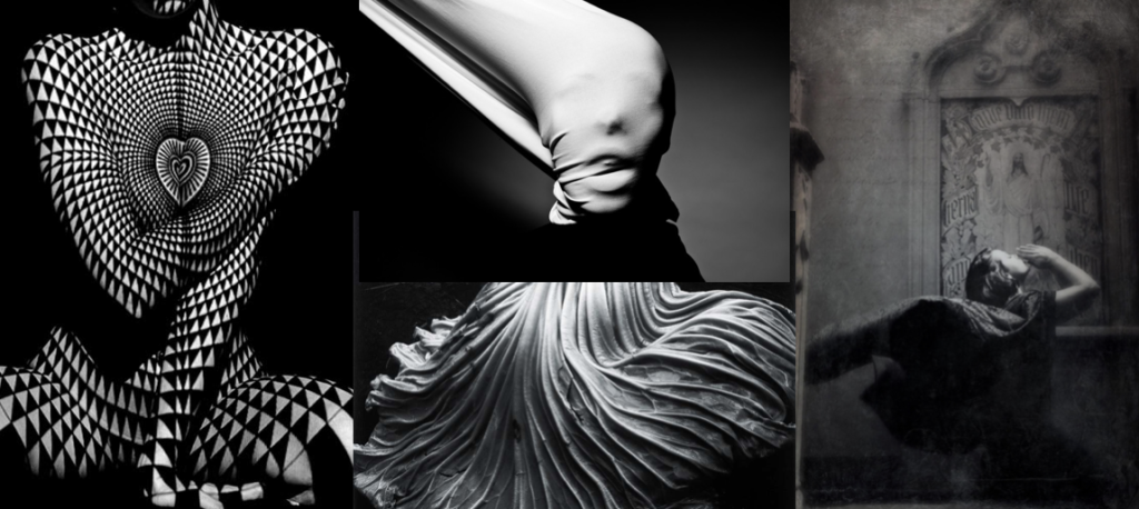
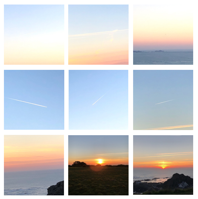
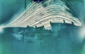
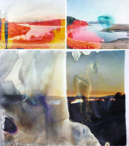
- This development of my first ideas, revolve around work which has such a significance meaning is no longer an image but is more contemporary piece of art. This means unlike more concept based photography, this work is so much more subjective and and shows attitudes of artistic fluidity and line throughout all of the pieces. One of the pieces that struck me the most is the first piece. It too was inspired by a Picasso cubism stylistic form, and the mould of the bodily from. The pattern and form is suggestive throughout the piece, it flows in and out creating a dynamic presentation of the human DNA. I started off looking into fine art by the influences of to what extent is art art. I believe expressing studies of photography in an arrangment of more abstract images which show shapes, almost mimics the way art has progressed to be more then just pretty pictures, but an intellectual statement from a point of view. Further research into the development of fine art and photography: My idea for the using artists such as Monet and van Gogh in order to show and explore how are has evolved. Is perhaps re creating some of their most influential paintings into photography, and perhaps moulding their techniques into mine. This first idea is developing a similarity to the fine art pieces, this being a a sense of mimicry of the artistic piece themselves. I believe I could then use the style of the artist chosen and either paint or edit the image into that stylistic manner. For example If I was using van Gogh, I could take images of beautiful night skys, and sun flowers. Then further edit the piece to be light and use small strokes observing the artist. I could animate videos inspired by each artists, or even animate the images I have chosen to move in the same way as the painting look as though they would move if they could. I chose to move just parts of the photos, in the same manner, just in order to create a flowing necessity to the pieces themselves. I belive if I both mimic the feeling and then the style I could really develop feeling of the artists work.
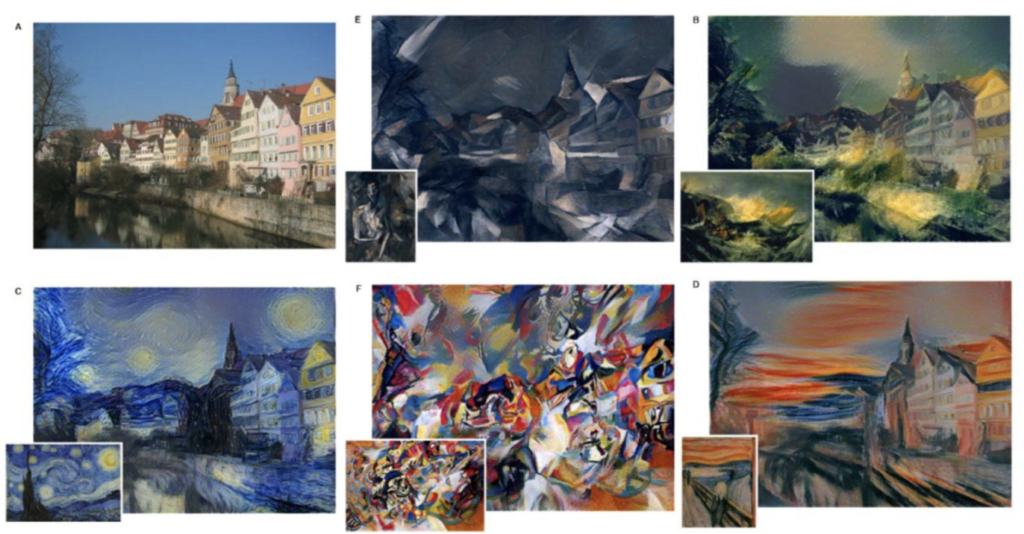
- I was too inspired by these pieces. It too shows a further possible development in order to express a certain style to the images. I believe it would be very hard to edit these images, but it shows the expression of how an art piece is painted, and changes the connotations and meaning behind the paintings. Overall with the following notions of developing both the concept of what fine art is, the conceptual meaning behind it, and turning and re creating my own work into such influential pieces, by developing their own stye and movement, will really achieve a sense of variation and similarity, being similar to the artists but still using my own imagery.
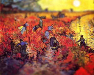
- Use a tilt-shift effect to make paintings or drawings appear real, as in these photographs of Vincent van Gogh artworks by Serena Malyon: https://www.studentartguide.com/articles/creative-photography-ideas




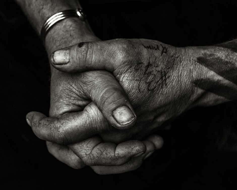 My first idea for a shoot is to photograph the hands of different people. I have chosen to focus on a person’s hands as there are man features on a hand that give indication of the person that they belong to – they can have clear veins running through them, they can have calluses, different skin tones and then everyone is guaranteed to have different lines running throughout their hands due to their genes as well as individual fingerprints. I have taken inspiration for this shoot from photography Tim Booth who did a project titled ‘A Show of Hands’.
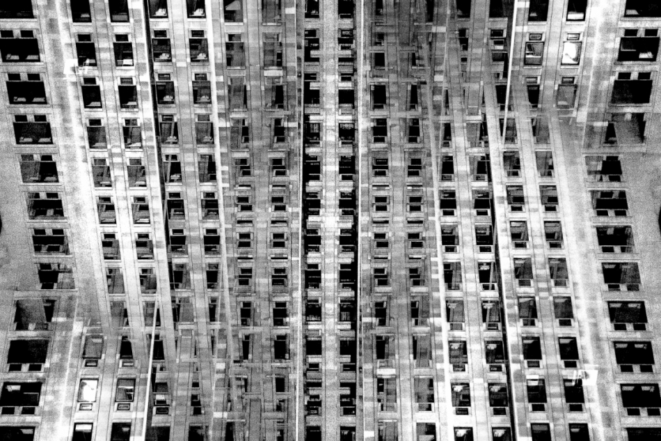
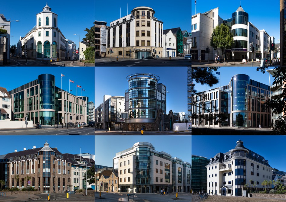
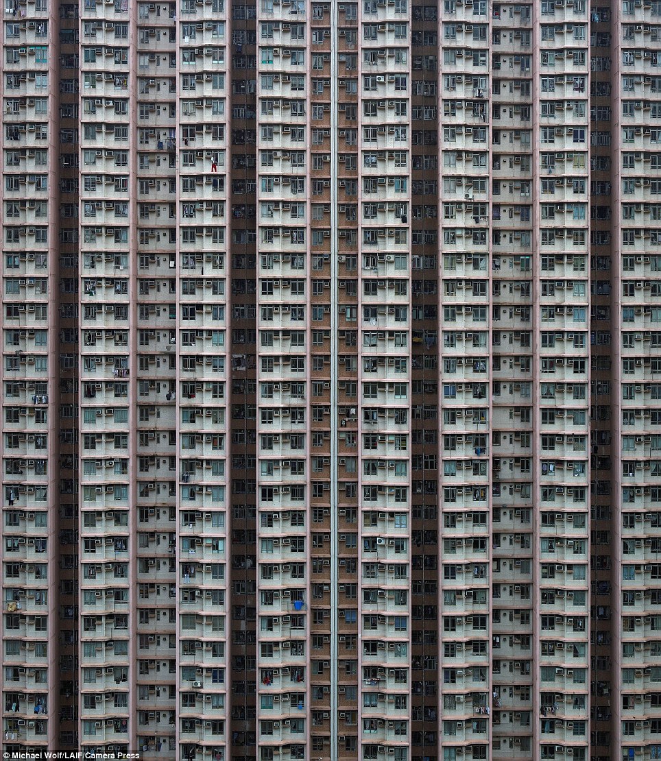 My second shoot idea is to photograph blocks of flats around Jersey and then photoshopping the resulting photographs to create repetition and patterns of the photographs in order to create a sense of monotony within the photographs and to show how repetitive blocks of flats can be. The resulting photographs will be very symmetrical and will almost create illusions. I could also approach this idea by photographing the symmetry and repetition within the blocks of flats and then presenting the photographs alongside each-other multiple times in a typographic style. I have drawn inspiration for this shoot idea from Lewis Bush’s work on ‘Metropole’ as well as the blocks of apartments in cities such as Hong Kong
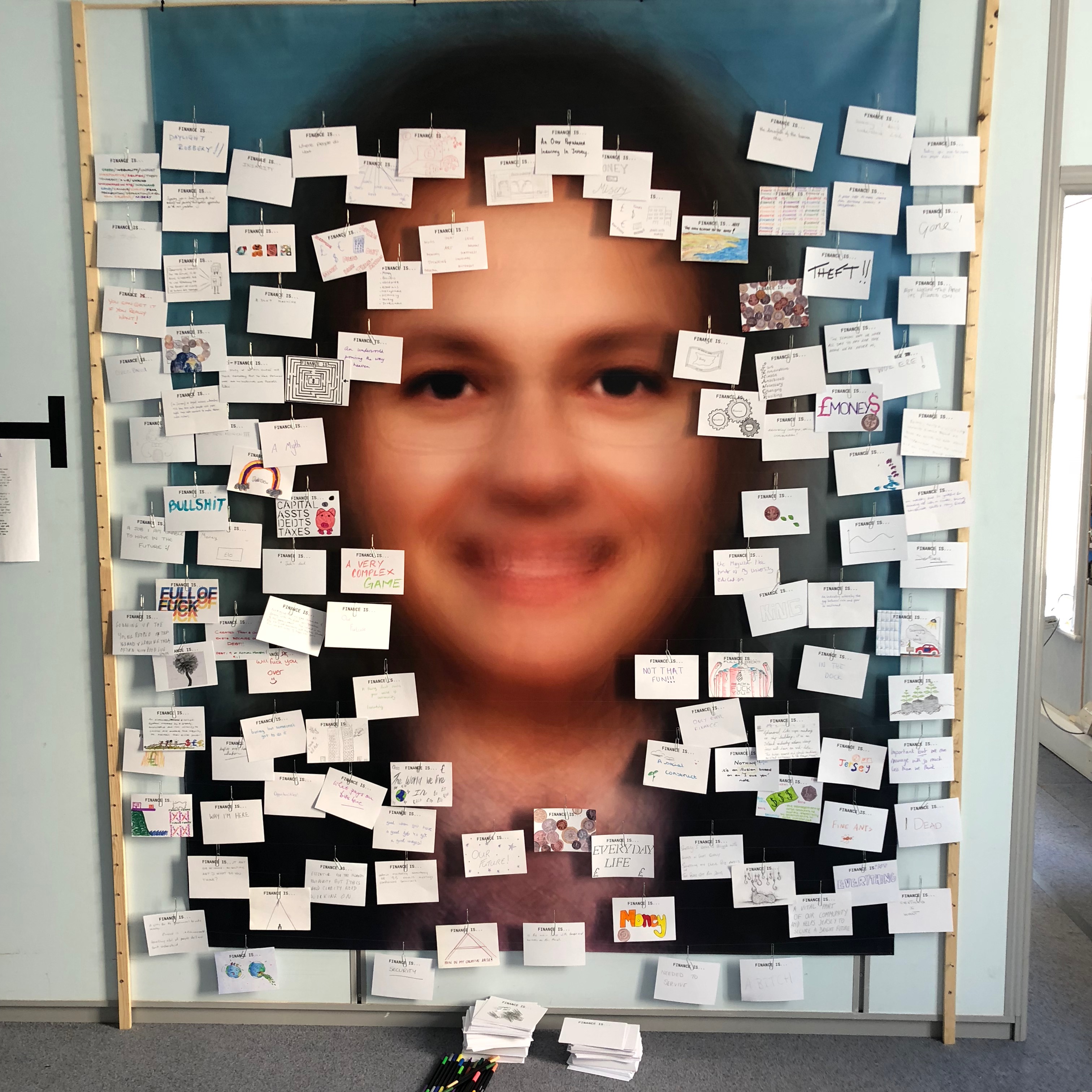 My third photo-shoot idea draws inspiration from Lewis Bush’s work on ‘Trading Zones’ in Jersey. In one segment of the work he showcased cards showing what the public though of finance. From this I believe that I could explore the unique hand-writing style of every individual through asking them to write what ‘Variance and Similarity’ means to them. The result of this will be a range of cards showing a variety of hand-writing styles which may be messy or neat which ultimately will give a slight insight into a personality trait of the person. Hand-writing is unique to everyone as everyone learns from a young age to write in different ways – some write quickly and messily whilst others take pride in ensuring that their hand-writing is neat and almost art-like. The aim of this shoot would be to show the wide variance in people’s styles.
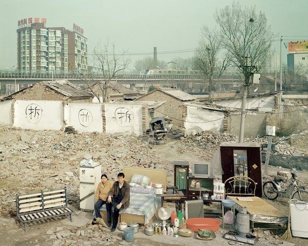
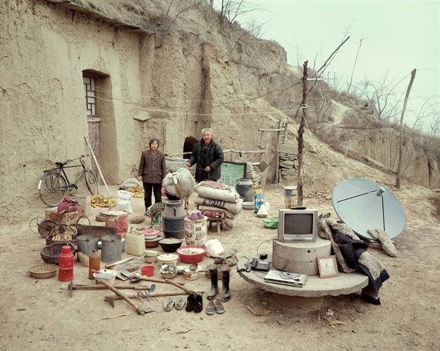
 My fourth shoot idea will focus on the personal belongings of different people. One way in which I could look at the personal belongings of individuals is by photographing the items that people carry around in their school bags on a day-to-day basis. This could be an interesting shoot that will give an insight into the personality traits of the individual as everyone will have different variations of items, some people may have more unnecessary items in their bags whereas some may only carry the minimum. This shoot idea takes inspiration from Huang Qingjun’s work ‘Jiading’ meaning ‘Family Stuff’ in which he photographed families along with their belongings in rural China to show the effect that modernisation is having on the population of the rural areas. I could present this in a typology style way so that the viewer can easily see the similarities and differences between what people carry around with them.






 Lewis Bush (born 1988 in London) is a British photographer, writer, curator and educator. Bush studied history at the University of Warwick and gained a master’s degree in documentary photography from London College of Communication, where he lectures on photojournalism and documentary photography. In his work bush seeks to draw attention to forms of invisible power that operate in the world – such as finance. Bush has the standpoint that ‘power is always problematic because it’s natural resting state is arbitrary and untransparent’. Bush’s projects tend to incorporate writing and he has written about photography for a range of national and international print and web titles.
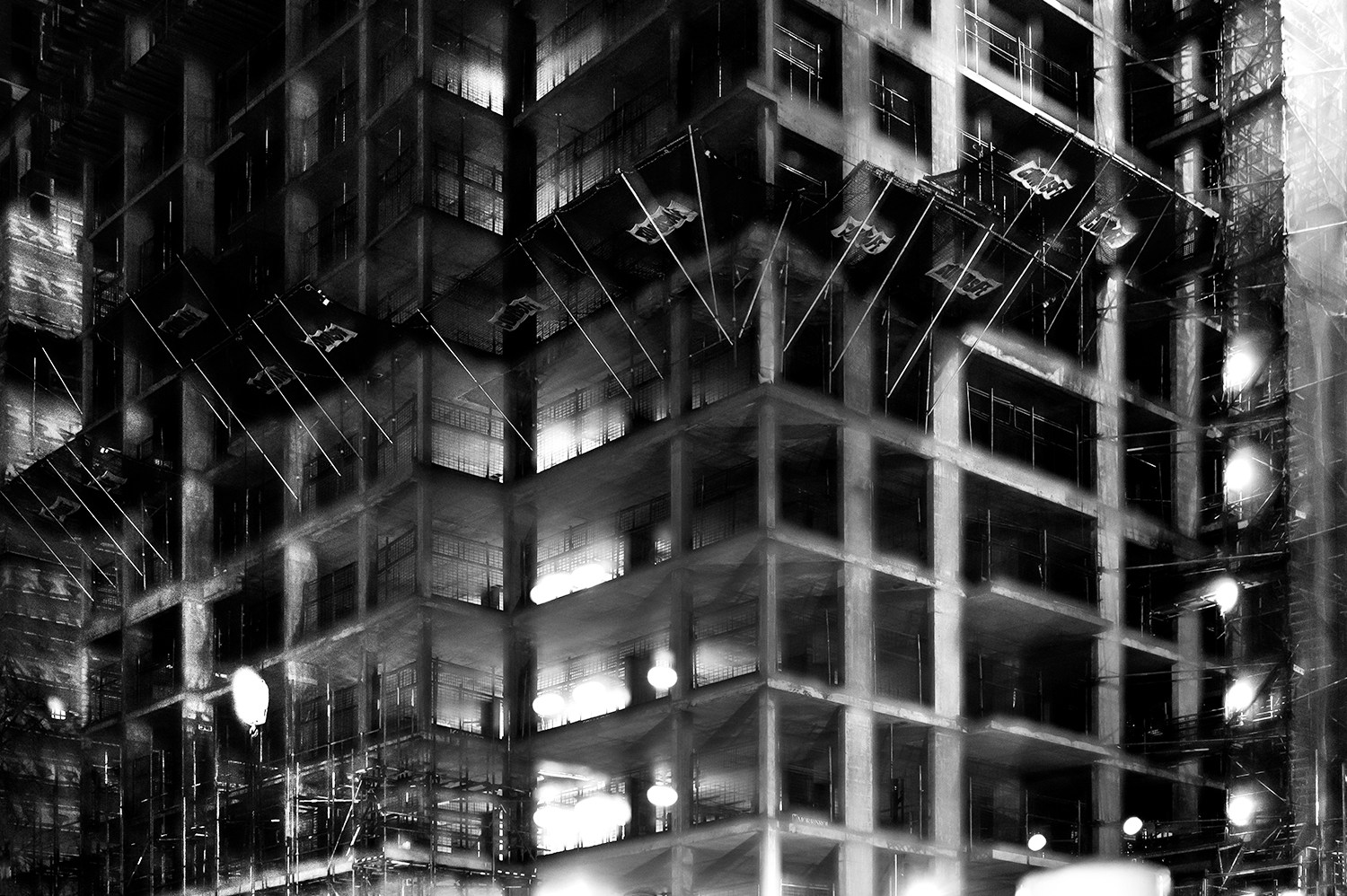
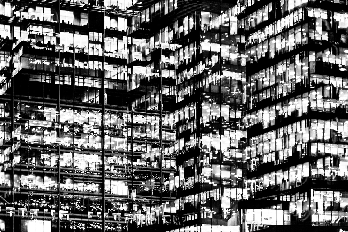 The main project by Bush that interests me is ‘Metropole’ in which he used a technique of double exposure. The project looks at the collapse of the British Empire and how in its place globalised capitalism grew as London has been rebranded as “a city of demolition, cranes, and glittering new high rises”. ‘Metropole’ aims to record the effect of this on London through the form of documentary photography. This appeals to me and links to the theme ‘Variance and Similarity’ because it explores the fact that there are an increasing amount of large buildings for offices or flats taking away from green land and so the landscape in which we live is turning into a repetitive view of similar flats and offices leaving citizens with a feeling of monotony as everything is being redeveloped to serve the same purpose. Bush’s work on ‘Metropole’ shows a lot of emphasis on the repetition between buildings due to his double exposure effect. I intend to respond to this work by capturing blocks of flats or offices, both in day and at night and then altering the photographs in photoshop to replicate the buildings and create a pattern of repetition throughout the edits. These edits will show how buildings can look different individually but a lot of them can be very boring and repetitive.
 Huang Qingjun is a Chinese photographer who has photographed families posing with their possessions amid China’s dash to become rich. He has spent nearly a decade travelling to remote parts of China to persuade people who have never been photographed to carry outside all their household possessions and pose for him. The results of this product are glimpses of the different lives and belongings of different families within China. The pictures have not been widely seen outside of China although some have been shown at exhibitions in Paris and New York.
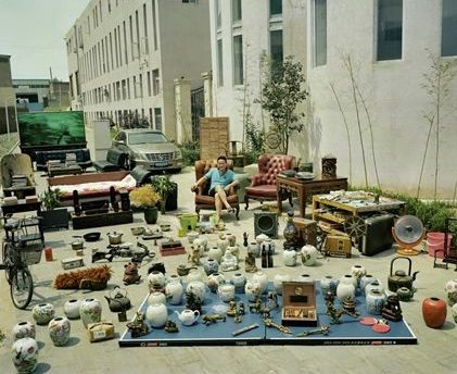 Huang was inspired as a teenager by an uncle when the typical hobbies for the Chinese youth were calligraphy and singing. The idea for the series about people’s material good, called ‘Jiadang’ (family stuff). first came in 2003 with some photographs that he took for the magazine Chinese National Geography but the project didn’t start properly until three years later, when Huang started travelling around China looking for suitable people. Huang says that “Most people thought what I was proposing was not normal” but most people understood the point at the end of it. Most of the people in these poor, remote areas did not have many possessions making the project both simpler and more interesting. Some of the projects took a couple of days whereas others took several months. Next year marks the 10th anniversary of the first photograph, and Huang plans to mark it by returning to the places he visited to see how they have changed. Huang also hopes to broaden the project’s range upon revisiting it by including people from a wider range of backgrounds, such as government officials.