I first wanted to explore the idea of repetition by creating a gif in Photoshop to generate ideas for my project. I chose the subject keys for my gif as everyone has them but with different variations in appearance i.e key shape, key chains. I thought by creating a gif showing different types of keys people have is a good way to represent the same object but in different variations.
To create the gif in Photoshop I chose >File>Load Files into a Stack> and chose all the images of the keys i had taken. I then selected all the layers and chose the speed i wanted the images to change.


GIF
Stands for “Graphics Interchange Format.” GIF is an image file format commonly used for images on the internet for sending images, especially moving images
I think that the limitations of creating is that you cannot see the movement in the image and only still objects if the timing of the images is slow, like the one I created above. Creating stop motion animations, if the timings were fast enough would create the appearance of movement which is something I could explore in my project. Another limitation when creating gifs is that it’s hard to create the same lighting in all the images which could make the gif look disorderly. I could also display gifs of different objects with more images than the one i may above to create more variation with a faster changes.
Early Works of Repetition
Andy Warhol 
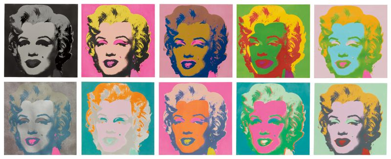
Andy Warhol has redeployed repetition as a device to alter our perception of a different type of society portrait – a portrait of celebrity. Warhol used an assembly line of silk-screened images of Marilyn Monroe as a metaphor for the loss of ‘self’ in the vicarious world of celebrity. Using silk-screening meant he could directly reproduce images already in the public eye, such as publicity shots or tabloid photographs. The technique also allowed him to easily produce multiple versions and variations of the prints.
He is known for his bright, colourful paintings and prints of subjects ranging from celebrities, to everyday products such as cans of soup. Marilyn Monroe 1962 is perhaps one of Warhol’s most iconic works. The work is made up of two canvases, each featuring 25 Marilyns printed in a grid pattern. The rows of repetitive heads suggest postage stamps, billboard posters or, perhaps more fittingly, film strips.
Warhol’s life and work simultaneously satirized and celebrated materiality and celebrity. On the one hand, his paintings of distorted brand images and celebrity faces could be read as a critique of what he viewed as a culture obsessed with money and celebrity. On the other hand, Warhol’s focus on consumer goods and pop-culture icons, as well as his own taste for money and fame, suggest a life in celebration of the very aspects of American culture that his work criticized.
My Interpretation of his Work
**
Hiroshi Sugimoto


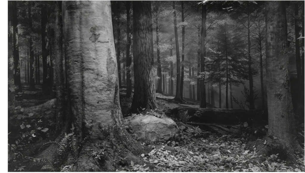
In 1980, Japanese photographer Hiroshi Sugimoto began working on an ongoing series of photographs of the sea and its horizon. From the English Channel to the Arctic Ocean, from the Norwegian Sea to the Black Sea, Tokyo-born artist has travelled the world to capture marine landscapes and create abstract canvas. Each black and white photograph is of the same size and cut directly through the center by the horizon line.
“Every time I see the sea, I feel a calming sense of security, as if visiting my ancestral home; I embark on a voyage of seeing.” says Sugimoto who describes his vision of sky and water as a form of time travel.
Sugimoto refers to his signature photographic style as “time exposure” experiments – playing with shutter speeds other photographers could never master. His goal through these “experiments” is to capture time through his images – creating time capsules that will last for eternity. Eternity is a constant focus of Sugimoto, who also worked on series that dealt with the issues of life and death – intrigued by the transience of human life.
Sugimoto has said that he draws much of his inspiration from sculpture artist Marcel Duchamp – famous for his sculpture of a urinal in the 1950s. Duchamp’s art dealt heavily with the Dadist movement of art. Sugimoto’s works are a unique combination of the Dadist movement as well as the Surrealist movement.
William Christenberry


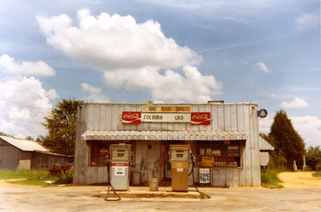
William Christenberry was an American photographer and artist who was known for simple, richly coloured photographs of decaying buildings in Alabama’s rural Hale county. Christenberry was considered a pioneer of fine colour photography, and his work carries a strong sense of both place and the passage of time.
Christenberry showed Walker Evans some of his photographs, taken with a Brownie camera that Christenberry had been given when he was a child. He used the photographs at the time as guides for his paintings and sculptures, but Evans told him that the photographs were worthy of consideration as art.
Christenberry explores the effects of time on his boyhood home by choosing subjects such as buildings, signs, and found objects. Christenberry believes that all objects leave their individual mark on the landscape as time passes, even when the object is destroyed in reality.
Typology- Bernd and Hilla Becher

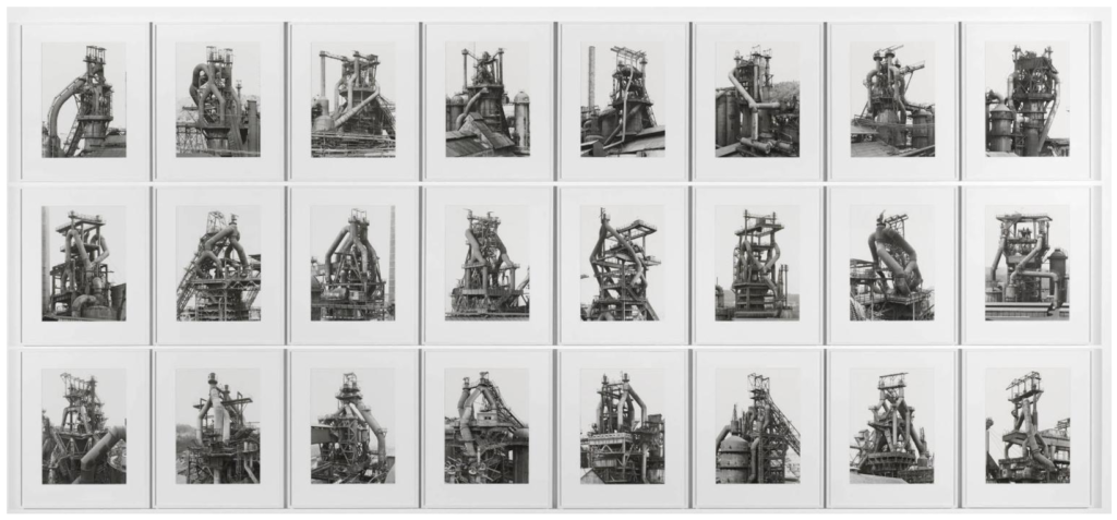
The German artists Bernd and Hilla Becher, who began working together in 1959 and married in 1961, are best known for their “typologies”—grids of black-and-white photographs of variant examples of a single type of industrial structure.
The seemingly objective and scientific character of their project was in part a polemical return to the ‘straight’ aesthetics and social themes of the 1920s and 1930s in response to the sentimental subjectivist photographic aesthetics that arose in the early post-war period.
They overlooked beauty and the relationship between form and function. Both subjects addressed the effect of industry on economy and the environment.
“I became aware that these buildings [blast furnaces] were a kind of nomadic architecture which had a comparatively short life—maybe 100 years, often less, then they disappear,” the artists said of their work. “It seemed important to keep them in some way and photography seemed the most appropriate way to do that.”
I think that Bernd and Hilla Becher’s work links to making gifs as they created series of images of the same objects in different areas. When making a gif I used different variation of the same obejct ‘keys’ aswell. Instead of displaying my work in a grid format though, i created a gif to only show image for a set amount of time.
