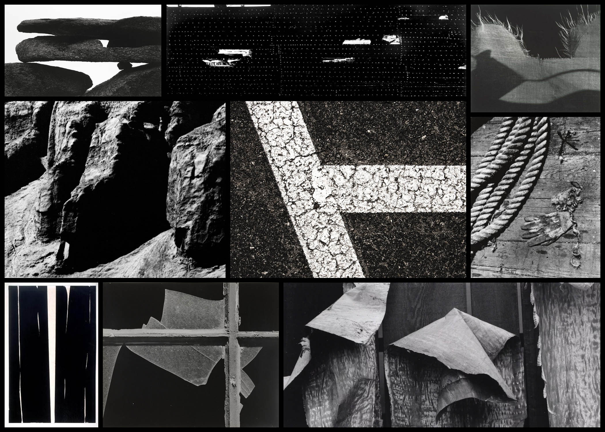
Who is he?
Arron Siskind was born December 4th, 1903, New York, dying in February 8th, 1992, Providence, Rhode Island. Siskind became an influential teacher, editor and photographer who is best known for his innovations in abstract photography. Starting 1932, as an English teacher in New York City he became a member of the Photo League, participating in projects designed to document neighbourhood life during the Great Depression. Siskind’s project Dead End: The Bowery and Harlem Document shows his concern for pure design rather than the subjects themselves. Because of this in the late 1930s he stopped photographing people and instead moved onto architectural photography, seen present in his book Old Houses of Bucks County, a book which looked at natural phenomena and still life.
Siskind soon specialised in abstract work which he became best known for, where he expresses his own state of mind instead of recording the subject matter as it is. In the late 1940s textures and patterns became the core focus for him, looking at regular objects such as rope, sand and seaweed. Siskind’s inspiration came from Group f.64 who photographed the subject up close much like his own style, this led him onto photographing two-dimensional surfaces such as pavements, billboards and walls, especially the ones which had been decayed and worn out by the weather. This turned into his main theme that allowed for him to take photos of the ruins of Arch of Constantine in 1967, a piece that was not originally accepted by other photographers. However many artists liked this and Siskind’s was hung up alongside abstract expressionist paintings.
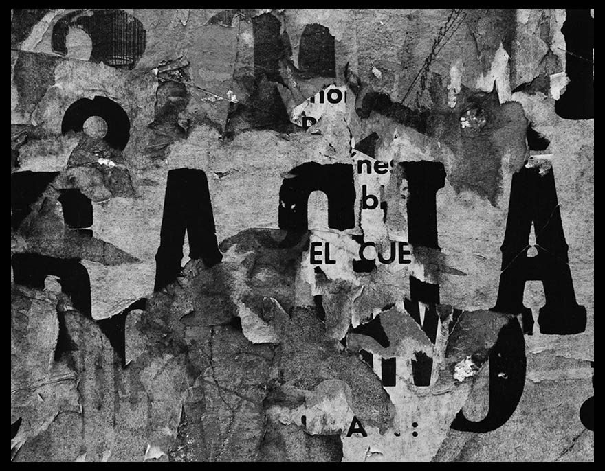
Most of his inspiration comes from various activities as a founding member of the Society of Photographic Education and as a co-editor of Choice, a literary and photography magazine. Overall his greatest inspiration was as a professor of photography at the Institute of Design of the Illinois Institute of Technology in Chicago, a post he held from 1951 to 1971. His final works consist of a 30 year anthology of his photographs, Bucks County, Photographs of Early Architecture and Places. Here are some examples of his work below: After looking over some examples of his work I decided that I would analyse one of his images, by doing this it would allow for a greater insight into how these photos are created and what makes them so effective. When looking over the photos it would give me the ability to incorporate the style into my own works, making them more effective as a result. The image I chose for this is called San Luis Potosi 16, a photo of a rotting billboard with deteriorating paper:
Visual:
Visually the image is of a billboard that had been left to rot, and as a result has become this abstract piece in itself which hides the initial meaning meant to be put across by it. This is accompanied by the fact that the paper has been repeatedly stacked upon different posters underneath, because of this the writing seems to jump around the image rather than stick in one place. When looking at it I found that the different sizes of fonts really attracted my attention due to it breaking up the piece from becoming too generic and repetitive, allowing for your eyes to travel across it with ease rather than become eye-sore from a lack of contrast. Composition wise the use of placing the biggest text in the centre of the photo really creates the whole image, as it becomes the focal point for your initial glance and the source of it’s overall aestheticism.
Technical:
When looking over the image there is a use of high contrast, this is done so that there is a clear definition between the lights and dark present inside the piece, emphasising and changing the final outcome as a result. The photo has been taken using monochrome, this like the contrast increases the difference between the lights and dark whilst also honing in on specific details that may of not been previously picked up upon when looking at it in colour. A relatively normal exposure and shutter speed have been used as there is no sign of blur or one of he shades overpowering the other, instead capturing the billboard as it was seen at the time.
Conceptual:
The image itself is part of a series consisting of various billboards in and around cities, capturing their deterioration in an aesthetic and unusual way. When looking over the photo it is clear to me that it was taken at the peak of Siskind’s exploration and experimentation regarding various takes on the environment which makes us the surrounding area, using it to reflect what can be seen and expected rather than take portraits instead. By using a monochrome filter it brings out the aestheticism of the image, making it entirely possible to interpret the image purely on an aesthetic level. The reason for Siskind’s attraction to abstract takes on cities come from experimentation between photographing an object in an unusual way or photographing the people found in that area, after much time he decided upon using abstraction to express his opinion regarding his viewpoint of the surround place, making the viewer interpret his meaning through only visual appearance alone.

Overall solid blog posts, but try and extend contextual/ critical studies on Artist Reference/ Tim Flach
For example, discuss how his images above are different from other images of wildlife seen in natural history or wildlife photography?
What does this images say about our current planet and our protection of endangered species?
You mention his references to horse painting – include images and compare visual analysis
Read articles here about his work from his website and include direct quotes to demonstrate wider reading, understanding etc.
You need to do the above to achieve exceptional marks in level 6 = A* grade
https://timflach.com/articles/