My Response to HIROSHI SUGIMOTO’S

“‘Seascapes’ is art for the plateau, a group of images that measure time not by growth but in repetition.”

Inspired by Sugimoto’s seascape project, a meditation on time examined through repetition and constancy, I decided to do a photo shoot focusing on the movement of the sea. Throughout this shoot I wanted to capture a sense of the sublime that the ocean entails. With its array of colors and amazing formations it is undoubtedly beautiful however with its immense power and force it can be very dangerous too. The main aim for this shoot was to display a sense of repetition through the representation of the ocean as a rhythmic entity of waves. I also wanted to develop my own style inspired by Sugimoto therefore as well as using his long exposure method i also contrasted this with very fast shutter speed images to capture the waves in motion and gain a bunch of detail that can’t be seen by the naked eye. Changing up the shutter speeds allowed me to capture a whole range of different images which gave variety to this shoot whilst keeping to the similar theme of the ocean.

Contact Sheet

Edited Images

Using a combination of Photoshop and Lightroom I decided to edit some of the best images from this shoot. I used Photoshop to remove some elements of the photograph that were distracting for example the safety barriers that are positioned the hole way along the sea wall. Using Lightroom allowed me to do simple adjustments such as changing particular colors, highlights and shadows. Throughout the editing process I cropped the images to achieve the most aesthetic result and within some images used a black and white filter to replicate the style of Sugimoto.

Geometric landscapes

Image result for geometric landscapes

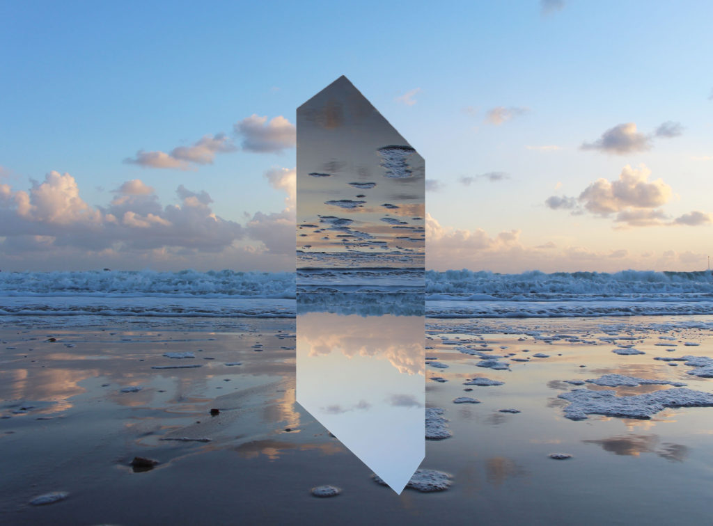
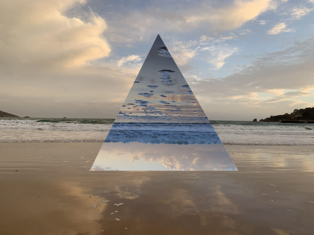
Geometric Landscapes is a series of landscapes overlaid with geometric shapes. The design is very attention grabbing from a viewers perspective. To make the design effective and look sleek, the editing process needs be be very precises with measurements and relies heavily on symmetry.

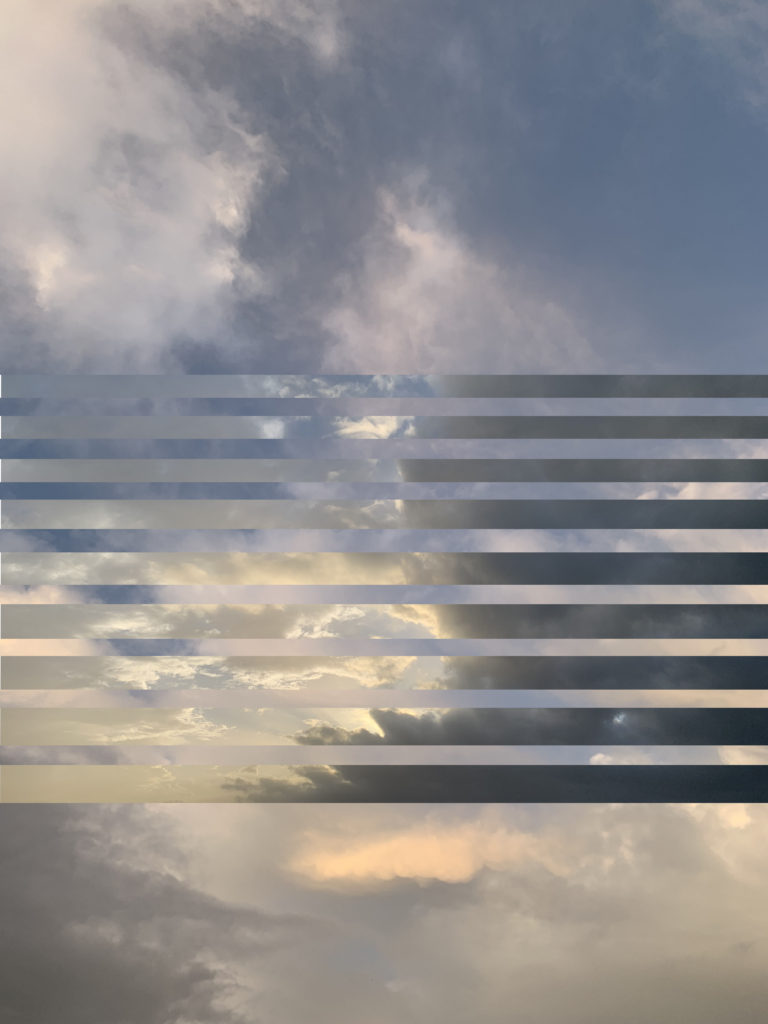
I began to experiment with some images that I had previous taken from other shoots and began to experiments with different designs to see which the most effective.

I think that this image would be better if the images where contrasting to each other because they are both images of the sky on cloudy days so the colour palletes are very similar. Another thing is that the lines of the images get gradually bigger so when I begin to editing in Photoshop again I will take more care and makes sure that the measurements are the same.
I found these images that I had taken from another shoot which have been taken in the exact same location, with the second layer image I flipped it upside down so that the line of the waves breaking are in line with each other, so the images become connected to each other. I find this to be athletically pleasing to the eye. The only thing that I think could improve the image would be if the colours of the images where different because the images where both taken during the sunset they both have a large amount of yellow and blues in them, so I will go and re take theses images, when I weather is stormy so the two images will be contrasting to each other

Initial Ideas

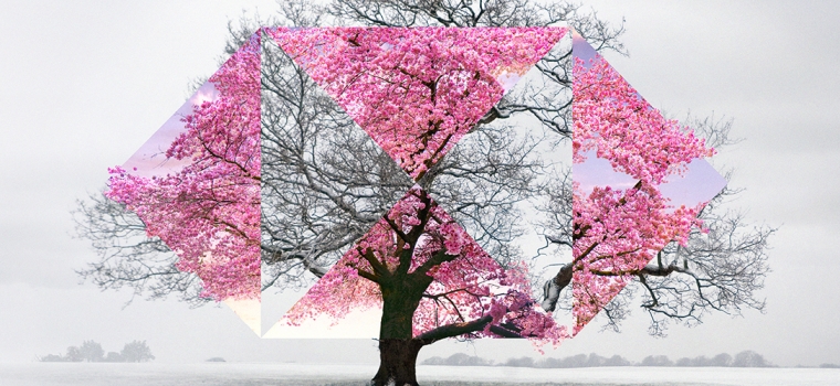
When I was coming back to Jersey through Gatwick airports I saw adverts for HSBC, which gave me inspiration of what I could do in my project.Image result for hsbc advert airports

In the images, there are two images that have been laid on top of each other to create a binary opposition, so in this image it is a Cherry blossom tree in the winter when the tree is bare and then in the spring/summer when the tree is out in full bloom. I thought that this was a very effective photography technique. Which I think is very fitting with the theme of the exam project ‘Variation and Similarity’ Image result for hsbc advert airports

The campaign by advertising company Saatchi & Saatchi  aims to bring to life HSBC’s role in “connecting the world”, and boost awareness of its “Together we thrive” brand promise, which launched earlier this year.

Each ad offers a view of a global scene relating to the bank’s business priorities – from trade and education to diversity and sustainability – as seen through the lens of HSBC’s “hexagon” logo. Topics include rooftop farming practices in New York, community cycling in the UK and food markets in Hong Kong.

A series of 79 different creative executions will roll out across 17 airports in nine countries – including Heathrow and Gatwick – covering 1,500 jet bridges and 94km of passenger walkways. HSBC claims the ads will be seen by 900 million passengers this summer alone.

“We do talk about having that intelligent wit, that wry sense of humour. Keeping that tone has been important. You want the consumers to work a little bit, both from a visual perspective and also with what words we might use. [We want] people to stop and say, ‘Oh’, and to get the slight joke,” said by Leanne Cutts, HSBC’s group head of marketing,

Video Art and Performance Art – Routine Experiment

Video art is an art form which relies on using video technology as a visual and audio medium.  This form of art emerged during the late 1960s as new technology began to come about such as video tape recorders.  Video art can come in a variety of forms – broadcast recordings, installations in galleries, online streaming or distributed as video tapes or DVDs.  Video art does not need to include actors or dialogue and also does not neet to have any sort of plot – they are often for the purpose of conveying a message.  Some artists have used video to make us think more critically about Hollywood film conventions as well as other social conventions through presenting personal or taboo subjects on the screen as works of art.

Video art can be combined with other forms of art such as performance art; this combination can be referred to as “media and performance art” when artists “break the mold of video and film and broaden the boundaries of art”.  Due to the increased availability of video cameras and technology this form of art can be documented easily and shared widely to reach many viewers.  An example of an artist who combined video art with performance art whilst using the camera as the audience is Kate Gilmore.  In her video ‘Anything’ she films her performance piece as she is constantly trying to reach the camera throughout the 13-minute video in different ways.  This piece of work brings an element of struggle into the genre and a sense of connection with the artist as the camera is performed to as if it was the audience.

Nam June Paik is a Korean-American artist who is widely recognised as a pioneer in video art.  In 1963 Paik showed her work ‘Exposition of Music – Electronic Television’ at the Galerie Parnass.  Video art is said to have begun when Paik used his Sony Portapak to shoot footage of Pope Paul VI’s procession through New York City where he played the tapes to people across town and so supposedly creating the style of art.  TV Cello is an example of June Paik breaking down the barriers between art and technology – it was created specifically for use in performance by the experiemental cellist Charlotte Moorman.  The work consisted of three television sets piled on top of each other and all showing different moveing images (a film of Moorman performing live, a collaged video of other cellists and an intercepted broadcast feed), the whole sculpture was also a fully operational cello which had been designed to be played with a bow to create a series of electronic notes.  Many of the early video artists were those involved with movements in conceptual art, performance and experimental film.

Later on as prices of editing software decreased, the access to technology that allowed people to create video art increase.  The result of this was different themes emerging and being explored.  Artists would begin to combine physical and digital technologies to allow their audience to physically explore the digital work.  A good example of this interactive digital work is Jeffrey Shaw’s “Legible City” in which the audience rides a stationary bicycle through a series of virtual images of Manhattan, Amsterdam and Karlsrule.  The images shown the the audience would change depending on the direction of the bike handles and the speed of the peddler and so creating a unique experience for everyone that took park.

In response to video and performance art I have produced my own 35 second video in which I demonstrate repetition within daily routines.  I recorded a clip of my taking a sip of tea as I sat down for a cup of tea once a day resulting in a 35 second clip that shows repetition and demonstrates the importance of daily routine within human behaviour.  The small video also demonstrates how easy it is for someone in our day and age to perform video art and how accessible the technology for it is.  I produced the video by downloading an app and then ordering the videos which took about two minutes in total – this is a massive contrast to some of the work that went into developing video art in the times of artists such as Nam June Paik as prior to the introduction of consumer video equipment, moving image production was only available non-commercially via 8mm film and 16mm film until the introduction of the Portapak.