Hiroshi Sugimoto’s – Artist Reference

Hiroshi Sugimoto is a Japanese photographer and architect. He leads the Tokyo-based architectural firm ‘New Material Research Laboratory’. Sugimoto has spoken of his work as an expression of ‘time exposed’, or photographs serving as a time capsule for a series of events in time. His work also focuses on transience of life, and the conflict between life and death. Sugimoto is also deeply influenced by the writings and works of Marcel Duchamp, as well as the Dadaist and Surrealist movements as a whole. He has also expressed a great deal of interest in late 20th century modern architecture.

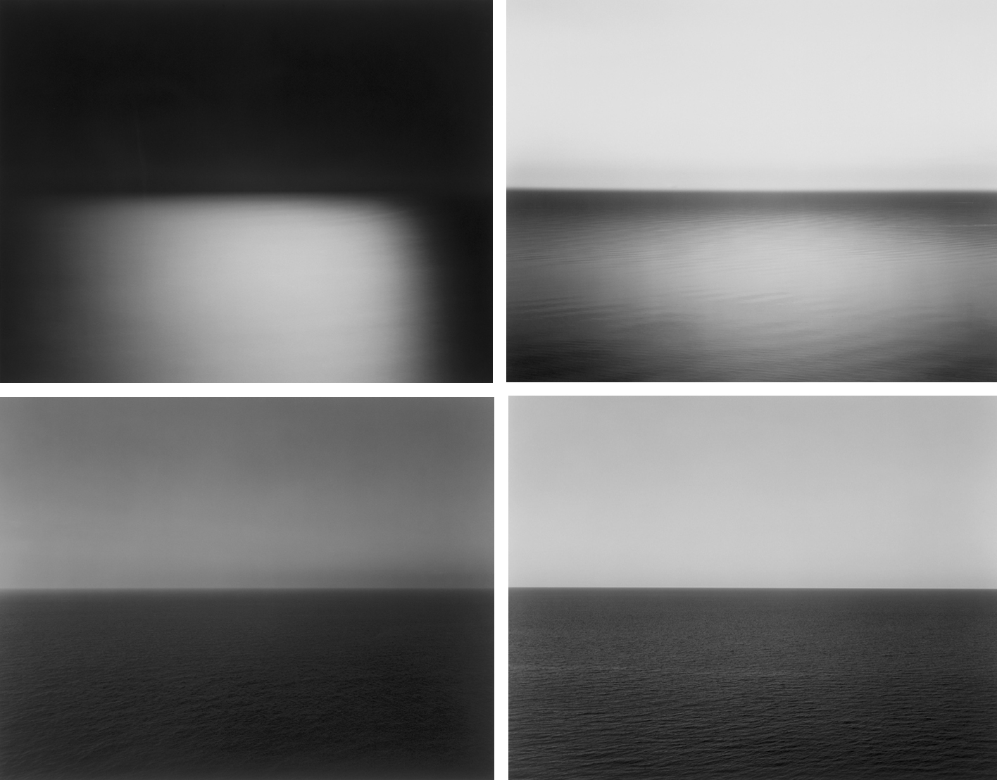
I am particularly interested in his project titled ‘seascapes’. In 1980 he began working on an ongoing series of photographs of the sea and its horizon, Seascapes, in locations all over the world, using an old-fashioned large-format camera to make exposures of varying duration (up to three hours). The locations range from the English Channel to the Arctic Ocean, from Italy, to the Tasman Sea and from the Norwegian Sea to the Black Sea in Turkey. The black-and-white pictures are all exactly the same size, bifurcated exactly in half by the horizon line. The systematic nature of Sugimoto’s project recalls the work Sunrise and Sunset at Praiano by Sol LeWitt, in which he photographed sunrises and sunsets over the Italy. Within this project there is a clear attention to the depiction of light and how it shapes the landscape as appose to the traditional landscape images from the romantic genre. 
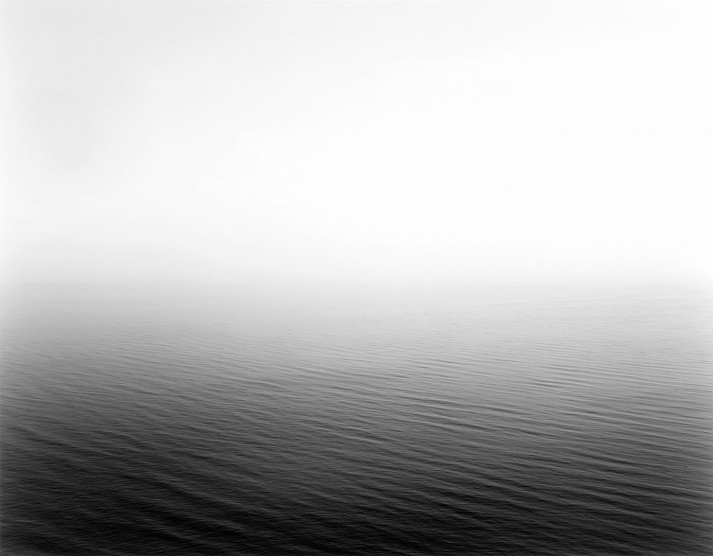
Image result for hiroshi sugimoto seascapes

All the images within this project are rather similar within the way they all consist of exactly half of the ocean and half of the sky. Another similarity is the fact they consist of black and white color tones which also links to my previous two artist references. Tommy ingberg’s images are all in black and white and also Ernst Haekel has works that happen to use the black and white color range. On the other hand, there are also a variety of shutter speeds clearly being used to capture the images with some of the photos being rather clear others are extremely hazy making it almost impossible to work out what the imagery is of. This unique perspective of the sea has elements of time and movement embedded into them as well as a clear interest for nature.

Analysis
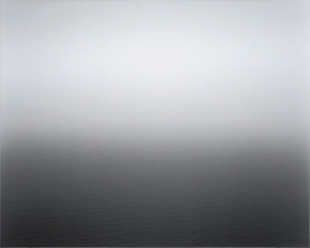
Image result for Hiroshi Sugimoto seascape analysis

This particular image and all the others embedded within the book are all neutral black and white. The image is formatted horizontally and there is a divide directly in the middle distinguishing the sea and the sky. There is no land mass or man made objects within this image, it contains only three elements; light water and air. Having very little features in the image gives a minimalist approach which is visually pleasing. This image has indications of movements on the water surface however mostly is hidden under the fog, haze and light clouds.

Splitting the frame in half, the images are classically balanced and no emphasis has been inferred to either sky or the water. There are no lines within the image that lead us to any part of the image or which emphasize one area or another. Minor pattern or texture on the water or within the sky do not demand our attention but provide some variety within an overall sameness. The affect of the computational structure is that while our eyes may freely wander, they tend to gravitate back to the center of the image and the horizon. Within this image and all the others contained within the project, he places the horizon in the center. I think this is to do with the instinctual human way of seeing. If we stare into the horizon, we stare right into the middle of it. In fact, anything we look at, due to the basic nature of human perception, is put right in the middle of our field of vision. I assume that Sugimoto knows this and has purposely constructed the image in this sense to reflect this.

The elimination of any land mass or man made objetcs means we have no way to determine where or when the images were made. Land mass characteristics allow identification of a place as well as man made structures or even a particular boat. These factors may even give a sense of time frame on when the image was created however with the absence of these we cannot know when or where the image was taken. This gives a sense of mystery and the unknown which is really interesting as it gets the viewer engaged with the image. Another thought that comes to mind when I consider the minimalist approach is a connection to the biblical view of the creation of the earth, being originally covered in water with light introduced before land surfaced.

I think through this particular image and the project as a whole the intent was to create a sense that, regardless of where we are, we could all go to a large body of water and see the same thing. The fact that we would share the same visual experience regardless of if we did that now, in the past or in the future. Our internal experience stimulated by the view will be more individual and vary from person to person. I think that Sugimoto’s view based on the quiet nature of the image is thought provoking. I also think he is expressing the ocean as a place to relax, where the repetitive sounds and beautiful view allow our minds to disconnect with any stress and simply enjoy life.

Ernst Haeckel – Artist Reference

Ernst Haeckel (February 1834 – 9 August 1919) was a German biologist, naturalist, philosopher, physician, professor, marine biologist, and artist who discovered, described and named thousands of new species, mapped a genealogical tree relating all life forms, and coined many terms in biology including anthropogeny, ecology, phylum, phylogeny and protista. Haeckel promoted and popularised Charles Darwin’s work in Germany and developed the influential but no longer widely held recapitulation theory.

The published artwork of Haeckel includes over 100 detailed, multi-colour illustrations of animals and sea creatures, collected in his Kunstformen der Natur (“Art Forms of Nature”). The book consists of lithographic and halftone prints. Lithography is a method of printing originally based on the immiscibility of oil and water. The printing is from a stone or a metal plate with a smooth surface. Halftone is the reprographic technique that simulates continuous tone imagery through the use of dots, varying either in size or in spacing, thus generating a gradient-like effect.

I decided to study the artwork of Haeckel due to his clear relation to nature and in particular living species. Undeniably there is huge variation within the species however all stemming from only four DNA variants there are some similarities too. I was really inspired by the vibrancy of his artwork along with bold solid colors. His black and white work is also very interesting as it allows us to view the species in much more detail revealing interesting shapes and textures. This use of black and white also links to my previous artist reference which therefore applies to the word ‘similarity’ that was given as part of the exam project. I think it would be interesting to combine inspiration taken from the two artists to produce a series of images that focuses on the thoughts and feelings of humans (Tommy Ingberg inspiration) and the diversity of species (Ernst Haeckel inspiration).

Image result for ernst haeckel

Image result for ernst haeckel

Photo Analysis

Related image


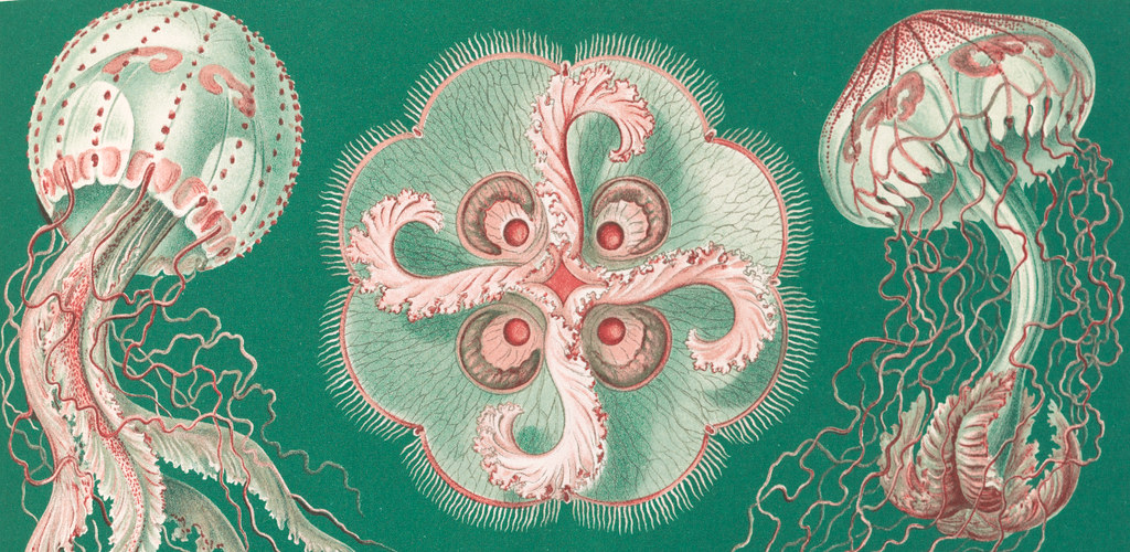
The diverse range of colors against the white background makes the image really pop and aesthetically appealing for the audience. The use of predominately orange and teal colors compliment each other contrasting nicely giving an overall effective result. There are a large variety and use of similar textures within this photo from the intertwining tentacles to the soft edges around the top of the species. There is a clear precision and careful shading that has taken place, but they also give a detailed insight into the understanding of organic evolution. Haeckel’s works is the emphasis on the essential symmetries and order of nature; even in the strangest of creatures, he managed to find a sense of biological beauty which to me is what makes his work stand out. Often people would associate a jelly fish as a scary and not so beautiful specie however his art has really transformed how some species are viewed in this case the jelly fish looks magnificent.

The art and science of  Ernst Haeckel outlines the 19th-century artist-biologist’s most important visual works and publications across a hefty 704 pages. The compendium includes 450 drawings, watercolors, and sketches from his research, which was in large support of Darwin’s theory of evolution. Most notably the book contains the Kunstformen der Natur (Art Forms in Nature), a collection of 100 prints of varying organisms originally published between 1899 and 1904. This particular image has come from the book which displays very detailed imagery of what appears to be a collection of jelly fish.

Experimenting with Repetition – Gif

To begin the repetition task we where set with the task of creating a Gif for ourselves

Gif

  1. a lossless format for image files that supports both animated and static images.”
  2. a file in GIF format.

The Graphics Interchange Format, is a bitmap image format that was developed by a team at the online services provider CompuServe led by American computer scientist Steve Wilhite on June 15, 1987.

To create a GIF within Photoshop is very straightforward. It can be done in three simple steps :

“a file in GIF format.

  1. open your chosen images in Photoshop
  2. go to: file > scripts > load files into stack
  3. select ‘open files’ and ‘ok’

FIRST SHOOT, LANDSCAPE WITH SURREAL EDITS

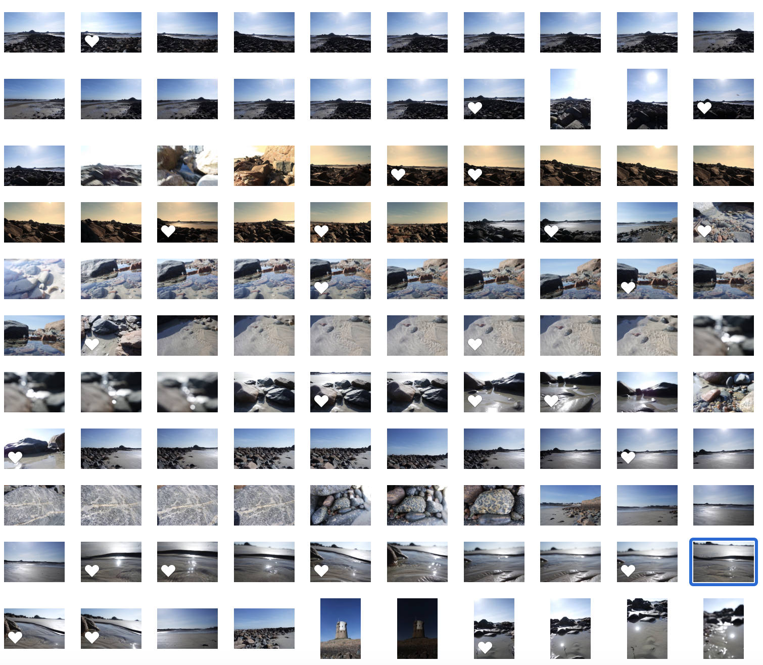
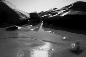
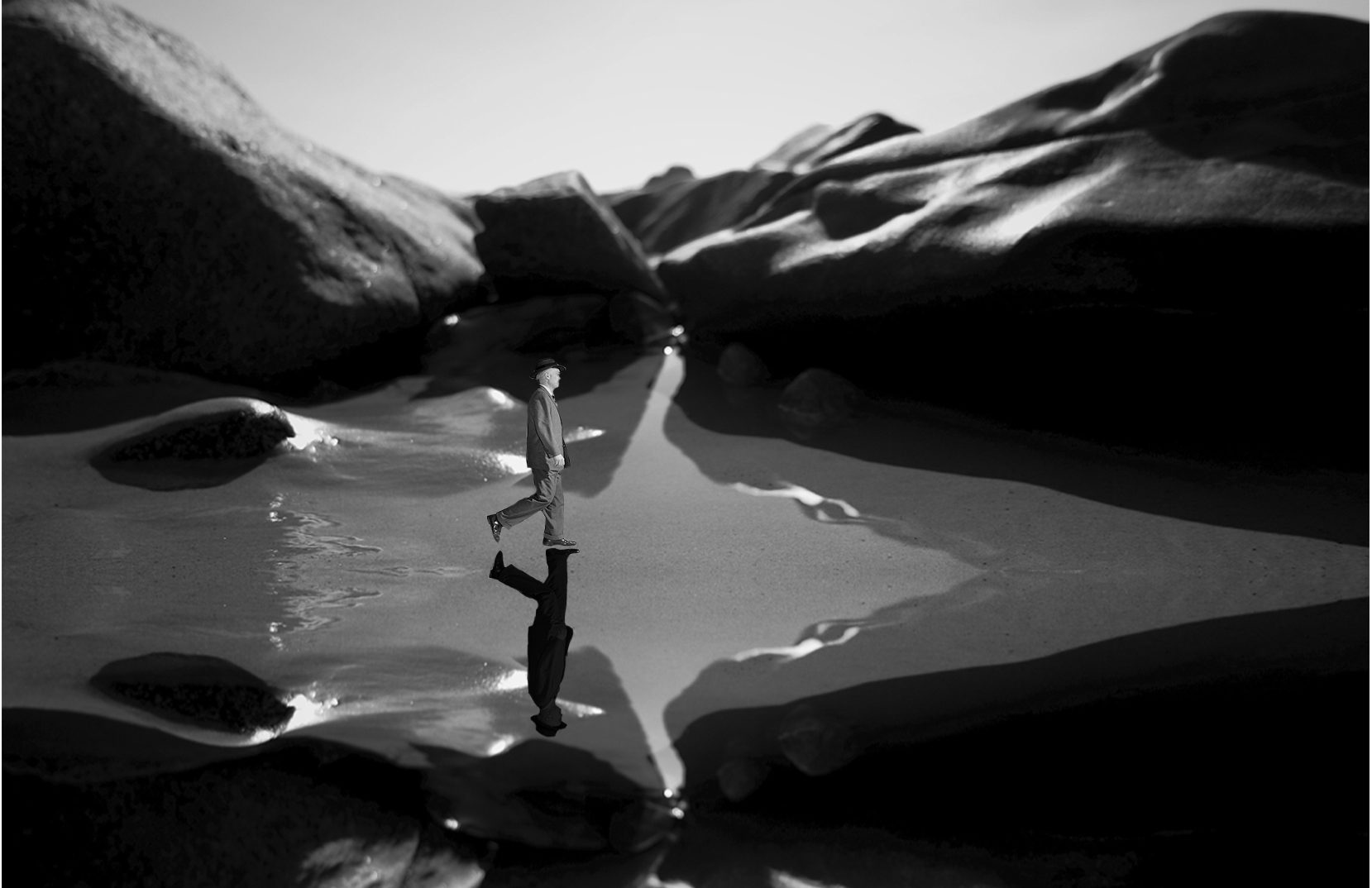
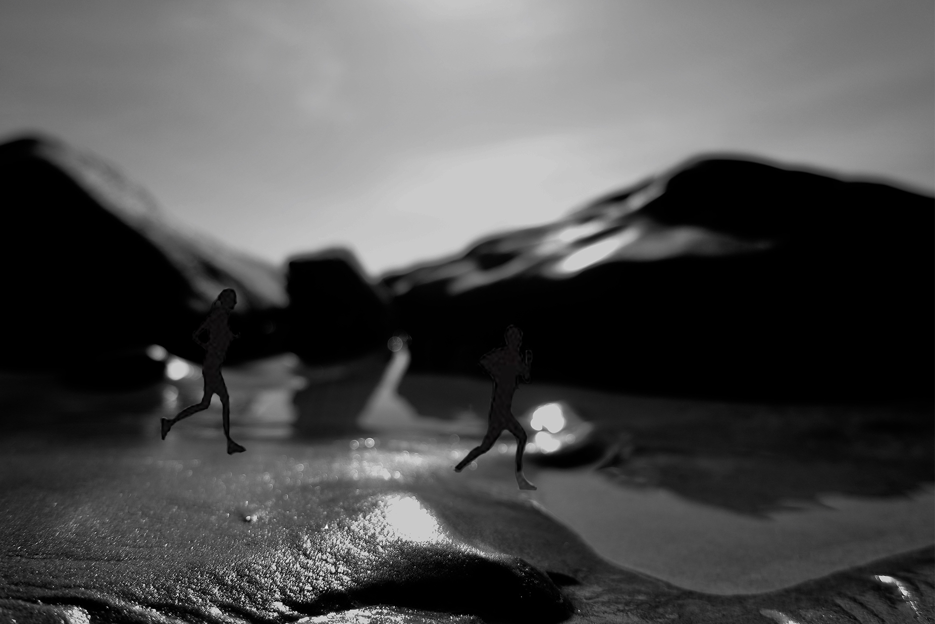
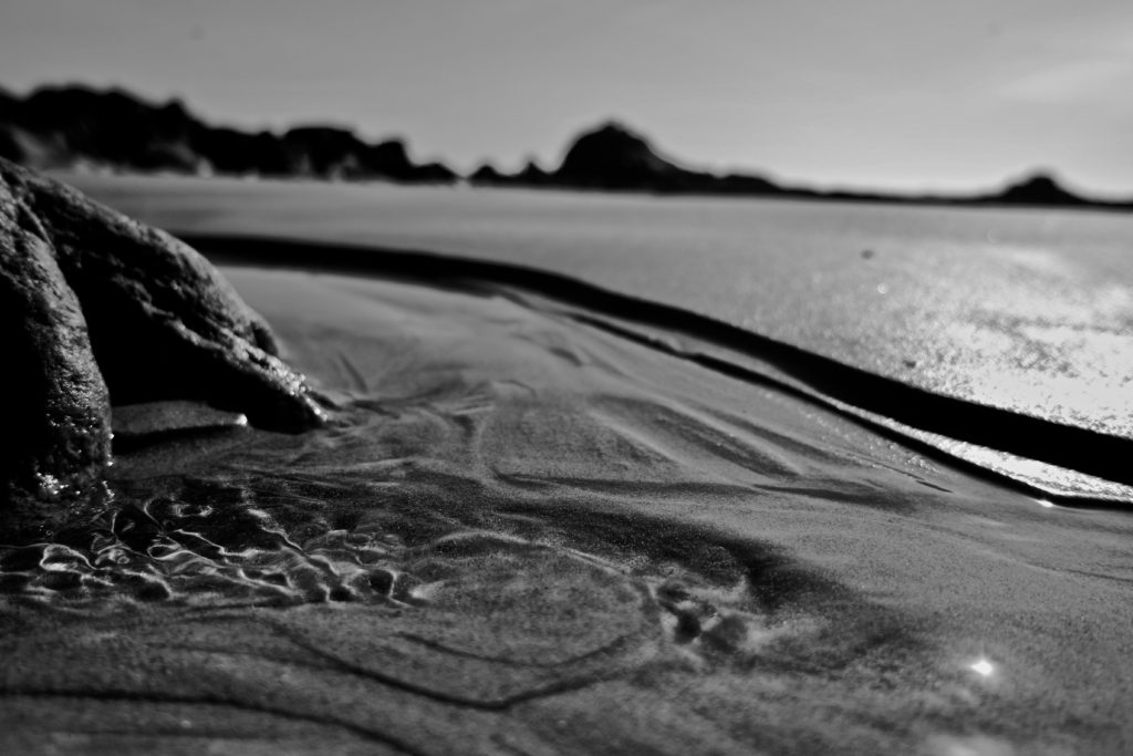
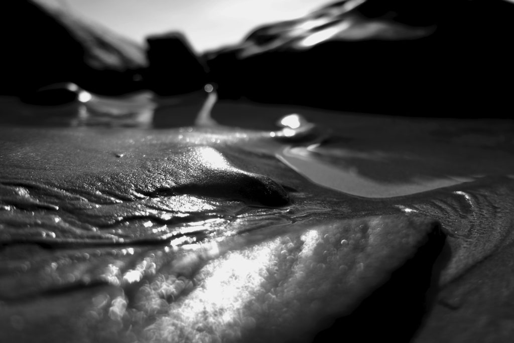
With this shoot I will develop the outcomes in two manners. The first being creating surreal pieces, editing the close-ups to have people and changing the perspective to the landscapes themselves, creating character. To do so I will probably over lap the images, and also edit the images themselves, into being black and white, to capture the tonal differences, from the light and more tonal shades. The second way in which I will develop this shoot, is from printing out some of the more clear landscape images, and pouring them in paint and liquids, in order to change the composition and the colouring of the art piece itself. This second composition idea, has a much more clear influence from the fine art outlook, and I believe it will be very different from the outcomes below, and less predictable. edits- to create a more fine art creative influence:

analysis: For this shoot and small edits, I wanted to show landscapes which could be further edited in order to show surreal elemnts. My main aim for these images, was to capture an element of fluidity, and softness of structure to the images. I wanted to get the reflection and the detail within the sand, and use this in order to change perspective and make it look as though the image is not close up but expands across a large-scale. When looking closer at the reflections and movement of the sand, I discovered that it looked as though it was a path, or something which was guiding a route for someone. Because of this, I thought to create a surreal image I would repeat the images, and make it appear as a wet pathway, and put someone and a reflection within the water. I chose A politician as then this both connects my theme of media into my work. It additionally creates a uncomfortability within the image. He looks out-of-place in his suite and with his surrounding, it creates contradictions within the image however, at the same time, still forming connections to surrealism. I added the shadow in order to give the piece an elements of realism. The second image, I too thought had elements which paved out a path. I decided to add more artistic looking fine art figurative people, running along the beach. However, I do not belive this is as successful as the previous, due to the composition and light.

PLANNING FOR FIRST 4 THEMED SHOOTS FOR VARIATION AND SIMILARITY

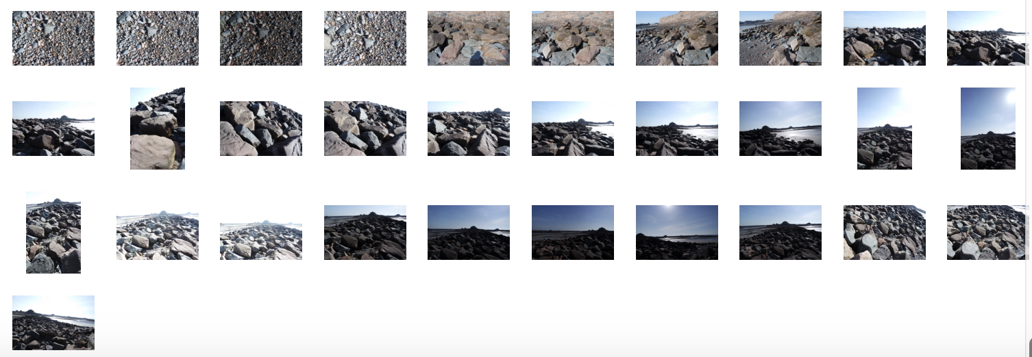
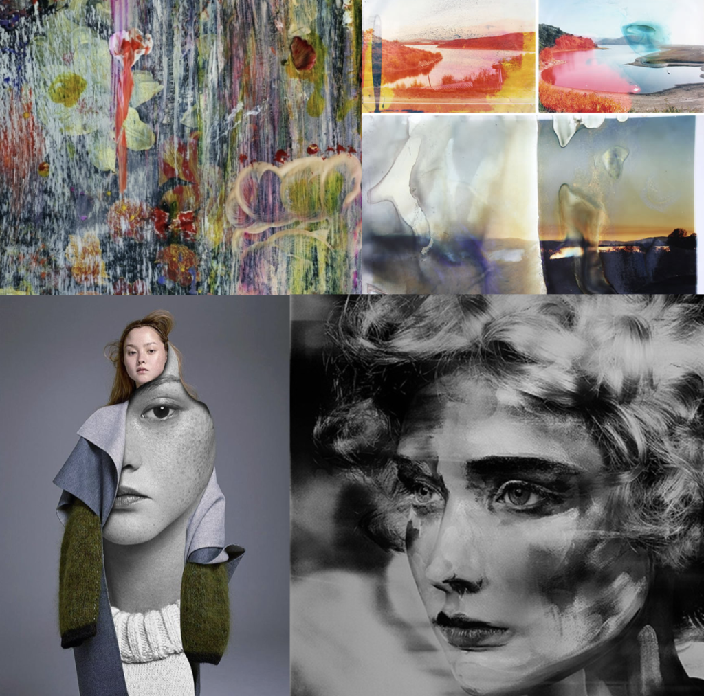
FIRST SHOOT:landscape manipulation shoot: within this shoot I have 4 different concepts that I would like to edit and experiment with when taking an manipulating the photos. The first I have recently looked up at and it is to take a more subsequently ‘normal’ landscape photo, yet cover the outcomes in a liquid and then use this development of the photo as the final. This liquidation, allows colours to move and leak and forms a new more interesting composition. Additionally this creates a clear transpire of artistic influence and forms a connection of fine art, and making it appear as if this photo was some what painted. The approach to this technique is: My second developmental idea for landscape shoots, is the editing process to make landscapes look as I have are paintings, or visa vera: Lastly I could use this same method in order to make portraits and other images, look as though they are painted, by doing thick brush stroke effects or making the image look more abstract and more filled with fine art effects. Additionally As spoken about previously, I want to believe the main version of this is taking pictures of thick paintings, possible inspired by van Gogh and Monet, and making it look as though they could be real people, or real objects. I think this is a very interesting method on how I could start developing my work. My third idea is surreal manipulation to a landscapes. I believe if I were to experiment with how landscape can be altered, in order to have more similar stylistic values to things such as paintings, or piece of more abstract contemporary work, it could be very successful. Surreal manipulation to a landscape to edit. I believe this could further link to making landscape look like altered realities and turned into abstract manipulated paintings. This again showing how far art has the ability to go. These abstract pieces come under many art categories and also shows an understanding of how to develop a piece to see a progression of artistic influence.

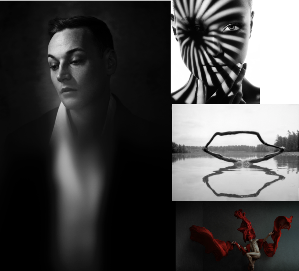
Studio shoot :To my mind the studio shoot is the shoot which I know what final outcomes I am really looking for, and even to the extent, this shoot will really help me to develop the rest of my imagery. I have divided this shoot into 5 subcategories of images, which I want to capture and further develop and how and why I believe these executions are the most important. The first is using a glass bowl, or jar, and using this in front of  a face in order to distort and stretch the face. Not only does this once agin show an interest of the element of fine art, but is almost connotes the elements of visible chaos, and showing a trauma to that persons personality. This can also be seen by the work of William Ye.  Another inspiration from Ye will be experimenting with using a flowing piece of fabric, in order to show a structure in the piece. I believe this effortless looking towel and the structure of the body, creates such a successful outcome, and connotes an overlooked power. This sentiment of chaos I believe can also be represented through the effect of people climbing on top of each other, and or forming together to make structures and new bodily forms. This shows a unity of people standing together, and also a combination of family. This leads me onto my representation of chaos, and the acts of people when pulled together in a group, yet still showing the effortlessness of how to form a new stature creating a new art piece.  The last idea which combines fine art, and the media that I can do within a studio, is the editing of faces onto peoples clothes, and using this to effect true feelings, and or editing on events which symbolise trauma or the past of peoples lives. This I believe has a certain contemporary art feel, yet is not done through a painting style. The combination of high fashion within this shoot, also symbolises the beauty industry and  how you have to look a certain why, and what is expected. These geometric shapes, create combinations of cubism and once again this whole shoot linked together with the interposing state of form, composition, and fine art media effect.

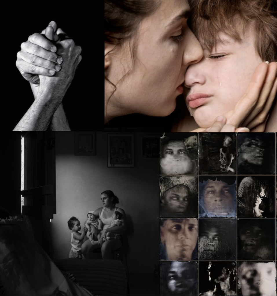
family and friends shoot: For the family shoot I  want to both approach this in both a journalism and  unconventional surreal manner. I wish to start off by producing images of many large groups of friends and family, or people who have a close net relationship. I then want to develop these into collages of smudges images, and faces covered and layered with effects, to create a distortion of  identity, but a similarity into the way which they are all covered. An extension from this process, could be family pictures, and portraits collages together, or patterns which have a significance to the families themselves. This could be, a flags or perhaps a pattern made by a grandparent. Anything which is texturised yet still causes a effect fro the family themselves, and an expression of themselves.

chaos: inspiration from the media: Chaos to my mind, is something which causes a feeling which depends an emotional response of panic and madness. It can mostly be seen throughout the media, through articles, fake news or even protests which go too far. These movements are all about conflict of peoples beliefs, because of this, I Believe if I were to layer images of people causing different facial effects, in order to show different emotional and a chaotic feeling expanding and becoming more abstract. This not only builds tension within the image but also shows expressions of human conflict within the images. Secondly a good example of variation and similarity, is watching peoples daily lives, and their own independent news. This could be caught and seen through peoples daily lives, and the activities which they get up too. Street photography is a great way to capture a reality of the people possibly not correctly expressed through the chaotic media, andI  belive this would be a very interesting way to reflect the society which we live within. Chaos can also be shown through more unconventional techniques, these being the light patterns of slow exposure, of perhaps even manipulating a person or landscape, to look or be presented in a unconventional way. This unique approach too seeing the worlds could count as a reflection of mediation and journalism, and the many dimensions which it is possible to see a story or event. You could even explore taking a picture from many different angles, and then experimenting with which angle tells the chosen story most successfully.