
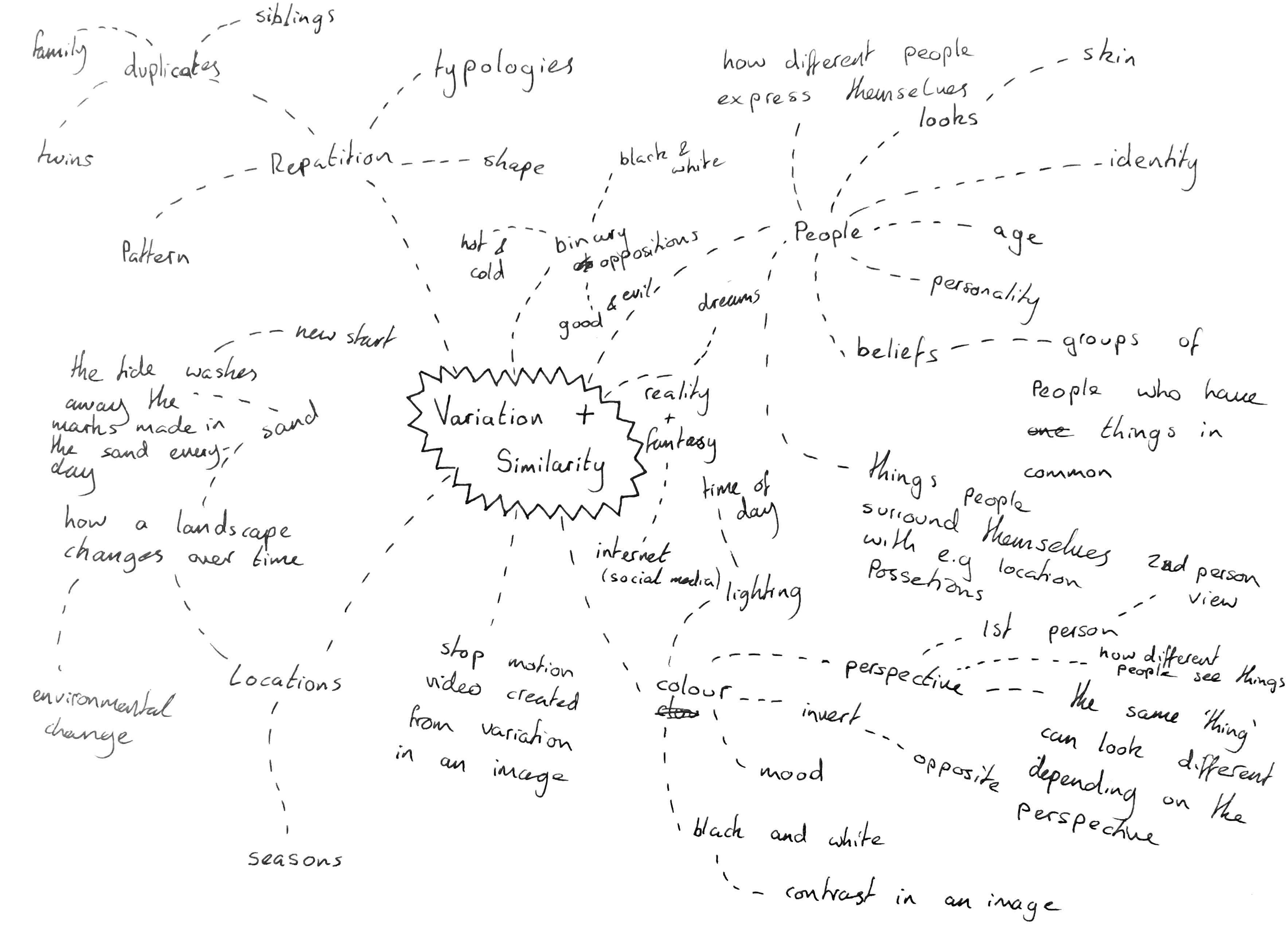
I will begin this project by looking through the exam paper and breaking down the initial title “variation and similarity” I will then look into the starting points given in the exam paper and brainstorming my own initial ideas to create a starting point for the project.
Dictionary Definition:
Variation – A change or slight difference in condition, amount, or level, typically within certain limits. A change or slight difference in condition, amount, or level, typically within certain limits.
Similarity – The state or fact of being similar. Having a resemblance in appearance, character, or quantity, without being identical.
Synonyms:
Variation – abnormality, alteration, deviation, discrepancy, disparity, divergence, diversity, difference, fluctuation, innovation, modification
Similarity – parallel, relationship, resemblance, closeness, comparison, connection, correlation, harmony, parity, relation,
when I first read this title I thought of variation and similarities between people, their looks, age, beliefs and backgrounds all the pieces that go together to give each human a unique identity. I would consider developing this idea further through the use of portrait images, close ups of skin and features which stand out on an individual. In an age where people are constantly trying to perfect themselves o think it would be interesting to look behind this to remind ourselves why it is so important that we show our differences.
I also instantly thought about work on typologies which I have previously studied, work by photographers such as Bernd and Hilla Becher who took photos of similar structures such as water towers and collated them together in a grid to show their subtle differences which would otherwise not be noticed or appreciated. This concept could be applied to anything, from packaging commenting on to issue of materialism to architectural structures showing the development of natural landscapes.
Daily Archives: February 21, 2019
Filters

ESA // Typologies – August Sander
Photographic typologies are believed to have originated from August Sander’s series of portraits ‘Face of our Time’.
August Sander was a German portrait and documentary photographer. August Sander photo series, People of the Twentieth Century is a great example of Environmental Portraiture. Sander has been described as “the most important German portrait photographer of the early twentieth century.” (cited: Wikipedia [Michael Collins, Record Pictures (Thomas Telford Publishing, 2004), p. 1842] )
He used a large-format camera and long-exposure times. He created hundreds of portraits for a typology of German society during both the World Wars. Many of his photographs are environmental portraits. – sourced from artsy.net “He established a photography studio, first in Austria, then in Cologne, where he settled in 1910 and made photographs of local peasants.” – icp.org. This is what inspired his life’s work.
His work includes landscape, nature, architecture, and street photography, however, he is known best for his portraits

Young Farmers 1914, printed 1996 
Pastrycook 1928, printed 1999 
Bricklayer 1928, printed 1990
Sander was born in Herdorf, he was the son of a carpenter working in the mining industry. He was working at a local mine when he first learned about photography by assisting a photographer who was working for a mining company. He acquired some financial support from his uncle, with which he bought photographic equipment and set up his own darkroom.
The image of the Pastry cook is a photograph from Sander’s photo series ‘People of the Twentieth Century’. The image depicts a particular type of person, in this case, Sander shows a skilled tradesman working in his kitchen. The round shape of the bowl mirrors the shape of the Cook’s body, this suggests that the subject of the photograph is the type of person to be really involved in their work, almost as if they have become it themselves. By using a sharp focus on the foreground, the subject becomes the priority along with his body language became this is the main focus of the image, the soft focus in the background allows this to happen. Sander has positioned the subject in order to have the most likely natural light reflecting on the side of the face, bowl and shoes. He takes black and white photographs, therefore tone is a big focus when taking the photos. By using a dark background this allows the lighter foreground to stand out more effectively. This also reiterates the subject being the main focus in the photograph and the suggestion that he is a part of his work.
My Response to Lewis Bush/Michael WOLF
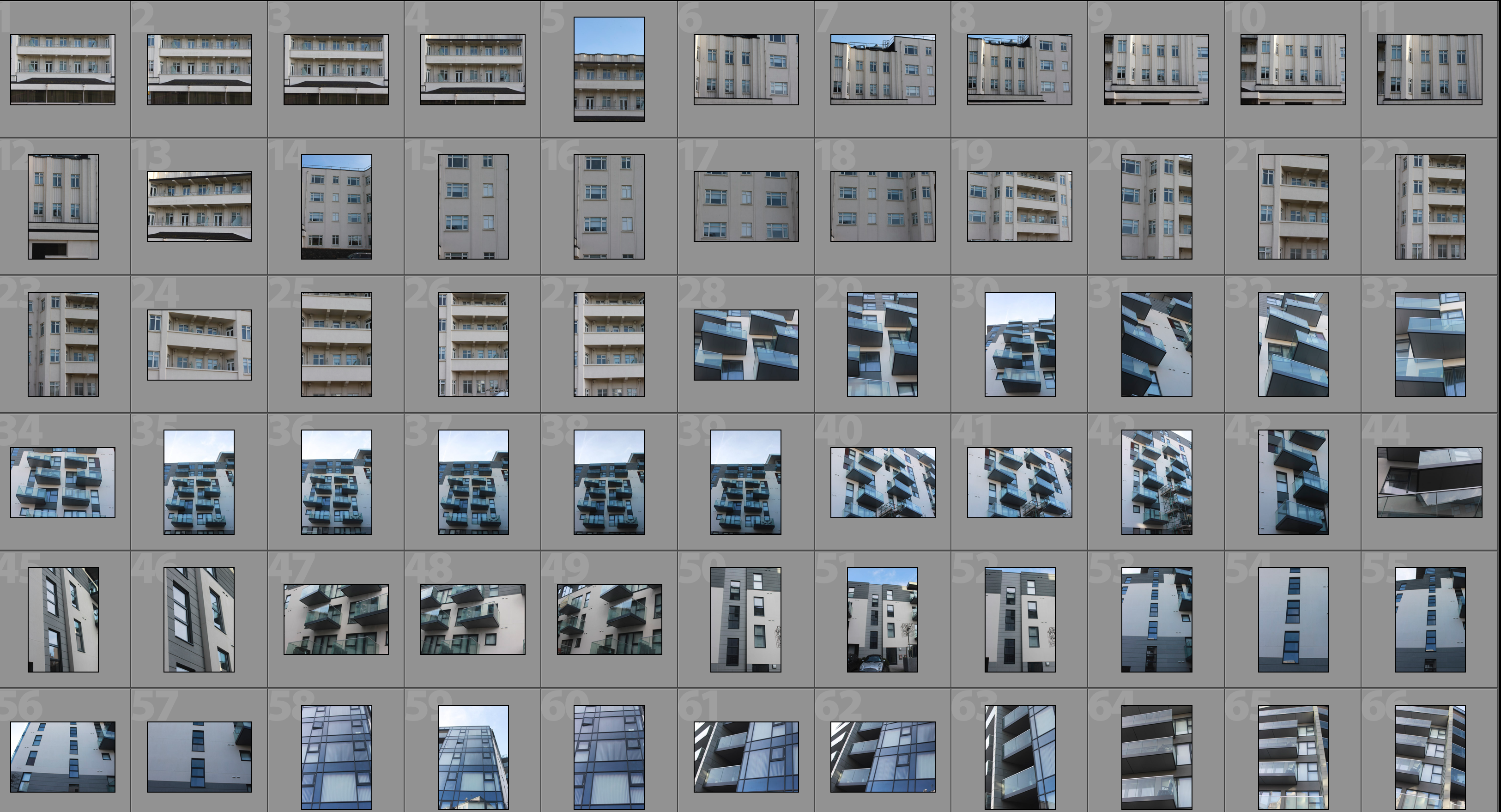
This shoot draws inspiration from Lewis Bush’s ‘Metropole’ as well as Michael Wolf’s ‘Architecture of Density’ and aims to show some of the repetition and symmetry in blocks of flats and offices whilst at the same time showing the difference in designs between buildings. Going into this shoot I had the vision of photoshopping the photographs that result to create compositions that are full of patterns and are illusion-like. Lewis Bush’s ‘Metropole’ came to me as an inspiration because it explores the fact that there are an increasing amount of large buildings for offices or flats taking away from green land and so the landscape in which we live is turning into a repetitive view of similar flats and offices leaving citizens with a feeling of monotony as everything is being redeveloped to serve the same purpose. Bush’s work on ‘Metropole’ shows a lot of emphasis on the repetition between buildings and I have tried to replicate this in this shoot. Wolf’s work has inspired me as he essentially does what I am attempting to do in this shoot but on a much larger scale by photographing the density of high-riser apartments in Hong Kong.
One way in which I could develop on this shoot in the future is by looking at typology, which would involve me researching Bernd and Hilla Bechers, of high rise buildings in Jersey. I could approach this by finding the 14 high rise apartment blocks in Jersey and photographing these in a similar style to this shoot and then creating a typology page of these different buildings.
Contact Sheet


Edited Photographs
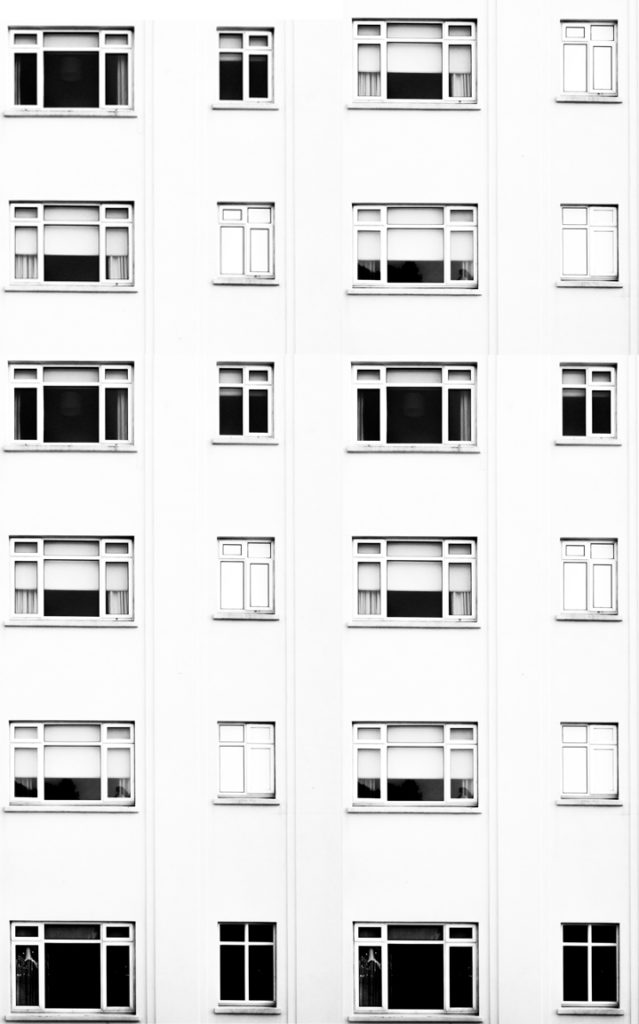
After going through all of the photographs that I produced on this shoot I selected some of the best that I could edit. I edited these photographs by putting a black and white filter on in order to allow the viewer to focus on the shapes within the photographs rather than the colour. I then used a perspective crop on the majority of the photographs in order to make the photograph completely straight on in order to further emphasise the symmetry and patterns within the photographs. As well as the black and white filter I increased the contrast, used high highlights and whites, used low shadows and blacks and adjusted the exposure accordingly to create a composition that is mostly over exposed but the features such as the windows are emphasised to help the shapes within the buildings to come forward.


Edits
After editing the individual photographs I brought the photographs into a blank photoshop document and duplicated it. After the duplication I then messed around with the layout of the multiple photographs to create illusions that show lots of repetition and some symmetry. The result is montages that emphasise in blocky shapes and use a black and white filter to bring contrast into the photographs.
#1

#2

#3
#4

#5

#6

Analysis
I captured this photograph in a natural lighting in order to bring out the natural shadows and shapes within the building that I was photographing. There is a wide tonal range due to both the nature of the building and my editing to the photograph. The bright whiteness in the walls of the photograph contrasts greatly with the dark black shadows on the balconies. I took this photograph on a bright day where there was plenty of sunlight so only needed to use a low ISO of 100 along with a shutter speed of 1/60 to capture this photograph. The low ISO paired with the quick shutter speed allowed for the photograph to be as high in quality as possible as well as not being overexposed (even though I edited the photograph to increase the exposure. I edited this photograph by using a black and white filter to bring out the shapes in the windows as well as the shadows and then I increased the contrast, highlights and whites whilst reducing blacks and shadows to create a composition that had high contrast between the black and whites. A depth of field of f/16 was used to capture the photograph which can be seen as the whole of the photograph is in focus. The photograph has a slightly cold colour cast to it due the bright whiteness throughout it.
I opted for a black and white filter over a colour photograph as it helped to bring out the details within the buildings, especially the contrasts as well as a wide tonal range to create a more dramatic composition. Due to the deep shadows and edges within the photograph as well as the editing of the photograph the composition has a 3D effect as it appears to have different layers which bring the photograph to life. There is also a lot of patterns and repetition within the photograph, which I aimed to create when setting out on this shoot. I have placed the balconies on the two horizontal lines of the rule of thirds as I feel that they are the most interesting parts of the photograph so placing them along these lines creates a more interesting composition as well as helping with symmetry.
The aim of this shoot was to create a set of photographs that showed the repetition of shapes within blocks of flats and offices and how this repetition can be aesthetically pleasing. The overall results shows how even though there is a lot of repetition within individual buildings, each building has its own unique characteristics and shapes and therefore have variance. The inspiration for this shoot came from photographs of tall tower blocks in cities such as Hong Kong where each floor and flat are almost identical, which is perfectly demonstrated in Michael Wolf’s work as well as inspiration from Lewis Bush’s ‘Metropole’ in which he looks at the development of buildings through a double exposure technique to create a similar outcome to what I have done.
The concept behind this is that there are an increasing amount of these large and repetitive buildings that make way for office buildings or flats due to the ever rising population and urban migration. The photographs resulting from my shoot show just how repetitive these buildings that are taking space from nature really are and reflect the idea that some residents may believe that the landscape of cities including Jersey is becoming repetitive and monotonous as lots of land is being taken to serve the same purpose of housing or offices.
Mood Board and Mind Map

.
.
.
.
.
Variation and Similarity
For our exam project we have been given the title ‘variation and similarity’, a binary opposite. This pair of words have directly opposite meanings making them a pair of binary opposites. I am going to explore the etymology of the words meaning the study of the origin of words and the way in which their meanings have changed throughout history. I will also show how i can explore these words within my works too.
Variation
Definition 1 – “a change or slight difference in condition, amount, or level, typically within certain limits”.
Definition 2 – “a different or distinct form or version of something”.
Synonyms
- Variant
- Alternative
- Different
- Development
- Adaptation
- Alteration
- Modification
Etymology of the word
late Middle English (denoting variance or conflict): from Old French, or from Latin variatio, from the verb ‘variare’.
Similarity
Definition 1 – the state or fact of being similar.
Definition 2 – a similar feature or aspect.
Synonyms
- Resemblance
- Comparability
- Equivalence
- Parallel
Etymology of the word
‘Similar’ is a late 16th century word from the French ‘similaire’ or medieval Latin ‘similaris’, from the Latin word ‘similis’ meaning ‘like’.