Variation and Similarity

For the exam project we have been given the stimulus of ‘ Variation and Similarity’, which are two binary opposites. Which are two things that are the direct opposite of each other

Variation

1.a change or slight difference in condition, amount, or level, typically within certain limits.
“regional variations in house prices”

Synonyms: variant, form, alternative, alternative form, other form, different form, derived form, development, adaptation, alteration, modification, revision

Similarity

  1. the state of being almost the same, or a particular way in which something is almost the same:
    “the similarity of symptoms makes them hard to diagnose”
  2. a similar feature or aspect.
    “the similarities between people of different nationalities

Synonyms: resemblance, likeness, sameness, similar nature, similitude, comparability, correspondence, comparison, analogy, parallel, parallelism, equivalence; interchangeability, closeness, nearness, affinity


VARIATION AND SIMILARITY SECOND IDEA OF DEVELOPMENT

Connecting onwards from the fine art side Similarly from the themes of William Ye, I want to focus on the themes of media, and that of chaos. Chaos formed off the premis of fake news, mass inflictions of terror, criticism of others, lack of trust and the lack of equality and accurate representation fo people. This is a large subdivision for a photography perspective, however, in this blog post I purpose to break down how I found these ideas step by step and the way they too successfully link to fine art.

when I was further considering the themes which are very influential within the media, I began to think distancing myself from more of the chaos, and into more of the long danger causes and pains which the media has causes. The mediation of images which only portray the same similar and very limited appearance to look a certain way, and question the extent, should we and are we expected to look and act the same? this leads me onto thinking that mediation and online influence and if it has led us to the destruction of our own minds and capabilities, due to us being stuck thinking and limiting ourselves to certain consciousness. The media subsequently is taking a percentage of our voice, it is regardless to the balance which we need, its such a staged development of the world, this lack of variation has really inflicted peoples opinions, and thirst for success and personal health and mental health issues within themsleves. Media produces a sense of importance around flaws, faults and criticism of ourselves and others. The power overs girls online is something which is unjust, it gives confidence to have less humanity, and allows groups of people to produce their own  acts of terror and chaos and target others, without the fear of prosecution. Coincidentally this presentation of power can too be linked tho the effect of DNA on people and what they do when they have power. These acts of people could also be used as an act of experiment to see prejudice, racism and discriminatory behaviour, and the scientific reasoning of why these actions are still occurring in 2019. However ‘new media’ is giving people their own large platform on social media states, such as instagram , these influences have the power to promote whatever product of system they want onto larger demographics. Their influence had the ability to change peoples perception of themselves as they have unconventionally large beauty standards. And make their young influential audience believe They should too aspire to look like them, despite even them not looking, or having a life that they are being convinced to want. However, the main primary purpose of media is to be an informative news source, and in order to educate people on real life events and happenings across the globe.  These current events are divided into political, social and cultural issues. Huge monumental political movements at the moment can be found within the discussion of fake news, me too, black lives matter, and general movements of feminism and the stretch for equality. However it is interesting the way the media presents each and every one of these subject matters, and which they deem to be more important than others. The media is a huge part of almost everyones everyday lives, because of tis it also successfully links into the study of each individuals everyday and what their actions do and what their consequences are like.

This then links to my next idea of expression of body and face and the relation and similarity seen between the stories and growth of a family. My final and third idea, links well again with the consideration of fine art, and political chaos, and it is the expression of body and face, and how we act towards and with our family, in groups of people. family is the first identity we are given, it is an almost extension of ourselves and who we are associated with for the first many years of our lives. Family is a primary example once agin our our DNA, and also a similarity we are also associated with having to others. Family should be a shared love of multiple support, however, I believe it is also a struggle of lifting and being there for each other. Family could be an investigation as to why and how forms and bonds are created, and more than just a genetic basis of variation .Artistic inspiration that I have found are the two following pieces, both link to the conceptions of media affecting out behaviour, genetics and have a fine art sentiment to them:
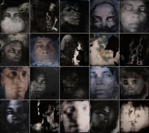
I chose this first piece as I belive it once again shows connotations to both a fine art element of abstraction and a clear artistic influence and quality to the photos. Secondly The element of community being all confined to one bonding image, and also how it forms a cohesion of family elements, and or a joined aspect of suffering in this case. It is a variation of a group of people experiencing the same effects of trauma. Additionally this trauma could have been caused by chaos within media. The effect of media fake news, and the reinforcing and constantly addressing of terrorism acts and focusing on the cruelties of the world, is what is seen within these images. A combination of individual views and variations on what they are seeing from the world. I love the effect that was used in these is, I believe it was over exposure, but covered In different fabrics and effects and then the image were near liquified, and formed into a more soft format of photos. 
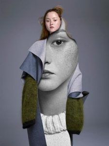
I chose this image as inspiration, due to many media related images or influencer images being concentrated on photoshoots with females looking to be the main idea of beauty. However I thought this piece was interesting as the high fashion and fine art feel comes through the interesting composition of clothes, the circular shape shows a fluidity to the images, much like many of the artists I have previously spoken about studying, additionally. The face using the eye for direct contact shows a true reflection of herself. Overall I will use these two development ideas for the effect of: combining all fo my three main perspectives, and use this to combine into five staged shoots. to begin my project.
VARIATION AND SIMILARITY- INITIAL IDEAS

The theme  given for our exam, Variation and similarities has an instant link to several different movements and types of photography. When hearing this my instant reaction was to look at Typologies and also use pop art as an inspiration.

Definitions:

Variation-

  1. A change or slight difference in condition, amount, or level, typically within certain limits.
  2. A different or distinct form or version of something.

Similarity-

  1. The state or fact of being similar.
  2. a similar feature or aspect.

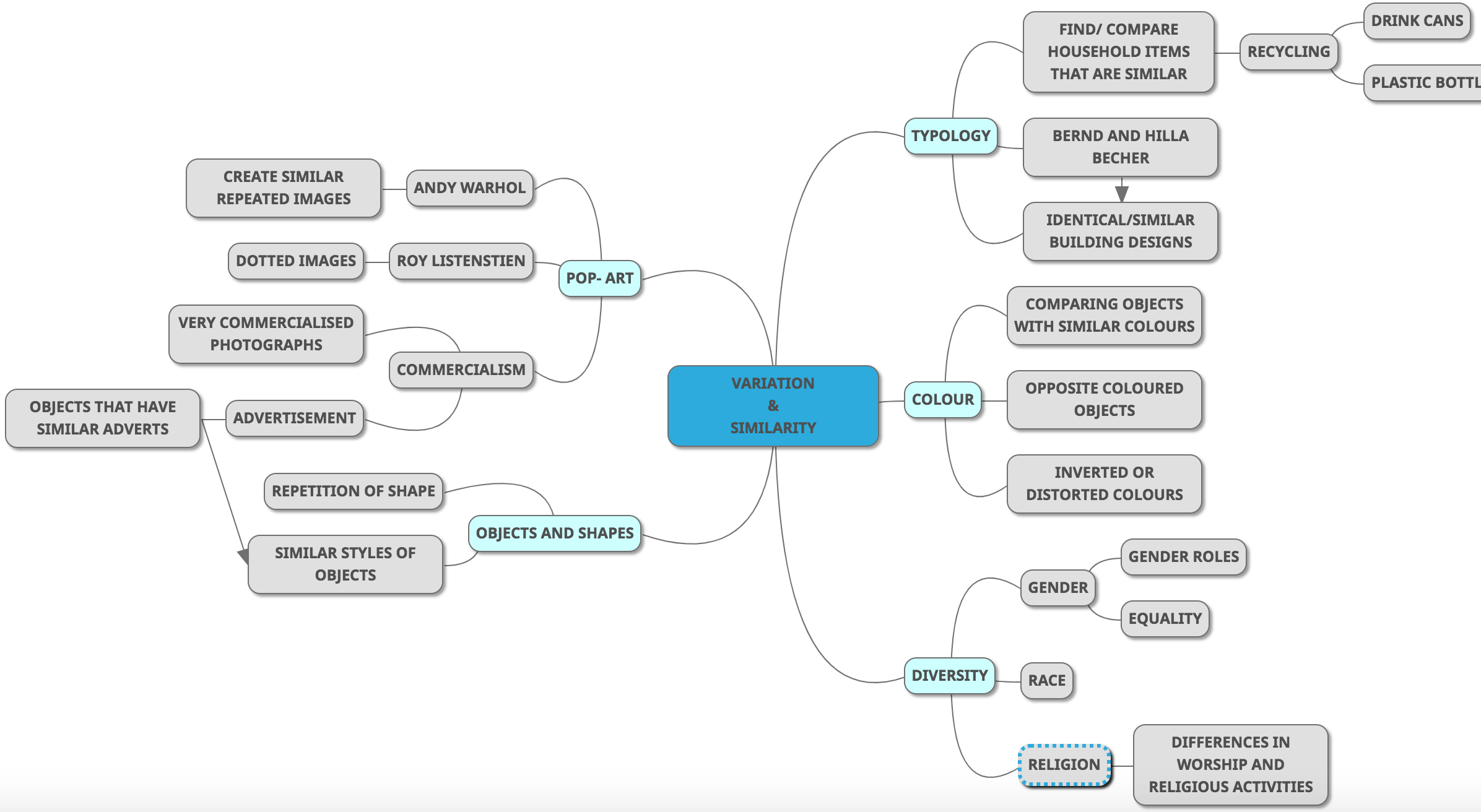
MIND MAP:


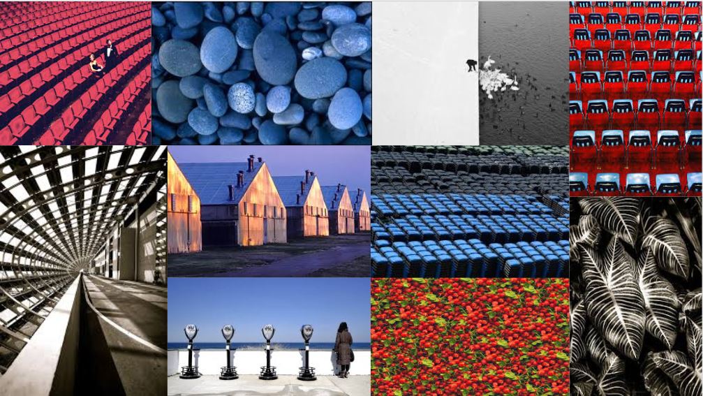
I was particularly interested in looking at incorporating Commercial advertisement into the theme to produce interesting images that would critique modern day advertisement. I was also keen to create images that have complete oppositional properties to another set of images. I thought using colour as a focus would be a good to compare images.

MOOD BOARDS:

An idea I looked at was Creating portrait photography for this theme as I have not explored portraiture as much and could create interesting images in this style. another idea could be reoccurring objects or buildings in landscape photography.

Tim Booth

Tim Booth, born in 1963, began his interest and work in photography when he started using his father’s camera at the age of eight.  Booth was inspired by travel and photography to spend several years shooting freelance photographs for a lot of UK weekend magazines as well as newspapers in Africa, Pakistan and South East Asia.  Booth has exhibitions shot all over the world, for example ‘Into the Light’ shot in Africa.  Booth’s work ranges from portraiture to landscape work.  He was been voted the ‘No. 1 Black and White photographer’ working in the UK today by OneEyeLand.

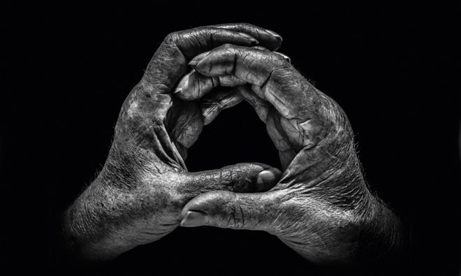
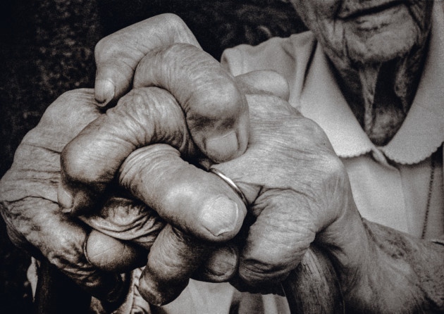
The book that brought him international recognition, which is also the piece of work that I am interested in, was ‘A Show of Hands’ which won awards.  The project spanned over twenty years and features hand portraits of hundreds of people whose hands are intrinsic to their contribution to the world – they show who they are and what they do.  Some portraits are of well-known celebrities and others are from working class people with everyday backgrounds.  Although there is a wide variety in people with their hands photographed,  all of the hands show an insight into the person’s lives and professions through the different markings, shaping’s, scars and lines.  The idea for this project came after he took a portrait of his 95-year-old grandmother’s hands – the photograph showed hands that had lives through two world wars, played the piano, went through art school, cared for the sick and played tennis for the county.  Booth said he was “sitting with my grandmother in her garden, and as always was struck by their arthritic pithiness.  The way they rested on her walking stick showing her wedding ring, so smooth against the rough skin, told a large part of her story”.  Booth says that it was his first ‘hands as a portrait’ and inspired him to carry out more hand portraits.  Booth decided that throughout the project he would shoot in black and white, in natural light and in half an hour wherever his subject found most convenient – I will also try to go by these standards as I seek to draw inspirations from this project.  Booth also says he has “always preferred black and white as a portrait medium.  It enables you to focus on all the detail and form, and not be distracted by skin colour, markers, blemishes and veins” which I completely agree with and believe that it will be vital in my response to this.  When picking his subjects booth would first think of a profession he wanted to feature and then who would best represent it.  In total there are about 115 pairs of hands in the exhibition telling hundreds of stories of people.

I have chosen to focus on hands, especially Booth’s “A Show of Hands” because a pair of hands tells multiple stories of a person’s life and who they are without having to show the features of their face, which many people may be insecure about.  I plan on responding to this work by producing close up photographs of hands in a similar way to Booth but without the props as I intend to create more of a typology style result with my response.  After the first initial response I may create further shoots in order to develop the idea by covering the hands in paints or inks in order to highlight the features within the hands and so a more interesting result.

Analysis

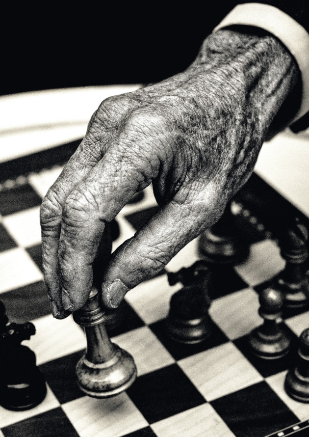
Booth would always use natural lighting in his hand portraits to create a type of photograph that allows the natural shadows and lines within the hands to be brought forward.  This photograph shows a very wide tonal range as there many dark tones throughout both the chess pieces and the crevices in the hands but at the same time there are contrasting light tones highlighted throughout the hand to create a strong contrast and therefore emphasise the features that Booth tries to capture within the hand.  This photograph has quite a lot of contrast due to this wide tonal range and is exposed just right to the point that this contrast in emphasised more.  A shallow depth of field was used to capture this photograph as can be told by how the hand is so sharp and in focus along with the chess piece that the hand is holding compared with the rest of the chess board in the background.  A low ISO will have been used in order to capture this photograph as the photograph is of very high quality – this low ISO paired with a shutter speed of around 1/60 allow for a technically correct photograph to be created.

There is no colour in this photograph – Booth has purposefully opted for a black and white colour scheme as he says he has “always preferred black and white as a portrait medium.  It enables you to focus on all the detail and form, and not be distracted by skin colour, markers, blemishes and veins”.  This rings very true in this photograph as it makes the details such as the veins and wrinkles in the hand pop in order to create a more interesting composition.  The black and white also allows the texture of the hands to come through more as well as the wooden texture of the chess pieces.  The wrinkled texture helps to create a 3D effect within the photograph, especially as the wrinkles begin to blur closer to the cuff.  The fingers and the chess piece sit on the bottom left cross-section of the rule of thirds and so create an aesthetically pleasing photograph as well as being technically correct.

This photograph is of Lord Carrington who is a renowned chess player.  Booth said that as soon as he got permission from Lord Carrington to carry out the shoot with him he knew that he wanted to bring an aspect of chess into the hand portrait.  Carrington and Booth sat in Carrington’s garden playing with different set-ups of the chess pieces and board eventually coming to a conclusion that they would move the Queen amongst the pawns as a joke as it is something a chess player would never do, especially someone of Lord Carrington’s level.  Booth would take these hand portraits on a Nikon F2 with a 55mm Macro lens on Tri-x (a grainy black and white film).  He set regulations within which he would work on this project – he would shoot in black and white, in natural light and in half an hour wherever the subject found most convenient.

When speaking on why Booth chose to focus on hands he said “My decision to focus on hands was also a deliberate choice. In a pair of hands you can see a whole life, a story if you will, that doesn’t require you to make a judgment about the person, which faces inevitably do.”  This statement can be clearly justified in this photograph as the chess gives an insight into what Lord Carrington does as well as the deep wrinkles and shapes within the hands showing the amount the he has lived through.  Booth aims to keep the photographs that he shoots simple; he says “I only have one goal really when shooting, and that’s to take a photograph that engenders a reaction in the viewer, making them not only remember the image, but want to see it again.”

Everyday – Research / Experimentation

  • Record an activity or routine that you do/ repeat on a daily basis, e.g. brushing teeth, putting on clothes, applying make-up, comb your hair, eating, feeding your dog, walk to school/work, sleeping, screen time on social media, talking, selfies etc.
My video

I recorded a video of me cycling as I usually cycle after school.

Video art is an art form which relies on using video technology as a visual and audio medium. Video art emerged during the late 1960s as new consumer video technology such as video tape recorders became available outside corporate broadcasting. Video art can take many forms: recordings that are broadcast; installations viewed in galleries or museums; works streamed online, distributed as video tapes, or DVDs; and performances which may incorporate one or more television sets, video monitors, and projections, displaying live or recorded images and sounds.


John Baldessari – I Will Not Make Any More Boring Art Video


John Baldessari – I Will Not Make Any More Boring Art Print

The print is based on an installation created at Nova Scotia College of Art and Design, but not by John Baldessari’s hand. “As there wasn’t enough money for me to travel to Nova Scotia, I proposed that the students voluntarily write ‘I Will Not Make Any More Boring Art’ on the walls of the gallery, like punishment. To my surprise they covered the walls.” Those same students made this print, but Baldessari wasn’t at the workshop when the print was made. In both cases, Baldessari gave scant instructions to the students from thousands of miles away, and he was not present to supervise, raising questions of authorship and the role of the artist.


Yoko Ono – Cut Piece

The artist sat alone on a stage, dressed in her best suit, with a pair of scissors in front of her. The audience had been instructed that they could take turns approaching her and use the scissors to cut off a small piece of her clothing, which was theirs to keep. Some people approached hesitantly, cutting a small square of fabric from her sleeve or the hem of her skirt. Others came boldly, snipping away the front of her blouse or the straps of her bra. Ono remained motionless and expressionless throughout, until, at her discretion, the performance ended. In reflecting upon the experience recently, the artist said: “When I do the Cut Piece, I get into a trance, and so I don’t feel too frightened.…We usually give something with a purpose…but I wanted to see what they would take….There was a long silence between one person coming up and the next person coming up. And I said it’s fantastic, beautiful music, you know? Ba-ba-ba-ba, cut! Ba-ba-ba-ba, cut! Beautiful poetry, actually.