experimental shoot // night branches with flash

This shoot was an experimental shoot that I hadn’t planned. It was done at night time in my garden. I wanted to capture nature at time time. I used the flash for the shoot because I liked the way it revealed the details with the dark background. I found that simply using the flash was too boring of an effect so I used my hand to cover the flash to what would happen. I really liked the effects it created because it made interesting shapes and shadows that made the image a lot better. By using my hand to cover the flash it also created a reddish tone over the scene which I really liked.

I edited the images using Photoshop. I didn’t change the original image dramatically, I simply added more colour and more contrast. I selected my favorite images and for each one I edited a colored and black and white version. This was because I wanted to the contrast and I really like the shadow and shadings of the black and white version.

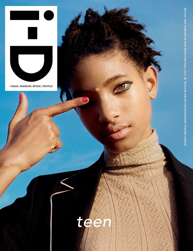
i-D Magazine

For my project looking at fashion among youth culture in Jersey, I am aiming to produce a magazine for my final product. I have briefly mentioned this intention in previous blog posts but I will now begin to publish blog posts that show my research on different magazines I will be taking inspiration form in terms of design, style, layout, graphics and actual photograph style. 

I have chosen to present all work produced for this project in the format of a magazine because the actual content I will be producing will fit most appropriately into this style of display. The magazines I will be researching are all magazines that highlight music, fashion and youth culture – the latter is what I will be covering in my project. As well, magazines are becoming much more popular now and there are many more magazines for many more reasons in this current day which cover lots of different things such as fashion, music, TV, home, lifestyle and photography/art. 

i-D

Image result for i-d magazine

i-D is a British magazine dedicated to fashionmusic art and youth culture. i-D was founded by designer and former Vogue art director Terry Jones in 1980. The first issue was published in the form of a hand-stapled fanzine with text produced on a typewriter. Over the years the magazine evolved into a mature glossy but it has kept street style and youth culture central.

Terry Jones is is a British graphic designer, art director, photographer, book- and magazine-editor. He is best known as co-founder of the British, street-style magazine i-D in 1980.

Image result for iD Magazine

The magazine is known for its innovative photography and typography, and over the years established a reputation as a training ground for fresh talent. Photographers Chris Dowling, Wolfgang Tillmans, Juergen Teller, Terry Richardson and Ellen von Unwerth, Kayt Jones have produced work for i-D. The magazine celebrated its 250th edition at the end of 2004 and its 25th anniversary in 2005. The July Issue of 2009 was the magazines 300th publication, boasting many interesting articles and iconic photography, true to the magazines concept.

People who have appeared in i-D include Madonna, John Galliano, Alexander McQueen, Kanye West, Helmut Lang, Franz Ferdinand, Chloë Sevigny, Raf Simons, Undercover, Veronique Branquinho, Lily Cole, Giles Deacon, Dizzee Rascal, Scarlett Johansson, Rick Owens, Selena Gomez, Rihanna.

Image result for iD Magazine

Terry has always said that “‘i-D’ should be recognised as the first ’emoticon’; at least three years before [the first] claims made in 1983.” The original “i-D” logo was painted by hand and was based on the typeface “Futura Demi Bold” and was modified to fit into the i-D star logo so the dot of the lower case ‘i’ could be split into two semi-circles. 

In 1980 the magazine was intentionally hand-made; everything was glued to boards either 100% or 50% its size. Issue One was printed by a fanzine printer called ‘Better Badges’ and the i-D badge, along with the first issue’s landscape cover turned on its side, created a ‘winking face’.

I-D Magazine 350 - Cover

Dazed Magazine

For my project looking at fashion among youth culture in Jersey, I am aiming to produce a magazine for my final product. I have briefly mentioned this intention in previous blog posts but I will now begin to publish blog posts that show my research on different magazines I will be taking inspiration form in terms of design, style, layout, graphics and actual photograph style. 

I have chosen to present all work produced for this project in the format of a magazine because the actual content I will be producing will fit most appropriately into this style of display. The magazines I will be researching are all magazines that highlight music, fashion and youth culture – the latter is what I will be covering in my project. As well, magazines are becoming much more popular now and there are many more magazines for many more reasons in this current day which cover lots of different things such as fashion, music, TV, home, lifestyle and photography/art. 

DAZED

Dazed (formerly Dazed & Confused) is a bi-monthly British style magazine founded in 1991. It covers music, fashion, film, art, and literature. Dazed is published by Dazed Media, an independent media group known for producing stories across its print, digital and video brands. The company’s portfolio includes titles such as AnOther, Another Man and Hunger. The company’s newest division, Dazed Studio, creates brand campaigns across the luxury and lifestyle sectors. Based in London, its founding editors are Jefferson Hack and fashion photographer Rankin.

The popular magazine is distributed globally, covering fashion, art, music and lifestyle. Cover stars have included Björk, Kate Moss, David Bowie, Young Thug, Millie Bobby Brown, Amandla Stenberg, Marilyn Manson, Jazz Jennings, Thom Yorke, Kendall Jenner, Tilda Swinton and FKA Twigs.

Image result for dazed magazine logo

Image result for dazed magazineDazed is a very diverse magazine that uses creativity to empower young people and the magazine has championed humanitarian issues including from AIDS in South Africa, giving blood, the refugee crisis, breast cancer awareness and LGBTQIA rights. Furthermore, Dazed is the first magazine to feature disabled models as cover stars – “Accessable” is a 14-page feature in the style magazine Dazed & Confused, shows people with disabilities looking powerful and beautiful in designer clothes.

Image result for dazed mag

Dazed magazine also owns their own digital format of the magazine where users can access all issues of their magazine on different formats of technology including heir phone, tablet, laptop or computer and this makes it a more easily accessible and easy to use magazine to read and take enjoyment out of. However, users have to subscribe for this and this costs the consumer money. This feature also allows consumers different features exclusive to the digital version of the magazine.

Image result for dazed magazine 2018

PUSH Magazine

For my project looking at fashion among youth culture in Jersey, I am aiming to produce a magazine for my final product. I have briefly mentioned this intention in previous blog posts but I will now begin to publish blog posts that show my research on different magazines I will be taking inspiration from in terms of design, style, layout, graphics, text content and actual photography.

I have chosen to present all work produced for this project in the format of a magazine because the actual content I will be producing will fit most appropriately into this style of display. The magazines I will be researching are all magazines that highlight music, fashion and youth culture – the latter is what I will be covering in my project. As well, magazines are becoming much more popular now and there are many more magazines for many more reasons in this current day which cover lots of different things such as fashion, music, TV, home, lifestyle and photography/art. 

PUSH

Image result for push magazine

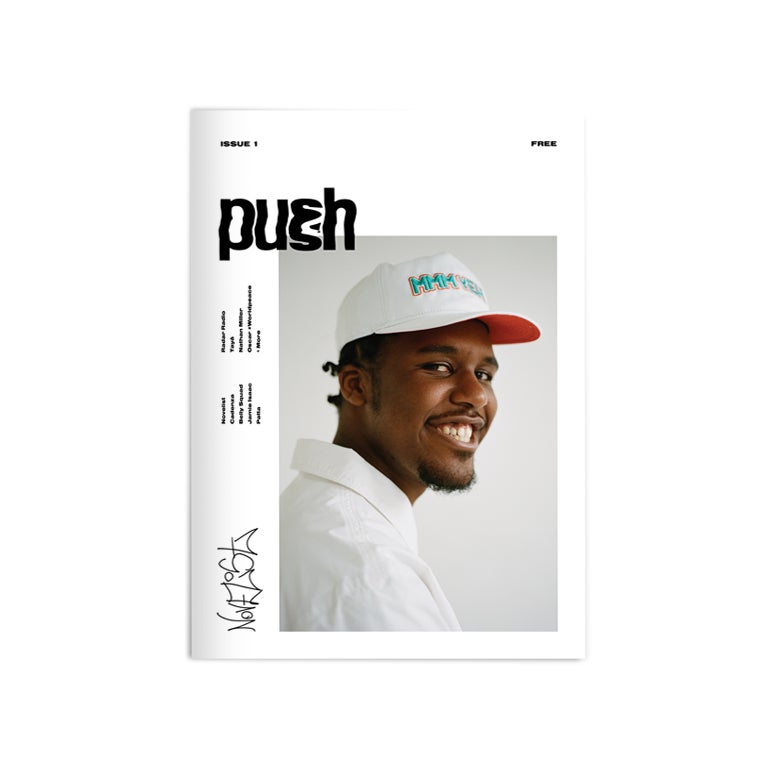
PUSH magazine is a very small, independent company that produces regular issues of their free magazine focusing on music and fashion.

Their issues are free of cost and all the customer has to pay is the postage and packaging cost and they can also choose to donate £5 to charity on their checkout.

PUSH magazine have so far published three issues of their magazine. The first issue’s cover star was the British grime MC and producer, Novelist. The second issues cover star was Guernsey born electronic music producer, Mura Masa. Their third and latest issue, published at the end of last year, which I recently purchased had two cover stars to celebrate music in 2017 and these were J Hus, the UK-born rapper and IAMDDB, the Manchester based rap artist. This issue also featured interviews and editorials on Ty Dolla $ign, Mahalia, Rich The Kid and 808ink. The magazine’s priority is promote the music of artists whose name may not get exposed otherwise.

In their magazine, at the front of each issue, they credit all contributors to the issue and these include the editors, writers and photographers. From this, I was able to search all the names of the photographers who photograph for the magazine and these consist of about 10 different photographers; all young and upcoming and specialist in their field.

Image result for push magazine
PUSH Magazine, Issue 1, Novelist
Image result for push magazine
PUSH Magazine, Issue 2, Mura Masa

Image of PUSH Issue Three [Out Now]
PUSH Magazine, Issue 3, J Hus + IAMDDB
PUSH magazine is a very current and trendy magazine that is at the forefront of fashion and music. It is a great magazine form myself to take inspiration form when producing my own and other magazines I will be researching include i-D and Dazed & Confused.

In the most recent issue of PUSH magazine that I own, one of the pages includes their own brief manifesto which outlines their intentions as an organisation and what their ethos and culture is as a company. The page reads:

“THEY ALWAYS TALK ABOUT PUSHING THE CULTURE,

BUT IT TAKES MORE THAN ONE TO MAKE A MOVEMENT.

EVERYONE EXERTING THEIR OWN FORCE, MAKING WHAT CONTRIBUTION THEY CAN.

TOGETHER WE CAN MOVE MOUNTAINS,

IF WE ALL PUSH.”

shoot plan // body

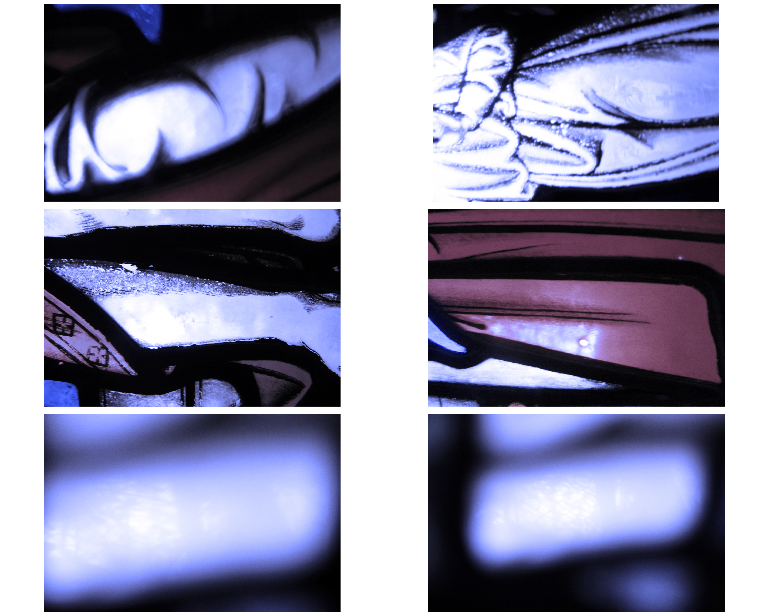
During this week I plan to organise and carry out a shoot or a few shoots to capture the spiritual aspects of the human body. I aim to fragment the body and form to capture it in unique ways. I want the shoot to be simple and something that enables me create bright pure images. I don’t want to have images of just one person, I want to explore the differences between people. I plan to capture images of females and males, old people and young people and also people of different ethnics. I aim to explore the spirituality  within the human form.

The word Wabi-Sabi is also about the natural cycle of growth and decay. I want to explore this process in people and how the body changes over time. This would be represented by capturing images of old and young people. Since I am capturing spiritual elements and the imperfect beauty, I want to try and focus on the smaller insignificant details such as wrinkles and folds. I also want to capture images of the body doing things such as holding objects or talking. I aim to capture the movement as well. 

The first shoot I plan to do is a shoot using myself. I wanted to start with me because I wanted to capture simple images fragmenting the body. I want a simple background because the main focus is the body itself. The background will be blurred anyway. I want to be capturing important aspects of the body such as the eyes and the mouth. I also want to capture images of the fingers and toes because they symbolize the beginning and end of the body which links to my concept of growth and decay.

After the first photoshoot, I want to start looking more at expressions and the finer details of the body, such as the creases by the mouth and the wrinkles by the eye. I want to start looking at these through different ages and different types of people. I want to try get a wide representation of people.

Planning shoot 2

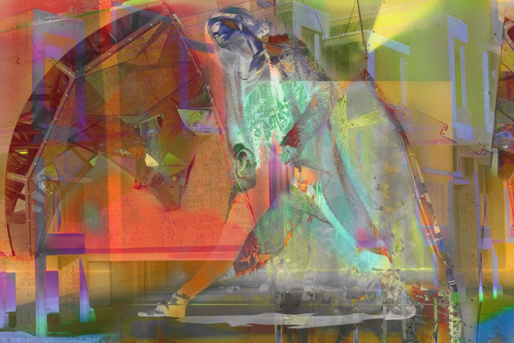
For my second shoot I’d like to use old negatives instead of color filters like my previous shoot. I am hoping this will have a similar effect to the photos below. The photos below are by the same photographer I studied in my first photo shoot. James Welling created a number photos inspired by dance and color. These photos were produced digitally however, I heard recently that you can use old film negatives as filters inside the camera lens. I am hoping to try this as well as digitally editing my images in Photoshop like Welling has. You can see Welling’s influence from older projects such as the Glass house. Color, nature and architecture are large recurring themes in his work and can be seen in this project. James Welling has used photos of dancers to decorate and turn his photos into dreamy and psychedelic inspired pictures. When I look at these photos the bodies turn into shapes and filters. When people look at my interpretation of this, I want them to recognize it’s a body or face but not focus on it. I want them to  just look at the photo like an abstract piece. Just like Kandinsky’s work who focused on shapes, color and composition.

The Male Gaze

In feminist theory, the male gaze is the act of depicting the world and women in the visual arts and literature from a masculine and heterosexual point of view, presenting women as objects of male pleasure.

Feminist theory aims to understand the nature of gender equality. It examines not only women, but men’s social experiences, interests and chores. Themes explored in feminism include discrimination, objectification – especially sexual objectification, oppression, patriarchy and stereotyping.

The male gaze is a theory developed in 1975 by feminist film critic, Laura Mulvey an she suggests that in the male gaze, women are visually positioned as an “object” of heterosexual male desire. A women’s feelings, thoughts and her own sexual drives are less important than her being “framed” by male desire. Mulvey introduced this theory in her now famous 1975 essay, Visual Pleasure and Narrative Cinema.

Although the notion of the male gaze is not directly relatable to my own project, it can still have some reference to what I am exploring because of the idea that the male gaze is made up of three parts. For the male gaze to  be present, the there parts to it has to be present and these include: (i) that of the person behind the camera, (ii) that of the characters within the representation and (iii) that of the spectator.

The male gaze has been contrasted with the idea of the female gaze which basically suggest the opposite of the make gaze where in which, in the male gaze, females become a sexual object of male filmmakers and they are represented to an audience from the view that a male sees which is often sexualised. Therefore, the female gaze, as a response to the male gaze suggests that a view of males are presented form the view of a female filmmaker or literary.

However, the male gaze, in a summary, denies women their human identity, relegating them to the status of objects to be admired for physical appearance and male sexual desires and fantasies.

Mulvey argued that traditional Hollywood films respond to a “deep-seated drive” known as “scopophilia”: the sexual pleasure involved in looking. Mulvey argued that most popular movies are filmed in ways that satisfy masculine scopophilia.

Lining my ideas back to the three perspectives within the male gaze, this is how my magazine’s content presents a view of a male gaze. However, I am not directly linking the content of my magazine to the male gaze and this notion that females are objects of male desire. Instead, I am looking at the effect of a male gaze from a male’s point of view on another male, however, in a non-homosexual manner. The male gaze states that to be present, the three perspectives need to be evident.

The first perspective is that of the person behind the camera and in this case, that is myself as the photographer. My gaze is on the subjects that I am photographing and this is mainly other males, however this gaze does not have to be of a homosexual nature and instead, as a gaze that fulfills the need to feel comfort or even discomfort. From mine and my camera’s gaze on the subject, they can either feel comfort through the relationship I have attempted to build with them before I begun shooting or they can either feel a sense of discomfort derived from a feeling of objectified when in front of the camera’s lens, as if they are being watched. The second perspective is that of the subject within the representation – the subject. The subject’s view can then be classed as a male gaze in direct relation to it’s true meaning in that their gaze is casted upon another female and in this case, that is the onto female in my magazine and happens to be my girlfriend.

The last perspective of the male gaze is from that of the spectator, which is the viewer. The male gaze works this way as well and the gaze of the subjects onto the spectator of my magazine can be seen as another view of the male gaze.

However, I wish to reiterate that the presentation of the male gaze in my again is not a direct reference to what the male gaze is known to mean and instead, it present a view that a male’s gaze can be impact on many different people, including other males. Therefore, this is why I have entitled my magazine’s edition ‘The Male’s Gaze’ (with emphasis on the plural) because if I was to name it ‘The Male gaze’, people would expect a direct reference to what they know this theory to be – where male’s views upon women exude a sense of sexual desire. However, calling it ‘The Male’s Gaze’ alludes to the idea of a play on words and that my magazine does not directly cover this theory and instead, looks at it in alternative way.

Furthermore, I feel like this was relatively important to cover and if I was to subtly hint at the theory of the male gaze in my magazine, it would make for some interesting interpretations by my audience. I have focused primarily on males in the magazine and how they behave in adolescence and part of growing up and maturing, for males, and of course for females, is to find love and it is at this point that young boys may find themselves on relationships and experiencing the feeling of love. It is also a second nature for males to attempt to impress girls through the way they behave and through perhaps showing off. In my magazine, I have therefore explored the gaze of a male upon other girls, however, showing how this could be confused between love and lust and how a vulnerable, quite timid male, in an attempt to find love and experience romance, may present himself. It is a mere contrast between what the male gaze is known to be – where males use their gaze to sexually objectify women and degrade them to a position that takes away their power – and an innocent attempt to find love in adolescence.


Photoshoot 1 & 2 – Planning

To get underway with my project for my photography exam, I have decided to begin planning for my first few photoshoots which are confirmed. These will be primary experimentation/practice shoots where I get to grips with what I want to do and experiment with different shots to out me in good stead for my other shoots to follow. Below I have outlined the brief details of my shoots where in which I state where the shoot will take place, when it will take place and who will be modelling for them.

This shoot will be competed as a response to my primary research and studies into photographers such as Vicky Grout and the work in magazine, PUSH.

I have decided to create a ‘planning’ blog post covering both shoots is because they will be practise shoots that will consist of more or less the same intentions – to get a god array of different shots of each model on their individual shoot. This will provide me with a basis to branch out form when advancing with other photoshoots which will be as a response to my first couple where I am finding my feet. As well both shoots take place within a day of each other and so it is easier to plan for both.

Model
For my first two shoots, I have confirmed both models for them and also briefly confirmed dates and times however these may change.

For the first photoshoot, I have confirmed Peter Le Gal as my model. Peter is 18 years old and is a good mate of mine so it was easy to arrange our shoot and recruit him as a model because he was willing to help.

For my second shoot, Max Feighan has agreed to be the model and this shoot is taking place a day after my one with Peter. Max is also 18 years old, however, I had never really spoken with him before so it was a risk to approach him about this but he was very eager to help.

But I believe both of these guys will be perfect for my first couple if shoots as I feel like both shoots will be a good laugh and I should be able to get some goo shots from both. My main aim will be to capture both models look and individuality through a heavy focus on their face by using close ups and head/shoulder as well as experimenting with long shots including the background.

Outfit
With regards to the outfits on the days of the photoshoots, I don’t know what either of the models will be wearing as I have no intention of telling them what to wear.

I will be leaving it up to both Peter and Max as to what they decide to wear but I will attempt to get an idea of what they plan to wear before the shoo so I have a rough idea of what to expect. Max has in fact already told me that he is planning on going for a vintage look but will confirm this with him bore the shoot.

As well, both pf them know what I am looking for from them and have briefed them on this.

Location
I am aiming to carry out at least one of the shoots at Minden Place Car Park on the top story. This is open air and overlooks St Helier. However, I don’t know where I want to base the other photoshoot and need to decide on this.

I have chosen Minden Place because it is a very suitable area to carry out this first photoshoot. It is a location that present an urban look on Jersey; on the top floor, it is open air and is surrounded by wire grids which overlooks the entire wide view of St Helier. This will complement the focus on the model very well and using this view as a background to close up shots when the background has a soft focus as well in long shots when the depth of field is much deeper and more of the frame is in focus.

I may also ask Peter or Max whether they know any cool, urban places in Jersey that may suitable for one of our shoots. They may know of some places that we could try out.

Equipment
(equipment bag) Canon EOS 600D – 50 mm Lens – 18-55 mm Lens Tripod – iPhone – Canon SureShot A1 – Olympus Pen EE 17

For the shoot, I will be bringing most of my camera equipment along with me to give me the best opportunities for success. This includes my camera body which is a Canon EOS 600D. I will also be bringing both my lenses along with my own my equipment bag, this includes my 18-55 mm lens which I plan to use for any long, landscape images where I want to capture a more wider angle than my 50 mm lens will allow. I will use my fixed lens for close ups and more facial focused images where I capture Emanuel’s face and his shoulders; as well when I want to achieve a soft background and bokeh effect. As well, I will have my phone on me as I always of and plan to use my phone to capture any informal shots of Emanuel. My intention for these types of shots are to look like cinematic shots as if they are from a film, whether Emanuel is mid-laughing or not staring straight into the camera lens. I will use the ‘Huji’ camera app on my phone which captures vibrant, saturated yet faded images in the style of a disposable camera. I will also be using my film cameras, especially my Olympus film camera to capture any other shots I wish to but in a half-frame format where whenever I release the shutter, a half of frame is captured and the next frame taken makes up the whole frame once developed.

Style/Look/Colours
For the first couple photoshoots of this project, I will be focusing heavily on the work of Vicky Grout and other young fashion and portraiture specialist photographers as their similar but unique and captivating style of photographing young people is the look I wish to achieve in my own work. These photographers, including Vicky Grout, Ali Arrowsmith and Filmawi Efrem, all of whom I discovered through the magazine called PUSH which I have recently bought and read, capture the youth of London primarily on the streets of where they may live and they focus heavily on capturing their personas on characteristics through the way they photograph them with heavy reliance on facial expressions and body language as well as a balanced mix of informal candid shot and more formal posed shots.

I want both shoots to have a very polished look to them; by this I mean, I would like all shots to be crisp and clear and in focus,paying close attention to ensuring the face of the subject is in focus. Using my 50mm fixed lens, I will also be able to experiment with using the f/stop to create a shallow and deep depth of field and I will be using a low f/stop most if the time to create a subtle bokeh effect where the background is focused softly and the foreground where the model stands will be crisp to ensure this is where the viewers are drawn to. I will be using my camera in both portrait and landscape to get both wide shots and close up shots as well as full body shots.

As well, I hope for the colours to be varied. I will be working solely with natural light and this will be vital in ensuring the quality of my shots.I believe I will achieve both cold colours as well as warm colorus but it depends on the weather. I could get some shots that are cold in their departure if the weather has been quite overcast for the day and clouds are expected for the evening time. However, I may be able to some warm temperatures if the sun is out but there are still clouds; this could create some great colour effects when the sun shines through the clouds and I am hoping for a sunset on onje of my shoots also.

I will be experimenting in post production also to enhance any colours or lighting that I feel necessary and will be working predominately in Lightroom so that I can collate contact sheets and also edit any photographs.

Date/Time of Day
I will be shooting wit Peter on Wednesday 14th March and we arranged to shoot at around 4pm but is dependent on how quickly we can both get to the location from school and whether Peter needs to change his outfit form what he was wearing at school so this time is flexible. 

As well, with Max, we have also aid to shoot at 4pm but this is again flexible and there is room to move this to later time if needs be. I will be working with Max on Thursday 15th March.

The good thing about producing two photoshoots so close to one another is that I will have two sets of images to use at point in time afterwards and don’t have to wait for a long time before my second shoot. It will also allow me to probably be more efficient in the way I shoot as I will be doing two consecutive shoots.

As well, because I will be shooting at this time of day when the sun is soon to go down, I may be able to get, if we are out on location for a good couple hours, some shots of the sun setting and this will add some really cool and effective colours into the palette. Especially when in the multi story car park in St Helier, I will be able to capture the warm oranges and pinks from a sunset because we will be above street level and overlooking the horizon of St Helier. It would be great if I got this opportunity to capture these amazing colours from a Jersey sunset at dusk.

Light vs Darkness

In these images I am trying to explore the relationship between light and darkness, that very much relates to the idea of creationism in that both these elements were  key features in the early days of the world according to the Bible and other similer sources. This strongly links to the idea of freedom and limitations because it not only represents the freedom in light and spiritual experience against the dark forces, but also in doing this, this concept explored and expresses the freedom in the constant change in nature and as to why it occurs.  This is as I am capturing light in a way that is represented to be overlapping the dark tones in these images.  In a sense this bears slight resemblance to the theory of evolution as I am depicting my images as not only as a direct reference to the continual spiritual development that occurs in nature to this day, but also this I believe references also to evolution.  This is because in order for evolution to take place, elements need to exist to support this growth.  In my opinion, by taking images of the elements I am conveying the idea that evolution takes place, but there is more to it than that as spiritual evolution that dictates the laws of nature is also taking place which reinforces the idea of evolution depicts the how where continuous spiritual creationism is the why.  However the slight issue which occurs is that although we don’t necessarily know why we creationism occurs likewise with evolution, religiously it is for us to draw closer to God.  Therefore in common religious belief it is that everything was created by and for God to act as a celebration of his creationism and that every element such as plants that exists, by existing is worshippig God.  ““Praise him, sun and moon; praise him, all you shining stars” (Psalm 148:3).  Therefore it is suggested that man also was created to worship God and be connected to him: “Everyone who is called by My name, whom I have created for My glory; I have formed him; yes, I have made him” (Isaiah 43:7).  ALthough this previous quote includes direct reference to man and nature, because in religious belief God gave man intelligence for stewardship over the Earth and the elements, I believe my images, I am trying to photograph and document the lost relationship and connection we previously had.  This is apparent in Genesis within the Bible:

“Then God said, ‘Let Us make man in Our image, according to Our likeness; let them have dominion over the fish of the sea, over the birds of the air, and over the cattle, over all the earth and over every creeping thing that creeps on the earth.’ So God created man in His own image; in the image of God He created him; male and female He created them. Then God blessed them, and God said to them, ‘Be fruitful and multiply; fill the earth and subdue it; have dominion over the fish of the sea, over the birds of the air, and over every living thing that moves on the earth.’ And God said, ‘See, I have given you every herb that yields seed which is on the face of all the earth, and every tree whose fruit yields seed; to you it shall be for food. Also, to every beast of the earth, to every bird of the air, and to everything that creeps on the earth, in which there is life, I have given every green herb for food;’ and it was so” (Genesis 1:26-30, NKJV). “The LORD God took the man and put him in the Garden of Eden to tend and keep it” (Genesis 2:15,


The Sublime

The Age of Enlightenment

The age of enlightenment was a philisophical movement that heavily occurred in the Europe in the 18th century.  This was during a period when science was breaking away from the Church which for centuries had dominated peoples lives in the way that they lived.  This is not to say that people weren’t religious but there was a stronger sense of freedom that existed which included individual liberties and religious tolerance to each individual.  This theory is closely linked with the scientific revolution, breaking away from the Church led to the political revolutions of the 18th and 19th centuries by empowering people to have a voice and interpretation of the world around us.

Rene Descartes’ rationalist philosophy alid the foundations for enlightenment thought by constructing science on a metaphysical basis.  His skepticism was refined by John Locke’s Essay: Concerning Human Understanding (1690) concerning the foundation of human knowledge and David Hume’s writings examine passion not reason was the governing factor influencing human behavior.  This laid down two significant lines of enlightenment: 1) reform vs power and faith 2) Democracy, Liberty, freedom of expression.  Philosophers advocating this theory wanted to emphasize the intellect from within from these overshadowing themes which contrasted counter Enlightenment philosophers who sought a return to faith and argued  that beauty existed in and out of this world.  This influenced art in this era because in the transition from faith to science, questioning where we stand, artists very much explored the idea of heaven being on earth as Earth being a hub for all things paradisaical.  This links to my project exploring creationism, evolution and the process of change – acting as backdrops for freedoms in nature and over that freedoms of spirituality in nature.

The Theory of the Sublime

In terms of Aesthetics  (a branch of philosophy exploring the nature of art, beauty and taste within the creation of beauty), is the quality of greatness, whether physical, moral, intellectual, metaphysical, spiritual measures that is beyond human comprehension.

The concept of the world appearing  sublime in an aesthetic form in how nature is distinct from beauty first arose heavily in the 18th century with three particular philosophers Anthony Ashley Cooper,  John Dennis and Joseph Addison – exposing the fearful and irregular forms of external nature with reference to sublimity.  Each of thee men had journeyed across the Alps and this essentially inspired them to express their accounts of the horror and harmony of the experience, highlighting the contrasting relationship of each aesthetic quality.

Contrastingly, Edmund Burke’s concept of the sublime was developed in the book: A Philosophical Enquiry into the origin of Our Ideas of the Sublime and Beautiful.  He believes that the sublime and the beautiful are mutually exclusive.  Burke heavily referenced the concept of light vs darkness as he advocates that beauty is made predominantly significant because of light, but either intense light or darkness is sublime in that it reconfigured the sight of an object and turn it into a sense of awe and wonder but also with horror because it connotes feelings of darkness, uncertainty and confusion.  The sublime may invoke horror, however in doing this, one receives pleasure in knowing the perception is fiction.  Burke identified the idea of the theory of the sublime as in his own words: “delightful when we have an idea of pain and danger, without being actually, in such circumstances… whatever excites this delight, I call the sublime.” (Burke, E. [date) A Philosophical Enquiry into the Origin of our Ideas of the Sublime and Beautiful. Oxford. Oxford University Press).

In Art

One artist who is well established in being philosophically influenced in their artwork for the sublime are JMW Turner.  Turner revolutionized the uses of light and color which he utilizes when capturing aesthetically beautiful natural world scenes by recalling experiences and their impacts internally and externally, expressing them through his work.   He clearly displays how Burke’s theories on light and darkness, and how both these factors create a sense of horror that exists to allow the viewer to feel exhilaration that the artist is capturing.

The oil painting Snow Storm I believe captures the awe and wonder found within the sublime.  The storm is creating danger within the image that creates a sense of exhilaration that is almost dangerous and out of control.  This links to Burke’s theory because he describes the sublime as being successfully endorsed through feelings of horror and through that, the viewer finds these perceived feelings enjoyable knowing that it is fiction.  For example the brush strokes showing the impact of the forces of nature such as the wind, the sea and the light I believe emphasizes this.