Here are the three possible layouts for my photos. I intend to use form board for all my photos.


Here are the three possible layouts for my photos. I intend to use form board for all my photos.
For my magazine, I have decided to entitle it Boys Will Be Boys. Due to the content matter and what I am presenting to my audience through my photographs, I feel it is quite a suitable title and a title that you won’t often see because of its already heavy usage. The title I have chosen is actually a phrase used quite often, especially in the 80s and 90s.
the official definition of the phrase is:
>> used to express the view that mischievous or childish behaviour is typical of boys or young men and should not cause surprise when it occurs.
The phrase basically excuses boys to do what they want because when using the phrase after a male may have done something mischievous or unruly, whoever is sating is it is excusing him of behaving in a negative way because it should be expected because of the fact that boys are boys and the are meant to be naughty and misbehave – it’s in their boisterous nature.
However, although I am not directly showing this in my magazine through my images or through the questions I have asked my models, I still feel it is suitable for the content. In a coupe of my shoots however, there are acts that could present this phrase well and accurately. For example, in my shoot with Max, we were at Les Quennevais Precinct which is like an area designated for restricted use by shops and pharmacies and supermarkets. Therefore, there are a few trolleys in the car park of the precinct and we put it upon ourselves to use a trolley found in a couple of the shots. From the shoot, I have retrieved around 50 images of Max in this trolley performing different acts for the camera. I have used a couple of these in my magazine and these particular shots link well with the phrase ‘boys will be boys’.
Furthermore, in my shoot with Charlie and Alex, for the most part of the shoot we based in St Andrew’s Park, both of them were smoking a cigarette, and to be precise – a Cuban cigarette. At the beginning of the shoot, Alex lit this Cuban cigar that he pulled out of his car and used it as a prop for the rest of the shoot and this actually gave the shots a really good touch because it something that I had not captured yet and is quite typical of teenagers these days – to smoke. Even though it is quite surprising that most kids these days smoke, I would class this situation a situation where you could say boys will be boys. Smoking is a social thing and an activity boys can use to impress or seem masculine and so when I have captured Alex and Charlie smoking their Cuban cigar which would be surprising because it is not even a normal cigarette, you could say boys will be boys because it is typical of males to try out new things.
However, to is being said recently that this phrase should be vanished from our vocabulary and we should not be saying it all together because of its inaccuracy and ability to provide males with a false seen of security that they can do whatever they want and get away with it.
An article by The Huffington Post a couple of years ago explores the use of the phrase and why it should be erased for our vocabulary. Writer, Jennifer Hicks of The Huffington Post published an article entitled ‘Stop Saying ‘Boys Will Be Boys’ due to the very reason that it is inaccurate. She, in the article says that ‘it’s not in their [boys] genetic makeup to automatically be mean-spirited or cruel.’ Hicks then goes on to say that ‘boys may be more likely to engage in physical play and want hands on activates but there’s no connection between this and intentionally damaging others or causing pain’ – as boys have been recorded to have been doing in the past and getting away with it because ‘boys will be boys’. Hicks, in her article is saying that we should not be handing over a free pass for being unruly and hurtful because of the fact that it can have an impact on others and therefore, the phrase ‘boys will be boys’ is very outdated.
Also, on another site – Psychology Today, they have also published an article which outlines the reason for why we should top saying the phrase. The reason that they believe should encourage people to stop using the phrase that excuses boys of misbehaving through their actions or words include the danger that it prompts students to contact gender stereotypes. As well, these gender stereotypes allow unconscious bias to form and proliferate which essentially means that an attitude toward a particular group e.g. confident males can shape our interactions with that group and hinder the relationships people can form with them.
As well, although the phrase is only often used in relation to younger more confident boys that have a much more free imagination, I feel like it still works as a title for my magazine that focuses on teen boys. It shows the maturity of males and how although it develops in adolescence, their playful and hands on nature is still present and can still make an appearance very now and again. The shoot I produced in St Andrew’s Park with Alex and Charlie presents an effective juxtaposition of young and old / immature and mature.
The Guardian also wrote an article that addresses the need for us to stop using the phrase and relates it to its impact on how men can freely act misogynistic towards women because of their typical boisterous behaviours that have been excused for so long. The Guardian say that ‘men are not inherently violent, degrading and predatory and women are not inherently victims.’ This relates to my magazine also in the fact that I have named its issue ‘the male’s gaze’ and this phrase/theory paired with Boys Will Be Boys sets up the magazine’s internal content to be very heavily focused around the typical natures of boys and how they can misuse their stereotyped power over their female counterparts and on society as a whole to get away with unfair behaviour. However, my magazine focuses more on the behaviour of teen boys and how they find an outlet for expression and creativity in relation to clothes and the way they dress to feel a sense of confidence and comfort in their skin. It addresses boys needs to be powerful and dominant in their characters and personalities but how this is sometimes overrun by their vulnerability during adolescence and emphasised by their mounting pressures in life.
The screenshots below show the processes I have gone through when creating some primary layout styles of my magazine. I have chosen to keep it very simple and this choice was informed by my observation on OUHS magazine where they also choose very simple and basic font types to create a sleek-looking layout. It is evident that they carefully choose whether to position their text in the centre of page or to the side and how such text may wrap around images and so on. Overall, the look of their magazine is very simple and I have attempted to achieve this but these are of course only primary experiments using the final images I have gathered and imported into BookWright. I am still yet to import all of the characters text that will come from the question and answers. Once I have received all of this, I will have to work the layout of imagery around the way text will be able to fit in the pages. As ell, I do not want to exceed the limit I have allowed myself to present the content for each character. I have given myself 6 pages to fill and do not want to exceed this because it is well ordered suing this amount of pages because it means that a characters name page will not be on a previous page spread to where their photographs begin. This layout is present below, however, only Peter’s full segment has been showed as this is as far as I got at this stage.
The images below show the cover pages, the first page which is taken up by the slogan of my magazine as well as Peter’s 6 pages and a couple of Max’s.
These are the two cover pages, both front and back. The images shown below that take up the cover ages are the final ones – I am hoping I will not have to edit them any further because if I do, they won’t be the best versions because I will be changing the slightest touches will in-turn affect my opinions on the covers as a whole and it is best if I leave them how they are because I feel they are effective.

This is the page that has the slogan of the magazine written on. I have chosen this is my slogan because I felt its the themes I am attempting to cover in my magazine. I came up with it myself based on the message I was trying to get across in the magazine.

I also created another version that was more fun and vibrant and less simple. I used the same text but instead of it being plain black, I added an iridescent pattern on the text to make it more colourful. As well, I also used the liquify tool after rasterizing the text layer to be able to manipulate the look of it. Using the liquify tool at a large brushstroke size, I could distort the position of some of the letters and make it look quite wavy which I think works effectively.

The next three screenshots show the section in the magazine that will be present the images of Peter and his question and answers. I will need to re-arrange the layout of images more once I have imported text because I will need to figure out the best way that the text fits in.


The last screenshot shows the my experimentation with images for the first page of Max’s section. I fits imported this image of him sitting on the bench looking directly at the camera because it is one of my favourites and I think it would look best as full bleed photograph because of the fact it is full body shot and audiences would get the full impact of it if it was presented on a large scale.

Below are the range of final images I intend to print out and present in the form of a simple display where in which I will mount each image in its own series on a black board so that each character is separated and has their own board in which 4 of the best edits from their shot have been displayed. I have shown the images from each shoot that I am going to print and stated their size of print, either A3, A4 or A5 and I have inserted an image of a brief experiment I carried out with plain pieces of paper of the same sizes on the black card I will be using to get an idea of the best layouts.
Jasper
I have chosen to print out some images from the shoot with Jasper because although I did not get a wide range of edits from the shoot, the ones chosen and shown below work well together as mini series and so I decided to present them as finals.
Final Images
A3

A4
![]()
A5


Layout

Max
I have also chosen to print out a range of edits from my shot with Max as this was another very successful shoot and provided me a wide array of different shots in a great environment.
Final Images
A3

A4

A5


Layout

Lucy
I have chosen to print out images from my shoot with Lucy as this one of my most successful shoots from the whole project due to the range of shots I came out with.
Final Images
A3

A4


A5

Layout

These are my images that I took that covers the last verses of the book of Genesis:
11 Then God said, “Let the land produce vegetation: seed-bearing plants and trees on the land that bear fruit with seed in it, according to their various kinds.” And it was so. 12 The land produced vegetation: plants bearing seed according to their kinds and trees bearing fruit with seed in it according to their kinds. And God saw that it was good. 13 And there was evening, and there was morning—the third day.
In this shoot I had a particuler consideration towards lighting which I wanted to use in order to bring the colour, “life” and “spirit” out of plants and nature. Because stereo typically, plants are generally first referred to when someone mentions nature, I wanted in my images to capture the beauty of the spirit whilst also showing this as a natural powerful force. This can be seen through my use of bright lighting and exposures that are effective as they almost replicate angelic activity. Furthermore I wanted to also capture the abstraction found within shapes of nature that show and highlight the individuality of each element, but also the similarities as well. Below is a link that I found useful when researching before I embarked on this shoot.
https://en.wikipedia.org/wiki/Patterns_in_nature#Trees,_fractals
Overall, I believe my images were largely successful at capturing spirituality. This is because up to this point I have explored the “how” in terms of evolutionist/scientific theories. However in this shoot I believe I have successfully captured the “how” in spirituality as well as the “why” in which the processes of change dictated by time, exist.

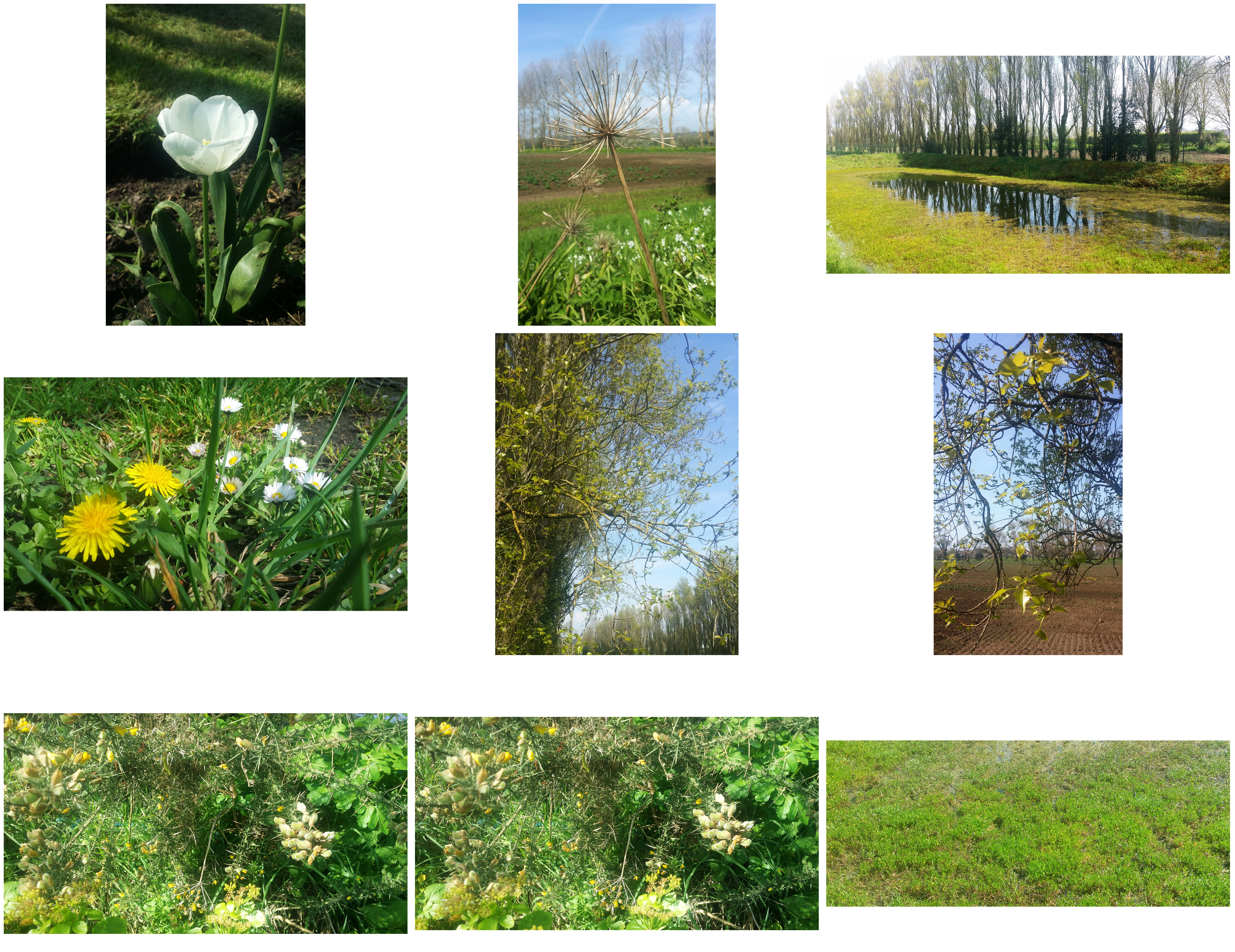


I really like how the colors are quite washed out in this image. For this reason, it almost appears similar to a watercolor painting. Furthermore the lighting is bright, yet also quite dim whilst the focus is very soft. In doing this, I believe how I have captured a sense of spirituality as these techniques convey a sense of warmth to the image. In doing this, along with the very detailed textures of the plants, this combined shows a strong variety of elements that describe the features of the spirit. I particularly like how there is a sense of wonder that causes for us to be curious, yet also feel a sense of calm as we immerse ourselves into the image.

I like this image as it depicts flowers arising from the Earth. The light also shows the idea of new light. From this there is a strong sense of purity, much like the birth of the world in how everything is new, delicate and pure. The use of colour among the flowers particularly stands out because as, colour is starting to blossom, it shows what potentially could be created out of this. This links to change in nature as it shows that change is yet to come. However spirituality which Ive tried to depict such as the golden lighting also show elements of creationism such as that that God is specifically causing for change to occur. I took this particuler image from a low, close up angle to show how cretionism occurs at the smallest as well as the larges of levels, and how small elemets can imapct larger ones – as all part of the purpose of God’s plan for humanity as he imposes change onto humanity.
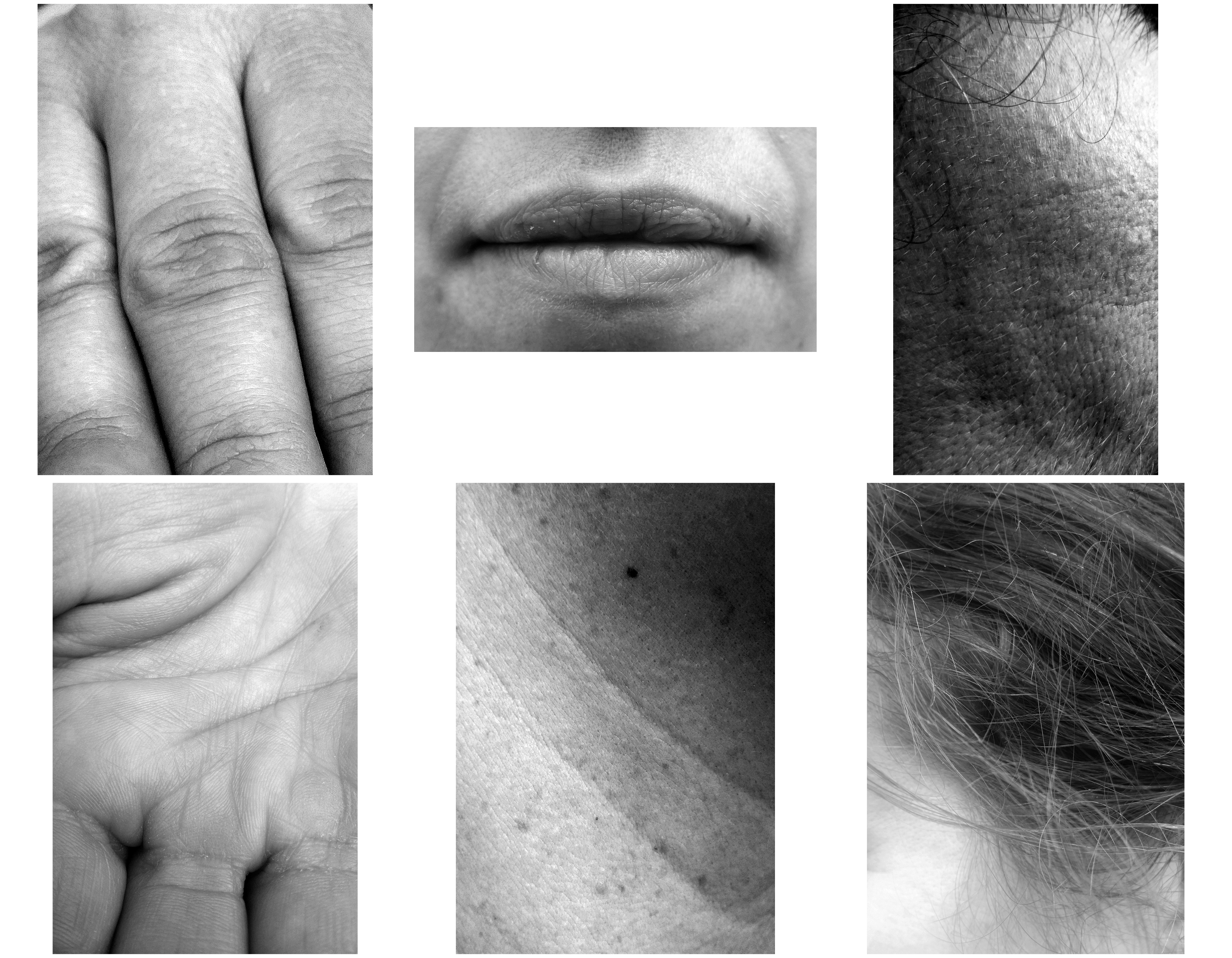
This is my shoot that covers the human element of my exploration of the story of creationism told in the book of Genesis in the bible. I wanted in this shoot, likewise with previous shoots to depict humanly features that are not obviously human. In doing this i wanted to uncover features about the skin and body that are not usually noticed but highlight these. I did this as I wanted to uncover not only the pure truth of human design, but I wanted to take images that emphasize the idea that humans were made in the image of their creater – thus allowing us to explore why the process of change occurs as in theory, it is linked to the idea of being at one (spiritually) with our creator.


For my final exam product, I will be creating a magazine which I have started production of. The magazine will display all my bets images in a typical fashion/music/arts magazine format and I have taken inspiration from exiting titles such as i-D, Dazed and PUSH. Below is a specification of my magazine and how I want it to feel/look and its narrative, concept and design.
how you want your magazine to look and feel
I want my magazine to look professional and quite minimalist in its design features. It will have a clear and simple layout and sequencing with both a combination of images and text, the text being question and answers from my discussion with each model. Both images and text will coincide with each other and work as a pair to bring the whole magazine together. The magazine will consist of full bleed pages that complement other smaller images and text and I want it to be colourful and vibrant as well as quite bold which will be achieved through colours of text boxes, page backgrounds and actual photos. However, it minimalism will also hopefully present a more subtle tone.
format, size and orientation
the orientation of my magazine will be portrait as this is the best effective for the orientation of my actual images and will allow my images to be presented in the largest format and this is quite important to me considering I have used a 50mm lens for the whole project and this has allowed em to capture intricate and crisp which can be emphasised through large full bleed prints on portrait.
design and layout
the design of my magazine is quite simple as already pressed. The front and back cover show the most design features as it has lots f text and although this is the same inside the magazine, the font and back covers is what you see first and so I have made this as effective as possible. The layout will be made up of around 6 pages for each ‘character’ and throughout these 6 pages, there will be a sequence of images and text in between. I want to keep the layout very self-explanatory and logical to follow and so that readers can choose a page at random and read from any point in the magazine as their own accord – it doesn’t have to be read from start to finish because it is divided into sections.
rhythm and sequencing
the rhythm and sequencing of my book will be white basic and as I have already stated, the book will divided into each ‘character’ and for each character, I will present 6 images and these will be in any order, however, if there are two images that are deliberately meant to go together as a diptych then this will be evident and I have trued to place Lucy as the only female in the middle of the magazine to maintain this notion of a male’s gaze.
structure and architecture
I will range my photos from full page photos without a border to maybe one or two double page spreads and lots of smaller images that take up half a page and the rest will be text. As well, I may find that the effect of overlapping an image on top of another may work well. I have briefly stated a layout I aim to follow for the magazine in a previous blog post and I am sticking to this so far.
narrative
the narrative follows what may look like a quite free and muddled narrative at first glance but this is because the message I want to show is quite subtle. It is obvious that the magazine is focused on males, males behaviour and male fashion and how a boys look and persona can impact on the people around him. I want to try and get across a typical boys boisterous and mischievous persona but show this as an underlying theme in which a more vulnerable and timid character may be seen primarily. I will explore through my questions, the reason for the what the models dress and their opinions on how boys are supposed to develop in adolescence when there are inevitable reassures on them and how expression through fashion can help this. Like my previous project, All My Love, this project still addresses quite tender subjects that do not get spoken about often. As well, it is a collaborative project that requires huge input from my subjects to provide meaning and context. I use the portraits and faces I have been capturing in this project to tell a story about boys and their nature as they develop from boys to men.
title
the title of my magazine is Boys Will Be Boys. I have named it this because I find it very fitting and as well, it is quite catchy and memorable because of it is already a known phrase that was used much more a few decades ago than it is now. Boys Will Be Boys is a phrase that was often used my mums in the 70s/80s/90s when their boys had been misbehaving my doing something mischievous or naughty and all they can say is ‘boys will be boys’ because boys have this stereotype that ahs developed over several decades of being quite mischievous through their adventurous natures when young. It is a title that I think fits the message I am trying to portray.
images and text
there will be both images and text in my magazine and they will coincide with each other to create meaning. The images come form the shoots I have carried out over the exam process an the text comes from the answers that each model has provided me with as responses to the questions I asked them.
colour and black and white (or a mix)
my magazine will be a mix of colour and black and white photographs but there will be more colour than black and white and when I have used black and white images, the contrasts and shadows are not harsh and instead, the image are made up of light grey tones and light blacks.
paper and ink
the magazine I will be suing form the Blurb/BookWright options is called ‘premium’. This has a high-end look from a semi-gloss cover and vibrant printing on matte, velvet-finish paper. Premium magazines also have a heavier cover (216 GSM) for protection. The paper inside is 118 GSM.
After creating my questions to ask each of the characters in my project, I sent each of the eight questions through to them digitally on social media either using Messenger or Instagram to message them with the questions outlining my intentions from them and that I would like them to answer as honestly as possible. In each of these blog posts I will post the questions and answers of each model from what they have sent back to me in reply to my message which included the questions. These questions and answers will be presented throughout each segment for each ‘character’ of the story. I am slotting the magazine up into a section for each of them and this text will be dispersed throughout in between the images. My aim from these questions was to find out more about who the model’s fashion is informed and where they taken inspiration for from it, what they would describe their fashion as and why they dress the way they do. It provides more context to the magazine than just visuals.
what would you describe your style of fashion as?
Lucy: comfy, classic and maybe a little random. I love a good jean and top combo. Something that is quite neutral so I can combine a bold lipstick with it. I don’t think I’m trendy, I just like to keep things simple.
if you could wear one brand for the rest of your life, what would it be?
Lucy: Lazy oaf. Their clothes are just so cute and fun. This is the type of clothing that really stands out to me as all their clothes are oversized and comfy. I love the way they advertise and collaborate with other brands.
do you go for comfort over style or style over comfort?
Lucy: 100% comfort over style – even on a night out I would definitely prefer to wear my pyjamas over a dress. I’m on my feet all day so comfort is my priority. I try to incorporate trendiness into my comfort.
do you feel as though there is a certain pressure on boys to fit in to a society even though there are the inevitable stresses that come with adolescence?
Lucy: Yes, I do. Like girls, everyone wants to look better than other people, to look ‘cool’. To have better, more expensive clothes.
why do you dress the way you do?
Lucy: It just suits me and make me feel confident. I don’t particularly like standing out from the crowd. I often use make-up to inform my fashion choices and may base an outfit around the type of makeup I’m wearing.
would you say you take pride in your appearance and make an effort each day to dress well?
Lucy: Yes, as a hairdresser image is so important. My make-up is the most important because if I have nice make-up I feel as though you can get away with unwashed hair in a messy bun! I have key items in my wardrobe, so I tend to just mix and match. Take each day as it comes.
do you feel like you can express yourself through the clothes you wear? if so, why?
Lucy: Definitely, it’s your first impression to a client. You should aim to give a person so many ideas of you as soon as they see you through what you’re wearing.
does dressing the way you do give you a sense of comfort in your own skin? a means of expression as such…
Lucy: Yes, otherwise I wouldn’t wear it. I wouldn’t put myself into something that doesn’t make me comfortable or confident. It makes your day rubbish.
In this blog post, I want to look at the distinctive properties that water holds itself. In doing this,I want to establish the scientific properties that are found which I can relate and compare to spiritual properties pf water based on my observations with a viewpoint from someone who is also trying to translate his faith in his work by finding not just the beauty, but also the dynamics of why change in nature occurs which from a creationist point of view, is all linked back to the book of Genesis. Therefore in this post, I also hope to contrast this by providing factual information on water properties, but also to give you the viewer a viewpoint on the alternative side of water. Within my images of water, I have wanted to include elements that relate to both the scientific but also the spiritual depths of the realms of this world which include close up elements, showing how they function. Then by comparison, I have taken a wider spread, zoomed out landscape to show and explore how these elements make up the whole environment as one which allows us to compare each elements role within the natural cycle of life. This relates to evolution because it explores how the process of change occurs whereas from a spiritual/creationist point of view, these underwater images are also a clear demonstration that by observing the beauty, magnificence, awe and wonder that is surrounded engulfs nature, this could mean that change in nature occurs because the Earth is going somewhere, somewhere similar to where its been before which could be why evolution occurs – linking both theories together.
Water is a transparent, tasteless, odorless, and nearly colorless chemical substance is crucial in providing and ensuring life on earth through survival. It is interesting how scientific properties of water provide life which in itself is hard to be scientifically defined as life is arguably something on the border of the spiritual realms. This is backed up by the fact that all life has water contained in their biological cells which allows for chemical reactions to take place, that are part of the processes for change within nature. These chemical reactions include within animal bodies of metabolism and anabolism, catabolism – all processes that break down, distribute and regulate the amount of molecules and acids within the body as one. This here is the argument for creationism that every individual element is so well coordinated that the creator is still in action to this moment. Water is also essential for the photosynthesis and respiration to occur – where the sun’s energy combined with the water allows for plant life to multiply. Therefore it appears that all the chemical elements (representing the how) are all working towards a common place (representing the why). Although we don’t the specific reasons for why, by examining the beauty and power of nature, can we understand that we are not an accident but have our purpose to be spiritually connected and in tune with nature and if we do that, we can also have greater involvement for the process for change in nature for the better.

The sea’s force is overwhelmingly powerful, how is it that chemical bonds all acting in coordination, can be so lethal? I believe that many humans are unaware of the power and dynamism of the sea. As it is one of the most powerful forces in the world, the sea plays a great role in the process of change within the natural environment on this Earth – breeding and also ending lives. Floods and Tsunamis have killed countless lives throughout the history of mankind. The randomness and chaos that evolves around free moving particles are very interesting as despite the idea that all particles are coordinated, there are arguments that the randomness of the seas reflect how evolution itself is the why in which change occurs and that is that. The sheer range from sharp, crystal whites to plunging dark depths of the deep sea, I have also tried to include in my work as well which highlight the endless power of the sea. However also in doing this I wanted to show the importance of the sea as well, symbolizing as humans are increasingly reliant on it, the rules of the sea will always dictate and influence the way nature occurs whether that is by spiritual reasons or by accident.
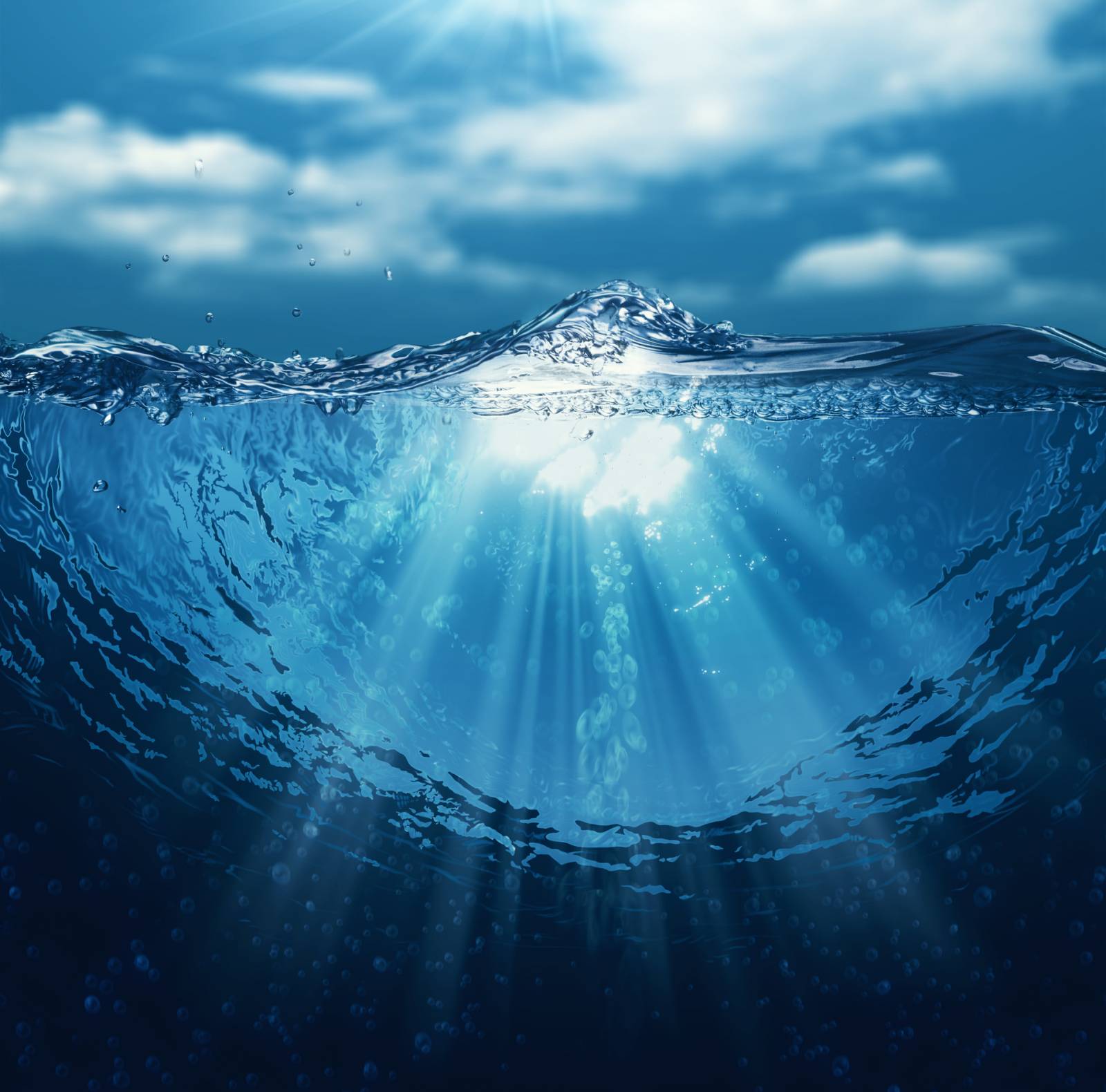


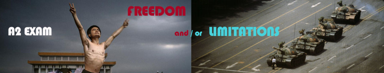
For centuries humans have held suspicions of what the sea actually accommodates in terms of myths, exploring the facts vs the fiction. 71% of the Earth’s surface is made up of water, allowing for unknown life to exist. This is important to recognize and note within my project because the spiritual realm doesn’t have boundaries, and as nature is so well connected with the spiritual forces dictating how change occurs, this reflects not only the endless power of nature, but also most importantly how we will never know the reasons for change and thus shall never be able to fully as humans influence nature as much as spiritualism does. This sense of mystery and the unknown is strongly linked to the title “Freedoms and Limitations” because we don’t know the depths of spirituality, but we do know its power and intervention within nature. Likewise we know how change occurs, but contrastingly we don’t know what the purpose for change to occur is in the end.
After creating my questions to ask each of the characters in my project, I sent each of the eight questions through to them digitally on social media either using Messenger or Instagram to message them with the questions outlining my intentions from them and that I would like them to answer as honestly as possible. In each of these blog posts I will post the questions and answers of each model from what they have sent back to me in reply to my message which included the questions. These questions and answers will be presented throughout each segment for each ‘character’ of the story. I am slotting the magazine up into a section for each of them and this text will be dispersed throughout in between the images. My aim from these questions was to find out more about who the model’s fashion is informed and where they taken inspiration for from it, what they would describe their fashion as and why they dress the way they do. It provides more context to the magazine than just visuals.
what would you describe your style of fashion as?
Alex: I would describe my fashion more by who it’s inspired by – people like Tyler, The Creator and A$AP Rocky. I wear looser fitting, usually bright clothing that’s out of the normal trends. It alternates between comfy loose fitting and also more fitting, upmarket prices. I would usually describe my fashion sense as a charity shop as that’s where the best pieces are found.
Charlie: I personally would describe my style of fashion as street wear, this including skate and surf brands. I like to go for the brands like Santa Cruz, Enjoi, Patagonia and Thrasher. This being because I enjoy wearing simple t-shirts and jumpers with colourful logos. It allows me to express who I am as a person, someone outgoing and always up for anything, the clothes I wear ensures that I will be dressed for any sort of occasion, no matter what it could be. I also enjoy wearing vintage shirts on top of t-shirts which enables me to go from a simple outfit to something I could go out to town in.
if you could wear one brand for the rest of your life, what would it be?
Alex: The one brand I would wear forever would be Carhartt as it’s cool and super functional.
Charlie: I think if I could wear one brand for the rest of my life it would be Thrasher. Thrasher is not only a clothing brand but it is also skateboard magazine which I have been reading ever since secondary school, I have always had a passion for skating and being outdoors so it suits me well. Thrasher not only being a fashionable brand is also very practical and comfy. I have probably 4 thrasher jumpers at the moment, a handful of t-shirts and a cap.
do you go for comfort over style or style over comfort?
Alex: Comfort all the way but it obviously depends on the occasion but I always like to keep it comfortable and casual.
Charlie: Hmm! This is a hard one, but I think I go for a comfort over style. It depends what sort of occasion it is, if it is an everyday outfit I definitely go for comfort as I like to be able to move freely.
do you feel as though there is a certain pressure on boys to fit in to a society even though there are the inevitable stresses that come with adolescence?
Alex: In certain situations, of course, there is a pressure to dress the part but sometimes not dressing the way others do makes you stand out more.
why do you dress the way you do?
Alex: I dress the way I do because of the influence whether that be artists or rappers. I feel like they set trend and regarded as fashionable as hey are mostly sponsored by clothing companies so they get stuff early and set looks earlier than anyone else.
would you say you take pride in your appearance and make an effort each day to dress well?
Alex: Some days when I’m a bit tired ill not really bother and just suit up in the loosest, comfiest clothes I can find but I do like to take ride in what others think of my look for sure – it’s important to make an impression.
do you feel like you can express yourself through the clothes you wear? if so, why?
Alex: I feel like I can express myself through art more than fashion although is probably the best outlet t express yourself as it’s the first thing people see and they can make an immediate judgement about you from what you wear. Wearing something that reflects how you feel or act can have a great impact on people.
does dressing the way you do give you a sense of comfort in your own skin? a means of expression as such…
Alex: Personally, I am very confident and comfortable in my own skin anyway. I have come to terms with how I look, although if I’m not wearing a good outfit that makes me look good and makes me comfortable in myself, I’m always thinking about what others way think of me. A good outfit really just clears my mind and gives me confidence.