Category Archives: Recording

Filters

Author:
Category:

Practise Photoshoot w/ Lucy

On Saturday 10th March, I carried out my first practise/experiment shoot with Lucy as my model for the day. I based my photoshoot at Les Quennevais Estate where there are many opportunities to capture my subject in an urban environment as the area is surrounded by maisonettes, apartment buildings and garages all within close proximity of each other and so I saw it is as the perfect opportunity to begin my project and I intend to re-visit this location again with another of my models.

From the shoot., I can take many positives but also many negatives and ways I can improve for next time however, I am pleased  there were weaknesses in the shoot as this gives me a basis of which to judge on how to better my performance of my next shoot on Wednesday 14th March (today).


This shoot was a very successful and useful photoshoot as I have managed to retrieve several positives outcomes in terms of edits; I have edited my best images – this being around 30 images out of the 330 I took and I did this on Adobe Lightroom as it is a very easy software to import, edit and export images with. Using this software allowed me arrange my images into contact sheets and it also allowed me to reject any images I did not like or were not of a good compositional quality and I was also able to put aside and rate images that were a success and that I intend to use.

In terms of the actual day of the photoshoot, it was a perfect day for me to take photos. The weather was perfect – it was sunny and this was the perfect light for my shoot considering I was working solely with natural light – the clear sky and sun provided perfect lighting for the afternoon and this in-turn benefited the final outcomes because the colours were very warm and this complemented Lucy’;s makeup and I was able to get very clear and crisp shots using my new lens. However, I am aware that on my future shoots, the weather will be very varying and I may not get the best weather conditions and because of this I may have to postpone any shoots where I deem it is necessary. As well, it is likely that I will be shooting after school hours at about 4pm and I need to take into consideration that the lighting may also not be great as the sun will soon be going down so will have to work around this to get the best results.

I will discuss later on in this post about the location and why I chose it as well the problems I had using my camera and how this affected the final results. As well I will comment ton my edits and my reasoning behind my choice of images and why I edited them very subtly with the intention just to enhance any colours that needed lifting or to crop any images where the composition/framing was not the best.

Contact Sheets

These are all the contact sheets from the shoot which I have created using Adobe Bridge. Creating these contact sheets gave me the ability to view all images in an orderly fashion all in one place and from this I was able to roughly mentally discard of any images I was not happy with.

Contact Sheet 1
Contact Sheet 2
Contact Sheet 3
Contact Sheet 4
Contact Sheet 5
Contact Sheet 6
Contact Sheet 7

Once I had created my contact sheets, I was then able to import all my images into Adobe Lightroom to begin making a shortlist of my favourite images and begin editing them from this step onwards.

On this software, I was able to make a selection of my best images and discard any  images that were not up to the standards of the others. From 330 images, it was quite difficult to narrow this down to a smaller array of images but at the same time it was quite easy because I was able to decipher easily between the successful images and weaker images; this being because most of my images were out of ficus and I was immediately able to understand the reason for this fault.

Because this photoshoot was the first time I was using my new 50mm fixed lens, I was not completely aware of the results of I was going to get from it as I was not sure on the right settings to use for different shots. Because it is a fixed lens and has a much lower f/stop of f1.4, I was very keen to use this feature as it is perfect  for portraits shots where you want to focus on the subjects face and isolate them from the background in which they stand. I was using this throughout the shoot and kept my camera aperture between f/1.4 and f/3.6 for the majority of the time, rarely switching to much higher aperture which I needed to do. On top of this, I was often standing to far away from the subject for the camera to actually focus on anything in the frame and this is what the cause was for a large range of my shots being out of focus and I now know how to improve upon this for my next shoot where I will be more cautious of the f/stop I am using for specific shots.

On Adobe Lightroom, it gives me the ability to rate each image out of a star rating of 5. From all my successful frames and after editing them all how I wish, I did exactly this and rated all the images I had gathered into this one place to allow to understand my best ones and the weaker ones.

2 Stars 

These are the edits which I have rated 2 stars because although they are still good images, they are my strongest ones and I would not be happy using them as finals if I was to keep these images as finals for the overall project.

3 Stars

For the following images I have given them a rating of 3 stars because I felt that they were a little better than the images above but still not the standard of my other edits. Furthermore, the edits below are other variations of the better shots that I have rated 5 stars later on in the post. Some of them are from the same area which we based a few of the shots and I have still edited them but have not out them in the 5 star rating because they are weaker variations of similar range of shots. However, the first two are still one of my favourites from the whole shoot and especially out of the photographs rated 4 stars because of the colour provided by the blue garage door behind Lucy.

The images following these two are also other variations of the better versions of the mini shoot we based on the road near Les Quennevais School where Lucy is seen on the road/pavement posing in front of a set of apartments on the green area behind her; but I still feel these images are strong and worth showing.

Also, most of the images I am showing work as a mini sequence if they were taken in close succession to each other and frame similar actions in the image and these would be obvious.

5 Stars

Below are my best images; the ones which I have rated 5 stars because of their quality and they are my favourite because of this.

In these images, I have also included a few images that do not frame Lucy and instead are images of landscape/environment we were surrounded by and where I was taking my images. I decided to do this and intend to do this throughout my perfect in all other shoots to provide consistency but more importantly, give the project something more that just portraits – it will fragment the structure of portraits and divide these up to give the audience a break to digest other images bit it will also provide a really effective look and a a basis for me to structure my other subject based images. It will show a different view to what is shown in the images that has a heavy focus on faces and subjects and will instead focus on admiring the beauty that is provided by a range of environments where I am basing the shoots.

On Adobe Lightroom, I was also able to narrow down my edits even further to the ones I would likely use in the magazine end product and the ones shown below would be the selection I would again have to narrow down even further to leave me with just 5 images that I would be happy to show in my magazine. In real magazine publications of fashion coverage, a photographer/editor would only have room to select between 5 and 1- images, if that for the final cut as you need to keep the audiences interests hooked and this is easily done with a good handful of effective images. I was able to colour code the shortlist of edits I selected that I believe would work in a magazine whilst taking into account pairs of photos that could work and trying top include a range of portraits and landscapes as well as close ups and wide shots. Below is a primary screen of the selection process and the final selection of images to choose from for the final cut.

The yellow colour coded images represent the edits I may use and these are ones I am insure on in terms of if they would actually work in the magazine and although they are goof images I feel they work well, I have chosen to select, with a green colour code, the bets images that would look most effective in a magazine when put together, however, this distribution between the green and yellow images may change later on as I may decide to remove some green ones and replace these with some yellow ones.

Wabi-sabi project // sea shoot

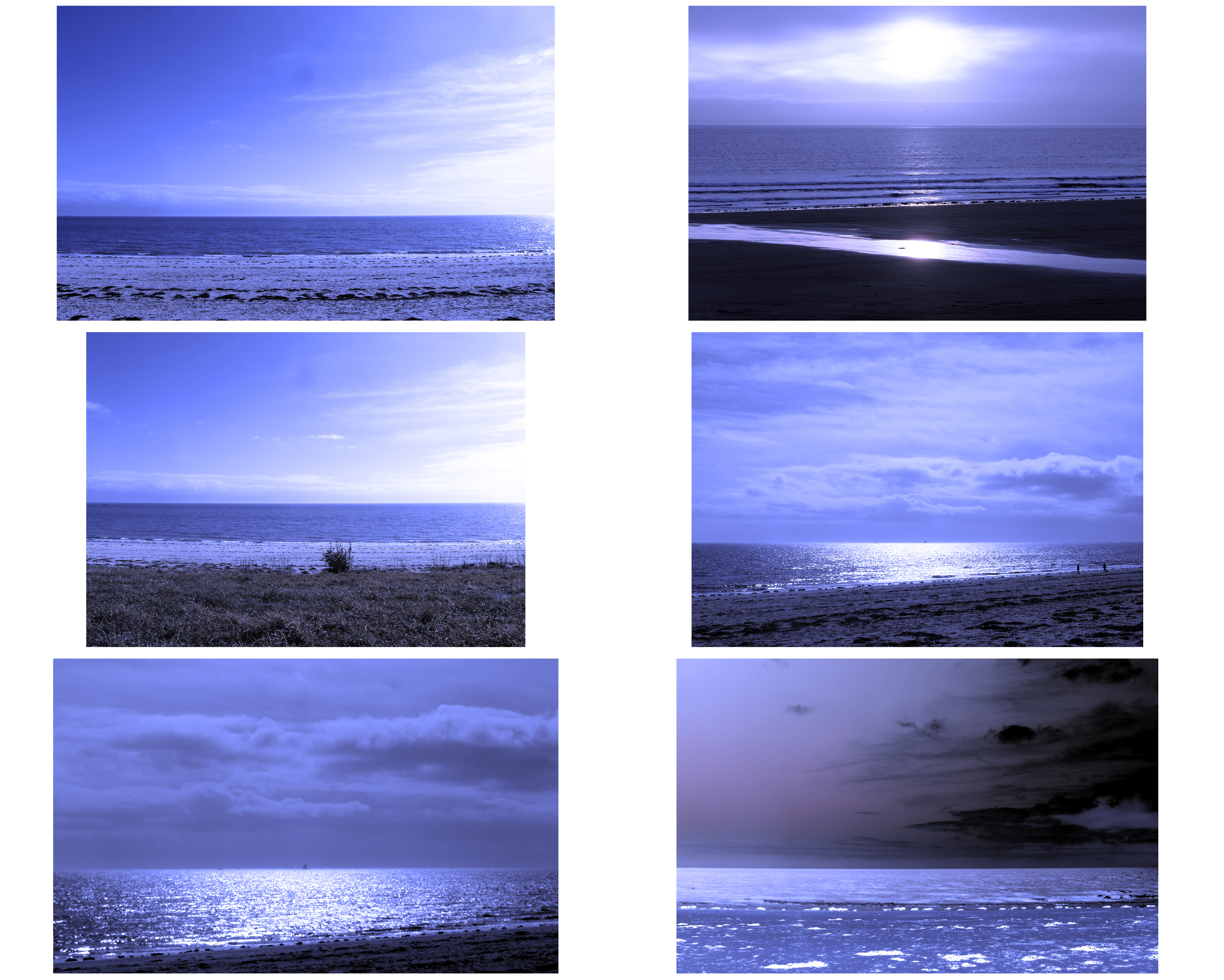
Within my personal project I plan to do many shoots to capture the insignificant events of day to day, however in a detailed and abstract way. The initial scene that I decided to start with was the sea. However I didn’t want to simply capture the whole scene, I wanted to fragment the environment and try to frame specific details that no body notices.

The shoot was done at Green Island beach at high tide so I could capture the water against the rocks. They shoot was done at around two in the afternoon and on a sunny day so that the lighting was good and clear. Here are the original images from the photoshoot.

I wanted to edit the best images from the shoot that really show what I wanted to capture.

Creationism – Light

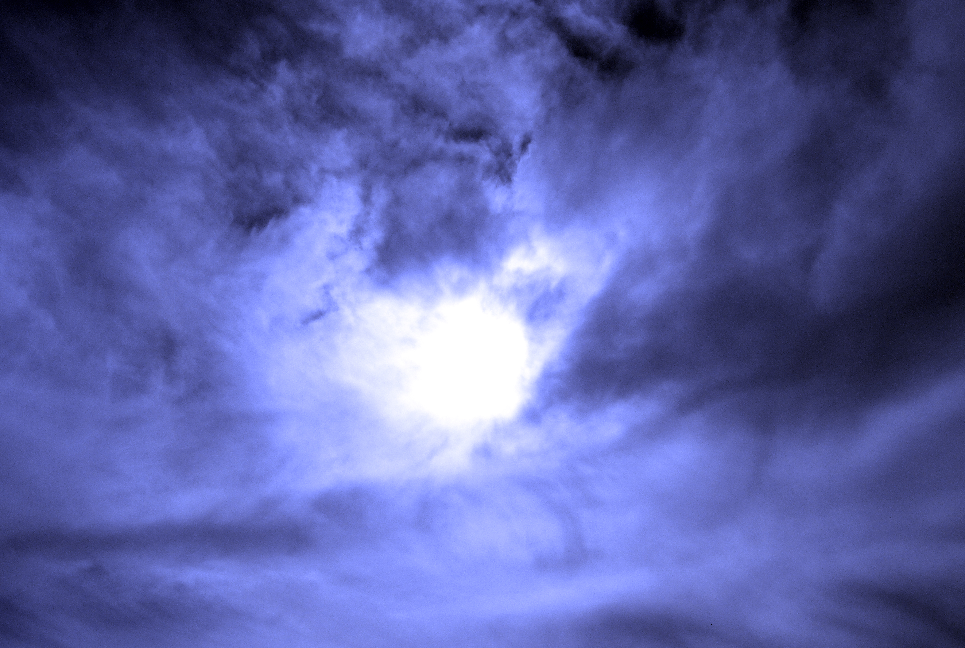
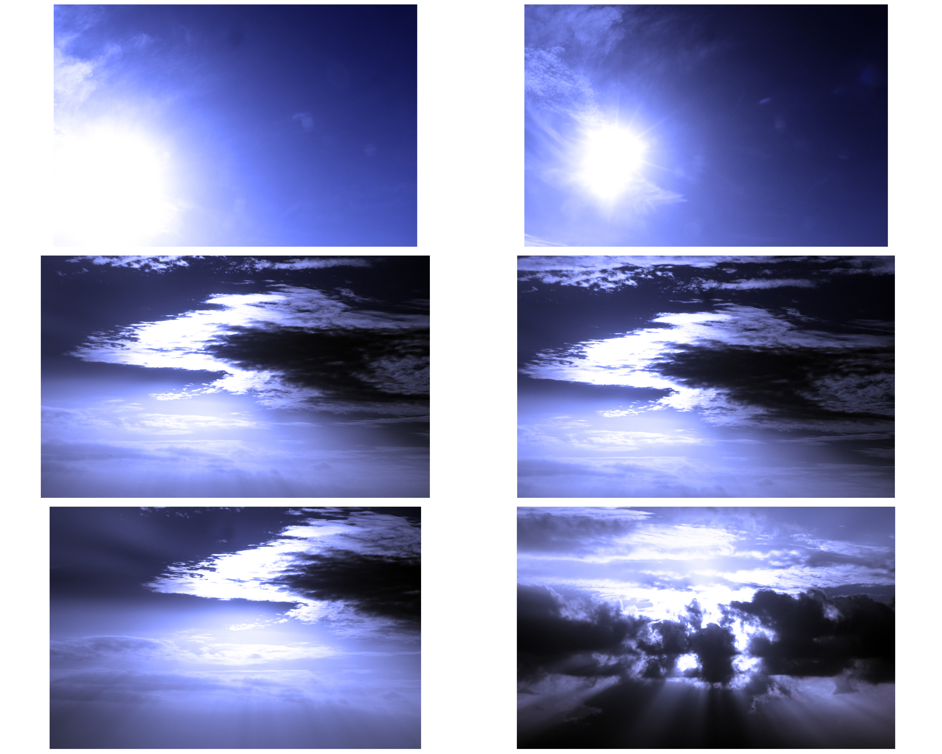
This shoot was all about capturing the experience and spirituality of the one of the elements – light.  I was trying to create the physical and also the metaphysical in my images, the idea that there is something extraodinary that can be seen beyond the normal object.  These images link to the idea of creationsim because I believe they not only appear similar to how when light first became introduced to the world, but they also appear similer in appearmce to the consatntly changing world that is occuring but poeople don’t seem to realise as dramatically and as quickly as it is.  Similarly to the work of Alexander Mourant, I wanted to capture the atmospheric tones that try and reaweken many of society’s lost connection with the continual processes of change that our own relationship holds with this planet, something I believe science has allowed us to do.  This in itself explores the relationship of freedom and limitations because what can be seen by some, can’t be seen by others.  And for those who do see, theere is a sense of awe and wonder that I am trying to invoke and express within these images.  In order to do this, I am trying to communicate my own spiritual interaction with my faith and am trying to implement the idea of why not how change occurs in reference to science and the theory of creation.

Best Images)


Chapter 1 – Genesis

[1:1] In the beginning when God created the heavens and the earth,
[1:2] the earth was a formless void and darkness covered the face of the deep, while a wind from God swept over the face of the waters.
[1:3] Then God said, “Let there be light”; and there was light.
[1:4] And God saw that the light was good; and God separated the light from the darkness.
[1:5] God called the light Day, and the darkness he called Night. And there was evening and there was morning, the first day.


Overall I believe my shoots were succesful despite how initially I felt it hard to gather inspiration in what to physically take, as light (which isn’t an object) is intangible.  I experimented with different sources that reflect light but eventually decided to focus on the single light source that lights up everything – the sun.  The spiritual significance associated with the sun, I felt was important to capture.  In the bible it talks of light seperating the darkness.  In today’s world, there is so many areas that I believe link the two and so therefore I tried to include light and darkness as a binary opposite in my photographs.  Areas that include the darkness is the idea that people are starting to miss seeing the light, and the ever wonders of change and freedom involved in this.  Therefore in these images I wanted to explore the notion of change, reecording it, and why I feel it is importan to recognise how as humans we can use this to reignite our relationship with the freedoms of nature.  However in this regard, I believe it is also important to consider the limitations of this in that we essentially don’t know what the causes of where we are going with thss livelihood of spiritual interaction in this world is taking us

Abstract Experimentation///Just keep smiling

When experimenting in my previous shoot I started to focus on the faces on these record covers. Due to them being in black and white and also in poor quality gave them a ghostly edge when I decided to bring the camera close and blur their faces. I made their faces look less human and eerie. It removed any detail from their faces and in a way  removed there identity. This doesn’t really follow the previous theme of color. However, it has inspired me to think of abstraction as more than just color. Maybe I will focus on color photos as well as black and white.

Abstract Experimentation///color

After my brief shoot on breaking the photographic rule of audience, I really wanted to explore abstraction and color. I did this by taking close up shots of front covers of LP records I had in my bedroom. Many of these were records from the 70’s this meant bright colors. I also took close ups of other colorful objects I found in my bedroom. Having these photos out of focus turned them into solid colors and in most cases showing no texture. It resembles another form of color field painting I studied previously. I selected colors carefully as I wanted them to complement each other. The helpful thing with using records is that the artist or record company probably would already chosen those colors as they work together. This meant all I had to do was to take these photos at the right angle capturing the right colors in the frame. This is just a small start to what I want to do in my project.

Task 2: Make a Manifesto

Following on from your first task of Rule Breaking your next task is write your own manifesto with a set of rules that you follow creatively in making a new set of photographic images, experimental film-making or video art.

A manifesto is a published verbal declaration of the intentions, motives, or views of the issuer, be it an individual, group, political party, government or an artistic movement.

In etymology (the study of the origin of words and the way in which their meanings have changed throughout history), the word manifesto  is derived from the Italian word manifesto, itself derived from the Latin manifestum, meaning clear or conspicuous.

Political manifestos from Britains three main parties, Labour, the Conservatives and Liberal Democrats in the last election in 2017.

Here a few examples of manifestos made by Jersey politicians

Reform Jersey Manifesto

Manifesto by Senator Lyndon Farnham

Futurism Manifesto written by the Italian poet Filippo Tommaso Marinetti was published in the French newspaper Le Figaro in 20 February 1909. In the manifesto Marinetti expresses an artistic philosophy, Futurism, that was a rejection of the past, and a celebration of speed, machinery, violence, youth and industry.

MANIFESTO OF FUTURISM

  1. We intend to sing the love of danger, the habit of energy and fearlessness.
  2. Courage, audacity, and revolt will be essential elements of our poetry.
  3. Up to now literature has exalted a pensive immobility, ecstasy, and sleep. We intend to exalt aggressive action, a feverish insomnia, the racer’s stride, the mortal leap, the punch and the slap.
  4. We affirm that the world’s magnificence has been enriched by a new beauty: the beauty of speed. A racing car whose hood is adorned with great pipes, like serpents of explosive breath—a roaring car that seems to ride on grapeshot is more beautiful than the Victory of Samothrace.
  5. We want to hymn the man at the wheel, who hurls the lance of his spirit across the Earth, along the circle of its orbit.
  6. The poet must spend himself with ardor, splendor, and generosity, to swell the enthusiastic fervor of the primordial elements.
  7. Except in struggle, there is no more beauty. No work without an aggressive character can be a masterpiece. Poetry must be conceived as a violent attack on unknown forces, to reduce and prostrate them before man.
  8. We stand on the last promontory of the centuries!… Why should we look back, when what we want is to break down the mysterious doors of the Impossible? Time and Space died yesterday. We already live in the absolute, because we have created eternal, omnipresent speed.
  9. We will glorify war—the world’s only hygiene—militarism, patriotism, the destructive gesture of freedom-bringers, beautiful ideas worth dying for, and scorn for woman.
  10. We will destroy the museums, libraries, academies of every kind, will fight moralism, feminism, every opportunistic or utilitarian cowardice.
  11. We will sing of great crowds excited by work, by pleasure, and by riot; we will sing of the multicolored, polyphonic tides of revolution in the modern capitals; we will sing of the vibrant nightly fervor of arsenals and shipyards blazing with violent electric moons; greedy railway stations that devour smoke-plumed serpents; factories hung on clouds by the crooked lines of their smoke; bridges that stride the rivers like giant gymnasts, flashing in the sun with a glitter of knives; adventurous steamers that sniff the horizon; deep-chested locomotives whose wheels paw the tracks like the hooves of enormous steel horses bridled by tubing; and the sleek flight of planes whose propellers chatter in the wind like banners and seem to cheer like an enthusiastic crowd.

In 1924 French Poet, Andre Breton published a Surrealist Manifesto which sets out specific terms on which to be creative and make art as a reaction against another art movement, Dadaism.

POEM

A burst of laughter

of sapphire in the island of Ceylon

The most beautiful straws

HAVE A FADED COLOR

UNDER THE LOCKS

on an isolated farm

FROM DAY TO DAY

the pleasant

grows worse

coffee

preaches for its saint

THE DAILY ARTISAN OF YOUR BEAUTY

MADAM,

a pair

of silk stockings

is not

A leap into space

A STAG

Love above all

Everything could be worked out so well

PARIS IS A BIG VILLAGE

Watch out for

the fire that covers

THE PRAYER

of fair weather

Know that

The ultraviolet rays

have finished their task

short and sweet

THE FIRST WHITE PAPER

OF CHANCE

Red will be

The wandering singer

WHERE IS HE?

in memory

in his house

AT THE SUITORS’ BALL

I do

as I dance

What people did, what they’re going to do

An example of a poem published as part of Breton’s Surrealist manifesto.

Tasks
1. Research and read at least one political manifesto and one manifesto from an artistic group or movement. Describe differences and similarities used in their use of language, metaphor and vision – 1 blog posts.

2. Analysis: from your chosen artistic manifesto, choose at least two key art works for further analysis that have been made as response to the rules/ aims/ objectives of the manifesto. Describe techniques used, interpret meaning/metaphor, evaluate aesthetic quality – 1-2 blog posts.

3. Planning: Write a manifesto with a set of rules (5-10) that provide a framework for your new shoots and overall project. Describe in detail how you are planning on developing your work and ideas in the next two weeks. Think about what you want to achieve, what you want to communicate, how your ideas relate to the themes of FREEDOM and/or LIMITATIONS – 1 blog post.

4. Record: Produce at least one shoot by Mon 12 March.

5. Experiment: Edit a selection of 5 images with annotation – 1 blog post.

6. Evaluate: Choose your best image and evaluate with reference to your manifesto and contextual references – 1 blog post.

7. Present: Print best image and prepare a 1 min presentation Wed 14 March in class around the table.

Extension: Write a new set of rules and repeat the above process.

Help & Support:

See link to manifesto in Wikipedia which has a hyperlinks to many manifestos, both political and artistic.

How to write a manifesto? Read more here
A manifesto is a statement where you can share your…
– Intentions (what you intend to do)
– Opinions (what you believe, your stance on a particular topic)
– Vision (the type of world that you dream about and wish to create)

See book: The Photographer’s Playbook on page 45 and David Campany’s: What to Photograph?

Here are class lists of what to photograph?

Class 13 A
Class 13 D
Class 13 E

Political Manifestos – in Jersey

Political parties makes a manifesto that sets out their political values and views on issues such as education, health, jobs, housing, environment, the economy etc and pledge a set of policies on what they would do if they got elected.

As there will be an election in Jersey during the exam preparation and the fact that you are all eligible to vote it makes sense to explore what manifestos exist in local politics. Unlike the UK, Jersey doesn’t have a political system with large parties, such as Labour, Conservative, Liberal Democrats and so on.

The parliamentary body responsible for adopting legislation and scrutinising the Council of Ministers is the Assembly of the States of Jersey. Forty-Nine elected members, 8 island-wide Senators, 29 Deputies and 12 Constables representing each parish sit in the assembly. There are also five non-elected, non-voting members appointed by the Crown (the Bailiff, the Lieutenant Governor, the Dean of Jersey, the Attorney General and the Solicitor General). Decisions in the States are taken by majority vote of the elected members present and voting.

Find out more here on the official Government website: gov.je

In Jersey there is only one small political party Reform Jersey (3 members). Some politicians, such as Senator Philip Ozouf, Senator Lyndon Farnham publish a manifesto in advance of an election so that the public can learn about their political views.  Hustings in each Parish will be taken place during the month of April leading up to the election day 9 May 2018.

Artistic Manifestos

Here is a a list of art movements that you may use as contextual research. Many of them produced various manifestos

Dadaism, Futurism, Surrealism,  Situationism, Neo-dadaism, Land/Environmental art, Performance art/Live art, Conceptualism, Experimental filmmaking/ Avant-garde cinema.

Here are a list of artists/ photographers that may inspire you associated with the above art movements and isms:

Vito Acconci, John Baldessari, Yves Klein, Bas Jan Ader, Erwin Wurm, Chris Arnatt, Richard Long, Hamish Fulton, Joseph Beuys, Chris Burden, Francis Alÿs, , Sophie Calle , Nikki S Lee, Claude Cahun, Dennis Oppenheim, Bruce Nauman, Allan Kaprow, Mark Wallinger, Gillian Wearing, Marcel Duchamp and the Readymade, Andy Warhol’s film work, Steve McQueen, Sam Taylor-Johnson, Marina Abramovic, Pipilotti Rist, Luis Bunuel/ Salvatore Dali: , Le ChienAndalou, Dziga Vertov: The Man with a Movie Camera

A few Youtube clips

Gillian Wearing: Dancing in Peckham

Mark Wallinger: Hymn

Martha Rosler: Semiotics of the Kitchen

Yoko Ono: Cut Piece

 Bruce Nauman: Art Make-Up

 Chris Burden, Shoot, 1971

Luis Bunuel/ Salvatore Dali: Un Chien Andalou

Dziga Vertov: The Man with a Movie Camera

Marcel Duchamp: Ready-mades


Breaking The Rules

http://www.huckmagazine.com/art-and-culture/photography-2/eight-photography-rules-worth-breaking/

#1 The Rules of Objectivity 

#2 The Rule of Audience

#3 The Rule of Manipulation

#4 The Rule of Reality

#5 The Rule of Technicality

#6 The Rule of Ownership

#7 The Rule of the Camera

#8 The Rule of Rule Breaking

The Rule of the Camera – Part 1

For this image, I interpreted the Rule of the Camera as being a collection of images that were created by having slightly odd camera techniques in terms of settings but also camera movement.  This image below was in reality taken as a mistake however all my images were essentially mistakes in this particular shoot as it was about exploring the boundaries of the camera.  The image below is an image of a bay that was taken at night with very long shutter speed of 30 secs with an ISO that was slightly lower than I would normally take.  As I took the image i ever so slightly gave a little wobble o the camera which created this red light shooting through the sky which is of a lighthouse, however I like the image of the bay is still well in focus.  This links to my current project as in a later date, I feel I would  be interested in exploring light as this has a direct relationship with nature.

The Rule of the Camera – Part 2

For these last 3 images I wanted to explore a relationship with the present and the past by taking images of structures that have survived time since before cameras existed.  This represents the rule of the camera as it captures the spirit of time of when ideally cameras couldn’t capture at the time they were built.  The first is an image of an old harbour, the second is a sea fortress and the third is a chapel, all surviving and existing for centuries.  This relationship of shared history among each structure where for centuries people have lived and survived off these locations reflects the rule of the camera because I believe it captures not the process of survival, but the legacy of how these places have been used to survive which links, particularly the first two images.

Breaking the rules///The Rule of Audience

Planning

The rule of audience suggest that an artists work should appeal to someone or a group of people. This is the rule I am going to break. I will try to take photos that won’t appeal or impress anyone. I won’t make photos that directly relate to a person or group of people. I want to make photos that have no meaning, nothing for someone to relate to, completely random photos that have no artistic value.

Recording

I decided to first take photos that were out of focus and blurred. Initially this wasn’t meant to look good however, due to it being to abstract and having bright colors, these photos were liked by many people. In some cases you could say I broke the rule of Technicality but this wasn’t the rule I was breaking so even though I made photos people liked they have to be consider a failed attempt as people liked themThe photos below was creating below with the same mind set however this was my most popular photo. For the same reasons as before these photos did not reasons before it did not hit the brief I set for myself.

These photos below did succeed in my goal of breaking the rule of Audience. Nobody I have shown these photos liked them as they showed no skill, nothing interesting and all round boring. I have created photos nobody liked or appreciated. Although I have completed the objective I set myself I personally even I do not like these photos and wish not to continue with this any further. However the photos above is something I would like to continue to explore. Abstraction is something I have lightly touched on in my previous projects however I’d like to explore this further fulling immersing myself in color, distortion and composition. This task has made me realize that the rule I want to continue to break is Technicality.

Provoke | Yutaka Takanashi, Takuma Nakahira and Daido Moriyama.

Changing perceptions and breaking boundaries |  Japanese Photography

provoke

WHATProvoke was a Japanese magazine which rejected glossy commercial imagery and the style of documentary photography. The Provoke era refers to its influence on photography made in post-war Japan

WHY : challenge the idea that photography has its own language, independent of words.Following the decimation and rebuilding of Japanese society after the Second World War, photography played an important part in a new self-definition of Japanese visual style, set apart from Western influences.

Provoke was a magazine with only three issues in the late 1960s, but its influence continued into the 1970s and 80s. It set itself apart from the photojournalistic style of the day, looking for a more subjective voice and validation of the person behind the camera. The images are often grainy and disorderly, reflecting the social and political upheavals taking place across the nation. It also constrasted with the glossy imagery of commercial magazines.

Takuma Nakahira and Yutaka Takanashi were founding members of the Provoke group. Daido Moriyama joined a little later, bringing with him his early influences of Cartier-Bresson, but with a desire to be a witness with more self-expressive intent.

HOW : The photographers featured here attempted for a short period to challenge the rules and conventions of photography in the context of massive social upheaval. They asked important questions of photography, testing its power and influence. Their youthful experiments became massively influential for subsequent generations of photographers.

The main subject of this project is Provoke (Purovōku), an experimental magazine founded by photographers Yutaka Takanashi and Takuma Nakahira, critic Koji Taki, and writer Takahiko Okada in 1968. The magazine’s subtitle read as: shisō no tame no chōhatsuteki shiryō (Provocative documents for the sake of thought).

​Photographer Daido Moriyama, the photographer most often associated with the publication, did not join the magazine until the second issue. Provoke lasted only three issues with a small print run, but was tremendously influential.

Provoke argued that the photographer can capture what cannot be expressed in words, presenting photographs as “documents” for others to read.  In Japanese, the visual style of the photographs in Provoke has been described as: ‘are-bure-boke‘, which translates as ‘grainy/rough, blurry, out-of-focus‘. On 31 March 1970 the Provoke collective published the book Mazu tashikarashisa no sekai o suterō: Shashin to gengo no shisō (First, Throw Out Verisimilitude – Thoughts on photography and language). It was to the be the last publication of this short lived but influential group. Each of the participants went on to establish their own individual visions in their subsequent careers.

Contextual history

>> Daido Moriyama wants you to WATCH THIS <<


“Photography was too explanatory, too narrational for me. […] It was natural for me to join Provoke. […] They said they were photographing atmosphere. But I was very precise and careful. […] But my work changed after I saw how they worked. I saw that I could not control everything. I understood that photography is only a fragment. I used to be a photographer who interprets things via language. And then Provoke changed me.”

— Yakuta Takanashi

“The ambitious mission of Provoke to create a new photographic language that could transcend the limitations of the written word was declared with the launch of the magazine’s first issue. The year was 1968 and Japan, like America, was undergoing sweeping changes in its social structure. A questioning of traditional social conventions and a loss of confidence in existing political powers was happening in many creative disciplines across Japan and formed the foundation that fuelled Provoke’s mission. Unified under a manifesto that advocated conceptualism over realism, Provoke‘s photographers and writers moved beyond issues of what to photograph, and sought to uncover and question the essential nature of photography itself. The visual results flouted the precision of earlier documentary modes in favour of a less focused imagery that allowed for chance and the unknown to reveal itself in the photographic process.”
— Russet Lederman, 2012

Other photographs by Provoke Group members:

Subsequent publications by each of the Provoke members were equally challenging in their subject matter and visual style. Most famous of these are the books ‘Farewell to Photography’ by Daido Moriyama, ‘For a Language to Come’ by Takuma Nakihara and ‘Towards the City’ by Yutaka Takanashi.

Your response to PROVOKE

  • Look carefully at the photographs published in the various issues of Provoke. How would you describe them? Write a list of words that might be used to capture the visual qualities, subjects and impact of these photographs on the viewer.
  • What does the word Provoke suggest to you? What is provocative about these photographs? Why do you think this was chosen as the title of the publication?
  • Reflect on your own feelings about the society in which you live and the state of photography. What kinds of images and ways of making photographs seem appropriate to you for documenting these feelings and attitudes? Where would you go to make these pictures? Given Moriyama’s use of a consumer compact camera (rather than an expensive, professional rangefinder or SLR) would it matter to you what equipment you used?
  • In order to explain the approach they were taking to photography in Provoke, the participants published a short manifesto. There is a long history of artists, especially in the twentieth century, banding together and writing manifestos. Imagine you decided to collaborate with classmates and/or friends to create an artistic collective. What would you write in your manifesto?
  • Daido Moriyama has said: “[My] photos are often out of focus, rough, streaky, warped, etc. But if you think about it, a normal human being will in one day perceive an infinite number of images, and some of them are focused upon, others are barely seen out of the corner of one’s eye.” What do you think he means? Watch the film Daido Moriyama: In Pictures and make some notes. How would you summarise his attitude to photography?
  • It is often more difficult to make ‘wrong‘ photographs than it is to follow the ‘rules’ or conventions of photography. Attempt to make a series of images which respond as instinctively to the world as possible. Consider the following questions:
    • ​Will you use a film or digital camera? Will your camera be an SLR/DSLR, a compact camera, a disposable camera or a camera phone?
    • Will you photograph in colour or black and white?
    • Will you always look through the viewfinder?
    • Will you always compose your image carefully?
    • Will you always keep the camera level with the horizon?
    • Will you always focus on your subject?
    • Will your subjects conform to one or more genres of photography?
    • Will you always photograph from your full height?
    • Will you always carefully select your subjects?
  • Whilst you are making photographs, ask yourself the questions: “What is photography?”, “Who becomes a photographer?” and “What is seeing?”…remember, you have access to texts and publications that ask the same questions
  • Once you have made a significant number of photographs, consider how you will editprintsequence and display them. You could continue to experiment at this stage by, for example, printing your images on unusual materials and/or using a scanner or photocopier to print/alter your photographs.
  • You might decide to create your own photobook or magazine (like Provoke). You could also choose to collaborate with classmates. Again, don’t be afraid to question the ‘rules’ about how photographs are generally displayed. Consider issues such as repetition, scale, materials, layering, orientation etc.
  • Daido Moriyama reportedly told the publisher of his groundbreaking book ‘Farewell to Photography’ to arrange the pictures in whatever way he liked. You could give a classmate a selection of your images and ask them to make their own sequence for a display or publication of some sort, thus delegating the responsibility of the final display to someone else.
  • Bend and break the rules, conventions, limitations of what you know about photography…and find a sense of freedom whilst provoking a response from the viewer(s).

Good Luck!

Task 1: Breaking the Rules

It is really important that you get off to a creative and productive start in your Exam preparation. You should aim to do something practical and photographic each week, either make new images with your camera or work digitally with images in post-production (Lightroom/ Photoshop/ Premiere.)

Those students who are disciplined and work with a real focus on a sustained investigation ie: go on shoots, experiment with images, explore ideas in-depth  will achieve the highest marks and also enjoy the creative challenge of exploring an Exam paper.

Watch this video about John Baldessari narrated by Tom Waits as an inspiration first.

In the first week of the Exam preparation we want you to complete a photographic shoot where you break one of the rules of photography.

#1 The Rules of ObjectivityW. Eugene Smith, John Grierson, Mathieu Asselin
#2 The Rule of Audience Lewis Hine, Daile Kaplan, Mark Neville
#3 The Rule of ManipulationSteve McCurry, Errol Morris, Alice Wielinga
#4 The Rule of RealityJohn Grierson, Peter Watkins, Joshua Oppenheimer, Cristina de Middle, Paula Paredes
#5 The Rule of TechnicalityLaura El-Tantawy, Henrik Malmström
#6 The Rule of OwnershipThomas Sauvin, Mishka Henner
#7 The Rule of the CameraDonald Weber, Liz Orton
#8 The Rule of Rule BreakingOlivia Arthur, Carolyn Drake

Deadline: Wed 28 February – all posts uploaded!

  1. Read: article Rule Breakers by Lewis Bush (Archisle Photographer-in-Residence 2018.)
  2. Plan: Choose one rule of photography and develop an idea for a shoot – 1 blog post.
  3. Research: At least two artists references in relation to your chosen rule that provide analysis and context – 1-2 blog posts.
  4. Record: Produce at least one shoot.
  5. Experiment: Edit a selection of 5 images with annotation – 1 blog post.
  6. Evaluate: Choose your best image and evaluate with reference to Bush’ text and artists references – 1 blog post.
  7. Present: Print best image and prepare a 1 min presentation Wed 28 Feb in class around the table.

Extension: Choose a second rule to break and repeat the above process.

In essence if you follow the above 7 step process in your exam preparation you will fulfil all assessment criteria and work towards a set of final and successful photographic outcomes.