Category Archives: Recording

Filters

Author:
Category:

Further Magazine Production/Layout Experimentation Using Final Images

The screenshots below show the processes I have gone through when creating some primary layout styles of my magazine. I have chosen to keep it very simple and this choice was informed by my observation on OUHS magazine where they also choose very simple and basic font types to create a sleek-looking layout. It is evident that they carefully choose whether to position their text in the centre of page or to the side and how such text may wrap around images and so on. Overall, the look of their magazine is very simple and I have attempted to achieve this but these are of course only primary experiments using the final images I have gathered and imported into BookWright. I am still yet to import all of the characters text that will come from the question and answers. Once I have received all of this, I will have to work the layout of imagery around the way text will be able to fit in the pages. As ell, I do not want to exceed the limit I have allowed myself to present the content for each character. I have given myself 6 pages to fill and do not want to exceed this because it is well ordered suing this amount of pages because it means that a characters name page will not be on a previous page spread to where their photographs begin. This layout is present below, however, only Peter’s full segment has been showed as this is as far as I got at this stage.

The images below show the cover pages, the first page which is taken up by the slogan of my magazine as well as Peter’s 6 pages and a couple of Max’s.

These are the two cover pages, both front and back. The images shown below that take up the cover ages are the final ones – I am hoping I will not have to edit them any further because if I do, they won’t be the best versions because I will be changing the slightest touches will in-turn affect my opinions on the covers as a whole and it is best if I leave them how they are because I feel they are effective.

This is the page that has the slogan of the magazine written on. I have chosen this is my slogan because I felt its the themes I am attempting to cover in my magazine. I came up with it myself based on the message I was trying to get across in the magazine.

I also created another version that was more fun and vibrant and less simple. I used the same text but instead of it being plain black, I added an iridescent pattern on the text to make it more colourful. As well, I also used the liquify tool after rasterizing the text layer to be able to manipulate the look of it. Using the liquify tool at a large brushstroke size, I could distort the position of some of the letters and make it look quite wavy which I think works effectively.

The next three screenshots show the section in the magazine that will be present the images of Peter and his question and answers. I will need to re-arrange the layout of images more once I have imported text because I will need to figure out the best way that the text fits in.

The last screenshot shows the my experimentation with images for the first page of Max’s section. I fits imported this image of him sitting on the bench looking directly at the camera because it is one of my favourites and I think it would look best as full bleed photograph because of the  fact it is full body shot and audiences would get the full impact of it if it was presented on a large scale.

Plants

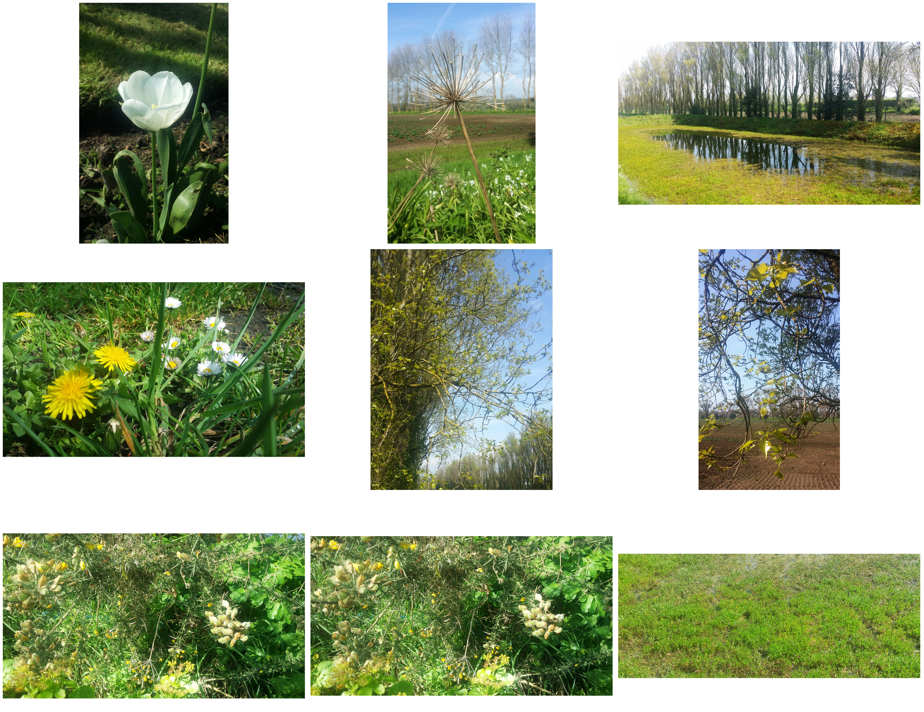
These are my images that I took that covers the last verses of the book of Genesis:

11 Then God said, “Let the land produce vegetation: seed-bearing plants and trees on the land that bear fruit with seed in it, according to their various kinds.” And it was so. 12 The land produced vegetation: plants bearing seed according to their kinds and trees bearing fruit with seed in it according to their kinds. And God saw that it was good. 13 And there was evening, and there was morning—the third day.

In this shoot I had a particuler consideration towards lighting which I wanted to use in order to bring the colour, “life” and “spirit” out of plants and nature.  Because stereo typically, plants are generally first referred to when someone mentions nature, I wanted in my images to capture the beauty of the spirit whilst also showing this as a natural powerful force.  This can be seen through my use of bright lighting and exposures that are effective as they almost replicate angelic activity.  Furthermore I wanted to also capture the abstraction found within shapes of nature that show and highlight the individuality of each element, but also the similarities as well.  Below is a link that I found useful when researching before I embarked on this shoot.

https://en.wikipedia.org/wiki/Patterns_in_nature#Trees,_fractals

Overall, I believe my images were largely successful at capturing spirituality.  This is because up to this point I have explored the “how” in terms of evolutionist/scientific theories.  However in this shoot I believe I have successfully captured the “how” in spirituality as well as the “why” in which the processes of change dictated by time, exist.


I really like how the colors are quite washed out in this image.  For this reason, it almost appears similar to a watercolor painting.  Furthermore the lighting is bright, yet also quite dim whilst the focus is very soft.  In doing this, I believe how I have captured a sense of spirituality as these techniques convey a sense of warmth to the image.  In doing this, along with the very detailed textures of the plants, this combined shows a strong variety of elements that describe the features of the spirit.  I particularly like how there is a sense of wonder that causes for us to be curious, yet also feel a sense of calm as we immerse ourselves into the image.

I like this image as it depicts flowers arising from the Earth.  The light also shows the idea of new light.  From this there is a strong sense of purity, much like the birth of the world in how everything is new, delicate and pure.  The use of colour among the flowers particularly stands out because as, colour is starting to blossom, it shows what potentially could be created out of this.  This links to change in nature as it shows that change is yet to come.  However spirituality which Ive tried to depict such as the golden lighting also show elements of creationism such as that that God is specifically causing for change to occur.  I took this particuler image from a low, close up angle to show how cretionism occurs at the smallest as well as the larges of levels, and how small elemets can imapct larger ones – as all part of the purpose of God’s plan for humanity as he imposes change onto humanity.


Lucy’s Q&A

After creating my questions to ask each of the characters in my project, I sent each of the eight questions through to them digitally on social media either using Messenger or Instagram to message them with the questions outlining my intentions from them and that I would like them to answer as honestly as possible. In each of these blog posts I will post the questions and answers of each model from what they have sent back to me in reply to my message which included the questions. These questions and answers will be presented throughout each segment for each ‘character’ of the story. I am slotting the magazine up into a section for each of them and this text will be dispersed throughout in between the images. My aim from these questions was to find out more about who the model’s fashion is informed and where they taken inspiration for from it, what they would describe their fashion as and why they dress the way they do. It provides more context to the magazine than just visuals. 


what would you describe your style of fashion as?

Lucy: comfy, classic and maybe a little random. I love a good jean and top combo. Something that is quite neutral so I can combine a bold lipstick with it. I don’t think I’m trendy, I just like to keep things simple.

if you could wear one brand for the rest of your life, what would it be?

Lucy: Lazy oaf. Their clothes are just so cute and fun. This is the type of clothing that really stands out to me as all their clothes are oversized and comfy. I love the way they advertise and collaborate with other brands.

do you go for comfort over style or style over comfort?

Lucy: 100% comfort over style – even on a night out I would definitely prefer to wear my pyjamas over a dress. I’m on my feet all day so comfort is my priority. I try to incorporate trendiness into my comfort.

do you feel as though there is a certain pressure on boys to fit in to a society even though there are the inevitable stresses that come with adolescence?

Lucy: Yes, I do. Like girls, everyone wants to look better than other people, to look ‘cool’. To have better, more expensive clothes.

why do you dress the way you do?

Lucy: It just suits me and make me feel confident. I don’t particularly like standing out from the crowd. I often use make-up to inform my fashion choices and may base an outfit around the type of makeup I’m wearing.  

would you say you take pride in your appearance and make an effort each day to dress well?

Lucy: Yes, as a hairdresser image is so important. My make-up is the most important because if I have nice make-up I feel as though you can get away with unwashed hair in a messy bun! I have key items in my wardrobe, so I tend to just mix and match. Take each day as it comes.

do you feel like you can express yourself through the clothes you wear? if so, why?

Lucy: Definitely, it’s your first impression to a client. You should aim to give a person so many ideas of you as soon as they see you through what you’re wearing.  

does dressing the way you do give you a sense of comfort in your own skin? a means of expression as such…

Lucy: Yes, otherwise I wouldn’t wear it. I wouldn’t put myself into something that doesn’t make me comfortable or confident. It makes your day rubbish.

Alex and Charlie’s Q&A

After creating my questions to ask each of the characters in my project, I sent each of the eight questions through to them digitally on social media either using Messenger or Instagram to message them with the questions outlining my intentions from them and that I would like them to answer as honestly as possible. In each of these blog posts I will post the questions and answers of each model from what they have sent back to me in reply to my message which included the questions. These questions and answers will be presented throughout each segment for each ‘character’ of the story. I am slotting the magazine up into a section for each of them and this text will be dispersed throughout in between the images. My aim from these questions was to find out more about who the model’s fashion is informed and where they taken inspiration for from it, what they would describe their fashion as and why they dress the way they do. It provides more context to the magazine than just visuals. 


what would you describe your style of fashion as?

Alex: I would describe my fashion more by who it’s inspired by – people like Tyler, The Creator and A$AP Rocky. I wear looser fitting, usually bright clothing that’s out of the normal trends. It alternates between comfy loose fitting and also more fitting, upmarket prices. I would usually describe my fashion sense as a charity shop as that’s where the best pieces are found.

Charlie: I personally would describe my style of fashion as street wear, this including skate and surf brands. I like to go for the brands like Santa Cruz, Enjoi, Patagonia and Thrasher. This being because I enjoy wearing simple t-shirts and jumpers with colourful logos. It allows me to express who I am as a person, someone outgoing and always up for anything, the clothes I wear ensures that I will be dressed for any sort of occasion, no matter what it could be. I also enjoy wearing vintage shirts on top of t-shirts which enables me to go from a simple outfit to something I could go out to town in.

if you could wear one brand for the rest of your life, what would it be?

Alex: The one brand I would wear forever would be Carhartt as it’s cool and super functional.

Charlie: I think if I could wear one brand for the rest of my life it would be Thrasher. Thrasher is not only a clothing brand but it is also skateboard magazine which I have been reading ever since secondary school, I have always had a passion for skating and being outdoors so it suits me well. Thrasher not only being a fashionable brand is also very practical and comfy. I have probably 4 thrasher jumpers at the moment, a handful of t-shirts and a cap.

do you go for comfort over style or style over comfort?

Alex: Comfort all the way but it obviously depends on the occasion but I always like to keep it comfortable and casual.

Charlie: Hmm! This is a hard one, but I think I go for a comfort over style. It depends what sort of occasion it is, if it is an everyday outfit I definitely go for comfort as I like to be able to move freely.

do you feel as though there is a certain pressure on boys to fit in to a society even though there are the inevitable stresses that come with adolescence?

Alex: In certain situations, of course, there is a pressure to dress the part but sometimes not dressing the way others do makes you stand out more.

why do you dress the way you do?

Alex: I dress the way I do because of the influence whether that be artists or rappers. I feel like they set trend and regarded as fashionable as hey are mostly sponsored by clothing companies so they get stuff early and set looks earlier than anyone else.

would you say you take pride in your appearance and make an effort each day to dress well?

Alex: Some days when I’m a bit tired ill not really bother and just suit up in the loosest, comfiest clothes I can find but I do like to take ride in what others think of my look for sure – it’s important to make an impression.

do you feel like you can express yourself through the clothes you wear? if so, why?

Alex: I feel like I can express myself through art more than fashion although is probably the best outlet t express yourself as it’s the first thing people see and they can make an immediate judgement about you from what you wear. Wearing something that reflects how you feel or act can have a great impact on people.

does dressing the way you do give you a sense of comfort in your own skin? a means of expression as such…

Alex: Personally, I am very confident and comfortable in my own skin anyway. I have come to terms with how I look, although if I’m not wearing a good outfit that makes me look good and makes me comfortable in myself, I’m always thinking about what others way think of me. A good outfit really just clears my mind and gives me confidence.


Max’s Q&A

After creating my questions to ask each of the characters in my project, I sent each of the eight questions through to them digitally on social media either using Messenger or Instagram to message them with the questions outlining my intentions from them and that I would like them to answer as honestly as possible. In each of these blog posts I will post the questions and answers of each model from what they have sent back to me in reply to my message which included the questions. These questions and answers will be presented throughout each segment for each ‘character’ of the story. I am slotting the magazine up into a section for each of them and this text will be dispersed throughout in between the images. My aim from these questions was to find out more about who the model’s fashion is informed and where they taken inspiration for from it, what they would describe their fashion as and why they dress the way they do. It provides more context to the magazine than just visuals. 


what would you describe your style of fashion as?

Max: My fashion style is relaxed, vintage and casual.

if you could wear one brand for the rest of your life, what would it be?

Max: Tommy Hilfiger.

do you go for comfort over style or style over comfort?

Max: I go for comfort over style most of the time.

do you feel as though there is a certain pressure on boys to fit in to a society even though there are the inevitable stresses that come with adolescence?

Max: I find there are stresses on guys our age to fit in, males tend to be overlooked on this subject because of the stereotypical pressure on females. Males my age have the pressure of looking like the guys in the music videos etc. To be attractive and stylish is a major pressure for many.

why do you dress the way you do?

Max: I dress the way I do because it can reflect personality. I wish to be seen as slightly bold and outgoing.

would you say you take pride in your appearance and make an effort each day to dress well?

Max: I have a certain amount of pride in my appearance but I am not obsessed at all. My efforts are minimal on a day to day basis.

do you feel like you can express yourself through the clothes you wear? if so, why?

Max: I do feel like I can express myself through the way I dress because it reflects mood and personality; if I wear a bright pink hoodie I come across different to if I was in all black.

does dressing the way you do give you a sense of comfort in your own skin? a means of expression as such…

Max: I find dressing the way I want makes me more comfortable in my own skin, I don’t feel any pressure to impress anyone I just like to do what I want.

Final evaluation // print images

Here are the Final displays of my printed images for my project based on Freedom. When choosing what images to display I went through all my final edits to pick the best ones that worked as a group. I decided to focus on two separate, contrasting displays.

The first one is based on the theme of how we see the world. I’ve focused and fragmented different scenes that are simple, unique and normally not noticed or ignored. I’ve photographed them to make them look beautiful and visually pleasing. I’ve used bright, pale colours to draw the viewer in. I wanted to display a set of six images size A3 for this series. I choose these images because they work really well as a group with the contrasting colours and shapes. Ive positioned the images with warm colours in a zig-zag, and the images with cool colours in the same way. I really like how this set of images have turned out, and they compliment my book really well.

For the second set of images I decided to use size A5 to print the images out because it caused the viewer to focus more closely on the images. I wanted to stick with a certain theme for my second display, so I decided to focus more on the body and the tiny, insignificant details within it. I again choose to display the images as a set of six because they complimented each other really well. I made sure I choose a set that were contrasting, containing different angles, fragments of the body and tones.

Overall, I am very happy with my final set of images and displays because they compliment and show a variation of images that are in my photo-book, Wabi Sabi.

Peter’s Q&A

After creating my questions to ask each of the characters in my project, I sent each of the eight questions through to them digitally on social media either using Messenger or Instagram to message them with the questions outlining my intentions from them and that I would like them to answer as honestly as possible. In each of these blog posts I will post the questions and answers of each model from what they have sent back to me in reply to my message which included the questions. These questions and answers will be presented throughout each segment for each ‘character’ of the story. I am slotting the magazine up into a section for each of them and this text will be dispersed throughout in between the images. My aim from these questions was to find out more about who the model’s fashion is informed and where they taken inspiration for from it, what they would describe their fashion as and why they dress the way they do. It provides more context to the magazine than just visuals. 


what would you describe your style of fashion as?

Peter: I would describe my style of fashion as interesting, different and vintage.

if you could wear one brand for the rest of your life, what would it be?

Peter: Probably Globe. I’ve been to a couple outlets where they sell Globe clothing and I find that it’s got that uniqueness but it’s also fairly normal.

do you go for comfort over style or style over comfort?

Peter: I think they are both important and one shouldn’t exceed the other. Personally I think if you’re not comfortable in what you are wearing you shouldn’t wear it. Although that shouldn’t mean you shouldn’t make an effort – it’s more like being comfortable in yourself.

do you feel as though there is a certain pressure on boys to fit in to a society even though there are the inevitable stresses that come with adolescence?

Peter: I don’t really think about it to be absolutely honest but I guess there can be but I don’t ever really feel like that.

why do you dress the way you do?

Peter: Because I like the way it looks.

would you say you take pride in your appearance and make an effort each day to dress well?

Peter: Yeah, I’d say I do care about what I look like but not to the point where I spend ages to get ready.

do you feel like you can express yourself through the clothes you wear? if so, why?

Peter: I just wear clothes that I feel like wearing and that looks good, that’s it.

does dressing the way you do give you a sense of comfort in your own skin? a means of expression as such…

Peter: I think it does. I wouldn’t wear things that made me uncomfortable but wearing things that interest me personally is very important and I think allows me to express who I am as a person.

Jasper’s Q&A

After creating my questions to ask each of the characters in my project, I sent each of the eight questions through to them digitally on social media either using Messenger or Instagram to message them with the questions outlining my intentions from them and that I would like them to answer as honestly as possible. In each of these blog posts I will post the questions and answers of each model from what they have sent back to me in reply to my message which included the questions. These questions and answers will be presented throughout each segment for each ‘character’ of the story. I am slotting the magazine up into a section for each of them and this text will be dispersed throughout in between the images. My aim from these questions was to find out more about who the model’s fashion is informed and where they taken inspiration for from it, what they would describe their fashion as and why they dress the way they do. It provides more context to the magazine than just visuals. 


what would you describe your style of fashion as?

Jasper: Personally, I would describe my style of fashion to be rather urban and cultural in the sense that most of the brands I wear have been worn and modelled by influential figures of mine. For an example, a Japanese streetwear brand which goes by the name of ‘Bape’ was famously worn by the one and only ‘Notorious B.I.G’ who in actual fact happens to be one of my main inspirations for the music I produce.

if you could wear one brand for the rest of your life, what would it be?

Jasper: If I could only wear one brand for the rest of my life, I would have to go with the American brand ‘Carhartt’. This is mainly due to my vivid liking for their slick and cartoony designs as well as quality of their clothing. I feel that Carhartt t-shirts are extremely breathable and nicely fitted to my physique.

do you go for comfort over style or style over comfort?

Jasper: In most cases, I will go for comfort over style as I strongly feel that the quality and fit of the clothing item is far more important than the overall design. However, this doesn’t go to say that I completely overlook items that in my eyes can be deemed to be more stylish than comfortable. I guess it just depends on the formality of the outing. For an example, If I was to go out skateboarding with a couple of friends, I would wear something that fits into the culture of that particular activity regardless its comfort. However, if I was chilling at home, I will normally wear comfy joggers and a loose t-shirt or something along those lines.

do you feel as though there is a certain pressure on boys to fit in to a society even though there are the inevitable stresses that come with adolescence?

Jasper: In modern day society, I believe that this is not the case. I feel that us as individuals simply find our likings and areas of fashion with the help of various sites, apps and magazines. For an example, websites, such as ASOS now incorporate a tool which pretty much finds items of your liking and sends them directly to your email.

why do you dress the way you do?

Jasper: I dress the way I do for self-gratification and enjoyment. I find pleasure and excitement when it comes to purchasing apparel as I simply just enjoy it! Besides this, I also purchase clothing which reflects my interests and likings. For an example, as I am a fan of the hip hop world, I dress in clothing that addresses and models certain artists such as the collaboration between ‘The Hundreds’ and the popular rapper ‘MF Doom’.

would you say you take pride in your appearance and make an effort each day to dress well?

Jasper: Yes. I believe that doing so just gives a certain edge of confidence within myself. I don’t know, I don’t deliberately dress to impress but whenever I receive a compliment on a clothing item of mine, it fills me with pleasure and just gives me an extrinsic kick to dress and look after myself!

do you feel like you can express yourself through the clothes you wear? if so, why?

Jasper: I’m not sure, I personally don’t intend on expressing emotions and what not however, as previously stated, I feel that the brands I wear fully express my likings and interests.

does dressing the way you do give you a sense of comfort in your own skin? a means of expression as such…

Jasper: Well in relation to the previous question, I don’t really seem to intentionally address any real signs of expression. However, I the clothing I wear does raise a certain comfort for me as the apparel I dress in gives me a sense of confidence and in some cases, underlines my personality.

Final Magazine Front and Back Cover

Below are my two final front and back covers for my magazine ‘Boys Will Be Boys’. I created both covers on Adobe Photoshop and they came from several experiments and drafts where I used a range of fonts and text design types as well as different layouts and graphic features. These drafts and experiments informed the production of these two final products as I crated my primary drafts and after reviewing these, I cam to the decision to create other experiments that use different fonts and layouts and from this process, I have managed to create the two covers below that, in hindsight, possess much better design features that my others as I learnt about the common conventions cover design from looking at the covers of magazines such as PUSH, i-D and Dazed.

Here are some examples of front and back covers from i-D and Dazed that show a similar layout and similar features to what I was going for in my front covers:

Image result for i-d magazine

Image result for i-d magazine          Image result for i-d magazine

Image result for dazed magazine

Image result for dazed magazine front cover

I realised from looking at the covers of professional fashion/music magazines that they use very simplistic design features and include, most of the it, a full bleed image as their background tin which they pl;ace the bold text design of the title of the magazine over accompanies by other minimal text which would often include on the cover only the issue number, issue name and company slogan/motto as well as the name of the cover star and potential mentions of the photographer/hair or makeup artist. However, because I have worked very independently and with models that decide what they wear and how they present themselves for the shoots we arranged, I didn’t need to include all of this. However, I have included, in the bottom left corner as a very last minute decision, small text which reads ‘all photography and words by Jude Luce’. I have put this in white an din font size 2 so that it is very small and requires the reader to get close to the cover in order to read it as it is not the most important piece of information but still felt as if it was necessary to include somewhere and did not know where to put it inside the magazine. Usually, magazine editors would name the photographer at the beginning of each segment which looks at a different artist or subject because they are many photographers that contribute to a large mass produced magazine but because this is an independent project, I have produced all visuals and so stated the my name as the photographer at the beginning.

Magazine (Boys Will Be Boys) Front Cover
Magazine (Boys Will Be Boys) Back Cover

I have used a pink font to connote a stereotype of females and then I have used a blue drop shadows to contrast this as it connotes a stereotype of boys and this assignment of colours has been the basis of gender for many years but it used to be other way around and girls were thought to wear blue and like blue things and boys – pink. I thought this was a suitable colour theme to have as the title because of the content of the magazine and the edition name.

Furthermore, I believe that the way I have set out my magazine covers i terms of texts and how it moves down the page in a chronological order aids the reading process for the audience. The main title – Boys Will Be Boys is at the top and it is the biggest sized font because of its importance to the whole product. Audience’s would read this first and then, naturally, their eyes would move down the page and they would read ‘issue one’ next as this is directly below the title but is in a different font colour to allude to the fact that it is not related in any way to the main title.

Next, the audience would read the text ‘the male’s gaze’ as this is next largest piece of text that is near the bottom of the page and would be read after the issue name. Finally, the audience would see the small text in the left corner and read it last most likely after naturally being drawn to the other larger texts which are read first. However, it does not matter when the text that states the photographers name is read.

Overall, I am very happy with these two covers as final ones ot use in the magazine as they get across a well constructed message of what the the magazine is and the images shown give the audience an insight into what is inside the magazine.

As well, when printed don the high quality photo paper that Bookwright offers, the colours will be enhanced and will look better than what they do on a digital screen. The texture of the paper as well will give the overall feel of the magazine when held that extra depth and aesthetic.

I have chosen to use the images that I have done on the magazine covers because they are two my best and favourite edits out of all my shoots because of their clarity and style. I really wanted to use a face-on portrait on the cover and the one I have used of Max in black and white is one of my best images all together and I think it works really well on the cover because of the tones that range from mid greys to mid blacks and it is too contrasted or harshly shadowed. His actual gaze into the the camera as well makes for a good cover photograph as he looks very emotive and expressive. Furthermore, the text on his jumper that is very bold and boxy matches and complements the text at the top even though it can’t really be seen.

The image on the back cover is also from the same shoot I did with Max and is an image of his shows he was wearing. He was wearing some classic Converse Chuck Taylor hit-tops in black but a pair that are from the Converse Comme De Garcon collection. I was et on getting some effective shots of these trainers as soon as I saw he was wearing them because they look really effective as the contrast between the black canvas and white sole works really well against the red heart. As well, the outfit that Max was wearing was very vintage and was very 80’s and looked a little like a classic biker look which worked really well in presenting a mischievous teen whose confidence is evident. He was wearing his Converse Comme De Garcon with a pair of rolled up blue straight fit vintage Levi’s and a tucked in long sleeve white t-shirt.

The page on the back cover that shows Max’s feet hanging out of something. The audience may notice that it is a trolley. The image complements the title and they coincide with each other because the image shows a male that is playing around and misbehaving a little bit as he sits in a trolley with his feet hanging out the end and this is often where the term ‘boys will be boys’ – when boys are being mischievous and doing risky and unruly things they shouldn’t be but can’t resit.

Further Magazine Front Cover Experimentation

After experimenting with designs for the front cover and back cover using my initial idea of handwriting as the main text, I decided it would be sensible to experiment using other font types and layouts after reviewing my first attempt and coming to the conclusion that it did not look very eye-catching or bold due to a use of very fine handwriting that overlapped the image on the cover. All the features that I thought would come together to create an effective cover, instead clashed and created a muddled and jumbled cover full of a mix of graphic elements that did not really work and so for my other attempt I chose to adopt a more simplistic method of construction where I told myself ‘less is more’.

Using some of the same features as my previous attempts using handwriting, I managed to create the design below with input form my tutor in terms of font to use. I used the same background – a plain blue background with the grid patterned box as a backdrop for the same image that I also kept at the same proportion. Also, I kept the ‘issue one’ and price of the same design and in the same place. I only changed the font of the title of the magazine in this design to get an idea of what using a bolder font would look like and after creating this, I was at first quite skeptical about it because it was a big difference and didn’t think it was as creative as my first attempt where I was using handwriting and graphics related to males to create a fun title. For me, this title connoted a boring style – I was using quite fine and scribbly-looking font at the start to connote a playful, yet quite vulnerable tone for the magazine as a whole – the portraits I have taken and am including in the magazine show the models to be quite timid and vulnerable due to the facial expressions and a few body expression types and this was connoted in the primary title design. However, I soon become fond of the bold title after experimenting more with different fonts and layouts.


First experiment using bold text

Because I have used quite a long title, I found it quite difficult to find a way to fit the whole title on the A4 page in a neat and tidy form so that it wasn’t too small or big or overlapping anything too much.

I still wanted to keep the use of a drop shadow or underline the title to make it stand out more and make it more noticeable as a main tittle. The use of a drop shadow made it stand it stand out more from the background but thus far I was using both a shadow and underline and decided it would be best if I chose one to include so the cover did not look too confused.

I was not happy with this design and so I moved on to creating another design that incorporated similar features but ti a different manner and the design below demonstrates this as I have removed all traces of handwritten text to simplify the look of the whole cover and I have changed the font of the main title as well as the colour to something more eye-catching against the new white background.


The design below shows the more simple version of the above one with different design elements.

I have changed the font to Arial and changed it to a pink colour to make it stand out more against the white background. I have still kept the shadow and underline but I have removed one of these feature in my other designs as seen below. As well, to make the other text match the main text more, I have changed the font of the issue number and price of the magazine to the same as the main title and edition title. This creates an overall more consistent look that has some sort of theme and it looks less muddled, although I still was not happy with it and couldn’t quite understand why at this point.

Alteration of first experiment using different font and layout

I soon realised that the whole piece looked very jumbled and not very consistent because of the use of the small image in the corner and the grid patterned box. I then moved on to experimenting with a cover that used a whole image as it background and this improved the overall look immensely as soon as I altered this little feature.

Other fashion/music magazines that focus heavily on the photography of their subjects also use full bleed images as their covers such as i-D and Dazed and use the same cover on the back as on the front but with a different image, however with the same layout. I decided to do this as well as I felt it would provide extra consistency that I was after. It also means that my magazine can be recognised whether the magazine is facing down or the right way up.

Furthermore, I have also altered the edition name from ‘The Male Gaze’ to ‘The Male’s Gaze’. I realised that my magazine didn’t rally address the male gaze even though I had entitled the magazines issue as this. At the time, I didn’t really think much of it because I didn’t know too much about the actual concept and theory that has been explored by many artists in the form of photography or art as well as literary’s. I still wanted to make this the name of my magazine’s issue though as it was still relevant in some way as I planned to include the images form my shoot with Lucy in it. As well, I was using the male gaze as a bit of a spin off of the actual meaning and instead of using at its actual meaning that focuses on the concept that women are objects of male pleasure, I was playing on the words and instead using it as a way to express the view of a males gaze on anything – males looking at other males in a non-homosexual manner. However, I changed the title to ‘The Male’s Gaze’ to make it less direct that I am addressing the male gaze and instead I am focusing on the actual gaze of male’s and it’s ability to captivate an audience as well females and Lucy, in the middle of the magazine could be seen as an object of this but it is up to the audience’s interpretation to decide. This also connotes a view of both freedom and limitation and through using the idea of a male’s gaze, I can show how this can limiting but also a means of freedom for a man or  a boy to express his feeling through the power of a look but this can also be a limitation for the subject on the end of his ‘gaze’


The edits below show the edits that I am most pleased with and which I will be using for my final front and back covers but with slight alterations which I will show in another blog post.

I have simplified it completely by using a full bleed image as the background, removing any worry of overlapping titles on image corners and I have removed the grid patterned box as this was creating an uncomfortable viewing experience for the audience who would struggle to concentrate on anything but the box.


Experimentation using full bleed images on cover with more simplistic layout and font design (front cover)

I have simplified the title through removing the underline and using only a shadow and placed it at the top of the page in center where it is visible and out of the way of the photograph’s focal point. I have included the issue number underneath in the same font but in black and the edition name in smaller font in an area on the photo that is free and not taken up by details of the model’s face so it is easily read.

It is much more minimalist and effective design that I very happy with.

The image below shows the back cover which is exactly the the same bit instead, I have used a different image that is also quite simple itself as it includes a pair of feet and around this, is completely negative space that makes it perfect for me to place titles upon.

I have adjusted the position of the edition name so that it doesn’t overlap the dark shadows of the model’s socks if I was to keep it in the same place as the front cover.

Experimentation using full bleed images on cover with more simplistic layout and font design (back cover)