In Adobe Photoshop, I decided to create a mock-up layout/storyboard-type document that outlined the very basic, primary ideas and thoughts for how I may want to structure my magazine for the final product of this exam project.
I created a range of a black, portrait boxes using the rectangular marquee tool and then duplicated these to create a storyboard-like layout to illustrate and begin creating a rough draft or the structure of pages for the magazine.
The purpose of this is to give me a better idea of what I want to do – it will allow me to understand how many pages the end result may be and will give me more confidence to branch off from this to create a more precise ad specific page-by-page mock up of the magazine. Doing this task can also be used a yardstick to judge my progress so far as I can see how many shoots I have done and haven’t.
Through the process of research, planning and actual construction of this project, I have realised how difficult it is to do in the little time I have and therefore, I have decided to keep it very minimalistic and in-turn, the final product will likely end up more like a mini photobook and in a sense, a little like a look book for a fashion house may produce.
Furthermore, it will also be very difficult for me to create words and text to the extent to which other fashion magazines such as i-D and Dazed do because this is an dependent project and because of this, I ma happy to showcase more so my photography and have little inserts of text that accompanies the imagery at times, however, it is certain that there will be a question and answer segment for each “character” as such. This is what I have called my models because I am exploring their stories behind their fashion and showing this to readers, therefore, they can be branded as characters to this story of modern0day fashion in adolescent teens.
I reiterate that this is a very brief primary mock up of what the magazine may end up being because I need to complete all shoots first and then I can decide how I want to present my work and in what order but I understand this will likely change as I am producing the magazine but it is useful to have a vague idea before starting.
This is the Photoshop document I produced outlining the brief layout I may adopt when structuring my magazine.
Here is a further development of my photo book to display most of my final images from my project. I tried to display images that link together so that a story is created. I also linked images based on colour and tone. I really like how my book is developing and am very happy with the layout so far.
As I have previously stated, I intend to produce a magazine for my final piece for this project I am currently undertaking for my exam work.
I didn’t really have any ideas of what I wanted to achieve from my magazine cover and what I wanted to go for when producing the first few drafts if my cover because i knew that they would be drafts and that it would be likely I will change the cover’s layout or overall design for the final product. I began experimenting with different typography designs in Adobe Photoshop and I created one text design before the ones you see below but automatically decided it wasn’t what I wanted because it looked too polished and too f’forced’ as I was using default Adobe font types. I immediately took out my notebook and began handwriting the magazine title – which I already had an idea for in my head when I began – I wanted to call the magazine ‘Boys Will Be Boys’ a soon as I began the focus on teenage boys for the project because I felt it works really well.
The below images show the process of which I went through to create my current final draft of which I am very happy for and I intended to use this for my final product, however, with a few layout or design alterations if needed.
Drawing of the type ‘Boys Will Be Boys’ in my notepad so that I could photograph it and digitise the textExtra text that I handwrote to photograph and again digitise so that I could use it on my magazine cover as I realised after a couple of drafts that it would benefit from other slight touches to make it look more authentic. To fit the ‘handwrote’ style I was aiming for, I decided to use this theme for the ‘issue one’ and ‘£8’ text also.
The images below show the process I went through to create the handwritten title and it was actually the first attempt which I used in my Photoshop mock up of the magazine because it had the look I was going for. However, it is likely I will re-produce this text again both on paper and then digitized into Photoshop because I know I can create a better version of this through more careful production of the specific lines to create stick men as well more polished looking letters. However, the look is supposed to be very rough and not clean and polished like a default font on software would because it is handwritten and I want to keep this authenticity.
After creating a couple of versions of the cover using fonts provided by Photoshop in their wide selection, I felt it may look more realistic and it would fit the theme better if I also handwrote the text ‘issue one’ and ‘£8’. I did this on the same piece of paper as well as drawing some arrows to add in also. I also drew a squiggly line to import into the software to use as an underline because I was not able to do this using the underline feature I usually would when working with provided fonts.
My first draft of the magazine cover which includes just the type and basic front cover information of a magazine – the issue no. and price
When I first inserted the handwritten text into Photoshop from an imported picture I took with iPhone of the notepad and the writing on it, I made it priority to remove all the negative space around the text – being the white paper. I did this through selecting the magic wand tool to manually select the white space around the text. This allowed me to erase the white paper which left me with the text – what I needed for the title to work. In order for me to remove this white space cleanly without the selected area bleeding into the writing, I had to apply some basic colour correction effects onto the imported image first to ensure the black writing was as dark and heavy as possible and the white surroundings was as light as possible to provide a clearly defined area to select so that I could erase the white surrounding.
After this, I noticed the writing was actually quite fine and didn’t stand out too much – as expected because I was not able to apply any bold effects to the type as it was not directly imported through Photoshop’s selection of fonts. To make the text I had imported stand out more so against the blank background I had chosen, I applied Layer Style effects such as a colour overlay to change the colour of the text as well as a ‘stroke’ to give a darker, more defined and bold outline to the text. I then, later on, applied a drop shadow effect.
This provided me the basis to move forward from to create tweaked and better versions of this primary design of my title.
My second draft of the magazine coverMy second draft of the magazine cover (only difference is the background colour)
The second draft shown above includes major alterations from the first version as I have imported a photograph from my shoot with Max. As well, I have changed the look of the title through changing the colour, positioning, size and removed the underlines. I have re-sized the size of the ‘issue one’ and ‘£8’ text aas OI feel this would look better once printed – I was taking into consideration the proportions and sizes of features once printed.
I have also produced a second version of the same draft but just with a different coloured background to give me a couple of options to choose from if this was what I was to go for in the final stages.
My third draft of the magazine cover with the addition of extra touches such as underlines and the ‘issue one’ type as well as ‘£8’ type also hand drawn and digitised for the magazine cover. I have also added the focus of the magazines – the magazines theme on the front cover but in typed font directly from Adobe Photoshop.My third draft of the magazine cover with the addition of extra touches such as underlines and the ‘issue one’ type as well as ‘£8’ type also hand drawn and digitised for the magazine cover as well as a different background colour to give a couple options to choose from. I have also added the focus of the magazines – the magazines theme on the front cover but in typed font directly from Adobe Photoshop.
As well as a film, I also plan to create a photo book containing the best images from my project. I want to display them in a story like way so that they flow from one to another really well. I will be linking certain images together depending on the objects shape, colour, texture and meaning. Instead of displaying the images as one size and format, I want to experiment with the sizing and layout of the images to see what outcome is the best format for my project. I plan to display some images larger then others so that their detail can be seen more easily and so that the colours have a greater impact. This is the first layout of my photo book to experiment with the flow and format.
On Adobe Lightroom, I was also able to narrow down my edits even further to the ones I would likely use in the magazine end product and the ones shown below would be the selection I would again have to narrow down even further to leave me with just 5 images that I would be happy to show in my magazine. In real magazine publications of fashion coverage, a photographer/editor would only have room to select between 5 and 1- images, if that for the final cut as you need to keep the audiences interests hooked and this is easily done with a good handful of effective images. I was able to colour code the shortlist of edits I selected that I believe would work in a magazine whilst taking into account pairs of photos that could work and trying top include a range of portraits and landscapes as well as close ups and wide shots. Below is a primary screen of the selection process and the final selection of images to choose from for the final cut.
The yellow colour coded images represent the edits I may use and these are ones I am insure on in terms of if they would actually work in the magazine and although they are goof images I feel they work well, I have chosen to select, with a green colour code, the bets images that would look most effective in a magazine when put together, however, this distribution between the green and yellow images may change later on as I may decide to remove some green ones and replace these with some yellow ones.
Following on from your first task of Rule Breaking your next task is write your own manifesto with a set of rules that you follow creatively in making a new set of photographic images, experimental film-making or video art.
A manifesto is a published verbal declaration of the intentions, motives, or views of the issuer, be it an individual, group, political party, government or an artistic movement.
In etymology (the study of the origin of words and the way in which their meanings have changed throughout history), the word manifesto is derived from the Italian word manifesto, itself derived from the Latin manifestum, meaning clear or conspicuous.
Political manifestos from Britains three main parties, Labour, the Conservatives and Liberal Democrats in the last election in 2017.
Here a few examples of manifestos made by Jersey politicians
Futurism Manifesto written by the Italian poet Filippo Tommaso Marinetti was published in the French newspaper Le Figaro in 20 February 1909. In the manifesto Marinetti expresses an artistic philosophy, Futurism, that was a rejection of the past, and a celebration of speed, machinery, violence, youth and industry.
MANIFESTO OF FUTURISM
We intend to sing the love of danger, the habit of energy and fearlessness.
Courage, audacity, and revolt will be essential elements of our poetry.
Up to now literature has exalted a pensive immobility, ecstasy, and sleep. We intend to exalt aggressive action, a feverish insomnia, the racer’s stride, the mortal leap, the punch and the slap.
We affirm that the world’s magnificence has been enriched by a new beauty: the beauty of speed. A racing car whose hood is adorned with great pipes, like serpents of explosive breath—a roaring car that seems to ride on grapeshot is more beautiful than the Victory of Samothrace.
We want to hymn the man at the wheel, who hurls the lance of his spirit across the Earth, along the circle of its orbit.
The poet must spend himself with ardor, splendor, and generosity, to swell the enthusiastic fervor of the primordial elements.
Except in struggle, there is no more beauty. No work without an aggressive character can be a masterpiece. Poetry must be conceived as a violent attack on unknown forces, to reduce and prostrate them before man.
We stand on the last promontory of the centuries!… Why should we look back, when what we want is to break down the mysterious doors of the Impossible? Time and Space died yesterday. We already live in the absolute, because we have created eternal, omnipresent speed.
We will glorify war—the world’s only hygiene—militarism, patriotism, the destructive gesture of freedom-bringers, beautiful ideas worth dying for, and scorn for woman.
We will destroy the museums, libraries, academies of every kind, will fight moralism, feminism, every opportunistic or utilitarian cowardice.
We will sing of great crowds excited by work, by pleasure, and by riot; we will sing of the multicolored, polyphonic tides of revolution in the modern capitals; we will sing of the vibrant nightly fervor of arsenals and shipyards blazing with violent electric moons; greedy railway stations that devour smoke-plumed serpents; factories hung on clouds by the crooked lines of their smoke; bridges that stride the rivers like giant gymnasts, flashing in the sun with a glitter of knives; adventurous steamers that sniff the horizon; deep-chested locomotives whose wheels paw the tracks like the hooves of enormous steel horses bridled by tubing; and the sleek flight of planes whose propellers chatter in the wind like banners and seem to cheer like an enthusiastic crowd.
In 1924 French Poet, Andre Breton published a Surrealist Manifesto which sets out specific terms on which to be creative and make art as a reaction against another art movement, Dadaism.
POEM
A burst of laughter
of sapphire in the island of Ceylon
The most beautiful straws
HAVE A FADED COLOR
UNDER THE LOCKS
on an isolated farm
FROM DAY TO DAY
the pleasant
grows worse
coffee
preaches for its saint
THE DAILY ARTISAN OF YOUR BEAUTY
MADAM,
a pair
of silk stockings
is not
A leap into space
A STAG
Love above all
Everything could be worked out so well
PARIS IS A BIG VILLAGE
Watch out for
the fire that covers
THE PRAYER
of fair weather
Know that
The ultraviolet rays
have finished their task
short and sweet
THE FIRST WHITE PAPER
OF CHANCE
Red will be
The wandering singer
WHERE IS HE?
in memory
in his house
AT THE SUITORS’ BALL
I do
as I dance
What people did, what they’re going to do
An example of a poem published as part of Breton’s Surrealist manifesto.
Tasks 1. Research and read at least one political manifesto and one manifesto from an artistic group or movement. Describe differences and similarities used in their use of language, metaphor and vision – 1 blog posts.
2. Analysis: from your chosen artistic manifesto, choose at least two key art works for further analysis that have been made as response to the rules/ aims/ objectives of the manifesto. Describe techniques used, interpret meaning/metaphor, evaluate aesthetic quality – 1-2 blog posts.
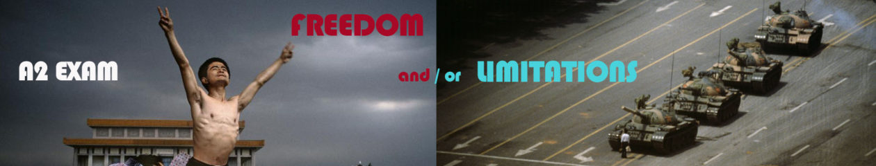
3. Planning: Write a manifesto with a set of rules (5-10) that provide a framework for your new shoots and overall project. Describe in detail how you are planning on developing your work and ideas in the next two weeks. Think about what you want to achieve, what you want to communicate, how your ideas relate to the themes of FREEDOM and/or LIMITATIONS – 1 blog post.
4. Record: Produce at least one shoot by Mon 12 March.
5. Experiment: Edit a selection of 5 images with annotation – 1 blog post.
6. Evaluate: Choose your best image and evaluate with reference to your manifesto and contextual references – 1 blog post.
7. Present: Print best image and prepare a 1 min presentation Wed 14 March in class around the table.
Extension: Write a new set of rules and repeat the above process.
Help & Support:
See link to manifesto in Wikipedia which has a hyperlinks to many manifestos, both political and artistic.
How to write a manifesto? Read more here
A manifesto is a statement where you can share your…
– Intentions (what you intend to do)
– Opinions (what you believe, your stance on a particular topic)
– Vision (the type of world that you dream about and wish to create)
Political parties makes a manifesto that sets out their political values and views on issues such as education, health, jobs, housing, environment, the economy etc and pledge a set of policies on what they would do if they got elected.
As there will be an election in Jersey during the exam preparation and the fact that you are all eligible to vote it makes sense to explore what manifestos exist in local politics. Unlike the UK, Jersey doesn’t have a political system with large parties, such as Labour, Conservative, Liberal Democrats and so on.
The parliamentary body responsible for adopting legislation and scrutinising the Council of Ministers is the Assembly of the States of Jersey. Forty-Nine elected members, 8 island-wide Senators, 29 Deputies and 12 Constables representing each parish sit in the assembly. There are also five non-elected, non-voting members appointed by the Crown (the Bailiff, the Lieutenant Governor, the Dean of Jersey, the Attorney General and the Solicitor General). Decisions in the States are taken by majority vote of the elected members present and voting.
Find out more here on the official Government website: gov.je
In Jersey there is only one small political party Reform Jersey (3 members). Some politicians, such as Senator Philip Ozouf,Senator Lyndon Farnham publish a manifesto in advance of an election so that the public can learn about their political views. Hustings in each Parish will be taken place during the month of April leading up to the election day 9 May 2018.
Artistic Manifestos
Here is a a list of art movements that you may use as contextual research. Many of them produced various manifestos
Here are a list of artists/ photographers that may inspire you associated with the above art movements and isms:
Vito Acconci, John Baldessari, Yves Klein, Bas Jan Ader, Erwin Wurm, Chris Arnatt, Richard Long, Hamish Fulton, Joseph Beuys, Chris Burden, Francis Alÿs, , Sophie Calle , Nikki S Lee, Claude Cahun, Dennis Oppenheim, Bruce Nauman, Allan Kaprow, Mark Wallinger, Gillian Wearing, Marcel Duchamp and the Readymade, Andy Warhol’s film work, Steve McQueen, Sam Taylor-Johnson, Marina Abramovic, PipilottiRist, Luis Bunuel/ Salvatore Dali: , Le ChienAndalou, Dziga Vertov: The Man with a Movie Camera
to own is to have something as one’s own; to posses something.
ownership – define
(noun)
1.
the act, state, or right of possessing something. possession, right of possession, holding, freehold, proprietorship, proprietary rights, title
To help me begin generating ideas surrounding the concept of ownership and how I can break this rule in relation to freedom/limitations within photography and my own work, I created, with Ben a mind map. On this large sheet of paper, we wrote the word ‘ownership’ in the centre and then drew out different ideas from this about what ownership is and how we could break it using our own photographic methods.
We can up with several ideas, as you can see from the mind map below. We though tit necessary to actually define what ownership was however and so did this first in the bottom right corner of the sheet and produced ideas from this understanding of what ownership means.
From this mood board of several ideas, I hope to be able to develop a better idea of what I could explore for my own exploration into the activity of using photography to break the rule of ownership.
It is really important that you get off to a creative and productive start in your Exam preparation. You should aim to do something practical and photographic each week, either make new images with your camera or work digitally with images in post-production (Lightroom/ Photoshop/ Premiere.)
Those students who are disciplined and work with a real focus on a sustained investigation ie: go on shoots, experiment with images, explore ideas in-depth will achieve the highest marks and also enjoy the creative challenge of exploring an Exam paper.
Watch this video about John Baldessari narrated by Tom Waits as an inspiration first.
In the first week of the Exam preparation we want you to complete a photographic shoot where you break one of the rules of photography.
#1 The Rules of Objectivity – W. Eugene Smith, John Grierson, Mathieu Asselin #2 The Rule of Audience– Lewis Hine, Daile Kaplan, Mark Neville #3 The Rule of Manipulation – Steve McCurry, Errol Morris, Alice Wielinga #4 The Rule of Reality – John Grierson, Peter Watkins, Joshua Oppenheimer, Cristina de Middle, Paula Paredes #5 The Rule of Technicality – Laura El-Tantawy, Henrik Malmström #6 The Rule of Ownership – Thomas Sauvin, Mishka Henner #7 The Rule of the Camera – Donald Weber, Liz Orton #8 The Rule of Rule Breaking – Olivia Arthur, Carolyn Drake
Alice Wielange
Mathieu Asselin
Carolyn Drake
Cristina de Middel
Donald Weber- War Sand
Laura El-Tantawy
Lewis Hiner
Mark Neville
Mishka Henner
Thomas Sauvin
Donald Weber – War Sand
W Eugene Smith
Deadline: Wed 28 February– all posts uploaded!
Read: article Rule Breakers by Lewis Bush (Archisle Photographer-in-Residence 2018.)
Plan: Choose one rule of photography and develop an idea for a shoot – 1 blog post.
Research: At least two artists references in relation to your chosen rule that provide analysis and context – 1-2 blog posts.
Record: Produce at least one shoot.
Experiment: Edit a selection of 5 images with annotation – 1 blog post.
Evaluate: Choose your best image and evaluate with reference to Bush’ text and artists references – 1 blog post.
Present: Print best image and prepare a 1 min presentation Wed 28 Feb in class around the table.
Extension: Choose a second rule to break and repeat the above process.
In essence if you follow the above 7 step process in your exam preparation you will fulfil all assessment criteria and work towards a set of final and successful photographic outcomes.