Category Archives: Presenting

Filters

Author:
Category:

Photo Book Layout

Link to my photo book:

IN THE BEGINNING

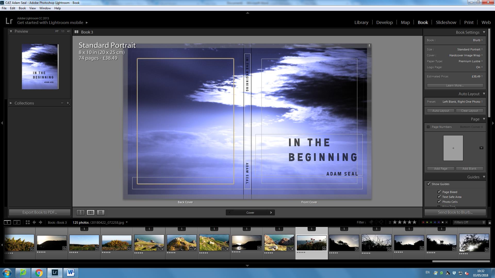
This is my book cover.  The title “IN THE BEGINNING” is important because these are the very first words that are written in Genesis and the viewer also opens up to Genesis 1:1.  The title is also symbolic as to what I am representing within my book in terms of the story of creationism and how this includes contrasting elements of evolutionist factors.

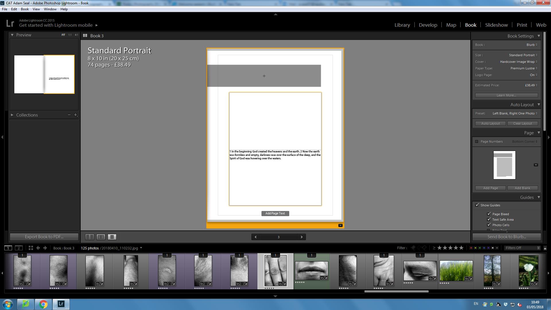
Throughout the book, I have divided my book into 7 chapters, each relating to the order of how the Earth was created, element by element.  This structure was important to me as it not only is a visual attempt to record spirituality, but also is symbolic as the idea of evolution is continuous change and adaptations and I feel that by as well as documenting pirituality, including these chapters in chronograph  also represents the how succesfully as well – relating to evolution.

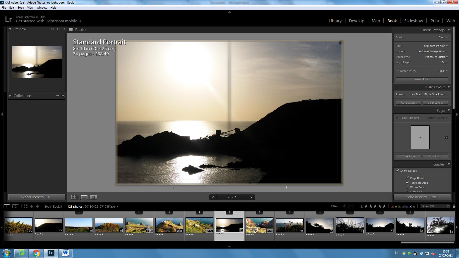
I chose this image as a double page spread to start the book off after the Bible quote because for me it shows not only the expanse of the Earth, but retells the story accurately of how all the elements began forming as the Earth was being molded together.

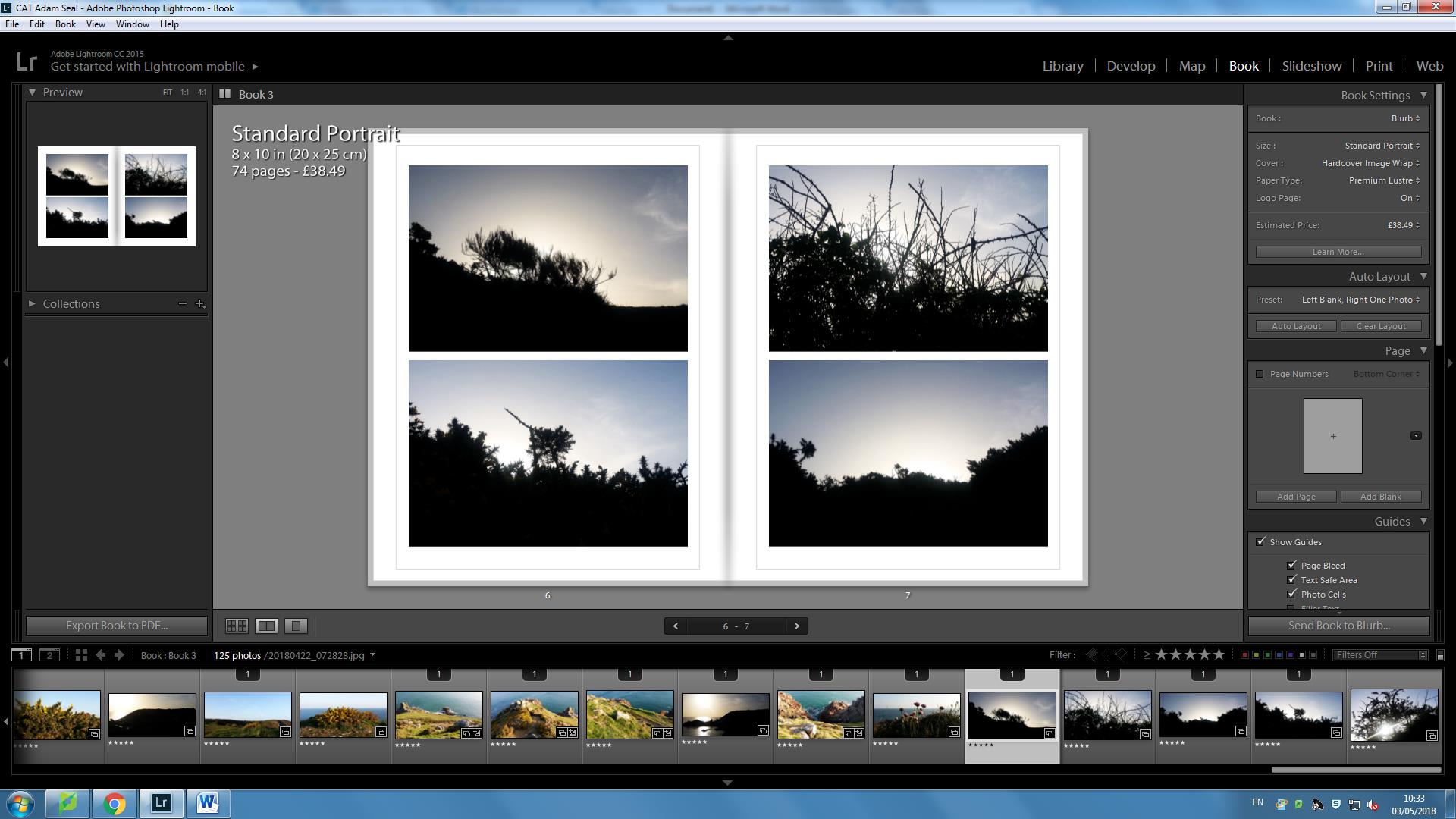
I put these images into 4 squares as a sequence because I like how it shows that order was being installed in each element of the Earth to reflect how it was created for its specific purpose. The sequence shows the haste and speed of creation as well. 

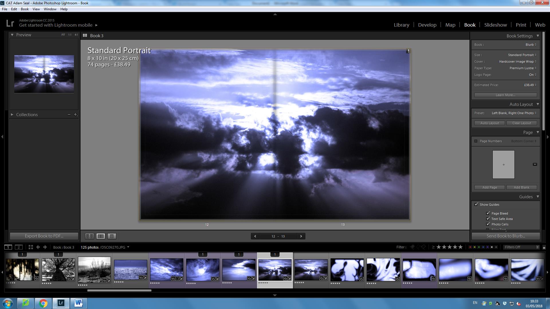
This was part of my second chapter as part of light.  Within the sky, it appears as if there is an explosion with light rays branching out in all directions.  I believe that by having no border reflects how the light is never ending.  This is almost presented as light having no limits and that is a basis for all evolutionist change since.

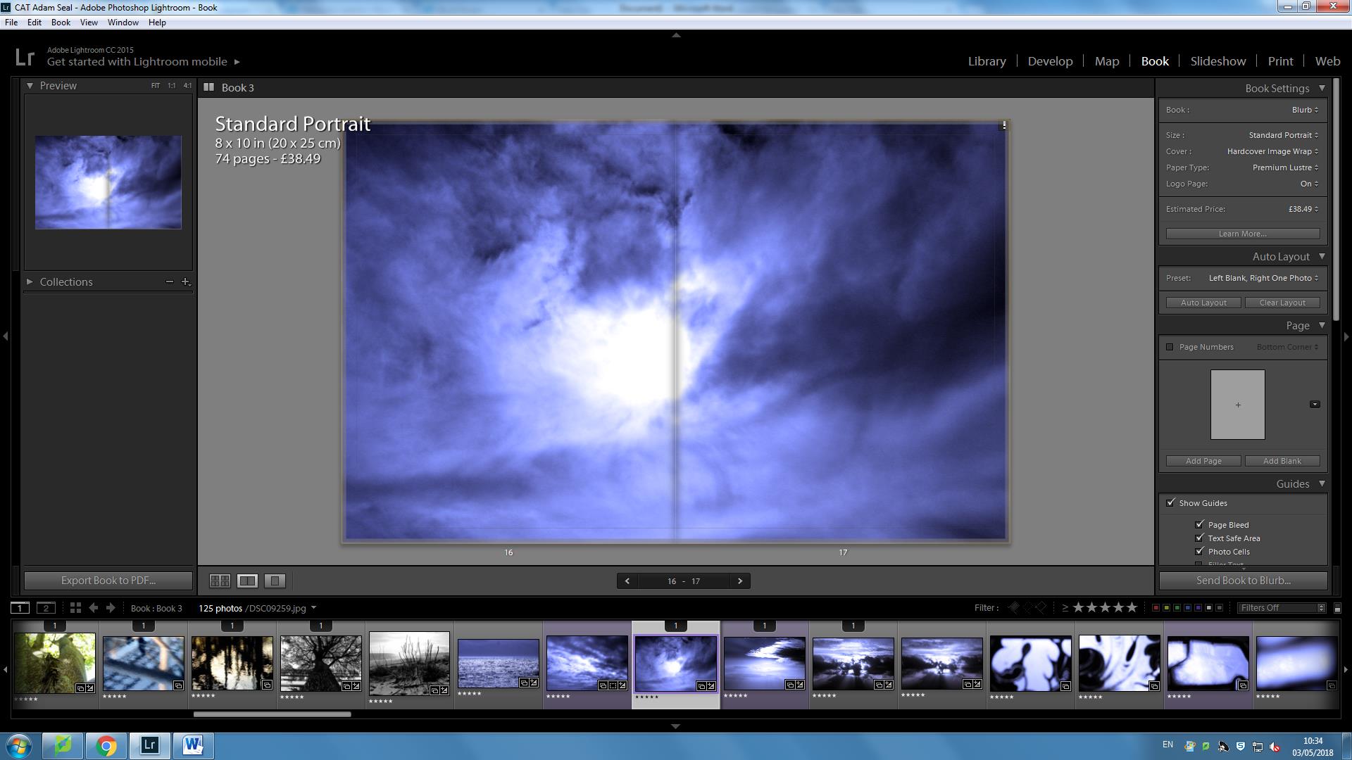
This is also a double page spread as it shows the after effects of the first big explosion and strongly acts as a metaphor the evolutionism’s very existence to exist.  Contrastingly, we have change occurring from the previous double page spread and my message for this is that evolution is a natural part of God’s plan for the world and evolution also can have spiritual links as well.  

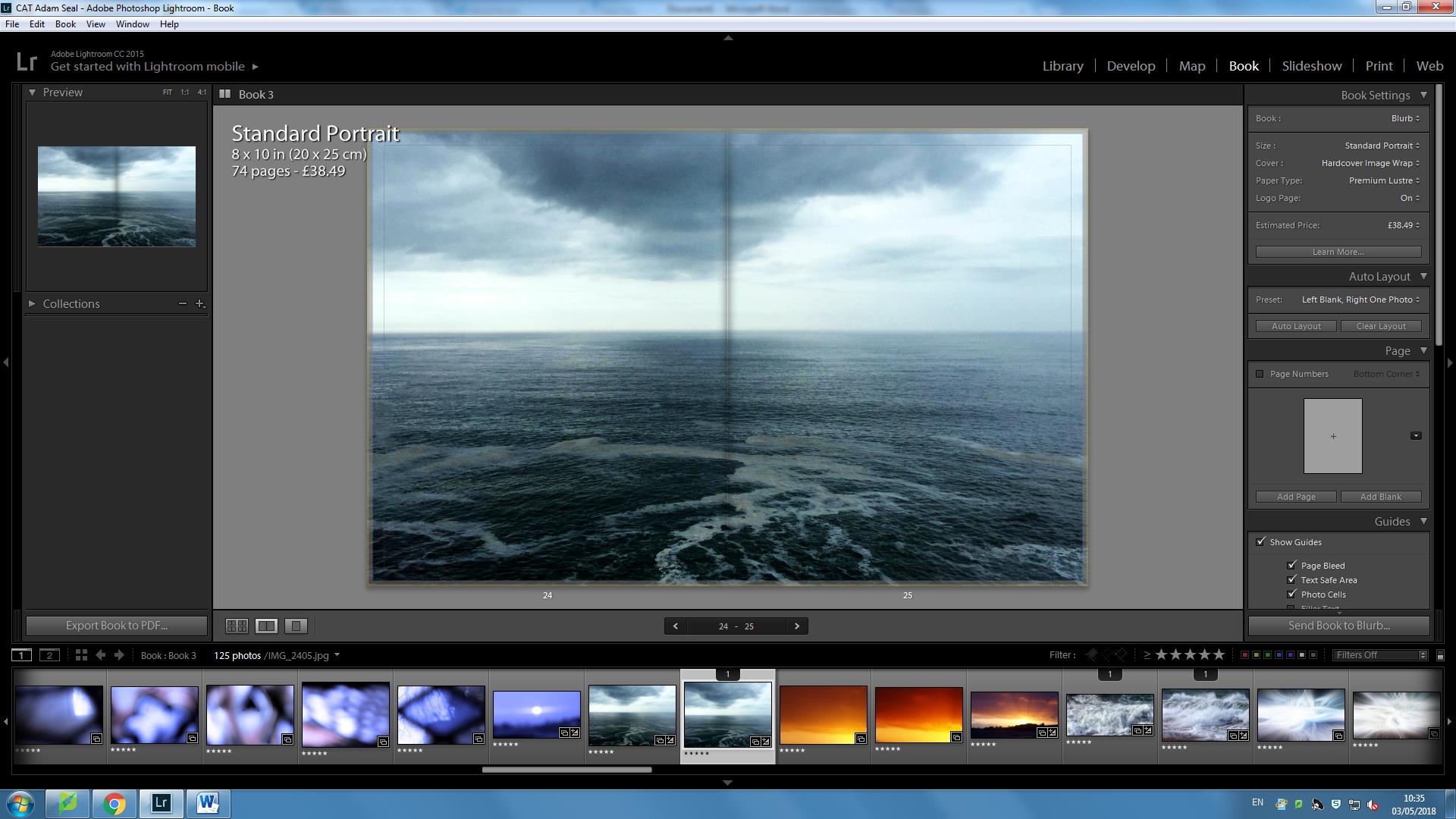
This double page spread depicts how the water was formed from the sky and forms a basis for chapter 3 for water.  I have consistently used the idea of emphasisng infinite power and wonder within my images to reflect the power of change is direct evidence that there was a creator at the beginning of the universe and there is the same creator still creating today.  

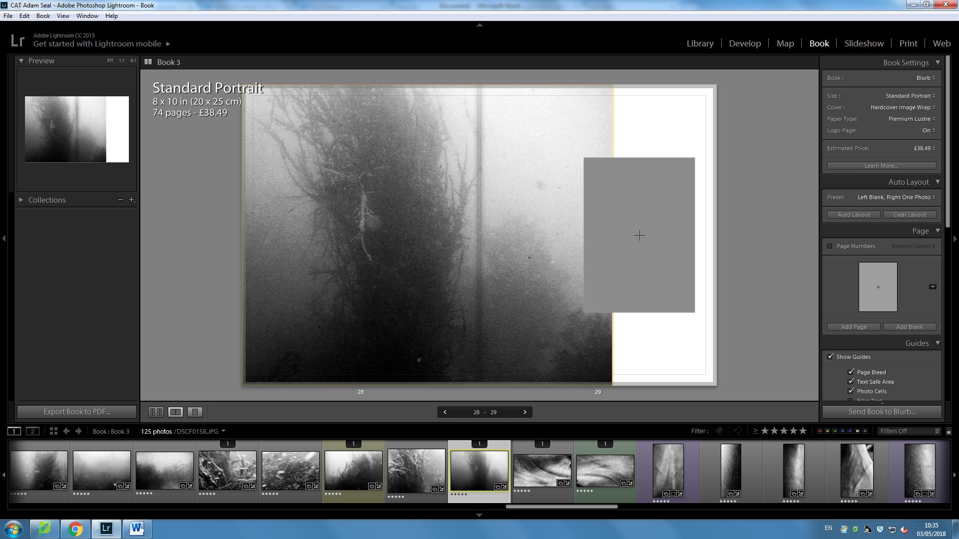
I went for a 3/4 page for this underwater image because the image was quite grainy due to the environment in which I shot in.  Although I like the grainyness as it brings out the individual elements, I wanted to ensure a smoother relationship between the two.

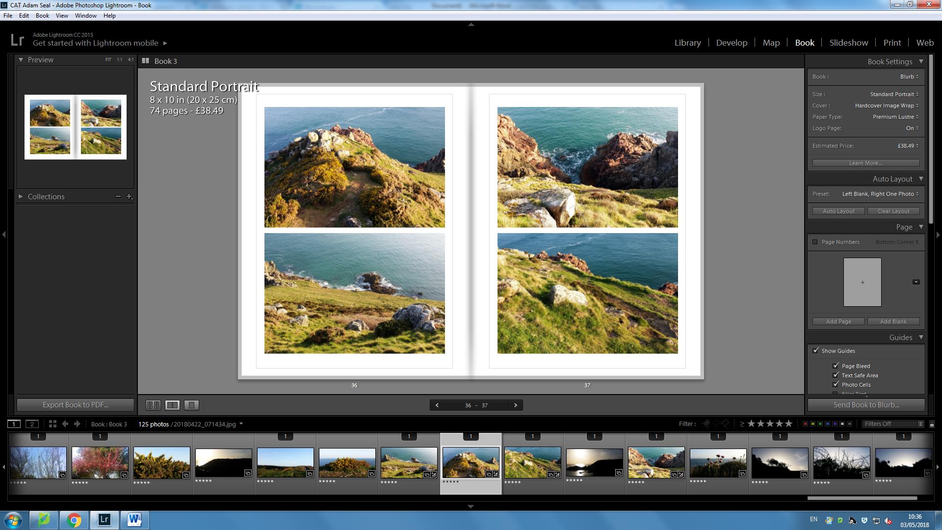
This chapter replicates how land and the sea had been separated after the sky and the sea was separated.  I believe up to this point, I have showed gradually the very evolution of the process of creationism as gradually my images in the book have started as showing elements that aren’t Earthly and eventually have started to appear more Earthly as we go further into the book.

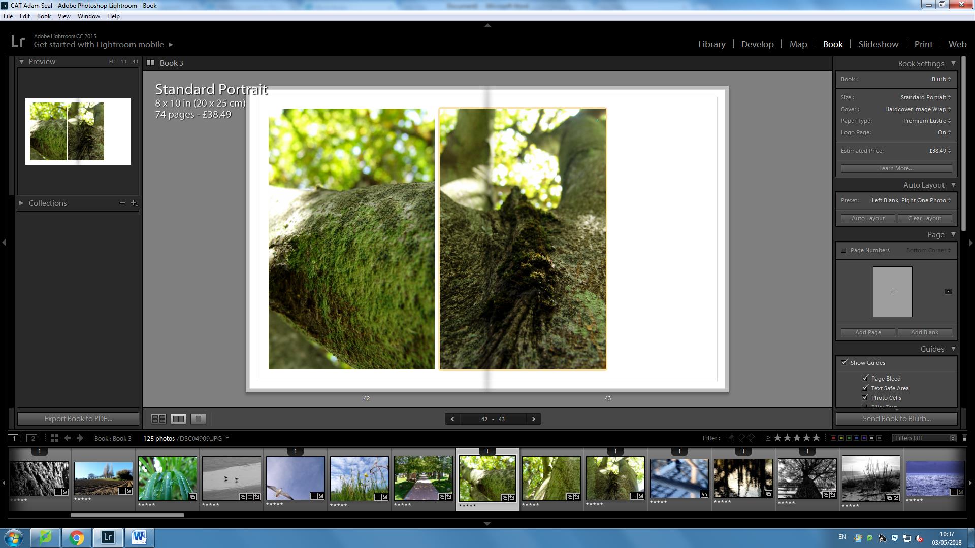
This chapter focuses more on the idea of plants and vegetation.  In these images I am focusing more and more on scientific, individual elements to show the very detail, advanced sophistication that creation covers.  I put these images together.  The layout appears almost as if both branches are connected, although they aren’t.  This is symbolic as it shows how everything in nature is so well connected, despite differences in each smaller individual element and larger being , and how everything is in sync which is how ot was created to be.  Thus this allows for change and evolutionary advances to occur.   

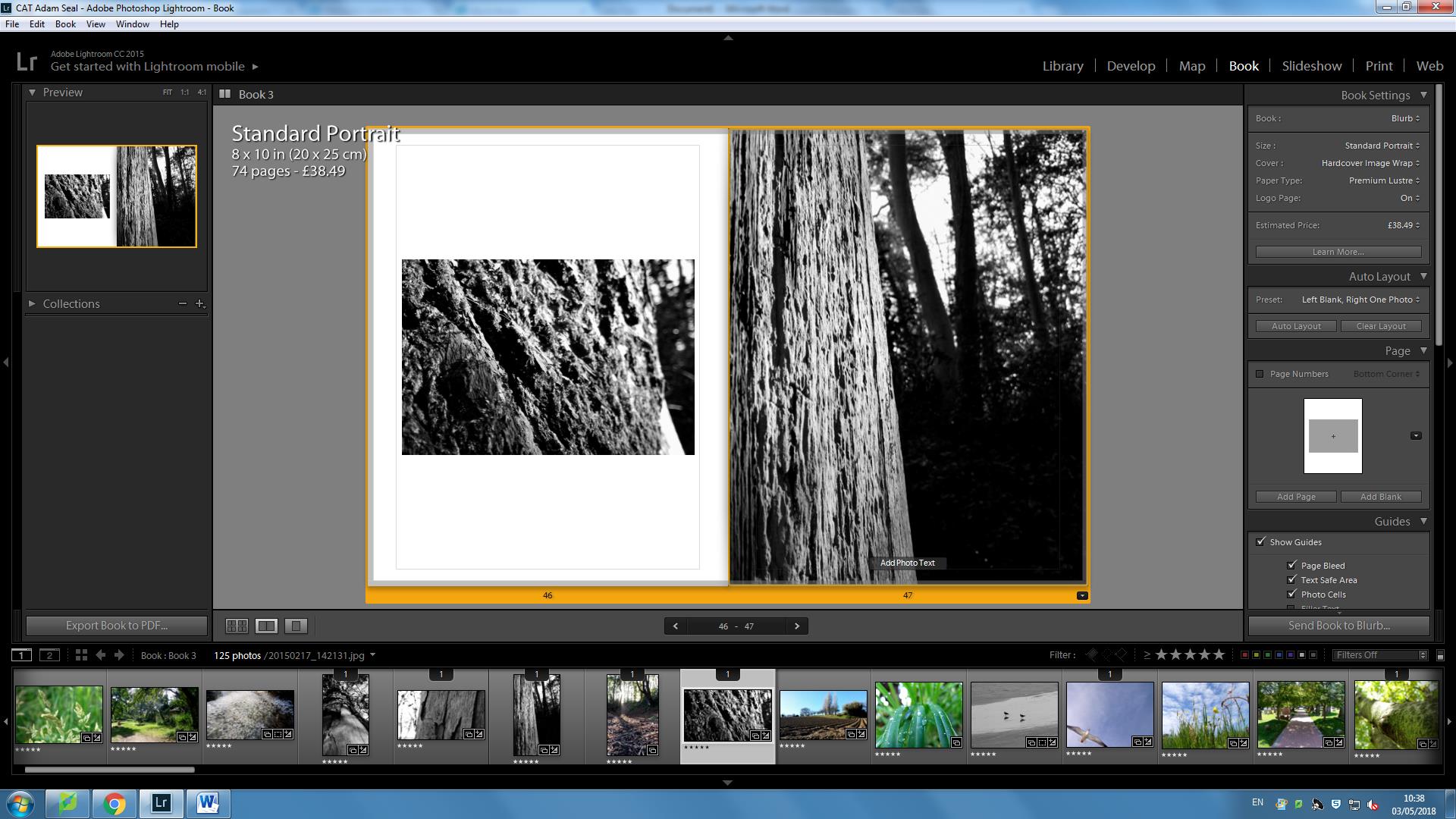
These images I put together as they show the individual element that live off the tree from an up close point of view but also to view the tree as a whole, showing how all these scientific elements make up a being that is beautiful and pure 

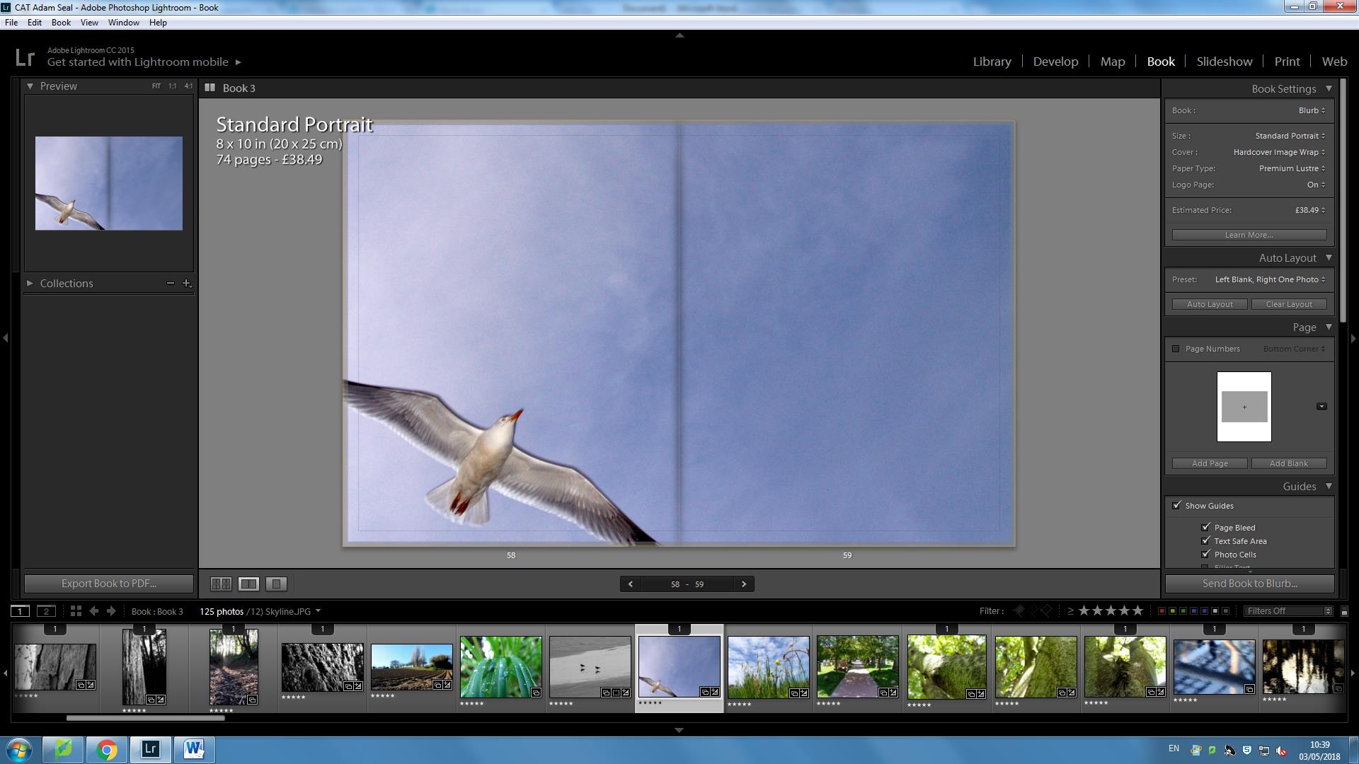
This image is part of my animals chapter where I look how life is becoming more potent within the world.  I took an image of a bird flying over and within the bottom right corner, a bird is flying through.  I like this because it communicates the idea that change and evolution is happening at a faster rate, however it is driven by spirituality.  

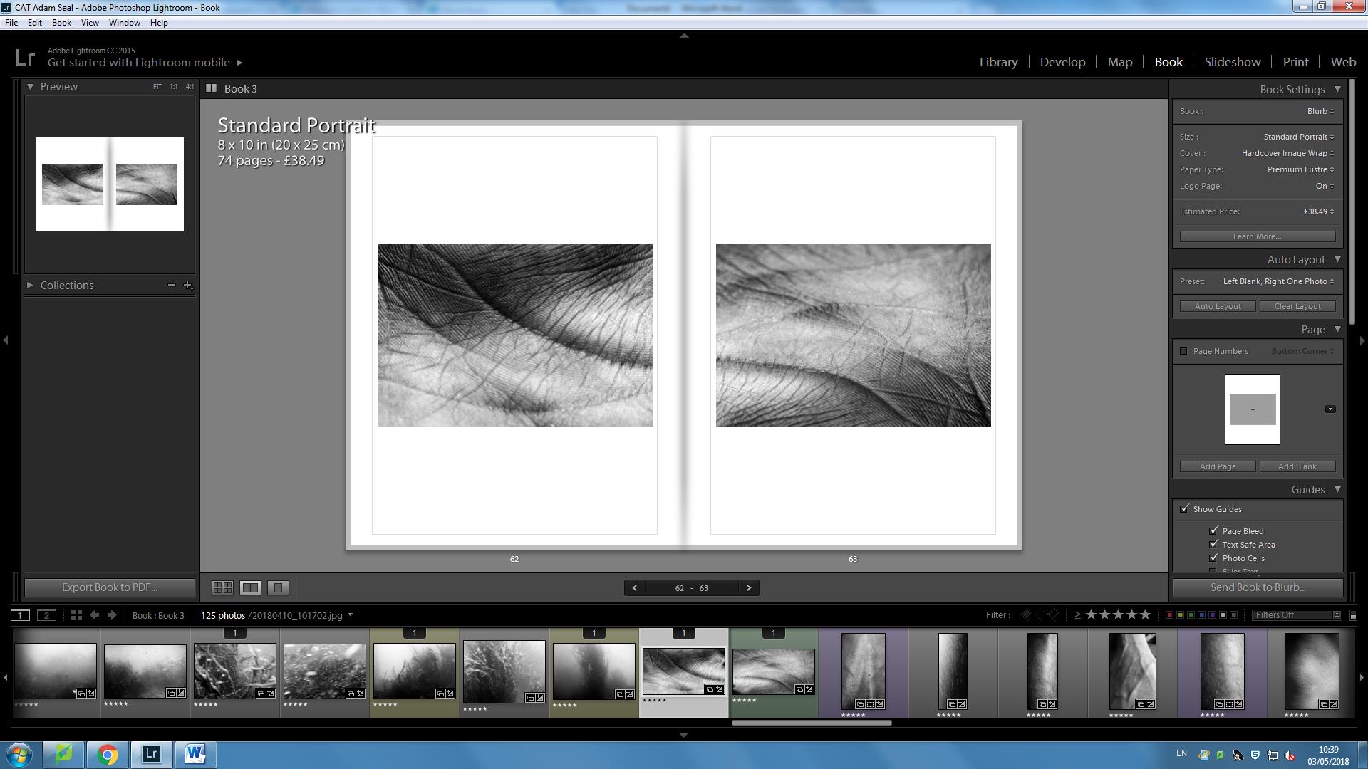
This is part of my chapter of humans.  I put these images together as a sequence because I like how the line of the hands are joined, although they aren’t joined because they are two separate images.  I am trying to communicate here, that when you biologically link up the dots, then you have a wider picture that makes you surprised  and curious of further wonders and mysteries of the Earth.   

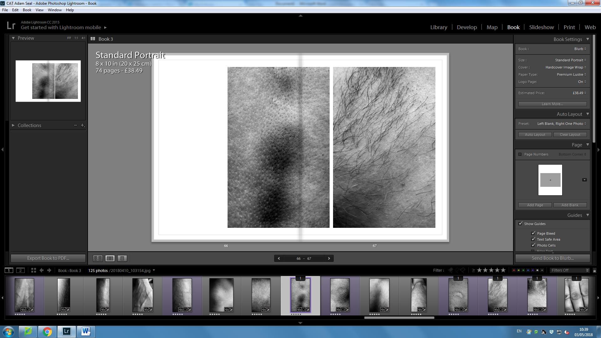
Likewise with my plant images, I believe these images appear quite scientific, almost as something microscopic.  Although these are macro shots, I believe they appear strongly spiritual as there is a sense that although they appear human, it is hard to distinguish what they are.  Therefore in a sense towards the end of my book, I have started to go back to depicting strong levels of spirituality within my images.  Although I have done this throughout my book, by going further in taking spiritual shots towards the end of my book is significant because it shows life and change as a cycle, with one of where change and creationism, fueled by spirituality is at the very center.


Book Layout

When designing my book I wanted to make sure photos with similar colors were split in a sequence where it would be enjoyable to read. I also used close up photos of people in between these landscapes to try and break rhythm. I also placed more simple abstract photos after more complex, full photos. I placed the yellows in between purples as they are complementary colors. Also yellow is a very harsh color on the eyes as it reflects more light where as purple is a darker color and relaxes the eyes, this is why these colors go well together. I placed the portraits next to landscapes that looked similar to each other. This is because I wanted these close images of people to  look more like a landscape and less like a part of a human being.

Photo Layout

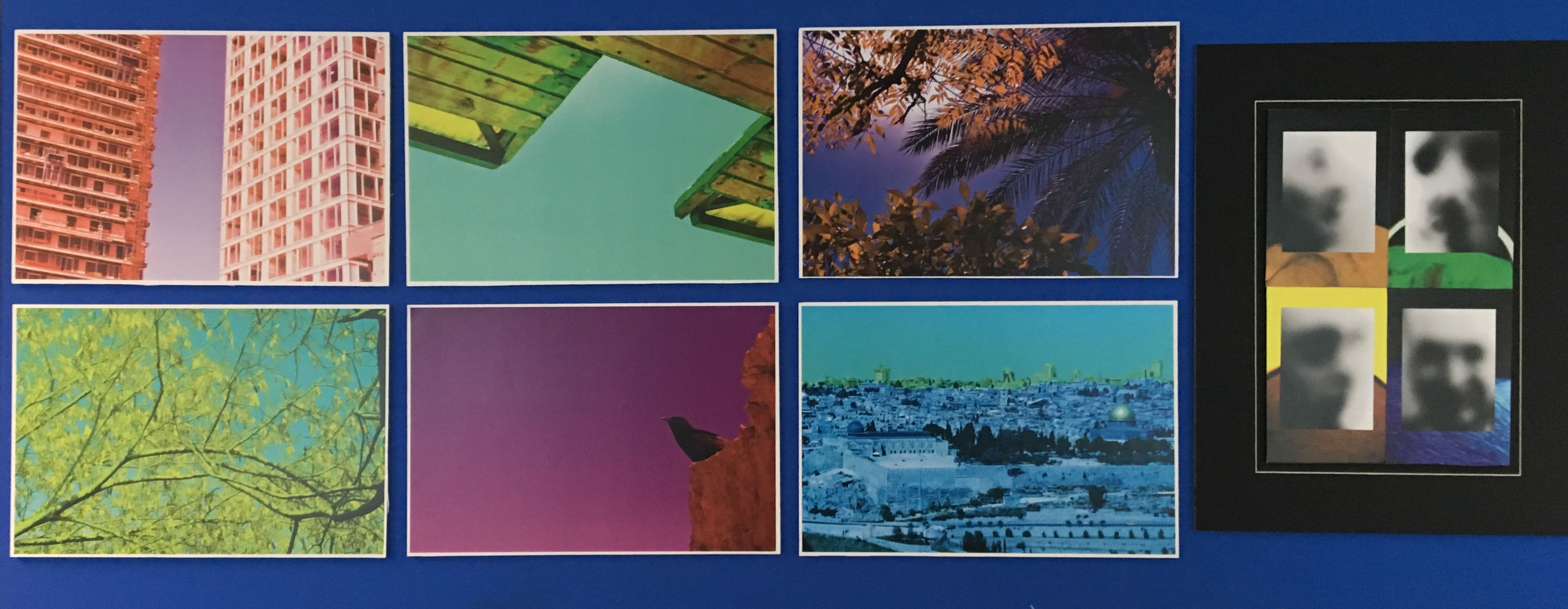
I have laid out my photos in such a way that shows off each photo individually. I stuck each landscape photo on some foam board and stuck each one to the wall individually. I then grouped my close up portraits together with my ghostly like photos that I took in the early stages of this project.

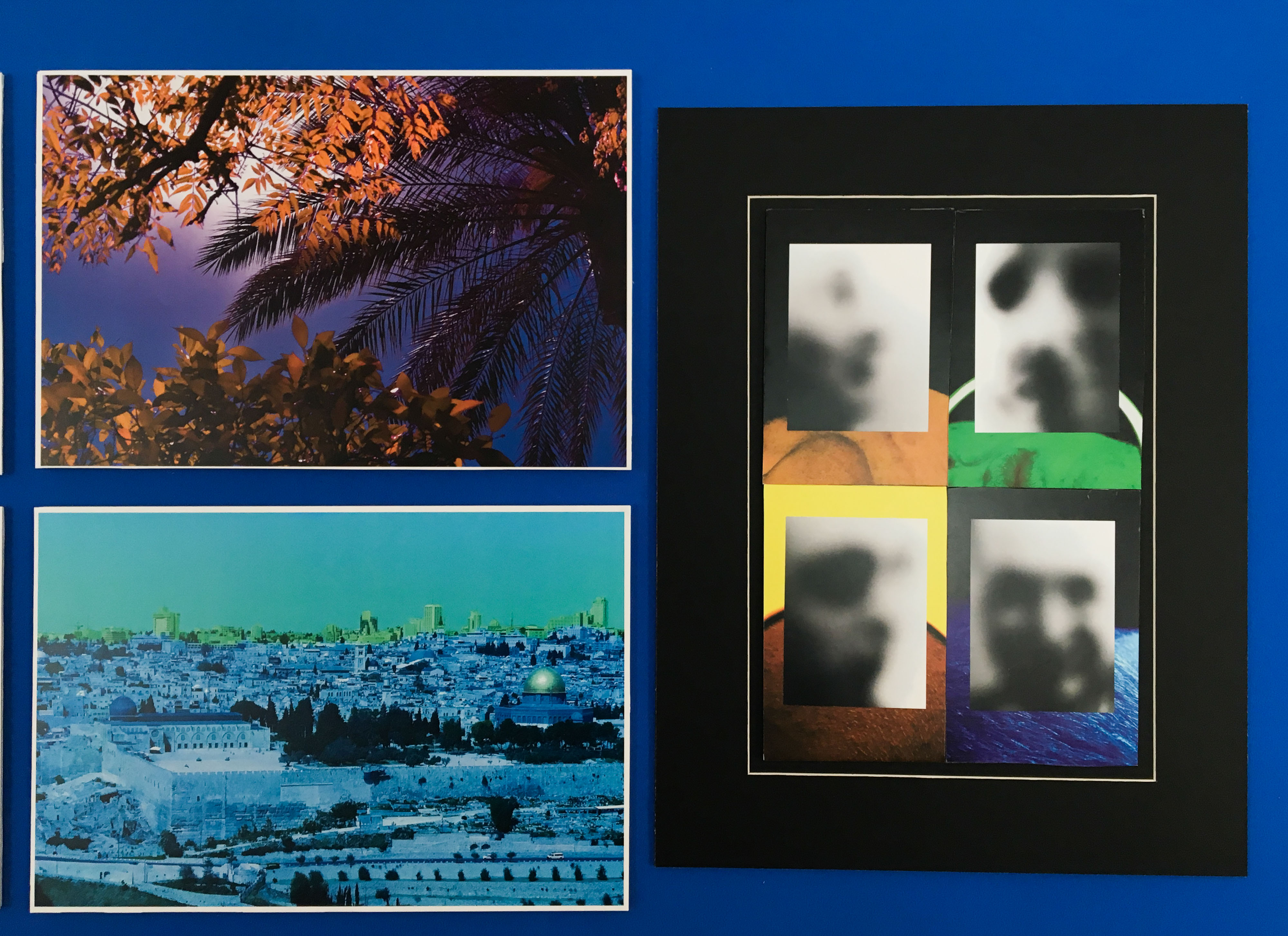
I placed these photos on top and used the close up portraits as backgrounds. I did this as you will be able to see the uncovered versions in the book. I liked this because it gave me an idea and a meaning. The way the photos have been laid out show how humanity often ruins photos, builds on top of landscapes and ruin the identity of a place or a person. I made a window mount and placed this inside as well as foam board and it made it stand out better.

Final Image Presentation

During my exam day two, I mounted up all of my printed images onto black card to make three separate installations of photography to go alongside my magazine.

I had printed out my best four images from my shoot with Jasper, Max and Lucy and divided these four images into A3, A4 and A5. I decided I was going to mount them in a montage form onto black card because I felt this would look most effective.

I had pre-arranged a layout that I would follow for each board in my previous exam day and this is shown on the blog as a preparation post and planning post.

The three images below show each of the three boards I have created using the images from my shoot with Jasper, Lucy and Max. They are all arranged differently depending on the types of images used, the sizes of the image and what works best to allow them to fit together like jigsaw and create very simple but effective series of photos that coincide with my magazine.


Final Image Presentation for ‘Jasper’ series
Final Image Presentation for ‘Max’ series
Final Image Presentation for ‘Lucy’ series


It is good to have both a physical version of the magazine with all my best images from the shoots I have produced as well as these three boards because having the physical prints on a large scale, especially shown in the A3 images is very rewarding because it allows me to see my imagery on a large scale and as a series that, personally, I think has worked well. For the A3 prints, I picked my best image out of each of the three shoots I was using because I felt that my best images which were the most powerful and impactful would look bets on A3 to get the full effect. On a larger size piece of paper, the features that I have captured of the subjects are much more emphasised and are made much more accentuated. For both Jasper and Max, I used both of their best head shots as A3s because I knew they would look bets and would accompany the other smaller, less impactful images well. For Lucy’s A3, I used the full body shot I captured of her in front of Les Quennevais Estates. This is one of my favourite images and along with the other images in her series, it makes it my favourite series of images because of the colour used and variety of shots as well as poses I managed to capture.

Furthermore, I also added for each board, a coloured strip down the length of the page behind the images. This emulates the graphic feature I have included in the magazine on each of the characters name pages. I felt this would be an effective addition to the board to not only make it stand out a little more and make it more eye-catching but it also provides a sense of consistency and thoroughness to my final pieces as I carried over a consistent feature of the magazine onto the final piece boards. The colour of the strip for each character carried over from the same colour I have used in the magazine; so for Jasper, I have used a purple-blue, for Max I have used orange and for Lucy I have used green.

Further Magazine Production/Layout Experimentation Using Final Images

The screenshots below show the processes I have gone through when creating some primary layout styles of my magazine. I have chosen to keep it very simple and this choice was informed by my observation on OUHS magazine where they also choose very simple and basic font types to create a sleek-looking layout. It is evident that they carefully choose whether to position their text in the centre of page or to the side and how such text may wrap around images and so on. Overall, the look of their magazine is very simple and I have attempted to achieve this but these are of course only primary experiments using the final images I have gathered and imported into BookWright. I am still yet to import all of the characters text that will come from the question and answers. Once I have received all of this, I will have to work the layout of imagery around the way text will be able to fit in the pages. As ell, I do not want to exceed the limit I have allowed myself to present the content for each character. I have given myself 6 pages to fill and do not want to exceed this because it is well ordered suing this amount of pages because it means that a characters name page will not be on a previous page spread to where their photographs begin. This layout is present below, however, only Peter’s full segment has been showed as this is as far as I got at this stage.

The images below show the cover pages, the first page which is taken up by the slogan of my magazine as well as Peter’s 6 pages and a couple of Max’s.

These are the two cover pages, both front and back. The images shown below that take up the cover ages are the final ones – I am hoping I will not have to edit them any further because if I do, they won’t be the best versions because I will be changing the slightest touches will in-turn affect my opinions on the covers as a whole and it is best if I leave them how they are because I feel they are effective.

This is the page that has the slogan of the magazine written on. I have chosen this is my slogan because I felt its the themes I am attempting to cover in my magazine. I came up with it myself based on the message I was trying to get across in the magazine.

I also created another version that was more fun and vibrant and less simple. I used the same text but instead of it being plain black, I added an iridescent pattern on the text to make it more colourful. As well, I also used the liquify tool after rasterizing the text layer to be able to manipulate the look of it. Using the liquify tool at a large brushstroke size, I could distort the position of some of the letters and make it look quite wavy which I think works effectively.

The next three screenshots show the section in the magazine that will be present the images of Peter and his question and answers. I will need to re-arrange the layout of images more once I have imported text because I will need to figure out the best way that the text fits in.

The last screenshot shows the my experimentation with images for the first page of Max’s section. I fits imported this image of him sitting on the bench looking directly at the camera because it is one of my favourites and I think it would look best as full bleed photograph because of the  fact it is full body shot and audiences would get the full impact of it if it was presented on a large scale.

Final Images for Presentation + Layout

Below are the range of final images I intend to print out and present in the form of a simple display where in which I will mount each image in its own series on a black board so that each character is separated and has their own board in which 4 of the best edits from their shot have been displayed. I have shown the images from each shoot that I am going to print and stated their size of print, either A3, A4 or A5 and I have inserted an image of a brief experiment I carried out with plain pieces of paper of the same sizes on the black card I will be using to get an idea of the best layouts. 

Jasper 

I have chosen to print out some images from the shoot with Jasper because although I did not get a wide range of edits from the shoot, the ones chosen and shown below work well together as mini series and so I decided to present them as finals. 

Final Images

A3

A4

A5


Layout


Max

I have also chosen to print out a range of edits from my shot with Max as this was another very successful shoot and provided me a wide array of different shots in a great environment. 

Final Images

A3 

A4

A5


Layout


Lucy

I have chosen to print out images from my shoot with Lucy as this one of my most successful shoots from the whole project due to the range of shots I came out with. 

Final Images

A3

A4

A5


Layout


Lucy’s Q&A

After creating my questions to ask each of the characters in my project, I sent each of the eight questions through to them digitally on social media either using Messenger or Instagram to message them with the questions outlining my intentions from them and that I would like them to answer as honestly as possible. In each of these blog posts I will post the questions and answers of each model from what they have sent back to me in reply to my message which included the questions. These questions and answers will be presented throughout each segment for each ‘character’ of the story. I am slotting the magazine up into a section for each of them and this text will be dispersed throughout in between the images. My aim from these questions was to find out more about who the model’s fashion is informed and where they taken inspiration for from it, what they would describe their fashion as and why they dress the way they do. It provides more context to the magazine than just visuals. 


what would you describe your style of fashion as?

Lucy: comfy, classic and maybe a little random. I love a good jean and top combo. Something that is quite neutral so I can combine a bold lipstick with it. I don’t think I’m trendy, I just like to keep things simple.

if you could wear one brand for the rest of your life, what would it be?

Lucy: Lazy oaf. Their clothes are just so cute and fun. This is the type of clothing that really stands out to me as all their clothes are oversized and comfy. I love the way they advertise and collaborate with other brands.

do you go for comfort over style or style over comfort?

Lucy: 100% comfort over style – even on a night out I would definitely prefer to wear my pyjamas over a dress. I’m on my feet all day so comfort is my priority. I try to incorporate trendiness into my comfort.

do you feel as though there is a certain pressure on boys to fit in to a society even though there are the inevitable stresses that come with adolescence?

Lucy: Yes, I do. Like girls, everyone wants to look better than other people, to look ‘cool’. To have better, more expensive clothes.

why do you dress the way you do?

Lucy: It just suits me and make me feel confident. I don’t particularly like standing out from the crowd. I often use make-up to inform my fashion choices and may base an outfit around the type of makeup I’m wearing.  

would you say you take pride in your appearance and make an effort each day to dress well?

Lucy: Yes, as a hairdresser image is so important. My make-up is the most important because if I have nice make-up I feel as though you can get away with unwashed hair in a messy bun! I have key items in my wardrobe, so I tend to just mix and match. Take each day as it comes.

do you feel like you can express yourself through the clothes you wear? if so, why?

Lucy: Definitely, it’s your first impression to a client. You should aim to give a person so many ideas of you as soon as they see you through what you’re wearing.  

does dressing the way you do give you a sense of comfort in your own skin? a means of expression as such…

Lucy: Yes, otherwise I wouldn’t wear it. I wouldn’t put myself into something that doesn’t make me comfortable or confident. It makes your day rubbish.

Alex and Charlie’s Q&A

After creating my questions to ask each of the characters in my project, I sent each of the eight questions through to them digitally on social media either using Messenger or Instagram to message them with the questions outlining my intentions from them and that I would like them to answer as honestly as possible. In each of these blog posts I will post the questions and answers of each model from what they have sent back to me in reply to my message which included the questions. These questions and answers will be presented throughout each segment for each ‘character’ of the story. I am slotting the magazine up into a section for each of them and this text will be dispersed throughout in between the images. My aim from these questions was to find out more about who the model’s fashion is informed and where they taken inspiration for from it, what they would describe their fashion as and why they dress the way they do. It provides more context to the magazine than just visuals. 


what would you describe your style of fashion as?

Alex: I would describe my fashion more by who it’s inspired by – people like Tyler, The Creator and A$AP Rocky. I wear looser fitting, usually bright clothing that’s out of the normal trends. It alternates between comfy loose fitting and also more fitting, upmarket prices. I would usually describe my fashion sense as a charity shop as that’s where the best pieces are found.

Charlie: I personally would describe my style of fashion as street wear, this including skate and surf brands. I like to go for the brands like Santa Cruz, Enjoi, Patagonia and Thrasher. This being because I enjoy wearing simple t-shirts and jumpers with colourful logos. It allows me to express who I am as a person, someone outgoing and always up for anything, the clothes I wear ensures that I will be dressed for any sort of occasion, no matter what it could be. I also enjoy wearing vintage shirts on top of t-shirts which enables me to go from a simple outfit to something I could go out to town in.

if you could wear one brand for the rest of your life, what would it be?

Alex: The one brand I would wear forever would be Carhartt as it’s cool and super functional.

Charlie: I think if I could wear one brand for the rest of my life it would be Thrasher. Thrasher is not only a clothing brand but it is also skateboard magazine which I have been reading ever since secondary school, I have always had a passion for skating and being outdoors so it suits me well. Thrasher not only being a fashionable brand is also very practical and comfy. I have probably 4 thrasher jumpers at the moment, a handful of t-shirts and a cap.

do you go for comfort over style or style over comfort?

Alex: Comfort all the way but it obviously depends on the occasion but I always like to keep it comfortable and casual.

Charlie: Hmm! This is a hard one, but I think I go for a comfort over style. It depends what sort of occasion it is, if it is an everyday outfit I definitely go for comfort as I like to be able to move freely.

do you feel as though there is a certain pressure on boys to fit in to a society even though there are the inevitable stresses that come with adolescence?

Alex: In certain situations, of course, there is a pressure to dress the part but sometimes not dressing the way others do makes you stand out more.

why do you dress the way you do?

Alex: I dress the way I do because of the influence whether that be artists or rappers. I feel like they set trend and regarded as fashionable as hey are mostly sponsored by clothing companies so they get stuff early and set looks earlier than anyone else.

would you say you take pride in your appearance and make an effort each day to dress well?

Alex: Some days when I’m a bit tired ill not really bother and just suit up in the loosest, comfiest clothes I can find but I do like to take ride in what others think of my look for sure – it’s important to make an impression.

do you feel like you can express yourself through the clothes you wear? if so, why?

Alex: I feel like I can express myself through art more than fashion although is probably the best outlet t express yourself as it’s the first thing people see and they can make an immediate judgement about you from what you wear. Wearing something that reflects how you feel or act can have a great impact on people.

does dressing the way you do give you a sense of comfort in your own skin? a means of expression as such…

Alex: Personally, I am very confident and comfortable in my own skin anyway. I have come to terms with how I look, although if I’m not wearing a good outfit that makes me look good and makes me comfortable in myself, I’m always thinking about what others way think of me. A good outfit really just clears my mind and gives me confidence.


Max’s Q&A

After creating my questions to ask each of the characters in my project, I sent each of the eight questions through to them digitally on social media either using Messenger or Instagram to message them with the questions outlining my intentions from them and that I would like them to answer as honestly as possible. In each of these blog posts I will post the questions and answers of each model from what they have sent back to me in reply to my message which included the questions. These questions and answers will be presented throughout each segment for each ‘character’ of the story. I am slotting the magazine up into a section for each of them and this text will be dispersed throughout in between the images. My aim from these questions was to find out more about who the model’s fashion is informed and where they taken inspiration for from it, what they would describe their fashion as and why they dress the way they do. It provides more context to the magazine than just visuals. 


what would you describe your style of fashion as?

Max: My fashion style is relaxed, vintage and casual.

if you could wear one brand for the rest of your life, what would it be?

Max: Tommy Hilfiger.

do you go for comfort over style or style over comfort?

Max: I go for comfort over style most of the time.

do you feel as though there is a certain pressure on boys to fit in to a society even though there are the inevitable stresses that come with adolescence?

Max: I find there are stresses on guys our age to fit in, males tend to be overlooked on this subject because of the stereotypical pressure on females. Males my age have the pressure of looking like the guys in the music videos etc. To be attractive and stylish is a major pressure for many.

why do you dress the way you do?

Max: I dress the way I do because it can reflect personality. I wish to be seen as slightly bold and outgoing.

would you say you take pride in your appearance and make an effort each day to dress well?

Max: I have a certain amount of pride in my appearance but I am not obsessed at all. My efforts are minimal on a day to day basis.

do you feel like you can express yourself through the clothes you wear? if so, why?

Max: I do feel like I can express myself through the way I dress because it reflects mood and personality; if I wear a bright pink hoodie I come across different to if I was in all black.

does dressing the way you do give you a sense of comfort in your own skin? a means of expression as such…

Max: I find dressing the way I want makes me more comfortable in my own skin, I don’t feel any pressure to impress anyone I just like to do what I want.

final evaluation // photo book

My book Wabi Sabi is about the freedom of viewing the world in our own unique way. Its about capturing the insignificant details that we would usually ignore or not notice, and appreciating the pure and spiritual elements of the imperfect details of our lives. The Japanese term, Wabi Sabi fully explains what the series is about in a simple way. The definition of the term, “a way of living that focuses on finding beauty within the imperfections of life and accepting peacefully the natural cycle of growth and decay” concludes the project well. Throughout the book I focus closely on the tiny details of objects and scenes that we witness all the time. An example of scenes that I’ve included is the Sky at evening time, and the movement of the sea. Within these scenes Ive  focused on and framed particular elements that interested me. My aim was to fragment specific details that were insignificant yet beautiful.

I wanted my book to be simple yet powerful. I wanted the images to make the viewer think about what they are looking at. My aim was to create a thought process in the viewers mind to make them reflect more on the imperfect and insignificant details of our day to day lives.

For the front and back cover I wanted an image that would draw the viewer in. Something that wasn’t too busy but had an appealing aesthetic. I am very happy with the cover that I choose because the warm colour is calming and links with my theme of spiritual connotations within tiny details. I choose to use a small font size for the title because I didn’t want it to over power the image. The image was meant to be the focus point and I believe I have achieved this.

I wanted the style and genre of my book to be in a similar style to Rinko Kawauchi’s book Illuminance. Her book is simple and flows really well from image to image. Although her images don’t link immediately, the colour, texture and form of each image leads onto the next in some way.  This is what I wanted to achieve within my photo book. I wanted to create a narrative within the book using the sequence of images as the story line. The aspects that I linked from image to image are colour, shape, tone and subject. I didn’t want images placed next to each other to be too similar, but I also didn’t want them to have no connection at all.

Most of my images are colorful because I wanted the viewer to be drawn in by the use of bright, pale colours. Although I wanted to stick with an overall aesthetic throughout the series of images, I also wanted the book to contain some contrast. I did this by also including black and white images to change the sequence and flow slightly. I choose specific images to be presented in black and white because they contained a lot of detail, such as the close up image of the skin. Since the image had a lot of detail, it was interesting enough without the use of colour to draw the viewer in.

The images above and bellow are examples of different connections I made between images. The image above contains an unusual perspective of a foot which contains wrinkles and decaying skin. I choose this image because it represents my project well because I’ve captured the beauty of an imperfect thing. The other image is a close up of water. The movement, reflection and shape is what I aimed to capture within the image. I decided to place these two images next to each other because of the texture and shape. The structure of the skin, and the shape of the wrinkles on the foot connect well with the shape of the water.

The image below is another example of a connection I made between two images to create a flow and narrative. Both images are close ups of particular objects that we see everyday. The image on the left is a close up of a flower, and the image on the right is a close up of a hand. Although the objects a completely different as subjects, I managed to make a connection between the two images by linking the shape, colour and texture.

I am very happy with the final outcome of my photo book because I have managed to portray and represent my ideas and way of thinking very well. My main aim was to create a book that made the viewer reflect on each image and make connections with what they see in the image in their own lives. I wanted to focus on the tiny details which I have managed to do very well. I also aimed to express the beauty of things that we viewed to be imperfect.