Here are the three possible layouts for my photos. I intend to use form board for all my photos.


Here are the three possible layouts for my photos. I intend to use form board for all my photos.
Below are the range of final images I intend to print out and present in the form of a simple display where in which I will mount each image in its own series on a black board so that each character is separated and has their own board in which 4 of the best edits from their shot have been displayed. I have shown the images from each shoot that I am going to print and stated their size of print, either A3, A4 or A5 and I have inserted an image of a brief experiment I carried out with plain pieces of paper of the same sizes on the black card I will be using to get an idea of the best layouts.
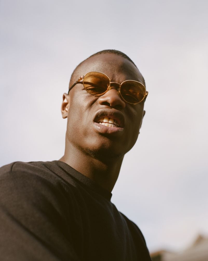
Jasper
I have chosen to print out some images from the shoot with Jasper because although I did not get a wide range of edits from the shoot, the ones chosen and shown below work well together as mini series and so I decided to present them as finals.
Final Images
A3

A4
![]()
A5


Layout

Max
I have also chosen to print out a range of edits from my shot with Max as this was another very successful shoot and provided me a wide array of different shots in a great environment.
Final Images
A3

A4

A5


Layout

Lucy
I have chosen to print out images from my shoot with Lucy as this one of my most successful shoots from the whole project due to the range of shots I came out with.
Final Images
A3

A4


A5

Layout

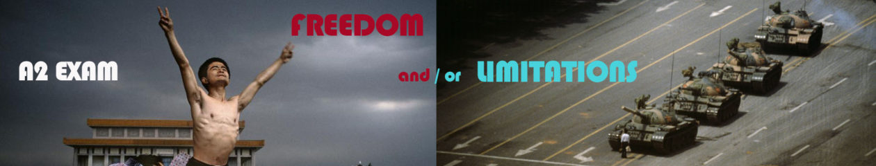
For my final exam product, I will be creating a magazine which I have started production of. The magazine will display all my bets images in a typical fashion/music/arts magazine format and I have taken inspiration from exiting titles such as i-D, Dazed and PUSH. Below is a specification of my magazine and how I want it to feel/look and its narrative, concept and design.
how you want your magazine to look and feel
I want my magazine to look professional and quite minimalist in its design features. It will have a clear and simple layout and sequencing with both a combination of images and text, the text being question and answers from my discussion with each model. Both images and text will coincide with each other and work as a pair to bring the whole magazine together. The magazine will consist of full bleed pages that complement other smaller images and text and I want it to be colourful and vibrant as well as quite bold which will be achieved through colours of text boxes, page backgrounds and actual photos. However, it minimalism will also hopefully present a more subtle tone.
format, size and orientation
the orientation of my magazine will be portrait as this is the best effective for the orientation of my actual images and will allow my images to be presented in the largest format and this is quite important to me considering I have used a 50mm lens for the whole project and this has allowed em to capture intricate and crisp which can be emphasised through large full bleed prints on portrait.
design and layout
the design of my magazine is quite simple as already pressed. The front and back cover show the most design features as it has lots f text and although this is the same inside the magazine, the font and back covers is what you see first and so I have made this as effective as possible. The layout will be made up of around 6 pages for each ‘character’ and throughout these 6 pages, there will be a sequence of images and text in between. I want to keep the layout very self-explanatory and logical to follow and so that readers can choose a page at random and read from any point in the magazine as their own accord – it doesn’t have to be read from start to finish because it is divided into sections.
rhythm and sequencing
the rhythm and sequencing of my book will be white basic and as I have already stated, the book will divided into each ‘character’ and for each character, I will present 6 images and these will be in any order, however, if there are two images that are deliberately meant to go together as a diptych then this will be evident and I have trued to place Lucy as the only female in the middle of the magazine to maintain this notion of a male’s gaze.
structure and architecture
I will range my photos from full page photos without a border to maybe one or two double page spreads and lots of smaller images that take up half a page and the rest will be text. As well, I may find that the effect of overlapping an image on top of another may work well. I have briefly stated a layout I aim to follow for the magazine in a previous blog post and I am sticking to this so far.
narrative
the narrative follows what may look like a quite free and muddled narrative at first glance but this is because the message I want to show is quite subtle. It is obvious that the magazine is focused on males, males behaviour and male fashion and how a boys look and persona can impact on the people around him. I want to try and get across a typical boys boisterous and mischievous persona but show this as an underlying theme in which a more vulnerable and timid character may be seen primarily. I will explore through my questions, the reason for the what the models dress and their opinions on how boys are supposed to develop in adolescence when there are inevitable reassures on them and how expression through fashion can help this. Like my previous project, All My Love, this project still addresses quite tender subjects that do not get spoken about often. As well, it is a collaborative project that requires huge input from my subjects to provide meaning and context. I use the portraits and faces I have been capturing in this project to tell a story about boys and their nature as they develop from boys to men.
title
the title of my magazine is Boys Will Be Boys. I have named it this because I find it very fitting and as well, it is quite catchy and memorable because of it is already a known phrase that was used much more a few decades ago than it is now. Boys Will Be Boys is a phrase that was often used my mums in the 70s/80s/90s when their boys had been misbehaving my doing something mischievous or naughty and all they can say is ‘boys will be boys’ because boys have this stereotype that ahs developed over several decades of being quite mischievous through their adventurous natures when young. It is a title that I think fits the message I am trying to portray.
images and text
there will be both images and text in my magazine and they will coincide with each other to create meaning. The images come form the shoots I have carried out over the exam process an the text comes from the answers that each model has provided me with as responses to the questions I asked them.
colour and black and white (or a mix)
my magazine will be a mix of colour and black and white photographs but there will be more colour than black and white and when I have used black and white images, the contrasts and shadows are not harsh and instead, the image are made up of light grey tones and light blacks.
paper and ink
the magazine I will be suing form the Blurb/BookWright options is called ‘premium’. This has a high-end look from a semi-gloss cover and vibrant printing on matte, velvet-finish paper. Premium magazines also have a heavier cover (216 GSM) for protection. The paper inside is 118 GSM.
How you want your book to look and feel
I want my book to have a limited amount of words in it, very similar to Stephen Gills books “Talking to Ants” and “Best Before End”. In these books there are little to no words with most of the photo taking up most of the page. I want my book to look fairly plain in the front then when opened it reveals a series of extremely colorful photos.
Format, size and orientation
My book is going to be portrait with mostly landscape photos in it with a few portrait photos to break the pattern and make it more interesting.
Design and layout
The front cover will be one of my photos of a pole. Most of the photo is one color apart from one green pole in the middle. This does not show up on the front and back cover but it can be seen on the spine of the book. I like this as in itself it is very mysterious.
Rhythm and sequencing
The photos that will be in my book are full of vibrant colors. This is why the order is very important as I want to place my photos in a sequence that doesn’t bore but interest. I did this by separating similar colored photos but also in some cases grouping them. Also the majority of the nature photos are at the beginning of the book and the more industrial ones are at the end. There were some exceptions to this rule as I did not want my book to feel legalistic. I wanted my book to feel free and placed together with care but not placed together where is feels like I’ve grouped photos together and completely separated them.
Structure and architecture
The photos will be presented like a a normal book. However the majority of the photos will be full page spread with no boarders.
Narrative
My narrative is built into the images. Recently I’ve studied the link between spirituality and color. I have found there is a clear link. I collected information from Kandinsky’s book and shared it in a previous blog post. This is the narrative of the book however, I share this using only photos. I am hoping the photos will speak for itself. I wanted to give these images new life showing how a photo with different colors can be exciting and interesting. In some cases it may cause a person to feel uncomfortable or upset.
Title
The title of my book will either be Baptism, Baptizien or Immerse. This is due to the nature of the book. I want the reader to be completely immersed and effected by the colors. Giving these photos new life washing away the other colors and giving them new ones. Very similar to Baptism. I also want the book to feel somewhat spiritual having a name like Baptism may be a good indicator to story I want to be told. Baptizien is the original Greek word for baptism and it’s actually other direct translation of the word is immerse.
Images and text
There will no text in my book as I feel like it will take away rhythm and simplicity of the book. It will be all photos.
Colour and B&W (or a mix)
My book is completely about color, every photo is in color.
At home, I downloaded the software called Bookwright which is a similar software to Blurb and is of thew same organisation as Blurb but a different piece of software with a different interface. I downloaded this as it will allow me to create my magazine better than I could do on Blurb as Blurb does not provide this option.
However, because I have downloaded it at home, I can only produce my magazine at home in my spare time, however, I will work around this and make sure it is completed in time for me to produce other work in class on exam days.
Before I began creating other cover pages with different text graphics and a different layout, I only had my primary draft version using the handwriting text I had originally produced. Therefore, I could only insert these covers as experiments for how a cover may look but I had the intention of crating other drafts – which I have done and will publish this as a blog post soon.
This have me an opportunity to begin becoming comfortable with the Bookwright software and its tools and how to navigate and there are also video tutorials on how to create magazines using the software and I intend to watch these also.
I inserted JPEG images of my front and back cover an this is shown below in the first screenshot.


Michelle Sank
Michelle Sank is a contemporary photographer born in Cape Town, South Africa. Her biography on her website reads: “Michelle Sank was born in Cape Town, South Africa. She left there in 1978 and has been living in England since 1987. Her images reflect a preoccupation with the human condition and to this end can be viewed as social documentary. Her work encompasses issues around social and cultural diversity.”
Sank is a photographer who has the ability to, so poetically, tell a subjects story so well through her ability to interact with her subject to make them feel comfortable in order for them to feel comfortable to perform for the camera. Sank relies heavily on body positioning and facial expression to tell a narrative i her images.
In particular, I will be looking at Sank’s project that consists of 18 individual images which each tell a story of one individual. The project is entitled ‘In My Skin’ and is a very poetic and truthful series of images which focuses on one subject per image and tells their story through that one image. Each image is very similar to the previous in the way it is constructed and this is a deliberate attempt at telling a consistent narrative that is understandable.
In the project, ‘In My Skin’, Sank visits the houses of a variety of people across Britain who are either thinking of having cosmetic surgery or have had it in order tot change the way they look. She sets out to tell each of their stories and achieves this through an intimate relationship between herself, the camera and the subject. On her website, the project synopsis reads: “These images are from a project called In My Skin about young people under 25 in the UK who are challenging their body image. I am looking at those who have had or are considering having cosmetic surgery in order to become more acceptable to themselves and achieve their ideal of being ‘beautiful’. Social consensus in Western society today is particularly focussed on physical beauty and achieving and maintaining the “perfect” face and body. Intertwined with this I am also documenting body dysmorphia as young people try and conform to this social expectation resulting in eating disorders and body transformation. Lastly I am documenting transgenderism and the struggle young people have to live within a body they were born into but have no affiliation with.”
The images are very elegant and can also act as typologies because of the way they are presented and the similarity between them all in the way they are constructed and framed. Each image is photographed in the subject’s bedroom and Sank positions them exactly how she wants them to come across to the camera.
I will be using Sank as inspiration for the way I take my own photos and although I will not be covering as hard-hitting topics, I hope to be able to present my subjects to the camera in the same poetic way.
Sank’s images are very raw and look as though the have been edited very minimally and I would imagine Sank has done this as she feels the actual content of the photographs speaks for themselves and therefore, did not want to over-edit them to the point that it removes their meaning. In my own images, I will only be editing them very subtly to enhance any necessary factors such as highlights, shadows, exposure or the black and white leveling because I do not want to distort them to the point that they lose their meaning that should be told through the way the subject present themselves to the lens.
As well, Sank uses bedrooms as her studio and in particular, the bedroom of the specific subject she is photographing because this is where they feel most comfortable and therefore, the truest representation of them can be expressed and it becomes a very personal series through photographing in such a personal space.
For my own set of images, I will be using the street as my studio as I will be creating street fashion photographs that show the behavior of boys when given the opportunity to roam free and act however they want.
 Sank also uses the ‘gaze’ of her subjects to tell a narrative and this is a very powerful tool to use in order to get across a message and allow the audience to feel a a sense of connection and inclusion into their story trying to be told. Through the subjects gaze into the camera, the audience can easily connect with them and feel a sense of sympathy if the content is as raw as what Sank has explored.
Looking at Sank’s work will allow me to better tell a narrative through my images, which, although doesn’t necessarily have to follow a clear narrative, I will be able to better take images that are more expressive after examining the work of Sank and the methods she uses to create poetic works as shown in this project.

Laura Pannack
Laura Pannack was born 12 June 1985 and is a British social documentary and portrait photographer, based in London. Pannack’s work is often of children and teenagers.
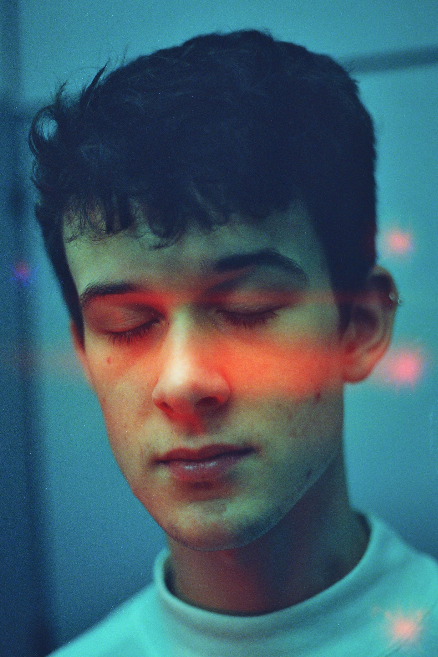
Laura Pannack, like Sank is a modern, conceptual photographer that has the ability to photograph a subject so elegantly to tell their story. Something that is evident in Pannack’s work is her use of very soft colours and tones as well as a use of very soft focus around the subjects existence in the forefront of each frame where, most of the time, Pannack captures them either looking directly at the camera or facing the camera with their eyes closed.
 This effect of the subject closing their eyes in the photo is something I will be trying to up-take and emulate in my own work because I feel it adds a very subtle and elegant tone to the imagery and a compelling mood is achieved when the subject eyes are closed because the audience feel a sense of inclusion in the image – that when looking at the subject closing their eyes, we are included in the thoughts they are thinking. I will using this technique of the subjects closing their eyes in a couple of my images so achieve a look of vulnerability – that when they close their eyes, they become more vulnerable as they become unaware of the happenings in front of them due a deep focus in their mind about their thoughts. This sense of vulnerability is something I wish to capitalise on in my project to show that boys are not always confident and boisterous freaks of nature that don’t fear anything and instead, through particular photographs of them with their yes closed, a much more vulnerable state of their personality can be shown.
 Pannack, like Sank focuses on telling her subjects story and focuses on the audience ability to connect with what the subject is experiencing in the frame. Both photographs focus on the notion of a gaze from the subject in the image to aid the narrative that can be told. When a subject gazes at the camera and in-turn, the viewer, they achieve a very somber effect that often works very well to present a mood. A gaze can not only be achieved through the eyes but through the other facial expressions of the subject and how they rest the other feature on their face to bring the attention to the eyes. A gaze can also be achieved through body positioning and body expression and the use of hands to help create meaning is also very effective.
Pannack’s work has been shown in three solo exhibitions and contributed to a couple of publications. She has received a number of awards, including a first place in the World Press Photo Awards in 2010, the Vic Odden Award from the Royal Photographic Society in 2012, and the John Kobal New Work Award in 2014. Pannack has also worked commercially for The Mental Health Foundation, Save the Children, Oxfam, Dove, Samsung, Barclays and Vodafone.
Pannack’s notable personal projects include The Untitled, Young Love and Young British Naturists. For her personal work Pannack largely uses a film camera and I believe this is noticeable in her work because of the very soft and subtle colour tones that look quite faded – an effect achieved from shooting on film.

The video above shows Laura Pannack at Nicer Tuesdays – an event by It’s Nice That which invites exciting creatives to share short, sharp insights to recent projects, aiming to inform and inspire. Pannack in this video, talks above her recent works to an audience and shows her processes and the meanings behind what she does.

In an interview with The British Journal of Photography, Pannack describes her processes on how to take a good portrait photograph and the thought behind taking compelling portraits that for so many, seems so simple but the methods Pannack uses shows her professionalism and dedication to creating the quality of portraits she does. BJP writes in their article, “dedicated to developing strong relationships with her subjects, Laura Pannack’s work is always a collaborative endeavor between artist and sitter.” This resonates with me strongly because I too believe that to create a strong portrait image, the collaboration between the subject and artist is vital because from this relationship can become a developed bond between the two of them in order to create the right portrait to tell their story. Pannack’s interest in youth culture is evident in her work and BJP highlights this in their article.
Pannack’s focus on documenting youth culture is another reason I have decided to study her work. Fro m observing the way she photographs this particular sub-culture will give me a sense of understanding to go and do it myself as I too will be photographing the youth of Jersey – youth are often ignored in this newly-developed political society that is now so focused on the present and the views of elders and the empowered at a time where the economic states of our country is the most talked about subject for last two years.
 In Pannack’s project entitled ‘The Untitled’, she aims to “challenge the sweeping generalisations and often negative perceptions of teenagers held by many, by capturing the individuality of each of her subjects.” In her portraits which she confesses to often titling the name of the subject pictured, Pannack’s aim is to show to her viewers that these people are unique individuals, not just as part of one single group.
BJP also asked Pannack, what, for her, makes for a compelling portrait and Pannack answered, “for me, a compelling portrait is one that provokes emotion and encourages an attachment. I like the idea of a threaded connection from subject, to photographer, to viewer – one that flows effortlessly and connects all three.” For me, this is very true and I agree with this strongly because it reiterates to the gaze that not only myself, but many other conceptual photographs attempt to achieve in their images. The gaze of a photographer on their subject is shown through the release of shutter on their camera and this gaze is then carried on to the subject that, in their image, gazes at the viewer on the other end of the photo. This is what I will be attempting to achieve in my portraits of young people.
James Greenhalgh
James Greenhalgh is another conceptual photographer and is British, like Pannack an again focuses on youth culture of England to create a range and sense of consistency I his work – photographing youth is his specialty and being young himself, this allows him to connect extensively with his subjects in order to create a collaborative process which results in images that show another side to teenage Brits that people often don’t see – Greenhalgh highlights the youth of Britain in his soft images that are a mixture of black and white images and colour images.
Greenghalgh’s work is of such a similar nature to Pannack’s that he was picked out by The British Journal of Photography to shadow Laura Pannack on an exclusive BJP portraiture commission.
 BJP writes: “After a lengthy judging process, Laura Pannack has selected 18-year-old James Greenhalgh as the winner of a competition to shadow her as she shoots Separation, a series of portraits commissioned by British Journal of Photography. Separation explores the angst and myriad emotions experienced by London-based couples who, as a result of Brexit, have been forced to contemplate separation.”
Greenhalgh is currently in his first year of studying Photography at London College of Communication. However, it was his A-Level project, Tungsten, that caught Pannack’s eye. A series of portraits of teenage boys, Tungsten seeks to break down the mask of masculinity and show the beauty and sensitivities that lie behind. And this seen, this is why I have chosen to study James Greenhalgh as his interests in photography lie within the opportunity to collaborate with his subjects, and in particular, teenage boys to show the sensitivities that exist beyond the face of masculinity that is often so forced in an attempt to fit in to society that sets, on a regular basis, the standards and ways boys should behave and act.

Greenhalgh was asked what appeals to him about portraiture and his reply to this was, “The connection that you share with the person you are shooting is so precious and special. For somebody to open up in front of you and be themselves without fear or judgement (with or without a camera present) is truly beautiful, especially in a world where everybody is putting on a mask or persona in an effort to appeal to others. With portraiture I feel I can capture that organic moment.”

David Bailey
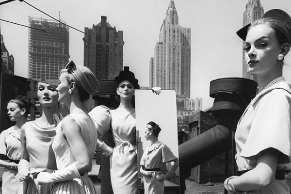
David Bailey is a portrait photographer that has shaped and formed the way artists in his footsteps photograph – he is one of the most famous contemporary portrait photographer known for his ability to capture a subject so truly in black and white.
The Visual Artists on David Bailey: “considered one of the pioneers of contemporary photography, David Bailey is credited with photographing some of the most compelling images of the last five decades. He first rose to fame making stars of a new generation of models including Jean Shrimpton and Penelope Tree. Since then his work has never failed to impress and inspire critics and admirers alike, capturing iconic images of legends such as: The Rolling Stones, the Kray twins, Damien Hirst and Kate Moss, these simple yet powerful black and white images have become a genre in their own right.”
 Looking at the work of Bailey is will be vital in ensuring I can create real and true portrait images because form looking a his work, I will be able to study the way he captures a subject using different facial expression and body positioning. Bailey often uses different shot types such as close ups or medium shots that include the models abdominal. Bailey is known for using plain white backgrounds as backdrops for his shots and then dresses each model he shoots in dark clothes that will deliberately contrast this white background to allow the black and white film to work to its full effect and provide that heavy contrast he is known for capturing between the subject and the background – making the subject so defined and at the forefront of the frame – as they should be. I aim to take inspiration from the way Bailey captures close ups so well in his photoshoots and will attempt to do this in my own because I believe that close ups are the most expressive because this is when the audience feel the closest to the subject and can see the intricate details on their face. As well, Bailey will tell his subjects to mostly keep a straight face for most of the time and to look directly in to the cameras lens in order to capture their personality in the best way.
Furthermore, it is the little touches that Bailey implements into his work that makes it so expressive and unique – in the mages below, you can notice how each subject has their mouth open ever so slightly and this is likely intended and has been instructed and directed by Bailey.
 However, Bailey uses a studio on all shoots and takes advantage of his access to a professional studio to interact with his subjects on personal level to direct them fully. Because Bailey photographed most predominantly and at his peak in the 60s, 70s, 80s and 90s, street fashion photography was unknown and unheard of because photographers were so comfortable with photographing in a studio environment where factors such as lighting, interaction with the model and background were much more controllable by the photographer. Street photography relied on natural circumstances including natural light and the backdrop of photos would have to be carefully chosen by the photographer as well as the day of shooting to take into account weather.

However, Bailey soon took up street fashion photography and again, became a pioneer of this. After photographing the most famous people in the world in his studio in London for many years, he tuned to street photography and used his most preferred model and girlfriend at the time, Jean Shrimpton.
The image below show Bailey’s attempts at street fashion photography using his girlfriend Jean Shrimpton. Shrimpton was an English model and actress. She was an icon of Swinging London and is considered to be one of the world’s first supermodels.

 To fiullfil Baileys fiull poetntila as astreet photographer, him and his girlfeind, Shrimnpton made their first foreign trip for Vogue.
NY JS DB 62 is a groundbreaking series of work that was made into a book first published in 2007 from the images produced by Bailey and Shrimpton’s New York trip. The images made were made with Bailey’s recently acquired 35mm camera. Newly freed from the confines of the studio, he shot rapidly on the streets.


The book is entitled NY JS DB 62 – the NY stands for New York, the JS, Jean Shrimpton, the DB, David Bailey and the 62 for 1962 – the date which the series of street photographs was shot.
The images in the book were completely different to what both Bailey was ever used as he explored the streets of America with his camera in an environment that he was very unfamiliar with and it was also a shock for the people who were followed the work of Bailey for so long as they would be used to carbon copy versions of the same image Bailey was capturing fr many years – studio shots of actors, musicians, artists faces. Now, Bailey was using the street as his studio and capturing much more candid, informal and unstaged shots of his girlfriend exploring the New York. The above images shows this perfectly as Shrimpton strands, poised to begin playing an arcade game.
William Klein

William Klein was another very famous photographer who also used the street as his alternative studio set up to capture much more urban-inspired fashion shots of the most sought-after models as well as strangers in the street. Klein, like Bailey used black and white film on his large forma camera to capture with what looks like a 24mm lens, close ups of crowds of people in the streets of America. Klein is an American-born French photographer and filmmaker noted for his ironic approach to media and his extensive use of unusual photographic techniques in the context of photojournalism and fashion photography.
What is evident in Klein’s work is his ability to capture people in the streets without their knowing the presence of the camera. Although they will be aware of Klein’s presence and the camera presence, they will not perform anything for the camera and instead just go about their life whilst Klein uses his camera as a tool of recording. Klein, as shown int here images below picks out particular characters in the streets that he spots and uses either methods of physically getting close to the subject or using a large zoom, which would only have been possible later in his career after the introduction of digital cameras and he captures the features that he has recognised as interesting in a character. The characters that Klein photographs have been chosen carefully by the photographer as he would usually spend a day in a couple of key spots on the streets and watch the world go past. He would attempt to pick out characters that could show the area he is photographing well.
 Widely acknowledged as a significant innovator in the history and design of the photo book, Klein published his first book Life is Good and Good For You in New York in 1956, which won the Prix Nadar the following year. Capturing the rough and tumble of daily life, Klein’s brutally honest images caused a major sensation.
Soon after Klein made a name for himself in the recently introduced street fashion scene that saw photographer take to the streets and use the natural happenings on the street as their content, he had achieved widespread fame as a fashion photographer for Vogue and for his photo essays on various cities. And despite having no formal training as a photographer, Klein was a natural and won several awards.

 However, Klein stated to a journalist for The Guardian in 2014 that “my feeling for the city hasn’t changed” and “the photographs I took were a corroboration of everything I resented in America and in New York.” Here he saying that his images were a confirmed physical evidence and validation of his resent for the city and country and he aimed, in his photographs to show everything he disliked about the city. His photographs are very gritty and this is what I have taken inspiration from for my own images.
Although I am not capturing my subjects in the same manner as Klein does in a very candid and typical street photograph manner that consists of quick snapshots of people running through streets. I want to capture a gritty and very personal presentation of my subject and will use Klein’s technique of getting close to his subjects at times to capture the details of faces.
Klein was another photographer that was naturally a studio photographer, like Bailey but then turned to the streets in order to capture a different mood and tone in his images. In Klein’s case, from shooing in the street he was able to capture a much more gritty sand raw depiction of America which was emphasised by the black and white format he shot in.
Wolfgang Tillmans
Wolfgang Tillmans is a German photographer. His diverse body of work is distinguished by observation of his surroundings.
Tillmans was the first photographer – and also the first non-British person – to be awarded the Tate annual Turner Prize.
Tillmans was initially known for his seemingly casual, sometimes snapshot-like portraits of friends and other youth in his immediate surroundings and scene. His photos – from the Europride in London (1992) or the Love Parade in Berlin (1992), for example – appeared in magazines such as i-D, Spex, Interview, SZ Magazin and Butt, and established his reputation as a prominent witness of a contemporary social movement.
 Most of Tillmans work is staged, with the artist choosing the clothes and the location, as well as setting his models up in their positions. Furthermore, in Tillamns work, he tries ot capture freedom through the way the model presents him/herself to the camera. In his early photographs of people, Tillman’s portrayed freedom in a different way and he says: “I wanted to somehow represent what was not being represented elsewhere.” Tillmans uses the themes of gender identity and sexual orientation to define the way he photographs and how he presents them. His portraits, still lifes, sky photographs (e.g. the Concorde series) and landscapes are motivated equally by aesthetic and political interests and like I said, especially related to homosexuality and gender identity.
In 2012, he abandoned film photography altogether and became a full-time digital photographer which is what separates Tillmans and Bailey/Klein because Tillmans is photographing in an era that is much more technologically advanced and this allows for him to control his shoot more and capture a more crisp and true image. As well, Tillmans has a passion and love for the streets and the club and these inspire him in his work along with his work in the gay movement rights.

Tillmans’ himself has in fact experienced AIDS and has suffered from its consequences. This battle with AIDS has informed his work and he uses his knowledge and experience of it to create meaningful works. His experience with AIDS began at the age of 26. Ever since, Tillmans has been fighting AIDS and he states in his interview with SHOWStudio’s, that after experiencing this feels he like life is fragile, and should not take advantage of it.
Tillmans touches upon very tender subjects in his work and this is what has made him so successful because his work is very true and the actual quality of his photographs, taking away the message behind them are of a very high quality. Tillmans uses quite warm colours and dark colours such as burgundys, browns and maroons to provide body to what he is photographing.
In an interview with The Guardian, Tillman’s speaks of his recent projects.
Vicky Grout
Vicky Grout is a London-based photographer shooting predominantly on analogue, however, also shoots digital and specialises in portraiture, music and street photography.
Grout is a very current photographer who has begun to make a big name for herself in the UK music scene, particularly, the grime scene where she has photographed the likes of Stormzy, Skepta, Novelist, AJ Tracey and J Hus. Therefore, because of her very current style being very contemporary, looking at her work will help me in producing similar work.
Below is a range of images that Grout has shot and these are all present on website also. The images below show shots of Skepta, Novelist and J Hus and are images that I personally really like. I only recently came across Grout’s work when exploring the internet when I came across the fashion/music magazine PUSH. I saw the photographs they were publishing and had to find out the photographers name. This is how I found Grout’s website and this was a contributing factor to what made me decide to carry out fashion work for the exam. I have bene wanting to do it for a long time but did not know how to start but I have taken the risk to do it.
Grout is a young photographer and this is another thing that I think is great about her work – that she is so young at 20 years old but is doing so well and becoming very successful at the very niche and specialised area she has found a passion for – grime music photography. From this, she has developed many friendships with the people she works with – making it a comfortable atmosphere when she shoots with her regulars. This is something that is important when shooting very intimate and collaborative portraiture and I knew this was going to be vital when shooting my own images – to make the occasion comfortable for the model, considering I have never spoken with a couple of the models I have recruited.


Grouts work has very light touch to them – the colours are not heavy or very contrasted and the look has a hazy, fade style to them – making it evident that she shoots on analogue. I would have liked to shoot on analogue also but knew this would be difficult considering the time period I had to complete the entire project in and it would mean I would have to finish a whole roll of 35mm film consisting of 36 exposures. As well, I have recently purchased a half frame camera and this would mean I would have to capture 72 exposures. I have still used a couple of my film cameras but understand I will not be able to use these in my magazine because I will not have developed them.

The image above shows the style that I would be able to achieve with my half-frame camera as a very frame captured is only half of a frame and the next frame taken will be paired with the previous to create a full frame – a really nice effect that I love the look of. It works especially well with portraits as shown above.

It is clear Grout works very well closely with her subjects to get then perform for the camera and this pays off excellently with the facial expressions and body language that is shown by the subjects makes each of the photographs – it adds character not only the image but to the actual subject.
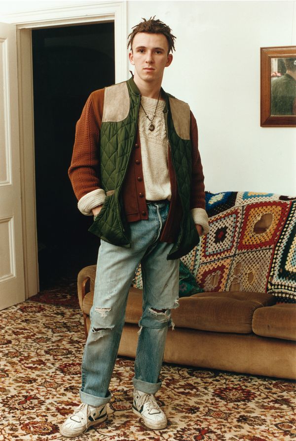
Ben Awin
Ben Awin, although very similar to Grout, has quite a distinctive style and a much wider range of clients. Awin, like Grout is a young London photographer who photographs people who he wishes to tell stories of whose styles captures his eye and this passion for clothes and photographing it comes for his own desire to own the most sought after cotes and brands.
Awin has photographed the likes of Lazy Oaf, a London based fashion label designing womenswear, menswear and accessories featuring bold colours and graphic prints. A couple of the images that presents a half-frame like style of the solo male are for Lazy Oaf shoot to promote one of their collections. Awin has also photographed A$AP Rocky, Jorja Smith, Kurupt FM, Virgil Abloh and Bugzy Malone – a couple of these similar to the clients of Grout.
Most if Awin’s work adopts a ‘snapshot’ style and they appear less conscious of composition, framing and colour balance than Grout. They definitely have less of a heavenly look to them and they are more gritty as Awin seems to connect better with males in his work, shown from the collections that present young, adolescent boys behaving badly if you like on the streets of London – they have more of a darker tone to them as models are scene with straight, serious and sombre facial expressions.
Shown below is also an image of a confident teen leaning against a police van as Awin snaps him looking very assure of himself and confident in his actions.
This style that Awin adopts in is work is the style I aim to create in my work and what I have done thus far – my models have expressed quite sombre facial expressions as they perform different acts for the camera, either crossing his arms, leaning against a set of railings , sat on public stairs or parading around pubic car parks. My images have more of a gritty tone to them like Awin’s and this coincides with the usage of male models throughout as I aim to present their typical boisterous personas through the camera whilst, at the same time, getting the to present a more vulnerable, timid character to the camera that is often covering the confident nature bys have. I have explored this in my imagery very subtly but will emphasise it more so in my text in the end product.


Awin uses bright colours paired with dark and dull backgrounds such as London’s streets or estates. He focuses on the clothing to provide that colour burst that is necessary to complement the much more darkened background where colours in the colour palette include browns, blacks and greys.
Awin’s models are witnessed styling very bright colours in their clothing and the running them throughout is yellow or orange. These bright, luminous and neon colurs are what gives Awin’s photos a very modern tone and they epitomise the street culture of London – the UK’s capital.

Awin, as well as Vicky Grout ranges his photos from landscapes to portraits and this is a very useful skill to use in photography but I have fund that my images are mostly portraits and this is because I have been predominately using my 50mm lens that os best used for close-up portraiture imagery. Therefore, for my final couple shoots, I will make an effort to photograph more wide angle images to provide a variety among my photographs.
Saskia Ivy
http://saskiaivypuxley.tumblr.com/
Saskia Ivy, another young photographer who also photographs UK’s young youth culture, mainly on the streets of the UK where youth are most active, lovely and present because this is where they interest and can be themselves, on the streets which some say is their own – where they grew up. This is a contributing factor to the quality of images from the work of these three contemporary artists – they all have the opportunity to photograph youth on the streets of the UK where young people feel most confident and this confidence is shown through the models acts in front of the camera – something I have tried to encourage from my models in the images I have produced because it has a great effect on the outcome of a series of images.
Saskia Ivy’s photographs are shown below. Although she is lesser known than Vicky Grout, she is one of my favourite photographers in the way she captures her subjects. She uses low angles quite often where she photographs looking upward on the subject and thus has a great effect because the subject is required t look down on the audience and they it draws attention to their confidence and mature manner more so.
Ivy also photographs mainly males as well and has carried out a few mini series of works that looks at male behaviour on the streets of London – an example of this is shown in the 4th image shown – the triple exposure of a few boys sat on some stairs.


Ivy also captures much more informal and candid shots and she explores Loudon clubs and nightclubs – the rave scene of the UK capital to see if she can find any people in the moment who are enjoying themselves and do not care about anyone else but the music and the place they are in – people in the moment oblivious to the camera make great photographs and this is achieved recently by Ivy as shown below. She adopts camera angles, such as canted and tilted angles that show this candid style and uses a flash for these particular environments which work very well, especially in the image below as the camera picks ups some flare and catches the reflection of the models jacket.

In Adobe Photoshop, I decided to create a mock-up layout/storyboard-type document that outlined the very basic, primary ideas and thoughts for how I may want to structure my magazine for the final product of this exam project.
I created a range of a black, portrait boxes using the rectangular marquee tool and then duplicated these to create a storyboard-like layout to illustrate and begin creating a rough draft or the structure of pages for the magazine.
The purpose of this is to give me a better idea of what I want to do – it will allow me to understand how many pages the end result may be and will give me more confidence to branch off from this to create a more precise ad specific page-by-page mock up of the magazine. Doing this task can also be used a yardstick to judge my progress so far as I can see how many shoots I have done and haven’t.
Through the process of research, planning and actual construction of this project, I have realised how difficult it is to do in the little time I have and therefore, I have decided to keep it very minimalistic and in-turn, the final product will likely end up more like a mini photobook and in a sense, a little like a look book for a fashion house may produce.
Furthermore, it will also be very difficult for me to create words and text to the extent to which other fashion magazines such as i-D and Dazed do because this is an dependent project and because of this, I ma happy to showcase more so my photography and have little inserts of text that accompanies the imagery at times, however, it is certain that there will be a question and answer segment for each “character” as such. This is what I have called my models because I am exploring their stories behind their fashion and showing this to readers, therefore, they can be branded as characters to this story of modern0day fashion in adolescent teens.
I reiterate that this is a very brief primary mock up of what the magazine may end up being because I need to complete all shoots first and then I can decide how I want to present my work and in what order but I understand this will likely change as I am producing the magazine but it is useful to have a vague idea before starting.

