Category Archives: Analysis

Filters

Author:
Category:

Water

This blog post is comprising of a number of images that I have taken in the last couple of months which that I haven’t specifically gone out and taken for a shoot for this project.  I wanted to include these past images as because I am starting to look at and explore the element of water and therefore as I am starting to explore the freedoms represented in water, through looking at it’s motions, textures and colors.  I shall be doing future shoots using and experimenting with water however I believe these images are a starting point for my future shots I am planning on taking over Easter.   In my future shots I want to try and take photographs that show a strong contrast between the physical and the metaphysical by portraying he elements in a variety of ways such as close ups vs macro or usingn light vs dark conditions.  Therefore in these images I believe I have captured the two contrasting portrayals of nature through water being presented as more of a scientific view but also including various spiritual elements in it as well.  Essentially therefore my process is to take photographs of elements that are found everyday but photograph them in a manner that invokes and reflects their spiritual connections in order to also highlight how humanity itself can reconnect with nature – referencing the story of Adam and Eve told in Genesis in the Bible.
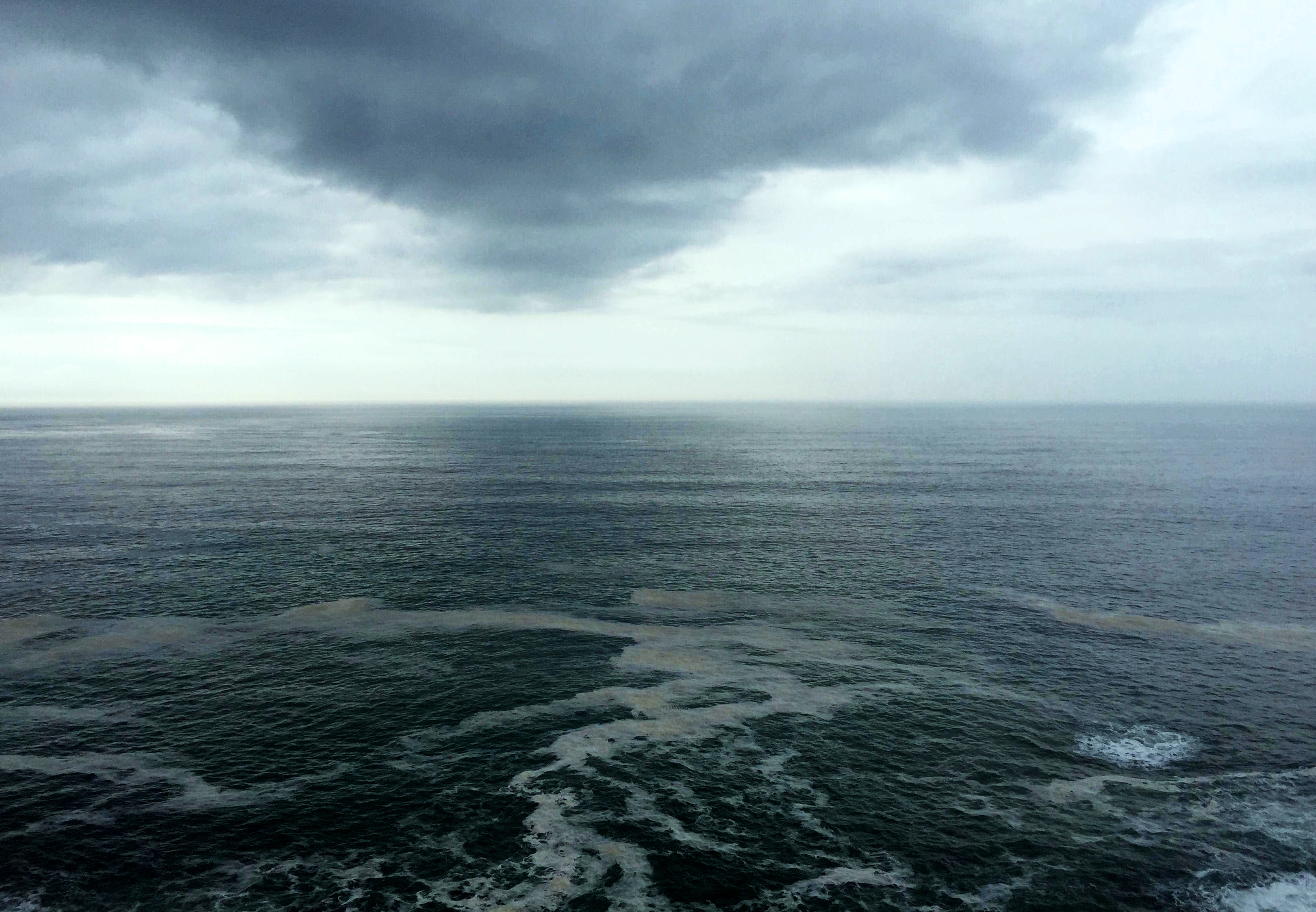
This is an image of a sky line.  I took it from a cliff looking outwards towards the horizon.  I wanted to include a large outward looking landscape over a large distance of water.  This is because it shows not only the scale of creationism in itself but also how furthermore the scale of continuous evolution and continuous change in nature.  Creationists and Evolutionists both agree that change occurs, however it is the principles governing this process is disputed.  Therefore I believe this image is inclusive of both theories in the sense that this image includes quite a potent sense of awe and wonder to it through the sea and sky formations that in itself appears spiritual as because of the similar colors and light – appearing somewhat connected.  Also because of how I have shot the element of water in its naturalist form, how this is a still image of change occurring in nature and also how their are darker tones appearing somewhat earth like and less “heavenly”, this could appear to appeal to the evolutionist theory.  However, personally for me, what particularly strikes me is how the tones and hues of light reflected from the sea in the distance is symbolic to the spiritual cause of the idea that the Earth was created for a purpose by God.  This is because looking on over the horizon, the idea that the sea is somewhat connected to another realm is expressed therefore I believe in this image.

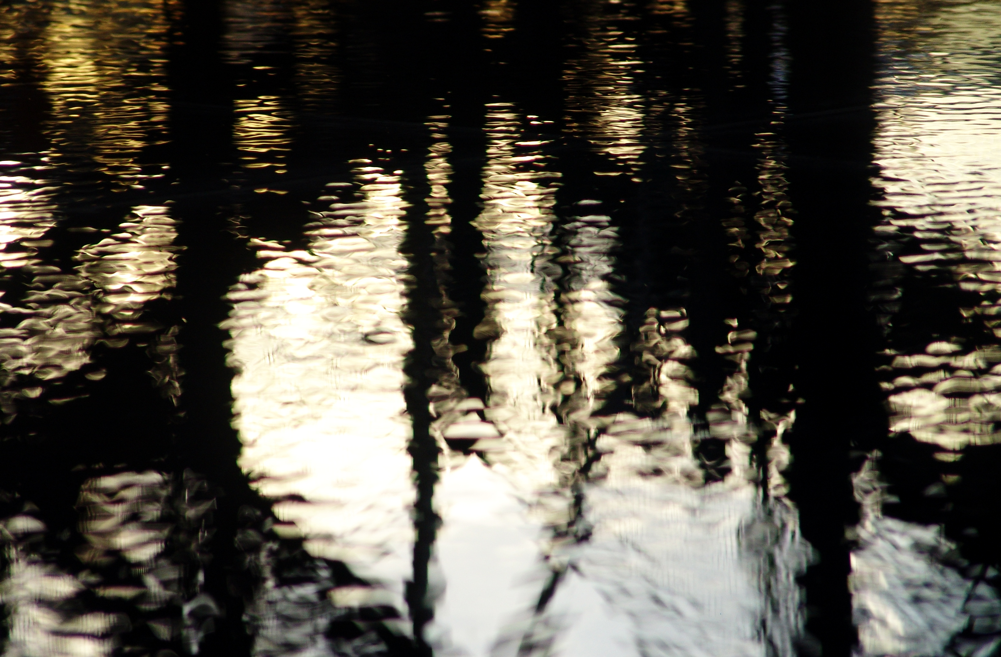
These next set of images I have included as I believe they successfully and effectively emphasize the idea in which spirituality governs the continuous evolution that occurs in nature.  I believe this triplet of images communicate and express the realms of spirituality within water but also most importantly the freedoms found i nature.  Arguably the freedoms given to us in nature could be given to us from a designer, allowing evolution in nature to occur freely.  This therefore links back to the theory of creationism because as God first created the world, it says in the first verse of Genesis “Now the earth was formless and empty, darkness was over the surface of the deep, and the Spirit of God was hovering over the waters”.  Interestingly, I have utilized the elements of water and light as a strong feature of these images which I believe re-enforce this verse.  This is symbolic because by expressing this relationship between light and water, it is representational not only just to the theory of creationism, but also  how the freedom that is found in nature is one of beauty and is in a way, appears almost alive and lifelike.  In doing this I believe that I am not only translating my own experience of spiritual encounters into this triplet of images, but also this links back to how as everything was created by God, just as they exist, they are worshiping God as these element have no known comprehension of intellect, understanding or morals.  “Everyone who is called by My name, whom I have created for My glory; I have formed him; yes, I have made him” (Isaiah 43:7)
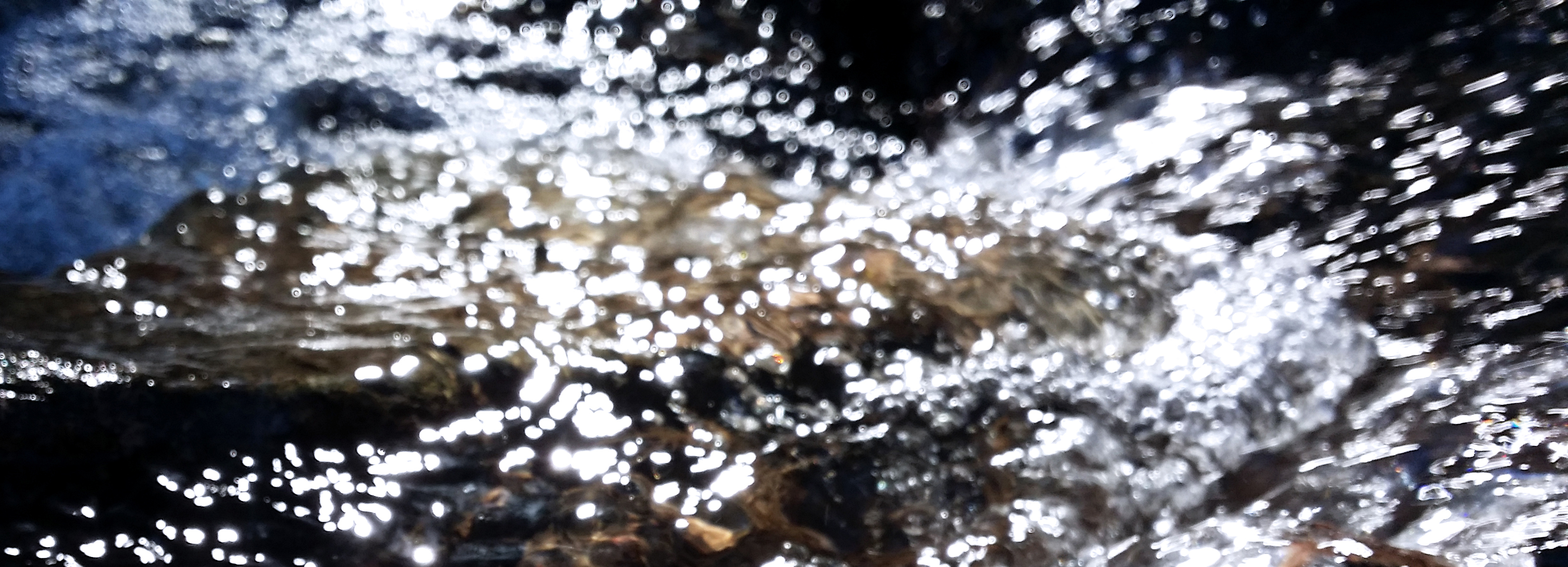
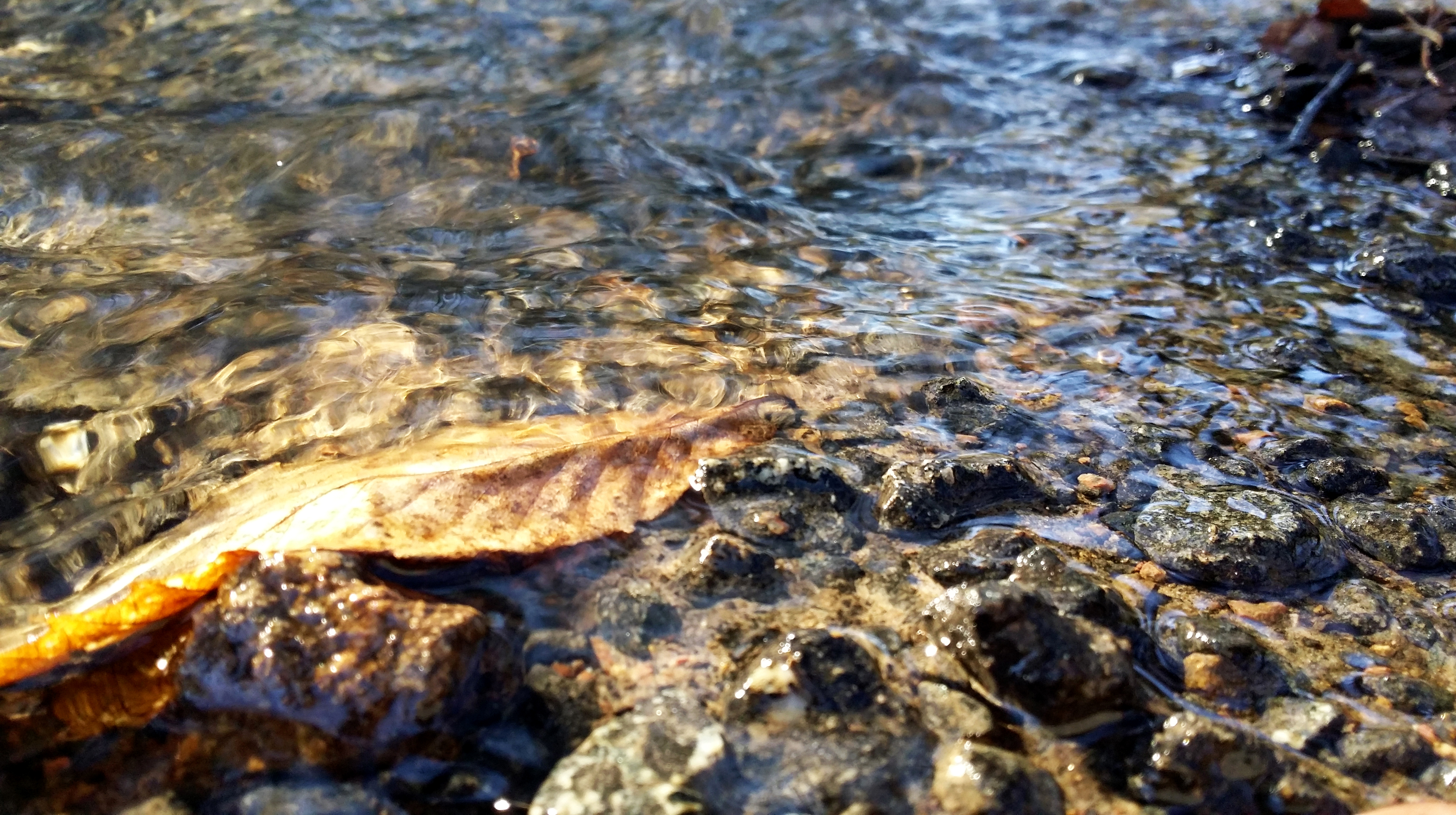
These last two images are very similar to the triplet beforehand, in that they are quite surreal and abstract, not of the objects of the physical within the image.  Te physical is very much just a normal stream, however the strong and powerful light tones add a metaphysical presence within the image which represents that water isn’t something ordinary but exists as a gift from God to nurture and support our existence.  In the top image, there is a lot of light, reflecting the idea that white light in the water is something pure and is a gift from our creator to allow us to exist and in doing that exercise and overseer change.  The bottom image includes a stronger use of colors and rough textures that are more delicate.  This is effective because it represents a sense of peace to it, and therefore relates to the idea of creationsim as we are created to be at one with nature and because we aren’t, we/humanity don’t necessarily feel as peaceful as the processes of change in nature occurs.

I like these double images and have included them as they represent the real vs the fiction.  For example, the beads of bubbles very much appear particle-like, however the motion and direction they are travelling in appears also reminiscent of the theory that change in nature occur for a purpose and in doing this is a celebration of the intricate and complex structure of the environment in which we live in.  Beforehand, my water images weren’t so much about capturing change but rather more so about beauty and individual design.  Contrastingly, here this image shows similar particles all moving in a similar direction, capturing the very process of change itself in nature.  The how in these images are about capturing how change occurs in nature and how we have got from one place to another.  The why in this image is why are the particles all together and why rare they moving in a particular direction – weakening the idea of individual freedom and strengthening the idea of nature’s change as being a collective freedom, one that serves all of the planet as one creation.


Specification and Future Shoot Plan

My full specification for this project title under Freedoms and Limitations is exploring the freedoms of spirituality within nature and the world vs the limiting factors of the the physical structures of the elements themselves.  Creationism solely is based on why we are here and why change occurs, which I can link back to my own spiritual connection based on my faith because this can help explore the reasons for existence.  Incorporating into this, I am interested in questioning the dimensions and depths of the realms of how far spiritual presence exists within nature by being guided by the spirit myself along this journey.  In doing this I hope to also answer the question posed as how despite spirituality in itself is freedom, many humans have lost their connection with this and rely solely on the physical, and in this project I not only want to highlight this and reconnect this lost connection, but also explore the freedoms that the elements hold and contain when suddenly they were designed and currently operated continuously by an operator that is beyond human comprehension.

By exploring the theories of creationism, outlining why change occurs in nature vs the theory of evolution, outlining how change occurs in nature, I want to tell a story of how the world was created.  By tracing these roots back, it allows us to see the reasons for change now and how human theories can be limiting as well as freeing as oppose to which theory is looked at.  Based on my previous work of photographing experience as I have shot light, I want to continue retelling the story of Genesis in the Bible through visually comparing and contrasting:

Physical vs metaphysical

Real vs Fiction

Representational vs Abstraction

Macro vs Micro

Evolutionism vs Creationism

How vs Why

In doing this I believe that I need to identify the elements in order to take photographs of and in doing this I want to show both sides of spiritual vs metaphysical stances in nature that allows us to trace back to the start of the world and therefore explains how and why the process of change in nature occurs today.  In a sense, nature is part of a system of continuous evolution that could potentially be part of a system of continuous creation.  In saying this, by looking backwards to explain how or why nature has got to where it has got, I believe that by examining these processes of change (especially spiritual), it could potentially allow fur us to see into the future as I explore this project.

Therefore as a shoot plan over Easter, I want to shoot the elements that are in order, described and told in the book of Genesis.  These elements include:

Light and Darkness

Water and land

Vegetation/Plants/Flora

Living Creatures/Animals

Humans

Over the Easter my plan is to move to each element, exploring the key concepts of how and why.  Every time I make an image I want to continue translating my own spiritual experience into my images and thus before each shoot I have decided I want to make a prayer in accordance with my shoot that I believe will allow me to  be best guided by the spirit as I am shooting.


Review and Reflect

So far, I am happy with the progress I have made in photographing light and in doing this translating spiritual experience into my images.  My first shoot I took images of the sky and more specifically the sun as the main source of natural light.  This links to the story of Genesis and of creationism as I am tracing back to the origins of nature and also symbolically light outshines the dark as new replaces old.  I believe these key concepts have successfully outlined the meaning of freedom through philosophically exploring the spiritual freedoms that exist within and beyond nature.  My second shoot I believe reflects this mentality whereby I took images of light through a church glass window with blurred focus and using blue filter which represents the idea of spirituality because both these elements link back to purity and how nature is pure because it is created by an intelligent creator for a specific purpose.  Alexander Mourant’s work heavily inspired me in these two shoots where he takes photographs that are based on an experience which was similarly what I dad as well.  Because of my religious environment as expressed in my previous project, my photos were also taken with a religious/spiritual experience that it was based on.  In order to help explore creationism and the characteristics of nature, I believe that by doing this, this has effectively helped me explore the metaphysical in natural processes as well as the physical.  Therefore in these images I have taken so far up to this point,  I believe I am conveying my own spiritual connection with the world and because of that, using that as a basis as to why change occurs in nature.


Comparison // mine and rinko Kawauchi

After doing my first body photoshoot I wanted to do a comparison of mine and Rinko Kawauchi’s images. I used Kawauchi as my main source of ideas because her images have a very spiritual element within them. Her images are bright which creates this pure atmosphere. I tried to produce this type of effect in my images using Photoshop to create this aesthetic Kawauchi also uses a very small f stop to focus primary on one particular spot within the frame, while the rest of the image is blurred. I really like this technique because it helps the viewer to focus on specific details within the image.

I have chosen to compare these two images because they are very similar in the terms of angle and subject. Both of the images are of an eye because the eyes are a very important features of the body. They are an extremely spiritual element because the eyes are what inhabits us to witness the world around us. Our eyes allow us to see pain, fear, love and happiness.  Kawauchi’s image of an eye is a much closer framing then mine and her f stop is also a lot smaller then mine because I wanted to capture a lot more detail then she did. I wanted to capture more of the face as well. The angles at which the images were taken are the same. The image is of the left eye being taken from the right side of the face. The brightness and feel of the image is similar to Kawauchi’s because I wanted to replicate her atmosphere. The colors however are different, mainly because of the background within the image. Kawauchi uses a blue background for her image whereas I wanted to have a colourless background because I wanted the focus to be on the face. Kawauchi’s image is also slightly brighter then mine because it was taken outside using natural light which created this soft, natural feeling. Mine was taken during the evening in a bathroom so I had to try reproduce this effect using camera settings and Photoshop. 

The hands are another important part of the body because we use them every single day to do almost everything. They also change a lot as we grow up because they start decaying and gaining what we call imperfections such as wrinkles and scars. We also use our hands a lot to express different emotions such as fear and love. The image by Kawauchi and my image have many differences because of the angle of the subject, the age of the subject and the colours are very contrasting. Kawauchi has captured the back of the subjects hand because she wants to capture the wrinkles and veins of the subject. I wanted to capture the wrinkles on the palm of the hand because they revealed much more detail then the back did. Kawauchi used a much older subject then I did because I simply used someone that was there at the time which was my mum. The picture was taken in my bathroom because I wanted a simple white background whereas Kawauchi takes the image in a random place so the background has more detail in it. Since I used my hand to cover part of the flash, it created a pink tinge to the image whereas Kawauchi’s image has a very cold, white light because she used the daylight from outside.

Photoshoot 1 – Product

Contact Sheets

2 Stars

3 Stars 

4 Stars

5 Stars 

On Adobe Lightroom, I was also able to narrow down my edits even further to the ones I would likely use in the magazine end product and the ones shown below would be the selection I would again have to narrow down even further to leave me with just 5 images that I would be happy to show in my magazine. In real magazine publications of fashion coverage, a photographer/editor would only have room to select between 5 and 1- images, if that for the final cut as you need to keep the audiences interests hooked and this is easily done with a good handful of effective images. I was able to colour code the shortlist of edits I selected that I believe would work in a magazine whilst taking into account pairs of photos that could work and trying top include a range of portraits and landscapes as well as close ups and wide shots. Below is a primary screen of the selection process and the final selection of images to choose from for the final cut.

The yellow colour coded images represent the edits I may use and these are ones I am insure on in terms of if they would actually work in the magazine and although they are goof images I feel they work well, I have chosen to select, with a green colour code, the bets images that would look most effective in a magazine when put together, however, this distribution between the green and yellow images may change later on as I may decide to remove some green ones and replace these with some yellow ones.

Exam Progress Log 21.03.18

Early last week, I uploaded a blog post outlining my intentions for my first two photoshoots and mentioned that I would be carrying out both of these shoots of that week (beginning Monday 12th). As well as this, I produced a blog post covering my plans for both of the shoots.

On Wednesday 14th, I did manage to carry out my first shoot of the project (excluding my practise shoot) and this was with Peter Le Gal. I have collated contact sheets from this shoot and have completed my edits of my best images also. Looking back on the photoshoot, it was very successful but it was the first stage at which I realised that my intentions may be more difficult to follow through than I first forecasted because doing this shoot made me realise that working with people I wasn’t very close with would be more difficult that I first anticipated because of the difficulties in communication we may have but I will become more comfortable and use to shooting and directing my models as I progress through the shoot. Apart from this, the shoot was successful and I retrieved many positive outcomes from it which I will present soon in another blog post.

However, I was also supposed to do another shoot on Thursday 15th – the day after but because of the weather, I had to cancel the shoot for that day that I was supposed to do with Max Feighan, as planned and postpone it until the week after (thus week beginning Monday 19th). The weather was looking very rainy and grey and this was not what I wanted to shoot in as it would make it very difficult to get a goof handful of successful outcomes from it and as it will be my first time shooting with Max, I wanted it to be the right conditions in all aspects. I have contacted Max again and ask ed if he is available to shoot on Saturday 24th instead which he said he was and is our shoot that was supposed to go ahead last week is now going ahead this Saturday. However, I have told him that this may change again depending on the weather. We will be basing the photoshoot in Les Quennevais Precinct as I feel this will be a very effective location for an urban look and feel  Therefore, the post outlining this second shoot will not be published as soon as I thought and I have had ot re-arrange how I structure my work because of this unforeseen and external circumstance that cannot be controlled. However, this will still be my second shoot if it goes ahead for the 24th and I have also arranged my third shoot on Monday 26th with another confirmed model, Emanuel Nobrega and I will be uploading my planning process for this in the latter of this week.

My plan for the remainder of this week is to upload all relevant evidence of my shoot with Peter form last week including any contact sheets, edits and evaluation/analysis of the photoshoot as well as showing evidence of my recce report of the location we shot in which I carried out before the shoot on Wednesday. As well,m I will still be carrying out any relevant planning/research I need to in the background and this will be uploaded when a piece is completed thoroughly. I will also be staying in contact with models in the background as I have been so far to maintain a relationship and keep them in the loop of what is going on.

Abstract Artist study

Wassily Kandinsky 1866-1944

“Color is a means of exerting direct influence on the soul.”-Wassily Kandinsky

Kandinsky contributed massively to the abstract expressionism movement as one of the pioneers of abstract modern art. Kandinsky believed abstraction offered the possibility for profound, spiritual expression and that copying from the surrounding environments prevented. He was inspired to create art that that connected with people on a spiritual level, innovating a pictorial language that loosely related to the real world and expressed largely about the artists inner experiences. For Kandinsky painting wasdeeply spiritual . He sought to convey profound spirituality and the depth of human emotion through a universal visual language of abstract forms and colors that transcended cultural and physical boundaries. Kandinsky viewed himself as a prophet. He viewed non-objective, abstract art as the main way to allow someone to have  a deep emotional connection.

Kandinsky viewed music as the most supernatural form of non-objective art. He strove to produce similarly object-free, spiritually rich paintings that represent sounds and emotions. The painting below is one of these paintings. Kandinsky has used color, structure, form, composition, dimension and shade to convey and show the spiritual experience he had when listening to a piece of music.

Music is also a large influence in my work. I often edit images while listening to music and sometimes even take photos while listening to music. This often affects the mood of the photo as the music effects my mood and the way I edit a certain photo. Whether that’d be increasing the dark’s or lights, increasing the saturation and vibrance or making the image black and white. I understand the mindset and mostly agree with what Kandinsky says about music. How it affects the soul deeply and how it is a huge influence. His careful composition of shapes and colors is something else I will use in my project. I want to take inspiration from this and carefully compose some my images to show different shades and shapes. Kandinsky was one of the first artist’s that completely allowed the spiritual, surreal emotions to be placed on a canvas. His work showed the freedom to express himself. It showed art without barriers, how art doesn’t need to show something physical like nature and trees to give a sense of spirituality. His art was a gateway for other artists to explore the freedom of painting and capturing their subconscious thoughts, their moods and feelings.

Image result for KandinskyKandinsky-Composition VIII, 1923

The painting above is one of those that has been heavily influenced by music. It features many circles, straight lines, squares, triangles and colors. As you can see it looks like a mixture of different shapes and colors almost like an organised mess. To me the lines that subsequently turn into boxes look like a psychedelic, dream like piano keys. Other lines remind me of music notes and the circles are like the color of emotions and mood the artist was feeling when listening to the music. Kandinsky is clearly trying to show the music and his thoughts through the picture. I am only attempting to intepret what the picture means. However, I do not think we need to know what it means as it is clearly an emotional response to piece of music.

Practise Photoshoot w/ Lucy

On Saturday 10th March, I carried out my first practise/experiment shoot with Lucy as my model for the day. I based my photoshoot at Les Quennevais Estate where there are many opportunities to capture my subject in an urban environment as the area is surrounded by maisonettes, apartment buildings and garages all within close proximity of each other and so I saw it is as the perfect opportunity to begin my project and I intend to re-visit this location again with another of my models.

From the shoot., I can take many positives but also many negatives and ways I can improve for next time however, I am pleased  there were weaknesses in the shoot as this gives me a basis of which to judge on how to better my performance of my next shoot on Wednesday 14th March (today).


This shoot was a very successful and useful photoshoot as I have managed to retrieve several positives outcomes in terms of edits; I have edited my best images – this being around 30 images out of the 330 I took and I did this on Adobe Lightroom as it is a very easy software to import, edit and export images with. Using this software allowed me arrange my images into contact sheets and it also allowed me to reject any images I did not like or were not of a good compositional quality and I was also able to put aside and rate images that were a success and that I intend to use.

In terms of the actual day of the photoshoot, it was a perfect day for me to take photos. The weather was perfect – it was sunny and this was the perfect light for my shoot considering I was working solely with natural light – the clear sky and sun provided perfect lighting for the afternoon and this in-turn benefited the final outcomes because the colours were very warm and this complemented Lucy’;s makeup and I was able to get very clear and crisp shots using my new lens. However, I am aware that on my future shoots, the weather will be very varying and I may not get the best weather conditions and because of this I may have to postpone any shoots where I deem it is necessary. As well, it is likely that I will be shooting after school hours at about 4pm and I need to take into consideration that the lighting may also not be great as the sun will soon be going down so will have to work around this to get the best results.

I will discuss later on in this post about the location and why I chose it as well the problems I had using my camera and how this affected the final results. As well I will comment ton my edits and my reasoning behind my choice of images and why I edited them very subtly with the intention just to enhance any colours that needed lifting or to crop any images where the composition/framing was not the best.

Contact Sheets

These are all the contact sheets from the shoot which I have created using Adobe Bridge. Creating these contact sheets gave me the ability to view all images in an orderly fashion all in one place and from this I was able to roughly mentally discard of any images I was not happy with.

Contact Sheet 1
Contact Sheet 2
Contact Sheet 3
Contact Sheet 4
Contact Sheet 5
Contact Sheet 6
Contact Sheet 7

Once I had created my contact sheets, I was then able to import all my images into Adobe Lightroom to begin making a shortlist of my favourite images and begin editing them from this step onwards.

On this software, I was able to make a selection of my best images and discard any  images that were not up to the standards of the others. From 330 images, it was quite difficult to narrow this down to a smaller array of images but at the same time it was quite easy because I was able to decipher easily between the successful images and weaker images; this being because most of my images were out of ficus and I was immediately able to understand the reason for this fault.

Because this photoshoot was the first time I was using my new 50mm fixed lens, I was not completely aware of the results of I was going to get from it as I was not sure on the right settings to use for different shots. Because it is a fixed lens and has a much lower f/stop of f1.4, I was very keen to use this feature as it is perfect  for portraits shots where you want to focus on the subjects face and isolate them from the background in which they stand. I was using this throughout the shoot and kept my camera aperture between f/1.4 and f/3.6 for the majority of the time, rarely switching to much higher aperture which I needed to do. On top of this, I was often standing to far away from the subject for the camera to actually focus on anything in the frame and this is what the cause was for a large range of my shots being out of focus and I now know how to improve upon this for my next shoot where I will be more cautious of the f/stop I am using for specific shots.

On Adobe Lightroom, it gives me the ability to rate each image out of a star rating of 5. From all my successful frames and after editing them all how I wish, I did exactly this and rated all the images I had gathered into this one place to allow to understand my best ones and the weaker ones.

2 Stars 

These are the edits which I have rated 2 stars because although they are still good images, they are my strongest ones and I would not be happy using them as finals if I was to keep these images as finals for the overall project.

3 Stars

For the following images I have given them a rating of 3 stars because I felt that they were a little better than the images above but still not the standard of my other edits. Furthermore, the edits below are other variations of the better shots that I have rated 5 stars later on in the post. Some of them are from the same area which we based a few of the shots and I have still edited them but have not out them in the 5 star rating because they are weaker variations of similar range of shots. However, the first two are still one of my favourites from the whole shoot and especially out of the photographs rated 4 stars because of the colour provided by the blue garage door behind Lucy.

The images following these two are also other variations of the better versions of the mini shoot we based on the road near Les Quennevais School where Lucy is seen on the road/pavement posing in front of a set of apartments on the green area behind her; but I still feel these images are strong and worth showing.

Also, most of the images I am showing work as a mini sequence if they were taken in close succession to each other and frame similar actions in the image and these would be obvious.

5 Stars

Below are my best images; the ones which I have rated 5 stars because of their quality and they are my favourite because of this.

In these images, I have also included a few images that do not frame Lucy and instead are images of landscape/environment we were surrounded by and where I was taking my images. I decided to do this and intend to do this throughout my perfect in all other shoots to provide consistency but more importantly, give the project something more that just portraits – it will fragment the structure of portraits and divide these up to give the audience a break to digest other images bit it will also provide a really effective look and a a basis for me to structure my other subject based images. It will show a different view to what is shown in the images that has a heavy focus on faces and subjects and will instead focus on admiring the beauty that is provided by a range of environments where I am basing the shoots.

On Adobe Lightroom, I was also able to narrow down my edits even further to the ones I would likely use in the magazine end product and the ones shown below would be the selection I would again have to narrow down even further to leave me with just 5 images that I would be happy to show in my magazine. In real magazine publications of fashion coverage, a photographer/editor would only have room to select between 5 and 1- images, if that for the final cut as you need to keep the audiences interests hooked and this is easily done with a good handful of effective images. I was able to colour code the shortlist of edits I selected that I believe would work in a magazine whilst taking into account pairs of photos that could work and trying top include a range of portraits and landscapes as well as close ups and wide shots. Below is a primary screen of the selection process and the final selection of images to choose from for the final cut.

The yellow colour coded images represent the edits I may use and these are ones I am insure on in terms of if they would actually work in the magazine and although they are goof images I feel they work well, I have chosen to select, with a green colour code, the bets images that would look most effective in a magazine when put together, however, this distribution between the green and yellow images may change later on as I may decide to remove some green ones and replace these with some yellow ones.

spiritual images and connotations // research and analysis

https://www.sfmoma.org/artist/Rinko_Kawauchi

For my project I want to research and learn more about spiritual connotations within photography. I started by researching some photographers because I wanted to annotate certain images that contained a spiritual connection. The word spiritual means relating to or affecting the human spirit or soul as opposed to material or physical things such as the body. The word spiritual creates religious connotations however I don’t plan to lead into religious aspects. The spirituality that I intend to focus on in my project is the purity and depth within insignificant events and scenes. I aim to capture the small details of everyday that people perceive as insignificant and portray them in a more detailed, beautiful way. All though these objects and events may seem insignificant they lead onto and contain a much more deeper sentiment.

The images below are by Rinko Kawauchi and they are examples of images that contain spiritual and deeper connotations. Although the images captured are events and objects that happen and are seen everyday, the way that Kawauchi frames them makes them unique and pure. Her series of images are bright and highly detailed which helps emphasise the spiritual elements.

Disposable shoot project // response shoot

After researching about the Disposable Camera Project I decided to do one of my own because I wanted to experiment with my freedom of expression and see what scenes would catch my eye more. I really liked the way I didn’t have to think of the technical side of the image by making sure the camera settings were right because I was using a disposable camera. This allowed me to focus more on what I was capturing. The images and the shoot below was my final outcome of the project.

These are all 24 images from the disposable image camera shoot. Not all the images turned out the way I was planning but I am happy with the overall result. I took the images over a period of 24 hours. I wanted to capture different scenes and objects that weren’t necessarily perfect images. I wanted to take images that would create a story, and something with unusual  aesthetics.

After collecting the images, I scanned them into a jpeg form so that I could edit them. I edited the images very simply because I didn’t want to manipulate the images too much. I know the images aren’t perfect but I really like that natural imperfect look.

As an experiment I also wanted to do some contrasting edits of the same images. I choose one of my favorite images and edited it in contrasting ways to see what style suited the image better. I first edited a colored version which I really  liked, and then I created a black and white version. I like both versions because of the variation between the light and the dark within the image. I really like the movement within the image and the way the light reflects of the water is captured really well. The image as a whole contains a spiritual atmosphere which was what I was trying to create.

The image below are light spill images because the scene or object I was trying to capture didn’t turn out the way I had planned, however I like the effect that they created.

Overall, I am very happy with the shoot and the final outcome of my images. I know that by doing this experimental shoot I have learnt more about how to perceive the world in an unusual and original perspective. I learnt about how to be more creative with what I am seeing and taking.