I believe my project of Creationism vs Evolution has taken me on a journey where I have learnt to appreciate nature and its beauty even more than I did previously. I originally started by looking at freedoms in nature and the processes for life and death. It was only after I reflected on my previous project of faith, I had decided to apply my own personal relationship with spirituality and try and document this in my book. In doing this I believe I have achieved my aims of exploring the contrasts and similarities within nature between science and fiction as I can conclude at the end of my project that in my opinion the two are strongly linked. I din’t however realize this for most of my project, it was only really whilst designing my book and exploring the layout, is where the science apparent within my images appeared very visual and I liked how this combined spiritual elements. Although through my shoots I took images of both sides of the coin, they were always separate in my mind. This therefore explains how (much like my project) my aims have changed and evolved in looking at how rather than the two theories being different, I have shown somehow the ways in which both are connected through their relationship. By basing most of my project on Genesis within the Bible, I have explored the freedoms of how the depths of spirituality exist within this world and out of this world but also through looking at evolution, I have also looked at the freedoms that exist with Science and how we have an understanding of what is happening. Conversely, the limitations of spirituality are that we don’t know why change occurs or why we are here, the closest we can get to is that we were created by God and that we have to be at one with nature to know our purpose better but yet not fully as only God knows this. Also the limitations of evolution and science is that we obviously cannot explain the purpose and reasons for change in nature, other than that we are aware that it exists. In looking at these comparisons, I believe I have made a balanced conclusion within my book of the freedom and limitations of both these concepts. I believe that overall I am happy with my project and that it went successfully. I wanted to explore spirituality further after my previous project, and that I believe because of my faith as well as my awareness to opposing and contrasting theories, I am in a good place to observe and explore both arguments.
Below are my final prints that work alongside and support my book. I have mainly chosen to focus on light and humans as I couldn’t use images from all my chapters as there are too many for just prints – this is one reason why I chose to create a book. Overall I am happy with my final prints, I chose the most spiritual looking shots (in my opinion) to display.
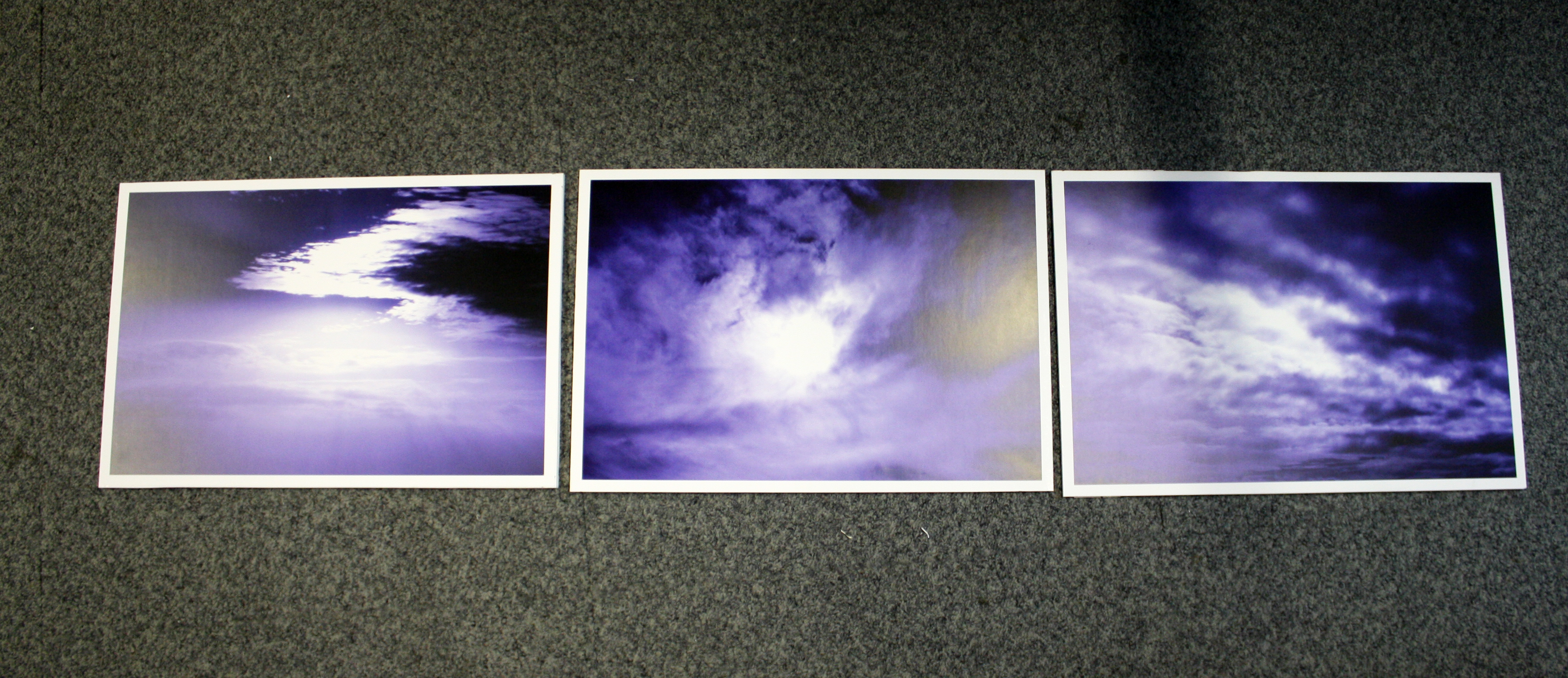
These three images I especially like as they depict not only light, but the role, purpose and significance of light within this world. I believe the sequence as presented within the display above is important because it almost represents the stages of light entering the world – firstly the emergence of light, the presence of light and finally the disappearance of light as it fades away. This triptych shows therefore the stages and process of this change from a spiritual and yet scientific viewpoint.
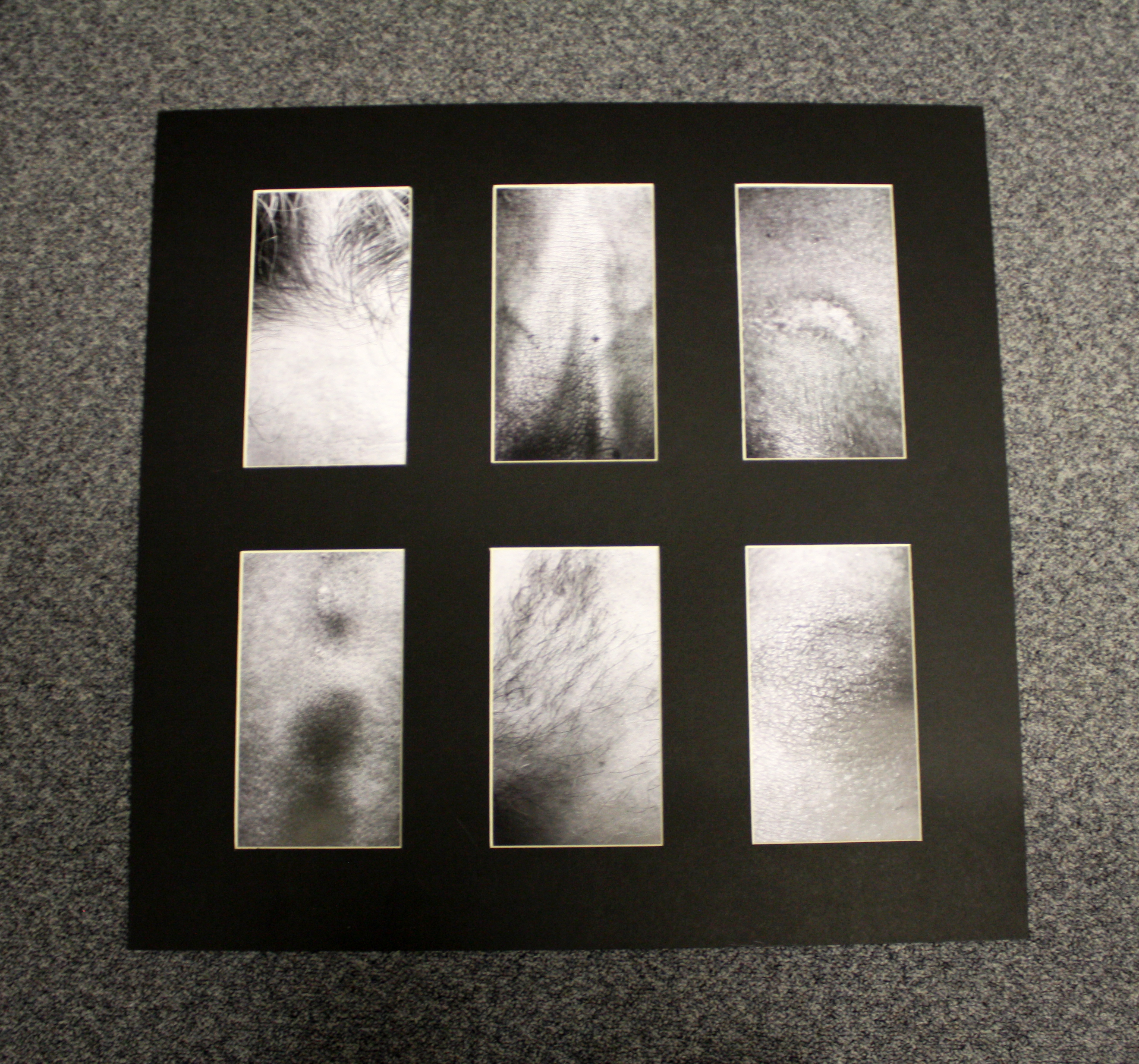
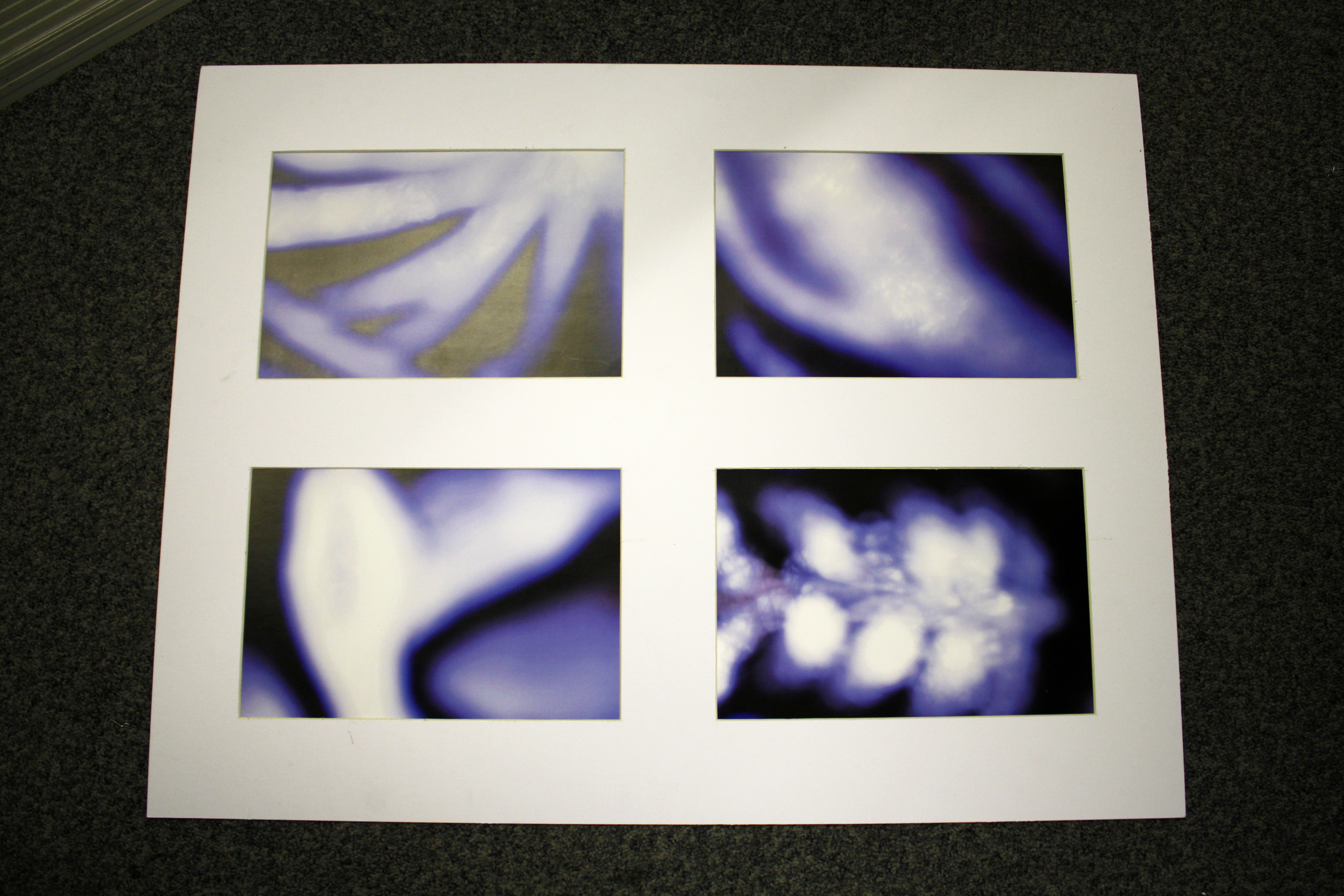
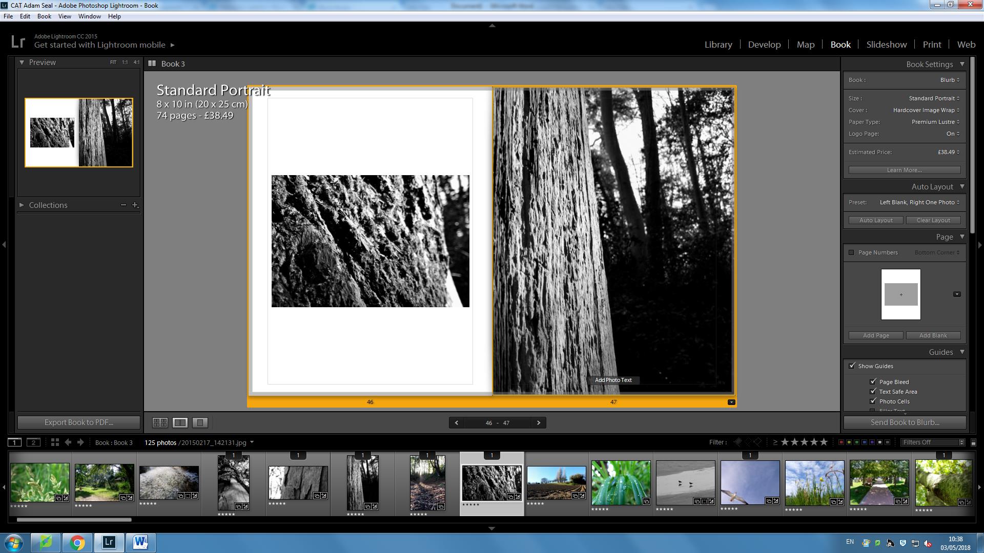
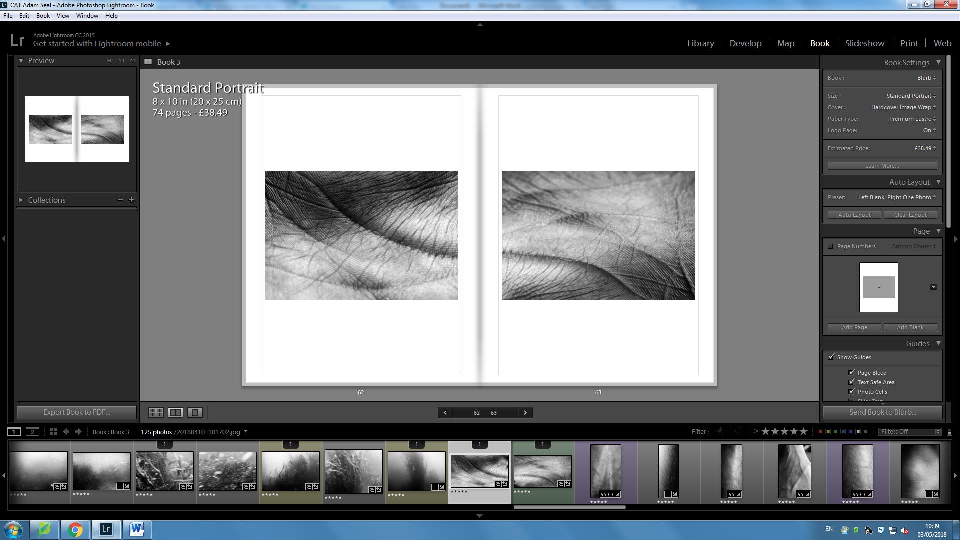
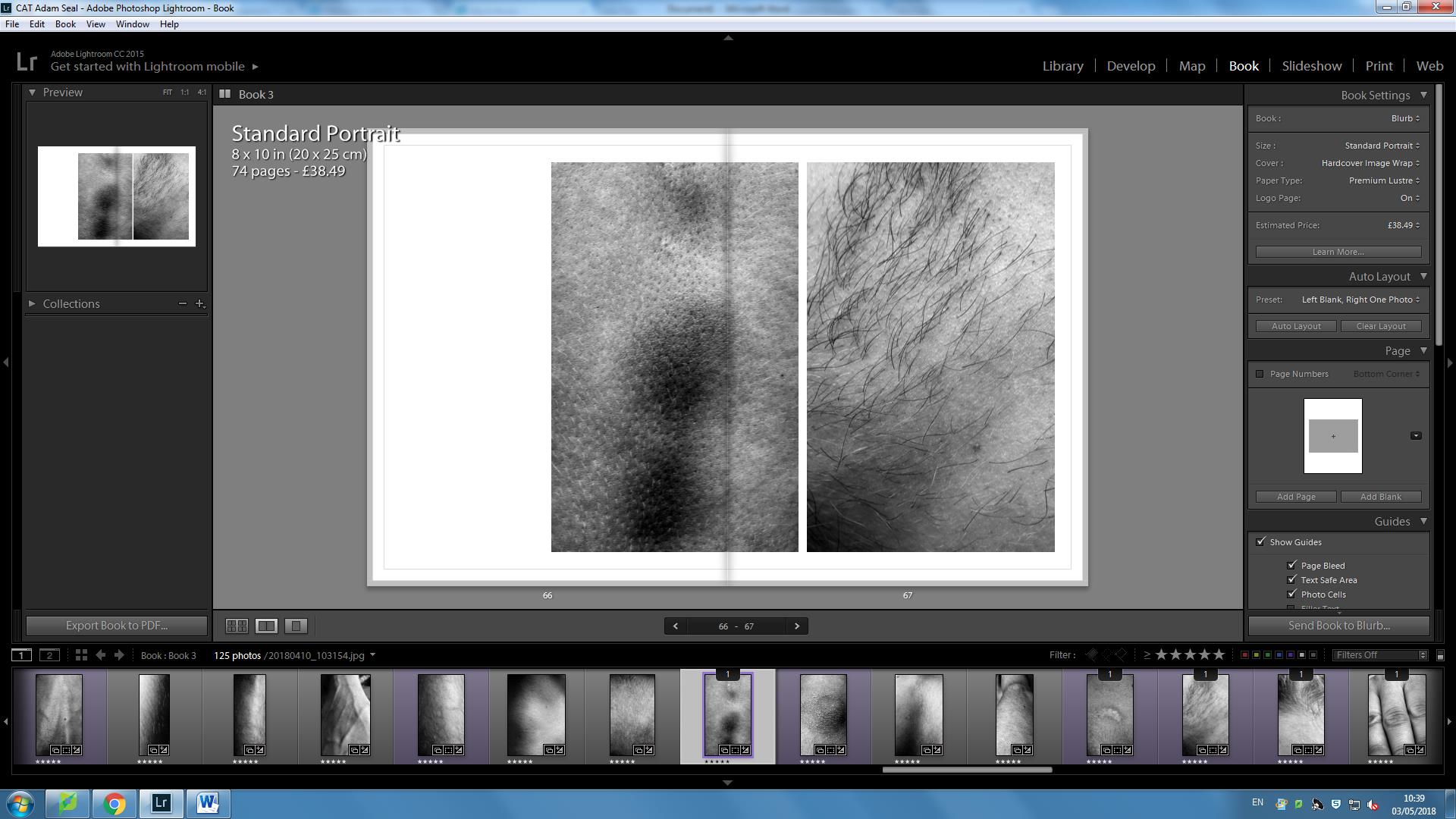
These 6 images are arranged so that compliment one another’s textures of bodily tissue. The textures appear particularly sharp, detailed and refined and I believe that by having six, thinner strips, this helps emphasize whats in the image through the style of framing. Furthermore, I arranged each image so that the darker tones would be simultaneously reveal-ant at having a balanced shade, whilst also maintaining strong lines of symmetry within the image.
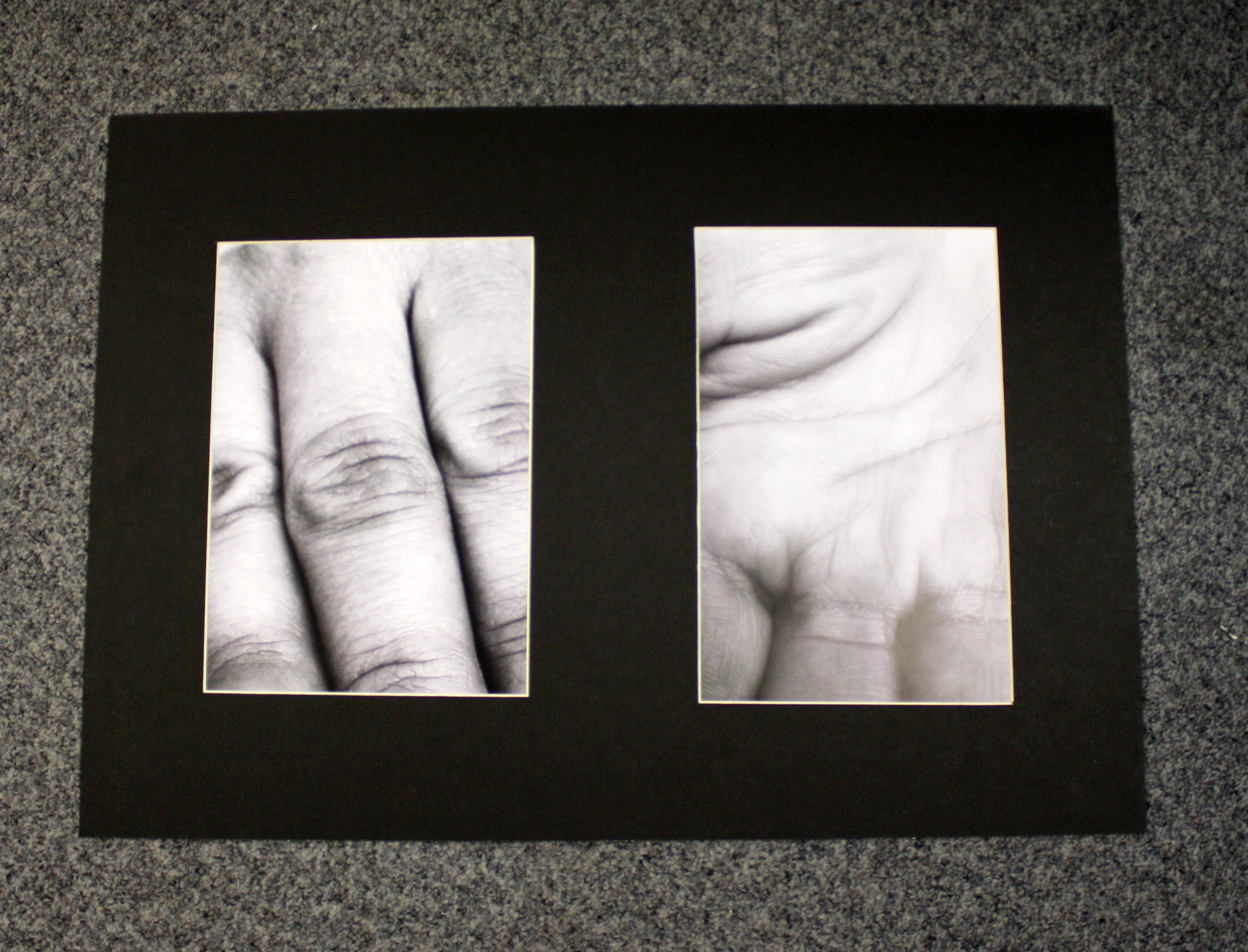
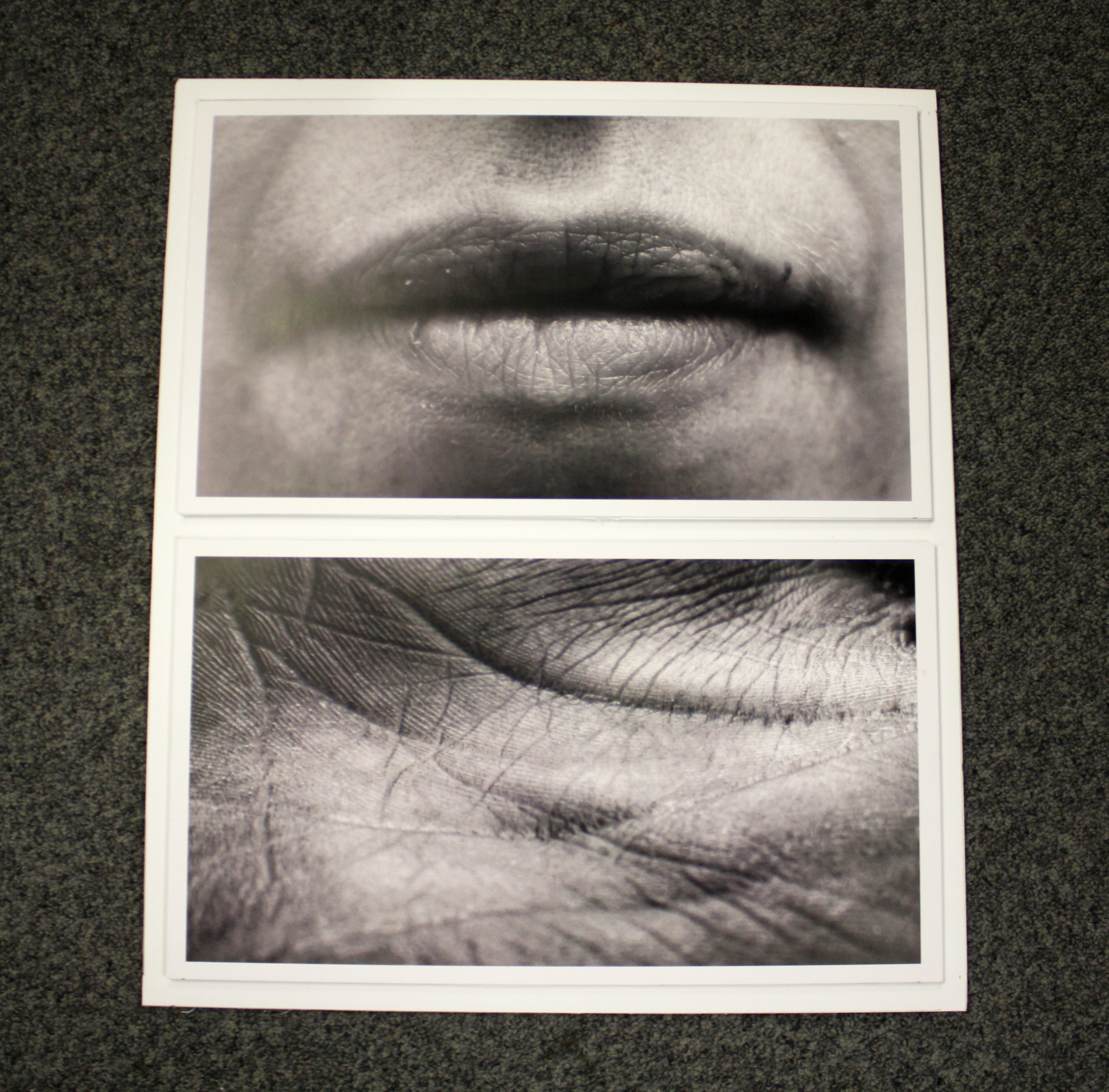
I particularly like these two images sequenced together. On the left are the fingers – the external, on the right is the palm – the internal. This contrast allows us to see the creationist, distinctive qualities that occur on different sections of the same body parts. I chose to have a strong, black border because I believe that this coincides effectively with the strong contrasting levels within both images – almost as if we as humans are curious to find out the depths and mysteries of what is beneath the skin.
These images I put together because of how they reflect the distinctive qualities from organism to organism. I have captured very distinct markings that act as evidence for each person whose skin it belongs to, adding symbolism to the creationsit story that it still occurs today. In doing this I am linking creationism and evolution together.
I particularly like these images. I found the white photo frame not only brings out the white tones, but also is very effective at proving stronger depth to the contrasting darker tones. As this happens, I like how the flow of white acts almost as like a circle within the squared photoframe that is important as it not only shows the relationship of light, but also furthermore the cycle of light as it changes.
The book published in 1912: “Concerning the Spiritual in Art” explores improvisations and compositions as an alternative to impressions which are based in external reality, improvisations and compositions are images that encapsulate images that arise from unconscious viewpoint of life and the world. Kandinsky associates the spiritual life of humanity to a pyramid with various levels of spiritual hierarchy that emerge before one can be fully connected to the surroundings of the unconscious. During low periods, the soul sinks to the bottom as humanity searches for external success ignoring soiritual forces. This has been a long term key concept for my work, as within my spiritual images, I have tried to reconnect people’s relationship with nature by looking at how and why we are here. I have therefore used this concept to explore the origins of life and being.
Furthermore, Kandinsky has further influenced me because his strong emphasis on colors is a method he uses to invoke the spiritualism that art creates. However there is a very fine line between spiritualism and fantasy/fiction, therefore its important to not use spiritualism as a name for exploring fantasy, spiritualism must be about capturing spirituality that comes from experience. Kandinsky’s colors evoke a double effect: Firstly a physical effect which is charmed by the beauty of colors. However secondly this effect can be deeper, causing a stirring of the soul as Kandinsky calls it: “inner resonance”— which is essentially a spiritual effect in which the color touches the soul. This is called “Inner resonance” because it is art that directly communicates with the soul. This has also been my ambition particularly in my shots where creationism was mostly established with plants etc, I have tried to use color that can communicate to the soul.
“In the first place one receives a purely physical impression, one of pleasure and contentment at the varied and beautiful colors. The eye is either warmed or else soothed and cooled. But these physical sensations can only be of short duration. They are merely superficial and leave no lasting impression, for the soul is unaffected. But although the effect of the colors is forgotten when the eye is turned away, the superficial impression of varied color may be the starting point of a whole chain of related sensations.”
Gary Fabian Millar
I recently came across this book which has also further inspired me. From page 152-167, Gary Millar explores taking images from photo paper against a church window, which captures the light from the moonlight over night. The dark blue of the Petworth windows correlate successfully with Johann Wolfgang Von Goethe’s color wheel which was designed to symbolize the life of the human soul and spirit. Millar relates his images to ” The idea of thought or spirit as matter, and vice versa, is underpinned by the doctrine of monism – the thesis that all of reality is of one kind”.
Fabian Millar isn’t someone who specifically sees himself as religious, however his work clearly relates to spiritual thinking. Unlike his work “The Sea Horizon“, the locations were to be imagined as Utopia as within these images, there is a sense of having no boundaries. Through Millar’s work, there is a strong sense of abstraction as well as surrealism which building from Kandinsky, “communicates universal spiritual values”. This means that there are underlying spiritual features that unite everyone within the world, regardless of whether they are religious or not. It is therefore the role of artists to bring this to attention. Millar has captured images of spirit, for example ” the blue circle indicated the realm of the spirit, the yellow triangle its earthly, intellectual opposite”. This is done in response to Kandinsky who established representational and the non representational imagery who was in turn response the Theosophist (focusing on the attainment of direct, unmediated knowledge of the nature of divinity and the origin and purpose of the universe)Rudolf Steiner. It was these 2 coherent theses that Millar was able to produce his images that directly relate to the spirit.
In terms of method and also theory, Millar like Kandinsky has also been very influential to me in this project as both have helped me to create images that aren’t just physically nice, but from a spiritual point of view have a meaning that ensures the viewer can recognize that spirituality does have an impact within this world and its process of creationism and evolution.
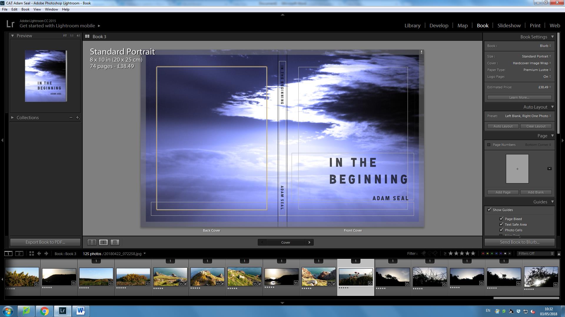
This is my book cover. The title “IN THE BEGINNING” is important because these are the very first words that are written in Genesis and the viewer also opens up to Genesis 1:1. The title is also symbolic as to what I am representing within my book in terms of the story of creationism and how this includes contrasting elements of evolutionist factors.
Throughout the book, I have divided my book into 7 chapters, each relating to the order of how the Earth was created, element by element. This structure was important to me as it not only is a visual attempt to record spirituality, but also is symbolic as the idea of evolution is continuous change and adaptations and I feel that by as well as documenting pirituality, including these chapters in chronograph also represents the how succesfully as well – relating to evolution.
I chose this image as a double page spread to start the book off after the Bible quote because for me it shows not only the expanse of the Earth, but retells the story accurately of how all the elements began forming as the Earth was being molded together.
I put these images into 4 squares as a sequence because I like how it shows that order was being installed in each element of the Earth to reflect how it was created for its specific purpose. The sequence shows the haste and speed of creation as well.
This was part of my second chapter as part of light. Within the sky, it appears as if there is an explosion with light rays branching out in all directions. I believe that by having no border reflects how the light is never ending. This is almost presented as light having no limits and that is a basis for all evolutionist change since.
This is also a double page spread as it shows the after effects of the first big explosion and strongly acts as a metaphor the evolutionism’s very existence to exist. Contrastingly, we have change occurring from the previous double page spread and my message for this is that evolution is a natural part of God’s plan for the world and evolution also can have spiritual links as well.
This double page spread depicts how the water was formed from the sky and forms a basis for chapter 3 for water. I have consistently used the idea of emphasisng infinite power and wonder within my images to reflect the power of change is direct evidence that there was a creator at the beginning of the universe and there is the same creator still creating today.
I went for a 3/4 page for this underwater image because the image was quite grainy due to the environment in which I shot in. Although I like the grainyness as it brings out the individual elements, I wanted to ensure a smoother relationship between the two.
This chapter replicates how land and the sea had been separated after the sky and the sea was separated. I believe up to this point, I have showed gradually the very evolution of the process of creationism as gradually my images in the book have started as showing elements that aren’t Earthly and eventually have started to appear more Earthly as we go further into the book.
This chapter focuses more on the idea of plants and vegetation. In these images I am focusing more and more on scientific, individual elements to show the very detail, advanced sophistication that creation covers. I put these images together. The layout appears almost as if both branches are connected, although they aren’t. This is symbolic as it shows how everything in nature is so well connected, despite differences in each smaller individual element and larger being , and how everything is in sync which is how ot was created to be. Thus this allows for change and evolutionary advances to occur.
These images I put together as they show the individual element that live off the tree from an up close point of view but also to view the tree as a whole, showing how all these scientific elements make up a being that is beautiful and pure
This image is part of my animals chapter where I look how life is becoming more potent within the world. I took an image of a bird flying over and within the bottom right corner, a bird is flying through. I like this because it communicates the idea that change and evolution is happening at a faster rate, however it is driven by spirituality.
This is part of my chapter of humans. I put these images together as a sequence because I like how the line of the hands are joined, although they aren’t joined because they are two separate images. I am trying to communicate here, that when you biologically link up the dots, then you have a wider picture that makes you surprised and curious of further wonders and mysteries of the Earth.
Likewise with my plant images, I believe these images appear quite scientific, almost as something microscopic. Although these are macro shots, I believe they appear strongly spiritual as there is a sense that although they appear human, it is hard to distinguish what they are. Therefore in a sense towards the end of my book, I have started to go back to depicting strong levels of spirituality within my images. Although I have done this throughout my book, by going further in taking spiritual shots towards the end of my book is significant because it shows life and change as a cycle, with one of where change and creationism, fueled by spirituality is at the very center.
I am very happy with the final outcome of my exam project. The ideas that I began with have been fully explored and developed throughout. My initial ideas to explore the concept of freedom was to focus on the freedom of how we view the world in our unique perspectives. I started my researching and exploring spiritual concepts within photography and how everyday situations can be a thing of beauty. My idea was to fragment certain scenes and to capture them in an abstract way. I looked at the artist Laura El-Tantawy and her own unique persepctives. I really liked her abstract, artistic images full of colour and I used her ideas as inspiration for my shoot. Here are some of the outcomes of that shoot.
After looking at the photographer Laura El-Tantawy I came across the photographer Rinko Kawauchi who I used as inspiration for the rest of my project. Her images are very spiritual and pure and have a sense of freedom within them. I looked at many of her series and focused a lot on her ideas and way of viewing the world. I used Kawuchi as inspiration to create an experimentation video focusing on nature. I wanted to do this to create a starting point for my art film that I wanted to create based on this concept of making insignificant things beautiful.
Since I was looking at the concept of freedom of expression and the freedom of viewing the world in our own way I researched a project called the Disposable Camera Project.The disposable camera project draws in on the idea of freedom of expression because it allows people to express themselves and show their own unique outlook of the world thorough photography. A disposable camera allows people who may not be use to using a camera to be able to very simply capture a scene or a scenario they find beautiful or interesting. It gives them an easy way of expressing themselves. After researching the disposable camera project, I wanted to use the idea myself and I did a shoot using a disposable camera. Here are some of outcomes of that shoot.
After doing the disposable camera shoot I did a shoot using Rinko Kawauchi as inspiration. I tried to create images containing a spiritual meaning and things with purity and beauty. I was very happy with the outcome of that shoot because It linked closely to my main idea of portraying insignificant things in a beautiful, unique way. Here are my favorite outcomes from that shoot.
After doing the experimentation shoot using Rinko Kawauchi as inspiration I started focusing more closely on certain scenes and objects to capture such as the sea, plants, the sky and the body. For each scene and object I focused closely and fragmented particular areas that I wanted to focus on. I kept linking my work to Rinko Kawauchi’s images to compare my viewpoint to hers. As well as focusing on nature and the body, I started to combine the two areas to capture unusual and interesting images such as the one below. After doing all my photo shoots and collecting my images I started creating my photo book and experimenting with different layouts and proportions of images. I looked closely at examples of Rinko Kawauchi’s books such as Amersuchi and Illuminance because the images and meaning relates well with my project. Whilst developing my photo book more I started focusing more closely on my art film based on the same concept as my photo book. After watching the film The Tree of Life, I researched more about the ideas behind it and began developing my own ideas for my own film. I started by collecting short clips of certain scenes that were insignificant yet beautiful. Here are some of the short clips that I collected. After collecting a substantial amount of clips I collaborated them together to create the film I had imagined.
Video Player
Media error: Format(s) not supported or source(s) not found
After looking closely at and evaluating Rinko Kawauchi’s book more called Illuminance I finaly finished the layout of my photobook Wabi Sabi which I was very happy with. I then decided on which final images to display as sets based on what images worked well together and represented my project best.
In this blog post, I want to look at the distinctive properties that water holds itself. In doing this,I want to establish the scientific properties that are found which I can relate and compare to spiritual properties pf water based on my observations with a viewpoint from someone who is also trying to translate his faith in his work by finding not just the beauty, but also the dynamics of why change in nature occurs which from a creationist point of view, is all linked back to the book of Genesis. Therefore in this post, I also hope to contrast this by providing factual information on water properties, but also to give you the viewer a viewpoint on the alternative side of water. Within my images of water, I have wanted to include elements that relate to both the scientific but also the spiritual depths of the realms of this world which include close up elements, showing how they function. Then by comparison, I have taken a wider spread, zoomed out landscape to show and explore how these elements make up the whole environment as one which allows us to compare each elements role within the natural cycle of life. This relates to evolution because it explores how the process of change occurs whereas from a spiritual/creationist point of view, these underwater images are also a clear demonstration that by observing the beauty, magnificence, awe and wonder that is surrounded engulfs nature, this could mean that change in nature occurs because the Earth is going somewhere, somewhere similar to where its been before which could be why evolution occurs – linking both theories together.
Water is a transparent, tasteless, odorless, and nearly colorless chemical substance is crucial in providing and ensuring life on earth through survival. It is interesting how scientific properties of water provide life which in itself is hard to be scientifically defined as life is arguably something on the border of the spiritual realms. This is backed up by the fact that all life has water contained in their biological cells which allows for chemical reactions to take place, that are part of the processes for change within nature. These chemical reactions include within animal bodies of metabolism and anabolism, catabolism – all processes that break down, distribute and regulate the amount of molecules and acids within the body as one. This here is the argument for creationism that every individual element is so well coordinated that the creator is still in action to this moment. Water is also essential for the photosynthesis and respiration to occur – where the sun’s energy combined with the water allows for plant life to multiply. Therefore it appears that all the chemical elements (representing the how) are all working towards a common place (representing the why). Although we don’t the specific reasons for why, by examining the beauty and power of nature, can we understand that we are not an accident but have our purpose to be spiritually connected and in tune with nature and if we do that, we can also have greater involvement for the process for change in nature for the better.
The sea’s force is overwhelmingly powerful, how is it that chemical bonds all acting in coordination, can be so lethal? I believe that many humans are unaware of the power and dynamism of the sea. As it is one of the most powerful forces in the world, the sea plays a great role in the process of change within the natural environment on this Earth – breeding and also ending lives. Floods and Tsunamis have killed countless lives throughout the history of mankind. The randomness and chaos that evolves around free moving particles are very interesting as despite the idea that all particles are coordinated, there are arguments that the randomness of the seas reflect how evolution itself is the why in which change occurs and that is that. The sheer range from sharp, crystal whites to plunging dark depths of the deep sea, I have also tried to include in my work as well which highlight the endless power of the sea. However also in doing this I wanted to show the importance of the sea as well, symbolizing as humans are increasingly reliant on it, the rules of the sea will always dictate and influence the way nature occurs whether that is by spiritual reasons or by accident.
For centuries humans have held suspicions of what the sea actually accommodates in terms of myths, exploring the facts vs the fiction. 71% of the Earth’s surface is made up of water, allowing for unknown life to exist. This is important to recognize and note within my project because the spiritual realm doesn’t have boundaries, and as nature is so well connected with the spiritual forces dictating how change occurs, this reflects not only the endless power of nature, but also most importantly how we will never know the reasons for change and thus shall never be able to fully as humans influence nature as much as spiritualism does. This sense of mystery and the unknown is strongly linked to the title “Freedoms and Limitations” because we don’t know the depths of spirituality, but we do know its power and intervention within nature. Likewise we know how change occurs, but contrastingly we don’t know what the purpose for change to occur is in the end.
My book Wabi Sabi is about the freedom of viewing the world in our own unique way. Its about capturing the insignificant details that we would usually ignore or not notice, and appreciating the pure and spiritual elements of the imperfect details of our lives. The Japanese term, Wabi Sabi fully explains what the series is about in a simple way. The definition of the term, “a way of living that focuses on finding beauty within the imperfections of life and accepting peacefully the natural cycle of growth and decay” concludes the project well. Throughout the book I focus closely on the tiny details of objects and scenes that we witness all the time. An example of scenes that I’ve included is the Sky at evening time, and the movement of the sea. Within these scenes Ive focused on and framed particular elements that interested me. My aim was to fragment specific details that were insignificant yet beautiful.
I wanted my book to be simple yet powerful. I wanted the images to make the viewer think about what they are looking at. My aim was to create a thought process in the viewers mind to make them reflect more on the imperfect and insignificant details of our day to day lives.
For the front and back cover I wanted an image that would draw the viewer in. Something that wasn’t too busy but had an appealing aesthetic. I am very happy with the cover that I choose because the warm colour is calming and links with my theme of spiritual connotations within tiny details. I choose to use a small font size for the title because I didn’t want it to over power the image. The image was meant to be the focus point and I believe I have achieved this.
I wanted the style and genre of my book to be in a similar style to Rinko Kawauchi’s book Illuminance. Her book is simple and flows really well from image to image. Although her images don’t link immediately, the colour, texture and form of each image leads onto the next in some way. This is what I wanted to achieve within my photo book. I wanted to create a narrative within the book using the sequence of images as the story line. The aspects that I linked from image to image are colour, shape, tone and subject. I didn’t want images placed next to each other to be too similar, but I also didn’t want them to have no connection at all.
Most of my images are colorful because I wanted the viewer to be drawn in by the use of bright, pale colours. Although I wanted to stick with an overall aesthetic throughout the series of images, I also wanted the book to contain some contrast. I did this by also including black and white images to change the sequence and flow slightly. I choose specific images to be presented in black and white because they contained a lot of detail, such as the close up image of the skin. Since the image had a lot of detail, it was interesting enough without the use of colour to draw the viewer in.
The images above and bellow are examples of different connections I made between images. The image above contains an unusual perspective of a foot which contains wrinkles and decaying skin. I choose this image because it represents my project well because I’ve captured the beauty of an imperfect thing. The other image is a close up of water. The movement, reflection and shape is what I aimed to capture within the image. I decided to place these two images next to each other because of the texture and shape. The structure of the skin, and the shape of the wrinkles on the foot connect well with the shape of the water.
The image below is another example of a connection I made between two images to create a flow and narrative. Both images are close ups of particular objects that we see everyday. The image on the left is a close up of a flower, and the image on the right is a close up of a hand. Although the objects a completely different as subjects, I managed to make a connection between the two images by linking the shape, colour and texture.
I am very happy with the final outcome of my photo book because I have managed to portray and represent my ideas and way of thinking very well. My main aim was to create a book that made the viewer reflect on each image and make connections with what they see in the image in their own lives. I wanted to focus on the tiny details which I have managed to do very well. I also aimed to express the beauty of things that we viewed to be imperfect.
Here are the Final displays of my printed images for my project based on Freedom. When choosing what images to display I went through all my final edits to pick the best ones that worked as a group. I decided to focus on two separate, contrasting displays.
The first one is based on the theme of how we see the world. I’ve focused and fragmented different scenes that are simple, unique and normally not noticed or ignored. I’ve photographed them to make them look beautiful and visually pleasing. I’ve used bright, pale colours to draw the viewer in. I wanted to display a set of six images size A3 for this series. I choose these images because they work really well as a group with the contrasting colours and shapes. Ive positioned the images with warm colours in a zig-zag, and the images with cool colours in the same way. I really like how this set of images have turned out, and they compliment my book really well.
For the second set of images I decided to use size A5 to print the images out because it caused the viewer to focus more closely on the images. I wanted to stick with a certain theme for my second display, so I decided to focus more on the body and the tiny, insignificant details within it. I again choose to display the images as a set of six because they complimented each other really well. I made sure I choose a set that were contrasting, containing different angles, fragments of the body and tones.
Overall, I am very happy with my final set of images and displays because they compliment and show a variation of images that are in my photo-book, Wabi Sabi.
The film, The Tree of Life was my main form of inspiration for this experiment. My goal was to create a film full of scenes of nature during evening time as an experiment for my project Wabi Sabi. The Photographer Rinko Kawauchi is another source of inspiration that I used for the film. Her style of Sublime photography really suited my theme and idea. To create the film I need to capture a lot of imagery of a few second shots of different things such as light, the sea and everyday events. An idea for the film is to use a subject, a model, as the focus of the film. The film would be about the different things that occur throughout the evening through nature. The title, Before the Sun goes works really well with the idea for the film because I am capturing the beauty and specific details that happen in the evening, before the sun sets. I decided to use a subject within the film because it made it more interesting and showed more of a story line by using the subject to symbolize the sun disappearing. In the last part of the film, the subject is seen running away towards the sea. My reason for this was to create a visual and symbolic link between the subject and the sun. As the sun was setting, the subject was also running away. Overall, I am very happy with the outcome of my film, Before the Sun goes, because it ties in well with my overall project and shows a thought process and story line behind my theme.
In the book Concerning the Spiritual in Art Kandinsky writes about the spiritual effect color has on a person. In the first paragraph of the chapter The Psychological Working of Color Kandinsky writes about how if you let the eye stray over a palette splashed with many colors it produces a dual result. Kandinsky goes onto say
“In the first place one receives a purely physical impression, one of pleasure and contentment at the varied and beautiful colors. The eye is either warmed or else soothed and cooled. But these physical sensations can only be of short duration. They are merely superficial and leave no lasting impression, for the soul is unaffected. But although the effect of the colors is forgotten when the eye is turned away, the superficial impression of varied color may be the starting point of a whole chain of related sensations.”
Kandinsky then goes onto write about how different colors and different shades of color can have a different affect to a persons soul. For example hes one red would prove exciting and another would cause pain or disgust through the association with running blood. A bright yellow may look sour because of the association to the taste of a lemon. He also goes onto say there is a link between color and musical notes. For example he says “it would be hard to find anyone who would try to express bright yellow in the bass notes, or dark blue int he treble”. I find this very true when visualizing music personally I picture darker colors for the bass notes and brighter colors for the higher tremble notes.
Kandinsky also goes onto say that chromotherapy, which involves stimulating the brain with different colors, has had definite influences on the whole body. Red light stimulates and excites the heart, blue can cause temporary paralysis. However when tried on animals and plants this no affect. Which Kandinsky goes onto say:
“Generally speaking, color is a power which directly influences the soul.”
“Color is the keyboard, the eyes are hammers, the soul is the piano with many strings. The artist is the hand which plays, touching one key or another, to cause vibrations in the soul.”
Michelle Sank is a contemporary photographer born in Cape Town, South Africa. Her biography on her website reads: “Michelle Sankwas born in Cape Town, South Africa. She left there in 1978 and has been living in England since 1987. Her images reflect a preoccupation with the human condition and to this end can be viewed as social documentary. Her work encompasses issues around social and cultural diversity.”
Sank is a photographer who has the ability to, so poetically, tell a subjects story so well through her ability to interact with her subject to make them feel comfortable in order for them to feel comfortable to perform for the camera. Sank relies heavily on body positioning and facial expression to tell a narrative i her images.
In particular, I will be looking at Sank’s project that consists of 18 individual images which each tell a story of one individual. The project is entitled ‘In My Skin’ and is a very poetic and truthful series of images which focuses on one subject per image and tells their story through that one image. Each image is very similar to the previous in the way it is constructed and this is a deliberate attempt at telling a consistent narrative that is understandable.
In the project, ‘In My Skin’, Sank visits the houses of a variety of people across Britain who are either thinking of having cosmetic surgery or have had it in order tot change the way they look. She sets out to tell each of their stories and achieves this through an intimate relationship between herself, the camera and the subject. On her website, the project synopsis reads: “These images are from a project called In My Skin about young people under 25 in the UK who are challenging their body image. I am looking at those who have had or are considering having cosmetic surgery in order to become more acceptable to themselves and achieve their ideal of being ‘beautiful’. Social consensus in Western society today is particularly focussed on physical beauty and achieving and maintaining the “perfect” face and body. Intertwined with this I am also documenting body dysmorphia as young people try and conform to this social expectation resulting in eating disorders and body transformation. Lastly I am documenting transgenderism and the struggle young people have to live within a body they were born into but have no affiliation with.”
The images are very elegant and can also act as typologies because of the way they are presented and the similarity between them all in the way they are constructed and framed. Each image is photographed in the subject’s bedroom and Sank positions them exactly how she wants them to come across to the camera.
I will be using Sank as inspiration for the way I take my own photos and although I will not be covering as hard-hitting topics, I hope to be able to present my subjects to the camera in the same poetic way.
Sank’s images are very raw and look as though the have been edited very minimally and I would imagine Sank has done this as she feels the actual content of the photographs speaks for themselves and therefore, did not want to over-edit them to the point that it removes their meaning. In my own images, I will only be editing them very subtly to enhance any necessary factors such as highlights, shadows, exposure or the black and white leveling because I do not want to distort them to the point that they lose their meaning that should be told through the way the subject present themselves to the lens.
As well, Sank uses bedrooms as her studio and in particular, the bedroom of the specific subject she is photographing because this is where they feel most comfortable and therefore, the truest representation of them can be expressed and it becomes a very personal series through photographing in such a personal space.
For my own set of images, I will be using the street as my studio as I will be creating street fashion photographs that show the behavior of boys when given the opportunity to roam free and act however they want.
Sank also uses the ‘gaze’ of her subjects to tell a narrative and this is a very powerful tool to use in order to get across a message and allow the audience to feel a a sense of connection and inclusion into their story trying to be told. Through the subjects gaze into the camera, the audience can easily connect with them and feel a sense of sympathy if the content is as raw as what Sank has explored.
Looking at Sank’s work will allow me to better tell a narrative through my images, which, although doesn’t necessarily have to follow a clear narrative, I will be able to better take images that are more expressive after examining the work of Sank and the methods she uses to create poetic works as shown in this project.
Laura Pannack
Laura Pannack was born 12 June 1985 and is a British social documentary and portrait photographer, based in London. Pannack’s work is often of children and teenagers.
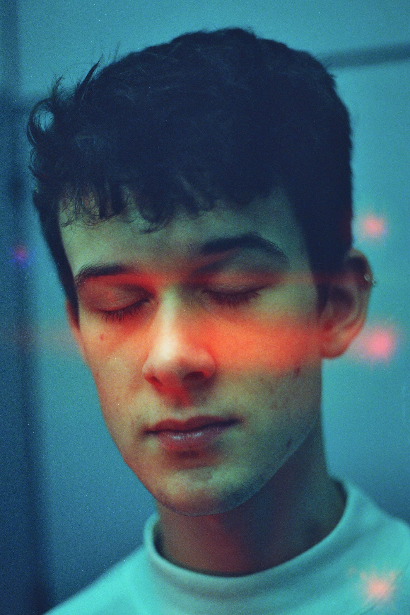
Laura Pannack, like Sank is a modern, conceptual photographer that has the ability to photograph a subject so elegantly to tell their story. Something that is evident in Pannack’s work is her use of very soft colours and tones as well as a use of very soft focus around the subjects existence in the forefront of each frame where, most of the time, Pannack captures them either looking directly at the camera or facing the camera with their eyes closed.
This effect of the subject closing their eyes in the photo is something I will be trying to up-take and emulate in my own work because I feel it adds a very subtle and elegant tone to the imagery and a compelling mood is achieved when the subject eyes are closed because the audience feel a sense of inclusion in the image – that when looking at the subject closing their eyes, we are included in the thoughts they are thinking. I will using this technique of the subjects closing their eyes in a couple of my images so achieve a look of vulnerability – that when they close their eyes, they become more vulnerable as they become unaware of the happenings in front of them due a deep focus in their mind about their thoughts. This sense of vulnerability is something I wish to capitalise on in my project to show that boys are not always confident and boisterous freaks of nature that don’t fear anything and instead, through particular photographs of them with their yes closed, a much more vulnerable state of their personality can be shown.
Pannack, like Sank focuses on telling her subjects story and focuses on the audience ability to connect with what the subject is experiencing in the frame. Both photographs focus on the notion of a gaze from the subject in the image to aid the narrative that can be told. When a subject gazes at the camera and in-turn, the viewer, they achieve a very somber effect that often works very well to present a mood. A gaze can not only be achieved through the eyes but through the other facial expressions of the subject and how they rest the other feature on their face to bring the attention to the eyes. A gaze can also be achieved through body positioning and body expression and the use of hands to help create meaning is also very effective.
Pannack’s work has been shown in three solo exhibitions and contributed to a couple of publications. She has received a number of awards, including a first place in the World Press Photo Awards in 2010, the Vic Odden Award from the Royal Photographic Society in 2012, and the John Kobal New Work Award in 2014. Pannack has also worked commercially for The Mental Health Foundation, Save the Children, Oxfam, Dove, Samsung, Barclays and Vodafone.
Pannack’s notable personal projects include The Untitled,Young Love and Young British Naturists. For her personal work Pannack largely uses a film camera and I believe this is noticeable in her work because of the very soft and subtle colour tones that look quite faded – an effect achieved from shooting on film.
The video above shows Laura Pannack at Nicer Tuesdays – an event by It’s Nice That which invites exciting creatives to share short, sharp insights to recent projects, aiming to inform and inspire. Pannack in this video, talks above her recent works to an audience and shows her processes and the meanings behind what she does.
In an interview with The British Journal of Photography, Pannack describes her processes on how to take a good portrait photograph and the thought behind taking compelling portraits that for so many, seems so simple but the methods Pannack uses shows her professionalism and dedication to creating the quality of portraits she does. BJP writes in their article, “dedicated to developing strong relationships with her subjects, Laura Pannack’s work is always a collaborative endeavor between artist and sitter.” This resonates with me strongly because I too believe that to create a strong portrait image, the collaboration between the subject and artist is vital because from this relationship can become a developed bond between the two of them in order to create the right portrait to tell their story. Pannack’s interest in youth culture is evident in her work and BJP highlights this in their article.
Pannack’s focus on documenting youth culture is another reason I have decided to study her work. Fro m observing the way she photographs this particular sub-culture will give me a sense of understanding to go and do it myself as I too will be photographing the youth of Jersey – youth are often ignored in this newly-developed political society that is now so focused on the present and the views of elders and the empowered at a time where the economic states of our country is the most talked about subject for last two years.
In Pannack’s project entitled ‘The Untitled’, she aims to “challenge the sweeping generalisations and often negative perceptions of teenagers held by many, by capturing the individuality of each of her subjects.” In her portraits which she confesses to often titling the name of the subject pictured, Pannack’s aim is to show to her viewers that these people are unique individuals, not just as part of one single group.
BJP also asked Pannack, what, for her, makes for a compelling portrait and Pannack answered, “for me, a compelling portrait is one that provokes emotion and encourages an attachment. I like the idea of a threaded connection from subject, to photographer, to viewer – one that flows effortlessly and connects all three.” For me, this is very true and I agree with this strongly because it reiterates to the gaze that not only myself, but many other conceptual photographs attempt to achieve in their images. The gaze of a photographer on their subject is shown through the release of shutter on their camera and this gaze is then carried on to the subject that, in their image, gazes at the viewer on the other end of the photo. This is what I will be attempting to achieve in my portraits of young people.
James Greenhalgh
James Greenhalgh is another conceptual photographer and is British, like Pannack an again focuses on youth culture of England to create a range and sense of consistency I his work – photographing youth is his specialty and being young himself, this allows him to connect extensively with his subjects in order to create a collaborative process which results in images that show another side to teenage Brits that people often don’t see – Greenhalgh highlights the youth of Britain in his soft images that are a mixture of black and white images and colour images.
Greenghalgh’s work is of such a similar nature to Pannack’s that he was picked out by The British Journal of Photography to shadow Laura Pannack on an exclusive BJP portraiture commission.
BJP writes: “After a lengthy judging process, Laura Pannack has selected 18-year-old James Greenhalgh as the winner of a competition to shadow her as she shoots Separation, a series of portraits commissioned by British Journal of Photography. Separationexplores the angst and myriad emotions experienced by London-based couples who, as a result of Brexit, have been forced to contemplate separation.”
Greenhalgh is currently in his first year of studying Photography at London College of Communication. However, it was his A-Level project, Tungsten, that caught Pannack’s eye. A series of portraits of teenage boys, Tungsten seeks to break down the mask of masculinity and show the beauty and sensitivities that lie behind. And this seen, this is why I have chosen to study James Greenhalgh as his interests in photography lie within the opportunity to collaborate with his subjects, and in particular, teenage boys to show the sensitivities that exist beyond the face of masculinity that is often so forced in an attempt to fit in to society that sets, on a regular basis, the standards and ways boys should behave and act.
Greenhalgh was asked what appeals to him about portraiture and his reply to this was, “The connection that you share with the person you are shooting is so precious and special. For somebody to open up in front of you and be themselves without fear or judgement (with or without a camera present) is truly beautiful, especially in a world where everybody is putting on a mask or persona in an effort to appeal to others. With portraiture I feel I can capture that organic moment.”


 After doing all my photo shoots and collecting my images I started creating my photo book and experimenting with different layouts and proportions of images. I looked closely at examples of Rinko Kawauchi’s books such as Amersuchi and Illuminance because the images and meaning relates well with my project. Whilst developing my photo book more I started focusing more closely on my art film based on the same concept as my photo book. After watching the film The Tree of Life, I researched more about the ideas behind it and began developing my own ideas for my own film. I started by collecting short clips of certain scenes that were insignificant yet beautiful. Here are some of the short clips that I collected. After collecting a substantial amount of clips I collaborated them together to create the film I had imagined.


 Sank also uses the ‘gaze’ of her subjects to tell a narrative and this is a very powerful tool to use in order to get across a message and allow the audience to feel a a sense of connection and inclusion into their story trying to be told. Through the subjects gaze into the camera, the audience can easily connect with them and feel a sense of sympathy if the content is as raw as what Sank has explored.
 This effect of the subject closing their eyes in the photo is something I will be trying to up-take and emulate in my own work because I feel it adds a very subtle and elegant tone to the imagery and a compelling mood is achieved when the subject eyes are closed because the audience feel a sense of inclusion in the image – that when looking at the subject closing their eyes, we are included in the thoughts they are thinking. I will using this technique of the subjects closing their eyes in a couple of my images so achieve a look of vulnerability – that when they close their eyes, they become more vulnerable as they become unaware of the happenings in front of them due a deep focus in their mind about their thoughts. This sense of vulnerability is something I wish to capitalise on in my project to show that boys are not always confident and boisterous freaks of nature that don’t fear anything and instead, through particular photographs of them with their yes closed, a much more vulnerable state of their personality can be shown.
 Pannack, like Sank focuses on telling her subjects story and focuses on the audience ability to connect with what the subject is experiencing in the frame. Both photographs focus on the notion of a gaze from the subject in the image to aid the narrative that can be told. When a subject gazes at the camera and in-turn, the viewer, they achieve a very somber effect that often works very well to present a mood. A gaze can not only be achieved through the eyes but through the other facial expressions of the subject and how they rest the other feature on their face to bring the attention to the eyes. A gaze can also be achieved through body positioning and body expression and the use of hands to help create meaning is also very effective.

 In Pannack’s project entitled ‘The Untitled’, she aims to “challenge the sweeping generalisations and often negative perceptions of teenagers held by many, by capturing the individuality of each of her subjects.” In her portraits which she confesses to often titling the name of the subject pictured, Pannack’s aim is to show to her viewers that these people are unique individuals, not just as part of one single group.
 BJP writes: “After a lengthy judging process, Laura Pannack has selected 18-year-old James Greenhalgh as the winner of a competition to shadow her as she shoots Separation, a series of portraits commissioned by British Journal of Photography. Separation explores the angst and myriad emotions experienced by London-based couples who, as a result of Brexit, have been forced to contemplate separation.”