All posts by Peter Le Gal

Filters

Author:
Category:

Evaluation

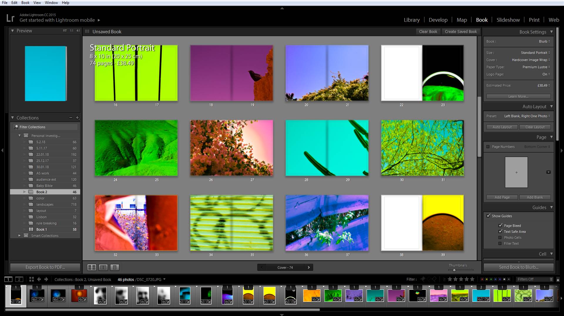
Link to my Book: Baptism

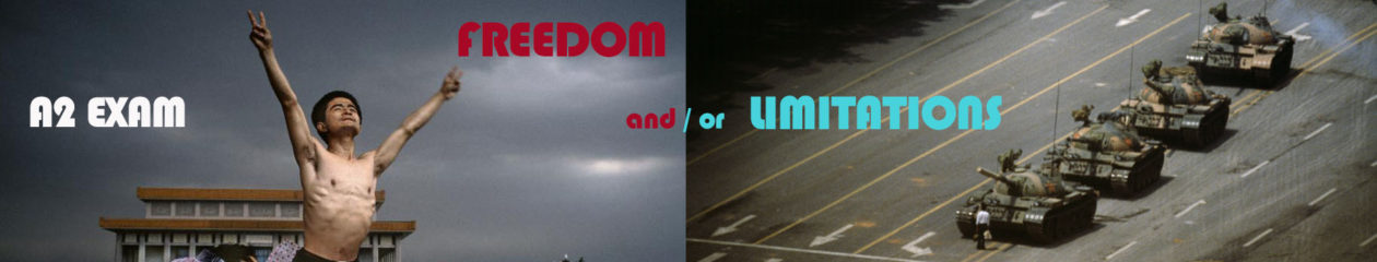
The exam brief was to create photos around the words Freedom and Limitations. I made a book with the name Baptism. The reason for this is because when a person is baptized it is a symbolic representation of what God has done in their life. In this we believe God has washed away the old life and this person has started a new life with god. ‘Old’ and ‘New’ are keys words in the context of my book. By using software I was able to change the original colors and intensify them. Giving these photos New Life with New Colors.

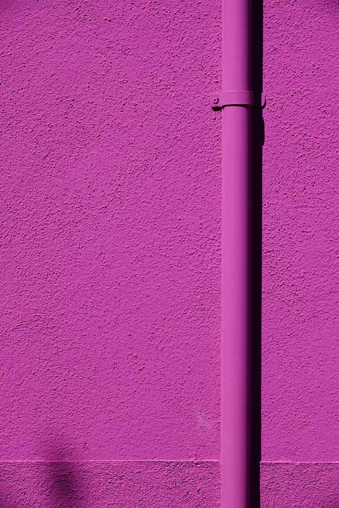
Previously I have been studying the spiritual link between color and the soul. I read the book ‘Concerning the Spiritual in Art’ by Wassily Kandinsky, in this he writes about how certain colors can effect human emotions differently. I wanted this to be the case with my book. Baptism is a very spiritual thing and I found calling my book that linked everything together nicely. When a person is baptized the person has the Freedom to start over to begin a new life. Before these photos were Limited by the colors that they were captured in. But I have given these photos the Freedom to change, to be something new, with new colors that effect the soul differently to when the photos were initially taken.

I personally have had the Freedom to work with different colors and saturation levels than I would when using the photos the way they were taken. Being able to experiment and dramatically change these photos has very Freeing. Personally I think I have met the brief as I have felt Freedom making these photos and have showed how Limitations have been broken, Freeing these photos.

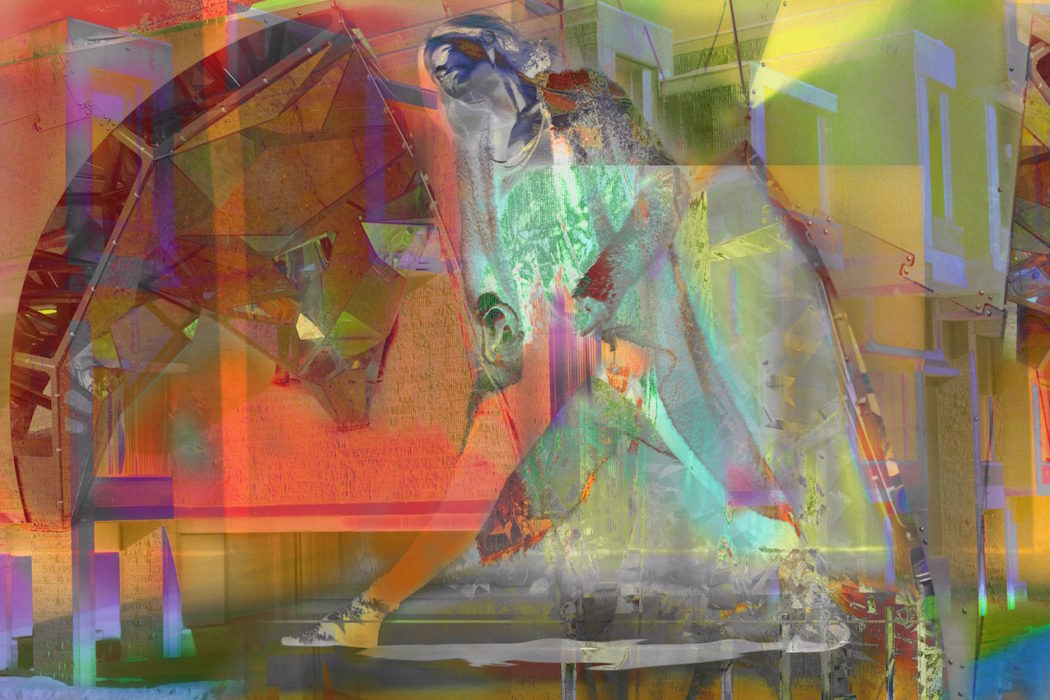
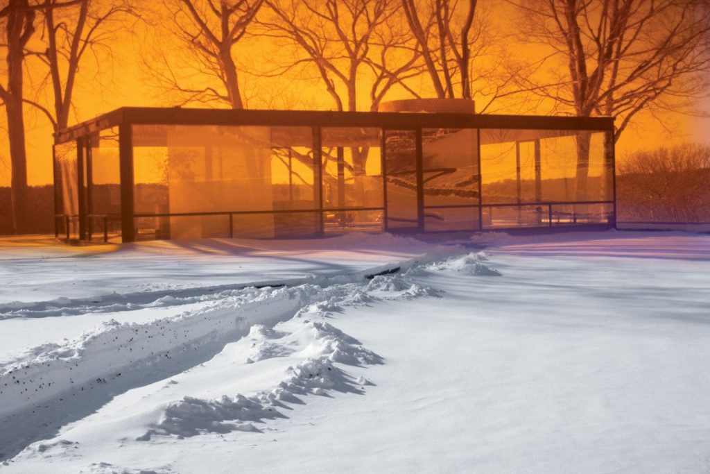
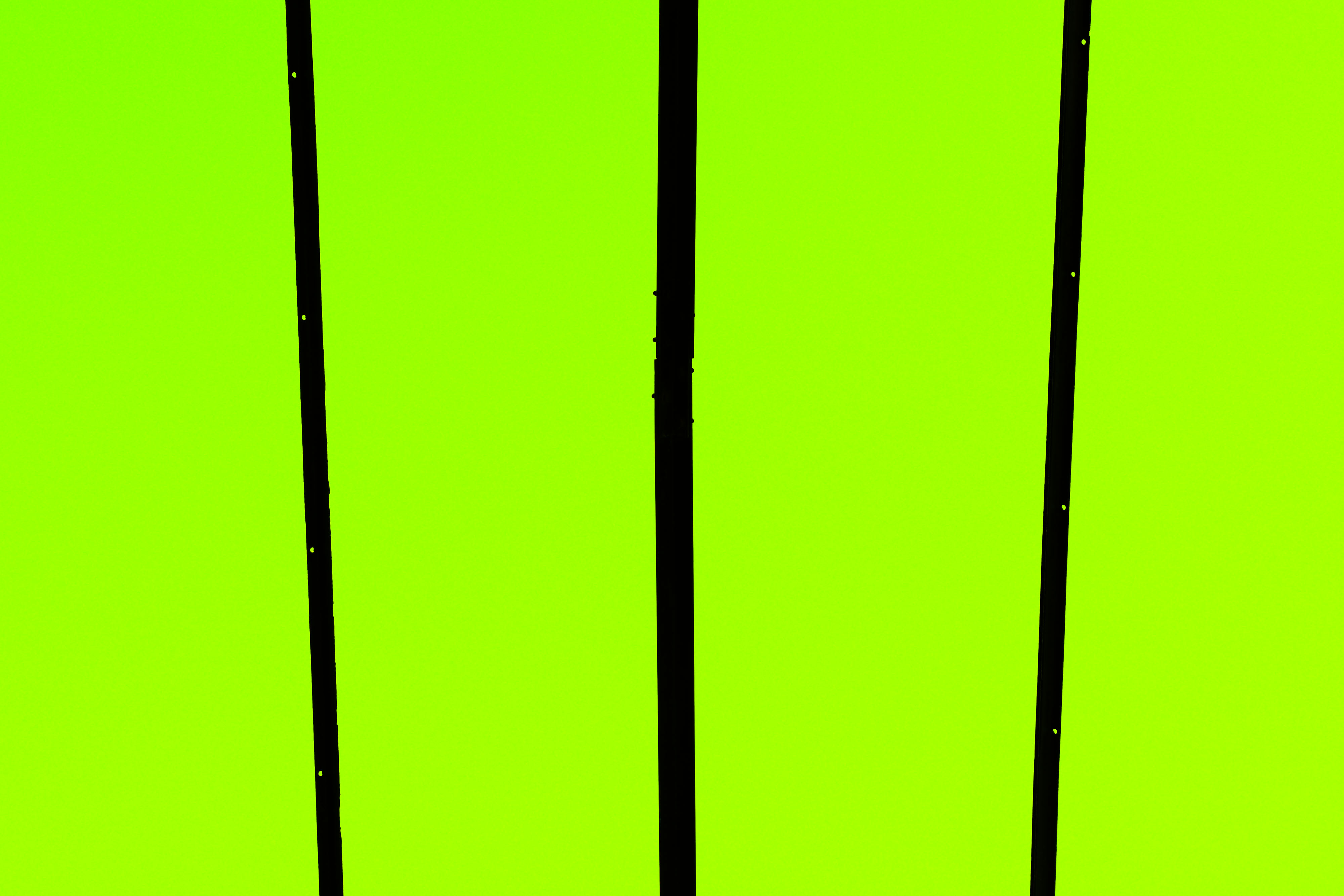
James Welling has the freedom to explore using different techniques and mediums. He has used color filters. overlay techniques and many others that create these beautiful abstract photos. One of the works of James Welling that inspired me the most is the one you can see below this. This is one of the photos from the Glass house project. In these photos colors have been split and changed. In this photo only the sky has changed to orange and the snow has stayed white. However, other photos there are often two of more colors. Like red and yellow and in some cases Welling used a diffraction filter that split the light into the spectrum. Throughout my work I have used digital filters. I have changed the hue, white balance and have used the Split Toning tool. All these to heighten these colors and make them pop out. I I often used the brush tool is I wanted to give something  else a different color. Welling has been one of the largest inspirations in the project.

James Welling- Glass house

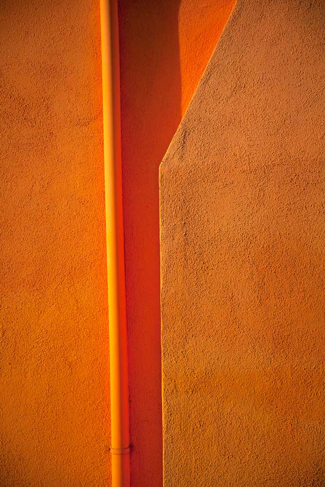
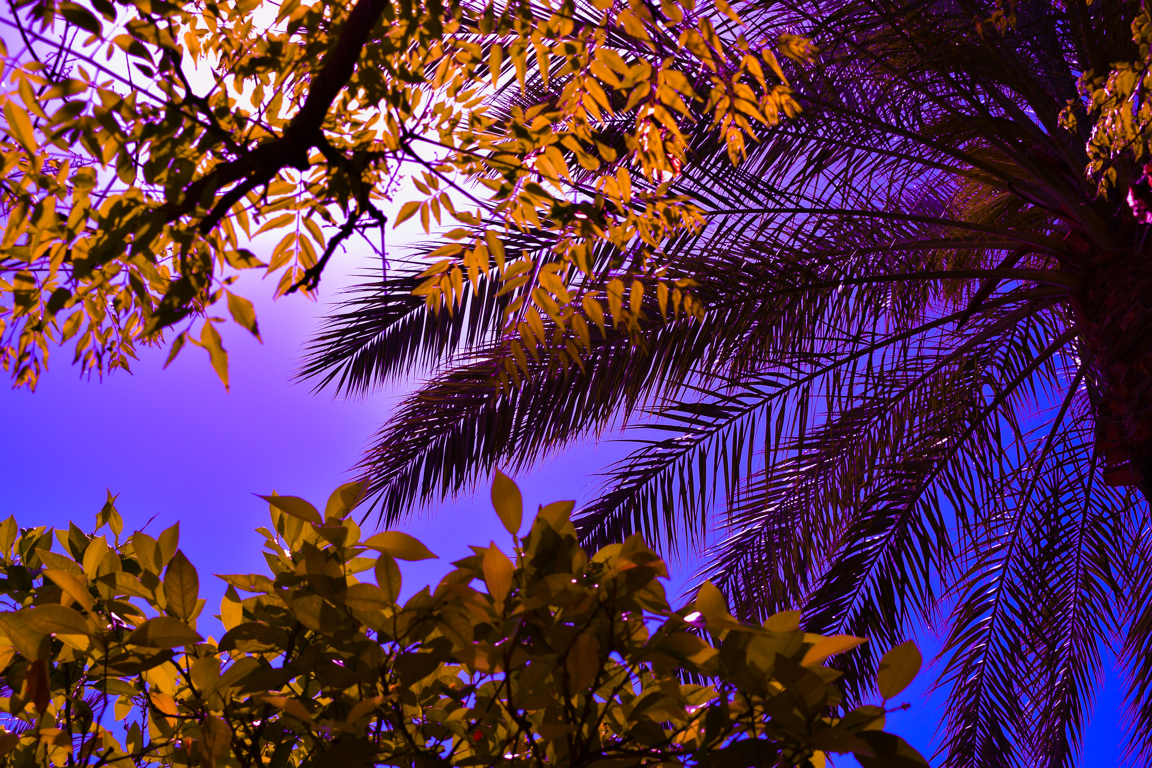
Another inspiration of mine when decided how to take photos was Jessica Backhaus. It was her Symphony of Shadows (as seen above) that caught my attention as it was full of color, so simplistic yet so fascinating. This inspired me to take more simple photos. Instead of a wall I often used the sky as a backdrop but changed the colors in Lightroom, giving the freedom to make these different abstract and simplistic photos. Backhaus’ composition of these shadows and shapes on the wall is very cleverly done to make the photo much more interesting. It makes you look at something you wouldn’t think twice about looking at in normal day life. That’s what I wanted to do, I wanted to bring new life to these mundane objects. The photo below is one of my own and inspired by Backhaus’ work. I have used the sky as a backdrop, it’s so simplistic yet so effective.

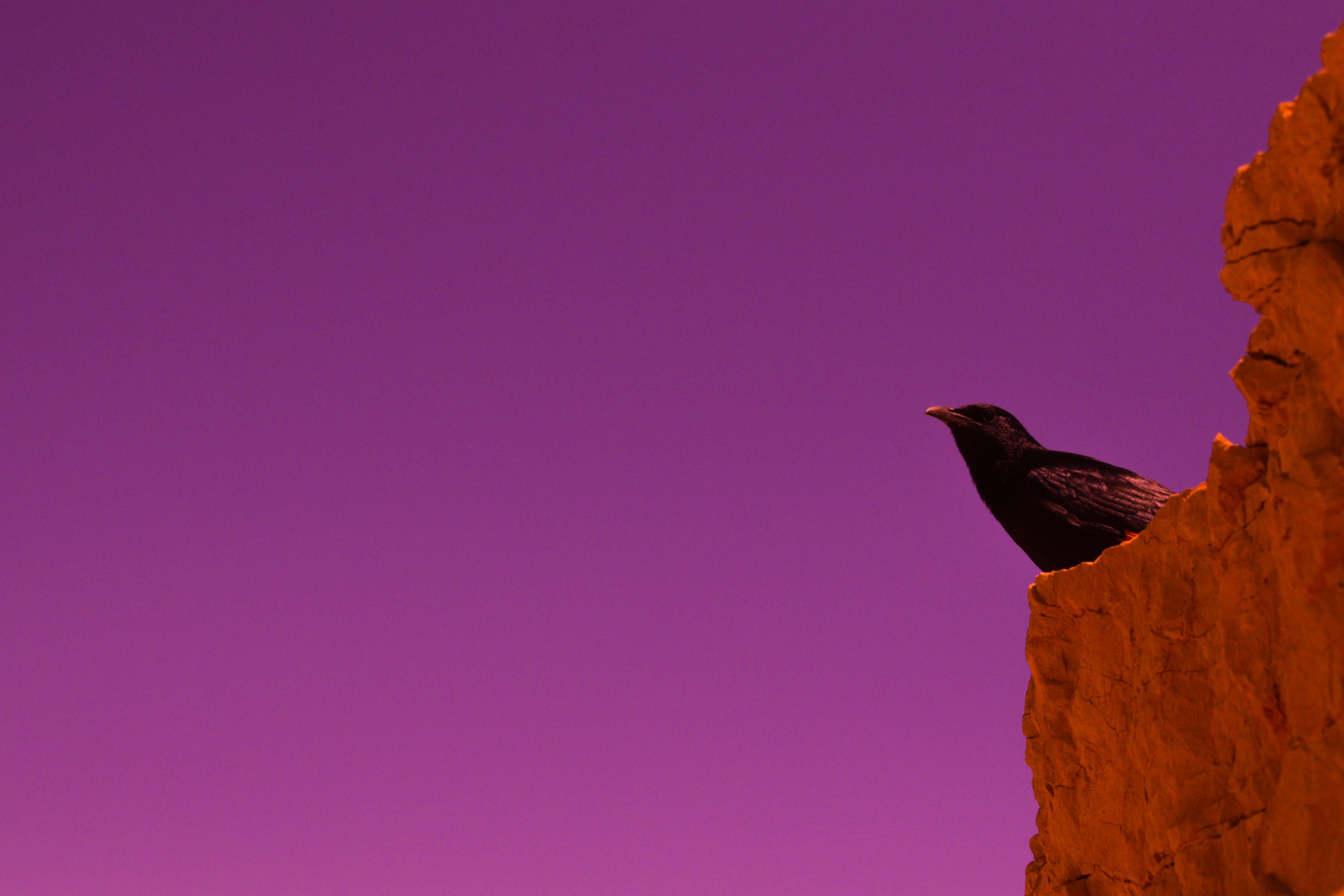
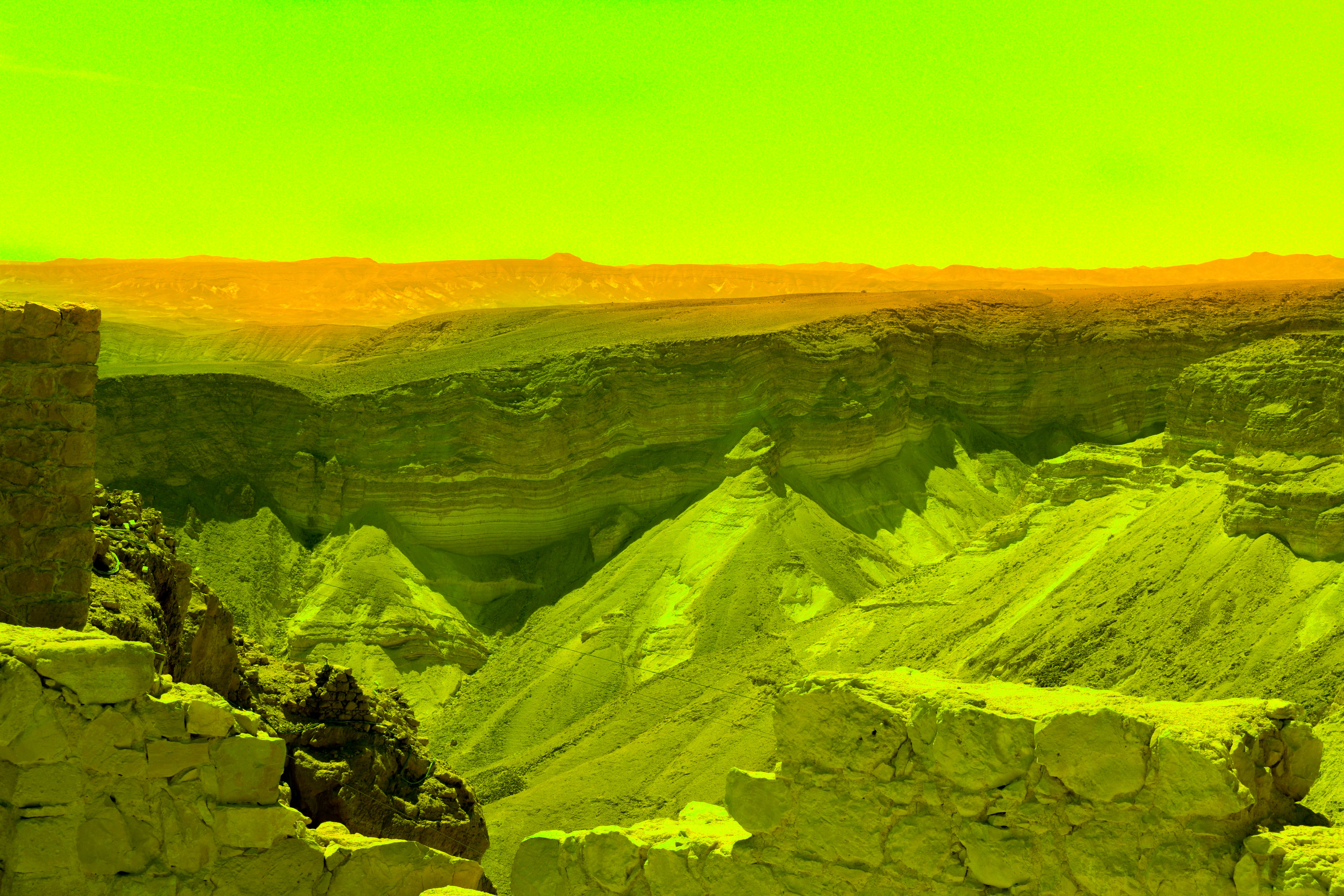
This is my favorite photo of mine from this project. It was captured in the moment. I saw the bird sitting there and it stayed there long enough for me to frame up and take the photo before flying away. I also like the colors in the photo. The wide open space of just purple, with a bird almost like a silhouette to right of the photo on top of this deep orange rock. I like this photo because it links well to narrative. I wanted the photos to have a spiritually feeling to them which often people feel when looking a nature. This photo shows nature and the colors work together very well. People often see nature a freeing as it does not answer to anybody it just happens. Also people often relate birds to freedom as they are able to fly where ever they want. The phrase that comes to mind is “Free as a Bird” again showing another form of spiritual freedom.  I think I like this image so much because it was such a tense photo to take, any quick movement would have startled the bird and it would have flown away. But I took my time and got the shot I was looking for.

This project was very enjoyable. The project was about freedom and I really felt like I had that when creating these photos. To explore color and discover it’s link between human emotion was very interesting. Showing how color can change a photo completely. The time given gave me time to make mistakes and create photos I really liked. I was challenged to make photos that were interesting, full of color and had a spiritual connection.

Book Layout

When designing my book I wanted to make sure photos with similar colors were split in a sequence where it would be enjoyable to read. I also used close up photos of people in between these landscapes to try and break rhythm. I also placed more simple abstract photos after more complex, full photos. I placed the yellows in between purples as they are complementary colors. Also yellow is a very harsh color on the eyes as it reflects more light where as purple is a darker color and relaxes the eyes, this is why these colors go well together. I placed the portraits next to landscapes that looked similar to each other. This is because I wanted these close images of people to  look more like a landscape and less like a part of a human being.

Photo Layout

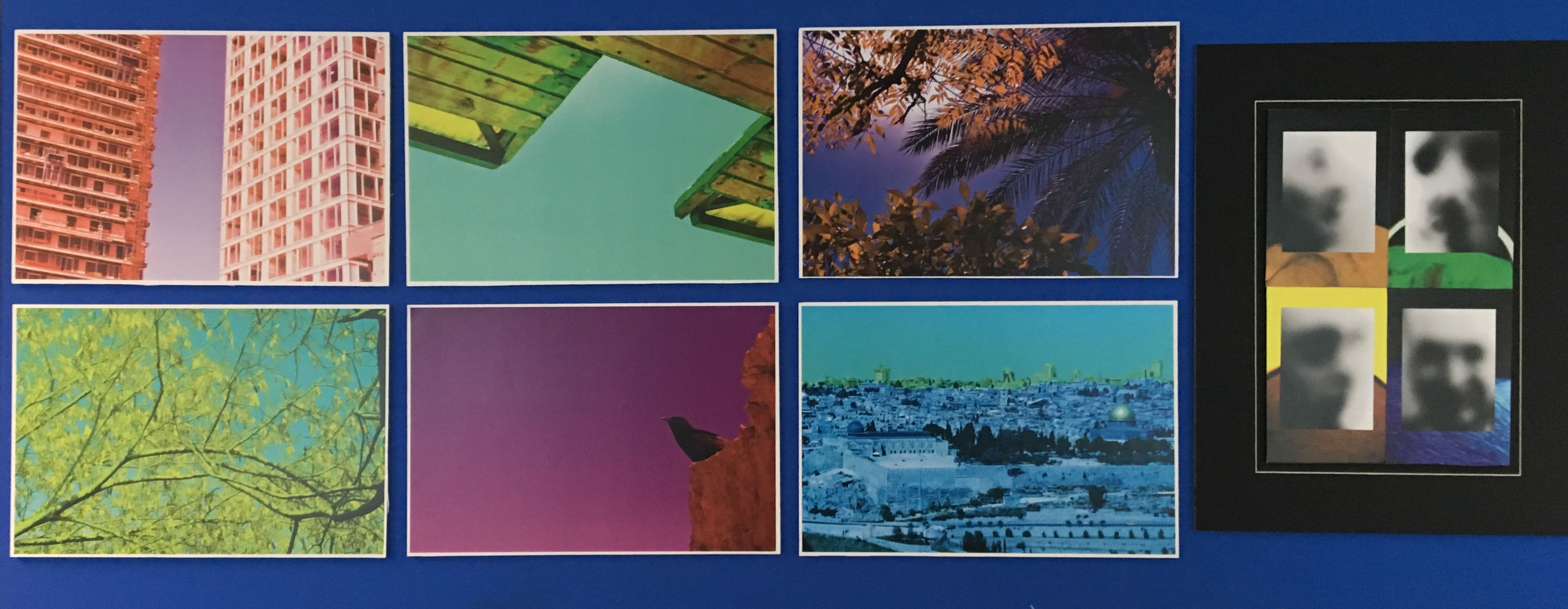
I have laid out my photos in such a way that shows off each photo individually. I stuck each landscape photo on some foam board and stuck each one to the wall individually. I then grouped my close up portraits together with my ghostly like photos that I took in the early stages of this project.

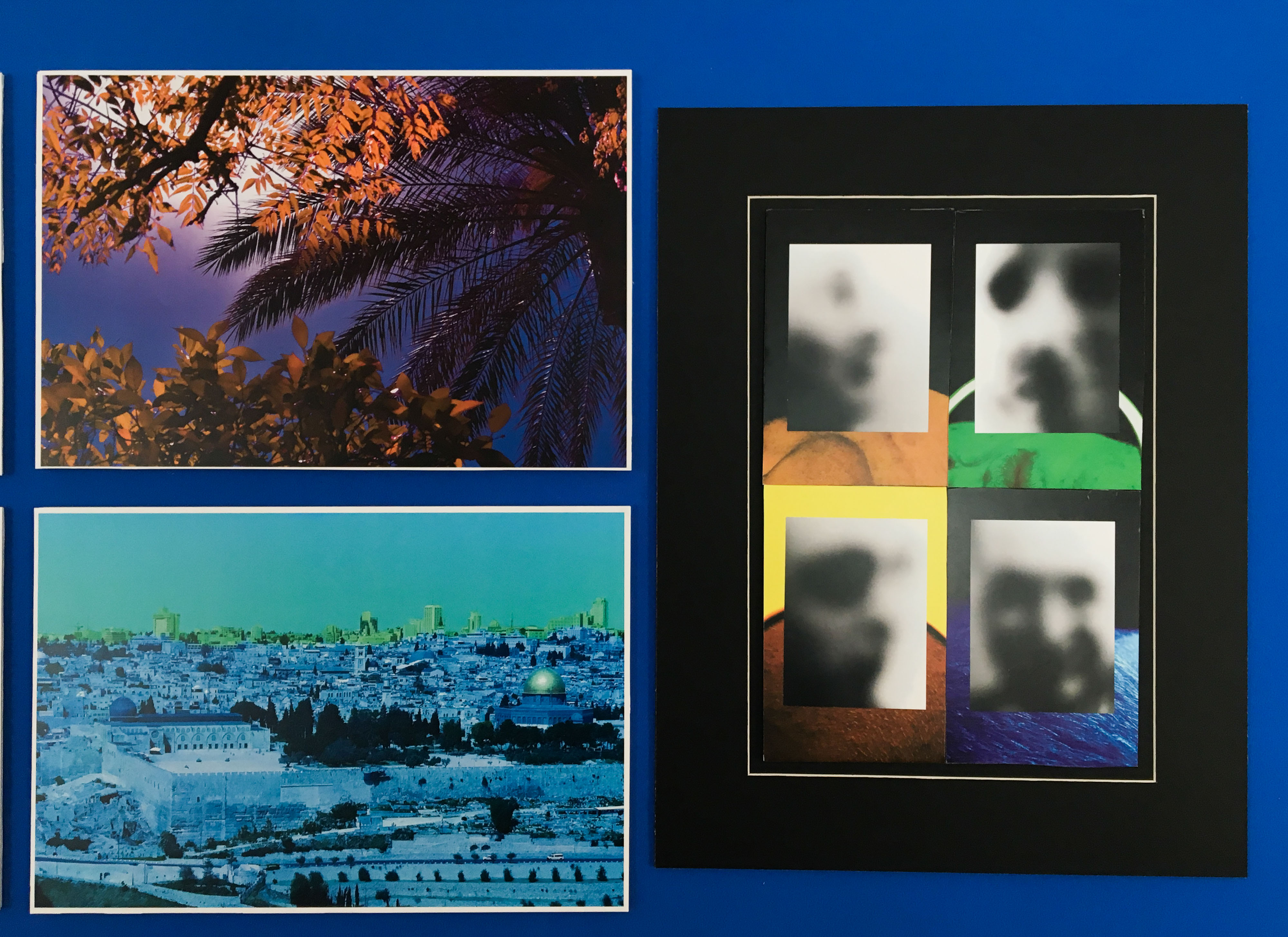
I placed these photos on top and used the close up portraits as backgrounds. I did this as you will be able to see the uncovered versions in the book. I liked this because it gave me an idea and a meaning. The way the photos have been laid out show how humanity often ruins photos, builds on top of landscapes and ruin the identity of a place or a person. I made a window mount and placed this inside as well as foam board and it made it stand out better.

Photo Book Specification

How you want your book to look and feel

I want my book to have a limited amount of words in it, very similar to Stephen Gills books “Talking to Ants” and  “Best Before End”. In these books there are little to no words with most of the photo taking up most of the page. I want my book to look fairly plain in the front then when opened it reveals a series of extremely colorful photos.

Format, size and orientation

My book is going to be portrait with mostly landscape photos in it with a few portrait photos to break the pattern and make it more interesting.

Design and layout

The front cover will be one of my photos of a pole. Most of the photo is one color apart from one green pole in the middle. This does not show up on the front and back cover but it can be seen on the spine of the book. I like this as in itself it is very mysterious.

Rhythm and sequencing

The photos that will be in my book are full of vibrant colors. This is why the order is very important as I want to place my photos in a sequence that doesn’t bore but interest. I did this by separating similar colored photos but also in some cases grouping them. Also the majority of the nature photos are at the beginning of the book and the more industrial ones are at the end. There were some exceptions to this rule as I did not want my book to feel legalistic. I wanted my book to feel free and placed together with care but not placed together where is feels like I’ve grouped photos together and completely separated them.

Structure and architecture

The photos will be presented like a a normal book. However the majority of the photos will be full page spread with no boarders.

Narrative

My narrative is built into the images. Recently I’ve studied the link between spirituality and color. I have found there is a clear link. I collected information from Kandinsky’s book and shared it in a previous blog post. This is the narrative of the book however, I share this using only photos. I am hoping the photos will speak for itself. I wanted to give these images new life showing how a photo with different colors can be exciting and interesting. In some cases it may cause a person to feel uncomfortable or upset.

Title 

The title of my book will either be Baptism, Baptizien or Immerse. This is due to the nature of the book. I want the reader to be completely immersed and effected by the colors. Giving these photos new life washing away the other colors and giving them new ones. Very similar to Baptism. I also want the book to feel somewhat spiritual having a name like Baptism may be a good indicator to story I want to be told. Baptizien is the original Greek word for baptism and it’s actually other direct translation of the word is immerse.

Images and text

There will no text in my book as I feel like it will take away rhythm and simplicity of the book. It will be all photos.

Colour and B&W (or a mix)

My book is completely about color, every photo is in color.

Kandinsky//Spirituality and Color

Image result for Concerning the Spiritual in Art echo library Wassily Kandinsky

In the book Concerning the Spiritual in Art Kandinsky writes about the spiritual effect color has on a person. In the first paragraph of the chapter The Psychological Working of Color Kandinsky writes about how if you let the eye stray over a palette splashed with many colors it produces a dual result. Kandinsky goes  onto say

“In the first place one receives a purely physical impression, one of pleasure and contentment at the varied and beautiful colors. The eye is either warmed or else soothed and cooled. But these physical sensations can only be of short duration. They are merely superficial and leave no lasting impression, for the soul is unaffected. But although the effect of the colors is forgotten when the eye is turned away, the superficial impression of varied color may be the starting point of a whole chain of related sensations.”

Kandinsky then goes onto write about how different colors and different shades of color can have a different affect to a persons soul. For example hes one red would prove exciting and another would cause pain or disgust through the association with running blood. A bright yellow may look sour because of the association to the taste of a lemon. He also goes onto say there is a link between color and musical notes. For example he says “it would be hard to find anyone who would try to express bright yellow in the bass notes, or dark blue int he treble”. I find this very true when visualizing music personally I picture darker colors for the bass notes and brighter colors for the higher tremble notes.

Kandinsky also goes onto say that chromotherapy, which involves stimulating the brain with different colors, has had definite influences on the whole body. Red light stimulates and excites the heart, blue can cause temporary paralysis. However when tried on animals and plants this no affect. Which Kandinsky goes onto say:

“Generally speaking, color is a power which directly influences the soul.”

“Color is the keyboard, the eyes are hammers, the soul is the piano with many strings. The artist is the hand which plays, touching one key or another, to cause vibrations in the soul.”

James Welling artist study

Image 1-Choreography 9818, 2015

9818

The photo is a montage of different images layered over one another to create one large abstract image. From the images I can make out I can see dancers, a mountain and windows. Each photos adds another texture turning the photo into a very layered piece. The transparent edges that can just be made out makes it look as if we are looking through glass. The inverted colors of the dancers alienates them as some of their body is not yellow like he rest of the image. This photo is like a piece of art, when looking at this I do not see a photo that has been captured in the moment, it’s a piece of art that has very carefully been put together. The imagery behind and in front almost mimics the dancer. Each edge and corner is sharp like the dancers posture that is very rigid and tense. There is also some curvature from the mountain behind that can also be found where the dancers hand meet as it is like a circle. I like this photo very much it very different to anything I have seen before. It looks as if a lot of thought has gone into the picture making sure meaning is a large part. At first glance it looks like a mess however when studying the photo it becomes to what the photographer was trying to convey. This photographer has done a whole line of works like this in a project called Choreography where he focused of mixing photos of dancers with either one or multiple landscapes.

Image 2 -Glass House 0469, 2009, 2009

0469, 2009

This photo is from a collection of photos from the project called Glass House. Welling has multiple photos of this glass house from different seasons. James Welling has used color filters between the camera and the subject. Welling said he used the word ‘filter’ as a noun and a verb.  In addition to plastic, colored filters, Welling used clear plastic, fogged plastic, clear glass, pieces of glass that were slightly uneven and tinted, and finally a diffraction filter that breaks light into the spectrum. The colors in this photo have been changed and have split the photo into two. The top half red and the bottom orange. The house is slightly off center and surrounded by trees. The change in color matches the change in seasons. Brighter colors are used in lighter seasons and darker colors are used in seasons like winter and Autumn. I like this photo and have used it as inspiration for one of my shoots. I have used different colors to show a spirituality and how certain colors can make a person feel different things.

Stephen Gill Artist Study

Stephen Gill has a variety of works some of which really break the “rules of photography”. The work I was mostly interested in was his photos using film and how he manipulated them. This would be something I would be willing to explore. Stephen Gill has a real sense of Freedom when taking photos, to be able to explore and think of original ideas then produce them. Instead of manipulating the image after it was taken Gill manipulates the camera or the film making these interesting photos.

This photo is from the book “Best Before End”. In this book Gill develops his photos in energy drinks. His aim was to show how bad these drinks are and how they contain so many chemicals that they actually destroy images. Stephen Gill does this in such a creative way that the destruction of these images is almost beautiful, giving these photos a new refreshing pattern.

The photo above is from the book “Talking to Ants”. In this book Gills photos featured objects and creatures sourced from the local surroundings of East London between 2009 and 2013. He achieved this effect by placing the objects he found in the body of the camera. He wanted to evoke the feeling of the area as the subject was both in front and behind the camera lens at the same moment. I like these photos because they have a sense of creative freedom. This is very rare, as many photographers limit themselves with unwritten rules  that do not necessarily need to be followed. In this photo we a portion of the photo a different color to the rest of the photo. I like this effect and would be interested in using this in my own photography. The color lens highlights the buildings that would be able to be seen without the filter due to the mist. I think it is a very clever and different way of making a photo more interesting. It is also another way of incorporating color into photography. As I could have one image where the background is one color and the part inside the circle is a different one.

Planning shoot 2

For my second shoot I’d like to use old negatives instead of color filters like my previous shoot. I am hoping this will have a similar effect to the photos below. The photos below are by the same photographer I studied in my first photo shoot. James Welling created a number photos inspired by dance and color. These photos were produced digitally however, I heard recently that you can use old film negatives as filters inside the camera lens. I am hoping to try this as well as digitally editing my images in Photoshop like Welling has. You can see Welling’s influence from older projects such as the Glass house. Color, nature and architecture are large recurring themes in his work and can be seen in this project. James Welling has used photos of dancers to decorate and turn his photos into dreamy and psychedelic inspired pictures. When I look at these photos the bodies turn into shapes and filters. When people look at my interpretation of this, I want them to recognize it’s a body or face but not focus on it. I want them to  just look at the photo like an abstract piece. Just like Kandinsky’s work who focused on shapes, color and composition.