All posts by Anna Houiellebecq

Filters

Author:
Category:

FINAL EVALUATION // EVERYTHING

I am very happy with the final outcome of my exam project. The ideas that I began with have been fully explored and developed throughout. My initial ideas to explore the concept of freedom was to focus on the freedom of how we view the world in our unique perspectives. I started my researching and exploring spiritual concepts within photography and how everyday situations can be a thing of beauty. My idea was to fragment certain scenes and to capture them in an abstract way. I looked at the artist Laura El-Tantawy and her own unique persepctives. I really liked her abstract, artistic images full of colour and I used her ideas as inspiration for my shoot.  Here are some of the outcomes of that shoot. 

After looking at the photographer Laura El-Tantawy I came across the photographer Rinko Kawauchi who I used as inspiration for the rest of my project. Her images are very spiritual and pure and have a sense of freedom within them. I looked at many of her series and focused a lot on her ideas and way of viewing the world. I used Kawuchi as inspiration to create an experimentation video focusing on nature. I wanted to do this to create a starting point for my art film that I wanted to create based on this concept of making insignificant things beautiful.

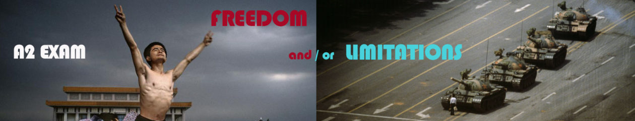
Since I was looking at the concept of freedom of expression and the freedom of viewing the world in our own way I researched a project called the Disposable Camera Project.The disposable camera project draws in on the idea of freedom of expression because it allows people to express themselves and show their own unique outlook of the world thorough photography. A disposable camera allows people who may not be use to using a camera to be able to very simply capture a scene or a scenario they find beautiful or interesting. It gives them an easy way of expressing themselves. After researching the disposable camera project, I wanted to use the idea myself and I did a shoot using a disposable camera. Here are some of outcomes of that shoot.

After doing the disposable camera shoot I did a shoot using Rinko Kawauchi as inspiration.  I tried to create images containing a spiritual meaning and things with purity and beauty. I was very happy with the outcome of that shoot because It linked closely to my main idea of portraying insignificant things in a beautiful, unique way. Here are my favorite outcomes from that shoot. 

After doing the experimentation shoot using Rinko Kawauchi as inspiration I started focusing more closely on certain scenes and objects to capture such as the sea, plants, the sky and the body. For each scene and object I focused closely and fragmented particular areas that I wanted to focus on. I kept linking my work to Rinko Kawauchi’s images to compare my viewpoint to hers. As well as focusing on nature and the body, I started to combine the two areas to capture unusual and interesting images such as the one below. After doing all my photo shoots and collecting my images I started creating my photo book and experimenting with different layouts and proportions of images. I looked closely at examples of Rinko Kawauchi’s books such as Amersuchi and Illuminance because the images and meaning relates well with my project. Whilst developing my photo book more I started focusing more closely on my art film based on the same concept as my photo book. After watching the film The Tree of Life, I researched more about the ideas behind it and began developing my own ideas for my own film. I started by collecting short clips of certain scenes that were insignificant yet beautiful. Here are some of the short clips that I collected. After collecting a substantial amount of clips I collaborated them together to create the film I had imagined.

After looking closely at and evaluating Rinko Kawauchi’s book more called Illuminance I finaly finished the layout of my photobook Wabi Sabi which I was very happy with.  I then decided on which final images to display as sets based on what images worked well together and represented my project best.

final evaluation // photo book

My book Wabi Sabi is about the freedom of viewing the world in our own unique way. Its about capturing the insignificant details that we would usually ignore or not notice, and appreciating the pure and spiritual elements of the imperfect details of our lives. The Japanese term, Wabi Sabi fully explains what the series is about in a simple way. The definition of the term, “a way of living that focuses on finding beauty within the imperfections of life and accepting peacefully the natural cycle of growth and decay” concludes the project well. Throughout the book I focus closely on the tiny details of objects and scenes that we witness all the time. An example of scenes that I’ve included is the Sky at evening time, and the movement of the sea. Within these scenes Ive  focused on and framed particular elements that interested me. My aim was to fragment specific details that were insignificant yet beautiful.

I wanted my book to be simple yet powerful. I wanted the images to make the viewer think about what they are looking at. My aim was to create a thought process in the viewers mind to make them reflect more on the imperfect and insignificant details of our day to day lives.

For the front and back cover I wanted an image that would draw the viewer in. Something that wasn’t too busy but had an appealing aesthetic. I am very happy with the cover that I choose because the warm colour is calming and links with my theme of spiritual connotations within tiny details. I choose to use a small font size for the title because I didn’t want it to over power the image. The image was meant to be the focus point and I believe I have achieved this.

I wanted the style and genre of my book to be in a similar style to Rinko Kawauchi’s book Illuminance. Her book is simple and flows really well from image to image. Although her images don’t link immediately, the colour, texture and form of each image leads onto the next in some way.  This is what I wanted to achieve within my photo book. I wanted to create a narrative within the book using the sequence of images as the story line. The aspects that I linked from image to image are colour, shape, tone and subject. I didn’t want images placed next to each other to be too similar, but I also didn’t want them to have no connection at all.

Most of my images are colorful because I wanted the viewer to be drawn in by the use of bright, pale colours. Although I wanted to stick with an overall aesthetic throughout the series of images, I also wanted the book to contain some contrast. I did this by also including black and white images to change the sequence and flow slightly. I choose specific images to be presented in black and white because they contained a lot of detail, such as the close up image of the skin. Since the image had a lot of detail, it was interesting enough without the use of colour to draw the viewer in.

The images above and bellow are examples of different connections I made between images. The image above contains an unusual perspective of a foot which contains wrinkles and decaying skin. I choose this image because it represents my project well because I’ve captured the beauty of an imperfect thing. The other image is a close up of water. The movement, reflection and shape is what I aimed to capture within the image. I decided to place these two images next to each other because of the texture and shape. The structure of the skin, and the shape of the wrinkles on the foot connect well with the shape of the water.

The image below is another example of a connection I made between two images to create a flow and narrative. Both images are close ups of particular objects that we see everyday. The image on the left is a close up of a flower, and the image on the right is a close up of a hand. Although the objects a completely different as subjects, I managed to make a connection between the two images by linking the shape, colour and texture.

I am very happy with the final outcome of my photo book because I have managed to portray and represent my ideas and way of thinking very well. My main aim was to create a book that made the viewer reflect on each image and make connections with what they see in the image in their own lives. I wanted to focus on the tiny details which I have managed to do very well. I also aimed to express the beauty of things that we viewed to be imperfect.

Final evaluation // print images

Here are the Final displays of my printed images for my project based on Freedom. When choosing what images to display I went through all my final edits to pick the best ones that worked as a group. I decided to focus on two separate, contrasting displays.

The first one is based on the theme of how we see the world. I’ve focused and fragmented different scenes that are simple, unique and normally not noticed or ignored. I’ve photographed them to make them look beautiful and visually pleasing. I’ve used bright, pale colours to draw the viewer in. I wanted to display a set of six images size A3 for this series. I choose these images because they work really well as a group with the contrasting colours and shapes. Ive positioned the images with warm colours in a zig-zag, and the images with cool colours in the same way. I really like how this set of images have turned out, and they compliment my book really well.

For the second set of images I decided to use size A5 to print the images out because it caused the viewer to focus more closely on the images. I wanted to stick with a certain theme for my second display, so I decided to focus more on the body and the tiny, insignificant details within it. I again choose to display the images as a set of six because they complimented each other really well. I made sure I choose a set that were contrasting, containing different angles, fragments of the body and tones.

Overall, I am very happy with my final set of images and displays because they compliment and show a variation of images that are in my photo-book, Wabi Sabi.

WABI SABI FILM // FINAL

Here is the Link to the Final version of my Wabi Sabi film.

The film, The Tree of Life was my main form of inspiration for this experiment. My goal was to create a film full of scenes of nature during evening time as an experiment for my project Wabi Sabi. The Photographer Rinko Kawauchi is another source of inspiration that I used for the film. Her style of Sublime photography really suited my theme and idea. To create the film I need to capture a lot of imagery of a few second shots of different things such as light, the sea and everyday events. An idea for the film is to use a subject, a model, as the focus of the film. The film would be about the different things that occur throughout the evening through nature. The title, Before the Sun goes works really well with the idea for the film because I am capturing the beauty and specific details that happen in the evening, before the sun sets. I decided to use a subject within the film because it made it more interesting and showed more of a story line by using the subject to symbolize the sun disappearing. In the last part of the film, the subject is seen running away towards the sea. My reason for this was to create a visual and symbolic link between the subject and the sun. As the sun was setting, the subject was also running away. Overall, I am very happy with the outcome of my film, Before the Sun goes, because it ties in well with my overall project and shows a thought process and story line behind my theme.

wabi sabi film // shoot 3 // nature and sunset

On the 18th of April I drove to St Ouens bay to do my shoot three for the wabi sabi film. The aim of the shoot was to capture more images of nature and the landscape with the sun setting because that was the time of day that I had decided to focus on. I wanted to capture the different colours and the different ways the sun can effect nature. I also wanted to capture the sense of movement within the film to replicate the movement of the sun while it sets. The different things I managed to capture was the way the sun hits on leaves and flowers such as the clip below.

Another way I wanted to replicate the movement was by simply moving my camera while I was filming. I used this method mainly for far away clips such as the sea and the sky. I really like this clip because of the colours and shapes that are captured.

Another way I was able to show movement was by filming the sea and the waves by the shore in St Ouen. I wanted to capture clips of the sea because Its the last thing the sun touches before it sets. I also love the expressive movement it naturally creates. The pal blue and green colours also work really well with my wabi sabi project because there is a lot of use of colour, mainly pale colours.

rinko kawauchi // photo book analysis // illuminance

Illuminance is a series by Rinko Kawauchi about focusing on the tiny gestures and details throughout our day to day lives. She explores the extraordinary in the insignificant things that we would normally ignore or not even notice. All her images within her series contain this spiritual, unique style that she creates effortlessly. She has a feminine touch that you can see in the soft, pastel colours throughout the book. The photobook, Illuminance was published in 2011 and costs £40 to purchase. The form and functions of the book is the first thing we think about when seeing the book.  It is produced as a cloth bound book using Japanese binding to hold it together. The book has a material texture too it because of the use of the cloth cover. This effect makes the book much more interesting because the cloth cover creates a rough texture for the hand to touch and feel. It gives the brain something extra to think about. The book is big and heavy to pick up because it contains hundreds of images by Kawauchi. The pages within the book are thick which improves the quality of the book and makes it feel and look more professional.

The book contains a spiritual and sublime aesthetic that runs throughout the whole series. Each image links to the next somehow. They flow in a sequence that symbolises a story or narrative that Kawauchi is trying to create. The images are about day to day events so the narrative Kawauchi is capturing could be in the time period of a day. She could be using the series of images to symbolise a series of events throughout a day. The images flow really well and link together in a good way because of the use of shape and colour. The pastel colours within each image is highlighted. Although some of the images presented next to each other are contrasting, its the contrast within them that works well together, such as the light and shadow and the line compared the circular shape.

Rinko Kawauchi has  a very contemporary approach to her work. She breaks the rules within photography and creates her own unique perspective of the world. She has an unusual way of framing and she also uses symmetry and patterns to add to her complex series. Her images are very bright and contain a feminine touch which is delicate. As a viewer of the photobook I can tell that Kawauchi adds her own personality and emotion into each image.

Rinko Kawauchi is a Japanese photographer and I believe you can see this in her work. Japan is a very spiritual culture and they care a lot for the body and soul. They view things very differently to the western world. Everything is seen to contain a spirit and an element of beauty, no matter how insignificant it is. When looking through the photobook I can see Kawauchi’s point if view and imagine looking at the image through her mind. She sees more then just a tree or a reflection. She sees remarkable beauty. I think the name Illuminance suits this series really well because it is a word we would use to describe something bright, and something radiating beauty. This is how she describes the objects and scenes she’s captured.

After researching more about the photo book illuminance I came across an article by lens culture about Rinko Kawauchi and her many series such as ‘Search for the Sun’, and Illuminance. The article contains a paragraph describing the series. “Inspired by the subtle aesthetic of wabi-sabi—a philosophy of reduction, modesty and the beauty of imperfection—these luminous images offer an enchanting gaze on the world around us.”  Wabi Sabi is the name of my project which ties in well with my whole theme and research because Kawauchi herself was also inspired by the aesthetic Wabi Sabi.

final print // layout

The images below are the final edits that I’ve chosen to display. I plan to present them in groups of six based on a certain theme. The first set of images will be printed out size A3 because I want to show all the details within them very clearly. I’ve chosen the images based on their colour and form and how interesting they each are. The first six work really well as a group because of the contrasting colours of the cool blues and the warm reds and oranges. The different shapes and textures also well work together, such as the tiny square shapes in the top right image compared to the large abstract shape of the clouds. Each of the diagonal corner images work really well together because of the colours within them. The warm colours of the orange and the cool colours of the purple and brought out.

The second set of six is of the body. I will be presenting them in this order at size A5. I really like this combination because they are all different and similar at the same time. There’s tones of pink, purples and orange in each image. There is also a different tone and texture in each image with the use of shadow and shape. They flow well as a group and tell a unique story. They are all close ups of the human form, but they are highlighting a particular area such as the ear or the foot. My aim was to capture them and  represent them in a way that hasn’t been done before. I used Rinko Kawauchi’s idea of highlighting the insignificance and thats what I’ve tried to achieve.

wabi sabi // shoot

This is a set of images taken at Queen’s Valley Reservoir. The images were taken during my film shoot. I didn’t take many images because I was mainly aiming to take film rather then images. However, when I saw something interesting and worth taking I did. I edited the best images to put into the photo book. I am very happy with the set of images that I managed to take. I edited the images using photoshop. I love the pale, pastel green that occurs throughout the images. It makes the set work really well together.

EXPERIMENTAL EDITS 

As well as some simple edits I wanted to experiment with my images to make more artistic fine art edits. For one of the experimental edits I used one of my sky images as a background. I wanted to incorporate my sky image with my image of the water drop on the blade of grass. They are both really good images by themselves, but I wanted to combine them to see what It would look like.

For the second experimental edit I wanted to incorporate my idea of using film as a backdrop for an image. I used my film clip of the flowers because It works well with image of the flower. I edited both of the clips into black and white because I think it makes the clip much more powerful. The shapes and the tones become much more highlighted without the colour.

COMPARISON

After doing this photo shoot I came across this image by Rinko Kawauchi that has a very similar theme to this series by me. Within the image she is focusing on two blades of grass with a spiders web hanging from them. On the blade’s of grass there’s also water drops on them which creates an extra dimension to the scene which makes it more interesting, and visually pleasing….

MINE

RINKO KAWAUCHI

wabi sabi film // shoot 2 // subject

As well as images of nature I wanted my film to have a subject. The film is about the sun setting and what happens before it. I decided to include a subject because It made the film more interesting and easier to relate to and understand. I wanted my subject to be immersed into the different scenes I planed to capture, such as the grass and by the sea. I wanted the subject to be interacting with the nature such as playing with the grass.

I wanted to mainly focus on close ups of the subject because I wanted most of her identity to remain hidden. I tried capturing the particular important features though such as the lips and the eyes. The day that I choose to capture clips of the subject was poor because the sky got cloudy which meant the lighting wasn’t as good as I hoped. This meant that some of the clips where to dark.  If I have time I may try to redo the shoot on a better day to get a better image quality. Some of the shots have a lot of noise because of the high ISO. However, overall I am happy with the outcome of the shoot.

For the last part of the film I want to create a link with the subject and the sun. As the sun disappears  and sets behind the sea I also want to replicate this with my subject. I aim to do this by showing the subject running towards the sea, similar to how the sun seems to disappear.