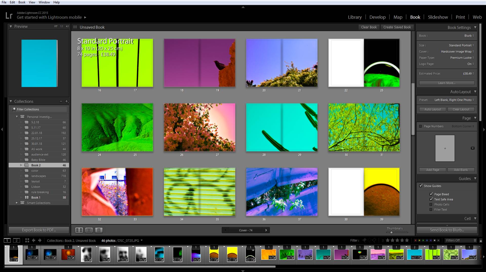
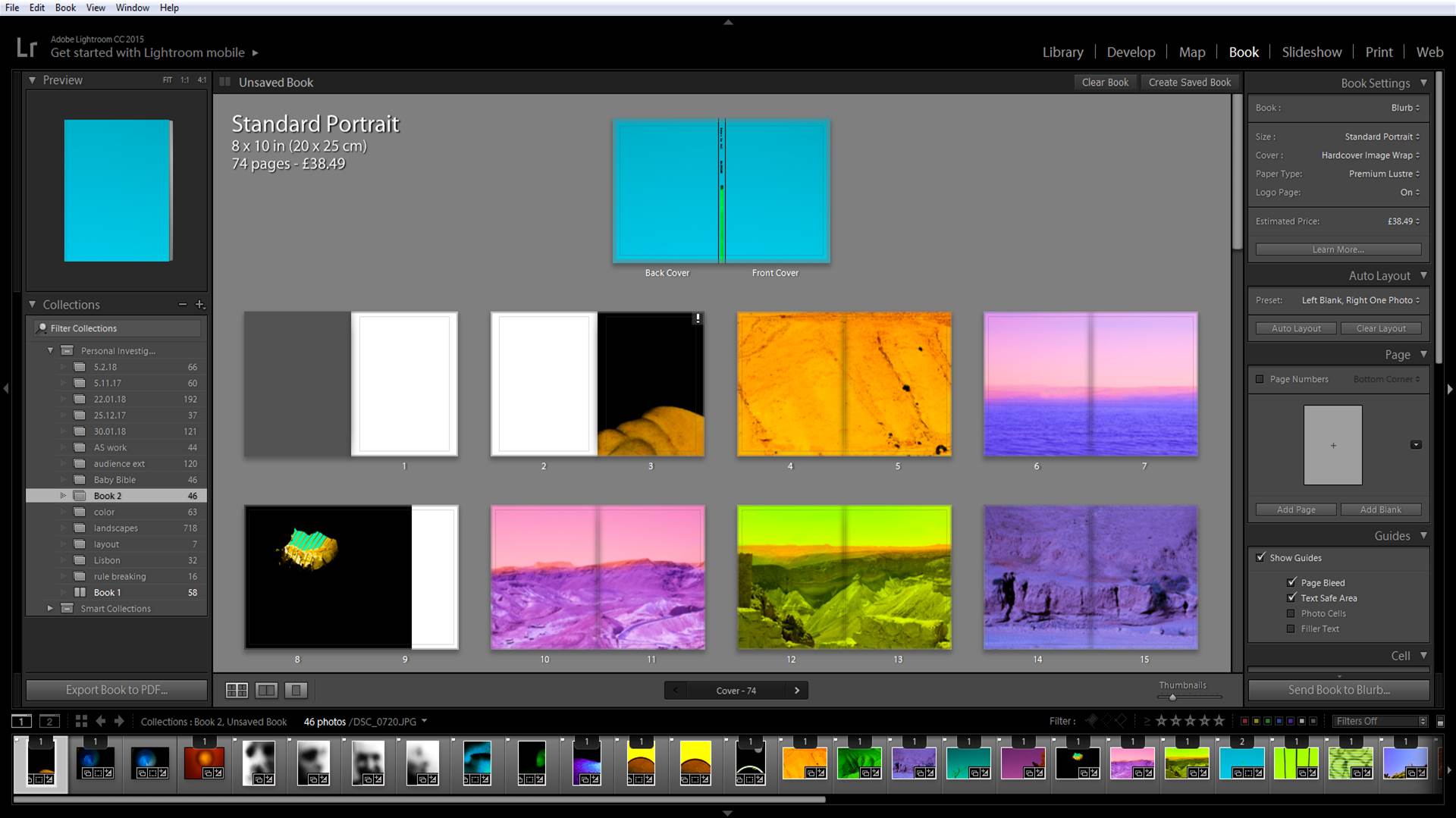
When designing my book I wanted to make sure photos with similar colors were split in a sequence where it would be enjoyable to read. I also used close up photos of people in between these landscapes to try and break rhythm. I also placed more simple abstract photos after more complex, full photos. I placed the yellows in between purples as they are complementary colors. Also yellow is a very harsh color on the eyes as it reflects more light where as purple is a darker color and relaxes the eyes, this is why these colors go well together. I placed the portraits next to landscapes that looked similar to each other. This is because I wanted these close images of people to look more like a landscape and less like a part of a human being.