Typologies
“Typology is the study of types, and a photographic typology is a suite of images or related forms, shot in a consistent, repetitive manner.”
Karl Blossfedlt (1865-1932) was a German artist and teacher who gathered photographs in close proximity to allow his art students to see the object in question from all sorts of angles, making creating the picture easier. He usually took close-up photographs of deceased plants. Having publish his work in 1929, fellow artists and photographers developed on the idea of typologies in photographs.
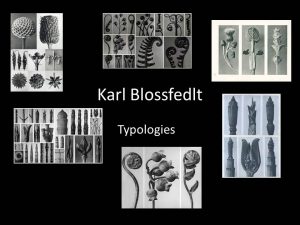
Typologies are a great technique for developing ideas closely and in detail as the close proximity of the photos forces you to see all angles of photographs. By utilizing the technique of typologies I can gather a series of photographs together in an attempt to alter the way the average man views nature around us, hopefully understanding the true beauty that the world posses.
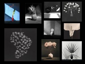
Here are some examples of flower typologies…

The Concept
I plan to experiment with placing vibrant coloured flowers against plain, mundane backgrounds to represent how the human species is over taking naure. By taking flowers, (a representation of nature), out of their natural environment and placed into a man-made scene it demonstrates the over powering dominance of mankind. The warm and cheerful colours of the flower will connote nature as beautiful and elegant, against an intense plain background. I intend to change the way people view the natural world in an ambitious attempt to eliminate human ignorance towards the care of our natural environment.
Action Plan
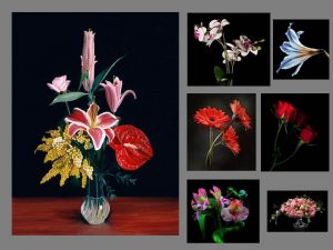
For my own interpretation of Mapplethorpe’s work, I’m going to use a black bed sheet to provide a similar background to the one Mapplethorpe created, hopefully giving the same effect. I could also utilize the school’s studio which has a black, white or green background in, giving me the opportunity to change the colour of the background which would make my work stand out as long as I find the correct colour balance. The school studio also provides a key light, a fill light and back light which will enable me to attain the correct lighting for the photo shoot. The object in question will be a selection of flowers that I either pick, or buy from the local market. I will be sure to select a multitude of colours in order to trial out what colours work the best. In terms of cameras, I will use the 100mm lens that I can borrow from school. The short lens will allow me to get close to the object whilst maintaining the correct proportion of detail.
Robert Mapplethorpe
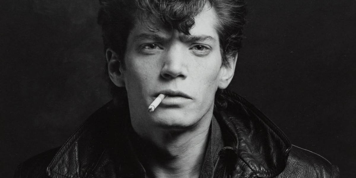
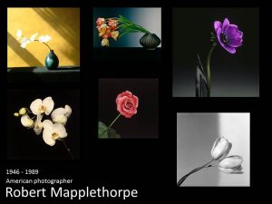
Robert Mapplethorpe was an American photographer who was renown for his sensitive yet blunt treatment towards controversial matters. His work usually consisted of celebrity portraits, male and female nudes, self-portraits and still-life images of flowers. Mapplethorpe’s still-life photographs are very unique.
I am going to use the work of Robert Mapplethorpe the most for inspiration and attempt to make my own take upon Mapplethorpe’s photographs.
I selected Mapplethorpe as my case study artist because I like the singularity of his photos, for example, he would place a very colourful flower in front of a plain yet powerful black background which would consequently enhance the colours of the flower itself. Mapplethorpe’s single object approach focuses our attention upon the object in question, enabling him to express his ideas clearly and thoroughly.

Rose, 1989
This is my favourite image of Mapplethorpe’s collection. The photograph has taken into account the angle of the flower and got the correct outcome as the flower head coincides perfectly with the rule of thirds scheme as it is exactly central within the image. There are few relevant examples of correct linear in this image as the lines upon the leaf are symmetrical and the stem of the flower is straight, leading into the middle segment of the rule of thirds square. The flower head itself is also very crisp as you can clearly see the definition of each petal and where it curls over, bends or ends. There is evidence of juxtaposition through the difference of colours. The flower has a vibrant pink shade with two varied green shades in the forms of the flowers stem and the flower’s leaves. The sharp colours are contrasted with the completely black background, which draws our attention to the flower itself. The background is a very cold black colour which is the opposite of the charismatic flower as it features very warm colours. The photograph shows shadowing around the petals as some are higher than others, enhancing the detail of the image and improving it over all. Despite the presence of shadows, there isn’t a distinctive light source shown, implying the light provided is artificial. I believe Mapplethorpe would have used the ‘three point lighting’ scheme to develop the precise detail of this image.
Inspiration


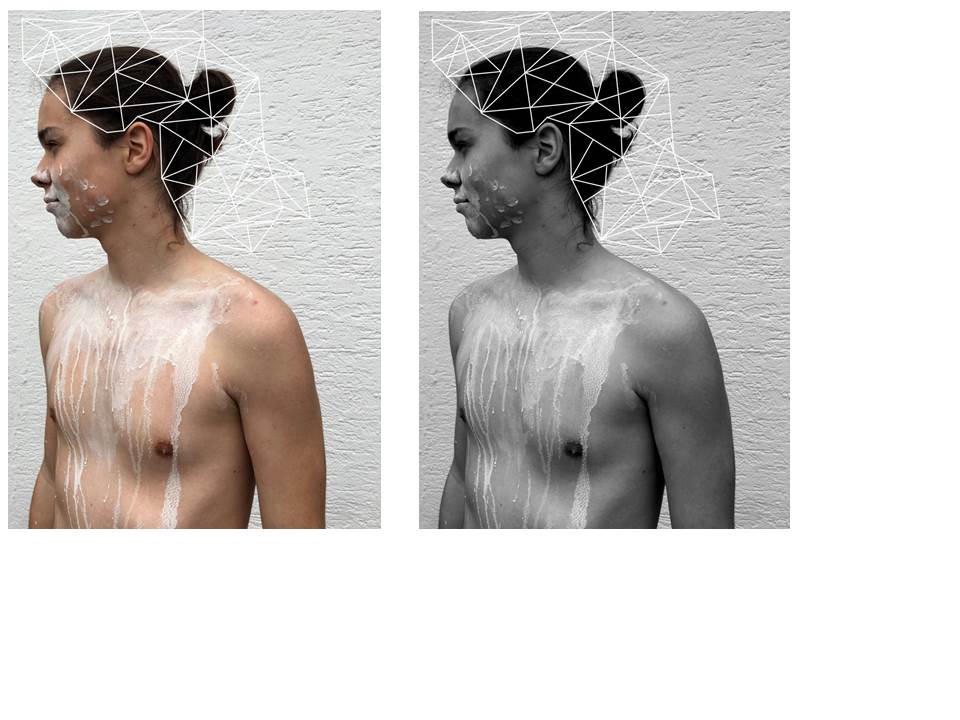
Structure Exam // 2017 // Zoe Pannenborg

















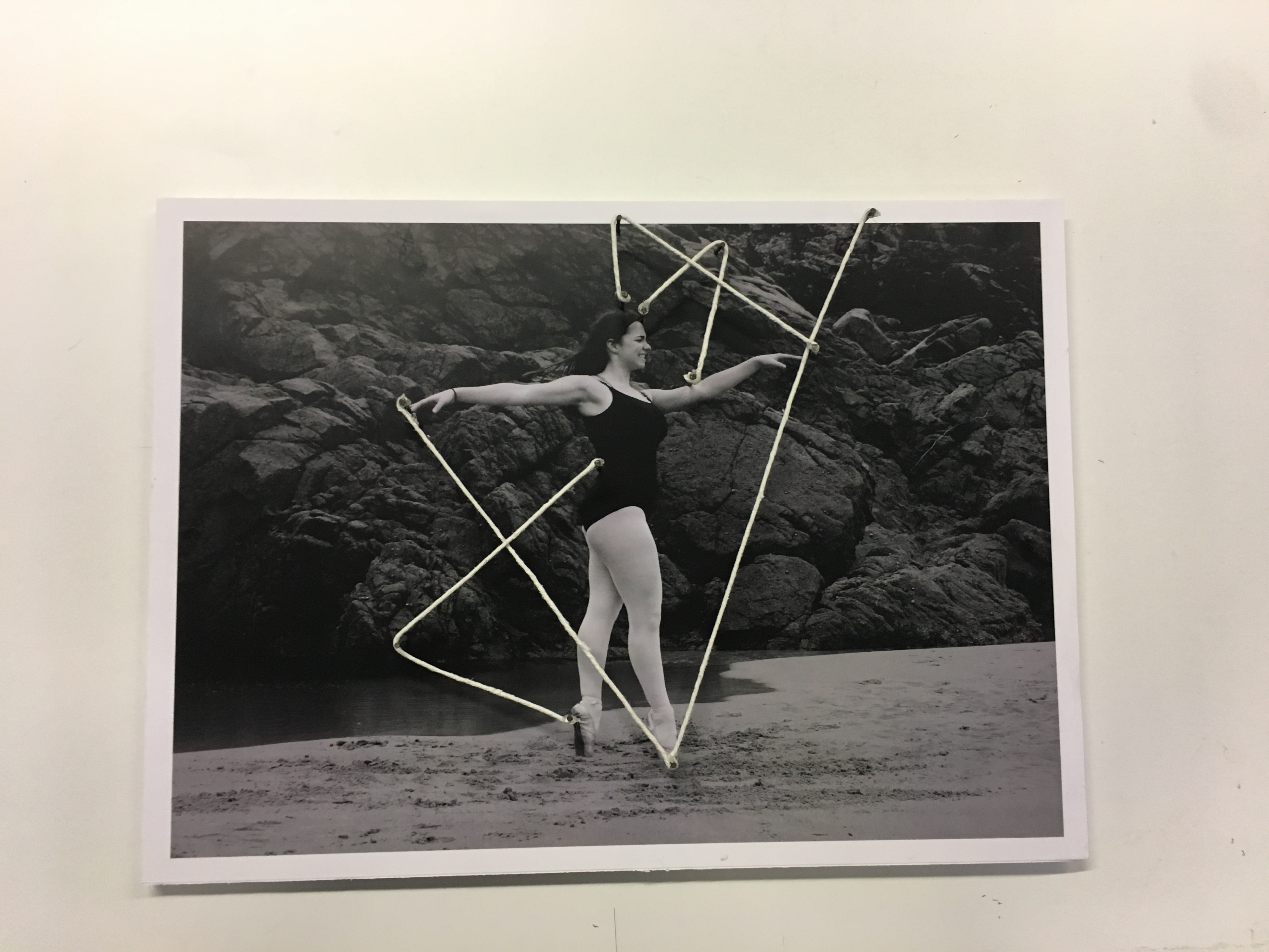


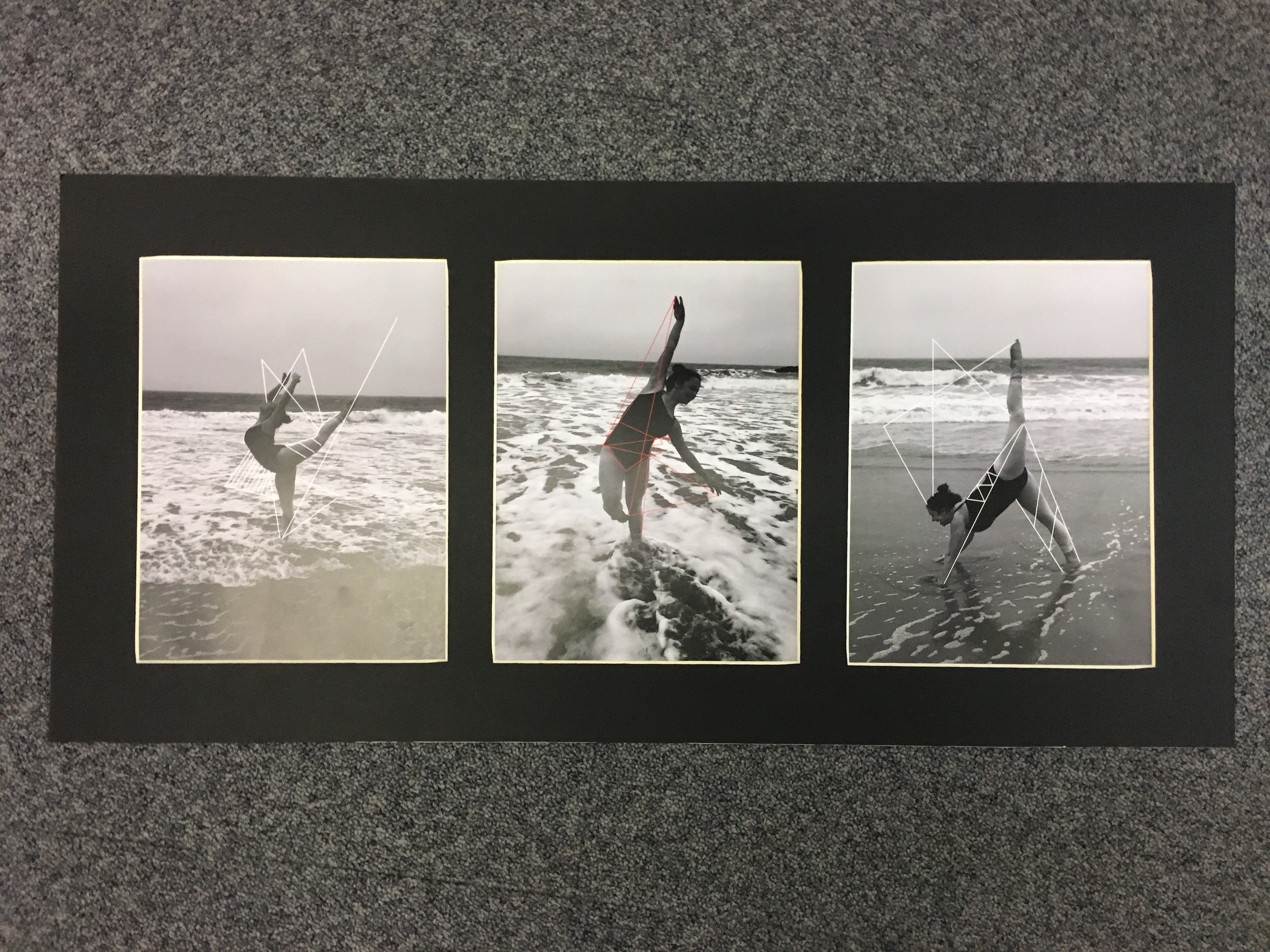
Evaluation of Project and Exam
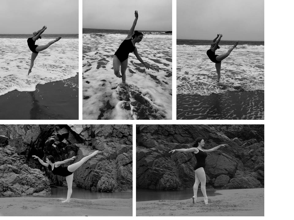
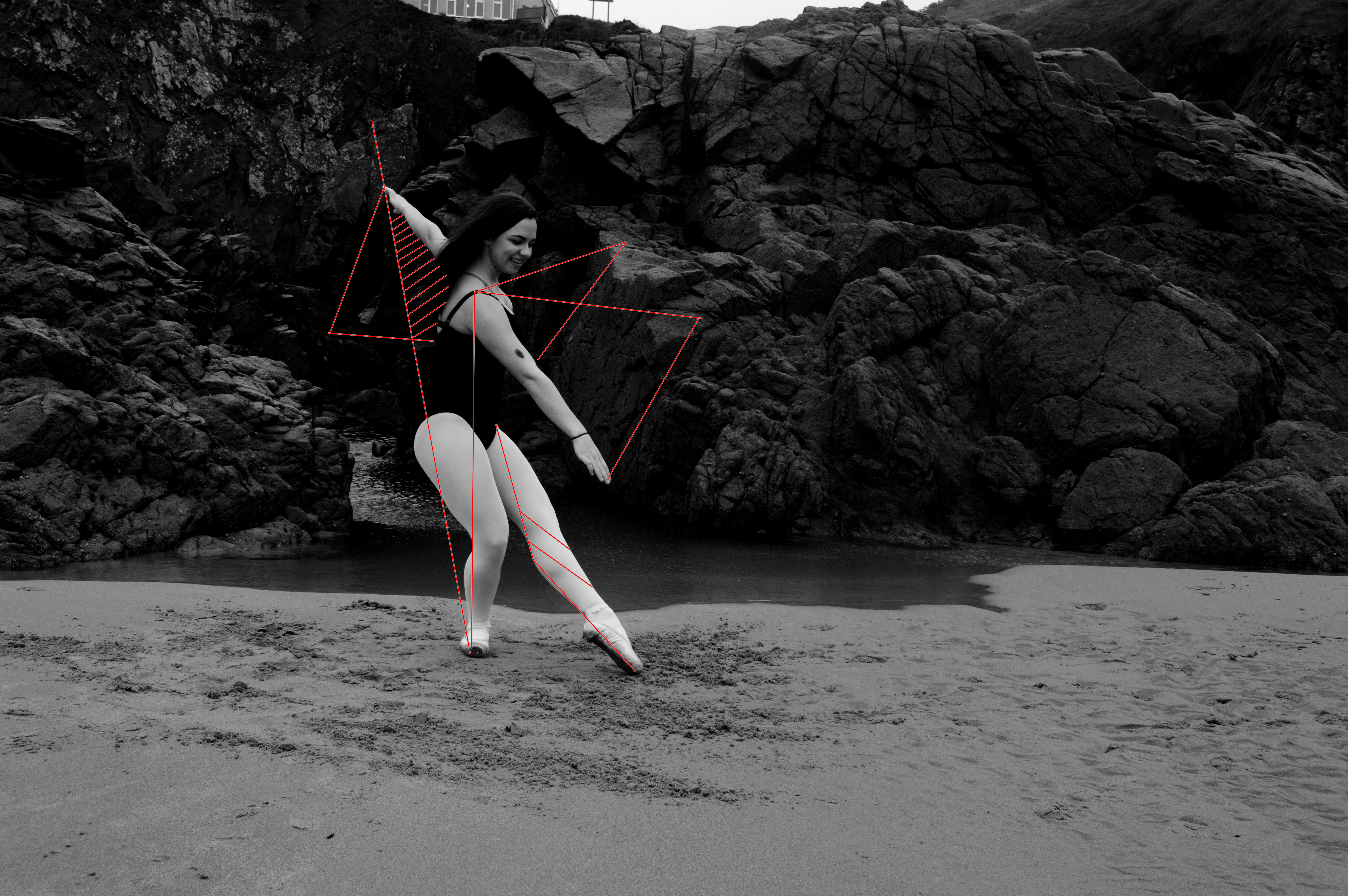
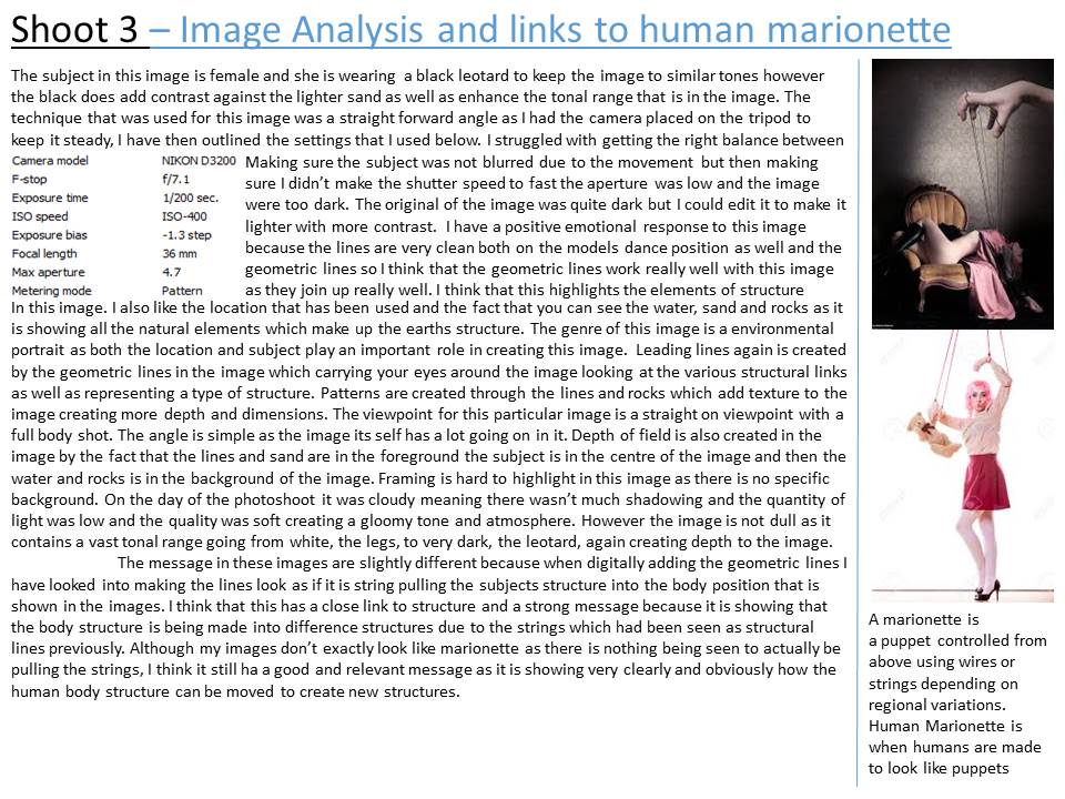
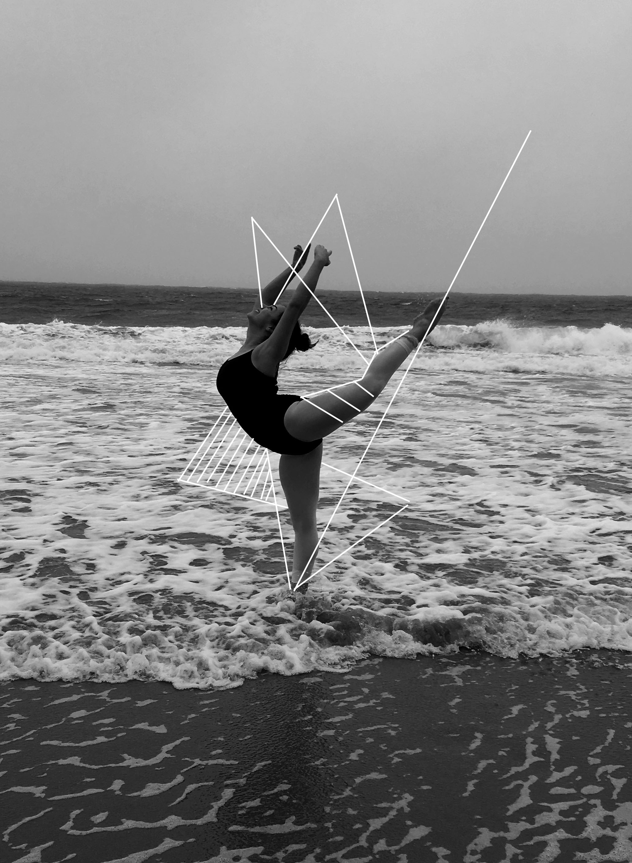
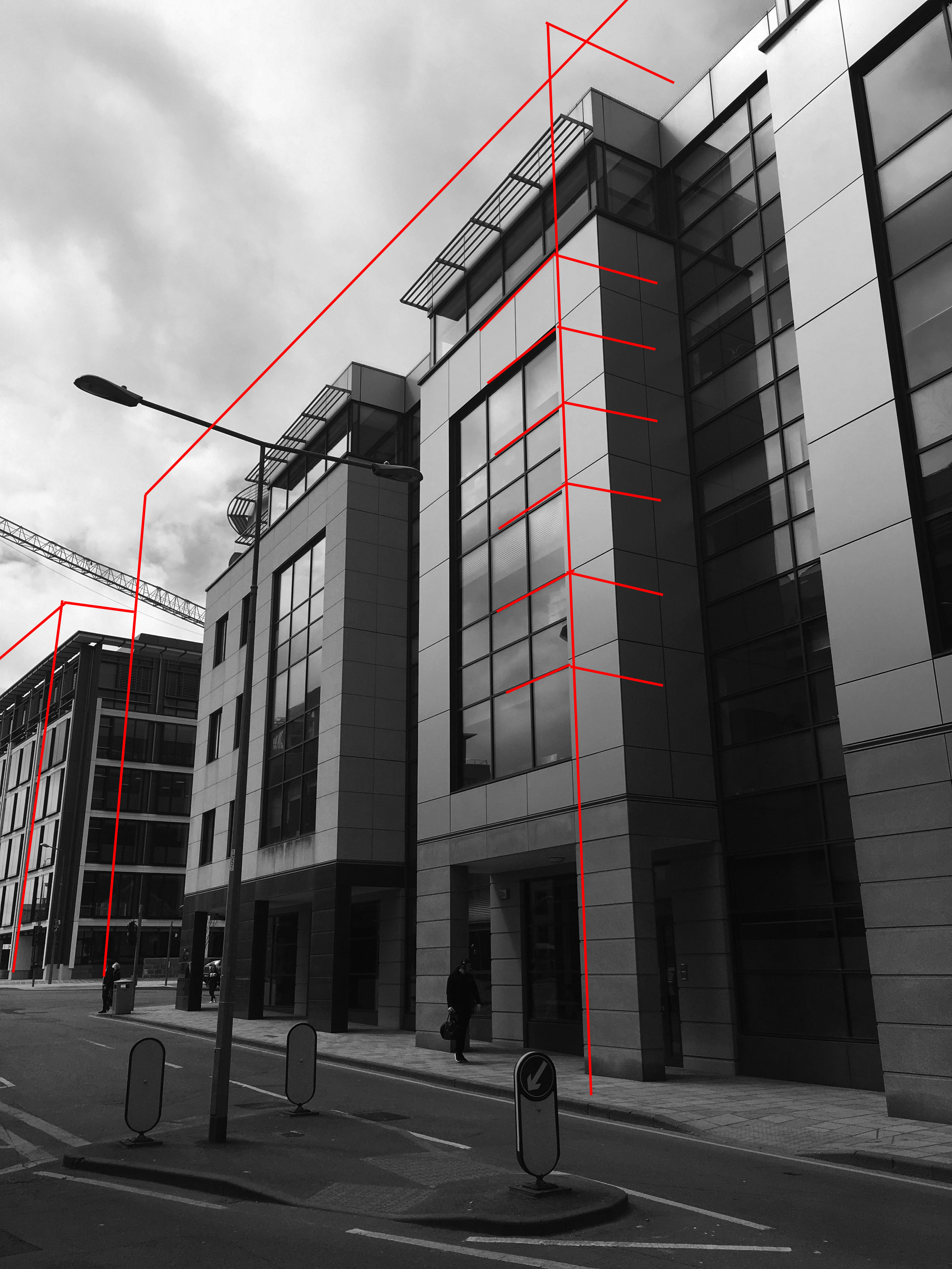
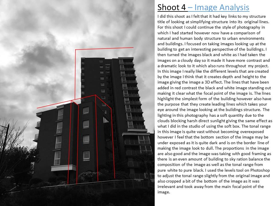
I Have really enjoyed doing this project and being able to explore new and different photo graphical ideas to what i have done in the past. During my exam i made 3 main final pieces. The final piece which i had planned and research the most didn’t go exactly to plan. i doubled foam boarded and trimmed all of my five A3 dancing images however when i came to adding the string it didn’t go quite to plan. I think the main problem was that the string was too thick and looked to bulky against the images so made it look slightly messy when you look up close. Nonetheless i still really like the final piece that was produced because it was different to what i have ever created before and the string did keep clear links between the title of the project ‘Structure’.i decided to leave it as just the one final piece that included string because it was over complicating it to have more because they didn’t fit together. Therefore i decided to leave to images as raw because they were good natural images and i didn’t want to take away from the technique that had been used to capture the images so i got three of my favourite of the A3 images mounted them onto foam board and the grouped them together on a big black board which emphasized the pure black tones in the image as well as bringing the photographs together too look like a group of images. As can be seen above i did window frames for my other final pieces which i think keeps the presentation of the images simple and clean so that it highlights the focal points in the images. I think that my final pieces are simplistic but purposely because it was the best way to show the images and get them to stand out. I have really enjoyed doing this project and it has really helped me develop my camera skills with understanding how to further use the shutter speed, ISO and aperture settings. I also loved doing the structure title because i could look at the different forms of structure analyses and comparing them and going into sections of photography that really interested me and inspired me. My favourite part of this exam has been going down to the beach and capturing images of my friend dancing and doing dancing jumps in the sea because i found it the most challenging shoot technically because i had to get the settings right, but when i did the outcome were photos that i was really proud of. I especially enjoyed this shoot because i was surrounded by our natural beautiful environment and really enjoying taking the images. Overall i think that it has been a really successful project where i have created work that is a true representation of my photography and what i can do.
Brainstorm

I use a brainstorm to experiment and structure my ideas. My selected option for the structure topic is the recording of natural beauty. The terms above will help me to stimulate unique and creative ideas regarding the topic of nature.
LINK TO AS COURSEWORK
The Process
- Moodboard of relevant and inspiring images—link to your title
- Mindmap / brainstorm / spidergram to include all ideas and possibilities
- Artist Case Study to include analysis and interpretation
- Action Plan and Specification
- Photoshoot
- Select and edit (repeat as necessary)
- Compare and contrast your work to the work of your chosen artist
- Presentation of final responses
- Evaluate your process
Ensure that you show a creative process underpinned by interesting ideas and sustain your approach…
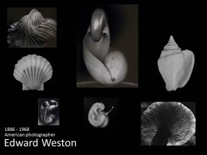
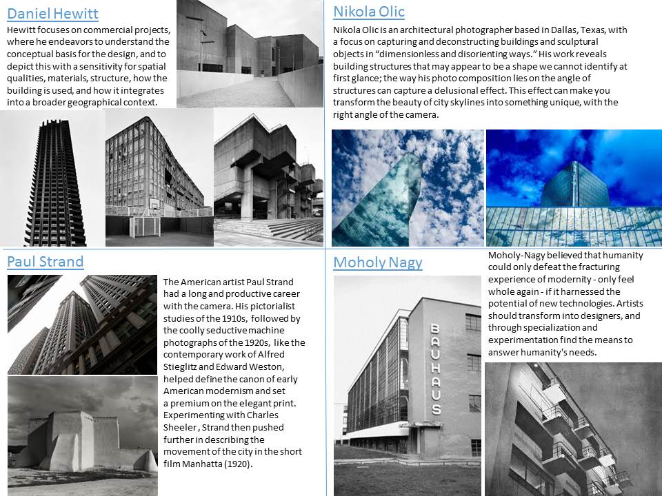
For example, you may want to look at these 3 artists in combination to develop your own ideas…

and then move onto colour developments like this…


and create a unique approach to the theme of structure using simple and interchangeable techniques.

Or explore the structure of a corroded surface….
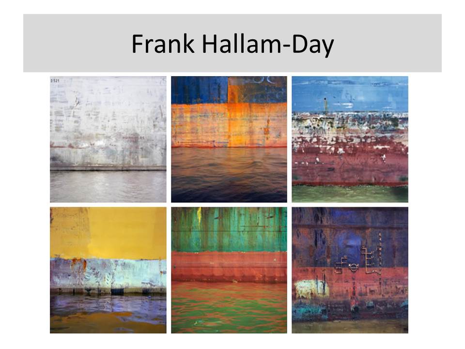


Use this link to see what kind of ideas are out there…
100+ Creative Photography Ideas: Techniques, Compositions & Mixed Media Approaches
http://www.studentartguide.com/articles/creative-photography-ideas
Now look at these artists to explore the concept of layers and structure…
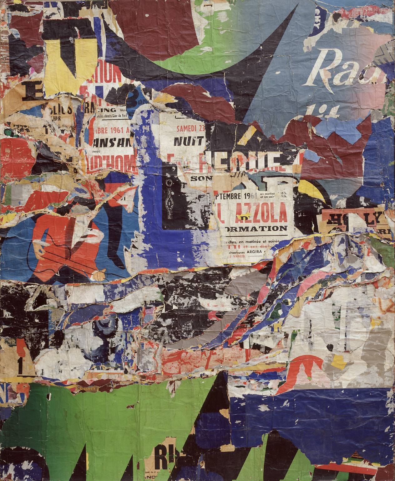
Jacques Villeglé 1926- (France)
The Jazzmen is a section of what Jacques Villeglé termed affiches lacérées, posters torn down from the walls of Paris. These particular ones were taken on 10 December 1961. Following his established practice, Villeglé removed the section from a billboard and, having mounted it on canvas, presented it as a work of art.
Robert Rauschenberg 1925 – 2008 (USA)
Pre pop art, neo -dada. Re-appropriation of photographic imagery to explore the structure of society, politics, hope and despair.
Collage / montage techniques + archival material, found objects
Construction / de-construction methods

Todd Mclellan…de-conSTRUCTION // typlogies

or distort the reality / structure of object, places, people…

Alvin Langdon Coburn created vortographs by using mirrros, reflective surfaces, prisms and more to distort his vision of the world and ultimately change the structure of his photographs…(one of the very first abstract photographers)
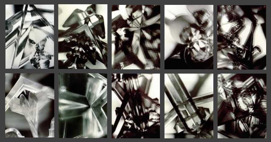
Vortograph experiments by A L Coburn
Think about shape and form…
Paper, paper, paper



Naum Gabo / Head of a Woman /1917

Interior Architecture

Still Life Objects

Time Lapse (constructing and deconstructing) ice cubes melting, flowers wilting and dying etc…

Cara Berer


Cara Berer explores the structure of books and magazines by photographing them from above and creating patterns and shapes that we associate with flowers and decoration…
Irving Penn

Franco Fontana
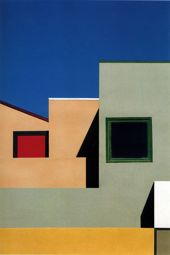

More ideas in this link here!
http://www.modernedition.com/art-articles/photographic-form/new-photography.html
Suggestions for exploring “structure”…
Tanja Deman // juxtaposition of changing environments // environments as temples of worship and culture //utopia // dystopia

Sculptural (photograph as object, combined with objects and ephemera or photographs as a response to a building or space ie environment)

Marlo Pascual (above)
“Pascual arranges the photos into simple, lackadaisical assemblages that she calls “props,” which rely primarily on found furniture. The images are all painfully elegant, and evoke the seductiveness of old Hollywood. In one photograph (all works untitled, 2009), a nude woman stands behind steamed glass—a scene from a movie descended from Psycho? A photograph of a set of crystal glasses is laser-cut and laid on the floor to look like it was dropped—or shattered by a single delicate stroke of a hammer. A joke about the fragility of the image, it is also a decidedly atmospheric work.”
http://www.artinamericamagazine.com/reviews/marlo-pascual/
Letha Wilson
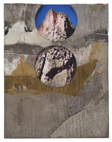
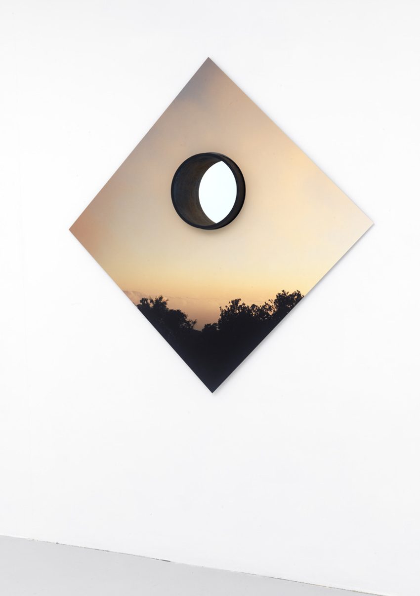
One of a number of contemporary artists who are blurring the lines between photography and other mediums, Letha Wilson makes artworks that are as much sculptures as photographs. Amalgamations of photographic images and spray paint, lumber and concrete, these hybrid objects, medium sized and mostly wall hung, occupy territory also being explored by sculptors such as Rachel Harrison and Virginia Overton. An exhibition of new pieces (all from 2012) showcased Wilson’s adventuresome way with materials.
Thomas Demand
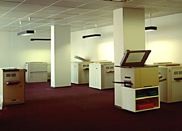
German Photographer Thomas Demand (born 1964) deals with inanimate objects and sterile interiors. He makes models of pre-photographed locations out of styrofoam, card and paper but leaves subtle signs of imperfections, then re-produces the images on a grand scale…in doing he alters the meaning and narrative attached to the environment he is re-presenting…
Laurenz Berges
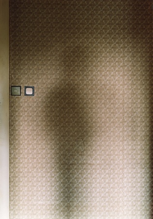
Laurenz Berges is German (Dusseldorf School) photographer. He tackles the notion of loss and removal…and often photographs both personal and shared environments. These can beintimate interiors, or extensive exteriors.
Candida Hofer
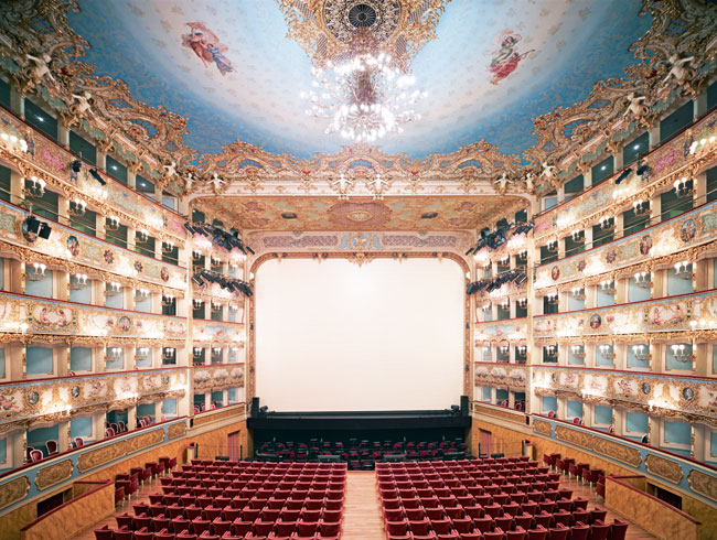
Candida Hofer was a student of Bernd and Hilla Becher in Germany in the 1970’s. Her images are a response to glorious interior environments that explore the contrast between the intention and reality of public and civic spaces…without people interacting with them.
James Casebere
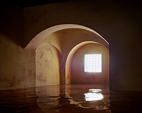
James Caseberes (USA) photographs small scale models that reduce an architectural space to a fragile set of surfaces…they disrupt our belief in the solidity of man-made spaces…what happened ? what happens next ?…we are left disorientated.
Rut Blees Luxemburg
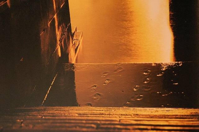
Rut Blees Luxemburg (Germany) uses amber lighting and reflections as found in 1920’s and 1930’s style flash photography…but in a thoroughly modern context.
Andy Goldsworthy


Andy Goldsworthy is a well known British Environmental artist. He makes sculptures that integrate with the environment…they are all bio-degradeable and often end up falling apart and becoming “one” with the landscape again. The photographs, however, remain a permanent feature…
Experiment 1
- You must show that you can COPY, ADJUST, BLUR and BLEND layers using Adobe Photoshop to create a set of images inspired by IDRIS KHAN / STEPHANIE JUNG

METHOD
- Open a suitable image in Ad-Ph
- CTRL J to copy layer (copy the background LAYER for this)
- Move tool to shift image slightly
- Repeat 2 + 3 5-10 times
- Choose a range of BLENDING OPTIONS eg overlay / multiply / lighten etc
- Adjust OPACITY as needed
- Adjust individual layers as needed
- Add FILTER – BLUR – SHAPE BLUR / SMART BLUR if needed
- Flatten LAYERS
- CROP where suitable
Extend your result…
Think about layering your image(s) onto acetate or glass and exploit the transparent qualities vs. opaque shapes, colours and tones
for example

Ardan Ozmenoglu
https://www.pinterest.com/pin/315040936408995781/
Photoshop Experiment 2
- Show that you can use a range of function and techniques to create a composite image like those of Tanja Deman (below).
- Many artists use cut and paste / collage techniques to change the context of their imagery…and challenge the way we look at the world and re-imagine our environment
- Research cut and paste / digital collage techniques and ideas
-
Method
- Select 2/ 3 images that you think you can combine to create a composite image and open in Ad-Ph
- You may need to select one image that you use as your BACKGROUND IMAGE
- Select the object / building / person from another image that you want to add to your BACKGROUND IMAGE
- Click CTRL J (to copy via layer)
- Use the move tool to drag your selection across, then position
- Use CTRL T or Free Transform to adjust shape and size of selected object
- Check your layers panel on both images!
- Now blend the edges in…
- Add a LAYER MASK and click to activate it
- Select a brush, adapt the size and reduce your OPACITY to 30%
- Now click on the edges of your object to blend it in smoothly
- Take care with this part…zoom in if you need to
- You can then merge your layers, or flatten and save the image if complete
- Add to your blog
Or explore x-ray images or household objects like this as part of your response to “structure”

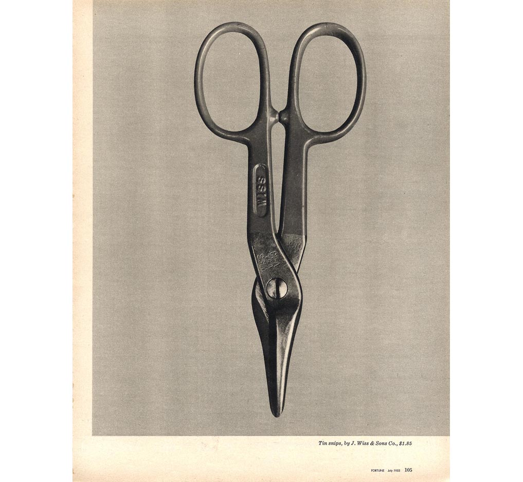
Walker Evans

Jim Dine and his “figurative tools”
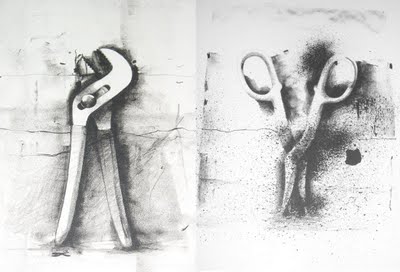
Two Frame Photography / Diptychs / Juxtapositions
http://www.photopedagogy.com/two-frame-films.html
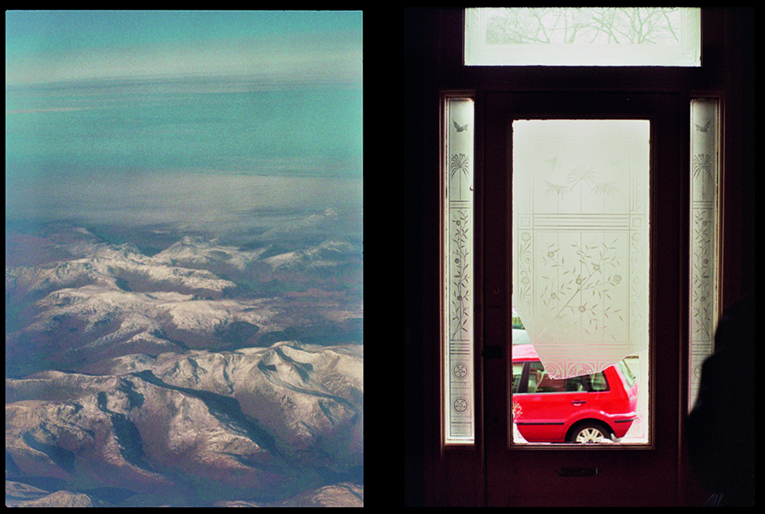
Luke Fowler

