Here is a link to my photobook The Aftermath
On top of the photo-book made we were given the opportunity to selected 5-6 photographs, which would be printed for us to present along side our book. I gathered that these photographs may be the same photographs, which were introduced in the book or slightly different images relating to your overall theme and concept. These images are supposed to tell your story in a similar way to the book in fewer images and will correlate to what has already been presented.
After receiving some advice about strong images and making sure that the images, which I present would work as a collective story board. I choose to work with the images of objects I had taken, we were asked to choose 6 images to send for printing, so these are the 6 images I chose. 


I decided to present these images in a picture story format as they provided a story and theme and therefore worked well together to express this. I decided to keep the name of the collection the same as my book, which is ‘ The Aftermath.’ I felt this fit the theme and story I was trying to portray quite well. Overall, I enjoyed the project as it allowed me to connect with my Granddad on a much deeper level. I liked working with in a documentary style and also taking snapshot images, however for future projects I would like to maybe explore staged images as well snapshot images, still working in this documentary style genre.
For my photo book, I originally photographed my mum and ad’s wedding cards which they sent to each other the day before their wedding, and, coincidentally, they happened to be the same.
I originally photographed these on a white background, raised from the white A2 sheet of card to create a shadow, and although the image turned out well, it didn’t fit the book as I wanted. Because the shade of white of the card did not match that of the white paper I was using for my book, I had to heavily increase the white clipping in the image which affected the look of the cards themselves as these are also white – in-turn, the cards ended up blending into the background because the shadows weren’t harsh enough.
Additionally, I hadn’t photographed the cards at a well enough height so that they looked the same size. One of the cards was also placed higher than the other and it didn’t achieve the affect of “direct replicates” as I wanted – I wanted to make it as symmetrical as possible. Because of this, and after realising that it didn’t fit in the book as I wished, I decided to re-photograph them.

I did photograph them again on the white background hoping I could get a better shot and hoping I could get a more harsh shadow from the sunlight on my window sill – where I had set up a mini studio for photographing the archive material. However, this again did not turn out as planned and once I had imported them into Adobe Lightroom, I was heavily affecting the lighting effects such as brightness, contrast, exposure and black/white clipping so that the image was in-turn becoming more and more low quality. I eventually realised that because of the card’s colour, I wasn’t able to photograph them well against the same coloured background. Because of this, I experimented with using black card, which, as you can, worked much better than that of the effects white card gave. It allowed the cards to stand out much better and I only needed to, once imported into Lightroom, alter the darkness of the black to darken this and increase the contrast of the black lines in the card.
I am very happy with the outcome of my third attempt at photographing my mum and dad’s wedding cards. Because it is the opening image in my book, I wanted it to be of high quality and this is my best edit yet and will be the final image used for the book. I will be using it as a full bleed image to get the full effect of the little details in the cards. I have also found that using black card places more emphasis on the cards and their value than white card did.
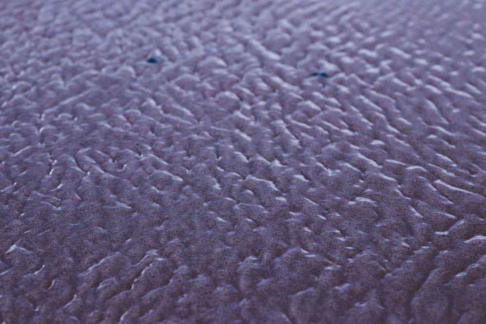
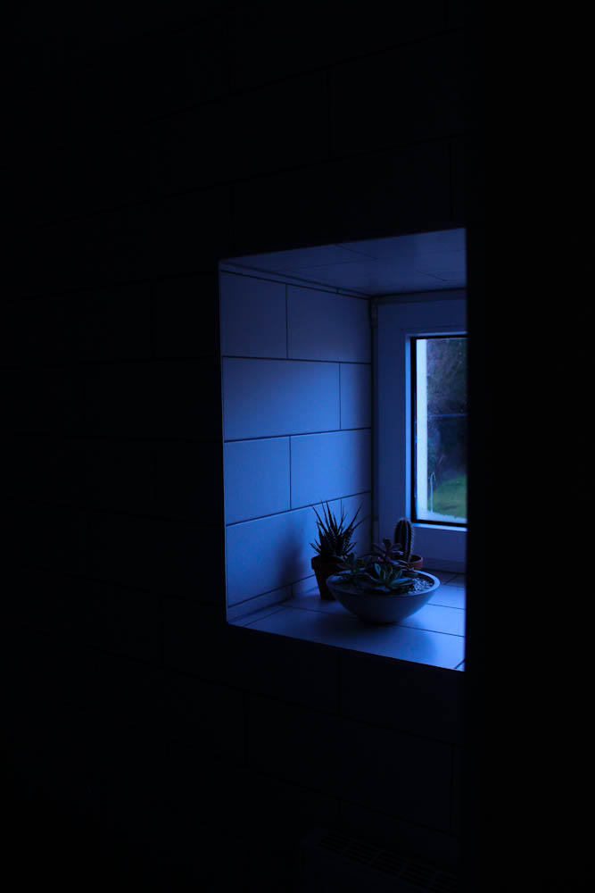
Although my project is focusing on body image, I also wanted my book to contain some images of landscapes and close up details of certain scenes within the landscape. I wanted to add some contrast within the book to change the subject and view slightly. I decided to go to St Ouens bay to capture the landscape images because I wanted scenes of the sea and the vast emptiness that St Ouen contained. My project is about portraying hidden emotions in a physical way and I believe that inserting images of an empty landscape would work well with my theme because its portraying the feeling of loneliness and emptyness.
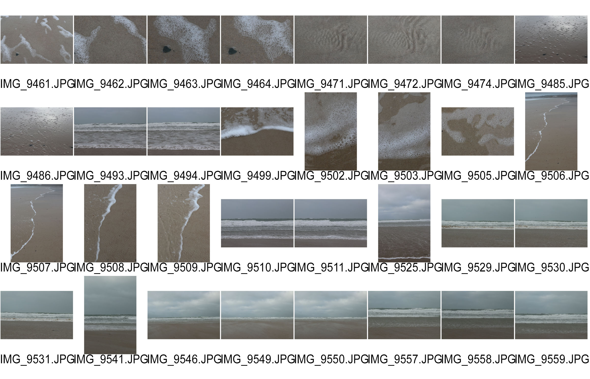
For the close up details of the landscape I wanted the sand to resemble skin because my project is based on body image. I edited the images using Photoshop because I only needed to do simple edits such as exposure changes and colour changes to achieve an overall look that suited my aesthetic.


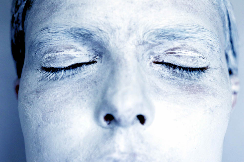
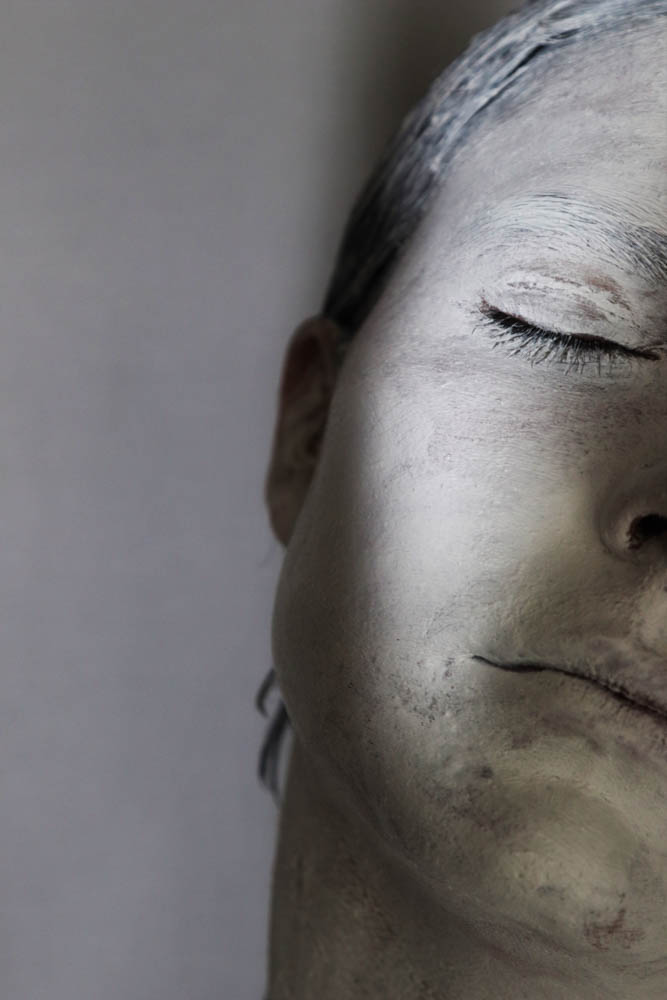
After doing the white body shoot I wanted to do another shoot based on the same theme of invisibility and losing your identity. However, instead of capturing the whole body I wanted to fragment the face. Since I was focusing on a smaller portion of the body I was able to properly cover the face with white paint so that the effect looked better. I wanted to do a shoot just focusing on the face because I believe the face is the most expressive part of the human body.
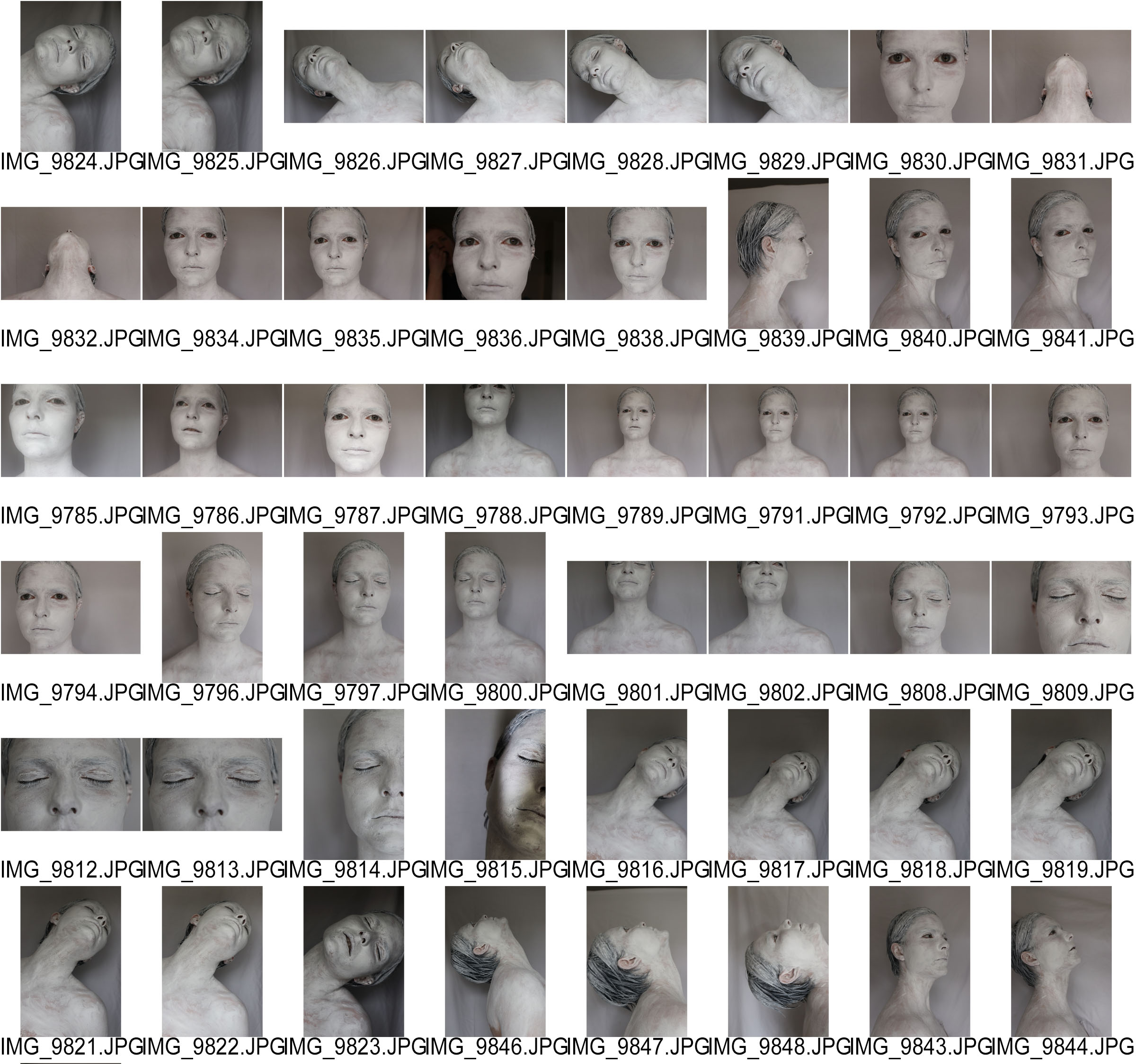
I edited the images using Photoshop because it enabled me to do the most editing since I planned to experiment more with there edits to make them more interesting and artistic. I really like the bright colour edits because they work well with the hand shoot images. Also the bright colours again symbolize different emotions.

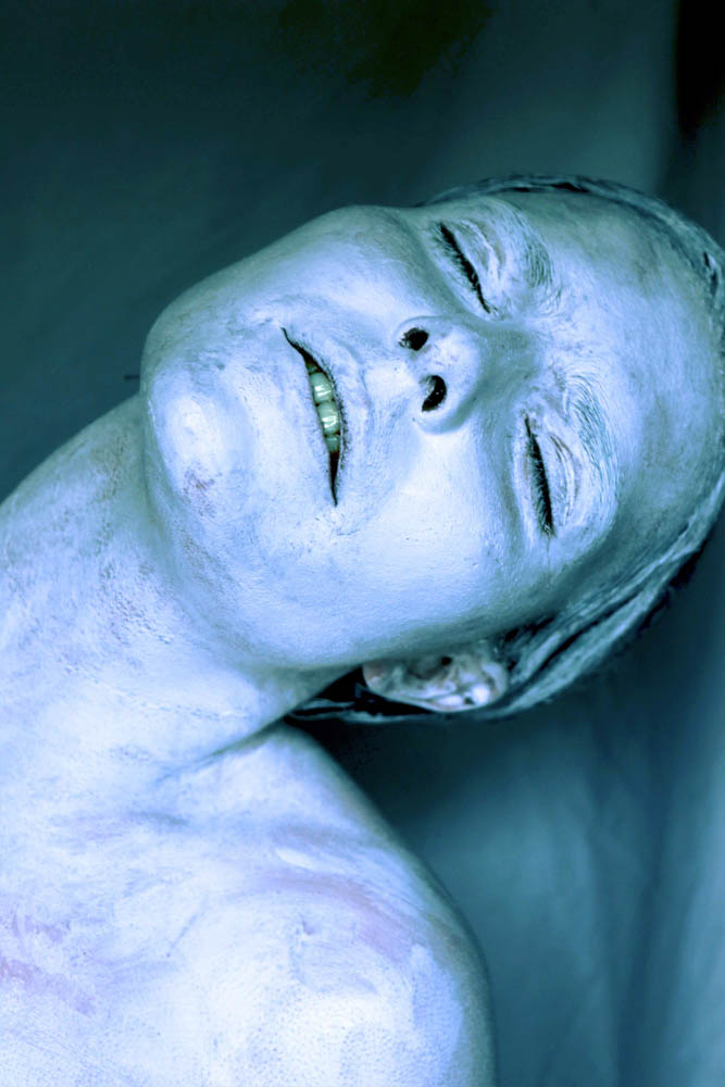

I also really like these edits without the colour because they are simple and effect with the white model posing in front of the shady background.

On Friday 19th I organised a photo shoot in the studio at Hautlieu to obtain images based in the concept of movement and body image. I managed to achieve a wide range of images and am happy with my result. Instead of using the studio flash lights, I decided to simply use the room lights on the ceiling because I didn’t want an extreme shadow. When preparing for the shoot, I asked two of my friends if I could paint their hands and arms with white acrylic paint. I used the paint in the art room to do this. To make sure all the skin was covered we had to do several layers.
Whilst taking images I asked my friends to create different shapes with their hands symbolizing certain emotions such as pain or struggle. The aim of this shoot was to represent emotions using the hands. This was an unusual and creative perspective of viewing the body to symbolize a hidden feeling.

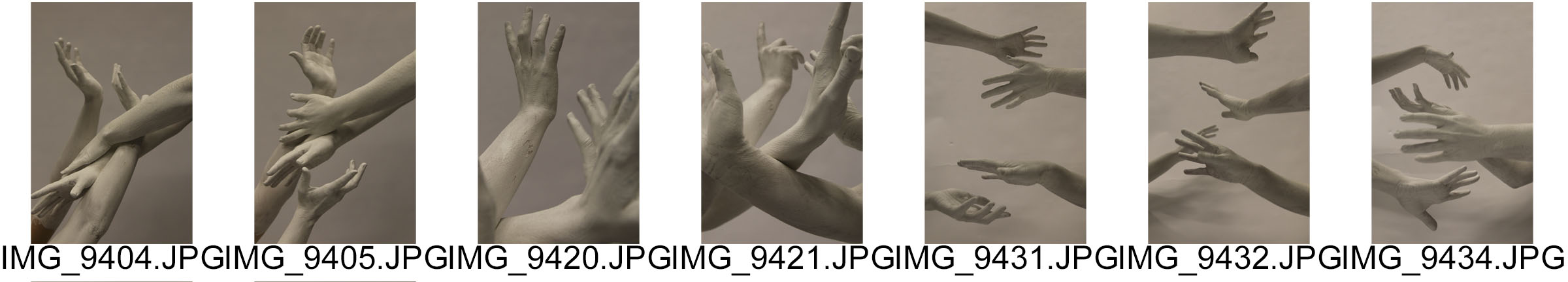
I framed the images so just the painted parts of the hands and arms were showing because they were the focus of the shoot. I asked the models to make sculptural shapes with their hands. Soft delicate shapes as well as rigid harsh shapes. I am very happy with the images a managed to achieve. They work especially well with my project because they express movement as well as emotion.
I wanted to start by doing simple edits. I firstly edited the images by lowering the contrast and adding brightness and exposure. I then changed the vibrance and saturation. Although there are some shadows on the backdrop, they work really well with the image because they make it look less two dimensional. They also add another tone to the image. I made sure I got some portrait orientations and landscapes to see which style was best.


I really liked the effect that the white on white created because the images were very pleasing to the eye and looked very professional. I wanted to experiment a bit more by adding some colour to the images. This made them look more contemporary and modern. The coloured images suited my project more because the colour helps to expresses the different emotions I was trying to replicate such as the red symbolizing terror.


Below are the edits I have created using Adobe Lightroom from my photoshoot where I photographed my girlfriend, Lucy cutting my mum’s hair in our kitchen.
This was one of the first the photoshoot I completed for my project and I saw it as the perfect opportunity to get a collection of a few strong images to start me off with my project looking at relationships within my life and my family circle.
My girlfriend, Lucy is 17 and has just recently qualified as a hairdresser and so is always being asked by family members for hair cuts, including my own family.
I really like these images and the reason for this is because of their very delicate, poetic and elegant nature. All three are very documentary style and are capturing a moment in time.


The three images below have been edited on Adobe Lightroom and are the best three images from the photoshoot. All three work well in conjunction with each, however, I plan to use them with the images produced from my mini photoshoot I carried out at my dad’s flat.
The photograph below is of Lucy cutting my mum’s hair. You can also see me in the reflection as I am taking the photograph and this could be seen to ruin the image as usually it is known for photographer to remain behind the camera and out of frame because if the audience are t see the camera or the photographer, then we don’t like this as we have been taught that the common ideology of photography is for the photographer to remain behind the camera. I enjoy the fact that as well as the subject, I am also in the frame but with both Lucy and Mum illuminated so the focus is on them.

The photo below is mid-at through the haircut and shows Lucy gathering some of my mum’s hair to cut and the effect of this movement is captured in the camera and transferred to a visible blur in her hands which I also think has a positive effect because it shows that the photo is more than just one dimensional and adds action to what is shown. It is pretty much the same photo as above as it consists of the same content but as a close up shot to view the subjects in more detail and instead in black and white. As opposed to focusing on hard shadows and contrasts, I have attempted to focus more on neutral tones such as greys and making these the base of the image because I observed this in LaToya Ruby Frazier’s images; that the contrast was quite low and instead, grey colours were used to provide a body to the image and this is also the same in Matt Eich’s images – something I ma not used to but enjoy the visual effect of.

There is in fact a Matt Eich image that he took of his family in the garden as his wife cuts his hair, shown below.

The image below is of the hair resulting form my mum having her hair cut. The wet, clumps of hair lay on kitchen floor scattered across the tiles as, in the top corner, the blurred motion of the vacuum enters the frame. It is a very simple image that takes little skill and technique and more observation and focus to see this moment as a photographic opportunity because this photo finishes off my collection of the first, second and this as the final image to create a mini series of three images.

![]()
![]()
![]()