Category Archives: Photobook Design

Filters

Author:
Category:

Luce Family Crest

On my return to Societe Jersiaise after the Christmas break, I re-started my studies from where I left off before Christmas immediately but instead of looking at old Jersey postcards, I began something a little different and hopefully more beneficial to my studies at school for my photography project – the tasks completed on Monday morning of this week has already proved much more beneficial to me than my previous tasks at the SJ. So even though, different to before Christmas, I still got straight back into the swing of things as I had an idea of what I wanted to achieve in my first session back before I attended the SJ. I didn’t want to continue with my study into the old postcards of Jersey because they were not providing me with what I wanted from my time at SJ. I wanted to find representations of Jersey as an old honeymoon destination but this was not being achieved and I felt my time wasn’t being used efficiently and it was getting a little repetitive so I suggested for me to move on form this and begin something new. I suggested my idea to Karen and she backed this up and gave me the all clear to go ahead with my intentions; my idea was to look through relevant information regarding my family history in the library at SJ. This task was really interesting and I will explain it more later in this post as well as what the create below actually is as it links with my studies from Monday 8th Jan.

When I was at Societe Jeriaise on 8th January, I was introduced to the library they have within the building. I was also introduced to the librarian and very knowledgeable, Ana. Myself and Karen went down to the library and told her what I wanted to research and observe relating to my family history. I wanted to look at my family tree and so Ana lead us straight to a draw full of family trees of the families of traditional Jersey names. She pulled out a large transparent envelope which included the family tree of the Luce family. I begin to look through this, and, as it was my first time looking at this family tree in such detail, I become a bit loots and overwhelmed by all the information provided about ancestors and potential long lost relatives which I was unaware of.

Ana then told both myself and Karen that earlier that week she discovered that the mother of the British comedian, Miranda Hart had the maiden name of Luce. This was also news to me and when I was left alone to delve deeper into my family history, I began researching this and discovered that great grandfather’s and uncle’s of Miranda Hart, were in fact Luce’s and they worked in the several wars of the world as surgeons and medical assistants. Although this was interesting, it did not have a relation to my project and I quickly moved on before I became knee deep in irrelevant content.

Next, Ana pulled out a very large hardback book; it was almost like an encyclopedia, but covered information of traditional Jersey surnames and their origins as well as including the crest of each family name. This book was called an armorial book. An armorial is defined as ‘relating to heraldry or heraldic devices.’ And heraldry as defined as ‘the system by which coats of arms and other armorial bearings are devised, described, and regulated.’ All information relating to the surnames of Jersey-born families is carefully collated and and detailed in this book and it included the origins of the Luce name which was a great. Although a very small segment of the book outlined the Luce name, it had the crest of our family within and it was amazing to see. I immediately had the idea to include this in some way or another within my photo book to give some sense of historical but personal meaning to my book.

Below is the crest if the Luce family taken from the online version of the armorial book. It is evidently very detailed and beautiful in it’s intricacy and symbolic representations and I was eager to create a replicate of this by tracing part of the crest, in particular, the coat of arms in the middle and there was no way I would be able to re-create a quality drawing of the full crest. Therefore i decided to begin my recreation of the coat if arms in the center which included a range of different symbols within this and I would use this creation once digitized on Adobe Photoshop as a personal and historical representation to include in my photo book.

Crest of ‘Luce’ family name

I would love to infer as to what the different symbols within the coat of arms actually mean and I think I would be able to find this information out from the librarian, Ana. For now, however, the image below is a JPEG of my recreation of the crest and it was a first draft experiment that may change slightly through alterations over thg next few weeks leading up to the creation of my photo book. However, I was really pleased with the final outcome because of the drastic change that occurred between the first stage of tracing the crest and the uploading an image of this to Photoshop to then improve in terms of final tweaks including the increase in black point and decrease in white point to make the black lines stand out and I also added the grey background as well as drop shadows to some of the symbols, as shown in the original crest above as I wanted it look as authentic as I could whilst still  holding elements of it being handmade/drawn.
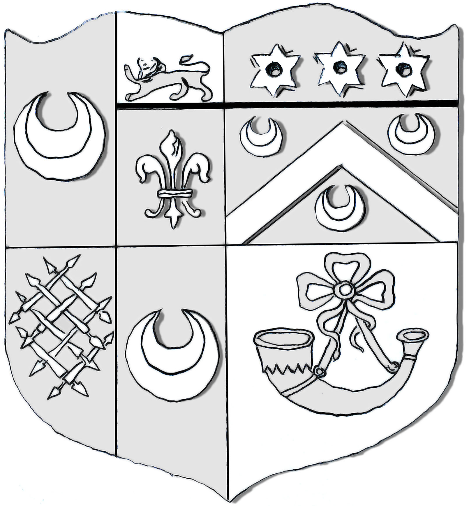
My digitized recreation of the ‘Luce’ coat of arms


Photo Book Investigation (Matt Eich – I Love You I’m Leaving) – Deconstructing the Book

For my investigation into a photo book, I will be observing in detail, then discussing the features of Matt Eich’s photo book entitled ‘I Love You I’m Leaving’. I have chosen this book to research because it is the book I will be using in my personal study and Matt Eich is a photographer I have paid close attention to throughout my project thus far. His images are so very poetic and it is a style of documentary photography I am aiming to replicate in my project. The following few blog posts will be dedicated to the research into this photo book and will include discussion surrounding the narrative and features of the book as well as who Matt Eich is and my own options on the book. 

Deconstruction of the physical and narrative features of the book:

Book in hand
The book in hand feels very light and small – it can be handled easily and doesn’t feel too heavy.
The cover has a very smooth texture yet a little rough and feels almost like plastic.
Book is a small portrait format.

Paper and ink
The paper is the same throughout – matte paper with solely black and white images printed throughout.
There is no text / captions in the book
There is a coloured image of photographers grandfather at the beginning and the end as it is dedicated to him.

Format, size and orientation
There are 64 pages and 46 photographs.
The edition is softcover with an exposed spine.
The dimensions are 22 x 17 cm.
It is portrait and features images of all sizes.

Design and layout:
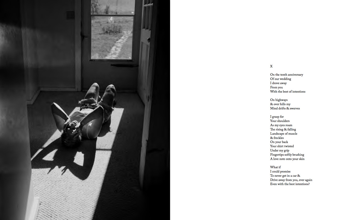
Within the book, there are no captions or texts alongside the images. However, there is a poem at the end next to the image where we the wife on the floor in what seems like a breakdown as she looks very uneased by something with her hands on head. I am not certain on what the poem means or who it was written by but it describes driving away from the one you love on a 10th wedding anniversary and feeling a sense of remorse.
Neither are there any fold-outs or inserts.
Landscape Images: 18
Portrait Images: 14
Full Bleed Images: 11
Tipped In Images: 2
Blank Pages: 5

Rhythm and sequencing:
The book starts and ends with very similar images; the first image of the project is of Eich’s daughter sat at a park bench with the light reflecting on her body and she has her eyes closed as she leans on the table. This image image is again shown as the last image to conclude the book but this time with her eyes open and the shadows reduced.
The second image introduces Eich and his wife in a self-portrait where we see Eich, sat down, learning his head against his wife’s bare abdominal as she stands. This is a very powerful image to introduce the wife and husband.
From this point, it seems as though every juxtaposes one another in the sequence they have been printed. There doesn’t seem to be an order yet that all work in conjunction with one another.
It is as though we physically take a journey through the busyness of family life as the husband and wife spend time with their children and as we are introduced to new characters throughout.

Structure and architecture:
The book, unlike other photo books simply consist of solely images which often don’t seem to have nay relation to one another and so it may, at first be difficult to derive nay meaning from the imagery and decipher the story which is wanting to be represented which is what I experienced at first . However, there seems to be a running theme of finding a balance between emotions, events and feelings. It starts at an equilibrium which seems to gradually crumble and become an imbalance of emotions within all family members and this is presented in the photographs as we people confiding in one another, and more serious facial expressions, if we see any at all because often, faces are covered with hands to hide the sadness. People seem to be less involved in their familial circle and daughters, the wife and Eich’s parents seem to become isolated from what once was an equilibrium.

Narrative:
The story is told from the perspective of Eich himself as a father, son and husband and focuses on all 3 of these elements of family life to tell a narrative of love, connections and detachments. Eich, although at the centre of it all, does not make this clear and instead focuses on the presence of his family members and how this provides a base for he life they all lead. Eich himself states that the book follows his documentation of what he experiences within his own familial circle as he, on regular basis makes connections with his daughters through his love for his wife and this welcomes an interaction between himself and his parents. The narrative can also tell a story of generations and how this is, even though very broad from elderly to youth, can actually connect a family through the relationships that build over this concept of ‘knowing our place in this fragile world’ as Eich states. This is shown in the image which includes the book where we one of Eich’s daughters sat by the coffin of Eich’s grandfather and even though this man is not present in the book’s content through, it reiterates the importance of remaining close because without that knowing of belonging, people can become so easily isolated which I explore in my own project through the main body looking at belonging; it provides an underlying guilt of not being present and instead being contained within yourself, something I have recently become a victim of and I am attempting to include this emotion in my project as I have become much more aware of my own feelings since starting this book. I see my own project as an experiment of truth and showing everything as it is – by not covering anything for the lens or presenting anything false for the camera. My aim and intent is for this to make my project more raw and real by not altering things to make them more “acceptable” because then photography does not become interesting and it removes that ability to connect with imagery once the rawness of what you are capturing has been discarded.

In Eich’s project, he does not attempt to tell a story of sorrow or upset and instead looks to simply present his family and the rawness of their respect and love for each other – this what I get and feel form looking and flicking through his book.

Title:
The title is literal but it is also poetic. The title ‘I Love You I’m Leaving’ I imagine was carefully chosen by Eich but once chosen would have been easily imagined because of it’s compete literal meaning. The story follows the split of his mother and father after over 30 years of marriage and how this break-away coincides with the departure if Eich and his newly formed family to a new city. It looks forming a new identify from what Eich used to be – from his mother and father’s careful nurturing to raise Eich to the man he is now has benefitted his ability to build his own relationships, however, occurring at the time of what once was a happy family’s physical and emotional detachment as he moves away, leaving his mother and father suffering on their own, also away from one another. The title, knowing this synopsis of the project, seems very suited and it does work very well. It also connotes the popular phrase of what people say to one another if they are about to leave an event or situation etc. but don’t rally want to and it is not out of their own will – people often say ‘I’ll love you and leave you’ as they say goodbye and this essentially what Eich is doing. It does very intrigue the audience because it opens the door to what is to come. 

Images and text: 

Image result for matt eich i love you i'm leaving

There is one piece of text throughout the hole book, excluding the two texts at the beginning and end which dedicates the book to Eich’s grandfather and this is the pome towards the latter of the book (shown above). It is a poem on a blank page next to a full bleed image of Eich’s wife lying on the floor. There are no captions or anything else apart from this four verse poem. I am not actually fully sure of the meaning of the pome and or what it’s intent on the audience is or who’s perspective it is actually from. However, I am imagining it is either rom Eich’s perspective to his wife or I thin that the most likely option is that it is written by Eich about his father’s divorce from his mother as it follows a story of leaving the said and feeling some sense of remorse but still a sense of love. I also believe the title of the poem is ‘X’ – most likely connoting a kiss in text talk.


Understanding photo books- analysing a photobook

I have chose to analyse the work of Phillip Toledano, I feel this makes sense as my essay question is discussing his work in relation to change, fate and absence. Phillip has made two book, which particularly inspire me in relation to my own personal investigation. I will be particularly focus on ‘Days with my Father.’

I have already looked into the story and the narrative of the book as it was one of my artist references so therefore I have some background information on Phillip and his work. Days with my father was made after his mothers death and he realised how severe his fathers memory loss was. He recorded the final chapter in his father’s long life, his sense of humour, his struggle with memory loss and above all his unfailing spirit. He particularly reflected on his father’s changing state. It shows the change but also the relationship between father and son and also how this has changed as a result of his memory loss. The genre of this is documentary photography, this is because he is photographing his dad doing things he might normally do, showing every emotion he has felt throughout the time he was photographing. Although in some of the images he might know he is being photographed and they could be seen as a bit posed they are naturalistic images, which to me feels like a documentary style book. He documents his father doing regular things but brings an element of emotion and connection within the photographs, which is reinforced my small sections of text explaining different aspects of his fathers life, conversation, feelings etc which relate to the image aside it. I feel this is almost a celebration of his fathers life as well as revealing his struggles, which I feel is extremely powerful and meaningful. This is an emotional rollercoaster of discovering long hidden details, of moments of genuine laughter, and of the intense sorrow and helpless emptiness of seeing the parent slowly deteriorate and finally die. This is extremely personal and heart-warming, which is clearly shown to the readers through each page in the book. I feel like the book was made to create a different and deeper relationship with his father as well as providing support to him in times where he was struggling with grieve as well as his illness (memory loss). The book would have been for himself as well as giving other viewers an insight into what living with memory loss is like, almost educating community on this, as well as maybe giving people relief who are going through the same thing as they know it isn’t just them.

The book itself is a small landscape size book and is a hard back, which has a card cover over it that has an image of his dad on the front, with the title ‘DAYS WITH MY FATHER’ on the back of the paper cover there is another image of his father’s toothbrush on a glass. Inside there are two pieces of text- one in the inside at the front and one at the back, which describe the book. The small well put together book feels precious as it feels small in your hands and you know it is a sentimental book. The book does not of anything in particular, just smells of good quality paper. The pages are all the same size and the same thickness, which I really like. The paper is thick and has an almost matte finish, which makes the paper feel smooth.` The images themselves are in colour throughout and he as no use of black and white images. All of the images are landscape and all but 2 are full bleed, which means there is no broader around the photograph to frame it. the others are portrait images on a landscape page, which creates a white blank space. The book and the photographs within the book are of an A5 size and there are 47 pages within the book. Throughout all of the book there is always a double page spread, for the majority of the book there is a white page on the left, which is either left blank or has text on it to marriage with the image of the right. There is one double spread page, which has two images on both the left and the right, one being full bleed and the other being a portrait, which takes up half of the page on the right. There were no grids, fold-outs or inserts, it is a very tidy and smart looking book. The images are all edited in the same way, which provided a rhythm and sequence to the book. The images were all high in contrast and they all had low lighting, which created shadows in the images. The title ‘Days with my father’ is relevant to the book and the story line and is taken quite literal as he explains it was his fathers last days. The text written next to the images link to the overall narrative and the images along side them, they told stories or created emotion and almost described the images.


My Book specification

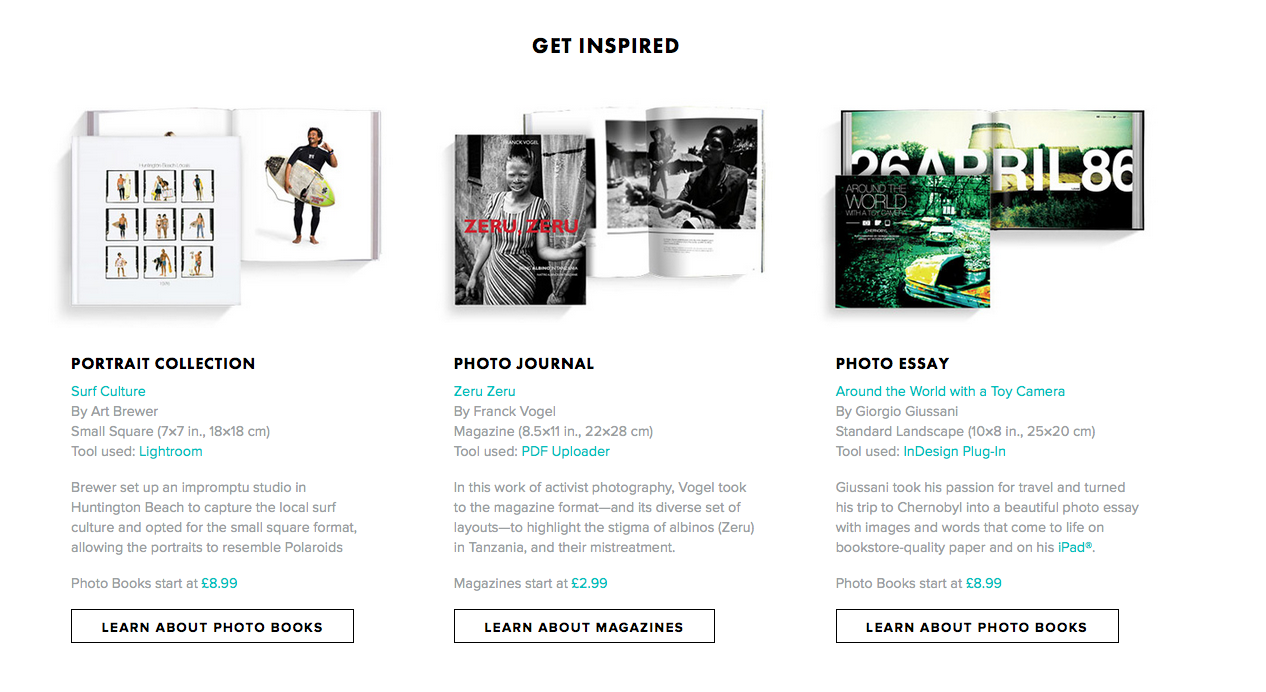
I would like to make my book through BLURB so that it has a hard cover, which will protect the pages within the book. This is something I found quite important as the images themselves are extremely precious to me. I would like the book to be small and landscape, which is similar to Phillips book about his father. I would like my design and layout to be similar to Phillip’s in that most of the way through there will be little notes or quotes next to specific photographs, but I would also like some images to take up two pages (double page spread) to empathise that particular image and also have some images full bleed as for most of my book I would like a broader around my images to act as a frame. The photographs within the book will be a mixture of black and white images and colour, which will be spread out over the book. I would also like to experiment with overlaying and grid my images on a page, however I am not sure how this will look.  I would like to play around with the order of the images, but for now I don’t want my images to be in any particular order. My order will be what looks the most aesthetic and also of course fits my theme of Absence, Fate and Change.  My narrative is exploring my granddad, showing how his life has changed dramatically from illness, which started from a stroke, leading to other illnesses impacting his life. I am also exploring absence within my work, particularly within my archival aspect of my work. I will be using both documentary style photographs and archival photographs to show elements of change. I will be including text in the book as I mentioned before, including quotes, stories and small explanation as well as my essay, which is tackling ‘How does Phillip Toledano explore notions of change, fate and Absence in his work? I would like the paper to be a matte finish and I would like all the paper to be the same size within the book. This might change when I come to making the book. I would like the paper where I am going to insert writing to be white and the ink be black in a basic font. I would also like the pages to smell of my granddad by spraying his aftershave on the pages, although I know it will not stay on the pages for long.  Finally, my title for my book will be: ‘The Aftermath’, which I would like to have in bold text and in capital letters. I researched into photobooks and also looked on the website blurb to gain ideas and inspiration for my book.


Photo Book Investigation (Matt Eich – I Love You I’m Leaving) – Research of Photo Book

For my investigation into a photo book, I will be observing in detail, then discussing the features of Matt Eich’s photo book entitled ‘I Love You I’m Leaving’. I have chosen this book to research because it is the book I will be using in my personal study and Matt Eich is a photographer I have paid close attention to throughout my project thus far. His images are so very poetic and it is a style of documentary photography I am aiming to replicate in my project. The following few blog posts will be dedicated to the research into this photo book and will include discussion surrounding the narrative and features of the book as well as who Matt Eich is and my own options on the book. 
Research of the photo book:

I will be researching, for this task, the photo book produced by Matt Eich highlighting his project entitled ‘I Love you I’m Leaving’. This project outlines his parents split after several years pf marriage as he and his newly formed family transfer themselves form their hometown to a new city to start a new life as his parents are in a phase of vulnerability, grief and need. He feels as if he leaving in the most fragile of times and he documents this through photographing his family’s habits in in their new lease of life.

“I Love You, I’m Leaving is my meditation on familial bonds, longing, and memory. The series borrows from personal experience and the visual language of the everyday in order to create a fictional account that mirrors my reality. Made during a time of personal domestic unease, I photographed as my parents separated, and my family moved to a new city.” (ceibaeditions.com)

Image result for matt eich i love you im leaving

Throughout the book, Matt Eich sticks strictly with black and white images and focuses harshly on using shadows and light to depict a particular mood – this being quite eerie – there is a certain glow to Eich’s images and his subjects posses a certain importance highlighted through the use of light to illuminate their presence. You see the subjects consisting of his wife, two daughters and older generations through the family wearing mainly white and flaunting their hereditary blonde hair as the light Eich focuses on strictly catches and provides glow to the light colours each subject possesses.

Eich also pays close attention to providing a balanced tone spectrum in each image as you notice the whites being visibly brighter than that of the solid blacks and in between this, greys of all different tones fill the negative space to create a very tonally balanced image.

The genre Eich takes on is that of a documentary approach where he captures the still moments that take their course in between the more hectic, busier moments of life which are also captured on a more subtle level. However, the overall tone the images depict is very atmospheric as if each image is their to tell a story and work as a collective but each individual image also has the ability to stand solitary as a documentation of the fragility of their familial circle. No one image is isolated and they come together, intentionally to create a solid visual narrative of what Eich experiences as a photographer, father, husband and son.

With Eich’s imagery, he pays no attention to attempting  to romanticise life itself and as a documentary photography project, it shows life itself and the rawness and actuality of what, on an everyday basis, his family are familiarised with but as a viewer, we are getting an insight in this and become hooked on what we are shown and begin to attempt to deconstruct this when, really, Eich’s job is to show is what is front of him as he discovers his family just as much as we are when delving through the project. Each photograph has a meaning and makes no effort to depict a false reality and instead focuses on what is there – the tangible – but we are shown a sense of intangibility through the project as we attempt to sympathise and relate with something we only know fragments of. Furthermore, Eich creates this sense of belonging as he brings each and every family member together as a collective and us as the audience feel involved in this poetic representation of what family is and it’s ability, in partnership with attachment and love, to unite yet destruct the once solid family tribe.

Photo Book Investigation (Matt Eich – I Love You I’m Leaving) – Who is Matt Eich?

For my investigation into a photo book, I will be observing in detail, then discussing the features of Matt Eich’s photo book entitled ‘I Love You I’m Leaving’. I have chosen this book to research because it is the book I will be using in my personal study and Matt Eich is a photographer I have paid close attention to throughout my project thus far. His images are so very poetic and it is a style of documentary photography I am aiming to replicate in my project. The following few blog posts will be dedicated to the research into this photo book and will include discussion surrounding the narrative and features of the book as well as who Matt Eich is and my own options on the book. 
Who is the photographer?

Matt Eich (b. 1986) is a portrait photographer and photographic essayist working on long-form projects about the American condition. He is currently a Professional Lecturer of Photography at The George Washington University and continues to accept commissions. Matt resides in Virginia with his family.

Matt holds a BS in Photojournalism from Ohio University and an MFA in Photography from Hartford Art School’s International Limited-Residency Program.

His second book, ‘I Love You, I’m Leaving’ was published in September 2017 by Ceiba Editions and is sold out. He has three forthcoming monographs scheduled between 2018 and 2020.

I Love You, I’m Leaving’ is Eich’s latest photo book. The book was a finalist at the Lucie Photo Book Prize in the Limited Edition category and received a special mention at FoLa Book Awards.

Until I came across Matt Eich, I did not really enjoy looking at black and white imagery because I thought it was traditional and classic and has been too over-used and as a result of this, I felt like I couldn’t be original when using black and white images in projects etc. I also felt like I couldn’t portray the mood and tone I would wish for in black and white because there is no colour and I used to enjoy relying on heavy colours to bring my photos to life but now I feel the complete opposite to this since discovering many modern day photographers who use black and white imagery for full projects. I now find pleasure out of relying on shadows, light and contrast to create dramatic or elegant and poetic black and white photographs.

Although this book would be aimed at a more elder target audience due to its subject matter and use of nudity within, I believe it could be aimed and read with enjoyment and pleasure by a keen photographer of any age because although the subject matter it relatively mature, it is very relatable to people of my age. It looks at the fragility of your place in the world and how this is secured through family life. I have found great enjoyment out of looking at this book because of its pure ability to speak to the reader throughout it’s poetic story-telling style.

understanding photo book design- reviewing blogs

To understand how to identify a narrative and understand the design process of photobook making before making my own I read varies texts and articles to see other peoples views and information.

In the article  Identifying the Story: Sequencing isn’t narrative written by Colin Pantall, he focuses on creating narrative within photobooks and then sequencing the photographs and book designs to tell the story and work well with the narrative. He also explained he found it quite difficult to sequence his book as he tried lots of different approaches such as: ‘hronology,  geography, family, resemblance, art history, season, colour, form, tone, flora, expression, dress, climate, mood, symbolism and material.’ He admits that sequencing was a ‘gradual process’ and he found it fairly hard, as none of these made a narrative. He explains that what actually made the narrative was identifying what the story was about. This links to creating ‘all the structures through which the story can flow and the structures plus the story creates the narrative.’ He refers to Ania Nalecka’s workshop where she asks in three words what your story is about- which to me seems extremely difficult to describe everything in just 3 words. Colin describes his book is: “the story of me going out into these environments with Isabel, it’s my identification with these places, it’s me forming a relationship in these places, and the sense of loss that I experienced as Isabel grew up.” This can be shortened to 3 words: Identification, relationships and loss. I decided to try this myself as I my 3 words would be: Change, Absence and Fate, which are 3 common words I will be referring to in my essay.

Another source I have looked at Joerg Colberg’s book, which consider the many aspects of photobook making, which is divided into 5 parts explanations online part 1part 2part 3part 4part 5. He explains that photographers looking at making a book can not done, ‘without considering its content’- this suggests that the layout and structure of the book is influenced by the subject of the book itself, which supports what Colin also mentioned in his blog. He also discusses the various properties, which book makers are ‘advised to pay careful attention to’ these are size, weight, choices of materials, type of binding, etc. In the first series of articles, he looks at production choices, in particular how a book is bound, by using more than one book for any given type of binding. He refers to the feel and smell of the book to be important as well as the look of the book (layout, the images themselves, colours, size, structure, text and title etc)  given we have to touch photobooks when we look at them, we feel how that handle. We feel how they react to us turning their pages and we feel how easy or difficult the handling is, which is a key concept within his text. He ‘derives deep pleasure from photobooks where the form of the object and its intended function work together.’ Stressing that the book does not have to look fancy or have a particular layout as long as it has a correlation to the concept of the book. He feels most Photobooks tend to consist of a larger number of pictures, which are shown in a particular sequence for any number of reasons. These reasons can be incredibly complex, in particular if they’re driven by ideas of narrative, or they can be quite simple (remember, simple isn’t bad — simplistic is). This is the basic approach adopted by George Georgiou‘s Last Stop , who photographed through the windows of buses in London, the idea of the journey becomes quite obvious. In reality, there could have been quite a few separate journeys, with the presentation in the book being a fictional trip. ‘But it also doesn’t matter so much whether the presented journey is real in a documentary sense or in a metaphorical sense.’ He also refers to accordions within books, which can also be referred to as leporello or concertina books. He also discusses how to make these by hand ‘To make a very basic accordion book, all you have to do is to fold a long piece of paper into smaller sections, and you got your book. The devil, of course, is in the details, since you’ll need to fold the paper carefully, so your book won’t be irregular or even start twisting. Folding a long piece of paper is one option of making an accordion. Usually, these types of books are produced from shorter sections that are taped or glued together.’

He then continues to look at unusual binding choices, one of these is Spiral (or coil) binding he feels this looks cheap and ineffective most of the time so advises photobook makers to produce a physical dummy to make sure this is how you would like your book to turn out and to avoid mistakes, especially for this type of technique. He also mentions this might be a good way of practicing the layout of the book, making sure you are happy with the structure even if you do not use the spiral bind for your final book. There are two types of spiral binding, which are spiral/coil binding and double-loop-wire binding. Simply,  a single spiral holding the book together, and the material could be either plastic or metal. On the other hand, the double-loop wire uses metal, and there are two loops going through each of the holes, this is less flexible and allows for pages to possibly escape, something that’s impossible for the single spiral, unless the page gets torn out. Much like the accordion, the spiral has its uses. Unlike the accordion, a spiral probably needs to be adopted more for the aesthetic it comes with than the function it offers. He feels ‘as the final form for a book, I quite like the spiral, but I feel that it’s a lot easier to make a bad spiral-bound book than an accordion, say. You really want to think it through before you commit to it.’ These more unusual binding types are interesting and as a viewer you notice them so much more in a busy self of books.


He tells his viewers that the simplest way to make a book is to take a piece of paper, to fold it in half. If  If you want your book to have more pages, you can add them by folding more pieces of paper and inserting them. If you don’t want the book to so easily fall apart, run two or three staples through the “spine,” and you’re all set. This is how you make a simple, basic and easy book. He uses  Donald Weber‘s Interrogations as an example as he uses a pamphlet style book, which was an idea driven and inspired by a ‘basic police report.’ Pamphlets can be seen as useful and have ‘good properties’ as you can stack as many different types, styles or weights of paper as you want to create your book, this type of mixing can become difficult in other types of binding.  The downside to pamphlet is that you need to plan the book carefully, he gives the example of  ‘Let’s say you think early on in your book you need two pages of a very different paper. So you’ll add it. What this means, though, is that given it’s a pamphlet book, there will also be two of those pages very late in the book.’ A pamphlet can look homely and precise- this may be the feel you are going for within your project so making a pamphlet which you can sew together or staple together could reinforce the feel and story you would like to tell.

He discusses the alternatives to holding the pages together if you don’t like the idea of the binder. These could be to ‘run some staples through the stack of paper.’ This is how the 1945 abridged softcover version of Weegee’s Naked City that was produced this way. Its cover, a just very slightly heavier paper stock, wraps around the stapled stack of paper. Another technique is Stab Binding, which is described ‘ instead of a hole punch and a pre-made binder, you make a series of smaller holes through the pages, and the book is held together with binder’s thread. ‘ This is unlike other binding techniques this is using thread not plastic or metal. The limitations of this is that you lose some of the image as the holes can’t not be close to the edge as this make the book unstable. An example of an artist who uses this is Kosuke Okahara’s Vanishing existence this particular book is maybe an even better example of stab binding. He advises bookmakers to be very specific in their intent, and that the intent is made to work with the binding. ‘In a sense, stab binding is a great way to make books that are even just aesthetically intensely pleasing.’ Of all the binding types I can think of stab binding is the one that commands most attention on its own.

He then focus on aspects of photobooks, which he feels ‘appears to have commanded more attention than binding.’ This is the use of different types and sizes of paper. He uses the example of Christian Patterson’s Redheaded Peckerwood ,which showed that the pages in a book didn’t necessarily all have the same size. This is a simple way to organise information in a tactile and/or visual order, the difference in size and material might contribute to the overall narrative of the book and therefore make sense to include this technique. In Peckerwood’s book, the different sizes support the idea of the facsimile, which supports the underlying message. He admits this is probably easier to produce if their handmade books and also says if they decided to do this digitally, high costs might be involved. He looks at important questions such as ‘is what I’m thinking I should have feasible? Can it be made, and can costs be kept under control?’ Also equally important question is: ‘does this actually make sense? What purpose do these different types of paper and/or page sizes serve?’ He finishes with making a statement about a photobook designer: ‘A smart and experienced photobook designer will be able to come up with a design/production that will adhere to the budget.’


UNDERSTANDING PHOTO BOOK DESIGN

UNDERSTANDING PHOTO BOOK DESIGN:
FORM, FUNCTION, SEQUENCING,  NARRATIVE, CONCEPT

Here is a link to the Personal Study Planner 2018 for the remaining 5 weeks of this module.

READ these texts to better understand how to identify a narrative and understand the design process of photobook making.

Colin Pantall: Identifying the Story: Sequencing isn’t narrative

For the die-hards here are a serious blog post by Photobook critic, Joerg Colberg which consider the many aspects of photobook making:  Understanding Photobooks: The Forms an Functions of Photobooks

This article is the first in a series of five. You can find the other parts here: part 1part 2part 3part 4part 5

Blog: Produce a number of posts that show evidence of the following:

1. Research a photo-book and describe what story/ narrative the book is telling – its subject-matter, genre, style, approach etc.

2. Who is the photographer? Why did he/she make it? (intentions/ reasons) Who is it for? (audience) How was it received? (any press, awards, legacy etc.)

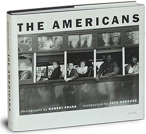
E.g Robert Frank’s “The Americans” was conceived with the help of a scholarship that allowed Frank to go on road trips across America during a two year period. He wanted to portray American society in the post-war period and his book has influenced (and still influence) many photographers since and also contributed to a new poetic style and subjective approach to documentary photography. Why?

3. Deconstruct the narrative, concept and design of the book such as:

  • Book in hand: how does it feel? Smell, sniff the paper.
  • Paper and ink: use of different paper/ textures/ colour or B&W or both.
  • Format, size and orientation: portraiture/ landscape/ square/ A5, A4, A3 / number of pages.
  • Design and layout: image size on pages/ single page, double-spread/ images/ grid, fold- outs/ inserts.
  • Rhythm and sequencing: flow of images/ juxtaposition of photographs/ editing process.
  • Structure and architecture: how design/ repeating motifs/ or specific features develops a concept or construct a narrative.
  • Narrative: what is the story/ subject-matter
  • Title: literal or poetic / relevant or intriguing.
  • Images and text: are they linked/ introduction/ essay/ statement by artists/ use of captions (if any.)

Here a few examples from previous students

Photobook Investigation – Lobismuller

Photobook Investigation – Sugar Paper Theories

Final Result – Photo Book Research

4. Decide if you want to make a hand-made photo book or use BLURB.

Hand-made books: You need to attend workshop on InDesign and book binding techniques after school every Tuesday in January between 3:30-5:00:

Tue 9 and Tue 16 Jan: InDesign
Tue  22 and Tue 30 Jan: Book binding techniques 

BLURB: Look at BLURB online book making website, photo books from photographers or see previous books produced by Hautlieu students on the table in class.

5. Write a book specification and describe in detail what your book will be about in terms of narrative, concept and design.  Produce a mood-board of design ideas and consider the following:

  • How you want your book to look and feel
  • Format, size and orientation
  • Design and layout
  • Rhythm and sequencing
  • Structure and architecture
  • Narrative
  • Title 
  • Images and text
  • Colour and B&W (or a mix)
  • Paper and ink

Create a BLURB account using your school email address. With Blurb you have different options on how you design your book:

a) Using Lightroom to design your book which is integrated with BLURB. Only for use on school computers, unless you have LR at home on your own laptop.

b) Download Bookwright via Blurb onto your own laptop and work offline at home and you can work indecently of school. Here you have full control of layout/ design features. Once completed, you upload photo book design to Blurb

c) Choose online option if you want to work directly online. Very limited layout/design options (not recommended!)