Category Archives: Photo-Assignment

Filters

Author:
Category:

Book layout

I start my book with a photo of a part from my Mothers journal. This is also the title of the book. The image has been wrapped round the book, covering the back and front of the book. The book starts with a bible verse which subtly explains the premise of some of the upcoming photos. I have separated my book into three different sections Father, Son and Mother this is very similar to the holy trinity which is the Father, Son and Holy Spirit. This was not purposefully done, I just thought it was worth mentioning.  It then introduces my brother with a small snapshot of his eye. I included portraits of my brother doing different actions, I matched these with words from the interviews and bible verses that related well. In between these photos I wanted included old family archive photos that I had edited. These were used to separate each photo giving the book variety. The book followed a similar pattern through out. I wanted to show a variety of styles of photographs, sequenced in a such a way that they interrupt each other giving the reader something new to look at.

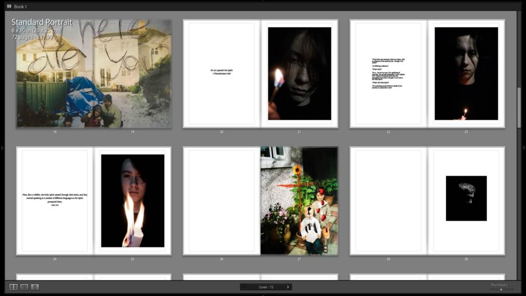
Just like the previous section there is a small snapshot however this time the person it the photo is my Father. This follows the same layout with slight differences. The old archive photos are of my Father is his youth and another one that is naturally abstract. The abstract photo did coincide with the meaning I was trying convey however I wanted to leave it unanswered as I wanted the viewer to work it out for themselves. Photos of my Father in his youth are matched with words of him talking about his youth.

My Mothers section starts with a small portrait that has been ripped. Then followed by a big portrait like previous sections. It then follows the same layout as previous parts of the book. This sections includes more dialogue. This is why I chose to have it at the end. The book then ends with a Bible verse.

There are 76 pages in total including the cover. 10 double spread photos and 26 Portraits. All photos apart from three are in color.

Childhood memories///Tableaux///Photoshoot

When taking these I wanted them to seem natural however it was clearly staged. I wanted my grandmother to pose like this as when our family used to live with her and my grandfather, one of the main things I noticed was that my gran would always make herself look nice before leaving the house. When she did this she always sit there chatting, joking and laughing with me. This was one of the happy memories of my childhood.

I wanted to re-create this in an almost cinematic tone just like Hannah Starkeys work however also a vintage tone. One of the main things I remember when looking at old photos of my grandmother was that orange tint to photos she was in when she was young. I did this by using a orange filter. The photos themselves remind me of how the movie stars would get ready in front on the mirrors with all the lights however obviously my gran does not have this so a handheld mirror will do.

My favorite photo is the first one as she looks as if she is staring at herself rather than posing. Almost as if she is staring at herself and analysis every feature. Just as an actress would. I also like how the photo is framed.

Alec Dawson///Hannah Starkey///Tableaux///Photoshoot

I enjoyed this shoot as it allowed me to get a message across very easily. This wasn’t a childhood memory however when I researched tableaux photography I found this photographer named Alec  Dawson. Part of his photography focused on how technology can distract us from the way we are living. You can find out more on my previous post. I have also done a separate post on childhood memories however I think this also links to memories. Its showing how these people in the frame could be making memories however they are too busy doing their own thing on their devices. I see this on a daily basis whether that be my own family or other people I see when i’m out.

When taking these photos I wanted to make them look almost cinematic like Hannah Starkey. I went around this a different way to Starkey as I conveyed this looked by cropped the photo in a cinematic looking frame. I also wanted the people on their devices to look lifeless almost ghost like I did this by selecting them only and decreasing the saturation. Also when taking the photos the lighting was very warm however I changed this as I wanted it to seem cold. I did this by places the a filter over the top of the photo and lowering the opacity.

My favorite photo is the photo in this selection as its frames perfectly for what I was trying to achieve and the lighting is also exactly how I wanted. It emotion on the subjects is also the right kind of facial expression I going for. I also like the last photo as it seem very eerie as we do not know what the female subject is staring at.

Documentary photoshoot

My Photo shoot was inspired by the photographer Larry Sultans photos of his Father. Especially the one of his Father practicing his golf swing in his bedroom. Just like Larry Sultans work I have taken photos of my Dad taking part in his hobby. This for my Dad is playing the guitar. Almost every night he retreats to his make do office where he places on his headphones and immerses himself in his own world playing his guitar for hours on end. I wanted to take a photograph my dad in the room he usually goes to practice his guitar however the lighting conditions weren’t ideal so in the future I would chose another room to do this. I also wanted to capture his make do practice room/office and how it isn’t anything special yet he spends to much time in that room.

The first two photos I chose to use natural lighting just as Larry Sultan does. I also used a reflection of one of the mirrors that had been placed in there. The second two photos I pulled down the blinds and used the flash. For the last two photos I decreased the iso giving it this blur look almost like another photographer i almost studied called Richard Billingham. I then changed these photos to black and white as I thought it suited the style better than color.  By doing this I wanted to portray movement even though the subject wasn’t actually moving and camera was I wanted to portray a movement in emotion and mood that music has the capability to do.

Environmental Portraits

Staying true to my plan, I photographed my step-dad; a Chartered Accountant who works and almost lives in his office. The company he owns himself and tries to keep exterior costs to a minimum, meaning he tries to do the majority of work that a company needs himself. This image displaying him at a desk really coincides with the environmental portrait theme as the model is in his own domain.

I tried to stay loyal to the style of environmental portraits as I instructed the model to maintain a sombre and melancholy facial expression to create this sense of ambiguity. I thought by getting a close-up shot, I was able to depict the stress upon his face; especially his eyes as they glare at the viewer, revealing their own story of what they think its like to be in their environment. The main light source is artificial and rather white, which helps portray the model’s face as pale, connoting a worried and confused impression. The secondary light source is that of the computer as it reflects against the model’s face, drawing our attention to his face like the computer draws the model’s attention, reinforcing how much work ties down the model. Furthermore, the model holds the mouse in his right hand, demonstrating he is in fact at work and does work.

As it was an environmental portrait, I thought it would be important to capture his accountancy qualifications in the background with the model in the foreground. Despite his extremely prestigious qualifications, he still depicts a sombre and unhappy mood, proving that there’s more to life than just work. Due to the positioning of the lighting and the way I positioned his chair, there is a shadow created in the background, almost hanging over him, acting as a burden much like work is. Furthermore, there is a small quantity of shadow on his face, portraying how work has a heavy impact upon adult life and that your occupation can slowly take over who you are.

A hidden feature within the photograph is the clock in the background, which rather obviously, tells the time. It shows 4:51 PM, nine minutes until he gets to leave; a time that most people who work in a banking occupation leave their job. This time adds story to the image as my step-dad would’ve been at work from nine AM and demonstrates the long hours he puts in, adding further strain to his facial expression. I thought that by including the clock which depicts the time ‘9 to 5’, reflected the time period that my step-dad works. However, due to the neutral look, we cannot tell whether he is excited to leave or not, relating back to this sense of ambiguity.