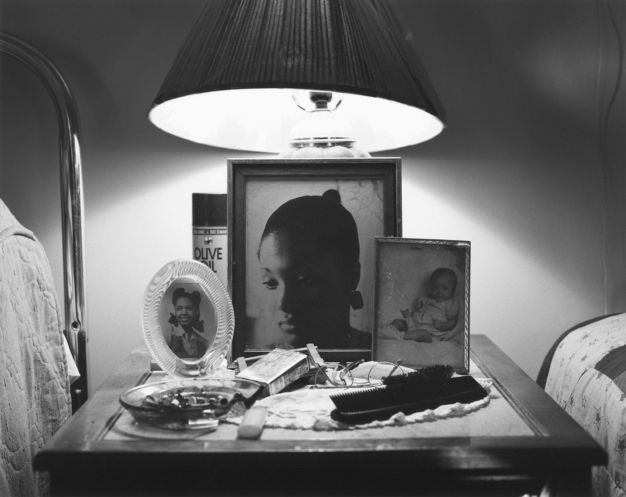
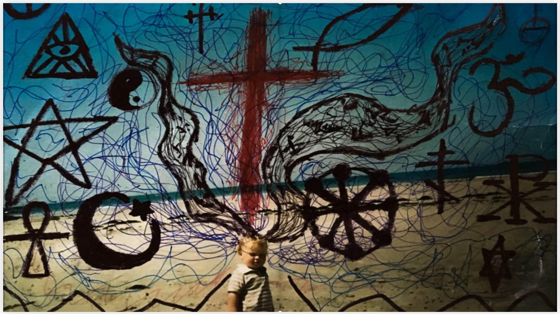
My intentions were always to have a book that explores family and how a belief and faith can connect a family as well as help it. Throughout my book I have placed photos like the one you can see below. This was useful to break up the photos as otherwise it could be considered very repetitive. Many of these family archive photos have been altered in some way or other. A continuing theme was red, this was meant to represent God as in the bible when the text is red it is Jesus talking. These photos are very symbolic. They were inspired by the photographer Jonny Briggs and Carol Benitah. Jonny Briggs is a photographer that actually visited our school. He asked us to manipulate, physically change the images to not be afraid of making mistakes. This opened a whole new realm of creativity for me and it gave me so many ideas of how I wanted to explore this. This played a part in the making of the book.
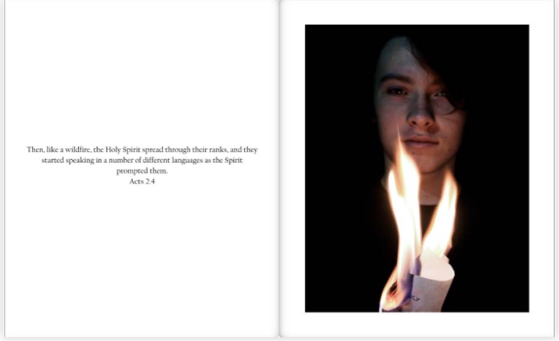
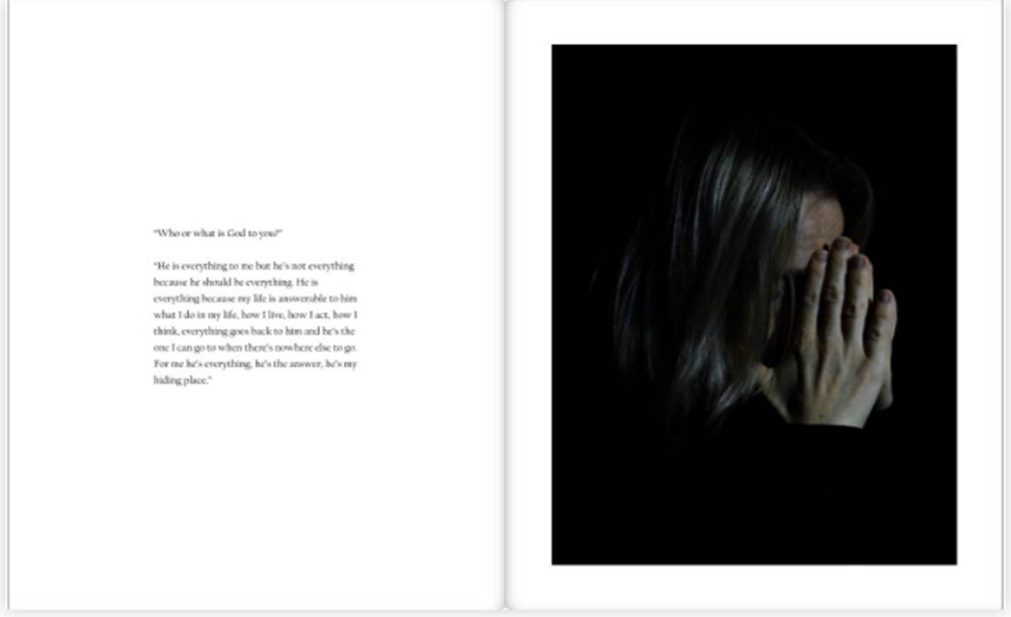
Throughout my book there were portraits which had either words from the interviews I had done with the people in the photos or bible verses that related to what could be seen in the photos. As you can see below there is a bible verse talking about the holy spirit being like a wildfire. In the photo you can see burning paper with the word holy on it. This was positioned around his chest area as Christians believe the holy spirit is inside of us. The subject seen in the photo mentioned the holy spirit in the interview. The words from the interview can be found on the previous page. This is just one example of how sections were linked. It was often a challenge to try and think of ways to link photos to the interview as the subjects did not always talk about things that were easy to photograph. However, I often focused on showing a physical representation of the emotion behind the words as well as what they were talking about.
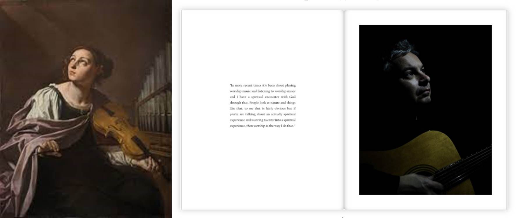
The light in these photos represented God. This was very similar to the old painting of the 17th century. Most musicians that were painted were seen looking up at a light that was suggested to be God. This dramatic pose was what I was trying to achieve in my image. As you can see the photo above shows the subject holding a guitar rather than a violin like the image opposite. The old 17th century painting does not feature in my book however I thought it would be worth showing the similarities between. Although the painting is much brighter and colorful this was done purposefully.
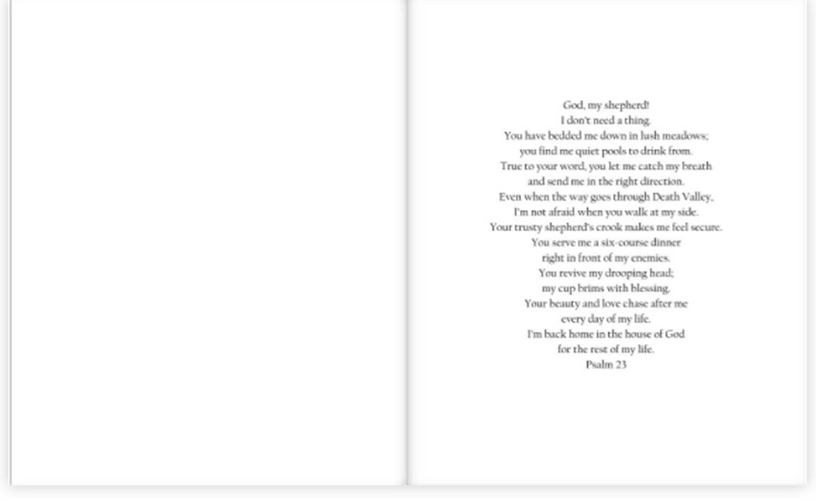
The sub theme of my book was about having faith in God in difficult times. The darkness in these images represents these difficult times. The light represents God, hope and a future. Each person looks at the light in a different way. Each set of photos explore this with each person giving their own views on this subject in the interviews and the photos of them actually physically reacting to the light. At the beginning of my book there is a picture of just a light with a bible verse relating God to light. This helped set the ground for the whole book and loosely explained the concept. The chiaroscuro lighting technique was used a lot in this project as I found it gave the dramatic contrast of light and dark I needed.
The book ends with this bible verse. I chose this verse because it relates to previous photos and things my subjects have said in their interviews. I thought this would be a good way to conclude and finish my book.
Overall, I think I have successfully made a book that centers around family and faith. The book has a clear concept but also enough unanswered imagery to leave the reader thinking. This project was a favorite of mine. It allowed me to expand my creative skill and freedom into a documentation style of photography as well as a more physical approach I had from the old archive images. The project was difficult to do because as a family the hard times have been very difficult and tackling this was a challenge for me as I wanted to do it respectively. However, I think I have created a book that creatively and successfully explores the idea of family and faith as well as having that faith in hard times. I have put a lot of work into this book and feel like the book has become something I will always appreciate.
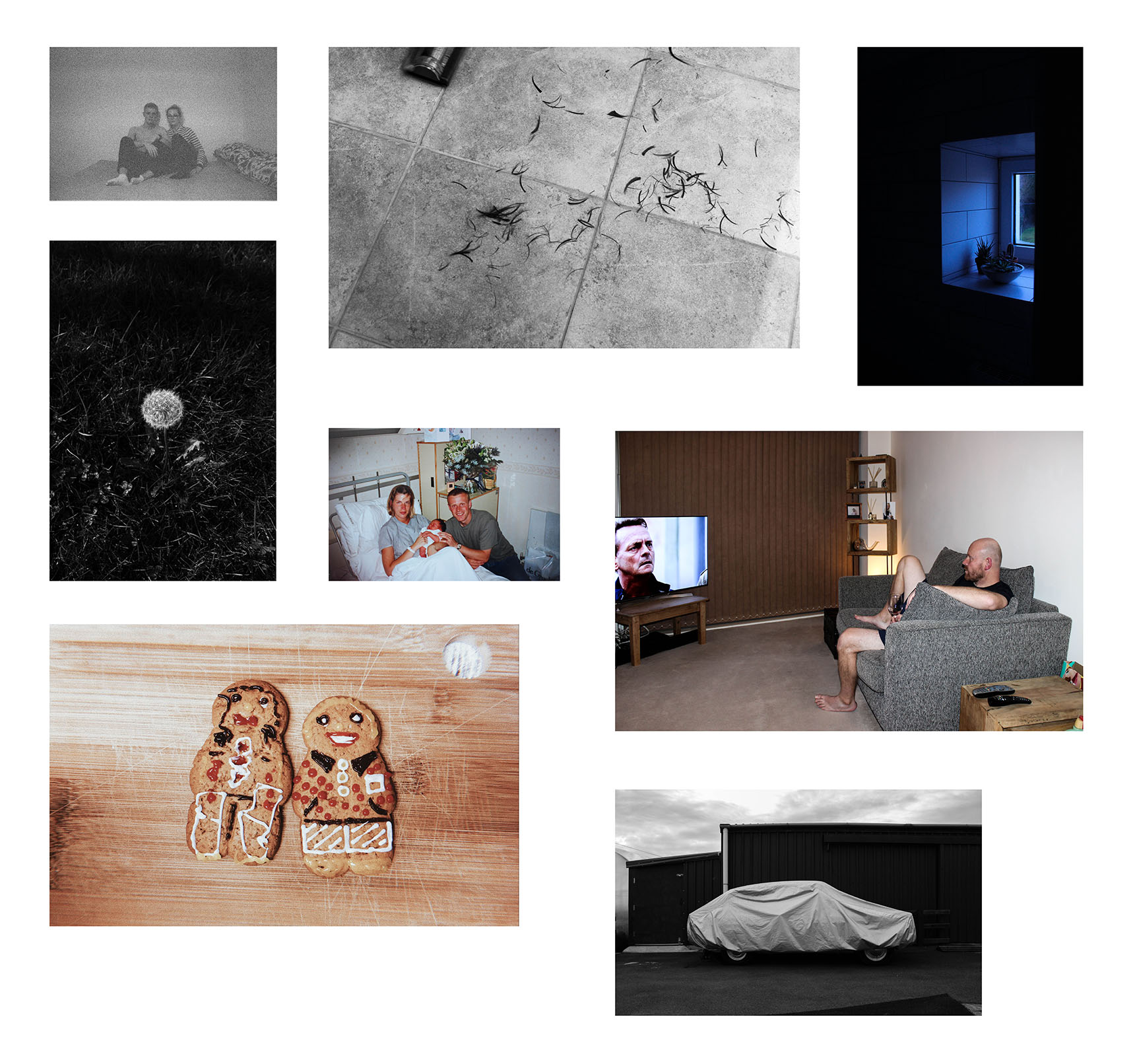
After the completion of my project and book ‘All My Love’, I have now chosen 8 images from the project as a whole to act as final photographs to represent the series as a whole. From the project, I have carefully chosen eight of my favourite images which I believe work well together to coincide with one another to create a meaningful mini series of works.
These are the final images that have just been printed and I am now in the process of arranging them into a layout I am happy to present on foam board as a photo board.
(A3)
(A4)
(A5)
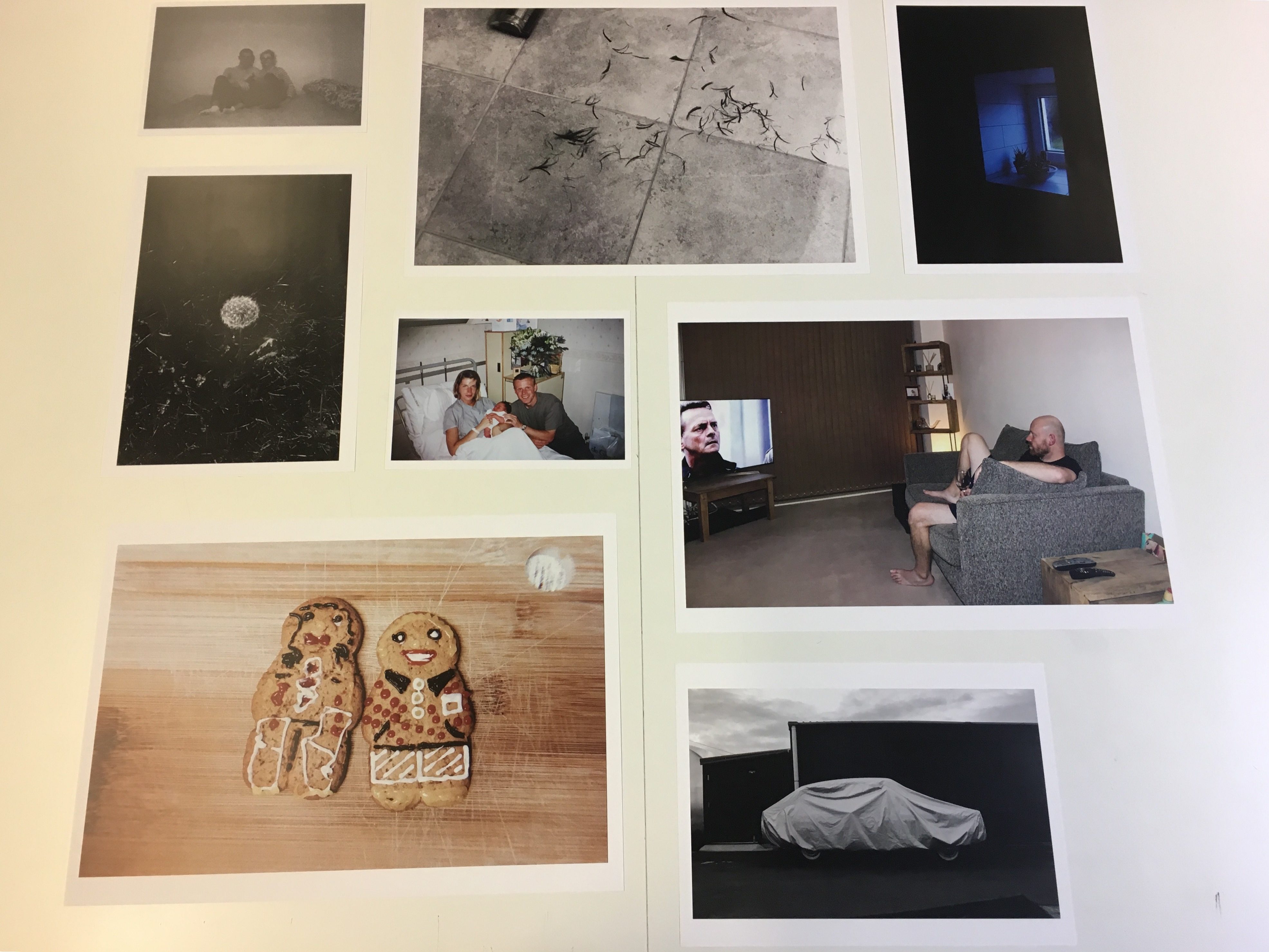
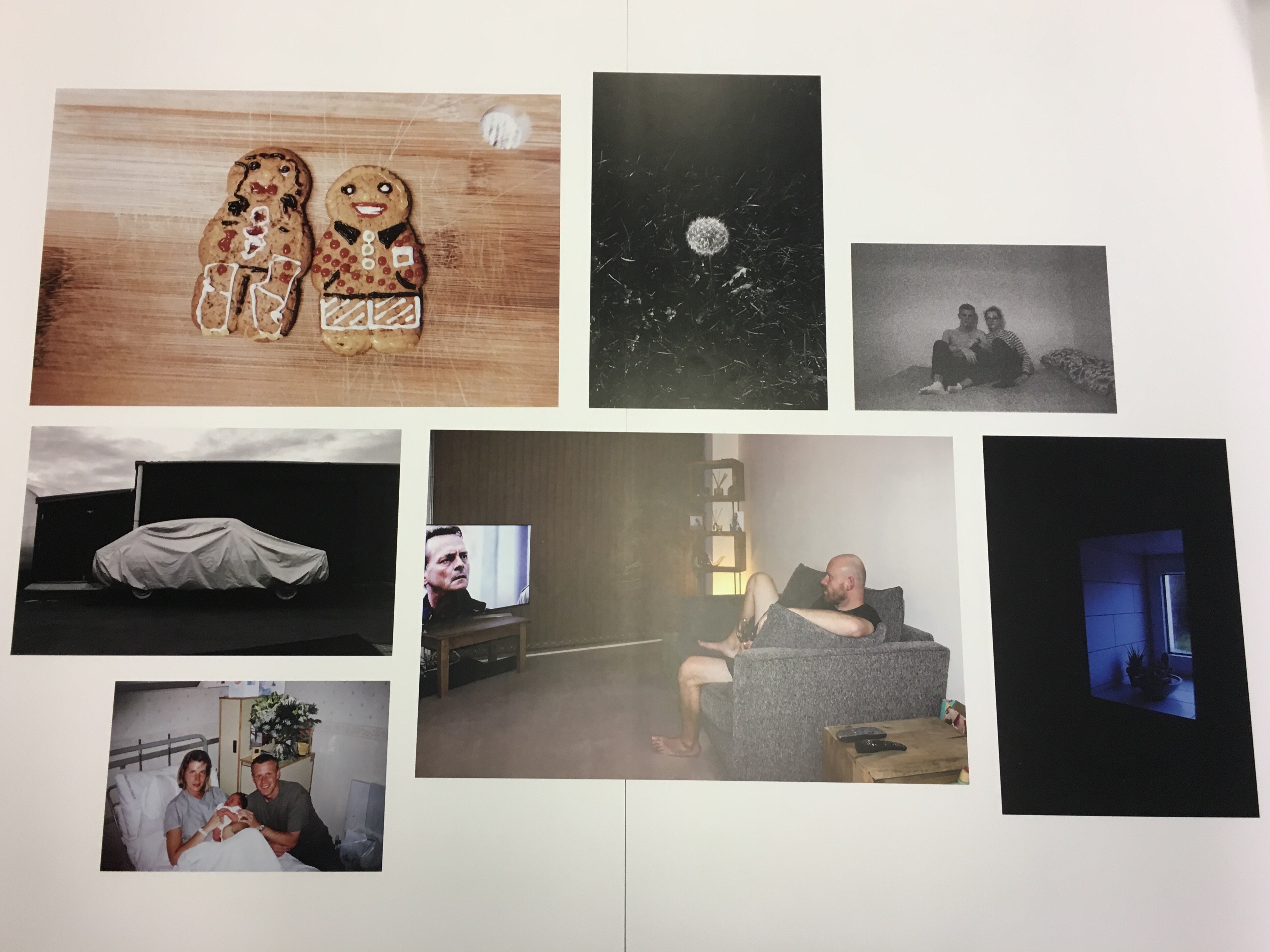
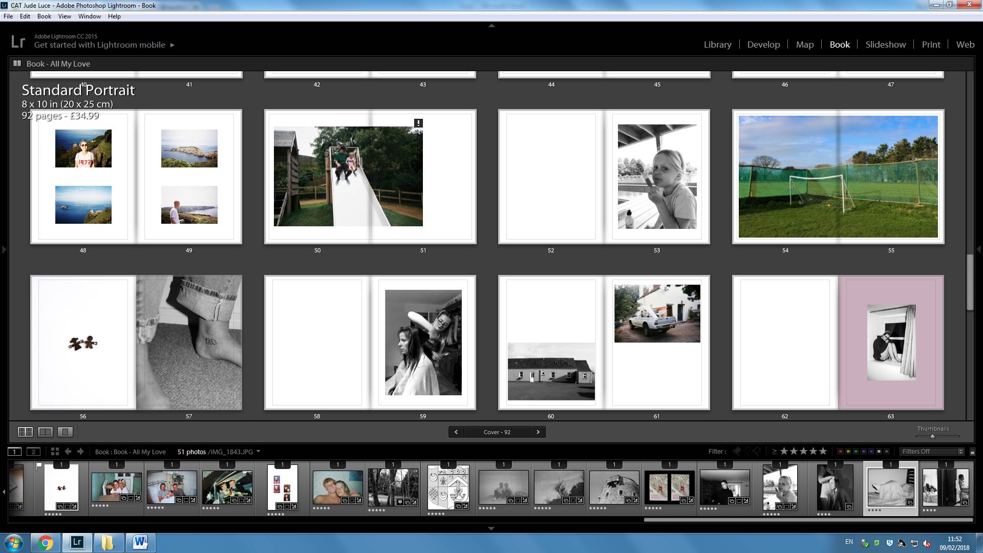
Here is the layout mock-up I produced on Adobe Photoshop to make it clearer as to how I want my display to look once complete. I had trouble fitting all dimensions righter on Photoshop, however, I did also experiment with the arrangement of my images on the large table in my photography classroom which shows better how the images would all fit together. However, this is only a draft arrangement and the final product may be made-up in a different sequence.
Adobe Photoshop mock-upMock-up produced in class with physical prints
In what way has Carolle Benitah and Laia Abril used different photographic processes and techniques in experimenting, responding to the notion of family archives and complex emotions?
“But the photos reawakened an anguish of something both familiar and totally unknown, the kind of disquieting strangeness that Freud spoke about. Those moments, fixed on paper, represented me, spoke about me and my family, told things about my identity, my place in the world, my family history and its secrets, the fears that constructed me, and many other things that contributed to who I am today.”- Carolle Benitah
“In Freud’s psychoanalysis, fragments, traces, or clues engage the imagination to release streams of emotion.”- Mary Bergstein in Mirrors of Memory: Freud, Photography, and the History of Art
When starting this project I did not realise the emotional impact it was going to have on me. As I explored my families memories, previous moments that are cherished by them and other memories that are not. They began to affect me in a deep way that is hard to describe. There is an emotional connection that can be found when looking at a part of your own history. I was looking at the moments that constructed me as a person. This is what drew me to manipulate these memories using photographs from our family album, thereby showing another side to these memories, that as people we do not notice. I wanted to show the spiritual side of the old archive family photos I was looking at. Showing how an emotion towards a certain photo can change after time due to unwanted events and struggles. Using symbolism and manipulation I wanted to destroy and create a new meaning to these family photos. I also included un-manipulated family photographs usually to emphasis comparison and change. I used these family photos almost like intervals to separate the new photos I have taken. The photographs that I made as response to my project used chiaroscuro lighting. This lighting was meant to represent God. I took photos of each family member reacting to this light. The family photos created another interesting element that varied the book. I wanted to renew and re-imagine these memories. Old photos that were just seen as a nice photo for the family to look at now has meaning for what person is going through or has gone through.
Inspirations for this project have come from many art movements, such as Dadaism, philosophical questions as well as personal thoughts and experiences. I opened this essay with a quote about memory, Mary Bergstein talks about how we are forced to re-live and remember a moment when we look at a photo . For example she says “In the world of archaeology and art history, photographs of fragments of ruined objects or human statues can serve as highly emotional reminders of the passage of time,”(Bergstein:http://bigthink.com), although Bergstein was talking about archaeology and art, I think this applies for old family photos as well. She also goes onto to say how our feelings towards memories can change due to old historic buildings being destroyed this could be said the same about life experiences, we can look back at a happier time or in some cases a difficult time and think differently, sometimes the opposite to how you felt when that photo was taken. For myself I would look at these photos and see a happier time to where I was. I also would look at these photos and find an emotional connection even when I wasn’t in them as they are a part of my history and journey. I wanted to change these memories to show a spiritual side of the photograph that is significant to me today. It showed how I felt about those photos in a physical way rather than just talking about it. Memories and photos are powerful things that in many cases cannot be tampered with as they a part of someone. This is why didn’t want to distort and manipulate those photos digitally, I wanted people to notice that they have been manipulated, rather than me trying to trick people into thinking that was what the initial photo looked like. I wanted the viewer to look how it has been changed and transformed. One of my influences was by the Dadaism technique of montage.
Dadaism was a European avant-garde art movement of the early 20th century. It was a movement that wanted to move away from the normal conventions of normal day life and the way art was normally represented. Dadaism was influenced by other movements around the beginning of the 20th century such as Cubism, Futurism, Constructivism, Expressionism and was seen as the corner stone of the surrealism movement. Key artists were people like Kurt Schwitters and Francis Picabia. Salvador Dali, who was a surrealist artist that took a lot of inspiration from Dadaism, once said “Surrealism is destructive, but it destroys only what it considers to be shackles limiting our vision” (Dali: https://www.artsy.net). The main aspect I took inspiration from Dadaism was the montage technique as I was destroying my old family photos then rebuilding it to create a new meaning. Dadaism was all about going against the ordinary, breaking the rules, leaving the conventions of art behind. This is the mind-set I had when creating this part to my book. It allowed me to be free to make mistakes then carry on till I found that I had created something that corresponds to where my mind-set was at the time and clearly showing the thought process it took to get there. These photos were used in-between my chiaroscuro studio shot photos that take up most of the book. These montage influenced photos gave a refreshing break from those photos as it was something to look at with more colour and sporadic influences. Chiaroscuro lighting was another prominent aspect in my work. The use of light and darks in the photos I took of my family showed this and contributed to the majority of the book. This technique was first used by painters such as Leonardo Da Vinci and Caravaggio. Often in these works of art an angel is featured in the picture and often the angel would illuminate the whole painting. The dark shadows are extremely dark and the light are selective in the painting giving the artist the power to focus on the important and more striking parts of the painting’s composition and meaning. It also featured in film as a technique well known as ‘film noir’ that refers to low light and high contrast imagery that often found in old Hollywood crime dramas. I wanted to focus of the main subject of the photograph working like a spotlight. This deep contrast and chiaroscuro lighting is an effect I’ve been experimenting with a long time, I’ve now grown a larger understanding of what looks good and how to achieve this.
I took inspiration from multiple photographers one being Carolle Benitah. I liked the way she manipulated images using embroidery focusing mainly on her upbringing and the issues that surrounded her. She used embroidery as a medium as it was seen as the standard thing for women to do in her family as the men left the home to work. In an interview she says “Embroidering is primarily a feminine activity. In the past, the embroiderer was seen as a paragon of virtue. Waiting was tied to this activity: women embroidered, hoping for the return of the man to the home. Embroidery is intimately linked to the milieu in which I grew up. Girls in a “good family” used to learn how to sew and embroider — essential activities for “perfect women”. My mother embroidered her trousseau.” (Benitah: https://www.lensculture.com) This frustrated Benitah and caused her to make these beautiful and striking photos. The photos she created had a theme of red thread and beads throughout her piece; the artist says the colour red represents the colour of violence and sexuality throughout her work. This theme connects these memories and showing a clear and structured narrative. The artist does not completely disclose the narrative of the book; this is up to the audience to work out. However, she does go onto to say her work is related to emotions. This is very similar to my own work as much of my own edited photos were manipulated based on the emotions I felt from the photo now looking back in retrospect. In the interview Benitah goes on to talk about how this kind of work can be therapeutic; she describes “With each stitch I make a hole with a needle. Each hole is a putting to death of my demons. It’s like an exorcism. I make holes in paper until I am not hurting anymore.” (Benitah: https://www.lensculture.com) I could relate to this kind of work. Personally it gave me the freedom to explore the ideas and issues I wanted to get through on paper. It allowed me to make mistakes and carry on. It also allowed me to release any underground emotions that I did not know I had. This was the most therapeutic part to my book as it allowed me to experiment with different mediums. The medium I used the most was ink. I used a different coloured and sized pens to do this. I used pens because I found it the easiest way to place my emotions on a photo. I often draw random things when I’m thinking or alone and I used this in my work. The colour red also features a lot in these photos. I used this colour for every time I drew a crucifix or cover someone in it. I used the colour red because in many bibles when Jesus speaks it is in red to show significance. I wanted this colour to represent protection as well as Christ figure and faith. I created other photos to go between these. These photos featured more influences from the photographer Laia Abril.
Laia Abril is another photographer that uses family archives to extend their narrative. Abril explored the damage eating disorder leave behind in her book ‘The Epilogue’. This book centers on the sad story of the Robinson family after losing their 26 year old daughter, Cammy to bulimia. The photographer deeply explore the grief experienced by the family. She does this by using flashbacks. These flashbacks can be seen in different ways. Abril uses photos of letters, key objects, places, testimonies told by different family members and friends. These especially, were full of deep grief as well as other emotions such as regret, guilt, frustration, distress, sadness all emotions that can be found with a sudden loss of a loved one. This book is very much a book about loss but also a book of awareness. It is letting people know this mental condition is a very real and it is a dangerous one not just affecting Cammy Robinson but many young people around the world. As well as taking inspiration from her the use of old family photos, I also took inspiration from her use of interviews. The photographer use images to go with some of these, photographing the family that had been left behind. Many of the photos of the family show them in deep thought which goes well with the interviews as it almost looks as if these voices are speaking in that persons head. I thought this was a good feature in the book as it gave the viewer a connection to the text that they were reading. Although Abril took these photos in a documentary style, I wanted to take these photos in a studio because that way I was able to control the lighting and focus on each person. The lighting was important in this shoot as it represented God. I used a chiaroscuro technique giving my photos a striking appearance. I interviewed key characters in my family about their faith. These people were of my Father, Brother and my Mother. I wanted to visualise the way they saw God and their Faith. I did this by using a spotlight in a dark room. I photographed the way each person reacted to that spotlight. From the photos I took, I matched with certain bible verses and sections from the interviews that corresponded with what was shown in the picture. These I found helped carry the book, as it was something the viewer can clearly see. Some of the photos that featured in the book were sometimes metaphorical or even abstract. Some photos had a clear relevance to the rest of the book, however others were not as clear. This was done purposefully as I didn’t want all the photos to be easy to understand. I find for a book to be interesting it has to feature some sort enigma code that needs to be broken by the viewer. This gives each viewer their own experience.
These questions also appear in Carol Benitah’s work as her work is also very metaphorical and leaves it to the viewer to work out the meaning. Although my book has moments where it isn’t very clear what the meaning is, there is a clear theme throughout. The theme of faith and having faith during difficult times is shown throughout and especially at the end of the book. The documentative style of interviews was inspired by the interviews that featured in Laia Abril’s book The Epilogue. These contrasts with metaphorical, artistic photos I have scattered in the book. I find this gives it a refreshing way to read the book. I also think it represents the way my mind works. Some memories are very clean cut and other memories are distorted. Altogether I think my book does show and develop the ideas of family archives and complex emotions just as these artists have.
I start my book with a photo of a part from my Mothers journal. This is also the title of the book. The image has been wrapped round the book, covering the back and front of the book. The book starts with a bible verse which subtly explains the premise of some of the upcoming photos. I have separated my book into three different sections Father, Son and Mother this is very similar to the holy trinity which is the Father, Son and Holy Spirit. This was not purposefully done, I just thought it was worth mentioning. It then introduces my brother with a small snapshot of his eye. I included portraits of my brother doing different actions, I matched these with words from the interviews and bible verses that related well. In between these photos I wanted included old family archive photos that I had edited. These were used to separate each photo giving the book variety. The book followed a similar pattern through out. I wanted to show a variety of styles of photographs, sequenced in a such a way that they interrupt each other giving the reader something new to look at.
Just like the previous section there is a small snapshot however this time the person it the photo is my Father. This follows the same layout with slight differences. The old archive photos are of my Father is his youth and another one that is naturally abstract. The abstract photo did coincide with the meaning I was trying convey however I wanted to leave it unanswered as I wanted the viewer to work it out for themselves. Photos of my Father in his youth are matched with words of him talking about his youth.
My Mothers section starts with a small portrait that has been ripped. Then followed by a big portrait like previous sections. It then follows the same layout as previous parts of the book. This sections includes more dialogue. This is why I chose to have it at the end. The book then ends with a Bible verse.
There are 76 pages in total including the cover. 10 double spread photos and 26 Portraits. All photos apart from three are in color.
Over the past couple of weeks, I have begun to create my photo book for my coursework. The work I have been producing up to this point has all been leading up this stage in which I can begin to insert them carefully into my photo book, which I am creating on the Adobe Lightroom interface using the Blurb book-making software.
To begin the process, I selected all appropriate images from all shoots completed and whittled these down to my favourite edits I had done as I gradually progressed through the coursework. I then created a new folder in Lightroom named ‘Book’ where in which all images I wanted to use in my photo book would be placed and began by putting in my already finalised images into here and then transferred these from the ‘library’ stage in Lightroom to the ‘book’ stage where I could begin arranging the images how I wanted and selected the particular book orientation I wanted and the type of paper.
I chose to use standard portrait orientation for my book as, from looking at other artists photo books, been attracted to this the most because of how it looked and how it felt in the hand when reading. I have also chosen to use a paper named ‘ProLine Uncoated’ paper which I saw on the Blurb website and thought this looked very effective. It does not have a gloss to it so looks very natural which I like. I believe it will benefit my images look in the end. After ding this task, I began arranging my photos as I wished. I have used a wide range of different image layouts but I tried to stick with a narrow range of looks so the whole outcome does not look to muddled and difficult to read. The most common page type is a double page spread where in which one image takes up two pages on a 3/4 proportion so is not full bleed and this has had the best effect on the look of my photos to complement the smaller, more delicate still images and that of full bleed, detailed portraits.
My plan for my photo book is to produce a detailed and insightful exploration into my family life, with me centered within the middle. This is the running theme throughout and I hope to show it through poetic, still images of landscapes or objects which may have no direct meaning at its face value but has a deeper meaning once inferred. As well, the portraits in my project are intended to be collaborative and intimate to show the relationships I hold with the people in my life but the portraits are intended to show the emotion of each being as well. I have contrasted yet shown the similarities of my mum and dad’s relationship when they were together to that of my relationship with Lucy now and the overall look I hope to achieve is that of a fun, vibrant, light-hearted but quite solemn and sombre image-based diary about how I am still developing through the events if life and the attachments I have built from the event which shaped my life – my mum and dad’s divorce. I want their to be an obvious existence of the theme of attachment but also an underlying theme of detachment. Although these themes are the main focus for my book, they are underlying themes which are subtly hinted at every now and then by a sequence which develops upon the understanding of love. Memory is fragile and I use this notion as a driving force for my project made up of diaristic photographs, which, when come together, create an album of moments in time which in-turn lend themselves to never be forgotten. I have attempted not to avoid the subject of my mum and dad’s divorce but felt it easier to express this and my feelings towards it through other subject matter, being my relationship with my girlfriend and the other people in my life, such as my individual relationships with my mum and dad and how I view them in solitary opposition to one another.
The settings if my book, including the orientation, paper and cover type
My plan for the front and back cover of my photo book was to keep it very simple and plain and include just the title ‘All My Love’ situated, in small print on the cover of the book and include a digitised version of an archival image on the back cover, with no writing. I was originally going to include another archival image in the front cover, however, instead of digitised and printed by Blurb, I was going to manually tip in the photo on the cover when it came back to me after production. Because I have chosen a softcover, this would have been possible – to, with a blade, make an incision into the card and place my image within these, like in old family photo albums. However, I decided not to go ahead with this and instead will just leave the title and the title only on the cover to keep in simple and leave the rest up to the audiences intrigue from reading the title. In the industry of photo books in the current day, it is the new trend not to include a photo on the cover at all and instead just a title or an abstract close up of an object, or even a painting or drawing etc.
I have chosen to place the title, in size 16 font, near to the bottom of the page and in the middle. I prefer the look of the title near to the bottom of the cover as opposed to the centre because it doesn’t follow typical conventions or norms to place text in the middle of a page.
I wanted to have a base colour for my book – a main colour that I use on the cover and back pages as well on the first few pages that hold the book together and as a background colour for a couple images in the book – which I have done. I have chosen to use a dusty, almost faded, dark-ish pink colour that connotes visuals of love and romance bit it’s faded colour represents a sense that this love may have also faded.
On the spine I have included the title as well as my name, because I am the author of the book. I chose not to put it on the font as I didn’t feel the need because I feel as though the project is not as much a project about me and more about the other people within. I did not want the audience to focus on me a photographer and instead focus on the title and what it could mean.
On the back cover is an image of my mum and I at the age of 3. I am sat on mt chair at the kitchen table in the house I grew up in for 10 years. This photo was taken on my birthday and my mum kneels by mu side as my dad takes the photo as we both smile at the lens. This image brings back very happy memories as I see both my mum and I in a joyous trance at this happy time.
The first two pages of the book consist of a white page non the left and the page on the right is printed in the same pink colour as the cover. On the white page on theft, I have included the ‘Luce’ family crest which I drew and then digitised. I have put this black and white emblem in the center of the page in a very small size because once printed, it will appear bigger so have compensated for this by making it even smaller than I originally would, however want it to look small and delicate anyways so the reader has to focus on the details of it. I have not included a caption which says what the crest is either because I did not want to give too much away.
On the right page I have included the title again with my name underneath and in a dark pink colour to contrast the lighter, dusty oink of the background. This is a common convention of photo books – to include the title and author’s name again in the first pages of the book before any images have been seen.
The first image, as I stated in my previous blog post is the image of the wedding cards and I have made this a full bleed image to get the full effect of the details within the cards.
On Lightroom, the controls are very easy to manage and I quickly got the hang of how to use the different tools and how to change different settings.
The next image, on pages 6 and 7 again takes up two pages and is a portrait of my girlfriend Lucy and I. This was an image I took using an expired black and white film in a Pentax MZ-M camera. The results of using an expired film has resulted in a change in affect of the image quality as it has added grain a swell as different light and brightness. It has made it darker as though it was under exposed but this was an effect I was aware of when using the roll of film and one I am happy with the results of. I have used a couple of other images from this roll of film in the book. The image which is a 3/4 page spread uses the white background as a means of a border to make the darkened image stand out. It is an image of myself and Lucy on my bed looking straight into the camera lens. We are centered in the frame and interlock are arms as Lucy leans on to me. The film has added a slight vignette effect to the edges of the photograph which I like and my intention for this image was to oppose the view of my mum and dad’s mature relationship from the image previous to this to that of mine an Lucy’s relationship which is much more fun, however, still somber in this particular image, emphasised in it’s darkness – as I intended to achieve in post-production.
I have then used another black and white image as a 3/4 page spread on the next two pages. It is an image taken with my iPhone of a tangled ribbon tied to a tree trunk as it blows in the wind. This photograph is intended to represent the idea of an attachment and a romance – in that a tied ribbon symbolises a knot – as though you tie the knot when marrying, as well as the connotations of love and romance of a ribbon tied in a girl’s hair or ribbon displayed on the back of a wedding car of newly-wed couples.
Next, I have included the text from both of the wedding cards written by my mum and dad. On the left page is the text written by my mum and on the right, my dad’s words. I wanted to disrupt the sequencing of the book by purposely not putting this text directly after the image of the cards because this how intrigue is created in a photo book.
The pages after this display juts one image, on the left. It is an image of my mum and dad when they were younger and had just fallen in love. They take a photo of themselves in bed as they lean against the wallpaper covered walls of my dad’s bedroom. You can see in the toip right corner part of a surfing poster of my dad’s as he was a surfing fanatic in his youth. It is an image that represent their romance as well as that of other couples as they document their intimacy in the fist couple years of falling in love. They look so happy and this I love. However, although this image is in place in the digital book, I am going to remove this before it gets sent off for production and when I received it again, I will use photo corner to tip in the real version of this image. This will add a sense of realness and make it more personal as well as something for the reader to physically interact with and experience the smell and feel of real photo paper which has been maturing over the last 25 years. This image works in conjunction with the text before.
On the following page is another archival image taken from my mum and dad’s wedding album. It frames both of them in the car they both arrived in and left in. My mum holds a bouquet a flowers as my dad leans in for the picture as they both smile form ear-to-ear. This image will be printed by Blurb directly into the book, not tipped in.
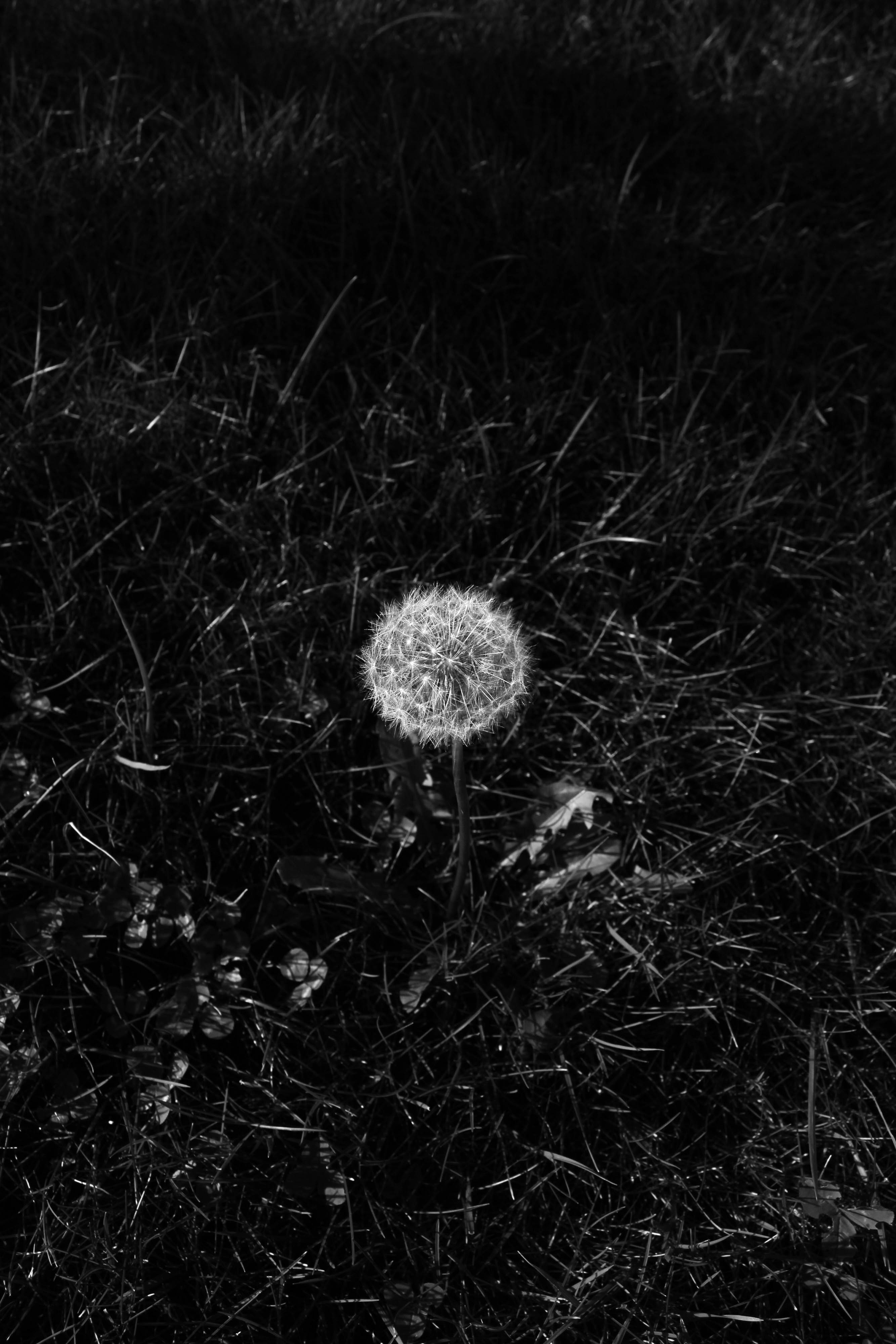
On pages 16 and 17 I have included my next image in the sequence which has is so far made up of 5 images. This image as taken in my garden and was not planned but instead a more spontaneous shot. The image is a close up of a dandelion and is representation of how love can be so delicate and fragile. I was instantly drawn to this flower because it sat in the grass very lonesomely, solitary from any other dandelions – this was the only one in the garden and it struck me instantly and had the urge to take a photo of it. After taking the image, I realised that the plant also connotes a deeper meaning of love – derived from the love poem children sued to sing whilst picking the petals of a flower or blowing the petals of a dandelion. Yu would sing “he/she’ loves me… he/she loves me not” where you would seek if the person of your affection returns that affection and the phrase said on the pick of the last petals determines whether he or she does love you or doesn’t. I have chosen to make this image a full bleed because the darkness of the grassy area surrounding the dandelions white petals contrasts that of the white page opposite.
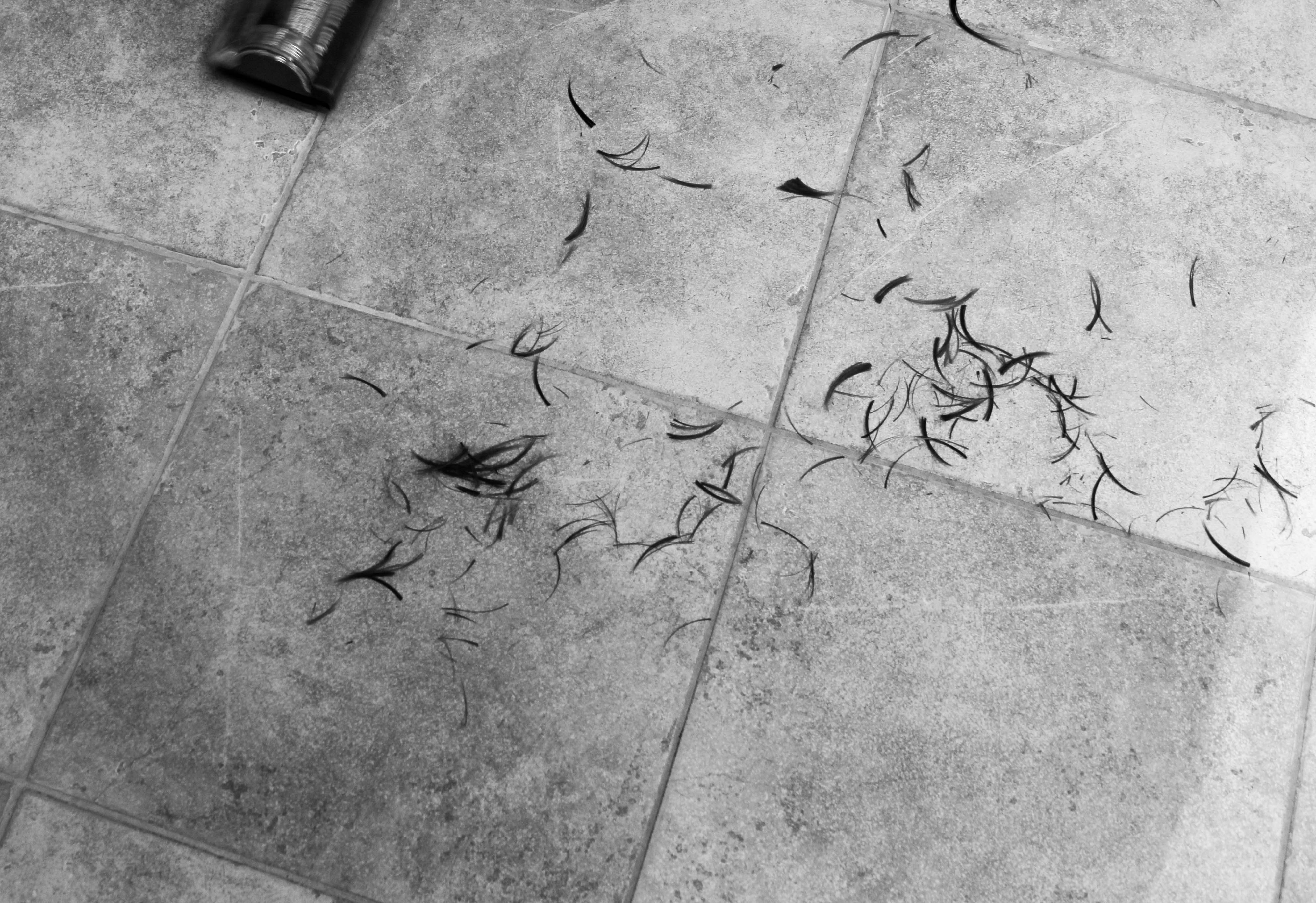
The next image is an image if Lucy cutting my mum’s hair in the kitchen. My mum sits on a stool in the kitchen as Lucy makes an orbit around her cutting her hair making sure it is as she wishes. My girlfriend is a qualified hairdresser and so my mum asked if she would be kind enough to cut it for her. On the evening of this happening, Lucy and my mum had set up and I decided to photograph the occurrences through the reflection of out kitchen door. I am framed within this image too because of this but the lights from the kitchen have illuminated my mum and Lucy so they are the focus and it is one of my favourites in the book because of its obscurity from the others – it includes the photographer which is seen as going against the rules and it is taken through a reflection. The image signifies a loss of identity as my mum loses some hair and this notion is reiterated in the identity lost as a result of my mum and dad’s split.
The following page is of another 3/4 page spread of an image which was from the same shoot as the one before. It is an image of the hair from my mum’s head on the floor, in wet clumps. After the haircut was finished, I quickly got my camera gain and released the shutter whilst pointing it at the floor to capture the aftermath of the cut. It is intended to co-exit with the image previous to it as a diptych across two pages.
I have then used another full bleed image of a portrait of my dad on the next page. This image is a black and white portrait of my the back of my dad’s head and shoulders. I have harshly cropped it just below the shoulders and didn’t know what I thought of it when I first imported into Lightroom. It is an unconventional portrait that is made of very dark, neutral greys with little contrast of blacks and whites. This darkness adds to its graveness however and I think it works well. The fact that you cannot see my dad’s face and instead, the back of it adds to this essence that he was a hidden figure in my childhood and I did in a way lose him as a dad for period of my life because this was a consequence of my mum and dad separating.
After these two pages comes another image which juxtaposes the content of the previous. It is a black and white photograph of a window in which there is a smiley face drawn on because of the condensation. I drew this smiley face on the window and thought i would make for an interesting image that shows happiness in a different sense. It is as though it is a smile, that it doesn’t really exist – or a smile that exists for a small period of time but then fades away – like what you attempt to o when you’ve experiences a detachment – put on a fake smile which is eventually erased. This smile contrasts that of the dull looking portrait of my dad on the page before. I decided to frame the mage on a black background because this way the photograph stood out better and it forms a division from the repetitive white pages that have been used thus far.
The next two images also work in conjunction with each the as a diptych. The first is of a goal I set up in Millbrook Park and the second is also in Millbrook Park but of the swimming pool that is in the park. I went to the park a few moths ago to do this shoot. The two image represent myself and my dad’s relationship – I remember he sued to take to Millbrook Park when I was younger and used to stay at his on Saturdays. We would go on Sunday mornings and play football with a goal we would set up with the bin lids and out jackets. I also used to go swimming in the pool in the summer and this brings back memories of my time with him and we use to do this most weekends when the weather was nice. I decided to include his because of the concept of memories and it symbolises my attachment with my dad when I would stay the night at his on the weekends, however, this relationship has since gone from cherishing moments with each other to seeing very little of each and I understandably never stay at his anymore because I am of the age where I want to do my own thing.
On the next page I have included another archival image bit this time of a two sets of two photo booth images – one of my dad on his onw and the other of my mum and I as a baby. These images were taken at different images and one sees my dad on his onw posing for the camera and the other of my mum and I posing for the camera. I came across both of them at different times during my time delving into my family’s family albums. I placed the photo on the same white card used for other shoot with old photographs and purposely placed my dad’s set above the one of my mum and I and to left, I noticed that my dad was looking down got the corner of the image frame coincidentally on the bottom image and thought it would look interesting if I placed this image so that it looked as though he was looking at my mum and I. I feel as though I achieved this well.
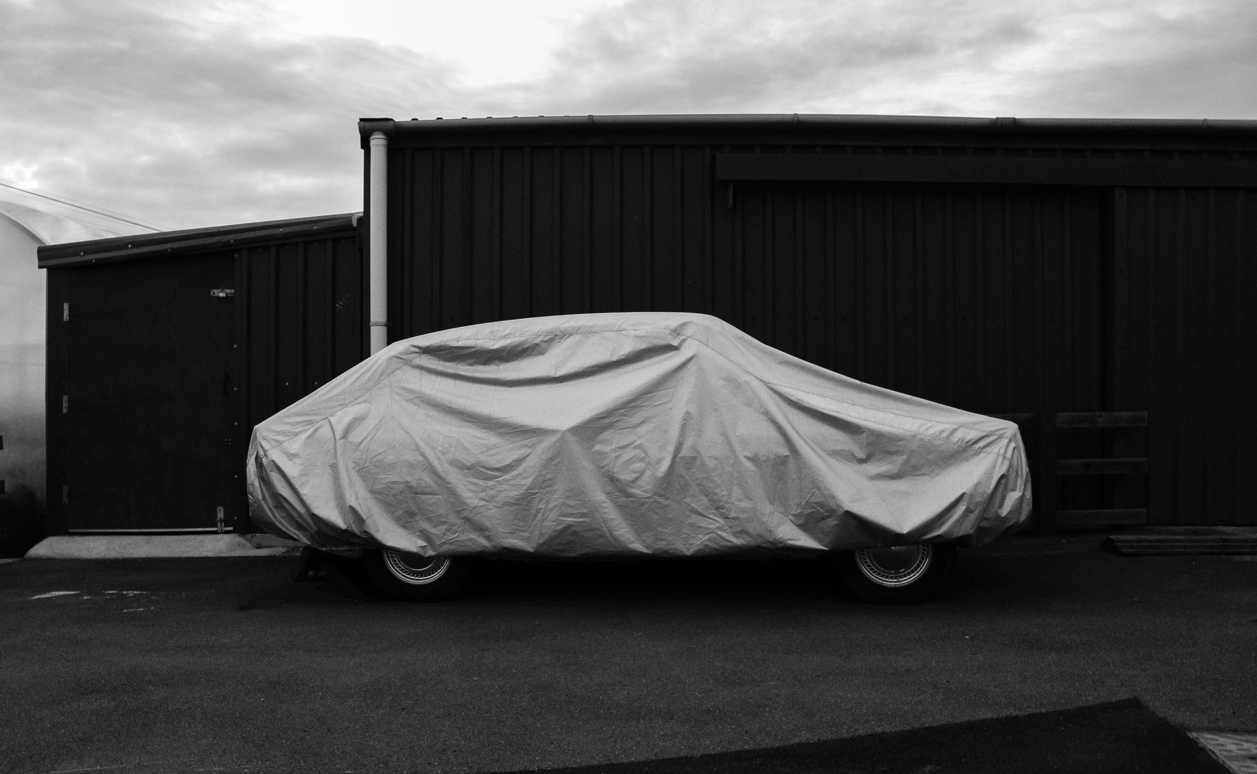
The next image in my book is a double page spread, with a slight white border. I have used a photograph I took of a car with its protective cover over it. This image came from a shoot I produced at my old home. This is my Papa’s vintage Ford car which has its protective cover over the top of it most of the time to reserve its quality and value. I saw it sitting there and the white/grey colour of the cover contrasted greatly with the dark green colour tat came from his shed behind the car. I though tit would make for a great image and in post-production I deliberately reduced the exposure and crated more shadows and increased the intensity of the black colour to make the lightness in the cover over the car stand out more. It is one of my favourite images because it’s likeness to that of the style of Matt Eich or other contemporary photographers such as New Topographic photographer Lewis Baltz. It represents the fragility of the importance of protection and security – the outer shell provided by the cover is what is hiding the car and it is as though it is showing only part of its personality but wishes to hide in order to preserve it’s beauty for the right time – like what my dad and mum, in some ways, did when they split from each other – they became more reserved until they found another partner.
The image on the following page frames the window sill in my house. I made this photograph of the window sill in my lounge because I wanted to focus on the images that took their place on it – as a centrepiece of the room – two framed photographs of me as a young child – one when I was around 5 years of age and the other on holiday when I was 10. This photographs purpose was to bring myself – the centre subject of the project – back into focus to reiterate that, as my mum’s only child, she likes to take pride in me and tells me constantly how much she loves me – I enjoy the meaning and simplicity of this image because it shows me as a young child and contrasts that of what I am like now – in a relationship with my girlfriend and living much more independently, as well as forming an ever-growing relationship with my sister. I chose to make this black and white because this looked most effective and I took inspiration form LaToya Ruby Frazier’s image much like this to create this photograph.
LaToya Ruby Frazier, ‘The Notion Of Family’
For the next image, I used some personal objects to create a representation of love and attachment in another perspective. In my lounge at home, we have displayed the characture figures of Lady and the Tramp – two china mini figures of the two dogs form the animated film. The film is about how two dogs fall in love and my mu, being a collector of vintage and antique goods, came across these two figures and decided to buy them and they now take their place in our lounge. I had never really thought anything of them until this project when I was finding ways to photograph things that I never easily would have before and think of things in ways I never would have before. I saw these figures and realised the story behind them and realised it would be perfect if I photographed them in my mini studio set-up. I photographed them together against a white background and made this black white. I love this image and its relationship with love and romance, but just shown in an unusual way. I have again used a black background to frame it – creating the colour theme of white, black and pink.
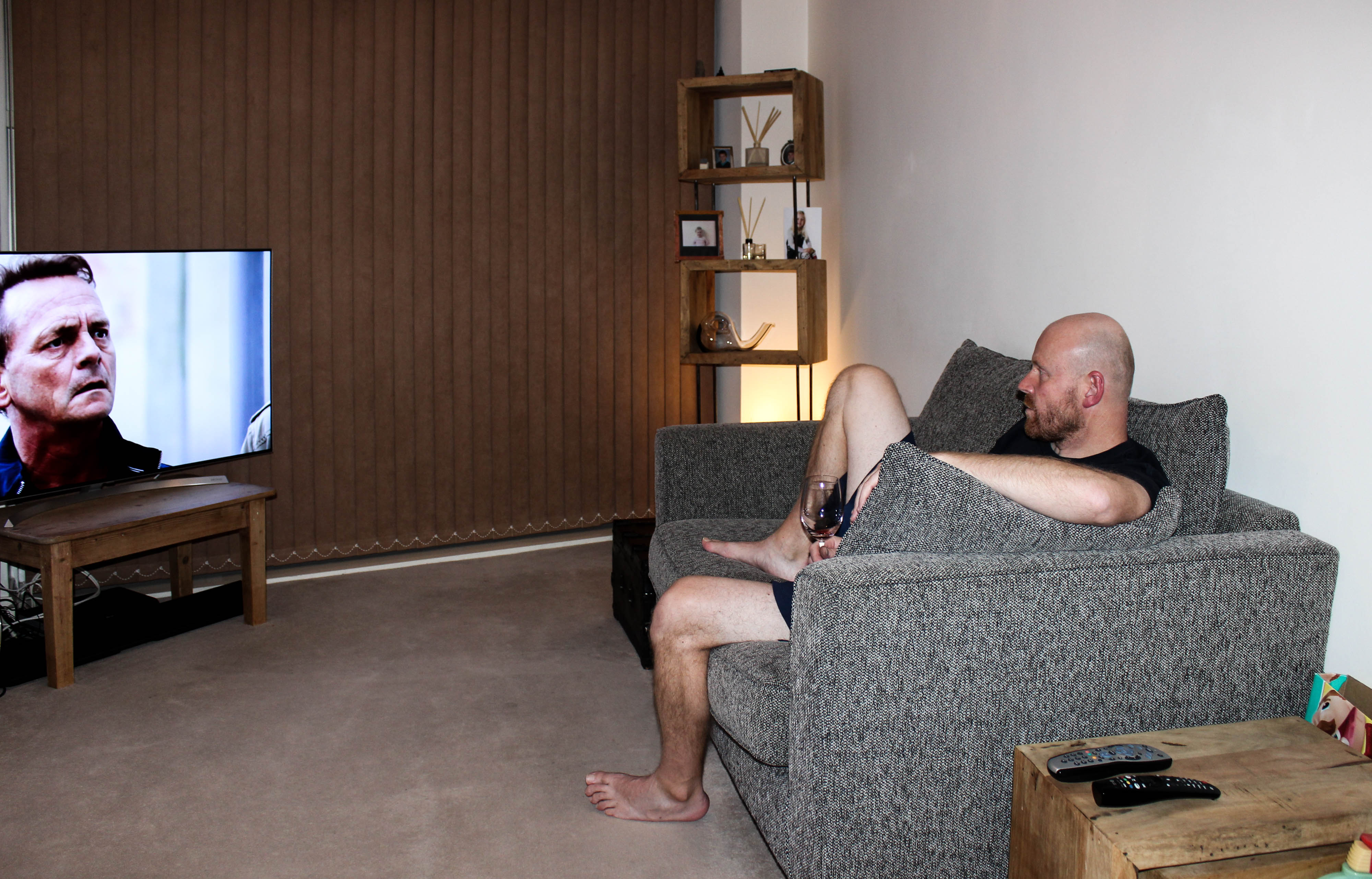
A full bleed, coloured photograph of my dad takes its place on the following two pages and feel like this sis one of my strongest images due to it’s crispness and sharpness of detail that makes this such a busy image. However, the busyness works because there are two clear focal points in the photograph – my dad sat on the sofa with his glass of wine and the TV which is playing EastEnders. The TV illuminates the rest f the room and in particular, my dad watching the screen. I have taken the image from a far to capture the whole scene and have used a flash as I experimented without but the quality was not as I wanted. This is the second image of my dad in which you do not his whole face and instead, just a side profile. However, there are direct, face-n portraits if my mum in the book and this restates the underlying reality that he is still hidden away and keeps himself to himself sometimes.
The reader then turns the page and sees another 3/4 page spread of a black and white image from the same roll of black and white film used in the Pentax camera. It is an image taken near to Christmas when out on a walk. It captures the top of a castle near to Grouville Bay. I pointe my camera upwards as I saw these pigeons were flying in and out of this one gap in the castle. I waited for the right time to capture the point at which two pigeons sat side by side in this opening in the castle’s wall. This image shows again, in a different way to break the monotonous sequencing of human interaction, what an attachment can look like – or a relationship between two people.
The following image keeps with the theme of animals and was also taken on the shoot to my old house. This is in fact my old cat which we had for 9 years, but, when we moved away from the house we grew up in with our cat, Betty, she ran away back to our old house and has stayed there ever since and now my Papa looks after her. Whenever I go back there, I always see Betty and she comes over to see me so I can stroke her. I made this image of her staring in to the distance as she sits on the ground and this also shows a sense of detachment.
Another black and white image takes its place on pages 44 and 45 in the form of a 3/4 page spread – this is a common convention and theme of my book and it is what I used to provide a structure to the layout sand sequencing because mots of my images, as I found out when arranging them in the book, look better in this format. It is a portrait of my mum which I took as she stood in the lounge and what I like about the image is her facial expressions and the way the she stands out very clearly from the background. There is ghostly presence and eerie mood to the image as I have used the flash on my camera. This was an image that was very much needed as I had a lack of images of my mum in the current day.
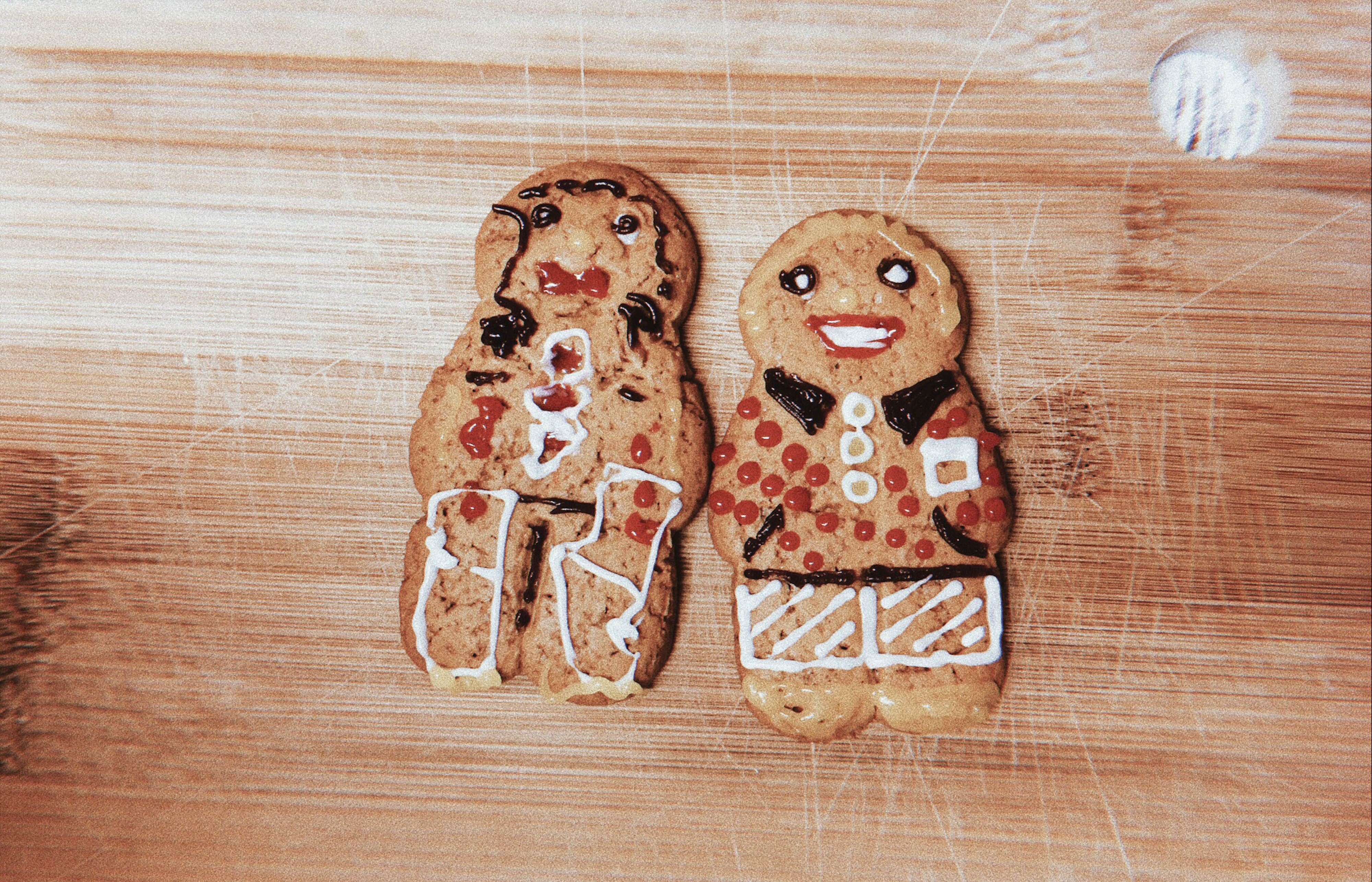
When I was round at my sister’s house where she lives with her mum a couple months ago, I was playing all sorts of games with her and it was at one pint that she got at her gingerbread men decoration set. She received this as a gift at Christmas and wanted to use it with me when I came round. We spent half an hour decorating ur gingerbread men and afterwards, I decided to photograph them both together on the chopping board we were using. I photographed this using my phone using an app called ‘Huji’ which makes images look very retro and visually eye-catching due o the colour and light affects it ads to the image once taken. The colours are very vibrant and I love the effects which come with it and I often use to capture everyday moments as opposed to my iPhone’s default camera app. The image brings the added and necessary vibrance in my book which I wanted to achieve through photographs that have a relation to my time with Minnie because this is what represents the fun we have together – the colour that comes from her personality and our experiences although she does not appear in the book too often.
When Lucy and I visited the island of Sark for couple of days in the summer last year, I took my point and shoot camera – my Canon SureShot A-1 and used it to take some photographs of the time we spent cycling and walking around the island for the two days we were there. On the following pages, I have created a photo album affect where in which I have arranged 4 images that I took of our time in Sark – two portraits of Lucy and I and two landscapes of the coastline and both sets work together as diptychs. On the first page I have used the face-on portrait of Lucy and underneath I have placed the landscape shot of what was behind her, however, in it’s own image and this creates a continuity effect which works well as a diptych. Lucy also took my picture on the day after and captured the landscape in which we were surrounded by afterwards as it its own image. This also makes for an effective diptych which I have represented on the opposite page and with the portrait of us both diagonal to one another.
The next page consist of a photo over a double spread of myself and Minnie waiting at the top of a slide at Tamba Park. Lucy has taken this image with my Canon point and shoot camera and is a great image because it sees Minnie looking with a grin on her face at the camera and myself gazing at Minnie’s joy as we get ready t launch ourselves down the slide. The next couple pages are about colour and vibrancy and the notion of playing and going back to childhood. Even though the next image is a black and white portrait of Minnie, she is looking into the camera with a ice lolly in her hand ready to lick it and it reveals a sense of fun and play behind it. This image was previously an image of Minnie going down a fireman’s pole in the same park as the image before with Lucy watching on as the both laugh but the image was not very strong and didn’t feel it fitted into the sequence so instead replaced it with a portrait of Minnie. I talk about her often in my essay but never really show her in my book and this image was needed in order for her presence to be realised.
Keeping on the same them as play and childhood fun, the following image is one I took in the garden in which I used to play in all the time at my Papa’s house. It was called the children’s garden because all most of my cousins on my mum’ side of the family used to live in the estate in which my Papa owns and rents the houses in it out to tenants – being my family and my other cousins families. This was the garden which we all used to play in together after school and I used to play football with my younger males cousins all the time. The image frames a goal in the garden with the netting behind it and the field which surrounded the garden. The image looked best on a full page spread to emphasise the wide angle landscape view. This concept of play reiterates the importance of living in the moment and, for me, reminds me of childhood and the community that out whole family was.
On the next two pages is two other images – the first is of a charm/jewel that my mum owns and has owned for several years. It reminds both her and myself of the time that my dad and her spent together when OI was much younger. The delicate, very small charm was part of a bracelet but now only this pendant exists. The charm is of a girl and boy holding hands. Very simple but a jewel that presents relationships very clearly. My mum decided to get this tattooed on her ankle when she was with my dad and she also added a heart in the middle where their hands joined to show the love between her and my dad. I wanted to show the relationship between this jewel and her tattoo and so arranged them side by side and used the image I took of my mum’s ankle as a full page spread with the tattoo being the centre point of focus.
The next image is from the same shoot I did with my mum and Lucy when she cut my mum’s hair bit this closer image of the two subjects presents a more intimate photograph of my mum staring, rather glumly as she loses the hair Lucy is cutting. I have put after the image of the charm/tattoo because it juxtaposes this notion attachment and detachment through a loss of identity.
This theme is followed on, onto the next two pages where the audience see a image of my old house which I grew up in for 10 years and an image on the opposite page of a pick-up truck with a load of furniture. This shows the event at which my mum, her boyfriend of 13 years and I moved out of this house and into our current one.
Next, is a portrait I took of Lucy sitting on my window ill. This was during an evening which we saw each other after I had finished school and she had finished work. She was lounging around in my fleece without any bottoms on and I had an idea to have her sit on the window ill which is big enough for somebody to sit on comfortably because of it depth. I wanted to take her picture as she stared blankly into the camera with her head rested on her les which were bent. This portrait shows the same style of image Eich used in his book where his own wife is pictured staring into the camera but from a closer perspective. This is more of a loner shot which frames both Lucy and the window sill. I added grain to the photograph in post-prediction because this looked affective and I purposely added aa slight hint of grain whilst taking the picture through slight incorrect adjustments of my camera settings so their was a blur and subtle noisy texture but emphasised this in Lightroom.
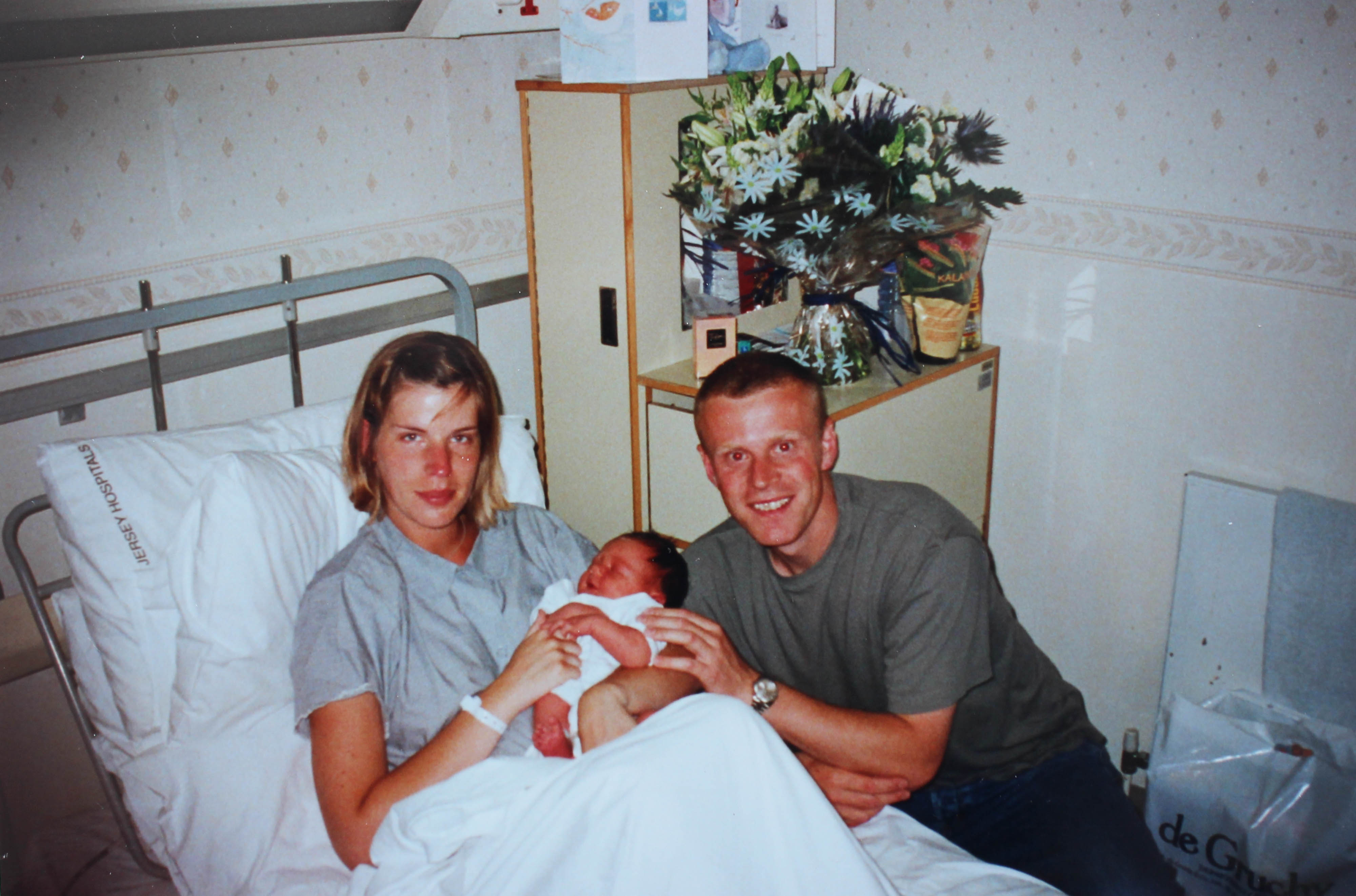
To conclude my book about attachments and detachments within my life and consequences of what love can do but what, on the other hand, it can achieve for the positive – it can unite people, I will be using another archival image which I have decided to also tip in with phot corners. I decided to do this with an image if my mum and dad in bed when they were much younger and had inly been dating for around a year. Again, will be using this same technique to tip in an image of my mum, dad and I when I was born. I found this image within the endless photo albums we keep in my loft. My mum holds me after I had just been born as she lies in bed with me in her arms, my dad kneels beside her with his arm around us both as they both look in the camera with joy and relief. It may have made sense to use it a at the start but with my book I have essentially started with an equilibrium. I presented the images surrounding my mum and ad’s wedding and marriage at the start – the balance and then this was disrupted in the middle and the focus came onto me. Finally, towards the end, I have subtly hinted again at this divide and this separation of people. I wanted to include this image of family at the end to show that although my project has been about a loss of parental figures and confusion among myself as to where I lie in my family as I am introduced to person upon person including my sister, her mother, my mum’s boyfriend, my own girlfriend and friends, I still manage to find a sense of belonging within my own being and can accept everything and embrace it because my family – the focus of this coursework – is who I love and who I choose to attach to because I feel my place among the fragility of my family circle is important and significant. Documenting this with my camera is something I have greatly enjoyed and wanted to end the book with a photo that is not mine because my project has been a collaboration wit my subjects and although I am the photographer, the subjects are what provides intrigue and meaning to what I am photographing.
A choose a variation of images to print out to display as a set. The following are to be printed out in a variation of sizes. I wanted there to be a variation of color and theme. I choose these images to display as final pieces because I believed that as a group they represented my project well and covered every aspect that I worked through within my project.
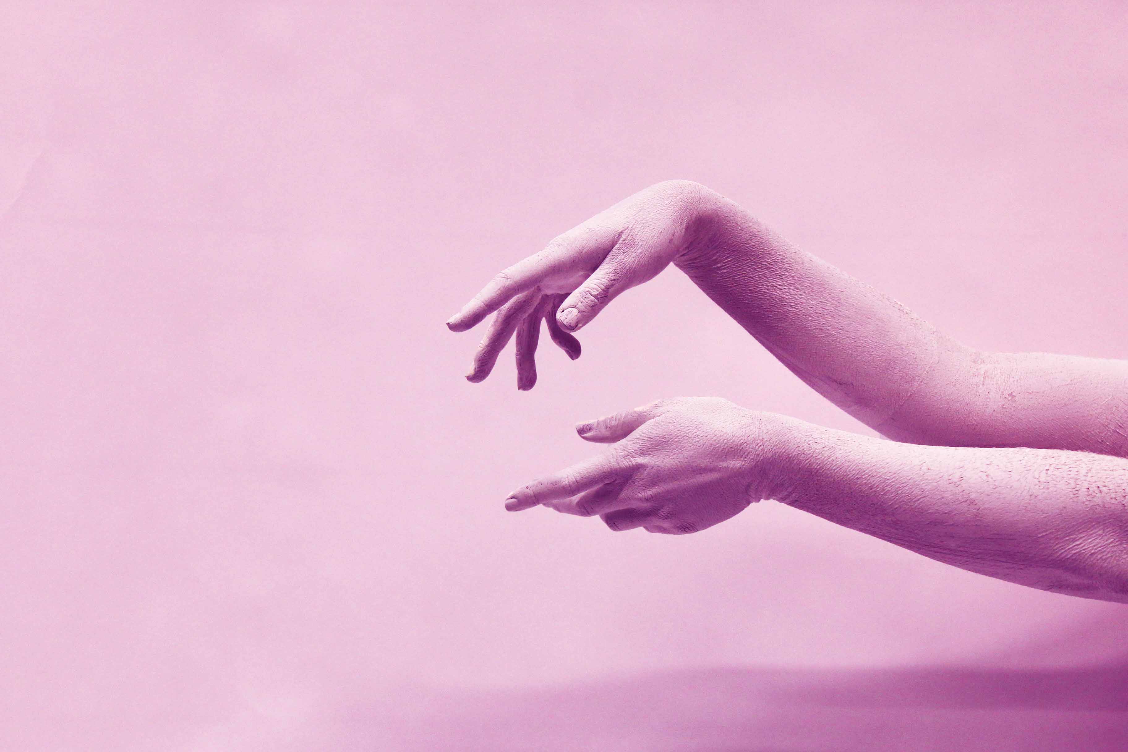
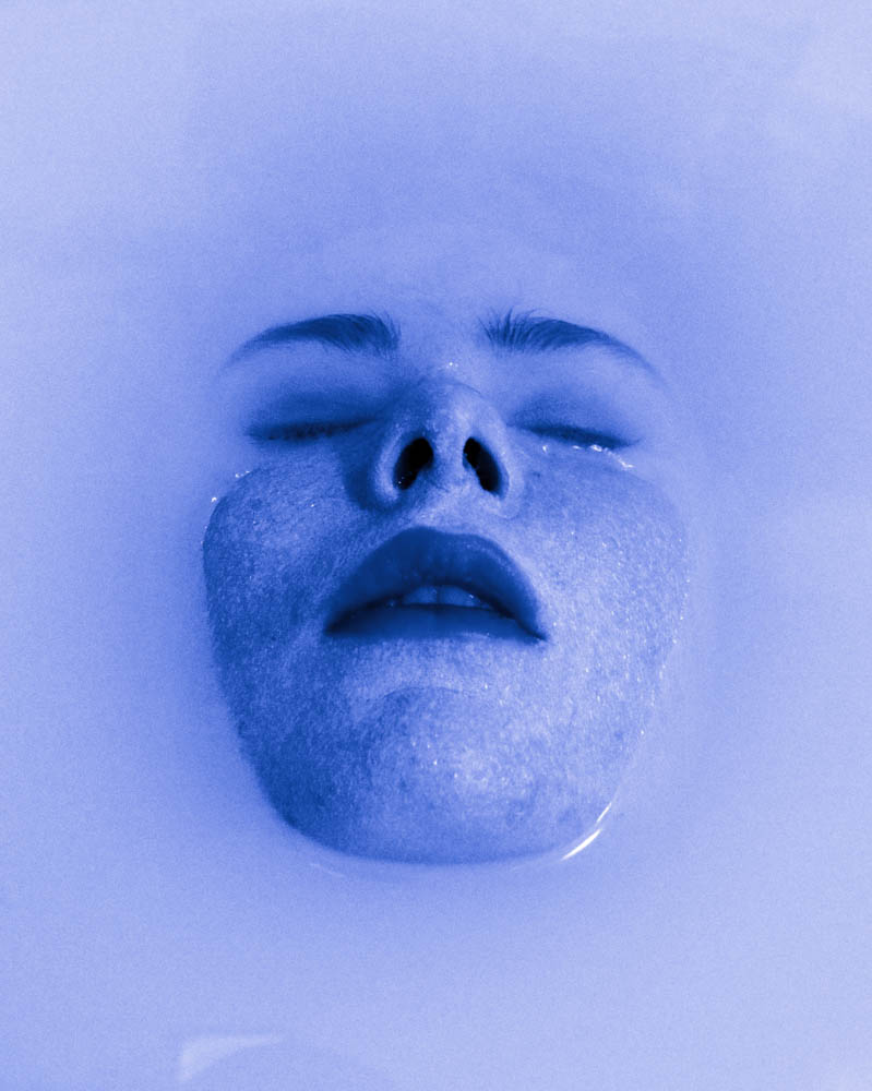
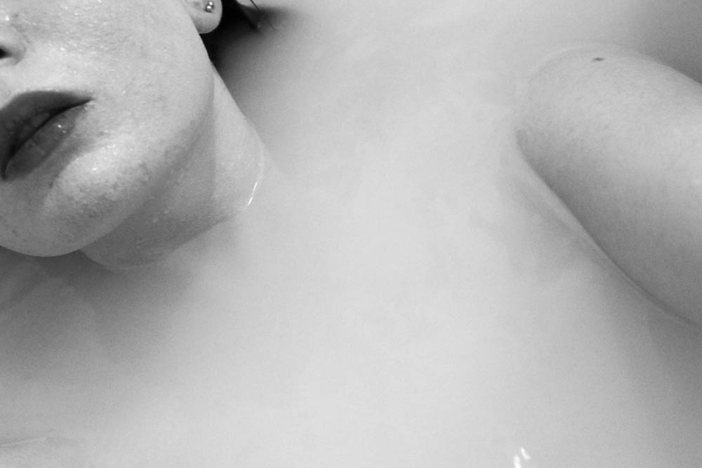
For A3 sizes I choose images that were visually interesting and were unique. I wanted them to express my view point and how I visually think about things. I planned to display the images in groups and I wanted a variation of sizes within the groups. There are going to be sets of groups, one with the focus of hands, one with the focus of faces and my last to do with submerging, and skin.
For my photo book, I originally photographed my mum and ad’s wedding cards which they sent to each other the day before their wedding, and, coincidentally, they happened to be the same.
I originally photographed these on a white background, raised from the white A2 sheet of card to create a shadow, and although the image turned out well, it didn’t fit the book as I wanted. Because the shade of white of the card did not match that of the white paper I was using for my book, I had to heavily increase the white clipping in the image which affected the look of the cards themselves as these are also white – in-turn, the cards ended up blending into the background because the shadows weren’t harsh enough.
Additionally, I hadn’t photographed the cards at a well enough height so that they looked the same size. One of the cards was also placed higher than the other and it didn’t achieve the affect of “direct replicates” as I wanted – I wanted to make it as symmetrical as possible. Because of this, and after realising that it didn’t fit in the book as I wished, I decided to re-photograph them.
I did photograph them again on the white background hoping I could get a better shot and hoping I could get a more harsh shadow from the sunlight on my window sill – where I had set up a mini studio for photographing the archive material. However, this again did not turn out as planned and once I had imported them into Adobe Lightroom, I was heavily affecting the lighting effects such as brightness, contrast, exposure and black/white clipping so that the image was in-turn becoming more and more low quality. I eventually realised that because of the card’s colour, I wasn’t able to photograph them well against the same coloured background. Because of this, I experimented with using black card, which, as you can, worked much better than that of the effects white card gave. It allowed the cards to stand out much better and I only needed to, once imported into Lightroom, alter the darkness of the black to darken this and increase the contrast of the black lines in the card.
I am very happy with the outcome of my third attempt at photographing my mum and dad’s wedding cards. Because it is the opening image in my book, I wanted it to be of high quality and this is my best edit yet and will be the final image used for the book. I will be using it as a full bleed image to get the full effect of the little details in the cards. I have also found that using black card places more emphasis on the cards and their value than white card did.
DEADLINE: MOCK EXAM!
Mon 5 Feb Class 13A
Tue 6 Feb Class 13E Wed 7 Feb Class 13D
IN PREPARATION FOR MOCK EXAM NEXT WEEK MAKE SURE THE FOLLOWING IS READY BY THE END OF THIS WEEK:
You want to aim for a draft layout of your photobook before your Mock Exam day and use that day to fine tune design with teacher
Complete and proof read essay by end of week so it is ready to be incorporated into book design.
Make sure you monitor and track your progress by Fri 2 Feb herePersonal Study Planner 2018Publish tracking sheet on the blog
AT THE END OF YOUR MOCK EXAM DAY – ALL COURSEWORK MUST BE COMPLETE
PHOTOBOOK
Final book design checked and signed off by teacher.
ESSAY
Include essay in the back of your book. Work in text columns and make sure to include illustrations of your own images and that of artists, as well as a bibliography
BLURB – ORDER BOOK
Upload book design to BLURB, log onto your account on their website, pay and order the book.
Consider spending a few extra pounds on choosing better paper, such as Premium Lustre in check-out, change colour on end paper or choose different cloth/ linen
BLOGPOST
All blog post in relation to the above must be published, including any other posts missing from previous work modules since the beginning of A2 academic year.
FINAL PRINTS
Select your final prints from book project. They may need to be added to prints from exhibition.
Save each image in your name as a high-res image (4000 pixels) into shared PRINTING folder here M:\Departments\Photography\Students\Image Transfer\PRINTING
MOUNTING
If you complete all the above and has extra time in Mock exam begin to mount and present final prints.
Collect AS folder from Mr Cole’s room and add mounted images to your CW folder. Make sure each print is labelled with your name and candidate number.
On the 23rd of January I did a photo shoot focusing on the different parts of the body such as the feet, hands and the face. I wanted to experiment a lot more with this shoot by using the environment I was in. I decided to do a self portrait shoot because I knew what sort of images I wanted to come out with. I used a bath as my environment and backdrop for the shoot because I wanted the body parts to be emerging from the water. I put milk into the bath so that the water wasn’t transparent which made the images much more interesting and effective. It was difficult doing this shoot because I had to hold the camera above the water and the steam also slightly blurred the lens. I am mostly happy with the outcome of my images for this shoot.
After seeing the final images I decided I wanted to edit the best images using Photoshop into black and white because the images looked much more effective and the details looked more defined.
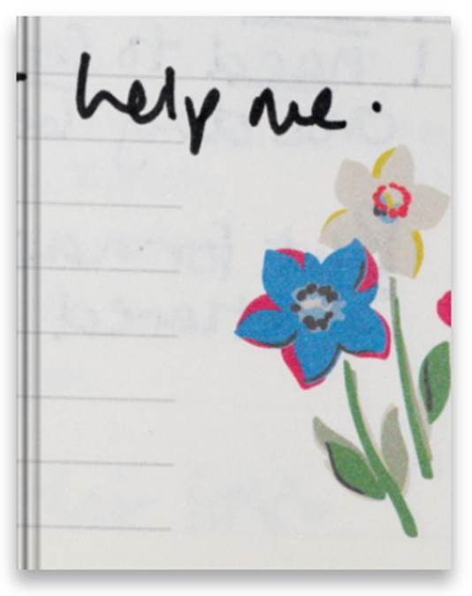
 The book ends with this bible verse. I chose this verse because it relates to previous photos and things my subjects have said in their interviews. I thought this would be a good way to conclude and finish my book.