Category Archives: Instruction

Filters

Author:
Category:

Representation in Photography

To study the idea of representation in photography and how certain aspects within imagery are presented to an audience, I will be looking at the work of world-renowned photographer, Steve McCurrywho is a very iconic documentary photographer succeeding in his captivating images produced for National Geographic.

Image result for steve mccurry

Steve McCurry (born April 23, 1950) is an American photographer. The photographer, is best summed as world-renowned success in the medium of documentary photography, especially in culturally deprived areas such as Pakistan and Afghanistan. He has worked in photojournalism and editorial. He is best known for his 1984 photograph “Afghan Girl”, which originally appeared in National Geographic magazine. McCurry is a member of Magnum Photos.

Image result for steve mccurry
AN AFGHAN REFUGEE IN BALOCHISTAN, PAKISTAN, 1981

Image result for steve mccurry afghan girl

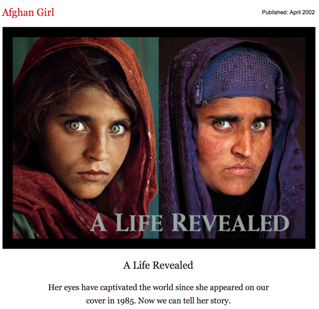
The image above is the world famous portrait of a young girl in Afghanistan and is titled ‘Afghan Girl’ for obvious reasons. Taken by Steve McCurry when traveling the world producing content of National Geographic, there is something very touching about the image above – something tat speak to the audience and I believe it to be because we know that this girl is likely to be very less well-of than we are if we use our schematic knowledge surrounding the topic of deprived areas such as Afghanistan this allows us to understand the likely difficult and traumatic life this girl may live – being surrounded by a war zone for most of her life and having to live with this as a environment that she has to grow up in. I, for one can feel a sense of sympathy and sorrow for this girl – she is young and lives a completely different life to us without the knowledge to understand the meaning behind possible explosions which occur on a day-to-day basis. We do not know of the help she may receiving if she does live a very poverty-run life and this portrait helps us to understand this. The use of her looking into the camera, directly at the audience is a very powerful tool and the facial expression gives off a feeling of trauma and vulnerability – her open and alert eyes let us know of her emotions, in that she is scared and overall it is a very well constructed image and is rightfully a world-famous image as it opens up a door to another life most of the world do not experience in their lives, and this is something we must be grateful for and McCurry has attempted to portray a unknown environment to us through his imagery. Us as humans love people watching and being a little nosey into others lives, which is why most of us enjoy and find pleasure out of watching vlogs, documentaries or capturing out own street photography or looking at other dociumeyatry photography but the scale on which McCurry does this at is on a much higher and more serious level. It triggers our satisfaction for being a fly-on-the-wall in others lies but this is for a much meaningful purpose. However, one thing I’d lie to pick up on is the fact  that I, personally do not actually like the image – I don’t enjoy looking at it, not due to its context but due to the actual way it looks – it is not something that attracts me t the image and is more so the meaning behind the subject which draws me in. Hover, McCurry produced this image with the purpose to fit the style and method of National Geographic as a whole and this has been done to a tee as it shows us the harsh reality, although not direct, of what life in other parts of the world us like. The image appeared on the cover of National Geographic in June 1985. There is a reason McCurry has been hand-picked by national Geographic and is member of Magnum Photos and this is because he does his job so well and many people gave fallen in love with not only him and his work bit the actual physicality of what he captures in every image – the colours, the subjects, the cultures, the lifestyles – our ability to connect with every subject in each portrait is what we love because not every photographer has the ability to create an image so well – something I will be talking about later.

American Photo magazine says the image has an “unusual combination of grittiness and glamour.” which I believe to be very true.

Expanding on the idea of representation, like I mentioned before, this is a very touching and harrowing representation of this young girl and we are able to get an insight into her life. The girl is represented as quite lonely and isolated and form her facial expression, quite scared and lonesome and we don’t know whether this as true or staged as us as the audience can only act as people who interpret the content to what we believe but the notion of true and false is hard to decipher when looking at the work of McCurry, yet t is something we believe to see as true and not staged as this would be providing us with false visuals bit in another sense, we also hope for it to be false because we do not wish to face the harsh reality that people across the world, in abundance, do actually live like this. On the other, we appreciate the imagery that McCurry produces us because we get so experience other cultures for ourselves fro what see in the frame.

It has been likened to Leonardo da Vinci’s painting of the Mona Lisa and has been called “the First World’s Third World Mona Lisa“.

Image result for mona lisa

Now mentioned, looking at the similarities of the Mona Lisa and McCurry’s Afghan Girl, there are many resemblances of both in each other. It is perhaps that McCurry took inspiration of the elegance and pureness of the painting of Mona Lisa an then transferred this into his portrait of the young girl in Afghanistan. Both look directly into the camera with a blank facial expression. They both have long, dark, maroon coloured hair and wear a draped scarf or vale over their head. In both imagery, there is a sense of delicateness and urge to show the femininity if our world – to show the beauty of females whether that be through a painting or photograph and though we may be faced with something difficult to address, looking at McCurry’s work, the beauty is beneath.  Maybe this is something else McCurry attempted to present and show us – the inner beauty of this young girl that is underpinned by the courageousness of her efforts to stay brave in the situation she found herself in at the time. It is aa though the women in both works are attempting to tell the audience something through the very intense gaze they possess. McCurry provides us with a modernised version of the Mona Lisa for us to embrace.

Image result for afghan girl

In early 2002, the subject of the photo was identified as Sharbat Gula, an Afghan woman who was living in the Nasir Bagh refugee camp in Pakistan during the time of the Soviet occupation of Afghanistan when she was photographed. This effort to re-photograph the same girl several years after she has once matured and become a grown adult tells a story and a very powerful narrative which the world can acknowledge as the image at the time when she was a girl touched the whole world as a community and again when her face is shown again over 15 years later. It was revealed that she had never seen the Afghan Girl image before it was shown to her in January 2002.

McCurry made several unsuccessful attempts during the 1990s to locate her. In January 2002, a National Geographic team travelled to Afghanistan to locate the subject. McCurry, upon learning that the Nasir Bagh refugee camp was soon to close, inquired of its remaining residents, one of whom knew Gula’s brother and was able to send word to her hometown. However, a number of women came forward and identified themselves erroneously as the famous Afghan Girl.

Although being a very successful and iconic image worldwide, ‘Afghan Girl’ and many of Steve McCurry’s other images taken in India during his time there for National Geographic can be seen to be quite romanticised and purposefully made to look more glamorous than reality suggests native to India, writer for New York Times Magazine, Teju Cole, explores this in more detail and criticises McCurry’s work on this very factor that many of his images seem ‘too perfect’ and he compares other representations of India that come from natives, such as Raghubhir Singh to McCurry’s and finds an evident juxtaposition between an insider’s view and an outsider’s view. Making for an interesting story about presenting a fake reality to please a modern by audience looking for extravagantness and in reverse, we see a more real and raw look of a country told by the locals, not tom please audiences but to provide reality.

Taj Mahal and train in Agra, 1983, Steve McCurry

Teju Cole in his article addressing this topic he feels very passionately about goes as far as to say that McCurry’s images are “astonishingly bring” which may seem quite harsh and disrespectful as most would see McCurry as a hugely influential and dedicated photographer but I can see where Cole is coming from with this very brave statement as there isn’t much in his images that sparks interest from me in terms of look and visuals. Like I said, you would think that McCurry’s work should be admired and loved by everyone because of its popularity in National Geographic and his image of the Afghan Girl which will live in memory but his work is not for everyone, including Teju Cole and myself but Cole himself mentions the immense popularity of McCurry’s work which “adorns calendars and books, and commands vertiginous prices at auction.” – in other words ‘sells for ridiculously expensive prices’ and Teju Cole cannot see the demand for such images which are “boring” because he sees the images produced by McCurry as unrealistic of Indian culture – evident in the image above where photographed is a very glamourous scene where in frame is a train going by with natives on the front in their colourful and beautiful headdresses looking very polished and slick and in the background is the Indian landmark. the Taj Mahal and it almost seems “too perfect” much like the title of the article suggest. Cole says “The men are real, of course, but they have also been chosen for how well they work as types.” This is suggesting a fake presence around McCurry’s work that they  have been specifically chosen as they look well together and it makes for a very glamorous image which is not a true representation.

Indian photographer, Raghubir Singh worked from the late ’60s until his untimely death in 1999, traveling all over India to create a series of powerful books about his homeland. His work shares formal content with McCurry’s: the subcontinental terrain, the eye-popping colour, the human presence. Within these shared parameters, however, Singh gives us photographs charged with life: not only beautiful experiences or painful scenes but also those in-between moments of drift that make up most of our days.” Here Cole talks about the difference between Singh and McCurry’s work as well as similarities but focuses on the negatively charged feelings which exude from McCurry’s work in particular and suggests that this is incorrect and not how he wishes for his homeland to be shown and therefore, with pride, backs the work of Singh to show what India is – in that it is a land full with life but is better shown through the snap-shots of everyday life – what is in between the hustle and bustle of a usual busy location.

Subhas Chandra Bose statue, Kolkata, 1987. Raghubir Singh
Kemps Corner, Mumbai, 1989. Raghubir Singh

An example of Singh’s work is show above and is quite the opposite of McCurry’s work although taken of the same content – just much more relaxed in its composition. Singh focuses on creating a ‘snap-shot’ of one second in time – no-one is looking directly into the camera, not is there exaggerated shadows and colours enhancing in after-affects and instead we are given a much more raw representation of India’s busyness told from the perspective of an insider. Although an outsider’s view, McCurry’s amateur representation of India is still loved because we are given something simple to feast our eyes on; not a narrative which needs to be unpicked yet still enjoyed in its visuals – much like what Singh’s work offers.

Looking at another view, above is the music video for Coldplay and Beyoncé collaboration song ‘Hymn For The Weekend’. Although very poplaur, it has spakred much controversy over its intentions.

Written by Billbaord, ‘Coldplay’s new “Hymn for the Weekend” video featuring Beyoncé that was released on Friday 29 January is catching some heat over its Indian inspiration, with some online calling the Mumbai-shot clip a work of appropriation while others defend it as an appreciation of the foreign culture.

People were seen to express their fury at both Beyoncé and Coldplay and people took to Twitter to outburst their range over what should be seen as an offense to the local culture instead is being ignored because it has been addressed by two popstars who are worth millions. Some said ‘Are we gonna discuss how Beyoncé dressing up as an Indian woman for the Coldplay video is cultural appropriation, or no?’ and another said ‘Just because it’s Beyoncé, doesn’t mean she’s right. She is being offensive and appropriating our culture.’ However, some actually like the fact that Beyoncé was seen in the video to dress up as an Indian woman as it empowers them and someone said ‘I adore Beyoncé for embracing my culture. In a country where I’m a “terrorist” I have never felt more accepted’. And it is argued that Beyoncé is likely not offensively appropriating due her black origins and this would not be in her remit.

However, In my own view, I had never looked that far into it until now and just saw it as a band who wants to embrace the culture of India and not intentionally offend anyone by different people have their own views on representation and it is often misinterpreted.

Review and Reflection and Progressing to Personal Investigation

Now I am making the transition from set assessments based around family and environment to my own personal study and investigation where I begin to take control of what I do, I saw it necessary to felt on the work I have produced so far during the second year. I have been very archive when participating in workshops and completing tasks relating to my own personal archive and have shown a keen interest when observing the history of Jersey through it sown public archive at the Societe Jersiaise and following on from these early stages, I have really enjoyed producing my own photoshoots which encapsulates the notion of documentary and tableaux and through these processes I have had the chance to look at several new artists which have heavily influenced my artistic mind to aid my success for the rest of the year.

I have used these last couple months as a process of learning of elimination essentially; I have thrown myself into all activities to allow myself to get a full understanding as well as letting myself experience the full effects of being very much committed to my work in order for myself to understand what I personally enjoy and what I am not too keen on. This has allowed me to reject certain topics/themes that I don’t feel I can strive in as much  as others – which has therefore made my decision easier now I am deciding on the outlet I want to pursue for my own personal project which will conclude in a photobook.

Being able to work with professional and world-renowned photographers such as Jonny Briggs and Tanja Deman has really expanded my horizons and matured my artistic mind as well my eye for new perspectives when using a camera because the close relationship and intimate workshops carried out with the two have been a very useful experience. As well as this, out of school, I have been actively involved in what else they had to offer and have taken full advantage of their time on the island because it is not often that you have two willing professional photographers on your doorstep to aid your own passion for photography. Through attending workshops they have held in holidays and at weekends, I have been able to work very closely with both artists and the skills learned from this has essentially been transferred into my work at school where I saw myself experimenting with new techniques and the skills learned on the workshops have benefited my confidence to be different which will play a very huge part in my own personal work in the future. Through the workshops, I had the chance to meet other likeminded people of my age and the close proximity I have had with these people has made me appreciate the creativity on the island much more.

With he two photographers immersing themselves into two very different concepts of genres of photography, it has allowed me to see the direct contrasts of two styles of photography and allowed me to realise, in my work at school as well, the format for my personal study I want to pursue. I have always had an eager interests in photographing people since I started using photography as an outlet for being creative and this has followed me through my whole experience with photography at school, however had not had the confidence to use people as focal subjects of my work until recently. This concept will be the main focus point of my work this year and I look to interlink the ideas of documentary and very “raw life” images of the actuality of our lives themselves and the use of portraiture and people who are very present in my life currently.

One of my aims for the year is to experiment and explore much more than what I have done thus far. I want to be much more contemporary in my work – evident from the work I have recently produced where I made a link between family members and their childhood memories trough objects they treasure. This contemporary approach was influenced by the likes of Alfonso Almendros and Rita Puig-Serra Costa. As opposed to last year and recent times where I have relied heavily on editing to manipulate an image heavily and produce very overpowering photo montages where the meaning and raw visual concept of the images is often ignored, this year I wish to be much more simplistic and delicate with my editing process where in portraits I will only look to enhance certain colours if needed or make a few touch ups etc.

Certain themes I enjoyed were mostly based around family and the idea of photographing the faces of the people around toy to tell a story – another idea I wish to experiment with in my work this year – to tell a visual story and this is vital in a photobook. I hope to use other various concepts such as dairy entries, notes and drawings etc. to insert into series of works to tell a narrative. As well, I hope to be much more elegant and thoughtful in the work I produce and one of my goals is to not rush things and make sure I am taking time with my processes in order to get the best outcome. 

Personal Target: to be experimental and concise with my work - make sure I taking my time with my thought processes to benefit the outcome and to tell a narrative with my images - be different to what I done already. 

Memories of Childhood / Tableaux Shoot

Childhood Nostalgia

After researching the work of a couple of tableaux photographers, being Alfonso Almendros and Maria Kapajeva, I really wanted to get underway with my own tableaux photoshoot, however, I did not feel like I wanted to produce a series of images in the style of either Kapajeva or Almendros because I wasn’t completely attracted to their work in order to implement their style into my own example.

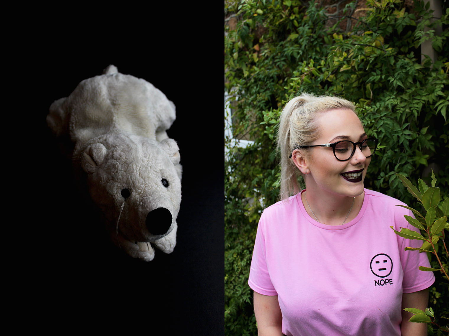
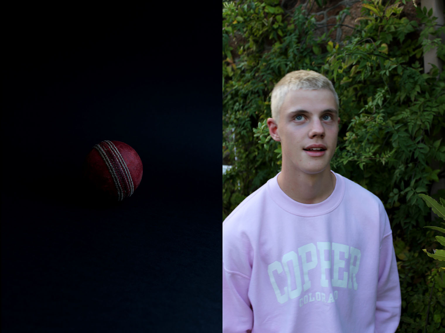
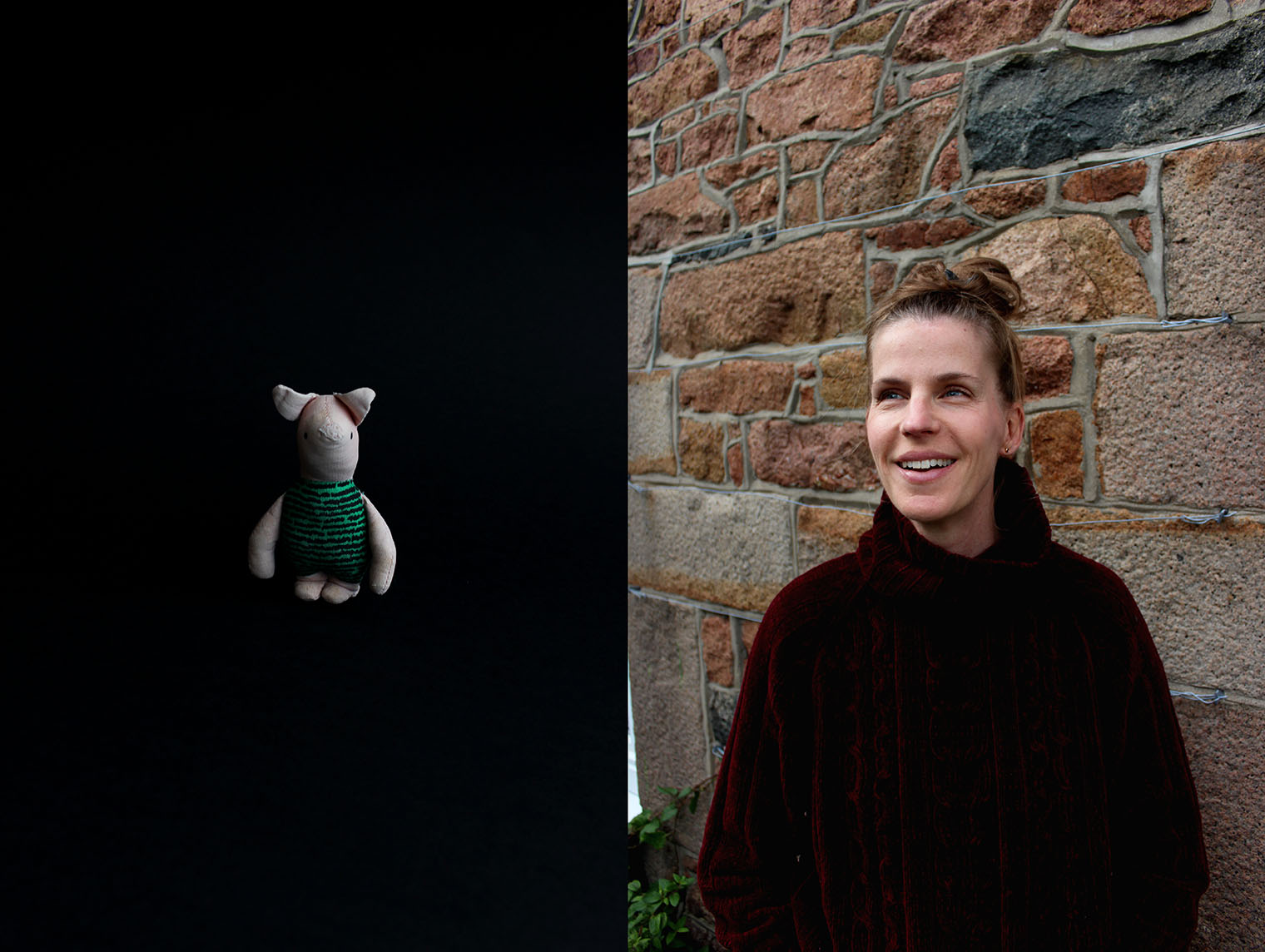
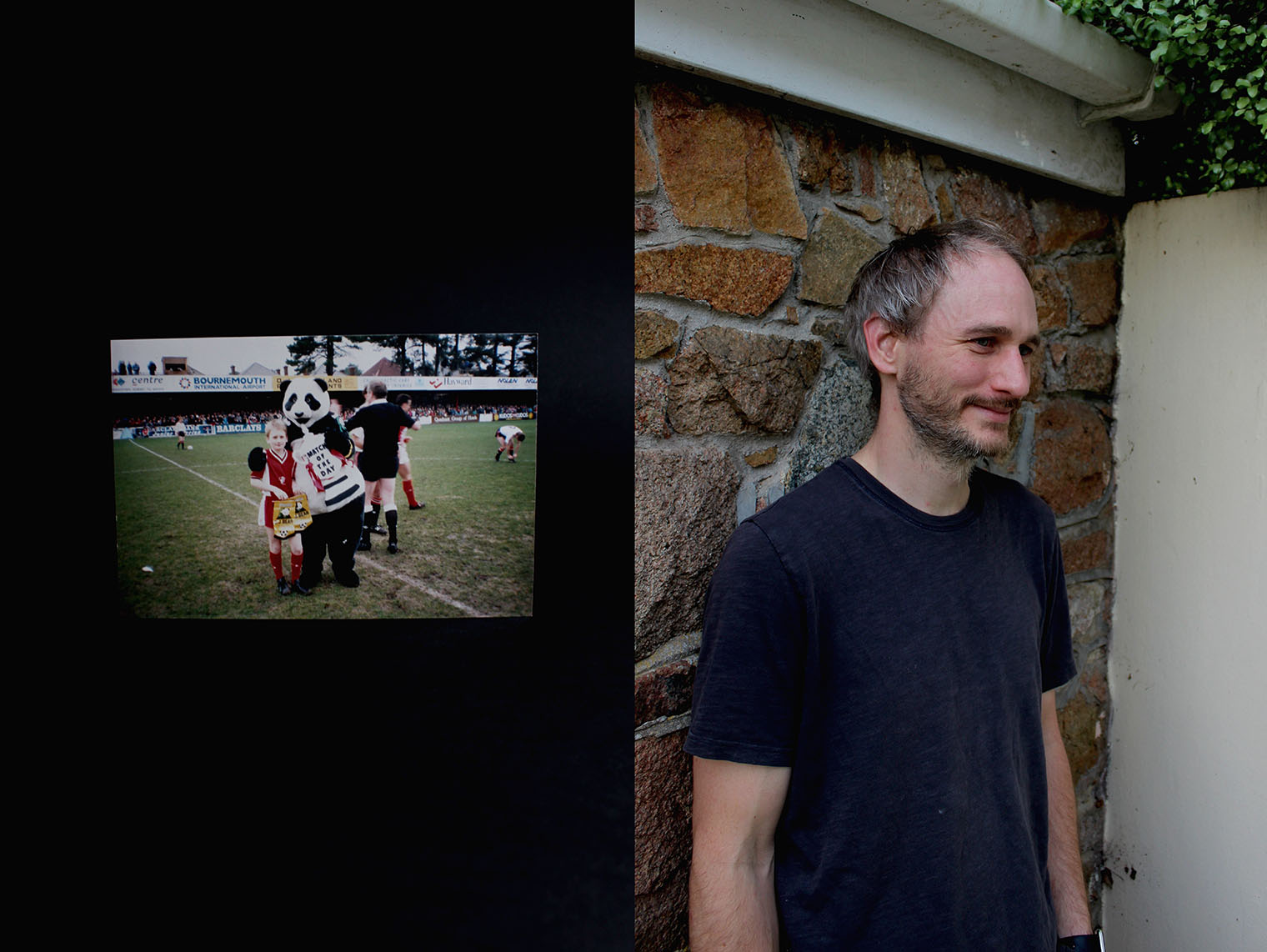
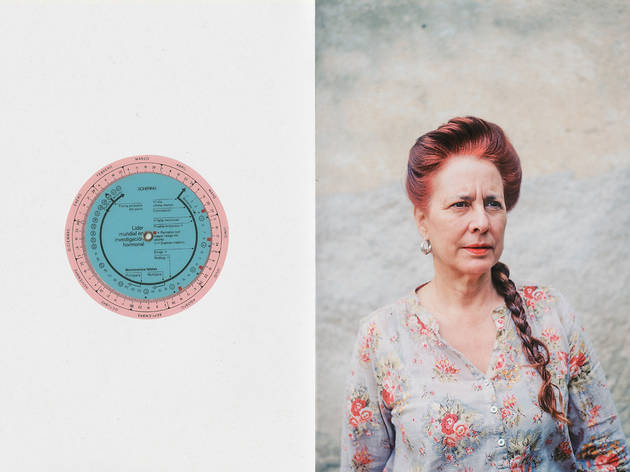
However, I had a look through a photo book which present in the classroom at school. It was a book entitled ‘Where Mimosa Bloom’ by an artist named Rita Puig-Serra Costa. In her book, she also specialised in aspects of tableaux photography in the form of photographing objects – still life as such and portraits of the family members and then pairing the images together. However, the meaning and concept goes beyond what the simplicity it sounds like. The objects photographed in a studio style as opposed to photographing them in their natural environment or where she found them are then digitally directly placed in this photo book on the opposite page of a portrait also taken by Serra-Costa. It seems as thought the portraits are of family members and the objects paired with each portrait is relevant in some way to the subject of the portrait. Although there is no direct explanation or link between the two, a narrative is drawn by the audience where we provide out own explanation of what could be the intention of this – there is obviously a meaning of the object in relation tot he subject but this is not actually explained. I found this very intriguing and eye-catching in its minimalism and wished to attempt a series of my own in the style I witnessed by Serra-Costa in her book ‘Where Mimosa Bloom’ which is about her family and place they live.

The primary results are below. I first attempted by completing my own memory and I will then go onto do the same process with my other close family members, including my mum, my step-dad, my nan and my girlfriend. This will provide a very compete and cohesive set of image which tell a visual story of not only my childhood memories about the loved ones around me.

Explaining the Series' Process

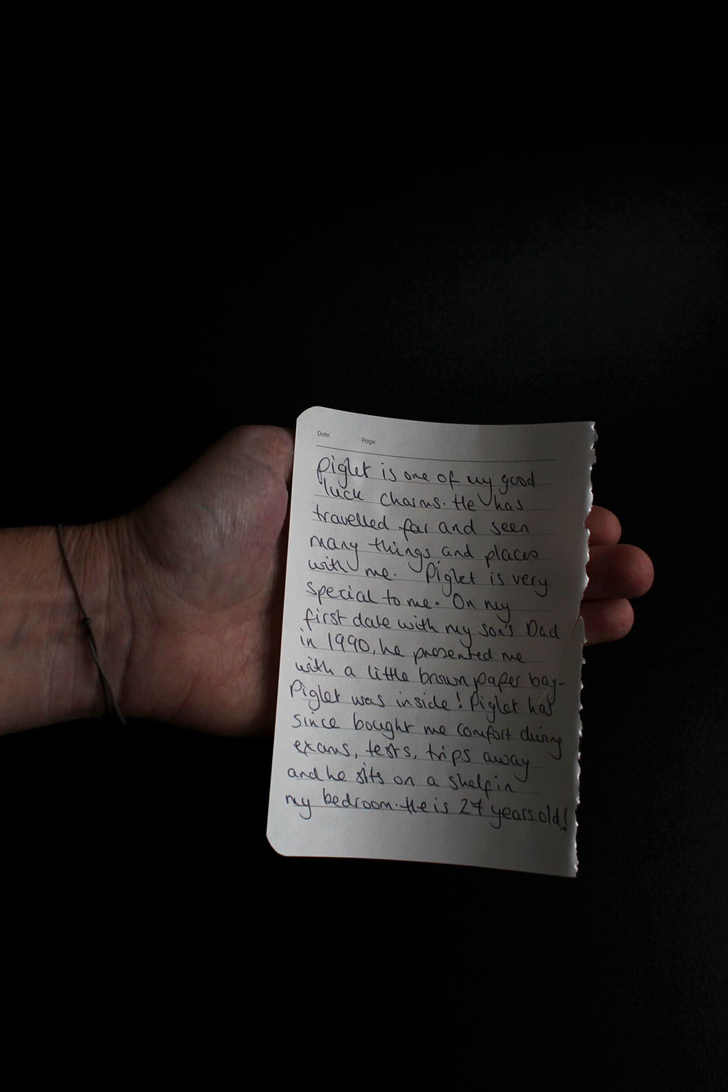
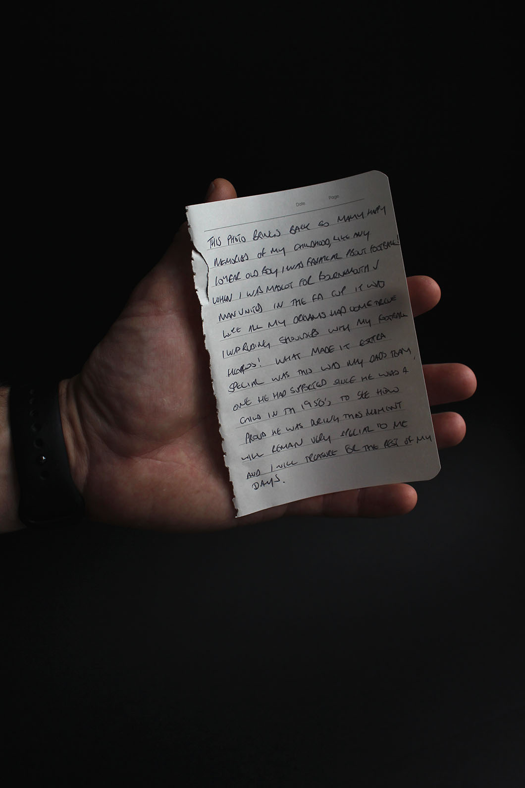
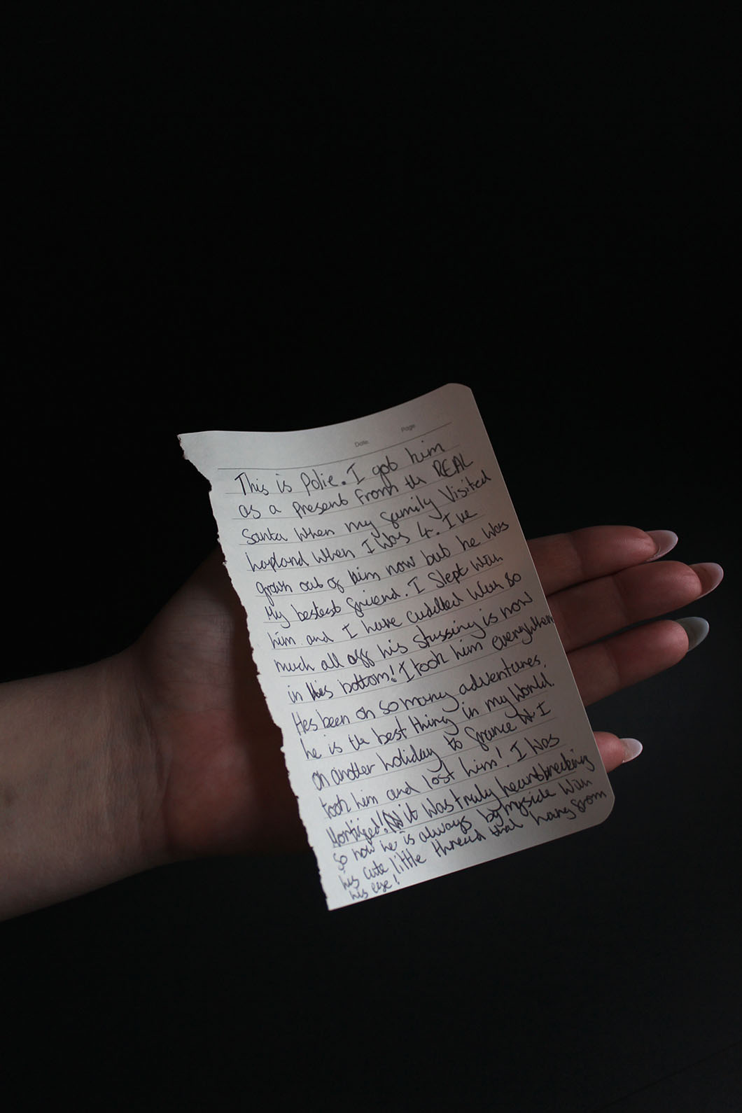
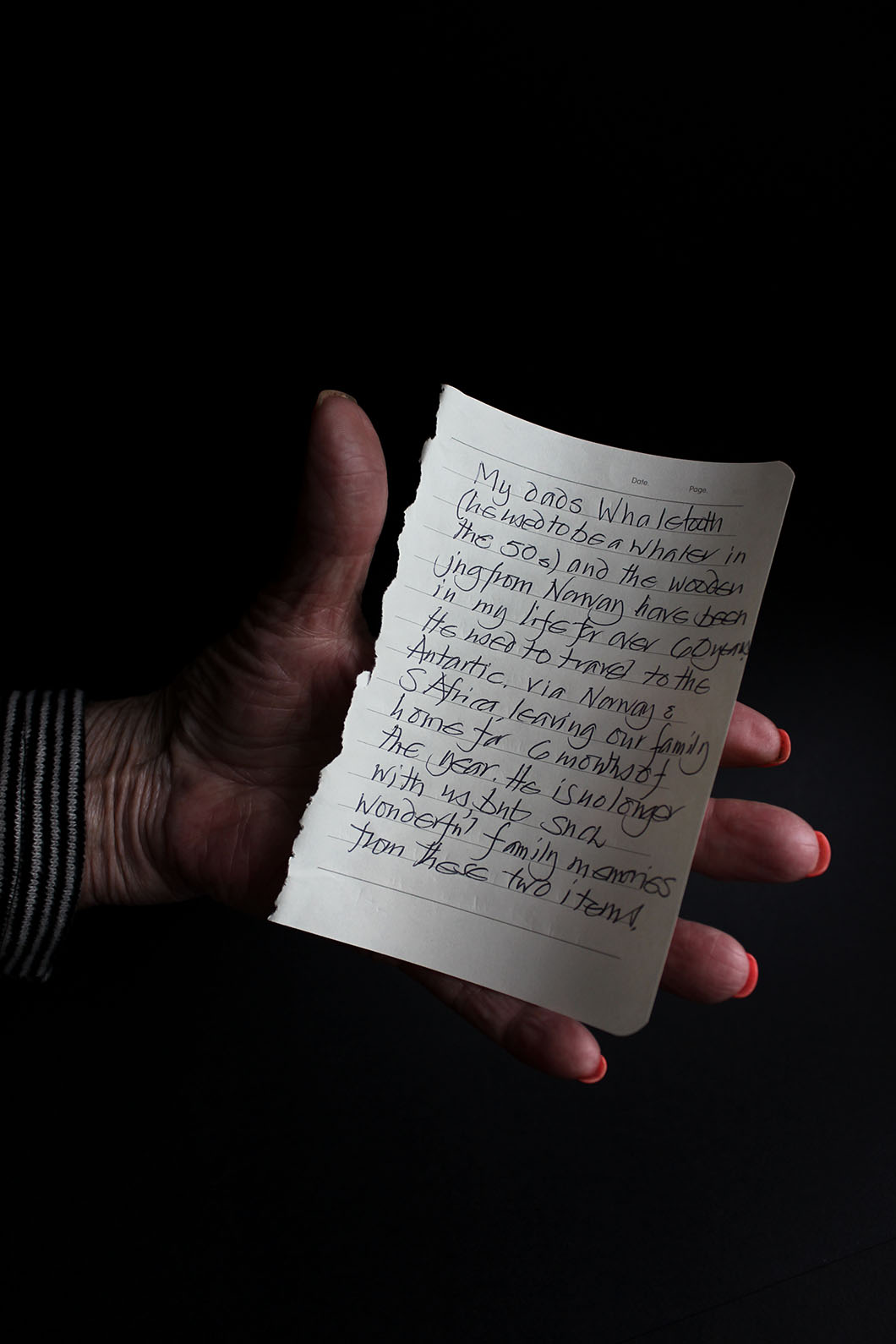
Here are the images I created in response to Rita Puig-Serra Costa’s images from her series ‘Where Mimosa Bloom’. My aim from this series I have created was to show my own family through a composition and the juxtaposition of old archives in comparison to contemporary, staged portraits of their life now and how they look back on to the memory they have shown. I have presented nt only my own childhood nostalgia but the others around me to create a cohesive narrative accompanied by very thoughtful inserts of written notes by each individual to he;p the audience understand what is going on in the photo. Each individual has explained why they have chosen the object they have and what it means to them as well as the memory it brings back. I attempted to show this connection to a particular object even further in the portraits where I asked my subjects to create a facial expression/show through their presented emotion the feeling the object gives them when looking back on its worth of their childhood.

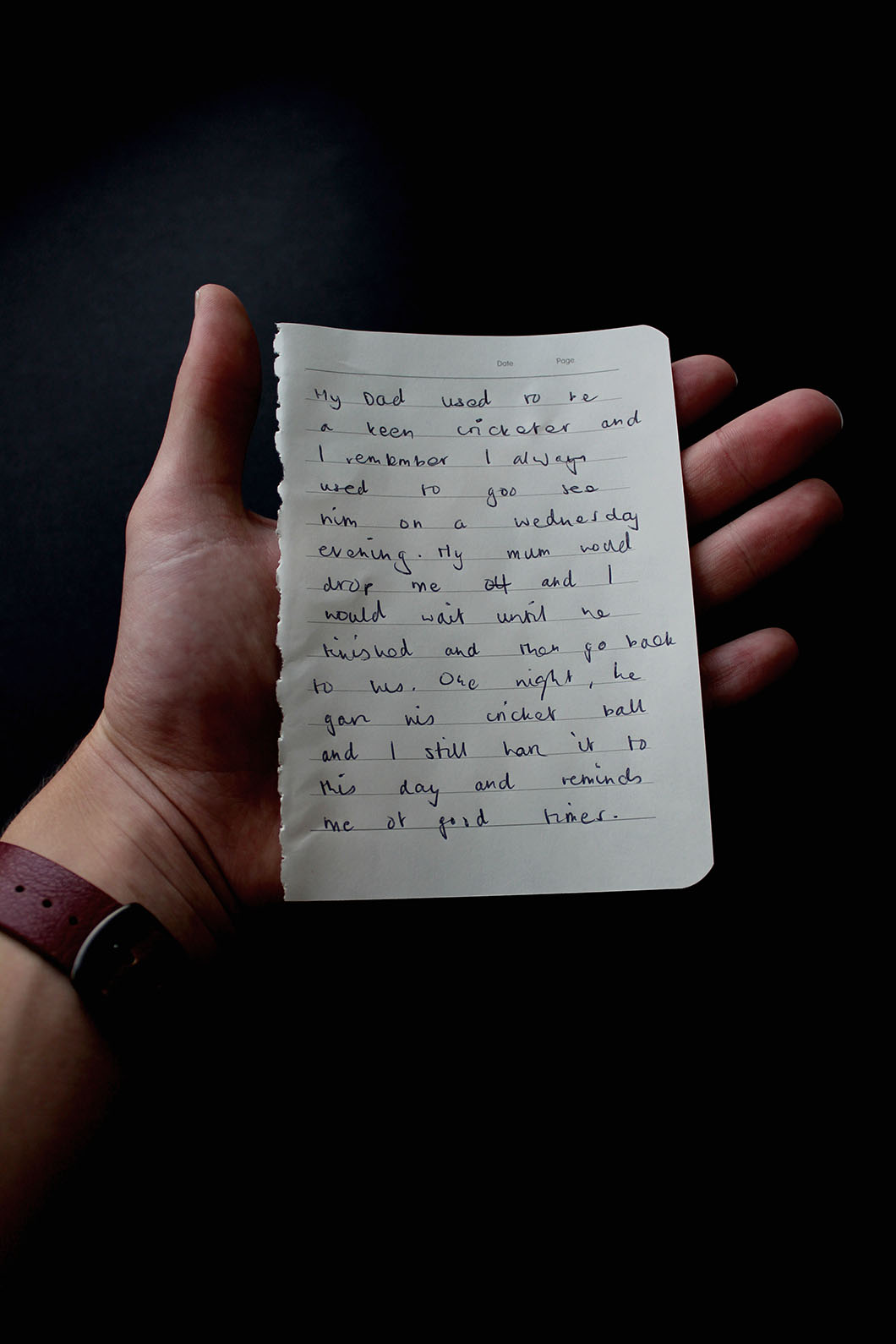
To create the studio-like images of the objects each subject handed me to accompany their portrait, I set-up a mini studio in my room suing black card. I collected a couple sheets of black card from my school to take home t allow me to produce to the still-life images. In my room I have two very large windows both with very large window sills as the windows are almost like alcoves in that they are very far into the wall. This allowed me to set up the black card on the window sill and this was perfect as I allowed for lots of natural light which resulted in my objects being perfectly lit and the conditions for this were great when I would come back for school each day. I created an infinity curve using one sheet stuck to the wall and then competed the set-up with another sheet on the flat surface and I would place each object on the curve and then adjust my camera settings accordingly to account for the lighting already provided which obviously illuminated the right side of each object and this allowed for an interesting look to each image where the left ide would be in the dark and I would aim to under-expose each very slightly to get the best effect of the black background. For the notes written by each subject, I got each of them to hold their own note with their hand so it adds a personal touch and I would photograph this against the black background also.

I don’t really feel a need to explain the actual chosen object of each person because the explanation in the words of the subject themselves is provided in written form and I feel like my words won’t do the memory justice because a memory is a very personal and it is best told fro the perspective of the person with that memory. I have attempted to get as close in to the note as possible to it is legible at the same time as keeping the hand in frame and I hope that the handwriting is not too difficult to read.

The Images
Jude

Mum

Mark

Lucy

Nan

Plan for Tableaux Photoshoot

Over the last couple days after doing some research into different artists who specialise in tableaux style images, I decided to start planning for my own tableaux photoshoot inspired by tableaux in contemporary photography.

I started jotting down some ideas in the form of a mind-map to get my mind flowing and so I could write down anything that came to my min and I was commenting on the idea of re-creating my own childhood memories by looking at my own personal archive and to do this I would pay close attention to the use of costumes and props in order to tell a narrative. This was a great idea when I first cam up with it because I would take inspiration form artist such ass Irene Werning who looks at her own old childhood memories in the form of images her parents took when she was younger. This was something I was very keen to pursue but I the realised it would not show a very interesting narrative or let me explore the idea of memories and our relationship with our past and the memories we hold in our lives – the moments we cherish which has brought us happiness – I feel like this shoot would not allow me to explore this in the depth I wanted.

I also begun discussing the idea d using certain apps on my iPhone which allow users to take pictures in the effect of old and retro images – an analogue film effect that adds graininess and low quality to your photos to create a sense of nostalgia. The app I won called ‘8mm’ also alters the proportions of the frame/aspect ratio to add to the notion of creating a photo that looks like it was taken on an old film/disposable camera and this is something I still wish to explore but for the shoot I aim to complete this week, I want to look at something more contemporary – something inspired actually by an artist that I have not studied – being Rita Puig-Serra Costa – this is because I was not fully attached to either Almendros or Kapajeva’s images. I love Almendros’ contemporary, very polished style of his photos and I hope to transfer this over to my images but I will be mainly documenting on Costa’s work and in particular her series which focuses on portraits of family members and the objects they cherish themselves.

I hope to, this week compete this shoot once I have planned some more and I full understand what I wish to achieve and how I am going to go about it. I will need to contact several people who are close to me and ask them if I can photograph them individually and I will also ask them to collect an object whether that be a document, a teddy bear, a photo, a pencil – anything that has some meaning to them, preferably something which takes their mind back to when they were a child. I will then photograph this object against a black background in a mini studio set up and once both images of the person and the object which relates to them are done, I will then pair each corresponding one up. I hope to do this task with my mum, my step-dad, my girlfriend, my papa, my nan as well as myself and perhaps my dad and my sister.

Although I am not directly linking this tableaux shoot to my own childhood and re-creating my own childhood memory, I am doing it with my other family members and their own childhood memories so that I am linking the theme of family and archives. As well, I believe it will be nice effect to get each relative to write up a little passage, almost like a diary entry or a description of the object they have chosen and the relevance it has to them for me to then insert and quote this in the final production/sequence of images so it tells more of a narrative.

Rita Puig-Serra Costa
WHERE MIMOSA BLOOM
Rita Puig-Serra Costa


https://vimeo.com/124694405

Image result for chris verene photography family
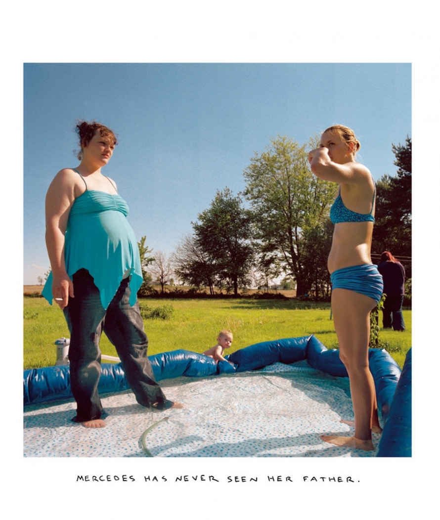
Chris Verene used handwritten text over his images to tell a story
Image result for chris verene photography family
Chris Verene

Visit to CCA Galleries, Tanja Deman & Jonny Briggs Exhibition, 12/09/17

Image result for cca galleriesOn 12/09/17, we visited the recent exhibition of Jonny Briggs and Tanja Deman’s work. The exhibition consisted of the work they had produced during their residency in Jersey and they were hoping to show off the research and efforts they made in an attempt to impress the locals of Jersey by showing them a side to the island the hadn’t seen before in this exhibition that was great experience and it was very impressive to see the extent of their work, especially having the opportunity to look at two world-renowned photographers who have had their work displayed in art galleries such as Saatchi, I was honoured to have this amazing chance to speak to them on a personal level about their work and get an insight into the style and aims from the series of images they had put on display for us.


Image result for cca galleries jersey

In the words of the Balliwick Express website from their publication and the very successful joint exhibition, “both artists were awarded £10,000 to work in the island and have both chosen different projects, Tania photographed underwater landscapes while Jonny focused on the island’s ancient landscape, monuments, institutions and archives through the motif of the mouth.” In my opinion, the contrast that showed two sides of Jersey rich in beauty and wonder was amazing.

CCA Galleries
Pictured: From left to right, Jonny Briggs, Tanja Deman, Sasha Gibb, Director of CCA Gallery International and Gareth Syvret, Société Jersiaise Photographic Archivist and Archisle Project Leader.

I had kindly received a private invitation to the opening night of this exhibition sent in the ail from Societe Jersiaise and I was very honoured to be given the opportunity personally to attend the opening night to be one of the first to see the amazing array of works produced by both artists. As well, on Tuesday 12th the following week, I attended the event again with my school and got another opportunity to speak to both photographers about what they had created on a more one-to-one, immersive basis and it was great to experience. As well, during both artists residency, I began to work with them both very closely on the workshops the set up for myself and other like-mind people and this was an opportunity to produce my own set of work influenced by both of them and the conversations I managed to have them throughout has benefitted my artistic mind and when I got to see the work they had been conjuring up behind the scene when I visited the exhibition, it was a amazing experience I that mad me feel very grateful.

Tanja’s exhibition, entitled ‘Sunken Garden’ focuses on the hidden wonders underneath the surface of the sea – the garden we don’t get to see in such great detail which we were given the opportunity to through the captivating series of works Tanja had produced looking at the types of seaweed that lie beneath the ocean which surrounds our island. There was something quite mesmerising and magical about her work which is what she stated her intentions were – to provoke a certain emotion out of her audience. She wasn’t intending to ell a particular message through the works which were consistent throughout to produce a very truthful series, but instead wanted to force a feeling out of her audience from the magic that was on display – very dream-like images which were underpinned by the very professional skills shown in the photographs with use of lighting to illuminate the texturized seaweeds and highlight their patterns often not noticed when going for a swim in shallow waters. For the project, Tanja had to plan thoroughly to determine the best bays of Jersey which would give her the chance to capture the different types of seaweeds. This wasn’t a very simple effort that required just a couple dips in the shore of St Brelade’s Bay and instead a much more conscious effort to locate perfect locations for the few shoots Tania created in between choosing final images and framing them ready for the exhibition. Tanja’s style and process through producing her images is very different to that of Jonny’s but the behaviour of both of them in terms of their work makes for very different results which both have tell a powerful story encapsulating the rich beauties of Jersey which is often not realised by the locals but the two artists forces the information through to us when exhibiting their work and articulating their intentions from it.

Tanja told Archisle at the beginning of her time in Jersey that she is concerned with ‘the perceptions of space and her relationship to  nature’ and this was evident in the work she put on display because she as a photographer and to really make a effort to make a physical relationship between herself and her surroundings – what she was photographing as this would make for the best results.

Tanja wanted us to explore her exhibition and then after 5 minuets of observing the images, she wanted us to choose a photograph we liked and one we disliked and then show her our choices and tell her why we chose the images we did. When I was first handed this task, I felt a bit sceptical about the prospect of criticising a professional photographer on her work she has spent 6 months producing for the locals of Jersey but this was part of the experience I would go onto embrace to allow me understand more bout her work.

This (right) is the image I chose as the one I ‘disliked’ due to the fact that I wasn’t too sure what it was and it seemed very dislocated from the serirs as it wasn’t too similar to other images Tanja had produced as the others showed clear subjects in that you could tell what was in the frame. I showed this to her explain it was my least favourite and told her why this was and she then went on to explain that it was a seabed and I then understood and forced myself to understand that in every series of images, there is going to be an anomalous result that may not always fit in however, this is what makes it special and interesting.

I chose these two images (above) which were displayed in a paring at the exhibition as my favourite because I thought they worked really well together and their wondrous nature is what attracted me to them because they look so fairy-tale-like. I love the haziness which is present in the images. The streak of seaweed which takes its place in the centre of each of image stands out beautifully from the clouded background of the sea and the lighting is what accentuates the detail of seaweed. It is as though the seaweed is so lonesome and it’s dream-like beauty is seen through the effect that the seaweed is floating in this clouded seascape but the effort to pair the two images together makes them much less lonely as opposed to hanging them separately. I explained my reasoning for these two being my favourite to Tanja and she understood why I liked them so much. Tanja’s other works were much bigger in sixe but the smaller size of them both and simplicity of it is what drew my attention to the photographs.

Jonny Briggs exhibition, although within very close proximity, being in the same building with Tanjas’ was actually very different in the type of work produced. Tanja’s was landscape based and Jonny’s was based around photo collaging and using other objects to create images which encouraged much more talk and thoughts from the viewer, in my experience because they ate not as self-explanatory as Tanja’s due to the very contemporary and untraditional techniques used to produce the images.

Jonny found himself during his time on the exploring the idea of censorship and controversy which comes with the motif of the human mouth and the relationship between the eyes and mouth – speaking and seeing. His works were much more muddled and there was no real sense of cohesion but they all worked together to complement each other even though the narrative was not fully direct to the audience however this is what I enjoyed about looking at Jonny’s work. The chance to see the exhibition twice gave me the opportunity to see images twice and therefore conjure up two different meanings which I thought the exhibition was intending to show. The first night was a chance for me to view the array of works but because of the busyness of the night, I could not speak to either Tanja or Jonny which was very frustrating but going back on the following Tuesday allowed me to speak to both artists one-to-one to allow me to get a better understanding of the purposes of the images and Jonny’s work really resonated with me due to the sole message he wanted to tell and hoe actually did this through the unusual and contemporary style of his 6 month project but also the way he articulated his intentions made me very grateful to be in his presence so he could, with much passion, tell us about each and every image.

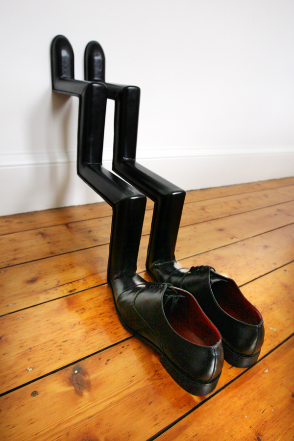
Jonny’s passion for photography originally came from his failure at architecture at university where he realised he found himself immersing more so into other media where je could find more freedom to do whatever – this is evident in what he produced on the island where you could see works which would put some people off because of the pure unusuality of it. He displayed works such as a pair of shoes with a second pair of feet branching off the end it which walked up the wall of the building. As well, a portrait the size of a credit card with a piece of used chewing gum spread across the two faces of the subjects hanging from the wall. Something I found particular unusual yet satisfying and intriguing was the candle which stood lonesome on pedestal; something I first thought was a normal candle used to freshen the air but in my second return, Jonny explained to us that it was a candle he had produced when working with specialists that burns the smell of burning human flesh. This was inspired by the concentration camps at war times where people inside would find themselves feasting in human flesh as cannibals.

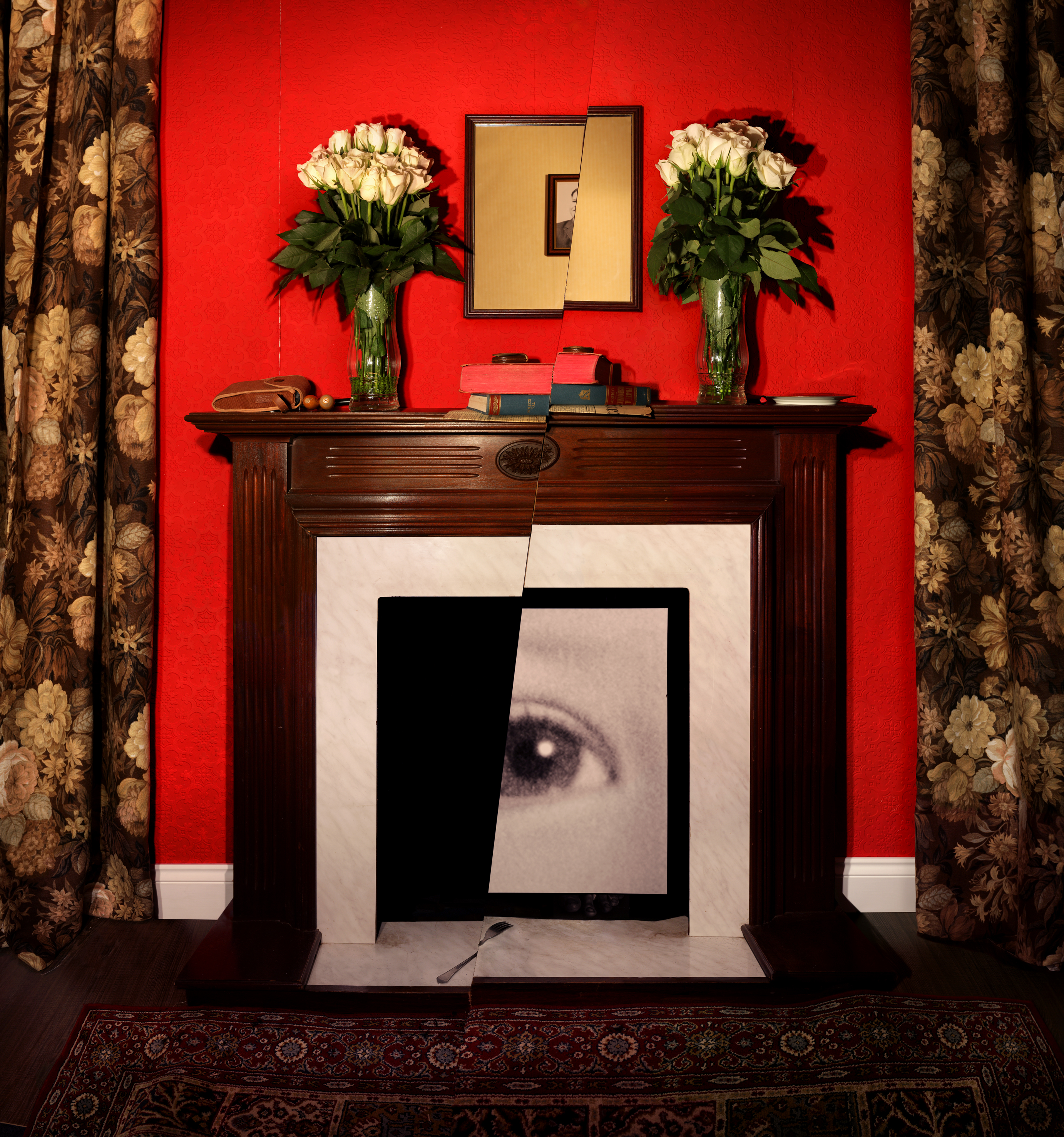
The exhibition overall held this unnerving and disconcerting sense of invasion into the human comfort zone. It was a series of works which played with the human need to be neat and for things to be directly explanatory. In Jonny’s work, he forced a sense of irritation from the audience by creating candles that exuded a pungent whiff of burning human flesh. He sticks chewing gum over images – something we would see as damaging. He takes the time out to create a set where everything within is sliced in half and then moved by one millimetre to create a sense of annoyance for the viewers.

Shoes to Walk up Stairs in an Orderly Fashion, Sculpture, 2017Lips Hierarchies series - Mirror, Objects within a room sliced through and photographed, 2017, 111 x 118 cm

Here, you can see the effort Jonny has made to show the relationship between the mouth and eyes and what is not seen is heard or vice versa. Again. it all about censorship and in his time in Jersey he visited the old police station. During his time here, he would attempt to cover objects in the dark room in red lipstick – a very repetitive and irritating process I can imagine but something that paid off to be very effective to show the relationship between the mouth and lipsticks and beauty and red lipstick and how it can, when applied in large amounts become something of disgust and unattraction. The sue of red lipstick was something that showed in Jonny work throughout and it is again reiterating the idea of purposely getting on the nerves of the viewers by ruffling their feathers with regards to OCD but how, in the end, it creates a beautiful and powerful catalogue of works.


Alfonso Almendros vs. Maria Kapajeva / Tableaux Portraits

Now I find myself looking at tableaux photography, I have chosen to study the pairing of these two artist by looking at each of their work individually and then comparing and contrasting their photographs by looking at their style and aims of their series of images. I have chosen to look at Alfonso Almendros and Maria Kapajeva because I feel like their is something very unique and perhaps quite sinister and unnerving abut each of their series of images which relate to theme of family, and in some way also underpinning the theme of environment also. After looking at Almendros’ series entitled ‘Family Reflections’, I found a quite strange connection I had with the series in that it made me feel a little uncomfortable looking though the photos but it also made me question the message behind each of them resulting in an enjoyable experience as interrogate back and  fourth with myself what the series’ attempts to represent. I will expand n my thoughts on his work later on this post. As well, Kapajeva’s series ‘Family’ again possesses an effective sense of eeriness due to the lighting techniques used and the way she divides two halves of the each photo down the middle to provide seven different images for the series. The split down the middle of her photos which is a recurring theme in all of her images makes us feel as though we as the audience are looking at new different images in what is one frame but divided t sow two different stories – one of the subject in one half an the other of the subject in the other half. One attracts me to the works of both artists is the captivating way in which they have addressed the style of tableaux photography. As well, I love how Almendros’ series seems very, sometimes overly staged in this one environment which you can see throughout the works as it does not changed where the actions in several photographs seem very dramatised. On the other hand, there is Kapajeva’s catalogue of works which does not seem at all romanticised in the actions performed in each image, instead it seems very natural and, almost like documentary imagery.

An image from Almendros’ series, Family Reflections

Both artists take a tableaux approach, however, I believe there is a fine line, which is near enough blurred between what tableaux imagery and documentary imagery is the way they look. There is very extreme tableaux photography where there is several subjective and people within the frame accompanied by film-like locations and props; mise-en-scene is vital in tableaux image. However, in documentary, although much moire informal, with the aim to capture an unexpected, unplanned moment in time, the look can be very similar to tableaux photography. Much like in the image above, however, we as the audience are aware that the photographer has arranged this shot and for the man to stand, naked in the middle of a road. Furthermore, both styles do provoke thoughts from the viewers which ask what the meaning behind an image was because as the audience, we are very much unaware of the happenings ‘behind-the-scenes’ as such. The aim of both styles is to give an insight.

What I like about the two series I am about to look at is the evident theme in each image. This contributes to the very powerful images that speak for themselves. The types of photographs set up are very captivating and in each photographers works based around the them of family you can see the very careful thought process that went in to making each image and together, the images in both artists selection complement each other.

Alfonso Almendros

Alfonso Almendros is an emerging photographer from Spain who lives and works in Helsinki. In a published article on photography website, GUP, they talk to Almendros about his work, Family Reflections and the described his work in a short paragraph which encapsulates the series and what it is about. They said: “Family Reflections captures the parallel of the now and then, each image defining one basic concept – the roots, obsession with death, virility as a symbol of authority, glorification of maternity or the sacred character of some objects. A series about family, struggle and intimacy that creates a parallel reality – words dissolve and become slightly dark, incomplete, almost invisible. The photographs evoke nostalgia, solitude, melancholy among others.”

Particularly in Alemendros’ work, you can notice the style of his work due form the colours used. This would have been a conscious decision, as well as the location used. He takes each image in the same location – a room in a house and you cans see the same furniture as you progress through the different images which would have appeared beforehand. Throughout the series, there is a division of the main series achieved through other images which can be classified as anomalies, in that they don’t fit the theme as such due to the change of location and subject. This is an effect I really like and hope to use in my own study.

A Collection of Images from the Series


On his website, Almendros does not provide any explanation about the series and the meanings behind his series, Family Reflections, however, GUP interviewed the photographer on the release of his series which provides answers to why he produced the images and what they mean.

Looking at the grouping of the images he has produced, I can draw my own conclusions from them but it is likely to be very far from the actual meanings and concept for the construction of the work. However, I am aware that the theme is based around family, and, form the title, I can conclude that Almendros is perhaps looking back at his own family, which, at the time of him making the series, may not have existed and it is therefore an homage to the relationship he may have had with his family members.

Alemendros states that’ Family Reflections’ came at a point in his life where he was full indecision. He also says “after living abroad for a few years, I decided to go back to my hometown and spend a few months with my family. There, I found things that had changed during my absence.” This was what spurred his choice ot make a photographic series of works relating to the changes that occurred in his environment that he remembered in a different way before his absence. As well, he wanted to document the change in his family members attitudes and behaviours since coming back from being abroad.

Alfonso Almendros also states that his father was a photographer beofre he ws born, however he died when Almendros was two years old but he cameras and photographs remained in their house – influencing his need to pick up a camera and begin shooting.

Image Analysis 

This, for me, is one of the most powerful images in the whole series because it is so unusual and quite difficult to decode because of its eeriness.

However, if I was to attempt to decode the image, I would suggest that the dead bird could be a metaphor for the relationship between Almendros and his mother and sister after coming back from travelling in that it is now non-existent and itself is dead because he feels as though he doesn’t have that previous, special relationship with his family members but his absence has resulted in them all becoming distant and therefore, when he arrived back in Spain, he came back to something that change dramatically to what he remembered and to him, he may have seen this as very upsetting that the previous memories stored in his mind did not exist when he cam back to his hometown. Now the relationships has to be rekindled and re-created in order for the family to become attached and ‘as one’ again. I believe this image is well representative of the series title as Almendros is looking back and reflecting on what had previously been part of his life – a paramount factor of his happiness when he had that special bond with his mother and sister which now, as he talks, is different as the environment around him and the people he loves has changed.

Talking about the environment, this is the first image of several in the series and it is a great image to have as the opening frame as it sets the mood and atmosphere for the images to come. This image is taken in a room which is a recurrence throughout he series as you notice ht dame wall beyond the subject in most of the images. It is, what looks like a barren and dark room which possess no emotion and it seems very melancholy, deriving the same feeling from audience – a feeling of emptiness and hardship in a way because of the theme throughout of loneliness and trauma, regret, nakedness. A whole array of emotions make up this series and contributes to the whole mood.

Looking at the technical factors in the image and how it is composed, the use of depth of field is used to full extent to make the image very visually pleasing. There is a very shallow depth of field where only the foreground is in focus and it is focused solely on the bird lying just over the edge of table just off the center of the frame. Everything else gradually become blurred, whether it be to the right of the bird where the bowl on the table is out of focus or behind the bird where as you look further into the image, the table cloth comes more and more blurred as well as the glass behind This effect leaves just the bird in focus and it has a great effect and forces our eyes t be drawn to the bird only.

The colour within the images are very similar an there is a very stimulating colour palette because although they are all very bland and dark, they all work very well together. There are different shades of brown that complement the off white of the table cloth and the yellow of the bowl as well as the brown bird. The colours all seem quite faded and it is create a vintage effect. This was perhaps the style of homes in Spain. There seem to be a source of light coming from the right also which illuminates the frame.

Maria Kapajeva 

Maria Kapajeva is a Russian artist from Estonia based in London who left her career in Economics behind and moved to the UK to get her BA and then MA in Photography at University of Westminster.  Her work has been exhibited internationally including Belfast, FORMAT and Guernsey photo festivals.

In her work Maria focuses on the issues of women representation in contemporary society and cultural and social stereotypes around that representation – shown through a very strong message in her series ‘Family’ In her practice she expands the borders of photography working also with found images, video and textile crafts.

I am Usual Woman, 2013 © Maria Kapajeva

Detail from I am Usual Woman, 2013 © Maria Kapajeva

For this piece above entitled ‘I Am Usual Women’, the used photographs on the quilt were found on the matrimonial websites specially created for Russian women to find a Western husband. The images for the quilt are carefully selected from the ones which were shown on these websites as ‘the best samples’ of how women should be photographed for the best matchmaking. She looks at the fantasies of Russian women and is one of several works she has produced which relate to the role of women in society and how the are perceived to be – that they are often objectified due to their gender and therefore sexualised but also seen as the leaders of the home-life in that they do the work to cater for the husband. 

About the series ‘Family’ taken form Kapajeva’s website:

“The series is an exploration of family as an integrated institution within its problems such as miscommunication or misunderstanding between its members. During her research she collected a lots of stories from people about how badly the misunderstanding could end up because of lack of an essential communication in the families on daily basis. Maria selected seven most common scenarios and interpreted them in her images. Each story consists of two separate photographs placed close to each other for an installation. The physical division between two prints visualise a distance between family members who are involved in each story. Even though Maria staged peculiar scenarios, she is open to other interpretations by the viewers. Thus, each pair left with no caption to give a space for people to find their reading of the set-ups.”

A Collection of Images from the Series

As well, it is evident that lighting is important feature of Kapajeva’s work, in particular, this series which focuses on divisions of family life and relationships between family members, as well as contrasting characters and how these clash and produce an “empty family” which has no cohesion or bond no more. She illuminates each subject in each half of every image to show the spotlight on them and this is also a popular technique in most tableaux images. It creates shadows and they high key lighting shone upon the subject’s face puts them in spotlight of the audience – under pressure as such.

Kapajeva’s work is very well produced as she has created a consistent series of images that all work together in harmony to create a documentation through tableaux photography that speaks to the women of Russia through the visualization she provides of family life in terms of how a wife and husband and their potential kids may behave in their home. Each image int the series is divided through the middle by cropping one side and then the other to create the effect as if you are looking at two different images but then on closer inspection, is one because the two sides often work together to show tow different environments with different subjects in, however, a hint that they are a whole image maybe given through the body positioning of the subjects or where they are looking. Although the environments in both halves often seem different, they produce a contrast of the characters in them and the audience are forced to see the two images combined to create a narrative. Her images often follow the theme of showing a husband and wife and their physical and mental divide and breakdown as they may begin to become two as opposed to the previous one harmonic couple the once were. This is also backed up by the physical divide of Kapajeva’s images.

Image Analysis 

This is one of the images form the series and is one of my favourites due to he complete contrast ad powerful and evident message it is trying to get across.

Like I mentioned above, it sows the physical; divide between family life between a husband and wife and then often the child involved as well – in the frame – the child glued to her mother’s side – reiterating the desire for children to be attached to their mums at the early stages of their life as they feel safe mum due to the connection built with them form birth. It creates this sense of fragility and preciousness – that this child possesses and she is at the fore front of everything done in the house and the parents’ life revolves around her. But also the fragility of family

As well, the image is illuminated on both side with the use of high key lighting on both subjects and the activity they are doing. Te women of the house is in the typical potion of doing work and providing for the others in the house. In the frame, she is doing the ironing whilst looking at the man with an expression showing no emotion – it is as though she is fed up and sh is looming in envy as the husband sits in the armchair with his beer watching the TV – he is ot watching over his daughter and it is instead left up to the wide even though is currently busy. As well, the kid is in a position of anger underneath the iron the mother is using, yet the male is not paying attention and it gives the sense that there is no communication between the two and they are at their worst where they cant bare to look at each directly and instead live their life trapped inside themselves.


My Environmental Documentary Shoot

This Is Your House, Mum

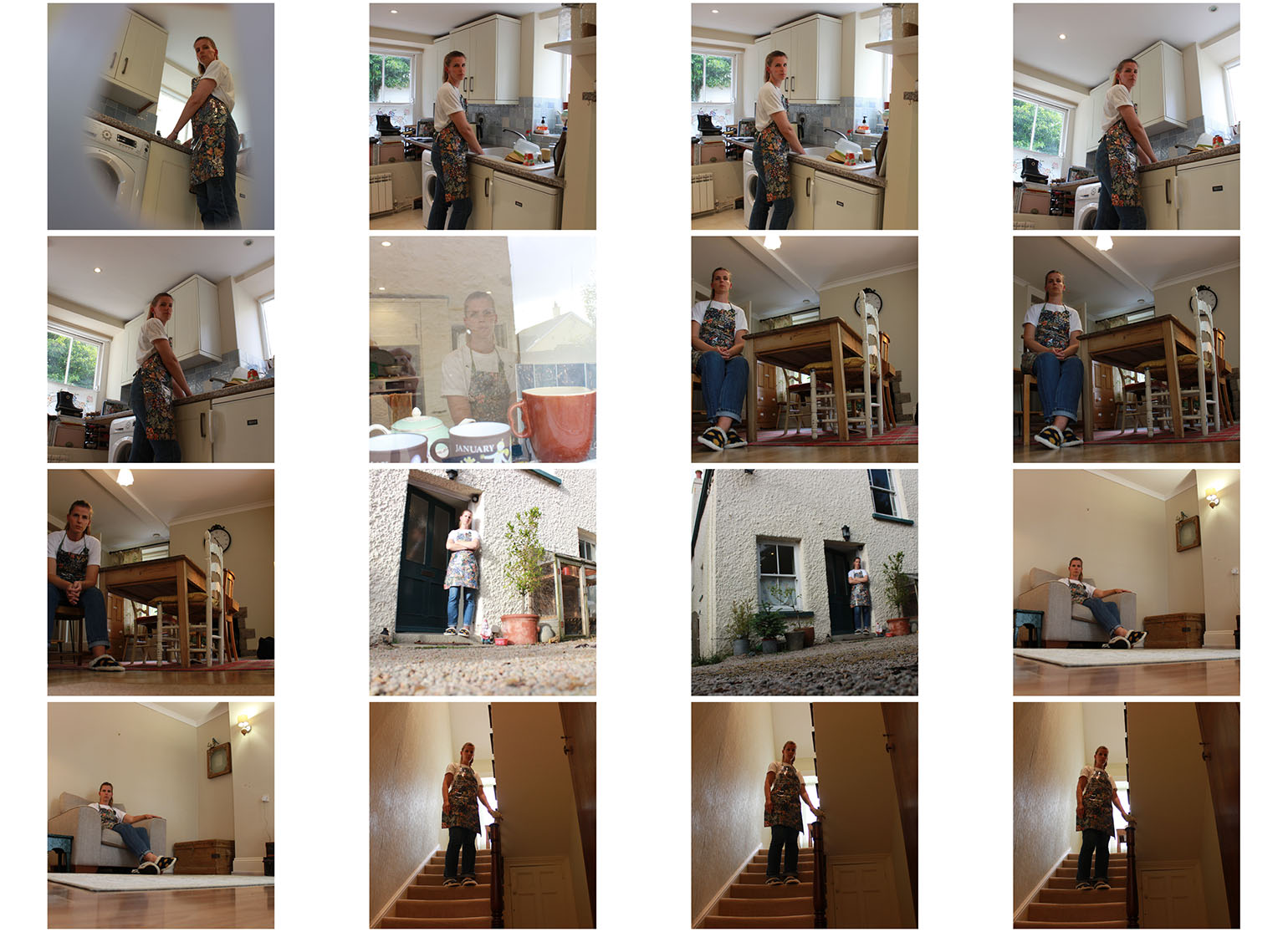
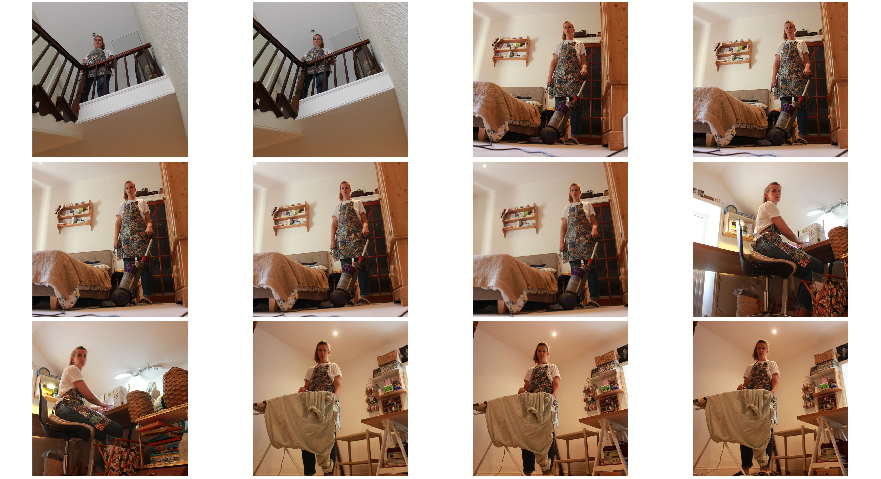
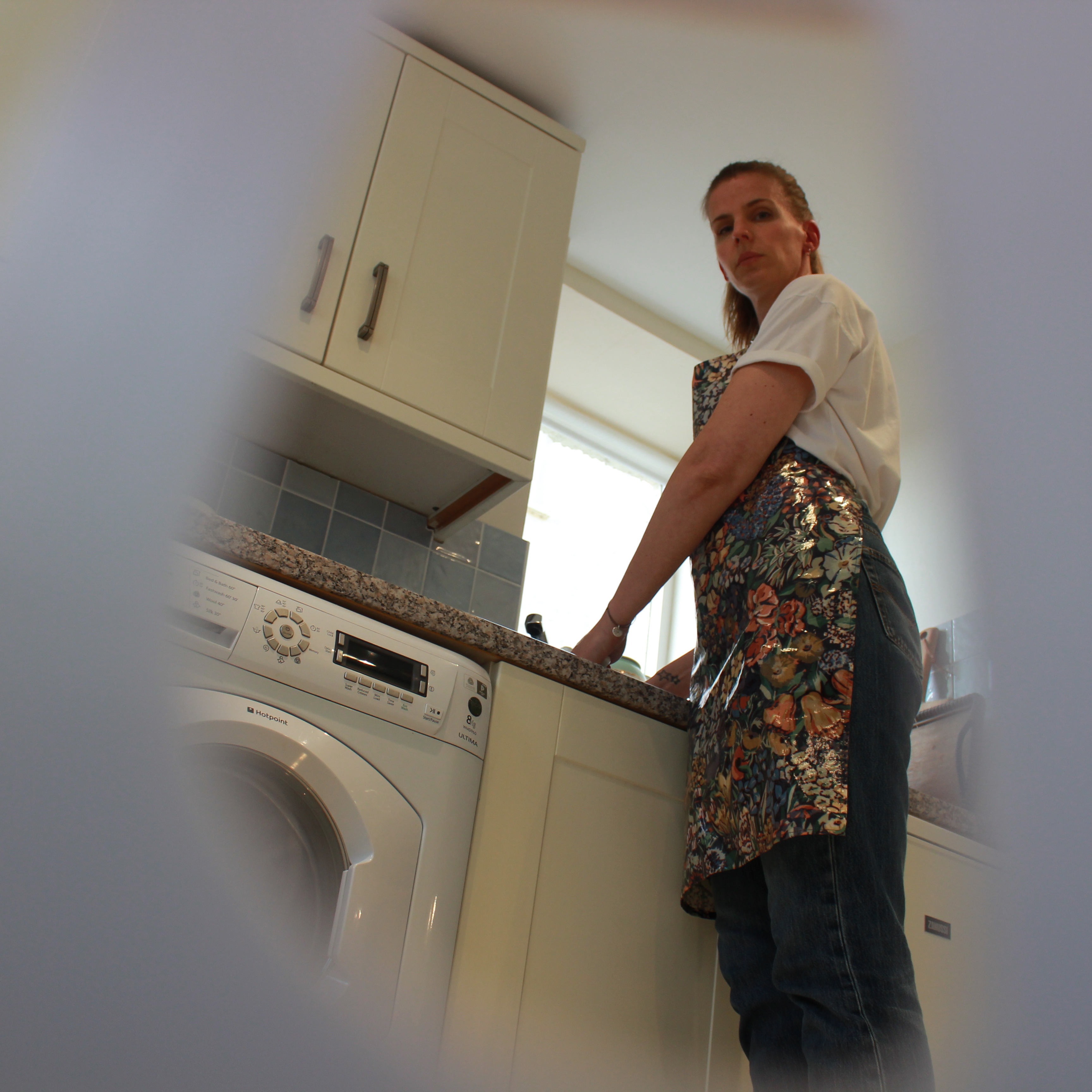
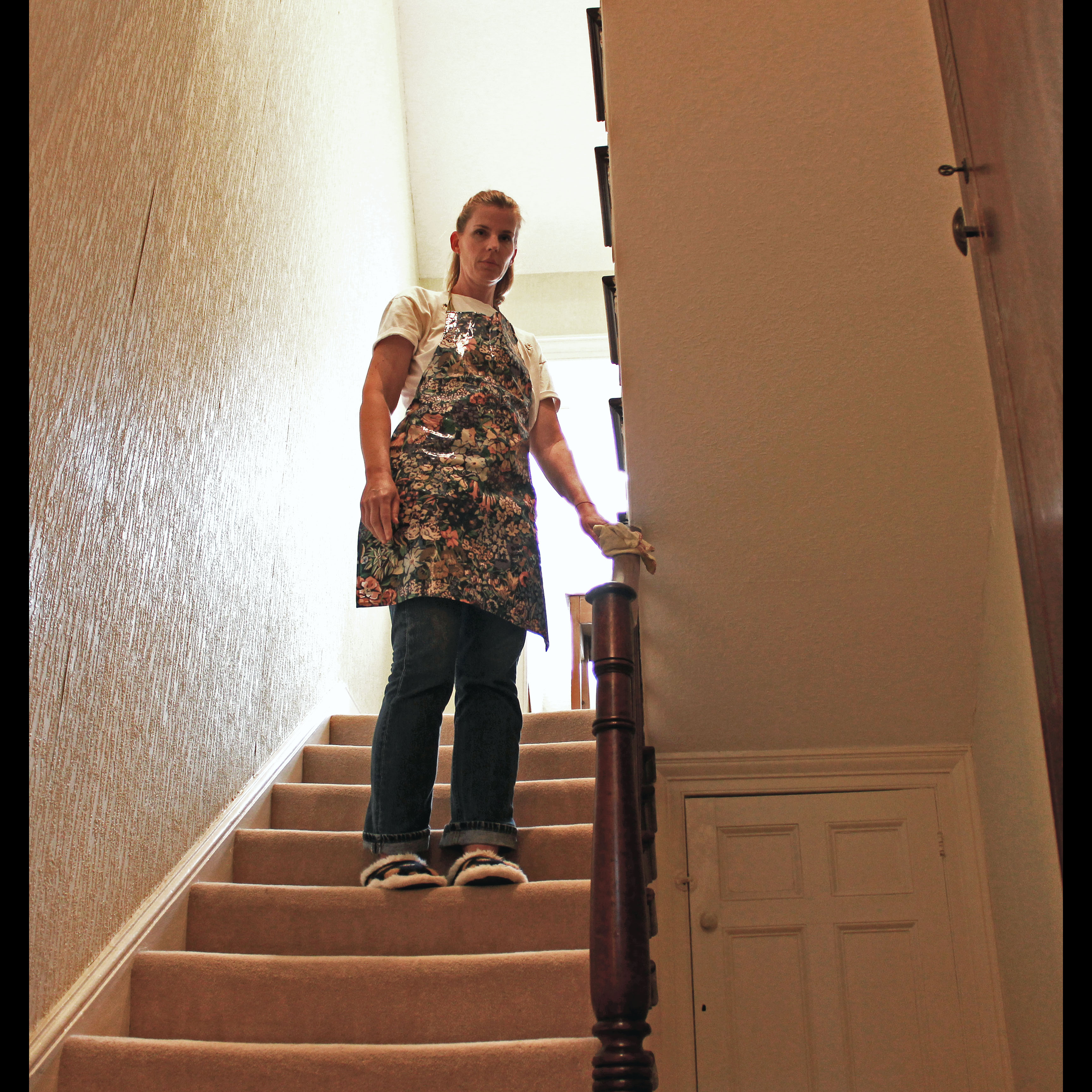
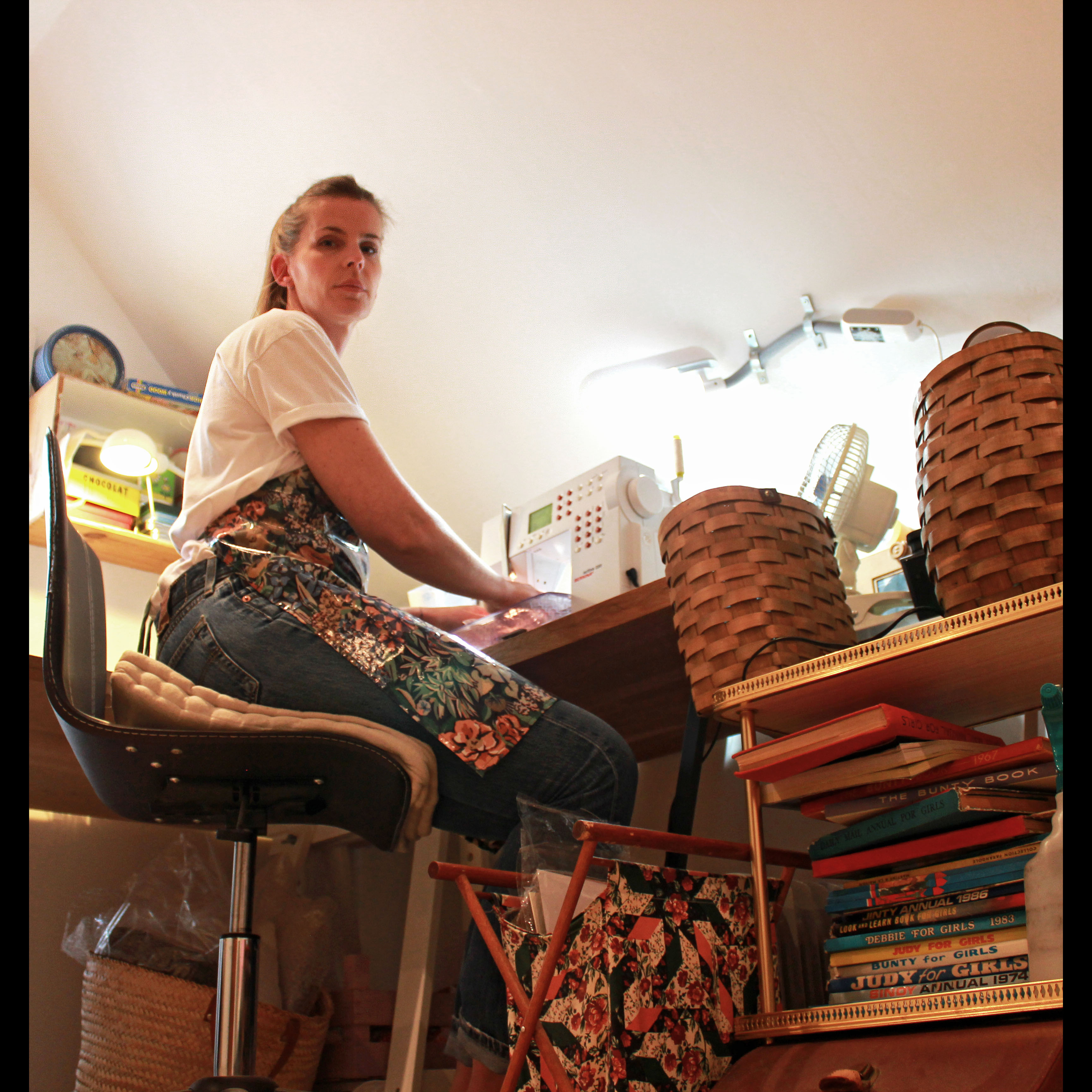
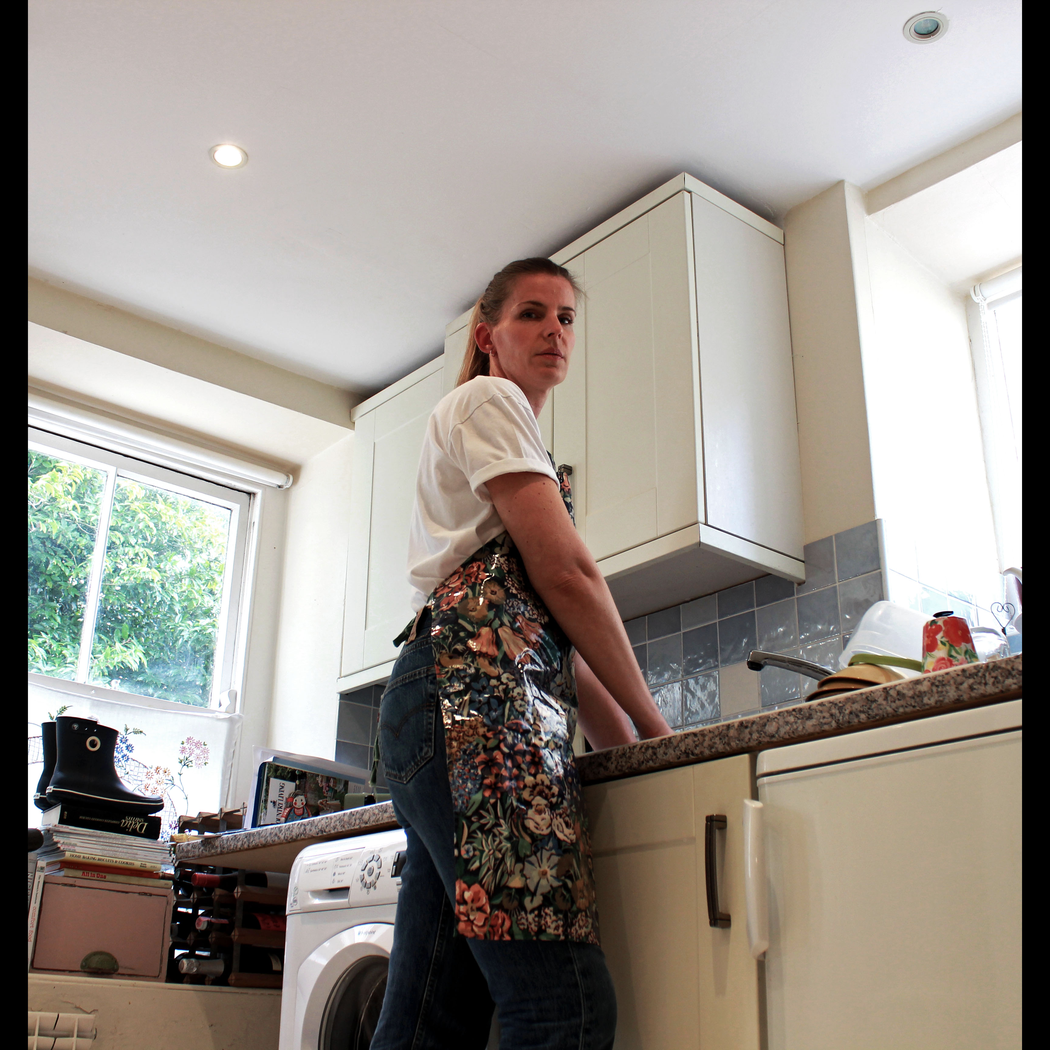
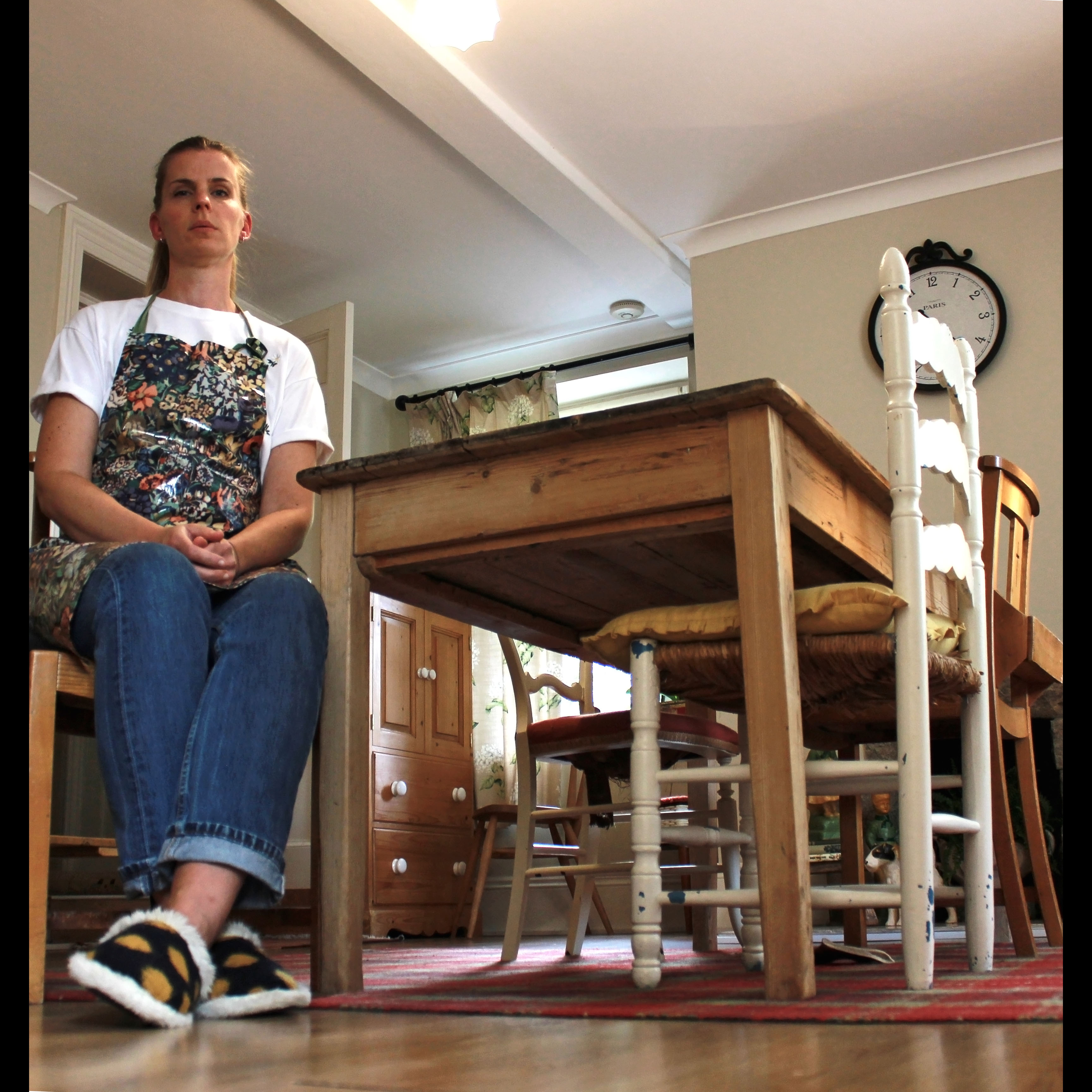
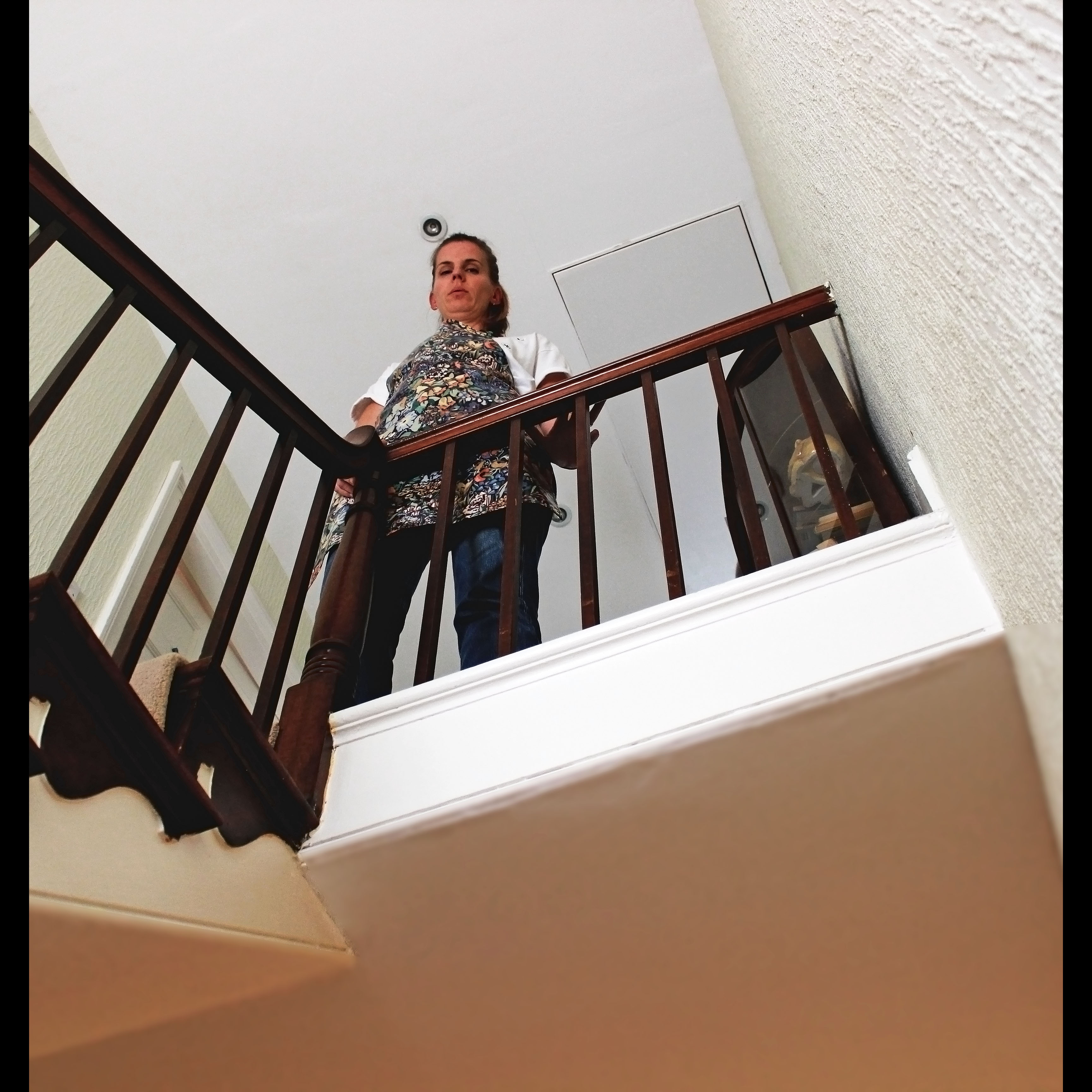
For the photoshoot I carried, I looked at the role of the women of the house in my own circumstance – being my mum. I looked at this through documenting in a staged style, almost tableaux and it also has environmental aspects within it because the shoot is executed in the subjects usual environment and this either the home or the workplace, however, for my mum, it is both as she works from home so it is often you find her slaving away in the kitchen or her workroom and I aimed to encapsulate this lifestyle which can get quite repetitive as she said when I was photographing her by staging different scenes in which she is posing doing different household jobs. In each shot she is also looking directly at the camera – making the viewer feel quite intimidated or uncomfortable. I wanted to show her as though she stating her authority within her own home – with pride and confidence but I also wanted her to look quite vulnerable to the audience as she could be looking into the camera as to say “help, look at me, look at what I do”.

Evaluation of the Shoot

I found that the shoot and its end products turned out to be very successful and I think I will use this experience as a learning curve in order for me to improve for next time. I treated the photoshoot as an experiment of to try out different ways of photographing documentary images and it is evident in this first attempt that I focused on low angles, body positioning, facial expressions and a different camera aspect ratio to the usual 4:3 – the square for,at is not achieved through cropping on Photoshop – I achieved this through altering the settings on my camera to shoot in 1:1 in order to achieve a more vintage effect. This limited the amount of the surroundings I was able to include in each shot but I attempted to focus on the main objects in the frame, being my mum and the event she is doing and the object needed for this – for example, the sink, the work unit, the stair case and the armchair.

The first room in which I photographed my mum was the kitchen. I already had the idea for the action being performed to be her washing the dishes.

Before the shoot, I took some reccee shots to decipher and terminate which position I wished to have my camera in for the best results. I was aware that I wanted a low angle shot but this was difficult to achieve due to the small sized of the room. I found a spot where I could get a good frame which included the main areas of the kitchen, including my mum in the middle. I first started out using a tripod as I thought this would be easier to capture good quality shots at a low angle – which is quite awkward to photograph hand-held, however, this is the technique that prevailed in the end. As the shoot went on, I found that mounting my camera on a tripod in a tight corner was quite difficult especially when I had to direct my subject to change her position. Therefore, for the most part, I ended up not using a tripod and instead myself. I would lie on the ground on my front and point my camera up to the subject manually. This proved to be much more effective to achieve the drastic low angle I wanted.

However, what I found most difficult during the shoot was being able to focus the subjects face as I was in a rather awkward position in order rot get a full clear view of the camera’s screen as I could  not use the viewfinder feature in this instance.

As well, I struggled to choose a pose which my mum would attempt to act out for me as I did not know what would look best nut I already had this image in my mind of how I wanted ach shot to look – vey serious, quite uncomfortable for the viewer but telling a story of a mum who rarely leaves which rarely leaves the house during the day and has the work-load of providing for the other occupants within the house. I wanted to get this across through the documentary style I took.

For example, the image above was the first image I took during the shoot and it was mainly an experimental sot to see whether I liked the look of this style. However, I opted not to proceed with this style of the rest of the shot because for me, the image looked to overloaded and it did not have the clean and polished affect I wanted due to the foregrounded object obstructing most of the frame. Even though this was intended, I did not like it at all.
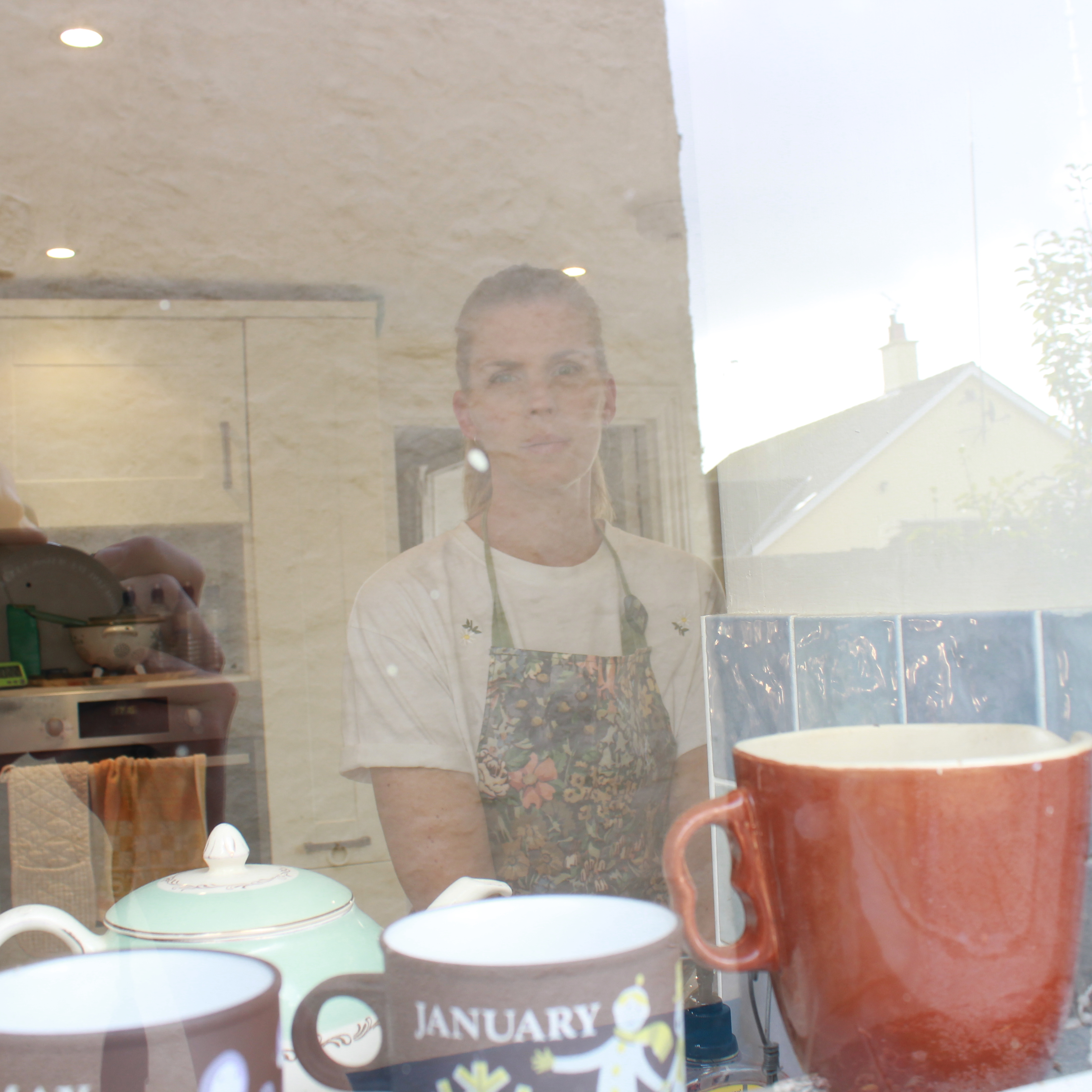
The look I wished to achieve form the image above was a fly-on-the-wall effect; as if the viewer is discreetly watching the subjects movements through a peep hole. I placed the camera within the washing basket which has holes in and I pointed the lens through one of the gaps and focused on the subject to allow the basket to become out of focus, in order to make my mum the focal point. I realised that the image would look something like this but when I reviewed my efforts, I was not attracted to the way it looked and I decided it would be in my best interests to continue with a more traditional approach to photographing but with my own personal touches. I don’t feel like you ca et the same feeling towards the image when there is foregrounded objects obstructing the view because I feel as though you, as the audience are not connected with the subject and are not building that relationship enough with them because of the fly-on-the-wall effect. However, with the tableaux style, the audience can really begin to build a relationship with the subject within, especially as she is looking directly at the camera – breaking the normal conventions of documentary photography where the subject is seemingly unaware of the presence of the photographer. However, I wanted my mum to attempt to represent her role in the house and for her to do this in a way which shows her as vulnerable and this is aided by the style I adopted.

In David Bates book, Art Photography, in chapter three which cover the topic of Documentary and Story-Telling, he writes “documentary drew on the idea of information as a creative education”. The way I interpret this is that: providing a visual story or visual element to physically view is another way, if photographed in the right way, to educate people and inform people of relevant issues, just form that ne image or “photo essay”. I do believe that a photograph has the contextual and technical power to achieve this education – a creative education and this is what I am aiming to do in the shoot and edits which follow.

Again, this image above was another experimentation that I attempted to do to give a different perspective however, it did not work. I also want the photoshoot to be consistent in the way each shot was photographed, just in different rooms of my house. However, I would not be able to do this in each room that we shot in so this would not be appropriate to show as part of the final images but was useful as an experimentation but the reflection of the window is too over-powering and it fades out the subject.
The Edits - Final Images
Image taken in the kitchen, mum doing the dishes
Image taken in the dining room, mum sitting down
Image taken on the landing, mum looking down
Image taken in the lounge, mum relaxing
Image taken on the staircase, mum polishing
Image taken in the workroom, mum at the sewing machine
Theory

Something I found quite interesting came not from the post photoshoot stages but the post editing stages when I decided to actually show my mum the images I had produced form the shoot she had no idea about until I called upon her to help me out with it at the last minute – something I do often if I need some assistance with models.

During the shoot, I had given very little details to my mum about the aim of the photoshoot and what is what for, as well as what I wanted to achieve from it and way I was even doing it. I gave enough information to her in order for her to know what she needed to do however. As well, throughout the shoot, I had snapped about 55 images and not one of them did she see. I also do this with any other portraiture shoot I carry out due to the inner worry of being judged if I was to show the subject what I was actually producing. I only enjoy showing people my products once fully completed – which would usually be after the photoshoot, after I had gone through them and defined which ones I would work with and then the final stages of editing. Only then would I show others because I feel I would get satisfaction out of showing something I feel proud of as I know my family would appreciate this too and would recognise the hard work I have put in. Yet, there is something disconcerting and worrying to me about showing my subjects the images I have taken of them due to the potential inner damage it could cause to me if they don’t “get” it or understand it. However, I have previously experienced the issue where when showing the model the images I have taken halfway through the shoot, they begin to doubt themselves and their attractiveness in front of the camera – this mostly being females. For example, when I worked with my girlfriend on previous projects she would comment on how “ugly” she looked and I experienced this for the first time with my mum after the point which I had shown her the edits from the documentary shoot.

What I find interesting however, is that for this shoot, I was not particularly aiming to show glamour or beauty, I was concentring more so on the message I could present but as soon as I showed my mum the images, the first thing she comment on was the way she looked and her exact words, as I flicked through the images were “oh, no, I look so gross”, however laughing as she said in a comedic way. She then went on to state how from the low angle I had adopted, you could see her double chins. To me, she was more focused on how she looked and how herself was being presented, not the character I wanted to portray. This is what contributes to the worry I have of showing others my work because of the reaction I may get where the focus of their comments is leant more towards how they look for the camera and they are often not pleased with it. It is at this point where I begin to question my own work  and whether it holds any quality to it.

From my own view and perspective on the outcomes of the photoshoot I have now named ‘This Is Your House, Mum’ for obvious reasons relating to authority, I am pleased with the results because I feel I have ben consistent in the way I approached each shot and this has paid off for the overall look of the final selection of images which I believe would work nicely as a selection of four or six together.

This is my favourite image out of the six because of the successful composition and framing. I feel my mum is positioned in a great way here in order for her to, through the image, connect with viewers through her looks and her body positioning as she stands vulnerably yet statefully on the stairs with her hand on the banister as she polishes it.

Childhood Memory: “Don’t go Dad”

In response to the task set, I delved into my nostalgia in order to recollect memories from when I was a little tiddler. Initially, I thought of my trip to Disney Land Paris for my eighth birthday, or my first day of secondary school or some sporting highlights. However, as my reminiscence developed, I remembered one of my earliest childhood memories but it was a darker recollection than the others.

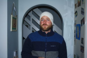
Somehow, my three and a half year old self remembered the day my father left home. To this day, I remember exactly what he was wearing, the expression on his face and the dialogue exchanged. My then nineteen year old father was sobbing with tears running down his face as I clung on to his right leg and looked up to his face whilst my mother told him to go. He was wearing a blue Henry Lloyd fleece with a Nike tight fit beanie. I have a specific image in my head of me looking up to my father with tears streaming down his face and I said to him “Don’t go dad”. Following this argument, my father never lived with me and my mother again and has definitely  changed my life, but not in a necessarily negative way. When I was seven years old, I had a birthday meal at Mano’s, a local restaurant in town in which I was surrounded by the young adults I had grown up with. After several years of conflict, my parents had finally agreed, for me, to both come to my birthday meal. It was great, I had all the lovely adults I had grown up with who had presents for me and good food (I had pasta), but most importantly my parents were in the same room after continuous phone call and text messaging arguments, they were both here, celebrating with me. The main meal passed by and out came my cake, I don’t remember the cake but I remember blowing out the candles shortly after my mum requested me to make a wish. Once all the candles were out and the applause had stopped, one of my mother’s friends asked me what I wished for. The room still silent, I raised my voice slightly higher than normal and said something along the lines of “I wish for my mum and dad to get back together”. Both my mother and father were stood with their new partners with my parents on the opposite ends of the table. A cloud of awkwardness shaded the room yet I was gleaming, it had felt liberating to release how I was feeling for so long. Of course they never got back together and the meal ended rather swiftly after that.

Fundamentally, I captured my dad wearing the exact same clothes he wore the day he left our perfect family trio. He is now in a comfortable and settled home with a new partner which contrasts with what happened the last time I saw him wearing that clothing combination.

Although the clothes are the same, my dad has changed in  numerous ways, for example the beard, however, his life has changed to a more settled one but I don’t primarily live with my father.


Environmental Documentary Shoot Planning

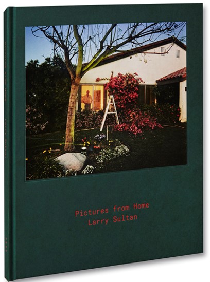
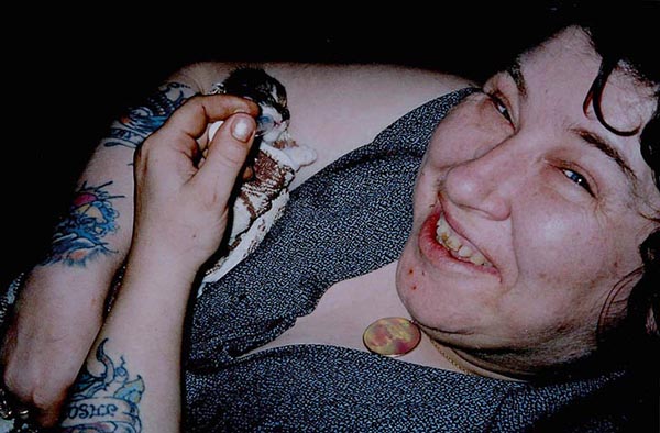
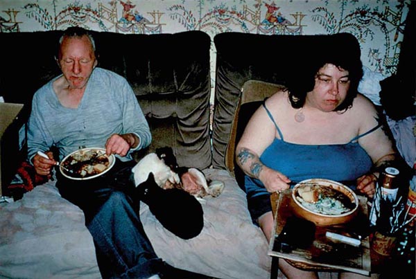
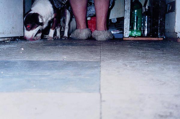
After studying two artists which both focus on producing documentary images revolving around the theme of family, in particular, parents, I have realised that documentary photography is a great means of showing the lives of people as if you are a fly on the wall observing their every move. Documentary photography can also be a way of degrading the lives of ordinary people by capturing the often monotonous and repetitive routine thru go through, which is evident in Richard Billingham’s work on his parents who live in a council flat. However, in a way, documentary imagery can be a way of romanticizing the events which occur in the shots because if you look deeper into the photo’s context, the photographer could be representing the subject as privileged, like in Sultan’s work on his family.

Idea #1

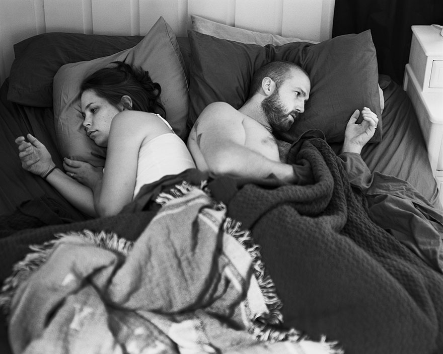
Furthermore, it is so easy to document events yourself to produce a visual catalogue of different stories. We document things which are so simple on a day-today basis, using smart phones and tablets. We may not realise it but when we take out our phone to record a video or tale a picture of a moment in time, you are then recording that particular moment in order for it to have meaning and a special purpose when you look back at it. The endless photos you take which are stored on your phone in it’s own gallery is an example of a personal archive. Technology as simple as smart phones makes saving memories much more easier and it is hard to argue why this is a negative. However, people can begin to over use their technology and often abuse it’s purpose and you can end up not living in the moment which is what is most special but I believe there is something very satisfying about looking back at old memories, whether it be from two weeks ago, a few months ago or ten years ago. I have briefly covered this because I feel it is an important and relevant issue for us as consumers of media to understand and that to produce visual documents is as easy as snapping a perhaps blurred picture without much thought gone into the composition. I wish to incorporate this concept into my personal study at some point because I feel it could tell a very powerful story about the positives of technology but about how destructive it can be to out society and the ability to socialise traditionally. We can become so addicted to our phones. I came across a photographer who addresses this issue by photographing real-life situations of people of their phones, however, with the phones removed form the shots to show how addicted we’ve become.

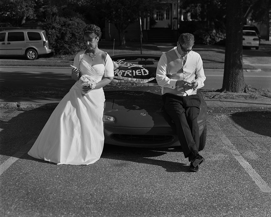
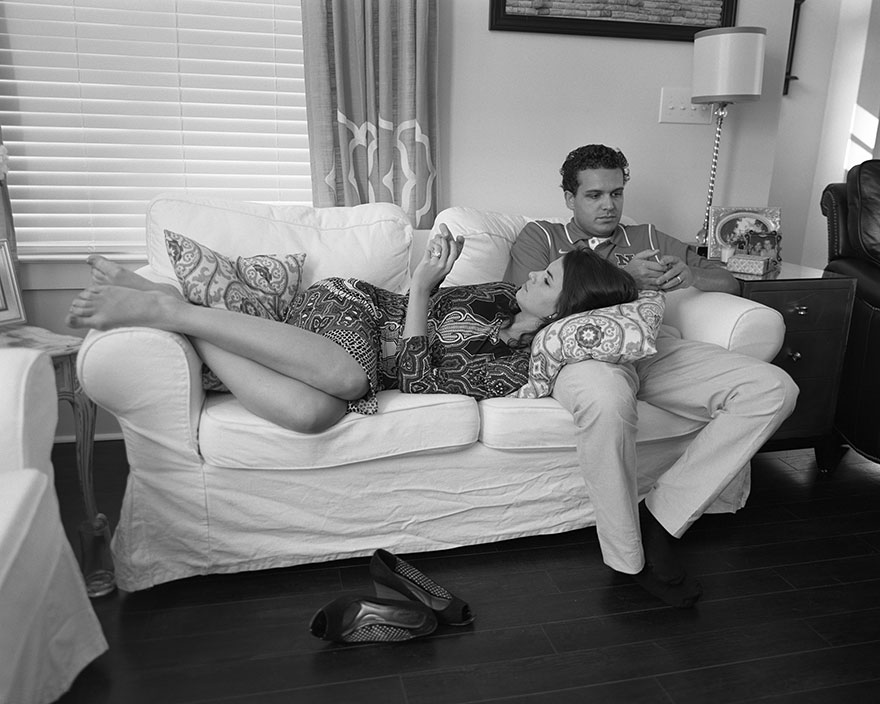
American photographer Eric Pickersgill removed the smartphones and digital devices from his portraits of everyday life. The project “Removed” aims to show our addiction to technology and hyper-connectivity, and Pickersgill claims that he’s also amongst the addicted, and I too, can admit this.

The project was inspired by some observations the photographer made in a New York City cafe one morning:

“Family sitting next to me at Illium café in Troy, NY is so disconnected from one another. Not much talking. Father and two daughters have their own phones out. Mom doesn’t have one or chooses to leave it put away. She stares out the window, sad and alone in the company of her closest family. Dad looks up every so often to announce some obscure piece of info he found online.”

He achieved the surreal effect in his photos by asking strangers and friends to remain in position, removing their cellphones, and then taking the shot. Here are some of  the shots from his series:

portraits-holding-devices-removed-eric-pickersgill-2

portraits-holding-devices-removed-eric-pickersgill-33

portraits-holding-devices-removed-eric-pickersgill-22

portraits-holding-devices-removed-eric-pickersgill-10

The concept is very simple yet the context is very complex and I feel like it is a great series of images with powerful meaning behind it. This series by Pickersgill is a form of documentary photography and it addresses a very relative subject to our modern day with he ever-growing proliferation of technology and the need to be up to date with all the current affairs, whether it be news, fashion, music, celebrity gossip or to chat with your friends – we are always on our phones and the images above are a very clever way of showing this. You can see that mot much has gone into the editing or actual composition and framing of the photo because most of the quality lies in the context and concept.

In terms of my environmental documentary photoshoot, I feel it would be a good experiment to do a photoshoot similar to this using the people in my house when glued to their phones, smart watches, the TV, laptops or games consoles. I will aim to remove these items or I may photograph the person with the object also in the frame to reduce it to its most simplest form.

Idea #2

My second idea for a photoshoot to complete this week is also based in my home and it will focus on one particular occupant of the home – the one person who is in the house the most – my mum. I have an idea to photograph my mum in each room of the house, or at least the ones she uses most often to create a nice little series of images.

When I was given the task to produce a photoshoot based around the theme of documentary and environmental, and after looking at the works of Larry Sultan and Richard Billingham, I began thinking of different themes and different styles of photoshoot I could look into and began thinking about what I could produce relating to the themes family as well as environment and the relationship people have to different locations. I decided that a could starting point for me to develop my understanding of documentary photography would be to concentrate on my mum and her everyday routine in the house but stage each shot as though it was setup, almost like a tableux image. I would achieve this effect through the subject looking into the camera and I would not attempt to capture her when she is not expecting it, I would look more at the effect I can achieve if I ask my um to pose in a particular way or position her body in particular when doing different tasks around the house, such as hoovering, cooking, using her sewing machine or washing the dishes etc. I would like for the style to be quite serious to get the message across that she is taking pride in her home in the way she looks at the camera. I would edit the images and put a heavy focus on contrast and making the shadows pop out the photo.

A photographer who focus much  more on tableaux photography is American artist Gregory Crewdson. He achieves a captivating look through the colour palettes and the locations he chooses which contribute to the overall feel of the image. They have very vintage looks to them due to the props used when photographing in houses and the scenes are very memorable. His photographs can be recognized very easily.

His series, Cathedral Of Pines was critically acclaimed for it’s tremendous efforts to achieve something very different. It took two and a half years to shoot and, typically for Crewdson, required the kind of preparation that usually attends a Hollywood film: months of casting, location hunting and storyboarding, with an extensive crew to oversee lighting, props, wardrobe, makeup and even some special effects involving artificial smoke and mist, as The Guardian Online writes.

Foreboding … Mother and Daughter, 2014

Gregory Crewdson’s Father and Son, 2013.

Image result for gregory crewdson cathedral of pines

This is only for me to look at to understand the style and look I intend to achieve if I was to do a shoot like the one I have just mentioned and it would definitely not be as professional slick-looking due to the limited time and budget I have! However, I love the work of Gregory Crewdson and think it is amazing how you can capture something so enthralling through an image.

Larry Sultan vs. Ray Billingham / Documentary + Environmental Portraits

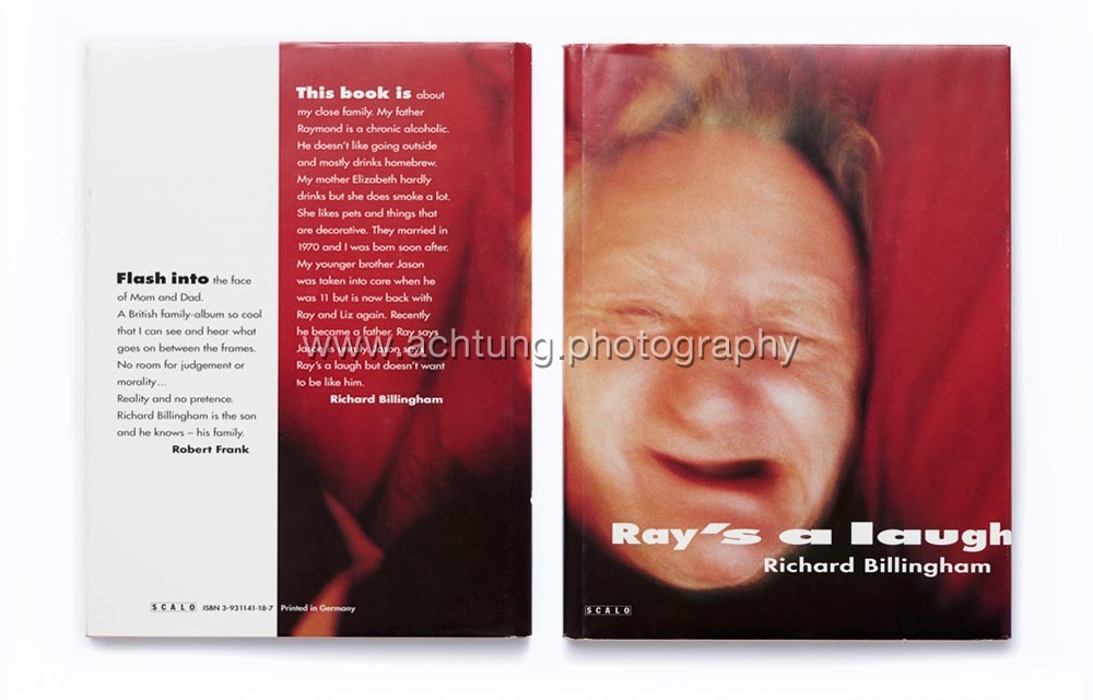
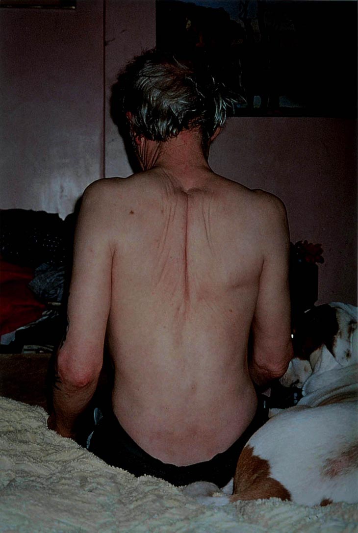
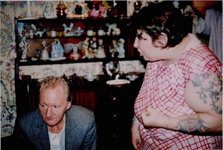
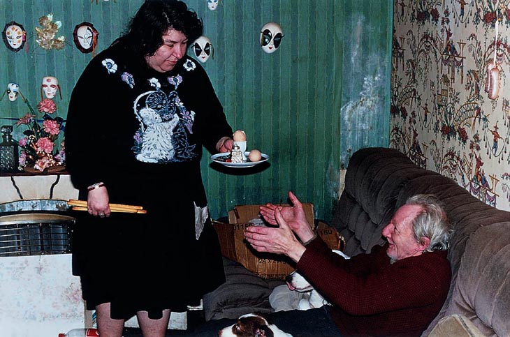
I have chosen these two artists, Larry Sultan and Ray Billingham because after looking at Billingham’s photobook, Ray’s A Laugh, I was instantly drawn to his work, in an emotional sense. I found his work very powerful and I think that it really told a story of his life and his background, consisting of his parents. In his book, he told a narrative of how his parents live and through the images, he depicted this is as very obstructive to the lives of the people around them – as if the way his parents live have affected him and his brother having to grow up with it. Both Billingham’s parents have an addiction of some sort – his father being a very heavy alcoholic and his mum being very reliant on cigarettes. He told a story through snap-shots of the conditions they live in on a daily basis in their council estate in a flat. The style of Billingham’s work really resonated with me and I found it very captivating to the see evident boundary that splits the two lives of Billingham’s parents and Larry Sultan’s parents who love, what seems like, very luxurious lives looking at the way they dress, eat and live within their home – Billingham’s family life looks very insignificant when put together with that of Sultan’s and the two contrast makes it very satisfying to notice differences and infer these differences to draw conclusions.

Image result for ray billingham ray's a laugh cover
Cover of Ray Billingham’s book, Ray’s A Laugh

 Both artists have taken a documentary approach in their series of works. They have both set out to document and produce a catalogue of images that depict their family lives in order for the audience to either sympathise with the photographer as they photograph a subject close to their heart that has a effected them, or to sympathise with the subjects of the images, in Billingham’s case. However, Sultan’s purpose out of his series, ‘Pictures from Home’ is to give the audience an insight into the lives his parents leads. He doesn’t wish to tell as much of a story for his viewers to question him about, like Billingham but a pendant for his parents. He says “it has more to do with love than sociology”. He used his photography to provide something that will last a life time for his parents.

Cover of Larry Sultan’s book, Pictures from Home
Larry Sultan

Larry Sultan was an American photographer from California and was a very influential photographer for many reasons and he definitely shaped photography for others who would follow, following his sudden death in 2009 at the age 63. During his active time as a photographer he carried out many series which were described as, like he was, very guarded, sincere and seductive. He was a great success and this was evident from his teaching career at the San Francisco Art Institute for 10 years. His dedication to photography earned him the Guggenheim Fellowship, an award dedicated to those “who have demonstrated exceptional capacity for productive scholarship or exceptional creative ability in the arts”. and he also had his work exhibited in museums of the United States.

With regards to his series, ‘Pictures from Home’, this was something he worked on for nearly 10 decades. ‘Time’ website writes, it is, in some sense, an aggregate of mini-collections: Sultan’s aging parents, stills from old home movies, transcribed interviews with his parents, and family snapshots appear side by side, creating a quiet but profoundly stirring portrait of familial intimacy. What makes Sultan’s family photobook different from the countless other artists who attempts it is the such intimacy that is delivered through the pages which touch the reader. He alternates between past and present in the book and puts together a collective that holds personal meanings through the use images and text which engages with class, memory and physical and emotional beings.

A Collection of Images from the Book
Reading In Bed
Sultan captures moments as far as his parents in bed together enjoying a time together as a couple -something which would be quite intimate but he depicts their life to the fullest as the pair look completely oblivious in order to get the fullest effect of it being a snap-shot.
My Father Sleeping
My Father Sleeping, 1984
Mom Garage Portrait
Other accounts within the series shows his parents looking directly into the camera, a technique I like in order for the audience to feel with the subject is feeling

Los Angeles, Early EveningMom in Curtain

One thing I admire about Sultan’s images is the colours he captures from each image. I believe this in mainly due to the décor that his parents house possessed. It is obvious from the colours, bright and eccentric, that his parents house was luxurious for the them. An image that is evident of this is the image where his mother and father are both in the lounge/dining room together and they have bright green walls surrounding them as well bright green carpet underneath them.

Across the Divide

Artist Analysis 

This sort of image reminds you of the retro rooms you see in houses of vintage films. It is very 70s but to the luxury we see here in comparison to Ray Billingham’s council flat was a novelty to them.

Relating this image to documentary and the functions and features of documentary photography, it is very clear to see that this particular (above) plays the role of a source of imagery that simply documents what goes on the household of the Sultan’s during the time taken. From looking at the image, I get the sense that Larry Sultan has simply held his camera to his eye in this position he found himself in what seems to be the lounge and, like the style suggests, snaps this one second in time which features his mother and father conversing with each other. The composition is very basic and Sultan would have intended to frame both his parents in the shot in order for the audience to get a sense of their day-to-day lives which consists of relaxing at home and enjoying the company of one another. You can see that the image is slightly slanted and is not completely straight but this adds a likable amateur look to the photograph.

I would imagine that his parents would not have been expecting Sultan to take this image at the time; they would have been going about their evening normally and it is very unlikely that this scene is staged, like a tableau because the whole point of documentary imagery is to capture the lives of ordinary people, most of the time, when they are not watching or expecting it. This is what makes the image above so captivating because you, as the viewer feel as though you are a fly on the wall and are supposed to be viewing inside these strangers lives – documentary photography, in some ways is a means of being nosy and intrusive of other lives – something I find very enthralling when I come to producing my own.

Something I have noticed about the photo, which I really enjoy and think is perhaps an unintentional addition to the photo is the way Sultan’s parents are sat apart from each but there is a empty chair in the middle of them. His mother is on the sofa and his father is at the dining table with his wine glass, seeming as though they have just finished their evening meal and the lady of the house has gone for a sit down. Sultan has captured the scene from his point of view where on one side is his mum and the other his dad, but in the middle of the two is a lonesome chair with no one occupying it. The chair is facing the camera and for someone who would be sitting in it, they would be looking straight at the camera, however, his mother is looking towards her husband and this empty space in the middle seems quite disconcerting and unnerving for the viewer. It’s as though they are waiting for a presence to come along or there is this invisible presence splitting the two. Looking at the facial expressions of the subjects. they are looking quite dull with no emotion, perhaps they have just had a row.

Sultan on hs website in his statement about the series comments on how the works are more about love and it is about showing this familiarity of love in families and the members within them and the relationships which are held. He says he wants his parents to live forever and this is a dedication to them. This is has allowed him to construct his series very thoughtfully in order for it to be a time-travelling tool to relive history that would have passed.

In the series, the boundary between documentary and the staged is blurred as Sultan includes efforts to position his mum and dad in positions and poses fro the camera at times but at other points, the format of images is so very informal and relaxed like inn the above where there is no thoughts of showing any emotion for the camera. The reality of living normal lives without presenting anything false for the camera is backed up by the clutter that lies around on the table and on the side unit.

A page from ‘Pictures From Home’
Ray Billingham
and artist comparison

Richard Billingham, you could say is completely on the other end of the spectrum to Larry Sultan in the way his parents live and in the message that Billingham wanted to force through to the viewers of his series ‘Ray’s A Laugh’. His parents led completely different lives of that of Sultan’s and it is evident in this very captivating catalogue of works for may different reasons compared to Sultan’s. Billingham as a photographer has become a household name for documentary photography and he received lots of reception, mostly positive about the way he addressed the topic of alcoholism in his father and audiences, including myself have loved looking through his published book about the state of which his parents lived in their council flat. He said ‘I just hated growing up in that tower block’ and this is what spurred him to photograph it. The Guardian Online published an article about the series and wrote ‘The photographer was a pioneer of ‘squalid realism’ with his images of his parents’ dreary, drunken existence in the Black Country, which won him a Turner prize nomination. Now, with the help of ‘White Dee’, he’s turning their life into a feature film’.

* Squalid / (of a place) extremely dirty and unpleasant, especially as a result of poverty or neglect.

Richard Billingham had a very touch upbringing and I believe this is what contributes to us as the audience being able to sympathise with him in terms of the way he was brought up, yet he still manages to capture a series so beautiful in it’s narrative. The brief of his teenage years goes as follows: he didn’t even take a photograph until he was nineteen. This was when he was living with his alcoholic father, Ray in flat on the seventh floor of a council block in Birmingham. He’d actually just begun an art foundation course at Bourneville College and was working every night to pay his way stacking shelves at the local Kwik Save supermarket, as ‘The Guardian’ writes.

The first pictures Billingham took, with a camera bought on credit after he persuaded the shop assistant he was a librarian, were of geese and ducks in the park, “just to see if they would come out”. He then trained his viewfinder on Ray. (words from The Guardian). He also said that the pictures he took of his dad were rare and that the film cameras he used own were to expensive to develop. This suggest that maybe Billingham always wanted to get into photography was always eager to be creative but never had the chance due to the circumstances he and his family were in. This series he produced could maybe have been a compensation for the times lost when he was younger as he watched over his mother and father physical and mental state deteriorate – a conclusion I can draw just from looking at the photographs included in the book as you see his mother and father slouch on the sofa eating their dinner with food-stained clothes and junk food packaging strewn across the grim carpet.

A Collection of Images from the Book
An image of Billingham’s mother grinning as she weans a new-born kitten, presumably from the new litter she would have bred as Billingham claimed she loved animals
His parents eating their dinner together on the sofa. You can see a very noticeable contrast between the living conditions of Billingham’s parents and Sultan’s as this image represents two recluses sat in the living room eating dinner as opposed to a dining room. They are surrounded by washed out wallpapers and dirt-covered furniture
You can see Billingham may have used the flash of is camera at points throughout the series when you look at the dog’s red-eye as it licks the substances off the ground and you wonder how the pets survived in conditions like this.

Untitled (RAL 22)

Untitled (RAL 25)

There is something about the images that I see in this collection by Richard Billingham that makes me feel very uncomfortable and on edge to look through them because I can sense, just by looking at the images that the tension within the house of the Billingham’s would have been very unpleasant to witness, especially between the two parental figures, who seem to be the most vulnerable yet should be the ones with their loving eye gazing over their sons yet, in the image above, it looks like the mother has her fist up at Ray’s face mid-way through a row. The facial expressions from both halves portray a sense of anger yet regret or upset. However, as much as it is not pleasant to observe the events that occur in the images, it is essential to do as it opens your eyes to the reality – once again – this is what documentary is; reality being forced directly to the viewer. I feel very connected when analysing the events that occur in the images because each photo has a meaning behind it, a story – this is a similarity between Billingham and Sultan, that each image represents a moment in time and that the collection of photo produced tell a story. Looking at the two contrasts re-defines the meaning of family as I am being told about two different situations – one of love and one of agitation.

Untitled (NRAL 13)

Artist Analysis

This image, to me holds a very strong and powerful message as it sums up the whole meaning behind the series, ‘Ray’s A Laugh’. It shows Ray’s wife bringing him his dinner, which looks like two boiled eggs and some toast. The simplicity of the dinner reiterates their need for simplicity and being basic in their life choices. It shows Ray sitting don on the sofa with his dogs and his wife coming over to him with his dinner as conjures up a smile as this moment in the day is probably his favourite. He puts out his hands as his wife looks at him drearily and it is a shot which makes the audience think of family. It is a typical scene of the lady of the house bringing dinner to her man as he relaxes on the sofa ready to enjoy a relaxing evening with his wife. This usually occurs in men who have ben at work all day and women who have spent the day at home cleaning and cooking, however, for these two, it is likely they have spent the day on the sofa and what is seen above is there everyday life – it has the sense of repetitiveness an this is what is ironic because something so simple for Ray is what brings him joy as he probably doesn’t have much else to provide him excitement.

The state of the house is shown by the surroundings. The walls are caked in dirt and grease and filth, there are cardboard boxes with what I can only imagine is junk which has been hoarded over several years. There are cheap-looking decorations hanging off the walls which at ornaments which Billingham’s mother has collected as he claims she loves little knick-knacks. The two subjects themselves don’t look clean and it is though they fit it with their surroundings perfectly and they have become part of the house over-time. The whole look of the image is very sad and the audience can sympathise with what is going on.

The wife is holding in her other hand as she oases over the boiled egg for at some breadsticks which you can only bare to imagine that this could be her dinner as she has had to focus on pleasing her husband. You could draw a conclusion that perhaps if Rau does not get his evening meal, if may get aggressive and retaliate and this prospect because it is breaking his routine. He is an alcoholic and Richard Billingham stresses this as in almost every shot in the series is a greasy recycled bottle filled with a brown, thick liquid said to be the homemade brew his father makes.

I find it hard to believe that Billingham has he courage to construct such a personal visual documentary of images because it is such a personal subject that encapsulates the hardship his parents have been living for the most part of their lives and how it has affected the ones around them, including himself but the context of the series is what makes it so thrilling to view.

His video art piece which re-imagines scenes from his book released in 2000, ‘Ray’s A Laugh’.