Category Archives: Inspirations

Filters

Author:
Category:

Alfonso Almendros vs. Maria Kapajeva / Tableaux Portraits

Now I find myself looking at tableaux photography, I have chosen to study the pairing of these two artist by looking at each of their work individually and then comparing and contrasting their photographs by looking at their style and aims of their series of images. I have chosen to look at Alfonso Almendros and Maria Kapajeva because I feel like their is something very unique and perhaps quite sinister and unnerving abut each of their series of images which relate to theme of family, and in some way also underpinning the theme of environment also. After looking at Almendros’ series entitled ‘Family Reflections’, I found a quite strange connection I had with the series in that it made me feel a little uncomfortable looking though the photos but it also made me question the message behind each of them resulting in an enjoyable experience as interrogate back and  fourth with myself what the series’ attempts to represent. I will expand n my thoughts on his work later on this post. As well, Kapajeva’s series ‘Family’ again possesses an effective sense of eeriness due to the lighting techniques used and the way she divides two halves of the each photo down the middle to provide seven different images for the series. The split down the middle of her photos which is a recurring theme in all of her images makes us feel as though we as the audience are looking at new different images in what is one frame but divided t sow two different stories – one of the subject in one half an the other of the subject in the other half. One attracts me to the works of both artists is the captivating way in which they have addressed the style of tableaux photography. As well, I love how Almendros’ series seems very, sometimes overly staged in this one environment which you can see throughout the works as it does not changed where the actions in several photographs seem very dramatised. On the other hand, there is Kapajeva’s catalogue of works which does not seem at all romanticised in the actions performed in each image, instead it seems very natural and, almost like documentary imagery.

An image from Almendros’ series, Family Reflections

Both artists take a tableaux approach, however, I believe there is a fine line, which is near enough blurred between what tableaux imagery and documentary imagery is the way they look. There is very extreme tableaux photography where there is several subjective and people within the frame accompanied by film-like locations and props; mise-en-scene is vital in tableaux image. However, in documentary, although much moire informal, with the aim to capture an unexpected, unplanned moment in time, the look can be very similar to tableaux photography. Much like in the image above, however, we as the audience are aware that the photographer has arranged this shot and for the man to stand, naked in the middle of a road. Furthermore, both styles do provoke thoughts from the viewers which ask what the meaning behind an image was because as the audience, we are very much unaware of the happenings ‘behind-the-scenes’ as such. The aim of both styles is to give an insight.

What I like about the two series I am about to look at is the evident theme in each image. This contributes to the very powerful images that speak for themselves. The types of photographs set up are very captivating and in each photographers works based around the them of family you can see the very careful thought process that went in to making each image and together, the images in both artists selection complement each other.

Alfonso Almendros

Alfonso Almendros is an emerging photographer from Spain who lives and works in Helsinki. In a published article on photography website, GUP, they talk to Almendros about his work, Family Reflections and the described his work in a short paragraph which encapsulates the series and what it is about. They said: “Family Reflections captures the parallel of the now and then, each image defining one basic concept – the roots, obsession with death, virility as a symbol of authority, glorification of maternity or the sacred character of some objects. A series about family, struggle and intimacy that creates a parallel reality – words dissolve and become slightly dark, incomplete, almost invisible. The photographs evoke nostalgia, solitude, melancholy among others.”

Particularly in Alemendros’ work, you can notice the style of his work due form the colours used. This would have been a conscious decision, as well as the location used. He takes each image in the same location – a room in a house and you cans see the same furniture as you progress through the different images which would have appeared beforehand. Throughout the series, there is a division of the main series achieved through other images which can be classified as anomalies, in that they don’t fit the theme as such due to the change of location and subject. This is an effect I really like and hope to use in my own study.

A Collection of Images from the Series


On his website, Almendros does not provide any explanation about the series and the meanings behind his series, Family Reflections, however, GUP interviewed the photographer on the release of his series which provides answers to why he produced the images and what they mean.

Looking at the grouping of the images he has produced, I can draw my own conclusions from them but it is likely to be very far from the actual meanings and concept for the construction of the work. However, I am aware that the theme is based around family, and, form the title, I can conclude that Almendros is perhaps looking back at his own family, which, at the time of him making the series, may not have existed and it is therefore an homage to the relationship he may have had with his family members.

Alemendros states that’ Family Reflections’ came at a point in his life where he was full indecision. He also says “after living abroad for a few years, I decided to go back to my hometown and spend a few months with my family. There, I found things that had changed during my absence.” This was what spurred his choice ot make a photographic series of works relating to the changes that occurred in his environment that he remembered in a different way before his absence. As well, he wanted to document the change in his family members attitudes and behaviours since coming back from being abroad.

Alfonso Almendros also states that his father was a photographer beofre he ws born, however he died when Almendros was two years old but he cameras and photographs remained in their house – influencing his need to pick up a camera and begin shooting.

Image Analysis 

This, for me, is one of the most powerful images in the whole series because it is so unusual and quite difficult to decode because of its eeriness.

However, if I was to attempt to decode the image, I would suggest that the dead bird could be a metaphor for the relationship between Almendros and his mother and sister after coming back from travelling in that it is now non-existent and itself is dead because he feels as though he doesn’t have that previous, special relationship with his family members but his absence has resulted in them all becoming distant and therefore, when he arrived back in Spain, he came back to something that change dramatically to what he remembered and to him, he may have seen this as very upsetting that the previous memories stored in his mind did not exist when he cam back to his hometown. Now the relationships has to be rekindled and re-created in order for the family to become attached and ‘as one’ again. I believe this image is well representative of the series title as Almendros is looking back and reflecting on what had previously been part of his life – a paramount factor of his happiness when he had that special bond with his mother and sister which now, as he talks, is different as the environment around him and the people he loves has changed.

Talking about the environment, this is the first image of several in the series and it is a great image to have as the opening frame as it sets the mood and atmosphere for the images to come. This image is taken in a room which is a recurrence throughout he series as you notice ht dame wall beyond the subject in most of the images. It is, what looks like a barren and dark room which possess no emotion and it seems very melancholy, deriving the same feeling from audience – a feeling of emptiness and hardship in a way because of the theme throughout of loneliness and trauma, regret, nakedness. A whole array of emotions make up this series and contributes to the whole mood.

Looking at the technical factors in the image and how it is composed, the use of depth of field is used to full extent to make the image very visually pleasing. There is a very shallow depth of field where only the foreground is in focus and it is focused solely on the bird lying just over the edge of table just off the center of the frame. Everything else gradually become blurred, whether it be to the right of the bird where the bowl on the table is out of focus or behind the bird where as you look further into the image, the table cloth comes more and more blurred as well as the glass behind This effect leaves just the bird in focus and it has a great effect and forces our eyes t be drawn to the bird only.

The colour within the images are very similar an there is a very stimulating colour palette because although they are all very bland and dark, they all work very well together. There are different shades of brown that complement the off white of the table cloth and the yellow of the bowl as well as the brown bird. The colours all seem quite faded and it is create a vintage effect. This was perhaps the style of homes in Spain. There seem to be a source of light coming from the right also which illuminates the frame.

Maria Kapajeva 

Maria Kapajeva is a Russian artist from Estonia based in London who left her career in Economics behind and moved to the UK to get her BA and then MA in Photography at University of Westminster.  Her work has been exhibited internationally including Belfast, FORMAT and Guernsey photo festivals.

In her work Maria focuses on the issues of women representation in contemporary society and cultural and social stereotypes around that representation – shown through a very strong message in her series ‘Family’ In her practice she expands the borders of photography working also with found images, video and textile crafts.

I am Usual Woman, 2013 © Maria Kapajeva

Detail from I am Usual Woman, 2013 © Maria Kapajeva

For this piece above entitled ‘I Am Usual Women’, the used photographs on the quilt were found on the matrimonial websites specially created for Russian women to find a Western husband. The images for the quilt are carefully selected from the ones which were shown on these websites as ‘the best samples’ of how women should be photographed for the best matchmaking. She looks at the fantasies of Russian women and is one of several works she has produced which relate to the role of women in society and how the are perceived to be – that they are often objectified due to their gender and therefore sexualised but also seen as the leaders of the home-life in that they do the work to cater for the husband. 

About the series ‘Family’ taken form Kapajeva’s website:

“The series is an exploration of family as an integrated institution within its problems such as miscommunication or misunderstanding between its members. During her research she collected a lots of stories from people about how badly the misunderstanding could end up because of lack of an essential communication in the families on daily basis. Maria selected seven most common scenarios and interpreted them in her images. Each story consists of two separate photographs placed close to each other for an installation. The physical division between two prints visualise a distance between family members who are involved in each story. Even though Maria staged peculiar scenarios, she is open to other interpretations by the viewers. Thus, each pair left with no caption to give a space for people to find their reading of the set-ups.”

A Collection of Images from the Series

As well, it is evident that lighting is important feature of Kapajeva’s work, in particular, this series which focuses on divisions of family life and relationships between family members, as well as contrasting characters and how these clash and produce an “empty family” which has no cohesion or bond no more. She illuminates each subject in each half of every image to show the spotlight on them and this is also a popular technique in most tableaux images. It creates shadows and they high key lighting shone upon the subject’s face puts them in spotlight of the audience – under pressure as such.

Kapajeva’s work is very well produced as she has created a consistent series of images that all work together in harmony to create a documentation through tableaux photography that speaks to the women of Russia through the visualization she provides of family life in terms of how a wife and husband and their potential kids may behave in their home. Each image int the series is divided through the middle by cropping one side and then the other to create the effect as if you are looking at two different images but then on closer inspection, is one because the two sides often work together to show tow different environments with different subjects in, however, a hint that they are a whole image maybe given through the body positioning of the subjects or where they are looking. Although the environments in both halves often seem different, they produce a contrast of the characters in them and the audience are forced to see the two images combined to create a narrative. Her images often follow the theme of showing a husband and wife and their physical and mental divide and breakdown as they may begin to become two as opposed to the previous one harmonic couple the once were. This is also backed up by the physical divide of Kapajeva’s images.

Image Analysis 

This is one of the images form the series and is one of my favourites due to he complete contrast ad powerful and evident message it is trying to get across.

Like I mentioned above, it sows the physical; divide between family life between a husband and wife and then often the child involved as well – in the frame – the child glued to her mother’s side – reiterating the desire for children to be attached to their mums at the early stages of their life as they feel safe mum due to the connection built with them form birth. It creates this sense of fragility and preciousness – that this child possesses and she is at the fore front of everything done in the house and the parents’ life revolves around her. But also the fragility of family

As well, the image is illuminated on both side with the use of high key lighting on both subjects and the activity they are doing. Te women of the house is in the typical potion of doing work and providing for the others in the house. In the frame, she is doing the ironing whilst looking at the man with an expression showing no emotion – it is as though she is fed up and sh is looming in envy as the husband sits in the armchair with his beer watching the TV – he is ot watching over his daughter and it is instead left up to the wide even though is currently busy. As well, the kid is in a position of anger underneath the iron the mother is using, yet the male is not paying attention and it gives the sense that there is no communication between the two and they are at their worst where they cant bare to look at each directly and instead live their life trapped inside themselves.

 

Inspiration

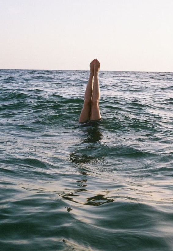
The thing that most inspired me over the summer was the ocean. The best part of my summer was spent near or on the sea. I always love spending time on the ocean because it is the place which allows me to think the most and feel free the most. In my opinion, the ocean is the best place to be, and it inspired me because I did a lot of photo shoots near or in the sea. It allowed me to experiment more, and be more adventurous with my photography. Here is one of my favorite images that I took over the summer using the ocean as inspiration. My friend took the picture, however the framing, setting and form of the photo was my idea.

I wanted to experiment with abstract forms by creating different shapes with my body, mainly with my legs. The lighting was really good on this day, and it worked really well with the current. The horizontal line of the sea works as a contrast to the vertical lines of my legs coming out of the water. The reflection of the light off the water, makes the  image much brighter, and much more interesting. Overall, I am really happy with the outcome of this image.

Environmental Documentary Shoot Planning

After studying two artists which both focus on producing documentary images revolving around the theme of family, in particular, parents, I have realised that documentary photography is a great means of showing the lives of people as if you are a fly on the wall observing their every move. Documentary photography can also be a way of degrading the lives of ordinary people by capturing the often monotonous and repetitive routine thru go through, which is evident in Richard Billingham’s work on his parents who live in a council flat. However, in a way, documentary imagery can be a way of romanticizing the events which occur in the shots because if you look deeper into the photo’s context, the photographer could be representing the subject as privileged, like in Sultan’s work on his family.

Idea #1

Furthermore, it is so easy to document events yourself to produce a visual catalogue of different stories. We document things which are so simple on a day-today basis, using smart phones and tablets. We may not realise it but when we take out our phone to record a video or tale a picture of a moment in time, you are then recording that particular moment in order for it to have meaning and a special purpose when you look back at it. The endless photos you take which are stored on your phone in it’s own gallery is an example of a personal archive. Technology as simple as smart phones makes saving memories much more easier and it is hard to argue why this is a negative. However, people can begin to over use their technology and often abuse it’s purpose and you can end up not living in the moment which is what is most special but I believe there is something very satisfying about looking back at old memories, whether it be from two weeks ago, a few months ago or ten years ago. I have briefly covered this because I feel it is an important and relevant issue for us as consumers of media to understand and that to produce visual documents is as easy as snapping a perhaps blurred picture without much thought gone into the composition. I wish to incorporate this concept into my personal study at some point because I feel it could tell a very powerful story about the positives of technology but about how destructive it can be to out society and the ability to socialise traditionally. We can become so addicted to our phones. I came across a photographer who addresses this issue by photographing real-life situations of people of their phones, however, with the phones removed form the shots to show how addicted we’ve become.

American photographer Eric Pickersgill removed the smartphones and digital devices from his portraits of everyday life. The project “Removed” aims to show our addiction to technology and hyper-connectivity, and Pickersgill claims that he’s also amongst the addicted, and I too, can admit this.

The project was inspired by some observations the photographer made in a New York City cafe one morning:

“Family sitting next to me at Illium café in Troy, NY is so disconnected from one another. Not much talking. Father and two daughters have their own phones out. Mom doesn’t have one or chooses to leave it put away. She stares out the window, sad and alone in the company of her closest family. Dad looks up every so often to announce some obscure piece of info he found online.”

He achieved the surreal effect in his photos by asking strangers and friends to remain in position, removing their cellphones, and then taking the shot. Here are some of  the shots from his series:

portraits-holding-devices-removed-eric-pickersgill-2

portraits-holding-devices-removed-eric-pickersgill-33

portraits-holding-devices-removed-eric-pickersgill-22

portraits-holding-devices-removed-eric-pickersgill-10

The concept is very simple yet the context is very complex and I feel like it is a great series of images with powerful meaning behind it. This series by Pickersgill is a form of documentary photography and it addresses a very relative subject to our modern day with he ever-growing proliferation of technology and the need to be up to date with all the current affairs, whether it be news, fashion, music, celebrity gossip or to chat with your friends – we are always on our phones and the images above are a very clever way of showing this. You can see that mot much has gone into the editing or actual composition and framing of the photo because most of the quality lies in the context and concept.

In terms of my environmental documentary photoshoot, I feel it would be a good experiment to do a photoshoot similar to this using the people in my house when glued to their phones, smart watches, the TV, laptops or games consoles. I will aim to remove these items or I may photograph the person with the object also in the frame to reduce it to its most simplest form.

Idea #2

My second idea for a photoshoot to complete this week is also based in my home and it will focus on one particular occupant of the home – the one person who is in the house the most – my mum. I have an idea to photograph my mum in each room of the house, or at least the ones she uses most often to create a nice little series of images.

When I was given the task to produce a photoshoot based around the theme of documentary and environmental, and after looking at the works of Larry Sultan and Richard Billingham, I began thinking of different themes and different styles of photoshoot I could look into and began thinking about what I could produce relating to the themes family as well as environment and the relationship people have to different locations. I decided that a could starting point for me to develop my understanding of documentary photography would be to concentrate on my mum and her everyday routine in the house but stage each shot as though it was setup, almost like a tableux image. I would achieve this effect through the subject looking into the camera and I would not attempt to capture her when she is not expecting it, I would look more at the effect I can achieve if I ask my um to pose in a particular way or position her body in particular when doing different tasks around the house, such as hoovering, cooking, using her sewing machine or washing the dishes etc. I would like for the style to be quite serious to get the message across that she is taking pride in her home in the way she looks at the camera. I would edit the images and put a heavy focus on contrast and making the shadows pop out the photo.

A photographer who focus much  more on tableaux photography is American artist Gregory Crewdson. He achieves a captivating look through the colour palettes and the locations he chooses which contribute to the overall feel of the image. They have very vintage looks to them due to the props used when photographing in houses and the scenes are very memorable. His photographs can be recognized very easily.

His series, Cathedral Of Pines was critically acclaimed for it’s tremendous efforts to achieve something very different. It took two and a half years to shoot and, typically for Crewdson, required the kind of preparation that usually attends a Hollywood film: months of casting, location hunting and storyboarding, with an extensive crew to oversee lighting, props, wardrobe, makeup and even some special effects involving artificial smoke and mist, as The Guardian Online writes.

Foreboding … Mother and Daughter, 2014

Gregory Crewdson’s Father and Son, 2013.

Image result for gregory crewdson cathedral of pines

This is only for me to look at to understand the style and look I intend to achieve if I was to do a shoot like the one I have just mentioned and it would definitely not be as professional slick-looking due to the limited time and budget I have! However, I love the work of Gregory Crewdson and think it is amazing how you can capture something so enthralling through an image.

Larry Sultan vs. Ray Billingham / Documentary + Environmental Portraits

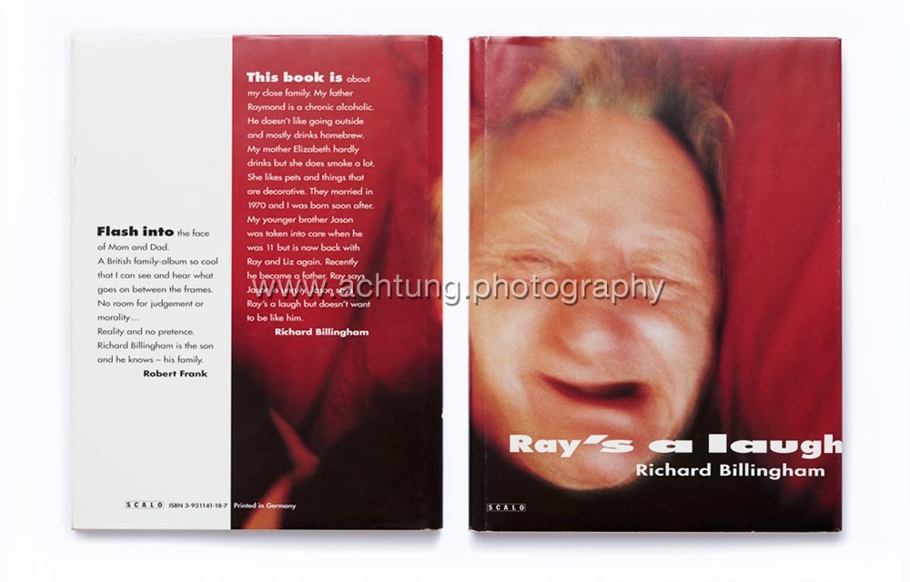
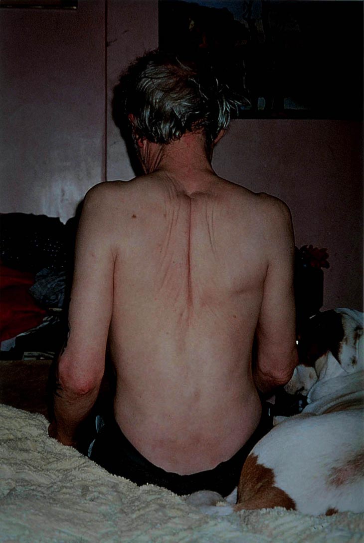
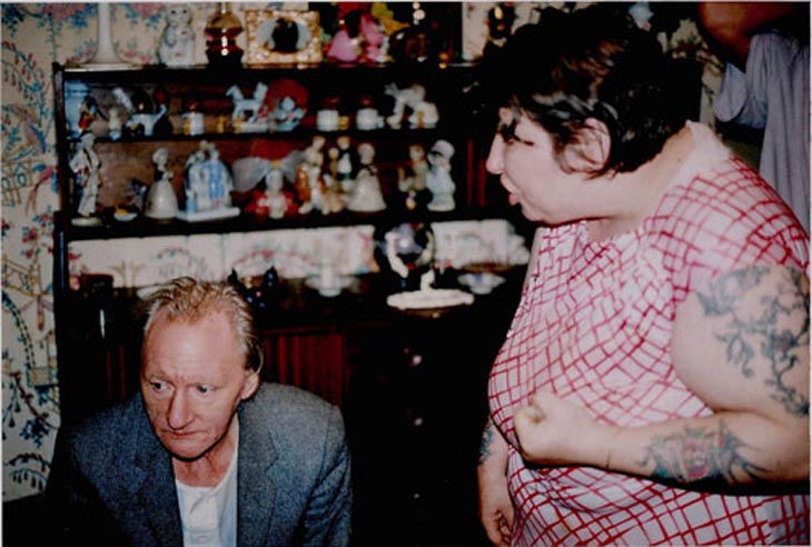
I have chosen these two artists, Larry Sultan and Ray Billingham because after looking at Billingham’s photobook, Ray’s A Laugh, I was instantly drawn to his work, in an emotional sense. I found his work very powerful and I think that it really told a story of his life and his background, consisting of his parents. In his book, he told a narrative of how his parents live and through the images, he depicted this is as very obstructive to the lives of the people around them – as if the way his parents live have affected him and his brother having to grow up with it. Both Billingham’s parents have an addiction of some sort – his father being a very heavy alcoholic and his mum being very reliant on cigarettes. He told a story through snap-shots of the conditions they live in on a daily basis in their council estate in a flat. The style of Billingham’s work really resonated with me and I found it very captivating to the see evident boundary that splits the two lives of Billingham’s parents and Larry Sultan’s parents who love, what seems like, very luxurious lives looking at the way they dress, eat and live within their home – Billingham’s family life looks very insignificant when put together with that of Sultan’s and the two contrast makes it very satisfying to notice differences and infer these differences to draw conclusions.

Image result for ray billingham ray's a laugh cover
Cover of Ray Billingham’s book, Ray’s A Laugh

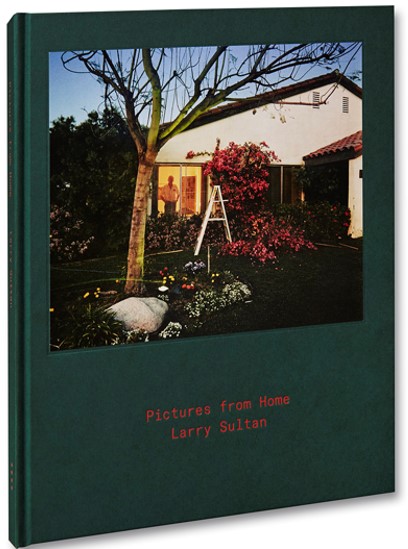
 Both artists have taken a documentary approach in their series of works. They have both set out to document and produce a catalogue of images that depict their family lives in order for the audience to either sympathise with the photographer as they photograph a subject close to their heart that has a effected them, or to sympathise with the subjects of the images, in Billingham’s case. However, Sultan’s purpose out of his series, ‘Pictures from Home’ is to give the audience an insight into the lives his parents leads. He doesn’t wish to tell as much of a story for his viewers to question him about, like Billingham but a pendant for his parents. He says “it has more to do with love than sociology”. He used his photography to provide something that will last a life time for his parents.

Cover of Larry Sultan’s book, Pictures from Home
Larry Sultan

Larry Sultan was an American photographer from California and was a very influential photographer for many reasons and he definitely shaped photography for others who would follow, following his sudden death in 2009 at the age 63. During his active time as a photographer he carried out many series which were described as, like he was, very guarded, sincere and seductive. He was a great success and this was evident from his teaching career at the San Francisco Art Institute for 10 years. His dedication to photography earned him the Guggenheim Fellowship, an award dedicated to those “who have demonstrated exceptional capacity for productive scholarship or exceptional creative ability in the arts”. and he also had his work exhibited in museums of the United States.

With regards to his series, ‘Pictures from Home’, this was something he worked on for nearly 10 decades. ‘Time’ website writes, it is, in some sense, an aggregate of mini-collections: Sultan’s aging parents, stills from old home movies, transcribed interviews with his parents, and family snapshots appear side by side, creating a quiet but profoundly stirring portrait of familial intimacy. What makes Sultan’s family photobook different from the countless other artists who attempts it is the such intimacy that is delivered through the pages which touch the reader. He alternates between past and present in the book and puts together a collective that holds personal meanings through the use images and text which engages with class, memory and physical and emotional beings.

A Collection of Images from the Book
Reading In Bed
Sultan captures moments as far as his parents in bed together enjoying a time together as a couple -something which would be quite intimate but he depicts their life to the fullest as the pair look completely oblivious in order to get the fullest effect of it being a snap-shot.
My Father Sleeping
My Father Sleeping, 1984
Mom Garage Portrait
Other accounts within the series shows his parents looking directly into the camera, a technique I like in order for the audience to feel with the subject is feeling

Los Angeles, Early EveningMom in Curtain

One thing I admire about Sultan’s images is the colours he captures from each image. I believe this in mainly due to the décor that his parents house possessed. It is obvious from the colours, bright and eccentric, that his parents house was luxurious for the them. An image that is evident of this is the image where his mother and father are both in the lounge/dining room together and they have bright green walls surrounding them as well bright green carpet underneath them.

Across the Divide

Artist Analysis 

This sort of image reminds you of the retro rooms you see in houses of vintage films. It is very 70s but to the luxury we see here in comparison to Ray Billingham’s council flat was a novelty to them.

Relating this image to documentary and the functions and features of documentary photography, it is very clear to see that this particular (above) plays the role of a source of imagery that simply documents what goes on the household of the Sultan’s during the time taken. From looking at the image, I get the sense that Larry Sultan has simply held his camera to his eye in this position he found himself in what seems to be the lounge and, like the style suggests, snaps this one second in time which features his mother and father conversing with each other. The composition is very basic and Sultan would have intended to frame both his parents in the shot in order for the audience to get a sense of their day-to-day lives which consists of relaxing at home and enjoying the company of one another. You can see that the image is slightly slanted and is not completely straight but this adds a likable amateur look to the photograph.

I would imagine that his parents would not have been expecting Sultan to take this image at the time; they would have been going about their evening normally and it is very unlikely that this scene is staged, like a tableau because the whole point of documentary imagery is to capture the lives of ordinary people, most of the time, when they are not watching or expecting it. This is what makes the image above so captivating because you, as the viewer feel as though you are a fly on the wall and are supposed to be viewing inside these strangers lives – documentary photography, in some ways is a means of being nosy and intrusive of other lives – something I find very enthralling when I come to producing my own.

Something I have noticed about the photo, which I really enjoy and think is perhaps an unintentional addition to the photo is the way Sultan’s parents are sat apart from each but there is a empty chair in the middle of them. His mother is on the sofa and his father is at the dining table with his wine glass, seeming as though they have just finished their evening meal and the lady of the house has gone for a sit down. Sultan has captured the scene from his point of view where on one side is his mum and the other his dad, but in the middle of the two is a lonesome chair with no one occupying it. The chair is facing the camera and for someone who would be sitting in it, they would be looking straight at the camera, however, his mother is looking towards her husband and this empty space in the middle seems quite disconcerting and unnerving for the viewer. It’s as though they are waiting for a presence to come along or there is this invisible presence splitting the two. Looking at the facial expressions of the subjects. they are looking quite dull with no emotion, perhaps they have just had a row.

Sultan on hs website in his statement about the series comments on how the works are more about love and it is about showing this familiarity of love in families and the members within them and the relationships which are held. He says he wants his parents to live forever and this is a dedication to them. This is has allowed him to construct his series very thoughtfully in order for it to be a time-travelling tool to relive history that would have passed.

In the series, the boundary between documentary and the staged is blurred as Sultan includes efforts to position his mum and dad in positions and poses fro the camera at times but at other points, the format of images is so very informal and relaxed like inn the above where there is no thoughts of showing any emotion for the camera. The reality of living normal lives without presenting anything false for the camera is backed up by the clutter that lies around on the table and on the side unit.

A page from ‘Pictures From Home’
Ray Billingham
and artist comparison

Richard Billingham, you could say is completely on the other end of the spectrum to Larry Sultan in the way his parents live and in the message that Billingham wanted to force through to the viewers of his series ‘Ray’s A Laugh’. His parents led completely different lives of that of Sultan’s and it is evident in this very captivating catalogue of works for may different reasons compared to Sultan’s. Billingham as a photographer has become a household name for documentary photography and he received lots of reception, mostly positive about the way he addressed the topic of alcoholism in his father and audiences, including myself have loved looking through his published book about the state of which his parents lived in their council flat. He said ‘I just hated growing up in that tower block’ and this is what spurred him to photograph it. The Guardian Online published an article about the series and wrote ‘The photographer was a pioneer of ‘squalid realism’ with his images of his parents’ dreary, drunken existence in the Black Country, which won him a Turner prize nomination. Now, with the help of ‘White Dee’, he’s turning their life into a feature film’.

* Squalid / (of a place) extremely dirty and unpleasant, especially as a result of poverty or neglect.

Richard Billingham had a very touch upbringing and I believe this is what contributes to us as the audience being able to sympathise with him in terms of the way he was brought up, yet he still manages to capture a series so beautiful in it’s narrative. The brief of his teenage years goes as follows: he didn’t even take a photograph until he was nineteen. This was when he was living with his alcoholic father, Ray in flat on the seventh floor of a council block in Birmingham. He’d actually just begun an art foundation course at Bourneville College and was working every night to pay his way stacking shelves at the local Kwik Save supermarket, as ‘The Guardian’ writes.

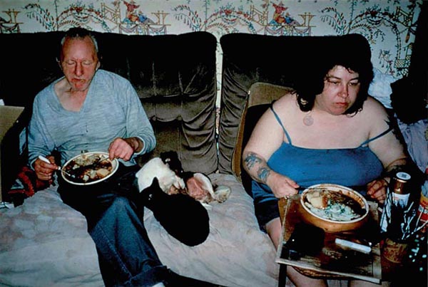
The first pictures Billingham took, with a camera bought on credit after he persuaded the shop assistant he was a librarian, were of geese and ducks in the park, “just to see if they would come out”. He then trained his viewfinder on Ray. (words from The Guardian). He also said that the pictures he took of his dad were rare and that the film cameras he used own were to expensive to develop. This suggest that maybe Billingham always wanted to get into photography was always eager to be creative but never had the chance due to the circumstances he and his family were in. This series he produced could maybe have been a compensation for the times lost when he was younger as he watched over his mother and father physical and mental state deteriorate – a conclusion I can draw just from looking at the photographs included in the book as you see his mother and father slouch on the sofa eating their dinner with food-stained clothes and junk food packaging strewn across the grim carpet.

A Collection of Images from the Book
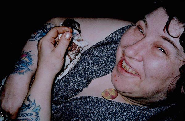
An image of Billingham’s mother grinning as she weans a new-born kitten, presumably from the new litter she would have bred as Billingham claimed she loved animals
His parents eating their dinner together on the sofa. You can see a very noticeable contrast between the living conditions of Billingham’s parents and Sultan’s as this image represents two recluses sat in the living room eating dinner as opposed to a dining room. They are surrounded by washed out wallpapers and dirt-covered furniture
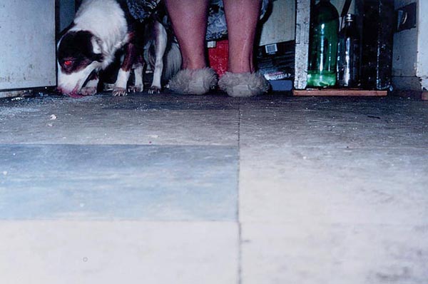
You can see Billingham may have used the flash of is camera at points throughout the series when you look at the dog’s red-eye as it licks the substances off the ground and you wonder how the pets survived in conditions like this.

Untitled (RAL 22)

Untitled (RAL 25)

There is something about the images that I see in this collection by Richard Billingham that makes me feel very uncomfortable and on edge to look through them because I can sense, just by looking at the images that the tension within the house of the Billingham’s would have been very unpleasant to witness, especially between the two parental figures, who seem to be the most vulnerable yet should be the ones with their loving eye gazing over their sons yet, in the image above, it looks like the mother has her fist up at Ray’s face mid-way through a row. The facial expressions from both halves portray a sense of anger yet regret or upset. However, as much as it is not pleasant to observe the events that occur in the images, it is essential to do as it opens your eyes to the reality – once again – this is what documentary is; reality being forced directly to the viewer. I feel very connected when analysing the events that occur in the images because each photo has a meaning behind it, a story – this is a similarity between Billingham and Sultan, that each image represents a moment in time and that the collection of photo produced tell a story. Looking at the two contrasts re-defines the meaning of family as I am being told about two different situations – one of love and one of agitation.

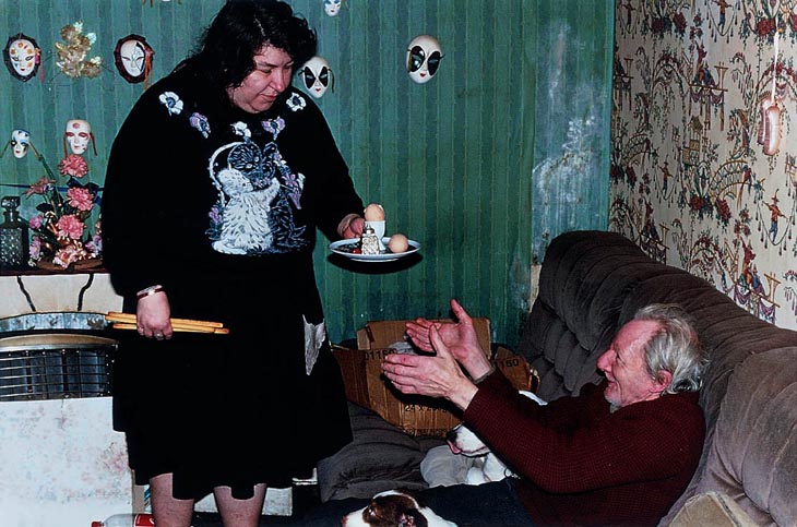
Untitled (NRAL 13)

Artist Analysis

This image, to me holds a very strong and powerful message as it sums up the whole meaning behind the series, ‘Ray’s A Laugh’. It shows Ray’s wife bringing him his dinner, which looks like two boiled eggs and some toast. The simplicity of the dinner reiterates their need for simplicity and being basic in their life choices. It shows Ray sitting don on the sofa with his dogs and his wife coming over to him with his dinner as conjures up a smile as this moment in the day is probably his favourite. He puts out his hands as his wife looks at him drearily and it is a shot which makes the audience think of family. It is a typical scene of the lady of the house bringing dinner to her man as he relaxes on the sofa ready to enjoy a relaxing evening with his wife. This usually occurs in men who have ben at work all day and women who have spent the day at home cleaning and cooking, however, for these two, it is likely they have spent the day on the sofa and what is seen above is there everyday life – it has the sense of repetitiveness an this is what is ironic because something so simple for Ray is what brings him joy as he probably doesn’t have much else to provide him excitement.

The state of the house is shown by the surroundings. The walls are caked in dirt and grease and filth, there are cardboard boxes with what I can only imagine is junk which has been hoarded over several years. There are cheap-looking decorations hanging off the walls which at ornaments which Billingham’s mother has collected as he claims she loves little knick-knacks. The two subjects themselves don’t look clean and it is though they fit it with their surroundings perfectly and they have become part of the house over-time. The whole look of the image is very sad and the audience can sympathise with what is going on.

The wife is holding in her other hand as she oases over the boiled egg for at some breadsticks which you can only bare to imagine that this could be her dinner as she has had to focus on pleasing her husband. You could draw a conclusion that perhaps if Rau does not get his evening meal, if may get aggressive and retaliate and this prospect because it is breaking his routine. He is an alcoholic and Richard Billingham stresses this as in almost every shot in the series is a greasy recycled bottle filled with a brown, thick liquid said to be the homemade brew his father makes.

I find it hard to believe that Billingham has he courage to construct such a personal visual documentary of images because it is such a personal subject that encapsulates the hardship his parents have been living for the most part of their lives and how it has affected the ones around them, including himself but the context of the series is what makes it so thrilling to view.

His video art piece which re-imagines scenes from his book released in 2000, ‘Ray’s A Laugh’. 

Environmental Portraiture

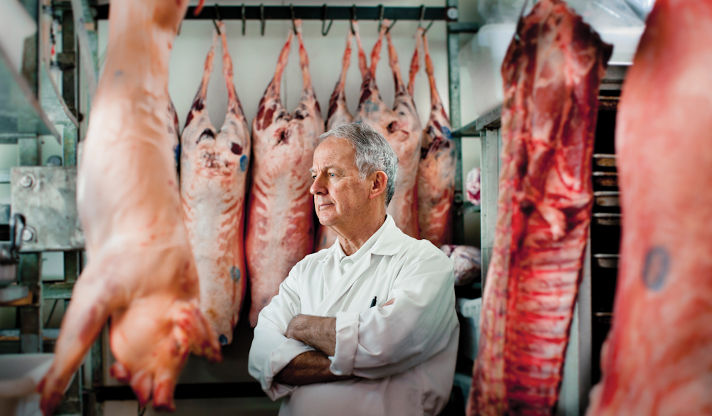
Jonathon Bielaski is a Canadian environmental photographer specialist based in Toronto. Although environmental portraits are restricted to often just the place of work for the model in question, Bielaski visits more diverse and a variety of work places. Bielaski’s photographic range gives his collection of work an edge on other environmental portraiture photographers which is also enhanced by the body language of the model. Throughout his work, the model avoids eye contact, creating this sense of ambiguity and the viewer of the image immediately questions the image – does the person enjoy their job? Are they happy?

Image result for jonathan bielaski

Presumably, the man in the image is the butcher, the man who butchered the seven pigs in the image. Although pork is a very popular meat, especially in the UK, to see meat in this formation is quite disturbing and grotesque, perhaps coinciding with the closed body language of the man in the image. The crossed arms, ambiguous side profile, aged skin and grey hair allude to an experienced butcher whose guilt of killing animals has caught up with him as he is surrounded by the corpses of pig bodies. Bielaski would have crafted the image in this way to show the struggles a butcher would face and perhaps the guilt the job accompanies.  Alternatively, it may be other factors that are causing this man to be stuck in deep thought during his work hours and this may affect his performance. Perhaps his job is an escape from the strain of everyday life but due to the posture the model holds, the images emotion is ambiguous and open to interpretation, which is the key method to an environmental portrait.

Image result for jonathan bielaski

Image result for jonathan bielaski

Image result for jonathan bielaski

Image result for jonathan bielaski

Image result for jonathan bielaski

Following the knowledge I attained from meticulously analyzing Jonathon Bielaski’s environmental portraiture work, I researched and reminded myself of how to take a successful environmental portrait of a family member, to stay inclined with the task and the main topic of family. I used the following links to help me conjure a plan of action…

https://petapixel.com/2016/04/07/8-tips-making-better-environmental-portraits-natural-light/

How to Create Environmental Portraits (Tips and Examples)

5 Tips for Better Environmental Portraits

Larry Sultan was an American photographer who framed his wealthy and prestigious family in the style of environmental portraits. Like many environmental portraits, the blank facial expression depicts a story open to interpretation, giving different dimensions to his photography as it becomes real although it is so clearly staged.

Image result for larry sultan

Image result for larry sultan

Image result for larry sultan

Initially, I plan to photograph my step-dad, a Chartered Accountant who jointly runs his office with brother. I’m going to tell him to model in the photograph as if he’s writing, on the computer, an image looking away from me and an image looking directly at me. I’m hoping by attaining a variety of images of the model, I am able to select a definitive picture that can portray the stress I see him experience. The working strain usually implements onto our family as it is clear when he is stressed.

Secondly, I want to photograph my little sister either in her bedroom or the garden on the trampoline. For this photoshoot, I’d have to find a perfect angle to get my sister and the objects I hope to capture with it. At the tender age of five, my sisters main aim is to have fun so if I’m going to capture images of her on fun apparatus, I’ll have to instruct her to keep a straight face, which may be a challenge.

Finally, for the environmental portrait study I will encapture images of my friends drinking and playing pool, which seems to be the culture since we’re turning eighteen this year. Personally, I consider my friendship an extension to my actual biological family, which allows me to incorporate them into my work.

Inspiration

What inspires me?

Inspiration is the process of being mentally stimulated to do or feel something, especially to do something creative. In photography being inspired by something is key because otherwise you would take boring meaningless photos that have no significance or real meaning to why you have captured them. Most people don’t realise when they are really inspired because it is easy to be inspired without really knowing, for example just seeing a photographers working and having and thinking you like it and then subconsciously creating a piece of work similar not even meaning to. or you can look for inspiration and search for artists and things that have meaning to you and want to look more into that and this tends to be how we start a project in photography by finding general inspiration of things/artists/objects which may capture our personal interests and make us want to explore this specific area further.

I find being properly inspired by things really rare because i have to be passionate about the topic, really interested in it and for it to have meaning and significance that is going to capture my interests. In the past i have found inspiration off pinterest and the internet of artists that i liked there work. But i have also always been inspired by social matters and what is going on in our environment and others environment. I based a photography project last year on the idea of ‘self reflection’ and how other view themselves through editing mirror reflections showing in the foreground who they are and then in the background was there mirror reflection with the words of what they saw themselves as. I was inspired by this idea because i thought it had true meaning of how no one is really happy with themselves, their image, or who they are as a person. So i felt it portrayed a strong message which would impact a lot of people.

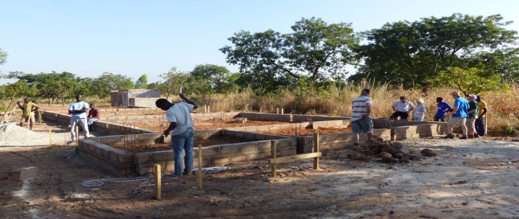
This year i have been inspired by a trip that i found out about a couple of years ago, where a group of people from jersey go on an aid trip to Burkina Faso, Africa and build schools, pharmacies and help out in the local area. After researching a bit about this location i have become really passionate about helping out as much as i can when i go over there in October 2017. I have been inspired by the people there and how well they cope with the tough realities of life that i am going to make a project about them and when i go over capture documentary portraiture images of the people of Burkina Faso in their natural environment and hope to portray the message of their lives through my images and how you don’t always need lots of money to be happy.

Summer Landscapes

Over the course of the summer, I took multiple photographs in a multitude of settings and places. I thoroughly enjoyed this freelance approach, photographing what I liked, espeically as each photograph withholds a personal and sentimental meaning.

Reinforcing this sense of inspiration and linking to the topic of environment, I thought I would post this collection of images in order to demonstrate and give a visual representation of the environments I get inspired by.

Areas of Focus this year (Documentary / Tableaux)

Throughout the process of this coming year in photography, I am going to be looking at a variety of different style of photography that will be paramount for me to present my personal study in a creative and new narrative style that I have not attempted before. I have already looked at one of the threes styles, being archival imagery. I have achieved this through looking briefly at my own personal family archive and visiting the archive of Jersey and it’s history at the Societe Jersiaise museum. This was a really enjoyable experience and it has set me up for the year to come because I aim to use these new skills learnt to help me analyse the background context of photographs deeper and I will be able to explain my now photographs better because of this. The other two style of photography will interlink with archival works and the pieces I produce from each aspect will hopefully come together to complement each other in the end result.

I have set myself a personal target this year to explore lots of new techniques and photography styles. Last year I focused solely on what was set and I feel this limited my ability to explore and expand my creativity further outside of the boundaries and therefore my outcomes were often basic and they weren’t always what I wanted in order to differentiate myself from others because I didn’t know what to do in order to make myself unique. Furthermore, my maturity as an artist has develop and artists mind has also advancement, therefore, I feel as if I am eager to try lots of new things and challenge myself in terms of exploring outside my comfort zone to help me understand what I want to be as an artist, the style I feel most attached to and so on. I hope to discover a particular look to my work and I think that looking at new techniques will aid this; this is why my ability to be experimental in photoshoots for documentary, tableaux and archival purposes will be vital for my own success. I see this year as a time for trial and error in an effort to discover myself. 


Documentary 

Documentary photography usually refers to a popular form of photography used to record events or environments both significant and relevant to history and historical events as well as everyday life.

Documentary imagery drew on the idea of information as a creative education of life itself and it has been used by a range of photographers to show everyday life of ordinary people – which is what I will be attempting to achieve in the near future.

Documentary photography wished to, when first introduced, pave the way for social change as people often photographed controversial subjects very subtly to get the idea of documenting a particular event as if they shouldn’t be because the subject is seen to be a taboo such as alcoholism, much like Richard Billingham did in his series Ray’s A Laugh. 

Richard Billingham’s Untitled, 1995, from the Ray’s a Laugh series.
Richard Billingham
Richard Billingham’s Untitled, 1994, from the Ray’s a Laugh series.
Richard Billingham

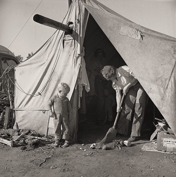
Tate says that Until the mid-twentieth century, documentary photography was a vital way of bearing witness to world events: from shoot-from-the-hip photographs of the Spanish Civil War by Robert Capa to the considered portraits of poor farmers by Dorothea Lange.

Dorothea Lange – one of America’s greatest documentary photographers who worked in War strucken areas and investigated the working conditions of farm workers

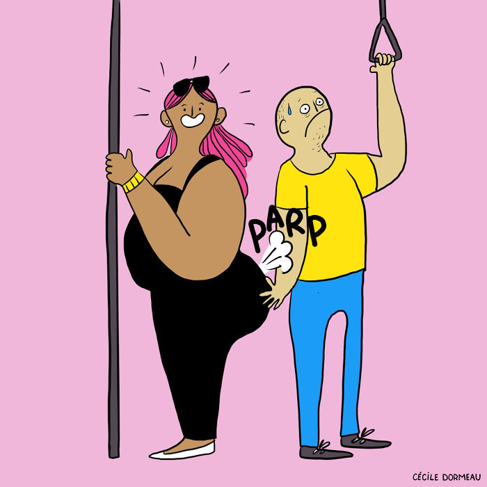
For me, documentary photography is a very powerful tool to use in order to get across a message creatively and artistically through the use a camera – a snap shot to allow us to compensate for the resistance that media has when serious topics such as mental illness or suicide are not addressed and are not put in the face of the public  due to such topics being regarded as taboo. I am not saying I will be addressing such topics and issues but I believe that documentary is a perfect way to compensate for the lack of publicity it gets and artists such as Richard Billingham or journalists as early as  1880’s who documented the slums in Manhattan shows this in their work. Also, an artist, I am particularly fond of addresses less serious topics but in a humorous way – French illustrator, Cecile Dormeau tells the hidden story of women and the other side to women that society don’t regard as lady-like through her colourful and cartoon-esque illustrations and gifs. She shows women eating junk food in lounge-wear and shows curvy women in strappy tops through the characters she creates in each of her drawings. It is a form of documentary work because it is publicising something that wouldn’t get addressed in other media because it is typical to have a petite models in the public eye through brand advertising. 

Image result for cecile dormeau
Cecile Dormeau
Cecile Dormeau
Tableaux

Tableaux photography is a type of art in which the subjects of image are staged. Tableaux is used to describe a painting or photograph in which characters are arranged for picturesque or dramatic effect and appear absorbed and completely unaware of the existence of the viewer.

‘Tableau’ derived from the French term ‘Tableau Vivant’ meaning ‘living picture’. The term is relevant to many art forms including painting, where it first stemmed from and it has since gone on to become popular in photography and sculpture for visual and aesthetic representations. In the theatrical context, the actors/models do not speak or move throughout the duration of the display they are presenting during a play or show etc. 

When I think of tableaux photography, bearing in mind I have never performed it myself or photographed due to the prospect of being motivated to due to my lack of interest in it, I personally do intend to concentrate my time too much on it because I feel like it wont suit my artistic style. However, I am definitely up for experimenting with the historical technique which is still in use now, mainly for theatrical reasons however but I feel like I could enjoy this style once I have planned a shoot for it. This is because I enjoy photographing people and faces. I feel like I can definitely envisage what I want to achieve once I have the subjects inf front of me , and, from what I have learnt of tableaux photography so far, it looks like it needs a lot of patience in order to make the position being performed. 

An example of tableau photography can be seen when looking at the worm of Ryan Schude. He photographs set up scenes as if they have just come from a movie and I love his work. I cam across him by chance and I was instantly attracted to the images due to the mayhem that is often occurring in each image and it is always at a particular location and the subjects are all performing something different to each other which is what makes it so interesting because there is always something to look at. I also love the colours that are present in the images andf they almost look vintage which is what I presume Schude has attempted to give the idea of original tableau vivants – the costumes of each character aids this effect and the mise-en-scene. 

Image result for ryan schude tableau vivant
Ryan Schude, Tableau Vivant, Crazy Pool Party
Image result for ryan schude tableau vivant
Ryan Schude

Tableaux photography, to me is different to documentary because it is not known as much to document serious issues and its aim is not to pave a pathway for social change. This is because of where it derives from, being theatrical purposes. 

Seamus Nicholson, another tableaux based photographer

His artist statement explains his work in a sentence and is revolved around documentary combine with tableaux and how he can create a snap shot moment with his camera to get an insight in ordinary peoples lives. 

“My work seeks to express the surreal and the unexpected found in ordinary everyday moments. I draw inspiration from cinema and the traditions of tableaux painting as well as from direct observations of life. I am interested in combining elements of documentary and the snapshot aesthetic.”

My Inspiration

One of my first inspirations to get into photography was Fashion Photography. As a typical young girl I would look on fashion blogs and in fashion magazines, which is where I was first introduced to this sort of photography. Fashion Photography is originally devoted to displaying clothing or other fashion items when photographing but has now developed into a way of challenging controversial ideas or creating a mood. What really inspired me was a particular piece by Steven Meisel, which appeared in the Vogue Italia magazine in 2011, but only came to my attention in the last 6 months.

These were the original images I first seen, as you can see the model’s waist is being pushed in by a corset, which makes it almost non-existent. A radical demonstration of the pain some go through in the name of fashion. These photos are apart of a series of photos, which I later found out was called ‘The discipline of fashion.’

As you look and analysis these particular images, you are then made aware of how the facial expression and body language of the model can change the mood and feel towards the image. These types of images can battle controversial matters, Steven Meisel is a Photographer who likes to use theses as his starting point.

I feel these 2 photographs together capture the story and meaning behind these selection of images. They show the pain woman in particular go through to make themselves fashionable and appealing to the public eye. In the first photograph you can see the marks that have been left indented into the skin by the leather gloves she was wearing, these indents shape lines on the skin that almost look like self harming scars, which also relates to pain and expectations. The hand hangs there with no real purpose as if it numb or aching. The second image you can see her tiny waist, which over exaggerates other features in her body such as her hips and shoulders. She is hunched over, almost as if she is in pain while she holds her chest. Her eyes are looking down and she has a serious look on her face as if she is uncomfortable.
These sort of images inspire me because the model is dressed in couture clothes, modelling the clothes and fashion items, which will later be published in a fashion magazine but also has an underlying theme that contradicts the magazine’s purpose. This shows the effects of ‘the discipline to fashion’ in a fashionable and stylish way.

Inspiration/ Ilham

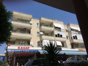
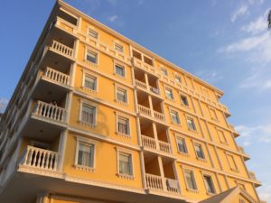
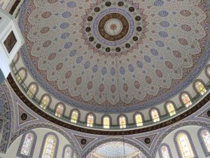
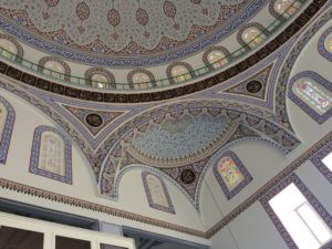
On the dreaded return to school, I was assigned the task of describing what inspired me over the long summer break which served more of a problem than I initially thought. In retrospect, I struggled to conjure up an exact moment in which I felt inspiration as the melancholy Jersey weather really prevented me from wanting to go out or participate in activities as much as I would have liked to, restricting me to exploring the depths of my house and my friend’s houses. However, looking back I can conclude that my primary source of inspiration was attained away from home and actually in the Asian sector of Turkey as my family booked a last minute and spontaneous holiday for the middle of August

Leading up to the family excursion, the weather in Jersey remained very miserable and wet, barely reaching 13 degrees despite being the “sunniest place in the British Isles”, yet the weather reports from Turkey were portraying air temperatures exceeding 35 degrees which provided us and the people I’m closest to, with excitement for what lied ahead.

The process of packing my bag was a very fast yet efficient one as not only was I scrupulous with packing my clothing and delicate belongings but I was packed as soon as I got word of the holiday booking. This attitude was reciprocated throughout my whole family, including my five year old sister who was sure she packed all of favorite toys as she didn’t want to make them miss out either. Our family hadn’t been on holiday together for three or four years as my parents became wrapped up in the mundane Jersey life where work is priority, making it easy to forget what is important.

When travelling through the airports, particularly when boarding and exiting the planes, there was a real sense of ambition and opportunity in the air, as if there was a new start and the stresses that real life provides are irrelevant, although we knew they’d all be returning in a matter of days.

I thoroughly enjoyed the trip on the whole. Exploring and embracing different cultures, different people and different settings really helps put things in perspective for when you’re back home, as if your priorities all become aligned and by embracing the Turkish tranquility whether it be the weather, massages or scenic views really helps you realize what is worth stressing over and what isn’t. Fundamentally, getting away with my family really provided me inspiration and motivation for working hard in school because being successful with qualifications is the only sufficient way I can achieve my life ambitions of seeing as much as possible before I die.