Category Archives: Independent Study

Filters

Author:
Category:

Typology Study

When searching for influence upon church typology, my teacher suggested assessing the work of Walker Evans. Evans photographs churches in a time before coloured image production, causing the photos to adopt this sepia sense, adding to the aged nature of his photographs.

Image result for walker evans church

Image result for walker evans church

Walker Evans’s images of the churches from the 1930s are very much how I like structuring my images with direct and clear focus on the linear of the building against a blank yet idyllic background. Following my recent shoot, I compared my image to his set of images and although the angle of the church is different to how he pictured it, you can see a clear comparison between the two.

Primary Inspirations/Thoughts for My Project

Primary Preferred Artists
  • Phillip Toledano – When I Was Six
  • Yoshikatsu Fujii – Red String
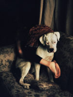
  • Colin Pantall – Sofa Portraits
  • Arno Brignon – Joespehine
  • Brooklyn Beckham – What I See
  • Paul Gaffney – We Make The Path By Walking
  • Sophie Calle
  • Hekki Kaski – Tranquility
  • Rita Puig-Serra Costa – Where Mimosa Bloom
Arno Brignon - Josephine

http://www.arno-brignon.fr/files/gimgs/th-45_josephine2016004-copie.jpg

http://www.arno-brignon.fr/files/gimgs/th-45_josephine2016006 copie.jpg

http://www.arno-brignon.fr/files/gimgs/th-45_josephine2016027 copie.jpg    http://www.arno-brignon.fr/files/gimgs/th-45_josephine2017021.jpg

“July 1st, 2009, birth of Joséphine. Doubt and fear mingle with joy and pride. Having a child can be the simplest thing in the world. For us, it was long, unlikely, unique. In maternity, they call it a “precious pregnancy”. It is also an imbalance announced to our life as a couple, a love story for two to rebuild to three.”


This series by French artist, Arno Brignon looks at the fragility of birth and being a mother and how carefully you need to transform your life in order to mold this new introduction into your being as human – what you lived for before pregnancy all of a sudden changes and this explored through a very diverse range of portraits and landscapes delicately addressing the topic of birth and the fear of your family crumbling.

I believe the concept and content of this very moving series is relatable to my thoughts for my project where I will look at the fragility of family life through divorce and the events that come after this. I love the colours in this series and the textures that are achieved from using film as opposed to digital. The graininess is very nostalgic and suitable.

Paul Gaffney - We Make The Path By Walking

The British Journal Of Photography writes “Nothing much is happening in the images and there are no people in sight, yet everything is happening; knotted, overgrown roots catch the light and weave in and out to form complex networks; a craggy cliff-side reveals an intricate patterned texture; windswept vegetation exposes an inviting pathway. Gaffney’s sensitive handling of the landscape allows his subjects to breathe, and through their very subtlety the images sing.”

It is Gaffney’s first self-publishes book and contains photographs taken in rural Spain, Portugal and France. The idea he explains was to explore long-distance walking as “a form of meditation and personal transformation.”

Although this project does not include any people whatsoever and focuses solely on landscapes and the environment around us, the images included in the series I hope will influence the style of imagery I capture for the images I produce of the environmental/location aspect of my project. What I like about the images are the very surrealist sense about them, as in some examples, it looks very overgrown with greenery and this often juxtaposes against an urban background. My images will not be as dramatic as this but will adapt the effect of looking hazy.

Heikki Kaski - Tranquility 

https://vimeo.com/125994256

Kaski_04    Image result for heikki kaski tranquility


Heikki Kaski (born in Kantvik, Finland, 1987) lives and works in Finland and throughout Scandinavia.

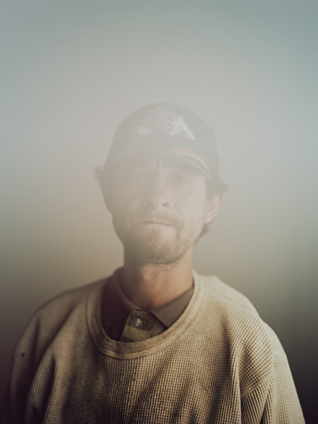
In the series, ‘Tranquillity’, there is a tension, a beat-down quality, that is beautifully conveyed in the barely balanced framing and dusty, drained palette of the photographs.

Heikki Kaski’s pictures of the town in California with a now population of 799 people and its inhabitants. It is a fractured series of reflections on a landscape that seems to have outlived its own history. He tells the story of the very quiet and isolated town and the people within through smart and sleek images of objects, portraits and landscapes. The images are very aesthetically pleasing and it something I am hoping to show in my project consisting of similar style images. Although a completely different context, the look and meaning behind the project will be similar to that of Kaski; I will look to the show the people that have a particular relation to environments and how this affects the lifestyle of these people. Although focusing on divorce, I am focusing on memories and the thoughts of my mum and dad that take them back to “good times” as such which will be displayed through very simple images of environments and portraits.

What I like about the project is the physical book which showcases the work so very elegantly. The set-out of the images on the pages, the colours involved and the overall look is very representative of the thoughts I have in mind to be minimalist in my presentation.

Rita Puig-Serra Costa - Where Mimosa Bloom

Rita Puig-Serra Costa’s work is very captivating and speaks lots about family and the relatives within shown through the thoughtful use of showing a family tree through the archival portraits of her family members.

Dealing with the grief that the photographer suffered following the death of her mother, ‘Where Mimosa Bloom’ by Rita Puig Serra Costa takes the form of an extended farewell letter; with photography skilfully used to present a visual dedication through speech and imagery to her deceased mother. This grief memoir about the loss of her mother is part meditative photo essay, part family biography and part personal message to her mother. These elements combine to form a fascinating and intriguing  discourse on love, loss and sorrow. “Where Mimosa Bloom” is the result of over two years work spent collecting and curating materials and taking photographs of places, objects and people that played a significant role in her relationship to her mother, writes the site’s statement in which the book is available of purchase.

The concept is something similar to what I hope to follow through with in my own memoir to my mum and dad and myself and the lives we have since followed after the division of the family. I will be focusing on the relatives from then and from now who have played  significant role in shaping my life to what it is now and who I am now because I feel using the technique of including myself and revolving the project around myself will make it easier for me to tell a better story.

I have already looked at the work of Serra-Costa and really enjoyed producing something so contemporary which revolves around the close collaboration with my subjects to produce the end result – I look forward to doing so again in my current project but on a much larger scale.

Image result for rita puig serra costa where mimosa bloom

My Idea

I am going to focus my study on my mum and dad and the event that changed my own experiences as well their own and the events we would come to experience together, as a collective throughout my upbringing as a child into a teenager and into a young adult to who I am now – their divorce. When I was at the tender age of 4 – when I was aware of my surroundings and what went on in my life – who my most closest relatives were and who I could put my trust into to develop as human to who I am now. At 4, however, you don’t know the concept of love and what the event of you being born can do to a couple who were once unconditionally in love with each other. It causes stress, friction and unwanted distancing from one another – love has the potential to eventually break the people involved.

I have therefore chosen to explore this very fragile and mildly taboo subject of divorce further in my own personal investigation for the year to come. The final result of this very in-depth and rigorous investigation about the relationship which was once there between my mother and father and to what it is now will be a photobook consisting of the images I aim to produce for the remainder of my A2 year.

When handed the task to collate several ideas about what you wish to hone in on for your own personal study at the beginning of the week, it is an understatement to say that I struggled to find something I had the passion and motivation to do. I wanted to focus on the concept of family because I feel like more of a narrative can be told through this concept and I was very eager to start exploring own family. Hover, I did not know what this “special” thing was that I actually wanted to look into because I couldn’t think of anything that would generate some exciting thoughts in my mind. I had the idea to use my sister – to show the contrast between my childhood and hers through t use of my own personal archival imagery, or maybe the use of my girlfriend and her own family and the juxtaposition of her own and my now family and idea of “family”, however, this did not excite me enough and I finally came to the conclusion to investigate the divorce if my mum and ad when I was at the tender age of 4. This very influential event has affected my life since the very day I found out the spit of my parents and even though I d not fully understand this very complex subject and concept when told at the time, it has followed me throughout my life and it has moulded how I am, as well the rest of my family, including my now 4 year old sister herself and my relationship with her.

I will be focusing predominantly on the work of Japanese photographer, Yoshikatsu Fujii. In particular, I will be using her book, Red String as my inspiration for my project based around my parents and myself and my relationship with both of them. 

Yoshikatsu Fujii was born and raised in Hiroshima City. He graduated from Tokyo Zokei University of Arts with BA in Art Film. He began photography work in Tokyo in 2006. His photographic works often deal with historical themes and memory lingering on in contemporary events. 

What I love about Fujii’s work is the very diverse range of materials and resources used in the book. Not only is the actual book handmade very carefully with fabric and actual red-string used as decoration throughout, but he has used archival imagery from his personal archive about his mother and father, but also inserts of texts and transcribed discourse from his parents and contemporary imagery to balance out the theme of looking back at the past but also living in the moment and exploring more about his present day family.

The reasoning behind the title ‘Red String’ is because of a legend that use to exist in Japan. In Japan, legend has it that a man and woman who are predestined to meet have been tied at the little finger by an invisible red string since the time they were born.
Unfortunately, the red string tying my parents undone, broke, or perhaps was never even tied to begin with. But if the two had never met, I would never have been born into this world. If anything, you might say that there is an unbreakable red string of fate between parent and child.

Fujii’s book about his parents divorce ‘Red String’


Mind Map of Ideas for my Project

Environment: Church – Specification

Churches are all around us in different shapes, sizes and forms for different religions. I am going to specifically focus upon the Christian church as this is an area I have the most knowledge in and within the Western region of the world, particularly England as  Christianity is the most prominent religion according to https://en.wikipedia.org/wiki/Religion_in_the_United_Kingdom.

Initially, I researched the influence of religion within my tiny Channel Island and that’s when I discovered; “two fifths of the island are… irreligious”, signifying the decreasing power of the Christian church over society. Getting as close to home as possible, I studied the history of Saint. Clement’s and the four churches within the parish, although only two of these are Christian churches. This is the parish where I live so these churches are very accessible, but with the help of my trusty moped and due to the small nature of Jersey I am able to study all Jersey Christian churches.  Following my research upon the religious scene in Jersey, I discovered Jersey’s established church is the Church of England, and although Christianity equates for half of Jersey’s population, wikipedia states  irreligion has been an increasing force in Jersey. A demographic which I come under as I am an atheist, however, I do respect the values that Christianity promotes, especially as they correspond with modern day law and legislation.

Image result for saint clements church jersey

The Parish Church

Fundamentally, what I do not support about Christianity is how in history and even more contemporary, in less educated global regions, the papacy have exploited the good-will of church goers for their money, demonstrating their indoctrination to religion. Recently, I watched a documentary known as “Deception of the Ages Nigeria”, which is available on YouTube. The documentary establishes this sense of exploitation of the lower class which angers me as these people have no money, they cannot afford for their children to have efficient education, yet the church is coercing finances from these families as they are not educated enough to understand the hoax they’re being gulled with, portraying life’s vicious cycle. This is just one of many examples I could provide to signify my anger towards the purpose behind the church.

Image result for nigeria christianity

A Christian Church in Nigeria

In response to the task set, I have decided to steer my focus towards the Christian church and how they have exploited the ancient literature of the Bible to gain money and power from the common people. Another reason why the Christian church has angered me is as recently, I unfortunately had to attend a funeral for a family friend who is the mother of one of my close friends. At the young age of 47, this lady lost her ten month battle with cancer. This lady was a mother of four extremely successful and lovely natured children and this death would leave a void in their lives all too soon. However, on the day of the funeral, with hundreds of people attending who were crying, sobbing, snuffling, the church televised an extract from the Bible. The b***** Bible. At such a tender time, the priest discussed how now sweet Elizabeth will rest with God. I can’t really justify why this angered me except to say its selfish. At this point, these four suffering children are numb with tears streaming down their face whilst a priest recites a quotation from the Bible. It goes unsaid I appreciate my mother’s health and eternally grateful that I wasn’t in that position, but I envisioned myself in that position of my close friend. I imagined that I was stood in her position, crying and having to say goodbye to my mother for the final time whilst this priest mumbled and gargled shit from the Bible. I stand outside of the ceremony starring inside to again, see my friend crying which is when I remember a thing I once discovered from a source I have now forgotten but it was the ‘seven’ stages of grief and this relates so well to what I can see happening to my friend.

Coping with Death: Grief and Photography

Image result for seven stages of grief

Seven stages of grief

Another reason to base upon my work upon grief, the church and orientate the production around the number ‘seven’ is that, within the content of the Bible, it states there are ‘seven’ deadly sins. I think basing my piece around the number seven will also give me some guidance to how I should arrange my work.

7 Deadly Sins List & Meanings

  1. Envy = the desire to have an item or experience that someone else possesses
  2. Gluttony = excessive ongoing consumption of food or drink
  3. Greed or Avarice = an excessive pursuit of material possessions
  4. Lust = an uncontrollable passion or longing, especially for sexual desires
  5. Pride = excessive view of one’s self without regard to others.
  6. Sloth = excessive laziness or the failure to act and utilize one’s talents
  7. Wrath = uncontrollable feelings of anger and hate towards another person

http://www.bibleinfo.com/en/questions/what-are-seven-deadly-sins

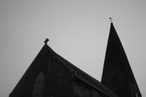
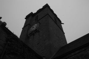
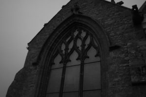
On Sunday the 15th of October, I plan to photograph as many churches as I can from outside in order to create a typology of churches. This will give me experience with photographing churches and discovering what churches are the best buildings to capture images of for future preference.

Due to my shoot being on a Sunday, I may also capture the services churches hold on a Sunday in order to gather more images for the future.


Documentary Photography and Truth

Photojournalism is based on assumptions that the photograph represents a one-to-one correspondence with reality, which is nearly accurate and adequate, and that the photographic image is capable of conveying information objectively.Traditional documentary believes the viewer to be a receptive subject taking in the objective information of the world through the photograph.

Photographs can be interpreted differently to how the photographer planned for it to be perceived. This can change the meaning of the images or what the photo is perceived to be for example Rorschach Inkblot test shows how different people interpret images differently and how this means different things about the individual’s unconscious mind. When you look at an image you can ask yourself whether the image is a truthful image or fiction by asking yourself questions about the particular images. Doing research into the photo and the photographer who took the image can tell you a lot about the image itself and what the meaning behind the image might have been. The photographs can be staged, which means the photographer would have had actors act out a particular scene. The photographs could also be a snapshot of a scene happening in front of the photographs eyes, which they then document.

“I have been a witness, and these pictures are my testimony. The events I have recorded should not be forgotten and must not be repeated.”

-James Nachtwey-  

James Nachtwey, Rwanda - Survivor of Hutu death camp, 1994


Propaganda

Photographs can be used as a form of Propaganda.This is the belief that Photographs are used to raise awareness (good or bad) of particular issues and can be made to represent a particular point of view. This is often used in politics, voluntary organisations and charity to promote their organisation to request support from the public. In war, governments and the media use propaganda as a ‘weapon’ to encourage patriotism and promote national interests. These images can also however change the public’s attitude or opinion on specific events happening within the world.

Aesthetics

Aesthetics is concerned with what is a good work of art, principles of taste and traditional systems of what is deemed beautiful in art. Thus the aesthetics of photography have been concerned with formal matters such as composition, subject-matter, form, medium and style. It has also encompassed questions of technique.A photographer such as Sebastiao Salgado has been criticized for anesthetising the poor and deprived through his  unique visual style, mastery of technical skill and highly detailed and artful prints which renders his subject matter almost too beautiful.

By Sebastiao Salgado


Huynh Cong (Nick Ut), Trangbang, Route 1, South Vietnam, 8 June 1972

This image was taken by Huynh Cong during the vietnam war. The Vietnam War was a long, costly armed conflict that pitted the communist regime of North Vietnam and its southern allies, known as the Viet Cong, against South Vietnam and its principal ally, the United States. The divisive war, increasingly unpopular at home, ended with the withdrawal of U.S. forces in 1973 and the unification of Vietnam under Communist control two years later. More than 3 million people, including 58,000 Americans, were killed in the conflict.

This was a chilling photograph that came to symbolise the horrors of the Vietnam War and ultimately, helped to end it. This image was taken just before the photographer saved the life of Kim Phuc, who is the second child from the left and has no clothing on her skin. She was 9 years old at the time as she was attacked by south Vietnamese planes, who sent Napalm bombs down to kill civilians. This is a flammable liquid used in warfare. It is a mixture of a gelling agent and either gasoline (petrol) or a similar fuel. It was initially used as an incendiary device against buildings and later primarily as an anti-personnel weapon, as it sticks to skin and causes severe burns when on fire.

On the 40th anniversary of the iconic photograph, she invited all the people who helped her during this time to a dinner. These were doctors, nurses, who treated her injuries as well as the photographer Huynh Cong, who took the image and also other journalists.

The photographer took the photograph, then immediately after drove the badly burned child to a small hospital, where he was told she was too far gone to help. He flashed his American press badge, demanded that doctors treat the girl.

Mr. Ut said “I cried when I saw her running. If I didn’t help and she died I would have killed myself.”

“It changed the war. I met so many American Soldiers who said ‘Nicky because of your picture, i’ll get to go home early”

http://www.thehindu.com/news/international/The-photo-that-changed-the-course-of-a-war/article12855030.ece


ANALYSIS:

The photograph ‘Napalm Girl’ is a picture of young children running down a road in Vietnam on June 8th 1972. The children all have a look of sheer terror and fear on their faces, and it seems as though they are running away from something horrific. Behind the children there are some soldiers, who do not look phased by what is happening, and who aren’t helping the injured children in any way, but instead herding them down the street. There is a huge contrast between the two different subjects. The children are helpless and hopeless, screaming for aid. They look small and weak. The soldiers however are tall and powerful, with their guns and helmets. They are not injured and are not conveying any emotion. In the background, it is clear that there has been an explosion of some sort as there are clouds of smoke billowing from the ground, and the area looks destroyed and damaged. The main subject in the picture is a naked young girl, who looks like she is in extreme pain. This girl is Kim Phuc.

There were a few issues associated with this image, one reason he claimed the photo had been fixed was that he thought the journalists and photographers were trying to make the war look more horrific and dramatic than it actually was. The photo had not been fixed in the slightest. This was very much evident when interviews were had with the Kim herself and stories told about her.

Another issue that was raised about the photo was the fact that there was a naked young girl in it. The photo was taken in the 70s and there had not been images of naked children released before this. However, you can argue that the image was too important to be hidden from the world. It showed the victims of war, a war that had not before been thought seriously about by anyone else around the world except the victims of it. So even though the sight of the naked young girl could have been an issue, it was overlooked, as the story behind the picture itself was far more important.

The image is a snapshot, showing what the photographer had seen in this particular moment. The theme of the photograph is war brings pain to the innocent, which is an extremely powerful message.


This is Kim Phuc now as an adult

Interview with Kim Phuc


“Based on your chosen themes, FAMILY or ENVIRONMENT make two images, one that you consider truthful and one that is not.”

This image has been manipulated using photoshop, the original photograph is of the upper arm, cutting off at the elbow, I decided to insert a hand just after the elbow, which was included in a different photograph. This is an example of manipulating the truth in an image, to make it untrue. This was inspired by Asger Carlsen as he uses different parts of the individuals body to create an image. I them experimented with photographs I had taken myself and used varies parts of the same body to form an image. This is taking the truth and making it untrue by adapting it. This is something that is seen as abnormal to this generation, however in the 60’s this was common as the government had persuades pregnant woman to take a pill to help the babies growth. This lead to babies in that generation to be born with shortened limbs as a result of this drug thalidomide, it was told it would help the woman with their morning sickness. The drug impacted the fetus, leading to thousands of woman blaming themselves for their “thalidomide babies.” This image I have created therefore is partly true and partly untrue, which shows how hard it is to claim a photograph to be true. This image represents something that was true, the “thalidomide babies.” However the image itself is not true as it has been manipulated to look this way.

Examples of Asger Carlsen’s work:


Drowned Syrian boy

A paramilitary police officer carries the lifeless body of Alan Kurdi off the coast of Bodrum, Turkey, where he was found. Photographer: Nilufer Demir from Turkey’s Dogan News Agency

Can change the world or change people’s perception?

All quotes taken from Photographs won’t change the world by Lewis Bush

In the summer of 2015, this three-year-old Syrian boy of Kurdish origins and his family fled the war engulfing their country, hoping to join relatives in the safety of Canada. They were part of a historic flow of refugees from the Middle East to Europe this year, and they followed the dangerous route taken by so many others. The family crowded onto a small inflatable boat on the beach of Bodrum, Turkey. A few minutes into the journey to Greece, the dinghy capsized. Alan, his older brother Ghalib and his mother Rihanna all drowned, joining the more than 3,600 other refugees who died in the eastern Mediterranean this year. This is where Alan’s story would have ended, were it not for the work of a photographer.

This photograph shocked the population and changed their opinion on war and the killings of thousands of civilians. This provoked the debate of whether an image could potentially change the world or change people’s perception. ” Great achievements have been piled around the totem of photography.” This can result in “environmental awareness” and “conclusions of armed conflicts.” However, a photograph itself “bits of paper” can’t change the world but photographs can change people’s perception and their views and opinions can change the world. When seeing an image, a viewer can not possibly claim that seeing this photograph of a drowned child is the same as experiencing the situation with your own eyes, but knowing that their is a drowned child, who has died as a consequence of situations which might be more “within our power to change,” This means that by the public voicing their concerns, changes will have to take place as the activities will be frowned upon socially, which would decrease the amount of countries participating in war. The photographs “present the idea that things are happening, or exist, or are possible.” This brings the worlds problems to the public eye, photographs have the power to “change the ways we see and understand the world and want to act in it.” However, some images are capable of influencing for the worse, of reinforcing negative attitudes and unrealistic expectations about the world, which  makes the influence on the public a negative thing as some images may lie or deceive the public by editing the image to make it look different to how it was seen through the eyes of the photographer, leading the public to believe the photograph is real. I personally, do not feel this is the case for the Syrian boy as I do not feel this is a staged image. However, the image could have been cropped or focused on that particular part, we as viewers do not see the full scene making it difficult for us to judge what is really happening at the scene. The beach could have been filled with washed up bodies, it may not have just been him but we do not get to see this, we are only shown what the photographer wants us to see. This makes it hard for the public to really know if an image is a truthful images or a staged image.

A photograph cannot change the world we live in by bringing it them to light, however “the real impetus is on us to respond to the things we feel when we view certain photographs and to decide to make things change.”  This is what makes photographs so powerful. It’s not what the photograph consists of but it’s how it makes people feel and how it makes people want to react and change. The story got published in varies newspapers, a sand sculpture had been made on the beach in his memory and a cartoon characters were made all in his memory as it hit the hearts of many people.  In conclusion, images themselves cannot change the world and things going on in it, however it can make people feel something resulting in them making a change to the way they live, changing the world they live in.

Photography and Truth

Truth or Fiction? 

Photographs can lie by being manipulated, in order to change or influence our opinion of something.  This therefore poses the question of reliability.  Some cases I would argue that these photographs trying to manipulate our opinion are reliable because they want to show us the truth which changes our opinion.  However more often than not, photo manipulation often exaggerates, slants the truth in favor of the message the photographer is trying to convey.  This can be potentially harmful as it leads to the population to take the photographer’s opinion of a certain event as truthful, even if it is shot in the style of documentary photography.  Photographers could argue that they are simply taking what they see through documenting the world.  However the photographer is documenting the world in a way in which he perceives it, leaving out certain elements that contradict the documenting of his view on the world.  Therefore we have to consider before acting on a certain photograph of how useful an image is in helping us find out about something rather than treat it as factual trust.  This is because the photographer may for example being trying to express his political beliefs in the photograph which we have to acknowledge before we treat it as accurate.

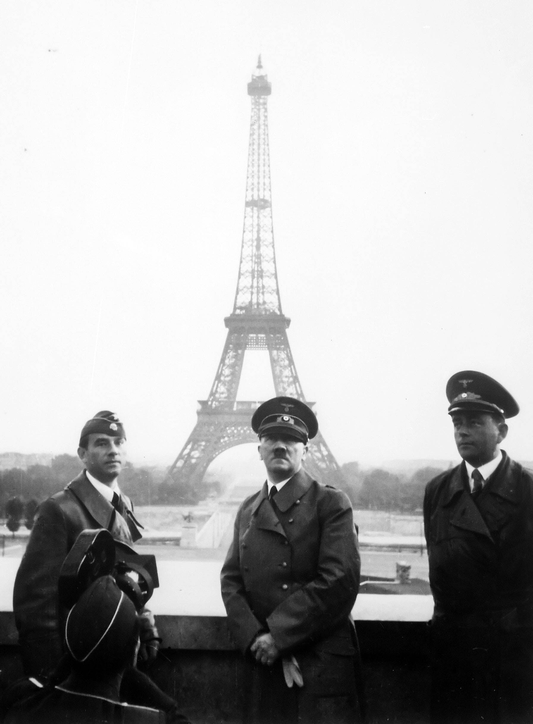
Essentially the date of the photograph is very important in the sense that as humans from different generations look at a specific photograph, the morals of each generation change as time goes on and so the opinions towards the message the photographer is conveying  changes.  For example in the photograph below, at the time in 1945 and in America it would of been seen as a patriotic shot celebrating the death of fascism in Europe.  However in more modern days, facts have come to light over the years of what the US army and her allies did when invading Nazi occupied Europe and so the photograph leaves out the context in what the US soldiers did in order so that one day, they could raise their flag that is portrayed as so patriotic.

Furthermore in respect of this last point, it is important to note what the photograph is showing, and how much, whether it be a lot or a little which ultimately helps affect our reliability rating towards a picture.  In considering the provenance, it helps the viewer determine not just for example the photographer’s motives, but the wider context in how the photographer’s motives fit into the opinions of society, which helps us to understand whether much of society agreed with the photographer or not.  Therefore the location  of where the photograph was taken is important but also where the photograph was published.  The location of the photograph which was taken in Japan, from a Japanese man’s perspective would view the photograph as these imperialists invading their country.  Where it was published, in America, the general view of society would be one which is proud and honored that shows the US major role in the world.

This allows us to get onto the topic of propaganda which was particularly important in warfare in the early to mid – twentieth century which could be an example of this photograph, whereas in nowadays we see the levels of blunt propaganda as more unacceptable because propaganda in our generation is much more subtle.


Image result for raising soviet flag on the reichstagImage result for hitler eiffel towerImage result for Japanese nuclear bombing

Now I wanted to have a go at taking some photographs which may not tell the entirety of the truth in terms of their content.  I chose to shoot some relatives walking with a slow shutter speed, adding a blurred effect that would later mean the viewer would question who the identity’s of these people are.   By altering the photograph in a way so that the presence of these people is mysterious, the truth is tilted in the sense we don’t know the identity, the purpose, the reason as to whay they are there and what they are doing.

Best Photographs:

How much is too much?

Photographic manipulation has always been prominent within the world of photography since the first picture was taken, dating back to 1826 or 1827 by Joseph Nicéphore Niépce. Although photo-editing programmes, for example, Adobe Photoshop weren’t invented or accessible; image manipulation was achievable by editing and being selective of what you choose to capture or how you processed the image in the light room. Fundamentally, I believe when the image is deferred from what the raw photograph portrays or otherwise known as the ‘truth’, the meaning and concept of the image taken is lost. I comprehend multiple photographs may be used in a combination to form a unique concept; however, I feel this process becomes its own, individual art form and moves away from photography. Crucially, restricted editing is acceptable for the world of photography, manipulating image colour, for instance, putting images into black and white, is an acceptable process as long as the photograph portrays the truth behind the lens.

View from the Window at Le Gras. Click to enlarge.

The work of American photographer Ansel Adams is a demonstration of early photograph manipulation, as he created black and white coloured filters to cover the lens of the camera. The variation of colour enables us to interpret the image in a different manner if in comparison to the coloured version, however, despite the colour difference, the image depiction is still the same but the variation may help the photograph enhance the concept they’re trying to portray. The technique stated is an organic and traditional way of image manipulation, preventing the image from becoming something that it is not, just merely improving a concept. On the contrary, utilizing the modern day software’s of Adobe Photoshop is acceptable as long as the content of the image is not altered. I have frequently used this device for manipulating the colours and enhancing the quality by eradicating slight blurs or cropping the image, however, artists have previously taken it too far and deferred from the truth.

Image result for ansel adams

Image result for ansel adams

Another early instance of camera manipulation is the “Man on the Moon” controversy of 1969. It is reported that the United States’s NASA hoaxed the event by setting up a fake studio and destroyed evidence in order to compete and beat the technological advances of the USSR in what was known as the “Space Race”. In this case, I believe that the US have created this staged scenario to create and record a breakthrough event, however, due to the severity of the lie and how this would have fooled people globally, it is morally incorrect. Fundamentally, the principle of changing what the lens of the camera sees is in my opinion, a valid manipulation of photographs, so long as the images portray a specific meaning or concept and maintains the truth of the setting.

Image result for man on the moon 1969

Personal study // Body image

BODY IMAGE

Body image is a person’s perception of the aesthetics or sexual attractiveness of their own body, according to Wikipedia. The phrase body image was first coined by the Austrian neurologist and psychoanalyst Paul Schilder in his book The Image and Appearance of the Human Body. Society over time has played a huge role in creating and developing the ‘perfect’ body image. The world has placed great value on these standards so much that a person’s perception of their own body is  based on society’s opinion on the  ‘perfect’ image.

Society’s view on the ‘ perfect’ body image has changed throughout history. On a website called Medical Daily, they show how this image has developed and progressed. They initially start in the 1800’s, with the ‘Rubenesque figures’. Peter Paul Rubens, a 17th century Flemish Baroque painter, was famous for his depictions of plump, sensual women. Up until the 20th century, curvy, voluptuous women were considered ideally beautiful in the U.S. and Europe. The image below is a painting by the artist Peter Paul Rubens.

The Bathers
Renoir’s paintings also depicted rubenesque figures, a type of body that was considered ideal in the 1800s.

In the website, they talk about how influential figures throughout history have inspired and changed the ideal body. For example, in the late 1800’s,  Lillian Russell, a famous actress and singer was chosen to represent a women of ultimate beauty. The image below shows her big-boned and heavyset posture that was a popular trait in the 1800’s. This popular body image is sufficiently different to the ‘ideal’ body image of modern day. You can see just how much society has changed over time.

Lillian Russell

Another famous actress that influenced the changing ideal body type was Alice Joyce , who was part of the flappers during the 1920’s. The flappers were trendy women with bob hair cuts and slender, lean builds.  They were confident women who smoked, drank, danced and voted. Women were becoming stronger and more powerful in their roles. The term “flapper” first appeared in Great Britain after World War I. It was used to describe young girls, still somewhat awkward in movement who had not yet entered womanhood. In the June 1922 edition of the Atlantic Monthly, G. Stanley Hall described looking in a dictionary to discover what the evasive term “flapper” meant:

The dictionary set me right by defining the word as a fledgling, yet in the nest, and vainly attempting to fly while its wings have only pinfeathers; and I recognized that the genius of ‘language’ had made the squab the symbol of budding girlhood.

The photo below is an image of Alice Joyce. Her slender, lean body was the ‘ideal’ body type during the period. Even though its only been 20 years since the end of the 1800’s, society’s opinion on the ‘perfect’ body type has already progressed and developed vastly since the rubenesque figures. The ideal body image was becoming more skinnier. Alice Joyce

During this time, men also had the pressure of body image. Women were behaving more and more like men, by taking up their roles. This was because by now, women could vote, drive cars, choose who they married, and even hold jobs that were previously allotted only to men. They began wanting attributes to define their masculinity. Mustaches were now the new trend fro me that would last for many decades. Here is an image of a sheet music cover design that symbolized that  women were gaining more freedom and success in society, while men needed to cling to some physical semblance of masculinity.

We Must Grow A MustacheDuring the 1940’s to the 1950’s, the ideal body type was the ‘Curvy Pin-up Girls‘. Marilyn Monroe was the pinnacle of attractiveness in the 1950s, proving that a fuller female body was considered more beautiful than thinness. Society was again changing their view on what the ‘perfect’ body image was. The ideal female body may have been heavier back then, but it was just as scrutinized, criticized, and retouched as it is now.Take pin-up girls, for example: glamorous models or actresses whose photos were mass-produced and meant to be “pinned up” on a wall. Pin-up girl photographs were also turned into illustrations that were highly retouched and stylized. Similar to using Photoshop.  During this same period, society was seen shaming skinnier girls in the same way mass media shames fat figures now. Men wouldn't look at me when I was skinnySkinny girls are not glamour girls

Both these images are advertisements from the 1940’s  and 50’s. There were many advertisments during this period that shamed women in many ways. It was always about body types, but also offending their character and traits. By society’s opinion, women were never good enough, and could always improve their appearance in someway. This is similar to modern society. During the 1960’s, famous women again adopted a a slender, almost emaciated look. Curves weren’t as important as being rail-thin and elegantly fashionable, like the tiny model Twiggy and the slender, doe-like Audrey Hepburn, both of whom were fashion and body image icons during this decade.

During the 1990’s, this was when the unhealthy obsession with thinness began. Kate Moss, a famous model began her career with a series of Calvin Klein photoshoots in the 90s that started the waif heroin-chic look and glamorized “thinspiration’. Kate Moss created the phrase “Nothing tastes as good as skinny feels.” Men were also under pressure to have their bodies strong and muscular. Although society has continuously pressured women and men to change and develop the physique to suite the ‘perfect’ type, now a days there are many movements and organisations created that promote body positiveness. They plan on  overturning these outdated standards for women, and represent bodies of all shapes and sizes in the media.

INITIAL IDEAS // BODY IMAGE

For my personal study, I want to explore different ways we can represent the human body. Within the project I want to show how body image has changed throughout time. The ‘ideal’ body image has constantly been developed and manipulated to suite the views of society and the media. I aim to be creative with my shoots, while at the same time, showing through my images the development and manipulation of body image.  I want to do a wide range of shoots containing completely different perceptions of the human body. Although I don’t want to focus my whole project on the issues of Body Image, I am including some aspects of body dysmorphia within the context of my project. I mostly want to be creative with my ideas, but at the same time include meaning and context.

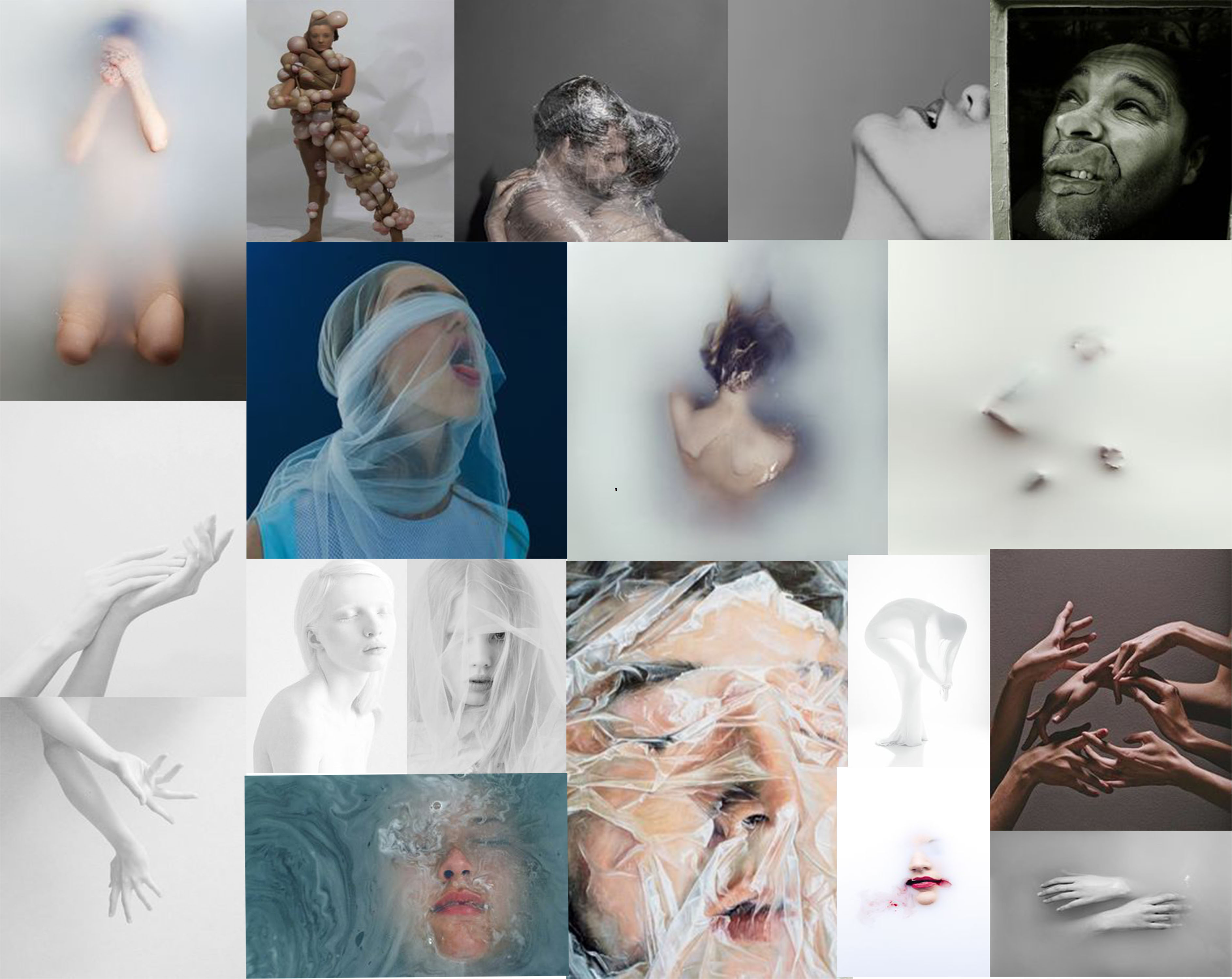
I will be researching many artists and photographers who will influence my work, such as Jenny Saville. I aim to Incorporate their ideas into my own shoots, but at the same time include my own concepts and contexts. I will explore in many ways how the human body can be represented and perceived. I want to include my love for art within this project by using and working with different materials, including paint, Clingfilm and other objects. At some point in the project I want to create some sort of suit or outfit that someone will wear during a shoot. The point of this is to express and symbolize how the ‘ideal’ body image has changed through time. It will also represent people dealing with dysmorphia, and how what they endure. The images bellow are ideas that I aim to incorporate within the outfit.

Another view I want to incorporate and research within my project is the use of the body to represent emotions. The body is an expressive tool and I aim to photograph it in a creative way symbolising certain emotions. I believe this will end up being the main aspect of my project based on body image.

Memories of Childhood / Tableaux Shoot

Childhood Nostalgia

After researching the work of a couple of tableaux photographers, being Alfonso Almendros and Maria Kapajeva, I really wanted to get underway with my own tableaux photoshoot, however, I did not feel like I wanted to produce a series of images in the style of either Kapajeva or Almendros because I wasn’t completely attracted to their work in order to implement their style into my own example.

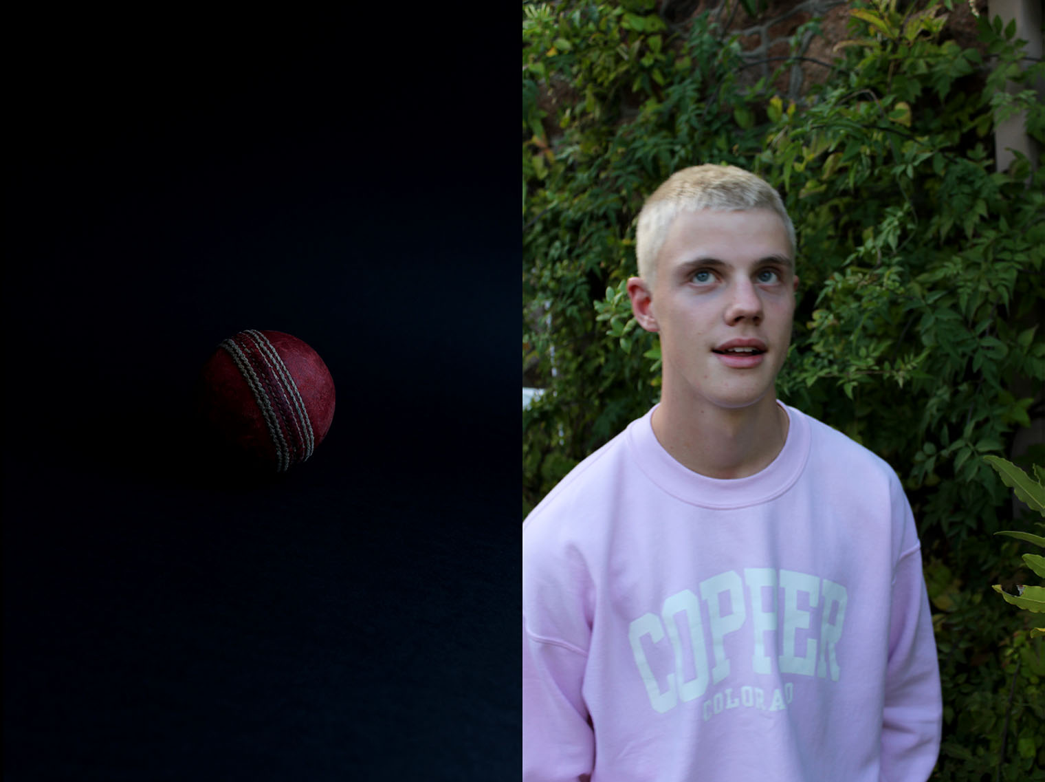
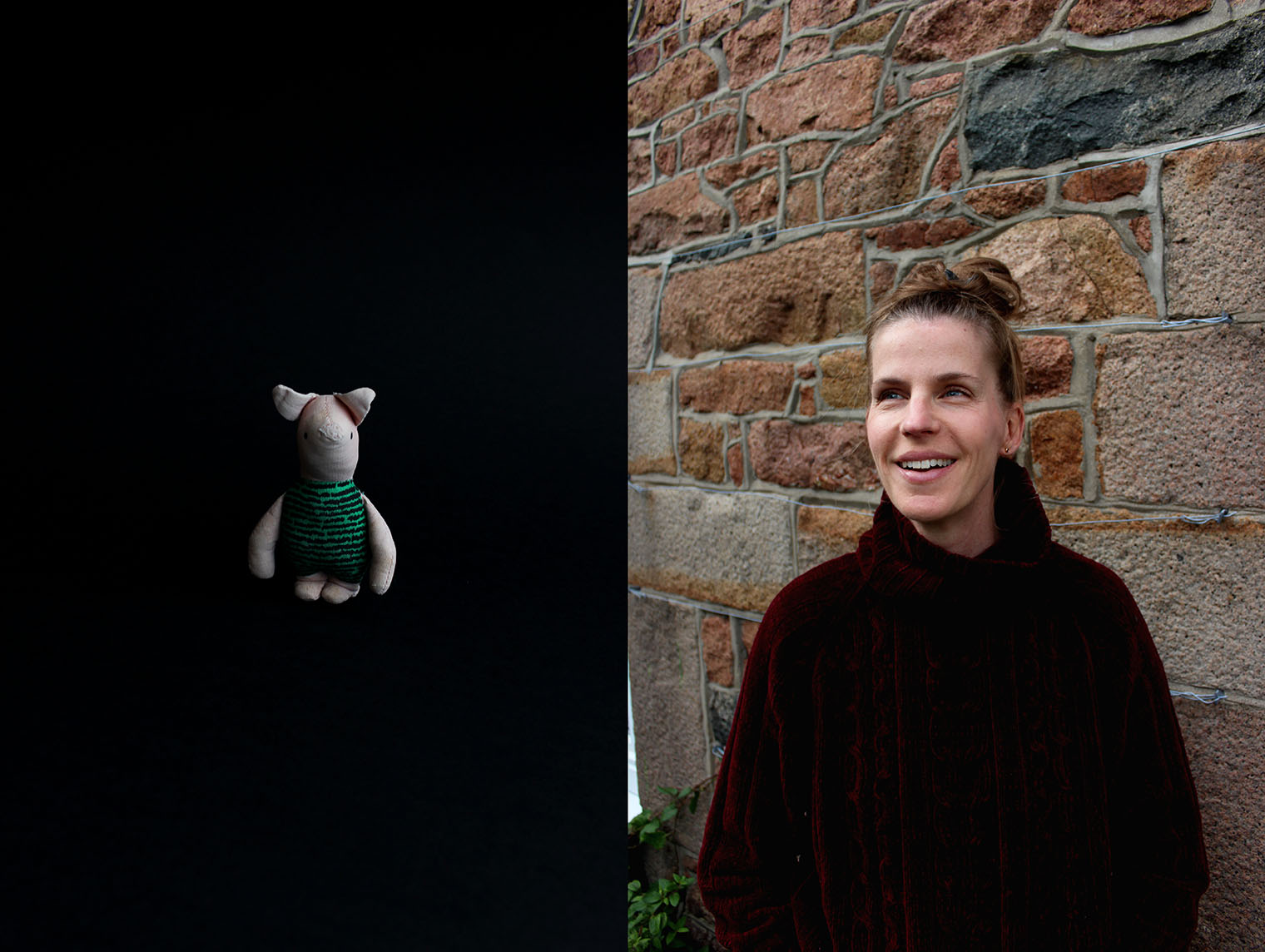
However, I had a look through a photo book which present in the classroom at school. It was a book entitled ‘Where Mimosa Bloom’ by an artist named Rita Puig-Serra Costa. In her book, she also specialised in aspects of tableaux photography in the form of photographing objects – still life as such and portraits of the family members and then pairing the images together. However, the meaning and concept goes beyond what the simplicity it sounds like. The objects photographed in a studio style as opposed to photographing them in their natural environment or where she found them are then digitally directly placed in this photo book on the opposite page of a portrait also taken by Serra-Costa. It seems as thought the portraits are of family members and the objects paired with each portrait is relevant in some way to the subject of the portrait. Although there is no direct explanation or link between the two, a narrative is drawn by the audience where we provide out own explanation of what could be the intention of this – there is obviously a meaning of the object in relation tot he subject but this is not actually explained. I found this very intriguing and eye-catching in its minimalism and wished to attempt a series of my own in the style I witnessed by Serra-Costa in her book ‘Where Mimosa Bloom’ which is about her family and place they live.

The primary results are below. I first attempted by completing my own memory and I will then go onto do the same process with my other close family members, including my mum, my step-dad, my nan and my girlfriend. This will provide a very compete and cohesive set of image which tell a visual story of not only my childhood memories about the loved ones around me.

Explaining the Series' Process

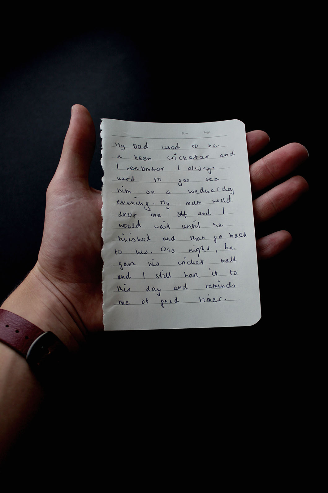
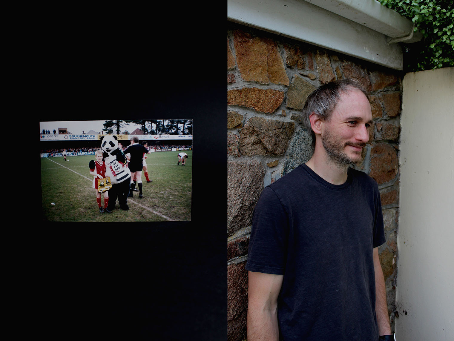
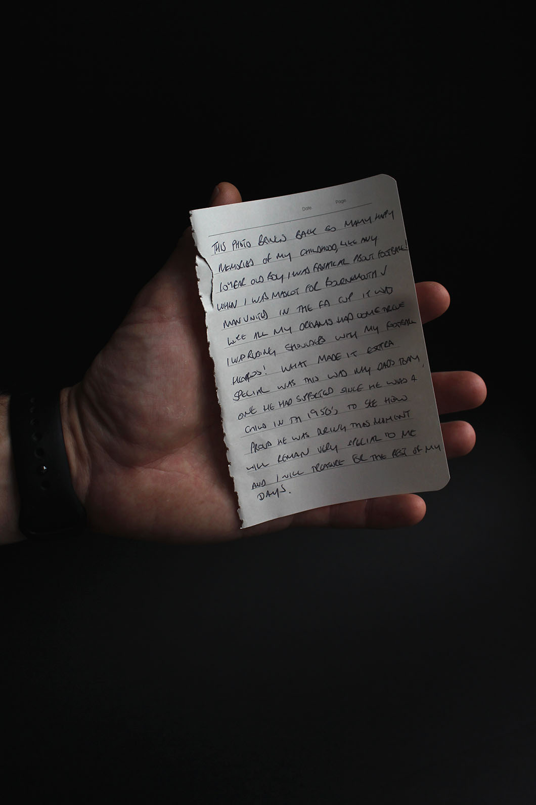
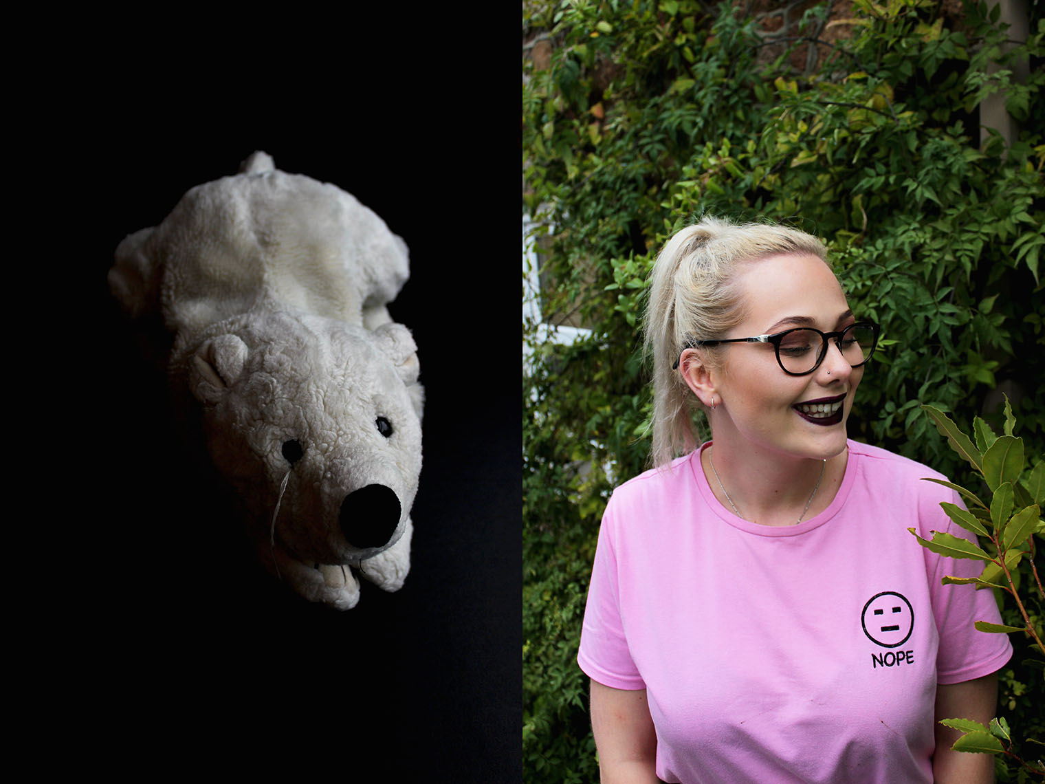
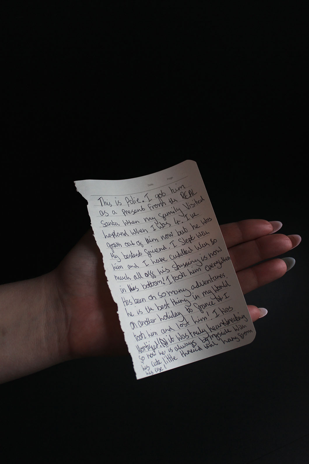
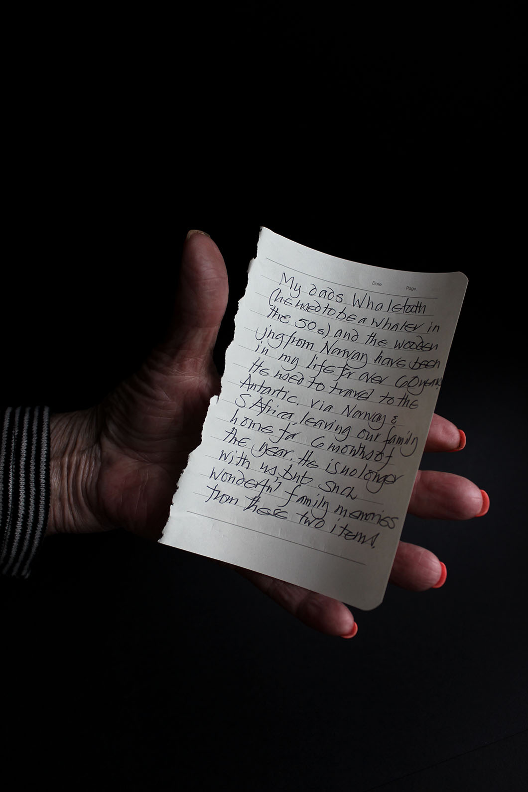
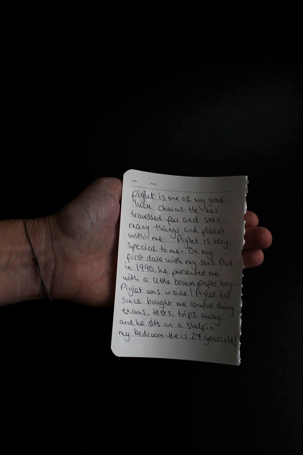
Here are the images I created in response to Rita Puig-Serra Costa’s images from her series ‘Where Mimosa Bloom’. My aim from this series I have created was to show my own family through a composition and the juxtaposition of old archives in comparison to contemporary, staged portraits of their life now and how they look back on to the memory they have shown. I have presented nt only my own childhood nostalgia but the others around me to create a cohesive narrative accompanied by very thoughtful inserts of written notes by each individual to he;p the audience understand what is going on in the photo. Each individual has explained why they have chosen the object they have and what it means to them as well as the memory it brings back. I attempted to show this connection to a particular object even further in the portraits where I asked my subjects to create a facial expression/show through their presented emotion the feeling the object gives them when looking back on its worth of their childhood.

To create the studio-like images of the objects each subject handed me to accompany their portrait, I set-up a mini studio in my room suing black card. I collected a couple sheets of black card from my school to take home t allow me to produce to the still-life images. In my room I have two very large windows both with very large window sills as the windows are almost like alcoves in that they are very far into the wall. This allowed me to set up the black card on the window sill and this was perfect as I allowed for lots of natural light which resulted in my objects being perfectly lit and the conditions for this were great when I would come back for school each day. I created an infinity curve using one sheet stuck to the wall and then competed the set-up with another sheet on the flat surface and I would place each object on the curve and then adjust my camera settings accordingly to account for the lighting already provided which obviously illuminated the right side of each object and this allowed for an interesting look to each image where the left ide would be in the dark and I would aim to under-expose each very slightly to get the best effect of the black background. For the notes written by each subject, I got each of them to hold their own note with their hand so it adds a personal touch and I would photograph this against the black background also.

I don’t really feel a need to explain the actual chosen object of each person because the explanation in the words of the subject themselves is provided in written form and I feel like my words won’t do the memory justice because a memory is a very personal and it is best told fro the perspective of the person with that memory. I have attempted to get as close in to the note as possible to it is legible at the same time as keeping the hand in frame and I hope that the handwriting is not too difficult to read.

The Images
Jude

Mum

Mark

Lucy

Nan

Alfonso Almendros vs. Maria Kapajeva / Tableaux Portraits

Now I find myself looking at tableaux photography, I have chosen to study the pairing of these two artist by looking at each of their work individually and then comparing and contrasting their photographs by looking at their style and aims of their series of images. I have chosen to look at Alfonso Almendros and Maria Kapajeva because I feel like their is something very unique and perhaps quite sinister and unnerving abut each of their series of images which relate to theme of family, and in some way also underpinning the theme of environment also. After looking at Almendros’ series entitled ‘Family Reflections’, I found a quite strange connection I had with the series in that it made me feel a little uncomfortable looking though the photos but it also made me question the message behind each of them resulting in an enjoyable experience as interrogate back and  fourth with myself what the series’ attempts to represent. I will expand n my thoughts on his work later on this post. As well, Kapajeva’s series ‘Family’ again possesses an effective sense of eeriness due to the lighting techniques used and the way she divides two halves of the each photo down the middle to provide seven different images for the series. The split down the middle of her photos which is a recurring theme in all of her images makes us feel as though we as the audience are looking at new different images in what is one frame but divided t sow two different stories – one of the subject in one half an the other of the subject in the other half. One attracts me to the works of both artists is the captivating way in which they have addressed the style of tableaux photography. As well, I love how Almendros’ series seems very, sometimes overly staged in this one environment which you can see throughout the works as it does not changed where the actions in several photographs seem very dramatised. On the other hand, there is Kapajeva’s catalogue of works which does not seem at all romanticised in the actions performed in each image, instead it seems very natural and, almost like documentary imagery.

An image from Almendros’ series, Family Reflections

Both artists take a tableaux approach, however, I believe there is a fine line, which is near enough blurred between what tableaux imagery and documentary imagery is the way they look. There is very extreme tableaux photography where there is several subjective and people within the frame accompanied by film-like locations and props; mise-en-scene is vital in tableaux image. However, in documentary, although much moire informal, with the aim to capture an unexpected, unplanned moment in time, the look can be very similar to tableaux photography. Much like in the image above, however, we as the audience are aware that the photographer has arranged this shot and for the man to stand, naked in the middle of a road. Furthermore, both styles do provoke thoughts from the viewers which ask what the meaning behind an image was because as the audience, we are very much unaware of the happenings ‘behind-the-scenes’ as such. The aim of both styles is to give an insight.

What I like about the two series I am about to look at is the evident theme in each image. This contributes to the very powerful images that speak for themselves. The types of photographs set up are very captivating and in each photographers works based around the them of family you can see the very careful thought process that went in to making each image and together, the images in both artists selection complement each other.

Alfonso Almendros

Alfonso Almendros is an emerging photographer from Spain who lives and works in Helsinki. In a published article on photography website, GUP, they talk to Almendros about his work, Family Reflections and the described his work in a short paragraph which encapsulates the series and what it is about. They said: “Family Reflections captures the parallel of the now and then, each image defining one basic concept – the roots, obsession with death, virility as a symbol of authority, glorification of maternity or the sacred character of some objects. A series about family, struggle and intimacy that creates a parallel reality – words dissolve and become slightly dark, incomplete, almost invisible. The photographs evoke nostalgia, solitude, melancholy among others.”

Particularly in Alemendros’ work, you can notice the style of his work due form the colours used. This would have been a conscious decision, as well as the location used. He takes each image in the same location – a room in a house and you cans see the same furniture as you progress through the different images which would have appeared beforehand. Throughout the series, there is a division of the main series achieved through other images which can be classified as anomalies, in that they don’t fit the theme as such due to the change of location and subject. This is an effect I really like and hope to use in my own study.

A Collection of Images from the Series


On his website, Almendros does not provide any explanation about the series and the meanings behind his series, Family Reflections, however, GUP interviewed the photographer on the release of his series which provides answers to why he produced the images and what they mean.

Looking at the grouping of the images he has produced, I can draw my own conclusions from them but it is likely to be very far from the actual meanings and concept for the construction of the work. However, I am aware that the theme is based around family, and, form the title, I can conclude that Almendros is perhaps looking back at his own family, which, at the time of him making the series, may not have existed and it is therefore an homage to the relationship he may have had with his family members.

Alemendros states that’ Family Reflections’ came at a point in his life where he was full indecision. He also says “after living abroad for a few years, I decided to go back to my hometown and spend a few months with my family. There, I found things that had changed during my absence.” This was what spurred his choice ot make a photographic series of works relating to the changes that occurred in his environment that he remembered in a different way before his absence. As well, he wanted to document the change in his family members attitudes and behaviours since coming back from being abroad.

Alfonso Almendros also states that his father was a photographer beofre he ws born, however he died when Almendros was two years old but he cameras and photographs remained in their house – influencing his need to pick up a camera and begin shooting.

Image Analysis 

This, for me, is one of the most powerful images in the whole series because it is so unusual and quite difficult to decode because of its eeriness.

However, if I was to attempt to decode the image, I would suggest that the dead bird could be a metaphor for the relationship between Almendros and his mother and sister after coming back from travelling in that it is now non-existent and itself is dead because he feels as though he doesn’t have that previous, special relationship with his family members but his absence has resulted in them all becoming distant and therefore, when he arrived back in Spain, he came back to something that change dramatically to what he remembered and to him, he may have seen this as very upsetting that the previous memories stored in his mind did not exist when he cam back to his hometown. Now the relationships has to be rekindled and re-created in order for the family to become attached and ‘as one’ again. I believe this image is well representative of the series title as Almendros is looking back and reflecting on what had previously been part of his life – a paramount factor of his happiness when he had that special bond with his mother and sister which now, as he talks, is different as the environment around him and the people he loves has changed.

Talking about the environment, this is the first image of several in the series and it is a great image to have as the opening frame as it sets the mood and atmosphere for the images to come. This image is taken in a room which is a recurrence throughout he series as you notice ht dame wall beyond the subject in most of the images. It is, what looks like a barren and dark room which possess no emotion and it seems very melancholy, deriving the same feeling from audience – a feeling of emptiness and hardship in a way because of the theme throughout of loneliness and trauma, regret, nakedness. A whole array of emotions make up this series and contributes to the whole mood.

Looking at the technical factors in the image and how it is composed, the use of depth of field is used to full extent to make the image very visually pleasing. There is a very shallow depth of field where only the foreground is in focus and it is focused solely on the bird lying just over the edge of table just off the center of the frame. Everything else gradually become blurred, whether it be to the right of the bird where the bowl on the table is out of focus or behind the bird where as you look further into the image, the table cloth comes more and more blurred as well as the glass behind This effect leaves just the bird in focus and it has a great effect and forces our eyes t be drawn to the bird only.

The colour within the images are very similar an there is a very stimulating colour palette because although they are all very bland and dark, they all work very well together. There are different shades of brown that complement the off white of the table cloth and the yellow of the bowl as well as the brown bird. The colours all seem quite faded and it is create a vintage effect. This was perhaps the style of homes in Spain. There seem to be a source of light coming from the right also which illuminates the frame.

Maria Kapajeva 

Maria Kapajeva is a Russian artist from Estonia based in London who left her career in Economics behind and moved to the UK to get her BA and then MA in Photography at University of Westminster.  Her work has been exhibited internationally including Belfast, FORMAT and Guernsey photo festivals.

In her work Maria focuses on the issues of women representation in contemporary society and cultural and social stereotypes around that representation – shown through a very strong message in her series ‘Family’ In her practice she expands the borders of photography working also with found images, video and textile crafts.

I am Usual Woman, 2013 © Maria Kapajeva

Detail from I am Usual Woman, 2013 © Maria Kapajeva

For this piece above entitled ‘I Am Usual Women’, the used photographs on the quilt were found on the matrimonial websites specially created for Russian women to find a Western husband. The images for the quilt are carefully selected from the ones which were shown on these websites as ‘the best samples’ of how women should be photographed for the best matchmaking. She looks at the fantasies of Russian women and is one of several works she has produced which relate to the role of women in society and how the are perceived to be – that they are often objectified due to their gender and therefore sexualised but also seen as the leaders of the home-life in that they do the work to cater for the husband. 

About the series ‘Family’ taken form Kapajeva’s website:

“The series is an exploration of family as an integrated institution within its problems such as miscommunication or misunderstanding between its members. During her research she collected a lots of stories from people about how badly the misunderstanding could end up because of lack of an essential communication in the families on daily basis. Maria selected seven most common scenarios and interpreted them in her images. Each story consists of two separate photographs placed close to each other for an installation. The physical division between two prints visualise a distance between family members who are involved in each story. Even though Maria staged peculiar scenarios, she is open to other interpretations by the viewers. Thus, each pair left with no caption to give a space for people to find their reading of the set-ups.”
A Collection of Images from the Series

As well, it is evident that lighting is important feature of Kapajeva’s work, in particular, this series which focuses on divisions of family life and relationships between family members, as well as contrasting characters and how these clash and produce an “empty family” which has no cohesion or bond no more. She illuminates each subject in each half of every image to show the spotlight on them and this is also a popular technique in most tableaux images. It creates shadows and they high key lighting shone upon the subject’s face puts them in spotlight of the audience – under pressure as such.
Kapajeva’s work is very well produced as she has created a consistent series of images that all work together in harmony to create a documentation through tableaux photography that speaks to the women of Russia through the visualization she provides of family life in terms of how a wife and husband and their potential kids may behave in their home. Each image int the series is divided through the middle by cropping one side and then the other to create the effect as if you are looking at two different images but then on closer inspection, is one because the two sides often work together to show tow different environments with different subjects in, however, a hint that they are a whole image maybe given through the body positioning of the subjects or where they are looking. Although the environments in both halves often seem different, they produce a contrast of the characters in them and the audience are forced to see the two images combined to create a narrative. Her images often follow the theme of showing a husband and wife and their physical and mental divide and breakdown as they may begin to become two as opposed to the previous one harmonic couple the once were. This is also backed up by the physical divide of Kapajeva’s images.

Image Analysis 

This is one of the images form the series and is one of my favourites due to he complete contrast ad powerful and evident message it is trying to get across.

Like I mentioned above, it sows the physical; divide between family life between a husband and wife and then often the child involved as well – in the frame – the child glued to her mother’s side – reiterating the desire for children to be attached to their mums at the early stages of their life as they feel safe mum due to the connection built with them form birth. It creates this sense of fragility and preciousness – that this child possesses and she is at the fore front of everything done in the house and the parents’ life revolves around her. But also the fragility of family

As well, the image is illuminated on both side with the use of high key lighting on both subjects and the activity they are doing. Te women of the house is in the typical potion of doing work and providing for the others in the house. In the frame, she is doing the ironing whilst looking at the man with an expression showing no emotion – it is as though she is fed up and sh is looming in envy as the husband sits in the armchair with his beer watching the TV – he is ot watching over his daughter and it is instead left up to the wide even though is currently busy. As well, the kid is in a position of anger underneath the iron the mother is using, yet the male is not paying attention and it gives the sense that there is no communication between the two and they are at their worst where they cant bare to look at each directly and instead live their life trapped inside themselves.