Category Archives: Experimentation

Filters

Author:
Category:

Body suite shoot// part 3// experiment edits

These three images are my favorite from the last part of the shoot. I love the colour and texture that is created. The images have an eery atmosphere that I really like.  I also really like the brightness within the images. They don’t have too much shadow which is what I wanted to achieve. The colours aren’t too bright, and they are soft, pastel colours which works with the atmosphere that I wanted to create.

Even though I didnt plan this part of the shoot, I am really happy with the outcome of the images. They are my favorite images from the whole shoot. They are exactly what I wanted to achieve, and after editing them, they work really well as a set. It looks like the person in the photograph is suffocating, or trapped.

I really like the image above, because you cant see the actual body part, but you can just see the shape of it through the material. I love the look of the texture the material creates within the image. I used Adobe Light room to edit these images. I first selected my favorite images from this part of the shoot and using light room, I changed the brightness and shadows. I also lowered the contrast because I wanted the images to be bright and eary.

Body Suit Photoshoot

Before the Christmas Holidays, I did a photo shoot in the photo studio at school. I decided to use this for the location because I just wanted a simple background to my images. I also wanted the use of the studio lights to highlight certain areas, and to create different shadows. I also really like the atmosphere that they created. My photo shoot was separated into three parts. For each section I slightly changed my camera settings to suit the style and atmosphere that I wanted to create.

For the first part of the shoot, I wanted to simply focus on the body itself, and the shape of it. I wanted to try and capture as many different angles and dimensions as I could. I didn’t want to focus on just one particular are of the body, such as the face. I wanted to photography every detail of the body, from the head to the feet.  I wanted to do it in a creative way though, so I asked the model to make different shapes, and stand in different positions. I tried to use the shadows within the imagery to create a different perspective.

For the second part of the shoot, I included the body suit that I worked on. I was inspired by an image I saw online, and I decided I wanted to re-create something similar. To make the suit, I simply stuffed old tights with different types of material. I also included some balloons because I liked the shape they created, and the shadows they formed. The model wasn’t able to move much in the suit because it was heavy. Therefore I wasn’t able to ask the model and move and make shapes like she did in the first part of the shoot. I still manged to get a wide range of images. I really like the look the different textures create on the camera. I also really like  how some of them reflect the light, and others absorb it. It created a completely different perspective that couldn’t be seen by the eye.

For the last part of the shoot, I simply used different materials to experiment with. I hadn’t planned this part, but I wanted to experiment with the materials to see what different shapes I could create. I really like the way the light reflects off the material because it creates a really cool effect. I’m really happy with some of the outcomes of this part of the shoot. The effect that the material creates is really cool, and works really well with my theme.

mock// experiment

Once I had edited and decided on the images that I wanted to use to display in the exhibition, I needed to choose a way to display them. I’ve chosen Severn images from a series to show as a collection. I printed the images out in the certain size that I wanted them to be represented in. I then experimented in different formations the images could be displayed in. I had to think about certain aspects that would effect how I would be able ti display my images. Each student has a certain amount if space, so I needed to think about collecting my images together so that they take up the least amount of space. I am happy with each of my outcomes because they all work well in terms of space, and which images work best together.In terms of shaping and angles, I decided that the best way to display the images would be the third one because it looks professional and pleasing to the eye.

The image below is the final chosen layout.

Archival Photos///Edited

Here is a selection of old family photos I have manipulated by using different mediums such as pastels, pencils and other objects such as plastic. Each photograph has different meaning usually relating to faith or something else I felt was relevant. I then chose the three I liked the most and put them large below. Making these photos I was trying to showing a spiritual aspect to the world we live in that we can’t always see. The shadow people represent the devil and/or demons. The red crucifix represents Jesus and/or the word (bible) basically the thing that protects us from the things that are trying to bring the worst out of us. The reason I made it red to represent the blood spilled by Jesus that we, as Christians believe that he did. This is all very metaphorical which is what I was trying to achieve. I could tell you what it means to me however I would also like the viewer to take their meanings away from it. This is why I am not going into too much detail when describing these photos. All these are meant to look as if a child has drawn them as I feature in each photo as a young child. It’s showing a darkness contrast with an innocence of a child.

This photo is showing myself being dragged away from my mum (arm in the bottom right corner) by this shadow like figure. This was meant to represent how the devil is trying to split up families, trying to make them feel separate and alone. The devil hates unity because there is strength in the that. When the accident happened, that’s exactly what could have taken place.

For the photo above I drew a red crucifix over my great grandmother. My great grandmother is such a strong women of God and has such a unrelenting faith that has been tested throughout the years but has become stronger throughout that time. My great grandmother now has dementia and throughout the situation with my mum she still knew exactly what to say. I think is because she has such a strong faith in God, he is almost telling her what to say even when her brain can’t. She gets up everyday 5 o clock in the morning and reads her Bible. She can quote scripture off the top of her head, as well as sing hymns she hasn’t listened to in almost 10 years. She has such a deep-rooted faith. In this photo she is the only one to be seen giving thanks for her food. This is why I drew a red cross over her as it’s almost as if she is has it protecting her from anything that gets thrown at her.

This is a photo of myself and my brother standing next a sunflower. Using pastels I put a shadow figure in the background off in the distance, I also used red pencil to turn that sunflower into a red crucifix. This is showing that darkness or devil waiting to strike almost haunting us. However, we are protected by the red cross that our parents helped us plant. In other words our parents brought us to church from an early age planted a seed that later was up to us if we want to carry on with church and if we believed in God. Those little things like reading bible stories and taking us to Sunday school allowed us to understand and protect us from other things that may not have been helpful to us. It also gave us enough knowledge to make our own decision. The shadow figure is there to show that there is always something trying to drag us away from our faith.

These archival photos that capture my attention. Some of them captured my attention as some of them look as if a mistake was taken. However, this is why I like those kinds of photos as because of the “mistake” it makes the photo more interesting, I also was able to put a meaning with those images. The other image do not have mistakes however they are significant. I like this image, personally I know that the people in the photo are myself and my father. However, due to what seems to be a thumb over the lens the main thing that makes a persons identity and allows to be identified in a photo (the face) has been taken away. This made me think of how since the accident a parts of our identity has changed.

This image does not have a mistake however it is significant. As it is showing my mum, myself and my brother a long time ago before anything happened. I like this photo a lot.

Plan for Constructed Realities Exhibition

For the exhibition which takes place at The Jersey Arts Centre on 27.11.17 entitled ‘Constructed Realities’, I have decided to not use images made thus far from my ‘relationships’ project for my coursework, and instead, use the images I produced from my tableaux shooting which I focused on the concept of childhood memories.


The exhibition’s synopsis is on the Arts Centre website and explains the purpose of the exhibition:

“This exhibition brings together work by Hautlieu School A-Level Photography students including their responses to a series of inspirational workshops, masterclasses and lectures delivered by Archisle International Photographers in Residence 2017 Tanja Deman and Jonny Briggs. The classes have been hosted by Hautlieu School in partnership with the Archisle educational programme and represent a range of multi-media creative outcomes inspired by the themes of family and environment.” 

The exhibition takes place from Monday 27th November to Saturday 23rd December.


I have been using the last month of my studies to construct my own personal study surrounding the ideas of relationships in my own family. In my previous blog posts, I have given a justification of what my project is about and what it encapsulates, as well as its purpose and I have been busy producing images to eventually come together to provide the main body of my project which wull also be accompanied by text and transcriptions from interviews with my parents. The project is kick-started by my parents divorce when I was 4 years old and this then branches out to a much wider topic of relationships – relationships which I have built with people who I have come to grow up with in my life during the time in which I have matured and become more knowledgeable of the world around me. From a divorce, I have experienced two different relationship with both my parents and this has affected myself as a human and the young man I am now – from which, I have built my own relationships and experienced my own interpretation of love. I now have a half-sister who is currently 4 years old and I also have a girlfriend – my first love and this concept of relationships and love, as well as underpinning topics of loss, lust, attachment and fear is beginning to make for an interesting narrative where I tell the story of my life from a child to a young man – a narrative in which I am the center point.

However, this narrative is not yet constructed enough to tell a cohesive story as I have not been working on it for a long enough period of time to feel as if I can show this as a catalogue of work which the audience can connect with. As well, because the project is based around a range of different divisions made up of the starting point of my mum and dad’s relationship, their divorce, my relationship with both of them and then leading onto my relationship with both my sister and girlfriend, I have so far, only got a mixture of these different aspects – adding to the idea of telling a confused and dislocated narrative, difficult to understand at this point. This is why I have chosen to exhibit my previous work using the relationship between people and objects to show childhood memories as this relates to how I am working now and it also shows my journey to where I am now.

I have again, shown this series of work in a previous blog post so will not explain it here and instead, this will be done more concisely and poetically in my artist statement which will be present at the exhibition for my audience to get an idea of what the work is. However, I feel like the series of work I will be showing is still very strong and does portray a message – a message of nostalgia which my viewers can all relate to and I believe that the use of portraits as well as objects, provides an interesting juxtaposition which is also accompanied by a very powerful image of a note each of my subjects wrote to explain their choice of ‘memory’. As well, the use archives is reliable to what I am doing now as I will be looking further into the idea of old memories which bring back either good or bad thoughts. I feel like delving into your onw personal, family archive can generate so many emotions and the showing the relation between this memory and the person it is related to tells an interesting story.

Therefore, for the exhibition in a couple of weeks, I have created a couple of digital versions of potential layouts I can achieve to show my images on a large scale.


In Photoshop, I created a couple of mock up displays of what I may produce for the real exhibition in which my images will be displayed on. Below is the first display I created, but realised, this may be difficult to achieve due to the lack of space we each have to present our work.
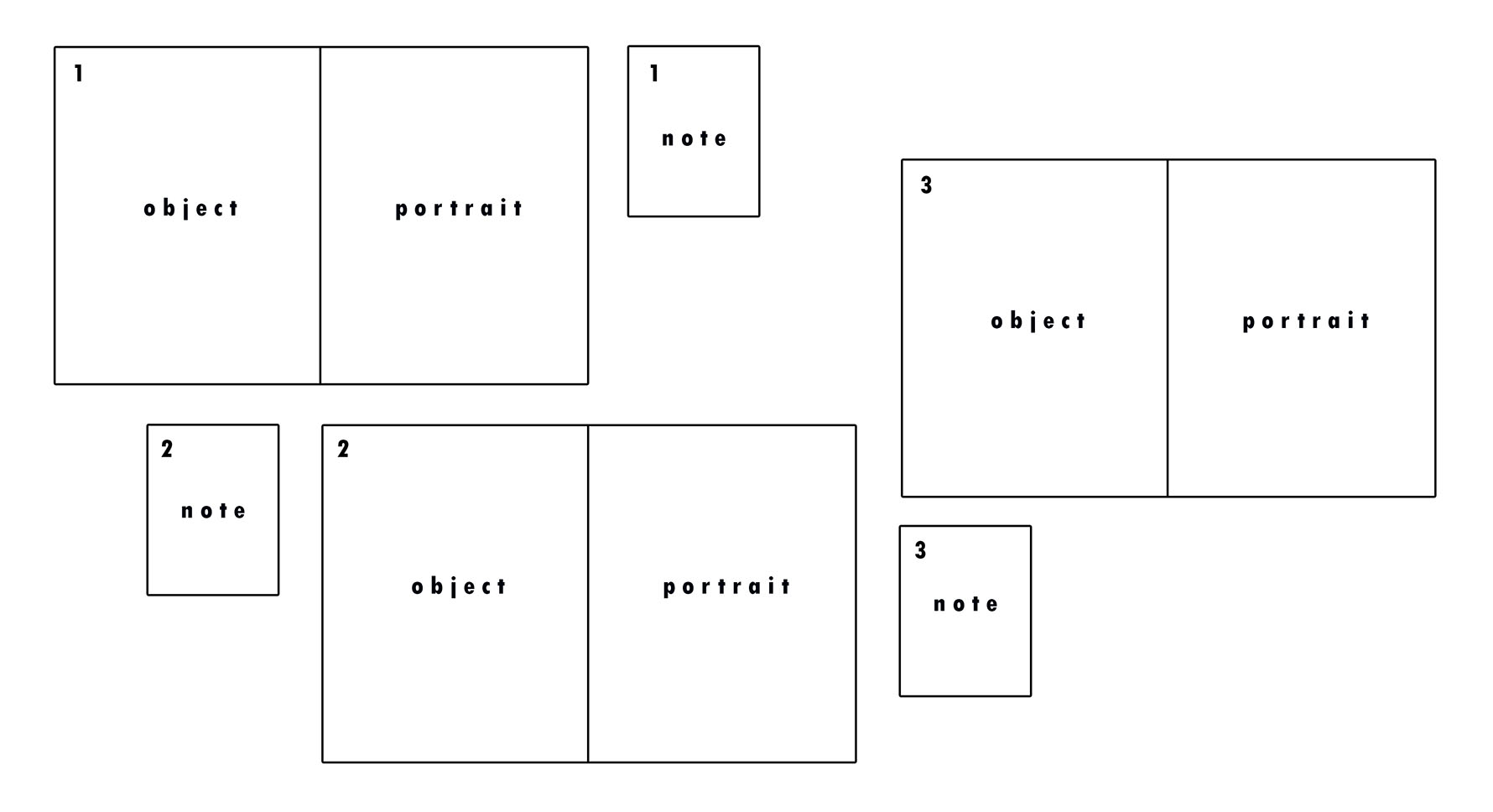
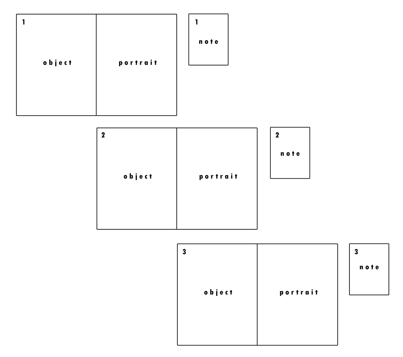
The second mock-up I produced took into account the space I am allowed and this is the display I am most likely to use. As you can see, I have also put in my images to the same set out to see what it would look like.

I intend to have each diptych below one another, creating a stair-like display as ach diptych will not be placed directly underneath and instead, to the side. Next to each diptych will be the note the subject handwrote which I then photographed in their hand. The diptychs will be A3 and the notes, A5. I hope for the outcome to be very contemporary and visually pleasing. As well as telling a story of memories as a whole, each combination of the portrait, object and note tells its own story of the subject.
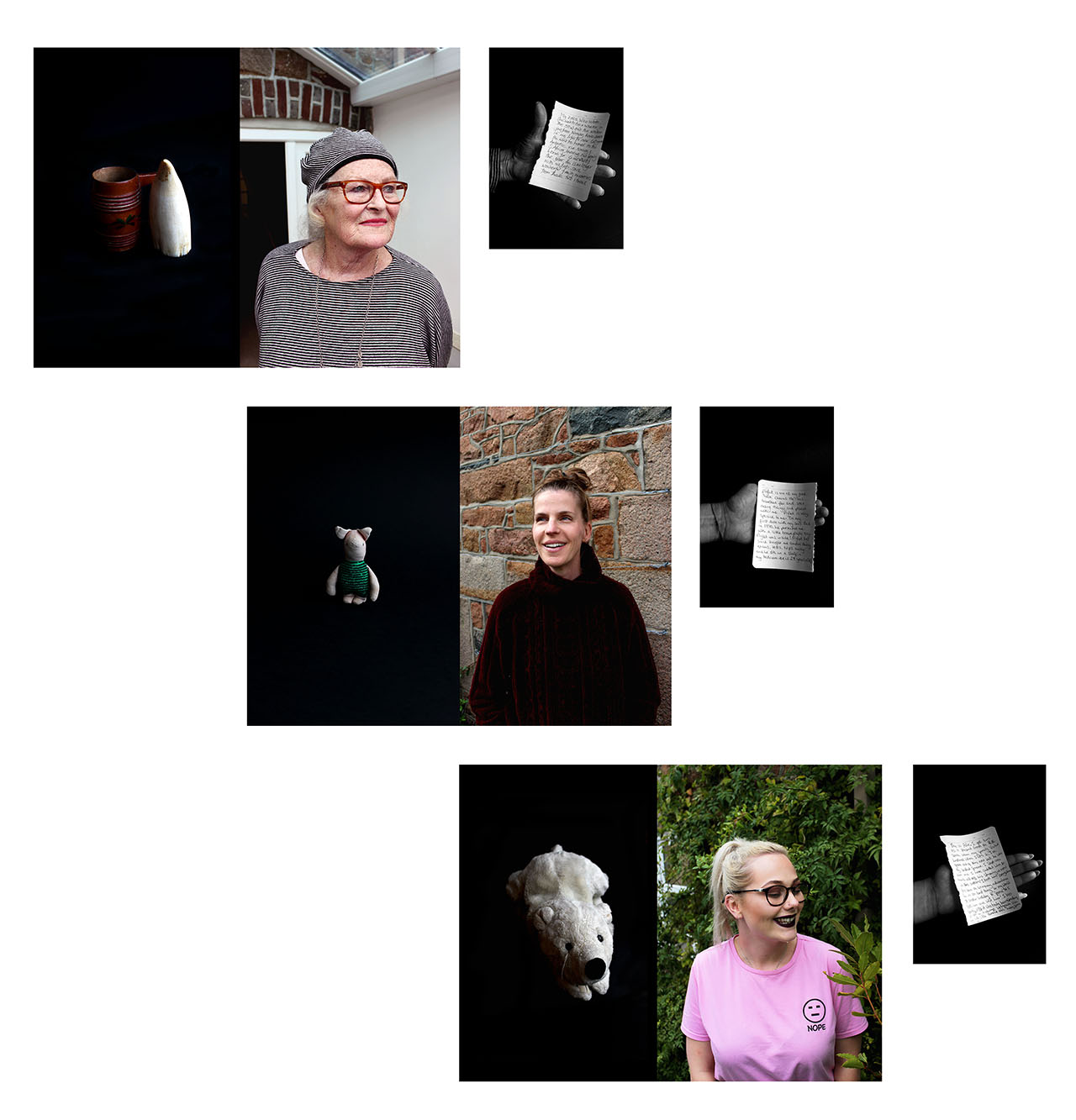
 

From the original images I had of the handwritten notes by each of my family members relating to the meaning behind their chosen object, I have altered them to be in black and white as I believe this looks much more effective because of the contrast available to me – I increased these when editing so that there is a clear contrast between illuminated whites and darkened blacks to create shadows against the white paper held in their hand.


Here is my artist statement which will go alongside my series of work at the exhibition:

3 Diptychs Representing a Childhood Memory

The brain is a magical organ of our body; it has the ability to hold limitless information, thoughts, ideas and memories from times forgotten. Taking inspiration from Rita Puig-Serra Costa, these 3 diptychs come from a series encapsulating the notion of childhood nostalgia. For most of us, our memories from childhood are a certain haze which, as we grow older, becomes more and more of a distant recollection of a time which is hard to understand the details of.

In this catalogue of works, I have explored the relationship we have with memories from our past – whether happy or upsetting, they exist and are sometimes consigned to an archive in our brain to be forgotten. Memories generate an emotion which may be difficult to describe but easier to visually portray. Using my Nan, Mum and Girlfriend, I have created a collection of juxtapositions between portraits and still-life object-imagery which represent their own childhood reminiscence.

A photograph is often a fragmentation of the truth and represents a one dimensional perspective but I have attempted to create a decryption of what is often hidden in this series. Each diptych is accompanied by a handwritten note from each subject explaining the context of their choice of memory.


Saint Nicholas Cathedral

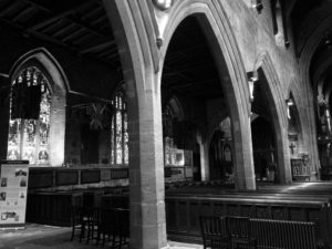
During the October half-term, me and my grandmother visited Newcastle upon Tyne just to explore the North of England and go for a spot of shopping. Historically, Newcastle was a very Catholic city along with neighboring regions in northern England, however, despite a rise in irreligion throughout the United Kingdom, Saint Nicholas Cathedral still stands tall. 

When in the building, the infrastructure established the cathedral as a powerful and prestigious building that had been inhabited for Catholic worship for over nine-hundred years. The strength gives us an insight into to the past as the cathedral was a dominant place in society.

Fulfilling my concept of subversion against religion, I organised for my grandmother to take a few images of me sat in the cathedral showing my middle finger to demonstrate my anger with the church for their ironic greediness and selfishness. As I am seated in the seats situated next to the main stage in which the cathedral is based around, where the service would take place,  I feel as if I’m directly and openly demonstrating my frustration. Living up to my teenage stereotypes, I am dressed in mostly black, with my hood up in slightly “chavvy” clothing, coinciding with this concept of juxtaposition between youth culture and religion. A secret symbol in the image is the very faint antichrist drawn upon my face to demonstrate my religious anarchy. By editing the image to black and white, I strip the image of its colour and therefore the limited symbols of life that do exist within the church.

Lauren Marek inspired shoot//Pieces

Lauren Marek inspired images // PIECES

Here are the final images from my shoot in response to Lauren Marek. I did the shoot at school during break time because I needed a few people to get images of. I choose three people who are all very different in terms of looks. I also made sure I used females as well as males to get a contrast. For the shoot I took close up images of the important features of the face and the body. For example, I made sure I had images of the eye, ear, mouth and also any scars that were unique to the subject.

I choose to focus on the most important features because they are unique to every person, and are what makes them who they are. When laying the images, I used photoshop because I could easily place the images were I wanted them to be.

EXPERIMENTATION

When editing the images I decided to edit them into black and white because it made the edits much more interesting and appealing. The colours and tones varied a lot, so making them into black and white also made it more appealing. I also found that the black and white versions also revealed much more of the details.

peter ainsworth// comparison

PETER AINSWORTH

https://www.celesteprize.com/artwork/ido:264313/

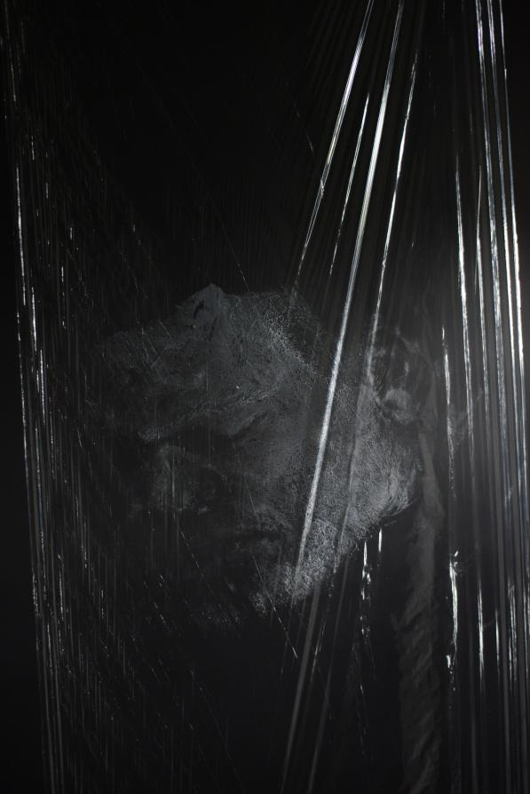
Peter Ainsworth was born in 1978. He is an artist based in London who works with sculpture, printmaking, video and photography. Ainsworth’s most recent projects are made from medical and industrial materials used in relation to photographs and videos. I came across Ainsworth after taking and editing the images of my distorted face shoot. Ainsworth also did a project using clingfilm to create different effects in his images. The project which I came across by Ainsworth is called LIFE MASK. He did the project in 2013 and it is a documentation of a performance: the creation of a self-portrait in cling film and soap. According to Ainsworth  the work is an ‘exploration of self on a domestic scale.’ The photos are a creation of a life mask in reference to the ‘obligatory Selfie that pervades online representations that at once purporting to be a ‘true’ image, an indexical imprint but also a surface, a façade designed to present oneself from a flattering viewpoint.’

The edit bellow of one of Ainsworths images is very similar in comparison to me edit from my distorted face shoot. Both images have a black, simple background so that the whole focus is on the figure rather than any distractions. I believe Ainsworth used a studio light for his images, like me, to create the reflections with the clingfilm. The bright reflections work really well in contrast to the dark background. Ainsworth uses the clingfilm as more of an overlay for his images, to create an overall look. However, I used the clingfilm to cover the face so that the reflections and shiny effect is only on the figure.

COMPARISON

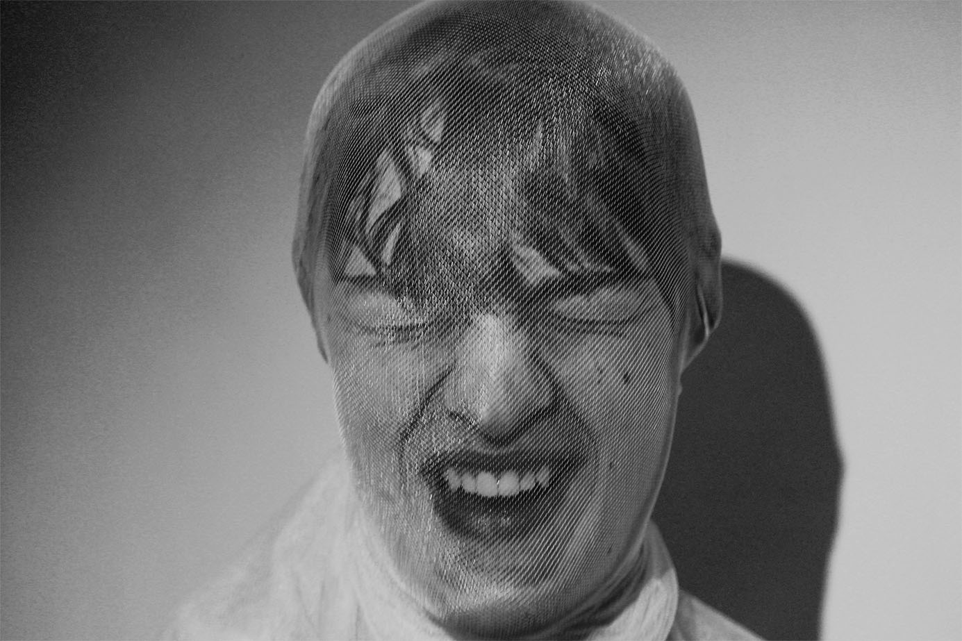
The image below by Peter Ainsworth is very similar compared to my final edited image from the shoot. The image by Ainsworth is taken of himself with his face painted white. He has used clingfilm to cover the whole frame to create an unusual texture look. For the shoot you can see that Ainsworth used studio lights to create a reflection of the  clingfilm which in turn adds another dimension to the image. Ainsworth’s image is in black and white, like mine, because it reveals the different tones and textures much more when in black and white. Instead of covering the whole image with clingfilm, I used the clingfilm to wrap round the subjects face to dis-form it in some way. I did this because I wanted to create a similar effect to Jenny Saville’s images.

PETER AINSWORTH

MINE

shoot//distorted face

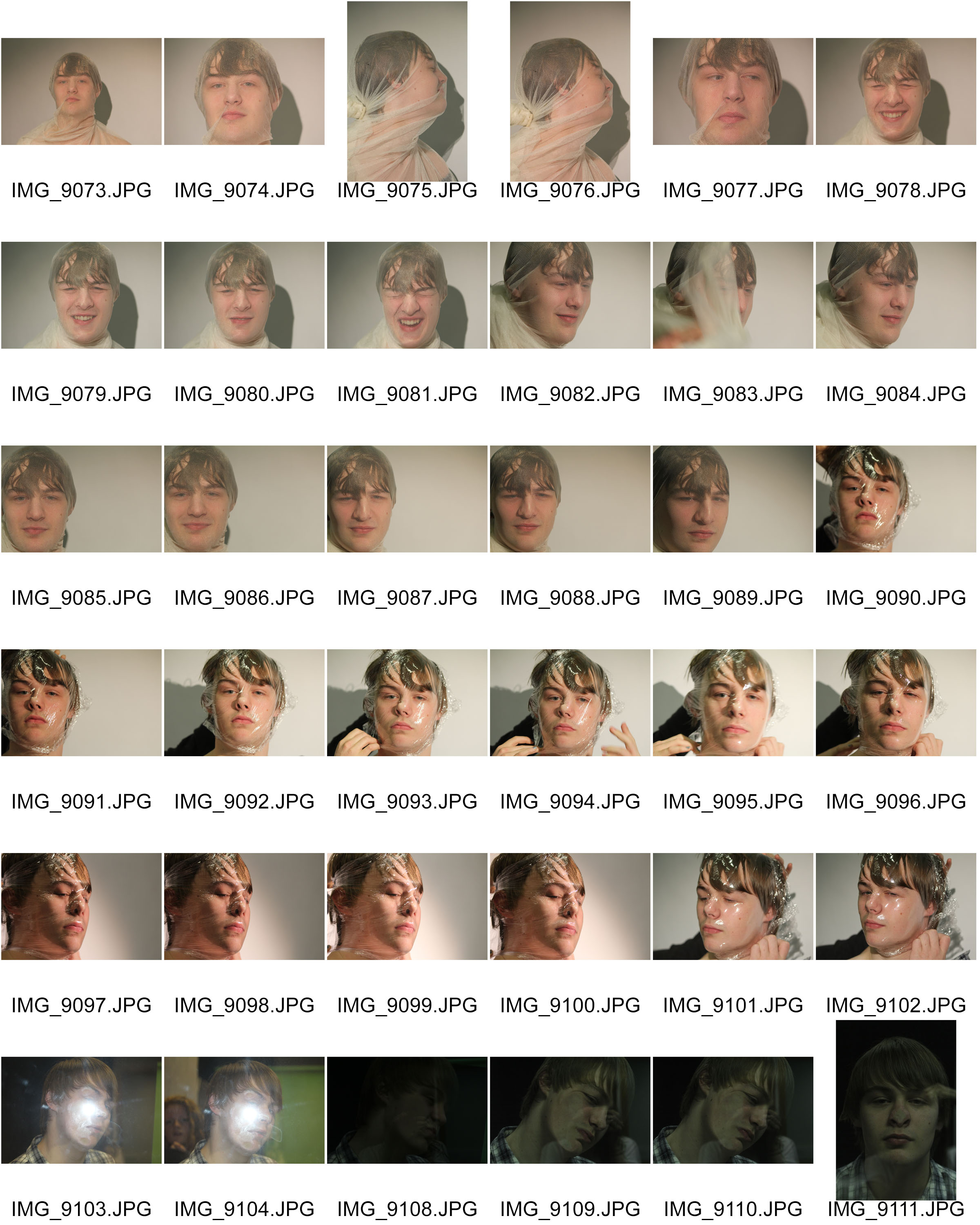
The images below are the original images from the photo shoot I did based on distorted faces. I was inspired by some of Jenny Saville’s images of the faces squished against glass. I aimed to create images similar to the ones by Jenny Saville, but I wanted to use different materials to experiment with. I used a transparent cloth, clingfilm and a pane of glass. They all needed to be transparent because I needed to see the face through the material. I did the photo shoot in the darkroom at school using the studio lights. I wanted a clear simple background so I asked the figure to stand in front of a white screen. I really like the effect of the reflection on the materials because of the studio lights.

For the first set of images I used a transparent material, similar to a pair of tights. I asked the figure to cover his face with it.  I then tied the material tightly at the back of his head so that It would distort the features of the face in someway. I’m happy with how this worked because the transparent material allows us to see the distorted features really well. I also really like how the material allows the light from the studio light to reflect back at the lends. I wanted a colour version and a black and white version of this image to see the comparison, and to decide which edit would be the best.  I really like the colours and the yellow tinge because it creates this unusual  atmosphere to the image. I prefer the black and white edit though because I like the contrast and variation of tones with the shadows and lights.

I really like the image below because of the face expression of the figure. The viewer is left to interpret what is happening in the image. The figure could either be laughing or screaming in pain. I also really like how the material has distorted the figures face in this image.

For the second part of the shoot, I used clingfilm as the material to distort the face. These images with the clingfilm are mush more interesting and unusual compared to the images from the first part of the shoot. I really liked the images in black ad white because it helped to highlight the reflections in the material. The images originally had a white background with shadows, but I wanted the background to be more simpler and darker to contrast with the figure. The way the material has distorted the face works really well. The images are somewhat similar to some of Jenny Saville’s images with the squashed faces. I wanted a variation of angles within the set of images and I know that I’ve achieved that.
Archives & Documentary Further experimentation

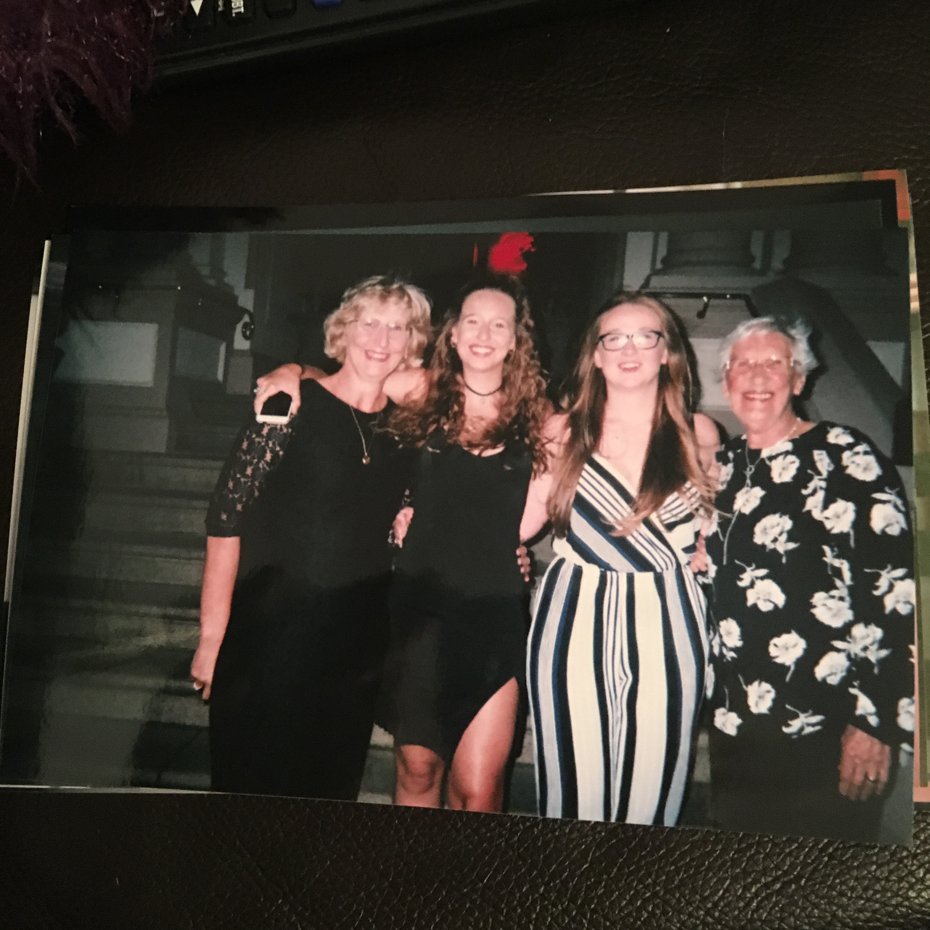
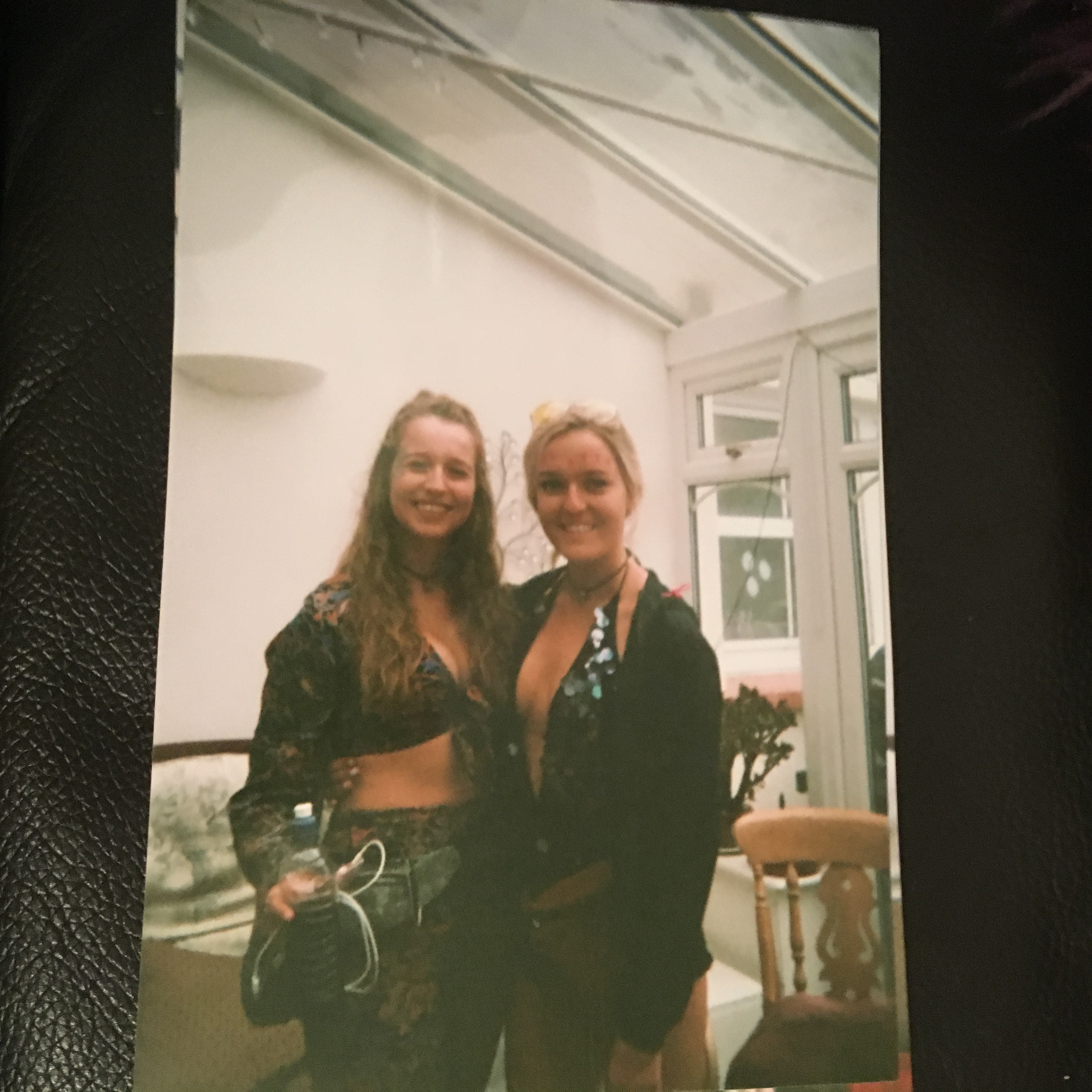
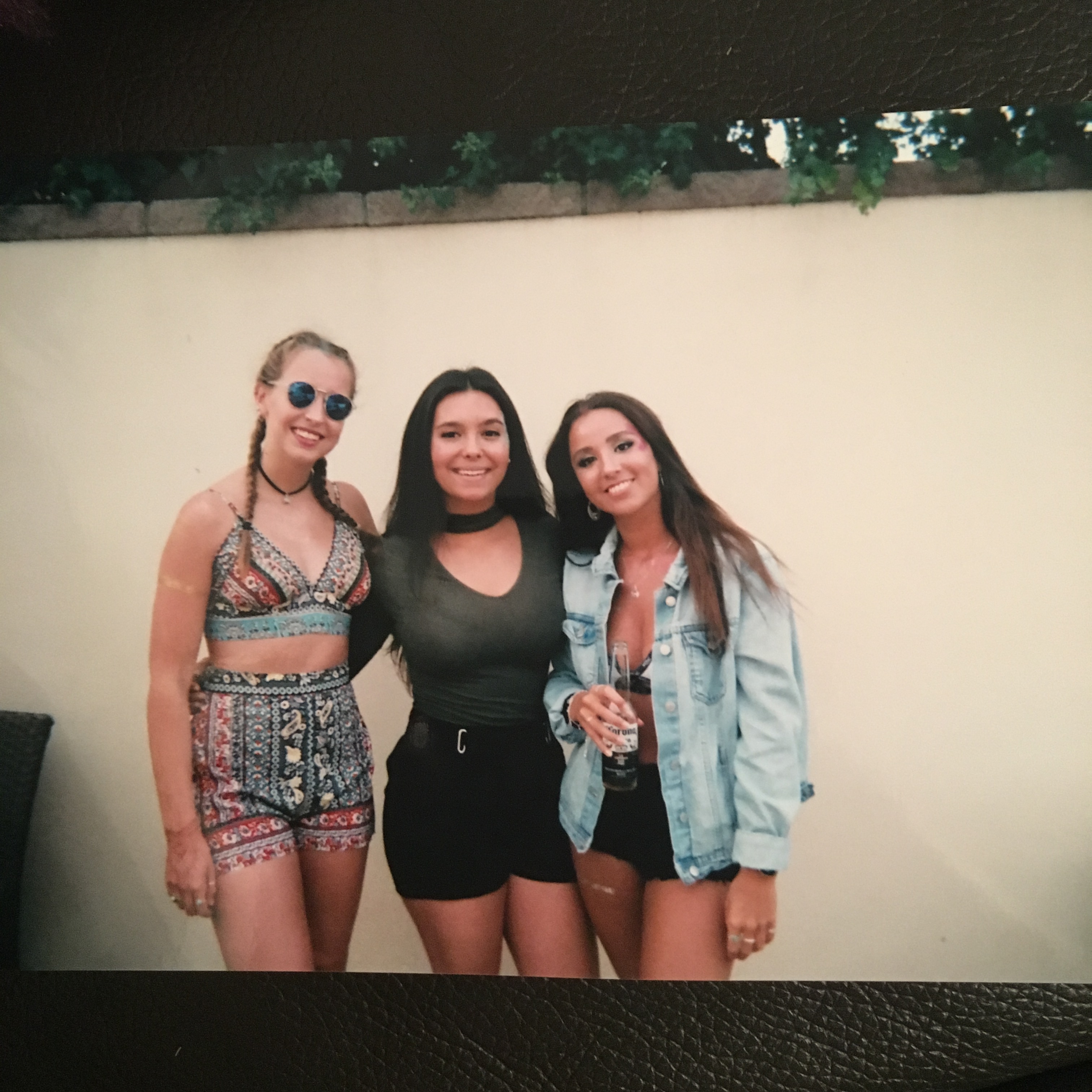
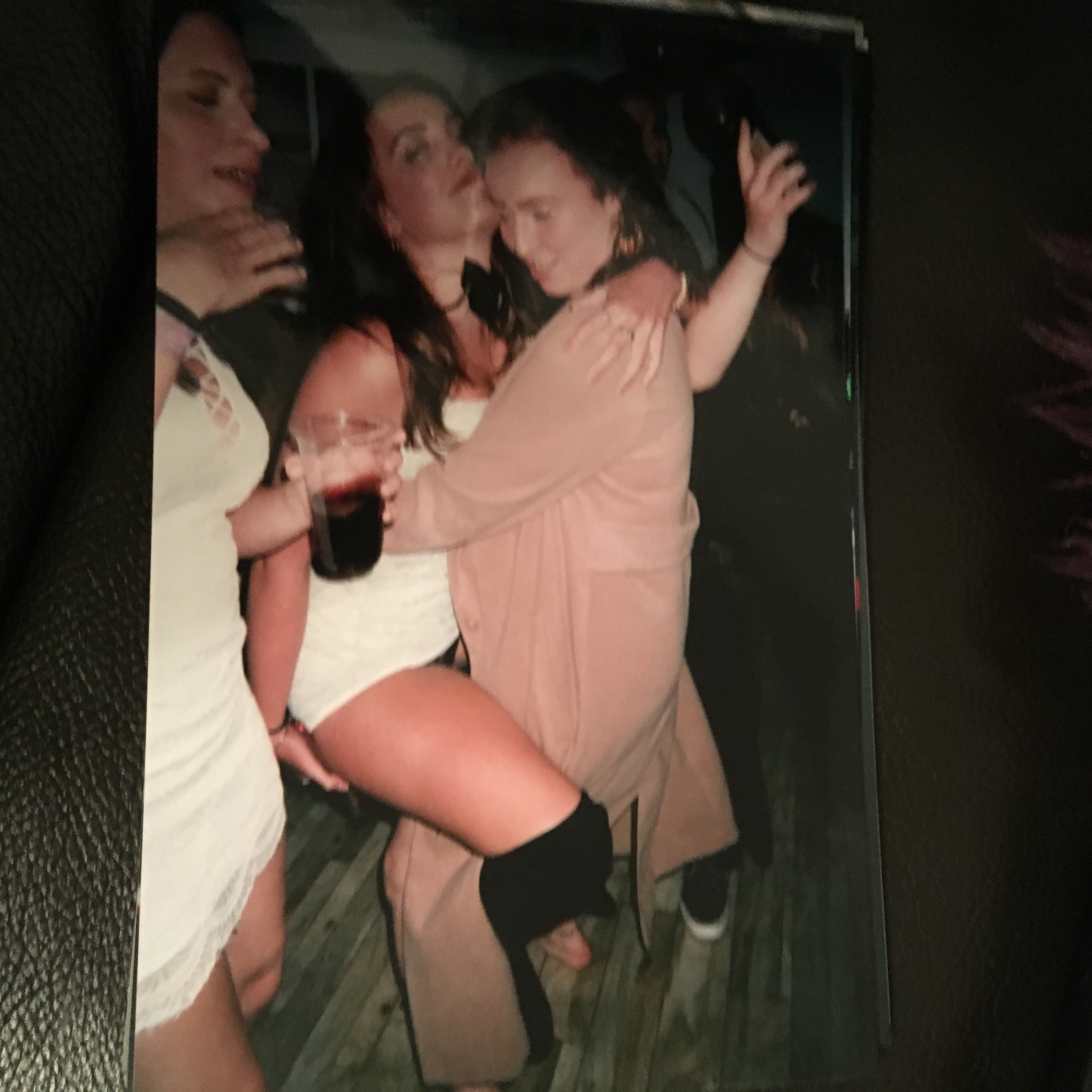
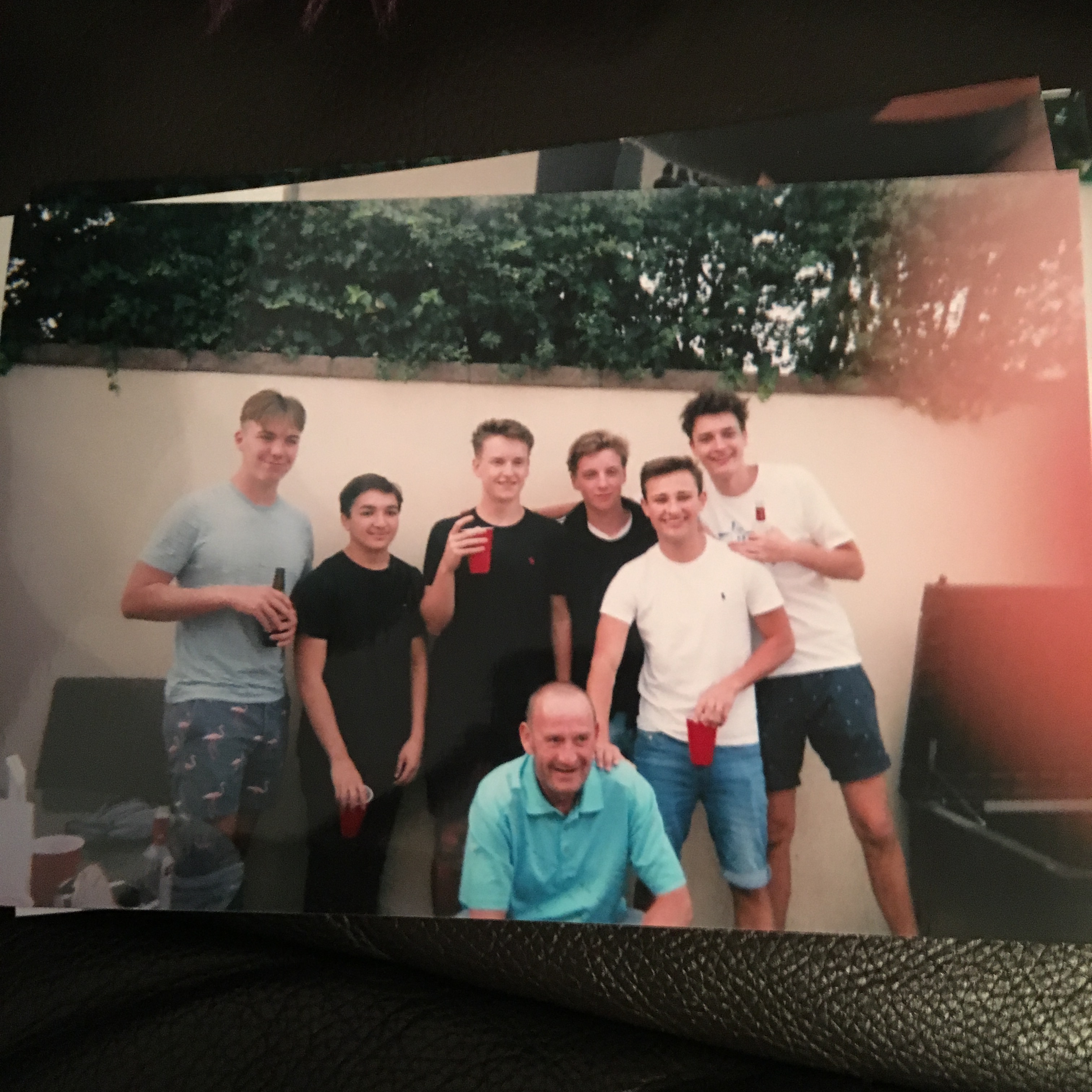
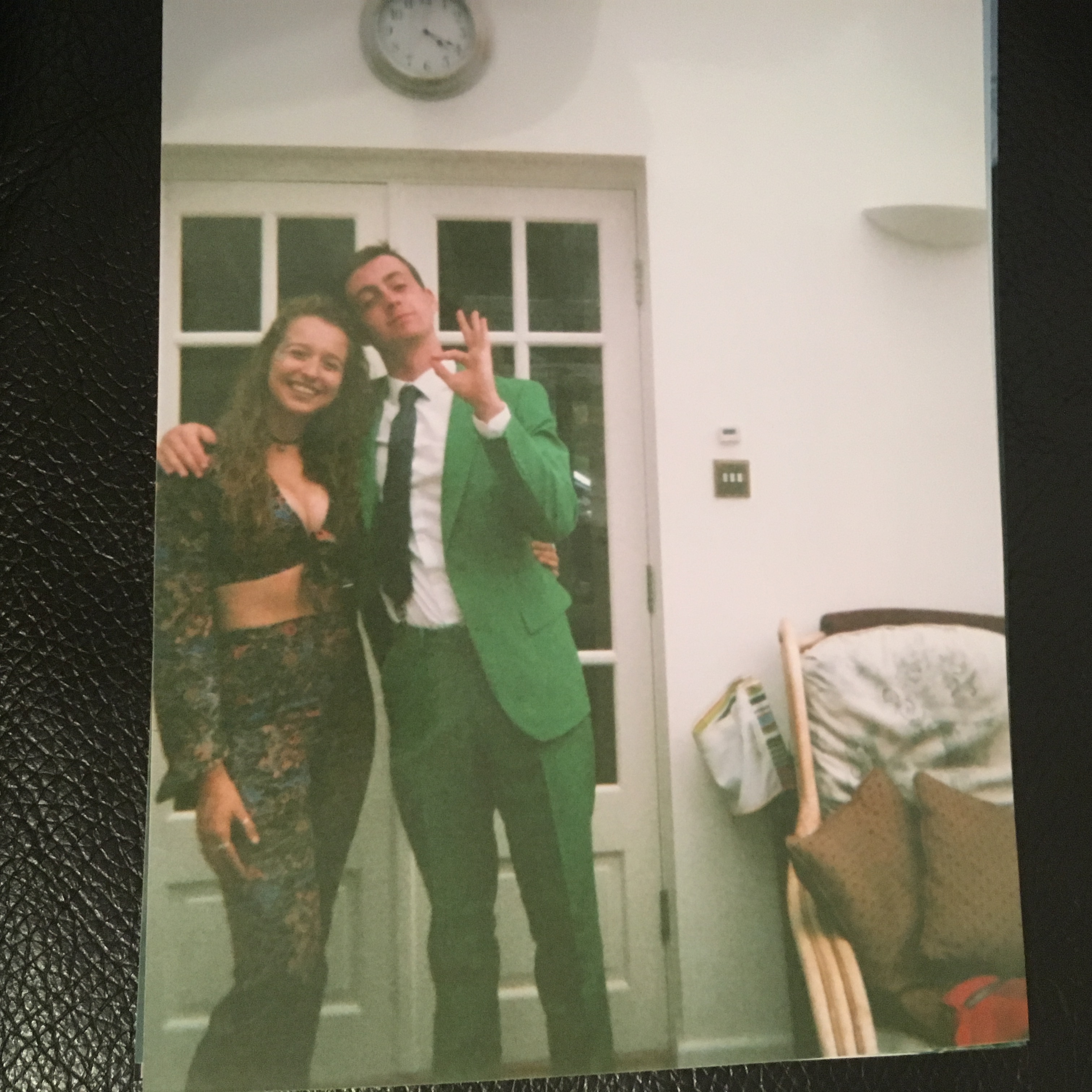
As further experimentation to the idea of family photography and the difference between documentary and tableaux and the links with family and archives, i decided to do a mini project. When i think of archives i think of my mums photo albums that she used to make when i was younger and they were full of images of the most important events and celebrations of that specific year. As these were also printed out images i wanted to replicate this as much as possible and therefore got a disposable camera because then they will have that old style film camera look. Linking again to family photography i am going to focus on capturing the most important events and celebrations that i experience in the month of september with my family and friends(which is like another family). the challenge of the film camera is that it has a set number of exposures therefore i have to make sure to only take a few good photos at each event. I feel this will extend my photographic ability as i will be having to think about the images that i want to capture and the placement of these images.

The photographs will become a mixture of archival images which are both documentary and tableaux because i am assuming that some will be taking very much in the moment and some i may get a group of people to gather round to get a ‘family style’ photograph.

These are the final outcomes of my shoot i had them developed at the end of September and found that i was being so careful with what images i captured that i didn’t even use all of the exposures. I really enjoyed doing a shoot/ mini project in this style because it has left me with archival images of my family and friends which are pictures of important and significant events but only a few key images. The shoot links back to the idea of family archives as these images will now become my archives of September 2017 which i will keep and be able to look back on similarly to what my mum had created when i was younger.

In my opinion this style of archive focuses more on tableaux photography as the images have had to be staged in a way to get a group of my family/friends to stand together and look at the camera. This is a true representation of what most family albums (archives) are created from and brings a real sense of family to my images.