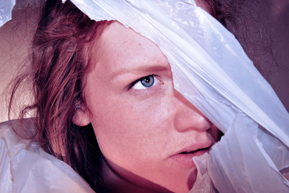
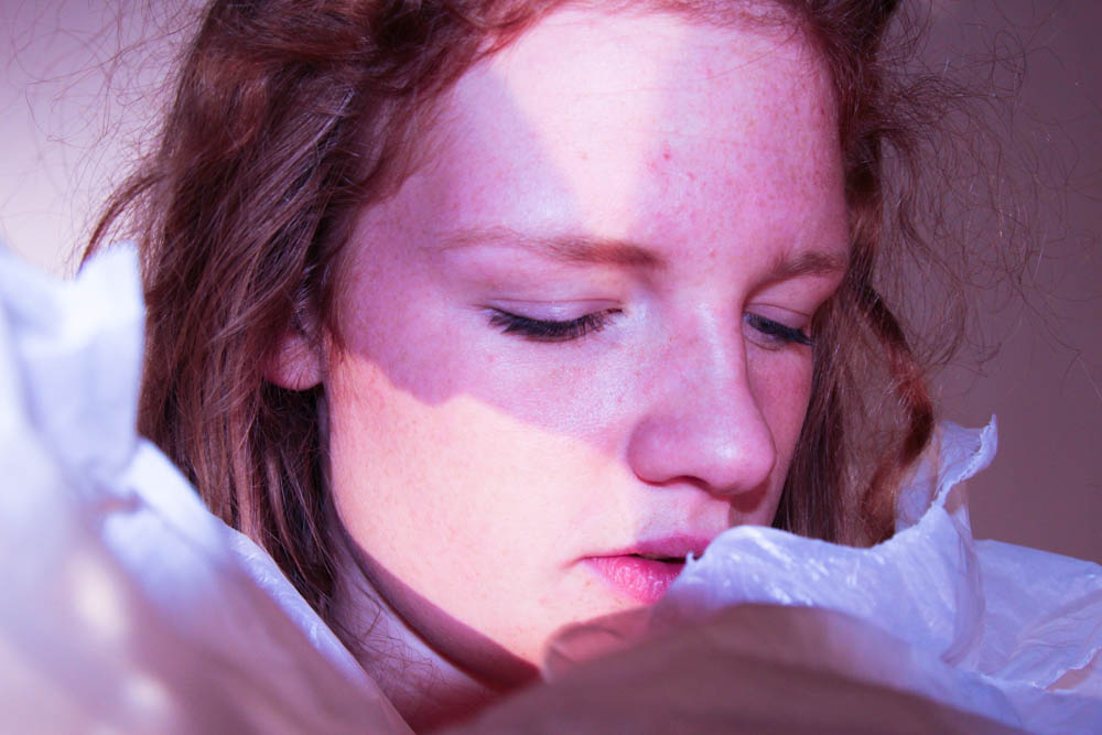
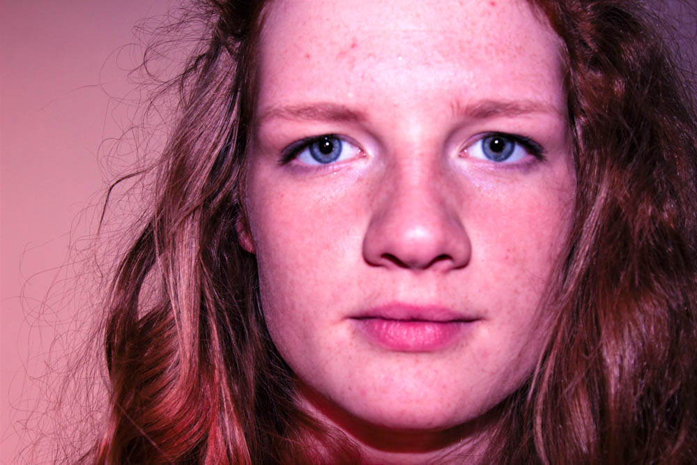
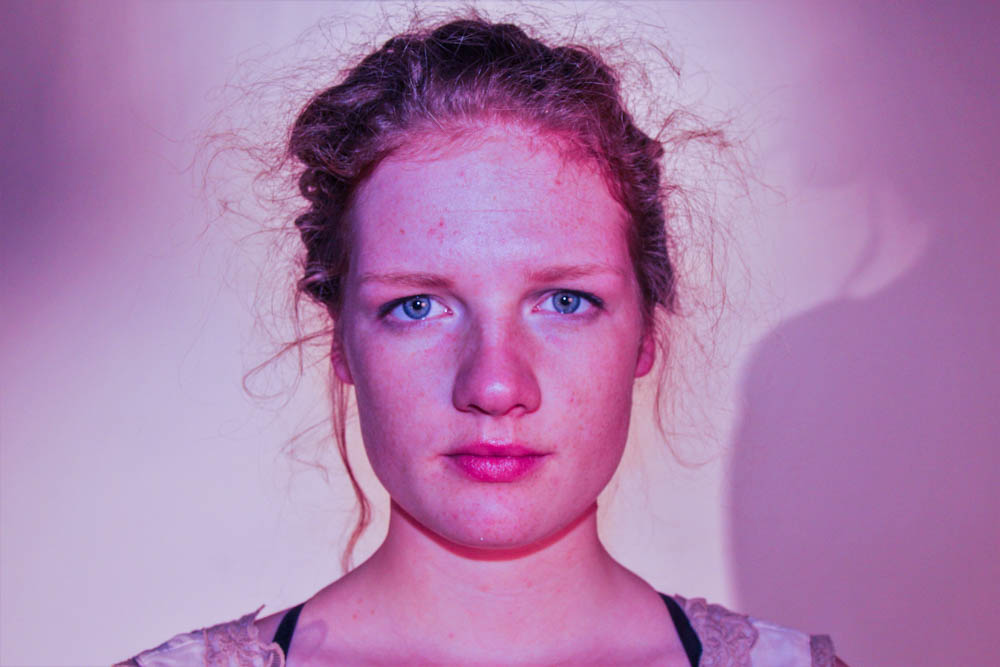
Category Archives: Experimentation

Filters

Author:
Category:

Social Circle

On the subject of describing how it was difficult for children to fit in with ADHD or from disadvantaged backgrounds, I have decided to capture how I have fit in by photographing everything around me. My aim is to capture my friends, their hobbies and some of their homes and how this has made them who they are, just like their influence has changed a part of me in way or another. The idea is by me photographing everybody individually, I hope to grasp this concept of sub narrative, a smaller, less generic and more personal method to depicting a narrative. Overall, after photographing my peers and their typical environments, hopefully their unique lives can be reflective of mine and demonstrate how school can bring and unify a variety of different people.

This shoot is extremely different to my others as I attempted to show my friend’s fashionable side. Ben’s main concern is his appearance and that is why he is “reppin'” his Stone Island jumper and Busy Boi tee-shirt. I tried to convey everybody in a way that I thought reflected them and for me this is Ben’s.

Personally, I couldn’t have captured a more reflective image of Ben in the studio as I did here as in the foreground, we have a teenager in light and focus. However, in the background there is a dominant shadow which cats over Ben and from my own knowledge and relationship with Ben, I know his family life has caused problems for him. These two identities are also examples of his zodiac star sign as a Gemini, with two sides to his personality.

Golf is played by three of my friends and me up at La Moye, a very different environment to the sort of images I usually capture. Stereo-typically, golf is played by the wealthier in society as the equipment and memberships are expensive, however, fortunately for me, I have two exceptionally gifted golfers who receive the membership for a cut price and can bring a friend each. I often tag along. The golf course over looks Saint Ouen’s bay so it was a good time to capture some images with the wintry sun setting at about five o’clock.

My big friendship group of boys finds itself often with a group of girls from JCG, with my girlfriend being a member of this clique. Our weekends are frequently spent in somebody’s house for a civilized “sesh” where we drink and play some sort of board games, probably order a take-away. Here are some images of a night spent at my friend Jay’s.

My first home visit was Charlie before we went to play golf, waiting for time to go by before we could tee off. I wanted Charlie to relax and feel as though I wasn’t there, or at least there without camera.

Shoot // body

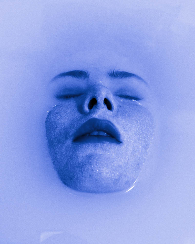
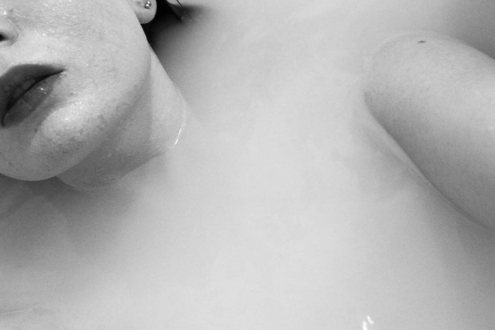
On the 23rd of January I did a photo shoot focusing on the different parts of the body such as the feet, hands and the face. I wanted to experiment a lot more with this shoot by using the environment I was in. I decided to do a self portrait shoot because I knew what sort of images I wanted to come out with. I used a bath as my environment and backdrop for the shoot because I wanted the body parts to be emerging from the water. I put milk into the bath so that the water wasn’t transparent which made the images much more interesting and effective. It was difficult doing this shoot because I had to hold the camera above the water and the steam also slightly blurred the lens.  I am mostly happy with the outcome of my images for this shoot.

After seeing the final images I decided I wanted to edit the best images using Photoshop into black and white because the images looked much more effective and the details looked more defined.


Shoot // white body // edits

The following shoot was done during the Christmas holidays.  The weather was bad which made the shoot much more difficult. The aim of the shoot was to capture a model painted white in a vast empty landscape. The meaning of the shoot was to resemble the feeling of being lost, or invisible among the world around us. We become trapped within ourselves as we’re forced to become part of the normal expectations. We lose who we are. This is what this shoot is meant to represent. By painting the model white and placing her in a bleak landscape she becomes part of it, almost invisible. I also decided to paint the model white to represent her losing her identity.

When editing the images I wanted to experiment with the use of colour to see how this would effect the overall mood. I really liked the black and white edits because this emphasized the bleakness of the images which I planned to exaggerate.

Shoot // white hands

On Friday 19th I organised a photo shoot in the studio at Hautlieu to obtain images based in the concept of movement and body image. I managed to achieve a wide range of images and am happy with my result. Instead of using the studio flash lights, I decided to simply use the room lights on the ceiling because I didn’t want an extreme shadow. When preparing for the shoot, I asked two of my friends if I could paint their hands and arms with white acrylic paint. I used the paint in the art room to do this. To make sure all the skin was covered we had to do several layers.

Whilst taking images I asked my friends to create different shapes with their hands symbolizing certain emotions such as pain or struggle. The aim of this shoot was to represent emotions using the hands. This was an unusual and creative perspective of viewing the body to symbolize a hidden feeling.

I framed the images so just the painted parts of the hands and arms were showing because they were the focus of the shoot. I asked the models to make sculptural shapes with their hands. Soft delicate shapes as well as rigid harsh shapes. I am very happy with the images a managed to achieve. They work especially well with my project because they express movement as well as emotion.

I wanted to start by doing simple edits. I firstly edited the images by lowering the contrast and adding brightness and exposure. I then changed the vibrance and saturation.  Although there are some shadows on the backdrop, they work really well with the image because they make it look less two dimensional.  They also add another tone to the image.  I made sure I got some portrait orientations and landscapes to see which style was best.

Experimental Edits using colour 

I really liked the effect that the white on white created because the images were very pleasing to the eye and looked very professional. I wanted to experiment a bit more by adding some colour to the images. This made them look more contemporary and modern. The coloured images suited my project more because the colour helps to expresses the different emotions I was trying to replicate such as the red symbolizing terror.


Extending Ideas and Concepts

Over the Christmas holidays, my family booked a sporadic trip to Valfréjus, a ski resort in Modane, France but it was extremely close to Geneva and Turin. The vacation provided an opportunity to capture images of my step-brother abroad, undergoing new activities and seeing how he would react in a new and daunting situation as we would undergo skiing. As a cyber-hub, Noah tends to struggle with physical activities as he does not have an interest in them, contrasting to his three other siblings who would strive in the situation, perhaps causing jealous and feeling second-best. Another emotion my mother and step father feared was the feeling of boredom and dissatisfaction that Noah may feel, especially as we were sat down for such long periods of time and restricted to the car when travelling. In practice, he wasn’t as bad as expected, however, he did cause problems with my two younger siblings, frequently disturbing them but overall, he wasn’t bad. Fundamentally, this attitude did not reflect the rest of the holiday as it consisted of us often walking and adventuring the South-East of France, causing unease for Noah who struggles to leave his own technological devices. My shoots are rather limited as to be quite frank, Noah was rather reserved over the trip, rarely taking time away from his devices, however, when he did, I captured Noah the best I could, Unfortunately, being a bit of a beginner at snow boarding, I did not want to carry around my camera which would produce much clearer images, instead I had my iPhone 6S and I used it to my best ability.

 These photographs have been cut down from around seventy items, choosing images that I feel portray Noah’s trip to France. My mum organised the holiday for us to have fun, but in reality, it was far from it, especially for Noah who rarely delved out of his comfort zone or escaped his gaming world, not counting frequent arguments between my mother and step-father. Admittedly, I have grown rather numb from arguments between my parents or my mother and her partner having listened to them for most of my life, and then watching them get resolved.

Shoot w/ Mum and Lucy

Below are the edits I have created using Adobe Lightroom from my photoshoot where I photographed my girlfriend, Lucy cutting my mum’s hair in our kitchen.

This was one of the first the photoshoot I completed for my project and I saw it as the perfect opportunity to get a collection of a few strong images to start me off with my project looking at relationships within my life and my family circle.

My girlfriend, Lucy is 17 and has just recently qualified as a hairdresser and so is always being asked by family members for hair cuts, including my own family.

I really like these images and the reason for this is because of their very delicate, poetic and elegant nature. All three are very documentary style and are capturing a moment in time.

The three images below have been edited on Adobe Lightroom and are the best three images from the photoshoot. All three work well in conjunction with each, however, I plan to use them with the images produced from my mini photoshoot I carried out at my dad’s flat.

The photograph below is of Lucy cutting my mum’s hair. You can also see me in the reflection as I am taking the photograph and this could be seen to ruin the image as usually it is known for photographer to remain behind the camera and out of frame because if the audience are t see the camera or the photographer, then we don’t like this as we have been taught that the common ideology of photography is for the photographer to remain behind the camera. I enjoy the fact that as well as the subject, I am also in the frame but with both Lucy and Mum illuminated so the focus is on them.

The photo below is mid-at through the haircut and shows Lucy gathering some of my mum’s hair to cut and the effect of this movement is captured in the camera and transferred to a visible blur in her hands which I also think has a positive effect because it shows that the photo is more than just one dimensional and adds action to what is shown. It is pretty much the same photo as above as it consists of the same content but as a close up shot to view the subjects in more detail and instead in black and white. As opposed to focusing on hard shadows and contrasts,  I have attempted to focus more on neutral tones such as greys and making these the base of the image because I observed this in LaToya Ruby Frazier’s images; that the contrast was quite low and instead, grey colours were used to provide a body to the image and this is also the same in Matt Eich’s images – something I ma not used to but enjoy the visual effect of.

There is in fact a Matt Eich image that he took of his family in the garden as his wife cuts his hair, shown below.

The image below is of the hair resulting form my mum having her hair cut. The wet, clumps of hair lay on kitchen floor scattered across the tiles as, in the top corner, the blurred motion of the vacuum enters the frame. It is a very simple image that takes little skill and technique and more observation and focus to see this moment as a photographic opportunity because this photo finishes off my collection of the first, second and this as the final image to create a mini series of three images.

Beach shoot// experiment edits

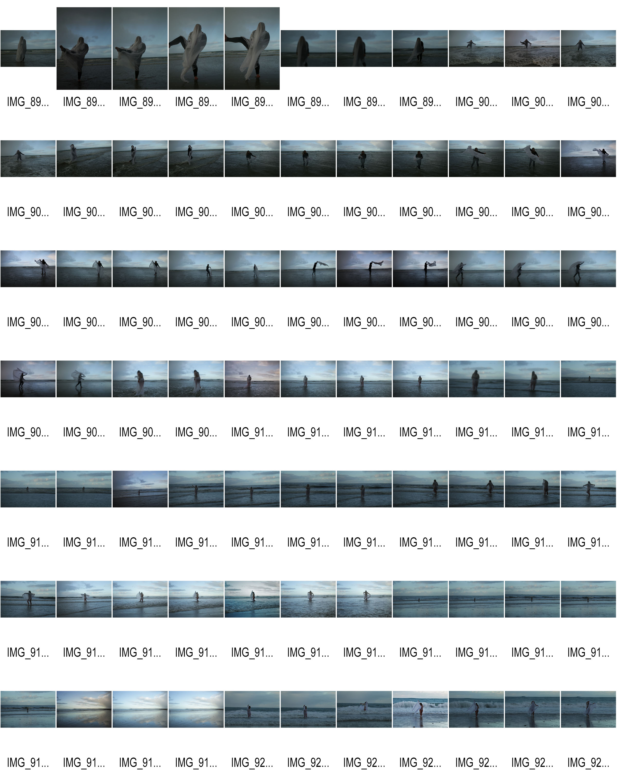
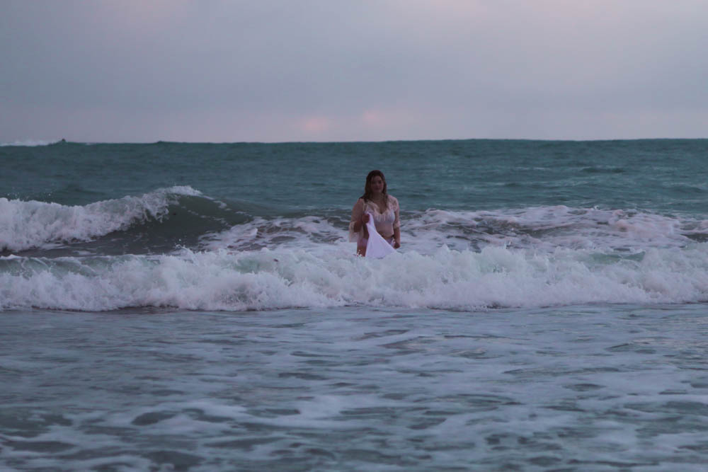
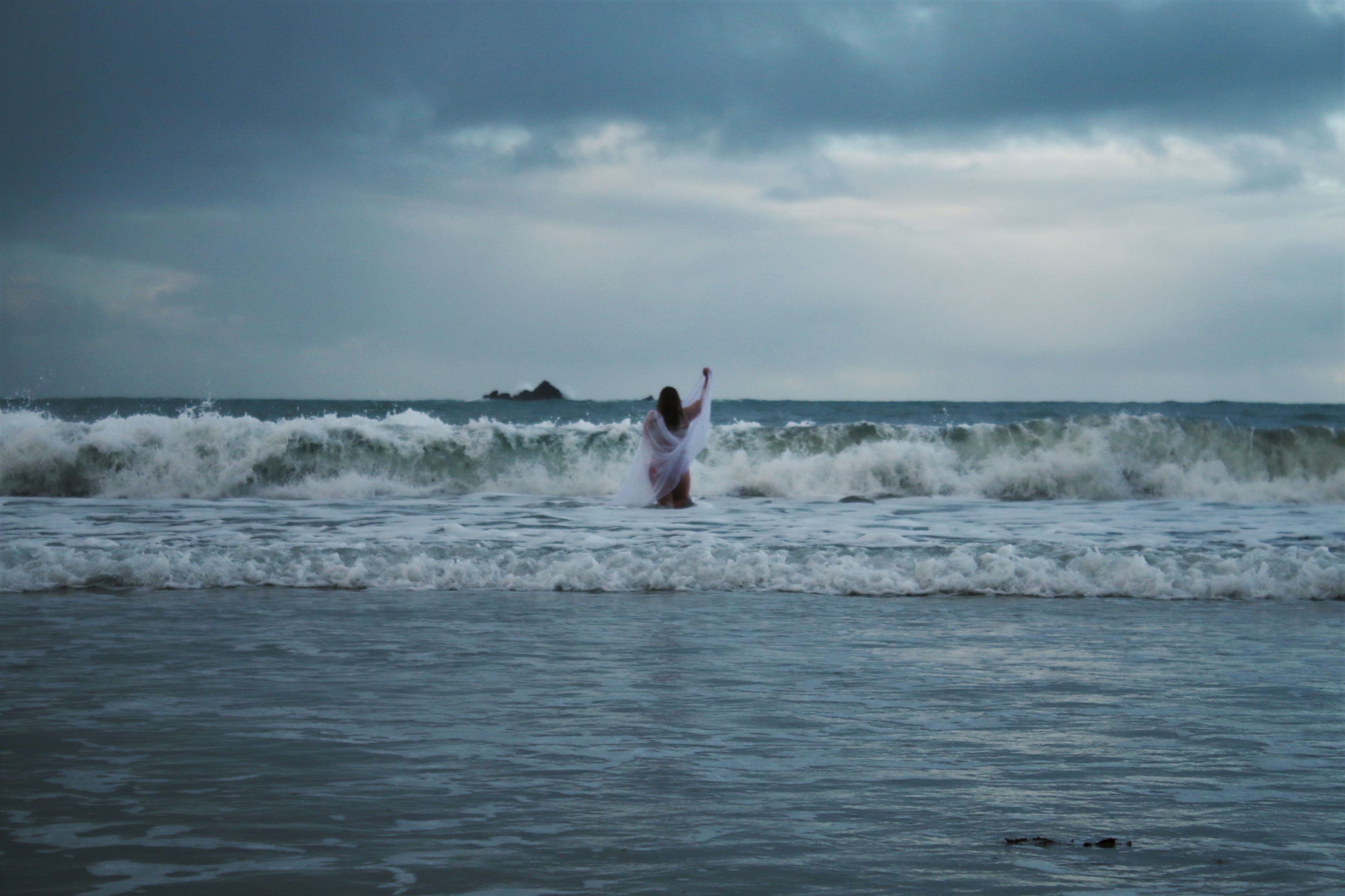
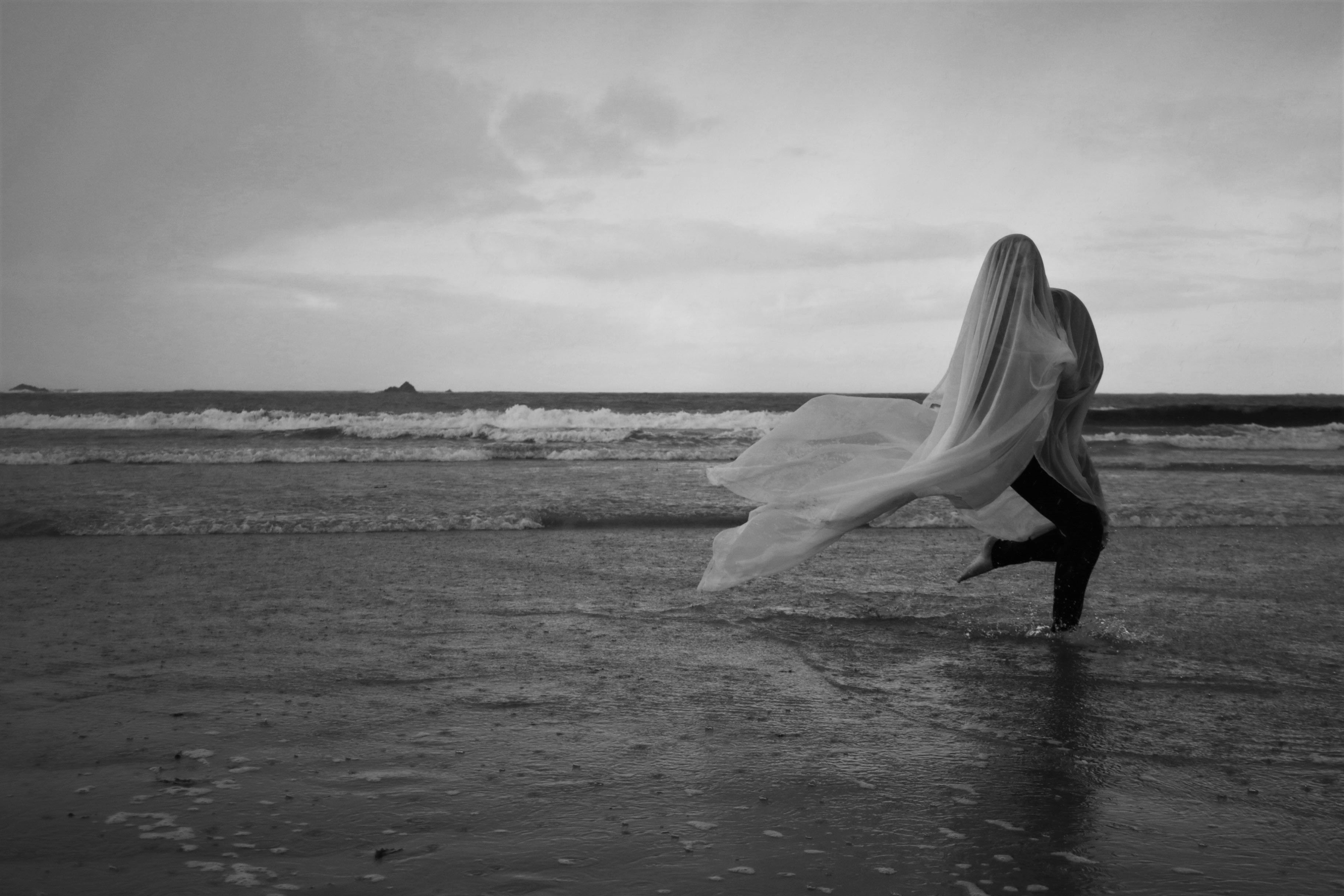
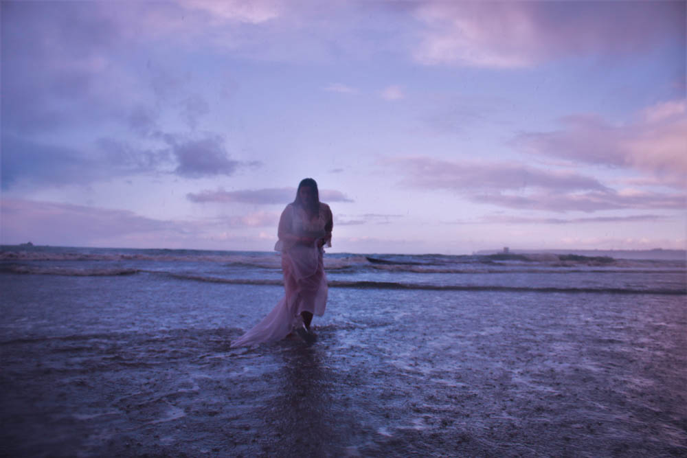
The inspiration for this shoot stemmed from the idea of movement within the body. I wanted to experiment by using the environment as well as a material to convey this movement. The photographer Michal Konrad who I am going to be researching for my project created a series of images based on movement. He used a slow shutter speed so that the movement performed by the body would be blurred in the image. He did this to symbolize the tension and movement of the mind. Although I only came across Michal Konrad after doing my own photo shoot, I can see similarities between his and my images so I am going to use his work as a comparison.

I did the shoot during the Christmas holiday. It was during December and so the weather was really cold. This made the shoot a lot more difficult than it should have been because we were freezing and it started hailing at some point. The hail and rain did effect the camera because it blurred the lens slightly, however, the effect of the hail on the water did make some interesting effects.  Since it was cold, and we were on the beach, my model had to keep moving to keep warm, do she ran around which also made it harder to get a decent result. We were on the beach for about 40 minutes and out of the whole 497 images that I manged to capture, there was only a few decent results that I was happy with.

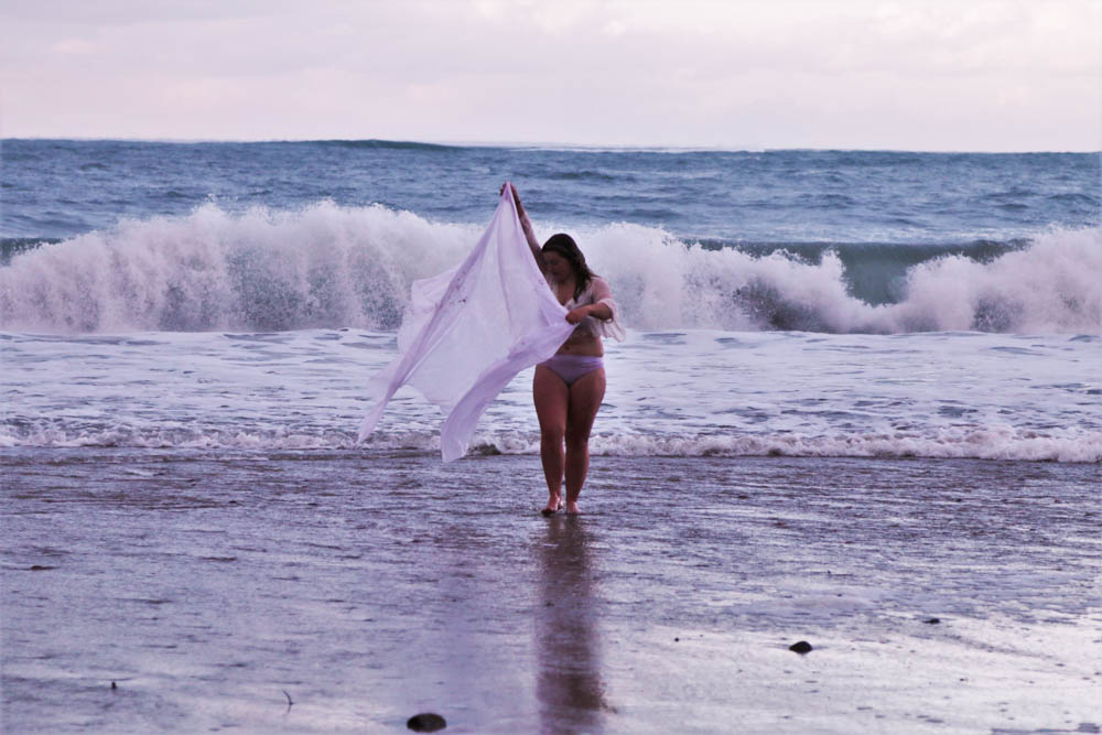
While dealing with the weather and the environment on the day, I had to change my camera settings constantly to get the best results. I used a fast shutter speed so that the image was in focus and so that It wouldn’t be over exposed. I tried to use the environment to my advantage so I got as close to the sea as I could for some of the images. I love the effect of the movement of the waves and the white foam that they created. The wight of the wave significantly brightens up the image.

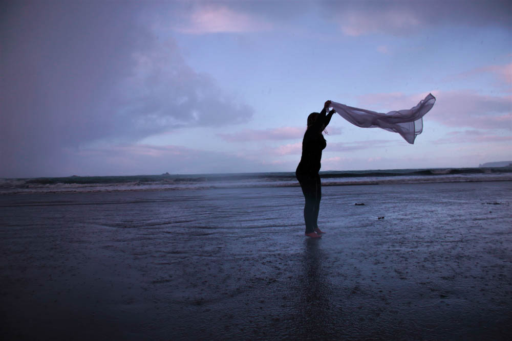
Since it was windy at the time of the shoot, it created a really nice effect with the material that we used. The wind made the movement of the material much more dramatic. When editing the images, I tried to edit them so that this movement would be dramatized.

Like my other edits from other shoots, I wanted to achieve a constant colour scheme and theme throughout.  I emphasized the natural pigments instead of adding another tone. I’m really happy with the effects because Its also a slimier colour scheme to my other photo series.

Another photographer that I will be researching for my project is Viviane Sassen. She also uses the environment around her to create the best images. Her images are also a lot based on the movement of the body.

I edited each of the images in a very slimier way. I used Adobe Light room for editing. I firstly edited the brightness, contrast and saturation of the images. I then changed the coolness and tint of each one. The last part of the editing was too simple bring out the vibrancy of the natural pigments.

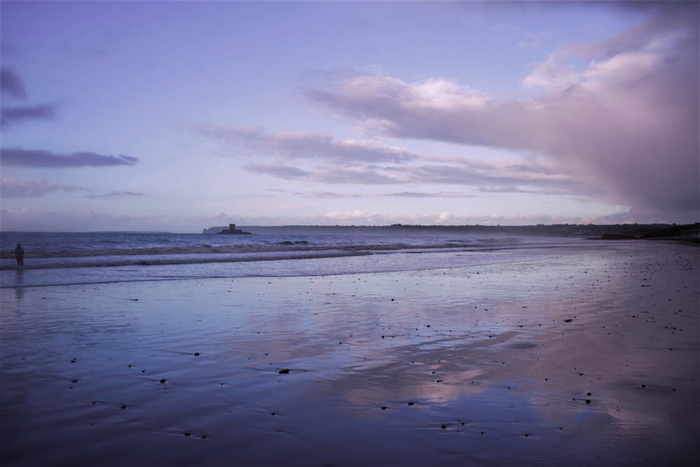
In the Photo book called Roxanne by Viviane Sassen she uses a combination of landscapes, abstract images, and portraits. For my photo shoot I also wanted to achieve a variation of images.  I managed to capture a set of on land portraits as well a portraits in the water.  I also captured a few landscape images to go with the series. I love the effect of the on land portraits because of the wet sand, it created a reflection in the images. I especially love this effect with the landscape because the clouds and the baby blue colour in the sky is repeated in the sand.


Body Suite // face edits

During the shoot I managed to capture some close up shots of the face. The face is the most important feature of the human body and is the most expressive part. As well as asking the subject to make different face expressions I also wanted to capture some natural face expressions while the subject was moving. I edited the images using Lightroom and am very happy with he final outcomes because the go very well with my theme of the body image. Although the face is an obvious way of expressing certain emotions, and I wanted to create more complicated and though provocative versions of emotions, I also wanted to contain some portrait images as well. I am very happy with these ones form the shoot.

body suit shoot// part 1// experiment edits

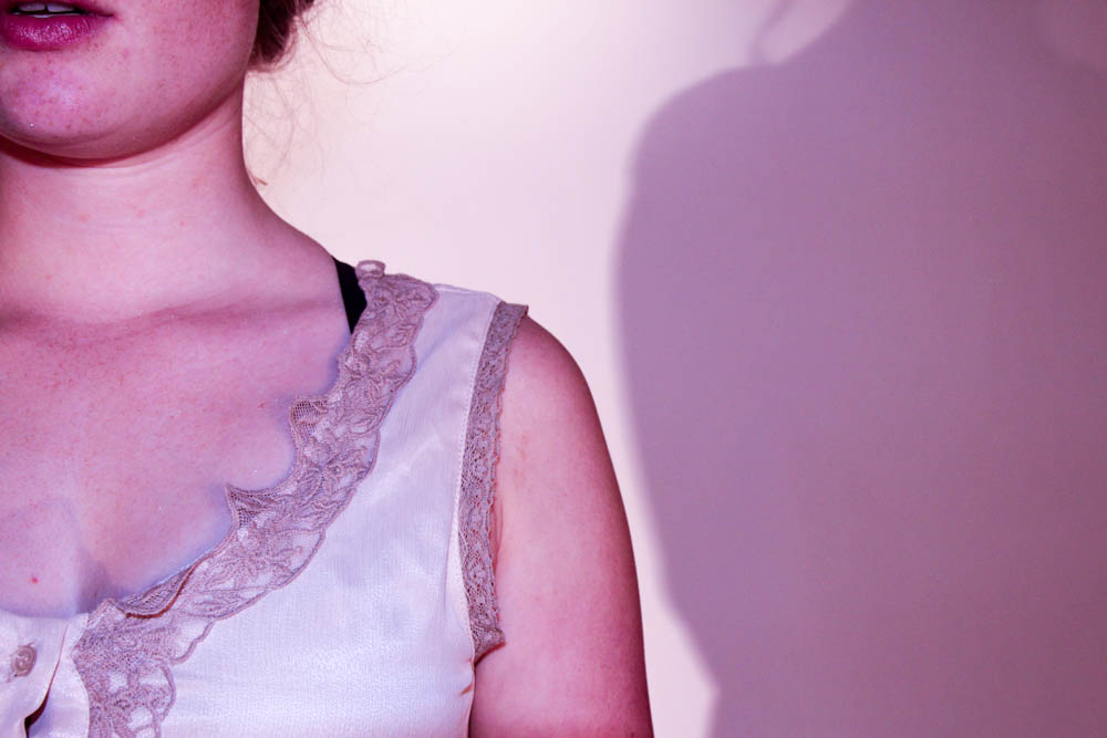
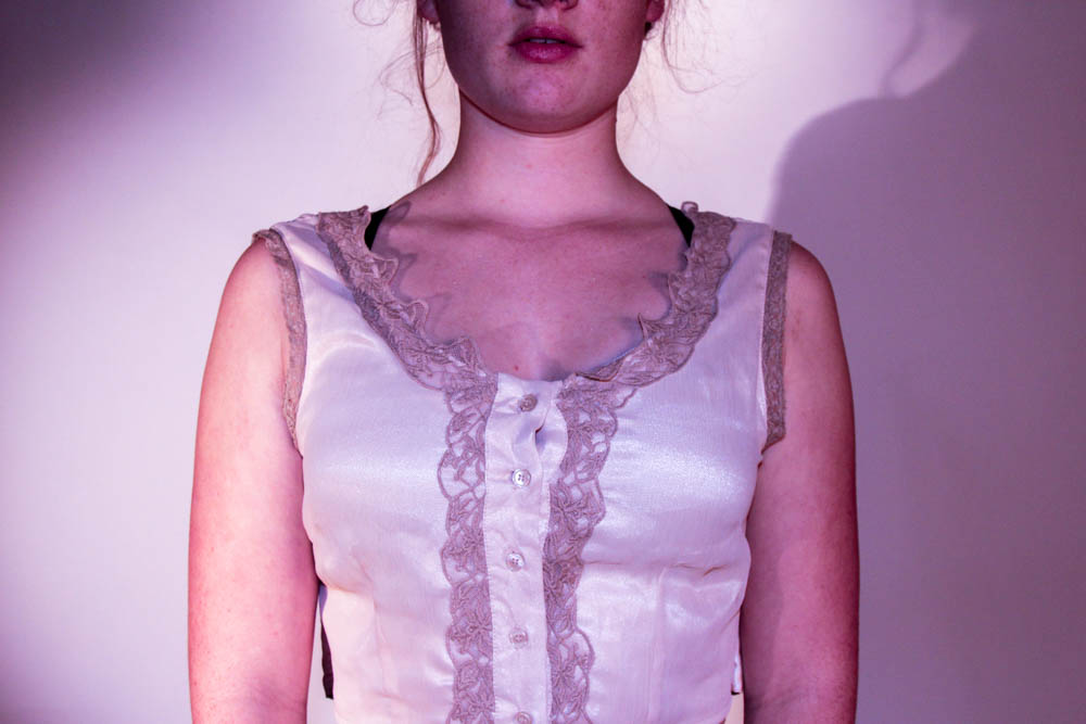
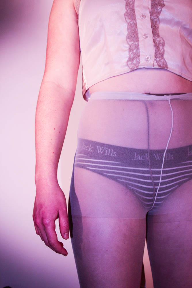
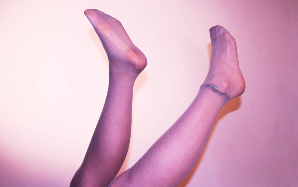
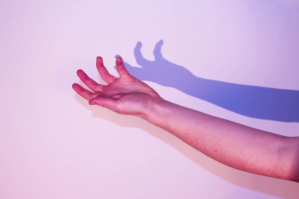
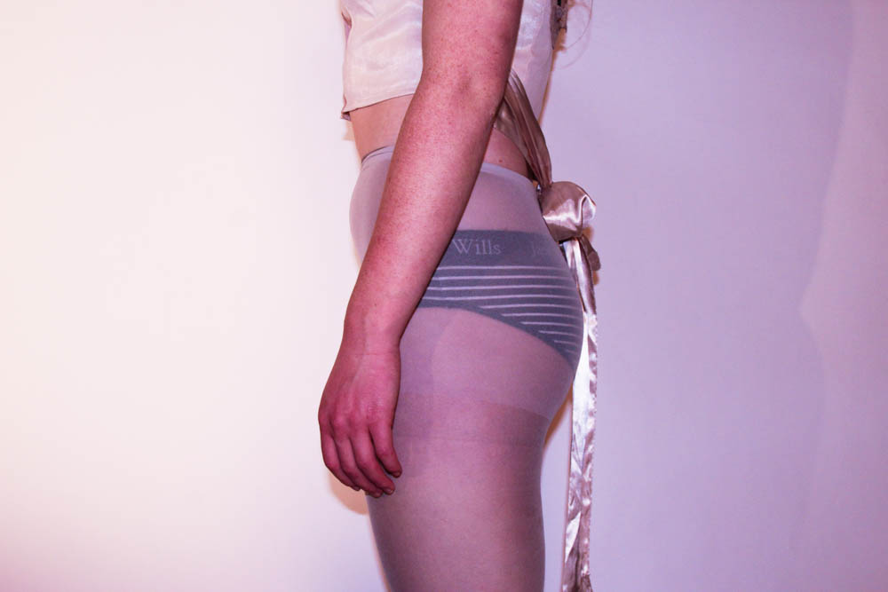
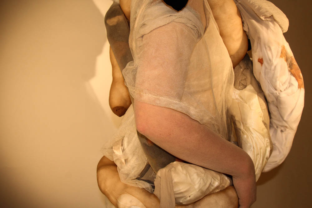
The first part of my body suit shoot was to simply focus on the shape and form of the female body. My aim was to try and capture as many angles of the form as I could.  I am very happy with the result of the photo shoot. The original images were good, however I wanted to edit the best images so that there was a constant colour scheme and so that there was a theme. I wanted a series of images that I would be happy to present together. When editing the images I wanted to bring out the natural tones and pigments. The pale pinks of the skin came out more when I turned up the saturation. I am very happy with the selection of images that I have ended up with.

During the photo shoot, I saw that shadows were being formed because of the studio lights. I decided I wanted to keep the shadows because they created a new dimension and perspective. They made the backdrop more interesting. It also added more tones within the frame which again made the images more appealing.

I edited the images using Adobe light room. I selected the best images from the shoot and started editing them by changing the lighting and darkening of each image. I then changed the saturation and tones to create the colour scheme I wanted.  It took a lot of time and editing to get each image to a similar colour theme.

I am very happy with the outcomes of the edits and I am glad I have managed to create a set of images containing different perspectives of the human body.

body suit shoot// part 2// experiment edits

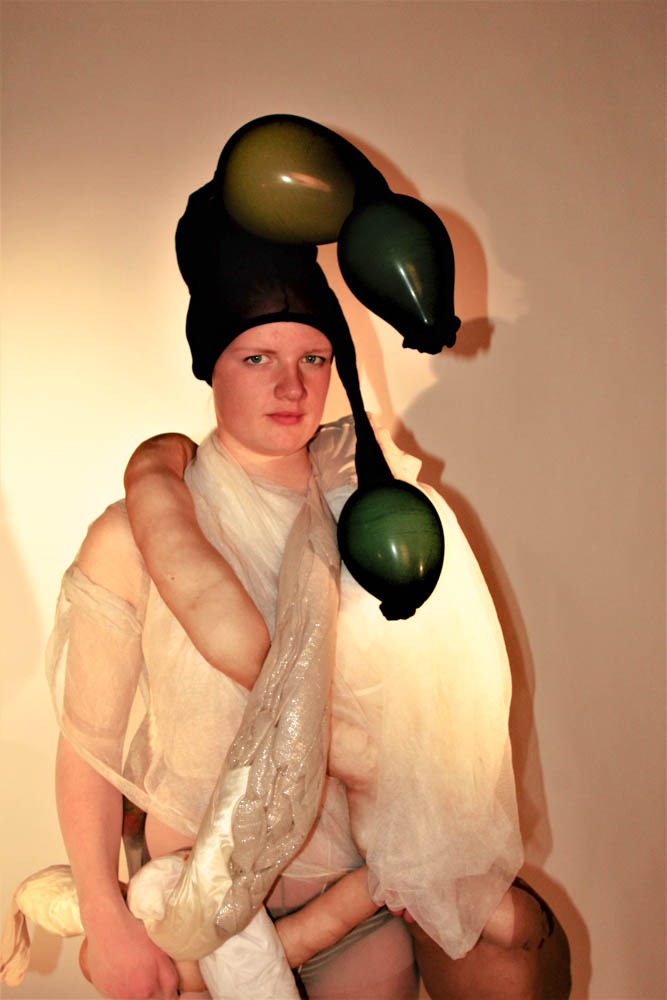
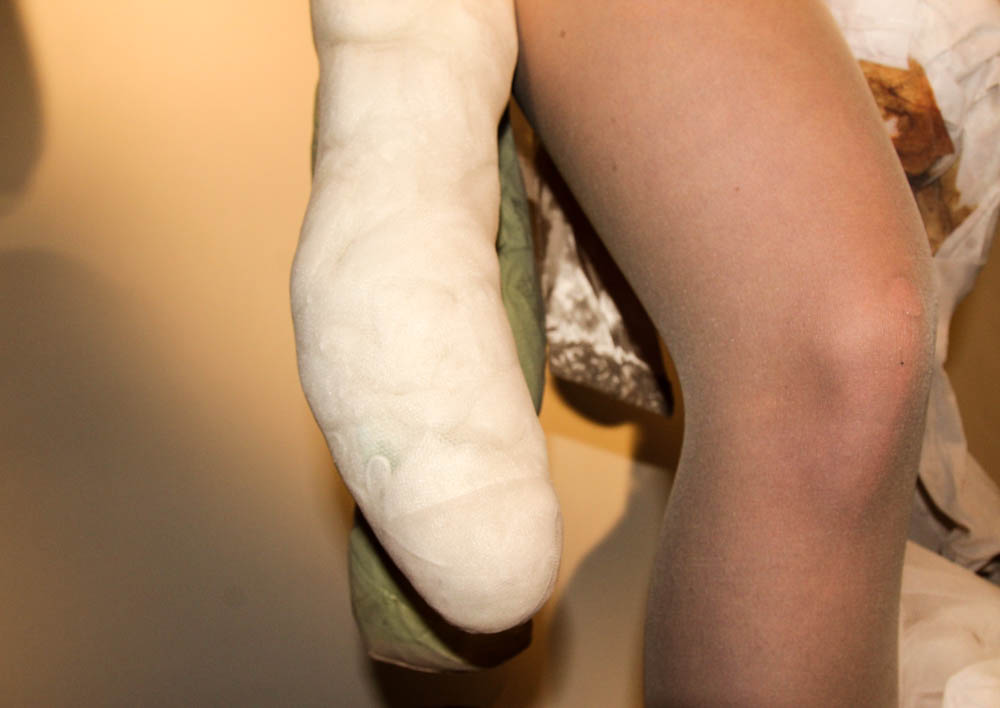
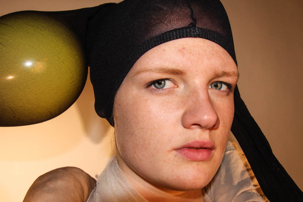
For the second part of the shoot, the fundamental aim was to capture images of a model wearing the body suit I made. Similarly to how I edited the first part of the shoot, I wanted to bring out the natural pigments of the original images.  I aimed to capture as many angles and dimensions of the suite and the model as I could. When editing the shoot I wanted to keep the natural pigments of the suite because I like the contrast that they created. Especially the black of the head piece against the white of the body suite. The point of the shoot was to express certain emotions and also some aspects of  body dysmorphia. I aimed to resemble what people with this condition feel and think they look like. Although it is not a realistic visualisation, I wanted to do it in more of a creative way.
I again used Adobe light room to edit these images. I started by editing the brightness, and the saturation of them. I didn’t want to edit the images too much, because the focus of the images was on the body suite and what that represented. I am very happy with the final outcomes of these edits because I have managed to represent what I wanted and have also managed to capture the different perspectives that I wanted.