
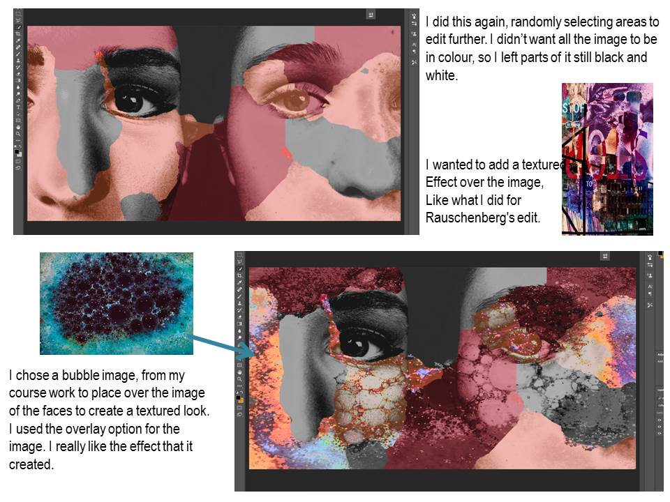
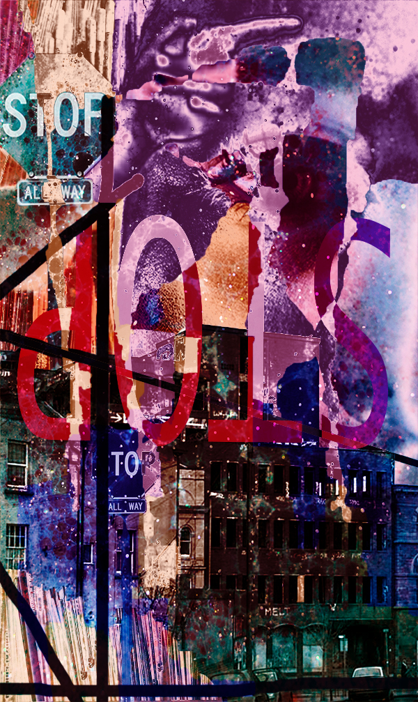
Here is the final experimental edit.


Here is the final experimental edit.




What is Structure?
“the broad understanding of applying a sense of pattern towards the underlying colours, shapes and contrasts in dark and light.”
The Zone System is a technique used a lot when capturing structure so that photographers are able to expose the existing contrasts between dark and light. It allows a brief direction for photographers to indicate their perspectives on a given structure. The Zone System exposes an existing contrast to the extent in which a balanced tone is produced.
Types of structure:
In structural photography, two types of structure are considered in order to stimulate ideas and projects, these are;
Geographic: photographers in the structure department of photography can decide to capture geographical objects in order to emphasize shape in either natural or man-made (architectural) forms.
Social: photographers like Bill Owens and John Bulmer are famous for documenting the hierarchy of society and how this can form a sense of structure of how demographic groups can be divided into different forms of life.
Structure involves a set of four elements that must be considered to take an efficient photograph in structure, these are;
Shape, form, pattern and texture
Shape can allow an indication of composure for a structural photograph, shape is an element with only two-dimensions and therefore angles are the main motive in capturing a suitable composure.
Form is when you see the subject three dimensional. Form gives us the depth of a subject. For example; if I was to take a picture of a football, I would capture a sphere rather than a disk. The main motive to execute form correctly is making sure you have the right shade to contrast, so that depth can be present in the given subject.
Pattern can allow an indication of composure inside a photograph by repeating a set of shapes and textures in order to balance a photo symmetrically. This element of structure can be the focal point for a certain photograph, or it can act as a backdrop to something else. It can also become quite a complex element as the eye may not recognise a valuable pattern due to size and appearance.
Texture conveys how the subject feels, meaning that this element can allow the photographer to capture either a hard, soft, smooth or rugged object. This element aids the use of photo composition by moving closer to the subject so you can isolate a specific part in the frame. This means shape and form is no longer a consideration when taking a textured photograph, as the approach becomes macro.
Nikola Olic
“Abstract structural photography offers playful re-imagination of what urban structures might represent, both in a real physical sense and a personal experimental one, drawing us closer to the cities we explore by assigning these structures a purpose and meaning that reflects us, our stories, and our histories.”
Nikola Olic, specialises in abstract structural photography, fixing patterns and shapes amongst city tower blocks. Looking closer at a city’s architecture.
Nikola Olic is an architectural photographer based in Dallas, Texas, with a focus on capturing and deconstructing buildings and sculptural objects in “dimensionless and disorienting ways.” His work reveals building structures that may appear to be a shape we cannot identify at first glance; the way his photo composition lies on the angle of structures can capture a delusional effect. This effect can make you transform the beauty of city skylines into something unique, with the right angle of the camera.


To briefly analyse the ‘Hypnotic Building’, Olic has angled the camera at a rare building in the densely populated downtown city, Houston. This building was a late-modernist structure during the 30’s and now resembles the rush of office workers and lawyers that use this daily. The context of this building is then portrayed in the final photo with the hypnotic lines that roughly match some of the elevator shafts from inside the building, transporting the daily chaos from office workers and lawyers from A to B. In contribution to this mesmeric feeling towards architecture, the use of black and white lines also contrast against each other in order to make the image more mesmerizing.
Photograph reference: http://www.structurephotography.org/all.asp
Koen Van Damme
Koen Van Damme specialises in architectural photography in a moderate way to Olic; his work captures a unique angle and perspective of shading and tonal value inside shapes that we become oblivious to in everyday life.
Van Damme reveals hidden beauty inside fragments of whole objects, when doing this he also uses the skill of combining other fragments in order to create leading lines, patterns and composition within his final photograph. Although his images are intense and concentrated; Van Damme captures a soft and aesthetically pleasing sense of structure.


To analyse the photo above – taken from Van Damme’s project ‘MODEL HOUSE .AR+’, we can identify the way photo composition supports each structural segment inside the image. Each segment presents a different shading of colour, yet they all seem to join together through the leading lines of architecture. Van Damme has captured this structure in portrait form so that he could isolate the given tones that contrast against the dark and disconnected background presented in the angle of which he was stood.
Photograph reference: http://koenvandamme.be/
Franco Fontana

“The purpose of art is to make the visible, invisible”
Fontana is an Italian photographer who explored his love for vibrancy during the late 1960’s. His work entails the initial purpose to expose the tropical colours of shape and texture inside an abstract photograph.
His photographs have Appeared worldwide in over 400 exhibitions, solo and collective. His images are in collections in over fifty public and private, Italian and international galleries, marking his unique approach to capturing a warm, vibrant flavor towards what may seem visually unfulfilling.


Photo reference: http://francofontanaphotographer.com/
Julian Schulze

Based in Berlin, Julian Schulze is an abstract photographer who is majorly influenced by composition and colour, focusing on the ‘Abstract & Surreal’ genre of photography. Schulze is also known as the master of minimalism; this term considers the idea of sculpture and painting that was first introduced during the earl 1950’s, usually presenting mass formations. This term best describes Schulze’s work since he typically captures the simplicity of everyday scenes of objectivity, made up of just one or two elements. By doing this, Schulze has the ability and unique skill of composing a 3D scene into a 2D perspective through using light, shadow, and color to create a compressed version of the clutter and confusion of society into mind-bending notions that will leave you to unravel the image.


Photo reference: http://madeinshoreditch.co.uk/2016/07/25/julian-schulze-many-different-ways-geometric-abstraction/
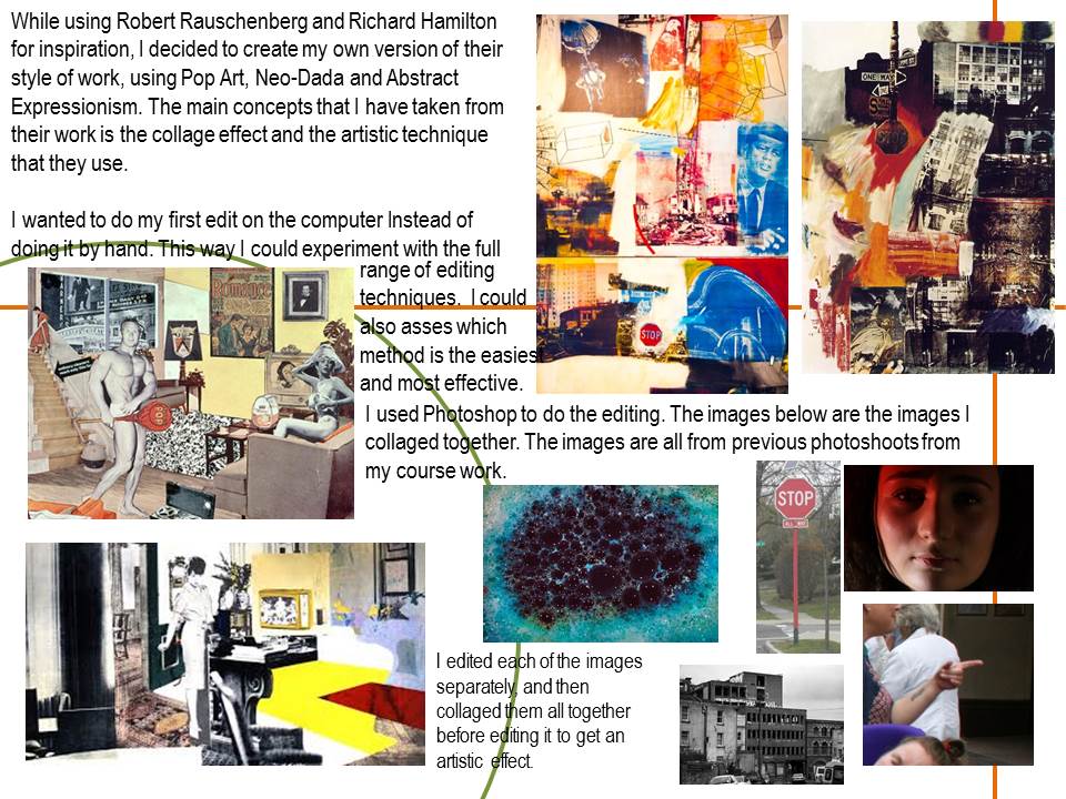
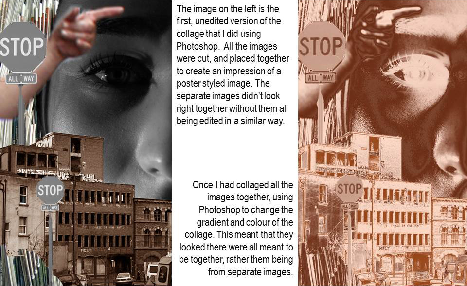
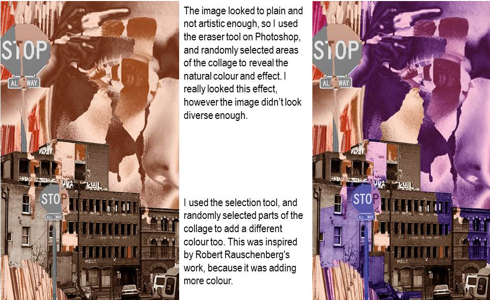
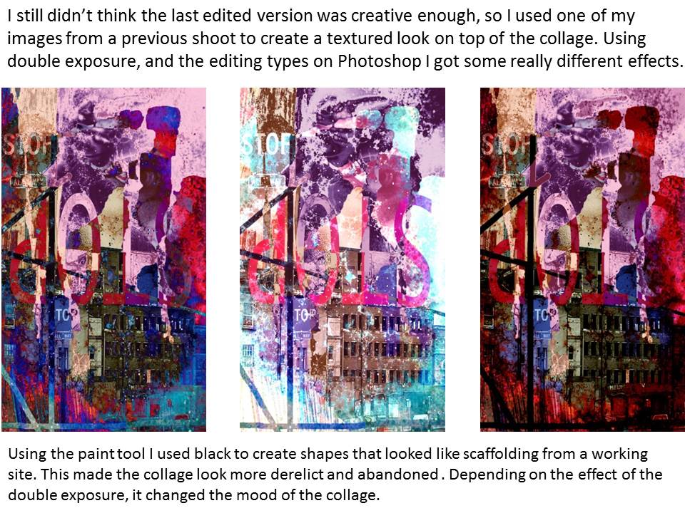
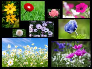
This is the Final edited version of the collage.


Karl Blossfeldt was a German photographer born on June 13, 1865 and died on December 9, 1932 who worked predominantly in Berlin. He is famous for his his close-up photographs of plants and living things being inspired by nature and how plants grow leading to the idea of structure. He believed that ‘the plant must be valued as a totally artistic and architectural structure.’ He was appointed a teacher at the Institute of Royal Arts Museum in 1898 where he established an archive for his photographs. From here until his death, Blossfeldt’s works were used for teaching and were publicised in 1928 known as: Urformen der Kunst (Art Forms in Nature). Urformen der Kunst soon became a bestseller making Blossfeldt famous very quickly. Other artists were impressed by the abstract shapes created through the idea structure in nature which he successfully revealed. Walter Benjamin declared that Blossfeldt ‘has played his part in that great examination of the inventory of perception, which will have an unforeseeable effect on our conception of the world’, comparing him to the early pioneers of the New Objectivity movement.
Image Analysis

I love this photograph due the very simple layout presented through the white background and relatively harsh lighting. This helps to cause a strong contrast due to the shadows created from within the shapes and structures within the pine cone. Bright areas appear as a strong white, and the shadowed areas appear almost black. This is successful as it helps build a strong structure overall thanks to all these specific details and elements. Building on this, I like how the strong macro focus used allows us to differentiate, sharpen and exaggerate a lot of the dark/white tones. Also in terms of simplicity, the fact the photograph has been taken from a birds eye angle, this is significant because these simple techniques allow the viewer to focus more on the natural structure of the image. I particularly find interesting with the structure of the pine cone, showing layers at the bottom building up to the top. This is interesting because it shows how the pine cone is fundamentally reliant on the foundations of the body. This is true in many forms of structure and I believe that Karl Blossfeldt through taking this photograph has successfully highlighted. Interestingly, with the lack of color and strong emphasis on the sharp, intense textures generated from the pine cone gives the photograph quite a cold feel, causing there to be a feeling of lifelessness. This makes the viewer feel somewhat apprehensive due to the fact that pine cones are structures that are seen as part of nature. However due to the fact of how there appears to be quite a cold feeling coming from within the image, I can conclude that the structure in the image appears to cause a sense of hostility.

My Responses


Here are some images that I took during the shoot exploring my own style of taking photographs of natural structures in a studio. However I also incorporated into my work the inspiration I have felt after researching and analyzing Karl Blossfeldt’s work. I experimented with the use of flash but then I found the images looked slightly too piercing and that I had less control rather than with a studio light. Therefore I stuck with a white studio light, in quite a dim setting for the photographs with a white background. The photographs with the black background I used with natural light. Comparing them now I believe that the natural light tended to bring out the lighter parts of the photograph whereas the studio photographs, I had a much stronger ability to adjust the contrast to bled nicely with the shadows. In doing this, likewise with Karl Blossfeldt I could use this to focus well on contrast. I believe an increased contrast helps the object blend better with it’s background, surroundings and other elements of the photograph. Overall I believe my shoot was successful because I achieved a grounding in Karl Blossfeldt’s style whilst also developing some of my own to incorporate more of an emphasis on aperture and various angles whilst still enforcing the Karl Blossfeldt’s style of black and white. I believe I have captured the essence of structure effectively due to the choice of the actual objects. I wanted to ensure that I could do this bu taking my photographs using a macro setting to bring about the textures of the object and how these fibres make up the object itself as a structure.
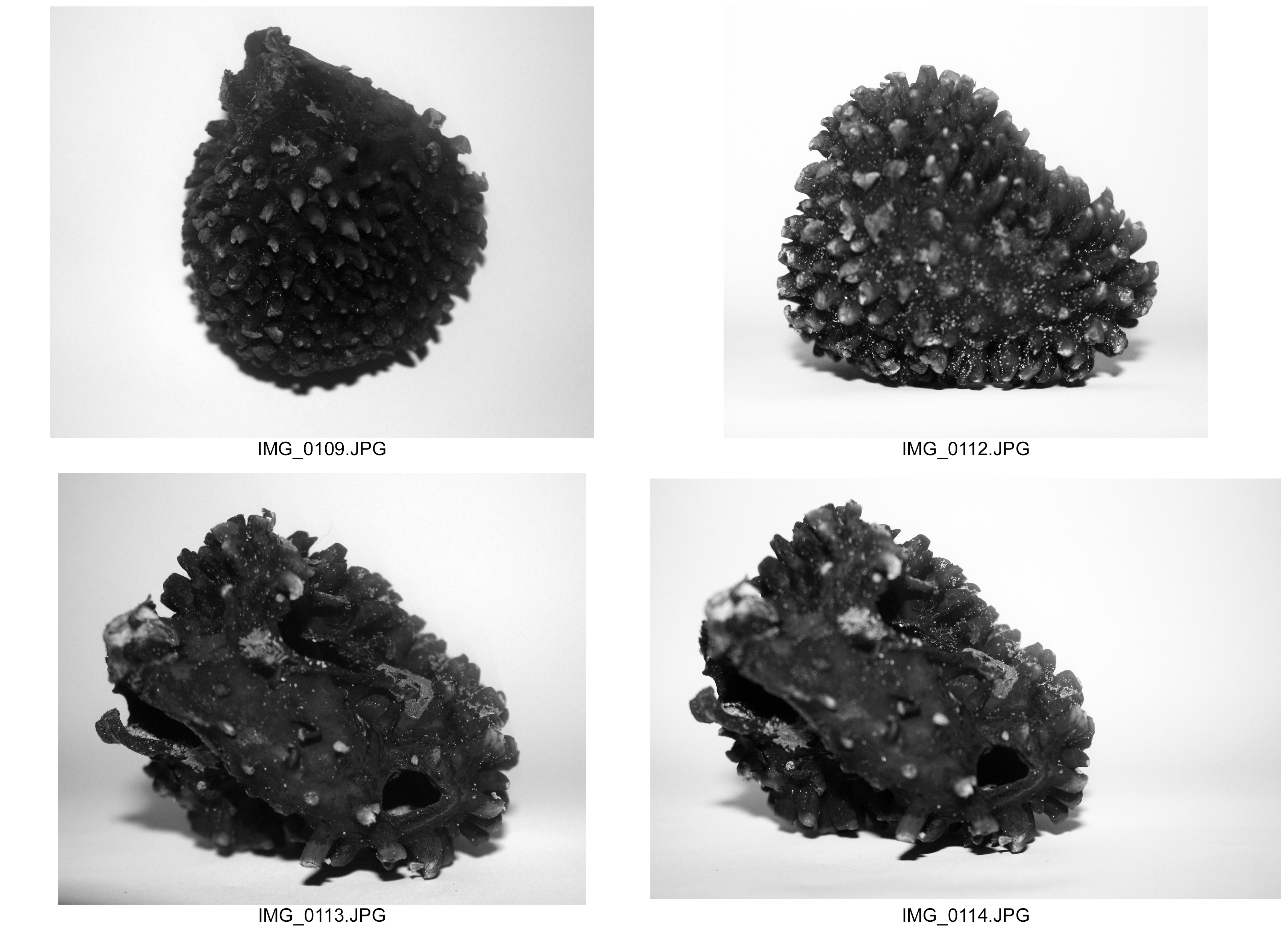




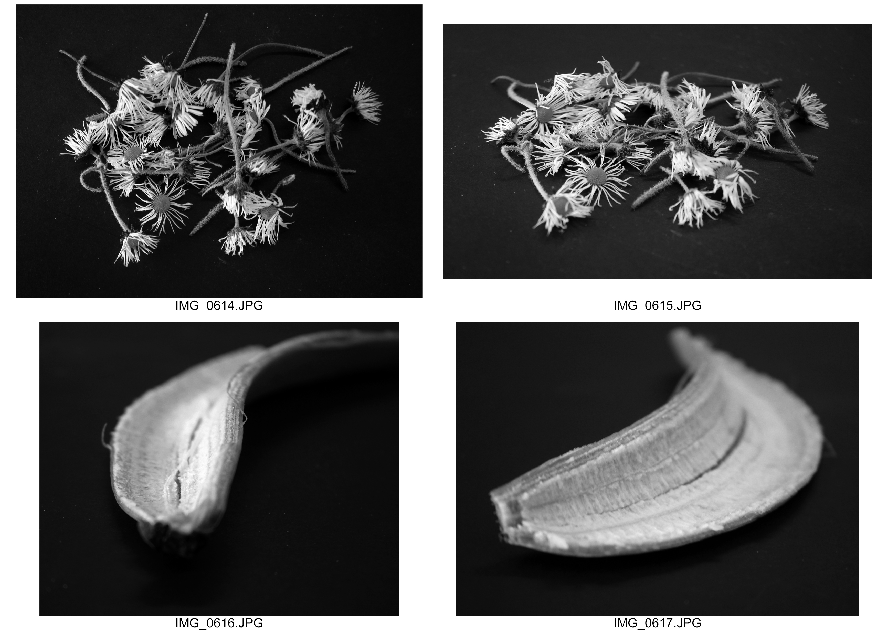

Best Images
I chose these as my final images because I believe that these show my own style, inspired and influenced by Karl Blossfeldt. In all of them I took them as a close up, attempting to show the structures of these objects as quite strong,bold and secure. I like how the aperture and use of the macro setting allows us to see tiny details of each object. I did this to show how every part of an object is important in terms of the structure and how everything has a separate part and role to play. Within each photograph using natural and artificial lighting, I ensured that I was in a bright environment to help the lens pick out the details in which I was hoping to capture. I also wanted to support this, through myself in terms of where I was placing each object and what angle they were positioned. I am confident that these photographs incorporate the theme of structure effectively and from here I would be interested to explore how black and white and aperture can be used to display further structure.



Andreas Bernhard Lyonel Feininger born December 27, 1906 – February 18, 1999, was an American photographer largely known for his black-and-white scenes of Manhattan and for his exploration of structures of natural objects. Feininger was born in Paris. In 1908 the family moved to Berlin and in 1919 to Weimar. Andreas left school at the age of 16 in 1922 to study at the Bauhaus graduating in 1925. After that he studied architecture at the Staatliche Bauschule Weimar (State Architectural College, Weimar) and after that at the Staatliche Bauschule Zerbst (where the Bauhaus moved to in 1926). During his architectural stidies Andreas developed an interest in photography and was given guidance by Bauhaus teacher Laszlo Moholy-Nagy. He gave up architecture and moved to Sweden in 1926 choosing to focus on photography. With the outbreak of WW2 in 1939, Feininger immigrated to the U.S. becoming a freelance photographer until joining Life magazine in 1943 till 1962. Feininger became famous for his photographs of New York, science and nature through work depicting bones, shells, plants, and minerals in the images which he profusively stressed their structure. Feininger wrote manuals about photography such as The Complete Photographer. Ralph Hatterley editor of the photography journal Infinity, described him as “one of the great architects who helped create photography as we know it today.”. He has won numerous awards. In 1966, the American Society of media Photographers (ASMP) awarded the Robert Leavitt Award. In 1991, the International Center of Photography awarded Feininger the Infinity Lifetime Achievement Award.
Image Analysis
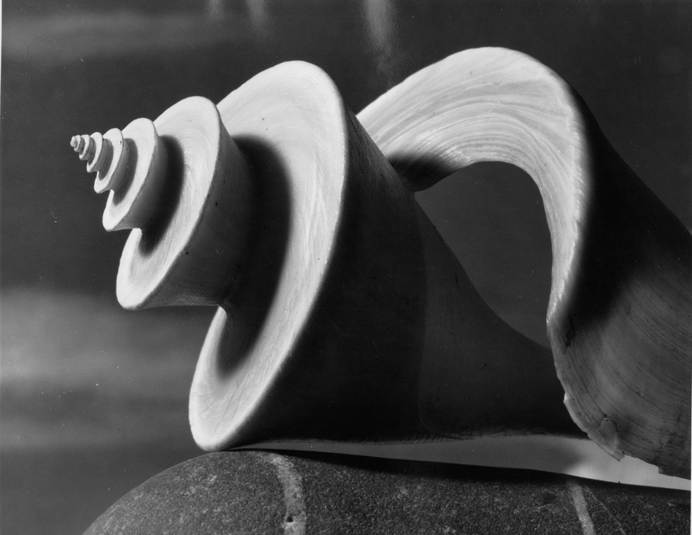
I love this photograph due to the beautiful texture and patterns caused by the natural structure. Why I particularly love natural structure is because of how the structure of the elements is free to go where it wants. I like how the angle is taken on a face on angle, allowing us to perceive the structure as slightly bigger than in reality. This has been exaggerated by the framing of the photograph through the fact that the structure doesn’t quite fit onto the frame. This is interesting to me because it strongly emphasizes the importance of structure within nature but also how it allows us to visualize how the structure of shells is formed by freely by nature. Andreas Feilinger I believe has successfully done this through the fact that the beautiful textures from within the shell are perfectly captured. For example, the photograph appears it has been taken from quite a distance with a strong zoom used. By doing this the photographer can achieve quite a shallow depth of field in the sense nearly all the shell is in focus. Interestingly, Andreas Feilinger has used a single light source, generating shadows around each curve that help illuminate the lighter parts. However there is a very smooth transition between dark and brighter tones to the right side of the shell, with very intricate textures being incorporated through the use of the macro setting. This displays a well developed exploration of the use of contrast that particularly strikes me as showing the structure as strong and solid. I believe I can develop my style as to incorporate techniques as using a low ISO with a relatively slow shutter speed to help capture the textures on the object with a single light source. I want to do this because a single light source involves an idea of simplicity showing just the structure for what it is and nothing else, and I believe by doing this, we can appreciate the hardened solid structure of the object for what it is.

What particularly strikes me about this photograph. The interesting shape and structure appears complex and also slightly mysterious to me. With the shape and structure appearing quite random, at first the photograph almost appears quite surreal. However after the viewer explores the photograph and examines it in further detail we can see how the structure is so very intricate. For example the dark background sets the environment to be quite dark and sets the mood as slightly tense. Then through the use of the low key lighting, the shell appears at the back to be brighter and expose grey tones and then further forward it appears brighter exposing further brighter tones of light. I believe this transition has been made smoothly through the shallow depth of field and aperture but also the angle of the lighting is positioned looking down and above towards the shell. Furthermore the framing of the photograph, similar to that of the previous photograph is slightly too big, isolating various parts of the photograph and highlighting the tip of the shell closest to the lens. On the other hand, it is slightly off center in terms of the rule of thirds, this is important because it highlights that the structure of the shell is holding up the other elements. Through this, the significance of structure is displayed as something that is essential in supporting the whole object which is the most important key aspect of structure. The photograph appears to have been slightly underexposed allowing the textures and light to appear smoother but also more subtle and allowing the well lit areas to be less harsh on the viewer. I like how Feininger has done this, and so for my shoot I will look to follow similar techniques however I would rather experiment with low key, chiaroscuro lighting. In doing this I wish to present my work as having a more dynamic representation of structure, by incorporating greater shadows adding depth to the structure of the object.
My Responses

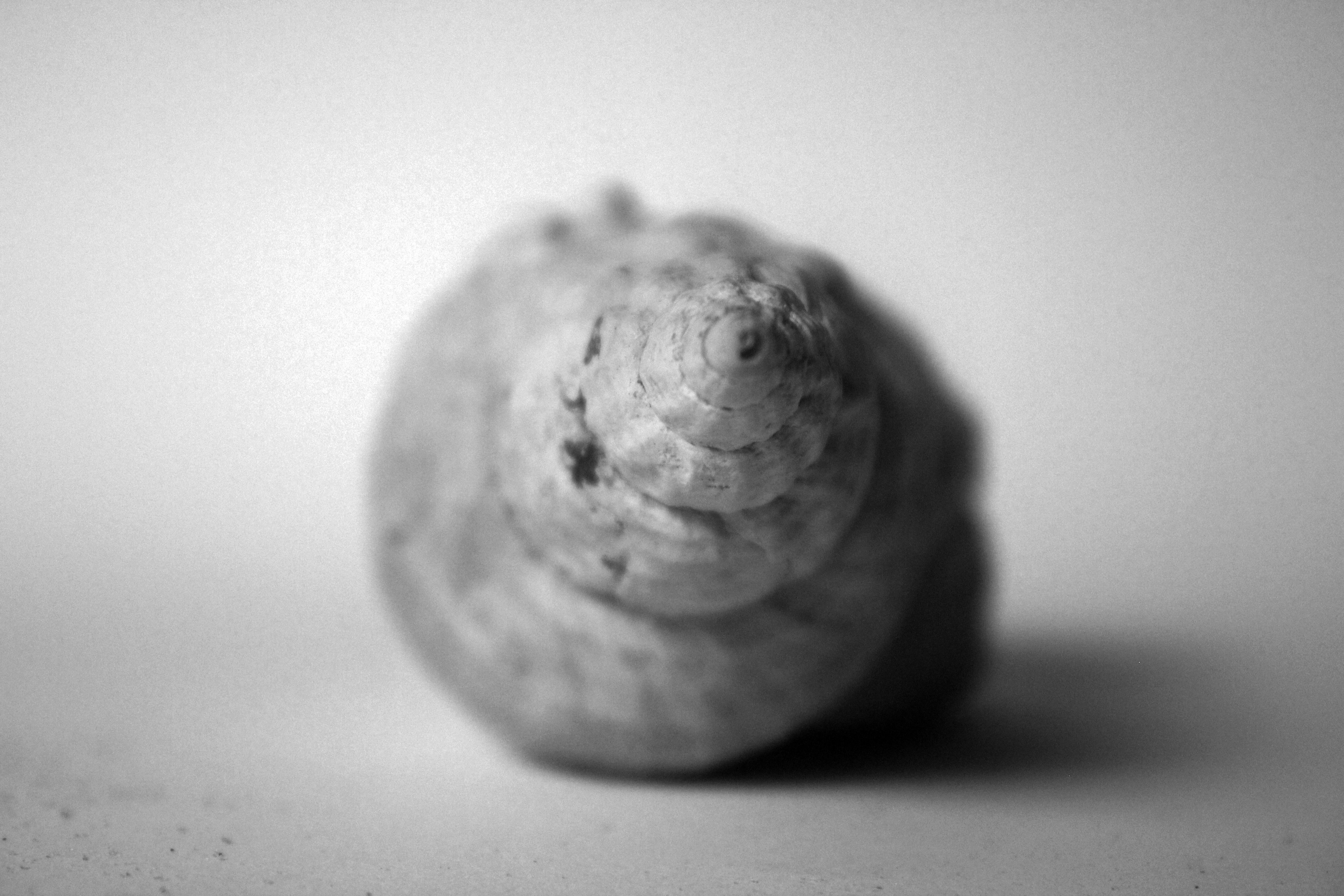

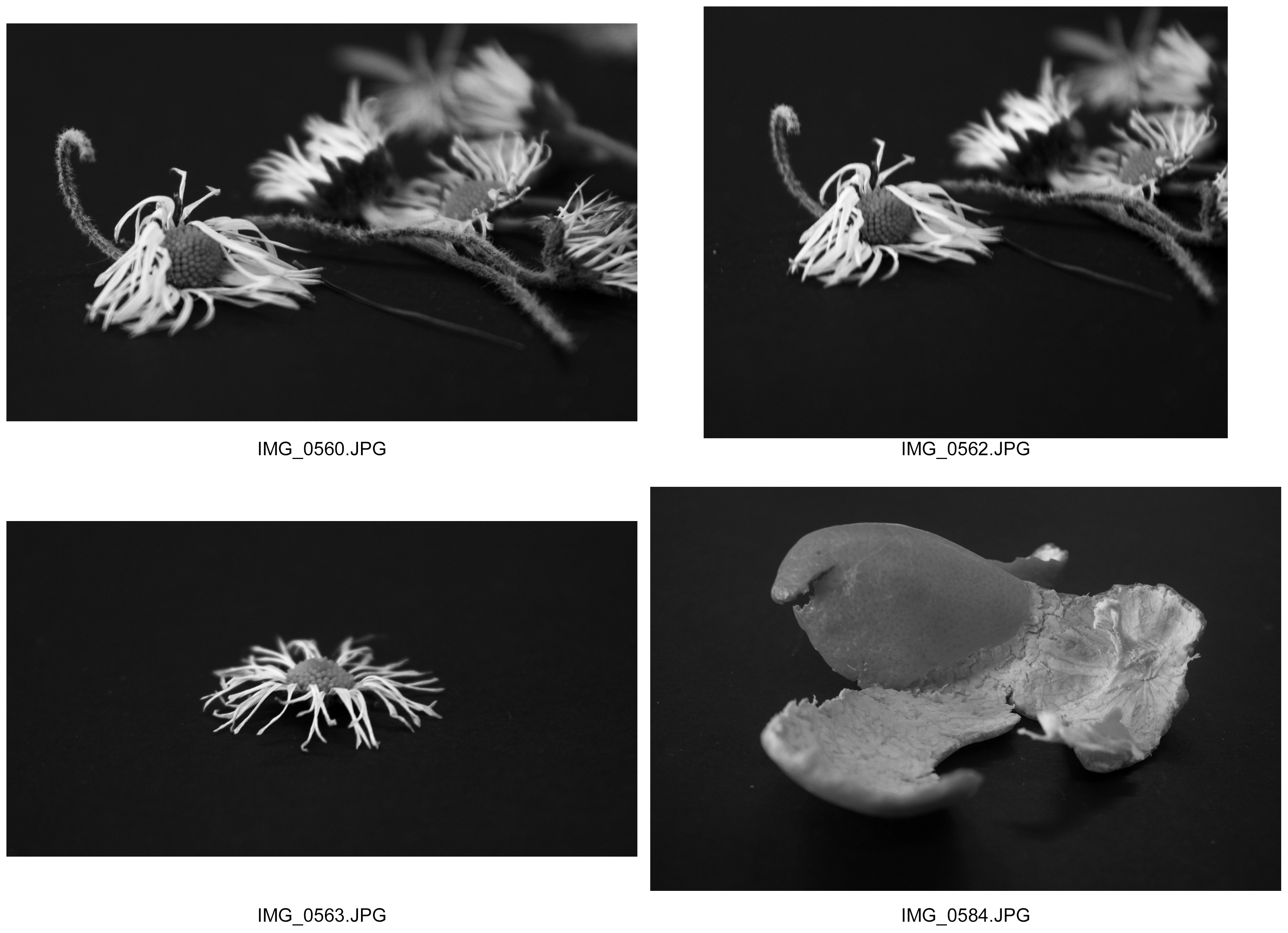
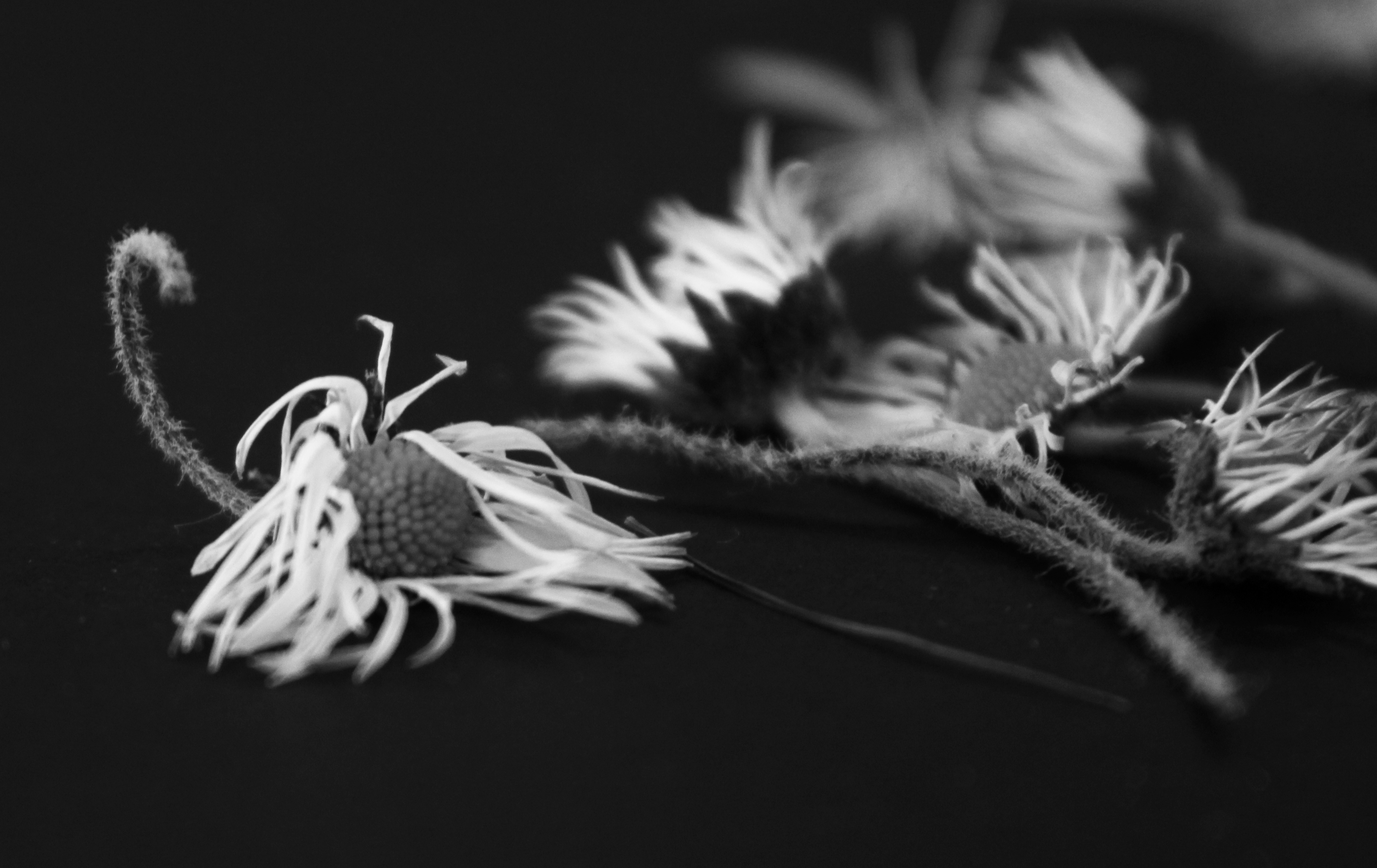
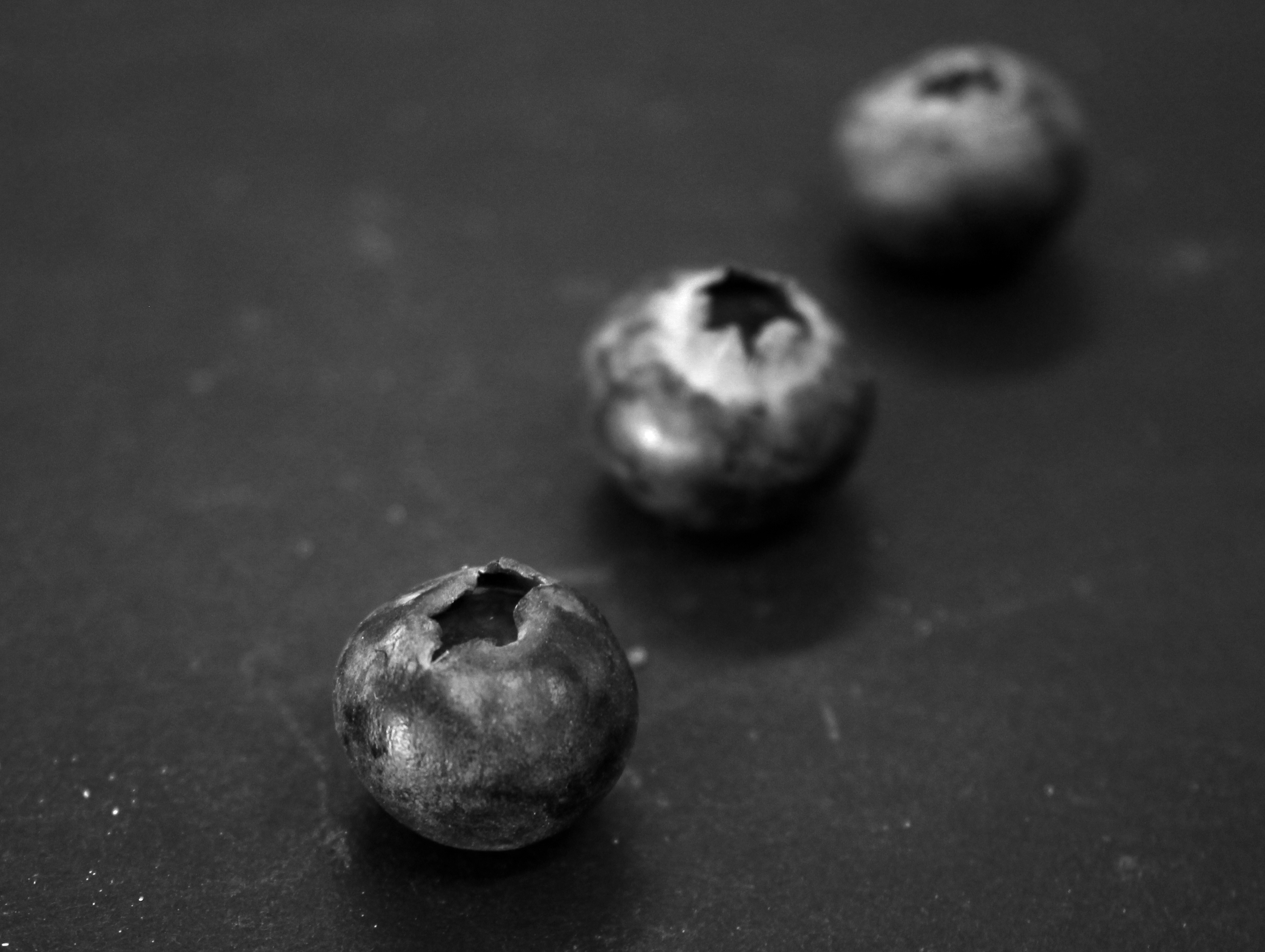
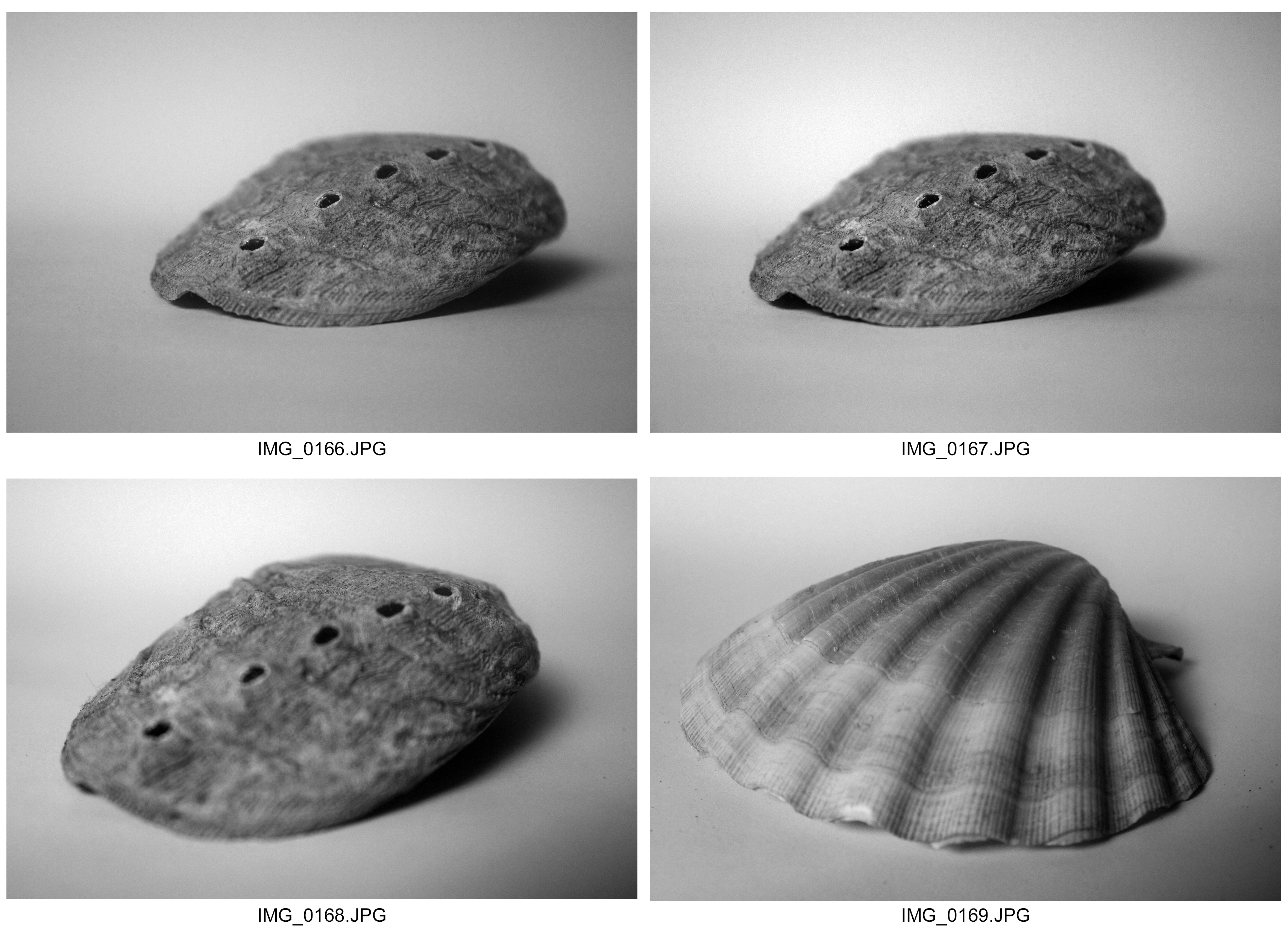
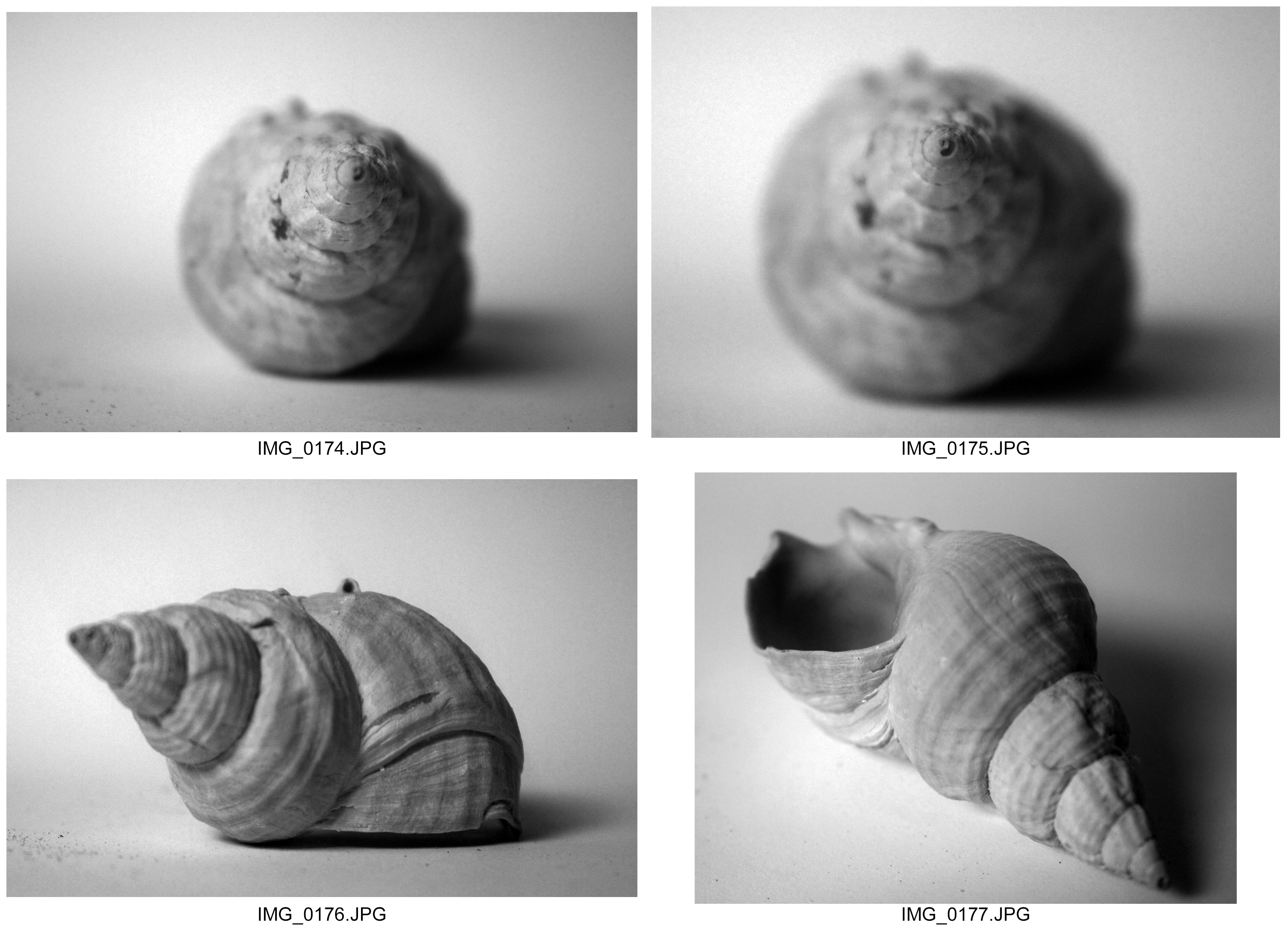
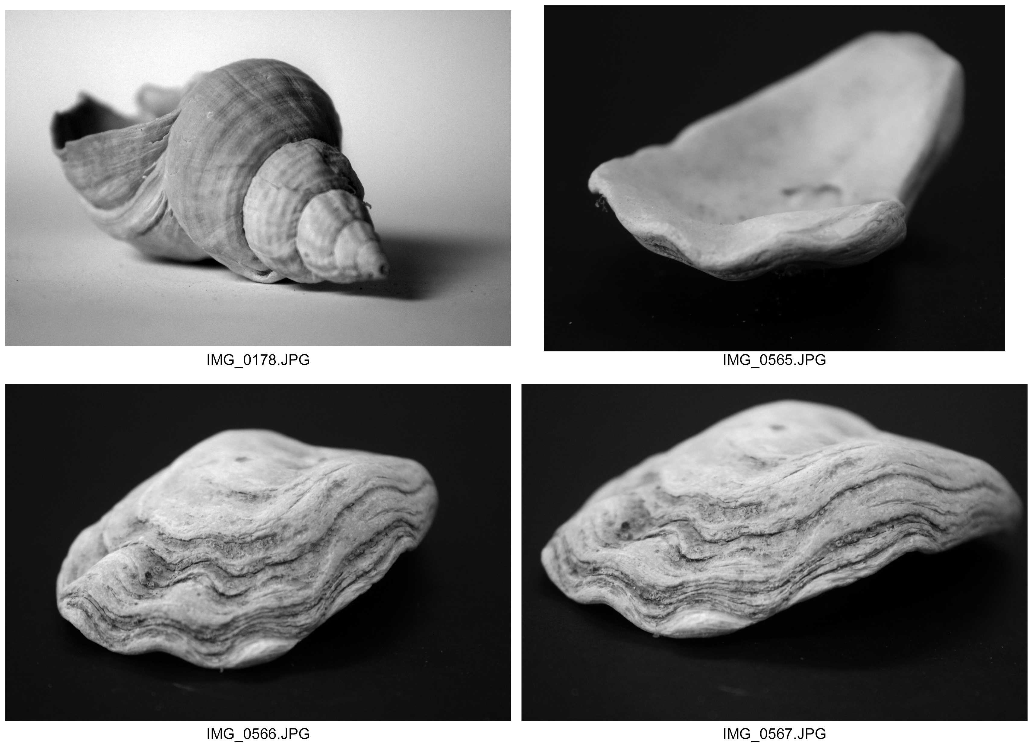
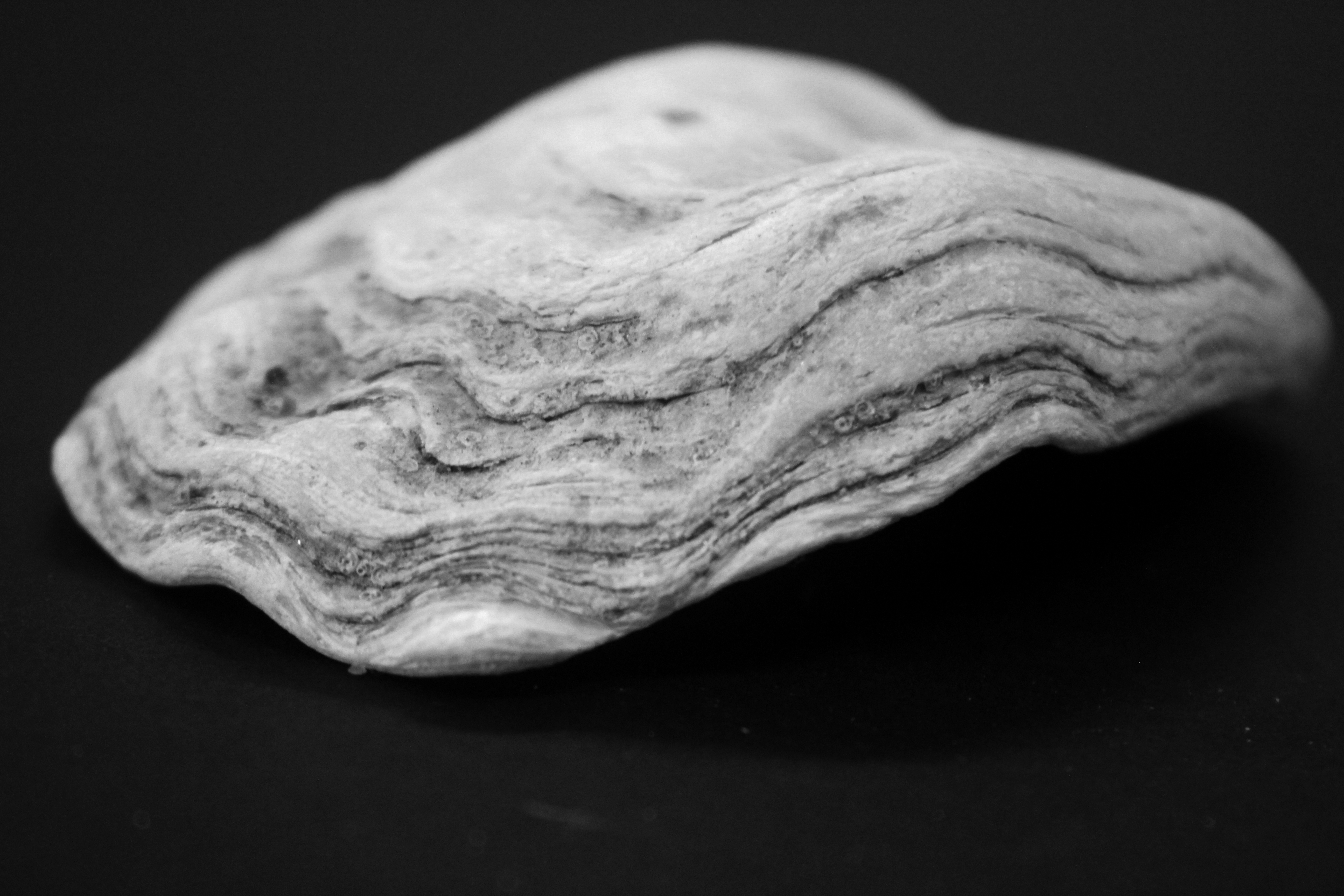
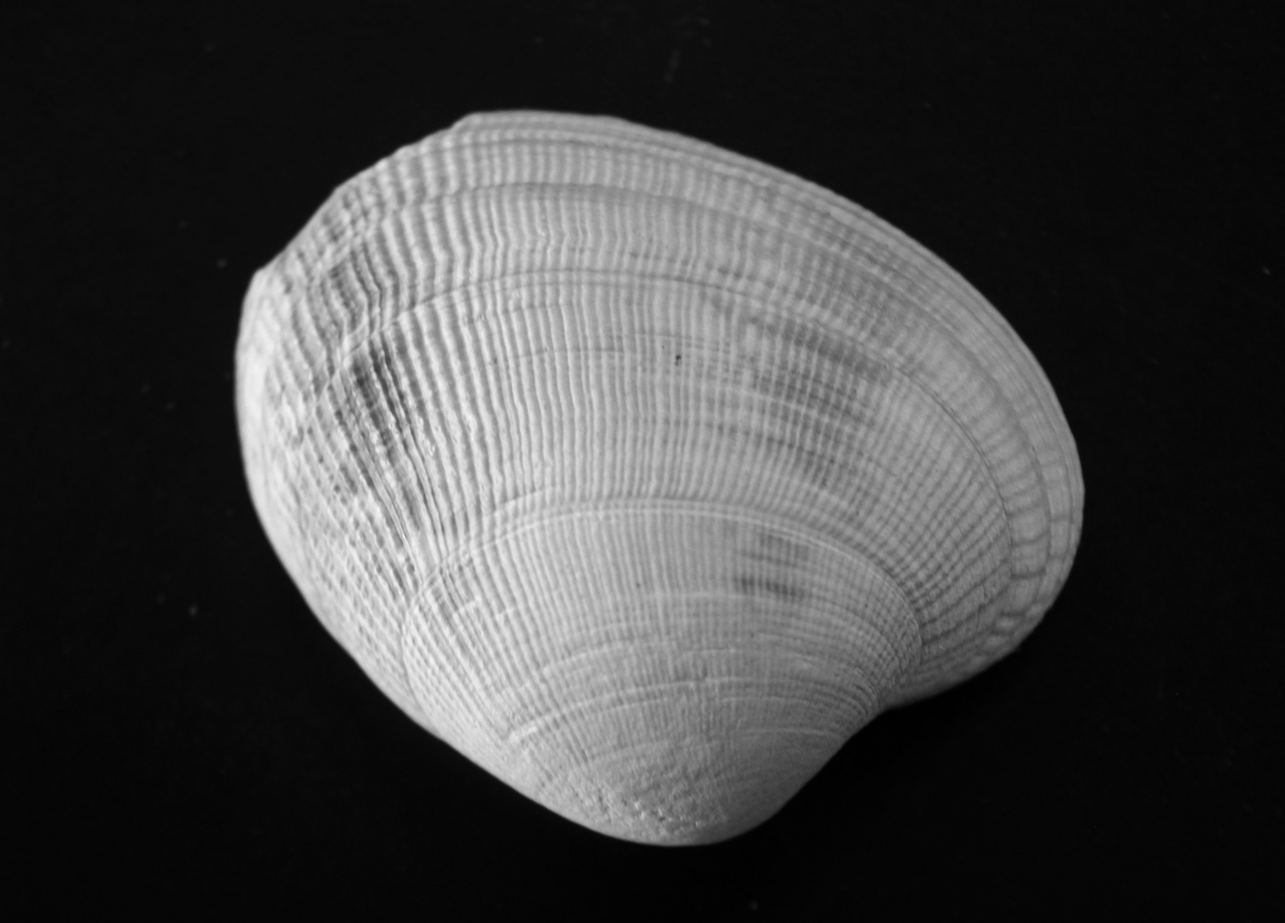
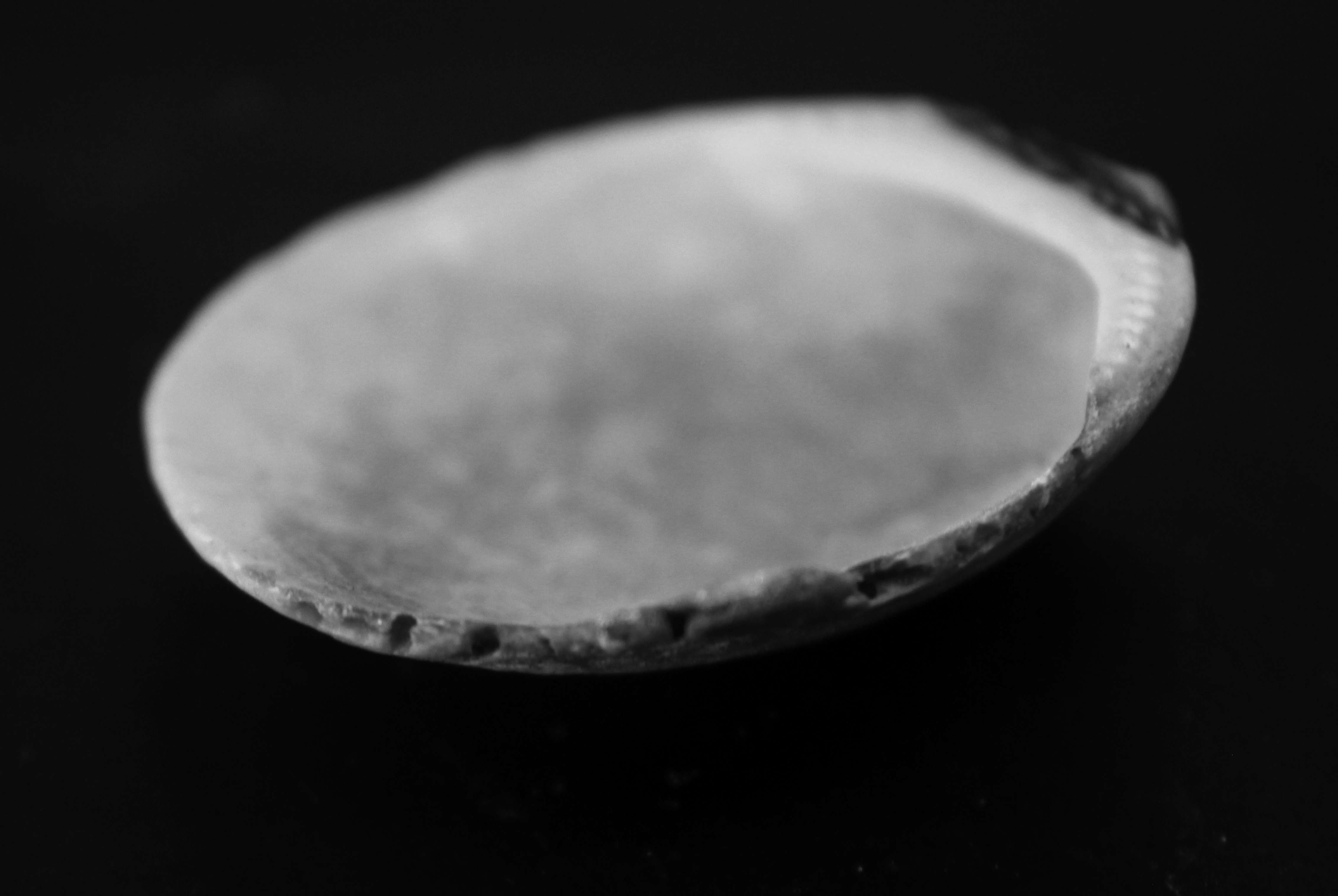
Here are some more images I took from the shoot that was taken in a similar style to Andreas Feininger. This is somewhat similar to Karl Blossfeldt’s work in the sense that I took these photographs in a similar style to my response to his work. I looked at the theme of structure in a slightly different perception to Karl Blossfeldt’s work. In terms of the angles where Karl Blossfeldt takes his photographs form a bird’s eye view, Andreas Feirlinger is focused much more on face on angles that depict structure in a sense which I believe, is rather beautiful. I took these images in a brighter sharper light, complementing the sharper edges and textures of the objects themselves. In doing this, I placed a greater emphasis on more areas being illuminated and only fewer areas showing a stronger dark sense. I like how these photographs appear to have a direct link with Andreas Feilinger’s work. This shows natural structure effectively because of the slightly odd and random angles I took the photographs from, it compliments the same of the shapes and ranges of grey, white and dark scales. Likewise with Karl Blossfeldt’s work I took the photographs on am macro setting, I followed that technique up here. However whereas before I focused on particular areas with Blossfeldt’s responses, here I focused more on the actual object itself as a whole. This shows structure in a different light because whereas before I showed how individual elements of an object helped make up a structure, now I am showing all the elements together in one. This shows now how the structure is strong and secure and lees delicate and fragile where it almost appeared like that before. Interestingly, this strong and secure form of structure is very beautiful because of the consistent fineness and accuracy for the delicate areas and textures. This link shows that these miniature structures, when not joined together, appear random but when joined have a strong purpose of holding together the structure of the shell. So therefore despite the free and random shapes of these structures, what is significant is from what we can see from the photographs is how the role of the structure is very similar if not the same in each object.


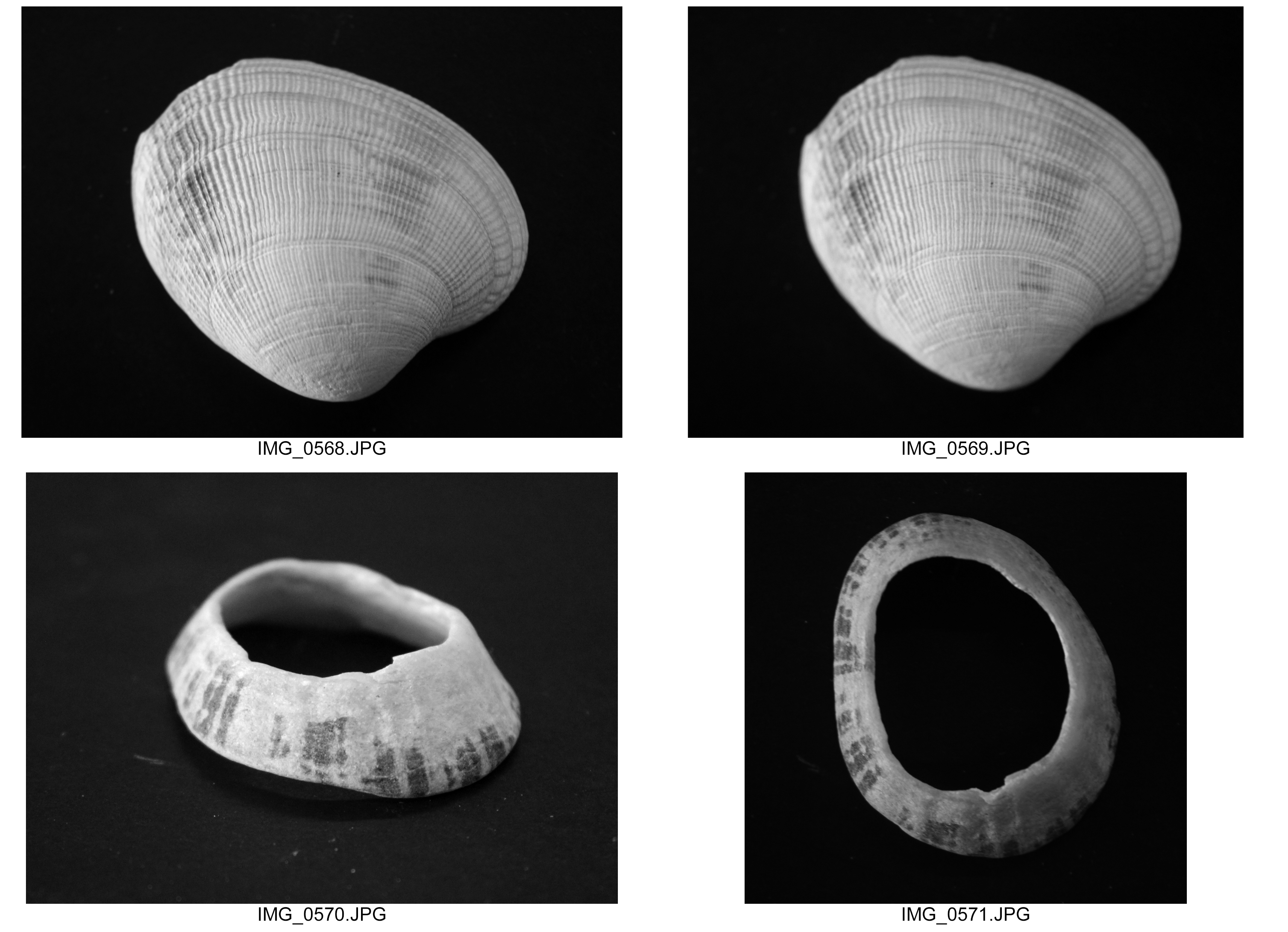


Best Images
I selected these as my best photographs because for me I love how similar they all are in terms of light source, texture and depth of field. However what sets them apart for me is how the shape of each object differs and through this how effectively they reflect light in the environment, create shadows and illuminating how sharp or smooth their textures are. For me I prefer to compare how each object responds and differs to this in this specific environment. I believe that the structure I have incorporated into these photographs is significant because it shows how the elements of natural structure are beautiful in the patterns they create, but also that the structure appears a little abstract. This fascinates me because, the question is: is how can something with such purpose, beauty and reason appear so abstract and almost random in its design? I believe that this question poses a challenge to me when exploring natural structure and through my photographs I hoped to have answered. For example random textures, shapes and perspective I believe show how despite the structure appears slightly random, it also helps make up the actual solid structure of the object itself. Natural structure for me follows a theme of freedom to it, I have captured in a well controlled environment. This selection of best images for me are important because they show that the structure between each object although holds the same role in all the other objects, each structure is coded to its specific object. This is significant because it adds to my idea of abstraction in the sense that each shell’s structure is using external features of shape, contrast and texture to hold an effect.


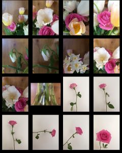
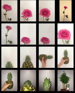
In order to explore the structure of flowers, I now think having a more well-rounded approach so the photographing of flowers in their natural environment would make my exploration more sufficient.
To gain some tips to reap the benefits of photographing flowers in nature, I used this website: https://digital-photography-school.com/photographing-flowers/
