Category Archives: AS EXAM 2017

Filters

Author:
Category:

CONTENT / CONCEPT / CONTEXT

The process and geometrical element of my photo shoots were based on locations that consisted of the ongoing commercial impact on housing estates and apartments offices. Approaching my photo shoot with this modernistic approach enrolled a perspective of how society has become a very repetitive, monotonous lifestyle for man-kind. I noticed how the apartments formed a stack of homes, giving the impression that our leisure has become compressed and so structured due to the economical demand of widespread finance offices that have harshly populated our environment. 

As part of my process, I also referred my work to Van Damme and how his work involves the presence of light within his structures. I planned half my shoots on capturing angles within light, hence the shadow features within most my images. I believe this effect enabled me to express a higher status of leading lines. This effect also created a contrast, which then spiraled my idea of merging my knowledge of two-frame filming and also David Hackneys technique of ‘joiners’. This contrast formed a juxtaposition within the image, conflicting both light and darkness within structure. 

I also linked my photo shoots to Nikola Olic and Julian Schulze who both focus their work on geometric abstraction and compositions that lacked in huge details or decoration. The simplicity of this effect gave me inspiration to replicate abstract shapes that are presented on frontal surfaces, both artists also use a variety of bold colours to liven the scenic view of urbanisation.

Photo shoot’s and raw/unused materials

Throughout the shoots I completed in preparation for this exam, I aimed to achieve a sense of understanding towards shape, symmetry and form. These three skills in photography all aid the idea of structure, especially in relation to my artist references. Shape supported my perspective and how to angle my camera; also compromising with the composition of the photograph, dealing with how distant i was from the scenery in order to capture the entire shape. This links with my motive towards symmetry as this technique allowed me to identify possible shapes that co-inside with each other, forming a moderate approach to a structured, symmetrical view. This also put emphasis on the rule of thirds, a tool that aligns a subject with the guide lines and their intersection points, allowing linear features in the image to flow from section to section.  Form was also an addition to the two motives since both resulted in the general idea of form; the visible shape or configuration of how something appears.


Still Life – Garlic

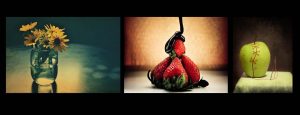
Still life photography is a genre of photography used for the depiction of inanimate subject matter, typically a small group of objects. It is really effective for portraying the detail of the photographed object in question, this can be furthered by paying attention to high and low key lighting.
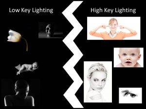
Low key lighting predominantly uses dark tones to create a dramatic looking image, whereas high key lighting seeks to over light the subject to the point of reduced contrast.
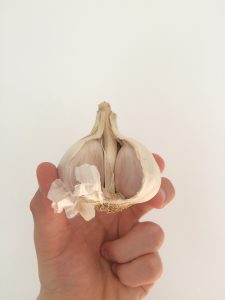
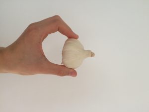
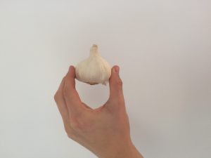
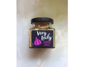
Using the still life approach, I attempted to take some images of a garlic from numerous angles. The garlic was missing a couple of cloves which made it more convenient to photograph as I’m trying to display man-kind’s negative impact upon the environment and demonstrate how humans merely take from the natural world.
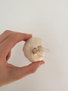
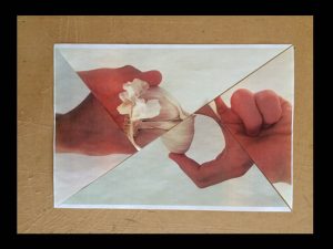
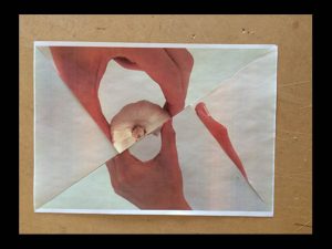
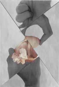
In order to experiment with the images, I printed the photographs out onto standard A4 paper and sliced the images up in order to combine the four photographs, or alternatively, the three or four segments of the garlic in an usual form of a garlic.
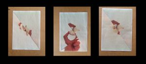
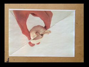
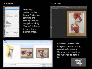
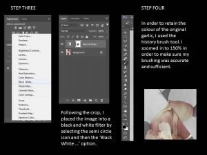
Considering the resurgence of a Karl Blossfedlt approach I also put the garlics into a black and white filter and gave them a black border on Adobe Photoshop.
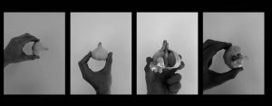
The black and white filter enhances the sinister effect of humans upon the natural world, which is also displayed through the garlic missing cloves as they were utilized for human consumption, demonstrating the greed of our species.

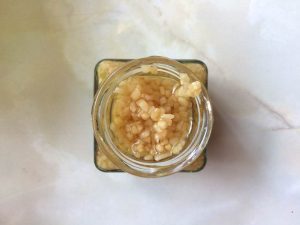
Following the attention to the human assumption aspect, I would like to establish what happens to the garlic once used or in its cooking form. Here is another garlic structure…
Sammy Slabbinck

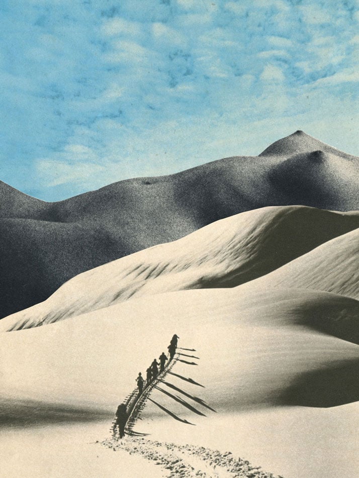
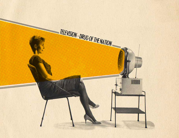
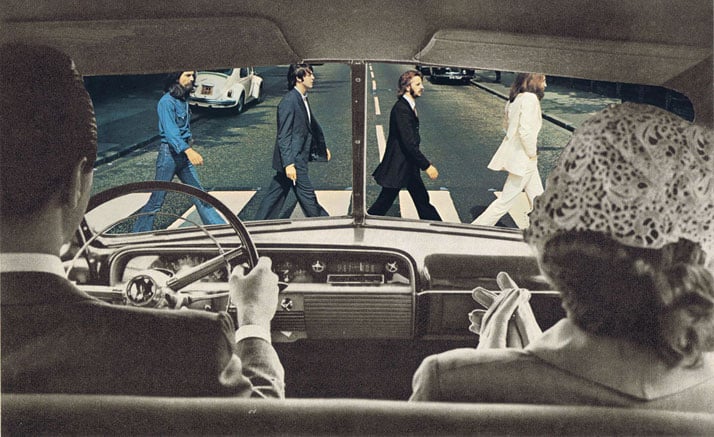
Sammy Slabbinck is a unique contemporary photographer who is notorious for using collages. The Belgiancombines his own photography with alternative images, which are usually old-fashioned, giving a vintage effect.

Image result for sammy slabbinck photography

Image result for sammy slabbinck photography

To view more of his work, click the following link … https://www.yatzer.com/sammy-slabbinck-art/slideshow/11
Sammy Slabbinck’s iconic and individual take on the world caught my attention as he combines photographs fluently and gives an obvious opinion in each of his images. One photograph of Slabbinck’s that certainly caught my attention is the following image as it really does open a variety of images you’d expect to see through a camera. Slabbinck gives such a simple yet effective visual representation of the photographic process and gives different examples to help visualize the camera and its function, whilst also portraying his own interpretation. For a modern photographer to use old fashioned images and emit such a vintage tone inverts my expectations which fundamentally, makes the collection of photographs more interesting.

Image result for sammy slabbinck photography

The split up images are portrayed as different rays coming from the camera. The graphics show presumably an old fashioned holiday home and a man holding a traditional camera, setting this very vintage and mature scene. The interesting visuals are juxtaposed with bland brown paper which help illuminate the images which Slabbinck forces us to focus on.

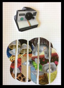
I attempted to recreate the image in my own way…

Moodboard: Influence to Artist Reference and Photoshoots

After researching an introduction to structure, I then funneled my inspirations into a mood board. Using this research allowed me to search the correct terminology of scale, shape and pattern related to architecture, conveying the scale and beauty found in buildings.

I decided to research structure in buildings because they a visually pleasing, with good composition, linear formation, symmetry and leading lines. It allowed me to go out and capture interesting architecture, revealing different styles, shapes and sizes. It also revealed the history behind each building I photographed as different textures exposed a certain emotion towards the scenery. For example, an old, desolated building triggered an emotion towards memory; leaving a sense of sadness towards the photograph, giving myself and the viewer an impression of past life that once lived within the melancholy building. Whereas, most my shoots were focused on a stylish, modern approach to building structure. This then formed a vision of sanitation, purity and life, three elements that were supported by the age of the building and how it was able to absorb the crisp light, colour and a strong composure in comparison to the subsided building.

Studying these images also spiraled certain terminology that I proposed on a mind map before going out to capture my shoots.