Category Archives: AS EXAM 2017

Filters

Author:
Category:

PLAN OF PRESENTATION

Panoramic Structure

Using a panoramic dimension, I have gathered three images (influenced by Van Damme) in attempt to recollect David Hockney’s technique of ‘joiners’. By merging all three image within close proximity, I believe the result of this presentation informs the viewer of a chain of scenery that both resemble the same composure. Presented on foam board, these images all support each other in the order their in, therefore suggesting formation and structure towards my presentation, linking with the leading light that progressively dims the viewer from one image to another.

Shadow Montage

Joining Architect

Also inspired by David Hockney’s joiners, my plan of presentation towards the set of images above signify the importance of leading lines with photography. Joining the leading lines of shadow and shape, I enrolled a technique of contrasting various images of different colour in a way that allowed both to correspond with a sense of flow and intimacy alongside from each other.

RBC Structure

Presenting both images onto black card enabled the level of exposure to contrast greatly, aiding its ability to demonstrate a high-key presentation of the building. This also supported the concept of both images, making them overhand the dull and secluded background helped to portray the message of success and hierarchy within the exterior of office blocks.

Finals: ARTificial

The second set of final pieces I produced were photographs of artificial flowers, linking to the iconic name ‘ARTificial’. By incorporating artificial flowers within my work, I attempted to demonstrate man kind’s ignorant and insincere nature as they’d rather obtain fake flowers that don’t need care than maintain the health of more natural and beautiful flowers.

Similarly to the Zoe Leonard technique of sewing together fruits to resemble her mourning, I used the sewing of photographs to represent the cold, inconsiderate and neglectful nature of the human species as in order to have a full flower, man-kind had to physically sew it together, which also demonstrates their attempts at rekindling nature.

The second piece I produced specifically for this project is the lonely flower. The flower is an obvious representation of the natural world and for me to photograph it intentionally on its own I attempted to display the reclusive and lonely nature that the environment faces. As humans, we often deface nature and turn areas of natural life into housing developments or offices, particularly in Jersey so for the flower to be stood up by its self establishes the natural resistance.

Finals: Project Garlic

Within my 10 hour photography exam, I was able to produce three final pieces for my coursework task. The collection of images were an attempt to portray the general struggles that nature endures due to the detrimental effect of humans, as well as humans attempting to rekindle a broken nature.

Primarily, I produced ‘Project Garlic’, fundamentally a collection of photographs displaying different angles of a half-used garlic. I attempted to take a typo-logic stance, linking to Karl Blossfedlt, as I felt it was necessary to show human’s destructive nature from a variety of perspectives which is the concept I tried to portray.

The image on the left is my edited prototype of my final before I added in the black’stroke’ around the edge of the image as well as inbetween the cracks. The image represents a human trying to re-piece a garlic with severe emphasis on the hand as the correct garlic formula is ambiguous.

EDITS: WHY?

I decided to link this image with the concept of triumph, a sense of pride to comprehend the level of brightness entering the image. This perspective was formed through the given environment; taken in the middle of St. Helier, this office rose above the life of society and looked down upon the rush of working life. To extend this perspective, I altered the entire exposure of this image to stress the angelic glow that radiates the office exterior in attempt to send a signal of success towards the meaning of this modernistic building. Giving the tonal value a profile of how education and finance appears to be the given spotlight within society today.

With great influence from Van Damme’s work with architect, I have presented my image with such significance on the shadow play due to the impact of leading lines. By increasing the saturation of this image, I was able to create a greater contrast of the warm escape that entices the viewer against the mysterious darkness that echoes further into the compact alleyway, directed through the thickness of the shadow and its leading lines. Given this context, I figured this image presents an opening of freedom that is tightly fitted between the urbanism of working life. Located in St. Helier, this scenery was taken in the center of a block of finance offices named ‘Liberation House’  a major new landmark within St. Helier, with clarity of form and the use of grey and pink granite cladding, combine an effect of fashionable hierarchy that dominantly overcomes the exposure of nature. With this ongoing issue of densely populated areas of society, man-kind continue to proceed with the compact demands of finance and how the economy is harshly cropping our perspective of atmospheric views as presented in this image.

With inspiration from both Fontana and Schulze, I have given this image a stressful demand of colour to the viewer. For this reason being; I took knowledge from both artists and formed a response to abstract photography. Originally capturing the structure of apartments located in First Tower, Jersey; I noticed a vision that seemed dull and flat, sparking my decision to introduce Fontana and Schulze’s technique of entering vibrant, bold colours to give elements of reality a sense of enthusiasm and fantasy. Playing with this concept, I also formed a set of formation towards the composition of the image, diving three portrait segments of colour, supporting my corporate objective to achieve structure.

EDITS: HOW?

Experiments with my artist references and how they polished their images taught me a range of techniques within Photoshop that allowed me to highlight/expose hidden structures by adjusting the curves and also through layering different shades of light inside the image.

Olic inspired:

STEP 1: Using the basics of Photoshop, I increased the brightness of the entire image before layering in order to estimate the level of exposure entering the image from behind the building.

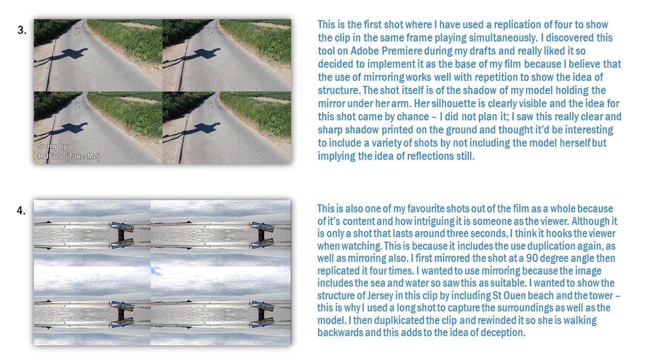
STEP 2: Then I furthered my ability to expose certain tones within my image by altering the saturation levels. By doing this, I was influenced by Olic’s work on contrasting the warm and liberated skyline the darker shade of blue exterior of the building. His work represents this multiple times and I agree with this technique in terms of exposing a structure, as this tool allowed me to sharply cut an embodied significant shape inside the image.

STEP 3: This effect on Photoshop is known as Curves, this allowed me to construct a smooth and angelic tone of the image, it also allowed me to put emphasis on the saturated colours, putting stress on my idea to give the foreseeable background a hint that glowed with brightness.

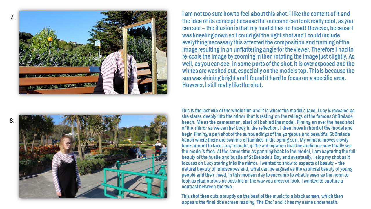
STEP 4: Adding a layer to the silhouette of the building.

STEP 5: Then I began to alter the image with complexity, adding various layers in order to adjust elements of the photo without adjusting as a whole. Once I created the layer that formed a new and separate element of the image, I used the brightness tool to greater the contrast between the skyline by decreasing the brightness in order to maintain the exposure and highlight the significance of the given glow arising from the building.

Van Damme inspired

STEP 1: Adjusting the basics first, I manipulated the levels of saturation that entered the image from the bottom left and also from the center, giving that extra warmth towards the contrasting shadows against the leading lines of contour.

STEP 2:  After renewing the colour, I selected the shadows evident from the center point of my image.

STEP 3: Identifying very little light within the middle third of my photograph, I decided to stress this tonal value by decreasing the light even more to form a stronger shape within the contour of the shadow.

Fontana inspired

STEP 1: Lowering the brightness in order to signify the lines, and texture that segmented the image and to also darken the shadow directed in the left third.

STEP 2: Adding this layer to form a profile of the shadow allowed me to strengthen the contrast between the walls, forming a shape of dimness that over hanged against the sun trap that exposed the vibrant paint.

STEP 3: Once I had implemented the shadow tones, contrast levels and brightness; I was inspired by Franco Fonatana’s work of selecting various colours to manipulate the given shapes that can be identified within urban construction. Adding vibrancy and formation, changing the concept of the image; by giving it a warmer tone that directs adventure and the ability to explore further into the image, giving it more life than the original.