Category Archives: Artists References

Filters

Author:
Category:

ANNA GASKELL VS HANNAH STARKEY

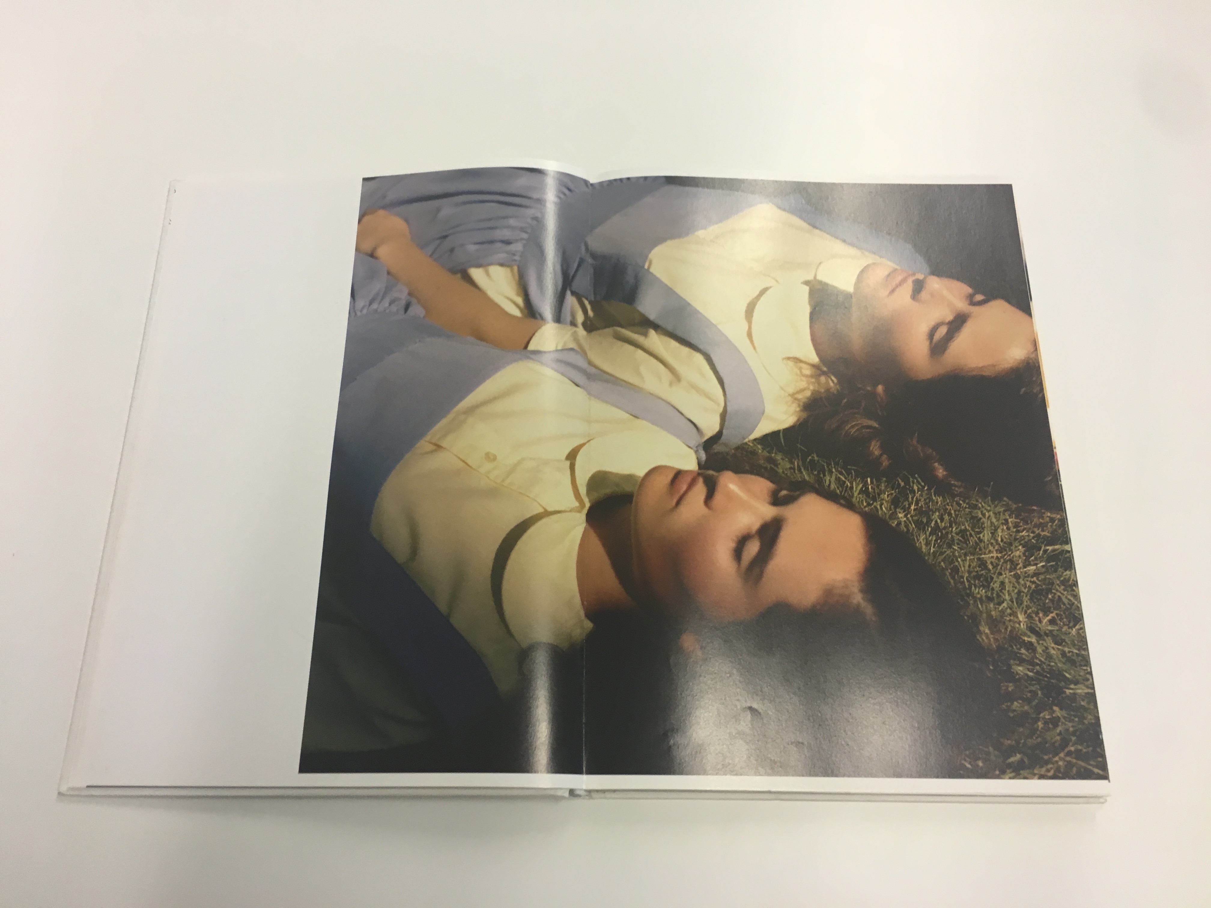
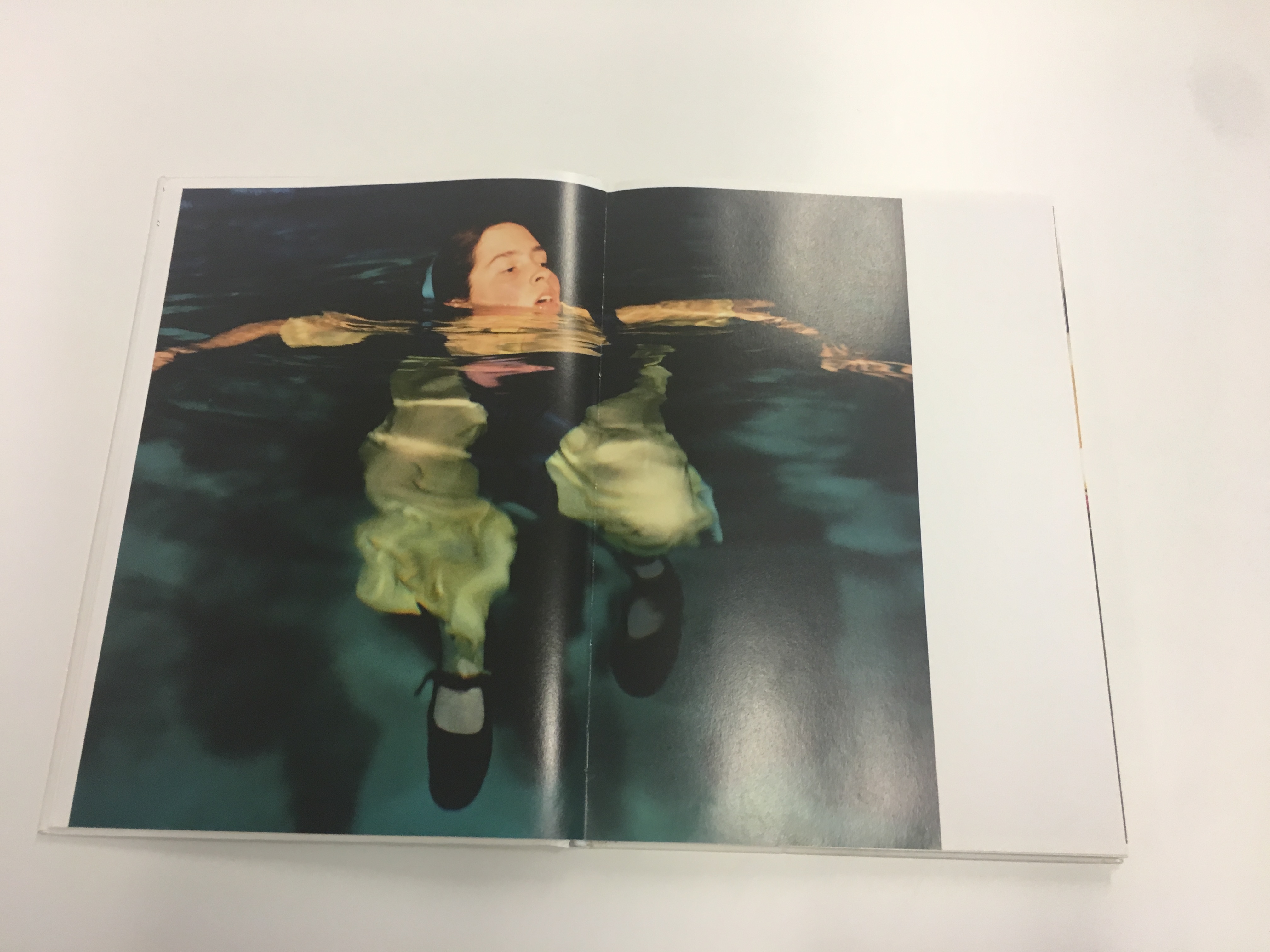
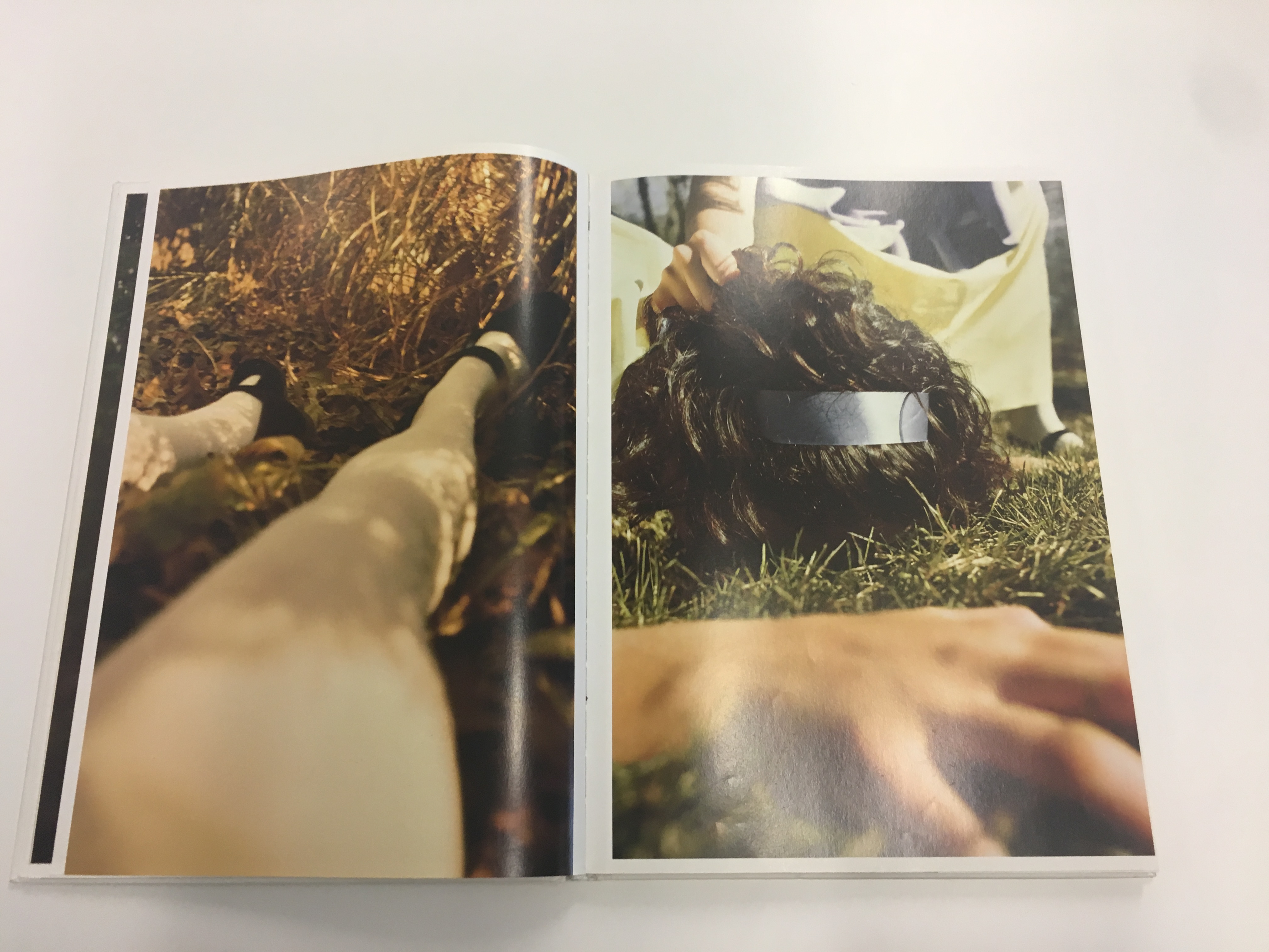
Anna Gaskell

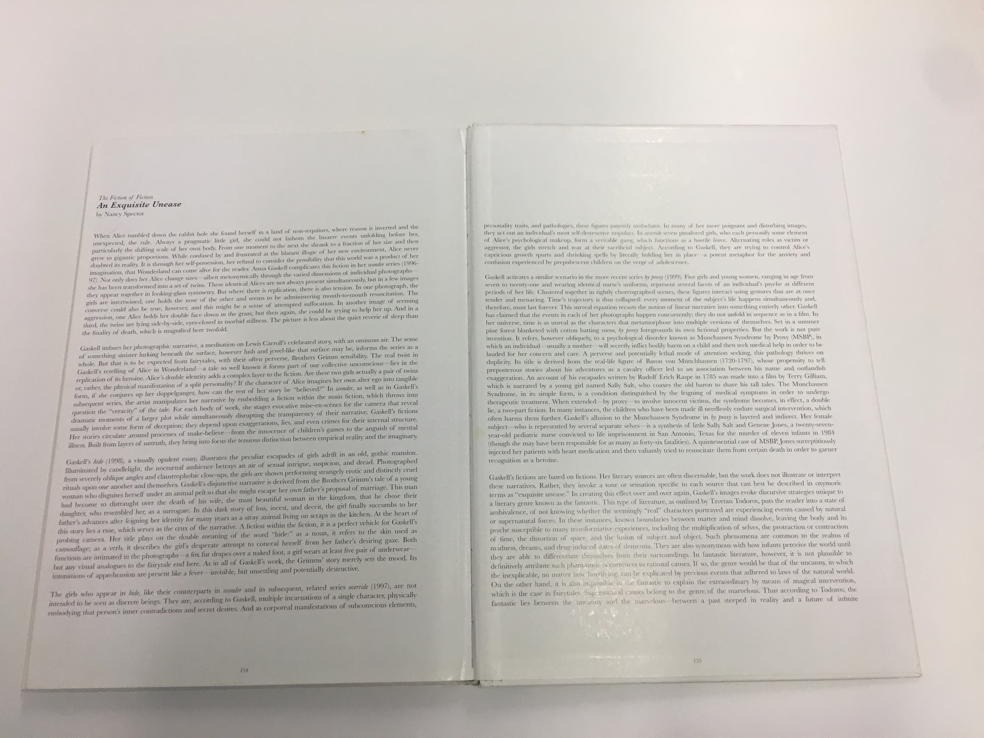
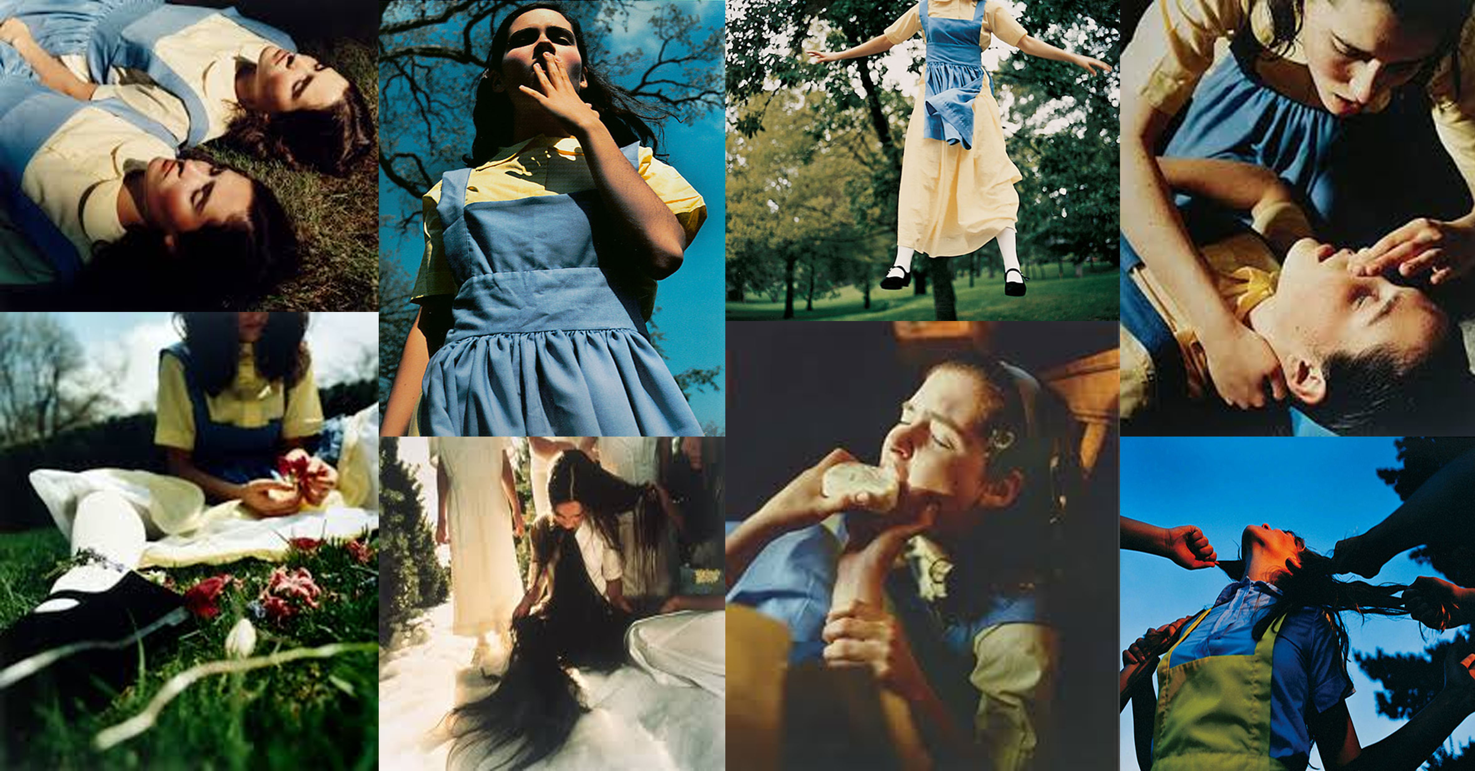
Anna Gaskell is most well known for producing works similar to Cindy Sherman. The American art photographer Elliptical narratives are photo series which have been influenced by paintings and film rather than the typical norms of photography. Now living and working in new york she has produced many tableaux photo series, including ‘Alice’s Adventures in Wonderland’ and hide. There is a basic theme of young girls running throughout her photo series and her ideas are usually drawn from her own imagination.

Gaskell usually has a deeper meaning that is portrayed through her images and the techniques she uses. For example in her photo series ‘Half Life’ she uses dynamic camera angles and decorates the location that she is using to create a claustrophobic sense to the images as well as interesting lighting to build a sense of vertigo.

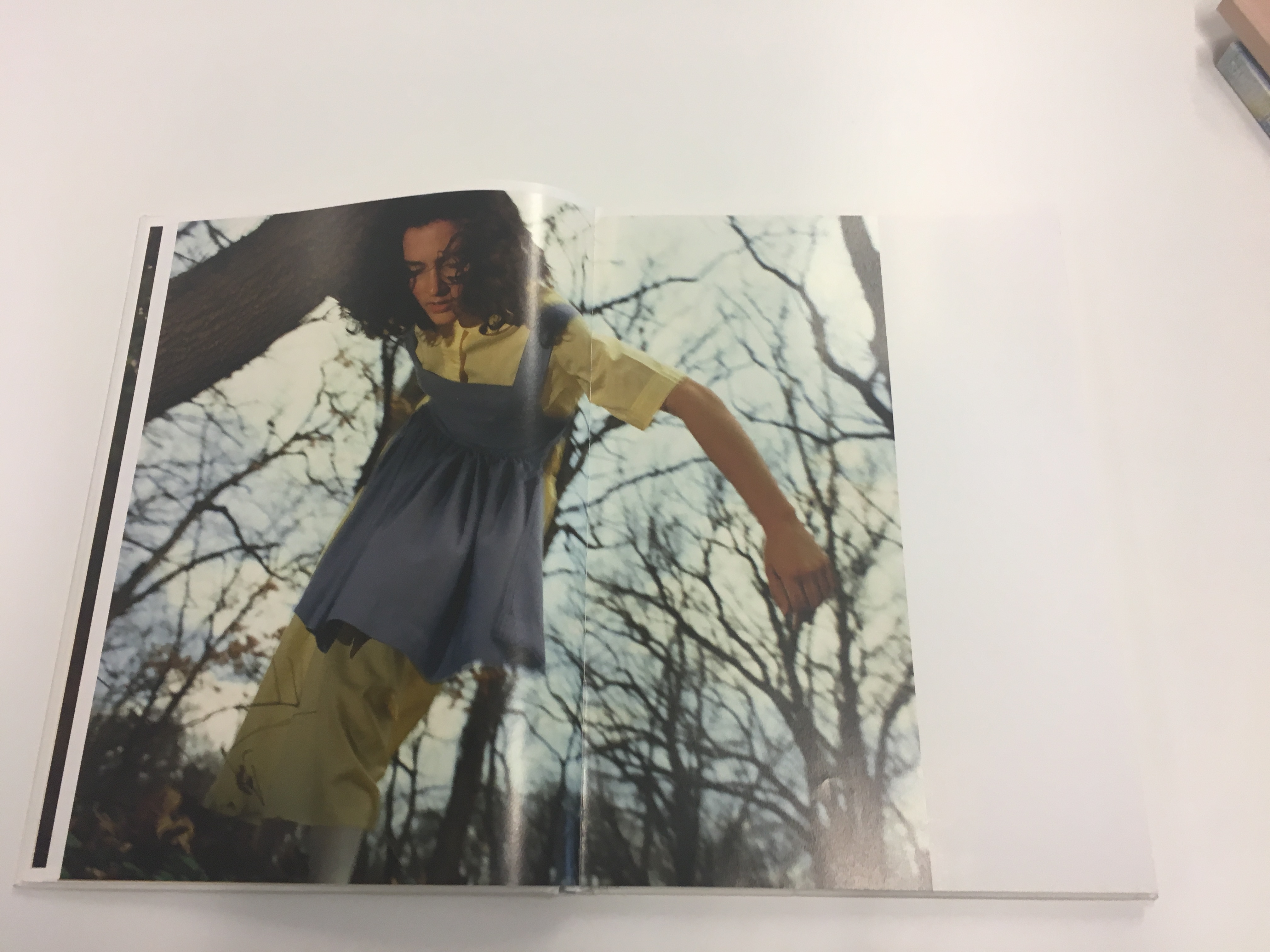
Her narrative images through staged and planned photo shops creates tableaux which after portray deep and meaningful messages in the way that she wants them to convey. Here are a few of her images from her book which include most of her photo series’ from ‘wonder’ to override’

Photo Analysis
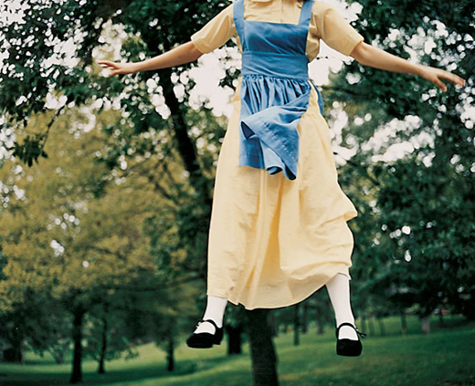
This image is of a young girl jumping in the air. It is hard to decipher whether she got into this position from just standing and then jumping up or what i think probably happened is that she was on a trampoline and the image has been captured hen she was mid bounce. in the image we do not see the young girls face but we can tell that i is a girl and probably of a young age because of the shape and form of the subject. She is captured in a garden and is surrounded by trees. We also when first looking at the image see that the subject is in unusual clothing, relation to what Alice would wear in Alice in wonderland and this is the main link in the photo to the the photo series title ‘Alice’s adventures in wonderland’. From what we see we can begin to build up an image in our mind of what the meaning is behind the image and how the photographer, Anna Gaskell, wanted us to feel when looking at the image. I think that the message behind the image might be Gaskell trying to convey her childhood memories of enjoying watching Alice in wonder or her dressing up as Alice wanting to be her. So this image may be showing connotations to family and childhood memories. As her typical style as a tablx photographer i feel like she has staged and created this seen from her own childhood imagination and it is her telling the audience about her childhood and the memories she has but may also be relate able to many other young girls. However i then think  that the image has a darker message that comes across as, like in all her other photos in the series of photos, the girls head/face is being kept out of the image. This could be because she wants to hide that its not actually Anna and wants us as the audience to picture that it is her as a young girl or be able to relate it to be ourselves or any young girl it remind us of. Or it could mean that it is a distance memory which is blurred and not all is remember and the girl that once wanted to be Alice has been left behind and forgotten.

The genre of this image is portrait through the meanings of tableaux photography so it aims to have a meaning, message or tell a story.  Gaskell must have used a range of photographical techniques to ensure that this photo was not blurred due to the moving subject at the time. She has caught a freeze frame image which means she probably used a tri-pod to keep the camera as still and steady as possible and then the camera would have been set on a very fast shutter of about 1/60 second and then the ISO on the higher settings of maybe 2600 so that as much light was captured as possible because the aperture would of had to be closed for the fast shutter speed letting in a small amount of light. Therefore i think this took a lot of technical work and would have taken a few attempts hence it is tableaux photography which is staged rather than documentary which would of meant she just took the photo in the moment of a random girl bouncing on a trampoline which wouldn’t of conveyed the story that she wanted to get across.

It has already been  discussed why the girl being photographed is in the position that she is in as the head may be purposely not in shot for a specific message in the photograph. When considering the rule of thirds is think that this image breaks the rules in a modern way as she is using the subjects body to take up a significant amount of the image however still leaving a gap. however she may have still considered the rules grid when photographing her image as the subject is along the right axis of the photo sticking to the rule slightly but then breaking it with the limbs spreading across the image. When looking at this image i notice that there is one significant leading line which my eyes where drawn to and this is the tree trunk in the background running behind the girl. As it is the darkest area of the photo it is the section which my eyes are drawn to the most and because it runs from the bottom of the image to the top just behind the subject it focus out eye on that focal point of the image where the girl is and the main message of the image can be considered. another aspect to notice is that symmetry is created in the image through the subject body position. the right side of her body is a reflection to the left this brings a sense of art and beauty to the image making it nice to look at. The photograph has been taken at a eye level angel from the ground and i think this has been used to make it as obvious as possible that she is playing on something like a trampoline as she is high in the air and moved out of eye level sight because she is jumping up. The shot is also a wide angle portrait to fit in most of the subjects body but also a significant amount of the background which creates a frame around the subject. The colours used in this image are also a crucial element to what makes the image. the use of bright bold colours (green,yellow and blue) all together works really well in this image at keeping all the elements seperate and stand out. The image is almost striking because of these colours but they work well together because the yellow and blue of the dress counters the dark green which could have been over powering. Furthermore the image has been taken on a partially cloudy day as there is no specific direction of a hard harsh light. The lighting in the image is soft and quite dark and this could be due to not much natural light as well as the sheltered location the image has been taken in creating a soft lighting with no shadows in the image.

Hannah Starkey
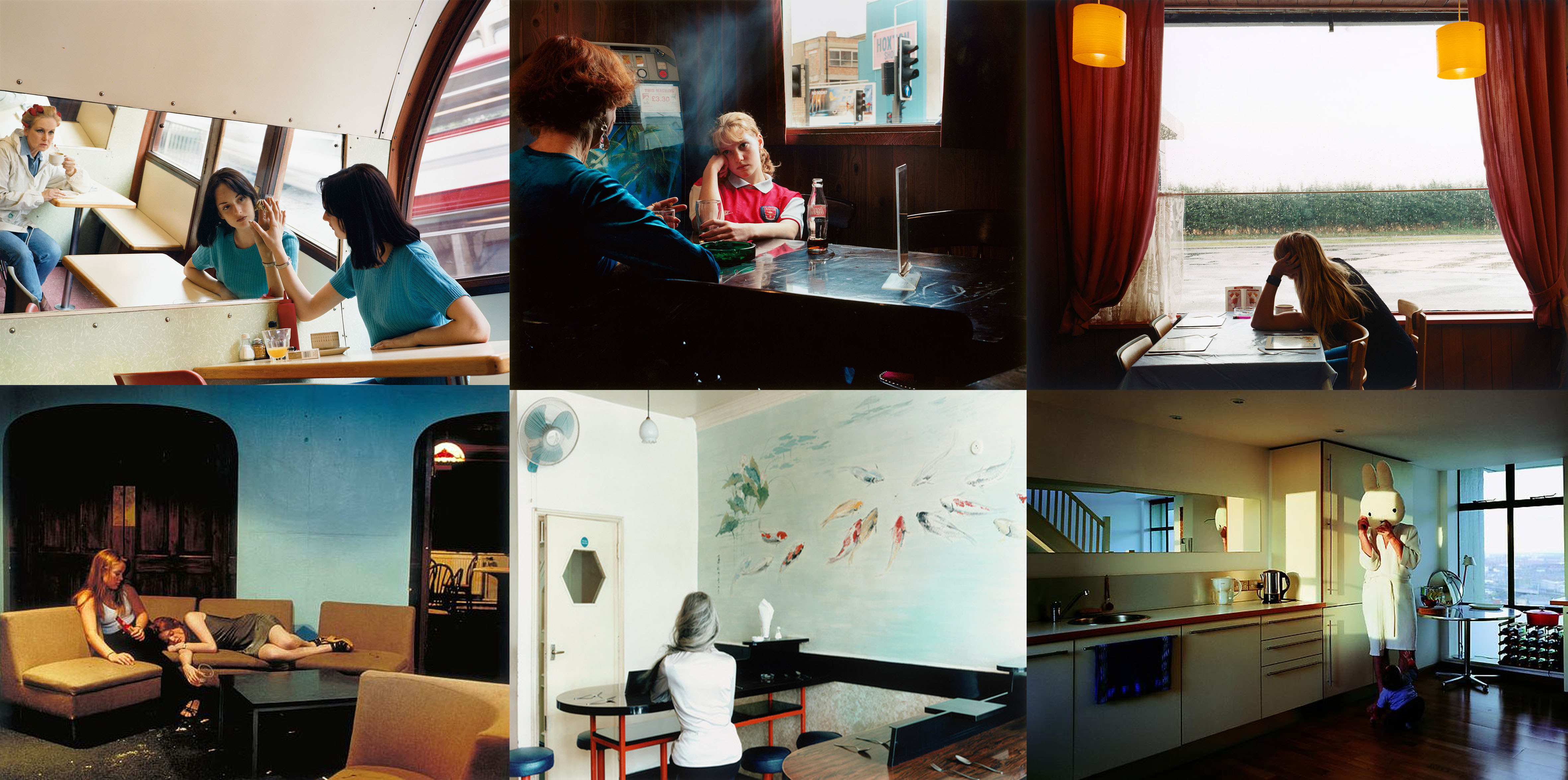
The British photographer, Hannah Starkey, creates scenes through her photography which resembles everyday life, she captures images of women usually partaking in regular daily activities such as sitting in a restaurant or coffee shop, chatting in the street and so on. Starkey focuses on capturing these ‘in between moments’, which i find is a really interesting concept, she doesn’t document them at work or home, she captures them maybe on their way to work and the smaller elements of these women’s routines that you wouldn’t usually photograph.

Her in the moment freeze frame images have a narrative and often focus on the isolated problems in society such as gender, class and social status, which are problems which women may encounter in there day to day experiences. The Saatchi gallery says that “Starkey often uses composition to heighten this sense of personal and emotional disconnection, with arrangements of lone figures separated from a group, or segregated with metaphoric physical divides such as tables or mirrors.” This emphasizes her use of planning to create these stage photographs (tableaux photography) which have this deeper meaning which she wants to convey through her photography.

Born in Ireland in 1971 and now living and working in England she has produced a vast amount of images and exhibited her works in a variety of exhibitions all over the world, including solo exhibitions in the Tanya Bonakdar Gallery in New York on various occasions.

Photo Analysis

This image by Hannah Starkey was taken in May 1997 and takes her typical approach of photographing woman. This particular image is a two women sitting in maybe a coffee shop or cafe in England. The protagonist is the woman in the blue top sitting at the table looking into the mirror. As i have already research Starkey’s work i have a basic knowledge and understanding of the concepts which she tries to capture in her images. Therefore i am going to use this knowledge and try to understand what might being going on in this image. The woman in blue is the subject and she is on a normal day maybe in a break at work or on her lunch break, so Starkey is continuing her stylist form of capturing women in their daily routine but then she builds on this creating a narrative with a meaning and message behind it. For example in this image the woman is looking into the mirror at herself touching her reflection, this could symbolize that she is reflecting on her life or on her self image. A big problem in today’s society is the stereo types and exceptions of women’s image. There is a stigmatization that women should look and act a certain way and for most women they are conscious about there self image and feel like they need to fit in with the social norms. Therefore i think that this image could symbolize the woman looking at herself and judging herself, she could also be thinking that she doesn’t recognize herself anymore due to trying to change to fit in with what she has been made to think is socially accepted. Furthermore in the back of the image is another woman also looking at the subject through the mirror, this can be seen as woman always looking at each other judging them seeing if they are fitting in with what society stereotypes the typical woman as.

Starkey’s image is a narrative creating a story with meaning about problems in society but she has also had to consider photographical techniques and composition to make this image work and be effective. I don’t think that Starkey uses any specific techniques in her image as it seems to be a simplistic image taken in the moment and therefore not much setting up has been done before this image was taking. She will have considered the ISO levels and aperture to ensure she has the correct amount of lighting in the image. However we can assume that a tri-pod was not used to capture this image as it has been taken at an angle not just a straight on shot. The purpose to this may have been to make sure that the mirror reflection was included in the image with the second women in the background showing her almost face of judgment as this is key to the narrative of the photograph. i consider the rule of thirds to have been followed in this image because each aspect of the image seems to belong to a different sector of the rule of thirds grid. For example the subject (woman) is in the right third of the image and the the second woman is in the left side of the photograph and then the mirror runs throughout the image as the main story telling aspect of the image. this therefore fills the whole frame of the image making it an interesting image with lots going on, so i think that the photo has also been framed well as she has got everything needed in  the image for the narrative included as well as having nearly an even amount of gap both below and above the wall giving the image a small sense of symmetry and pattern. I specifically find this image interesting as leading lines is created through this image through the use of the rectangular image running throughout the center of the image which draws your eye to this central part of the image. This is effective because your eye is immediately drawn to the biggest sector of the image and i find it interesting that you look at the reflection first before the real people in the image. The mirror has multiple purposes in this image and another example is that it creates depth in the image as it is almost a three dimensional image because of the reflection we are seeing the room in double making the image possible look deeper than it actual is because of the illusion of the mirror. The lighting is the image creates the atmosphere that it is a natural moment because of the natural use of lighting coming in the window from behind the subject, which illuminates the narrative in a natural non intentional way. The lighting is soft keeping it a calm, mellow image where nothing is striking taking away from the calmness of the image created through the warm tones of colour.

 

Sam Harris vs Sian Davey

Sian Davey

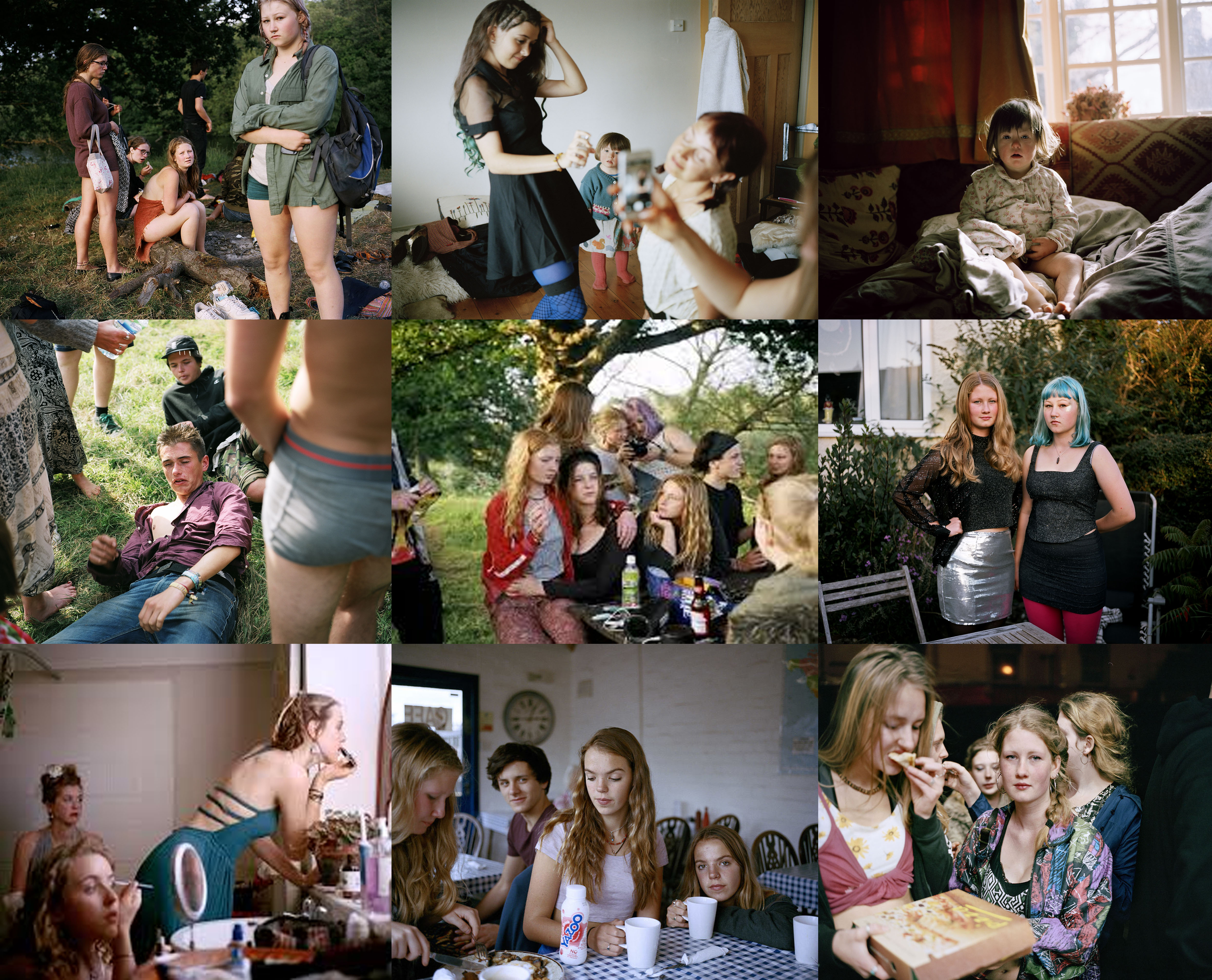
Sian Davey is a photographer from Britain who focuses on taking documentary photographs of her family including her older daughter and her friends creating series of images as well as a series called ‘looking for Alice’ based on her youngest daughter who is diagnosed with down syndrome. the photos series shows her daughter experiencing and enjoying everyday life and was a huge success when it was released in 2015.

Sian spoke about in an interview with ‘Lensculture’ how she has always had an interest in photographer ever since a young age but really began taking documentary photos around four years ago and had her main inspiration from her daughter Martha which is the main theme which runs throughout the images above. she also intertwines her photography with her psychotherapy works which she feels helps her emphasise both her inside and outside worlds.

Website – Sian Davey

Michael Hoppen Gallery – Artist information

“…presents an idyllic scene that is layered with underlying tensions.  It is named after the artist’s stepdaughter and grew as a response to the question ‘why don’t you photograph me anymore?” –  https://www.michaelhoppengallery.com/artists/211-sin-davey/overview/#/artworks/10509

Analysis

I chose this image from Sian Davey because i think the image is a clear reflection of family through documentary photography. If you know what Sian Daveys photographs or have research her works you know that this is an image of her daughter Martha and her friend. Daveys started photographing her stepdaughter as a project when the question came up in their family ‘why don’t you photograph me anymore?”. when researching this i interpreted this as a question asked by Martha because generally parents and family member take the most photographs of general family life or events when their children are at a young age and then less photographs are taken when they because teenagers because they don’t like there photograph being taken anymore. I think therefore Daveys ‘Martha’ project shows clear links of family because she is photographing her daughter growing up with her friends, which can also be seen as another form of family for many. I chose this image in particular to analyse showing links with family and documentary photograhy because of the background. You can see that they are in the family garden with their home in the background so the images is not only capturing Sian Daveys family members but also one of the biggest family momentum is the family home because it is usually where the most family memories are created and has a lot of family connotations.

The photograph shows Sian Daveys stepdaughter and her friend therefore they are the subject and the focal point of the image. they are stood outside there family home in the garden showing clear links to family and although documentary photography can been seen a lot of the time as spontaneous images of people in the moment it can also be staged and i think that this image was a mixture of both. The image is natural in the form it is their natural environment and a casual photograph of her and her friend but it has been slightly staged like family photograph would be when you decide to capture a photo of a family event and the photographer say stand over there. As i stated above i think that there has been some planning and staging for this photograph and that Daveys would have wanted the two girls to be stood central in the image breaking the rule of friends as the are in the center axis of the grid, although this works for the image as they have a balanced ratio of the girls and the background making it a symmetrical image as there is equal background to the proportion of the girls as it is taken as a long shot. that means that this image has some symmetry to it making it a nice/ aesthetically pleasing image to look at.

I don’t consider this image to have leading lines either on purpose or accidental as there are no striking lines which lead your eyes around the image. The main technique which is focusing where you look in this image is the use of depth of field through adjusting her ISO settings which has had the effect on the image that the subject is in clear focus and the background is slightly blurred and out of focus which has helped to create a natural frame as if the background was purposely framing the two girls so Daveys daughter, the subject of the whole project stands out the most. The rest of the image almost comes across as simplistic in technical terms because it is a straight on viewpoint, however i think this has been purposely done as i said before because she is trying to capture image which all families would of their children. Therefore to make it realistic Daveys probably didn’t want too much technical aspects to the image apart from i clear, good quality, well thought out image.

The lighting in all of her images are similar to the image above where they all contain and dark green background making the images themselves dark, from the trees and woodland setting that they are usually taken in. i think that this could have a deeper meaning in that Daveys is portraying what family means to them and what kind of family they are as it seems like they are earthy people and out doors spending time together a lot.

Sam Harris

Sam Harris has been a photographer since around 1990 when he started his career in london taking photographs for recording artists and also photographing editorial portraits. Further into his photographic career he went onto photographing international assignments for leading Uk publications.

Around 2000 he decided to turn his career around from looking at images that didn’t really have much sentimental meaning to him to flipping the camera and looking inwards and began to focus his photography and his loved ones, family and friends. He now has an on-going project of photographing his family and doing workshops in southwestern Australia, where he has won numerous awards for his creative documentary work.

Website – Sam Harris

Wikipedia – Sam Harris

Analysis

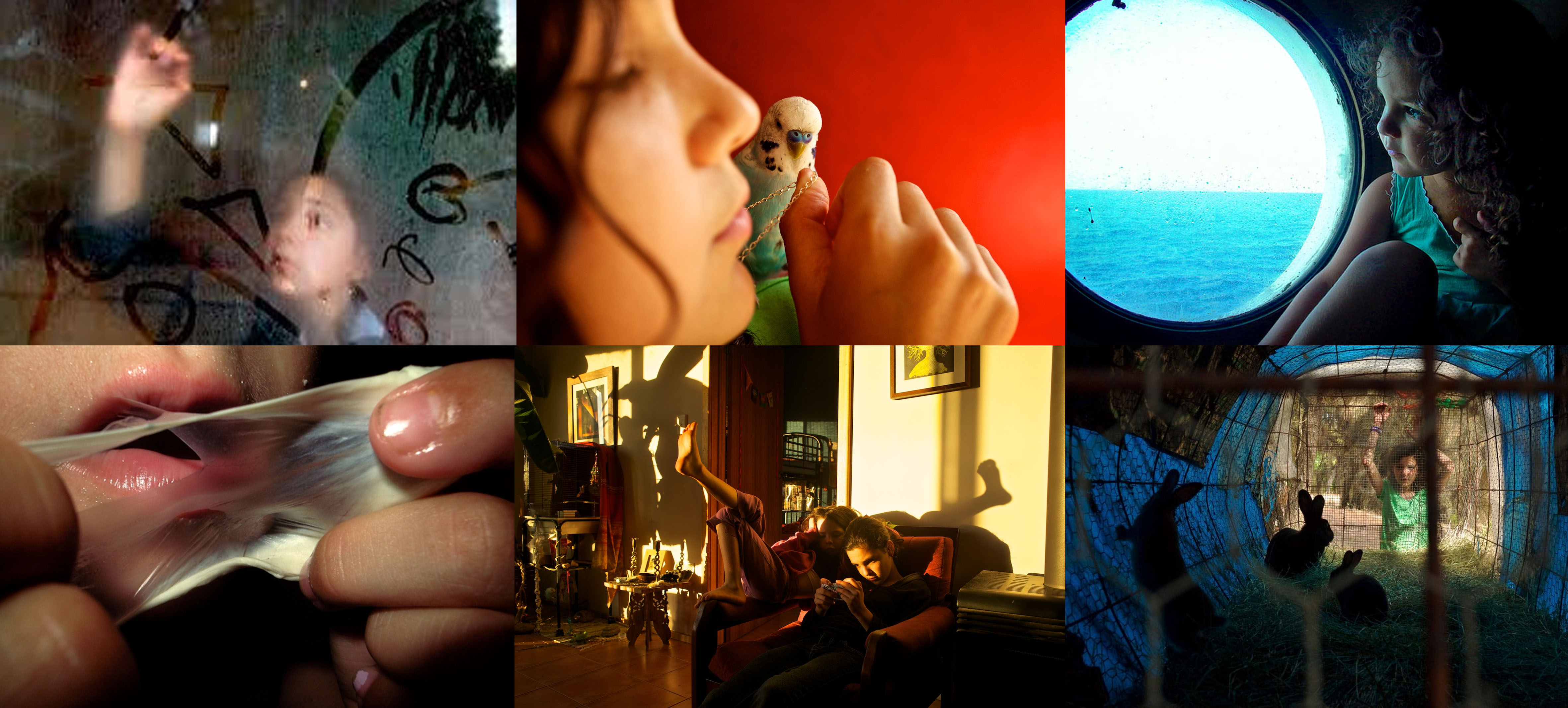
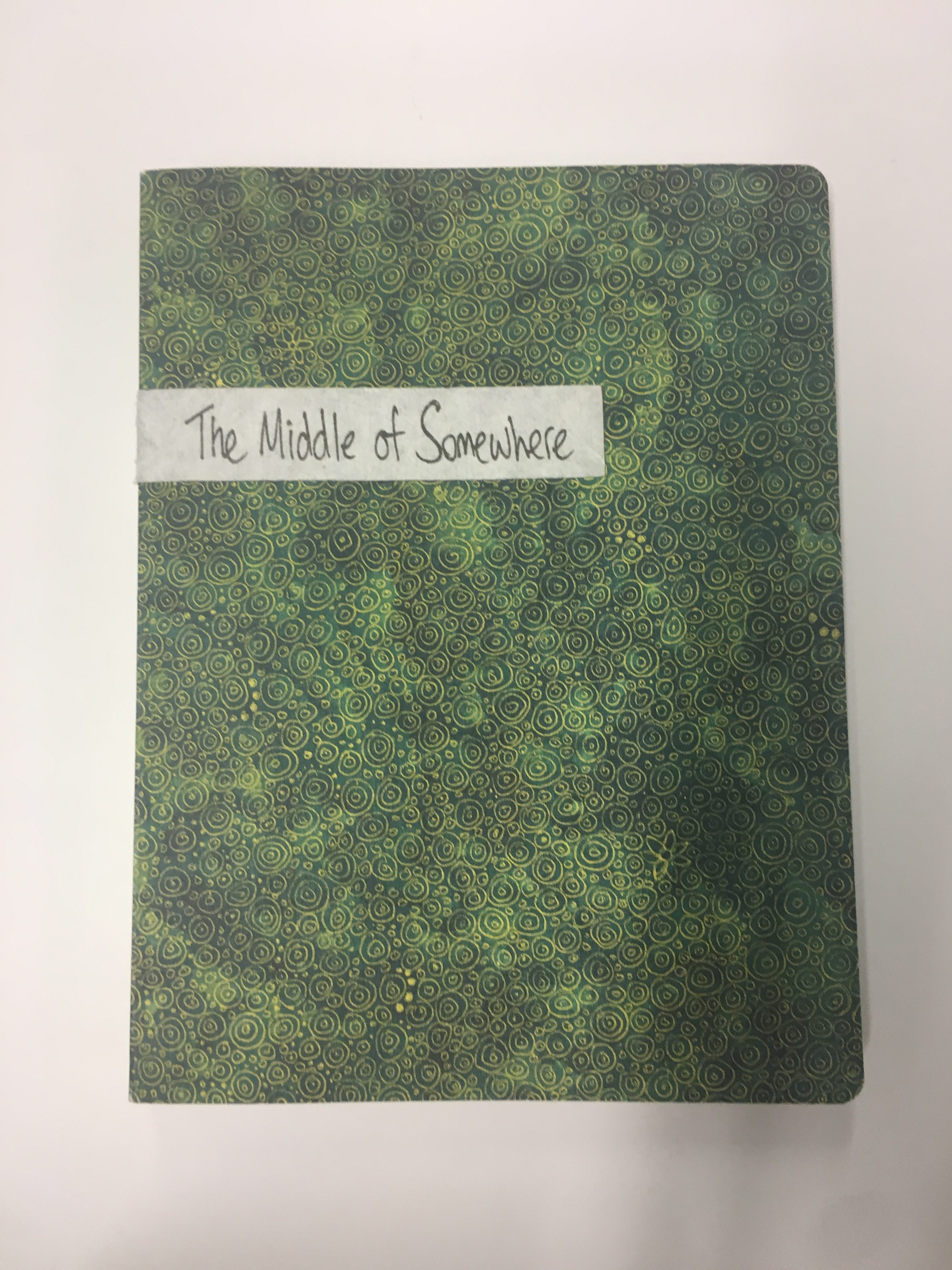
The image above, photographed by Sam Harris, is an image of his daughter from his on-going project in southwestern Australia called ‘the middle of somewhere’. The image is a close up of his daughter and possibly their family pet along with a necklace which could have some kind of sentimental meaning to the family. I chose this image because i think that it shows links to the topic of family through the use of documentry photography. The first link is that it is a photograph of his daughter which is clearly a huge part of his family and everyday family life. I also see the image as being a close up because he sees himself close with his family. She may be holding a family heirloom in the image or a precious necklace which means something to the family which only those close to them would understand the real meaning of it. But i also find the inclusion of the bird a really interesting aspect because it not only tells you they have a family pet but it begins to tell you about the family and what kind of people they are. Therefore from this i get that the Sam Harris family love animals, family means a lot to them, and they are a close family.

The subject of the image is his daughter, but she is not necessarily the focal point of the image. i see the focal point of the image being the hand because this is the clearest most in focus section of the image which my eyes are immediately drawn to so i think this was the focal point that Sam Harris wanted to be focused on when looking at his image. The depth of field is a key aspect in this photograph due to it highlighting the areas of the photo that he wants to be focused on but also in my view makes this image a technically well thought out image and well photographed as the use of ISO and aperture settings have been successfully used to capture a creative image where both the foreground and background have been blurred and there is a main focal point. I think that the meaning that is trying to be portrayed in this image has been well worked into the image through the techniques used as well as the use of colour in the image. The image has a strong bold background colour of orange/red, which tends to have the effect of an images mood of making them feel warm and calm. This image definitely looks calm and peaceful in my eyes and i think this is down the the colour in the image as well as the soft, natural lighting being directed on the young girls face.

Everything in the image seems to have been thoroughly though out and as if everything has been placed in the specific position for a reason. For example the girls face runs throughout the left axis of the image following the rule of thirds keep the image balanced between portraiture and the background, however it begins to break the ordinary rules of photography when the bird and the hand are included making the image slightly abstract because the image now seems to be half full in a diagonal way which is not seen a lot in photography. i think that leading lines does occur in this photograph through the lines of Sam Harris daughter face. Framing can also be seen to be used in this image through the strong block coloured background which almost frames the face bird and hand making this aspects the subject and focal point of the image.

Tanja Deman

Tanja Deman is Archisle International Photographer and she is currently working on a commission of new work in Jersey from the start of April and will continue this until September. Her work will join the Archisle collection at the Société Jersiaise Photographic Archive for future public enjoyment. She obtained her BFA and MFA from the Academy of Fine Arts in Zagreb. Her work has been exhibited widely including: Museum of Contemporary Art Zagreb / Kunstmuseum Bonn / 15th Venice Biennial of Architecture, 2016 / The Central House of Artists, Moscow / Museum of Modern and Contemporary Art, Rijeka.

Tanja was born in Split, Croatia but has been to various places to conduct her work. In Tanja Deman’s art is inspired by her interest in physical and emotional perceptions of specific spaces, architectures, geological formations and sites. She incorporates photography, collage, video and public art, as well as sociological research. Deman’s images reflect upon the ‘dynamics hidden beneath the surface of built’ and natural environments. In 2015 Deman was commissioned to produce a monumental photographic public art project titled ‘Sommerfreuden’ which presented a wrapping of the Ringturm Tower on the bank of the River Danube in the city of Vienna.

"Saltwater (2015 - ongoing) portrays the underwater landscapes of the middle Adriatic. This photo series represents a physical and emotional connection to the place, and my relationship to this environment, silent yet under constant fluctuation. The series observes morphological formations, the mountains that penetrate the sea depths, the dynamic nature of the water, the transmission and refraction of light and sometimes a swimmer."

"The work documents urban gardens as organic micro areas food productions, green niches inside of the city structure and spaces for pause, contemplation and relaxation.
The photographs are capturing my long walks in Linz, Austria on Pöstlingberg and Freinberg, wondering moments in Bauernberpark and Schlosspark, being lost in the curiosity cabinet of plants and faraway places in the Botanischer Garten, intriguing conversations in Hafengarten and patient labor and attention on organic food growing in Demeter Garden Leisenhof in Linz."

Some of her other works:

Analysis:

I was drawn to this photograph because of many components. Firstly, I find the different tones and shade of black contrasting with the white elements of the photograph, where the light is hitting the water very fascinating and almost peaceful to look at. This is empathised by increasing the contrast levels and maybe decreasing the lighting slightly to give the photograph more of a dark and dusty look.  I specifically like how the photograph also includes the waters surface and it almost acts like a roof to the photograph that gives a sense of strength and stability to the water and also gives it a sense of compression . I also like how you can see the textures of the rocks and the water and how these almost clash. The water creates a soft and elegant line within the photo  contrasting with the strong and harsh patterns created by the rocks. This clearly shows the relationship between Tanja and her environment as she is clearly aware of space, using this to create a sense of eeriness, however she also creates a sense of awe and serenity, it describes the relationship between Tanja and the environment in the sense that despite the world we live in, there is beauty to be found everywhere we look.

Tanja has clearly been inspired by other artists/photographers in her work and has given her new and creative ideas to work with and produce new works such as Robert Adams and Thomas Struth.

Robert Adam:

Robert is an American photographer who has focused on the changing landscape of the American west and he is particularly interested in New Topographic and participated in an exhibition of man-altered landscapes. His photographs are a kind of testimony: evidence of what has been lost and what remains.But they also ask us fundamental questions about how we live amid the contradictions and compromises of progress.  His photographs are of urban sites and he often works in black and white.

This is similar to how Tanja works as her photographs are also of urban environments and she took sometimes uses black and white in a similar to how Robert uses it and could say you can see an element of New Topographics and also is interested in man-altered buildings and nature and how they are linked.

Thomas Struth:

He is a German photographer who is best known for his Museum Photographs, family portraits and 1970s black and white photographs of the streets of Dusseldorf and New York.  He too has taken and shows an interest in urban and ‘ugly’ buildings and capturing the ugly as well as the beauty. These early works largely consisted of black-and-white shots of streets. Skyscrapers were another feature of his work, with many of his photographs attempting to show the relationship people have with their modern-day environment. He never manipulates his photographs and they are never staged.

Although Tanja does manipulate and stage her photographs the key concept of recording the beauty and ugly in an environment is similar. She also works in black and white a lot of the time and she too tries to show the difference between years and how people’s relationships change with this.