Category Archives: Analysis

Filters

Author:
Category:

REPRESENTATION, ETHICS AND STANDARDS

How is McCurry’s images different compared to Singh in the way that they represent Indian culture?

I shall use the example of McCurry who is a documentary photographer but has been criticized for focusing on re-inforcing stereotypes on top of the reality to slant the accuracy of the representation of the photograph and Raghubir Singh who contrasts McCurry in the sense his images depict the realities of his environment.  However arguably both artists are realistic in terms of what they represent as particularly in India there are 2 sides to every coin and McCurry may be accurate in representing the beauty within India however Singha is perhaps more accurate in showing ht eeconomic and cultural hardships within India.

For McCurry

Image result for steve mccurry

Image result for steve mccurry

Steve McCurry (born April 23, 1950) is an American photographer. and has world-renowned success as a documentary photographer, who shoots in more deprived and less economically developed countries such as Pakistan and Afghanistan.  In doing this Steve McCurry has become very iconic in contemporary photography for more than thirty years, through magazines and books and many exhibitions .  Born in Philadelphia, Pennsylvania; McCurry studied film at Pennsylvania State University, before going on to work for a local newspaper.  After working as a freelancer photographer, McCurry made his first trip to India.  Travelling with a few clothes and some film, he made his way exploring the country with his camera.  Since then he has worked in photojournalism and editorial and is famous for his 1984 photograph “Afghan Girl”, which originally appeared in National Geographic magazine which is shown below above.  Other examples of his images are included above:

Image result for steve mccurry

This image of an Afghan refugee was published in National Geographic in 1985. The image captured the hearts of many as it caught the the impact of the surrounding context of which many people suffered and struggled so effectively in the photograph which is why it was so heavily publicised.  The context was set around the Soviet invasion of Afghanistan with the subject’s  family being killed and she had to trek as a refugee to a refugee camp.

The girl is the main focal point of the picture.  This is supported by the rule of thirds which her eyes are framed very effectively which this and the fact that the girl’s eyes are so colourful strengthen how effectively the viewer connects the eyes.  The eyes are almost hypnotic and tell a realistic picture as to the struggles the girl has and continues to face up to this point.  The effect on the viewer is we feel sympathetic towards this girl and her struggles and so because we feel so strongly about putting the right into the wrong that is shown through the girl’s eyes, as the viewer we start to examine other details that suggests the girl’s story is not just intriguing from an individual level but on a social level, it reflects the international relations and this impact on the whole of society.  for example interestingly the fact the girl is positioned to the far left third of the photograph and the contrasting red/brown skin and clothe shades that stick out from the green rural environment she is hsot in also reflect the idea that this environment isn’t the natural girl’s and because of this she appears slightly uncomfortable and reflects the journey and trials refugees faced from this war.  Because of this, this suggests McCurray has staged these photographs and has drawn criticism for fabricating/exagerating the truth from how this girl may have been shot in an unstaged shot which would essentially reflect the true horrors that went on in this time period.  I agree that the photographic features limit the usefulness for us in terms of finding out what the struggles of this war was like.  However on the other hand, I believe McCurray despite this has made an effort to at least through the model communicate to us from a personal and opinionated expression of the girl expressing how she feels towards her struggles that exposes more truth than what critics may say.  Many of McCurry’s images also have gone under criticism for this, since the images appear staged and to some portray far from the truth.  However I believe that despite an image being staged, McCurray is skilled at capturing the reality in his staged photographs in that the subject’s facial expression primarily or other composition features often reflect the hardships of a context through subtle but yet powerful techniques.  Even if the image is staged, it represents an accurate truth of the surrounding context that may not be captured as succefully in an unstaged photograph.  this is because by staging a photograph it gives the photographer and subject more freedom and control to express their views on a particuler issue.

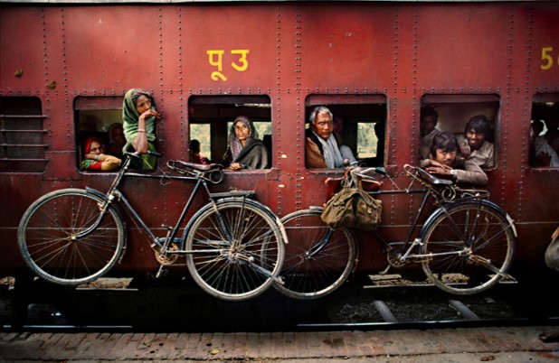
I believe similar can be said with McCurry’s image of the Indian train  too.  This is because it may show a romanticized touristic approach to the photograph with slight clues suggesting the photograph was staged.  However in doing this, I would argue that it is irrelevant whether McCurry’s photograph was staged or not because some such as the New York Times may argue this is a slant of the real living truth.  It’s impossible for one photograph to cover the whole spectrum of issues in one country and it is the job of the photographer to focus on one specific issue and communicate that reality as effectively as possible.  By taking an unstaged photograph this is waht your doing, by taking a staged photograph you have the freedom to attempt to include the relative features in order to communicate and express the photographer’s views and feelings.   I believe that likewise the photograph with the train, by staging it it allows McCurry to communicate not just the economic hardships within India, but also the growth in Indian industrial might but also allows us to see the culture that flourishes within India and in doing this, it displays truth not only from  the photographer’s viewpoint but also from a factual one too.  Evidence within the photograph to back this up includes the highly romanticized lighting which compliments not only the abundance and variety of culture within India, but also with the Taj Mahal in the background symbolizing the Country’s rich history which creates depth to the photograph as a basis for the rest of the features in the photograph.  The train storming through resembles the economic and industrial growing might of India that is overlooked when so many photographers focus on the singular issue of poverty and social issues within India.  I like the feature of the train and the Taj Mahal because it not only represents where India has come from, it also emphasizes the idea of where India is going as well.  Finally the idea of having 2 men at the front of the train could symbolize two things.  That India is at the forefrnt of growth in the world as a forward thinking nation, but also the struggles it is and has faced in order to get to where it is and both men represent the poverty that exists amidst India’s economic power house growth.  Therefore in defense of McMurray, I believe that it is unfair to criticism his photographs as they may appear staged, but they represent very strong heartfelt issues from he people’s and subject’s he’s shooting points of view.  Therefore we should take it in our strength as viewer’s to understand what the photographer’s aims are and compare them with our own knowledge to judge a photograph’s accuracy in terms of representation but finally I believe that a photograph can be truthful when staged or unstaged, it is just a matter of method to achieve a similar result.  Obviously staged photographs can be manipulated to convey wrong messages which should be cautioned when viewing these images however staged photographs can be very effective at describing one’s feelings or emotions where an unstaged photograph could easily be taken out of context and easily used for a different purpose that which wasn’t part of the actual reality of the situation.

For Singh

On the other hand, Raghubir Singh is an India photoghraper.  because he is Indian I believe this allows him to see his own country – India from the inside as well as from the outside in how a Westernized individual may see his country.  Singh worked from the late ’60s until his death in 1999, traveling all over India to create a series of powerful books about his homeland. His work shares formal content with McCurry’s: the subcontinental terrain, the eye-popping color, the human presence.  However where these two differ is Singh has what the New York times calls a “democratic eye” where he may take a range of photographs relating to a range of issues whereas McMurry takes a photograph with incluing as many features and messages as possible into a single image.  His images include cities, towns, villages, shops, rivers, worshipers, workers, construction sites, motorbikes, statues, modern furniture, balconies, suits, dresses and turbans/saris.  There is a sense of power in his images but also yet a sense of bluntness and honesty which may be hard to find in Mcmurray’s images which may be fabricated with the photographer’s viewpoint against the real living conditions from the perspective of the ordinary fellow.  Comparitively the image of the people and the road below is very similar to McMurry’s image of the train inthat boh communicate the rapid growth and expansion of India’s industry at the cost of the people on society.  However where McMnurray has focused on portraying these people as being at the forefront of this revolution, Singh has portrayed the people in his images as people who are suffering meanwhile in the background there is wealth which isn’t accessible to most people.  Interestingly McCurry’s image could be criticized for suggesting that the two men  at the front of the train who are also at the forefront of this revolution may suggest how this wealth is only accessible to a small few elite and that he doesn’t cover and ignores the whole spectrum of the cost on society in terms of how this industrial growth is actually damaging for the everyday citizen rather than improving their lives.

The image above is interesting because its bluntness with the broken door is quite intrusive in the sense it appears rather forceful as we feel sort of confined to where wer are and cannot explore much of the photgraph.  This not only represents the roughness and busyness of Indian culture for many which McMurray contrastingly expresses it as very delicate and intricate, but also again the poverty that people live with.  In the image, through the door there is an army commander presumably from the days of British colonial rule.  This image appears like a reference to that and how even today, despite the economic growth, life is still the same for the ordinary folk.  This is because of the forceful door intruding in our faces and hgow we feel confined, it almost symbolizes the idea of a prison and as we look out of the prison door we see a direct link to British colonialism.  What is interesting is Singh has put us Westerners into the seat from which most Indian people sit and view India from and therefore it appears that the purpose of this images is to explicitly convey the hardships and remove the stereotypes from westerners such as McCurry who’s hoping to re enhance these stereotypes through creating highly romanticized images.  By taking these photographs from ground level, we start to see the realities of everyday life for most people and this in turn represents Indian culture in a very different light to McCurry.  Singh is therefore effective at producing images that as ordinary people ourselves, we can relate to and because of this we emphasize and trust them more as truth.  However it can be argued that these images may like with McCurry easily bet taken as truth where actually it is still very possible to manipulate and influence the representation of a photograh that is unstaged.  For example in the image with the door, it could be potentially argued that the strong link back to British colonialism is a strong exaggeration ad that  the India today which is outward looking and prosperous is far better than those days and could be insulting to the people who fought for Indian independance.  Therefore likewise with McCurry, when we see an image it is best to evaluate how well it represents the truth from the fiction and not take an image at face value as gospel as this could potentially affect the accuracy of the representation that the photograph is trying to communicate.

In conclusion, I believe no photograoher is worng, both are choosing to focus on very different aspects of Indian culture which in itself is such as broad term as each individual’s culture is different to another.  Both convey truth in their images using very different techniques to focus on very different themes and therefore no one is correct.

mock// Display format

ARTIST STATEMENT

ESCAPE

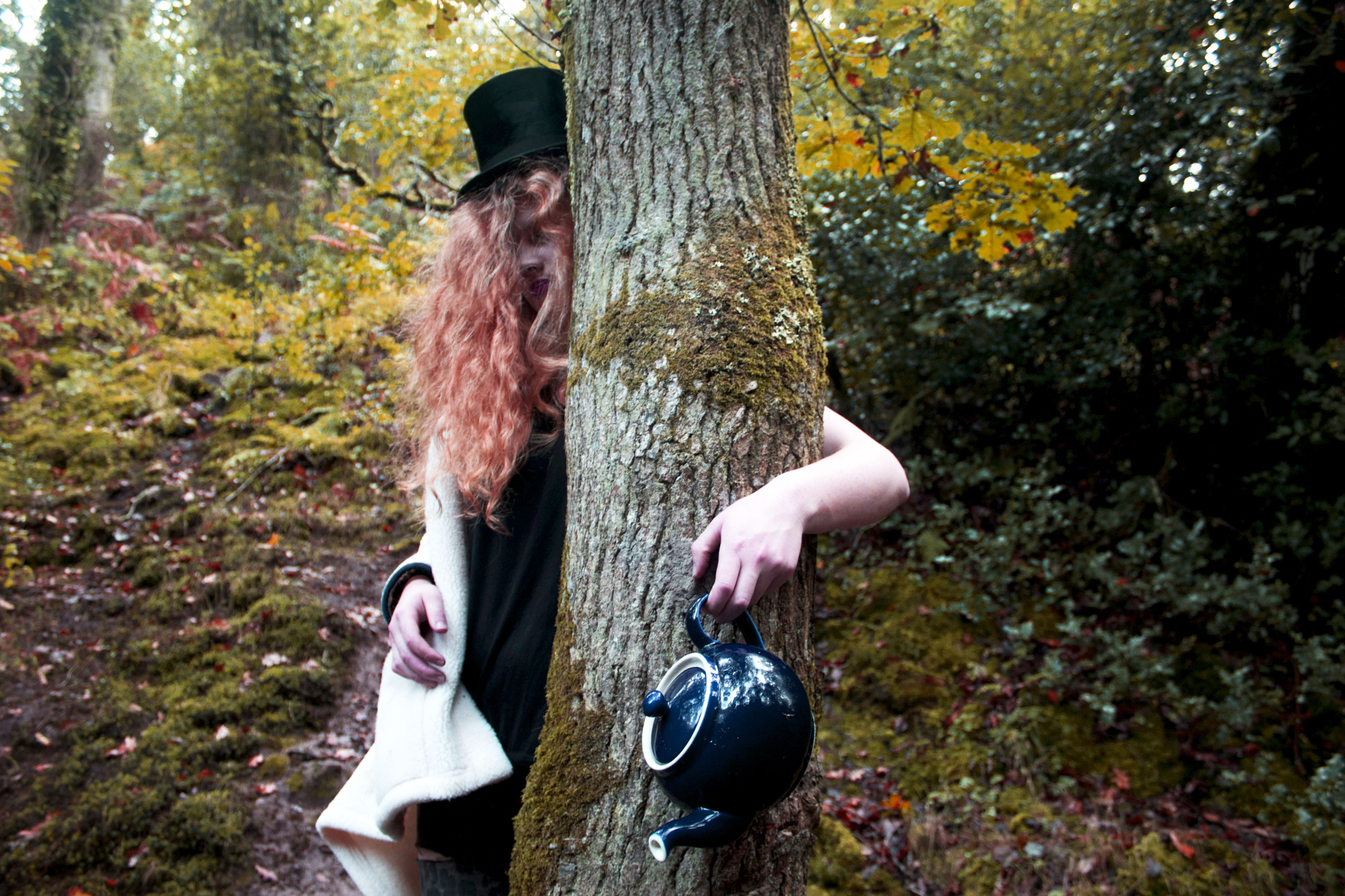
The reality of life is that there’s always a time when we distant ourselves from the world. Especially as a child, we try to distort the truth to create a perceived form of what is real. My project ‘Escape’ is based on what reality was like as a child. I decided to take certain aspects of my own childhood to create this collaboration of images. One of the factors that I decided to focus on was the book Alice in Wonderland. The story was told regularly to me, and eventually became burned into my memory. As a child, I always perceived the book as nothing more than a fairy tale, with the character Alice going on Adventures in Wonderland. However, many people started creating their own interpretation on the story, including some aspects of sex and love. What I perceive the story to be about now, is the Character Alice running away from the world. Although Wonderland is part of Alice’s imagination, she sees it to be a physical place where she can escape from reality. As a child, I too often wanted to escape, or disappear. I have focused on this feeling of escaping, and have used the character the Mad Hatter from the Alice in Wonderland book to convey what I wanted to symbolize through the shoot.

EVALUATION

The main aim for the exhibition on Monday 27th November is to  choose a selection of images from the personal project that we are doing at the moment. The project that I am doing is based on the theme of body image. However, I decided to choose a set of images that I had collected from a childhood memory theme. I did this because I hadn’t yet achieved a wide range of images that I would be happy to display to represent my project so far. I was very happy with the collection of images from my childhood memory shoot though, and was happy with the representation that they displayed.

The images that I have chosen for the exhibition are from a project based on Childhood memory. The shoot was inspired by a book that I had read as a child called Alice in Wonderland. The way the images represented the book, and childhood memories worked really well. The images themselves were inspired by tableaux and fashion photography, which I believe can be clearly seen through the set of images. The atmosphere and the hidden story line behind the images create a sense of mystery which is what I wanted to convey. I love the tones and colors clearly shown through the set of images, with the constant theme of wonder and mystery. I am very happy with the way the images are going to be displayed because they flow well together. I have also chosen a wide variation of images, some close up and some full of the wild environment. There is also a wide variation of poses and angles that help to tell the story that I aimed to convey.

The images are set in a distorted form of reality because the main theme for the project is escaping. I am very happy with the outcome of my display for the exhibition because I believe it conveys my idea really well.

Artist Reference Comparison

Environmental portraits
Steve McCurry
Gideon Mendel

Steve McCurry and Gideon Mendel are both highly recognised photographers for their environmental images capturing third world countries through there conceptual portraits and photo journalistic photographs. In the top two images are a more environmental portrait from both of my inspirational artists. Differences and similarities are seen in both these images as they may focus on similar subjects and messages to focus their photography on but the acual way in which they capture this images varies in terms of the techniques used and the conceptual theme in the image or  a more theoretical way of showing third world countries. A similarity which is noticable in these two image is that they have focused on a wider angle of shot to capture a wider range of subjects, this may have the intention of showing the community spirit that is event in locations such as those that mendel and McCurry capture. Another similarity is that the use of colour is very important in both photographers work. the bright, vibrant colour tones use in both photographers work highlights the vibrancy of the third world countries cultures. However many differences can be noticed between these two images for example Mendels image is a strong form of documentary photography, it is noticeable that he has placed himself in a natural position and captured image of things which were occurring in that time and place without planning or adjusting what was actually happening. this is highlighted by the fact the lady is not looking directly at the camera. However McCurrys photography takes a very different approach. hi image still tells a story of community and culture however it is in a more tableaux style of photography. he has clearly times the photograph to capture the moment that he wants and everything seems to be in perfect position as well as the subjects in the photograph looking at the camera suggests they new it was being taken and are focusing on it therefore not showing their natural train journey. however both are very strong images in different ways and i will attempt to capture both of these styles of photography when i go to Africa and do similar shoots showing community spirit.

Portraits
Steve McCurry


Gideon Mendel

These two images both take a slightly different approach to the previous images. Both of these images are portraits of young children however they show messages in different ways and i find analysing and comparing these images are giving me lots of influence, inspiration and my own ideas for the style of images that i wan to capture on my trip. McCurrys image highlights an environmental photographers style of portrait. the photograph does have the focal point of a young child and there face is clear and are looking at the camera,however the image also contains the background which shows the location they are in making it helpful to decide where they’ve possibly grown up and tells us a little about the subject of the image. On the other hand Mendel takes a more conceptual style of portrait and captures a straight on angle of this young girl. This simple but effect portrait is also linked to a small piece of writing which tells us about the subject of the image. This shows a very modern form of portrait and i really like the idea of speaking the the community after i have photographed them to find out their name and a little but more about them to add depth and knowledge to my images.

Images from Canon Prima AS-1 Film

From my point and shoot camera, the Canon Prima AS-1, I have developed my first roll of film and the images achieved from the roll of 36 exposures were both successful but unsuccessful considering this is the first time I have used the camera – a handful of the images were not of good quality as the flash was stunned in images where it didn’t need to be, resulting in low quality images where subjects are washed out. However, most of the images came out very well, including the ones below, which I intend to use in my project as diptychs. I will use this first experience with my retro camera as a learning curve where I was getting use to how it works and what the best settings were, even though it is a point and shoot. I will, next time, use the flash on lesser occasions to get sharper and clearer images.

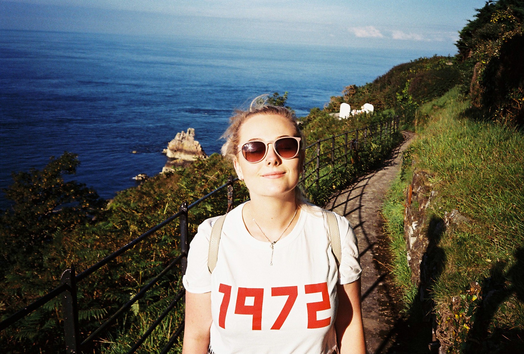
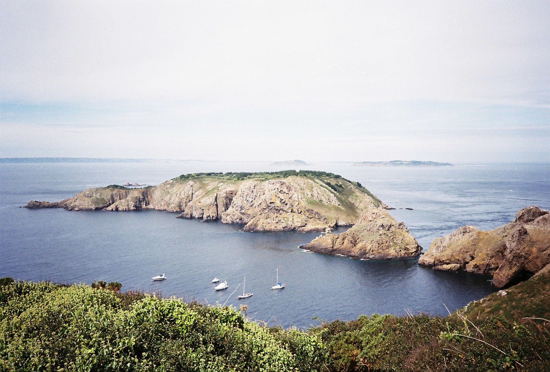
The roll of film developed was used gradually over the period of about 3 months and of these 36 exposures, quite a few were from mine and my girlfriend’s trip to Sark, our neighbouring island for a couple of days. The first 4 images you see below are from this trip and are 4 images I hope to use in my project to represent an aspect of mine and my girlfriend’s relationship.

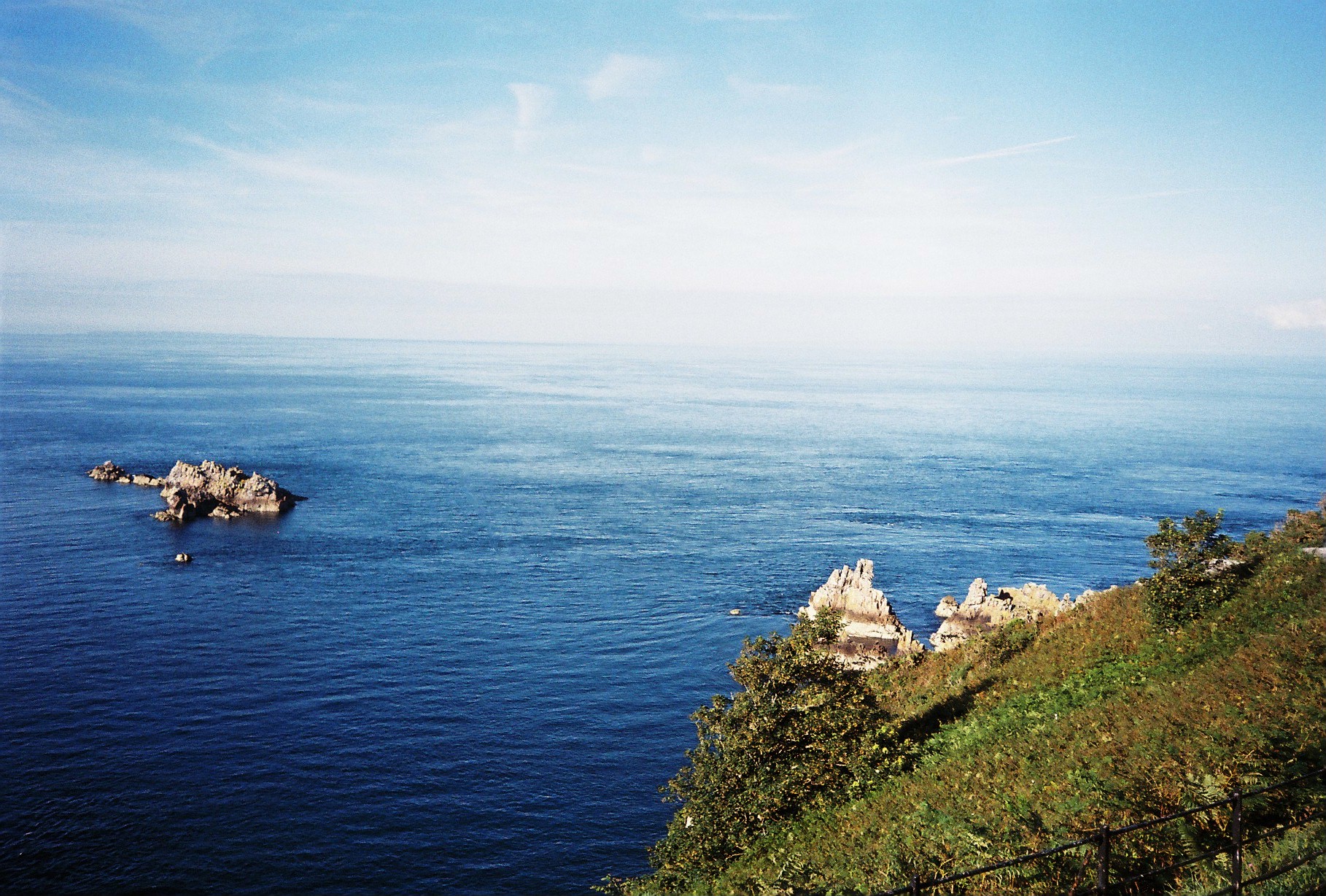
The first set of images consists of two photographs, a portrait of Lucy on the sunny day it was with a seascape as the background. The second image of this particular diptych is of the seascape alone where you can see a couple of rocks within the ocean and, in the foreground, some greenery from the cliff we were on. I believe these two images work well together as it shows a portrait and then the landscape which as originally partly blocked by the portrait – this I s why they work well together as they include the same colours and same content. The two images below are full of vibrant colours as well as shadows and dark contrasts.

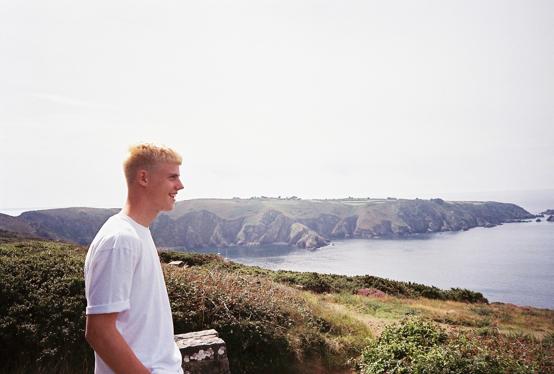
The two images below act as my second diptych from our time in Sark, however, this time, the subject I myself and it follows the same sequence as before. The first image is a portrait of myself, taken by Lucy and it is a side profile of me looking out to a landscape, on a different day to the above occasion.

The second image below the portrait is of the landscape I ma looking out at. It follows the same concept as the above images where the portrait is the primary image and then the full landscape is revealed.

As to as taken on a different day to the above images, the colour palettes and temperatures are different and this time, the look is more gazed – as if the colours are more faded out and there was less sun on this day as it looks more foggy and misty but this adds a different mood to the diptych – one which presents a variety of washed out neutrals of beige, white and greys in the sky bit also in the sea.

I believe that the images below can also work in a diptych, however, they may look better presented separately considering they are of two different scenes.

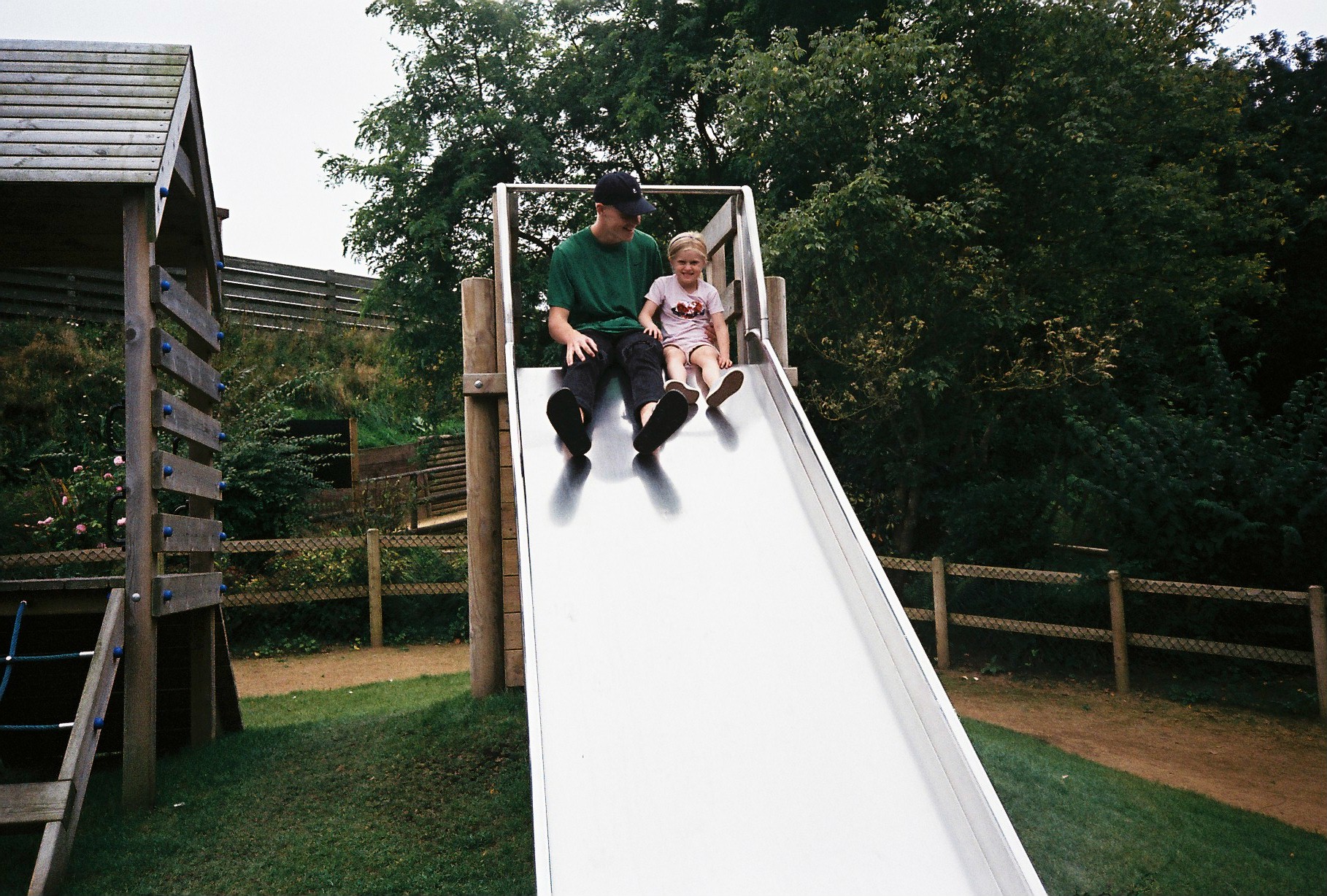
The first is an image, taken on a day out to Tamba Park with my sister and girlfriend. It’s an image which includes myself and my sister at the top of a slide in the park. You can see myself looking, smiling at Minnie while she pulls a cheesy grin to the camera.

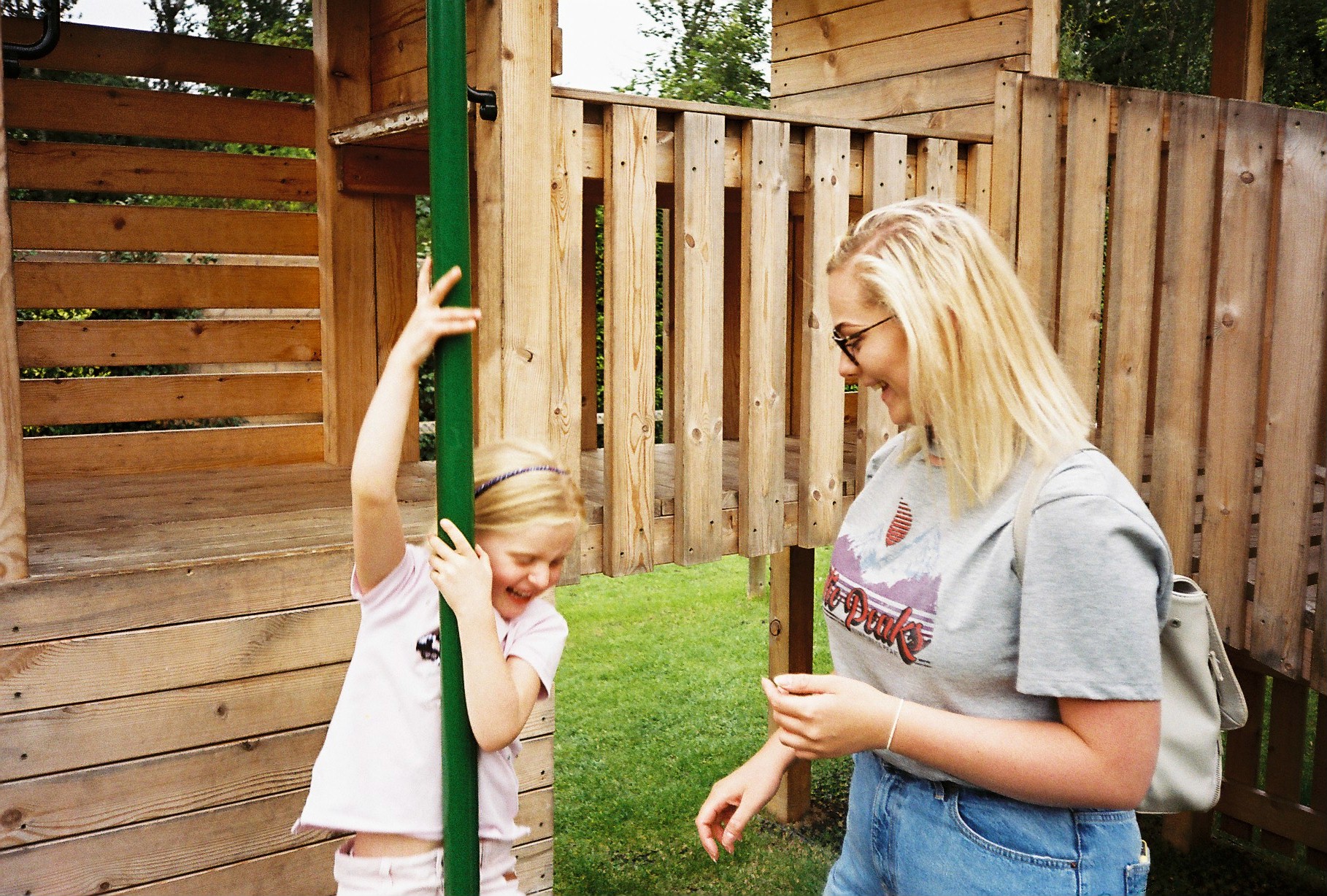
The second image includes Lucy and Minnie both mid-laugh as Minnie slides down the fireman’s pole – an image I love but could do with cropping a little. They both, again, show relationships between us all – my relationship with Minnie and Minnie’s relationship with Lucy. The sense of intimacy as well as fun and playfulness is the underlying theme in thee two photographs and they work well to show the notion of being young again and enjoying yourself – youth prevails. It can also be a metaphorical reverse of my childhood when I used to play in parks with my parents. Now, me being the adult, I find myself being a child again with my own sister at such a tender age she is at – she reminds me of myself and this is representative in the first image of myself looking at her as we prepare to launch ourselves down the slide.

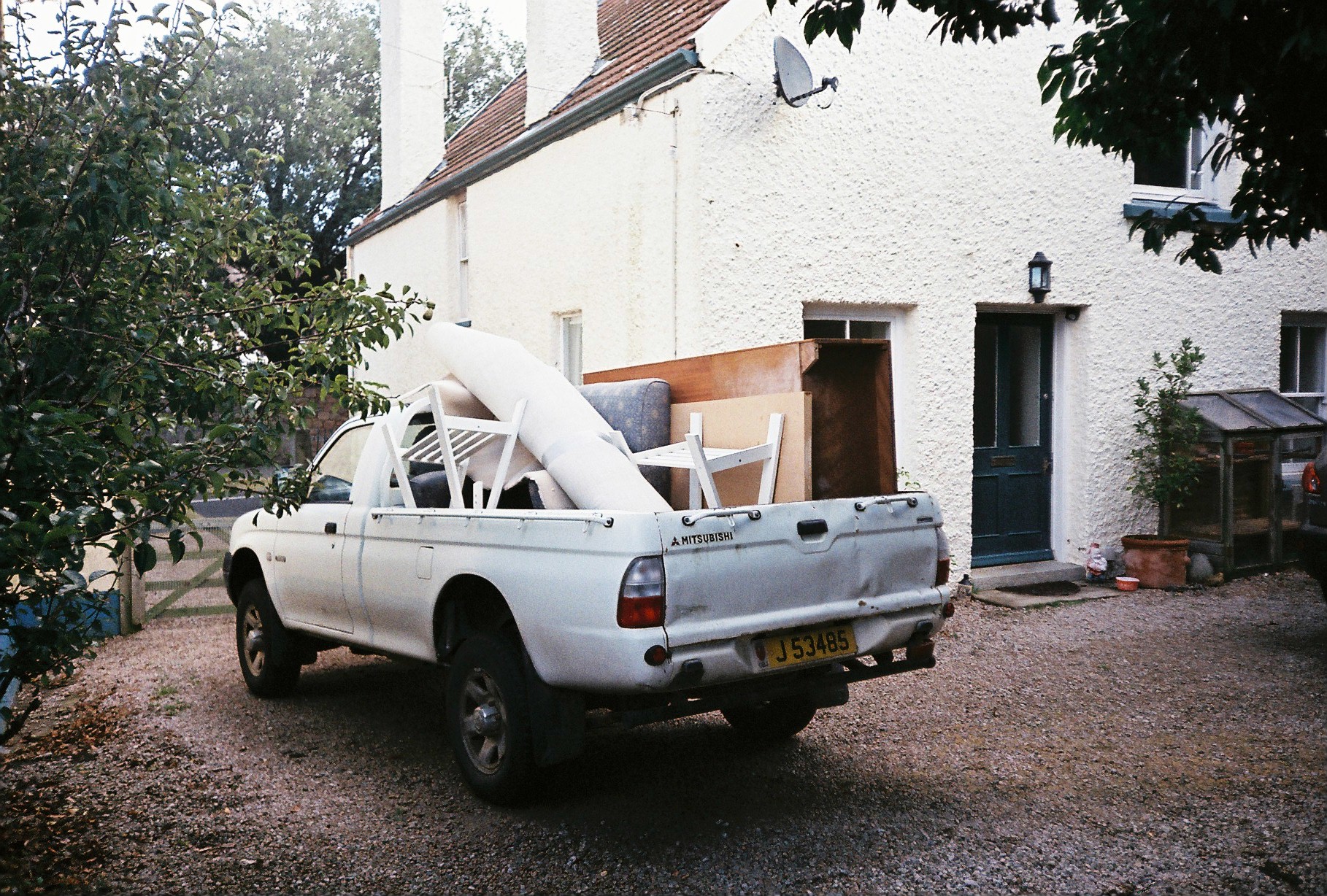
This was another image I came across from the roll of film developed which I had forgotten I had taken but shows the process of when myself, my mum and my step-dad moved house form St Brealde’s to Grouville. The image frames the pick-up truck we used to transfer old and unwanted furniture to the dump. It is an image which may useful when encapsulating the use of loss at the very start when looking at my mum and dad’s divorcee – as we pack up our belongings and prepare to lead a new life somewhere else with new surroundings. We are getting rid of unwanted things and it reiterates the idea of being attached to something so dearly but eventually, you have to let go of that thing which was so important in your life – a house or a partner.

These images remind of that of Arno Brignon’s from her series focusing on her daughter, Josephine due to the graininess which I achieved from the film camera and the vibrant yet hazed colour palettes with observations of darkened contrasts.

Lucy McRae // inside out

LUCY MCRAE

Lucy McRae was born in 1979 in London, United Kingdom. She lives and works in Amsterdam, the Netherlands. She was trained as a classical ballet dancer and interior designer.

Lucy McRae is a body architect and artist who is fascinated by the relationship between humans and technology. She combines science with imagination. She creates multimedia art pieces using the human body as the canvas. She is inspired by architecture and fashion. Her art challenges convention in film, experimental art, fashion and body art.

I love the sculptural elements that arise within McRae’s work. Her art is similar to the body suites I have previously been inspired by. This idea of creating sculptural forms surrounding the body could easily work with my concept.

The body suits that I aim to create myself are meant to symbolize the representation of what people feel inside.  I believe Lucy also aimed to achieve this with her shoots of her body suits. When I create my body suit I want to capture lots of different angles and perspectives of the subject wearing it so that I clearly demonstrate and represent what I aim to symbolise.

Ethics in Photography

Now looking at ethics in photography, another important issue to address when looking at imagery which had had a impact on how photography is produced in the current day, I will still be focusing ion the work of Steve McCurry and looking at how he his work over the years of his success has received both praise for its braveness in capturing something so alien from what we know in our society, as well as criticism for its untruthful representation of the other cultures he chooses to photograph. I have previously looked at his work in relation to the representation of other cultures in our world and how this may be an inaccurate representation due his outsider’s POV when immersing himself into the lifestyle and living of places like India and Afghanistan. Now I will look at ethics and whether his imagery is accepted by the public based on its perceptions of being right or wrong in relation to morales of how we should treat and respect other cultures – often, McCurry is criticised being offensive in his work because what he shows is glamorised and romanticised for the camera and the people of their culture would prefer to be shown in their true colours – how they live life everyday – which, for most of the people in deprived countries, is a lot worse of than us and this representation is often looked at as being inappropriate (cultural appropriation) because it goes against the view that everything should be true and we should not lie – sparking arguments  about the ethical value of McCurry’s imagery.

As McCurry’s imagery was looked into further and more thoroughly, it was discovered that there were questions surrounding the methods of production of his photographs and that it went against the ethics and standards of photojournalism.

Photojournalism is defined as ‘the practice of communicating news by photographs, especially in magazines.’ Photojournalism relies on the sequencing of images to tell a story – a narrative and essentially a news story – the images should be strong enough to get a message across to an audience without the need for a caption or any text to accompany it. This is what McCurry has achieved, to immense extents in his career with several of his images being published in the National Geographic magazines and as well on the covers of a few magazines – this shows that his images are extremely powerful – powerful enough to portray a story to his audience. Photojournalism is intended to be very narrative driven bit also, there obviously has to be a underlying notion of truth and what is shown in the imagery produced by a photojournalist should be both truthful and relevant to current news stories as well as being ethically right in its content and methods. A photojournalist should not put anyone in an uncomfortable position in the process of taking their images nor should their methods be unethical.

Furthermore, ethics are defined as ‘moral principles that govern a person’s behaviour or the conducting of an activity.’ Therefore, looking at photojournalism and ethics combined, it would make sense that photojournalism, is all about being ethical and ‘right’ so that society is not harmed buy anything produced. If ethics are moral principals, then this should be evident in the imagery produced for journalism purposes where everything shown is truthful and not altered in order to show a picture or a story which is more ‘accepted’ or an image which shows things to be ‘correct’ which is what Steve McCurry has been accused of not doing in his work where people have begun to unpick his work and reveal the ugly which was not shown to us in the first place – McCurry has been heavily criticised for Photoshopping or ‘touching up’ certain elements of his images so that they look better and nicer to look at, whether this be through removing people or objects to make the images look less cluttered or romanticising a scene which is not glamorous in real life.

During Steve McCurry’s career as a photojournalist for National Geographic, India was his most visited country evident in his work and was a place which he said was very special yo him – he expressed his love for the country and it was the location which made up most of portfolio as a backdrop for captivating images capturing Indian culture and Indian people. On the blog post written by Kshitij Nagar on PetaPixel focussing the examination into is work, the writer states that India to some was regarded as his ‘Karma Bhoomi'(the land where one works)’. It is in the next paragraph that the either then goes on to talk about McCurry’s depiction of India which sparks the most controversy both internally and internationally due its ‘certain stereotypical, exotic, almost “Slumdog Millionaire-ish” version of India’. I have already discussed this when looking sat the comments made by Teju Cole of The New York Times in which he makes no efforts to hold back in his rant at McCurry and has no regard for his status in the photography due to the fact that he, in his eyes, as an Indian, disrespects their culture by showing it in the light McCurry does. This is re-iterated by Nagar.

(Words from PetaPixel’s publication on ‘The Botched Print’) ‘A travel photography giant, his vibrant images have inspired millions, but he’s recently come under fire over Photoshop use after a botched print at a show in Italy was found to have a serious issue.’ And this is quite right – McCurry is a documentary photography giant and he is expected, due to this big status and big name to follow the rules and to not offend people of the cultures he is photographing so heavily which also in the public eye so much now he is this world-renowned artist. Hover, he has been found out to potentially be a user of Photoshop to improve images beyond there rawness and actuality of life itself to a point where the story is distorted.

mccurry_featureSchermata-2016-04-23-alle-21.20.41

This image, has been, understandably removed from McCurry’s website now as he has been under fire for using Photoshop to alter his images but has made a ‘botch up’ of it to the point where it is very obvious due to the unrealism of it – the bottom of the road sign pole has been dislocated form the actual sign post and it is floating in mid air where it does not look real – this has caused much rage over audiences and it is now questioned ‘how far has McCurry’s imagery been altered?’ This, as well, has generated more controversy over other images of his which has also been commented on in the article.

The two images below are also digitally manipulated images of McCurry’s and were both found on his website. In the first image, you can see, in the background, a hazed and blurred second cart to the left as well as a pole sticking out from this bit in the image below, these two objects have been removed from the frame by McCurry and Sharma writes that he is ‘not at all surprised’ of this digital manipulation done by McCurry because all he wishes to do is to create the ‘perfect frame’ and eh would go any lengths to do this, but the result is an untruthful representation of the real life events which occurred at the time; in turn, abusing the notion of ethical methods.

13062201_10209300783219510_4123666415850551493_n

13061970_10209300783099507_8328500818408060987_n

“I am not at all surprised at the digital manipulation (done by him) to create the perfect frame.
I have watched him rig (stage) his pictures. (He) Arranged the subjects (back then) because chromes (slide film) could not be that easily manipulated.”

Another image produced by McCurry has been revealed to be very staged and this seem to be a recurring theme of his imagery production methods and we can begin to lose our hope of such a renowned photographer which has much success with his work because of this critical examination int his work and the reveal of these unethical methods. Do all photographers carry out false methods of production to create this ‘perfect frame’ or are there artists who embrace the idea of a candid portrait? Sharma also says that McCurry’s imagery are ‘staged candid portraits’ – this oxymoron presents a juxtaposition that doesn’t work as a ‘candid portrait’ is a photograph taken of a moment in time – without the subjects aware of the cameras presence – it is natural but a ‘staged portrait’ is a method where the subjects are positioned purposely to show a mood. The image below has been staged and Sharma comments on this:

avinash-pasricha-steve-mccury

“This apparently off the cuff moment was arranged too. The lady is the wife of a photographer friend and the suitcases the coolie (porter) is carrying are empty. They had to be because the shot took time and lots of patient posing. McCurry’s pictures have been called STAGED CANDID MOMENTS by Avinash Pasricha, a photographer friend who knows how he works because he helped him with the pictures like the one above. The lady is his sister-in-law.”

When technology makes it so easy to manipulate images, how much manipulation is acceptable?

With the easy accessibility of software such as Adobe Photoshop and Lightroom, as well as Instagram an other image editing applications, and using software such as the examples listed above being sop vital for photographers in the current day, image manipulation is more or less inevitable in this ever-growing age where technology is taking over the human generation. Everyday, we rely on technology to get us through the day and everyday 52,000,000 images are uploaded to Instagram on average. This shows the pure depth of how image editing is so important to even non-photographers.

The use of Adobe Photoshop and Lightroom is a second nature to most photographers in the modern day of technology driven lives. Most photographers may feel like the editing of imagery is the way forward and it is essential in order for audiences to enjoy your work and this is why artists strive to create the ‘perfect frame’ through manipulation of the original image to take it beyond it’s raw form where audiences struggle to connect with it as the truth has been removed. I enjoy looking at contemporary and delicate imagery where the only editing done is subtle adjustments of contrast, exposure or brightness etc.

The extent to which manipulation is acceptable is very debate-able and different people would argue different things but I believe that if the message of the image becomes distorted or the truth becomes hazed due to the extent to which an artist has altered their image, the this is hard to accept as an image which can have an impact on our society – this is an image which is has no powerful meaning to impact the audiences thoughts. However, there is also the argument that heavy image manipulation is essential when creating a photo collage for example, and this is understandably. If an artist’s work is based in the fine art industry where surrealism is wanted to be achieved from each image, then I can understand how the may need to go to further extents to produce something for its purpose than want a more contemporary style artists who focuses on the more technical elements such as composition and framing may do.

Therefore, there is a whole issue surrounding the idea of manipulation of images which needs to be straightened out in order for audiences to understand an artists intentions but looking at McCurry’s imagery, his efforts to create the perfect frame goes to far, especially when looking at such a touchy subject such as poverty in deprived countries – almost taboo, this needs to be appearance every carefully but he holds no regard for the views of the subjects he photographs and this has come out in recent years to put him under scrutiny.

With viewers more sophisticated and skeptical than ever before, how can photojournalists and documentary photographers preserve their integrity and maintain trust?

Like I said before, due to this whole saga surrounding Steve McCurry’s work and his intentions from producing his work, with it also being revealed tat he is not as trustworthy and professional as originally thought, it is difficult for us viewers and consumers of these products to understand where the boundaries are – are all photojounrasists showing us flase information? Photojournalists are ‘supposed’ to be putting truthful and accurate information on the cover of our media for us to understand and absorb so we are not being fed false facts.

Although photographers, Steve McCurry being a great example, believe they can alter their images beyond the point of actuality without their audience realising because we weren’t present at the time, often, their unethical methods are revealed, much like what happened with Steve McCurry and not only does it not play well with us, but it also ruins his reputation that he has built up over several years – his status, being part of the huge firm, National Geographic – he has allowed us to put our trust in him to provide with direct information about the places he visits but this reputation and status becomes less and less over the years as more and more information about the way he manipulates is put in the public eye and the view he had maintained and the dignity he had obtained from his much loved work gradually decreases and his fans trust in him disappears.

Audiences of any media are much more opinionated in this current day and it can often come back to haunt the producers of the media especially if it has been hidden that they have been unethical in how it was produced or morally incorrect. In photography, methods of editing is often hidden and this can be very hurtful to audiences if they are loyal fans and suddenly realise the artist they follow has not shown them the full picture and it can be argued that hidden truths were kept secret for many years regarding the Weinstein scandal in the news still after a month with more and more women coming out about the sexual harassment put on them by Weinstein – this is an example of reputations and integrity vanishing in a second due to one mistake and audiences become very opinionated once news like this comes out and although less severe with photography, people still wish to voice their views and may lash out on the subject.

Photojournalists should make their intentions clear from the get go when releasing a series of works etc. so that their audiences know exactly what is occurring and how each image has been produced. If releasing two versions of an image, make this clear and make the alterations made clear also so there is no misunderstanding – communicate with your audiences.

Who sets the boundaries of what defines photojournalism or documentary ethics?

Like in photography in general, there are no boundaries as such – everything in photography is free – everybody is free with their creativity to produce what they want and I believe this is the same in photojournalism and any other aspect of photography as an art form but there is the notion of producing something within reason; like I said, nothing that offends, or pits anyone in unconformable situation and in photojournalism, it goes against the purpose of using imagery to show a visual story for news reasons by removing objects in the mage or heavily altering the way the  image looks because it is about the meaning behind it – the message. Photojournalism does not adopt the same purposes as contemporary photography where it is about showing a photograph which shows aspects aesthetics through careful composition etc. Photojournalism is also this but its main function is to show a story and relate to texts which take power in the news at that current time – you want to focus on creating a meaning and this requires careful thought into the framing and content of the frame but I believe that editing should be very minimal to get the full effect of immersing yourself into the news story without worrying about the story being distorted in any way.

Therefore, I believe there  are no boundaries as such because photography is a creative outlet which people engage themselves in to be free in their ways of showing something – a message but, linking back to the idea of ethics, standards and representation, these should all be considered when taking an image.

Saint Nicholas Cathedral

During the October half-term, me and my grandmother visited Newcastle upon Tyne just to explore the North of England and go for a spot of shopping. Historically, Newcastle was a very Catholic city along with neighboring regions in northern England, however, despite a rise in irreligion throughout the United Kingdom, Saint Nicholas Cathedral still stands tall. 

When in the building, the infrastructure established the cathedral as a powerful and prestigious building that had been inhabited for Catholic worship for over nine-hundred years. The strength gives us an insight into to the past as the cathedral was a dominant place in society.

Fulfilling my concept of subversion against religion, I organised for my grandmother to take a few images of me sat in the cathedral showing my middle finger to demonstrate my anger with the church for their ironic greediness and selfishness. As I am seated in the seats situated next to the main stage in which the cathedral is based around, where the service would take place,  I feel as if I’m directly and openly demonstrating my frustration. Living up to my teenage stereotypes, I am dressed in mostly black, with my hood up in slightly “chavvy” clothing, coinciding with this concept of juxtaposition between youth culture and religion. A secret symbol in the image is the very faint antichrist drawn upon my face to demonstrate my religious anarchy. By editing the image to black and white, I strip the image of its colour and therefore the limited symbols of life that do exist within the church.

ARTIST REFERENCE // GIDEON MENDEL

Biography

Gideon Mendel is a world wide known photographer, who is recognized for his contemporary photographs focusing and engaging his work on social issues which are of global concern. His is a committed photographer to taking an intimate style of photography, which shows his long term commitment to his love of photography and the projects that he emerges himself in. He has completed an enormous amount of social issues project around the world many which have earned him international recognition and many awards, including the Pollock prize for creativity.

The self motivated photographer was born in Johannesburg in 1959 and studied psychology and African history, so therefore not always showing the greatest interest in photograph from a young age. However he did began to take photographs around the 1980’s where his work as a ‘struggle photographer’ where first brought to the attention. After this he moved around and continued to photograph global social issues and one of his most notable being his project into HIV/AIDs, which had a very hard hitting impact of general public because it was showing true harshness of society in struggling countries. His photo taken began in Africa and expanded to many different locations around the world capturing stories of hardship and global social issues which have made his photographs so famous and popular today.

In 2007, he began his project ‘ the drowning world’ photographing flooding in an emotional and personal project responding the the current situation of climate change. He has been recognised for his unusual portraits and awarded for his creativity and different strategies he takes to produce his story telling images. Following his extensive career capturing global social issues he has worked with many organisations such as National geographic, fortune and the guardian etc.this emphasises the vast amount of work he has done on this topic and shows that he is a professional reliable photographer, which is truthful to the images he captures.

Four stories about hunger

Four stories of hunger is an incredible short film produce by Mendel which shows video clips and images from some of his projects. this short film that he created adds depth and reality to his images and brings more of a story and excitement to the images which often captivates the audience more, and this is one of the aspects which made Mendel stand out as a photographer that inspired me and that i wanted to analyse and have influence in my project which i am conducting in Africa. I was inspired by his passion and long term commitment for photographing social issues and believe that the work that want to capture whilst i am in Burkina Faso shows strong links to the work of Mendel.  I personally really like the contemporary style of photography that he uses to capture his images, from the way that he conducts his portraits getting an individual to stand infront of a plain wall can often be difficult and even more so if they speak a different language. Therefore i appreciate his images as they seem as though they are simplistic images however getting to the stage where that image can be taken with the right lighting and position of the camera takes skill and experience.


Image Analysis


Eunice Achieng, age 8 project: Disability reframed

The first thing which noticeable when analysing Gideon Mendel work is that he has a project title for all of his shoots which immediately tell you about what the images are of and also where they are taken, meaning in which part of the world and the specific social issue which is being targeted.  Without even seeing the image above i already new that the project was focused on in africa and that the project title was ‘Disability Reframed’. From this i started to pick out what he was gong to be capturing in his images and you can assume that it was going to be focusing on how the third world deal and cope with disability. therefore when you click onto the project mendel gives you information about the project, often statistics and background information to the story the project is telling. I think that this is the feature which makes Mendels work stand out from other photojournalist as he is putting raw facts and information behind his images, emphasising that these images are truthful and are telling the stories of global social issues.

The image is of a young girl with some form of disability. She is standing in the middle of the shot therefore making her the focal point of the image. The photograph has no significant distracting background from the image so all focus is on this little girl and wht er story may be. The image breaks the rule of thirds following Mendels contemporary approach to photography and breaks the rule of thirds through the way that the young girl is placed perfectly in the center of the image with an even amount of gap above and below her head. this contemporary form of photographing portraits creates a sense of unusuality which may be a connotation for the fact that he is photographing children with disability which is seen as unique. The series of photos sees every child photographed together in the same way and this could emphasis a sense of community or belonging as they are all photographed in the same way the images are portraying equality which these children may not be used to experiencing because they do not get the same schooling opportunities as other children. Another element of the photograph that i noticed is the angle that the image is taking the photo at. The straight on camera shot that Mendal uses could also be used to portray equality as they are at the same level, the camera is level with the subjects eye.

The background of the image although being plain, is extremely important in the image as it makes the subject stand out more against the background. the neutral colours could also be signifying the simpleness of third world countries lives. And the the use of bold vibrant colored clothing gives a personality and a sense of life to the individual. each portrait in the project the individuals have different coloured clothing and i think that is what signify there individuality and uniqueness. Framing is also a key aspect to this image as the background frames the young girl making her the center point of the image, this is a technique which i am going to use when i am in Africa taking similar portrait images showing the stories of their community. I thin that if i use Mendel’s technique of photographing against a plain wall then the personality of the individual and their story will be the main focus of the image and this will show contrast to maybe other more environmental portraits which i will capture.

The image below is a good example however of how much variation Mendel includes throughout all of his different projects. This portrait although very similar in the stance of the subject and the use of the bright coloured clothing that emphasises their individuality has a very different element to it. Th background of the portrait below shows blurred out the woman’s house. This begins to tell a deeper story of who the individual is. For example in the image below i can pick out that this woman may be a house wife, who stays in the home most of the day looking after the children. Therefore this is a different approach to documentary portraiture which i would also like to explore more and have a go at in my own personal investigation.

By researching all the different projects which mendel has thrown himself into with his love of photography i feel extremely inspired to take some of his ideas and techniques of portraying stories of family and community through social issues and use it to influence my own style of photography and capture images similar. Main points that i want to take away from looking at mendel,is the idea of producing a short film to advertise, or show a deeper story to the images that i will be taking, after my research i am considering the types of video clips that i want to capture whilst im away as well as how i can link in interviews with the local community to show there story and what family means to them.


Inspiration//Carolle Benitah//Matthew Knapman//Planning

Carolle Benitah

Initially Carolle Benitah work for ten years as a fashion designer she then moved on from this to photography and some would say she incorporated this in her photography. The French Moroccan photographer focused on themes around family, memories and the passage of time. Her work is very metaphorical and focus’ on manipulating old images using embroidery, beading and ink drawings. I like this idea of physically editing the photo to create a new meaning or give a photo meaning. This is something I would be interested in using in my project as I have done similar things in the past and would like to further explore it.

Image result for Carolle Benitah

My favorite photo by Carolle Benitah is the one above. I like this photo as just like other photos she has manipulated this one in a particular way, that has a real haunting quality to it. This is most probably due to it being a photo of children with their mouths sown shut. The photos show violence as to sow a mouth shut is very violent. This what gives it this haunting, shocking quality. The only boy in the photo has his face covered by what seems to be pills, this could symbolize that he has been blinded by drugs, however this is just a guess. Yet again these  pills are red. The use of red throughout of all her photos is very clever and makes her photos distinctive. There is a use of red throughout her work often shown with red thread in this case it has been used to sow the mouths shut. Benitah explains the significance of the red in the statement below.

“I use a red thread, which is my connecting thread. It leads me through the maze of my past. Red is the color of violent emotions, the color of blood, of bad blood, it is also a color of sexuality. The beads chosen for their shininess and their delicacy accentuate the decorative element and create a discontinuity. I reintroduce the gestures of handiwork in this series and renew my connection with my previous work as a clothing designer.”

Embroidery in these photos where used out of protest as it was commonly seen for women to do this sort of thing waiting for the man to come back from work. She wants to denounce this and show it did not turn her into the “perfect wife” she was expected to be. She is using it to protest these sexist ideologies. There is phrase she uses that I really like when taking about putting the needle through the paper; “To embroider my photograph, I make holes in the paper. With each stitch, I stick the needle through the paper. Each hole is a putting to death of my demons. It is like an exorcism. I stab the paper until I don’t hurt anymore.” This is a powerful statement and one I will remember throughout my project as I have discovered in the past this kind of work can be very therapeutic, setting free any built up emotion.  It allows you to deal with things may not be able to deal with in the “real world”.

Another artist I taken inspiration from is also actually an ex Student. Matthew Knapman created a book all about his mothers life. His mother was diagnosed with breast cancer in 2014 that then spread to the rest of the body. This must have been a very difficult subject to do his project on. This has inspired me to cover a subject that is very difficult for me to cover. He also took inspiration from the artist above (Carolle Benitah). This is shown clearly throughout his book as he has changed these photos physically by burning, cutting and drawing over these photos. Again this is also something I’d like to continue from my exam project as I find this much more interesting and effective when conveying a meaning. When creating my book I want it to be full of emotion really showing the affect its had on my family and myself. I don’t want my work or photos to be shallow and have no meaning. If i come to the end of my project and I have no emotional connection with book and photos I have created, no matter what grade I achieved I have personally failed. I need this to have more meaning than achieving some grade and if I achieve a good grade that would be a plus yet that is not my primary goal.

Representation in Photography

To study the idea of representation in photography and how certain aspects within imagery are presented to an audience, I will be looking at the work of world-renowned photographer, Steve McCurrywho is a very iconic documentary photographer succeeding in his captivating images produced for National Geographic.

Image result for steve mccurry

Steve McCurry (born April 23, 1950) is an American photographer. The photographer, is best summed as world-renowned success in the medium of documentary photography, especially in culturally deprived areas such as Pakistan and Afghanistan. He has worked in photojournalism and editorial. He is best known for his 1984 photograph “Afghan Girl”, which originally appeared in National Geographic magazine. McCurry is a member of Magnum Photos.

Image result for steve mccurry
AN AFGHAN REFUGEE IN BALOCHISTAN, PAKISTAN, 1981

Image result for steve mccurry afghan girl

The image above is the world famous portrait of a young girl in Afghanistan and is titled ‘Afghan Girl’ for obvious reasons. Taken by Steve McCurry when traveling the world producing content of National Geographic, there is something very touching about the image above – something tat speak to the audience and I believe it to be because we know that this girl is likely to be very less well-of than we are if we use our schematic knowledge surrounding the topic of deprived areas such as Afghanistan this allows us to understand the likely difficult and traumatic life this girl may live – being surrounded by a war zone for most of her life and having to live with this as a environment that she has to grow up in. I, for one can feel a sense of sympathy and sorrow for this girl – she is young and lives a completely different life to us without the knowledge to understand the meaning behind possible explosions which occur on a day-to-day basis. We do not know of the help she may receiving if she does live a very poverty-run life and this portrait helps us to understand this. The use of her looking into the camera, directly at the audience is a very powerful tool and the facial expression gives off a feeling of trauma and vulnerability – her open and alert eyes let us know of her emotions, in that she is scared and overall it is a very well constructed image and is rightfully a world-famous image as it opens up a door to another life most of the world do not experience in their lives, and this is something we must be grateful for and McCurry has attempted to portray a unknown environment to us through his imagery. Us as humans love people watching and being a little nosey into others lives, which is why most of us enjoy and find pleasure out of watching vlogs, documentaries or capturing out own street photography or looking at other dociumeyatry photography but the scale on which McCurry does this at is on a much higher and more serious level. It triggers our satisfaction for being a fly-on-the-wall in others lies but this is for a much meaningful purpose. However, one thing I’d lie to pick up on is the fact  that I, personally do not actually like the image – I don’t enjoy looking at it, not due to its context but due to the actual way it looks – it is not something that attracts me t the image and is more so the meaning behind the subject which draws me in. Hover, McCurry produced this image with the purpose to fit the style and method of National Geographic as a whole and this has been done to a tee as it shows us the harsh reality, although not direct, of what life in other parts of the world us like. The image appeared on the cover of National Geographic in June 1985. There is a reason McCurry has been hand-picked by national Geographic and is member of Magnum Photos and this is because he does his job so well and many people gave fallen in love with not only him and his work bit the actual physicality of what he captures in every image – the colours, the subjects, the cultures, the lifestyles – our ability to connect with every subject in each portrait is what we love because not every photographer has the ability to create an image so well – something I will be talking about later.

American Photo magazine says the image has an “unusual combination of grittiness and glamour.” which I believe to be very true.

Expanding on the idea of representation, like I mentioned before, this is a very touching and harrowing representation of this young girl and we are able to get an insight into her life. The girl is represented as quite lonely and isolated and form her facial expression, quite scared and lonesome and we don’t know whether this as true or staged as us as the audience can only act as people who interpret the content to what we believe but the notion of true and false is hard to decipher when looking at the work of McCurry, yet t is something we believe to see as true and not staged as this would be providing us with false visuals bit in another sense, we also hope for it to be false because we do not wish to face the harsh reality that people across the world, in abundance, do actually live like this. On the other, we appreciate the imagery that McCurry produces us because we get so experience other cultures for ourselves fro what see in the frame.

It has been likened to Leonardo da Vinci’s painting of the Mona Lisa and has been called “the First World’s Third World Mona Lisa“.

Image result for mona lisa

Now mentioned, looking at the similarities of the Mona Lisa and McCurry’s Afghan Girl, there are many resemblances of both in each other. It is perhaps that McCurry took inspiration of the elegance and pureness of the painting of Mona Lisa an then transferred this into his portrait of the young girl in Afghanistan. Both look directly into the camera with a blank facial expression. They both have long, dark, maroon coloured hair and wear a draped scarf or vale over their head. In both imagery, there is a sense of delicateness and urge to show the femininity if our world – to show the beauty of females whether that be through a painting or photograph and though we may be faced with something difficult to address, looking at McCurry’s work, the beauty is beneath.  Maybe this is something else McCurry attempted to present and show us – the inner beauty of this young girl that is underpinned by the courageousness of her efforts to stay brave in the situation she found herself in at the time. It is aa though the women in both works are attempting to tell the audience something through the very intense gaze they possess. McCurry provides us with a modernised version of the Mona Lisa for us to embrace.

Image result for afghan girl

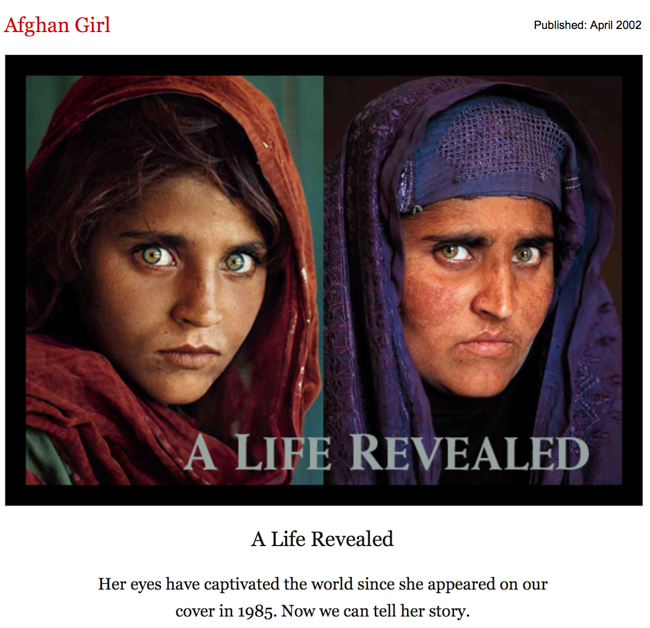
In early 2002, the subject of the photo was identified as Sharbat Gula, an Afghan woman who was living in the Nasir Bagh refugee camp in Pakistan during the time of the Soviet occupation of Afghanistan when she was photographed. This effort to re-photograph the same girl several years after she has once matured and become a grown adult tells a story and a very powerful narrative which the world can acknowledge as the image at the time when she was a girl touched the whole world as a community and again when her face is shown again over 15 years later. It was revealed that she had never seen the Afghan Girl image before it was shown to her in January 2002.

McCurry made several unsuccessful attempts during the 1990s to locate her. In January 2002, a National Geographic team travelled to Afghanistan to locate the subject. McCurry, upon learning that the Nasir Bagh refugee camp was soon to close, inquired of its remaining residents, one of whom knew Gula’s brother and was able to send word to her hometown. However, a number of women came forward and identified themselves erroneously as the famous Afghan Girl.
Although being a very successful and iconic image worldwide, ‘Afghan Girl’ and many of Steve McCurry’s other images taken in India during his time there for National Geographic can be seen to be quite romanticised and purposefully made to look more glamorous than reality suggests native to India, writer for New York Times Magazine, Teju Cole, explores this in more detail and criticises McCurry’s work on this very factor that many of his images seem ‘too perfect’ and he compares other representations of India that come from natives, such as Raghubhir Singh to McCurry’s and finds an evident juxtaposition between an insider’s view and an outsider’s view. Making for an interesting story about presenting a fake reality to please a modern by audience looking for extravagantness and in reverse, we see a more real and raw look of a country told by the locals, not tom please audiences but to provide reality.

Taj Mahal and train in Agra, 1983, Steve McCurry

Teju Cole in his article addressing this topic he feels very passionately about goes as far as to say that McCurry’s images are “astonishingly bring” which may seem quite harsh and disrespectful as most would see McCurry as a hugely influential and dedicated photographer but I can see where Cole is coming from with this very brave statement as there isn’t much in his images that sparks interest from me in terms of look and visuals. Like I said, you would think that McCurry’s work should be admired and loved by everyone because of its popularity in National Geographic and his image of the Afghan Girl which will live in memory but his work is not for everyone, including Teju Cole and myself but Cole himself mentions the immense popularity of McCurry’s work which “adorns calendars and books, and commands vertiginous prices at auction.” – in other words ‘sells for ridiculously expensive prices’ and Teju Cole cannot see the demand for such images which are “boring” because he sees the images produced by McCurry as unrealistic of Indian culture – evident in the image above where photographed is a very glamourous scene where in frame is a train going by with natives on the front in their colourful and beautiful headdresses looking very polished and slick and in the background is the Indian landmark. the Taj Mahal and it almost seems “too perfect” much like the title of the article suggest. Cole says “The men are real, of course, but they have also been chosen for how well they work as types.” This is suggesting a fake presence around McCurry’s work that they  have been specifically chosen as they look well together and it makes for a very glamorous image which is not a true representation.

Indian photographer, Raghubir Singh worked from the late ’60s until his untimely death in 1999, traveling all over India to create a series of powerful books about his homeland. His work shares formal content with McCurry’s: the subcontinental terrain, the eye-popping colour, the human presence. Within these shared parameters, however, Singh gives us photographs charged with life: not only beautiful experiences or painful scenes but also those in-between moments of drift that make up most of our days.” Here Cole talks about the difference between Singh and McCurry’s work as well as similarities but focuses on the negatively charged feelings which exude from McCurry’s work in particular and suggests that this is incorrect and not how he wishes for his homeland to be shown and therefore, with pride, backs the work of Singh to show what India is – in that it is a land full with life but is better shown through the snap-shots of everyday life – what is in between the hustle and bustle of a usual busy location.

Subhas Chandra Bose statue, Kolkata, 1987. Raghubir Singh
Kemps Corner, Mumbai, 1989. Raghubir Singh

An example of Singh’s work is show above and is quite the opposite of McCurry’s work although taken of the same content – just much more relaxed in its composition. Singh focuses on creating a ‘snap-shot’ of one second in time – no-one is looking directly into the camera, not is there exaggerated shadows and colours enhancing in after-affects and instead we are given a much more raw representation of India’s busyness told from the perspective of an insider. Although an outsider’s view, McCurry’s amateur representation of India is still loved because we are given something simple to feast our eyes on; not a narrative which needs to be unpicked yet still enjoyed in its visuals – much like what Singh’s work offers.

Looking at another view, above is the music video for Coldplay and Beyoncé collaboration song ‘Hymn For The Weekend’. Although very poplaur, it has spakred much controversy over its intentions.

Written by Billbaord, ‘Coldplay’s new “Hymn for the Weekend” video featuring Beyoncé that was released on Friday 29 January is catching some heat over its Indian inspiration, with some online calling the Mumbai-shot clip a work of appropriation while others defend it as an appreciation of the foreign culture.

People were seen to express their fury at both Beyoncé and Coldplay and people took to Twitter to outburst their range over what should be seen as an offense to the local culture instead is being ignored because it has been addressed by two popstars who are worth millions. Some said ‘Are we gonna discuss how Beyoncé dressing up as an Indian woman for the Coldplay video is cultural appropriation, or no?’ and another said ‘Just because it’s Beyoncé, doesn’t mean she’s right. She is being offensive and appropriating our culture.’ However, some actually like the fact that Beyoncé was seen in the video to dress up as an Indian woman as it empowers them and someone said ‘I adore Beyoncé for embracing my culture. In a country where I’m a “terrorist” I have never felt more accepted’. And it is argued that Beyoncé is likely not offensively appropriating due her black origins and this would not be in her remit.

However, In my own view, I had never looked that far into it until now and just saw it as a band who wants to embrace the culture of India and not intentionally offend anyone by different people have their own views on representation and it is often misinterpreted.