Category Archives: Analysis

Filters

Author:
Category:

Critical Image Analysis

METHODOLOGY OF ANALYSIS

Describing ~ FORM ~ What is here? What am I looking at?

Interpreting ~ MEANING ~ What is it about?

Evaluating ~ JUDGEMENT ~ How good is it?

Theorizing ~ CONTEXT ~ Is it art? How does it relate to the history and theory of photography, art and culture?


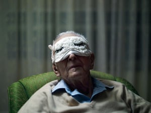
Days with my father: Phillip Toledano's father wearing a mask

In 2010, Phillip Toledano completed the production of his third photo book with the publication of “Days With My Father” – a compelling book that depicts the final stages of his father’s life as he slowly loses his battle with dementia. The image is very powerful as it portrays an elderly man, literally blindfolded, however, this blindfold could be metaphorically interpreted as his dementia which now prevents Toledano senior from living life in the same manner. Furthermore, the blindfold has two closed eyes upon, acting as if the subject is asleep, or perhaps dead as we know it is a photographic journey of the man’s remainder of his life.  This image covers the front page of Toledano’s photo book, suggesting the photographer also valued the image in terms of effect and relevance. The rule of thirds scheme demonstrated in this image allows us as the reader to focus upon the man’s face, which is aged and half covered, adding a sense of ambiguity. This emotion of ambiguity is enhanced by the depth of field as it is solely focused upon the model in question, blurring out the irrelevant background, indicating our attention should be on the subject.

For what the book aims to portray, this opening image is very relevant and reflective, showing how his father is clearly old and as we’ve discussed, the blindfolded connotes death. The image has crucial effect and sets up the rest of the book very well so I believe the image is a success. The colors of the image are very dull and monotone, reflecting this sense of deterioration.

art1
ɑːt/
noun
  1. 1.
    the expression or application of human creative skill and imagination, typically in a visual form such as painting or sculpture, producing works to be appreciated primarily for their beauty or emotional power.

The photograph is the opening image for a book made to give a specific insight into a son’s experience before his father’s death, staying loyal to the main objective of photography as it informs and is an alternative way of documenting. However, I think it is a rather limited demonstration of art as although Toledano has had the idea to photograph the lead up to his father’s death, the images lack creative skill and imagination. In contrast, the images do contain emotional power, causing me to rate “DAYS WITH MY FATHER” as fairly limited in terms of art.

Laia Abril- The Epilogue part 3

Book in hand

When picking up the book, it seems very heavy but not too heavy, a good weight. The first thing noticed is the indent of the blue part to the book making it seem like another book has been placed inside of this book. This part is covering Cammy’s face. Standard book portrait size.

Paper and ink

The photos are on plain white paper throughout the book. Inserts can also be found throughout the book on different types of paper thin paper. Almost every image is colored there are no black and white images.

Format, size and orientation

The book is portrait but features landscape photos as well  throughout the book. It has a hardcover. The book is just under A4 size-19.00 x 26.50 cm and contains 172 pages.

Design and layout

There are multiple sizes to images in the book such as A3, A4, A5 etc. There are multiple full bleed images as well as framed images. There fold outs under/between large A3 images which personally I thought was very creative. There were a number of inserts throughout the book. There were also many landscape and portrait photos.

Rhythm and sequencing

The sequencing was something I was very impressed with and in some ways it was a large contribution to the emotional connection many readers experienced. It allowed the shock the reader experienced a little bit closer the families shock the family must have experienced. It builds the narrative and allows the reader to witness how such a great family and upbringing Cammy even from the Cammy’s own words she says she has ‘amazing parents’. This is then disturbed by an insert from the newspaper of her death. This sudden change in tone is meant to shock the reader. There are multiple cases like this throughout the book.

Structure and architecture

The book is full of images of the Cammy’s family after her death. It is made to seem like a normal family nothing strange apart from momentary glimpses of grief. The families grief and sadness become more prominent the further the reader gets through the book. These photos are split into groups with inserts and old family photos between each section. This book is designed and structured to shock, upset and make its audience think.

Narrative

The narrative that has explained before in previous blog posts is about the aftermath of a young woman’s death after a long battle with bulimia. The name of the victim is Mary Cameron Robinson, known as ‘Cammy’ to her friends and often referenced as Cammy in the book. The book explores her family and friends grief, frustration and shock. It is a tribute and a book really emphasizing how real of an issue eating disorders are.

Title

‘The Epilogue’ is a clever title as it causes the reader to question it as it is not a clear title. It also suggests that it is the aftermath of something significant. The Epilogue of a novel is often at the end however,  this whole book is called ‘The Epilogue’. Once the reading this book the title becomes clear as it is the story of a families grief after losing a loved one to an eating disorder. Also before this book the author released two other books of eating disorders the title may also nod to her other projects as it may show the consequences of not taking this illness seriously.

Images and text

The only text that can be found are from diaries, reports, newspaper articles, letters and quotes from the family there is almost nothing directly from artist, which in many cases makes sense as she is not part of that family she is only sharing the story, she is not a part of the story.  Often the images have relation to the text that can be found next to it.

Laia Abril- The Epilogue part 2

Raised in Barcelona Laia Abril is a documentary photographer, journalist and ‘maker of books’. Her projects such as this one have been exhibited in Italy, Spain, Poland, London and New York. Her work has also been published by The Sunday Times Magazine, D Repubblica, Ojo de Pez, Le Monde, FT, PDN, Burn, Esquire etc. Abril spent 5 years on different projects exploring eating disorders.

This book is for anyone to read, whether it’d be someone who has never heard of eating disorders or doesn’t know much about them. It’s also for people who are victims and the families of victims of eating disorders as it shows they’re not the only ones that have been through the difficult times. It shows awareness and it is a beautiful tribute to a life that was sadly taken too soon.

Laia Abril focus’ on the key objects and papers building a narrative that many people can become so emotionally attached too. Abril in many of her projects puts meaning into every aspect of the books she makes. You can see this in sequencing of this and many other books of hers. The order she places these photos is cleverly put in such a way that plays with the readers emotions. It allows the reader to connect with book in such a way that gives the story the respect and acknowledge it deserves. This is seen throughout this project as well as her other projects on difficult subjects such as abortion, sexuality and gender. Laia Abril gathers so much information it actually allows the audience to connect to it unlike other photographers.

CRITICAL IMAGE ANALYSIS

“criticism is informed discourse about art to increase understanding and appreciation of art”

(Source: Criticizing Photographs: An Introduction to Understanding Images, by Terry Barrett, 1990, pg:3)

At AS we taught you how to analyse and write about photographs using specific terminology such as: Formal Elements – lines, tone,  texture, shapes, colour, space etc. Composition – layout, rule of thirds, depth of field, cropping/framing, foreground/mid-ground/ back ground, viewpoints, balance. Technical – use of lighting, camera-skills, aperture, shutter-speed, iso, white balance etc.

In your essay you have to write about your chosen artists/photographers. Often you would chose a specific image or body of work or a photobook and use as an exemple and analyse in depth in relation to your essay question and investigation.

To develop your analytical skills you need to understand different ways or methods of analysis.

Firstly, here is a model of a 4 step process

METHODOLOGY OF ANALYSIS

Describing ~ FORM ~ What is here? What am I looking at?

Interpreting ~ MEANING ~ What is it about?

Evaluating ~ JUDGEMENT ~ How good is it?

Theorizing ~ CONTEXT ~ Is it art? How does it relate to the history and theory of photography, art and culture?

Read through this Powerpoint how to analyse a photograph + photographic theory for more help and guidance

TASK 1: Choose one key image from your first artists/photographer that you are studying in your Personal Study and write a detailed critical analysis following the above methodology.

You must use subheadings in your analysis as above i.e. FORM, MEANING, JUDGEMENT, CONTEXT.

Now lets look at a Case Study:

201307F03-KC-MigrantMother-Photo-Portrait-thumbnail-1200x1200
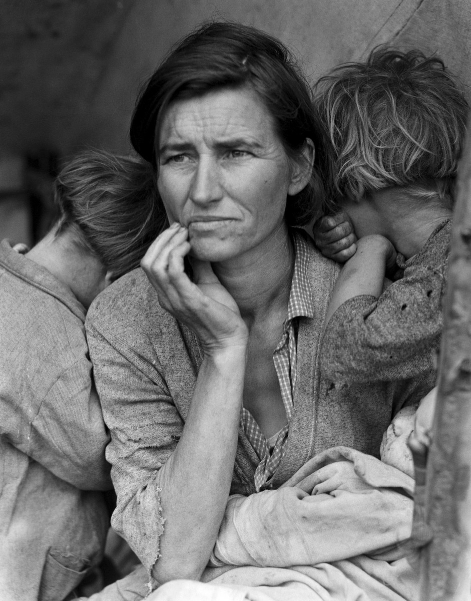
‘Migrant Mother’ by Dorothea Lange, 1936

When analysing a photograph you may want to operate in an interdisciplinary manner using a variety of different analytical methods and approaches:

  • Assessed through reference to form, process and technique
  • Investigate the intentions of the photographer and the context of its making
  • Viewed as a social or historical document
  • Related to politics and ideology
  • Discussed in relation to class, race and gender
  • Considered in terms of aesthetics and traditions of representation of art
  • Analysed through reference to psychoanalysis
  • Decoded as a semiotic text

Read through Powerpoint case study Dorothea Lange for more help and guidance

TASK 2: Choose one key image from your second artists/photographer that you are studying in your Personal Study and write a detailed critical analysis using one or two of the above analytical approaches.

Upload image analysis as a blog  post by Fri 19 Jan.

For more help and guidance on image analysis visit this website: Photopedagogy  

2653761_orig

Laia Abril- The Epilogue

This book centers around the sad story of the Robinson family after losing their 26 year old daughter to bulimia. The photographer deeply explores the grief experienced by family. She does this by using flashbacks. These flashbacks can be seen in different ways. Abril uses photos of letters, key objects, places, testimonies told by different family members and friends. These especially, were full of deep grief as well as other emotions such as regret, guilt, frustration, distress, sadness all emotions that can be found with a sudden loss of a loved one. This book is very much a book of loss but also a book of awareness. It is letting people know this mental condition is a very real and it is a dangerous one not just affecting Cammy Robinson but many young women around the world.

Abril explores Cammy Robinson’s story in a very sensitive but confident way, using her documentation techniques to help her do this. She does not hesitate to tackle the real issue. This can be seen with the photo of the weights placed over a two page spread. This photo alone is very saddening and when surrounded by the narrative very powerful. The use of photos before and after her death is also very effective. The sequencing and framing of these have been very cleverly placed to make sure the audience get the full impact of the story being told. Some photos are so simple however they carry so much meaning and significance. The narrative is so powerful it carries and improves the rest of the book. There are multiple inserts from Cammy Robinson’s life that have been cleverly been placed throughout the book.

The Epilogue is a beautiful, upsetting but also very powerful book. It’s a clear example of a photographer having a difficult story to tell and then having them tell it in the best possible way. The book is clever, interesting and thought provoking. It is a great piece of documentary photography tackling a real issue.

Photo Book Investigation (Matt Eich – I Love You I’m Leaving) – Research of Photo Book

For my investigation into a photo book, I will be observing in detail, then discussing the features of Matt Eich’s photo book entitled ‘I Love You I’m Leaving’. I have chosen this book to research because it is the book I will be using in my personal study and Matt Eich is a photographer I have paid close attention to throughout my project thus far. His images are so very poetic and it is a style of documentary photography I am aiming to replicate in my project. The following few blog posts will be dedicated to the research into this photo book and will include discussion surrounding the narrative and features of the book as well as who Matt Eich is and my own options on the book. 
Research of the photo book:

I will be researching, for this task, the photo book produced by Matt Eich highlighting his project entitled ‘I Love you I’m Leaving’. This project outlines his parents split after several years pf marriage as he and his newly formed family transfer themselves form their hometown to a new city to start a new life as his parents are in a phase of vulnerability, grief and need. He feels as if he leaving in the most fragile of times and he documents this through photographing his family’s habits in in their new lease of life.

“I Love You, I’m Leaving is my meditation on familial bonds, longing, and memory. The series borrows from personal experience and the visual language of the everyday in order to create a fictional account that mirrors my reality. Made during a time of personal domestic unease, I photographed as my parents separated, and my family moved to a new city.” (ceibaeditions.com)

Image result for matt eich i love you im leaving

Throughout the book, Matt Eich sticks strictly with black and white images and focuses harshly on using shadows and light to depict a particular mood – this being quite eerie – there is a certain glow to Eich’s images and his subjects posses a certain importance highlighted through the use of light to illuminate their presence. You see the subjects consisting of his wife, two daughters and older generations through the family wearing mainly white and flaunting their hereditary blonde hair as the light Eich focuses on strictly catches and provides glow to the light colours each subject possesses.

Eich also pays close attention to providing a balanced tone spectrum in each image as you notice the whites being visibly brighter than that of the solid blacks and in between this, greys of all different tones fill the negative space to create a very tonally balanced image.

The genre Eich takes on is that of a documentary approach where he captures the still moments that take their course in between the more hectic, busier moments of life which are also captured on a more subtle level. However, the overall tone the images depict is very atmospheric as if each image is their to tell a story and work as a collective but each individual image also has the ability to stand solitary as a documentation of the fragility of their familial circle. No one image is isolated and they come together, intentionally to create a solid visual narrative of what Eich experiences as a photographer, father, husband and son.

With Eich’s imagery, he pays no attention to attempting  to romanticise life itself and as a documentary photography project, it shows life itself and the rawness and actuality of what, on an everyday basis, his family are familiarised with but as a viewer, we are getting an insight in this and become hooked on what we are shown and begin to attempt to deconstruct this when, really, Eich’s job is to show is what is front of him as he discovers his family just as much as we are when delving through the project. Each photograph has a meaning and makes no effort to depict a false reality and instead focuses on what is there – the tangible – but we are shown a sense of intangibility through the project as we attempt to sympathise and relate with something we only know fragments of. Furthermore, Eich creates this sense of belonging as he brings each and every family member together as a collective and us as the audience feel involved in this poetic representation of what family is and it’s ability, in partnership with attachment and love, to unite yet destruct the once solid family tribe.

understanding photo book design- reviewing blogs

To understand how to identify a narrative and understand the design process of photobook making before making my own I read varies texts and articles to see other peoples views and information.

In the article  Identifying the Story: Sequencing isn’t narrative written by Colin Pantall, he focuses on creating narrative within photobooks and then sequencing the photographs and book designs to tell the story and work well with the narrative. He also explained he found it quite difficult to sequence his book as he tried lots of different approaches such as: ‘hronology,  geography, family, resemblance, art history, season, colour, form, tone, flora, expression, dress, climate, mood, symbolism and material.’ He admits that sequencing was a ‘gradual process’ and he found it fairly hard, as none of these made a narrative. He explains that what actually made the narrative was identifying what the story was about. This links to creating ‘all the structures through which the story can flow and the structures plus the story creates the narrative.’ He refers to Ania Nalecka’s workshop where she asks in three words what your story is about- which to me seems extremely difficult to describe everything in just 3 words. Colin describes his book is: “the story of me going out into these environments with Isabel, it’s my identification with these places, it’s me forming a relationship in these places, and the sense of loss that I experienced as Isabel grew up.” This can be shortened to 3 words: Identification, relationships and loss. I decided to try this myself as I my 3 words would be: Change, Absence and Fate, which are 3 common words I will be referring to in my essay.

Another source I have looked at Joerg Colberg’s book, which consider the many aspects of photobook making, which is divided into 5 parts explanations online part 1part 2part 3part 4part 5. He explains that photographers looking at making a book can not done, ‘without considering its content’- this suggests that the layout and structure of the book is influenced by the subject of the book itself, which supports what Colin also mentioned in his blog. He also discusses the various properties, which book makers are ‘advised to pay careful attention to’ these are size, weight, choices of materials, type of binding, etc. In the first series of articles, he looks at production choices, in particular how a book is bound, by using more than one book for any given type of binding. He refers to the feel and smell of the book to be important as well as the look of the book (layout, the images themselves, colours, size, structure, text and title etc)  given we have to touch photobooks when we look at them, we feel how that handle. We feel how they react to us turning their pages and we feel how easy or difficult the handling is, which is a key concept within his text. He ‘derives deep pleasure from photobooks where the form of the object and its intended function work together.’ Stressing that the book does not have to look fancy or have a particular layout as long as it has a correlation to the concept of the book. He feels most Photobooks tend to consist of a larger number of pictures, which are shown in a particular sequence for any number of reasons. These reasons can be incredibly complex, in particular if they’re driven by ideas of narrative, or they can be quite simple (remember, simple isn’t bad — simplistic is). This is the basic approach adopted by George Georgiou‘s Last Stop , who photographed through the windows of buses in London, the idea of the journey becomes quite obvious. In reality, there could have been quite a few separate journeys, with the presentation in the book being a fictional trip. ‘But it also doesn’t matter so much whether the presented journey is real in a documentary sense or in a metaphorical sense.’ He also refers to accordions within books, which can also be referred to as leporello or concertina books. He also discusses how to make these by hand ‘To make a very basic accordion book, all you have to do is to fold a long piece of paper into smaller sections, and you got your book. The devil, of course, is in the details, since you’ll need to fold the paper carefully, so your book won’t be irregular or even start twisting. Folding a long piece of paper is one option of making an accordion. Usually, these types of books are produced from shorter sections that are taped or glued together.’

He then continues to look at unusual binding choices, one of these is Spiral (or coil) binding he feels this looks cheap and ineffective most of the time so advises photobook makers to produce a physical dummy to make sure this is how you would like your book to turn out and to avoid mistakes, especially for this type of technique. He also mentions this might be a good way of practicing the layout of the book, making sure you are happy with the structure even if you do not use the spiral bind for your final book. There are two types of spiral binding, which are spiral/coil binding and double-loop-wire binding. Simply,  a single spiral holding the book together, and the material could be either plastic or metal. On the other hand, the double-loop wire uses metal, and there are two loops going through each of the holes, this is less flexible and allows for pages to possibly escape, something that’s impossible for the single spiral, unless the page gets torn out. Much like the accordion, the spiral has its uses. Unlike the accordion, a spiral probably needs to be adopted more for the aesthetic it comes with than the function it offers. He feels ‘as the final form for a book, I quite like the spiral, but I feel that it’s a lot easier to make a bad spiral-bound book than an accordion, say. You really want to think it through before you commit to it.’ These more unusual binding types are interesting and as a viewer you notice them so much more in a busy self of books.


He tells his viewers that the simplest way to make a book is to take a piece of paper, to fold it in half. If  If you want your book to have more pages, you can add them by folding more pieces of paper and inserting them. If you don’t want the book to so easily fall apart, run two or three staples through the “spine,” and you’re all set. This is how you make a simple, basic and easy book. He uses  Donald Weber‘s Interrogations as an example as he uses a pamphlet style book, which was an idea driven and inspired by a ‘basic police report.’ Pamphlets can be seen as useful and have ‘good properties’ as you can stack as many different types, styles or weights of paper as you want to create your book, this type of mixing can become difficult in other types of binding.  The downside to pamphlet is that you need to plan the book carefully, he gives the example of  ‘Let’s say you think early on in your book you need two pages of a very different paper. So you’ll add it. What this means, though, is that given it’s a pamphlet book, there will also be two of those pages very late in the book.’ A pamphlet can look homely and precise- this may be the feel you are going for within your project so making a pamphlet which you can sew together or staple together could reinforce the feel and story you would like to tell.

He discusses the alternatives to holding the pages together if you don’t like the idea of the binder. These could be to ‘run some staples through the stack of paper.’ This is how the 1945 abridged softcover version of Weegee’s Naked City that was produced this way. Its cover, a just very slightly heavier paper stock, wraps around the stapled stack of paper. Another technique is Stab Binding, which is described ‘ instead of a hole punch and a pre-made binder, you make a series of smaller holes through the pages, and the book is held together with binder’s thread. ‘ This is unlike other binding techniques this is using thread not plastic or metal. The limitations of this is that you lose some of the image as the holes can’t not be close to the edge as this make the book unstable. An example of an artist who uses this is Kosuke Okahara’s Vanishing existence this particular book is maybe an even better example of stab binding. He advises bookmakers to be very specific in their intent, and that the intent is made to work with the binding. ‘In a sense, stab binding is a great way to make books that are even just aesthetically intensely pleasing.’ Of all the binding types I can think of stab binding is the one that commands most attention on its own.

He then focus on aspects of photobooks, which he feels ‘appears to have commanded more attention than binding.’ This is the use of different types and sizes of paper. He uses the example of Christian Patterson’s Redheaded Peckerwood ,which showed that the pages in a book didn’t necessarily all have the same size. This is a simple way to organise information in a tactile and/or visual order, the difference in size and material might contribute to the overall narrative of the book and therefore make sense to include this technique. In Peckerwood’s book, the different sizes support the idea of the facsimile, which supports the underlying message. He admits this is probably easier to produce if their handmade books and also says if they decided to do this digitally, high costs might be involved. He looks at important questions such as ‘is what I’m thinking I should have feasible? Can it be made, and can costs be kept under control?’ Also equally important question is: ‘does this actually make sense? What purpose do these different types of paper and/or page sizes serve?’ He finishes with making a statement about a photobook designer: ‘A smart and experienced photobook designer will be able to come up with a design/production that will adhere to the budget.’
 

Shoot w/ Mum and Lucy

Below are the edits I have created using Adobe Lightroom from my photoshoot where I photographed my girlfriend, Lucy cutting my mum’s hair in our kitchen.

This was one of the first the photoshoot I completed for my project and I saw it as the perfect opportunity to get a collection of a few strong images to start me off with my project looking at relationships within my life and my family circle.

My girlfriend, Lucy is 17 and has just recently qualified as a hairdresser and so is always being asked by family members for hair cuts, including my own family.

I really like these images and the reason for this is because of their very delicate, poetic and elegant nature. All three are very documentary style and are capturing a moment in time.

The three images below have been edited on Adobe Lightroom and are the best three images from the photoshoot. All three work well in conjunction with each, however, I plan to use them with the images produced from my mini photoshoot I carried out at my dad’s flat.

The photograph below is of Lucy cutting my mum’s hair. You can also see me in the reflection as I am taking the photograph and this could be seen to ruin the image as usually it is known for photographer to remain behind the camera and out of frame because if the audience are t see the camera or the photographer, then we don’t like this as we have been taught that the common ideology of photography is for the photographer to remain behind the camera. I enjoy the fact that as well as the subject, I am also in the frame but with both Lucy and Mum illuminated so the focus is on them.

The photo below is mid-at through the haircut and shows Lucy gathering some of my mum’s hair to cut and the effect of this movement is captured in the camera and transferred to a visible blur in her hands which I also think has a positive effect because it shows that the photo is more than just one dimensional and adds action to what is shown. It is pretty much the same photo as above as it consists of the same content but as a close up shot to view the subjects in more detail and instead in black and white. As opposed to focusing on hard shadows and contrasts,  I have attempted to focus more on neutral tones such as greys and making these the base of the image because I observed this in LaToya Ruby Frazier’s images; that the contrast was quite low and instead, grey colours were used to provide a body to the image and this is also the same in Matt Eich’s images – something I ma not used to but enjoy the visual effect of.

There is in fact a Matt Eich image that he took of his family in the garden as his wife cuts his hair, shown below.

The image below is of the hair resulting form my mum having her hair cut. The wet, clumps of hair lay on kitchen floor scattered across the tiles as, in the top corner, the blurred motion of the vacuum enters the frame. It is a very simple image that takes little skill and technique and more observation and focus to see this moment as a photographic opportunity because this photo finishes off my collection of the first, second and this as the final image to create a mini series of three images.

Viviane sassen’s photobook // Roxane

http://www.bjp-online.com/2017/05/photobook-roxane-ii-by-viviane-sassen/

http://oodee.net/books/viviane-sassen-roxane-ii/

http://www.vivianesassen.com/books/roxane/

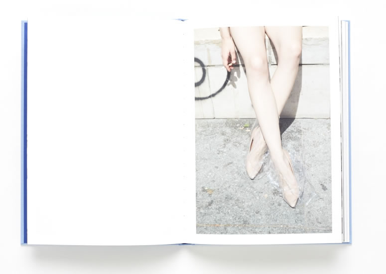
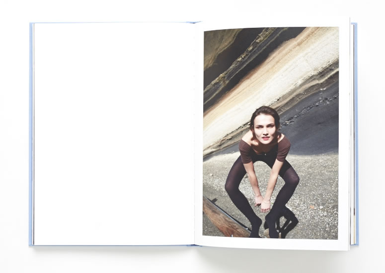
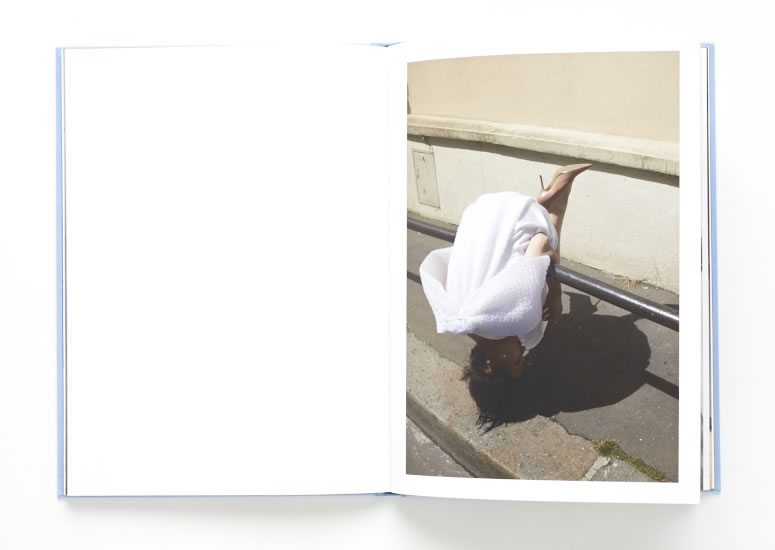
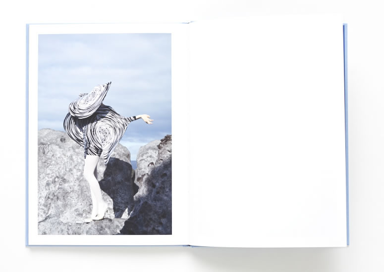
I really like the Photographer Viviane Sassen and have decided to chose one of her many photo books. The photo book I have decided to focus on is called Roxane. I believe that Roxane is the name of the model within the images.  The images within the book are extremely unique and full of abstract, twisted visions. She explores the female body by using a variation of photo styles, such as fashion photography and abstract photography. Sassen also includes some landscapes within her book to create a contrast, and a story like layout. I love the wierd and unique style that Sassen has. Her way of thinking really helps me to express and develop my unique style as well.

Here are a few pages from the Photo book Roxane. I really like how she develops the book with the use of portraits and landscapes, as well as her abstract images. There is a large use of fashion photography within her images, similar to the images I have managed to develop so far in the project. 

The photo book flows very well from image to images because Sassen makes links between her images to create a genre and narrative. Her images are very unique and contain a contemporary style. The layout of her book is very simple and plain. This is something I want to do differently with my phonebook because I want to use my sequencing and layout to express a wild format and way of thinking.

All the images in the photo book are the same size, apart from the abstract landscape images that she uses to split up the flow. She does this to make the concept of the book more interesting, and to add contrast to the flow and layout. All the images of the woman, Roxanne are single spread images, on either side of the book. The abstract landscape ones are multi spread images that spread across both pages. In every image of Roxanne she is pulling a different pose, and making different shapes with her body. She is playing different female characters, that Viviane Sassen wants her to perform.

Viviane Sassen dosen’t dramatically edit her images because they are good enough to stick to the original as much as possible. She uses the model and the environment to add the interest into the images. Sassen’s focus point in her series is the movement of the body and the expressive shapes it creates. The clothes that the models are wearing links a lot with the landscape that she places them in. This seems to be an overall theme within Sassens images.

Contemporary photographer // viviane sassen

VIVIANE SASSEN

Viviane Sassen was born in 1972. She is a Dutch artist who lives in Armsterdam. She is also a photographer who works with both fashion and fine art.  She is mainly known for her use of geometric shapes, often abstractions of bodies. This is why I really like Sassen because she experiments with her visions and her style is unique.  Sassen in known foremost as an artist. Her colorful photographs of Africa won her the  Prix de Rome in 2007. Sassen has managed to develop a ‘personal language’ that is sometimes surreal. She creates images with intertwines bodies, sculptural compositions and abstract forms. Her images are always fascinating and full of energy.

Sassen lived in Kenya as a child and often works in Africa.  She started studying fashion at Arnhem, but soon turned to photography. She is a photographer/ artist that is part of the group who create alternate personal, editorial, and commercial work. She embraces an interdisciplinary attitude. According to Sassen, she says “You should always be able to Judge a photograph on different grounds, on political, social, emotional, but also on personal grounds.” The photographs of intertwined bodies in inspired by daily physical contact with strangers she experienced in Africa.

The images below are some of Sassen’s images that were taken in Africa. I like the contrast of images that she has, some of portraits and some landscapes. I also love the contrasts within her images, and the abstract formations that she creates.

I love some of the contrasts that Sassen includes in her images. The vastness between her ideas shows that she has a vast amount of ideas that she presents. Some of the colours that she includes in her images are bright and full of energy.  She likes to use shadows to create a new dimension within her frame. I also really like some of her more simplistic ideas, such as her abstract landscapes, like the image below.  This image works really well in black and white because of the huge range of tones, from the light being reflected, to the darkest shadows. The image looks almost like a painting which I really like.

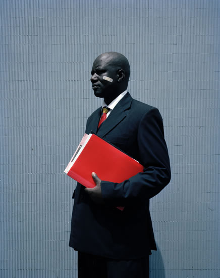
Ive decided to focus on this particular image of Sassen’s because I think it is extremely powerful. The main focus of the image is the man wearing a business suite holding a red folder.  At first look this image could be boring with no deeper meaning, however when you focus on the smaller details within the image, there’s a much more powerful concept. The name of the image is George.  This is probably the name of the guy within the image. George looks very powerful and professional because of the way he is standing, with his head held high, and the way he has positioned his body. He also looks very professional because of what he is wearing. He is in a business suite, so could be in a well payed position. I’m unaware if its deliberate or a good circumstance, but the plaster on the man’s face is what makes this image unique and powerful. The man