Category Archives: Analysis

Filters

Author:
Category:

book layout // draft 1

Here is my first draft for my photo book. I choose all my best, favorite images from each shoot that I did. I wanted to try organise the images into some sort of series, in a way that would make sense to the reader. I decided to separate the images into the different parts of the body. I first started with the feet, then the hands and face. I did this because I wanted to separate the series instead of presenting them together.

I wanted their to be a colour theme within my photo book because I wanted the images to flow. I didn’t want my images to solely be black and white though because that wouldn’t suit the theme of my project. Since my project is about body image and expressing emotions in a physical way, I wanted an image that represented this as the front and back cover. Instead of having two different images for the front and back, I wanted it to be one really good image. I choose the image of the hands reaching out because I think its a really powerful image that coincides with my theme.

My initial step was to choose the very best images from my selection to present as multi page images. I decided to primarily focus on the landscapes to present largely because I wanted to use them as a divider to separate the different sections of my project. I planned that I wanted all my other images to be presented on a smaller scale because I wanted it to be a simplistic flow.

The images of the beach landscape promote the idea of movement within my project. I have also focused on sea landscapes because I wanted to use an environment that related to the movement of the mind and the body.  I didn’t want the layout of the images within the book to be exactly the same, so I mixed up the position of the images to create a movement that worked.

White face // image analysis

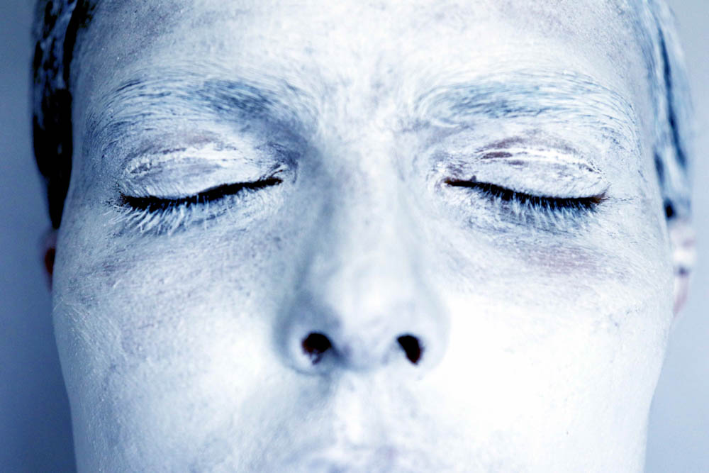
FORM ~ The image above is a close up of a portrait of a model covered in white paint and edited so that it has a light blue hue to the image. The image has been framed so that only half of the models face is captured. The model is standing in front of a a plain white background so that it was simple and that the portrait was the main focus. The models face has a bleak, solemn expression which i believe made the image more powerful. There is a shadow cast over the models face which allows the top part of the face including the eye to be highlighted.

MEANING ~ The image is from a series about conformity and invisibility within the world around us. The aim of the image was to symbolize how we change ourselves to suit the strains and expectations of society. We cover up who we really are to become the same as everyone else around us which therefore makes us invisible.  I represented this by painting the model white to symbolize her being invisible.

JUDGEMENT ~I am very happy with this image because is reveals and represents exactly what I wanted to within the shoot. It a powerful image with the connotations behind it. It provocative and makes the viewer think a lot more about what they are seeing.

CONTEXT ~ When thinking a lot more about the context behind the image and the ways it links to society I discovered that the image links closely to femininity and and society’s expectations to females.  This is something I would like to explore a lot more within the rest of my project and essay.

white face // shoot // edits

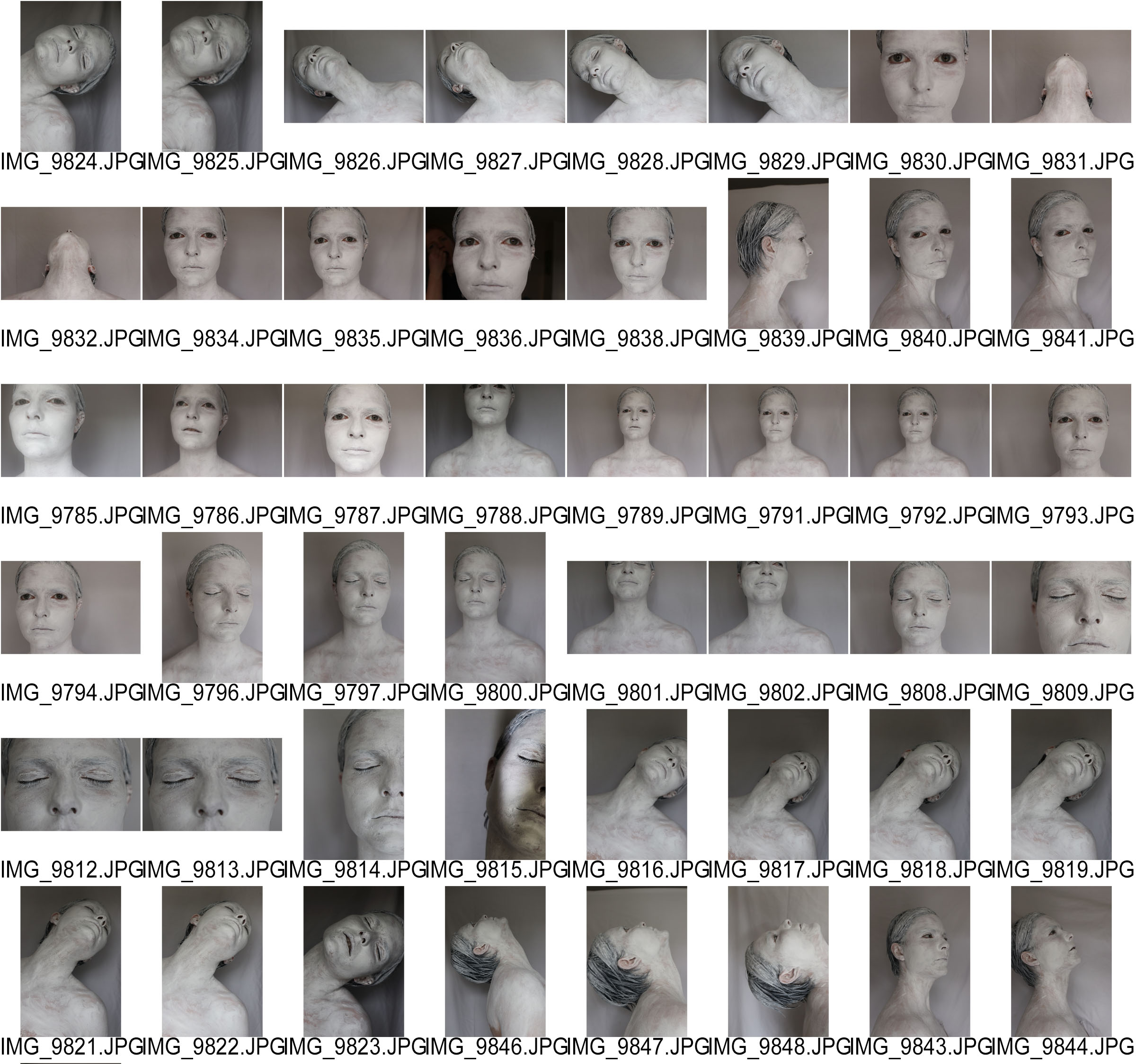
After doing the white body shoot I wanted to do another shoot based on the same theme of invisibility and losing your identity. However, instead of capturing the whole body I wanted to fragment the face. Since I was focusing on a smaller portion of the body I was able to properly cover the face with white paint so that the effect looked better. I wanted to do a shoot just focusing on the face because I believe the face is the most expressive part of the human body.

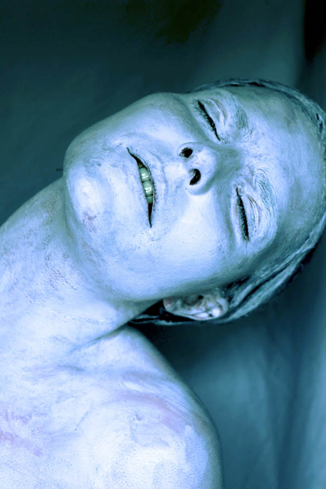
I edited the images using Photoshop because it enabled me to do the most editing since I planned to experiment more with there edits to make them more interesting and artistic. I really like the bright colour edits because they work well with the hand shoot images. Also the bright colours again symbolize different emotions.

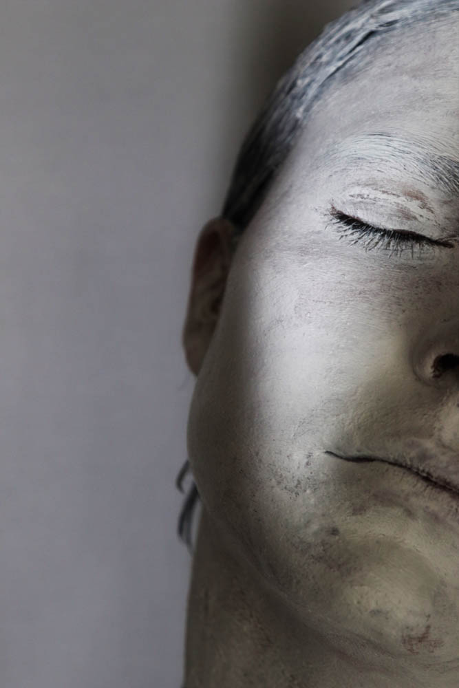
I also really like these edits without the colour because they are simple and effect with the white model posing in front of the shady background.

Critical Image Analysis (Matt Eich)

This post will outline a critical image analysis of a chosen photograph from Matt Eich’s diaristic project following the journey of his family through their time a time of distress and grief surrounding his parents divorce. It is entitled ‘I Love You, I’m Leaving’ and is one of two parts of my personal study for my coursework; LaToya Ruby Frazier being the other – whom I have already carried out a critical image analysis of.

Describing – FORM – What is here? What am I looking at?

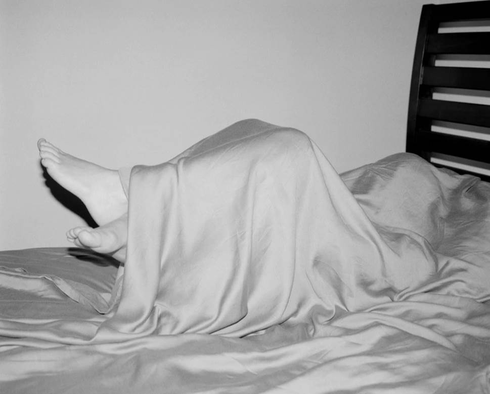
The image above, which I will be analysing in detail, is taken form Matt Eich’s series entitled ‘I Love You, I’m Leaving’. The insightful project follows the life of Matt Eich and his family as he documents, as a photographer, his relationships, as he serves as a father to his children, a husband to his wife and a son to his just divorced parents. It is a poetic and diaristic expression of love and what attachment and detachment can do to a family. Eich, in his statement for the project, taken form (website) expresses that the series was “created during a time of personal domestic unease. I made this work when my parents separated after 33 years of marriage and my wife, children and I had moved to a new city.”

The photograph in question is a very simple yet well executed and elegant image full of character. The image frames one person – and this subject is actually unknown and the only part of the subject’s body that we can see, informing us that it is a photo of realism, is the subjects feet poking out of the bottom of the silk sheet which falls gracefully, and rather ghostly over the shape of the body underneath. Looking at the feet of the subject it looks like it could be a little boy’s feet due to the size of them and the body underneath the cover.

However, observing Eich’s family which is revealed in the rest of the images in the project, their son only looks very young and the size of the body looks more suited to that of the their daughter’s height.

The little girl huddles lonesomely in the corner of her bed underneath a silk sheet which drapes gracefully over her body contours. There is certain glow and glaze which provides body to the image.

It is an image I really like because it is quite eerie in its ghostly state – with the shadow of the feet casting against the wall and the silk texture of the sheet providing a certain glow and shine to the overall look. Furthermore, the head is completely covered under the sheet and the only evidence of a human body is shown in the the feet which hand out the end. The girl is curled up in a semi-ball shape as though  she is scared of something. Connotations of ghostliness is reiterated in the relationship between the way she is curled up, huddled under a cover, like a child would when scared, as well as the fact that she, in her own form looks ghostly.

Interpreting – MEANING – What is it about?

Interpreting this image beyond its face value and deeper into the psychological meaning of it, it could mean much more relating to the grief the family may be going through. Eich states that the project was made during a time of personal domestic unease; during a time where the unwelcomed separation of his parents came after 33 years of marriage and, as well, at the inconvenient time at which Eich, their son, had began to create his own family and they were ready to move to a new city to begin their lives elsewhere with his own wife, and three children. The fact that one of the children, whom we don’t know, is tucked away under the blanket, with a deliberate hidden identity may signify that they may feel quite isolated from family life at the moment with the relatives she once knew to be happy and cohesive, now broken and full of upset. Eich reiterates this feeling of unease and makes it clear that it was personal unease but this internal feeling, although tempting to keep in and hide from others, often has to be expressed. This may, in-turn affect the whole family.

Although the little girl may only be playing around with her father as she hides under the sheet in a game of hide-and-seek, it is useful to look further into it to infer and interpret another meaning that could also be realistic. The fact that we cannot see the body underneath the sheet may represent a feeling a lost identity in the new life the family leads. Eich, along with his wife has made the joint decision that it would be best to move away to start a new life, to create more memories with their new-found family. The children likely wouldn’t have got s say in this and the move may have been sprung on them at the last minute. Because of this, it likely that the children may begin to feel a sense of lost identity that the home they once lived in and begin their live sin has now been taken away. I am aware of this feeling from personal experience when I moved from house to house to visit my dad wherever he was staying st the time. After moving out of his, once known home, he had to find a place to live which came as a struggle at the time and as his son, I felt quite confused but found ways to make the most of the new surroundings I found myself in when visiting him.

As a child, you look for a certain spots in your home to act as a den-type area – where you can go to be yourself – to be a kid, sit and do nothing – like I used to – I used to make dens out sofa cushions and find nooks in the house that I could fit into and sit for the fun of it because I was young and my mind had the ability to imagine and wonder off. The image above could represent  this same concept – under the sheets on this bed – she may find comfort or enjoyment out of hiding underneath it and it could be her own way of isolating herself from the family to allow herself mental room to imagine, as a kid should.

Evaluating – JUDGEMENT – How good is it?

In my personal opinion, knowing the type of photography I enjoy, I would say that this image is very good and is the exact type of image that attracts me to look at the rest if the series is I was to spot this in an exhibition etc.

Because of it obscurity, I believe that is a very attractive and intriguing image that would draw me in to know more about the photographer as well as the project.

The image would have been taken with a fixed lens in order to get a close to to the subject and the fact that it is black and white adds ot the quality, in my opinion – because it is not heavily reliant on contrasts between heavy blacks and luminant whites and instead focuses on the neutral to provide body to the photograph. Furthermore, there are several leading lines within the photograph; from the feet hanging out the end of the sheet, these lead the audiences eyes along the top of the body, over the legs and to the head which is also under the covers and on centered on a hotspot, if I was to apply the rule of thirds.

As well, I often say this with Eich’s images, each and every one, within this particular project, I believe could work on its own, in solitary from the other images because every one is so powerful and poetic in its expression. This may be why Eich puts only one image to two pages throughout his book because he feels like they would be best appreciated one at a time – as opposed to other photographers who may use two or even three to a page. The size of the images in the small portrait book also reiterate the fact that they are delicate images which hold meaning in more than one way.

Theorizing – CONTEXT – Is it art? How does it relate to the history and theory of photography, art and culture?

Eich’s image capturing this particular moment in time of his daughter’s life at home is an image which works perfectly in his series looking at the fragility of family contrasting its ability to unite a collective of people within the familial circle.

The simplicity that lies within his photography is what makes it so beautiful and captivating because it is the thought behind each and every photo as well as the tones achieved from black and white film – all aspects come together to create meaningful and natural, very organic looking documentary images – and because of this, Eich’s work lends itself to the particular art movement of realism and straight photography because it captures life it most arwwst from – the camera is used as a witness to create memories of intimate moments int time in between the hustle an bustle of daily life – a style of work I enjoy experimenting with in my own projects – the reasons being, for personal reasons and it is the same for any documentary imagery, is that it creates a very truthful and realistic sense of emotion and makes it very easy to tell a story because you are capturing people in their natural forms. Catching people off guard with your lens makes for great results to show a series or a sequence. Eich’s imagery encapsulates the whole meaning of documentary work because it focuses less on post-production and alterations to improve an image an more on the subject and content matte to create a “good” image.

Eich borrows from personal experiences to stimulate his photographic work and his artistic eye – making for a very personal insight into what we, as the audience often tend not to see because it is regarded as personal business to be kept to oneself. The state of acting as a fly-on-the-wall looking in on family life of others, in both Eich and Frazier’s projects is what intrigues the audience, myself included.


Critical Image Analysis (LaToya Ruby Frazier)

To help generate a full-bodied and quality response to my personal study question regarding the photography of both Matt Eich and LaToya Ruby Frazier, I will need to develop a detailed analysis of one of each of their images from their recent projects looking at family. Below, I will begin to develop a critical analysis of the image taken from Frazier’s project ‘The Notion Of Family’. I will use topics such as form, meaning, judgement and context as discussion points.


Image result for latoya ruby frazier the notion of family

Describing – FORM – What is here? What am I looking at?

This is an image taken from LaToya Ruby Frazier’s project, The Notion Of Family which is an “incisive exploration of the legacy of racism and economic decline in America’s small towns. The work also considers the impact of that decline on her communicability and her family” (taken from statement on website).

The photograph frames both Frazier as a teenager and what looks like her dad or possible step-dad. The project was completed over a period of 13 years in which, during this time, Frazier and her family grew yet declined due to the economic state of the town the were living in. We see Fraizer sat on the edge of her bed in her bedroom on the right side of the image as she is cropped to by the frame of the image and, on the left side, her dad lies, relaxed on his bed in the parents room, with his back ti the camera, she he was probably oblivious to the camera’s presence.

I would imagine that this is taken in the Frazier house and both Frazier and her dad are captured within the frame. Frazier is wearing a strappy white top with pyjama shorts and is lying on the edge of her bed. The door is wide open and hanging from the handle is a white towel drying. Underneath her bed, we see a baby doll with a dummy in its mouth, arms up, as though it is crying for help as it pokes its head from underneath the bed frame. Frazier sits there with a blank expression on her face looking away from her dad in the opposite room.

There is a physical divide between the two subjects, but, what also looks like an emotional divide. In the room on the left, her dad, styling a vest reading ‘THE SMOOTH EDGE’ on the back lies, in a relaxed manner on the end of the bed with his back to the camera. This door also wide open and the joining of the two doors is what provides the separation between the two people, giving structure to the image.

Interpreting – MEANING – What is it about?

As I mentioned just above, the visual divide we see between both subjects can also represent an emotional separation between the two of them; the relationship they have with one another may be very weak and this could be as result of the economic crisis in which the town for Braddock faces due to the ever-expanding bombardment of racism on locals. They both have their back to each other and this could  represent their perhaps dislike for each other.

We can’t actually see the father’s face and instead, get a view of his back in which, in his vest, it reads ‘THE SMOOTH EDGE’ and this could be an accurate or perhaps ironical representation of him – he may in fact be the smooth edge or instead, may be a figure that causes a division between the whole family – a person who Frazier may not like and from this, the statement can be seen as ironic as he could be instead branded as ‘THE SHARP EDGE’ portraying the idea that he could in fact be a figure who provides unease to the family house. Maybe, as us as the audience cant see his face, this is how he is seen to Frazier a as teenager – as though he doesn’t show his face in the most crucial of times, like when she has been growing up – he may not have been there and instead dislocated from family life.

Looking at the setting of the image and the other objects within the photograph a,so gives an indication to how the family may live and the condition of their lives. Looking at the bedding, it looks very old fashioned and quite out of date ion its old, floral-like pattern. It doesn’t look like the beds have been made and the fact that Frazier’s towel is hanging to dry on the handle of her door indicates that perhaps they can’t afford a heated towel rail. Looking at the wall, there is nothing hanging on them, such as art or paintings or any shelves and we can see just a mirror in the parents bedroom. Also, the doors themselves look quite worn and battered, as if they are in need of a paint job but this is not a priority of the Frazier family.

In conclusion, this image could represent the breakdown of family life, shown in one image due to the crisis that Braddock face as a result of explicit and constant discrimination against the black community. They are crying for help within and it is kept this way – internal and within the four walls of their house because they are too scared to speak up. As a result, they become isolated and hurt to a point that they don’t know how to show it – detachment from social norms and distancing from society as a collective – this is Frazier’s family, dislocated from the rest of America and detached from one another because of it.

Evaluating – JUDGEMENT – How good is it?

In terms of the quality of the photograph, I would confidently say that it is a very good image – to be very basic and straight-the-point about it. And I am also sure that if you asked anyone else whether they personally liked the image or if it was a “good” image, the would say yes because of how highly regarded Frazier is as both a photographer and a motivational talker which she undertakes alongside her photography and video work to coincided with the images she produces. She is a very well-known artist and is regarded highly and this status is shown throughout her work due to the pure thought that goes behind little details such as composition and framing.

The image above is one of my favourites from the project ‘The Notion Of Family’ because of how well thought out and composed it is. She has probably used a fixed 35mm lens mounted on a tripod tp capture this self-portrait of herself and her dad. Frazier would have used a timer to allow her to get to her bed in tome for the shutter release and the framing is probably the best aspect of the image. Although the two doors take up the whole centre of the image from head to toe, it frames the split perfectly and we get sense that it si almost like a split screen with Frazier on one side looking very dull and the back of her father on the left. It gives a sense that Frazier has to live in this very enclosed space where everyone within the house is in close proximity of one another but it is against her will and she finds it difficult to grow into a young adult when she lives in a small bungalow in a town which defines and shapes her state of living.

In terms of tones and shadows, the image is black and white and the balance of tones is perfect. The whites highlight and provide a border to the subjects for the to stand out against, as the Frazier and her father are both black and the neutral tones of greys are balanced equally in the image. Overall creating a very balanced image. All elements within the photograph are in focus and therefore a deep depth of field has been used at a high aperture.

Theorizing – CONTEXT – Is it art? How does it relate to the history and theory of photography, art and culture?

The image of Frazier’s in question represents a very truthful illustration of family life. Although to some extent, it has been staged in Frazier’s positioning within the image as she lies on the bed indirect opposition to the other subject on the left, the image possesses more features of documentary than tableaux. Frazier’s intent was likely to represent her feelings towards her family, as well as the house she is confined to and the town she has to grow up in as it is ruled by racism. The image represents the project as a whole as it represent the breakdown of not only the Braddock town as a whole but it shows how it affects the families within it as they were defined by the racism that circulates North America at the time. It was time of uncertainty and fear and the image does a very good job of showing this.

The image, in its documentary form, posses features of realism photography – an art movement introduced in the early 1900s which pioneered not only art but photography as it gradually muscled its way to the forefront of visual arts throughout the 1900’s and is still in use by many photographers in the current day as we, regularly, as consumers and producers of media, create real and raw representations of life as it is in. We expose people, places etc in our photography and the truth of them is revealed through the visual we create. Straight photography is the opposite to pictorialism where the manipulation of imagery was seen as a way to improve it. With realist art, the photographer uses the camera as a witness to life itself without alerting reality to romanticise or fragment the truth. The image produced by Frazier shows exactly this but in a more poetic, and indeed staged way but to emphasis the reality of what was occurring at the time – the racist and economic decline of America. The image speaks in one sense about family life but in a whole other sense about how this detachment from the other parts of the world due to the discrimination faced about local families origins.

However, even though the image does possess features of realism, it can also lean more towards the art movement of post-modernism. This movement is defined to borrow from references of historical, cultural, social and psychological issues – which it does exactly that – as expressed above – that it is more than just an image about family life – it is an image which presents the life of family within the struggle of racism. Frazier uses references of racism and economic decline throughout the book with added reference to Bill Cosby – a household name in the American society in the mid-late 1900’s but then further allegations of sexual assault against his name was released and he became a figure of hate and remorse – as though he betrayed the black culture. Frazier uses this post-modernist approach to highlight key events in American history.

Critical image analysis

METHODOLOGY OF ANALYSIS

Describing ~ FORM ~ What is here? What am I looking at?

Interpreting ~ MEANING ~ What is it about?

Evaluating ~ JUDGEMENT ~ How good is it?

Theorizing ~ CONTEXT ~ Is it art? How does it relate to the history and theory of photography, art and culture?


FORM

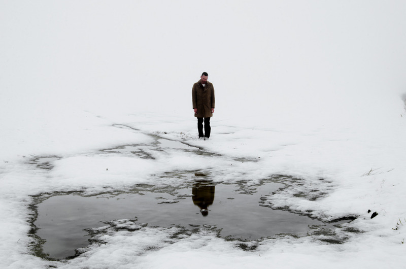
This photo has been spread over two A4 pages. It has a white frame and has been photographed in color. The photo is taken from inside the house looking out at a man who seems to be deep in thought. The subject is at the center of the image looking away from the camera. The sun is very bright causing an almost over exposed background. Due to it being taken behind a window it also caused glare. There are no bright colors only browns, blacks, greens and grays. The photo seems to be taken in a documentative style; not set up.

CONTEXT

This photo is from a collection that can be found in Laia Abril’s book ‘The Epilogue’. The subject of the photo is Cammy Robinson’s father Wejun. The book that features this photo is about Cammy and her lost battle against bulimia that lead to her death. The book is the aftermath of her death. The photos explore her families grief and the shock they felt. Abril has done two other projects on eating disorders this was here last project on subject so far.

MEANING

The photo is clearly of a grieving father. It’s a photo of those alone moments that many people have their life where they are just still. Those moments involve reflection, reflecting on the life one has lived, the regrets, the happy times, the deep frustration that may torment the soul. This is very much a happy/sad moment, this is displayed in the photo as there are neither really bright, saturated colors and the photo it not a dark photo either. I like the way the photo has been taken through a window as it’s almost as if, through the window, we get an insight to his raw emotions. The window represents more than just a glass plain it represents an emotional barrier that we are able to see through.

JUDGEMENT

The window works as a second frame causing us to focus on the man in the photo and really focus on his face. The color scheme of the photo displays a melancholy approach that works well, this may not have been planed however, it works. The main subject is at the center of the photo giving another way to tell the audience where to look. The subject is looking away from the camera allowing us to get sense that the subject does not know the camera is there and also showing us that he is not playing up to the camera. The over exposed sky allows the photo to still be bright but not too colorful. The photo is not like a tableaux photo that has been perfectly planned it’s a great documentative photo that has been well timed and framed allowing the photographer to convey the meaning they want to.


critical image analysis // insomnia // Michal Konrad

http://www.scopionetwork.com/node/1000#1

Another series that Michal Konrad created is called “Insomnia” Its this series that I am linking closely to because I love the influx of images that Michal captures. The main subject of Michal’s photography is the male form. Michal also uses the environment a lot within his work to inspire his ideas. He uses the environment to create these unique thought provoking portraits. His images have a surreal feel to them because they are his dream like visions.

According to Michal, the title Insomnia “shows the anxiety of the modern world caused by lies. The era in which we live is called energy. As far as man is concerned, it means his constant excitement.
Lots of information that constantly stimulate my brain. Ask yourself the question that is true and which is false? Where is the boundary between fiction and reality? Maybe I’m not real either? Maybe I’m not here? Maybe I just think I’m!”

Michal is questioning his existence by asking these questions. According to the internet, Insomnia means “habitual sleeplessness; inability to sleep”.  Michal uses the words “constant excitement”. I believe Michal is calling this series Insomnia because of the constant excitement caused by the world, and the confusion of our everyday lives causes our brains to constantly have an influx of thoughts. This perhaps would then cause us to have a sleepless night because of the endless thoughts moving around our heads.

This concept links to my personal study because Michal is using the process of the mind, and the emotion “excitement” to influence his series.  I love the way he uses the blur of the mind to represent the movement of thoughts. I am going to choose an image from this series to critically analyse.

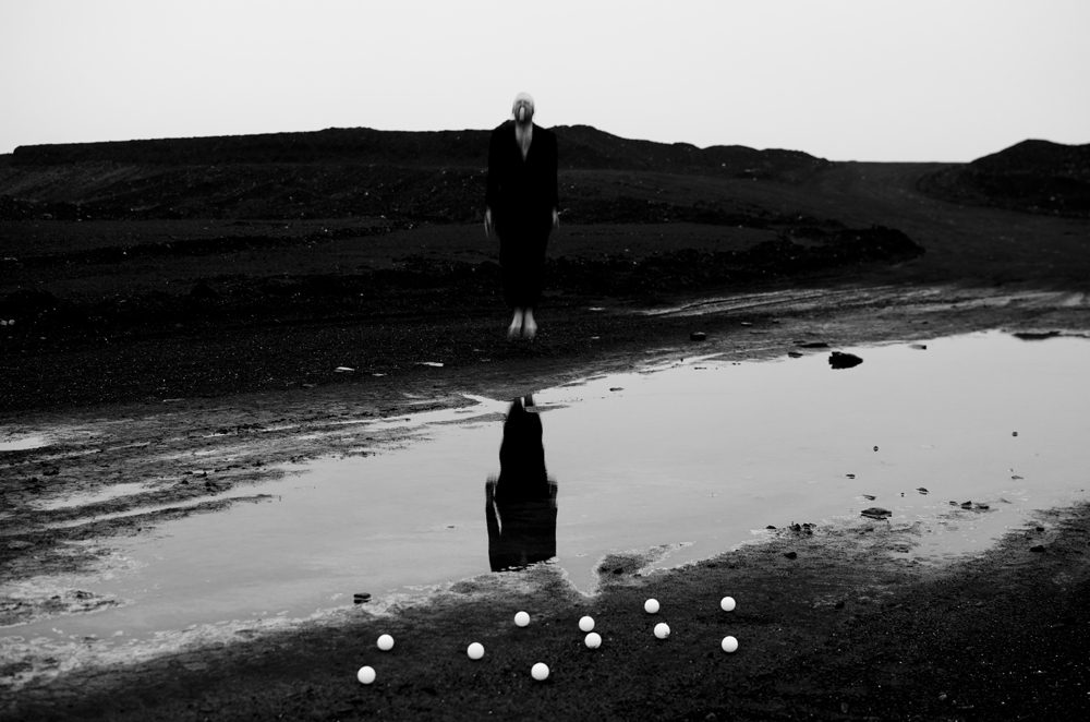
The image above is the photo that I’ve chosen to do a critical analysis on. Its the most interesting and thought provoking one from the series.

FORM ~ The image above is a black and white portrait image. It’s a self portrait taken by Michal Konrad. He’s using the environment around him to simulate ideas. He’s used the puddle of water in front of him to create a reflection of his own body form. Within the image, Michal is captured in the mid air jumping. He’s deliberately kept a slow shutter speed so that the image of him is blurred.

MEANING ~ The image is from a series called Insomnia. The series is about how the lies from the modern world can cause anxiety. The series is trying to represent how the excitement and confusion of the world can cause Insomnia. Michal uses the blur of the head to symbolize the influx of thoughts. Within the series Michal is also questioning his existence by asking “Maybe I’m not real either? Maybe I’m not here?” 

JUDGEMENT ~ I really like the image by Michal because its a very thought provoking image. Although its a simple framing and simple form, the depth of analysis and meaning that Michal thinks about makes the image into a highly sophisticated one. The technical side of the image is very good, the environment around him is in focus, and Michal is blurred, however this was deliberate. I like how Michal decided to make it a black and white image because it highlights and really captures  the tones.

CONTEXT ~ This image and series from Michal Konrad relates to the history and theory of photography because they are all fundamentally self portraits of Michal.  Self-portrait is a representation of an artist that is drawn, painted, photographed, or sculpted by that artist. Although self-portraits have been made since the earliest times, it is not until the Early Renaissance in the mid-15th century that artists can be frequently identified depicting themselves as either the main subject, or as important characters in their work. With better and cheaper mirrors, and the advent of the panel portrait, many painters, sculptors and print makers tried some form of self-portraiture.

Contemporary Photographer // Michael Konrad

http://www.artconnect.com/projects/promised-land

Michal Konrad

Michal Konrad is a polish photographer who was born in 1983. He lives in Wodzislaw Slaski. From an early age Michal was interested in visual art.  He is a Physical Education teacher, but he does not let it stop his artistic motivations. The focus of Michal’s photography is man. Within his work he primarily concentrates on the ‘psychological sphere’. It shows how a person perceives the environment in the modern world and ho environment effects him. His visions have a surreal character, balancing on the border of sleep and imagination. According to Michal, “Inspiration comes mainly from observation, but also on his subjective feelings.”

My project is fundamentally focused on how the body can be used to physically express hidden emotions, and mental illnesses. I also plan on linking body dysmophia into it. I believe that the photographer Michal Konrad used this  conception within his work. He describes the different ways he creates his ideas, and one if them is based on his “subjective feelings.” This definitely links with me project because he is using his emotions to conceive the unique perspectives that he creates. Some of the projects that he has done are called “Promised Land”, “Amnesia” and “Insomnia.” He uses the body, mainly a man, to express his views.

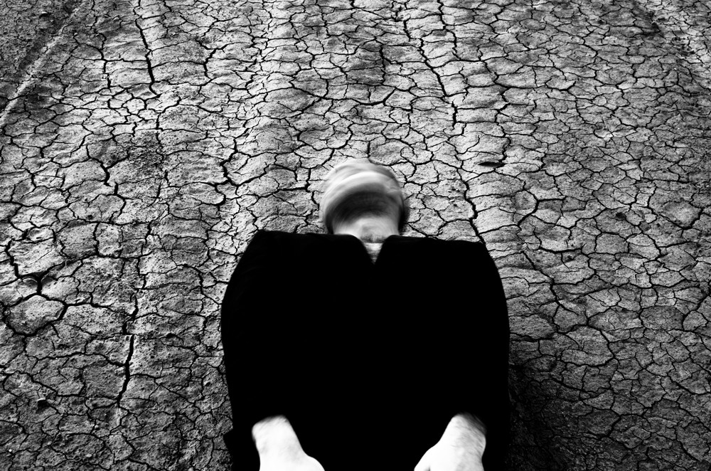
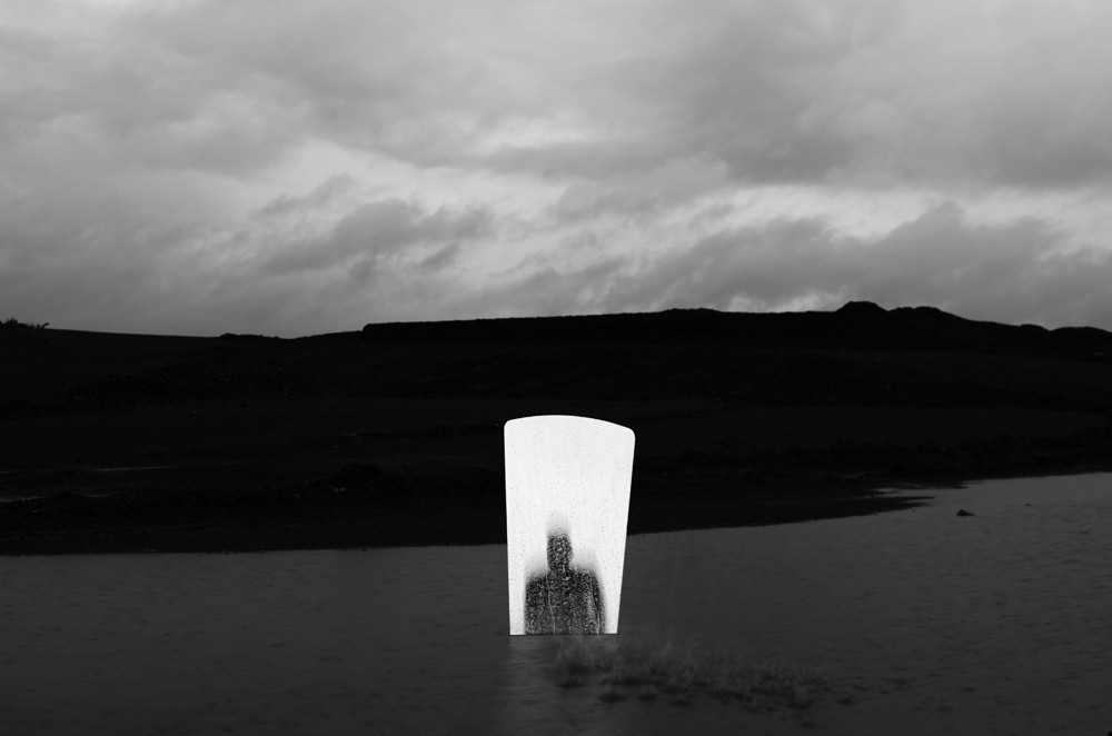
The images below are from his project called Amnesia. Michal has an extremely unique outlook on his perspectives. He describes his ideas in a very descriptive, poetic way which I really like.

I can see the horizon somewhere in the distance, the noise in the ears. I’m sort of without a head, but the body trembling. I’m going ahead, looking for a trace in the memory. In the reflection of the water I see myself. I think it was me. Although I do not know who I am. I thought to myself how is it suddenly lose memory. This cycle is just about it. It is my imagination, as well as experience. As a small boy I have experienced short-term memory loss as a result of the accident.”

Although the images have a simplistic look and feel, with the soft light and simple colour scheme, the atmosphere that each image has creates this deeper meaning within the frame. The images as a series unfolds a story. From Michal’s description we learn that he experienced an accident as a young child, and because of this he had short-term memory loss. Michal uses this experience and convey’s the emotions into his work. He describes one of the images as ” I’m without a head, but the body trembling.”  Michal uses his imagination as well as his experiences to create his unique ideas. I really like this conception and way of planning and I now want to use this process in my own project.

Another project that Michal did is called “Promised Land.This is how he describes it, “I had a dream, like a strange helplessness overwhelmed me. I felt heavy and tired. My legs like roots were rooted in the ground. Each step was hard after which grew tired. I stood there motionless, unmoved snow and cold. I watched the others go, and I was tied to the ground. I prayed to God. God told me to play music.

 The cycle presents the difficult relationship of man to the place where the man lives. Photographs are my self-portrait. All I have done using a 20-second shutter release. Series of conceptual photography. The cycle presents the difficult relationship of man to the place where the man alive. Photographs are my self-portrait.”

According to the internet, Conceptual Photography is “a type of photography that illustrates an idea” The whole of this series is based on the idea of conceptual photography. Michal uses his imagination rather than his experiences. He describes the series as “I had a dream, like a strange helpless overwhelmed me.” Similarly to the series called Amnesia, the series is told like a story. I really like the way Michal presents his work, and the description that each series is introduced with. You can see the each series has a theme that Michal keeps too. This is what makes his work so appealing.

I really like Michal Konrad’s images because they are simple yet they express a deeper sentiment. he created image that are made to make the viewer think more about what they are seeing. He is a surrealist photographer who wants to provoke a thought process in the viewers mind. Most of Konrad’s images are based on an emotion or thought process. He use using himself within his images to express his feelings.

Critical image analysis

This image is a portrait of his father presented in a landscape format, again capturing the shoulders upwards. The main focus of the photograph is his the man’s face as the background is blurred, leaving the focal point sharp and clear. He has a painful expression on his face, suggesting he is crying or hurt. This is clear as his nose is crumpled; his eyebrows frowning and his mouth and teeth clenching. His eye gaze is directed towards the floor and his back seems to be hunched over, rounding his shoulders as if he feels the pain physically. This suggests the change in his mental and emotional state, showing his frustration. This image was captioned with context which states “Eating is often a miserable experience.” Toledano explains the one thing he did love was eggs: scrambled eggs; egg salad; egg-drop soup.” This implies he would stick to what he knew he liked and this was probably easy to make. The main reason I like this photograph is because it radiates emotion, which makes me feel sympathy towards him and his family. It is a painful image, which can be compared to photographs, which show times when he is happy and cheerful. The lighting of this image is dark on the viewers left side, which is contrasted with the right as it appears to have a beam of light shining on the top of his face, which I assume is coming from an artificial light. I personally feel this image is extremely strong and can be linked to straight or documentary photography as he documents his fathers emotions.

Luce Family Crest

On my return to Societe Jersiaise after the Christmas break, I re-started my studies from where I left off before Christmas immediately but instead of looking at old Jersey postcards, I began something a little different and hopefully more beneficial to my studies at school for my photography project – the tasks completed on Monday morning of this week has already proved much more beneficial to me than my previous tasks at the SJ. So even though, different to before Christmas, I still got straight back into the swing of things as I had an idea of what I wanted to achieve in my first session back before I attended the SJ. I didn’t want to continue with my study into the old postcards of Jersey because they were not providing me with what I wanted from my time at SJ. I wanted to find representations of Jersey as an old honeymoon destination but this was not being achieved and I felt my time wasn’t being used efficiently and it was getting a little repetitive so I suggested for me to move on form this and begin something new. I suggested my idea to Karen and she backed this up and gave me the all clear to go ahead with my intentions; my idea was to look through relevant information regarding my family history in the library at SJ. This task was really interesting and I will explain it more later in this post as well as what the create below actually is as it links with my studies from Monday 8th Jan.

When I was at Societe Jeriaise on 8th January, I was introduced to the library they have within the building. I was also introduced to the librarian and very knowledgeable, Ana. Myself and Karen went down to the library and told her what I wanted to research and observe relating to my family history. I wanted to look at my family tree and so Ana lead us straight to a draw full of family trees of the families of traditional Jersey names. She pulled out a large transparent envelope which included the family tree of the Luce family. I begin to look through this, and, as it was my first time looking at this family tree in such detail, I become a bit loots and overwhelmed by all the information provided about ancestors and potential long lost relatives which I was unaware of.

Ana then told both myself and Karen that earlier that week she discovered that the mother of the British comedian, Miranda Hart had the maiden name of Luce. This was also news to me and when I was left alone to delve deeper into my family history, I began researching this and discovered that great grandfather’s and uncle’s of Miranda Hart, were in fact Luce’s and they worked in the several wars of the world as surgeons and medical assistants. Although this was interesting, it did not have a relation to my project and I quickly moved on before I became knee deep in irrelevant content.

Next, Ana pulled out a very large hardback book; it was almost like an encyclopedia, but covered information of traditional Jersey surnames and their origins as well as including the crest of each family name. This book was called an armorial book. An armorial is defined as ‘relating to heraldry or heraldic devices.’ And heraldry as defined as ‘the system by which coats of arms and other armorial bearings are devised, described, and regulated.’ All information relating to the surnames of Jersey-born families is carefully collated and and detailed in this book and it included the origins of the Luce name which was a great. Although a very small segment of the book outlined the Luce name, it had the crest of our family within and it was amazing to see. I immediately had the idea to include this in some way or another within my photo book to give some sense of historical but personal meaning to my book.

Below is the crest if the Luce family taken from the online version of the armorial book. It is evidently very detailed and beautiful in it’s intricacy and symbolic representations and I was eager to create a replicate of this by tracing part of the crest, in particular, the coat of arms in the middle and there was no way I would be able to re-create a quality drawing of the full crest. Therefore i decided to begin my recreation of the coat if arms in the center which included a range of different symbols within this and I would use this creation once digitized on Adobe Photoshop as a personal and historical representation to include in my photo book.

Crest of ‘Luce’ family name

I would love to infer as to what the different symbols within the coat of arms actually mean and I think I would be able to find this information out from the librarian, Ana. For now, however, the image below is a JPEG of my recreation of the crest and it was a first draft experiment that may change slightly through alterations over thg next few weeks leading up to the creation of my photo book. However, I was really pleased with the final outcome because of the drastic change that occurred between the first stage of tracing the crest and the uploading an image of this to Photoshop to then improve in terms of final tweaks including the increase in black point and decrease in white point to make the black lines stand out and I also added the grey background as well as drop shadows to some of the symbols, as shown in the original crest above as I wanted it look as authentic as I could whilst still  holding elements of it being handmade/drawn.

My digitized recreation of the ‘Luce’ coat of arms