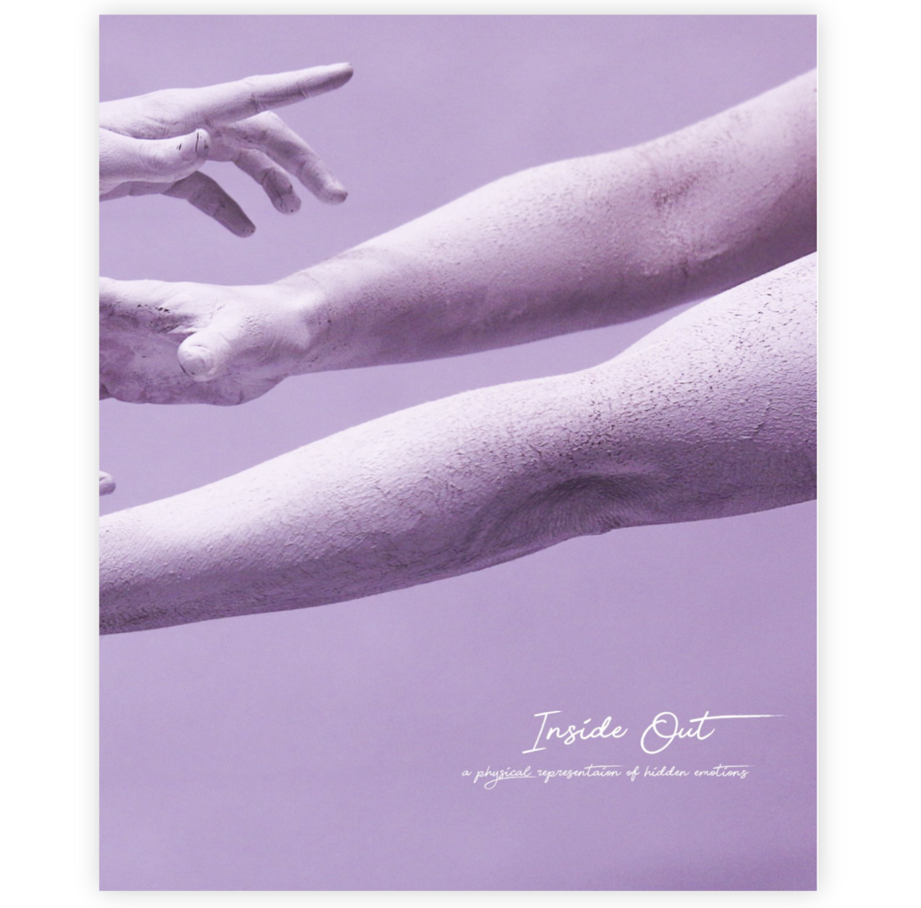
My body image project is about capturing a physical representation of hidden emotions. My book “Inside Out” includes images of subjects posing in a certain way that represents a specific emotion such as pain or happiness. The title Inside Out, concludes what the series is about in a very simple way.
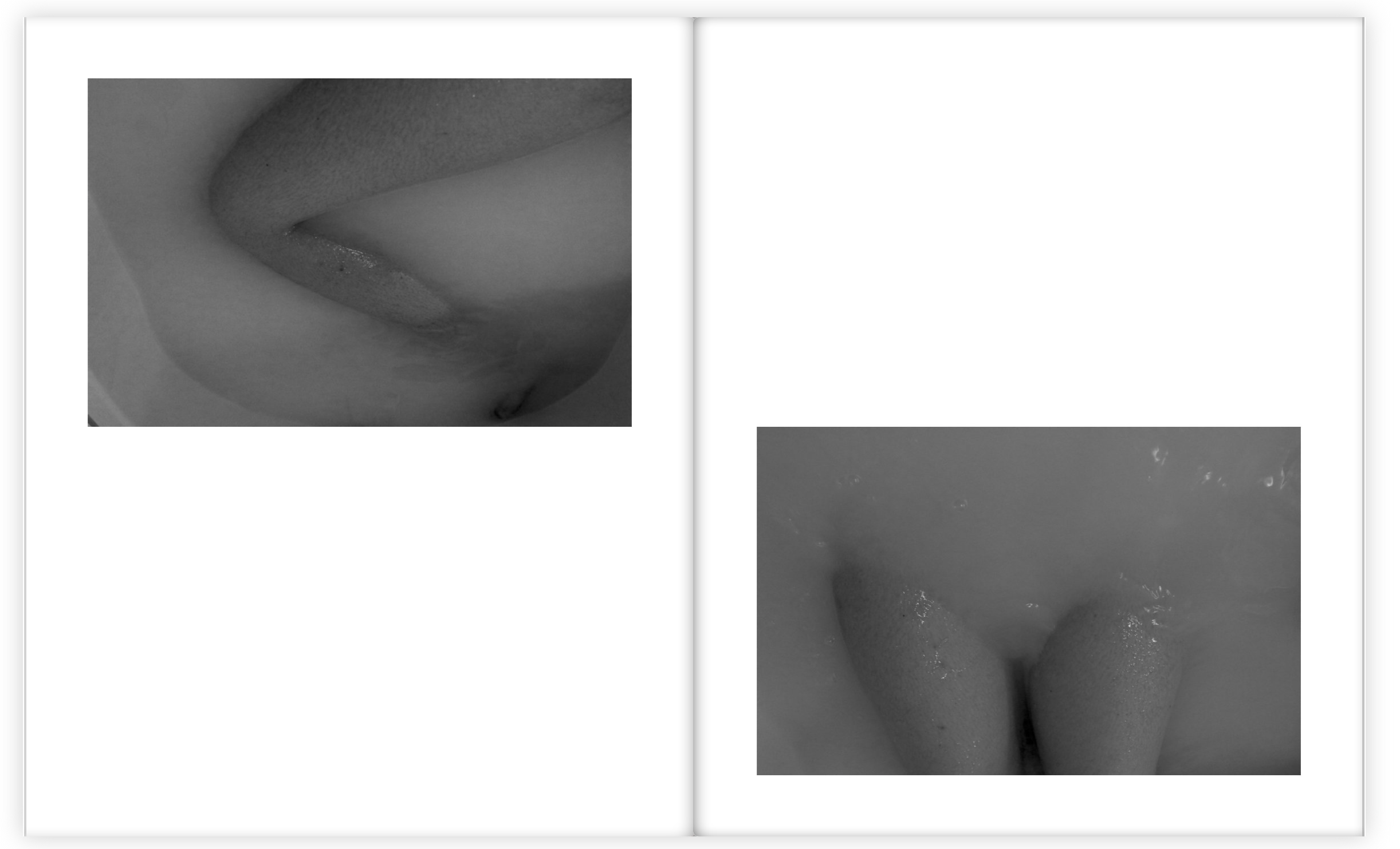
The book contains images where I’ve focused on particular body parts, such as the face or the hands. I’ve captured them in a creative way where the shapes and movement that they create represent certain emotions. The book contains a certain aesthetic that flows throughout. It has a very contemporary feel because of the way of using the human body and also the use of the bright colours and abstract visions. The book contains a variation of sizes of images, ranging from half page images to full page spreads. I decided to use a portrait orientation for the book because it was the best way to display my images. Although I didn’t want to categories my images into different sections of the book, I also didn’t want a completely random structure and sequencing. I therefore displayed images together that linked in some way, to do with colour or subject.
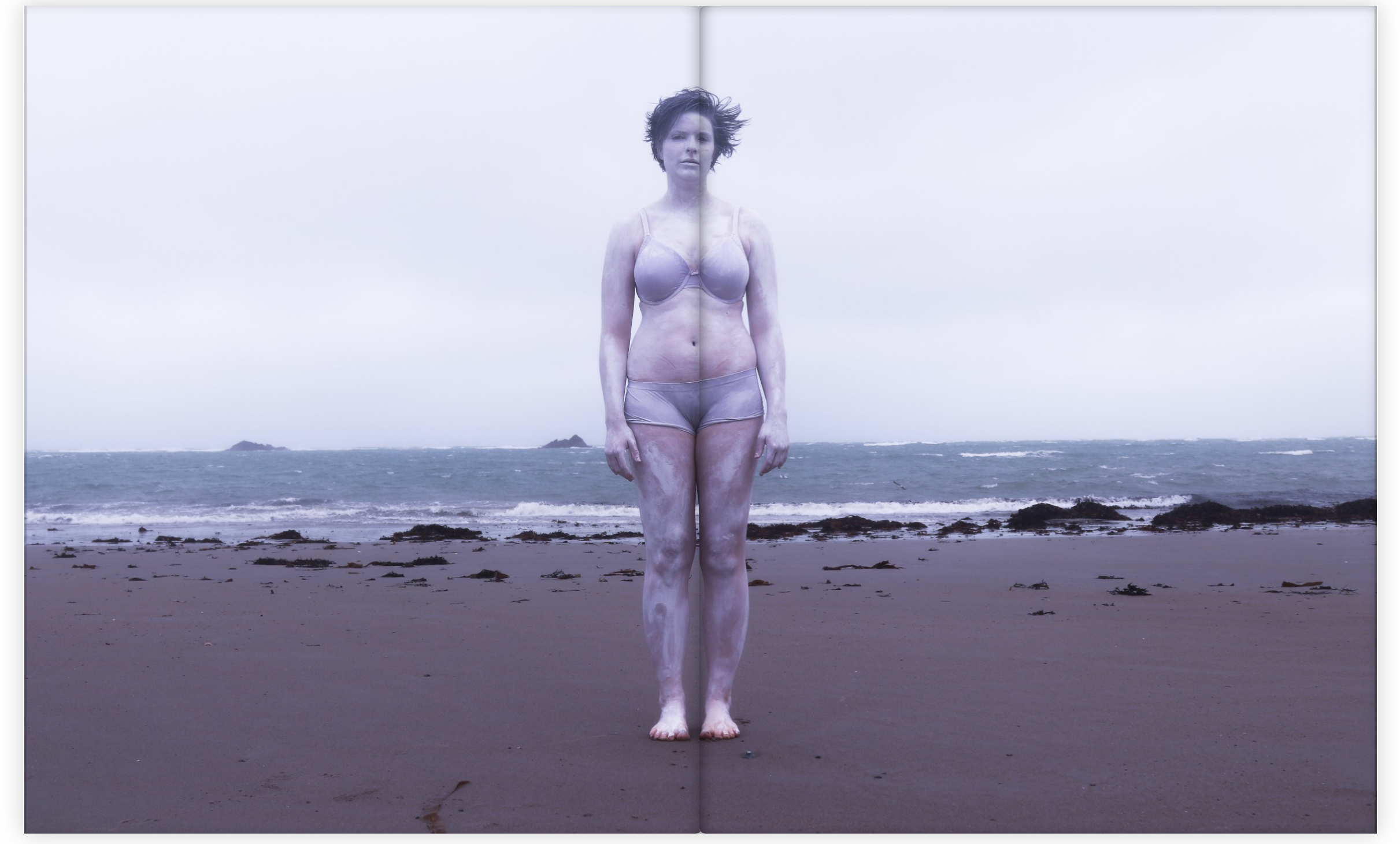
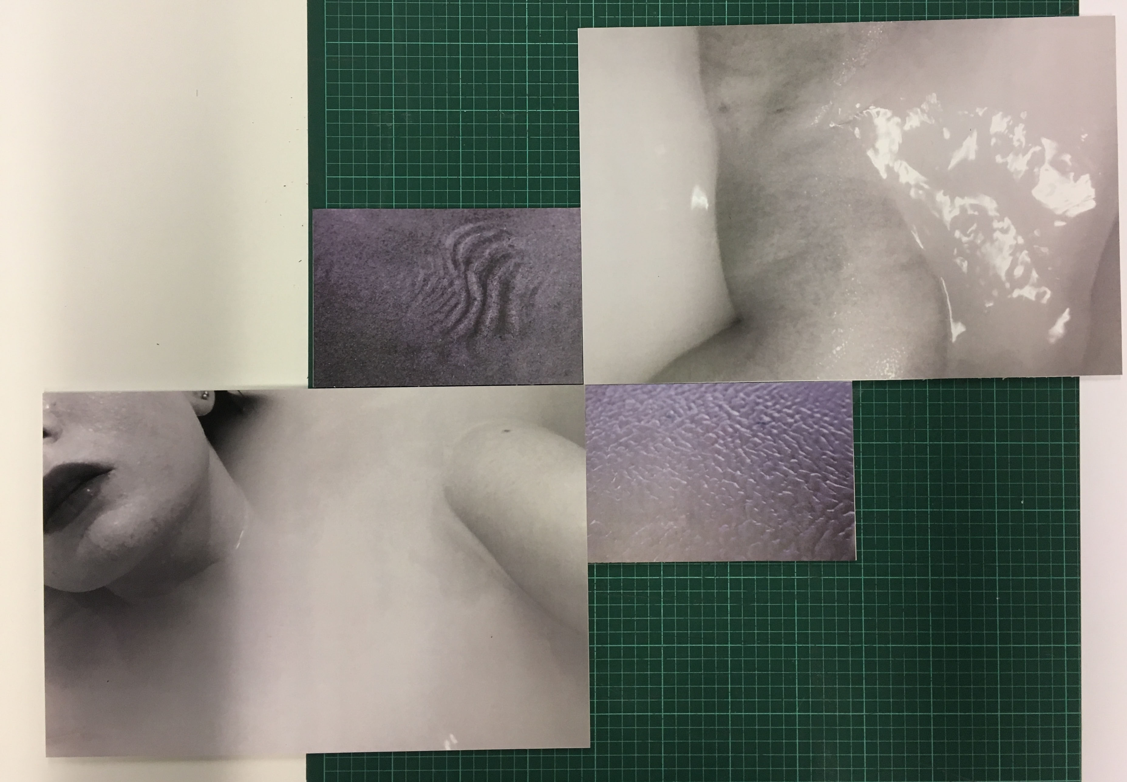
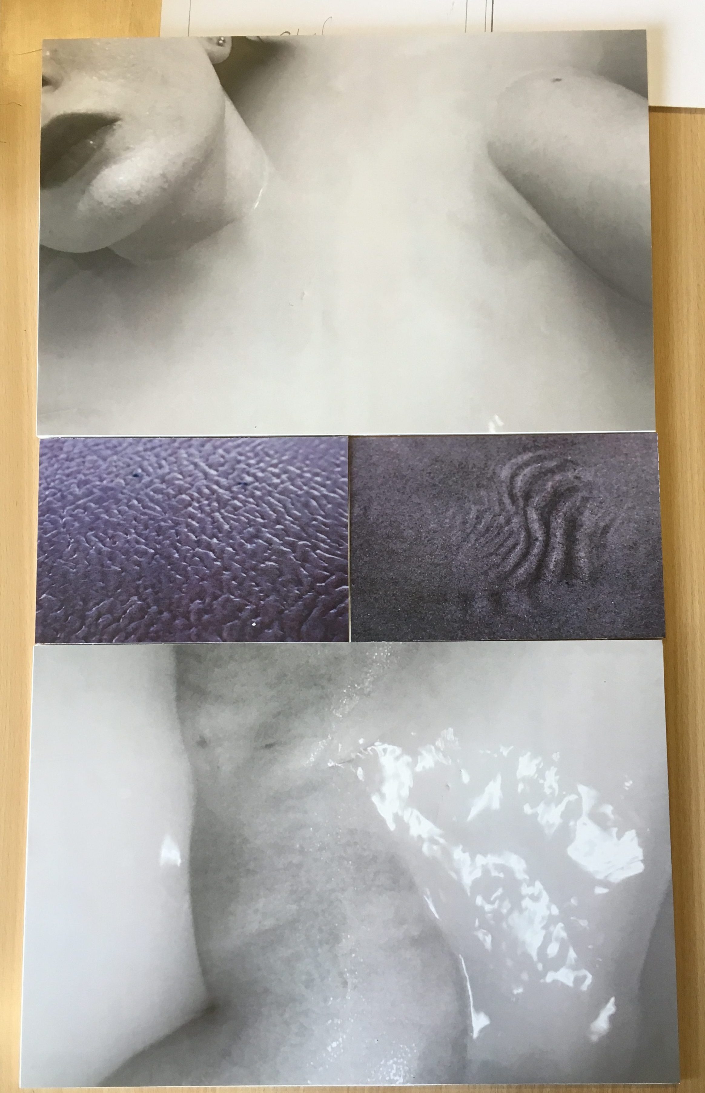
The book contains a variation of colour and black and white images because I wanted a contrast within the sequencing and flow. I decided to choose the bath images to be in black and white because it looked better this way with the body images submerging through the water. I also liked the way the contrast of tones were brought out a lot more when in black and white.
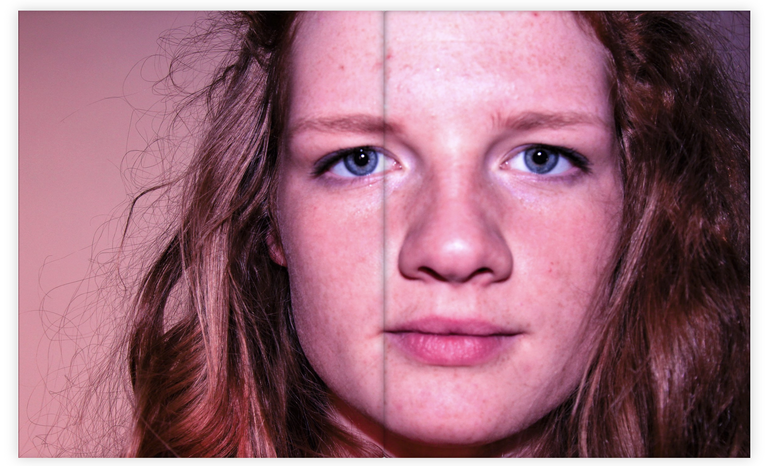
When choosing the multi spread pages I choose images with a lot of detail so that the viewer had a lot of interest and something to think about when looking through the book. I really like this particular image below as a multi page spread because of the position of the subject and the way she is looking straight at the camera. The colour of the image also links very well with my theme and aesthetic.
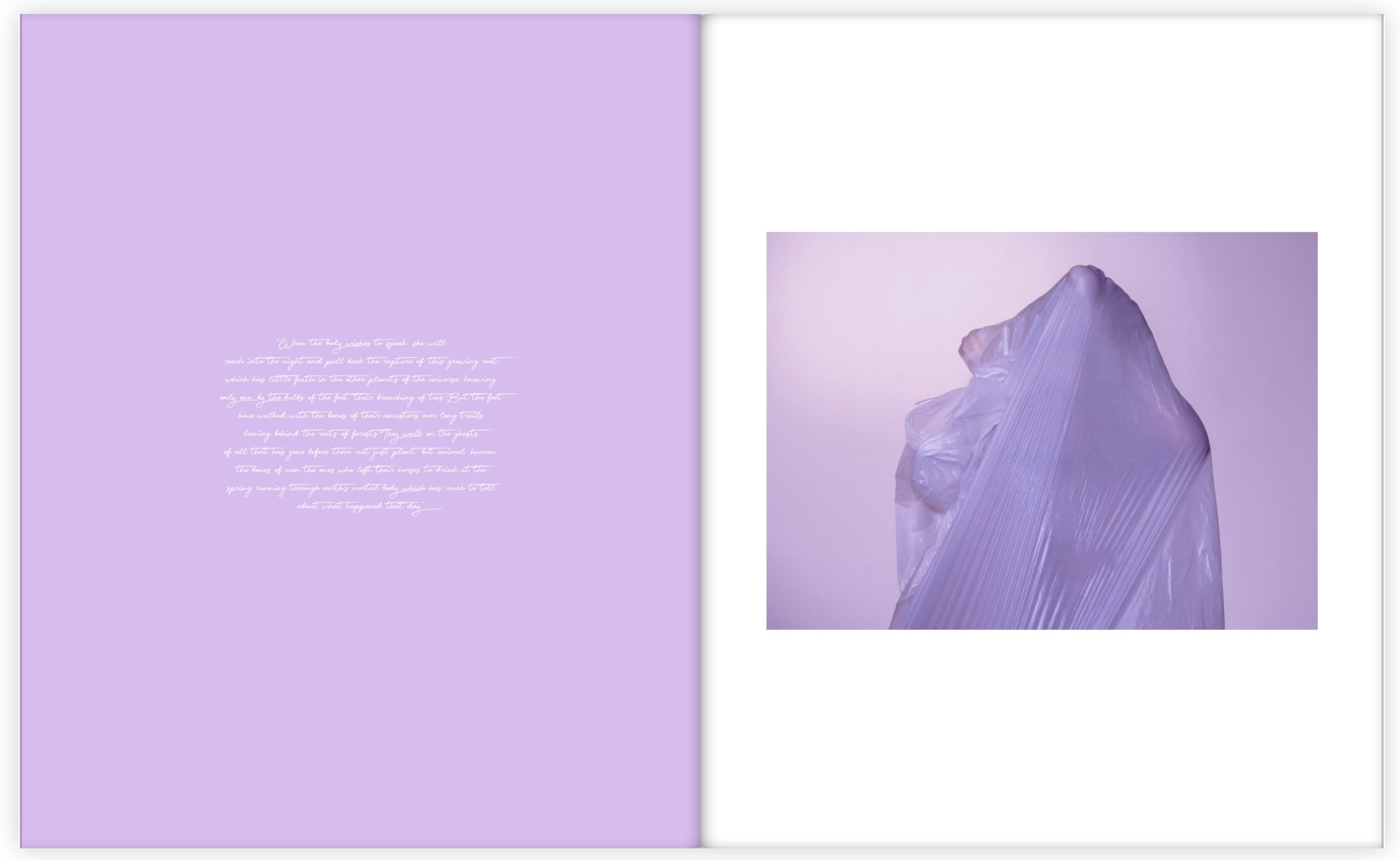
Throughout the book I also included sections of a poem about particular parts of the body placed next to the particular body part that it talks about. For these pages I wanted the colours to match, or be very similar because I wanted to stick to my colour theme and aesthetic as much as possible. I am very happy with how my photo book turned out because it flows very well and I have managed to create an overall feel and theme that links with my main idea, which is physically showing hidden emotions.
Here are the layouts of my final pieces from my body project, which the main aim was to represent hidden emotions in a physical way. There are three separate displays that I wanted to create. Each of them containing a different theme.
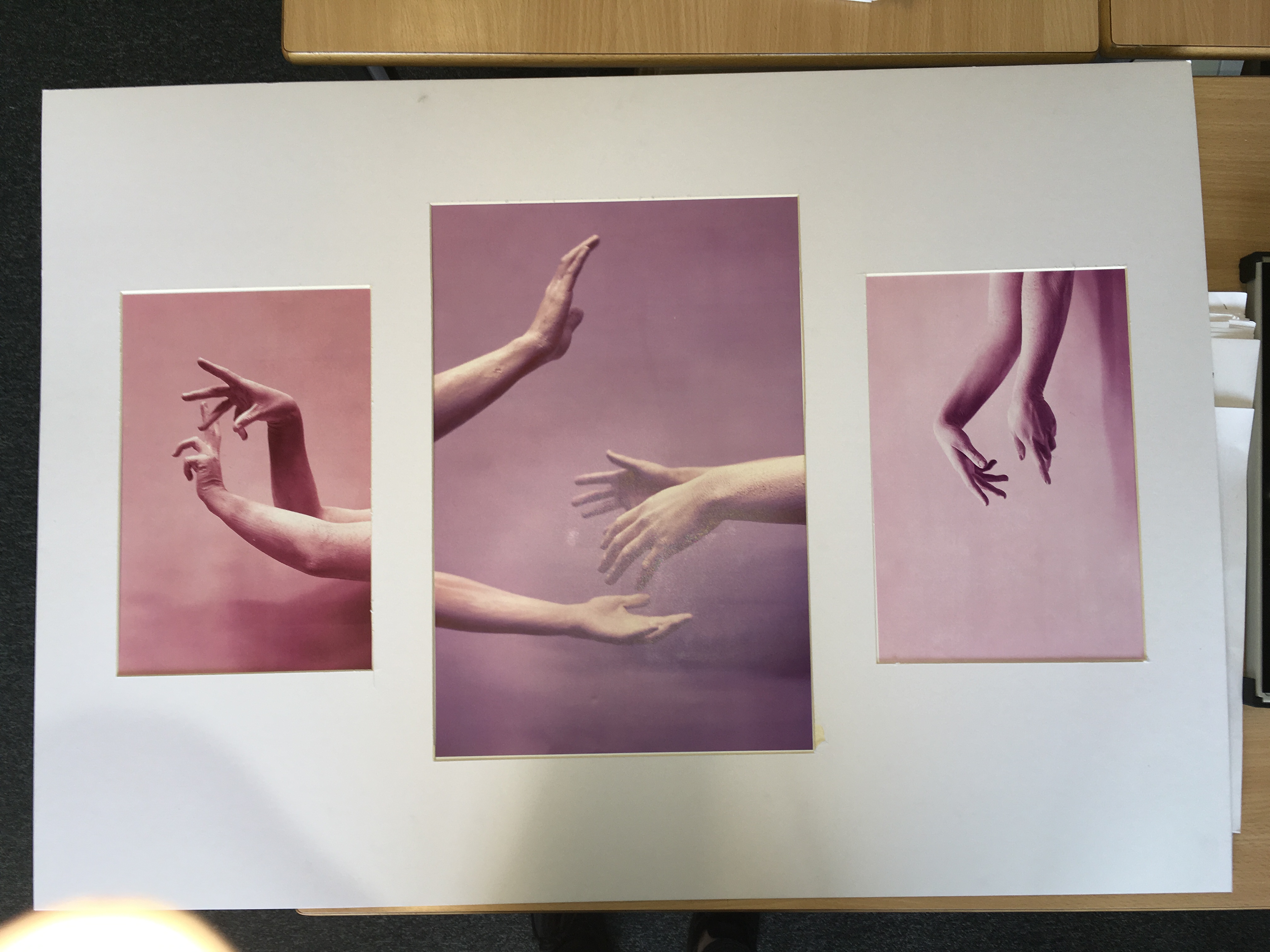
The first presentation that I came up with was the one for the hand series. The shoot was based on the concept of movement and the use of the hands to express emotion. I choose the best image from the shoot to display as a set of three. I experimented with different layouts to display and decided to use a white mount board to display the images. I liked the layout with the A3 being positioned in the center and the A4’s either side. I choose this layout because I liked the flow of the contrasting colours and the way the hands emerged into the images.
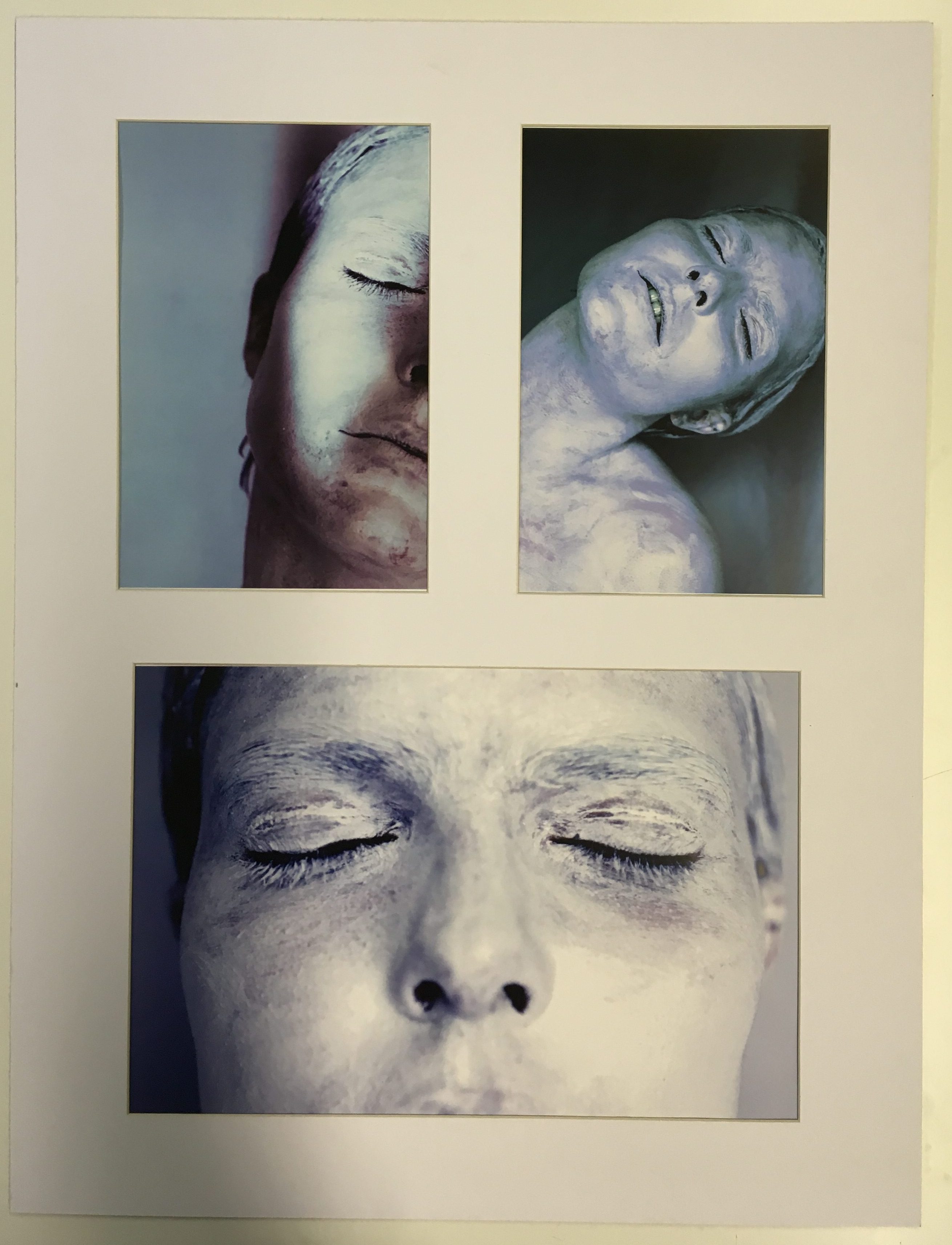
For my second group of images I choose to focus on the face as the primary part of the body. I choose my best final images from the white face shoot to display as a set of three. I choose images that were contrasting in terms of position and colour and angle because I don’t want the images to be to similar because I wanted to grab the viewers attention. I tried many different ways to display the image but I ended up with the version below because it showed the images the best as a group. The layout is clean and simple which I really like.
For my last presentation I looked at contrasting ways of displaying them to see which layout would suit it the best. I looked at two different examples to compare which one I liked the best. The first layout I came up with was a diagonal one where the two images of similar theme and of the same size were presented opposite each other. This was a very interesting way of presenting the images which I really liked because of the unusual shapes and angles that the images were viewed at.
However I decided to choose my final layout of this set of images because it looked more professional and simple. I wanted a simple and clean layout because it looked more pleasing to the viewer and was easier to view the images as a set displayed like this. I really like the contrast of the different tones and colours. The theme of this set of images came from the idea of submerging, and also from the subject of skin. The ripples and shapes in the sand replicate the structure of skin which links to the images of the subject laying in water. I love the comparison between the black and white and the colour because the contrast makes a much more interesting and powerful display.
Robert Clayton is an English photographer who is renown for his sole work on Estate from Lion Farm Estate in 1991. The estate near Birmingham was scheduled for a re-vamp when Clayton began to take photographs with the content of these images varying between portraits of residence or distant landscapes to show the sheer size of the complex. The renovation of the estate would consequent in the moving of residents, causing upset to the occupants of the estate, which is fundamentally what Clayton is capturing, along with the outdated accommodation that has become accustom to those who live there.
I selected Robert Clayton as my artist inspiration for his unique lens and investigation into lower-class British life, giving a balanced perception and not biased. He creates images which are both aesthetically pleasing and have covert meanings as the documentary approach exposes a way of life which not many are aware of. The work of Clayton coincides with my concept as he documents the lower social orders and their struggle of being rehoused, but by producing this book he would have illuminated the struggles the lower class undergo within society, hopefully reducing the stigma against them.
Robert Clayton appears to use a more stand-back, social documentary approach to his photography as there is a substantial distance between the photographer and the two main subjects. In the foreground of the image are the two main subjects which appears to be a mother and her young daughter, who presumably live on the estate, which fundamentally highlights the importance this complex provides. As well as the clothes, there are indications of the era that photograph was captured in as the small car in the background has an 80s-esque representation and the dominant telephone poles. Another factor to consider is the over-casting shadow which shades the majority of the right-hand side of them image, perhaps reflecting the government’s destructive yet constructive intervention with these people’s lives.
Over the past couple of weeks, I have begun to create my photo book for my coursework. The work I have been producing up to this point has all been leading up this stage in which I can begin to insert them carefully into my photo book, which I am creating on the Adobe Lightroom interface using the Blurb book-making software.
To begin the process, I selected all appropriate images from all shoots completed and whittled these down to my favourite edits I had done as I gradually progressed through the coursework. I then created a new folder in Lightroom named ‘Book’ where in which all images I wanted to use in my photo book would be placed and began by putting in my already finalised images into here and then transferred these from the ‘library’ stage in Lightroom to the ‘book’ stage where I could begin arranging the images how I wanted and selected the particular book orientation I wanted and the type of paper.
I chose to use standard portrait orientation for my book as, from looking at other artists photo books, been attracted to this the most because of how it looked and how it felt in the hand when reading. I have also chosen to use a paper named ‘ProLine Uncoated’ paper which I saw on the Blurb website and thought this looked very effective. It does not have a gloss to it so looks very natural which I like. I believe it will benefit my images look in the end. After ding this task, I began arranging my photos as I wished. I have used a wide range of different image layouts but I tried to stick with a narrow range of looks so the whole outcome does not look to muddled and difficult to read. The most common page type is a double page spread where in which one image takes up two pages on a 3/4 proportion so is not full bleed and this has had the best effect on the look of my photos to complement the smaller, more delicate still images and that of full bleed, detailed portraits.
My plan for my photo book is to produce a detailed and insightful exploration into my family life, with me centered within the middle. This is the running theme throughout and I hope to show it through poetic, still images of landscapes or objects which may have no direct meaning at its face value but has a deeper meaning once inferred. As well, the portraits in my project are intended to be collaborative and intimate to show the relationships I hold with the people in my life but the portraits are intended to show the emotion of each being as well. I have contrasted yet shown the similarities of my mum and dad’s relationship when they were together to that of my relationship with Lucy now and the overall look I hope to achieve is that of a fun, vibrant, light-hearted but quite solemn and sombre image-based diary about how I am still developing through the events if life and the attachments I have built from the event which shaped my life – my mum and dad’s divorce. I want their to be an obvious existence of the theme of attachment but also an underlying theme of detachment. Although these themes are the main focus for my book, they are underlying themes which are subtly hinted at every now and then by a sequence which develops upon the understanding of love. Memory is fragile and I use this notion as a driving force for my project made up of diaristic photographs, which, when come together, create an album of moments in time which in-turn lend themselves to never be forgotten. I have attempted not to avoid the subject of my mum and dad’s divorce but felt it easier to express this and my feelings towards it through other subject matter, being my relationship with my girlfriend and the other people in my life, such as my individual relationships with my mum and dad and how I view them in solitary opposition to one another.
The settings if my book, including the orientation, paper and cover type
My plan for the front and back cover of my photo book was to keep it very simple and plain and include just the title ‘All My Love’ situated, in small print on the cover of the book and include a digitised version of an archival image on the back cover, with no writing. I was originally going to include another archival image in the front cover, however, instead of digitised and printed by Blurb, I was going to manually tip in the photo on the cover when it came back to me after production. Because I have chosen a softcover, this would have been possible – to, with a blade, make an incision into the card and place my image within these, like in old family photo albums. However, I decided not to go ahead with this and instead will just leave the title and the title only on the cover to keep in simple and leave the rest up to the audiences intrigue from reading the title. In the industry of photo books in the current day, it is the new trend not to include a photo on the cover at all and instead just a title or an abstract close up of an object, or even a painting or drawing etc.
I have chosen to place the title, in size 16 font, near to the bottom of the page and in the middle. I prefer the look of the title near to the bottom of the cover as opposed to the centre because it doesn’t follow typical conventions or norms to place text in the middle of a page.
I wanted to have a base colour for my book – a main colour that I use on the cover and back pages as well on the first few pages that hold the book together and as a background colour for a couple images in the book – which I have done. I have chosen to use a dusty, almost faded, dark-ish pink colour that connotes visuals of love and romance bit it’s faded colour represents a sense that this love may have also faded.
On the spine I have included the title as well as my name, because I am the author of the book. I chose not to put it on the font as I didn’t feel the need because I feel as though the project is not as much a project about me and more about the other people within. I did not want the audience to focus on me a photographer and instead focus on the title and what it could mean.
On the back cover is an image of my mum and I at the age of 3. I am sat on mt chair at the kitchen table in the house I grew up in for 10 years. This photo was taken on my birthday and my mum kneels by mu side as my dad takes the photo as we both smile at the lens. This image brings back very happy memories as I see both my mum and I in a joyous trance at this happy time.
The first two pages of the book consist of a white page non the left and the page on the right is printed in the same pink colour as the cover. On the white page on theft, I have included the ‘Luce’ family crest which I drew and then digitised. I have put this black and white emblem in the center of the page in a very small size because once printed, it will appear bigger so have compensated for this by making it even smaller than I originally would, however want it to look small and delicate anyways so the reader has to focus on the details of it. I have not included a caption which says what the crest is either because I did not want to give too much away.
On the right page I have included the title again with my name underneath and in a dark pink colour to contrast the lighter, dusty oink of the background. This is a common convention of photo books – to include the title and author’s name again in the first pages of the book before any images have been seen.
The first image, as I stated in my previous blog post is the image of the wedding cards and I have made this a full bleed image to get the full effect of the details within the cards.
On Lightroom, the controls are very easy to manage and I quickly got the hang of how to use the different tools and how to change different settings.
The next image, on pages 6 and 7 again takes up two pages and is a portrait of my girlfriend Lucy and I. This was an image I took using an expired black and white film in a Pentax MZ-M camera. The results of using an expired film has resulted in a change in affect of the image quality as it has added grain a swell as different light and brightness. It has made it darker as though it was under exposed but this was an effect I was aware of when using the roll of film and one I am happy with the results of. I have used a couple of other images from this roll of film in the book. The image which is a 3/4 page spread uses the white background as a means of a border to make the darkened image stand out. It is an image of myself and Lucy on my bed looking straight into the camera lens. We are centered in the frame and interlock are arms as Lucy leans on to me. The film has added a slight vignette effect to the edges of the photograph which I like and my intention for this image was to oppose the view of my mum and dad’s mature relationship from the image previous to this to that of mine an Lucy’s relationship which is much more fun, however, still somber in this particular image, emphasised in it’s darkness – as I intended to achieve in post-production.
I have then used another black and white image as a 3/4 page spread on the next two pages. It is an image taken with my iPhone of a tangled ribbon tied to a tree trunk as it blows in the wind. This photograph is intended to represent the idea of an attachment and a romance – in that a tied ribbon symbolises a knot – as though you tie the knot when marrying, as well as the connotations of love and romance of a ribbon tied in a girl’s hair or ribbon displayed on the back of a wedding car of newly-wed couples.
Next, I have included the text from both of the wedding cards written by my mum and dad. On the left page is the text written by my mum and on the right, my dad’s words. I wanted to disrupt the sequencing of the book by purposely not putting this text directly after the image of the cards because this how intrigue is created in a photo book.
The pages after this display juts one image, on the left. It is an image of my mum and dad when they were younger and had just fallen in love. They take a photo of themselves in bed as they lean against the wallpaper covered walls of my dad’s bedroom. You can see in the toip right corner part of a surfing poster of my dad’s as he was a surfing fanatic in his youth. It is an image that represent their romance as well as that of other couples as they document their intimacy in the fist couple years of falling in love. They look so happy and this I love. However, although this image is in place in the digital book, I am going to remove this before it gets sent off for production and when I received it again, I will use photo corner to tip in the real version of this image. This will add a sense of realness and make it more personal as well as something for the reader to physically interact with and experience the smell and feel of real photo paper which has been maturing over the last 25 years. This image works in conjunction with the text before.
On the following page is another archival image taken from my mum and dad’s wedding album. It frames both of them in the car they both arrived in and left in. My mum holds a bouquet a flowers as my dad leans in for the picture as they both smile form ear-to-ear. This image will be printed by Blurb directly into the book, not tipped in.
On pages 16 and 17 I have included my next image in the sequence which has is so far made up of 5 images. This image as taken in my garden and was not planned but instead a more spontaneous shot. The image is a close up of a dandelion and is representation of how love can be so delicate and fragile. I was instantly drawn to this flower because it sat in the grass very lonesomely, solitary from any other dandelions – this was the only one in the garden and it struck me instantly and had the urge to take a photo of it. After taking the image, I realised that the plant also connotes a deeper meaning of love – derived from the love poem children sued to sing whilst picking the petals of a flower or blowing the petals of a dandelion. Yu would sing “he/she’ loves me… he/she loves me not” where you would seek if the person of your affection returns that affection and the phrase said on the pick of the last petals determines whether he or she does love you or doesn’t. I have chosen to make this image a full bleed because the darkness of the grassy area surrounding the dandelions white petals contrasts that of the white page opposite.
The next image is an image if Lucy cutting my mum’s hair in the kitchen. My mum sits on a stool in the kitchen as Lucy makes an orbit around her cutting her hair making sure it is as she wishes. My girlfriend is a qualified hairdresser and so my mum asked if she would be kind enough to cut it for her. On the evening of this happening, Lucy and my mum had set up and I decided to photograph the occurrences through the reflection of out kitchen door. I am framed within this image too because of this but the lights from the kitchen have illuminated my mum and Lucy so they are the focus and it is one of my favourites in the book because of its obscurity from the others – it includes the photographer which is seen as going against the rules and it is taken through a reflection. The image signifies a loss of identity as my mum loses some hair and this notion is reiterated in the identity lost as a result of my mum and dad’s split.
The following page is of another 3/4 page spread of an image which was from the same shoot as the one before. It is an image of the hair from my mum’s head on the floor, in wet clumps. After the haircut was finished, I quickly got my camera gain and released the shutter whilst pointing it at the floor to capture the aftermath of the cut. It is intended to co-exit with the image previous to it as a diptych across two pages.
I have then used another full bleed image of a portrait of my dad on the next page. This image is a black and white portrait of my the back of my dad’s head and shoulders. I have harshly cropped it just below the shoulders and didn’t know what I thought of it when I first imported into Lightroom. It is an unconventional portrait that is made of very dark, neutral greys with little contrast of blacks and whites. This darkness adds to its graveness however and I think it works well. The fact that you cannot see my dad’s face and instead, the back of it adds to this essence that he was a hidden figure in my childhood and I did in a way lose him as a dad for period of my life because this was a consequence of my mum and dad separating.
After these two pages comes another image which juxtaposes the content of the previous. It is a black and white photograph of a window in which there is a smiley face drawn on because of the condensation. I drew this smiley face on the window and thought i would make for an interesting image that shows happiness in a different sense. It is as though it is a smile, that it doesn’t really exist – or a smile that exists for a small period of time but then fades away – like what you attempt to o when you’ve experiences a detachment – put on a fake smile which is eventually erased. This smile contrasts that of the dull looking portrait of my dad on the page before. I decided to frame the mage on a black background because this way the photograph stood out better and it forms a division from the repetitive white pages that have been used thus far.
The next two images also work in conjunction with each the as a diptych. The first is of a goal I set up in Millbrook Park and the second is also in Millbrook Park but of the swimming pool that is in the park. I went to the park a few moths ago to do this shoot. The two image represent myself and my dad’s relationship – I remember he sued to take to Millbrook Park when I was younger and used to stay at his on Saturdays. We would go on Sunday mornings and play football with a goal we would set up with the bin lids and out jackets. I also used to go swimming in the pool in the summer and this brings back memories of my time with him and we use to do this most weekends when the weather was nice. I decided to include his because of the concept of memories and it symbolises my attachment with my dad when I would stay the night at his on the weekends, however, this relationship has since gone from cherishing moments with each other to seeing very little of each and I understandably never stay at his anymore because I am of the age where I want to do my own thing.
On the next page I have included another archival image bit this time of a two sets of two photo booth images – one of my dad on his onw and the other of my mum and I as a baby. These images were taken at different images and one sees my dad on his onw posing for the camera and the other of my mum and I posing for the camera. I came across both of them at different times during my time delving into my family’s family albums. I placed the photo on the same white card used for other shoot with old photographs and purposely placed my dad’s set above the one of my mum and I and to left, I noticed that my dad was looking down got the corner of the image frame coincidentally on the bottom image and thought it would look interesting if I placed this image so that it looked as though he was looking at my mum and I. I feel as though I achieved this well.
The next image in my book is a double page spread, with a slight white border. I have used a photograph I took of a car with its protective cover over it. This image came from a shoot I produced at my old home. This is my Papa’s vintage Ford car which has its protective cover over the top of it most of the time to reserve its quality and value. I saw it sitting there and the white/grey colour of the cover contrasted greatly with the dark green colour tat came from his shed behind the car. I though tit would make for a great image and in post-production I deliberately reduced the exposure and crated more shadows and increased the intensity of the black colour to make the lightness in the cover over the car stand out more. It is one of my favourite images because it’s likeness to that of the style of Matt Eich or other contemporary photographers such as New Topographic photographer Lewis Baltz. It represents the fragility of the importance of protection and security – the outer shell provided by the cover is what is hiding the car and it is as though it is showing only part of its personality but wishes to hide in order to preserve it’s beauty for the right time – like what my dad and mum, in some ways, did when they split from each other – they became more reserved until they found another partner.
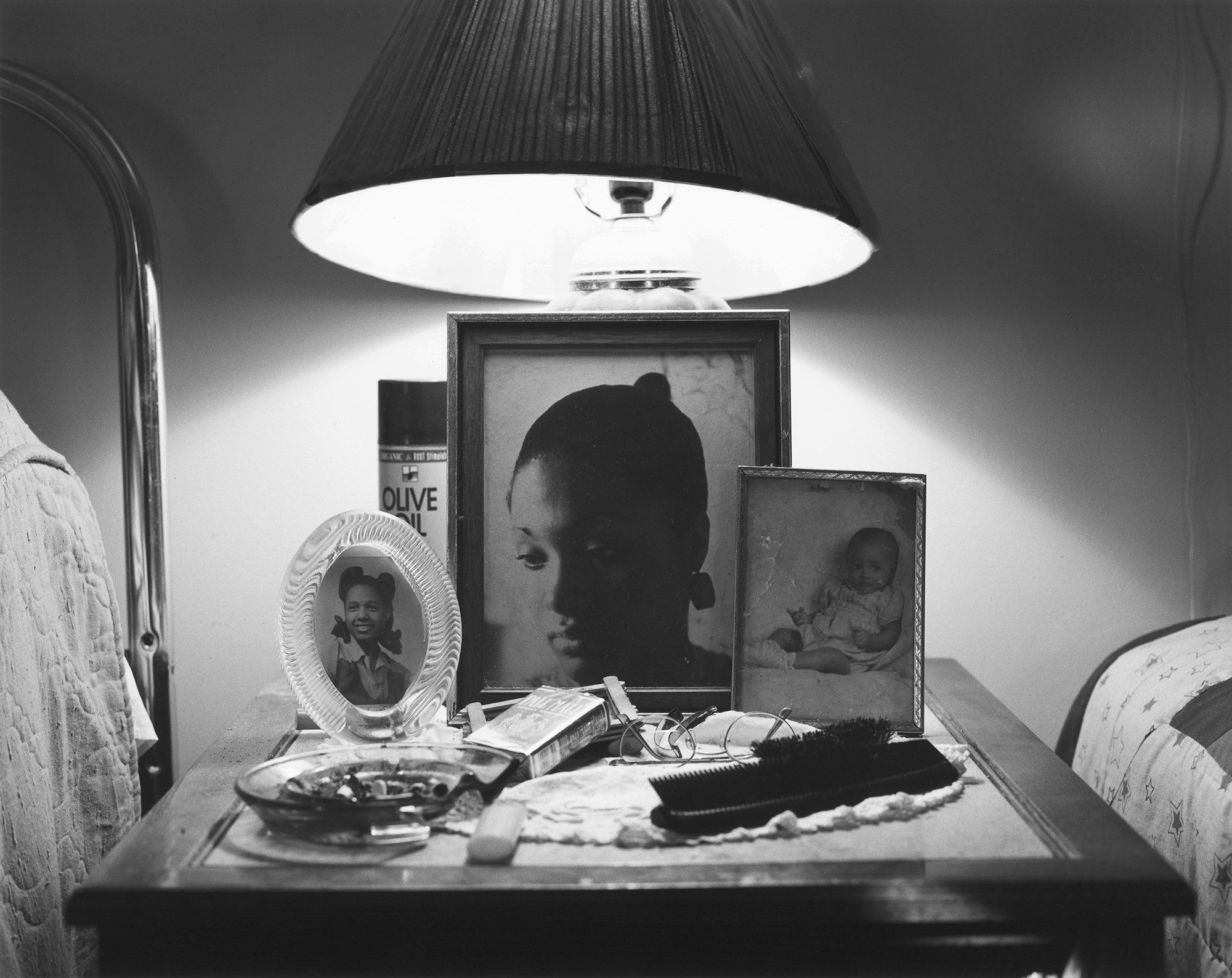
The image on the following page frames the window sill in my house. I made this photograph of the window sill in my lounge because I wanted to focus on the images that took their place on it – as a centrepiece of the room – two framed photographs of me as a young child – one when I was around 5 years of age and the other on holiday when I was 10. This photographs purpose was to bring myself – the centre subject of the project – back into focus to reiterate that, as my mum’s only child, she likes to take pride in me and tells me constantly how much she loves me – I enjoy the meaning and simplicity of this image because it shows me as a young child and contrasts that of what I am like now – in a relationship with my girlfriend and living much more independently, as well as forming an ever-growing relationship with my sister. I chose to make this black and white because this looked most effective and I took inspiration form LaToya Ruby Frazier’s image much like this to create this photograph.
LaToya Ruby Frazier, ‘The Notion Of Family’
For the next image, I used some personal objects to create a representation of love and attachment in another perspective. In my lounge at home, we have displayed the characture figures of Lady and the Tramp – two china mini figures of the two dogs form the animated film. The film is about how two dogs fall in love and my mu, being a collector of vintage and antique goods, came across these two figures and decided to buy them and they now take their place in our lounge. I had never really thought anything of them until this project when I was finding ways to photograph things that I never easily would have before and think of things in ways I never would have before. I saw these figures and realised the story behind them and realised it would be perfect if I photographed them in my mini studio set-up. I photographed them together against a white background and made this black white. I love this image and its relationship with love and romance, but just shown in an unusual way. I have again used a black background to frame it – creating the colour theme of white, black and pink.
A full bleed, coloured photograph of my dad takes its place on the following two pages and feel like this sis one of my strongest images due to it’s crispness and sharpness of detail that makes this such a busy image. However, the busyness works because there are two clear focal points in the photograph – my dad sat on the sofa with his glass of wine and the TV which is playing EastEnders. The TV illuminates the rest f the room and in particular, my dad watching the screen. I have taken the image from a far to capture the whole scene and have used a flash as I experimented without but the quality was not as I wanted. This is the second image of my dad in which you do not his whole face and instead, just a side profile. However, there are direct, face-n portraits if my mum in the book and this restates the underlying reality that he is still hidden away and keeps himself to himself sometimes.
The reader then turns the page and sees another 3/4 page spread of a black and white image from the same roll of black and white film used in the Pentax camera. It is an image taken near to Christmas when out on a walk. It captures the top of a castle near to Grouville Bay. I pointe my camera upwards as I saw these pigeons were flying in and out of this one gap in the castle. I waited for the right time to capture the point at which two pigeons sat side by side in this opening in the castle’s wall. This image shows again, in a different way to break the monotonous sequencing of human interaction, what an attachment can look like – or a relationship between two people.
The following image keeps with the theme of animals and was also taken on the shoot to my old house. This is in fact my old cat which we had for 9 years, but, when we moved away from the house we grew up in with our cat, Betty, she ran away back to our old house and has stayed there ever since and now my Papa looks after her. Whenever I go back there, I always see Betty and she comes over to see me so I can stroke her. I made this image of her staring in to the distance as she sits on the ground and this also shows a sense of detachment.
Another black and white image takes its place on pages 44 and 45 in the form of a 3/4 page spread – this is a common convention and theme of my book and it is what I used to provide a structure to the layout sand sequencing because mots of my images, as I found out when arranging them in the book, look better in this format. It is a portrait of my mum which I took as she stood in the lounge and what I like about the image is her facial expressions and the way the she stands out very clearly from the background. There is ghostly presence and eerie mood to the image as I have used the flash on my camera. This was an image that was very much needed as I had a lack of images of my mum in the current day.
When I was round at my sister’s house where she lives with her mum a couple months ago, I was playing all sorts of games with her and it was at one pint that she got at her gingerbread men decoration set. She received this as a gift at Christmas and wanted to use it with me when I came round. We spent half an hour decorating ur gingerbread men and afterwards, I decided to photograph them both together on the chopping board we were using. I photographed this using my phone using an app called ‘Huji’ which makes images look very retro and visually eye-catching due o the colour and light affects it ads to the image once taken. The colours are very vibrant and I love the effects which come with it and I often use to capture everyday moments as opposed to my iPhone’s default camera app. The image brings the added and necessary vibrance in my book which I wanted to achieve through photographs that have a relation to my time with Minnie because this is what represents the fun we have together – the colour that comes from her personality and our experiences although she does not appear in the book too often.
When Lucy and I visited the island of Sark for couple of days in the summer last year, I took my point and shoot camera – my Canon SureShot A-1 and used it to take some photographs of the time we spent cycling and walking around the island for the two days we were there. On the following pages, I have created a photo album affect where in which I have arranged 4 images that I took of our time in Sark – two portraits of Lucy and I and two landscapes of the coastline and both sets work together as diptychs. On the first page I have used the face-on portrait of Lucy and underneath I have placed the landscape shot of what was behind her, however, in it’s own image and this creates a continuity effect which works well as a diptych. Lucy also took my picture on the day after and captured the landscape in which we were surrounded by afterwards as it its own image. This also makes for an effective diptych which I have represented on the opposite page and with the portrait of us both diagonal to one another.
The next page consist of a photo over a double spread of myself and Minnie waiting at the top of a slide at Tamba Park. Lucy has taken this image with my Canon point and shoot camera and is a great image because it sees Minnie looking with a grin on her face at the camera and myself gazing at Minnie’s joy as we get ready t launch ourselves down the slide. The next couple pages are about colour and vibrancy and the notion of playing and going back to childhood. Even though the next image is a black and white portrait of Minnie, she is looking into the camera with a ice lolly in her hand ready to lick it and it reveals a sense of fun and play behind it. This image was previously an image of Minnie going down a fireman’s pole in the same park as the image before with Lucy watching on as the both laugh but the image was not very strong and didn’t feel it fitted into the sequence so instead replaced it with a portrait of Minnie. I talk about her often in my essay but never really show her in my book and this image was needed in order for her presence to be realised.
Keeping on the same them as play and childhood fun, the following image is one I took in the garden in which I used to play in all the time at my Papa’s house. It was called the children’s garden because all most of my cousins on my mum’ side of the family used to live in the estate in which my Papa owns and rents the houses in it out to tenants – being my family and my other cousins families. This was the garden which we all used to play in together after school and I used to play football with my younger males cousins all the time. The image frames a goal in the garden with the netting behind it and the field which surrounded the garden. The image looked best on a full page spread to emphasise the wide angle landscape view. This concept of play reiterates the importance of living in the moment and, for me, reminds me of childhood and the community that out whole family was.
On the next two pages is two other images – the first is of a charm/jewel that my mum owns and has owned for several years. It reminds both her and myself of the time that my dad and her spent together when OI was much younger. The delicate, very small charm was part of a bracelet but now only this pendant exists. The charm is of a girl and boy holding hands. Very simple but a jewel that presents relationships very clearly. My mum decided to get this tattooed on her ankle when she was with my dad and she also added a heart in the middle where their hands joined to show the love between her and my dad. I wanted to show the relationship between this jewel and her tattoo and so arranged them side by side and used the image I took of my mum’s ankle as a full page spread with the tattoo being the centre point of focus.
The next image is from the same shoot I did with my mum and Lucy when she cut my mum’s hair bit this closer image of the two subjects presents a more intimate photograph of my mum staring, rather glumly as she loses the hair Lucy is cutting. I have put after the image of the charm/tattoo because it juxtaposes this notion attachment and detachment through a loss of identity.
This theme is followed on, onto the next two pages where the audience see a image of my old house which I grew up in for 10 years and an image on the opposite page of a pick-up truck with a load of furniture. This shows the event at which my mum, her boyfriend of 13 years and I moved out of this house and into our current one.
Next, is a portrait I took of Lucy sitting on my window ill. This was during an evening which we saw each other after I had finished school and she had finished work. She was lounging around in my fleece without any bottoms on and I had an idea to have her sit on the window ill which is big enough for somebody to sit on comfortably because of it depth. I wanted to take her picture as she stared blankly into the camera with her head rested on her les which were bent. This portrait shows the same style of image Eich used in his book where his own wife is pictured staring into the camera but from a closer perspective. This is more of a loner shot which frames both Lucy and the window sill. I added grain to the photograph in post-prediction because this looked affective and I purposely added aa slight hint of grain whilst taking the picture through slight incorrect adjustments of my camera settings so their was a blur and subtle noisy texture but emphasised this in Lightroom.
To conclude my book about attachments and detachments within my life and consequences of what love can do but what, on the other hand, it can achieve for the positive – it can unite people, I will be using another archival image which I have decided to also tip in with phot corners. I decided to do this with an image if my mum and dad in bed when they were much younger and had inly been dating for around a year. Again, will be using this same technique to tip in an image of my mum, dad and I when I was born. I found this image within the endless photo albums we keep in my loft. My mum holds me after I had just been born as she lies in bed with me in her arms, my dad kneels beside her with his arm around us both as they both look in the camera with joy and relief. It may have made sense to use it a at the start but with my book I have essentially started with an equilibrium. I presented the images surrounding my mum and ad’s wedding and marriage at the start – the balance and then this was disrupted in the middle and the focus came onto me. Finally, towards the end, I have subtly hinted again at this divide and this separation of people. I wanted to include this image of family at the end to show that although my project has been about a loss of parental figures and confusion among myself as to where I lie in my family as I am introduced to person upon person including my sister, her mother, my mum’s boyfriend, my own girlfriend and friends, I still manage to find a sense of belonging within my own being and can accept everything and embrace it because my family – the focus of this coursework – is who I love and who I choose to attach to because I feel my place among the fragility of my family circle is important and significant. Documenting this with my camera is something I have greatly enjoyed and wanted to end the book with a photo that is not mine because my project has been a collaboration wit my subjects and although I am the photographer, the subjects are what provides intrigue and meaning to what I am photographing.
On top of the photo-book made we were given the opportunity to selected 5-6 photographs, which would be printed for us to present along side our book. I gathered that these photographs may be the same photographs, which were introduced in the book or slightly different images relating to your overall theme and concept. These images are supposed to tell your story in a similar way to the book in fewer images and will correlate to what has already been presented.
After receiving some advice about strong images and making sure that the images, which I present would work as a collective story board. I choose to work with the images of objects I had taken, we were asked to choose 6 images to send for printing, so these are the 6 images I chose.
I decided to present these images in a picture story format as they provided a story and theme and therefore worked well together to express this. I decided to keep the name of the collection the same as my book, which is ‘ The Aftermath.’ I felt this fit the theme and story I was trying to portray quite well. Overall, I enjoyed the project as it allowed me to connect with my Granddad on a much deeper level. I liked working with in a documentary style and also taking snapshot images, however for future projects I would like to maybe explore staged images as well snapshot images, still working in this documentary style genre.
I decided to produce my book in a portrait layout as I felt it would be better for when landscape photographs are spread over two pages, which is a common theme throughout my book. I decided to sequence the photographs so that the viewer does not know what condition my granddad is in until later in the book, revealing the story slowly. The viewer will be able to identify juxtaposition between archival photographs and photographs of him now as well as objects, which provide evidence and give clues to the viewer of what had happened. The images within the photobook are a mixture of both black and white and colour. I have also included text within my book, which provides additional information. The layout of my book changed as I made the book, which was because I would come up with new ideas I didn’t have before or when asking for the perspective of others, they seen it differently to what I did. I found this extremely helpful to have critique as well as positive feedback, as it guided me to my final outcome. The research into photobooks and also looked on the website blurb to gain ideas and inspiration for my book. The way I came to my final outcome was trial and error, moving images around consistently until I was happy with the layout. Once I was content with my layout, I started to choose the image templates to select what the image would look like on the page. You could choose a variety of layouts from 1, 2, 3, 4 photographs to a page. We also had an option to pick multiple photographs, two page spreads and text pages. I used 1,2, multiple photographs, two page spreads and text pages. This is my final layout for my photobook.
This is the front cover I decided to choose in the end. It is one archival image in some sort of paper frame or folder. The image is of my granddad at 19 years old, his brother and his father, who has been covered in black. This is because they lost at a fairly young age, the black is to show loss but is painted as a silhouette figure to show he is still there but just not present in our world. He is still spoken about by my granddad as he looked up to his father and always says this is why he’s the man he is today. The father figure is in the middle of the two pages so he is split in half by the spine, which represents my granddad and his brother is half of him and always will be. This image might have been interpreted differently by viewers, which is what I would like to happen. Consistent questions being asked throughout the book. It took me a while to pick this front cover and I spent time adjusting the image to make sure it was exactly the way I wanted it. Getting the father figure in the middle was difficult to achieve as well as including other parts of the image I wanted, such as the frame and the sharp paper corners.
My title for my book is “The Aftermath” I feel this again leaves it open to interpretation and also keeps the reader guessing, which might intrigue them to look through my book to learn more. This is a simple title, which contrasts to the difficulty within my Granddad’s life. The aftermath represents the consequences of a unpleasant event, this was the strokes which occurred. The consequences were what resulted from this. These consequences and symptoms are presented in the book later on, to provide the viewer more information on what a stroke is and how it can effect the individual.
This is the first image within the book, this is an archival image which has been slightly manipulated. The manipulation taken place was the black line, which is located across the eyes. This leaves the viewer interested to know why this is the case, which is what I wanted. The reason why I did this is because he is now nearly completely blind due to the stroke. This indicates this, without being obvious. Again this is showing loss. He found this particularly hard as he enjoyed reading in his space time and felt like everything he loved to do, was taken away from him. He now reads the newspaper with a magnifying glass but can not read a book due to the pain he feels if he is straining his eye to much. This image represents this.
This is a double page spread, full bleed. I selected this as I wanted the viewer to feel as if they were in the room. This is the interior of my granddads house. This shows where he spends more of his time and will see his life out. I feel it represents family showing how he lives. Also, on the television located in the left half of the photograph there is a politician, which represents his personality and interests as he is extremely interested in politics and history. I feel this gives the viewer an insight into my granddads life behind closed doors and where he lives.
My granddad often scratches his head, the same specific part. I never really knew why but I researched into this as I know many older individuals, which excessively scratch their skin. I found that the sensation of scratching at skin can be pleasurable for some, while others describe a feeling of tension release when scratching. It can also have a calming effect as the sensation can be soothing to the nervous system. The scratching may therefore be a response to feelings of anxiety, depression, nervousness or fear. These are all common emotions in the aging adult, compounded by the deterioration of other mental faculties such as memory. I found this extremely interesting how this was a common activity for elderly individuals and felt this was important to photograph as it is something he likes to do.
The image of a magnifying glass, is something my Granddad uses when reading as he struggles to see as he currently only has one eye which he can partially see out of the other eye but not very well. He uses this to make the words bigger on page to enable him to see the words to read. Reading and learning has always been a significant element in his life, even as a young man so he does not want to give this up so therefore he uses as a way of adapting to his condition. I decided to photograph objects which were significant things in his life, this is one of them, without this he would not be able to read. This is a result of his eye being taken out which is correlating with the photograph of his glass eye. The two images go well together as they are taken in the same way but also because one is a result of the other.
Although this photograph is not of a good quality, I feel it shows how my family are extremely family orientated. This is full bleed as I wanted the viewer to feel they were sitting on the table, making them feel included. This also shows how many people actually care about my Granddad and how many people are effected by his condition.
These are my granddad’s childhood friends, most of his friends are now dead, he only has 2 of them who are still alive today. They are both in this picture. The two people, which are covered by a black overlay to make an almost silhouette effect to show the absence of these people in my granddad’s life as they have both sadly passed away. The other two men in the photograph, which are either side of my granddad in the image are still alive, they are both fairly ill themselves so have not seen my granddad in a long time. But are hopefully going to make an appearance for my granddad’s 80th birthday in December. This photograph is to again empathises the absence and presence in my Granddad’s life.
This is my granddad washing his eye, everyday he has to clean and wash his eye so he doesn’t get infections. This is a snapshot image and illustrates a part of his daily routine, which I wanted to capture in my photo book as this is the main theme of my book- how his life has changed due to the illness and the adaptations he has to make to his daily routine. Although the window is seen as white in the photograph due to the light reacting with the camera, the main focus is my granddad so I feel this does not matter as much as if it was a environmental or landscape photograph. This is a portrait image and shows my granddad in action.
I decided to make a collective image of all his medication he uses for various reasons- all resulting from his strokes. Every week he puts his tablets into his container so that he remembers to take them as he regularly used to forget to take them all. This way they are all in the same place and this is kept next to his bedside table, the tablets has changed his life significantly as they are extremely strong, which results in him not being allowed to drink or take any other tablets in conjunction with them. They are also evidence that he needs medical help, which is something he never needed before his strokes. The tablets are also placed in an orderly manner, which is to show the structure in his life as he has a very structured routine when it comes to his medication and medical care.
These are interviews with my uncles, which are my Granddad’s sons. I turned the interviews into paragraphs about my Granddad and also took images of them to show who said it. This provides outside voices and opinions about my Granddad’s condition, supplying further details.
This shows the house from the outside looking in. You can see my Granddad sitting on his chair, which shows what people see from the external. His chair is where he spends most of his time. So this will be an image others see regularly.
These are interviews with my Mum and Gran, which are my Granddad’s daughter and wife. I turned the interviews into paragraphs about my Granddad and also took images of them to show who said it. This provides outside voices and opinions about my Granddad’s condition, supplying further details.
The images are of my granddad’s glass eye, this goes in his right eye socket, he hates putting it in as it causes discomfit and pain for him. He got his eye taken out after his second stroke in an attempt to remove pain he was getting behind the eye, he had already lost his sight in that eye and he was desperate to stop the pain, he agreed to have his eye taken out and replaced with a glass eye, which was matched to the original colour of his eye. He told me that this was the hardest part of his stroke and often thinks about how he regrets making this decision as the pain is still there and the glass eye causes infections, which are again extremely painful. The box is what he keeps it in to protect it from damage, when in the house he takes it out and relaxes his eye, he finds this extremely soothing and relaxing, This represents the change in my granddad’s life as he has had things taken off him- his freedom, his eye, his ability to see, walk and talk as he did before.
I felt it was equally important to have words from my Granddad about what he thought about his current situation and how he feels both physically and mentally. You see him from a almost side profile, revealing his nose, which as you can see has partly deteriorated leaving him with half a right nostril. It was the whole of the right side of his body which was mostly affected by the stroke. This image shows this as you see his eye socket without his glass eye in it.
This is a photograph from the 60’s of my granddad and his friends, in this photograph is he 21. The red overlay over half the photo is to show separation between the boys as the two underneath the overlay are not here anymore as they passed away over the last 5 years, which brought a lot of emotional to my granddad as he felt this was a part of his childhood disappearing. He currently still has his brother with him but doesn’t see him due to him too being ill, he also had a stroke, which could link to my granddad as an heredity factor.
This is a snapshot of my granddad, receiving his birthday cake. He is now 80 years old, I wanted an image in the book to show his age. I feel like this shows this well. This is also a natural image of my Granddad, which means it is his true self.
This image has been edited in photoshop, only half of the image has been manipulated to show the loss of feeling in one side of his body due to the stroke. He finds it difficult to move this part of his body and this is represented in the photograph by a darken the right side of the body/photograph. Also when you cover one half of the photograph each part looks like a different person to show how he has changed as a person both physically and mentally. The text along side this image, describes what a stroke is and what the short and long term symptoms are. I felt this was important for the viewers to know as they go through the book.
This is my granddad’s eye patch, this is to protect his eye socket from getting infections when he is not wearing his glass eye, as this is potentially a hole or wound in his face. My granddad does not like wearing this as he finds it uncomfortable and he often calls it his pirate patch as admittedly he looks like a pirate when wearing it. He also has to get a new eye patch every few months as it gets dirty, which could result in infection this is collected from the chemist and comes with his repeat descriptions. This is something he uses regularly, which is why I felt it was important to photograph this. The image of the face is the symbol of fate, this is a common theme within my book.
I took images of thinks I seen round where they live. These would be objects my granddad would see when he leaves the house. This tree is located outside their house and is in clear view out of the window next to my granddad’s chair. I decided to turn it black and white and add more contrast to make it a bit eerie, which is because its something my granddad can see but will never touch as its too fair of a walk for him.
This photograph was taken while sitting in my Granddad’s chair. The photograph shows what he would see when looking out the window, I thought this was quite interesting as the viewer sees what my Granddad sees daily, almost putting themselves in his shoes.
These are archival photographs. One of my Granddad and my mum and the one of my Granddad and I. These correlate with each other because he made my mum, who made me. This shows generation and family.
This photograph seems like he is thinking about something, my Nan says he does this daily and she thinks that he is thinking about the life he used to have but whenever anyone asks him what he is thinking about he demands its nothing. Again this is demonstrating that his life is mostly him sitting on his chair. I often catch him staring into space and I am convinced he is reminiscing about how good his life used to be and how he wishes he could move. He also frequently grips his hands together and scratches his head, maybe to release his pain as his grip is usually tight and strong as if he is distracting his attention to other pressure instead of the pain he feels in his body.
This is a cut down tree, which is near their house. About 10 years ago my granddad fought to keep this tree, instead of it being cut down, however he lost that battle. The tree was 15 years old and it was a beautiful feature, they cut it down to give one of the houses a sufficient view. My granddad didn’t think this was a good enough reason to cut down trees and ruin out environment and nature. This image illustrates his strong beliefs in nature.
Finally, this image is my Granddad singing, which he has loved to do from a very young age. This represents his personality and hobbies, he was always a very outgoing person, who would always want to be the life and soul of the party. He was confident and witty, which I feels shows in this image. I wanted to start with an archival image and end with one also, these photographs are included so that the viewer can make comparisons of who he was then and who he is now. The other peoples fill the gaps and explain his journey. I have enjoyed making this book as I felt I was able to reconnect with my Granddad in a much deeper way. A way I never thought I would. Making the comparison myself about what my Granddad used to be like before the stroke made me and my family realise just how much he has been affected by his illness. This is a sensitive topic and I hope my concern for his health and my love for my family show within this book.
For my photo book, I originally photographed my mum and ad’s wedding cards which they sent to each other the day before their wedding, and, coincidentally, they happened to be the same.
I originally photographed these on a white background, raised from the white A2 sheet of card to create a shadow, and although the image turned out well, it didn’t fit the book as I wanted. Because the shade of white of the card did not match that of the white paper I was using for my book, I had to heavily increase the white clipping in the image which affected the look of the cards themselves as these are also white – in-turn, the cards ended up blending into the background because the shadows weren’t harsh enough.
Additionally, I hadn’t photographed the cards at a well enough height so that they looked the same size. One of the cards was also placed higher than the other and it didn’t achieve the affect of “direct replicates” as I wanted – I wanted to make it as symmetrical as possible. Because of this, and after realising that it didn’t fit in the book as I wished, I decided to re-photograph them.
I did photograph them again on the white background hoping I could get a better shot and hoping I could get a more harsh shadow from the sunlight on my window sill – where I had set up a mini studio for photographing the archive material. However, this again did not turn out as planned and once I had imported them into Adobe Lightroom, I was heavily affecting the lighting effects such as brightness, contrast, exposure and black/white clipping so that the image was in-turn becoming more and more low quality. I eventually realised that because of the card’s colour, I wasn’t able to photograph them well against the same coloured background. Because of this, I experimented with using black card, which, as you can, worked much better than that of the effects white card gave. It allowed the cards to stand out much better and I only needed to, once imported into Lightroom, alter the darkness of the black to darken this and increase the contrast of the black lines in the card.
I am very happy with the outcome of my third attempt at photographing my mum and dad’s wedding cards. Because it is the opening image in my book, I wanted it to be of high quality and this is my best edit yet and will be the final image used for the book. I will be using it as a full bleed image to get the full effect of the little details in the cards. I have also found that using black card places more emphasis on the cards and their value than white card did.
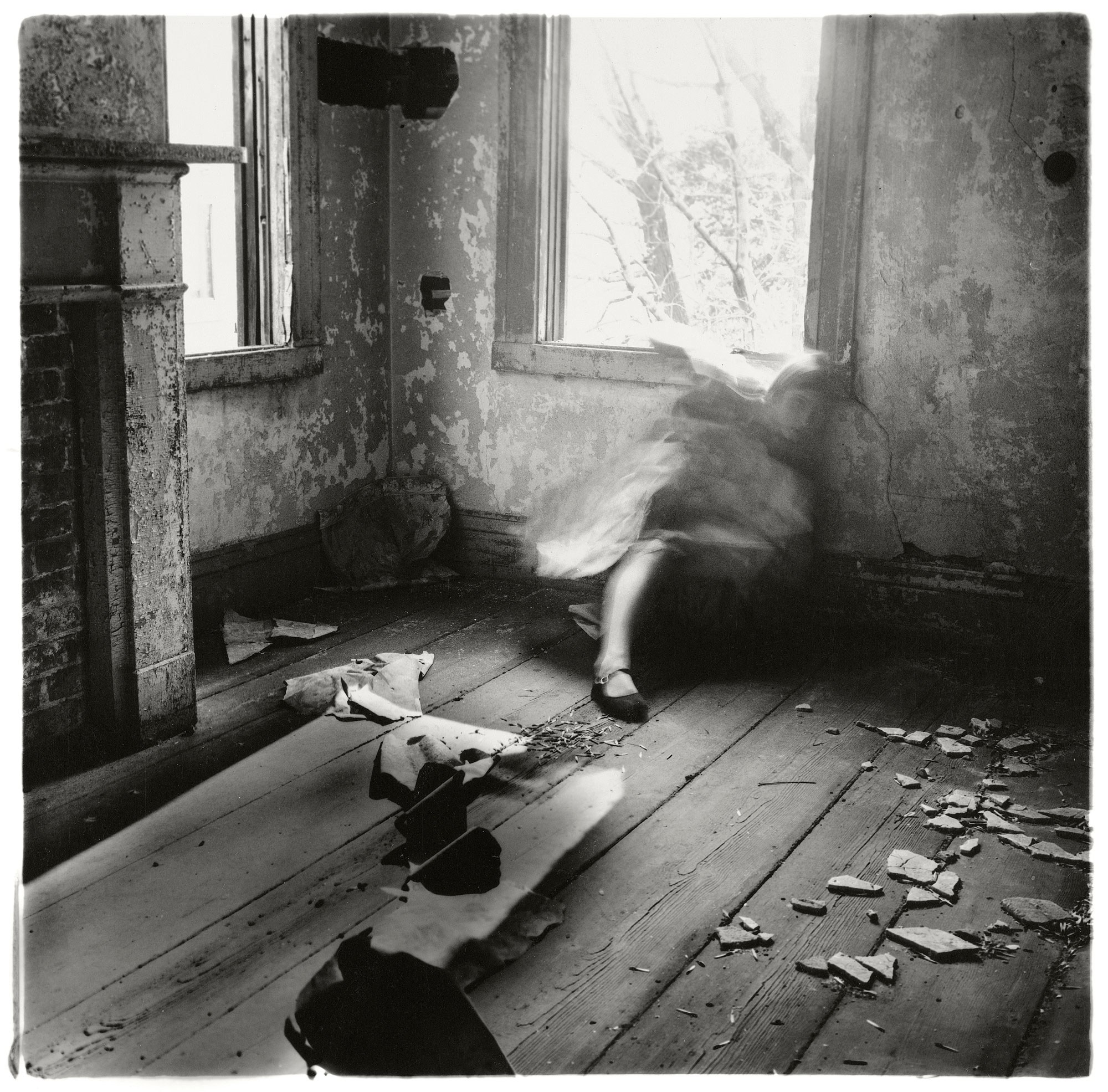
Francesca Woodman was born April 1958 and died in 1981. On 9th January Woodman died by suicide after jumping out of a loft window of a building on the East Side of New York. One of her friends wrote “things had been bad, there had been therapy, things had gotten better, guard had been let down.” She died at the age of 22. She was an American photographer who was best known for her black and white pictures featuring herself or other female models. Many of her images contain the subject naked or clothed, blurred or merging with their surroundings.
During Woodman’s life she used many different types of media for her work. For her photography Woodman used different cameras and film formats. She used medium format cameras producing 6x6cm square negatives. Over her life Woodman created at least 10,000 negatives. Most of Woodman’s work is untitled and only known by the location at which they were taken.
Woodman’s images contain this haunting atmosphere because of the environment, the bleakness and the poses that the subject is doing. I love how her images look. Woodman was struggling with life which I can clearly feel from dissecting her images. The black and white really emphasizes the haunting and death like atmosphere that Woodman is trying to create.
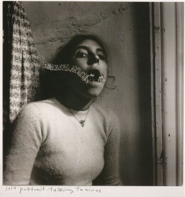
Her images are relatively similar to Rebecca Horn’s because they both use themselves as the main subject. They also have this bleak, eary atmosphere which coincides with their experiences of life. In the late 1980’s Woodman became depressed because of the failure of her work gaining attention. It was also due to a broken down relationship. Woodman survived a suicide attempt in the autumn of 1980.
I choose Woodman as my second Historical Photographer because her photography is so unique from her time period. She only becomes famous after her death, which shows us how she found it hard for people to share her artistic style and perspective.
Rebecca Horn was born in March 1944 in Michelstadt, Hesse. She is a German visual artist who is best known for her installation art, film directing and her unique body modifications. She practices body art using different medias such as performance art, installation art, sculpture and film. She writes poetry as well, which she sometimes uses to influence her work.
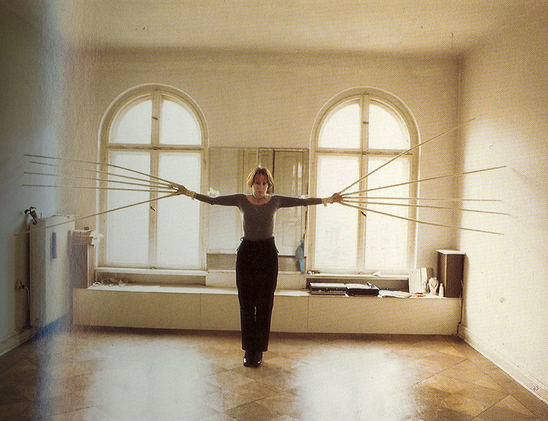
In 1968 Horn produced her first body sculpture where she attached objects and instruments to the human body. She used the theme of the context between a person and his or her environment. Einhirn (Unicorn) is one of Horn’s best known performance pieces. The subject of this piece is a women who is described by Horn as “very bourgeois”. The subject walks through a field and forest on a summer morning wearing nothing but a white horn from the top of her head. The image below is from the film that Horn produced from the project “Unicorn”.
Horn also created many sculptures over her career. She explores feathers in her works of 1970’s and 1980’s. Many of her feathered pieces contain a figure wrapped in the manner of a cocoon to cover or imprison the body. In the 1990’s a series of her sculptures was presented in places of historical importance. Here are images of some of the sculptures that Horn created.
Rebecca Horn had a difficult life when growing up. Her parents sent her to boding school as a child to study economics however Horn desperately wanted to study art. She rebelled against her parents and in 1963 attended the Hamburg Academy of Fine Art. Horn’s troubles were still not over because a year later after joining art school she had to pull out due to severe lung poisoning. This is how Horn describes her experience, “In 1964 I was 20 years old and living in Barcelona, in one of those hotels where you rent rooms by the hour. I was working with glass fiber, without a mask, because nobody said it was dangerous, and I got very sick. For a year I was in a sanatorium. My parents died. I was totally isolated.” Horn also experienced severe isolation. She felt like her life was over before it had even begin. When Horn walked out of the hospital she was still to ill to carry on with school. She started creating sculptures and strange extensions using wood and cloth. “I began to produce my first body-sculptures. I could sew lying in bed.” Her goal then was to quash her “loneliness by communicating through bodily forms.”
I decided to look at Rebacca Horn as one of my Historical photographers because she uses a lot of her past experiences, such as her poor health and her loneliness as a stimulate for her work. Similar to many women during Horn’s period, she had to go against her parents and people around her to do what she truly wanted to achieve in life. By becoming a women artist and photographer, Horn was one of many who helped with the progression of women. She used women as the subject for her work, however her perspective was from a women’s point of view and therefore her creative and female perspectives become prominent.
Here is my second draft for my photo book. I decided to completely change the layout from my original idea because I wanted the project to be more contemporary and wild. I also decided that I wanted my images to be bigger to create more of a lasting effect on the viewer. I first changed the image for the front and back cover because the black and white image of the hands didn’t create the initial look that I wanted to create. The color theme for my photo book is soft pastel colors, such as blue, purple and pink. I simply brought out the natural pigments in my original photos, and used them as the base of my color theme. I wanted my front and back cover to really show what the book is about, and that’s why I didn’t want to use a black and white photo. I really like the colour and framing of this image, and it works really well as the initial image that draws people in. Although the image looks elegant, because it looks like the hands are dancing, it also looks like they are reaching out for each other. It could represent pain and torment, as well as love. However, the hands are physically expressing a deeper emotion which is what my project is about. This is why I really like this image as my front cover.
I wanted my book to be eye catching, and to draw the viewer in with the use of color and shape, and with the flow of the images. I decided I wanted more of my imaged to be larger and more dramatic. I also decided that I didn’t want to categorize my images any more. I wanted them to be all combined and mixed up, rather then placing them into a particular order. I no longer just wanted the landscapes to be the multi page images, I choose the best images out of the whole selection to present in a larger scale. Some landscapes, some faces, and some body image.
I made sure the whole of my book worked really well together. I wanted every image to lead onto the other one really well. I also made sure that the color scheme and shapes worked well together. I love the flow of these sets of images in particular because the colour and flow leads really well onto the next image. I also really like the contrast that there is within the book. Every image is different, yet they all work really well as a set.
I wanted to include some words within my photo book to achieve a deeper understanding of what the images were meant to represent. I found a poem online by Linda Hogan called “When the Body”. Linda Hogan was born in 1947 in Denver, Colorado. She is a poet, storyteller, playwright and novelist. I decided to use particular stanzas from her poem because I like the way she fragments certain parts of the body, “But the feet have walked”, and “from the hands”. She links the body to nature and uses tress to describe what the body is like, “their branching of toes”. Her writing is really poetic and romantic and I think it suits the theme of my photo book.