All posts by Peter Le Gal

Filters

Author:
Category:

Plan for tableaux shoot

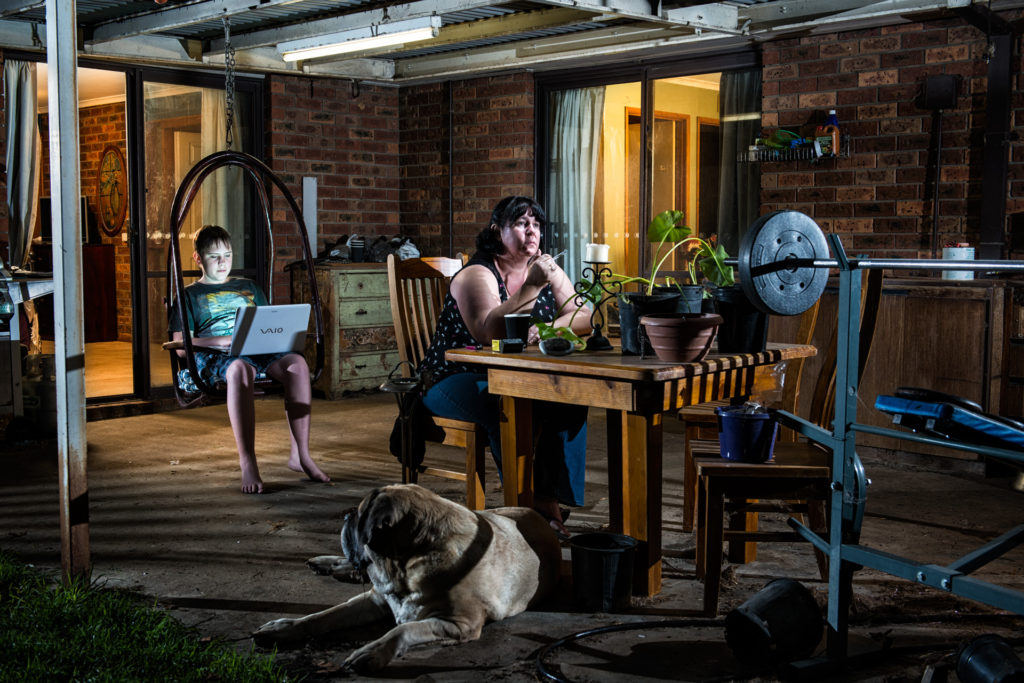
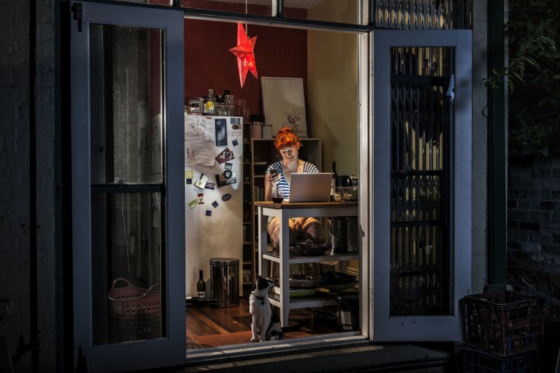
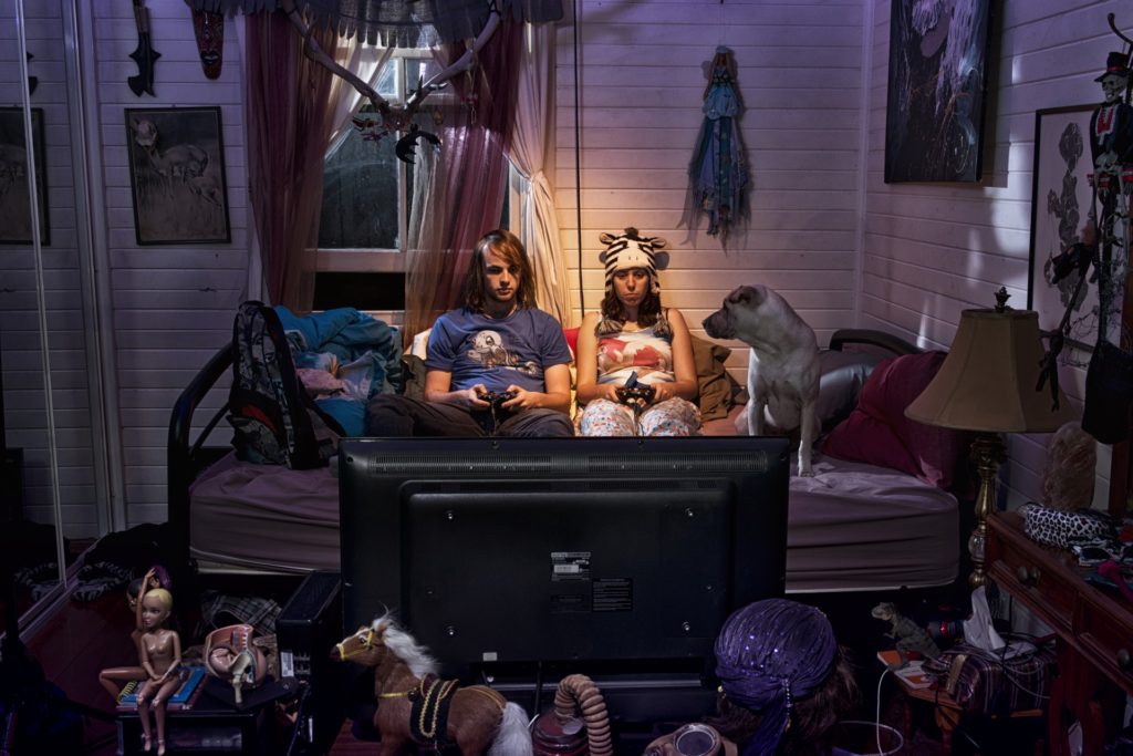
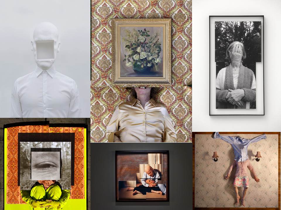
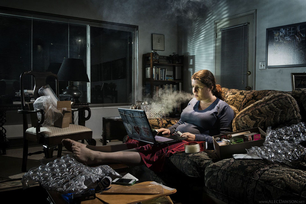
The photos above are by a photographer named Alec Dawson. I like his concept that technology is blinding us from what is around us and turning ourselves into numb, motionless human beings. I find almost everyone has spent or spends too much time on technology whether that’d be on the phone, laptop, the TV whatever it maybe, most people living in the privileged part of the world are guilty of this one time or another.  Looking on at this is a sad site to see, in the photos you can see people, animals and even the environment around that person being neglected as these people are so immersed in what ever they are looking at. I see this very often in my own home even now i am typing this on a laptop in my kitchen. To an onlooking person this could be seen as an unhealthy thing.

In my photos I am wanting to convey the same meaning behind these photos showing how these devices are killing these short precious times we could spend living rather than vegetating in front of a screen. I also like the fact that these photos were taken at night this gives the photographer more control over the lights that are being used. This is another aspect I will taking inspiration from as it also emphasises the light coming from the screens. I will be taking photos of my grandparents and my brother as it is showing two completely different generations some drawn to this habit and others not. Alec Dawson’s photos are often very cluttered and in most cases it is to convey a message that is most of the time very obvious however when I take my photos they will not be as cluttered as his are.

I have a solid idea in my head and have the inspiration to have a successful photo shoot. I am looking forward to see the results .

Anna Gaskell vs Hannah Starkey

Analysis

Hannah Starkey

Maureen-paley-hannah-starkey-artwork-untitled-may-1997-1997-1

The use of reflections in this photo as it gives it a unique eeriness even though the lighting is very high key. The lighting is also another aspect here having the white curved wall and mirror reflecting light. The amount of white shown is excessive and makes a good photo. The roof is curved giving the photo an usual framing as we often see basic rectangle ceilings (is there is one). We can see one person on both sides of the mirror however the person on the left we cannot see her on the other side of the mirror I think this is also another reason the photo seems so eerie as she as the older lady is clearly staring at herself with a motionless look on her face. Also the  younger women is pressing something against the mirror it looks almost like a flower. The older women is also wearing blue just as the younger women however covering it with a white coat.

It looks as if the older lady is somewhat related to the women on the right whether it is her future older self, this would explain why we cannot see he on the other side of the mirror or it could be her mother or grandmother. I’d like to think it was the first one as it would explain the eeriness to the photo as when you’re young growing old can often seem like a scary concept. It would also explain the fact that they are both wearing blue. The fact that she is touching the mirror its almost as if shes looking through a mysterious window through time. The fact that Hannah Starkey’s photography is very much cinematic based this could be the case.

I like this photo as it draws my attention. It also has a cinematic edge to it that I really like. It looks like a quirky american diner. I like the hidden meanings there could be behind the photo. The photographer hasn’t said much about the photo, the photo itself doesn’t even have a title. All we know is the date it was taken which was May 1997.

Anna Gaskell

When looking at this photograph the colors and the image itself is very striking. There’s yellows, blues and a very bright orange. This shoot most probably took place at sun down as the main subjects face and the others hands have a glowing orange to them. The emphasized colors go hand in hand with the Alice in Wonderland themed shoot as that piece literature is all about magically, fantasy, scary but amazing land  where Alice is trapped. There is a helpless to this photo, this aspect gives the photo a dark and eerie tone. The hands have also become almost like silhouettes making them look mysterious and evil. You could relate them to branches I got this idea as I saw the tree also a silhouette in the background.  The main subject has also been focused on and placed in the middle almost dehumanizing the hands surrounding her.

I like this photo as the artist is showing Alice in Wonderland something most people can relate to yet using that to convey their own message. The way it has been shot is very striking and causes the viewer to take a double take as it is quite violent photo. All of Anna Gaskell Alice in Wonderland work is untitled. It has been decided by others that the photos could be a potent metaphor for the anxiety and confusion experienced by children on the verge of adolescence.

DOCUMENTARY VS TABLEAUX

Documentary photography is when a photographer captures a movement that is happening at that time without any staging of interference from the photographer themselves. Documentary photography can be seen throughout history as it was initially invented to record, it was never created with the intent of becoming a creative format. However, this has changed throughout the years with photography actually become a creative subject often taught in schools and programs designed to manipulate photographs such as the well known program called Photoshop. Photography is no longer just about recording the world, it is also about manipulating it.

However early 20th century after the First World War documentary photography was thriving. The point to documentary photography wasn’t just to record an event, it was also to enlighten and teach in a creative way. Documentary photography was all about showing what everyday life was like for different people and showing that in motion, showing them smiling, frowning, angry, happy or sad. It was all about giving people the ability to notice things they weren’t used to seeing.  This sometimes shown in a certain order to convey a message. They may have put each photo in chronological order to show an event unravel or place to place them in a certain sequence to convey a meaning such as loneliness.

Image result for documentary photographyhttp://time.com/3449718/mystery-in-the-sky-a-legendary-photo-slowly-gives-up-its-secrets/

Just this photo in itself shows how important documentary photography is as its showing how the work men of the Rockefeller building would sit on the beams and have their lunch. This photo looks very artistic and staged or even edited however it’s not as the work men would do this almost every lunchtime and has been recorded and well documented. This is one of Rockefeller’s biggest part of their marketing campaign. Now they invite you to recreate this photo using a green screen when visiting the tower. This iconic photo has become something Rockefeller prides themselves off even through this would not be allowed now days, although this is probably why it was so interesting that these men had less care for their own lives than most people. This is all due to some one picking up their camera and taking a photo of these men otherwise we would not have known this happened. This is why documentary photography was important it was unstaged art.

The opposite to this was Tableaux. Tableaux is photography that is staged to look like a scene usually inspired by novels, film, art and any other visual and maybe non visual creative format. They would take scenes out of these forms of media and make whats essentially still life and photograph this. Tableaux was first seen in the at royal weddings where actors would imitate statues from paintings. They would not move until they did another scene. This was theatre with no dialogue, telling a story with just one still scene at a time. When it came to photography it wasn’t much different. The photographer would take photos of people that have been placed by the photographer themselves to convey a meaning and/or a story maybe relating to their own experiences or to mimic art.

The key characteristics of the contemporary photographic tableau according to Jean-François Chevrier are:

“They are designed and produced for the wall. summoning a confrontational experience on the part of the spectator that sharply contrasts with the habitual processes of appropriation and projection whereby photographic images are normally received and “consumed”

Jean-François Chevrier was the first to use the term tableau in relation to a form of art photography, which began in the 1970s and 1980s in an essay titled “The Adventures of the Picture Form in the History of Photography” in 1989.
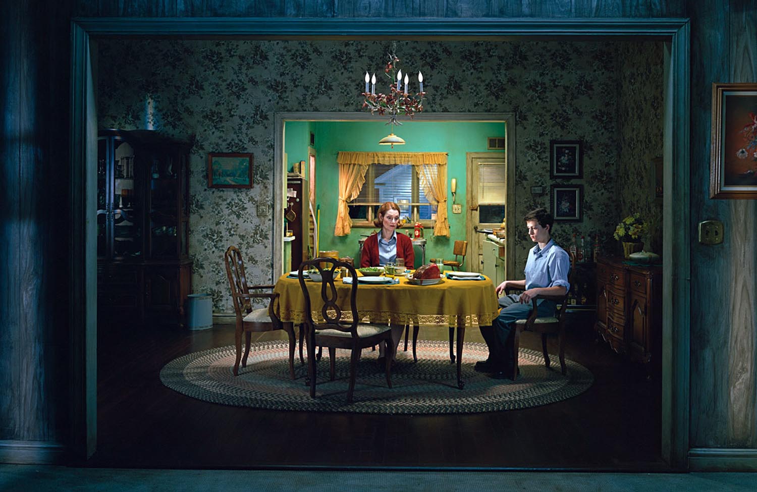
Image result for tableau photographers

‘Small Town America’ By Gregory Crewdson     https://francessmithphotoworks.wordpress.com/tag/tableaux-photography/

As you can see with the photo above it has clearly been staged with props, actors, costumes and a specific location to convey a certain message. Compare this to documentary photography the subject often have their photo taken in the environment they are already in it is more of a matter of recording and maybe this may naturally translate into a message. This photo has clearly been set up and framed and set up with the proper lighting to make an ideal image. Tableaux is all about making a false reality showing the view a distorted and manipulated version of the world. Where as documentary photography is all about showing the world in its rawness whether that’s hard to view or not.

Documentary photoshoot

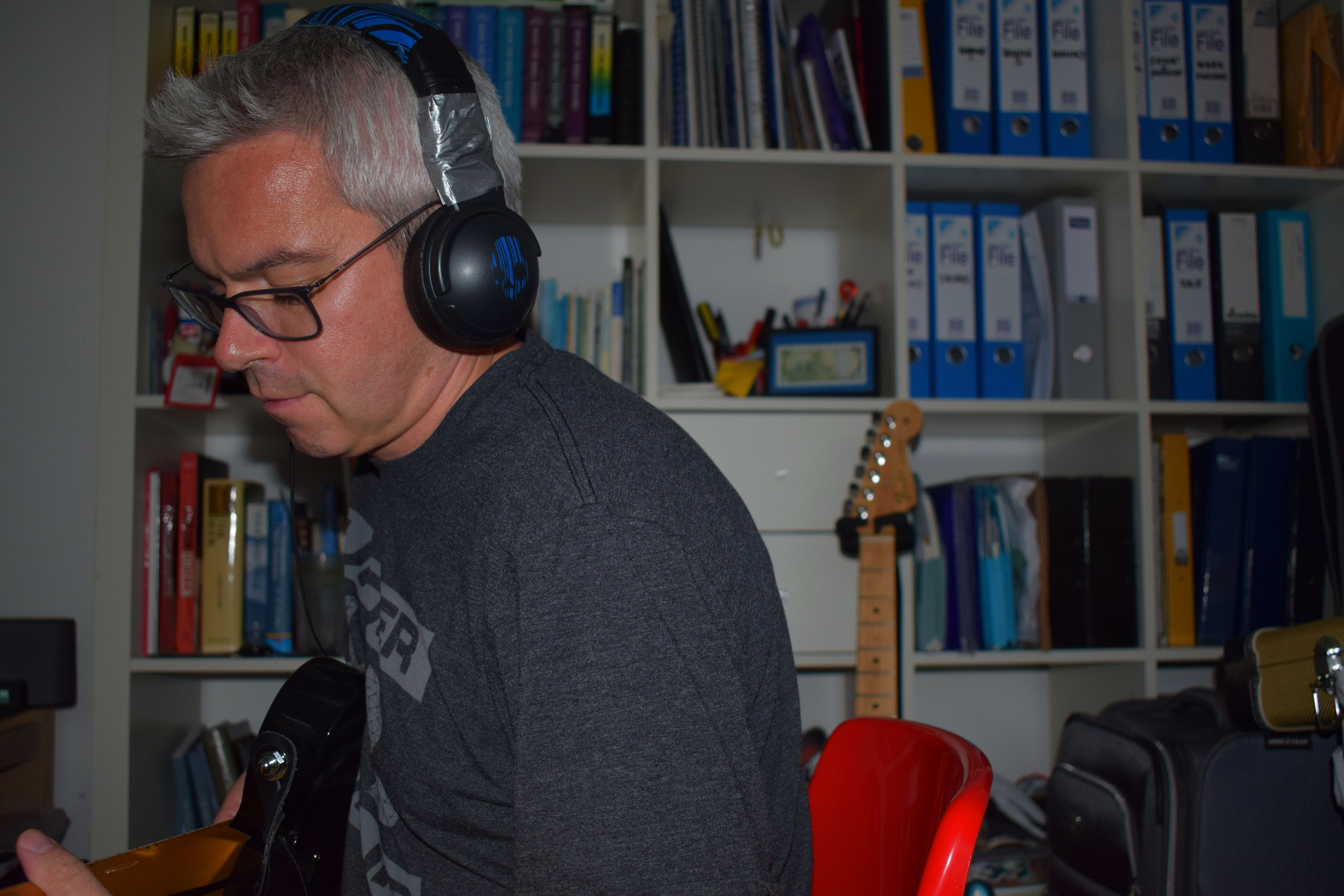
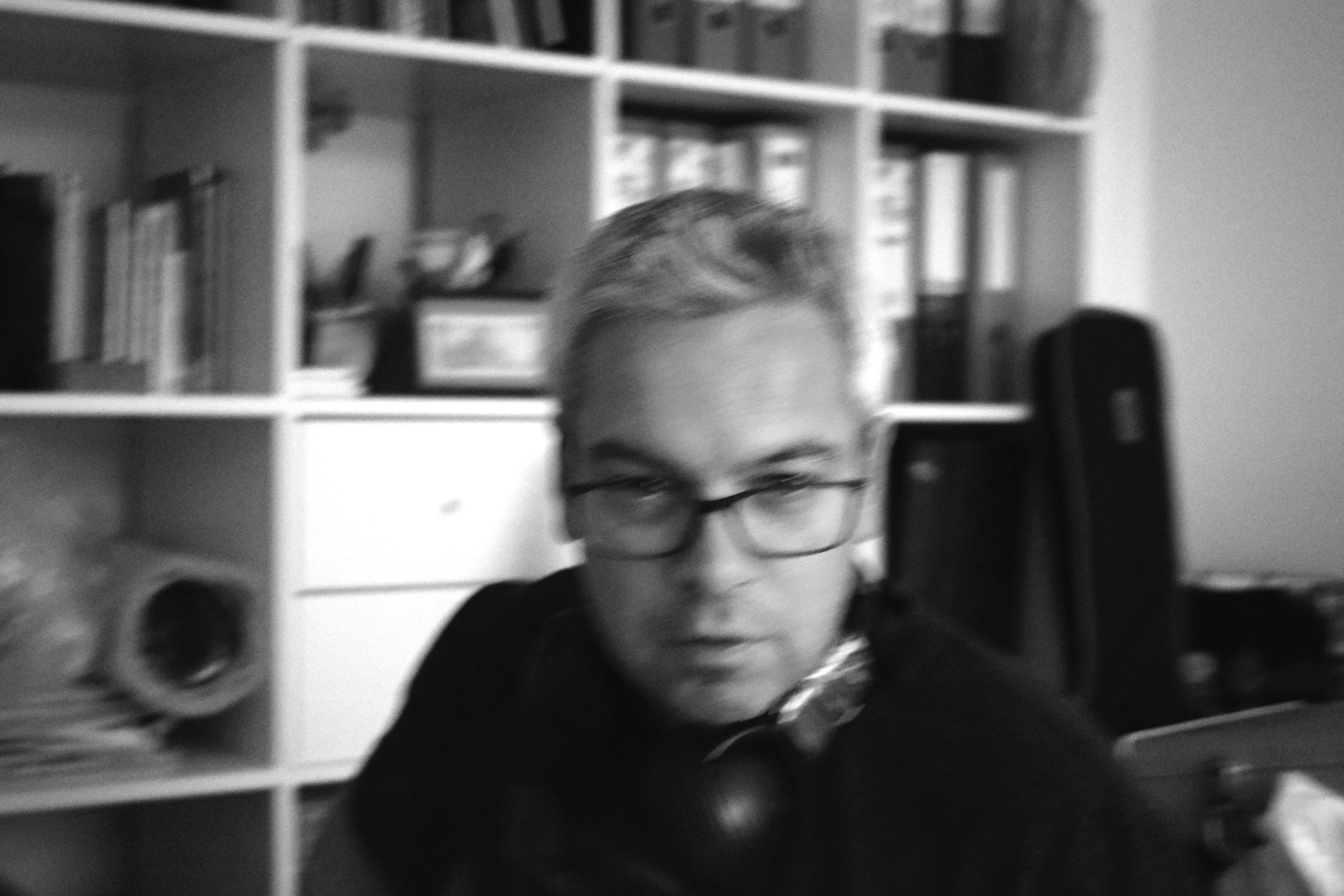
My Photo shoot was inspired by the photographer Larry Sultans photos of his Father. Especially the one of his Father practicing his golf swing in his bedroom. Just like Larry Sultans work I have taken photos of my Dad taking part in his hobby. This for my Dad is playing the guitar. Almost every night he retreats to his make do office where he places on his headphones and immerses himself in his own world playing his guitar for hours on end. I wanted to take a photograph my dad in the room he usually goes to practice his guitar however the lighting conditions weren’t ideal so in the future I would chose another room to do this. I also wanted to capture his make do practice room/office and how it isn’t anything special yet he spends to much time in that room.

The first two photos I chose to use natural lighting just as Larry Sultan does. I also used a reflection of one of the mirrors that had been placed in there. The second two photos I pulled down the blinds and used the flash. For the last two photos I decreased the iso giving it this blur look almost like another photographer i almost studied called Richard Billingham. I then changed these photos to black and white as I thought it suited the style better than color.  By doing this I wanted to portray movement even though the subject wasn’t actually moving and camera was I wanted to portray a movement in emotion and mood that music has the capability to do.

Larry Sultan

Mood Board

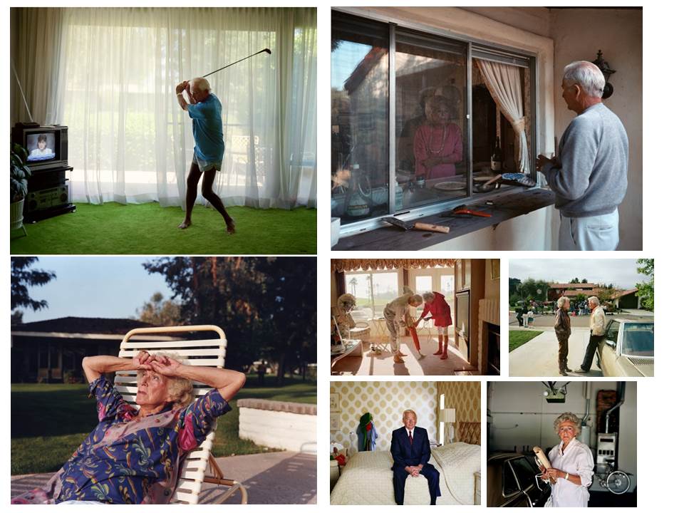
The reason I chose Larry Sultan is because I like the structure and form of his photos. He isn’t afraid to use color yet still display a brokenness or sadness. When looking at these photos I get a sense of a dis-functional couple, this is due to every time we see this couple together there is a barrier or a distance between them. Otherwise they have been photographed on their own looking distressed as we can see in the bottom left photo or we see them obsessed with a hobby as we see in the top left photo.  The people in the photos are the photographers parents. Sultan is clearly showing his family in these photos. Showing how family isn’t always easy and can be difficult sometimes. Sultan’s work is very centered the main thing that he wants you to focus on is in the middle clearly showing wants he wants the viewer to look. It also gives the photos a sense of formality as most formal photos the main subject is placed in the middle of the frame which is something we can see here. Some of these photos look very staged however there are others look as if they have been captured in the moment such as the one with the Vacuum cleaner and one with the father practicing his golf swing.

Analysis
Related image

In this photo we see the photographers father on one side of the window and his mother on the other. The father is on the outside and mother in the inside. This looks like a photo captured in the moment as the lighting in this photo isn’t perfect, it’s very much improvised using natural lighting. However, I do not think this photo is celebrating how to create the perfect photo I think it is celebrating to capture the perfect at the right time. When looking at this photo I see multiple meanings behind it.

I find the when first looking at this photo I got a sense of a dis-functional relationship like I did from the other photos Sultan has taken. I see as there is a distance between them both, the window acts as a barrier almost like the american prisons where you go visit an inmate and there is security glass separating the visitor and the inmate. This could represent that maybe someone or both people feel imprisoned in their relationship as they are not happy. Also we see the father at the window coming back from gardening (or playing golf like we discovered he liked doing in other photos). However, the mother is in the kitchen. This in itself it reinforcing dominant ideologies that women should be inside preparing food and the man should be outside working or doing “Man things”. This ideology is very popular among the older generation which again shows off their subjects old age.  It could also be a reason why the mother of the photography looks so sad and distressed as she does not have a life of her own to live. I like this photo as it talks for itself.

This photo may not be perfectly framed or lighting may not be perfect but it has captured something that tells its own story to each person. This is very important for a photo as it allows the viewer to connect to the photo and have their own meaning. I like the fact the fact that the photographer has captured the subjects in such a way that they look awkward to be around each other. I like how informal the photo is as it is almost like a window into what the photographers eyes.

Image result for larry sultan here and home golf

This photo looks as if it could have been staged and to a certain extent I think it was. I think the photographer asked the subject to practice his golf stance and he photographed this. The carpet is green just like the grass he would be on if he was actually playing golf. The main subject is almost in the center of the photo. This can be seen almost all of Larry Sultans photos as the main thing he want you to focus on is in the middle of the frame. The photo is taken in very low key lighting giving it a isolated feeling. There isn’t much actually in the photo however the fact that the photo isn’t cluttered gives the photo a isolated feeling.

When I look at the photograph I feel like the photographer is trying to show his father isolating himself using his hobby (golf). I see this a lot in the older generation as my grandfather also plays golf as is often not in the house leaving my grandmother at home. This again links to other photos as it showing a dis-functional family however this time only showing one side to that family. Its showing a man so obsessed with this hobby that he is forgetting to spend time with his wife leading to a broken marriage. Most of the time the hobbies exist as a distraction for something that needs to be talked about. This is the meaning I get out of this photo.

I like this photo as it is strange as he is practicing his stance indoors in front of the TV rather than outside in the sun. I also like the way it has been framed as like his other photos it has a sense of formality to it yet it is still informal. I also like that the carpet is green as it is almost like grass and goes perfectly with the photo, its what makes the photo special. I like the fact that throughout his shoot he has a obvious theme that can be taken in different ways and viewed in a different way by each person that views this photo.

Tanja Deman

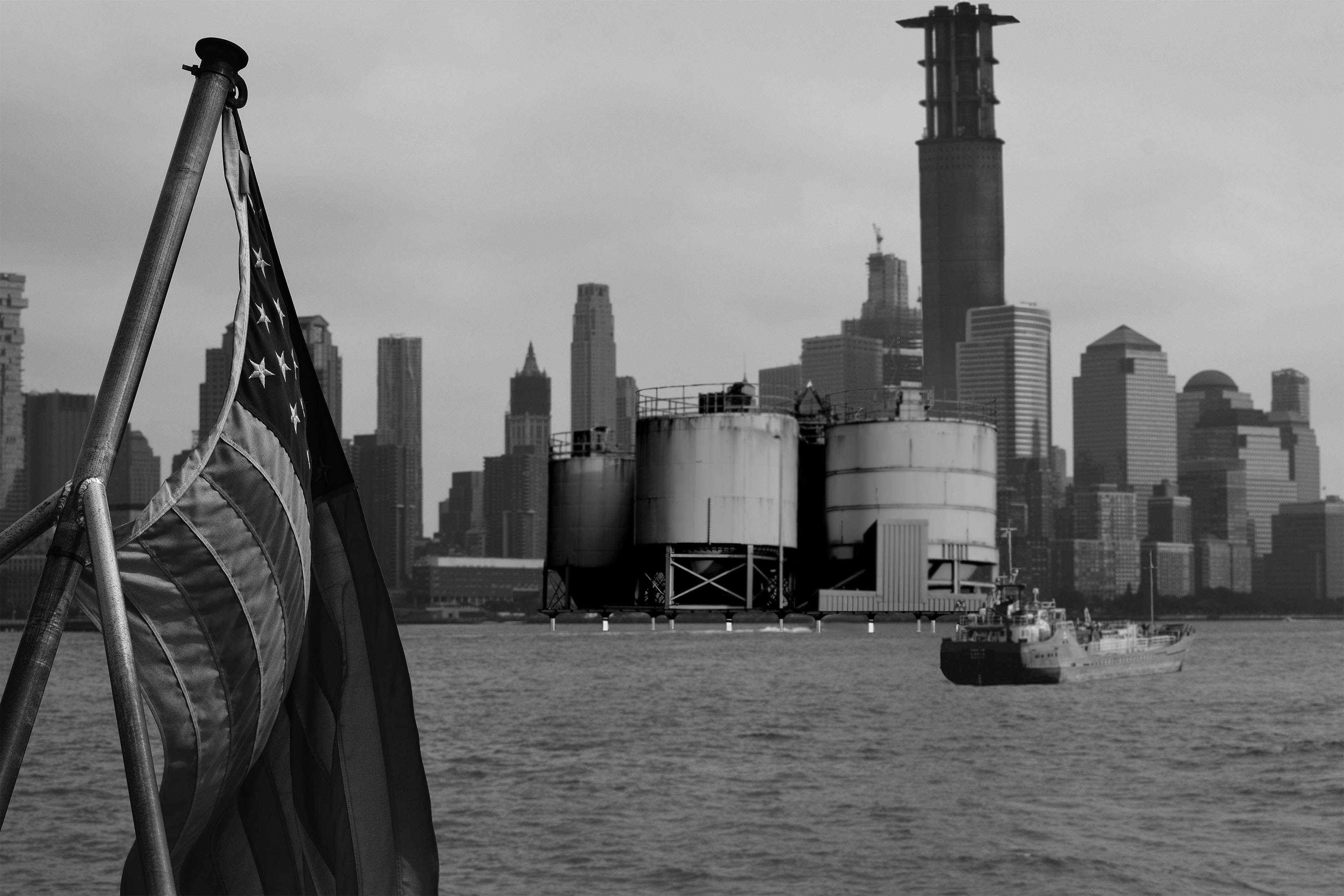
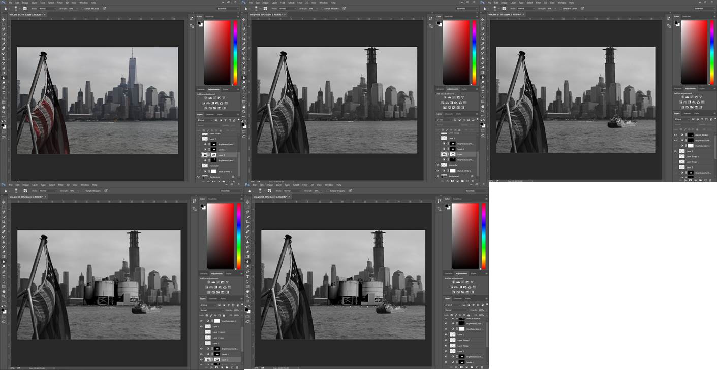
Here I have 3 different pictures in one. Did this by using the lasso tool and making any picture i used black and white as using the blur tool to make in look as if it was initially in the photo.

Here I s a step by step process of each object being put into the photo.

These are the three photos I used.

Destroying an Image

When Jonny Briggs last visited the school he gave us a task. This was to destroy the same image multiple ways whether that’d be done using analogue methods or digitally.

This is the image I chose as I really wanted to explore the idea of loss and only knowing a certain person through photos and stories told by other family members. In the photo is myself as a toddler sitting on my great-grandfathers lap reading a book. As you can probably guess I cannot remember this moment however I have heard stories about him and have used this in my work.

Analogue

For the first image I used water to rub and remove the ink that was used to print the picture of my great grandfather. This gave the photo a faded look showing how the memories of my great grandfather have faded over the years. It could represent my families tears that had been shed over his death.

The reason I covered him in fluff from a dog toy is because he owned a pet cat named fluffy. When I thought of my great grandfather I always thought of his pet cat this wasn’t just the case for this grandparent, I also did this other grandparents my other great grand-dad had a dog called brandy so he was known as grand-dad brandy. This is why I covered him fluff as I related him to the cat he owned,

For this picture I got mud from the garden as well as herbs. This was meant to represent what his life consisted of as he was a farmer. His whole life consisted of looking after the farm and looking after the animals on that farm. This is just one of many things i have been told about my great grandfather and yet again my memories of him have been built up and enforced by others that actually knew him. So because of this again I have covered him with dirt as I remember that he was farmer from other peoples stories however that’s not how I remember him.

In this photo I have cut a hole where his heart would be, placed a tomato underneath that hole and using scissors I cut a crucifix into that tomato. The reason I did this is because out of the many things he grew was tomatoes, my grandmother told me he loved tomatoes. My dad also told me that he didn’t find out he was a christian till very close to when he died. This came as a shock  to him as he had never spoken about this before. This showing a significant thing my Dad didn’t find out till very close to his death. I didn’t want to make the crucifix too obvious as the fact he had this faith wasn’t obvious to the rest of my family.

Digital

In this photo I made my head a lot bigger by selecting it on photo shoot using the lasso tool and using re size tool I made it bigger. I did this because when I looked at the initial photo I thought my head looked massive anyway so I thought to exaggerate that.

In this photo I used the mixer tool and another tool I made it look like my great grandfather had disappeared as I have already said I don’t remember him the same way as others in my family even though I am pictured sitting with him.

In this photo I shrunk his mouth as I have been told by others that he had a very high pitched, squeaky and raspy  voice that was very distinctive. So I wanted to showing this visually using the lasso and mixer tool.

Jonny Briggs Workshop

At the beginning of the workshop Jonny asked multiple people in the class is fear good or bad in photography and if we have fear what of. Many people said they have a fear of people not be able to understand their work or fear the work is not enough. Personally I have a fear that my work will not be good enough in my standards. For me I think a good piece of work/ photography is when you can look at the photo and get multiple meanings or even one prominent one. Basically something that makes the viewer think and find themselves drawn to it. My fear is that I will take a photo or a complete a project that has no thought behind it and is just there for marks as I do not want it to be the reason for my work.

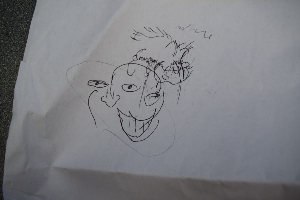
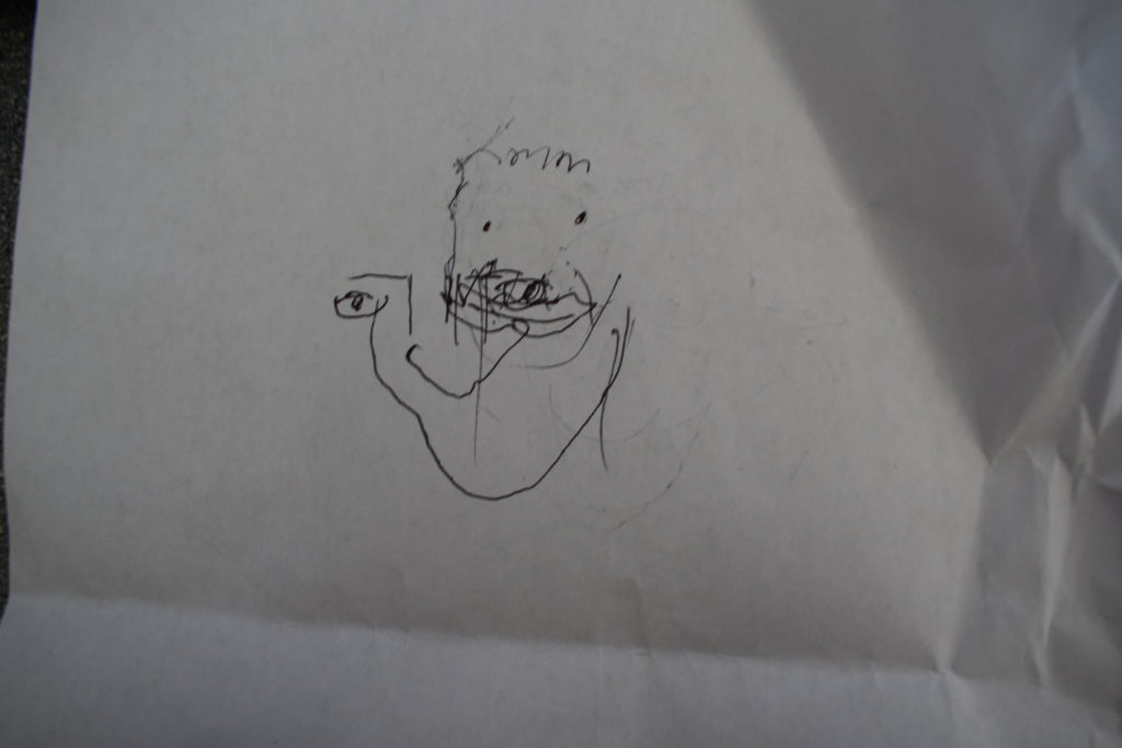
After this Jonny got us to close our eyes and draw a random face. This was my attempt.

As you can see it shows some resemblance to a face such as eyes, nose and a mouth. However, it is quite clearly not a face. Jonny then asked us to close our eyes again and draw a persons face of someone in the room. My attempt is below. I found this exercise a lot harder than the first as there was something to compare my drawing too. We were then asked, if we were asked to draw a face with our eyes open which ones would be more interesting and the majority of the class said the ones we had done with our eyes closed would be.  He then went onto talk about how mistakes can make a photo or a piece of art look better.

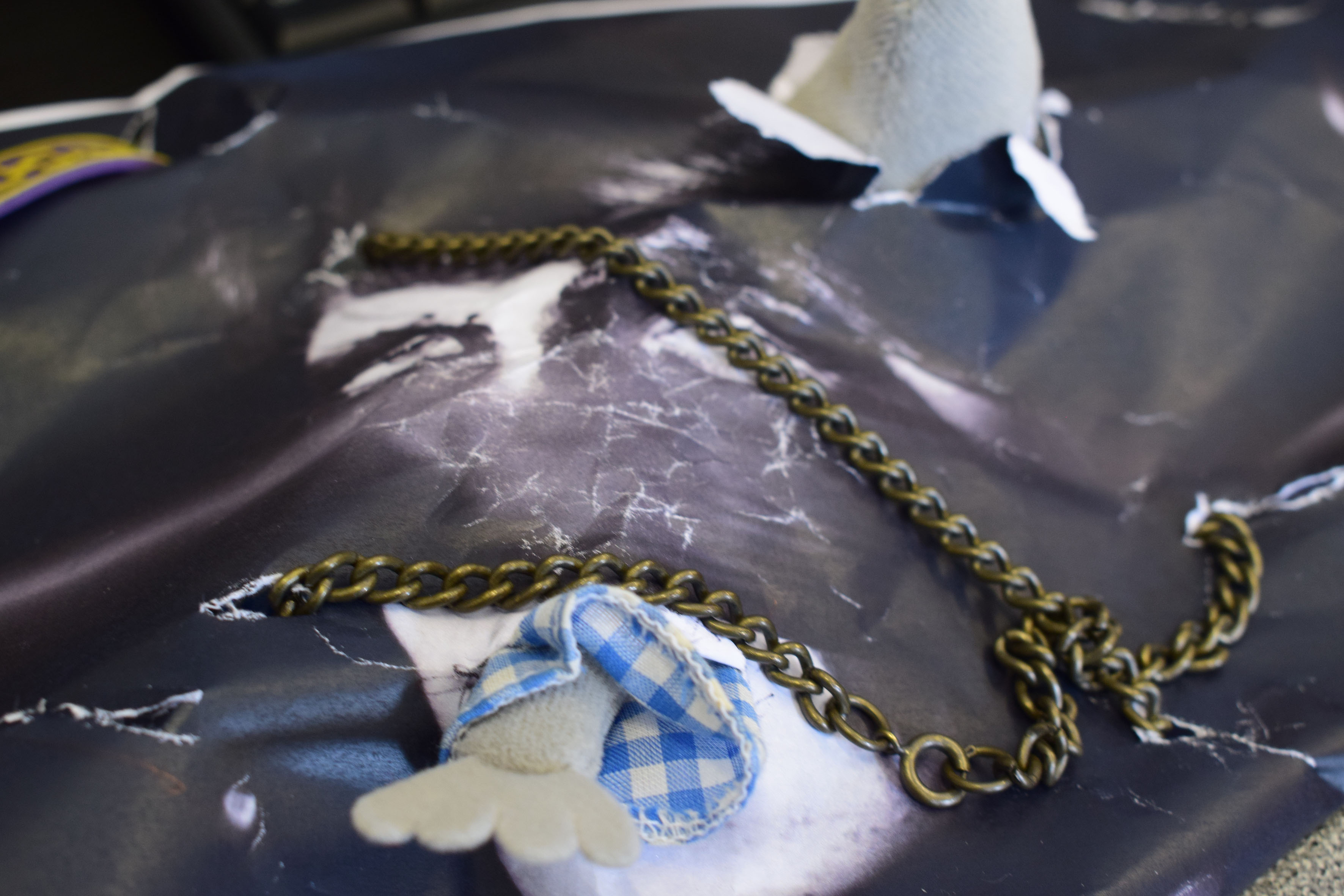
With this in mind we were then asked to make something out of the objects we were asked to bring but trying to make as many mistakes as possible. The objects I brought were as old mouse toy, a Pirates of the Caribbean necklace and a old PUSH wrist band as well as a photo of my brother. Here’s what I came up with.

When creating something in the mindset that if you make a mistake its ok really allowed me to be free with my creativity. I found this exercise very helpful and therapeutic as I could find meanings in the thing I had created with no thought process initially apart from making mistakes.